The fallout from last week’s ESPN column about Robert Griffin III’s RNOB and a brief history of nickNOBs continued over the weekend. One thing at a time:
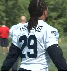
• Reader James Nagasawa points out that Earl Thomas of the Seahawks has been wearing RNOB on his practice jersey, as you can see at right. That Roman numeral looks like an aftermarket addition, no? Anyway, I got in touch with the Seahawks PR guy and asked if Williams planned to wear RNOB on his game jersey, and was told, “No. He just put it on his practice jersey last year.” So while Griffin isn’t the first NFLer to have worn RNOB in practice, he’s still on pace to become the first to wear RNOB in an actual game.
• Shawn Klis has alerted me to a nickNOB I hadn’t previously been aware of: “Back in the ’70s, the Buffalo Braves had a player named Ernie DiGregorio. I remember him specifically because he was the first guy that I ever saw with a nickNOB.”
• Last Friday I wrote this:
[A reader told me] that 49ers running back John David Crow wore a nickNOB ”” “Goober” ”” in the early 1970s. That claim is clearly false, since Crow’s last game in the league was in 1968, and the Niners didn’t even have NOBs yet at that point. I’m only bothering to mention it here because maybe Vinnie got some players mixed up in his head and there really was someone out there (not Crow) wearing “Goober” in the early ’70s. Anyone know more?
Just as I hoped, someone was able to connect the dots. “49ers running back Doug Cunningham was the one who was nicknamed Goober,” writes Richard Lewis (true enough — confirmed in this SI article). “Obviously, the 49ers would never have put ‘Goober’ on the back of his jersey, as you can see here.” Thanks for shedding some light on this one, Richard.
Finally, there’s an additional development arising from that ESPN column, but it’s too big to be summarized in a simple bullet point. I’ll have a full entry on it soon, and I don’t mind saying it’s gonna be epic — stay tuned.

Culinary Corner: I had a few friends over in the back yard on Sunday to celebrate the holiday weekend and my 25th anniversary of moving to Brooklyn (the exact date was May 29 — today). I usually try to experiment with new things in the smoker, and this time around I revisited a concept I began developing last summer, namely that anything that’s usually braised can also be smoked. Last year I successfully applied this concept to smoked short ribs and smoked lamb shanks. This time I tried it with something new, which you can see in the pan on the right side of this photo — see if you can tell what they are (click to enlarge):

Could you figure it out? They’re oxtails! I coated them with a coffee-based spice rub and then they got all blackened in the smoker, so it’s hard to recognize them, but they turned out really well. All my guests liked them (even a few folks who I thought would be squeamish about them). Another “If you can braise it, you can smoke it” success!
The other things on that platter are beef short ribs (the big, blackened nuggets) and lamb ribs, all of which were also smoked. On the grill, I had a steak, a pork chop, and a few dozen clams. Quite a feast!

Collector’s Corner
By Brinke Guthrie
Tommy Lasorda’s been a Dodger for so long that it’s hard to imagine him in any other uniform. But here’s a cap and a pair of cleats from his days cap and cleat set from Tommy Lasorda with the Montreal Royals. Too bad they don’t have his old Montreal pants or belt — that might make for an interesting then-vs.-now comparison. (Thanks to Allen Yelent for sending that one in.)
In other eBay finds for this week:
• Fantastic 1968 Eagles poster, still in the factory packaging. Why can’t they switch back to this look?
• I was an avid fan of Apex NFL stuff, so I like this neat Apex promo cap. Speaking of Apex, I had this Cowboys parka and loved it, but it totally picked up every piece of lint in the air. Strange.
• Don’t think I’ve ever seen this before — a decal set for an NFL helmet, right down to the green dot. (What’s that for again?)
• Pat Patriot looks a bit crazed on this early-1970s Patriots button, doesn’t he?
• Totally cool: 1969 Packers helmet bicycle hubcaps. The same seller also has Giants and Redskins versions for sale, along with
lots of other cool stuff.
• Here’s a pretty cool 1967 Baltimore Colts autograph book.
• Mal Alberts of KRON TV probably did not know back on September 29th, 1968, that his Falcons/49ers game program and media pass would end up on something called eBay.
Seen something on eBay or Etsy that you think would make good Collector’s Corner fodder? Send your submissions here, and you can follow Brinke on Twitter and Facebook.
In case you missed it on Sunday, voting is underway for Phil’s contest to redesign the Redskins. Cast your ballot here.
Uni Watch News Ticker: Well, that was embarrassing. Noteworthy details: The Rockies’ pandering cap was purple (first time the Rox had worn purple lids in many years); the Reds’ pandering cap was black (Cincy’s first time in black lids in many years); Orioles infielder Robert Andino forgot to pander, plus he does that thing where he wears his cap over his ears, like former Mets pitcher John Maine used to do (screen shot by Paul Gaiser). ”¦ Was Dusty Baker managing in jeans on Sunday? Sorta looks that way, but it’s just the black mesh screen on the railing making his uni pants look darker. … The Giants wore their headspooned “SF” road jerseys on Sunday, but Nate Schierholtz’s headspoon was MIA (good spot by Roger Hodges). … What are the Olympics all about again? Oh, right: athletic excellence. More detailed info here. … Here’s a video on how Nike soccer jerseys are made. … “We had our helmet fitting at the Toledo-area high school where I coach,” says Jacob Kubuske. “I was talking to the local Riddell representative, and while he was showing me his schedule I saw he had an appointment coming up at Bowling Green. As I mentioned the new matte orange BGSU helmets I’d just seen on Uni Watch, he went on to mention that BGSU will also debut a new white helmet at some point this year. He said it’s to keep up with all the other schools doing it.” … For reasons that aren’t clear, the Rochester Rhinos (USL Pro soccer) changed from their black/white stripes to their yellow alts during the break in Friday night’s game (from Kenn Tomasch). … Kevin Tiessen made himself a groovy little John Elway Cubee. … Unusual uni tracker of sorts from Jon Gates: “On the NBC comedy Community, Dean Craig Pelton (played by Jim Rash) has been known to wear a variety of ‘uniforms’ throughout the series. Cartoonist Dennis Culver is participating in a Community-themed art show and has created this poster, which features each one of the cross-dressing Dean’s costumes throughout the series so far.” … The James Caldwell High baseball team in West Caldwell, New Jersey, is wearing some nifty stirrups this season. That’s thanks to a donation by an anonymous Uni Watch reader who’s a Caldwell alum (class of ’87). “I ordered the stirrups through Comrade Marshall,” he says. “I did not tell the coach in advance, so he must have wondered what the hell was going on when a box with six dozen stirrups showed up unannounced, like Twin City Knitting was trying to flim-flam him for stuff he didn’t order.” Awesome work. We should all do this for our hometown high schools! … Ike Davis had some helmet decal issues on Saturday (screen shot by Steve Dodell). … Aussie footie news from Leo Strawn, Jr., who reports that the Western Bulldogs recently wore a one-off jumper to honor the club’s Hall of Fame members. “The letters ‘FFC” on the jumper stand for Footscray Football Club, which is the former name of the Western Bulldogs, and still the official corporate name for the organization,” Leo explains. … More Aussie footie news from Leo: “Two big manufacturing changes were quietly announced, both dealing with Adidas. First, Adidas will pick up Hawthorn for next season, although the official announcement won’t come until later in the year. The Hawks have been with Puma for over 30 years. Second, the Collingwood Magpies announced that they will drop Adidas after this season and make their own jumpers. That could mean no more manufacturers logos on their kits, among other changes.” … “I’m visiting my parents’ house in Minnesota, where I rediscovered these old Kellogg’s giveaway posters from 1993 showing the evolution of baseball jerseys and caps,” writes Erik Siemers. “I can’t remember the exact circumstances of how I originally got them, but I thought they were cool enough to share.” … Check out the similarity in Bob Ojeda’s stirrup stylings as a Little Leaguer and as a pro. … Although the auction ended last night, it’s worth checking out the eBay listing for this 1967 box of NFL miniatures, if only for the gorgeous box. “Never seen that one before,” says Brinke. … Don Larsen plans to sell the uniform from his perfect game (Leo Strawn again). ”¦ Lots of great stuff in this huge batch of Braves wire photos. Among other things, it looks like the Braves once experimented with “air-conditioned” mesh caps during spring training, just like the Reds did (from Jerry Wolper). ”¦ Ooh, check out this old Coast Guard hockey team — the Cutters! Here’s a color close-up of the jersey crest (great stuff from Willie Gabel). ”¦ Brookwood High in Georgia wears a rather minimalist baseball jersey. Seems more like a BP jersey (from Mike Raymer). … New logo for the Coca-Cola 600 (from Clint Ricahrdson). ”¦ Was Hammerin’ Hank getting some hitting advice from Chief Knock-A-Homa? Sure looks that way (thanks, Phil). ”¦ Here’s a video of new football turf being installed at Missouri. “Interesting that they shave out turf for numbers and logos,” says Terry Wehrend. ”¦ I’ve never read a Harry Potter book or seen a Harry Potter movie, so I’m not even sure what this means, but here are the 2012 Olympic Quidditch team uniforms. “Totally legit event going to take place,” says Andrew DeFrank. “Probably the biggest Quidditch tournament since the World Cup on Randall’s Island in November.” ”¦ Now that’s a football uniform (nice find by Jeffrey Allen). ”¦ Looks like Bob Lanier of the Pistons wore a captain’s C (Jerry Wolper again). ”¦ New 125th-anniversary jersey for Celtic. “If you fold over the sleeve, it shows the Irish Tricolour,” explains Daniel McLaughlin. ”¦ Kellogg’s has been producing throwback packaging for Frosted Flakes. Not bad, but I always preferred this version (from Bob Williams). ”¦ LetsRun.com is having a T-shirt design contest with a $250 prize (from Anthony Gonsalves). … Boy howdy, check out the solid gold uniforms that Southeastern Louisiana baseball wore on Saturday (from Chris Mycoskie). … Fresh on the heels of Randy Choate wearing orange sannies last week, the Angels wore red sannies for Saturday’s throwback game in Seattle. I figure they probably just wore the stirrups over their usual red socks (from Kerby Bealle). … A guy in St. Louis is trying to change the name of the Rams and their stadium (from Marty Hick). … Miguel Cairo apparently sweats a lot. … Take a close look at the uni number on the back of Michael Bourn’s helmet. Kinda looks like the Padres’ number font, no? (Good spot by Terry Duroncelet.) … Also from Terry: New uniforms for the Phantom Regiment Drum & Bugle Corps (“which is not a marching band,” he adds). … Michael Orr held another of his KitNerd gatherings in Portland on Friday. Full details, including photos of the soccer jerseys that everyone wore, here. ”¦ Remember our recent discussion of J.P. Walters etching his deceased daughter’s initials into the back of the mound? Someone in yesterday’s A’s/Twins game etched a cross into the mound. “It was definitely not there in the top of the 1st with Minnesota pitcher Scott Diamond on the mound but was there in the 2nd and even more clear in the 3rd,” says Jared Wieseler. “A safe assumption is that you could rule out Diamond and say that A’s pitcher Travis Blackley did it in the bottom of the 1st and then added to it later on.” ”¦ I don’t know what “thinclad” means, but that’s one hell of a track uni (Jerry Wolper yet again). … “The University of Arizona will come out with another helmet color this upcoming season, most likely red,” says Kenny Abbey Jr. “I’m not sure when it will be made public, but I’m hearing that it will be included with a Pro Combat uniform that will be gray. Also, there will be a jersey to go with the copper helmets that were introduced last week. Sorry, I can’t give up my source, who is close to the football program.”
Don’t the Falcons decals look weirdly positioned on that eBay program?
Or is it my imagination?
Yep. Definitely the former Padres numbers on that Braves helmet. What a crying shame that the Padres did away with everything in their uniform set that wasn’t completely bland.
The Braves have been using the old Padres number font on their helmets for 3-4 years, I thought it had been covered here before.
… “I’m visiting my parents’ house in Minnesota, where I rediscovered these old Kellogg’s giveaway posters from 1993 showing the evolution of baseball jerseys and caps,” writes Erik Siemers. “I can’t remember the exact circumstances of how I originally got them, but I thought they were cool enough to share.” …
Way cool enough.
“…… Now that’s a football uniform (nice find by Jeffrey Allen)…”
Wow.
“… I’ve never read a Harry Potter book or seen a Harry Potter movie, so I’m not even sure what this means, but here are the 2012 Olympic Quidditch team uniforms….”
Wow again. Life without kids. It does have its appeal.
“…… What are the Olympics all about again? Oh, right: athletic excellence..”
Paul’s link takes you to an opening paragraph on gawker.com that bears quoting. “Everyone knows the London Olympics are going to be an advertising shit-show. But a full understanding of the Olympics’ all-enveloping corporate embrace requires a trip into the “Brand Exclusion Zone,” a desolate region of London where only Official Olympic Sponsors can survive.”
Still and all, PL, you know we need a rundown of standout national Olympic unis…
Greg Swindell and I called Saturday’s Southeastern Louisiana game on ESPN3. We spent plenty of time discussing the solid gold uniforms. In fact, one of our keys to the game right off the top was “feel the power of the solid golds!” I had seen pictures, but I did not truly appreciate (I guess that’s the right word) them until seeing them in person. Here’s the replay: link
Isn’t the green sticker for a player on the field with a headset/radio comm in his helmet?
Yes. We know that. Brinke was being sarcastic.
I’m just throwing this out there, Paul, for a little different perspective on the caps MLB wore yesterday. Not trying to start a crapstorm like people got into with the Redskins thing.
I used to think they were all stupid, and, really, they looked atrocious. Some of the ones from yesterday don’t look good, but you have to admit it’s an improvement.
I’ve also had a change of heart in the whole thing since a friend of mine was killed in a helicopter crash last August (close enough that my dad was his first contact). Not to send everyone on a sob story, but I’ll support almost whatever helps these guys out, particularly since the “net proceeds,” whatever that means, are going to PTSD treatment.
Could they do something better/cooler? Absolutely. I believe you mentioned some time ago the idea of putting unit patches on the jerseys or something of the sort, and that would be pretty badass. Regardless, I think these were a move in a better direction, and they were at least in the teams’ own colors.
Thanks a lot. Keep up the good work.
That’s certainly sobering. Best wishes to you and your family (cuz friends are family too, yea?)
That said, I agree that while not ideal, these caps are a VAST improvement over the previous stars/stripes caps. I still shudder thinking about the Brewers wearing a red cap with a white panel.
I’m torn as well; I’ve been an active duty infantryman in the Marine Corps for a decade now, and baseball is my “time away,” so I honestly don’t like the “pandering” as you put it, especially on Memorial Day, which is NOT for those of us that are still here, but for those of us that didn’t come back.
As of now, I’m at over a dozen close friends (close as in attended weddings, drink together, travel together, watch each other’s kids, etc) that have not made it back, and countless others that I was associated with in a professional manner (subordinates that I trained, mentors that trained me, etc).
Yes, I think America needs to be aware of such things that occur on a daily basis, but the overt celebration of it all on one day seems not only inappropriate, but completely hollow and forced. I’d prefer a simple 30 seconds of silence before “Take me out to the ball game” during the 7th inning stretch over “God Bless America” any day, but really, a solemn and humble “Thank you” on random days throughout the year, rather than the obligatory Veterans Day, Memorial Day, 4th of July, 9/11 anniversary, etc that occurs now would be far more preferred.
War, death, and service is not to be celebrated, but solemnly respected and remembered.
Awesome site by the way, sorry for my soap box.
“especially on Memorial Day, which is NOT for those of us that are still here, but for those of us that didn’t come back.”
Thank you. Not to slight those who still serve, but that IS what yesterday is supposed to be all about, those who “gave the last full measure.”
I think perhaps those currently serving are more aware of that than the general public is.
I agree Ricko.
I was taught when I was young the difference between Memorial Day and Veteran’s Day. But it seems that fewer and fewer non-military folks actually understand who to “think of” on which day.
“it seems that fewer and fewer non-military folks actually understand who to “think of” on which day”
~~~
or punks on UW who just want to stir shit by stating:
“Bringing attention to the troops on their holiday? Offensive! They should spend more time on their socks stripes!”
or
“A lot of communities use Memorial Day to honor both the dead and those who are still serving. What’s your problem with that?”
(scroll down to the comment made at 4:24 pm)
Other than the camo on the logo, that purple hat is what the Rockies should wear all the time (my apologies, Paul). The black hat makes them the current most boring uniform in the major leagues, IMO.
Padres are more boring.
D-Backs and Brewers look worse.
But yeah, the Rockies need a purple cap.
A) Rockies should switch to purple caps. Obviously with a regular logo.
B) Love the San Francisco road unis – with the headspoon.
Regarding the Olympic advertising exclusion zone, weirdly, I believe that it will only apply if you are there in person. Watching on TV, you never see any advertising on screen except for the logo creep on the competitor’s uniforms. You may also catch a Panasonic logo if they show the video screen at the stadium. Even during the Coca-Cola games of 1996, I can’t recall seeing their logo on screen.
I went to the Winter Olympics in Turin in 2006. At the short-track speed skating venue, a vending machine ate my money. I managed to explain the situation to an Italian manager who spoke good English and he apologised that the machines had been only been installed the week before, replacing the regular ones that didn’t sell Coca-Cola products.
Regarding the mesh baseball hats, I can’t find photographic proof, but I am quite sure that the Twins used to wear mesh hats at least during part of spring training during the penurious Calvin Griffith era. I always assumed that it had to do with (a) Griffith finding another way to pinch pennies, and (b) the fitted hats not having arrived yet. I am less sure of this, but I think I recall seeing them wear mesh hats in a game at Detroit in 1981, which was their first road game following the end of the strike; again, I speculated (albeit as a 13-year-old) that the fitted hats had not arrived yet. This sounds like the kind of think Ricko might know.
Yes, and I think some teams wore mesh-like jerseys for spring training as well during that era. These jerseys were the same style as the regular jerseys with the lighter material.
Adjustable meshbacks in spring training were darn near universal for a while there.
They are cooler (temperature-wise) and they eliminate an equipment manager dealing with a HUGE group of players ever having to say, “Crap, we’re out of 7 3/8.”
Plus, there wasn’t as much money in the uni-pool back then, and also not as much sales of game gear. When game gear sales go up, manufacturer production goes up. When production is up, there’s a more ready supply of fitted hats for spring training.
As to the Twins wearing meshbacks after the strike, I can neither confirm nor deny. But I can see it as entirely possible, and wouldn’t be surprised if it was only one team that did it. For a game or two.
“Thinclads” is an old sportswriting term for track teams. Kind of like “cagers” for basketball and “harriers” for cross country.
Ah, thanks — you learn something new etc., etc….
Here’s a discussion on the issue
link
Or “harriers” for cross country runners.
Oops, didn’t see u said that.
We can assume Paul knew of “keglers”.
It seems as if Paul never tells us what he served as side dishes. I am also curious how it would be handled if he served a unique meat product and some guests did not enjoy it. Is there a secondary main course?
The big question of course is why do I actually care about stuff like this? Maybe the answer lies somewhere in the idea that people like us care about sports aesthetics and trivial matters.
Who knows…..
I made a big bowl of pico de gallo; other people brought other side dishes.
I always serve a wide variety of meats (pork, lamb, beef, sausages, chicken etc.), usually with some seafood for good measure, so there’s something for everyone.
Oxtail may sound scary to the uninformed, but it’s really just cowtail. Although I’m not sure if that sounds better or worse for boring eaters.
is it really the “ox” part of oxtail that’s scary-sounding?
No screen shot, but the Twins camo cap featured the old M logo instead of the current TC.
Astros also had red camo caps in the nightcap of the doubleheader yesterday. Not sure if the Rockies black caps had it in that game. Hard to tell from photos.
link — Astros red camo caps
These are for sale on MLB.com, but the Red Sox haven’t worn the 2 Sox cap in over two years (thank god):
link
Rockies wore link.
“Fantastic 1968 Eagles poster, still in the factory packaging. Why can’t they switch back to this look?”
It would make too much sense.
Yup.
-Jet
Uh, no thanks. As an Eagles fan, I’d rather not look like a green Colts. How about the link or maybe Eagles a la link?
Just, for the away jersey(s), please add an option for Kelly Green pants. You won’t have to worry about monochrome, since you can count the times the Eagles did that on one hand.
Not that I’d mind the look… but wouldn’t adding kelly green pants to the 80’s Eagles uniforms make them look a bit too much like the 90’s Jets? That’s not really better than being the Green Colts, is it?
link
That wouldn’t work on today’s jersey cuts. The bottom white stripe wouldn’t even exist, let alone be thick enough to look right.
Saw something strange during highlights of Eagles RB Bryan Westbrook on the NFL Network. For at least one game, the Eagles wore the black alternate jersey with green pants. I don’t recall this set at all, only the black jersey with white pants.
link.
Disagree with Jeff.
The Eagles should go to the Roman Gabriel/ Carmichael/Vermiel look. The colors are better, and the lok is unique to the NFL. The key to it working is the shoulder numerals being where they are, “above” the UCLA stripe. The lower striping is less important to that overal look. That can be accomodated to the sleeveless look.
I say go with it!
I know I’m posting this way too late for anyone to see it… but link (q&d)
I still think it loses something without the white stripe.
As all right thinking humans do, I wish with all my heart that Kelly would replace Midnight green, but there are currently 68,532 Midnight Green seats at the linc. and that may be the real dealbreaker.
Most stadiums have dark green seats regardless of what the team colors are.
Late addition to the talk about nickNOBs, but Japanese baseball has produced some doozies. Players are allowed to register their given names or (occasionally) nicknames as their “official” names (which appear in box scores, on scoreboards, and on jerseys) if the league approves. Ichiro was one of the first, but a few other players with very common surnames (like Suzuki, Tanaka, etc.) have also done it.
But where it gets really interesting is when someone picks a nickname as their official name. Takahiro Okada, or “T-Okada”, likes using an initial and a dash, and link
Fellow Orix Buffalo Jeremy Powell wanted to be called by just his initials, and link. Doug Jennings went by his real name, but got “D.J” (one dot) link.
But the winner is Australian-born Dave Nilsson, who got away with link, and that’s what was link. And his link!
Quidditch Olympics?, no it can’t be. I watched a Quidditch clip on youtube and it reminded me of a scene from Happy Gilmore, where Happy rides his golf club like a horse.
how has anyone not seen any of the Harry Potter movies? It’s only the biggest movie franchise of all time
It’s cool not to be part of the mainstream dontcha know?
i draw the line at twilight and the hunger games
I treasure my highbrow cred as much as the next man, but if Hunger Games become an Olympic event, I’M FREAKING THERE.
“It’s cool not to be part of the mainstream dontcha know?”
Sports?
i’ve never watched nor read any harry potter shite, and incidentally, quidditch as an olympic sport puts me a large step closer to totally turning my back on olymipic/pro/collegiate sports all together…
“i’ve never watched nor read any harry potter shite”
~~~
shite? shite?
really, ryco…if you actually read any of the books, you wouldn’t think it was shite
~~~
on another note…quiddich olympics? really? unless they’re actually, ya know, using flying brooms and snitches and quaffles and bludgers that also fly…then it’s just some really bad role-playing game that deserves no actual cred
Tried.
Shite.
Yeah, what Phil said — don’t be calling it quidditch unless it’s actually quidditch. (But he should know better than to think Ryco’s capable of reading an actual book.)
And TOMtiger, don’t you be lumping Twilight and The Hunger Games into the same category.
Jeez, Marty and RyCo, just because you don’t care for something doesn’t make it “shite.” It just doesn’t work for you, that’s really all you can say.
Like or not, the Harry Potter books are one of the masterful, fully developed works of storytelling of any generation. That’s pretty much impossible to deny.
I read somewhere that every 30 seconds somewhere in the world someone begins reading a Harry Potter book.
In these times when if you aren’t scurrying around like you’re on a sugar high your life is boring, anything that gets kids to slow down and sit down and read is a positive.
Or adults, for that matter.
“really, ryco…if you actually read any of the books, you wouldn’t think it was shite”
no, i’d probably then think it was a fantastic waste of time :-)
you literary types need to quit taking. things. so… literally
Let me clear my throat.
“large step closer to totally turning my back on olymipic/pro/collegiate sports all together…”
Just Do It. ®
Surprised they didn’t do their research better; the “Team UK” ones contain a clear, basic error.. namely the non-geographic “United Kingdom” is never used in athletics or the Olympics. Should be Great Britain (optional & Northern Ireland for some reason)
Frosted Flakes/Frosties – why are there dozens of evenly placed holes in the box?
Because it’s not a cereal box. It’s a link.
That Caldwell High School stirrups story is the feel-good story of the week!
-Jet
The really annoying thing about the new black Celtic shirts is that they distort one of the grey hoops, so that the Tennent’s logo fits in.
I suppose they could make the logo smaller, but that surely doesn’t make sense.
not the first time the hoops have been link.
Course, these were the second shirts with the link green block numbers in white rectangles (help! I’ve forgotten the proper term for these, if there is one)
*the second regularly numbered shirts
I was bothered the most that some of the pandering caps had the wrong buttons on the top of the cap, i.e. the Mets and Dodgers were blue instead of orange and white, respectively.
Wait, so New Era gave the Mets 2012 pandering caps blue squatchees, yet can’t get the color right when they issue link caps?
“…he went on to mention that BGSU will also debut a new white helmet at some point this year. He said it’s to keep up with all the other schools doing it.”
Worst. Excuse. Ever. Shaking my head at this one.
It’s the same reason why we have the silvergray basketball/football uniforms, black jerseys, pajama pants, and multiple helmet options.
Everybody’s doin’ it!
That is so the schools can attract more 17-18 year olds that look at uniforms, aka “bling”, than an institution of higher learning and an education.
Missed your comment when I posted mine below. But I echo your feelings.
Interestingly, the Padres don’t seem to be actually be using that number font anymore. I notice that when they were in St. Louis this past week. They seem to have switched back to a more traditional block-number font on all their jerseys.
link
Strange how the cammo on the Orioles hat’s were link the bird head, while for Toronto their bird head link cammo.
Semper …. You’ve earned the soapbox.please don’t apologize.
A for the padres font ….sat in the upper deck at Busch this past week … seriously thought the Yankees might have come to town.
The Robert Griffin III saga is beginning to annoy me….
Just like the Reggie Bush #5 annoyed me.
Great to see “Community” and Dean Pelton get some love here!
Fan of the show, but a bit bummed to see that Dan Harmon has been link
Agreed! 8^(
I’m worried but hopeful.
Six seasons and a movie.
i was dean-lighted to see it as well.
“Totally legit event going to take place…”
…except for the fact that Quidditch isn’t a real sport, considering that it requires players to ride on magical flying brooms and chase a small, magical winged object. Otherwise, totally legit.
On quid ditch, it’s not actually A real part of the Olympics, but is happening in London this summer with International teams. The World Cup took place in NOvemer in NYC. 30,000 people attended. Over 100 collegiate teams. It’s not all imaginary!
Unlesss they’re on sticks that literally fly and play with a ball that has functional wings, they might as well be larping.
Yeah, but they’re larping with spectators, so it’s cool – it’s just like professional wrestling, but with less steroids.
The latest full-length Permanent Record feature is up now on Slate:
link
very nice
Scuba Uniform Watch. Interesting.
link
Why are the Military ( Camo ) tribute caps considered to be a bad thing? Isn’t it just a tribute to our nations Military, on a national holiday? Maybe I view this differently because I’ve been serving on active duty for the past 15 years. Im not trying to be argumentative, just trying to look at it from a different perspective.
My feelings about the use of camouflage in sports uniforms can be found here:
link
Wow! What a great article Paul! I’ve only been reading uni-watch for about 2 years, so I hadn’t seen that article before. I now see your perspective on the topic. Which was very well written. I always enjoy a different point of view, whether I agree with it or not! Good stuff and Cheers!
Thanks, Josh — I appreciate different points of view as well. And I also appreciate your kind words.
Paul,
Concerning Dusty Baker and his pantaloons:
There’s clearly (perhaps only to me…) a meshing inside that railing to protect people from foul balls and such – link . You can see the black zip ties holding the meshing in place around the red railing and you can see how the meshing changes the color of #25’s pants too, it’s just that he’s standing further away so the effect isn’t as significant.
wow, I need to read the next sentence of things…
MY BAD!
(that’s what I get for going through the ticker so late in the day. smh@myself)
According to the second Olympic article it seems that Nike started big events having exclusion zones.
Now that they have stepped it up in 2010 by projecting their mark on buildings outside of the zone, how long will it be before the entire city is one big exclusion zone?
BGSU doing it to keep up with all the other schools doing it
Now that is a great reason to use multiple helmets.
link
So sweet.
Great one. Always wondered how that sorta “rising sun” helmet would have played in 1943.
Want to get lost in a website for, like, days? Literally.
link
Then search, say, “football”…
link
Speaking of new era caps, here’s a shot of
Matt Kemp watching batting practice sporting a black dodgers fashion cap… Don’t think I’ve ever seen that before. link
Dodgers have been wearing the Black Caps in honor of the LA Kings playoff run
please get off the “rename the skins / indians” crap. overdone. we get it already. u dont like it. overkill by far.
Please get off the “Get off the ‘rename the skin/indians crap'” crap. Overdone. We get it already. (Yo)u don’t like it. Overkill by far.
See how that works?
It’s our site; we’ll cover what we think is noteworthy. You have your life; you can read what you think is noteworthy. Simple! It’s a win-win.
^^^ THIS is how you combine grammar Nazism and a logical answer to a troll’s blabbering almost (if not totally) flawlessly. Well said, Paul.
From sid lowe’s la liga year in review column in the guardian:
Villarreal decided that they were going to mark Mothers’ Day by playing with the names of the mothers who gave birth to them on the back of their shirts — an idea so good the fans were reminding them of it for the rest of the season
Should have gone with this pic of Brookwood’s uniforms.
link
That way it could have been mentioned that Grayson, whose colors are Green and Gold, were wearing Navy. NFNS?
On second thought, you can’t even see how minimalist those uniforms were.
How about this angle:
link
No wait, you still can’t see the front (but you can see the Parkview Panthers celebrating the State Championship over hated rival brookwood).
Also Parkview wears a variation of the Dodgers home uniform (there was a time when they didn’t have that stupid stripe on the pants, but then Under Armour became the uniform supplier)
link