A quiet revolution has been unfolding in the batter’s box this spring, and I didn’t even realize it until just now.
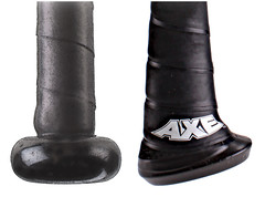
The revolution involves a new bat design called the Axe, which is made by a company I’d never heard of before called Baden Sports. The bottom few inches of the Axe are slightly flattened, with an knobless off-center end, like an axe handle, which supposedly provides better bat control and leverage.
The Axe has been around for about two years now, and several articles have been written about it, but I didn’t learn about it until yesterday, when reader Jason Hillyer sent me this article about the Axe being used by the Marietta College baseball team in Ohio. It has lots of basic info on the Axe — recommended reading.
The article says Phillies shortstop Jimmy Rollins has been using the Axe “full time” this season, so I went looking for photos from the past few weeks. I did find two shots of him swing the Axe (that shot on the right, from a spring training game, shows him hitting the first professional home run ever hit with the Axe), but I also found several pics of him using conventional bat, plus a dugout shot of him carrying a bunch of standard-knobbed bats. So the “full time” Axe claim is apparently a bit of an exaggeration. (The article also says Matt Kemp of the Dodgers and Jacoby Ellsbury of the Red Sox have “experimented” with the Axe, but that sounds like a needle/haystack situation, so I didn’t go hunting for photos of them.)
I also found this promotional video about the Axe, featuring ex-MLBer Jay Buhner:
Hmmm, between this and the rise of bat knob decals, the unassuming little end of the bat sure has been getting a lot of attention lately. Growing up, I remember a few players whose bats had no knob, or very truncated knobs. But this asymmetrical knob is something new. If it catches on, it could mark a major alteration to something that’s been basically unchanged for over a century.
ESPN reminder: In case you missed it yesterday afternoon, my latest ESPN piece is about a guy who’s reluctantly selling some intriguing sports artifacts from his youth.
Uni Watch News Ticker: With Mo Rivera’s season apparently over, and maybe his career as well, we may have seen the last of No. 42 on the diamond, aside from April 15. ”¦ Whatever your thoughts on Chief Wahoo, I hope we all agree that this promotional material is in really poor taste (from Ray Barrington). … Jim Mullin has written a series of blog posts on the worst CFL uniforms. … This slideshow provides our first non-Photoshopped look at Peyton Manning in a Broncos uniform. … Ron Roza tipped me off to the new “guess the logos” iPhone app. … Here’s a weird one: When the Brooklyn Dodgers had their 1955 championship parade, it looks like they wore shower slippers (good spot by Greg Stamps). … Looks like Dexter Manley was wearing shinguards under his socks. As I’ve said before, I’m amazed more football players don’t do this (from Marc Mandin). … AC Milan’s new number and NOB font is pretty weird. “Also, it turns out the design between the black and red stripes is an Italian flag motif,” notes Jeremy Schneider. … “Here’s a pretty lengthy (16 minutes) video about Ole Miss’s indoor practice facility that has a lot of uniform and equipment info,” writes Michael Martin. “There’s one part toward the end where TE Jamal Mosley expresses a desire to wear the all-gray uniforms every game.” … Is UGA planning to wear pink helmets and/or uniforms this fall? Could be. … Another college baseball team wearing a tequila sunrise variant: Seton Hall (from Andy Hyman). … Also from Andy: We’ve all seen those Sears NFL bedsheets and blankets from the 1970s, but until now I’d never seen these pants. That sound you just heard in the background was Brinke Guthrie drooling. … Whoa, check this out: Some Little Leaguers in the Kansas City area wore 1918 throwbacks, complete with henley pullovers and hoop socks (big thanks to Brian McDavitt). … New away kit for Swansea City. “The red and green are for the Welsh flag,” says Jon Forbes. … Here’s what the USA weightlifters will be wearing in the Olympics. “They’re made by Risto Sports, a small custom weightlifting shoe and singlet maker,” says Kevin Mueller. … Here’s a photo of Andrew Luck wearing a blank Colts jersey for his head shot (from Todd Usher). … The L.A. Galaxy are inviting fans to design the team’s 2013-14 third kit (from David Lassen). ”¦ New uniforms on tap, including gold helmets and gold pants, for Southeastern Louisiana (from Christopher Mycoskie). ”¦ Mavs gave out blue T-shirts to everyone attending last night’s game against the Thunder. A nice gesture, except it made the crowd look like they were dressed in Thunder colors. “Drives me f’n crazy!” says a very entertainingly enraged Timothy P. Obrien.
That Cleveland Indians promotional material dates from before 1946, as it says that the team’s address is at League Park and so it isn’t fair to say it is of poor taste.
Patrick beat me to it — sure you can say it’s in poor taste by today’s standards, but we have to view that through the lens of the standards of the time. It’s not fair to criticize something that was perfectly acceptable when it was done for not standing up to our standards over sixty years later.
Yeah, and slavery was perfectly acceptable in 1850.
Just because something was “acceptable at the time” doesn’t mean it was right. In the early 1960s, the poll tax was still legal and common in the South — that doesn’t mean it was right. It was as wrong then as it would be now.
That Indians promo material was offensive then, and it’s offensive now. It’s not that the material itself was acceptable 60 years ago; it was acceptable for people to be offensive 60 years ago. That’s what’s changed, not the inherent wrongness of the material.
So, is it ever acceptable to represent a race with a cartoon character? Should all cartoon characters be completely devoid of any types of racial elements? How do you feel about Disney’s Pocahontas, or Avatar (take away the blue skin and tails and the Na’vi are pure Native American imagery)? Is that wrong too?
When I look at that Indians ad, I see a bunch of cutesy cartoon characters, I don’t see any racist intent.
can you really say something was “offensive” for a time period, if no one during that era found it offensive though? people back in those days would have even blinked twice at this type of ads.
people back in those days would have even blinked twice at this type of ads.
I think you mean WHITE people wouldn’t have blinked twice. Indians might have felt differently.
“Indians might have felt differently”
you’d have to ask them though, not just assume they think it’s racist or wrong. really talk to them, not read a study from 19xx. talk to them without an agenda…
i had about 30 Ryberto’s hats made, and distributed (at cost) amongst friends. when one of my “white” friends recieved his hat, he liked it but his significant other got on his case about the racist undertones of the logo. i never told anybody but it’s a logo that was made with the help, and rooted on in a contest, of a good friend of mine that happens to be mexican. 8 other Mexican friends of mine that requested a hat love the logo. trust me, they didn’t buy the hats because they liked me, they barely knew me or knew of me at the time (one 1 or 2 really did), we’ve since became friends. pretty sure one of my friends wore his in mexico and had a local love it so much, that he gave it to him.
i agree with The:
“When I look at that Indians ad, I see a bunch of cutesy cartoon characters, I don’t see any racist intent”
when people see speedy, they see a cute little mosue with a sombraro
I repeat this till I’m blue in the face: NOBODY HAS THE RIGHT TO NOT BE OFFENDED. Since the age of five, my sensibilities have been a china shop for people to pass their bull through. So I learned to offend right back. Take it from Sartre, “Hell is Other People.”
Walter, this comment kicks ass all day long, and twice as hard on Saturdays.
but Paul deleting an entire discussion about Brenda Warner because he looks bad for mocking her IS censorship
“‘Indians might have felt differently’
you’d have to ask them though, not just assume they think it’s racist or wrong. really talk to them, not read a study from 19xx. talk to them without an agenda…”
I have. I have several friends who are Apache and we talked about this a couple weeks ago when the weekend columns were posted here. They absolutely hate the Indians moniker and “Chief Wahoo” (is that name not completely offensive?). Same for Redskins, etc. It makes them cringe when they see those logos or hear those team names. To them, it’s insulting especially considering the treatment they still get in this country.
A censor and by extension censorship are concerned with the Law. Actually it has nothing to do with the “government” which is merely the collection of organs that enforce the Law. The rules and practices of Uni-Watch are not part of the Law. This is a voluntary, private, informal group, set up by Paul. He has the right to do with it as he pleases.
Now even if a private citizen has the right to do, say, or publish something that person can still objectively be wrong or an ass. I can say 2 + 2 = 583 and no one can touch me no matter how wrong I may be. In that same vein, the Chief Wahoo motif (then as now) is still objectively wrong.
This doesn’t make the people who rooted for the Indians (then as now) bad people. When it comes to people nothing is ever black and white. We can only evaluate and study actions. What made it good/bad? Why did it happen? I don’t see how this is difficult to grasp.
Sorry to say I missed reading UW yesterday, but I swear it looks like Don Knotts modeled for that Indians promo.
Paul, I agree with them. Literature falls into this category too…Huck Finn, Ten Little Indians (which WAS changed once)…A lot of Warner Bros. WWII cartoons are “offensive” by today’s standards, but we watch them as they would have been viewed in their appropriate era.
*sorry…”and then there were none”… is what I was trying to reference…
A lot of Warner Bros. WWII cartoons are “offensive” by today’s standards…
Why the scare quotes? Are you being ironic?
No, they are not “offensive”; they are offensive. And they were offensive back at the time, too. But at the time it was acceptable to be offensive in certain ways.
…and South Park is in it’s 16th season, so it’s obviously STILL acceptable to be offensive in certain ways.
There is no truly definitive answer to the question of “What is offensive?”
Example – the huge uproar in the US over one second of Janet Jackson’s exposed breast at the Superbowl vs shampoo commercials with topless women on German TV. Some people find nudity offensive, others don’t. The same thing applies to just about anything that can be claimed as offensive. Some people will be offended by something and others will respond with “dude, it’s just a _____, chill out”.
Please. South Park is socio-cultural commentary. It makes a statement on contemporary morés by offending *everyone.* It’s not a valid comparison and you know it.
No use in trying to discuss anything with him…he is the type of person that is happy Song of the South is unavailable…even though it is an amazing film…
Paul, I think this may be going a little far. To censor the past because it was offensive to people today is to remove it as a reminder of where society and culture has (de-)evolved from. You can’t say “we’re better today” if yesterday didn’t exist.
Mark Twain used the N-word in his stories. Should we ban his books along with the Indians pamphlet? The N-word probably the worst word a caucasian person can use due to its association with slavery, yet Twain is heralded as a visionary with his writing.
This reminds me of the scene in “Field of Dreams” where Annie Kinsella is defending Terrence Mann. Perhaps we should ban all works by Stanley Kubrick, Alexander Solzhenitsyn, George Orwell, and Ray Bradbury while we’re at it. All wrote pieces that promoted all sorts of anarchy in various forms, yet all are considered to be visionaries.
The point is that once you start this banning of materials deemed offensive by today’s standards, you’re creating a slippery slope. While the atrocities committed by the Nazis and the Klu Klux Klan still happen today, removing the existence of the Nazis or Klu Klux Klan from history only encourages future generations to make those same horrific mistakes again. After all, “those who do not know history are condemned to repeat it”.
I get what you’re saying about the offensive nature of the pamphlet, but hindsight is always 20/20.
link
Well, I was hoping that would post the whole address. That’s TV Tropes entry for “Fair for Its Day.” Every generation operates under it’s own social rules and norms. Sure, a lot of things are regrettable in hindsight, but you can’t judge it by today’s standards.
Twain used the word “nigger” to show how ridiculous society was when it came to race. He was shoving it in our face in order to comment on how wrong white society was at that time. Twain would most probably agree with Paul on this Indians issue and pamphlet.
It’s all about intent. Twain and South Park use offensive terms and images in order to comment on society and illustrate how wrong something may be by shoving it in our face. The Indians are taking a people and stereotyping them for their own profit. Big difference, you can’t compare the two at all. Wrong is wrong regardless of the decade or century you are in.
There is no need to remove or censor this stuff, I don’t believe Paul is saying that, in fact it needs to stay as an example of where we as a society don’t need to go back to. It also shows how far we have come in this area, as well as how far we still have to go. Kubrik, Orwell, Bradbury, etc. all used offensive language/scenarios/etc. in order to make points, comment on the world at the time and illustrate hypocrisy.
Paul, I think this may be going a little far. To censor the past because it was offensive to people today is to remove it as a reminder of where society and culture has (de-)evolved from.
Who said anything about censoring? If I was trying to censor it, I wouldn’t have linked to it.
we are comparing Mark Twain to a pamphlet for a baseball team. Just a little perspective. One is a work of art, the other is a pamphlet for a baseball team.
Many things we do today that we consider normal will be considered offensive, even against the law in years to come.
I agree, Mark, but his usage makes it seem perfectly acceptable. When younger children read this in school, the concept of how he used it is often not taught properly or at all, so children can and do use it without knowing the reasons for its usage by a prominent author.
It’s still an unacceptable word by today’s standards, though. So do we stop teaching Twain’s message because of today’s standard?
Finding something offensive is often the first step in censorship. Since you’ve stopped the production of all membership cards with Native American imagery, that is censorship.
You can’t blame Twain for use of the word “nigger”. Chances are by the time they even read the book they already heard it and used it a million times. Rap songs, movies, TV, etc. At least Twain puts it in a historical context and tries to convey it in a negative light. It’s up to the parents to set an example for their children about the use and meaning of the word (as well as the teacher when reading the book), but kids should know well before they even pick up Twain’s novel about the stupidity and evil that word carries. But that/this is a different conversation all together.
You can’t define offensive materials, but you know it when you see it. Twain no, Indians pamphlet yes. Just me.
Finding something offensive is often the first step in censorship. Since you’ve stopped the production of all membership cards with Native American imagery, that is censorship.
Teebz, I’m sorry, but that is a fundamental misunderstanding of what censorship is. Censorship is when the government prevents you from saying something, or punishes you for saying it.
There is no fundamental “right” to a Uni Watch membership card. I don’t do purple cards — is that censorship? From the start, we wouldn’t do Mets cards that included the black drop shadow — was that censorship? What if I shut down the membership program entirely — would THAT be censorship? No, no, and no.
Not doing Native American-based cards isn’t censorship either. It’s just a set of guidelines for a voluntary program. You don’t like the guideline? Then don’t join the program — simple.
If Congress passes a law saying nobody can wear Indian-inspired imagery, *that* would be censorship. But that won’t happen — the First Amendment guarantees that you can wear a swastika, or a Klan robe, or anything else you like, no matter how offensive it is. And that’s as it should be.
Since when is it only censorship if the government does it?
Wal-mart only sells CDs that don’t contain profanity. Meaning that any artist who wants to be sold there needs to provide a “clean” version of their album, if the normal version has foul language. That’s still censorship and the government has absolutely nothing to do with it.
It’s your site and your rules for membership and you’re free to disallow any images you want to, but it’s still a form of censorship.
Wal-mart only sells CDs that don’t contain profanity. Meaning that any artist who wants to be sold there needs to provide a “clean” version of their album, if the normal version has foul language. That’s still censorship…
Uh, no it’s not. Wal-Mart is under no obligation to sell any particular product. And the recording industry is under no obligation to comply with Wal-Mart’s demands — they could simply do without selling their product at Wal-Mart. In both cases, it’s a choice. That’s not censorship; that’s a series of calculated choices based on the marketplace.
Just thought I’d point out that the Indians owner at the time, the man who signed those ads, was Bill Veeck, who was about as progressive politically and racially as they come. Integrated the American League, as is well known, and also wanted to buy the Phillies and sign black players to play for them years before Jackie Robinson.
Are we seriously arguing about whether or not this kind of thing is racist?
The definition of “censor” is this:
1. an official who examines books, plays, news reports, motion pictures, radio and television programs, letters, cablegrams, etc., for the purpose of suppressing parts deemed objectionable on moral, political, military, or other grounds. (CHECK)
2. any person who supervises the manners or morality of others. (CHECK)
3. an adverse critic; faultfinder. (CHECK)
Therefore, it is censorship by the very definition of the word.
Actually, it fails the first test, because none of this is being done by “an official” — which means an agent of the government.
By the definition you’re trying to push, Teebz, every movie critic is a censor. For that matter, so is Miss Manners, and maybe my Mom. Get real.
In legal terms, censorship is suppressing free expression and imposing legal penalties for its exercise. If you want to try to overturn a few centuries’ worth of established legal doctrine, go ahead, but you may find it’s an uphill climb.
Paul, you’re the official on this blog. We adhere to your rules, just as you adhere to the government’s rules. Just as you adhered to your parents’ rules. Just as you adhere to society’s rules. Just as… so on and so on.
We get that you don’t produce purple cards aside from one amnesty day – that’s fine. We live by those rules. We accept the censoring of all purple cards on this site.
An official doesn’t have to be an elected official.
I’m sorry, Teebz, but you’re stretching the definition of “official” as much as you’re stretching the definition of “censorship.”
Censorship is the suppression of something to which you have a basic right. But you have no basic right to view Uni Watch, or have a membership card, etc. This web site is not a society, I am not its ruler, and you are not a citizen of it; this web site is a project of mine, and you can come and go as you please, whatever suits you. I make the rules, but they’re my rules because it’s *my* place. Society belongs to *all* of us; this site belongs to me.
Censorship only exists in the public/civic realm. This site is a private project (although a welcoming one). You’re really talking apples and kumquats here.
So it’s not censorship if it’s a private club/group? Bullshit.
The only difference is that it’s legally acceptable censorship rather than being a First Amendment violation.
A private company can legally censor content, the government can not.
Quit playing semantics.
Is the internet a basic right?
People in China and North Korea experience all sorts of censorship on this front. My workplace censors all things they deem inappropriate, yet I may find some of these sites to be quite normal.
I’m not stretching the meaning of the word by any means. It seems you’re pigeon-holing into a very small context.
Quit playing semantics.
It’s not semantics. I can’t help it if you don’t understand what censorship is. If you honestly think Wal-Mart is engaging in censorship (or that I am), be my guest. But you’ll find very little support for that position from any serious person who understands the legal or intellectual meanings of that term.
People in China and North Korea experience all sorts of censorship on this front.
Actually, they experience all sorts of censorship on MANY fronts.
My workplace censors all things they deem inappropriate….
No, they don’t. They restrict your access to things that they feel are antithetical to your work performance. That’s not censorship; that’s maintaining rules in the workplace. If you don’t like those rules, you don’t have to work there.
Again, censorship is the suppression of free expression. But not all expression is free. When Don Imus was fired for being offensive on the air, that wasn’t censorship — that was an employee violating workplace standards. He has the right to say whatever he wants, but he doesn’t have the right *to be employed* while saying whatever he wants. Big difference.
Oh for the love of…
A CD/movie/whatever which has had language bleeped out has been “censored” by any practical definition. It doesn’t matter if that particular bit of editing was carried out by a government official or by an unpaid intern at a record label, it’s still a form of censorship.
A CD/movie/whatever which has had language bleeped out has been “censored” by any practical definition. It doesn’t matter if that particular bit of editing was carried out by a government official or by an unpaid intern at a record label, it’s still a form of censorship.
I’m sorry, but that’s simply a fundamental misunderstanding of a very powerful and important word.
We appear to be at a stalemate now, since we’ve both stated our positions clearly but are at loggerheads. Let’s move on. Thanks.
The United States constitution only protects against censorship from the government, a government body or a government entity (official). This doesn’t include private blogs, retail stores, shop owners, my mom, or Bob down the street. A shop owner can decide what they wish to sell. You decide what you wish to buy. It is Wal-Mart’s choice to only sell PG-13 CDs. It is the record company’s/artist’s choice to bend to their own private and personal guidelines and change their music for that one store. The artist can also say, “Screw you” and sell through other outlets. They usually bend because Wal-Mart is huge and has a huge customer base. So the choice is either not bend to their guidelines and stay true to your original work or change your work in order to get better sales. Either way, you make the choice and are not forced to do anything. You just have to live with the outcome. If it was true censorship by the government then they would not be allowed to make the original adult content CD in the first place.
Also, Paul’s history of not printing Native American themed cards or even not recognizing purple is not him censoring. It is actually an example of him flexing his First Amendment rights. As UniWatch is a private space/outlet, Paul is allowed to write/not write whatever the hell he wants (with few exceptions i.e. anything that may incite riots, threatening other’s well being, anything that is libel, etc.). It is your choice to read or not to read. It is not written anywhere that states reading UniWatch is a basic human right and that includes reading about purple and owning a Native American themed membership card. Once again, Paul isn’t censoring, he is expressing his first amendment rights, which encompass what you can say/write, but also not having to say/write anything you do not wish.
but Paul deleting an entire discussion about Brenda Warner because he looks bad for mocking her IS censorship
(my bad for the double post)
Once again, that is not censorship. That is Paul removing something from his property that he does not want, regardless of his reasons. He is not stopping you from saying the same thing anywhere else. It’s him making a decision, not censoring. It’s like if you placed a poster on my house/property about something you feel strongly about. i have the right to remove it because it is on my property/yard, but I am not saying you can’t keep on expressing yourself anywhere else, just not on a place that I own and therefore can make decisions on. It would only be censorship if the government came to Paul and told him to take it down and then told you to stop expressing your views or you would pay some consequences. That is censorship. That is the 1st amendment being broken. Paul can delete the whole site, it is him to do with what he pleases. Once we post, that content is his property, it is no longer ours. Paul deleting comments is a personal choice he makes in regards to what he feels like having on HIS site. It does not count as censorship because you can go to other venues and express the same thoughts. You can stand on a street corner and yell what you feel to the masses. You can print up flyers with your thoughts on them and start passing them out. he is not taking away your right of expression, just a private venue for you to express it through, which is 100% in his rights to do. Anyone telling Paul what he can and can not delete/post/write about is encroaching on his 1st amendment rights….I quit.
Maybe instead of being in a perpetual state of high dudgeon about the horribly “offensive” name and logo of the Cleveland professional we should remember that the team was named in memory of the first native American professional baseball player, as evidenced by the following (to quote James Thurber, “You could look it up!):
Cleveland Plain Dealer
Editorial, January 18, 1915
Many years ago there was an Indian named Sockalexis who was the star player of the Cleveland baseball club. As batter, fielder, and base runner, he was a marvel. Sockalexis so far outshone his teammates that he naturally came to be regarded as the whole team. The “fans” throughout the country began to call the Clevelanders the “Indians.” It was an honorable name, and while it stuck the team made an excellent record.
It has now been decided to revive this name. The Clevelands of 1915 will be the “Indians.” There will be no real red Indians on the roster, but the name will recall fine traditions. It is looking backward to a time when Cleveland had one of the most popular teams of the United States. It also serves to revive the memory of a single great player who has been gathered to his fathers in the happy hunting grounds of the Abriakis.
Even before the time of Sockalexis there was another great era of Cleveland baseball history. Patsy Tebeau, the Muggsy McGraw of his day, got together an aggregation of mediocre players, and by the sheer forcefulness of his personality made them a winning team. Never was there a baseball organization which fought so hard or so unscrupulously. There was nothing ladylike or Chesterfieldian in the Tebeau methods. But his team was liked, nevertheless; for it won, and that is the main requirement in baseball. Tebeau called his team the “Spiders,” and now it has been decided to revive the name and apply it to Cleveland’s American Association team.
Rechristened “Indians” and “Spiders,” Cleveland’s two teams will have high traditions to live up to this summer. Every baseball enthusiast of the Sixth City will hope that they may prove worthy of their namesakes.
Reggie, that story has been debunked many, many times, most recently here:
link
It simply isn’t true.
Two things about the naming of the Indians after Sockalexis being “debunked”:
First of all, the editorial I copied, verbatim, from the January 18, 1915 edition of the Cleveland Plain Dealer. The Plain Dealer was, and is today, the major daily newspaper for the city. It’s always struck me as funny that the published newspaper version stating how the Indians were named is offhandedly considered wrong and inaccurate, but we’re supposed to accept that a couple of unnamed sportswriters or club officials cooked up, and renamed the team to somehow mock or denigrate native Americans—where’s even one shred of this account? We don’t have to debunk that story, because it’s never been “bunked” in the first place. If the city’s daily newspaper and the club’s administration asserted that the team was honoring Sockalexis, isn’t that good enough? Despite the popular liberal manifesto storyline, there’s not always a sinister, white-rich-anglo-male scheme behind every corner plotting to keep everyone else oppressed.
Secondly, I know that a regular contributer to this site is also published in the Cleveland Scene, and that you’re based in New York and wouldn’t know this, but the Scene is a free tabloid whose sole purpose is to advertise the flesh trade and the bar specials for the week. The rag couldn’t debunk an “Elvis Works at my Seven-Eleven” story: hell, they’re likely to be the ones printing such a story–so while their latest article does a nice job of repeating the echo-chamber of horribly wounded Wahoo bashing libs, it is devoid of any actual facts. Even the occupy anarchists don’t read it for the articles.
It’s about time we credit the Cleveland Indians for naming the team after a then unpopular minority, and for having the courage to continue that honor to present day. Having grown up in Cleveland, I can say for a fact that the Sockalexis naming origin of the team has always been presented in a positive way in the area, and, believe it or not, the positive role model has led to a greater acceptance and inspiration of Native Americans, contrary to the current PC victim-mentality, Kumbaya noise machine.
link
“… Despite the popular liberal manifesto storyline, there’s not always a sinister, white-rich-anglo-male scheme behind every corner plotting to keep everyone else oppressed…”
What a straw man! Puh-leeze.
“.. It’s about time we credit the Cleveland Indians for naming the team after a then unpopular minority…”
If you’re saying that American Indians were institutionally screwed over, then no argument, of course. But “unpopular?” No. Read the popular literature of the day, and you’ll see that the Red Man was romanticized and admired for his warrior courage. Which explains why so many college football teams of that era chose “Indians,” Braves,” “Illini,” et cetera. Indians may have been de-humanized all over, and ill-treated by whites in the Dakotas and Oklahoma and other places near reservations, but in Cleveland, as in Hanover, NH, or Amherst, MA, or Miami OH, or Queens, NY, or scores of other places, Indian legends and Indian iconology were much in fashion.
“… (T)he positive role model has led to a greater acceptance and inspiration of Native Americans, contrary to the current PC victim-mentality, Kumbaya noise machine…”
Raymond Williams once said that there are a lot of people who argue by means of what he called “generalized swearing.” Light on evidence and reasoning, heavy on clichéd insult. Just calm down a little.
The definition of censorship is really not that hard to grasp. Just because Wal-Mart won’t sell music with foul language doesn’t qualify that act (or Wal-Mart) as censorship.
You don’t have to buy your music from Wal-Mart just as artists don’t have to distribute through them.
If Wal-Mart was the only place to get music in the country, and the government ran Wal-Mart, then it would be censorship. As it stands now though, Wal-Mart uses restrictions…not censorship.
The Seton Hall uniforms are throwbacks to what they wore in the 1980s, when they copied the Astros’ look.
They are also Craig Biggo’s alma mater…
The Seton Hall uniforms are throwbacks to what they wore in the 1980s, when they copied the
Astros’ lookRichfield Auto Parts softball team.Man, I wish I still had my jersey…
Handle looks like an Irish Hurley
Mavs gave out blue T-shirts to everyone attending last night’s game against the Thunder. A nice gesture, except it made the crowd look like they were dressed in Thunder colors.
Wait, didn’t that just happen a couple games ago, but in reverse? The Thunder giving out blue shirts while the Mavs were wearing that color?
Both teams did it last year during the Western Conference Finals. It’s bizarre to say the least.
Dallas at home: link
OKC at home: link
Sorry for the broken link. Here’s another of Dallas at home: link
I don’t know if this has been brought up before, but looking at the blue thunder jerseys against the blue backdrop of the Dallas t-shirts, is the intent to possibly confuse the thunder with their blue jerseys against a blue backdrop? Makes the Mavs pop out so much better in white against the blue. On a blind play perhaps a thunder player looks up to make a quick pass to a blue jersey or something and only sees a sea of blue.
And speaking of a single thunder player, what are they called? Booms?
From now on, Kevin Durant will be a Boom to me.
Kind of along the same lines mentioned a few days ago about pitchers wearing white sleeves, or hockey goalies wearing white pads to confuse the shooter.
Bulls/Sixers, same thing — Bulls at home in white, Sixers in red. Fans given shirts the color of the road team’s unis.
Interestingly enough, this could only work in certain team combinations though. The opposing team has to have colors similar to the home team. Dallas/OKC works, but what if the 76er’s visited the Celtics, you wouldn’t give away red celtics wear would you?
The opposing team has to have colors similar to the home team. Dallas/OKC works, but what if the 76er’s visited the Celtics, you wouldn’t give away red celtics wear would you?
No, you wouldn’t.
The whole thing is just evidence that all mandatory white-at-home rules need to be revoked. It seems obvious that fans consider the Bulls to be a “red team”, the Mavs & Thunder are both “blue teams”, the Celtics are a “green team”, etc. Obviously you can’t have the Mavs & Thunder going blue vs blue, but maybe the home team should be the one in the blue instead of the visitors. Maybe a Bulls/Celtics game *should* be red vs green, regardless of location.
Lots of color blind people would disagree with your last sentence.
And giveaway shirts have nothing at all to do with the fact that contrasting white/bright unis still make sense. You’re reaching.
link
;)
Ok, joking aside, what would be so bad about color at home rather than white at home? I mean, if a league (control freaks) simply must force a team to wear white instead of their team colors, shouldn’t it be the road team?
Man Jeff I agree so much with this statement. Unfortunately truth is, for the majority of sports white is the home color. I would much rather see my teams in their color tops at home. Probably why I can’t cheer for the Browns :)
Pretty sure the NBA doesn’t say white has to be the *home* uni…just that you have to *have* a white uni.
I have no problem what the old IHL (d. 2001) used to do. White at home for the first half, white on the road for the second half.
This is a risk teams take when they all copy one another’s color schemes.
There are really only so many colors.
Or rather, there are really only so many colors that look good. (Phoenix Coyotes, Arizona Diamondbacks and Houston Astros need to stop making up desert red colors.)
But that being said, everyone needs to stop using blue so much. Half the NBA teams became blue. The Tampa Bay Rays dropped the green. And the Tampa Bay Lightning became the Tampa Bay Maple Leafs.
I totally agree with you that the home team should wear the colored jersey and the road team should wear a white or alt jersey.
The NHL wasn’t as great when the home team wore white. Now the home team wears the colored jersey. And here in Washington, we Rock the Red!
Rocking the white is boring unless that’s your primary color or the color you chose for your home unis (Dallas Cowboys).
The wildly miscolored team logos on those NFL pants are unsettling. Today’s COTD could be the most esoteric yet.
I don’t think it’s that unsettling; they’re just monochrome, though the choice of red and blue seems to be arbitrary (you’d think they’d pick red for the AFC teams and blue for the NFC teams, instead of mixing them up).
Upon further review, if anything’s unsettling, it’s the NFL shield, which looks like it’s in transition from link to <a href="link. It’s got the outward-curving upper corner points and what looks to be the thinner border around the “NFL” part, but no gridlines, and the stars and football are in the post-merger alignment.
Sorry, must’ve forgot to properly close that second link, but link.
That “in transition” logo was actually used by the NFL from the link (at least) through link.
That logo’s absence is a major hole in the Chris Creamer database, and some of us have suggested over there that it be added.
That makes a lot of sense, then.
It would be cool if at the Pro Bowl, the players would wear either a Blue or Red version of their regular team helmet as they represent their conference.
oh wait,…. nevermind (probably).
Once again, Bill Scheft plays link on Wednesday’s Late Show.
BTW…Handle looks like an Irish Hurley
The Dodgers are wearing slipper cuz they’re walking on pavement. Just “Softball Guy” always does. ;^)
Is there a reason that I have to click on a link to read the whole Uni Watch post today?
Something I’m experimenting with. A lot of the entries on the site are very long, which means (a) our home page has loooong rivers of text, which doesn’t look good, and (b) some of our advertisers’ ads are pushed way, way far down the page. So for a few days I’m going to be trying that “More” function, which is common on many other sites.
I like it. Even if it just cut the Ticker from the main page, I think it is a good idea.
What do you like about it? Seriously — I welcome feedback on this.
just truncating the main page, especially when I come into work on Monday and have to scroll down to Saturday’s posting. Some of those weekend posts can go on forever. I’m a fan of keeping the front page clean.
adding a “jump” click to get to a ticker full of clicks is functionally no biggie at all.
however, UW will look ripe with ads now so i’m sure there’s going to be lots of negative feedback.
IMO, i think the full post look is much cleaner
I don’t like it. Now, first off, I basically never like anything new, so, you know, my anti- opinion comes with a discount. (Though I did like the nested comments from the start, so I’m not a total hater!) My paper-thin justifica – er, I mean, thoughtful reason for not liking it is that the site is always a slow loader for me, whether I’m on a desktop with Fios connection or a tablet over slow public wifi. And it’s not the rivers of text that load slowly, it’s all the ads. (And embedded Flash slideshows. Those are evil bandwitth and processor drains.) The “more” thing effectively forces me to load the page twice just to read the main article, and sitting through page load twice is already proving to be a major drag.
If the current article were open, but previous days went to collapsed preview format, I wouldn’t experience the double-load-time issue.
I like it too. If I happen to miss a day or want to go back to a day when I made a comment, I don’t have to scroll through days of entries….This is much better and cleaner (from a graphic design/web developer) perspective. (No, I don’t code, I just work with a slew of folks that do.)
I like it for one simple reason. I’ll read the entry once, and then check the comments throughout the day. This way, the link to the comments section is much easier to get to on subsequent visits.
a link to the comments section should be on the top of the post also. doesn’t really apply to the snippit format.
I often read the site from my phone’s web browser, and it’s more clunky this way. It was already clunky to access the comments, and this is just another click, although I get it if it helps your site stats for ad revenue purposes. Maybe you could keep today’s post on one front page and shuffle older posts to an “older posts” page? Just spitballin’.
I dont know how many people have this problem, but when I read the comments on my phone (Android), they are all chronological and threaded, so it’s a mess to try and follow a discussion.
I like the “clean look”. You could just have a list of links for each day. Then put all of the days pages of a month into one link for that month, etc. I would like that design.
I personally don’t like it, but its like a 3 out of 10 on my “don’t like” scale. So I wouldn’t mind if you kept this new format if it helps with advertising and the like- which is obviously important for a site with free content.
Why don’t I like it? Pure laziness is all :)
Now, on the other side… it has one plus. Its an easier way to get to the comments without scrolling past the entire ticker, etc. That can be a pain in the butt (sea of text) when I don’t feel like hitting the ticker quite yet.
All in all I guess I’m a non-vote.
It also generates double visits. Nah, just kidding, I do like this format better.
Why do you like it better? And for those who don’t like it, why don’t you like it? Feedback welcome.
Personally, I don’t see a point to it. If I come to a page, I’m intending to read the whole article. Making me click again when I’m already here is kinda silly. You’re not an online newspaper with a variety of different stories presented on one page where giving a brief preview and expecting people to click for the full article makes sense.
I was thrown off a bit, but nothing I couldn’t get used to. No biggie, I would just click the comments button instead of the jump. I have no strong feelings either way. It will make it easier to scroll to older posts.
I like being able to see the ticker when skimming the site.
For those of us who aren’t cool enough to link to an RSS feed, or don’t frequently comment, the old way was much better. One click to the main site and boom, a day’s worth of Uni-Watch. I know a lot of people comment frequently here, and this new style doesn’t make a difference for them, but I’m sure you also have numbers that show a lot more people visit without commenting. For those people (I’m one of them) this new style means a click too many.
The guy a couple posts before me had a good idea, leaving the main article without the “jump link” or whatever it’s called, but giving all the previous days’ entries jump links. That would help the page load faster. And I don’t think anyone would have any problems if you threw an ad in front of the ticker.
For those that don’t check Uni-Watch every day, it’s much better, IMO. Much easier to scroll through the entries to find one that’s most interesting, or see what you’ve missed.
I like it because I do an extra click anyway to go to the comments so instead of reading the whole piece then waiting to load the post page and scrolling down again I can click right away after a couple of paragraphs and comment as soon as I’m done reading.
However, I think the purpose of the long rivers of text in the homepage can’t be seen until you do this “more button” thing during a whole week or something so that you have entry, 2 paragraphs, ad, old entry, 2 paragraphs, ad. Because right now it only looks like a small entry.
I like it because when I come back later to check comments, I don’t have to scroll forever (depending on the day’s entry) to find the comment link.
Same here. Keep the new entry format…but go back to the old comment format.
Interesting. The new format makes zero difference to me because I almost never visit the main uni-watch.com page. I have a live bookmark set up in Firefox for the RSS feed so I just go directly to each day’s post.
And even if I did, I’d click on it anyway because I pretty much always read/post comments.
For me, it doesn’t make much of a difference because if I do go to the main Uni Watch page, I just click on the article title before I even start reading.
If anything, though, it’ll be less scrolling through to get to a previous day’s article, which is useful when there’s a particularly long article (e.g. a particularly lengthy Culinary Corner segment).
Not a fan…more ads for me to ignore, but it’s your site…do whatever you like…
It depends…sometimes I follow the link from the Twitter feed and get the whole post for that day. Sometimes I follow the bookmark and get the main page. Sometimes I click on comments, like today when my Indians contribution splashed into the comments pool like a Baby Ruth. Most of the blogs I read have gone to the “here’s the introduction, if you want the whole thing click here,” so I’m used to it. As they say over at Fark.com anytime they change anything, “you’ll get used to it.”
As often happens, I agree with Scott. And for the same reasons: mossback reflexes plus frequent encounters with very slow public WiFi systems (trains, airports, schools).
I brought it up as a web issue…didn’t know if Paul’s web-server had done this or if he’d made the change. I don’t really care how the daily posting is presented I suppose.
My only suggestion would be 2 links; 1 for the rest of the top story and 1 to go to the Ticker.
My reasoning is that there are some days that I am just not interested in the article or, as usual, the Culinary Corner or The Permanent Record entries. That way I can click and go right to the Ticker.
I don’t care for it. It feels tedious to have to take an extra step each day to read the entire article. If there were multiple writers on each day, I could see the use of snippits then. In this case with one article a day and many daily readers…
personally, I like that Uniwatch is one of the few sites left that put the whole of a story in one link.
Not accusing Paul of this, but I really dislike sites with multiple pages to an article, just to pad their page hits. And I refuse to refuse things where they do the list thing and make each entry their own page.
Um, maybe I am clueless–entirely possible–but what link? The main post looks like it always does.
Anyone else getting sick of this Indians stuff too…let it go Lukas…
It’s Paul’s blog. You can always reserve/ignore commentary if you’ve grown tired of this topic in particular or of selective outrage in general.
point is Paul and Co seem to be beating a dead horse. we all know how he feels about Chief Wahoo, no need to keep bringing it up in the manner he does
He beats the “dead horse” of stirrups all the time and you’re not complaining about that because it doesn’t mean your favorite team should change their identity (or it’s your bizarrely strong stance that’s pro-racism for a team you don’t care about. One or the other).
Get over your biases. This website is all about beating “dead horses”, especially in the uniform department. Fighting against BFBS, fighting against logo creep, fighting against uni advertising… some would argue that those arguments are all beating a dead horse, but it’s not the job of this blog to give up the fight, it’s job is to carry the torch and be the City on the Hill (in Uniformia).
I’m actually getting more intrigued by it. I was originally in the camp of “let it go” but I had never really thought about it in depth.
The more information I receive from Paul, Phil, and others the more I’m able to make an informed decision on where I stand as opposed to just making a snap judgement.
There is nothing wrong with good debate….it’s one of the best qualities about this blog.
Agreed 100% Shaftman. Well played.
Let’s face it, an old MLB team ad like that would have been intriguing (be it for the logos, graphic design, etc.)to the readers of this site regardless of the team. It’s just that it involved a team that has garnered a lot of debate recently on the site. There certainly would have been less vitriol in the comments if it was, say, the Chicago White Sox, or if this had appeared six months from now when this debate wasn’t as fresh as it is now with the redesign contest.
As the guy who sent it – just because I had just seen it and thought it was interesting – don’t blame Paul. He didn’t comment on it in the post, just in the comments.
Oops, he did comment in the post. Sorry about that. Long night last night.
That bat handle is curious. But not as curious as the ol’ Easton Zapper III.
link
A guy in our softball league showed up with one of those one time! We told him no way.
You mean…you CENSORED his bat? (Sorry, couldn’t resist….)
When I saw the axe handle, my first thought was that it would serve no purpose if you were choking up on the bat. Then I realized that a Major Leaguer choking up on the bat seems as commonplace as a bounce pass in the NBA.
Yeah, it’s really something to watch a game from the 70s or even 80s and see how many hitters choked up on the bat. It’s become more rare than high cuffs or gloveless batting.
Happy Stirrup Friday! link
Oooh, nice one!
Thanks. These are the only stirrups I have that have the 9in loop.
Excellent ‘rups, what team are they from? Oh and those calves, positively rubenesque.
Let’s wait to see what Ricko comes up with. ;-)
I must have stumped Ricko…
These ‘rups are unknowns, but I call them my Halloween Stirrups. I got them from eBay last year from a seller who had several stirrup auctions, but no team identified. I will say these are not the best quality material as the knitting separates when I pull them on.
I’ll be in on this soon enough. Just waiting to hear back from Comrade Marshall so I can pay him for those Red Sox ‘rups.
Found this on the Southeastern Louisiana twitter page, apparently they had a “Solid Gold Sunday” recently, with the players wearing solid gold (bright yellow) uniforms, and even went so far as to add this little detail to the game:
link
Well the yellow bases are a bit silly, but I’ve got absolutely no problem with the uniform.
The yellow bases on the infield dirt look like slabs of butter on a pancake.
I like that.
This has been The Deliciously Descriptive Comment of the Dayâ„¢
I like it!! Wow, those made my day!!
“… New away kit for Swansea City. ‘The red and green are for the Welsh flag,’ says Jon Forbes…”
Very nice look (except for the damned ad on the chest, but that fight is lost, I’m afraid). Red-and-green can be a fine motif, and I’m surprised it’s not used more often, eg MBL. Devils and Bucks have experimented with red-and-really-dark-green, but not the straight ahead look of this uni and (my favorite) the traditional national soccer kit of Mexico: green shirt, white shorts, red socks.
The Welsh flag that Jon refers to is also a beaut. Since I don’t know how to link to anything (I know, pathetic), I’ll have to use words: two equal-sized vertical stripes, green on the pole side, white on the flappy side, bright red dragon smack in the middle. Very cool. The Welsh are OK, really, fellow Celts and all that. Tom Jones, Super Furry Animals. No good liquor, though.
Horizontal. The stripes on the Baner Cmyru are horizontal.
link
Right. Horizontal. Sorry. And thanks for the link!
Connie, you’ve obviously never tried Brains: link
Brains is good stuff, but it is not liquor.
You’re the man, JTH. Spirits, Beahan, particularly whiskey (uisce beatha).
I’m still mad at myself over that vertical/horizontal blunder. At least I got the color of the dragon right.
Ah, we don’t use “liquor” over here – thought it was a catch-all term for booze. In that case, give Penderyn a try – I’m not much of a whisky guy these days, but it’s not bad.
And if you like the Super Furries, you might also like Gorky’s Zygotic Mynci. They’re much more overtly Welsh than SFA (which is saying something), but they made some cracking music.
link
To me, it looked like Swansea is Liverpool Jr.
Love the Wales color scheme – real Red and real Green. I am Italian, and I often wear my Wales Rugby Shirts to Italian events, as it is nearly impossible to find anything “Italian” in Red & Green – the Italy teams almost always wear Blue & White – the teams are called “The Azure” – which I believe is done in respect to the color of the sea ….
I hope Mariano Rivera can rehab his knee and return for 2013. Hate to see him go like this but he will always be permitted to wear #42 at old timers day or if he eventually coaches/manages.
The Yankees also have a tradition of having retired players assist as instructors at spring training so even if Mo never “officially” joins the coaching staff he is likely to wear his #42 jersey for many more years in spring training.
Not sure but I don’t know if there are any other retired players who wear 42 in spring training or any type of old timers celebrations.
Rivera has meant as much to the Yankees as almost any other man to wear the uniform. Sad day for us Yankee fans.
Eli’s towel in the directv photos still has the NFL Equipment shield.
For what it’s worth,I’m partial to the ‘click the link for more’ option.
As for the Mavs giving out blue t-shirts, a similar puzzling move occurs during the NHL playoffs where white t-shirts are handed out (e.g. Pens, Coyotes).
Personally, I’ll be happy when the trend of “(insert color here)-outs” ends. I mean, I’m all for a free t-shirt. But when I go to a sporting event, and I know this is crazy, I actually try to dress in my team’s color to start with. Is it too much to ask for other people to do the same? Plus, the next time a crowd who’s all wearing the same color shirt somehow gives the home team MORE of an advantage will be the first time.
but, for example, if you go to a Rangers game at MSG, do you wear white or blue? What if you always wear a white sweater, but they want you to wear blue? Or vice versa?
Do you abide by the team’s wishes or go with your “lucky jersey?”
I’ve had the “guess the logos” app for a couple weeks now and it is major league addictive.
Pro Bowl jammie pants? Pass.
Now, if there were NHL All-Star Game pants from the Wales-Campbell era…
Me too. Sadly, the NFL logo is incorrect. Has the old with the 32 stars and different writing.
Apparently I am. It good at hitting the reply button..supposed to be the post above.
Maybe off topic. but just curious. Anyone else notice, what is the deal with the players headbands in the Knicks-Heat series? Players on both teams are wearing headbands inside out with NBA logo not showing.
Still disappointed to see Nike has chosen not to address the Colts’ link. Fuckers.
I think I’m going to blame the Colts for that, actually. We know that Nike *can* do better shoulder loops – just look at LSU’s Pro Combat uniform last year link (just ignore the extra purple panel below the gold – that section could easily be made white instead), but for whatever reason, the Colts didn’t tell Nike to fix them.
It was my understanding the truncated stripes of Reebok (and adidas in college football) were a result of the limitations of an unconventional jersey cut, not an aesthetic choice. Nike clearly *could have* corrected this, as your LSU link illustrates. They *should* have.
I agree completely, but I think the Colts are to blame. If the Colts essentially said “no changes” and the style guide showed truncated stripes, then Nike did what they were told. The Bears & Chiefs both had their numbers shifted up to the shoulders to “fix” their sleeve stripes, so I blame the Colts for not telling Nike to “fix” their shoulders.
If that’s really what it came down to – essentially, laziness – then fuck everyone involved.
I am located in New Orleans. Some years ago LSU wore full “UCLA” stripes, while the linemen wore the current “trucated UCLA” stripes. During the off-season, the LSU colunmist ran a blurb that LSU would in the future have the entire team wear the “truncated” UCLA stripes for uniformnity’s sake. It was a short, one sentence blurb included with the JC Transfers and other trivia. I thought it was a horrible idea then, and I do now.
The truncated “UCLA” striping is right up there with weak Cat Piss-colored Vegas Gold, Black Leotard pants, and sleeveless jerseys as horrible developments in football uniforms. I must also include BFBS, as well as the cookie-cutter, 40-teams-at-a-time Nike Templates that plague us every other year ….
That extra Purple underarm panel truly reduced what was a 9.5 LSU “fauxback” into a 6.5. Tiedman & Formby is producing a Yellow/Gold version of an LSU jersey rarely worn, maybe 1955, and they have gratuitously added the Purple underarm panel which is historically incorrect, and reduces the great look of the jersey.
Well if a jersey has sleeves like the LSU and the Luck/Colts, yes the stripes should be there.
But when you get on field and most of the guys are wearing jerseys similar in cut to a muscle shirt, there ain’t no way to make stripes work.
Yes there is, Tom. At the very least, the Colts stripes could be treated the same way as the Panthers stripes, which still manage to go around the shoulder even on truncated jerseys.
From the Peyton Manning photos, it looks like the pants stripe on the new Broncos pants now extends further across the knee.
I fail miserably at linking to photos so I won’t even try.
Yup. Definitely.
I couldn’t help but think that Dion’s jersey is what the NFL would look like if they ever adopted ad patches on game jerseys.
Felix Millan had no knob on his bat because as much as he choked up, he had no use for one. (link)
Excellent! I’m going to add that to the text.
RE: NFL Pants
Yup I want those right now, no doubt.
That LA Galaxy 3rd kit design contest is pretty cool, letting the fans have a say and what not. Kind of a bummer that they only give 2 jersey templates to choose between, so they have some aspects I don’t care for, but everyone should get on the Facebooks and vote for mine anyhow:
link
This is just a gripe on my part, but I was looking at pictures of my alma mater’s baseball team (Bucknell) and noticed that they have a cap logo of a gothic B that is not used on any other of the school’s uniforms. I want one of these caps but cannot find anywhere to even buy one. This drives me crazy.
link
I’ve always liked Bucknell colors and unis. I wish the current logo was a little more retro, but oh, well. I noticed that the school sports logo says “Bucknell Bison,” which reignited (for me) the recent debate here on proper plurals for teams with nicknames where the animal mascot is spelled the same whether singular or plural, eg deer, bison. I agreed with the camp that would have argued that Bucknell teams should be referred to as “the Bisons,” so c’mon Todd, change it for us, wouldja?
I’ve written a short ESPN piece on the history of uni #42 over the past 15 years:
link
I’ve been of the opinion that the grandfather clause should’ve been limited to the players’ current teams, and that once they left that team to play elsewhere, they should’ve been required to changed numbers, just as a player would for any other retired number. That players were allowed to port 42 to other teams at all after the retirement went into effect always came off as odd to me.
You noted that Jose Lima forfeited his grandfather status when he switched numbers at one point and tried to switch back. When I looked up Butch Huskey, though, it turned out he wore 44 with the Red Sox in 1999, but then went back to 42 when he joined the Twins in 2000. How did that work?
After looking at that chart, I found out that Mike Jackson, after switching to 38 with the Astros (since Lima had 42 when Jackson arrived), went back to 42 when he went to the Twins.
Inconsistent much, Bud?
Curiously enough, the only player I ever really got irritated with for keeping 42 after changing teams was Mo Vaughn. For some reason, I took great amusement that his first play in his first game as an Angel resulted in him injuring his ankle falling into the visitor’s dugout. I remember feeling that it was a sign that he should’ve left 42 back in Boston, that it was his hubris coming back to bite him in the ass (or his ankle, I suppose).
“took great amusement in that”…
Yeah, Lima got jobbed. Other 42ers were never told that they’d forfeited their eligibility when switching back and forth between 42 and other numbers. I always thought he got a raw deal.
Paul, I just chalked Lima getting screwed as another example of how much Bud hates the Astros.
most chokers and singles hitters used that no handle or taper handle bat because they didn’t need the tork of the nob. i loved it too, but here are just a few examples…link link linklink(later in his career, i just showed that for the socks.)
as far as revolution goes, if this constitutes a revolution then there have been many over the years from knob type, and weight ratios, handle thickness, tars and resigns, flame tempering, types of finishes, types of wood, to the little link. in the end, maybe we will see a few more of these bats in high school and college, but it won’t change major league wood very much if at all. but let’s say even 20% of the major leagues went to this style, this is no way “a major alteration to something that’s been basically unchanged for over a century.” that statement is in no way true. subtle innovation or in some cases unrecognizable(type of wood for instance) is constant, always has been.
dang, i must have forgotten to add this chico ruiz image.
screw it…
link
And your Rusty Staub links is a no-go.
*link* — singular
rusty was for the socks, he had a “standard” nob in 1976 i guess…
link
willie montanez…
link
willie wilson…
link
pete rose…
link
pete rose…
link
skip jutze…
link
willie montanez…
link
willie wilson…
link
pete rose…
link
pete rose…
link
omar moreno…
link
garry templeton…
link
bert campaneris…
link
jerry remy…
link
okay, i could find more nobless bats, but that should do. let’s ens it with this revolution…
or freddie patek’s revolutionary choke-r-aide…
link
what is with the non posting posts? i waist a bunch of time finding nobless bats from pete rose to campy to willie wilson and they get eaten not once but twice?
and i know phil waste. i was typing before i thought
“and i know phil waste.”
~~~
ewww
thanks phil. i am actually shocked i didn’t combine the two words in my haste and type waiste for an uber brain fart. i need to slow down sometimes.
this comment thread is confusing == a nob is a knob, and a NOB is ‘name on back’, right? Or is a KNOB a Kapitalized Name on Back?
Here’s my beef. Paul posts this:
“…Whatever your thoughts on Chief Wahoo, I hope we all agree that this promotional material is in really poor taste…”
What ticks me off is Paul telling me what I should think.
If Paul came on and said “…Man look how offensive this Indians ad is…” I’d take a look and say yeah that is kind of offensive, or not offensive, I’ll make up my own mind, whatever.
But the fact Paul is telling me I should agree with him is just about as far from free speech as you can get. When I come here for a few minutes in the morning for some entertainment I don’t expect to be told what to think.
With that said Paul (and others on this site) did actually open my eyes to why Wahoo and Nokahoma were offensive and I do agree with it, but I’m not offended by an ad from 1947 showing little indian girls as cutesy cartoon characters for a team named the Indians. That was 65 years ago, if anything appreciate the pamphlet as a sign of the times and appreciate the advances we’ve made since then.
What ticks me off is Paul telling me what I should think.
Go back and read what I wrote: I said, “I hope.” I guess that hope has been dashed, but I’ll live. I trust you will, too.
Paul the fact of the matter is that you’re projecting what you think we should all think. It’s far from the first time you’ve done it and it’s as far as one can get from freedom without actually telling us what to do and think. You should tell us what you think and leave our mind making up to ourselves, that’s what freedom is about.
It’s his site. He can project his feelings on certain topics any way he likes. Simple as that.
I, for one, hope that not everyone who reads this site would be that easily swayed one way or the other. We’re not sheep.
Paul is right. At least in my view as a Native American (Choctaw).
Well, this is the first time I’ve been called an enemy of freedom. I wish you all could decide whether I’m a commie or a fascist — it gets confusing.
Go Commie. Socialism is better for everyone. LOL
Hey Paul, I want everyone to have their own opinion.
You hope that all of us agree with you.
See the difference?
Payton: “…I, for one, hope that not everyone who reads this site would be that easily swayed one way or the other. We’re not sheep…”
Paul apparently thinks we are.
Just to reiterate:
2012 Nokahoma and Wahoo: Offensive
1947 cute little indian girl caracatures: Not Offensive
Well, this is the first time I’ve been called an enemy of freedom.
What, are you trying to tell us you don’t have a link in your closet?
(Sorry, couldn’t resist…)
“You should tell us what you think and leave our mind making up to ourselves”
What ticks me off is Tom telling us what Paul should do.
“Just to reiterate:
2012 Nokahoma and Wahoo: Offensive
1947 cute little indian girl caracatures: Not Offensive”
~~~
tom —
i tried to stay out of this today, but i just want to address this, perhaps in a way that hasn’t been addressed before
both are offensive; but, there is a difference — we, as a society, didn’t deem them offensive in 1946 (or whenever that was posted); we also didn’t deem stuff like this offensive (well, some did, i’m sure) when they were created
but they are offensive now
but that’s not to say we should cleanse history or make like these images didn’t exist…should the braves, for example, never throwback to this uniform? that’s debatable, but it is a part of their history — if they were to choose to throwback to that year, then by all means, they should NOT expunge the tomahawk or the indian head caricature — just like the tampa bay rays should NOT have removed the cigar from their smokers throwback and it would have been completely WRONG to remove the smoking gun from the colt .45s throwback
what is wrong is that these teams CONTINUE to use this racist imagery today — not that they once wore it — that’s a part of our history, and good or bad, we can’t change it…but we can change things going forward
if someone owns a historical jersey or a jacket or a sweater that happens to have offensive imagery, that’s not wrong — it would be wrong if they don’t acknowledge that it’s racist now and was racist then, but it still happened
you may disagree with me that the “cute little indian girl caricatures” are offensive, and that’s fine
but just because something like that was “acceptable” doesn’t mean it was right…then or now
I can fully endorse this idea because it considers the history, and it also looks to make the future better. We, as human beings, learn from mistakes.
Teebz, have you met human beings? We make the same damn mistakes all the time. It’s our right. We’re not free unless we’re sticking that fork into that electrical outlet one more time because, damnit, this time it’ll be differnTZZZZZZZAAAAAAAP…
“…but they are offensive now…”
I agree Phil and perhaps I wasn’t clear. Chief Nokahoma on a hat made yesterday is 100% offensive.
That pamphlet, if it was made today would also be offensive. But it’s a pamphlet from 65 years ago. We’ve made progress, and thats where I applaud Paul for showing us stuff like that, it says “look what times were like back then.”
But I don’t find it offensive for the time period in which it was produced. Yes it’s offensive today, but it’s not offensive in that it was produced 65 years ago for society 65 years ago.
It is offensive now and it was offensive then. Maybe the society was ignorant of the offense, but that doesn’t change the fact.
The pamphlet reminds me of many programs the government had during that time that relocated Native Americans and tried to assimilate them in to white society. I’ve met with Elders that were passed around from location to location. Just like that image implies.
Maybe it isn’t offensive to you, but it is to me and the people I know that lived in that time.
I just think we should all watch what we say, think and post, ’cause we never know what the people of the future might think is offensive.
I’ve heard of Baden Sports before. They used to be the official supplier of basketballs for the International Basketball League, but I noticed they’ve been replaced by Spalding.
link
Notice the picture at the top of the page with the Baden ball.
I wonder if Baden will come out with an Axe Wiffle bat?
Just to combine this thread with the big theme of today’s comments, they can have a mascot of an Indian waving an axe-handled hatchet!
hey vilk, is that wooden wiffle bat i sent you knobless? should be, i was trying to replicate that style as i recall because i figured you would consider homers as fascist as a strikeout.
It is indeed knobless.
I’m like a chick, though…I dig the long ball. I also dig strikeouts, especially if I can confound some poor batter with my knuckler. Basically, I dig well-balanced game that also gets the fielders involved.
“It is indeed knobless.
I’m like a chick, though”
~~~
say no more
got’cha jim, you want it to play relatively realistic, i mostly agree. i like to limit hone rons and maximise strikeouts though. i think my favourite way to play is to start 0-0 and play 3 innings.
“my favourite way to play is to start 0-0”
~~~
as opposed to what, starting like 7-3?
The realisticer the better. Obviously you don’t need nine people for wiffle, but I try to keep as much of baseball in the game.
I didn’t even know until last year that the Official Wiffle Ball rules call for no base running, and zones for hitting singles, doubles and triples.
link
That’s fine if you have limited space and you’re playing one-on-one. But, with all due respect to the inventors, if you have the people and the room, screw that. Run the bases! Field grounders and try to turn two!
well i would spot you a few phil for sure, but what i was saying is rather then play a 3 inning game, i like to think of it as a scoreless game in the 7th.
jim, we always assumed a first baseman. if you throw it to firt before the runner is there he is out. he also said you could throw the ball at the runner for an out, that is how we incorporated steals sometimes, or outfield assists.
If the players are old enough and everyone agrees, we can throw the ball at the runner for an out. Or, we have the pitcher’s mound rule – if you have control of the ball and step on the rubber (in my case a brick embedded in the ground) before the runner gets to first, it’s an out. Doesn’t have to be just the pitcher…if the LF/3B fields the ball and runs to the mound he can make the putout.
No steals at Wifflevilker Field (naming rights discussions are taking place). No bunting, either. In fact, if you hit a dribbler, it has to go at least half the distance to the mound or it’s a do-over.
So, there’s going to be the link?
Also, Peyton’s pants are a little too transparent.
They are too transparent but they won’t appear that way during the regular season. I’m sure the players will wear slips with white pants.
Why couldn’t my LL team every do that??
Anyone else think the collars on the Giants & Broncos unis looks stupid? Especially the Giants
And a half.
That stupid “flywire” (did we ever finally agree with our own term for that?) looks ugly no matter what, but I think it looks worse on the Broncos’ uni.
I’m sticking with the “It’s our NIKE TRADEMARK TECHNOLOGY, and we want you to LOOK AT IT, dammit!” theory, because I can’t fathom any other reason they can’t hide that behind a normal-looking collar.
In the words of Sir Charles Barkley: They look turrible.
Paul had the best observation the day of the unveiling, it makes them look like they have neck rolls on.
I wonder how it would look reversed. For example on the Broncos’ jersey what if the Nikelace was navy and the back collar was orange?
I did the same thing as Andy Holmes when I was a kid – wrote to all the sports teams (the addresses were posted in the annual World Almanac) requesting schedules, stickers or whatever else they could throw in an envelope for free.
Unlike Andy, I didn’t save the envelopes. Damn.
If Andy needs to raise some cash, he should put that Russian hockey jersey he’s wearing on Ebay too.
-Jet
Also did the same thing back in the early 80’s, usually asking for autographs and wishing the team best of luck in the upcoming season.
Didn’t get many autographs (had no idea what a SASE was back then), but did get a lot of stickers, postcards and even some of my first skeds.
Packrat that I am, I kept everything. :-)
I can honestly say, if Rollins is using the axe handle this season, this wouldnt be something that the company would want to tell people. As someone who watches every Phillies game, I can tell you that Rollins is having having one of his worst seasons of his career hitting. I’m sure that has something to do with the fact that hes getting up there in age, but still, just bad timing for Baden Sports.
re: last item in ticker…
i thought Dallas wouldn’t copy OKC’s mistake. Game one OKC vs Dallas at OKC, the fans were given blue teeshirts, looking like they were supporting Dallas. Glad to see in Game 2, they fixed that and wore white to match OKC’s home whites. proof: link
OKC home game 2: that looks so much better. link
Here’s my question about the axe bat: Is it legal for Major League Baseball?
MLB Rule 1.10(a) says: “The bat shall be a smooth, round stick.” With an asymetric handle, isn’t the bat no longer “round”?
I understand this rule could be interpreted a number of different ways. The round part could simply mean the hitting face of the bat isn’t supposed to look like a cricket bat or something. But think of all the times a ball has hit the knob of a batter’s bat and has been called a foul ball rather than a hit-by-pitch.
Thoughts?
Several MLBers have been using it, so it’s apparently legal.
Ah, but SHOULD it be, per the letter of the rules?
Players are also not supposed to fraternize before, during or after the game, per the rules. But they do.
Just because it’s being used doesn’t mean it’s legal.
Hey Paul, (forgive me if this was covered, and I missed it) I noticed a change on the mobile site today. For the first time, I was able to select which day’s entry I wanted to view (very nice).
Am I just late to the party (I don’t view the site everyday on my phone), or does this have something to do with the format change you are tweaking?
I don’t read the site on my phone very often either, but I think it’s been like that for a while.
Yep. It’s been like that forever.
And by “forever” I mean at least 2 years.
R.I.P. Yauch
RIP Nathaniel Hornblower.
Damn. That hurts.
Wow, everyone take a chill pill today! Its Friday for crissakes!
Its Paul’s blog. If he says he hopes everyone agrees with something, that’s cool. You’re free to not agree.
Still to this day I’ll never understand anyone getting up in arms about free content on a personal blog. Don’t like it, don’t read it. Don’t agree with it… keep it to yourself, or come up with a respectful well-reasoned comment.
I have zero interest in soccer kits. So I just skip over those links. Simple stuff.
For the record, I have zero interest in soccer kits myself. But I include them on the site because I know some readers care about them…..
I’m going to take a subway to Brooklyn, Lukas, and pummel your sorry ass until you like soccer kits. Liberal, PC, kumbaya, victimologist… sputter… sputter
Bring it on, Conn. I have a baseball bat, a hockey stick, a football helmet, a lacrosse stick, etc. — let’s see your Nancy-boy shinguards protect you from all that!
As soon as I’m through with my meditative Yoga class at the Wellness and Centering Institute, Mr Die Hard, I’m just gonna lay a whole lot of hurt on your poor lil self.
you have a hockey stick?
why do you hate america so, paul?
Looks like “Spirit” and “Angels” have the inside track for the Hornets’ renaming:
link
Now are they officially changing their name so Charlotte can have it back? Or is that going to happen too?
And then would the Bobcats be “contracted” and the new Charlotte Hornets have the history of the original Charlotte-New Orleans Hornets franchise and the new New Orleans team be considered a new expansion team?
What in the name of the Cleveland Browns is going on?
Can I vote for Jazz?
I’m rooting for the Louisiana Angels of New Orleans.
New Orleans Angels? wtf
Lame on its own… but it probably has a lot to do with the Saints. Saints and Angels, etc.
Also, New Orleans is one of the most religious cities in America.
I was hoping for something more creative.
“Spirit” is just plain stupid.
“Spirit” must be meant in the religious sense as well.
Spirit is just plain *not* stupid. It doesn’t belong in the NBA, though, because I’m holding out for a Pittsburgh Spirit comeback.
link
“Spirit is just plain *not* stupid”
~~~
yeah, it pretty much is
Spirit should at least be plural.
As mentioned at the end of the article, the former owners of the Spirits of St. Louis may have something to say about this matter. Wouldn’t mind seeing that franchise return.
Interesting that as the end-game buyout for not joining the NBA with the remaining four ABA teams that did, the owners of the Spirits of St. Louis negotiated receiving a huge cash buyout, with an additional full 4/7th share of the Television money paid to an NBA team to be received each and every year – in purpetuity – with the four merged ABA teams forking over 1/7th of each of their TV money shares to the St. Louis owners.
At the time, TV money was an afterthought. Local stations carrying a few games, etc. Big TV and cable were futurama thoughts and pipe dreams.
The real joke was that all of this was done by some NYC lawyer doing this by acquainence for the St. Louis owners. They let him into the room and let him loose. The St. Louis franchise was already on it’s way to dissolution, with the team having decided to leave St. Louis and move to Salt Lake City to replace the bankrupt Utah Stars there – if the St. Louis guys could find a way to fund the Utah relocation. The St. Louis office staff were already answering the telephones with “Salt Lake City Basketball Club”, when the merger gained steam. Then the merger did not look like it could include them, and the owners got the lawyer to see whatever he could get. Word was that the NYC lawyer simply wore everybody down, and would take these exhausted guys on hours of argument and threats and lawsuit scenarios if the St. Louis guys were not taken care of. He succeeded beyond anyone’s widest dreams.
And now, the St. Louis owners get an annual 4/7th’s of NBA TV money without having to buy a single basketball, buy a single jersey, or print a single ticket.
In perpetuity. That means “Forever” in Rio Lindo ….
To Jim’s point, per Wikipedia:
link
When they said they wanted to go with something more linked to New Orleans, I thought they meant a name like Creoles link or Krewe link not something that just links the team to the Saints.
Lame. Super lame.
“Spirit” would be an especially ironic name, seeing as the Hornets were originally going to be the “Charlotte Spirit”, until local fans objected…
why did they object?
I honestly don’t know. From the Hornets website:
“Before the city of Charlotte (the original city for the New Orleans Hornets) was awarded an NBA franchise, the club was to be called the Charlotte Spirit. But Carolinians objected.
Instead, a contest garnered six names submitted by fans, and Hornets was the eventual winning nickname for the team, which took the court for the first time in 1988.”
thanks matt
wonder if the “religious” (or non-religious, as it were) nature of it had anything to do with it
“Blue Devils”? okay.
“spirit”? not okay.
I was going to submit the New Orleans Zydeco, but never got around to it.
Jerseys would have been inspired by this Zydeco instrument:
link
The Angels sounds like strip club in the French Quarter, and the Spirit is just boaring.
Why not call them the New Orleans Revelers, or Crescents, or Pirates (after Jean Lafitte)?
One suggestion I saw someone offer on Paul’s New Orleans Hornets rebrand article on ESPN/Page 2/Playbook/whatever was the Krewe. I generally prefer team nicknames to end in “s”, but I like that one. It relates to Mardi Gras, and is uniquely New Orleans. If others not from there don’t get it, tough.
I like Krewe as well.
I’m in New Orleans, and don’t like either name. I believe the “Sprits” were a WBL team in the late 1970’s – Butch Van Breda Kolff coached them for 1-2 years.
Knights would go well – no issues with other teams. Pelicans have been traditionally a baseball name, but it could work and the name is actually owned by owner Tom Benson.
Angels works for a WNBA team, plus, I can see trademark issues through the wazzooo.
I vote Knights – with colors of Purple, (true) Green & Gold (Utah Jazz’s current Navy,Forest Yellow are different enough ….)
“The Cleveland Baseball Company”. I like that.
Manning in a Broncos jersey…just doesn’t seem right.
Now I know what the folks in San Fran or Green Bay felt like…
Is this years NHL and NBA playoffs the first time an arena has hosted 3 separate teams for playoff games in the same post-season? LA Kings, Clippers and Lakers all play at the Staples Center if I’m not mistaken. That must be one helluva logistical nightmare!
Why was there a camera trained on Mariano Rivera shagging batting practice flyballs? Would make for some boring footage most days.
Zero vs. zero alert in Boston, as the Celts take on the Hawks.
link
University of San Diego and BYU are in a blue vs. blue matchup. Both teams in dark blue headgear, USD in light blue jerseys and white pants, BYU in dark blue jerseys and white pants with blue pinstripes. Looks as if the whole BYU team wears dark blue stirrups. Both teams are headspooning it, too.
I’d wear it all.
Orange
HatsCaps*whatever*…Held Hostage: Game 26link
Dear Santa, if one of the games in this series is orange headgear vs. Taco Bell throwbacks, you can skip my house this year.
Great look tonite for the Astros!
link
Lincecum lookin’ a hot mess with an orange jersey, black undershirt collar (sans swoosh), grey undershirt sleeves with the cream pants.
When I first looked at the pic of ‘the Axe’ I knew it reminded me of something but I couldn’t remember what. Then it came to me, it reminded me somewhat of the ‘Oggie Grip’ (even though the Oggie Grip is an extension for composite hockey sticks).