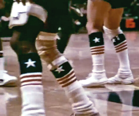
What you see above are the wonderful star-spangled socks worn by the Philadelphia 76ers four decades ago. They’re my favorite detail in a 25-minute promotional film called New Faces of the NBA, which was made early in the 1971-72 season. Narrated by Charlie Jones and produced in a very NFL Films-esque style, it’s a fucking gold mine (or in the words of reader Tom Farley, who found the film on YouTube, it’s “a uni watcher’s delight”). You should definitely watch the whole thing, which is available here.
But if you want a sneak peek, here are some of the film’s most uni-notable details and moments:
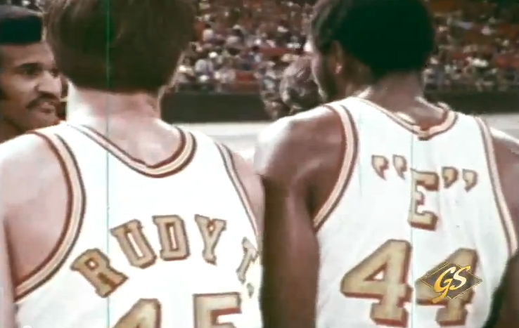
• Oh baby, dig these amazing Houston Rockets nickNOBs (click to enlarge):
• Can’t get enough of that old Baltimore Bullets stripe-o-rama design:
• And look, they even had a similar design for their warm-ups:
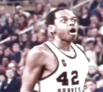
• And if you like striped uniforms, how about the old Buffalo Braves:
• Speaking of the Braves, Walt Hazzard wore a captain’s “C” back in the day:
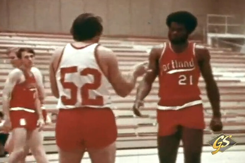
• Blazers coach Rolland Todd had a, um, interesting look for practices:
• Golden State had some pretty massive uni numbers:
• The Suns had a very large, very rounded NOB font:
• The Cincinnati Royals had drop-down NOBs:
• I’ve always had mixed feelings about that weird below-the-waist stripe on the Sonics’ shorts, but I love the white uni numbers paired with gold NOB lettering:
There’s more — I haven’t even provided any shots of the Hawks’ racing-stripe uniforms — but you can discover the rest of it on your own. Again, the full 25-minute film is here. Enjoy.
A few notes regarding last night’s NFL draft festivities:
• Nike posted a bunch of photos showing how they lettered and numbered Andrew Luck’s jersey at the draft. I don’t really get the point of that, since everyone has known Luck would be the first pick, so they had days — weeks, months — to make that jersey. I’d be more interested in seeing how they scrambled to letter up some of the surprise picks on the fly.
• Speaking of which, Brinke sent me this shot of a nameplate being whipped up for 49ers draftee A.J. Jenkins. Not sure if that was actually taking place at the draft, but I like the Niners-branded sewing machine.
• Several readers noted that the NFL Network apparently didn’t get the memo about the Seahawks’ new logo.
• Adidas made a set of Redskins-colored socks for Robert Griffin III.
• Someone showed up wearing a jersey with RQBBOB — that’s Redskins QB busts on back. (My thanks to Rex Henry for that one.)
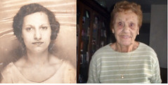
The photo on the left is from the report card of Rose Baggini; the one on the right is Rose Vrana today, at age 95. She is the first — and so far only — living link to the Permanent Record project, which makes its long-awaited return to Slate today. Check it out here.
The plan is for me to keep doing new PermaRec features for Slate on a roughly monthly basis. Meanwhile, I’ll keep posting short dispatches on the PermaRec blog. I’ve also created a PermaRec mailing list — if you want to be included on that, let me know.
Don’t forget, I’m selling several T-shirts based on old sportswear labels. You can get them in the Uni Watch shop.
Uni Watch News Ticker: Looks like we won’t get to make fun of the Pro Bowl anymore. It’s a sensible move, but I’m feeling a bit misty about it all the same. Thanks for the memories, Pro Bowl — you be missed. ”¦ This is major: We’ve seen photos of the A’s wearing green-on-green before, but I don’t think we’ve ever seen Reggie wearing that combo. Jon Helfenstein of the might Fleer Sticker Project came across that photo. Check out his full report here. ”¦ Shame on the city of Miami, which may sell advertising on hydrants, lampposts, and other public fixtures (from Josh Paster). ”¦ Good conspiracy theory from Frank Bitzer, who says there’s a lot of radio chatter in Cincinnati about how the Cardinals’ pitchers may be adding a white substance to the baseball — possibly rosin — that makes it harder to pick up the laces. … Adam Jones has a new kind of NOB: name on bat (from Jason Hicks). … New home kit for Celtic. “Smaller Sponsership?!” asks a shocked Gerry Muir. “What’s the world coming to!” … Miami of Ohio is apparently considering a rebranding (from Todd Peak). … This Nike video shows Brian Orakpo of the Redskins giving a ’Skins jersey to the rapper Wale (it happens at the 1:45 mark). The thing is, the jersey has TV numbers on the shoulders, not the sleeves. That’s not what was shown at the recent unveiling, and it’s not what Nike is selling online either (good spot by Antonio Bradley). … Two good contributions from Tommy Turner: a very entertaining assessment of the NFL’s new pop-up retail shop in Manhattan, and an article on potential draftees getting fitted for their draft-day suits. … Good article on how to wear a cycling cap (from Chad Todd). … “I picked up a photo of my favorite baseball player, Jim Rice, wearing an interesting yet very troubling shirt,” writes Craig Mellish. “I think I now understand why his career took a steady nosedive after the ’86 season.” ”¦ UCF baseball is playing G.I. Joe tonight. ”¦ New kits for Juventus (from Griffin Whitmer). ”¦ New third kit for the Houston Dynamo. “Don’t you hate it when marketing suits talk about “maintaining brand integrity?” asks Kenn Tomasch. ”¦ Remember the inscription on Brandon Phillips’scap? I’m now told it’s for a family member. No other details. ”¦ “The Brisbane Lions (which came about from a merger between the Fitzroy Lions and the Brisbane Bears) will be wearing a special jumper to coincide with the club’s Hall of Fame celebrations later this season,” says Leo Strawn. “The design is based upon a throwback jumper of the Fitzroy Lions (‘FFC’ monogram for ‘Fitzroy Football Club’).” ”¦ This is rumored to be the new home shirt for Manchester City (from Tim O’Malley). ”¦ Jeremy Brahm was watching the BYU/Stanford volleyball match last night and noticed that the sponsor tape on the net was upside-down. “Normally it would be on top of the net,” he says. ”¦ “The Colts encourage their fans to buy season tickets for next season with a graphic showing the helmets of the teams they’ll be hosting,” writes Vincent Delestree. “Problem is, they do not seem to know the Bills do not have those awful red helmets anymore.” ”¦ Wondering if Petr Sykora still wears his wedding band on the ice? Yup, he still does (screen shot by Dave Scimeca). ”¦ Just what the world’s been waiting for: a 3-D soccer jersey (from Kenny Loo). … I’ve occasionally referred to “the Color Mafia” — the group of designers, fashion bigwigs, color consultants, Pantone executives, and textile magnates who decide which colors will be trendy a few years in advance. Here’s a great article showing exactly how they do it.
What they didn’t mention about the NFL pop-up stores (there are 2 at opposite corners of the building) are the surprises on the 2nd floor of the 41st St. store. A team from Wilson is there demonstrating how footballs are sewn together and laced up. The Lombardi Trophy is also on display.
Paul, I believe the NFL was only making up jerseys for players sitting in the green room, so there wouldn’t have been a ton of scrambling, since they had all of the nameplates pre-made, as per Darren Rovell:
link
Rovell owns Lukas!!!!!!!! As does Nike!!!!!
Sorry, but your user name is pretty vulgar. Please change it.
Of course – why would they bother making up jerseys for players who aren’t present?
What’s unusual about this is that the turnaround time for each jersey was under 90 seconds, thanks to that heat press. That’s new and different.
That was nuts. I expected Luck to have a NOB jersey, but Fletcher Cox or Michael Floyd? That was a shock to me. They also had their NOB on the graphics link.
Yeah, but that’s Photoshop, and that’s even quicker. ;)
But that’s the beauty of a heat press; you can turn around jerseys in under two minutes.
English football teams have been doing this for years; on a match day, you can walk into the team store at Ashburton Grove and have your name put on the back of an Arsenal shirt (should you be interested in such a thing) in about the time it takes to run your credit card.
Walt Hazzard–not Larry
Right — thanks. Now fixed.
As the Reggie Jackson photo shows, the lettering went straight across the shoulders of the A’s players, an interesting detail. But I bet eyewitnesses said the players were too hard to make out against the grass. Think of the 1977 Pirates in their solid black Descente uniforms; looks sharp on the runway, comes up a bit short in the field.
That photo is fantastic. +1 to Jon Helfenstein for the great find. Further reinforces my opinion that if you’re gonna go softball tops, go all the way.
if you’re gonna go softball tops,
go all the waykeep them in the gift shop.Fixed.
That’s the main reason I think green (and, to a lesser extent, brown) has never been a popular color in baseball uniforms. The green grass just overwhelms it.
(Clearly the solution is to have one of the astroturf teams wear green and paint their field blue.)
“Clearly the solution is to have one of the astroturf teams wear green and paint their field blue.”
Oh god no.
I don’t see what the big deal of wearing green on a baseball field is. 2/3rds of the team fields under light brown dirt on a grass field which offers enough contrast & the batter & baserunners as well. I think it has more to do with baseball’s preference of being navy, red, royal or black & use of dark colors. MLB is has been really lazy with its color palette. Nobody with brown, crimson, red/orange, tan, aqua, Athletic Gold or Old Vegas Gold as primary colors and yet when they had purple, copper & the awful teal, it’s used very sparingly.
Agree that the photo is a great (and rare) find. I was pretty stoked to see it also has a date (6 June ’73), so we can find more like it.
Slight problem: the A’s link. Looks like it’s from the 9th or 10th (the A’s always played weekend day games) instead. Weird that SI would screw that up — and that the A’s wouldn’t try the unis again (if only for superstition): they shut out the Tigers in both games.
I generally don’t like all-dark unis like the Indians “blood clot” or all-navy, or the Phillies all-burgundy… but I make an exception for the A’s in all green. Maybe its just the right blend of the gold and white, right down to the shoes, or because green/gold is my favorite uni color combo, like Paul…
-Jet
I was thinking the same thing after I posted. The gold sleeves, cap bill, sansabelt, pant stripes, sanis, and white cleats all break up the monochrome nicely.
Looks like a much more “complete” uniform than the link
Sorry I didn’t get to this until late but Getty dates are often no more accurate than the month, since much of their catalog was shot as features rather than dated news like the AP.
Customized Elite ($250 on Nike.com; $299 on NFLshop) jersey is not available for Philadelphia Eagles.
Re: Otto Moore, Mel Counts, Paul Silas. Baby Got Back!!
Maybe the Colts used Sports Illustrated NFL schedule website for reference when they chose to keep the Bills helmet red. SI had it that way all last year and seem prepared to so it again.
link
It just shows how many people actually care about the Bills.
Olympique Lyonnais has a habit of designing godawful jerseys for its European campaign, every year the jerseys are worse.
Like this : link
Or this : link
Or even this atrocity : link
Good thing is, this year it won’t qualify for the Champion’s League, thus they won’t ashame France as much on the pitch for at least 12 months.
Re: 3D jersey, press release sez it “is the first 3D football shirt in modern history”, modern being a necessary qualifier ’cause there were so many 3D football shirts in Hattusha, Mohenjo Daro, Ur, Carthage, Herculaneum, etc.
Ur may have used a brown or blue horse, historians still argue the point to this day.
Happy Stirrup Friday! link
Mad love to James.
That team was in the league with Mudville, right?
Your guess is as good as mine. Seller was from PA, and said they cam from an estate sale so nothing was known about them other then they were old. The color on them is amazing for wool stirrups from the 1900-10s. When I got them, I thought they were faded with time till I noticed they had been stored inside-out.
I wore them for the first time last year when Paul came out here to StL. I can only wear them on days like today where there is a chill to the air.
link
Rang out Marshall’s birthday and rang in this morning with these:
link
Thank the stars there was not a tissue box or a loation bottle in that shot… ;-)
I still want a pair of the Uni Watch stirrups…
Props to JamesP and Mothervilker!!!
Those can’t be the new Juventus kits. The tricolore roundel and the Italian flag “scudetto” are worn by the winner of the Coppa Italia and the Serie A, respectively. These patches wouldn’t be unveiled by the club without having yet won the trophies. Also, if you look closely there are three stars above the crest. Each star represents 10 Serie A titles. Juventus have currently won only 27. Seems to me like an optimistic fan design.
…I was about to say the “Scudetti” are more than a bit premature, plus the thing looks a bit retro to me.
They may be counting the two titles that Juventus were stripped of a few years ago for their part in the match-fixing scandal. There have been some reports that if Juventus win the title this year, they’ll claim it as their 30th, and begin wearing three stars.
I still think the Bills would look nice with a red helmet (change up the helmet stripes, since they had like link). It wouldn’t work, however, with the all white away they had link.
Also, the Wikipedia page for the Redskins shows a noticable lack of link. Was this noticed on here before?
Also, two-tone Nikelace on the ‘Skins away? I feel sorry for RGIII.
And no striped socks. Does that mean they’re gong with the two-tone socks with the maroon pants? Ugh.
D-oh. Sorry about that Kyle Allebach.
The Jim Kelly era helmets would look pretty good with the current uniforms. Going back to white helmets was a mistake.
White lid with the old Buff looked nice, but I would agree that the Jim Kelly era red lid would probably look cool with the current unis.
This may be an unpopular opinion but I would have no issue with selling advertising on things like fire hydrants if the profits went directly to funding the firefighting department. It may be ugly but I’m sure people in say the Atlanta-area would put up with such a thing if it meant they knew the fire department around the corner was functioning.
I know there is the pandora’s box fear, and that the likelihood of local governments stopping at fire hydrants is unlikely, but if there was some way to guarantee that such advertising would be limited to law enforcement departments I would have no issue (that is a big if though).
But, if the people around the corner are so worried about the fire department functioning, then they should be willing to foot a slightly higher tax bill in exchange for that. It is ridiculous that corporations should want their name placed on a civic piece of equipment in exchange for the funds to maintain and use that equipment.
It is more disturbing that you want it limited ONLY to law enforcement. I could perhaps understand an argument for a park or rest area, but law enforcement and schools must be especially above even the suggestion that they might show preferential treatment to a corporation or group of people simply because they have given money to support the law enforcement.
This isn’t an aesthetic argument, nor is it a Pandora’s box argument. It is a civic argument. As members of a society, we should all (and since corporations have protected speech rights, that includes them) contribute to the good of that society without having to be rewarded with our name or logo. When I pay my taxes, I understand that the money will go to many projects. The same should be true of corporations.
Nah, selling ads on fire hydrants doesn’t have a “Pandora’s box” fear, and it doesn’t risk a “slippery slope.” It is the bottom of the slippery slope; it is the content of the Pandora’s box that people warn against opening. If the people of Atlanta want to have a functioning fire department, they should levy sufficient taxes to pay for it. The choice not to pay for a public good is a choice not to have that good. Advertising revenue is not a backstop for the care of the commonwealth, and it should not be accepted as an out to permit lawmakers to shirk their duty like cowards. Too chickenshit to present the voters with the choice between paying for fire protection or letting fires burn? Then get the hell out of public office. Don’t go ask a corporation to bail you out.
What saddens me is that the growing acceptance of this sort of private underwriting of public services shows that Gibbon has passed from our memory. Comparisons to the decadent end of the Roman republic are usually overdrawn, but in this instance we are seeing exactly and literally the same erosion of republican virtue that conditioned the citizenry to accept imperial rule.
Also, Gibbon teaches us that Roman gladiators began wearing black and neon green just before the end of the republic, so these are perilous times indeed.
“This may be an unpopular opinion but I would have no issue with selling advertising on things like fire hydrants if the profits went directly to funding the firefighting department.”
That’s a big if. Money, after all, is fungible. Put another way: in year 1, all else being equal, the added revenue does accrue to the Fire Department. In year 2, the budget-setters see that the FD has a revenue line from advertising, and so either doesn’t raise the FD’s allocation as would be necessary (increased personnel costs, mostly, but inflation in general), or cuts the budget, by the amount of the advertising revenue. So they effectively transfer the ‘dedicated’ revenue to the general fund. See, for example, ‘lottery/education’.
That’s where I see the biggest issue, this happens all the time, a system is put in place and then when it is working as it is intended they decide that the money should be moved elsewhere, which screws up the entire system.
It cuts both ways too, as every time things like college tuition are supplemented the colleges look to take advantage of this by upping the price knowing that it will be paid for, this drains funding for scholarships and increases the burden for those whose tuition is not funded by any type of scholarship.
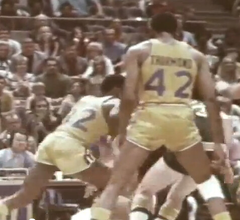
Imagine being 11 years old and obsessed with basketball and the NBA and, especially, uniforms. It is 1971 and there is no internet, no cable TV and where I lived, no team to follow. Then one day in a magazine or maybe on a basketball card, I see the new Bullets unifrom. I was floored by its brilliance then and still am.
I see new designs come and go, but none can touch the perfect storm of that Bullets set: Bold. Colorful. Daring. Unconventional, yet simple, really. No team or city name on the chest! No border on the numbers! First name or nickname on back! Nice thick stripes without trim!
Too cool to last very long. Just as well.
That film is a treat. A reminder of how basketball uniforms looked before the merchandizing craze began.
Wasn’t someone going to do a “Dressed To The Nines” type of NBA overview some time ago? A website? I read about it here, then forgot about it. That Bullets uni is precisely why we need one.
If I had the energy of my teenage years, I’d spearhead an NBA uniform database. The tired old man before you doesn’t want to contemplate what an undertaking it would be.
I was helping out with the research for that site, but progress ground to a halt last year, and I’m not sure if/when it’ll get going again.
It’s still a dream of mine to get it finished, though.
Well, if others do the research and the graphics, I’ll set up the website just like the football & baseball ones — as long as we’re just talking year-to-year… I’m not into basketball enough to commit to setting up a game-by-game site for basketball
Well said, quiet seattle.
Those vintage NBA and ABA uniforms never get old. What a time it was.
james q. vilk, iii approves of this post
Indeed!
My favorite era is ’75-’85, but I do have fond (albeit fuzzy) memories of this time in basketball history. I loved those Buffalo Braves unis. Mentioned this before, but as a kid I didn’t realize that was a feather in the logo. I always thought the B was a rocket with flames coming out of it.
Ditto to quiet seattle and Jeff.
-Jet
I thought the same thing about the Braves jerseys.
Speaking of Jimmy Vilk, I was hoping that the NHL would allow the Nashville-Phoenix series to go colour-on-colour for the whole series. Yellow vs. brick red? AWESOME.
Rangers-Caps could do it too: blue vs. red. AWESOME! Yet the NHL will, of course, refuse the option to infuse some serious colour into the playoff by allowing either of these series to go colour-on-colour. SIGH.
And for those of you playing in the HBIC Playoff Pool, the link.
Good God, did my picks suck in the first round.
Oh, and WHITE AT HOME!
Yellow vs. red would be awesome, for sure.
Although…the mention of those colors in conjunction with the sport of hockey always takes me back to 1994.
link
Sorry, Teebz…
I said…1994.
link
Sorry again.
The proper colourization is off in this image, but I was thinking more of link, Jim. ;o)
Besides, just mentioning 1994 link of the link.
This is cool (must be an old-timers game):
link
Jet, that picture was from the alumni game from the fourth Winter Classic between Washington and Pittsburgh in 2011. #66 is a pretty famous guy, and that #10 in the blue is Ron Francis. Dennis Maruk is #21 for the Caps, and #19 is John Druce.
Some 1992 color vs. color clips link.
No more Pro Bowl? Good riddance…
I’m not going to miss it. The players get enough of a vacation in the offseason. They don’t need a free trip to Hawaii anyways. I remember the one year the Steelers had a rare down year (6-10 in 1999), and although some players got picked to go to the Pro Bowl (including Hall of Fame inductee-to-be Dermontti Dawson) Bill Cowher wouldn’t allow any of his players to play in the game as punishment for the bad season. I think it’s still the only time since the 1970 merger (before the Super Bowl rule was put into place) that no Steeler player participated in the Pro Bowl.
I’d love to see some sort of skills competition like they used to have on TV during the off-season back in the 80s. Would be much more entertaining and I think the players would take that pretty seriously.
I used to watch it when it was after the Super Bowl and I knew it was the last football fix we were going to get until summer. Now that its before the Super Bowl, there’s not any reason whatsoever to pay attention.
Actually that’s not entirely true – I used to watch it for Aloha Stadium and think about the fact that this entire giant football stadium was on wheels. But I guess that’s not even true anymore (both because they don’t play it in Honolulu and because they fixed the stadium in one position)
I have no issue with the Pro Bowl going away completely, but I liked it when it was moved in the week between the Conference Championship games and the Super Bowl. Having it the week after the Super Bowl was anti-climatic. Everyone already saw the game they wanted. The Pro Bowl was, as is now, a waste.
Actually (until the unis got weird in the 90s, and until I realized just how many players couldn’t be bothered to play in it), the Pro Bowl was one of my favorite things to watch. Reason #261 I don’t miss the NFL now.
As a kid I liked seeing the craziness of different helmets on all the players.
Good piece on Rose Vrana. A little sad that her grandkids won’t talk to her, but at least you found a living member for Permanent Record.
As for General Slocum, I’ve never heard of him and I’ve always had an interest in the Civil War. Been to Gettysburg countless times. Plus my family is trying to figure out if we’re distantly related to link, who bears a strong resemblance to my uncle. My grandmother, who if we were related to this general from the South it would be through her, also had a great-uncle that fought for the Union during the war, too. She once had a sabre from the bluecoats, but I’m not sure what has happened to it. She died in 2003, and that aforementioned uncle lives in my grandparents old house now. It might be there, I’ll have to ask him the next time I talk to him.
The thing that stuck out at me the most during the draft was that this was New Era’s big debut as the hat supplier, and two of the first three draft picks were given hats that didn’t come close to fitting. RGIII was up there struggling with his Redskins hat, trying to get it to stay up there on his head.
Most of the first few picks weren’t much of a surprise. The RGIII one especially sticks out. If this is your big debut as a supplier, it would be in your best interest to make sure the product doesn’t look uncomfortable on the guys modeling it. As a hat guy, I am VERY happy that I’m not stuck buying Reebok, but that wasn’t a great debut for New Era.
Track that story down sooner than later. A few years back my uncle chased down the family legend that an ancestor was shot in the butt at Shiloh (though accounts differed as to what side he was fighting for). Not only was it true, but chasing the story down led to finding artifacts in scattered family attics that confirmed the story – including the Bible he was carrying as a chaplain on Grant’s staff, the Minié ball he carried around for the rest of his life, likely the one pulled from his rear, and best of all a cane with a brass plate engraved to him with gratitude from General Grant after the war. If my uncle had waited even another year before chasing it down, several of the people who knew key details and held artifacts would have been dead and in all likelihood their knowledge gone.
Check out Redskins.com. The front page is a picture of RG3 made of twitter and facebook pictures of fans. Pretty cool idea.
What, Heath Shuler didn’t want any part of that jersey?
Enjoying the “New Face of the NBA” short. Other fun details: the Hawks’ racing stripe unis, the Tigers-like Old English D on the Pistons’ warmups, the huge flourish under the Cavaliers’ jersey script.
I never thought I’d have a favorite guernsey, but the link have proved me wrong. Fantastic design.
How’s this for a quirky NOB? I’ve seen the small C in “Mc” written on the baseline, and sometimes raised, and sometimes (with the incompetent St. Louis Cardinals) full-sized with a space after it… but I’ve never seen it raised and with a line below it:
link
My lovely city of Pittsburgh is also considering places advertisements on garbage cans, hydrants, bus stops, public urinals etc.. The folks proposing the advertisements said they would be ‘small and appropriate’ . What does is THAT supposed to mean? Hefty bag logos on garbage cans? Dasani on hydrants? Are the streets going to get an extra yellow stripe and be sponsored by Adidas? …. ‘ yeah so make a left on Penn Ave. from Adidas …’
Does it surprise you at all, considering who the mayor is?
he already slapped his name on the side of some garbage cans (think it cost the city $100,000 or something)
link
That goes back to Pete Flaherty putting “For Pete’s Sake” on garbage cans in the late ’60s/early ’70s. (The ABA days, if you prefer.)
I wonder if Luke Ravenstahl is still trying to merge the city’s government and the Allegheny County government together. It would be weird driving in Cranberry Township and then suddenly be in “Pittsburgh”.
Don’t we do that already? Isn’t mccandless a pittsburgh zip?
Supposedly, the city of Pittsburgh and Allegheny County were going to merge a lot of governmental services together, which led to speculation that the two would flat-out merge and Pittsburgh was going to become a city-county like structure, like a lot of places in Virginia and a few other locales such as Baltimore. (This would be a first for Pennsylvania, though.) Meh, I live in New Castle and I’m looking to move back to Beaver County this summer, so it doesn’t affect me directly.
@Joseph: Isn’t Philadelphia a merged city/county?
(sniff) As many times as I’ve contributed to Uni-Watch and you get my last name wrong. I don’t even know who you are anymore.
Sorry — now fixed. (But at least I spelled your FIRST name correctly, which I bet most people misspell.)
Hey I just noticed that the Colts Nike jerseys sold for retail have the truncated shoulder stripes–which was NOT the case with Reebok. Guess they’re trying to make them more accurate.
link
Reebok’s jersey had the truncated stripes…
link
Those were probably the “authentic” jerseys. Scroll down on the link I posted, where they still have the Reebok jerseys on clearance.
They’re all truncated. You just can’t tell from some of the pictures. Believe me. I live in Indiana, I own a Colts jersey, I see them in stores, they’re all truncated.
check the armpit…
link
Are the Colts the only team with an established history of having their no. 1 overall pick hold up a numbered jersey? Ids it juts a QB thing? Seems to me not many draft picks hold up a jersey with something other than 1 on it.
link
link
link
Interesting! Never noticed that about the Colts draft picks before.
You also provided us with a nice little evolution of the truncated shoulder loops/UCLA stripes. On George’s jersey the loops are continuous, on Manning’s jersey they end in the armpit, and on Luck’s jersey they end between the name and the number.
Fascinating!
So I did some more research, and here are some pictures of guys at the draft with custom numbered jerseys (There are a lot of guys with their team owners/presidents, but I was looking for guys at the actual selection meeting):
Earl Campbell pick #1 1978
link
Aundray Bruce pick #1 1988
link
Troy Aikman pick #1 1989
link
Ryan Leaf pick #2 1998
link
Lavar Arrington pick #2 2000 (Pictured with #3 pick Chris Samuels, who couldn’t even get his name on a jersey)
link
Carson Palmer pick #1 2003
link
Vince Young pick #3 2006
link
With regards to rebranding for Miami University. One of the questions they asked was related to the logo for the university as a whole, being the “M” or the lamp.
I’ve always felt that logos like the “M” look better for athletic departments and logos like the lamp, a more classic look, are better for representing the university as a whole.
Virginia Tech does this and I think it looks great. Even though I’m not a fan of the current VT they brand everything related to athletics with. Too bland!
Athletics logo: link
Generic university logo: link
Logo used on diplomas: link
That seems to be the norm with all colleges. Look at my alma mater, Youngstown State. Here’s the link link (which until a few years ago was the school’s primary logo), link and link
Seton Hall has it set up the same way, formal, tertiary, and athletic. link shows the differences.
I graduated from Youngstown State also.
Brooklyn Nets gear already on sale at the Adidas shop in Manhattan:
link
I like the look so far, but uniforms in black and white can go very right or very wrong.
Ugh, what’s that last pic in the slideshow – a basketball with an adjustable Adidas baseball cap on it, backwards?
Huh?
-Jet
Wait, have any teams from the big 4 EVER gone with just black and white as colors? The Nets are going to look absolutely dreary.
Maybe going for “that Russian feeling”?
Vladivostok in the late fall is lovely, I’ve heard (eyeroll)
Spurs are awfully close to B&W… add a touch of silver which is basically metallic grey which in turn is a mix of black and white… Maybe the Nets will add a red/white/blue splash of color behind the logo like the Spurs did with fiesta colors a few years back.
The White Sox have since about 91.
Nope, they – just like the Spurs, Raiders and LA Kings – include silver into their color scheme.
Just B&W is a rarity.
Perhaps the White Sox in 1950, the year before they added pinstripes and red trim.
I like the B on the basketball. That’s already probably my favorite NBA logo that incorporates a basketball. But the B on the shield by itself just looks like a pretentious guitar pick. Not an effective logo; the shape doesn’t speak to anything basketball or sporty or Brooklynite.
However, if they put the guitar pick on the jerseys and put the numbers inside them, that would be awesome.
Is it 1990 already?
Boring. At least they could have done an interlocking NY or a more stylized B or both. Slight Oklahoma City Thunder logo tendencies.
I completely agree that the new Nets logo is boring. It is TOTALLY Oklahoma City happening all over again.
I mean, a nondescript “B” on a basketball? That’s seriously your logo??? Did you pay a high school kid 20 bucks to design that in 10 minutes?
And black and white as your colors??? Are you trying to save money on photocopies????????
I know there’s a contest to rename/redesign the Hornets going on right now, but another good contest woulda been to rename/redesign the Nets when they announced they were moving to Brooklyn. I’m sure somebody would’ve designed a better logo than the clip art they’re now presenting to us.
If it took somebody 10 minutes to design that, I’d want my $20 back.
Underwhelming after the hype, but I can see where they’re going with it. The black/silver “BROOKLYN” type is going to be all over NYC this summer.
I mostly like the new Nets look. It certainly represents an improvement.
Black-and-white is good so long as the silver temptation is stoutly resisted. OK for a T-shirt or even a warm-up jacket to go gray, but the uni itself should stick to b&w.
I’m not as crazy about the B as Scott is, but I certainly like the idea of a simple letter of the alphabet. My ideal B would be rounder and fatter than the version featured today, but the simplicity is attractive. Hence I part company with Hubert Humphrey on the relative value of clip art vs the kind of manic professional fussing that gave us the current look of the Mavericks and Kings…
My intitial reaction is very positive. It is actually quite bold what they’ve done. It’s not like the templated minimalism of the nike system of dress crap…but has an old timey feel to it. Stark, but not despate look-at-me starkness. I guess in a world of over produced, everything but the kitchen sink, hyper colored, hyper frenzied, shadowed, beveled, you name the indulgence, these look refreshing.
Almost an allergic reaction to the busy, overdone designs dominating sports nowadays.
Certainly different than the banner revealed at a press conference of a file that I saved way back on January 25, 2004:
link
it must be so nice to sit on your perch and preach how shameful it is for American cities to sell ad space…many cities across the nation are hurting for money; if they’re presented with an opportunity to make some, why not? its the american way.
i wish i could be as perfect as you, lukas
Actually, the American way is to hide behind a pseudonym and a phony email address and lob sarcastic spitballs at people whose arguments you can’t contend with. In that respect, you a paragon of patriotism.
Gettin snippy on the “internets” are we? LOL
Really? The states of the union as well as the federal government were hurting for money even worse after the Revolution and the War of Independence. That period may have been the worst economic depression in American history, what with the collapse of imperial commerce with Britain and the widespread destruction from the later years of the war. So. Show us one example – just one! – in which the Founders sold public assets to the highest bidder to score a little quick cash.
You can’t, because they didn’t, and that pretty well settles the question of who is representing the “American way” on this one. Hint: It’s Paul, who on this as on a surprising range of issues shows himself to be a deeply conservative cultural critic.
The Founders may not have “sold public assets to the highest bidder to score a little quick cash” (since there was not a ‘fully functioning’ federal government until after 1789)…but President Jackson sure did. The federal govenment own a lot of land in the West (thanks to Jefferson’s Louisiana Purchase), and AJ sold it off to service the debt. Some may argue that the land actually ‘belonged’ to the Indian tribes, but that’s another debate for another time. Jackson paid off the Revolutionary War debt and the US was ‘in the red’…for about a year.
“A little bit of knowledge …”
But the purpose of selling the western lands was to settle the land. Raising revenue was not the point; it was a mechanism for controlling the pace and nature of the settlement (ie Jacksonians wanted to sell large parcels of land to speculators; Whigs and later Republicans wanted to sell small parcels directly to families). No analogy to selling ad space on an asset the government intended to keep and maintain.
As to the rest, there absolutely was a fully functioning federal government prior to 1789 – just ask the British, whose army the original federal government managed to defeat – and anyway even granting the fiction that there was not, the state governments were fully functional during that period, and they did not respond to revenue shortfalls with measures anything like what is proposed in Georgia or Pittsburgh.
Selling ad space on public property like this is simply not a part of America’s heritage. It’s an innovation, a departure from American traditions.
Maybe it’s just me, but I don’t consider Paul’s use of the word “shame” as preaching.
Not sure what “American Way” you are talking about because my “American Way” is working for what you earn and holding yourself accountable…not whoring yourself out for a quick buck. Though sadly it seems the latter is becoming more prevalent. There are better ways for non-federal governments to solve their cash problems. I hope in my lifetime that i don’t have to live in “the city of Pittsburgh sponsored by Budweiser” or Heinzburgh.
The idea of our governments whoring out items that our tax dollars paid for immediately brings to mind the movie “Idiocracy”. So, something to shoot for there.
That vintage basketball film was incredible. I completely forgot that when Earl Monroe debuted with the Knicks..he wore number 33! Obviously he could not wear his old number 10..Clyde had it. Awesome stuff here..great memories for me as a kid.
Speaking of Adam Jones, he’s been wearing high cuffs lately. The announcers for the game the other night said that he did it for one game and a young fan told him it was a good look so he stuck with it.
sorry for the bad link code.
During O’s Xtra after the game, the announcers made a comment about Jones looking like a ball player should during their interview with him.
Funny how I missed it this morning when going to the Colts website that they used the red Bills helmet. Got excited for season tix, only to find it’s a FREAKIN’ WAITING LIST!!!
“… New home kit for Celtic. ‘Smaller Sponsership?!’ asks a shocked Gerry Muir. ‘What’s the world coming to!’ … ”
They look great. Celtic’s green-and-white hoops is enduringly sweet.
I hope this starts a trend.
Inter used it the one season they had a white change jersey with the red St. George’s cross on it (the flag of Milan). The Pirelli mark was underneath the Inter badge.
… Miami of Ohio is apparently considering a rebranding (from Todd Peak). …
Followed the link to their site, where they’re seeking input to change the domain name, letterhead, etc. Aside from the suggested possible domains they proffered, I suggested “miohmi.edu”. Say it loud, say it proud, My, oh, my!
Oh, and I neglected to add, FIRE UP CHIPS!
Sorry, but to me, (and my dorm was right across from the football field) they are always the Miami Redskins.
Redhawks? Please.
link
Is that a football thigh pad taped to the guy in the foreground’s thigh?
Extra padding and athletic tape looked so primitive in the 70’s. It looked more like what you’d get after visiting a quack doctor than anything athletic.
In regards to the Redskins Nike commercial and the numbers being on the shoulders and not the sleeves, at the beginning of the commercial Orakpo is seen closing a box with Limited Edition on the outside of it. Could the reason be that jersey he gives Wale is the yet to be released Limited Jersey and so they would have a different design than the other jerseys?
As we’ve seen lately with the Blue Jays, Sabres, Canucks, etc., sometimes the best uniform design is in your own uniform history.
I’m severely disappointed the Nets didn’t look to their own history to revive a timeless look.
link
Go back a *liitle* bit more into their history, Mike.
link
There ya go. “Brooklyn” would look good in that script.
Mike 2, While I never liked that jersey, I’ve long felt that jersey was a little ahead of its time. If they came out with that jersey 10 or 15 years later, it would have been a lot more popular in stores.
RIP Moose Skowron.
That basketball film was amazing.
I think my favorite part was seeing the Rockets playing in the Astrodome.
I see Bill Hoskett former Buckeye on the Buffalo Braves. I thought Buffalo was light blue?
The original uniforms were orange and black. IIRC, when Bob McAdoo, a UNC grad, joined the Braves, they soon adopted light blue and white uniforms, with some black trim. The stylized B-feather logo remained black and orange.
I’ve written a little Pro Bowl uni retrospective:
link
Just finished reading that. Great look at some whacky stars and patches. Thanks for the old NBA slides as well. Those shots of Tiny Archibald take me back to when he was wearing the Kansas City-Omaha Kings uniform. Definitely my favorite player of all time. I believe one of those sets had the NOB, below the numbers as well. Good weekend to all of you.
Today’s ticker gave me a great idea for justifying my (rather OCD) insistence that soccer goalies wear kits that more closely resemble those of the rest of the team:
“maintaining brand integrity”
Just might have an effect.
Can we rename them the Brooklyn Blands? In actuality, they should have been renamed the Brooklyn Strikers. Nice bowling ref for ya Paul. I figured that’d be…(takes off sunglasses) right up your alley.
Heres tiny, probably inconsequential detail that bothers me about Marlins Park: the little triangle on the sculpture that looks like it should be in play, but actually counts as a home run. link
Are the Tigers, Yankees, and Dodgers the only teams in the majors without alternate uniforms? I wish that list was longer.
+1
Red Sox are wearing their navy gift shop rags tonight. They look SO Spring Training / batting practice.
Tigers and Dodgers should bring back their alternate tops, and Yankees should introduce an alternate.
A proposed Yankee alternate would be a very interesting idea for this site.
…and we should put ketchup on a hot dog, start speaking French & use the Metric system.
Just, no.
Add the St. Louis Cardinals to the no-alt list. Aside from those tacky gold wordmarked World Series attention whore unis.
Hey now, ketchup on a hot dog… isn’t bad. Especially with a Yoo-Hoo.
Every time I say that, someone says otherwise. In Chicago, it’s WRONG. I’m pretty sure it’s actually against the law, too. Same rule apply’s to sausage. Ketchup on a sausage? Don’t even think about it.
“we should put ketchup on a hot dog, start speaking French & use the Metric system”
~~~
no, no, and yes
apply’sapplies. D’oh. See, I ate ketchup on a hot dog once & look what it did to me!@ Phil
“But I would walk 804.672 kilometers
And I would walk 804.672 kilometers more
Just to be the man who walked 1609.344 kilometers
To fall down at your door”
That doesn’t sound good at all.
I should also add that sauerkraut is essential on a hot with ketchup. And the Cardinals should only wear their ketchup-colored hats.
“I should also add that sauerkraut is essential on a hot with ketchup.”
~~~
ok, wheels, buddy…
please stop…you’re worse than vilk with how you ruin a dog
the only condiment in semi-liquid form that belongs on a hot dog is stadium
Funny movie: link
“But I would walk 804.672 kilometers
And I would walk 804.672 kilometers more
Just to be the man who walked 1609.344 kilometers
To fall down at your door”
That doesn’t sound good at all.
That song doesn’t sound good in any system of measurement…
Completely agree.
You can start speaking French it’s alright, no one’s gonna die.
you can add the cardinals to that, if you discount their sunday cap
so the list is slightly longer
and gusto…please
no alts for those teams, although i am intrigued about a yankee alternate concept
but for the field, the yanks throwback was enough of an alternate for this season (and the 10 to follow)
Mets start Chris Schwinden is wearing an undershirt with very Nikepox-esque sleeves. It’s not the full-on Nikepox dot pattern from a few years back, but it’s similar.
The Giants are finally @ home, hosting the Padres.
Those Padres road uni’s made me fall asleep instantly.