Click to enlarge
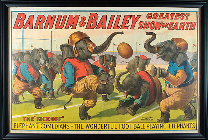
The image shown above is from a 1918 circus poster, and it’s probably the most bizarre animals-playing-sports illustration I’ve ever seen. I especially love that the elephants are wearing old-school nose guards, even though their trunks are way too long to be protected by them. Also, note the elephant in the background, who’s wearing a cap — I believe he’s supposed to be the ref.
This poster is currently up for bids at Robert Edwards auctions. It’s one of several notable items that Mike Hersh recently flagged in the current Robert Edwards and Mears listings. Here are some others that I particularly liked:
• I can never get enough of these old Cubs program cover illustrations by Otis Shepard (here’s the full listing).
• How do you keep your baseball socks from sagging down? With Boston Garters, natch (full listing).
• I’m always a sucker for these old die-cut figurines (full listing).
• Something else I’m a sucker for: a 1920s football jersey with friction strips (full listing).
• This is fascinating: See all the conical hats being worn by fans attending this Milwaukee Braves game? Those hats were a Ladies’ Day giveaway, and here’s one of the original hats (full listing).
• Even more fascinating: In 1970, Topps produced a set of trading cards for its own employees. The cards featured the entire staff and were distributed in-house. I’d never heard about this before (full listing).

Culinary Corner: I love oysters, but they’re such strange-looking creatures. They don’t exactly look like successful examples of evolution. If you look at the shell of a clam, or a scallop, or a mussel, those look very geometric, very designed. Your typical oyster shell, by comparison, looks so random and primitive, like an abstraction or maybe a defective product. If a clam shell is a neatly appointed kitchen and a scallop shell is a well-arranged living room filled with mid-century modern furniture, then an oyster shell is a 12-year-old’s messy room with an unmade bed and dirty clothes lying all over the floor.
I’ve thought a lot about oyster shells over the years, in part because they figured prominently in an episode that has had a lasting impact on me. The story goes like this:
In 1996 or so, I went to the Grand Central Oyster Bar in Manhattan to have lunch with a magazine editor I’ll call Richard (not his real name). I hadn’t met Richard in person before, but I knew a bit about him. He was about my age and was good friends with a writer acquaintance of mine. The writer acquaintance came from rarefied stock — his mother was a big shot in the publishing world and his father was a Federal judge — and I assumed Richard probably came from a similarly privileged world of old money.
That assumption was reinforced when I arrived at the Oyster Bar and met Richard, who wore a very snazzy suit, had impeccable posture, and had the WASPy visage of someone whose family gene pool had likely been free of external contaminants since approximately the 1600s. There was nothing snooty or off-putting about him, mind you, but he just exuded that feel of coming from a certain kind of stock. I wasn’t intimidated or bothered by this, but it would be fair to say I felt very aware of the apparent differences in our backgrounds. I figured Richard was aware of them, too.
Since we were at the Oyster Bar, we ordered a dozen oysters. They came, as oysters often do, on a bed of crushed ice. As we ate them, I noticed Richard doing something I’d never seen before: After consuming each oyster, he gently placed its shell back onto the crushed ice, face down.
I had three immediate reactions to this. First, I could see that Richard’s system had a certain practical utility, because the face-down shells made it easy for our waitress to chart our progress at a glance and see when we had finished. Second, I liked the ritual of it, the air of custom and tradition and protocol. It all felt very Ivy League eating club.
Mostly, though, I felt like Richard’s oyster shell routine encapsulated the differences between his background and mine. I imagined his father teaching the ritual to him at some fancy club in the Hamptons when Richard was very young: “See, after you eat the oyster, you turn the shell upside-down, like this. That’s how it’s done.” I then imagined his father schooling him in a few dozen additional social graces, most of which Richard had probably mastered by the time he was 11. I envisioned Richard being given classic masculine heirlooms as he grew up, like his grandfather’s cufflinks or his great-uncle’s golf clubs, all of which helped connect him with the unbroken lineage of WASPy etiquette and propriety that was now being expressed in the face-down oyster shells I saw in front of me.
Meanwhile, I had grown up as a Long Island Jew, I had zero sense of family heritage and few if any social graces, I’d attended a hideously ugly state university where the only “eating clubs” were the frat goons who’d competed to cram the most french fries into their mouths at the dining hall, nobody in my family had ever played a round of golf that didn’t involve a windmill on the 10th hole and shooting the ball in the clown’s mouth on the 18th, and my father had never imparted any life lessons to me about women, cocktails, or even how to tie a necktie. I was generally fine with all of that — or at least I always had been up to that point. But sitting there at the Oyster Bar, a lifetime’s worth of repressed class insecurities suddenly sprung to life, and I projected all of them onto Richard.
My introspections notwithstanding, the lunch went fine. I pitched some story ideas, Richard liked them, and I ended up writing a few short pieces for him over the next year or so. But then he left that editing gig and I lost track of him.
I didn’t think much about Richard again until the fall of 2000, when he wrote a feature for the New York Times Magazine. To my surprise, the feature was about how his marriage had fallen apart due to his dysfunctional finances. He had bounced some checks, bought some fancy clothes he couldn’t afford, kept buying his wife expensive gifts even though she knew as well as he did that he was overspending, and so on. The overriding theme was that he had a very unhealthy relationship with money (sort of like some people have an unhealthy relationship with alcohol). It was a sad tale, told with the unsparing voice of someone who knew he’d fucked up and hadn’t yet forgiven himself for it.
Once again, I had three immediate reactions. The first, I’ll admit, was a feeling of schadenfreude. Like, “Okay, buddy, you may have good genes and your granddaddy’s cufflinks, but none of that will buy back your credit rating.” The second, I’ll also admit, was a sense of jealousy, because Richard had somehow managed to parlay his foibles into a New York Times Magazine feature, which was something I’d never been able to score. (Still haven’t, actually.)
Mostly, though, I just felt foolish. I’d constructed this narrative about Richard — a narrative that clearly had more to do with me than with him — and now it had been exposed as a fairy tale. I was able to laugh at my own stupidity, but I also tried to absorb the larger lessons, namely that I shouldn’t judge people based on superficial nonsense and that I should also try to be comfortable with who I am, no matter who I’m interacting with.
Richard has since remarried, had a few kids, and written a book (or at least that’s what the internet says about him). He still lives in NYC, but that one lunch at the Oyster Bar was the only time I’ve ever met him in person. I think of him often, however, because every time I eat oysters, I turn the empty shells face-down on the bed of crushed ice. I can’t fully explain why it’s such a satisfying ritual, but it is. I heartily recommend it to any oyster eater.
There’s a new entry on the Permanent Record blog, and I promise it has nothing to do with oyster shells.
Uni Watch News Ticker: Yesterday’s post on Nike owning the rights to Mississippi State’s “MSU” logo prompted Chris Ray to point out that Swoosh Inc. also owns Michigan’s old shade of maize. ”¦ Good article on the NFL’s latest attempts to market merch to women. … Can’t Make It Up Dept.: Under Armour is one of many apparel companies that are now making fashionable clothing that’s specifically designed to conceal a handgun. Can’t wait to see that feature incorporated into Maryland’s football uniforms. … An Ohio high school has been asked to stop using Moorehead State’s logo (from Tom Pachuta). … “While watching some Rangers post-game interviews on Tuesday morning, I noticed that Brad Richards has some old-looking Jofa shoulder pads that he has apparently had repaired with new Warrior shoulder caps,” writes Luke Rosnick. … “I’ve been poking around the U.S. Patent and Trademark web site in hopes of seeing if the Brooklyn Nets have filed any trademark or service mark applications for the new logo,” writes Joe Juettner. “Nothing yet, just wordmarks. However, I did find an interesting application they filed for Brooklyn Nets in Cyrillic for clothing. Seems like Mikhail Prokhorov is interested in branding the Nets to a broader range of basketball fans in coming years.” … The Feds busted a flea market in Baltimore that was selling lots of counterfeit Ravens merch, among other items (from Duncan Wilson). … Latest organizations to go BFBS: the California lottery and the webmag Salon.com (from Mike Cooperman and Andrew Levitt, respectively). … Russell Athletic has created a new uni-builder app for the iPad. … Good article about the decline of sports cartooning. … Adidas has launched what it’s billing as the world’s lightest basketball shoe. … Attention refs and other officiating types, or anyone who likes whistles: You’ll never find a better whistle web site — complete with audio samples! — than this one (big thanks to my buddy Jon Hammer). … Amelie Mancini’s latest batch of letterpressed baseball postcards, due to launch next week, will focus on baseball facial hair. … Interesting WSU NOB here. “There’s no other Bucannon the team,” notes Matthew Eng. ”¦ New logo for the Winnipeg Blue Bombers (from Gerry Muir). ”¦ Jon Forbes sent along links for a bunch of new international soccer kits. I suspect some of them have been Ticker-linked before, but here they all are, just in case. … This just in: Adidas can no longer claim to have “the world’s lightest basketball shoe,” because Nike owns the rights to that term. ”¦ They Don’t Pay Me Enough to Deal with This Crap Dept.: Got a note yesterday from a publicist, as follows: “We just had a 2pm opening tomorrow in our interview schedule for the NY Giants equipment manager. He’s touring on behalf of Tide’s new partnership with the NFL, so you could ask him about the weirdest stain he’s ever had to get out, or anything else that might be fun.” I explained that it’s gratifying to know I’m the first person they think of when someone else drops out of the 2pm slot Joe Skiba is already a friend of mine and that I’m not particularly interested in helping to sell Tide. … “Taylormade held a special ‘Relive Golf History’ event at this week’s Zurich Classic in New Orleans,” writes Clint Richardson. The Taylormade-sponsored players played in throwback-ish attire, and even the caddies carried period-appropriate bags! Very cool idea! Too bad about the logo creep, though.” ”¦ Nike is offering e-mail notifications so fans can know the very nanosecond when NFL draftees’ jerseys are available. That news, unsurprisingly, comes our way via the Swooshkateers’ favorite mouthpiece. ”¦ Speaking of the NFL, Kyle Allebach reports the following: “I was told by a guy at Lids that along with the three draft day hats New Era has released, they’re going to release three different training camp hats (they had one at the store; it was like the spring training hats), three different sideline hats for the athletes, three different coaching hats, etc. Basically, there’ll be three hats for everyone in the NFL, reaching somewhere like 16 or so varieties of hats New Era is making.” Which just goes to show that the old line about a sucker being born every minute is 1/16th correct. ”¦ Evan Shanley notes that the MLB logo on the back of the Marlins’ orange cap was originally supposed to be blue, white, and orange (see the thumbnail of the back view) but was then changed to black, white, and orange. For the record, the MLB Style Guide has the black version, so anyone with the blue version of the cap may have a collector’s item. Rumors that the blue version had to be pulled because Nike owns the rights to that color combination are probably almost completely untrue. ”¦ Latest team to go for the bat knob decals: the Twins. “They’ll be sporting those in about two weeks,” says David Sulecki. ”¦ “Royals catcher Humberto Quintero was wearing an odd glove under his catcher’s mitt against the Indians on Tuesday night,” writes Tommy Daniels. “It looks like a batting glove but only covers his exposed index finger. The logo matches his Mizuno gear.” Interesting. ”¦ HHH found a pretty good blog about a hockey jersey collection. ”¦ Excellent catch by Matt Lesser, who spotted a little “SDP” inscription — or maybe it’s “SOP” — on Brandon Phillips’s cap last night. Since “Phillips” starts with “P,” I’m assuming this is a shout-out to a relative, but I’m trying to get confirmation. ”¦ New logo for Purdue athletics. According to the comments, no plans to put it on the football jersey, at least for now (from Austin Chen). ”¦ Whatever You Did Last Night Sucked Compared to This Dept.: It’s not often one gets to see Mr. Nick Tosches Himself holding forth onstage like the crazed genius he is. It’s also not often one gets to be inside the Friars Club. But last night I had the privilege of doing both. Tosches was just introducing T. Valentine’s set, but his 10-minute intro was better than anything Valentine did. As for the Friars Club, it’s a pretty swank space. And hey, free peanuts!
Great not-really-about-oysters oyster story. Personally, I’d never had raw oysters until 2005, and from the very first one I’ve always put the empty shell back on the ice, face down. No training or WASPY breeding; just seemed the obvious thing to do. It’s not like mussels, where they bring you a plate for your empties – where else ya gonna put your oyster shells? Back on the ice, natch.
One exception to the back-on-the-ice rule: Particularly interesting shells, I clean and keep. Happens about once a year.
Why haven’t you been in the New York Times? You are wasting your talents with this UW thingee. Great piece.
Yup. This may be my favorite piece you’ve ever written on this blog.
Agreed! Too good for NYT Magazine, even. Thanks, Paul.
I like my oysters with a dash or two of Tabasco sauce. Great post.
i believe nike owns the rights to the words “oysters” so you may need to edit CC
on another note, how the fuck can you own a shade of a color?
Especially one called “maize.” Artificial pigments like fuschia, maybe, but surely the color of corn is discovered, not invented. Besides, I thought Monsanto already owned all the maize in America.
I wonder how specific that ownership is. Do they own an entire range of yellows or just one particular RGB value? There’s not exactly a noticeable difference between 225,225,50 and 226,226,49.
I’m pretty sure Nike isn’t the only company to own a color though. Doesn’t Home Depot own that shade of orange?
Kodak has a trademark on their shade of yellow, at least when it’s used for film packaging. [What’s ‘film’?]
The difference is that Kodak owns ITS OWN yellow, and Home Depot owns ITS OWN orange. Nike owns *someone else’s* maize. That’s what’s fucked up.
That kinda depends on how you look at it, doesn’t it?
Nike created a uniform with that particular shade of yellow (which I assume was slightly different than what was used previously) and paid the school to wear it. So, in a sense, it was Nike’s color.
Let’s ignore Michigan for a moment and just focus on sports apparel companies in general. If you’re buying blank jerseys for a high school team or something, each company has their own list of colors to choose from, right? So, maybe Russell has “brilliant blue” while Wilson has “bright blue” and another company is “neon sky” or whatever, all 3 are just slightly different, but close enough to be interchangeable for any team wanting them. So the football team in question might say their color is Sky Blue, but the catalog color might vary each year depending on the supplier.
Now back to Michigan – they’ve pretty much always been “Maize & Blue” but the actual colors they’ve worn have varied slightly over the years, have they not? So, their current pants are officially “Sun” in Adidas terms, they’re still Maize & Blue in Michigan terms. When they (hypothetically) switch to UnderArmor in 3 years, they’ll start wearing “Lightning Yellow” officially but they’ll still be Maize & Blue to everyone then too.
I don’t care if it is your own color or someone else’s color — as Phil said How the f— can you own a color?
Now back to Michigan — they’ve pretty much always been “Maize & Blue” but the actual colors they’ve worn have varied slightly over the years, have they not? So, their current pants are officially “Sun” in Adidas terms, they’re still Maize & Blue in Michigan terms. When they (hypothetically) switch to UnderArmor in 3 years, they’ll start wearing “Lightning Yellow” officially but they’ll still be Maize & Blue to everyone then too.
Right. Now if you’ll excuse me, I’m going to get back to reading about the link.
…dammit
You might wanna edit your comment. I think Nike owns the rights to italics.
I’ve read that the Petty family still owns the rights to the shade of blue that they developed (out of necessity) and which bears their name; one can buy a close approximation to ‘Petty Blue’ from paint suppliers, but use and procurement of the exact tone must be authorized.
No picture, but in last night’s Indians game, Tribe outfielder Aaron Cunningham was wearing a ‘C’ batting helmet while the rest of the team was sporting the Chief Wahoo version.
link
sorry about the poor cropping
The typeface on the Twin’s bat knob decals…what is it? I want it!
It looks like it’s Fritz Quadrata, probably bold:
link
link
My guess: Friz Quadrata.
Which, if memory serves, is what the Phoenix Coyotes use for their NOBs.
No surprise that Purdue didn’t have an unveiling of the new logo. They’ve had major fan backlash on a lot of recent initiatives by the athletics department (see “New Purdue Pete”). And seeing as the new logo is in my opinion, very cartoony and a major step backward from the current version, it makes sense to roll it out quietly. Disappointing.
In addition to which it’s also perhaps the most phallic logo in the B1G.
I like the train and hammer imagery my beloved Boilermakers have been moving towards (especially the cow-catcher wordmark they’ve been working on the Men’s Basketball unis), but this isn’t very good. Too tall and skinny, the fact that it looks like a phallus (complete with veins!) and it doesn’t seem as much like a train and the old one. Downgrade across the board.
Wow… I definitely did not see that when I saw the mark at first, but upon further inspection, I cannot un-see it.
what no rant about how the circus is evil and exploitive to animals?? the way the blog has been going i was expecting that after seeing today’s main photo
I’ll leave that to you, Tony.
Animals not to wear funny hats and to ride little bicycles!! Animals are for eat!!
I had a similar response, but it was more along the lines of: 1) Football-playing elephants? How grotesque and barbaric. 2) I’m almost glad I won’t be alive to know all the stuff we all take for granted now that our great-grandchildren will see as grotesque and barbaric. The awful thing is that whatever it is, they’ll probably be right.
I’m from the future and I have to say people’s infatuation with bacon is gross. Pigs are cleaver and kind critters unlike people.
“I’m from the future and I have to say people’s infatuation with bacon is gross. Pigs are cleaver and kind critters unlike people”
…that’s why i’m eating towards a heart attack now, so i don’t have to deal with that in the “future” :-)
Pigs are vile, mean fuckers. They kill dogs, cats and even people every year. You are more likely to die from a pig than a shark.
They are stupid, vicious delicious creatures and I’m glad most are locked up in giant pens where the longest they ever walk is to the truck that’s about to bring them to slaughter.
Bacon forever.
That’s close to my firm ideological commitment to eating beef. Do you know how many cows there are, and what cows do to the landscape? If we stopped eating them, farmers would no longer have an economic incentive to fence them in, and roaming herds of cattle would quickly overrun the entire North American landscape, laying waste to all before them. It’d be like The Walking Dead, but smellier. Civilization depends on enough of us eating enough beef to keep the cattle industry sufficiently profitable to keep the herds locked up on ranches.
right there… best thing R.S. has ever commented on this site! (IMO, of course. haha)
Interesting footwear on Eddie in that garter ad. Seems juxtaposed to the uni. ???
Counterfeit merchandise at a fleamarket???!!! Say it ain’t so, Joe!
I’m stunned. Flummoxed, I say.
I don’t know about the “worlds lightest basketball shoe” for Adidas, but the Adi-zero shoes I just picked up are pretty damn light.
Your oyster story: that was a really good narrative. I mean, I’m still in the whole “screw the upper-class socialite” mode, but your story helped me keep my mind just a little bit more open.
Also, I just realized that the 16 number for New Era hats isn’t divisible by three, so you might just be 1/15 correct, or even 1/18 correct.
That finger protector the catcher from the Royals is wearing is called “the finger” from All Star Sports. I can hook you up with their product development manager if you’d like for further information.
Huh, sure enough:
link
That’s a new one on me.
they have been making products like this for years and years. heck, i used one 25 years ago, the only difference was it was flat and didn’t wrap around the finger
Salon’s new design is hideous. Like, I-no-longer-have-any-desire-to-visit-this-website bad.
Terrific non uni story about the oysters. Well done. I have a habit too that reminds of the oyster guys routine..
The habit started when I was a senior in high school and began to attend parties where everyone is drinking beer and whatever we could steal from our parents liquor stash.When Drinking beer from a can (we almost always drank canned beer back then) I would always slightly crush my can when empty. Not a total John Belushi smash it against my forehead but a moderate crush. The crushing served several purposes, one being to assure that I did not try to drink from an empty can, two, I could keep track of how many beers I had consumed and the third was to alert my host that I needed another if he/she was kind enough to grab one for me.
I still drink beer and although I don’t drink from cans as often as I used to, yes, I still slightly crush my cans. Since I am firmly encased in adulthood I get some odd looks at barbecues and parties when I crush but hey, why mess with a good system?
I imagine those wasp types do not engage in such primal habits but they don’t know what they’re missing.
Richard’s dad taught him how to eat oysters, but Paul’s dad taught him how to eat peanuts at a ballpark.
Point->Lukas.
On that new Purdue Athletics logo- hasn’t the cowcatcher wordmark already been used a few times, like on the alternate men’s basketball jerseys?
link
The current jerseys pull from these logos:
link
link
The new mark uses a different typeface on the cowcatcher.
Come to think of it, placing the shells upside down also helps YOU to keep track of whats been eaten and what’s not. As usually by time I get around to eating oysters I’m a few beers in, it’s nothing that can’t be accomplished with a quick glance around the plate though.
Before people deride the Salon redesign further, there’s actually a functional reason that more web sites should have black backgrounds. In short, as more and more people view sites on mobile devices, saving battery power becomes a higher priority. Thus, at least for mobile versions of sites and mobile apps, making extensive use of black is a user-friendly design choice. Salon’s redesign certainly could be BFBS, but I wouldn’t be surprised if they did it for the functional reason.
That’s fascinating. Thank you for bringing that to our attention!
Black For Blackberry’s Sake
Good one!
Depends on the display technology. For LCD technology, there is no power savings (the backlight is always on). For OLED technology, there may be savings.
ed
Reminds me of this website:
link
Paul, while you are certainly entitled to think those figurines are as cute as a button, I’m going to go out on a limb and say you probably meant to say cut.
Thanks. Now fixed.
Probably my favorite part of the weaved conical Milwaukee Braves ladies hats… is that it looks like “Braves” was scribbled on by some staffer with chalk.
The oyster entry was fantastically written. Kudos. It reminded me of a blog entry or article written by Jeff Pearlman a while back, which was of a similar vein but much more troubling. Pearlman has written some very entertaining books on Barry Bonds, the Mets, the Dallas Cowboys and Roger Clemens. His blog has shown him to be a bit of an odd duck, with death-related neuroses and strong political views. (I stopped reading the blog a couple of years ago because it got to be . . . just too much.)
Anyway, the Pearlman entry was somewhat similar to Paul’s oyster story, in that he made certain assumptions about people based on how they looked (and in Pearlman’s case, where they lived). For reasons I have forgotten, Pearlman had cause to go to Tennessee, where he met up with a rural family. Pearlman wrote that he was genuinely surprised to learn that the people in the family were wonderful folks, despite being church-going, gun-owning, country-living Southerners.
Without ever having met them, Pearlman seemingly assumed that the Tennessee family was going to be a bunch of Confederate flag-waving, preachy assholes just because they lived a different lifestyle than him. While we are all guilty of making unfounded assumptions, this one really got to me. Pearlman’s writing indicated that he never did get that the way he was acting was just as bad as a Southern redneck believing the worst about (insert minority race or religion here), and probably even worse, since he frequently wrote about how open-minded he is.
Ah well, this was probably a meaningless ramble on my part. Paul’s oyster story was a good one and I am by no means comparing him to Pearlman; I was just reminded of the latter, which has bothered me for a long time.
Paul, keep up the good work. I enjoy your non-uni content nearly as much as the analysis of Pedro Portholes and the evils of pajama pants.
Thanks, Robert (and thanks also to everyone else who’s had nice things to say about the oyster/Richard story).
As for Pearlman, my take is that he’s an excellent reporter — much better than I’ll ever be — but a middling writer.
Man, as a Southerner (currently living in Tennessee) that hits home. I’ve always been angered by the thought of the “yankee” that ignorantly stereotypes us all in a manner that Pearlman described. Then again, I’ve also come to the ironic conclusion at times that I’m also stereotyping those “yankees” as being people that always rush to judge Southerners. Of course, the simple answer is projecting a stereotype of any kind on anyone is a very ignorant thing to do. Still, how many times do we see it happen daily. I guess it’s human nature, but that doesn’t mean we can’t try to NOT do it.
But I agree with Robert. Interesting story, Paul.
With that Cyrillic spelling of Brooklyn Nets, they’ll certainly be called the “Nyets” in Russian.
#hellobrooklyn
Just when I thought the gorilla would be the most “unlikely to find on Uni Watch” picture I’ve ever seen, football-playing elephants!? Wow.
And even though Topps clearly predates it, I personally prefer rpm’s Chicago Curling Club set.
Topps spelled “teammates” with link.
Yep. Friends you have tea with.
That Cubs’ program reminds me of these illustrations from the original sales brochures for Willingboro(nee Levittown), NJ (I wonder if Otis Shepard was also the artist or just a influence):
link
Evan Shanley notes that the MLB logo on the back of the Marlins’ orange cap was originally supposed to be blue, white, and orange…
Not that we’ll ever see the orange cap. Have they worn it in the regular season yet?
I was hoping the new unis would allow the Marlins an excuse to get away from black, but from the highlights I’ve seen so far this season, that doesn’t appear to be the case. I’ve seen those black shirts too much.
Is there a GOOD reason they didn’t just use teal/aqua/whatever and orange as their colors, and align with the Dolphins? It seems like such a natural fit considering teal used to be, you know, one of their colors. And last time I checked there are a couple of other teams in the majors using that black/orange combo. Sigh.
I didn’t mind the black…as a secondary color.
Their link for instance, was flat-out awesome. I was hoping for something similar with the new unis – that they would be orange/black as opposed to the black/orange we see with the Orioles and Giants.
No, I agree. Black as an accent was ok. But somewhere along the line the teal and black were switched, and by the end of the “Florida” Marlins, they were basically black/white/silver. They became White Sox South.
I would have been ok with teal/orange/black. But any sports franchise that incorporates black seems to inevitably use black way too much (see Mets, New York). Using black in South Florida just seems like such a dumb thing to do. Heck, as colorful as the actual logo is, I was hoping we might see alt unis in yellow or even bright blue.
Isn’t this all because Jeffrey Loria loves black? If he loves the color so much, though, he should also have the team wear black trousers, too.
^^^insert pithy bit from ricko here about how this uni just exudes south fla and how the black is fine
Yeah, they wore the orange hat at home a week ago yesterday. They wore the white jerseys and orange socks with it.
The 17th?
Nope.
link
what’s the point of Nike owning a college logo?
can nike use the MSU logo for other schools? lets say Moorehead State picks up nike, can they use the MSU
Surprisingly, I would say that Nike could legally do that.
but i dont see why anyone would want to use a logo on loan from nike. you want to build your own brand, not be hostage by some stupid contract. nike giveth msu, nike taketh away
To keep the school wanting their services. Also all brands make apparel for various schools, they now have a logo that you can’t get from any other company (though I imagine that by this point not many people are looking for the short-lived MSU logo). They may not supply the uniforms anymore but they still make and sell gear bearing the Mississippi State name.
NC State has joined a host of other schools and signed on with Adidas, better than the evil empire.
link
They’ve been with adidas for a while now, I have no idea how many sports weren’t sponsored by adidas before this deal but for football and basketball its effectively a renewal.
nc state was with the yankees before?
I’ll contribute another golf bit. This one being uni-related I guess. Some of the players were dressed in early 20th century clothes down in New Orleans this week. As I said last week, I happen to be an advocate for throwing back to that look more often. To enhance the effort they were using hickory shafted clubs in the photos. Bonus points for that. Rickie Fowler doesn’t pull the look off very well, but the rest were pretty nice. link
Thanks for link to article anout sports cartooning and its decline. A great loss. Exhibit A: football program covers. Exhibits B thru D: willard Mullin.
exhibit E: benchies
I KID! I KID!
Wait isn’t the train the collar logo on the football uniforms? Are they not going to replace that or are they waiting to see how the fans react before they put it there?
I’m referring to Purdue (somehow forgot to include that tidbit)
I will join those who have lauded your oyster story, Paul; but I’ll admit I had link when there was no recipe at the end.
Well you have to watch out for Paul’s recipes. You could get a pretty good recipe from him or a recipe about how you save the oyster meat for yourself and serve the oyster shells to your friends.
You can’t copyright a colour, but you can trademark one. I don’t know about Kodak but a couple prominent examples are Fibreglass pink and T-Mobile pink.
link
What you have to remember about trademarks is that the trademark is associated with a particular product. T-Mobile owns a trademark to magenta, but they only sell cell phones and only have a trademark on magenta in relation to cell phones. If you make a magenta bicycle, you’re not infringing.
Its not a bad policy – one purpose of trademarks is to avoid confusion. If a startup cell phone company or a startup hardware store starts using T-Mobile’s or Home Depot’s colours, there’s confusion, and its not a bad thing necessarily to let Home Depot build its brand around association with a colour.
As long as they don’t start thinking that they own that colour in relation to all products, and bullying people who use that colour in association with products that don’t compete with theirs (back to my bicycle example).
Home Depot’s registration is as follows: “The mark consists of the color orange used as a background for advertising, promotional materials, signage, and labels. The drawing is lined for the color orange.” The registration number is 2279646 if anyone wants to go look (you can’t link into TESS).
But then, a la your example, wouldn’t Nike have trademarked the use of specific maize upon the Michigan uniforms, equipment, and/or merchandise, so that other schools couldn’t use that specific shade of maize?
(It’s still stupid, IMO)
Good question. I was just trying to talk about the general issue of trademarking colours.
All I’ve seen is that Michigan Daily article which says that Nike “copyrighted” the colour, which makes no sense. I’m more inclined to think the writer got their facts wrong than to think Nike somehow acquired the right to Michigan’s shade of yellow.
It seems ridiculous to me that Michigan is having to use a shade other than Maize for their uniforms. I mean their colors are Maize and Blue, how did Nike trademark that and how did Michigan allow them to do that?
Paul’s uni-centric writing is why I come here, albeit not very frequently of late.
When he writes on topics such as in today’s Culinary Corner, it is why I come back.
Wonderful writing touching on so many different things at once!
Interestingly enough, my opinion of oysters is very similar. My summers were and are still mostly spent in Wellfleet, Mass. which happens to be the epicenter of one of the world’s delicacies: Wellfleet Oysters.
No matter how many times I’ve attempted to enjoy them in order to join the elite group that dines of them, I find them utterly inedible.
It is on par with my practice of wearing The tee shirts if Ivy League colleges or sharing what I’ve heard on NPR…the hope that someone will mistake me for something or someone “better than me”.
Sad, but true!
Nonetheless, you never disappoint, Paul!
“the hope that someone will mistake me for something or someone “better than me”.”
~~~
oh matt…don’t be so hard on yourself…no one will ever mistake you for someone better than you
I would happily purchase a “Swooshkateers” shirt if Paul ever made one.
I think that’s what nike wants…
What would a Swooshkateer look like anyway? Bucco Bruce rendered in gray & bright green with a swoosh replacing the dagger?
A big freakin’ rodent with swooshes for ears.
It might look like this. link
wearing reebok apparel, and UA shoes!
“What would a Swooshkateer look like anyway?”
~~~
possibly this?
Me too, as long as they come in maize.
You know, if Washington State changed Buccanon’s jersey number to 1 — you could have an FNOB in rebus fashion.
Thought you might like. A great example of TV commentary :)
Chelsea beat Barcelona to get to the Champions League Final, sealed by a last minute goal by Fernando Torres. Here is the goal, but the reason I am posting is that former England player Gary Neville was co-presenting, and as Torres scores you can hear his reaction. Well – I think/hope he’s reacting to the goal. Harry meets Sally and all that ;)
link
He needs a cigarette after that…
You sure he’s British? ;)
Fun fact – Gary Neville’s father is called Neville Neville.
link
That’s some awful camera work the first five seconds.
i guess nike owns this logo too.
link
makes since that state uses this logo instead
link
sorry i’m just fascinated by the story
Hadn’t seen that hockey jersey collection blog submitted by HHH before – small but interesting.
Here’s a blog I often look at that does a hockey jersey a day:
link
Looks like Nike will letter draftees names before they go on stage. But look at that Giants jersey. If they are going to direct letter the jersey, why bother with the nameplate? I assume it’s to match the onfield look, but it still seems unnecessary to me.
link
This raises a few questions:
1. What if a team manages to acquire and then use 4 1st round draft picks? They only have 3 for each team, and while I doubt any team will even get 3 picks let alone 4 it would be interesting to know if they have emergency jerseys available.
2. Since most of the teams will not have 2 picks let alone 3 in the first round what will happen to the left overs?
3. Do they have any Falcons jerseys on the ready? They don’t have a first round pick and there is no way they will be trading up into the first round. What is the protocol for 2nd round picks? I doubt that the any of the invited players will be around when the Falcons finally pick but if they are do they get a 1 on the jersey as they would be the first pick?
Thank god you didn’t do the Tide interview. My day is going to go much better not knowing what the weirdest stain the Giants’ equipment manager ever had to get out….
Ya blew it, Paul. Could’ve had free Tide.
Apparently there’s a huge demand for Tide on the black market. It’s being treated like currency in certain circles. And I thought the strangest use of Tide I’d ever see was at this year’s Daytona 500.
link
Q: How many NASCAR drivers does it take to ruin a jet dryer?
A: Juan.
(link)
@Simply Moono: So that explains why a coworker of mine saw bottles of Tide with security devices at a Walgreens a couple of months ago!
About that 1920’s jersey with friction strips:
link
I thought friction strips were made of leather with the rough side facing out? If you zoom in on that photo, it looks like the strips are canvas. I’d think rough leather would do a better job of providing friction against the ball.
Anyone know more about this subject?
I wish I did. I too love that era football jerseys. But knowing what the actual material is made of still puzzles me.
Over time Paul has posted football catalogs from the 20’s and 30’s. I forget if any of them actually say what material the strips are made of.
I hope someday somebody who knows will share the info with us.
The auction says the #21 on back is the same cloth as friction strips.
I am pretty sure a lot of old time numbers were felt.
I wonder what team wore the black and white jersey. Maybe a high school team?
This says “canvas like” too:
link
Thanks George. You posted same time I did
I loved your Holy Cross Harvard colorization the other day.
How long did that one take you to do?
Hard to say really as I rarely sit down and work from start to finish. Probably 6 hours-ish overall would be the norm, but some I can rattle off in an hour or so, but some take AGES!
I figured. Just keep it up and I love when you try American football.
Especially old time football from 30’s.
Fantastic piece, Paul. Really great.
Interesting to see what the ad logarithm spits out given our conversations here, that link is the ad I see at the bottom of today’s entry.
Speaking of viewing we pages on mobile phones … I’m doing more and more of that lately here. Will there ever be a change in the “flow” of the mobile site to see comments more like you would on your laptop?
Also, I despise oysters but loved the story.
It reminded me of the poem Richard Cory, by Edwin Robinson. I read the poem years ago, and reread the poem every now and then when I see someone in a better suit and a better car.
link
link
WCVB in Boston is using the Memphis Grizzlies logo as part of their Bruins coverage…
link
link
Wow.
“Our House, Our Cup.
But not Our Logo.”
haha wow.
tony allen did play for the celtics and chris wallace was the gm so there’s kind of a connection…
Ah hell. Now when I finish enjoying an oyster I will have to face a dilemma. Either copy the moves of you and Richie Rich, or keep placing them face up like a rube. Rube or copy cat? Its a no win situation!
Great little piece though. Thanks!
I’ll be the voice of dissent withregard to Nike owning colors and logos. It’s as much a function of the school’s laziness as it is Nike’s capatalistic tendencies. You simply can’t excuse the school, be it Michigan, Mississippi State, or any other for letting Nike dictate what’s done with their brand.
I suspect that for MSU, it was easier and less expensive (and lazier) for them to just let Nike create a logo and go through the steps to register it (and protect it). Same goes for Michigan. There was probably a time when they could have used any royalty-free shade of yellow they wanted, but they settled for what they were pitched because it was easier.
Don’t hate the playa, hate the game…
Maybe I missed someone else point this out, but does anyone else think the new Winnipeg logo looks eerily a lot like the “W” that the University of Washington uses for it’s athletics? Even the helmet is a close match…
They’re similar but I don’t think anyone considers it eerie because the Bombers are going back to the same logo they wore for years (before the Reinebold blue helmet years).
In other words, the new Winnipeg helmet is reminding everyone of the old Winnipeg helmet, not Washington.
Good point. I guess living in Seattle I saw UW first, and Winnipeg second. I like it way better though.
…and when I eat oysters in the future, I will think of this story, and place my empty shells face down. Though, like an above commenter – I might start keeping interesting shells. I’ve thought about it, but never followed through.
Sorry if I’m late to the party on this one, but have the Rockies discontinued their black vests? I don’t believe they have worn them this year and they’re not on the authentic jersey page on the Rockies’ shop website. They’re even wearing purple right now.
They still wear them. From April 13th: link
OOOOPS. Thank you!
Found this article on the Big Ten Network website that cites a comment in the Purdue Exponent (student newspaper) from the associate AD that Nike approached Purdue about the logo change, not the other way around.
link
As Paul says, Nike is a vendor–a provider of services. They shouldn’t be telling anyone what to do with their logos, markings, etc., or should they?
Again, as a vendor, Nike is free to pitch whatever they want. It’s up to Purdue to say Yea or Nay. If they decide to go with what Nike pitches and don’t own the final product, it’s their own fault, period.
I agree, Robb, that the university is the entity that ultimately says yes or no, and I understand the concept that Nike claims, which is that the old logo doesn’t work well on apparel.
Part of their claim is that the smoke plume doesn’t work on apparel, hence the new logo. But look what’s in the new logo, too! A (sadly, penis-shaped) smoke plume!
When Nike says the old logo doesn’t work on apparel, they mean to say that they don’t make money unless you buy the new apparel with the new logo. The old logo doesn’t work for their bottom line.
True, but isn’t that what (almost) any vendor would do? Try to get you to buy something you may not need but would make them more money? And isn’t Purdue benefitting from the relationship as well (free uniforms, shoes, apparel)?
I’m not trying to suggest that Nike (like most modern companies) isn’t borderline unscrupulous at times, but it’s nosense to think they’re pushing their agenda at gunpoint and that these state-run institutions are poor puppy dogs. They’re as much interested in making money as Nike is.
“I’m not trying to suggest that Nike (like most modern companies) isn’t borderline unscrupulous at times…”
~~~
perish the thought
It’s another bad decision by Purdue’s athletic and marketing departments. The more I see it, the more I dislike it.
And ps: the article I read Nike refers to “tweaks” and “slight revisions”… Does anyone see this as a tweak, or small revision?
Quite possibly one of the finest posts, if not the finest, I have ever seen on this site in my 7+ years of reading it. Well done Paul and thank you.
Thanks, Pete. But the site isn’t 7+ years old yet. We’ll hit our sixth anniversary next month, however….
From a former frat goon who more than likely participated in multiple fry eating contests I have to say I thoroughly enjoyed today’s post.
New Nets logo?
link
For those who are wondering: I saw prototypes of the new uniforms back in December but honestly don’t recall the new logo (I was focusing on the chest mark, the striping, etc.), so I can’t confirm or deny the legitimacy of this logo.
But I can say this: The black/white color scheme is consistent with what I was shown.
Thanks, Paul.
Black and white? Trying to be the Raiders? With a beautiful ABA history, I think not going to the red white and blue scheme is a big mistake.
If the Nets wanted to be like the Raiders, they would’ve gone with silver, not white. Also, out of the 30 NBA teams, 25 of them (counting the current NJ Nets) use some shade of red, blue, or both simultaneously between them, the five exceptions being the Lakers, Suns, Kings, Spurs, and Celtics, so I think that going a completely different route with a brand-new color-scheme is a great idea.
Besides New Zealand soccer and the New Zealand All-Blacks rugby team, I can’t think of any major-level team that uses straight-up black and white (no, I’m not counting the Heat’s shiny jet-black alts).
@Simply Moono Chicago White Sox?
Newcastle United and Fulham both wear black and white.
The WSU player has a “De. Bucannon” because his brother David has committed to join the team in the fall so I assume we’ll also have a “Da. Bucannon” down the line.
The football playing elephants is great poster. Especially from that era.
And I too like those baseball die cut figures.
Can anyone repost the article in the ticker about the CCW clothing line? Seems like you can only click on it once, after that it goes to the NYT paywall. :-(
Here:
By MATT RICHTEL
Published: April 23, 2012
Woolrich, a 182-year-old clothing company, describes its new chino pants as an elegant and sturdy fashion statement, with a clean profile and fabric that provides comfort and flexibility.
And they are great for hiding a handgun.
The company has added a second pocket behind the traditional front pocket for a weapon. Or, for those who prefer to pack their gun in a holster, it can be tucked inside the stretchable waistband. The back pockets are also designed to help hide accessories, like a knife and a flashlight.
The chinos, which cost $65, are not for commandos, but rather, the company says, for the fashion-aware gun owner. And Woolrich has competition. Several clothing companies are following suit, building businesses around the sharp rise in people with permits to carry concealed weapons.
Their ranks swelled to around seven million last year from five million in 2008, partly because of changes to state laws on concealed handguns.
Shawn Thompson, 35, who works at an auto dealership in eastern Kentucky, bought two shirts last month from the Woolrich Elite Concealed Carry line. Both, he wrote on his blog, are a step up from more rugged gear.
“Most of the clothes I used in the past to hide my sidearm looked pretty sloppy and had my girlfriend complaining about my looks,” he wrote, adding in an interview, “I’m not James Bond or nothing, but these look pretty nice.”
The shirt has a barely discernible side slit with Velcro through which, he said, he can yank his Colt 1911 from his waistband holster. Depending on circumstances and mood, he might also carry a folding knife and, at night, a flashlight in a pair of Woolrich chinos his girlfriend bought for him.
Carriers of concealed guns say the new options are a departure from the law enforcement and military look, known as “tactical,” long favored by gun owners.
The latest styles, by contrast, are called “concealed carry” or “covert fashion.”
“What we’ve tried to do is create a collection of garments that allows the end user to have stylish lifestyle apparel but have features in the garment that enable them to carry a weapon and draw the weapon quickly,” said David Hagler, a vice president at 5.11 Tactical, who was lured from Nike to work at 5.11, one of the biggest makers of clothing for soldiers and police officers.
The company’s growing concealed-carry line includes a lightweight water-resistant vest coming this fall – the sort of vest that is standard and trendy at any mainstream outdoor shop but has strategic pockets for guns. It also includes a stealth compartment in front so the wearer can appear to be warming his hands while actually gripping a pistol in a waistband holster.
Other companies are rushing to meet the demand for concealed-carry clothing. Under Armour, best known for its sports and action gear, will be adding a jacket and a plaid shirt with Velcro pockets for easy gun access.
Kevin Eskridge, senior director for outdoor product and design at the company, said the company had seen demand double in the last year for such clothing from traditional outdoor and sporting goods stores, like Dick’s Sporting Goods and Cabela’s.
Mr. Eskridge said the Under Armour apparel was catching on because of fashion but also because of its features, including moisture-wicking fabric.
“Others are making shirts with gun access but using regular cotton,” he said. With his company’s fabrics, “there’s no stink factor,” he said. And if gun owners do not use fabrics that wick away moisture, “You’ll literally rust out,” he added.
Gun experts suggest that there are many reasons for the growth in the number of people with concealed-carry permits. They say it is partly due to a changing political and economic climate – gun owners are professing to want a feeling of control – and state laws certainly have made a difference.
After a campaign by gun rights advocates, 37 states now have “shall issue” statutes that require them to provide concealed-carry permits if an applicant meets legal requirements, like not being a felon. (A handful of other states allow the concealed carrying of handguns without a permit). By contrast, in 1984 only 8 states had such statutes, and 15 did not allow handgun carrying at all, said John Lott, a researcher of gun culture who has held teaching or research posts at a number of universities, including the University of Chicago.
Only one state, Illinois, now forbids handgun carrying in any form, but the legislature is considering a change.
A majority of states have long allowed the open carrying of handguns, said Mr. Lott, who also provided the data on gun permits. But the reality, said Mr. Lott and other gun experts, is that people do not want to show others that they are carrying a weapon or invite sharp questioning from the police.
The clothing lines address a perceived need in the concealed-carry subculture. Gun owners say they want to practice “maximum uncertainty,” meaning that if a gun is sufficiently concealed, a potential criminal will be unsure whether to attack. Gun experts say the research is inconclusive about whether such tactics reduce crime. Regardless, the clothing makers are jumping on the line of thinking.
“When someone walks down the street in a button-down and khakis, the bad guy gets a glimmer of fear, wondering: are they packing or not?” said Allen Forkner, a spokesman for Woolrich, which started its concealed-carry line in 2010 with three shirts.
The company has since added new patterns for shirts, pants and the Elite Discreet Carry Twill jacket, in dark shale gray and dark wheat tan. In addition to its gun-friendly pockets, the jacket has a channel cut through the back that the company says can be used to store plastic handcuffs.
Not everyone who carries a concealed gun is a fan of the new fashion. Howard Walter, 61, a salesman at Wade’s Eastside Guns in Bellevue, Wash., said he preferred to carry his Colt – and a couple of knives and two extra magazines – in a durable pair of work pants.
“They don’t shout ‘gun,’ they shout ‘average guy in the street,’ ” said Mr. Walter, who years ago worked in sales at Nordstrom. But really, he said, the most important thing in picking clothing is to choose something that works for the weapon. “They should dress for the gun,” he said he advised his customers. “Not for the fashion.”
Had Seinfeld on now. This was episode where George was trying to get fired from the Yankees. He had on Babe Ruth uni and was eating strawberries. Then wiped his hands on the uni.
How about the one where George convinces the team to go with cotton unis? Thing I love about the show is that it doesn’t feel dated compared to a lot of other stuff from the 90’s
Paul: loved the story about “Richard” and his oysters. The moral of the story is don’t judge a book by its cover. So does that also carry over to sports? Don’t judge a team by its uni?
no one will see this tonight, so i’ll probably post it tomorrow…
but now it’s time…
O_O
the finger thing on the catcher towards the end is an all-star sports “finger” its strictly a padded finger.