Click to enlarge
The NHL playoffs start tonight, and reader Ben Traxel has marked the occasion by finding the perfect use for one of those Uni Watch logo stickers I was giving out a few months ago. Nicely done, Ben.
In honor of the playoffs’ start, here are a bunch of sensational old hockey photos from the recent Mears Auctions listing, selected for us by reader Mike Hersh:
• Check out the jersey crest being worn by the 1929 Bruins. Looks like a close cousin to the 1929 Tigers (here’s the full auction listing).
• Speaking of the Bruins, here’s what their current throwbacks are based on. Love that chunky “Boston” lettering (full listing).
• More Beantown uni goodness, but not from the Bruins this time — check out the gorgeous script worn by the 1938 Boston Olympics (full listing).
• Two rarities here: white pants and vertically striped socks (full listing).
• Oh baby, here’s one that’s just begging for colorization. That’s Leo Carbol of the 1930 Seattle Eskimos (full listing).
• The Eskimos weren’t Seattle’s only 1930s hockey team, as you can see in this shot of a Seattle Elks player (full listing).
• Yet another great-looking Seattle team: the Iron Men (full listing).
• No caption, but I’m assuming this is still another Seattle-area team, or at least from the Pacific Northwest. Note the football-style thigh pad insert, too (full listing).
• Fisher’s Blend was a brand of flour. That seems like an unlikely sponsor for a hockey team, but the resulting uniform was a beauty. Meanwhile, what’s that peeking out from over the player’s left shoulder? Wish we could see! (Full listing.)
• Oh. My. God. Doesn’t get any better than that (full listing).
• And we conclude with a uniform that lives up to its name. Mmmm, love that ribbed collar, too (full listing).
———
Speaking of the NHL postseason, two Uni Watch readers are conducting playoff-related contests:
• Teebz is running his annual playoff pool on his Hockey Blog in Canada site. Big prizes, Teebz says. You can enter up until the first puck is dropped this evening.
• Pin-up illustrator extraordinaire Rob Ullman has set up his annual playoff picks with accompanying cheesecake illos and is inviting folks to pick the final four, final two, and Stanley Cup champion (if that link isn’t working, check back in a little bit — at press time, Rob was still putting the finishing touches on the page). The person with the
most correct picks gets a custom piece of original jersey pin-up art based on his or her fave hockey team, plus Rob’s Atom-Bomb Bikini book, his Old-Timey Hockey Tales zine, and some stickers. Two runners-up get just the books and stickers. Enter before the games start tonight!
Bookmark this: What do a bunch of letters, a postcard, a receipt, a recipe, a map, some four-leaf clovers, and the bookmark shown at left have in common? Find out in the latest installment of Permanent Record.
ESPN reminder: In case you missed it yesterday afternoon, my latest ESPN column, about uni-notable moments in women’s sports history, is available here. I’ll have another ESPN column tomorrow. Busy week!
Uni Watch News Ticker: The Astros wore their Colt .45s throwbacks. They get bonus points for going the extra mile with batting helmets and stirrups, although most players didn’t wear (or at least show) the latter. ”¦ Looks like Jose Molina was wearing a ski cap under his mask yesterday in Detroit. ”¦ Speaking of cold-weather gear, look what was going on in Chicago last night. ”¦ If you live in the DC/Balto area and can’t decide between the Nats and the O’s, here’s the perfect solution. But here’s the weird thing: That’s Webster Groves High, which is actually in Missouri, nowhere near DC (from Gary Streeting). … New uniforms for the Japanese national softball team (from Jeremy Brahm). … Pretty funny video clip about NFL logos — recommended. … The NFL has discontinued its monthly magazine after only four issues (from Patrick Bouche). … New kit for Ipswich (from George Chilvers). … Nebraska football fans have been weighing in on what the team’s new alts should look like. “I’m not a hardcore traditionalist like a good portion of our fan base, but this proposed alternate scares me,” says Josh Erlandson. … You know those old Gatorade caps with the football helmets on them? I didn’t know there was an accompanying display for them until now (from Michael Klepchick). … Black baseball jerseys on top for Arizona State (from Marc Altieri). … You know how the USA hoops uniforms for the upcoming Olympics have that upward-arching insignia? Gymnast Shawn Johnson was wearing a T-shirt the other day with that same insignia facing down (from Terry Duroncelet). … You knew this would happen: Now that the Giants have two different gray road jerseys, somebody was wearing the wrong one yesterday in Colorado (good spot by Jake Hurley). … Ian Kinsler of the Rangers is a high-cuffer, so someone created this T-shirt. As usual, I take issue with the term “high socks,” since everyone wears high socks under their pants. The key for Kinsler is that he goes high-cuffed. Get it right! (From Chris Mycoskie.) … You know those team-builder sites when you can design your own uniform? Callaway has created something similar that lets you custom-colorize your golf club. I’ve written a short ESPN piece about it. … Douchebag v. Douchebag has been settled. … Tone of baseball-themed cigarette ads here (from Frankie Parish). … Blue Jays GM Alex Anthopoulos hated the team’s pre-2012 logo. ”¦ Scott M.X. Turner was on Vashon Island over the weekend and found these socks in a thrift store. “Presumably Vashon High School — it’s their colors,” he says. “I bequeath them to you upon my passing. The authorities have been notified.” ”¦ The Orioles were wearing their white-paneled home headgear last night. But Endy Chavez somehow ended up wearing grabbed the solid-black road helmet when he came up in the 9th. Very odd — why would the road helmets even be in the O’s home dugout? (Screen shot by Robert Onolfi, although about 10 other readers also caught this one.) … New uniforms for the Orlando Solar Bears. … Adidas has come up with “smart jerseys” for the MLS All-Star Game (from Jeremy Brahm). ”¦ Good interview on the business of bobbleheads.
On the road again: By the time most of you read this, I’ll be on my way to Bristol for a day of ESPN meetings. Won’t be home until midnight-ish, so please go easy on the Ticker submissions today. Thanks.
Bad tag on the Ipswich item.
Got it. Thanks.
paul. look at the no caption seattle area team hockey pic – who knew lindsey nelson could skate…
Of course the dribbling sequence on the video reminds me of the old joke:
Kenny Dalglish (Liverpool’s manager if you don’t know) phones Alex Ferguson and asks the secret of Man United’s success. Alex tells him it’s milk churns – get the team to practice dribbling round milk churns, passing between them, chipping the ball over them.
“Great” says Dalglish and goes out and buys a set of milk churns for £25 million (cheaper than Andy Carroll anyway).
The following day Alex Ferguson’s phone rings.
“Hi Alex, it’s Kenny Dalglish. The milk churns are winning 3-0, what do I do now”
Love that joke, and I love that Ipswich Town video. This West Brom fan may have to make room for the Tractor Boys on his list of teams to root for.
In regards to the Ian Kinsler shirt, I coach middle school baseball, and before I made the team go high cuffed, most of them wore no higher than mid-calf length socks, and a large number wore the same ankle socks they wore to school. That said, saying high socks might actually be accurate these days.
Speaking of such things, was thinking again last night that not very players in MLB wear a uni as well, or look as good in it, as Curtis Granderson.
I have a baseball coach in high school who make us wear high socks even if not high cuffed. He says it’s because when he was in the minors for the Yankees he slid into second with plain white socks on and got chewed out by the coach.
Those “Beat L.A.A.A.” are four kinds of awesome.
Onetime Mets outfielder Dan Norman (the 4th player received in the Tom Seaver/Midnight Massacre trade) was sometimes commended by announcer Bob Murphy for “wearing his socks up high.”
link
The last Seattle team is the Totems, played in the Western League up until the Seventies;
Funky website dedicated to the team, old programs and epherema
link
Don’t know if this has been addressed in this space: Is there enough interest to put a Seattle team in the NHL? It seems like an obvious destination. They certainly would have plenty of forebears.
No NHL-suitable arena, no owner(s) that have presented themselves as wanting a team, and the fanbase is tepid for the Seattle Thunderbirds at best.
Seattle’s market is a great idea, but the market should dictate where the next team is rooted, not the demographics of the market.
A named Chris Hansen wants to build a new arena in the SoDo area of Seattle, (where the football and baseball stadiums also reside) and he wants to build it on his own dime. He is already buying up the parcels of land where he wants to build and is also paying for the feasibility study. He’s not interested in purchasing an NBA or NHL franchise, however. He’s leaving that to somebody else.
“a guy named Chris Hansen…”
It was thought that someone could piggyback an NHL team into Hansen’s new arena, but, as Louis said, there has been zero potential owners asking the NHL for a Seattle-based NHL team.
“Do you think it’s appropriate to ask a 13-year-old girl if she’d like to own an NHL franchise? link
It’s not that Seattle region doesn’t like hockey(I was at more than a few sold out games on the weekends @ Seattle Center before Ackerley destroyed it or the Tacoma Dome) it’s that there’s no suitable building.
The T-Birds don’t draw because they’ve sucked for the last 3 years and Kent is not an optimal location unless you’re trying to poach fans from Tacoma and not overlap with Everett.
With the Coyotes less than 50-50 chance of staying in Phoenix(another NBA owner screwing up a market for their own greed) and both Seattle & Everett on a down cycle, you could put a team in Seattle and make it work.
A guy named Don Levin, a minor league owner in Chicago, is supposedly kicking the tires at owning the NHL franchise that would play in the Hansen built arena. When the arena is passed, it’s not an “if” the NHL will come, it’s when. Securing a team is a must for the arena to be built, and the market is too attractive for the NHL to pass up. Securing a rival for Vancouver, gaining the markets of Seattle & Portland, keeping a team in the US as opposed to Canada, etc. There is some great interest in the NHL here, especially this time of year when the Canucks are in the playoffs.
The Seattle Totems player is Bill Dineen who played there from 1964-1969. He coached the Houston Aeros of the WHA and is Kevin’s dad. I saw him play for Rochester in 1961-62.
Here is a condensed history of Seattle hockey (about 10 minutes) I recently posted. For hockey fans on the go!
link
The unidentified Seattle team is the Seattle Totems of the old professional Western Hockey League. (1958-75) That player is Bill Dineen, who played for Detroit for a number of years as well as Chicago. As a coach, Dineen won consecutive WHA championships with Houston (74&75). His son Kevin is head coach of the Florida Panthers.
Here is a condensed history of Seattle hockey (about 10 minutes) I recently posted. For hockey fans on the go! link
What throwbacks? The Bruins haven’t worn throwbacks since pre-Reebok, and those were to the late 60s-early 70s unis.
I think Paul meant the current alternate.
He’s referring to the throwback-ish alternate logo on the shoulders.
I think the un-captioned photo is the Seattle Totems. There is an excellent site (seattlehockey.net) that has some excellent information and pictures – good for wasting a few hours.
The Astros/Colt .45s looked good, but I wish the Braves had joined in the throwback festivities as well. At least they didn’t wear their monochromatic navy softball tops. There’s that to be thankful for…
They could have come close to the general look of 1962 (without going back to Milwaukee, that is) if their hats had had red visors and squatchees. Well, and had a few players worn those great striped Braves socks.
Agreed. I’m a Braves fan, and LOVED the Boston throwbacks that we wore against the Dodgers last year. I know it wouldn’t have necessarily been appropriate since the Colts never played the Boston Braves, but… anyway. The Braves away uniforms are quite the abortion nowadays, with the simply horrible blue softball tops and wearing the solid-navy hats even with the gray jerseys (need to go back to the red bill).
Agreed. Between pajama pants, alt jerseys, and alt caps, it’s almost as if baseball players are DETERMINED to mash their bums firmly against the car window that is fan opinion.*
I’m almost moved to wonder if there’s something passive-aggressive going on here. At some odd level, do the players want to look bad for the fans? It’s seriously enough to make a fellow paranoid. Currently, I can’t shake off the possibility.
+ You’re welcome.
The Astros could’ve sprung for 1962 Milwaukee Braves unis for Atlanta.
At least the Braves wore their gray jerseys, so the tomahawk was visible. Fun to see players from both teams with a deadly weapon used as a script underline!
On Endy Chavez: I recall him wearing the dark road helmet the whole game. I think the white-paneled helmets would look even better with one of those raised squatchees a la the Mets.
NHL playoffs!
Let’s go Capitals!
How cool are the Orioles helmets both home and away? Damm, they look good even when a player wears the wrong one(didn’t anyone in the dugout notice? Weird)
Webster Groves really needs to find a new W
It looks as though only the baseball team uses that W.
FYI: the WGHS boys athletic teams are called “Statesmen”; the girls are called “Stateswomen”.
With the Seahawks new unis, it’s as if Nike took all the bad aspects of a very bad uni and exacerbated them. What an awful design.
Hate the white panel Orioles hats. Remind me of those cheap foam-front trucker hats…
link
Sadly, the white-paneled hats are a 70’s throwback that are best left in that decade. But I am digging the flatness of the Orioles’ bird; no lumpy hat insignia, for once.
dude me 2! cant stand them. it reminds me of my tee-ball hats with the mesh on the side.
dress like a mlb team !
+1 The look should’ve stayed in the 80s, can’t understand the love for them.
Same here. Cartoon faces on a cap are strictly for the Sally League and below. Bring back the ’89-’97 cap!
Really dislike the white-panelled caps and helmets. The cartoon bird is a bit better on the black helmets, but the whole look seems dated and sort of minor league-ish.
It’s the white front panel that I mind. I’m OK with front-panel caps, but it’s gotta be a color up there.
As for the cartoon bird, I agree that it’s bush league. So, perfect for the O’s.
And as far as minor-league cartoon caps go, link > link. On a strictly aesthetic basis, I’d happily swap the Orioles for the Mud Hens in the American league. At least Toledo has a good cartoon-bird cap.
link > both of those other birds.
On the contrary…the Orioles look faaaaantastic.
Love the white panel, love the cartoon bird. If they make a mesh-backed adjustable hat, I’m all over that!
On the Oriole’s batting helmets where the white meets the orange on the corners of the brim, part of the brim is exposed (black) whereas the batting helmets without the white have the entire brim orange. If the brim on the white helmet were entirely orange it would look more like the hat. Laziness? Or by design. Looks odd to me. Also the the shape of the white panel is different from when they had white before. The white used to curve to the side not go straight down to the brim.
I assume the wider brim of the helmet is why they had the white panel gracefully curve down to it, back in the day. What they have now is a badly-executed throwback, made permanent.
They should have simply adopted the 66-70 uni, the best they ever wore, instead of mashing up every style they’ve ever worn…bleagh.
Ricko, I don’t think there’s a difference between the bill coverage on the two helmets. I’ve noticed that pretty on much all batting helmets with contrast-color bills, the bill coloring doesn’t go all the way to the crown on the edges. I believe that the presence of the white panel just makes the gap more easily visible. But exactly the same not-going-all-the-way-to-the-crown thing is plainly visible on Nats road helmets, so I assume that the orange bill is identical from home to road for the O’s.
Ain’t Ricko. Is someone else named Rick.
(This is borderline identity theft, people; who do I speak to about this???)
;)
But it’s just the kind of detail you’d notice!
As the man said in The Untouchables, “Who would claim to be that who is not?” ;-)
Sorry Ricko! :)
Sorry not Ricko…just Rick.
link
Notice how the white and orange have the same edge. Far tip of the brim is not orange. link
link
Far tip of brim is orange. This reflects how the cap looks
link
Old helmets had the white curve back and the entire brim was orange.
The new white panel on the helmts better reflects what the caps look like though.
Oh, man, I couldn’t disagree with a thing you said. Didn’t want to get/take credit for it.
I see what you’re saying – opposite of what I thought was going on. I’d have no problem with the O’s letting the brim painting continue past the edge of the white panel, as with the cloth caps. Or with modifying the white panel to meet the natural edge of the orange brim painting. This is a worst-of-all-possible-worlds approach.
It seems like the O’s have the orange painting riding much higher on the brim, even up onto the horizontal surface of the crown, compared to other contrast-brim helmets I’ve seen so far this season.
From now on it will one of those those things that i can’t take my eyes off of.
The one good thing about it is that last night it took my attention away from them blowing their lead against NY.
Also the helmet does not have a squatchee dot on the top.
Worse to me is that most of the photos I’ve seen of O’s players with white-panel caps show black stitching along the seams of the white panels. I’m sure this is easier for New Era to do, but old Orioles panel caps (and Expos pinwheel caps, etc.) have stitching on each side of the seam that matches the panel fabric color. Makes the O’s look like they’re wearing cheap Taiwanese ripoff merch instead of big-league ballcaps.
Before the O’s went back to this look I had two different white paneled cartoon bird caps. The older of the two had no MLB logo on it and the stitching was done with clear fishing-line-type thread so that it wouldn’t be noticeable on the white or black. The newer one (a 1983 throwback not the 2012 version) has an MLB logo on the back and has all black stitching.
The ‘cut’ of O’s white panel on their helmets looks more like the way the Brewers used to look:
link
Why did the Brew Crew (and for that matter the Mariners and the Twins)have a white triangle on their helmets anyway since it did not match their caps?
Im ok with the O’s white panel. It’s not the way they used to do it but im ok with it. Its the fact that the orange doesnt continue past the white on the brim is what bothers me.
Looking at the first picture, I found it odd that he was labeled for playing for the Bruins. So after intensive research, it appears that this photo is actually of him playing for the Boston Tigers of the Can-Am Hockey League in 1929, not the Boston Bruins of the NHL. Although, the Tigers did change their name to the Boston Bruins in 1935, and perhaps that led to the ambiguity and mislabelling of the photo. So, it makes sense that his crest looks more like the 1929 Detroit Tigers logo than a bear head.
The first photo of Eddie Burke is not the 1929 Bruins, but the 1929 Boston Tigers. They were a minor league team in the Canadian-American League, and were a minor league affiliate of the Bruins. Burke only played 3 games with the Boston Bruins, all in the 1931-32 season. The caption on the back of the photo in the listing clearly says Tigers, so the title on the auction is misleading. So – I guess there is a reason that the uniform looks like the Detroit Tigers. The actual Bruins 1929 uniform can be found here: link
good catch
I want to say thank you to the 30+ people who have entered the HBIC Playoff Pool thus far. A big thanks to Paul as well for allowing me some space on his blog to get the word out to any and all hockey fans.
Just to confirm the “big prizes” for the HBIC Playoff Pool, I can already confirm that there are two jerseys available to be won, a boatload of t-shirts (including many Winnipeg Jets t-shirts), DVDs, books, and pile of other odds and ends. I’m still working on getting more, but the prizes will certainly be worth the effort.
Grand prizes will value somewhere near $100 while secondary prizes will range between $20-50.
Thanks again to all who have entered or are planning on entering!
The IIMH has outdone himelf. The old-time hockey images on today’s site qualify among the best ever. I love ’em.
I had sent this to Paul about a week ago as he sent me a couple of the photos, but there is one that needs to examined a little closer.
I was looking at the photo of link, and I noticed that the newspaper clipping on the back had him playing for Brandon. However, his logo states that he’s a member of the Regina Regals. I was slightly confused by this, so I did a little digging.
It appears that the Regina Regals were bleeding money in Saskatchewan, so they has started to play games in Brandon as way to see if the city was a viable WHL market (the old professional league, not the junior league of today). They moved into Brandon and played a handful of games there in December as the Brandon Regals, but <a href="link moved there permanently on January 5, 1956.
Based on that information, the newspaper stamp and clipping are over one-year old on this photo. This photo would have been taken sometime in 1955 or earlier because the Brandon Regals would surely not be wearing Regina Regals’ uniforms over a year later on December 9, 1956. Alternatively, if the stamp was wrong – set to 1956 instead of 1955 – that would be a little closer to the truth as the Regals had played in Brandon before December 9, 1955.
took some updated pics of the Civic Arena last week, and posted them really quick for anyone interested. click each pic for a larger version:
link
I was disappointed to see the old barn demolished in this way. By that I mean slow and unceremoniously. At least if they did an implosion, there is a sense of ceremony. I’m sure they have their reasons why they did it the way they did. I have a ton of great memories from the Igloo. It was falling apart, cramped, out-of-date, etc. But was a great place to watch hockey. Let’s go Pens! It’s a great day for hockey.
Wasn’t it originally intended as a concert hall for the Pittsburgh Opera, hence the retractable roof? It would have been cool if they could just take the roof off and leave it as an ampitheater of some sort. Did the renovations that expanded the seating remove that option?
It was the Civic Light Opera, which presents musical theater (and would do so in Pitt Stadium). During the period where the plan for a civic auditorium was coming together, the Duquesne Gardens, which had been the indoor sporting venue, shut down, so the Arena part got added.
The biggest factor in no longer opening the roof was adding a video board, which was too heavy to just hang from the center of the roof. The added seats were supposed to fit inside a mobile roof, although I’ve heard that turned out not to be the case.
And there was some sentiment for finding a way to reuse the roof, but not among the people making the decisions.
Seeing an interesting, disappointing phenomenon with the Nats. Last season, they changed the shape of their curly W logo, eliminating the link at the top of the first loop and making it a link. Big improvement. But a full season later, a close watch of Nats broadcasts & photos shows that the road “Washington” jersey script still uses the old W with the flat notch. And it appears that the Nats road caps are also still using the old logo shape.
The odd thing is that although the shape of the W has not been changed in the Nats script, the other changes to the script form and placement the Nats called for in 2011 were made, such as the script breaking between the S and the H, rather than on the stroke of the H.
I can understand New Era saying “screw it, that’s too small a change, so we’re not going to bother making a new embroidery pattern for Nats caps.” What are the Nats going to do, fire New Era? But I don’t understand why Majestic would fail to link to conform with team design specs, since Majestic had to link anyway.
I’m still annoyed that the Nats got rid of the all navy hats. That, to me, was the best part of their uniform.
Preach it, brother.
I don’t mind that the Nats have moved toward giving navy and red more equal space in their uni elements. And a red/navy hat definitely fits this paradigm. But the Braves own the navy crown, red bill look. So the only good options for the Nats are to go red crown, navy bill, or to have a red cap and a navy cap, like they used to.
So the only good options for the Nats are to go red crown, navy bill, or to have a red cap and a navy cap, like they used to.
You almost lost me earlier with your dislike of the Orioles’ cartoon bird and white panel, but you won me back with the red crown/navy bill suggestion for the Nats.
I’m still bothered that the Nats did not adopt any uniform elements of the Montreal Expos (this one in particular):
link
Flip and recolor(?) the “M”, replace “Expos” with “Nationals”…Viola!
Would you have a pinwheel cap in navy, white & red? I’d really like to see this. Would’ve been a cool one-or-two season ‘transition’ design ala the 70-71 Brewers.
Oops…forgot they were wearing link unfortunate design before the move.
Those Colt 45’s stirrups are
sweetjust too sweet.to quote borat – the stirrups looked “very nice”
Holy shit – EXCELLENT COTD.
“The Astros wore their Colt .45s throwbacks. They get bonus points for going the extra mile with batting helmets and stirrups”
I can’t be sure, but from that one picture it looks like they didn’t put the MLB logo on the back of the cap, but that may be too much to hope for.
I was watching the game, too. No MLB logo on the back of the caps.
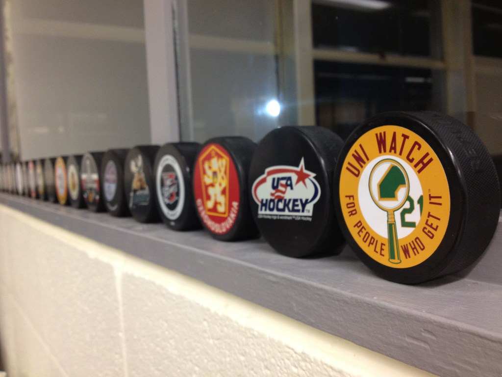
Okay, WHERE can I get a Uni Watch puck?
1. Discuss sticker acquisition with Paul (pending inventory)
2. Acquire blank puck from local sporting goods warehouse
3. Carefully apply sticker to said puck.
Bammo! Your a DIY master. Not quite in the Frosty or Ryco category but who’s to judge.
I spent 18 seconds last night and DIYed another one. Results were just a sharp.
ben’s diy skills are surpassed only by his stirrup collection
Ah! Yeah, I’m already a DIY pucker, so that makes sense.
One of those baseball-themed cigarette ads may be considered particularly outrageous by some:
link
Notice the name of the team the “Sox” are playing?!
“OUT-SMARTED!”
:D
Except for the dropshadow I’d like to see the White Sox adopt that baby blue sleeveless look. I don’t believe they’ve done SOX arched across the chest like that.
Like the ‘skins stirrups. Notice in the second panel: they’re playing in old Yankee Stadium.
am i the only one who doesnt like the orioles new hat logo? whats wrong with the cursive O ?
The apostrophe is backward?
Nothing wrong with the cartoon bird. In 1971 he had 4 x 20 game winners and an ERA under 3. What did the O-apostrophe ever do?
Never liked the cursive O hats. When I think of that format for a logo, I think of the A’s. The Orioles, on the other hand, I associate with the current hat style, like Earl Weaver and Jim Palmer wore.
When I see a cap with an O on it, I think of Jim McMahon’s stint with the Eagles.
cool that Paul didn’t use the (fairly obvious) Brandi Chastain entry for his Title IX column.
I would think a lack of a uniform would exclude someone from a uniform article.
Good ol’ NY baseball – link
What pants are Alex Gonzalez wearing? Is that the Portland Sea Dogs?
Yankees pinstripes turn 100 years old today: link
A lot of bluster from the PR dept. At least they didn’t rip that design off a tribute to dead police officers.
Beyond the fact that the uniforms are “Reebok Ugly”, it’s interesting that the Orlando Solar Bears went with the obligatory cartoon animal with a hockey stick and the full team name on one crest and a cleaner design on the other.
Not for nothing, but who introduces a new uniform after their season is over?
Saw Chavez on MLB last night and was wondering about that.
Assuming that the same dopes who show up for baseball games in pajamas are wearing long socks under their clown pants is giving them way too much credit.
If the San Francisco Giants are lined up in numeric order then the player in the wrong jersey is Santiago Casilla.
Molina was indeed wearing a ski cap. Here’s a better view…
link
That same collection also shows Stephen Vogt using batting gloves. Vogt was in the ticket a couple of days ago without gloves. But it was cold in Detroit (obviously).
link
*in the ticker*
This is visual artist Megan Vossler discussing the aesthetics of baseball unis at Salon Saloon, a live-action arts magazine taking place at Bryant-Lake Bowl in Minneapolis. link. She discusses many issues close to our heart; ten minutes but very fun.
The Bryant-Lake Bowl?
A few of us went bowling there on the last day of the UW Deep Freeze in 2010.
Definitely was Paul’s kind of place.
total dive
definitely paul’s/rpm’s kind of establishment
THE & timE (just to name a few) would never have been able to handle it
“you mean i have to score myself?”
Adding up 7s and 4s and the more than occasional 0 isn’t that hard Phil.
yeah…but there was no midnight neon rock’n’roll bowling and definitely no scoring machines
and if you look closely, i think you can see jimbo bowling in the background
As a hockey nut, today’s offering has me still wiping the drool off my keyboard.
Did anyone see THIS pic in the listing for the Seattle Totems player?
link
Good grief, is that goalie SEVEN FEET TALL?!?!?!!
-Jet
I would say the little guy is just “vertically challenged”. The goal should be 4′ tall. I would imagine the little guy is only about 5’5″-5’6″. The goalie does seem tall for a goalie.
Also check out the 1962-63 team photo of the Totems. I don’t recall seeing a team photo where everyone is wearing a suit. link
Way to go, Tony Romo!
“This birth link“
…looking closely at that goalie pic above, it appears he may have a skater’s shin pad, or some kind of extra extension attached to the top of his goalie leg pads, because he’s so tall that the standard pads don’t cover his knees!!!
As a kid goalie during the 60’s/70’s, I used to study what the pros and other goalies wore and it wasn’t uncommon to see extra padding sewn onto the inside edge of the legs pads, or even into the pants…
-Jet
Were we so enthralled by the sweet-lookin’ Colt 45 stirrups in this picture, that we didn’t see the buffoon in the crowd on the left side wearing a MICKEY MOUSE BASEBALL JERSEY?!?!?!
link
Photoshop him out of the pic, please.
-Jet
Perhaps his way of saying the Astros have been a Mickey Mouse organization over the last few years?
Maybe next year, Nike can take over the uniform contract for MLB, and the potential new uniforms will go a little bit old-school Disney-style and use “Periwinkle Steel” and “Goofy Turtleneck Orange”.
Concerning the designs for the Nebraka alternate-
Uh, what? I believe this site is just trying to stir up controversy…so I’ll bite.
1st design: Purposefully NOT using school colors to avoid the Maryland look with the BFBS kit?
2nd design: Gold uniform? What was all that one in a million talk? (translation: Maryland)
3rd design: 1995 college basketball meets 1996 NHL alternates.
4th design: ugly as sin, but it wins by default. note: could be confused with another team. see: Cincinnati & Georgia
Every alternate proposal that I have seen from this guy and others have made me ill. At this point, I have resigned myself to the alt uniform being hideous and an embarrassment to the program. The best that I can hope for is that they stick with school colors (i.e., no BFBS).
They could remove the stripes and use a red helmet. Keep it simple, no black, no outrage.
Oh wait, Adidas needs to draw attention. Let’s start over.
correction: NebraSka
It’t not easy being green:
The Philadelphia Eagles list “midnight green” as their official color. However, with the NIKE takeover of jersey production and other merchandising, the color is now identified as “sport teal” on the Nike website:
link
Dafuq? What’s next: Saints gear being listed as “Bounty Brown and Black”? (you have no idea how gut-wrenchingly funny/depressing that was for me to type)
“Sport Teal” just reinforces my long-held belief that the Eagles current green is just a darker, more sinister shade of that 90’s color craze. I like to call the Eagles’ current green “Forrest Teal”. It screams 1996 and makes me sick to my stomach whenever I watch an Eagles game. They desperately need to update the green and get rid of the black in the uniforms while they’re at it too.
I wouldn’t be surprised if it was just, in fact, a darker teal. It does have a lot of blue in it as a green.
However, as a (young) Eagles fan, I prefer the midnight green/”sports teal” as opposed to the kelly, only because when I look back on Eagles history, I think of the 1960 Championship win, Jaworski’s Super Bowl loss, Jerome Brown dying, and Randall Cunningham’s knee injury (and I wasn’t alive for most of that).
It’s kind of the same route as the Bucs: they went from those awesome creamsickle uniforms to the red and sport brown (couldn’t resist), they started winning, up to the Super Bowl. It’s sort of a mentality thing–with the color change, the Bucs have forsaken their less successful past and embraced their current “winning” uniforms. Not saying the Bucs (or any team who wasn’t as successful before a uniform change) aren’t proud of their history, but they would just like to forget all of the bad parts.
On the other hand, you could argue the color change hasn’t helped, but the Eagles did go to five NFC Championships and one Super Bowl. You could argue we’re in the same boat as before, but with a better looking shoreline we’ll never reach.
But I love their jerseys. The link looks really nice, and it’s my favorite font in the NFL. The asymmetrical pants striping is one of my favorite details on the uniform, too. I love it, but that’s probably because I grew up watching it, and not Randall Cunningham’s era of jerseys.
On the SB Nation NFL logo vid: I was gonna make a joke involving Rarity (nothing R34-related, promise) when I saw that “soft-serve unicorn” Broncos logo, but I’m pretty sure that Rarity’s a Chargers fan, so I don’t want to piss her off.
Regarding those Colt .45s throwbacks from last night: Interesting that the pants link. The originals link.
— Paul, checking in from ESPN HQ
I had no idea that the Colt .45’s had a minor league affiliate called the .22’s (Moultrie…Georgia?) until you posted that pic. Too funny!
Cool seeing the two players with .22’s on their caps. Never knew about that before
His favorite player with his favorite magazine… link
Good to see The Blue Jays GM cop to the hideousness of their previous look. It was easily one of the worst logo/uniform combos in recent decades. Forget about the BFBS, remember those ridiculous gray caps they wore the first year? WOW!
I liked the color combination. I thought it was a nice combination for a Toronto team. I thought it was abominable for the Blue Jays.
agreed…no one uses a DARK gray — and i’m not talking just for a cap — some team should really go with a dark gray roadie (ok, looks like shit on the mets, but that’s all i had)…might look good on a team with a red primary or even the chisox
The University of Michigan is going to have a hash tag “Go Blue” printed on their field for people to use on twitter during their spring game this Saturday.
Apparently they had it in the endzone during the Mississippi State vs. Ole Miss game last year.
link
When I think of UofM, I don’t think hashtag. Hash bash yes, hashtag no.
Normally I would send this in to Paul but he’s busy today so I’ll try later in the week, but for now Just linking to my website here will have to do.
Anywho, here is (what I’m calling) link
Link disappeared (and then I put it in the wrong place):
The 2012 Logo Cup Playoffs — link
Link disappeared:
The 2012 Logo Cup Playoffs – link
Marlins wearing black, again. Have they even worn their grey tops yet? The free MLB preview sure is great for checking out this seasons’ new uniforms and changes.
Another story on what are sure to be fugly new link next season.
watching the Padres/Diamondbacks game and had something ive never seen before happen. Chris Denorfria hit a two run homerun to dead center, so Chris Young the Dbacks CF leaps up and loses his glove over the wall, sad part was his glove came off before the ball even touched it.
Thanks for the link to Rob Ullman’s site. I was just thinking about his work the other day, still trying to convince my better half to do the personalized pin-up thing.
Maybe the Team USA insignia is a new gender-specific thing? I know there is one image floating around of the new women’s hoops uniforms with the upward insignia, but it would seem, to me at least in the terms of a logo on a chest, that the downward pointing logo appears to be much more fitting for a woman’s bust-line than the one that points up; whereas it’s just the opposite for the link. I mean look at the one pic of the link. Pardon if you blush a little, but doesn’t it look like something seems a bit…umm, saggy?
Who knew NHL goalies went high cuffed? link
Also, Emery has the skinniest legs of all time.
isn’t the hockey season over?
It’s just getting started…
I’ll agree with that. The fighting tends to go down in the playoffs, so that’s when I actually pay (a little bit of) attention.
Go Anybody But The Flyers!
If you noticed with the Nebraska alt article, the player mock up was wearing everything adidas, but his gloves had the swoosh on them.
As regards the propriety of the fully armed Colt .45s jersey: In 1901, the Milwaukee Brewers were an original American League franchise. The next year they move to St Louis and became the Browns and in the mid 50s they move to Baltimore to become the Orioles. There was a 1901 Baltimore Oriole team and I think they eventually became the Yankees. I digress…..
The point is, a thing called Prohibition came about around 1919 to 1933. I wonder if the Brewers had stayed in Milwaukee if they would have been forced to have dropped the name Brewers as politically expedient? Milwaukee most certainly had a minor league team then, was it the Brewers? Even today, I think alcohol reeks more havoc than an 1873 Colt .45 Peacemaker. Union Station was built in 1911 in Houston which is now part of MMP. An Old West motif would be perfect for the franchise.since it has been deemed politically correct to shut down manned space flight in deference to income redistribution. I say Houston needs to bring back the Colt .45 uni in all it’s glory next year. Set up plinking arcades just like they have at Walt Disney World. And make the Braves take that war-mongering tomahawk off their uni and change their name to the Beaneaters or Crackers.
A little research – the Milwaukee team was always known as the Brewers in the minors – even through Prohibition. Presumably near-beer was OK. The mascot was the beer barrel man – a portly player running around with a beer barrel for a jersey. Nothing like getting young fans ready for fraternity frolics
In 1962, when Houston was known as the Colt .45s popular TV shows included Gunsmoke, Wyatt Earp, Palladin, Maverick, Wagon Train, Roy Rogers, Gene Autry, etc. The Colt .45 Peacemaker was omnipresent. Every boy had a toy pistol in a holster to play Cowboys and Indians. Despite all that, the country seemed to be a bit better place back then. Maybe so, maybe no.