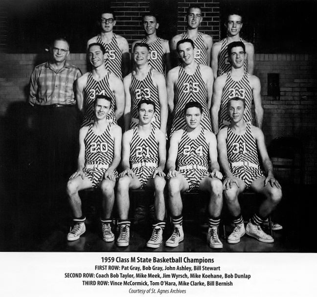
Well, at least now we know where Adidas got the idea for those Zubaz-esque stripes on its latest college hoops uniforms — or maybe where Zubaz got the idea in the first place. Behold the glory of the 1959 St. Agnes basketball team. “Imagine that in green and white!” says reader Ben Gray, who submitted the photo (and whose great-uncles Pat and Bob are seated in the front row). Surely one of you colorization types can make that happen, yes?
My only gripe, of course, is with the striped socks. Ben’s great-uncles had them drooping down at their ankles (can’t blame it on Maravich, who was only 12 years old at the time), and the other two guys in the front row either didn’t have them pulled up all the way or else the socks themselves weren’t long enough. A nettlesome fly in an otherwise pleasing ointment.
St. Agnes is now known as Springfield Catholic High School, whose teams are the Fightin’ Irish. Not sure if that’s what they were called back in ’59. “Green Zebras” seems more appropriate, no?
And as long as we’re talking stripes and high school basketball, here’s another school with striped warm-ups: ROCORI High School in Cold Spring, Minnesota. “They’ve been wearing these warm-ups since at least the mid-’70s, and the away shorts even had the same stripes up until 2001,” says Reece Hemmesch (who cruelly neglected to provide a photo of said shorts).
And speaking of striped basketball shorts, check out these satin beauties, which my longtime pal Robin Edgerton spotted on eBay. The striped side inserts are nothing new, but you don’t often see that element paired with the wider striped panels at the bottom — nice!
Finally, there’s this, which speaks for itself:

From James Crabtree’s cold, dead hands: It appears that children in Houston will get to be exposed to handgun imagery after all — you know, just like children everywhere else — because the Astros are poised to restore the revolver to their Colt .45s throwback jersey. As you can see from that press release (which was issued yesterday around noontime), MLB has rescinded its objection to the firearm and left the decision up to the ’Stros, who’ll announce their decision at some point today. Given that (a) team owner Jim Crane has already made it clear that he never wanted the gun removed in the first place and (b) Houston is not exactly a hotbed of gun control sentiment, I think we can all see where this is heading.
It’s no exaggeration to say that the lion’s share of the credit for this turn of events goes to Uni Watch reader James Crabtree, who spotted a small reference to the gun’s excision buried in the fine print of an Astros blog item a few weeks ago. He started writing a series of outraged letters, including one to me, which led to my own take on the story, and from there it kind of snowballed.
As for me, I’ve wanted the gun to be included on the jersey from the start — not because removing the gun is bad politics, but because it’s bad history (and even worse design). Glad to see it’s likely to be restored.
Incidentally, the first Colts throwback game is slated for April 10 — one month from tomorrow. So if the jerseys for that game were already made, now they’ll have to be revised. And if they weren’t already made, well, they have one month in which to make them. Either way, it proves the point that uniforms can be made (or altered) relatively quickly, despite all the talk we often hear about how “Oh no, we can’t do [whatever cool uni-related idea someone has come up with], because there isn’t enough time, the logistics are too complicated for such a short time frame,” etc.
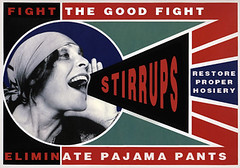
Uni Watch Stirrups Club
By Comrade Robert Marshall
Ordinarily as Opening Day approaches I am knocking the ice out of my frozen brain-pan and saying things like “It has been a long, cold winter on the front lines of the hosiery wars.” However, this year that just is not true. It has been mild, to say the least, here in my remote cabin getaway at the foot of Mount Lajoie. The weather has been so temperate that it got the hamster at my rusty wheel thinking about the role of hosier in the broader culture. For instance, were there people in the 1950s who bucked the single-mindedness of the era and found stirrups to be not just functional but sexy? Thankfully, the answer appears to have been yes. But I guess that isn’t too surprising, given the awesome nature of footless hosiery. The real question is, did the men in the gray flannel suits pull up their stirrups one leg at a time for work on Fridays? Again, turns out they did.
Enough of my nonsense, let’s get on with the first stirrup offerings of the year without further ado. We’ll start with something special for our pied piper Paul, who strongly suggested (read: demanded) that the Revolution would do well to offer the stirrups shown in this Harlem Globetrotters uniform. In addition, the Revolution will offer some re-releases of past favorites. These can be found in our à la carte menu, which also features re-stocks of some designs that had previously been listed as sold out.
Two important points of order: First, I have tried to simplify things by rolling shipping and handling into the list price. And the Revolution can now be found on Twitter (grumble grumble), at @stirrup_rvltn.
As always, full ordering instructions and additional information can be found at our Revolutionary headquarters.
From each according his stirrvp,
To each according his strype,
Comrade 91200
ESPN reminder: In case you missed it yesterday afternoon, my latest ESPN column, about a sensational uni-related program being undertaken by the Padres, is available here.
Uni Watch News Ticker: New logo for US Speedskating (from Ray Barrington). … New mask design for James Reimer. “At first glance, meh, it’s another artistic goalie mask, we’ve seen it 1000 times before,” says Ryan Connelly. “But upon further review, check out the ‘cat’s eye goalie mask’ autobot logo on the left side — super clever!” … The Chicago Express have come up with what James Huening describes as “possibly the worst a St. Paddy’s Day jerseys I’ve ever seen, in any sport.” … Brady Phelps posted screen shots of Daniel-san wearing a Chargers jersey in The Karate Kid. … “I noticed something unusual while watching the CONCACAF Champions League quarter-finals game between my hometown Toronto FC and L.A. Galaxy,” writes Tim Chiu. “Major League Soccer jerseys normally have an MLS logo patch on one sleeve and either a Canadian or United States national flag on the other sleeve. For CONCACAF Champions League matches, the MLS patch should be replaced by the Champions League patch while the national flag patch should in theory be left intact. (This is also true for UEFA Champions League matches where say, Manchester United plays Real Madrid — they will not have the Premier League patch and La Liga patches visible on their jerseys at all.) But during the Toronto/L.A. game I noticed the jerseys that Beckham and company wore had an MLS patch on one side, a Champions League patch on the other, and no national flag patch. On the other hand, Toronto FC got it right by having the CONCACAF Champions League patch and the Canadian national flag.” … Many readers have noted that the Peyton Manning press conference featured a lecturn with a blue Colts helmet icon. Not sure that it really means anything. Anyone know if the Colts have used this same graphic in the past? … “Cool video and pics from the University of Utah’s 1944 NCAA championship team,” writes Bill Trovinger. “Color on Color in the era of black-and-white TV didn’t quite work (you can really see it in the pictures). I’m assuming it was red (Utah) vs. green (Dartmouth), but I have no proof of that.” … “A friend who’s an NC State alumn showed me this web site of NC State cartoons,” writes Michael Evangelista. “They were published in the student newspaper while the artist was there, from 2007 until 2011. Each year he had a different style, but I like the ones from 2011 the best.” … Have we ever had a tug-of-war item in the Ticker? We do now. Check out the uni-notable bit in the caption (big thanks to my ESPN editor Dave Wilson). ”¦ Dig this: Maple Leafs players who volunteered for WWII trained in their hockey sweaters! Guess nobody told them that anything military-related has to be camo-patterned (from Brandon Roberts). ”¦ “I took a photo during one of my son’s freshman football games two years ago in which there were three different boys wearing the same number,” says Phillip Wells. “I know it’s common on sub-varsity football to see two of the same number, but three was pretty impressive.” ”¦ Ben Traxel was driving through eastern Kansas recently when he spotted a school with a rather familiar logo. Note that their main color is even purple! ”¦ CBS reporter Bruce Feldman had an amusing take on the new Baylor uniforms (from David Cline). ”¦ Cool throwbacks worn last night by Nebraska. ”¦ New uniforms and logos for the York Revolution (from Alan Poff). ”¦ Cool infographic about the 2011 NFL season (from Benjamin Harris). ”¦ Ricko came across several good photos, including Bobby Bonds posing with the caps of all the teams he’d played for, a good view of the Reds’ drop-down NOBs, and an unfortunate episode in the annals of baseball headbandery. ”¦ Here’s a good historical overview of Auburn’s football uniforms (from Jeff Hunter). ”¦ Ben Bishop, recently traded from St. Louis to Ottawa, was still wearing his Blues mask when he made his Sens debut on Tuesday. Last night, however, he’d switched to a plain white mask (from Ryan Raymond). ”¦ Several readers raised an eyebrow over the third-to-last graf of this story, which reads: “[Derrick] Rose and [Dwight] Howard have praised each other recently and implied they would be open to being teammates. Both have endorsement deals with Adidas, and an executive with Adidas said the shoe company would have no problem with them being on the same team.” Aw, isn’t that nice of Adidas? What a nice bunch of douchebags they are. ”¦ Casey B, who didn’t give his last name, noticed an Oilers player with the TaylorMade logo on his stick. Yes, that’s Taylor Hall in the photo — Taylor Hall, TaylorMade, get it? — but he’s not the one who was holding the TaylorMade stick. He’s holding the black stick in his right hand, and the TaylorMade stick was being held by the player sitting next to him (possibly Ryan Nugent-Hopkins). So why is a golf logo appearing on a hockey stick? I took the highly ambitious step of Googling the words “TaylorMade hockey stick” and came up with the answer. … New field design for the Bengals.
To be fair, I don’t think the Galaxy give half a shit about patches. They altered the colors of the MLS patch and the flag to match their third jersey, last year.
That’s not uncommon – lots of teams do that.
Makes perfect sense that Toronto would replace the MLS patch with a CONCACAF Champions League. What LA was thinking, I have no idea. I really hate national flag patches on club teams (you’re not representing your country), but in this situation that’s not the patch that should be replaced.
Pretty sure the Galaxy were wearing these training jerseys last night, which only come with the MLS patch.
link
Those are definitely the training unis because these are their new primary unis for this season.
link
It could also because LA is representing MLS where as Toronto is representing Canada.Canada sends one team based on a tournament of only Canadian teams.
The “lede” photo is covering up the top of today’s post for some reason.
On my browser, at least.
Mine too, I think (I’m confined to the evils of IE here at work).
It’s fine in Firefox (I’m running v10.0.2), but I checked it in Internet Explorer (v8.0.6001), and the following from the first sentence is omitted:
“Well, at least now we know where Adidas g”
So, it starts at “ot”. o_O
Last item in the ticker should say ‘Oilers player’ & not ‘Canadiens player’
Right. Thanks. Now fixed.
That Colts blue lectern has been there for years. Don’t know why they didn’t they didn’t print the helmet properly, other than it was easier to do it the way they did.
My employer uses blue and white for its logos and marks, and we’ve found that on a lectern, a mostly blue seal with bits of white is much, much more telegenic than a small amount of blue on a field of white. My guess would be the Colts do it this way for the same reason. Much more camera-friendly than the alternative.
Oddly, nobody in the Colts’ organization sees a need to render the artwork in reverse, in anticipation of printing white ink on a dark surface. Of course, their artwork is so stark it can be readily interpreted no matter what colors are used. It’s less grievous than, say, printing the Raiders’ insignia that way, resulting in a black-faced mascot with a white eyepatch.
Yep, I was gonna say the same thing.
A few pics link, link, link & link
But I feel like I’ve seen it somewhere else, like on a building or sign outside their practice facility, like in an ESPN report or something. Maybe it was just the podium, but I remember thinking it was funny when I saw it the first time b/c they’ve never (that I know of) had a helmet exactly like that.
Speaking of high schools using pro logos, a local high school here in MA uses a modified Chiefs logo (sorry, can’t find an image of it, I see stickers around town though). Coincidentally I just moved back to MA from KC
Not disagreeing with you douchebaggery comment about Adidas, but usually some sponsors have problems with two starts playing together because it equals less exposure.
When I read it, I imagined it in the same tone you would talk to a dog.
Who gives a fuck whether they have any problem with it? Trades and roster makeup are none of their damn business. A trade puts two of their guys in the same market? Boo-fucking-hoo.
I don’t really care if they have a problem with it either. They could get their nuts in a knot all they want, it shouldn’t matter. But it will (to them), because it’s all about the dollar bills to them.
To me, it’s pretty scary that they even had a comment on it. We aren’t going to get to the point someday where the shoe companies dictate trades, are we? It’s enough to make the conspiracy theorist in me wonder if there are already influential shoe company representatives advising some of these teams when big-name players are rumored to be traded.
It’s worth noting that they were asked to comment. But the fact that a reporter felt it was appropriate to ask them speaks volumes about how the tail is wagging the dog.
There were rumors that Howard wouldn’t go to Chicago because of adidas. Adidas was simply stating that those rumors were unfounded.
How dare they!!!
Of course Adidas would say that it’s unfounded; they would be sticking their three-striped fingers into something that it doesn’t’ belong in. I mean, I generally like Adidas, but they have the uniform rights to the NBA, why do you need to fuck with where a player wants to go? What, are they salty they can’t have their logo on the actual game-worn unis during the game?
I hope it was just a rumor.
They can comment all they want to, as long as they aren’t actually effecting anything.
If they can influence trades, then it’s time to form a new league.
I’m with Paul 100% on this one.
To me it creates / reinforces the perception that the players play for their sponsors first and their teams second.
(which is I think exactly what the sponsors are aiming for)
I don’t think Nike minded a whole lot Pippen and Mike played together.
Personally, I have no problem with the statement. The reason it was addressed was in response to all the blogger douchebaggery speculating they wouldn’t play together because of their Adidas ties.
Karate Kid photo link is broken
Thanks. Now fixed.
Now it reads “posted screen shots of wearing a Chargers jersey”… I’m assuming Ralph Macchio’s name is supposed to be in there?
Nice work, Mr. Crabtree. It’s refreshing to see a true grass roots effort lead to some common sense. Whitewashing history is always a bad idea. Plus that .45’s jersey is one of MLB best designs ever.
I second the motion. Someone who’s within arm’s length of Mr. Crabtree needs to buy him a drink.
Preferably one of these:
link
Well done, Mr. Crabtree!
Or more appropriately, a shot.
With a Colt 45 Malt Liquor chaser.
Yep, standing O for Mr. Crabtree.
An inspiring story, maybe next time when our team offers up an incorrect or lazy throwback we’ll do more than bitch about it.
Good for Houston. The fact that it was even an issue was just stupid.
As for that Padres thing… on one hand, it’s really cool that they’re giving out free uniforms. On the other hand, it seems wrong for an entire group/”league” of teams playing each other to all be using the same name. I dunno, maybe I’m just biased since my team had it’s own identity that wasn’t an MLB ripoff when I played little league ball. If I were the Padres, I think I’d give out blank uniforms and pay for the teams to customize them instead. *shrug*
Interesting point. I’m totally guessing on this, but my feeling is that kids probably love wearing pro uniforms, as it makes them feel connected to a real franchise, and if given the choice of teams, they’d probably choose to play in uniforms representing the local (presumably favorite) team.
I dunno. As a former player for a little league team called the Padres, I’m cool with it. I just think the MLB Padres skimped a little by not offering the correct caps to correspond with the jerseys. Still I’d have loved to have that ’69 or ’72 home jersey to wear instead of the brown t-shirts we got.
When Garfinkel says, “but they all have one thing in common — the ‘SD’ on the cap….” he is referring to them all wearing a San Diego hat, but by the pictures it is clear that the cap is era appropriate for each jersey.
Even if the caps were generic, the Padres would have gone above and beyond by providing actual button down Majestic jerseys.
The hats with the bell are swell, but a bit spendy.
I have no problem with an all-Padres league, as long as the unis are different enough. In my son’s league last year, it bugged the crap out of me that, even though they were all different names, more than half the teams wore navy or black shirts.
Well at least the Padres do have a rather rich uniform history so there is some diversity… various white jerseys, gray, “sand”, navy, yellow, brown, and the camo thing… but it does mean a league completely devoid of red, green, black, royal blue, powder blue or orange.
It’s probably just my own personal thing, but it still feels wrong to me.
/and for the record, my little league team was the Red Devils – we wore a white uniform with red pinstripes, a stylized R (similar to, but not quite the same as Joe Gibbs’ Redskins hat) on the caps and a devil face logo on the jerseys.
Then more power to the Pods for creating loyalty in their backyard. Admit that in the company of Cardinals, Dodgers, Yankees and Red Sox, the Fathers aren’t really an “aspirational” team. And maybe the kids will develop an affinity for colors that aren’t “usual”.
Those won’t even be the primary jerseys for the Galaxy this season; they’ll have a blue sash going from the left shoulder to the right flank. Probably waiting until the regular season begins to wear them.
I want to know how a hockey stick can be “powered” by anything. Wouldn’t it sound like less of a placebo if it said “Designed by TaylorMade” or something similar?
It is referring to the “flex” in the stick which provides the power. See link
No, the power still comes from the player using his muscles to manipulate the stick. The “flex” makes the transfer of power from muscle to puck more efficient, but there’s no power coming from the stick. The laws of physics still apply, no matter how much marketing flacks would like us to pretend otherwise.
Hockey sticks provide power.
Corporations are people.
Ignorance is strength.
The potential energy that the flex builds adds to the overall force of the shot. The release of that potential energy can actually add force that will slightly increase the shot’s force, thereby “powering” the shot to a greater speed than a player may use.
The law of physics do apply here, Arr, in that the energy created by the flex of the stick used in accelerating the puck must be conserved and represented in the overall force applied to the puck.
link.
It’s a freakin marketing line, just like the “halftime show powered by Ford” or wtf-ever. Maybe the Taylormade stick has better flexibility, maybe it doesn’t, but saying it’s “powered by Taylormade” is just a meaningless line.
Except that it does add power to the shot, Jeff. I’ll grant you that it’s 90% marketing-10% truth, but science says that the flex does actually help to add some zip to a shot.
Teebz, it can’t add power; it can only reduce the loss of power transfer (i.e., make the shot more efficient).
Then how does one explain composite sticks which flex better than wooden sticks providing faster shots?
Zdeno Chara and Shea Weber have eclipsed Al MacInnis and Al Iafrate in the hardest-shooter competition while using composite sticks. Chara’s slowest shot in the five years he has won the event was in 2007 when he hit 100.4 mph. That was Al MacInnis’ top speed in any of the eight hardest-shot competetions that he won.
Now, you can make the argument that Chara, at 6’9″ tall, has a distinct advantage over a guy listed at 6’1″ when it comes to force applied, but Al Iafrate, was of the same height as MacInnis, and his top speed in the event was 105.2 mph.
Since 2007, Chara’s winning speeds have increased every year he’s been in the event, including a ridiculous 108.8 mph this year. If what you are saying is true, Paul, then the stick is making one helluva difference in how he shoots.
I’m not saying that it directly adds 10 mph to a shot. What I am saying, though, is that the stick is definitely allowing players to shoot harder and faster, and power, as defined by physics, is the rate at which energy is transferred, used, or transformed.
Therefore, by definition, it is powered by Taylormade’s flex science.
Teebz, in order for that to be a fair assessment, you need to have the same player using both types of stick.
No, it’s a comparison between wood (Iafrate, MacInnis) and composite (Chara, Weber). I’m illustrating how the flex is actually adding power to the shot.
Different players means it isn’t a truly fair comparison. How do you know that the players using the composite stick aren’t just a little bit stronger? You don’t. You need to have the same player use both and compare numbers. Actually you need to have multiple players use both types for multiple shots so that any potential fluke shots are accounted for.
SCIENCE!
Weber, who is only slightly taller than MacInnis and Iafrate, shoots harder with a composite stick than both.
Iafrate and MacInnes are nerly the same height, and they shot with wooden sticks. Yhey were always near one another when it came to speeds, aside from Iafrate’s 105 mph blast.
The fact is this: composite sticks have changed the game immensely in that players are now routinely shooting harder and faster BECAUSE of their sticks. The power generated by the stick – read: the way the stick transfers the energy from the player – has changed the game.
teebz is 110% right on this one (as per usual). MAJOR difference between shots with the composite and wood (i use both during the year. wood, for pick up games and a much easier league. composite for a really competitive league with much sharper goalies). if it wasn’t that big of a deal, then you could probably name more than 2 players in the NHL today that still use wood.
also, here’s chara with wood:
link
Futhermore, are you telling me that Chara is getting stronger and stronger every year over the last five years? He’s won the hardest shot competition every year for the last five seasons, and he looks like the same guy.
Or could it be that the sticks are getting better? Composite sticks were starting to gain popularlity right around 2007, and more and more stick manufacturers are doing more composite/less wood stick productions. Could it be that the science of how a stick flexes is now a main proponent in the development of new sticks? I say yes, and the TaylorMade inclusion into this is definitive proof that the science is wagging the industry.
In short, Chara’s shot has always been a cannon – except now that cannon has nitroglycerin powering the cannonball.
I refer the court’s attention to the Law of Conservation of Energy. Your honor will note that said law has not been repealed and thus remains the governing statute in this case.
This really is a simple force equation. No energy is created; it is merely transferred. In as much as we use the word “power” to describe alternately “force” or “energy”, then no, the stick really and truly isn’t creating power here. To wit: lean the flexiest stick on the market against the boards, set a puck on the ice next to its blade, and let’s see how much energy the stick transfers on its own to the puck. The flexier stick has more potential energy available, yes, but to actuate that energy requires the application of force from an external source. Which is to say, the muscles of the player. The potential energy of the stick makes possible the more efficient transfer of energy from muscle to puck, it doesn’t create any power on its own. If it did, we could use hockey sticks to fuel electric power plants.
I will refer the court’s attention to the Law of Conservation of Energy, and point out that “power, as defined by physics, is the rate at which energy is transferred, used, or transformed”. Energy is conserved, and power is how that energy is dissipated.
Think of it as a light bulb, Arr. A light bulb transfers electrical energy into heat and light. More efficient bulbs use that electricity for light moreso than heat.
The composite sticks are like fluorescent bulbs: lots of energy used for light, very little wasted on heat. By using a composite stick, the energy is conserved, but dissapated much more efficiently than in a wood stick, thus driving the puck with more force.
link
Teebz is 100% right on this one.
You can argue till the cows come home whether its good for hockey, whether its good to have 11 year old kids begging their parents for $300 sticks, whether its good to have players sticks exploding on the ice, but this isn’t like Reebok claiming the players skate faster because of the jerseys – this is real science.
The discussion on the law of conservation of energy is missing the point.
The sticks are like a spring – you slowly put a bunch of energy in, and then get it all back at once.
Unless you think that springs also violate the laws of physics.
The conservation of energy that I speak, Mike, of says that the force a player puts into a shot is generated out at the same rate, but you lose some energy to different forms: friction of the stick on the ice, resistance of the puck, energy lost through the stick’s resistance when flexing, etc.
What composite sticks do better than wood is to transfer more of the energy down the flexing shaft to generate a harder shot. That, in its essence, is exactly what physicists call power.
At this point we’re just down to semantics. Nobody has disputed the fact that a given stick can result in a harder/faster/power-er shot; the distinction I was trying to make (and I think Scott was as well, although I don’t want to speak for him) is that this is because there’s less energy lost, not because there’s more energy added. The latter is impossible.
You may see this as a distinction without a difference. But of course that’s precisely what, uh, powers a web site like this one…
But then TaylorMade’s technology POWERS the stick. Again, it’s 90% marketing-10% truth which I’ve already conceded.
Nope. The player powers the stick; the stick’s technology simply makes it an efficient tool. Again, you may think this distinction doesn’t matter. If so, we can agree to disagree. Let’s move on.
But you’re confusing the terms in a physicist’s point of view.
A player energizes the stick by applying force. The stick changes the way that energy is used (the definition of power).
You and I quibbling over the definition of the word in how it is used in the marketing of the tool, Paul.
Electricity – which is just energy – transfers its energy to a lightbulb. The lightbulb determines how much heat and electricity are generated. That’s power in the physics world. A player – who has energy – transfers that energy to the stick in order to move the puck. The stick, however, determines how much of that energy is transferred to the puck.
But to say that electricity powers a light bulb? Completely acceptable, and, in fact, more readily acceptable that the physicist’s explanation.
Perhaps TaylorMade needs to explain its stance on the word “power” in their marketing in order for us to see whether they are using it incorrectly.
The puck is the light bulb. The stick is the lamp. Taylor Made is the cord.
Close, Jim.
The light bulb = the stick.
The electicity in the cord = the energy used by the player to move the stick.
The puck = light generated by the light bulb.
The cord = the player’s arms.
The sarcasm tags have failed yet again.
I didn’t see the tags.
DAMN YOU, IE @ WORK!
all I know about hockey sticks is my 11 year old daughter just “upgraded” from a Wood Patrick Sharp youth Model stick with a 42 flex to a composite Nick Backstrom youth model with the same range of flex ~ her shots seem harder and smoother. (this is causing a problem with my 9 year old son who wants to go composite instead of his wood Ovechkin) [and both my children know I will not pay more then $70 for a stick] ~ a the joys of being a hockey parent
An equipment controversy in Olympic Tug-of-War? Shocking!
Tito Fuentes was on a headband kick back in the late 70s.
1978 link
1974 link
1976 link
1977 link
Also remember when Tito came up on the mid-60s he was among the first to pull his stirrups up so high they were just vertical ribbons up each side. Didn’t show any sock front and back. Was kind of a Giants “thing” back then, cuz the Willies (Mays and McCovey) did it.
(Shhhh. Don’t tell Ben Traxel that he’d crossed the state line, and was actually in Western Missouri. link)
To be fair it is pretty close though, less than half a mile to the state line.
The difference is pretty important to those of us who live in Kansas.
More vikings logo rip-offs. Here is our local high school. And the kicker is, its Bears country here.
link
A Packer colored Vikings logo in Bears country. Nice. Hopefully one of their rival schools calls themselves the Lions & wears purple.
Always amazed that we see this kind of things as big news. It’s almost easier to list high schools that DON’T have some kind of pro or college knockoff somewhere in their, um, heraldry.
Now, if we’re simply noting how they “spin” them, that’s different. And entirely intriguing.
@ricko – I don’t have any problem with high schools patronizing professional sports teams. I just think its odd as The Jeff pointed out a chicago suburban high school sporting a viking logo with packers colors.
I actually refused to let my son play hockey for a club that calls them the Wings. Just couldn’t allow my son to put on that red sweater.
“I actually refused to let my son play hockey for a club that calls them the Wings”
gotta say it, hate to on a friday, but that’s fairly ridiculous. LOL. i’m assuming he had another team to play for (hopefully), but still…
Yeah, no offense, Simulated, but I’m with RyCo. That’s pretty fucking idiotic.
It’s a joke people… We ‘Hawks fans just hate the Red Wings that much!
Fremd is where I went to high school.
The purple and gold rival school is Rolling Meadows and they’re the Mustangs.
Cool COTD today.
In regards to the CONCACAF Champions League patch issue, I believe I have a possible answer. Toronto FC is in the League as a representative of Canada while LA Galaxy is in because they represent the MLS not just the US. For instance Seattle Sounders are in because they won the US Open Cup not the MLS.
Probably not even close but I like to tell myself that…
Also interesting note… LA Galaxy wore their training tops for their Champions league match rather than their regular kits or even their 3rd kits. Seattle wore their 3rd kits.
I suspect “LA Galaxy wore their training tops” is the right answer here. There’s not much need to dig deeper when simple laziness is an acceptable answer.
Those Leaf players who trained for World War II in their uniforms? Could have been a way to honour the Maple Leaf Regiment from World War I for which the team was named.
Conn Smythe, owner of the Leafs, was a lieutenant for the 40th Battery, and he earned a Military Cross for “an act or acts of exemplary gallantry during active operations against the enemy on land to all members, of any rank in Our Armed Forces” when he killed three German soldiers and rescued a number of wounded colleagues.
During World War II, Conn Smythe owned the Leafs outright, so perhaps it was also a tribute from his players in honour of his bravery in the first World War.
i’ll be dammed if i didn’t log onto CCM’s site just yesterday, saw that, and forgot to send it your way…
hockey monkey was sold out of navy CCM practice jerseys, so i went over to CCM to see if they sold directly off their site. saw that… scratched my head… got lost in the bigger picture…
Anybody find it ironic that MLB would consider removing the gun from the Colt .45s jersey on the grounds that it’s “inapropriate” but then has not a single problem dressing a bunch of little children up as soldiers?
Right on.
Yeah, there’s that too. Still like the idea of the Padres supplying the little league unis though.
I think that shows how divorced we have allowed ourselves to become to the nature of war.
There’s no sense of the human cost, no sense of shared sacrifice. We’ve been at war for nearly a decade, with absolutely zero impact on the life of average Americans.
That actual cost of war is something for others to bear, preferably out of our sight. The rest of it is equal measure video game and opportunity for baseball players to wear drag.
“…We’ve been at war for nearly a decade, with absolutely zero impact on the life of average Americans…”
Theoretically, things could have gotten worse if we didn’t go to war, so the seemingly unchanged life you see today is a result of the past decades war. I’m not saying that’s true, just asking you to consider that. Apologies in advance for extending a non-sports related issue.
And it is intriguing that the camo uniforms were such a big hit, but I don’t think most little leaguers are too conservative and probably go for the coolest looking flashiest things they could get.
I don’t know that the kids necessarily chose what to wear. For some of the teams, I’m sure the coach made the call.
Yeah I thought about that after I posted it, I wonder what the breakdown was of coaches picking uniforms and kids picking uniforms and who picked what.
I would imagine that kids picked camo and coaches went a little more conservative, however, with the presence the military has on the area would probably be hard to predict who would pick what.
things could have gotten worse if we didn’t go to war
Debatable, but also I think a bit beside the point. It’s very easy for us to forget that we’ve been at war for nearly ten years, so the camouflage drag is just another costume.
The thing is that it’s more than just desensitising or a disconnecting of the people to the reality of war. Camo jerseys and things like that actually work to romanticise war by associating it with sport and fun and good times. This is most dangerous in kids for obvious reasons. Kids won’t automatically be pro war nuts as a result of wearing camo, but they will have a psychological predisposition to associate war with happy times as opposed to the realities which are anything but happy.
Support the troops, but don’t celebrate the regrettable work a fucked up world has deemed necessary for them.
Well put.
that is a fantastic point paddy, i nary thought of that, and i have to admit it is pretty thought provoking.
the fact that the US is usually an away side in war probably contributes to that too
“…New logo for US Speedskating (from Ray Barrington)…”
Even worse than the new logo is the ridiculous press release that attended it. The only thing that works, kinda, is the S in the USA on the side of the tights.
I disagree. While I’d like to see all national teams with one identity, this is a great logo from a formal perspective. I would never have imagined a U, S and S could be so seamlessly combined into such a great, restrained, professional-looking mark.
Let me clarify, though, that the full color mark is indeed awful. The one-color shield mark and the USA marks featuring the two color S on the uniforms are excellent.
“I disagree”??! What do you mean, you “disagree”? You disagree with ME?! Why, I’ve got a good mind to… to… hey, Phi, hold my coat, wouldja?
that should be “hey, Phil…” Got a little excited.
Watch out, Connie’s got on his fitting trousers!
link
Watch out, Connie’s got on his fitting trousers!
Well I would hope so, otherwise he’d need a belt…
Those 1908 London olympic photos are some of the best to grace the ticker in a good long while. Just amazing stuff.
So many spectacular mustaches!!
Amazing pictures. Wonderful.
“Aw, isn’t that nice of Adidas? What a nice bunch of douchebags they are.”
Classy.
First time here?
no…he works for them
link
“… The Chicago Express have come up with what James Huening describes as ‘possibly the worst a St. Paddy’s Day jerseys I’ve ever seen, in any sport.’ …
Since I have seen many a horrible eyesore in this genre, I assumed that Brother Huening might be drawing from the hyperbole well. I was mistaken. Really astonishingly bad.
The whole St Patrick’s thing has evolved (badly, of course) into the commercial holiday between the car and appliances of Presidents’ Day (now there’s an exciting celebratory occasion) and the candy and frou-fous of Easter. One benefit is that non-Irish people seem to get a kick out of wearing green plastic crap and drinking in public. In my neighborhood, the Dominicans and Puerto Rican are really into it. Welcome, I guess.
Yeah, those are really, really bad.
And I just took another look at them and realized something that makes them even worse, in my opinion. I had origially thought that all those link were supposed to be snowflakes or something. (I had no idea why they’d put that detail on them.)
I’m pretty sure they’re supposed to be the bubbles in a glass of green beer.
*originally
Happy Stirrup Friday: link
Camilo Pascual Day?
Pasqual
(it’s not like the Senators later moved to Minnesota or anything, jeez)
link
true rick, link.
Now THAT’S a chart worthy of the stirrups. Much nicer.
For a DIY project, I would use a black stirrup to incorporate based on one of my MLB concepts to make this:
link
I wish I’d gotten in on those ’50s era Nats v1.0 stirrups. Would compliment my M&N ’59 Roy Sievers jersey nicely.
Can’t believe they left off Drew Brees’ birthmark in that 2011 NFL infographic. Downright offensive.
I noticed that too.
Daniel-son?
Daniel-san.
I know, he got it wrong in the original blog…
“he” did. fixed. nice catch.
I’m sorry, Lob. Presumption on my part. In my defense, the “hot girl – browse her pics” ad on your blog led me down that garden path….
And I hope I didn’t come off as too snarky. There’s Japanese ancestry in my family, so I’ve learned a thing or two about the honorifics.
this is somewhat silly, but it should be “Daniel-san”, as in:
link
Right. Now fixed.
fixed in my post too… man, nothing gets by you guys. impressive.
I was going to say something earlier after I saw it had been added (after I had commented on the lack of name after the link was first fixed)… but, I had other things to do at that point.
That new S logo for the speed skating team looks a whole lot like the logo for Shazam, the app used to look up music.
The HS with the Vikings logo is actually in Missouri. Cleveland to be exact. It’s a big difference to those of us who live in these parts.
Regardless of whether the Astros make the proper decision to return the pistol to its proper place on the Colt .45s’ jersey or not, will the Braves be joining in the throwback festivities during that April 10th game?
It makes sense to have the NHL have those TaylorMade sticks. For those who don’t know:
TaylorMade = Adidas = Reebok = CCM
Really?
Freakin monopolies…
If corporations are people, doesn’t that mean that a corporation with this many different identies is schizophrenic?
Indeed. It’s insane isn’t it?
I dunno, I guess it’s probably not too different from the various brands under General Mills or Kellogg’s cereal… but still… at least in those cases, the parent company logo is on all of those products. I’d bet that a rather large percentage of the population have absolutely no idea that Adidas & Reebok are the same thing.
Its not like they are the only one that does that:
Nike = Hurley = Converse = Umbro
Disney = ABC = ESPN
Google = Zagat = Android = YouTube
NBC = Comcast = 76ers = MLB Network
Is the Bill Stewart in the photo Payne Stewart’s dad? They were from Springfield, Mo., I think.
awesome article on Auburn football jerseys. the 1997 jersey is missing the “tiger eyes” logo that terry bowden drew up on the pants.
i wish auburn would wear an simple,plain orange jersey once a year. there was a rumor that the team was going to wear orange jersey vs UGA in 2004….
Today’s header photo reminds me of one I posted back in October 2010. I took a picture of the 1932-33 Nemo Vista (Arkansas) High School basketball team. They were known as the Zebras back then.
link
Interesting enough, the boy on the back left (Marlin Hawkins) was our county’s sheriff for nearly 30 years and later wrote a book entitled “How I Stole Elections.” link
Here’s his biography for anyone interested: link
Some crazy basketball unis here and in the column today.
This just in:
ProFootballTalk †@ProFootballTalk
NFL will unveil new Nike uniforms on April 3.
Packers fans already in a tizzy. Search #Packers on Twitter to see their reaction.
That’s because Matt Barrows of the Sac Bee link this:
“Got an email from someone who has seen the new Packers unis. They are “futuristic and fun” Gulp.”
Paul, if you go to the unveiling, can I be your +1?
Is Matt Barrows a troll? Almost sounds like that’s what he’s going for with that.
Disclaimer: I have never heard of Matt Barrows before making this post.
Neither had I.
Keep in mind that he “got an email from someone”. He might as well have read it on Wikipedia, for all the credence it deserves.
but that email probably had A BUNCH OF WORDS written in ALL CAPS with LOTS OF EXCLAMATION POINTS after them!!!!!!!!!!!!!!!!!!!!!
So it was his duty as a reporter to tweet that.
No mention of the mid 90s movie featuring a hockey player turned golfer? He had a putter with a hockey stick head made by Odyssey Golf.
link
MLB has tweeted a photo of the Colt 45s jersey to be worn by the Astros on April 10 and April 20.
link
Is it just me or does the “C” look really off? Something with that angular curvature of the C…
The “C” is off, and the revolver itself is not accurate. Looks like a quick-and-dirty mock-up jersey that was made to show the team’s decision.
Hope so.
That wouldn’t explain the terrible “C”, though. Best thing about link is the variable outline.
Shouldn’t the numbers in the “.45s” on the cap be a little wider?
So it’s a done deal?
link.
Well, it is looking like that jersey shown in the article about keeping the revolver on the jersey IS the jersey they will be wearing. If you enlarge the image, the COLTS logo looks to be chain-stitched…
I hope it is just the lighting that makes the revolver look like a heat-pressed graphic…
this is DIY gold!!!
link
“Worn at 2 SuperBowl Games”
He should DIY a certificate of authenticity too.
ordered a Chicago Fire replica away jersey from a soccer store and not the fire themselves and got one minus the sponsor quaker…
link
Red Sox BP jerseys with 100th anniversary patch. Where is this for sale? Why would it not be for sale? Maybe the Uni-Watch experts can figure this out. Thanks
<a href="linkThe US Speedskating S is quite similar to the logo of this former nationalised industry
Hmmmm… You’re right.
bleh, arsed that one up, the link still works though
There’s a guy on the Syracuse basketball team with the last name “Christmas”. Still looking for a teammate of his with the NOB “Thanksgiving”. Or — since it’s Friday — “Easter”.
OMG, everybody turn on NFL Network right now for a seriously embarrassing cream vs white matchup. Both the Pittsburgh Power and the Orlando Predators have black helmets and black numbers, so if it wasn’t for Pittsburgh’s yellow socks I’d have no freakin’ clue which team was which.
Are these the first ever CFCS jerseys? (Cream for cream’s sake?)
There is barely any contrast between the two teams so I have no idea how the players aren’t getting confused.
Maybe “cream” is the wrong word and they are really “champagne”?
Looks more like faded silver/dingy white. link
I’m pretty sure Orlando’s are silver. It’s because the players union went on strike about an hour before the game, so Orlando is wearing NNOB alts, and pitt is wearing their regular whites with names crossed out.
The Pittsburgh Power are only in their second season, but I’d change the nickname to Ironmen, which was the name of the short-lived NBA franchise. This year, the Milwaukee franchise switched nicknames, from Iron to Mustangs.
Or Cleveland could give the Gladiators name back to Pittsburgh and they could go back to being the Thunderbolts. Then they could relive this matchup with the Mustangs.
link
And a two-point dropkick at the end of the clip, to boot.
Right now at the Saddledome – Atlanta vs atlanta.
I notice the caption above the Maple Leafs photo used the term jersey. I still can’t get used to ‘sweater’. When I hear sweater, the famous christmas sweater always comes to mind that ‘neighbour Marg’ wore all of December.
Anybody else listening to Jay Bilas talk about the Louisville uniforms?
“I can’t get used to these uniforms. THey look like the Cincinnati Bengals.”
“Let’s hope they don’t draw Baylor.”
“Wearing these uniforms really does assure you will not be struck by an automobile.”
Anyone notice that Christmas for Syracuse wears #25
I noticed the name, but not the number. link.
Rare sport spectacle:
Hockey player thigh – link
what thigh?
Rumor is the Galaxy’s main kits were recalled by Adidas. I personally believe the reason is to move the Adidas logo up the shoulder so the scudetto is even with the team badge, similar to Colorado’s shirts last season.
Where can I find/buy current designs for st. Louis cardinals stirrup socks?? I’ve been looking for two years now with no luck…
Have you heard of this site called uni-watch.com? You should read it once in a while.