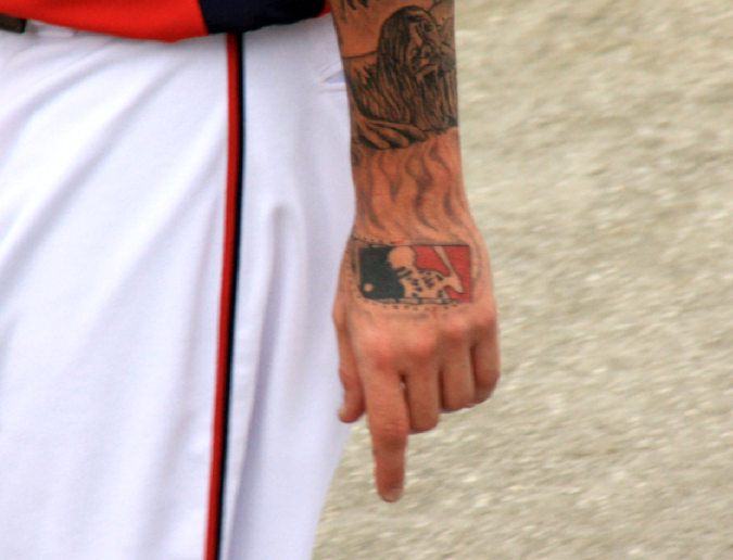
I’m generally fine with tattoos — I have two of them myself, and I’m pondering another one — but for some reason I prefer not to see them on the baseball diamond. Especially when they’re on a pitcher. And when they go all the way down his arm. And when they’re supposed to look all heavy metal badass. Despite all of that, however, it’s hard not to like the skeletal version of the MLB logo inked onto Nats reliever Ryan Perry’s left hand. (Further details here, and big thanks to R. Scott Rogers for bringing this one to my attention.)
New ESPN column today, about a real feel-good story from San Diego. Enjoy.
I had a blast last night appearing on WFMU’s Seven Second Delay show, which was broadcast live from a small theater in Manhattan (click to enlarge):

The guy up on the cross is co-host Andy, who had promised to be crucified if the show met its pledge drive goal, which it did. He was mortified that he actually had to follow through on his promise and spent a good portion of the show apologizing to anyone who might be offended.
We talked about a lot of stuff, including Uni Watch, Permanent Record, and Show-and-Tell. Here’s the audio of my segment, which lasts about 10 minutes:
Uni Watch News Ticker: Here’s a weird one — there’s an NHL player whose NOB has been misspelled since 2006. … There are striped stirrups and then there are striped stirrups. That’s the U. of Delaware, and damn do they look sweet. … And if you liked those hose, check out the beauties being worn by Kansas! Mama mia (from Mario Fontana). … Reprinted from yesterday’s comments: Here’s a really good slideshow of NBA players wearing facemasks. … New logo for the Richmond Kickers. … More Mizzou gossip (from Kevin Wright). … Fun piece on soccer kits that have never been used (from Chris Cruz). … Remember in the late ’90s when stirrups were disappearing and pants were getting longer, but the full-fledged pajama look wasn’t yet in vogue, so many players were wearing their pants at ankle-level, with a few inches of colored sock showing? That look is being revived by Adron Chambers of the Cardinals. Greg Stamps was curious about this, so he found that Chambers also had this look in the minors, and that it apparently has something to do with Willie McGee. … Oooh, check out the nice throwback Princeton warm-up being worn by the guy in the background of this photo. “It immediately brought me to a previous era of college basketball,” writes Andrew Bright. “Skinny young men battling on a real hardwood court, press members with their passes tucked in their hats, the distinctive crackling sound of a PA system, and the fresh smell of popcorn in all directions.” Andrew has a more vivid imagination than I do, but I share his admiration for the warm-up. … The Flyers retired Mark Howe’s number the other night, so the team did the now-standard routine of wearing Howe jerseys during warm-ups. “I like how they went old-school by using CCM jerseys instead of Reebok,” says Logan Stair. … “The triple-A Scranton/Wilkes-Barre Yankees will be renamed the Empire State Yankees for the 2012 season,” reports Matt Harris. “The club will play all its games on the road this summer because of renovations to its stadium.” ”¦ “The jerseys for the San Francisco Bulls were unveiled on Wednesday,” says Mike Joi. “They are a new ECHL team that will start in the 2013 season.” ”¦ I’ve never played Dungeons & Dragon (that’s a whole different school of geekery). But for those of you who are into it, Patrick Runge has found a D&D logo history. ”¦ What’s with the ridiculously oversized helmet and cap logos in this old Nestlé Quik commercial? (From Joe Dotzman.) ”¦ The Arizona Rattlers of the Arena League have new uniforms and helmets. “No word on whether the helmets are mix-and-match,” says Jeff Milne. “There was a big backlash last year when they changed the helmet color from copper to black, so I assume they added the copper helmet to appease us fans.” I’m assuming Jeff was saying “big backlash” in the somewhat relative sense of the term. ”¦ Andre Ethier has switched to New Balance cleats (from Parker Ferguson). ”¦ Yesterday I Ticker-linked to this new Bills T-shirt from Nike. A reader whose name I’m keeping private recognized the person holding the tee: “It was me! I work as an athletic trainer at a high school in he Buffalo area and have a side job at the Nike factory store in Niagara Falls. Working in the shipping and receiving department, we always see when new stuff comes in. Usually it’s older stuff that has already hit retail stores, but with the new NFL contract we will be an exclusive Bills store (which as a fan is great for me). The shirts arrived on Tuesday and we were pretty excited to get our hands on them. My co-worker snapped a quick picture and amazingly it ended up on your site [actually on Nikeblog; I just linked to it ”” PL]. I didn’t want to release it for fear of losing the job and any charges being brought against us for releasing the info. One thing I can tell you is that there’s a Visa logo on the price tag, above the UPC code (which is visible but blurry in the picture). Must be some licensing agreement with them. Another thing is that it isn’t your standard dri-fit material. It is 50% polyester, 25% rayon, and 25% cotton, and is unlike anything I’ve seen there. Very soft and very light, feels like an old cotton T-shirt that has been worn for 10 years.” ”¦ Kyle Shaner notes that Peyton Manning has always worn a white helmet — in high school, college, and of course with the Colts. “If he ends up with the Cardinals, Dolphins, or Jets, you may have to investigate this,” says Kyle. ”¦ And as if on cue, Brady Phelps has provided some Peyton-centric Photoshoppery. ”¦ Ben Gorbaty notes that Evgeni Malkin of the Penguins was wearing a Lokomotiv Yaroslavl helmet decal last night. “It appears that he was the only player on the team with the decal,” says Ben. “I remember that earlier in the season, the Pens played the Capitals and worn Lokomotiv patches and decals, so at first I thought Malkin’s decal was just left over from that game. But then I check, and the Pens were not wearing their alternates that night.” ”¦ Jason Lord attended a function where the guest speaker was Bobby Lamb, who’ll be the coach of the new Mercer University football team when it begins play in 2013. “Mercer is an Adidas school and currently in the design phase of their football unis, but Lamb mentioned the struggles that come with starting up a program. He used to coach at Furman, where his equipment manager had affiliations with the University of Tennessee. Lamb had placed a call to him to ask if he could hook them up with any equipment, and it turned out UT had nearly 250 pair of pants available, free of charge. UT’s orange and Mercer’s orange are not the same shade, but Lamb nonetheless drove a truck up to Knoxville, loaded up the pants, and brought them back to Mercer, where they will serve as practice pants. Lamb went on to mention that he got hooked up with a ton of Nike cleats from Duke. It was interesting to hear about the struggles that programs face when starting up, and that established programs can take for granted that their equipment/uni/clothing supplier will continuously send new merchandise their way while they’re free to unload the old stuff wherever possible.” ”¦ Finally, check this out: 83-year-old Connie Mack, in his suit and tie, tossing the ball around in spring training (thanks, Phil):
The unused kits link, she’s a’borked, Paul.
Oopsie. Now fixed.
Sorry, still getting a “404 – Not Found”…
hmmm…it was there before, now it’s not (again)…maybe the page has been farked
Try it now.
Now works, thanks!
Malkin’s been wearing the Lokomotiv logo all season, on all helmets.
and also Steve Sullivan of the Pens has been wearing a patch in the same spot of his helmet honoring former Nashville teammate Wade Belak who died last summer. He is the only Penguin wearing it and has been all season
Malkin has been wearing it all season long because he’s involved with Team Lokomotiv. He has been working to raise money for the families of the players all season long through various charitable events.
You all beat me to it, but yes, he’s wearing that all year. He’s been the point man on a lot of fund raising, most visibly the livestrong-style wrist bands that have proceeds going to the families of the victims.
The entire Delaware Blue Hens uniform looks fantastic!
I second the motion.
3rd. Bring back royal/yellow to MLB!
word, that’s what a baseball team should look like
They look great, as blue and gold usually do. Love the striped stirrups.
And love the Princeton shirt. Paul, thanks for the reader’s vivid imagination, which is based on memories that I also have. That shirt harkens back to an era of college basketball that I truly loved, when the game was grand. It’s not so much anymore.
As long as we’re in a Delaware thread, congrats to the Blue Hens hockey team for winning the ACHA National Championship last night. I am a supporter of a rival club team, but I’ve always enjoyed going to Newark and interacting with the Delaware fans.
The uniforms, of course.
Home:
link
link
Road:
link
Camo:
link
That was last season’s home uniforms for Delaware Hockey. This is a picture from last night with the Murdoch Cup (ACHA’s Stanley Cup), and the winning sweater in the background!
link
ALL HAIL TO DELAWARE!
I like the bird head much better than the UD logo.
The team needs to update their website with current photos.
Just realized after I posted the pic that the one player has different socks than the rest. Didn’t notice it in game because the feed wasn’t great. Here are some pics of the celebration:
link
link
link
Ditto, Dane. The coach owns/runs the pro shop at the rink so he’s got the product and tools for some great uni’s at his disposal. The away jersey is the same last I saw, but the colors are a bit off for me (both blue and gold are too light in shade).
I called the games for hockey for a few years while I went to UD, some of those players are now the Asst. Coaches. So glad they finally took the title!
You a Blue Hen too?
Arizona. But I’ve always felt that Delaware fans were the closest to our fans in mentality. Or mental illness – not sure which.
More ACHA National Championship Photos!
link
link
These are beautiful…
link
Who would’ve thought Delaware had such bad ass looking baseball and hockey teams?
That really is a beautiful uniform. Though I’m not nuts about the cartoony crest.
Here’s something I came up with that might work better…
link
er…this:
link
If you check Creamer’s site ( link ) you’ll see that what they have now is tons better than the cartoons of the past (minus Dick Chicken, which was awesome).
That Connie Mack vid is great old timey stuff, wonder if when they stopped filming he shook his fist and told everyone to “get off my lawn”?
i’m just sad that 83 year old connie runs faster then i do…
Nothing to be ashamed of, Connie ran like he wasn’t a day over 75 :-)
Peyton Manning hasnt ALWAYS worn a white helmet:
link
Good find, I forgot the colts had the blue helmet throwbacks. Noticed that during the Colts/Manning breakup speech yesterday the podium featured the blue helmet logo and not the white.
link
Malkin has been wearing the Lokomotiv logo on every helmet all year, but hes not the only penguin wearing a memorial sticker. Steve Sullivan is wearing a Wade Belak sticker in Penguins Colors (despite belak never playing for the pens) since the two were teammates in Nashville.
Wow that Bills tee is fugly. Seriously looks like something you would find at a TJ Maxx. Sounds comfortable though.
That fabric ratio is pretty standard for tri-blend shirts. It’s generally a nice-feeling blend, even if the materials used aren’t of the best quality. Definitely not quite a moisture-wicking fabric, though.
Pitcher tattoos: A few years ago against the Marlins, Brett Myers was instructed by Joe West to cover his wrist tattoo as it was determined to be a ‘distraction’ to the batters. Ok, so it was West who made him go to the long sleeves, but how will this go over with the Men (Formerly) in Blue?
Related question: How long until we see an ump with arm tattoos? Bound to happen eventually, just like we now have umps with goatees….
Hey I vaguely remember that from when he was still with the Phils! Joe West, ugh what a douche, the fact that I even know his nickname is proof that he’s terrible. The best umpires/referees/officials blend into the background and do their jobs, if one of them has become enough of a personality to garner a widely known nickname this shows they’ve been inserting themselves into the game far too much
TL;DR Joe West sucks, and is a grandstanding D-Bag.
Justin Miller (pitcher) has to wear long sleeves because of his tats…
link
I’m suspcious of pitchers with arm tats….they end up bunting the ball of their face, breaking their orbital bone and being out 10-12 weeks.
Brandon League as well.
Another thing to like about the Mark Howe tribute jersey, it was period specific.
That particular setup (CCM & NHL logos on the hemline) was worn from 1990 to 1996. 1990 was when the NHL logo was added to all uniforms, and 1996 was when the Flyers switched to Nike-branded uniforms. The Flyers reverted to CCM in 1999, but the NHL logo on the hem changed from black-and-orange to black-and-silver that year, and the CCM logo on the hem would be replaced by a Koho logo on the back of the neck the next year.
Mark Howe would’ve worn that style for his last two seasons in Philly. His first season was the first year of the 2nd Generation unis (which initially had the same thick-outlined numbers as their immediate predecessors, as well as the trim along the back of the shoulders meeting the neck), and also Philly’s second (and final) year in the infamous Cooperalls.
Funny thing is, Mark probably wouldn’t have ended up in Philly if not for the freak injury he suffered with Hartford. (For those who don’t know, the base of the NHL’s goal frame was arranged as two semi-circles, joining at a point in the center where the vertical post came down; Howe’s thigh was impaled on the point, and his long recovery time led the Whalers to give up on him. Their loss…)
It’s just too bad that he couldn’t get a Stanley Cup ring as a player, falling short with the Flyers twice (thanks to the guy who would shatter his dad’s records), and with the Wings once at the end of his career. He’d have to settle for his two Avco Cup wins with the Aeros, and four Cup rings as a scout for the Wings.
Those 80’s-era orange Flyer jerseys are still my absolute favourite look (I died a little inside when they brought in the BFBS, and phased out the orange) – glad the classic sweater made a return to honour Mark Howe. Did anyone get a nice closeup of the jersey patch the Flyers wore during the game? I haven’t seen a good shot of it yet.
Kobe went back to the clear mask last night. I had thought maybe he was going clear at home, black on the road, but apparently not:
link
During the Pistons game, he switched from the black mask to the clear one.
Someone sent a twitter message that Bryant went back to the clear mask because it fit better.
I like the Adron Chambers look, that’s what we looked like playing in the 80s. It’s not the bloused, full stirrup look, but it’s better than the damn PJs clownish trend.
I don’t like the new look for Adron. I’d rather see more sock showing. Mike Matheny’s comment on it:
“He had the bloomin’ pants like everyone else, and Willie McGee told him he wasn’t as aerodynamic,” Matheny said. “Willie told him that early in the day, and by the end of the day he already had leotards on. That’s respect. That’s Adron. That’s how he goes about it. He’s so respectful and realizes how valuable learning from a guy like Willie is.”
I agree. That hint of color at the bottom of the leg makes such a difference. Aerodynamism will come back, and when it does, the pants will start to creep back up the leg.
Paul,
Great job on “Seven Second Delay”. You managed to cover a lot of territory in a short amount of time.
Cheers!
~B
Found a pic from the show here: link
Ah, excellent — thanks! I’ll add that to the text.
The reason Andy is standing up there on a cross is that he promised to be crucified if the show met its pledge drive goal (which it did). He was mortified that he actually had to follow thru, and spent a good portion of the show apologizing to anyone who might be offended.
can’t imagine why
When Peyton Manning was in high school, at Newman here in New Orleans, one year his team practiced at a field in City Park while, I believe, their home field was under renovation. My drive home from work every day took me right past their practices.
What initially caught my eye was how uniformly dressed the entire team was in their green and white practice gear. This was a departure from when I played in high school and college when practice gear was mostly a hodge-podge of mismatched practice jerseys, scrimmage vests and old game uniforms. I pulled over to watch them practice one day and noticed the tall kid flinging the football around before remembering that Archie Manning’s son was the quarterback.
Wow! Haven’t seen that Nestle’s Quik commercial since I was a kid. One of my faves. Gotta agree with Davis J. I could root for the Delaware Blue Hens based on the uniform alone. Classic.
That #3 D&D concept logo reminds me of the Code Monkeys episode “Todd Loses His Mind”.
I used to love that show in HS, my favorite episode was the one with the wrestlers, although I suspect we werethe only two watching the show.
Code Monkey like Fritos….code monkey like tab and mountain dew…
No screenshot, but I just saw someone in the crowd of the Today show holding up a homemade paper doll, with a homemade Under Armour logo drawn on it… I just can’t figure out what the fucking point of it was exactly.
Can we get an X-Ray of Harmon Killebrew, compare it to that tattoo and settle the MLG logo once and for all?
~kidding!
or “MLB” logo….back to coffee IV for me.
Mr. Met FINALLY ditched the drop shadow uni!
link
link Kansas stirrups are very nice, but why not three stripes? They’re an adidas school; I’m surprised adidas missed this opportunity (no I’m not).
Three stripes should be solid colored if it were an adidas brand mark.
Right. And obviously this isn’t an adidas brand mark. I’m just surprised adidas didn’t suggest/supply something that reinforced their brand.
What colorway are them stirrups?
I think they’re just not as interested in growing their baseball presence.
They are three stripes — the red and blue stripes are the three stripes.
Besides those stirrups, I’m really digging Kansas’ white-crowned caps. LOVE that look.
I’m wondering if those Bill’s t-shirt designs will become a copypasta design for every team in the league. I wouldn’t mind an Eagles one, but I’ll probably not get it. It’ll probably cost like $40.
Don’t understand tattoos. I like the way a lot of tattoos look, I just can’t make the commitment. They’re permanent. Do you wear the same fashions or mullett hairstyle you wore 20 years ago? Do you really want to be stuck with that tramp stamp tattoo forever?
Don’t understand marriage. I like the way a lot of girls are, but I just can’t make the commitment. It’s permanent. Do you really want to be stuck with that same girl forever?
Okay, so it’s not quite the same thing, but still… Personally, I love my two tattoos, which are 20 and nine yrs old, respectively. No regrets.
there are only two truisms of marriage:
1) women marry men thinking they can change them
2) men marry women thinking they’ll never change
neither happens
I totally get that – most of my untattooed friends say the same thing, and a lot of tattooed friends regret at least some of their ink. Personally, I made sure whatever I got tattooed was something I wasn’t going to regret 2, 5, 10 years down the road, and that I wasn’t going to get anything too “fashionable” that would date quickly. I always wait a couple of years (at least) between designing the tat and actually getting it inked, just to make sure I really want it (out of 30+ tattoos, the only one I truly regret was my first, which I got out of a misplaced sense of teenage rebellion).
Now, piecings… Those, I’ll never understand.
Objecting to tattoos because they’re permanent is like objecting to religion because it requires faith without proof — like, duh, that’s the whole point. In the case of tattoos, the willingness to get inked implicitly reflects a willingness to live in/for the moment, to take risks, etc. You can say it’s stupid or immature to have to broadcast that mindset via a visible body modification (and I wouldn’t necessarily disagree with you), but that’s still part of the underlying point.
I don’t get tattoos either. My dad got one in the early 60s & it always looked like a bad dark green bruise on his bicep. Plus as a person who has hundreds of moles all over his body, I don’t need anymore unsightly markings.
I always thought there were antiquated & faux macho-esque, and at the same time “kids stuff” with ballpoint pens – which many of us got that out of our systems as kids (self included). For the life of me, I don’t know why tattoos gained popularity in the past 15-20 years and here I’ll sound like a total dick: I don’t think they look very lady-like on women at all. Designs and logos go on shirts & caps – tho if I had it my way back in the day I’d be walking around with a dumb Sox logo on my right wrist. Then there’s that whole Asian alphabet symbol tattoo trend which seems like one big practical joke on people.
Also I just really hate needles & cringe of the idea of sticking a needle with ink into my skin.
How do you feel about the kids these days wearing their dungarees everywhere they go?
Well for one thing, they better stay off my lawn, that’s for sure.
To me, a tattoo is like wearing the same novelty t-shirt every day of your life. So when you go link it makes me think of something like link
That being said, to each his (or her) own. I’m not getting one, though.
15 to 11?
Watch it, smart guy…
this goes to 11
In my case, both of my legs are badly scarred from an old auto accident, and I never wear shorts so people don’t have to see them. (That’s one reason it took me a long time to get married.) So I have a tendency to look at tattoos as the same thing, only intentionally self-inflicted. They may be for others, but not for me, and while I know many great people who have them, they don’t leave me with a good first impression.
Nicely done with the Peyton mocks Brady! I think if Peyton ended up with thelink, what he wore at
Tennessee?
Thanks… but cannot take credit. Credit is given here:
link
We possess incredible bitmap paint skills, not photoshop.
I’d give anything to see Peyton in SF. For once the defense would fear our offense. Now, only the FANS fear our offense.
Brinke, you’re old enough to remember when the Niners offense was indeed fearsome.
the peyton manning presser- the stand had a picture of a blue colts helmet with a white horseshoe. looked pretty good too
Curious to feel that Nike material (while not crazy about the shirt design). I wonder if that’s some sort of answer to the charged cotton like that UA has put out recently. Great product by the way.
Everyone has ‘Charged Cotton’ already. It’s simply a polyester shirt with some cotton blended in to give it an acceptable level of softness and sometimes some elastane blended in for a little extra stretch. It’s all marketing lingo, but Under Armour calls it Charged Cotton, Nike calls it the Dri-Fit Cotton Tee and adidas calls it the Ultimate Tee. It’s all identical, save for a bit a of give or take in the percentage of the materials involved. The Bills Nike shirt in the link above is a true tri-blend, a shirt we most often see in heathered fabric. It is a thin, soft fabric with a little ‘tooth’ to it and a good amount of stretch. Not a performance material.
I take it you don’t like UA, LOL! I love how people complain in here under the guise of “it’s all marketing lingo”. Ok, fine, it is, but really, it’s a completely different product than a regular 100% cotton t-shirt so maybe it does garner a different name.
Here is what the Astros’ Colt .45’s jerseys will look like:
link
The Astros released their promotional schedule and this is the replica Colts jersey they will be giving away.
Despite already knowing what MLB was doing to that jersey, it’s still very disappointing to see it like that. I don’t think the Astros should even bother wearing it since it’s so wrong IMO. Will Astros fans buy that? I’m a Halos fan, and I have a number of their jerseys. If they had to retroactively and fundamentally change the design retail version, there’s no way I’d buy one.
Instead of wearing that maybe the Astros should have come up with a heritage uniform that pays homage to that era, similar to what the Phil and Tribe wear.
Very disappointed about the gun-removal thing. Next thing you know officious do-gooders will be demanding that the Braves remove that beautiful tomahawk because it’s a dangerous weapon!
Perhaps the Chicago Cubs could assert rights to the name “Colts” (that’s what they called themselves in the 1890s) and stop the Astros from wearing that jersey until the “.45s” part is added.
“Next thing you know officious do-gooders will be demanding that the Braves remove that beautiful tomahawk because it’s a dangerous weapon!”
~~~
the braves should be removing the tomahawk, but not because it’s a dangerous weapon
Nothing should cause the Braves to remove the tomahawk. Ever. Unfortunately, nothing will ever change Phil’s mind either.
Funny how the same basic principles can produce different results: I’m with Phil prob’ly north of 90% on the tribal team name thing, but the Braves name and the tomahawk I find unobjectionable.
The tomahawk chop chant, on the other hand …
benjamin,
we can agree to disagree on this…i don’t expect you’ll ever change your mind either
i will say this, however, if the braves were ever to remove the tomahawk, and then at some point in time decided to throwback to a period when they had it, i would fight to the death to see that it was included
we can’t and shouldn’t EVER try to whitewash (no pun, believe me, intended) history, just like it was WRONG to remove the ceegar from the tampa smokers uni last year, but that doesn’t mean we can’t bring about what is (in some people’s opinions) meaningful change today
robert scott,
i’m surprised, though not altogether shocked, that you support the braves name AND native american imagery…and we agree upwards of 90% of the time? on here? wow…guess i’ll have to start paying more attention to your
diatribeswell-written, if lengthy, discourses on myriad subjects ;)Boring. Talk about white-washing history.
Maybe the league wouldn’t find it objectionable if they put a water gun on the jersey instead.
I just read that MLB has reconsidered the gun on the Colt .45 jersey and now it is up to Astros to put it back in the jersey. I thought that I read that a decision will be made tomorrow.
Funny how some are in high dudgeon over the sports logos of a certain plains state college or a certain midwestern baseball team but have no problem with the most sacred belief of hundreds of millions of persons on this planet.
–that is “have no problem with accepting a comical caricutarization of the most sacred belief of millions of persons on this planet.”
Sorry for the error….more sorry to see the picture.
You think it’s funny that we get more worked up over names and logos than religion on a website devoted to uniform ephemera?
That’s because this is a sports uniform blog not a religion blog. Go peddle your complaints elsewhere.
Not really a complaint, just an observation….and regular readers of the site know that non-uniform related commentary on social issues occurs very often.
in the comments or in the LEDE?
because of course you’re going to get all kinds of non-uni commentary in the comments…i’d say (while not speaking for him) that paul keeps his main articles (and most of the sub articles) completely free of any social commentary, and when there is some, it is usually kept to a bare minimum
Grossmann said when he was young, he didn’t want to complain, saying, “I was just happy to have a jersey with my name on it.”
That’s one of the best quotes I’ve read from a pro athlete in a while.
Yeah — except it *wasn’t* his name!
That makes it even better.
Mark DeRosa said almost the exact same thing when he was with the Cubs and the first jersey they gave him said “DEROSA” and not “DeROSA”. He was “just happy to have a jersey,” he said.
We traditionalist Cub fans knew that the whole thing could have been avoided had the new ownership not decided to put names on the home jerseys for 2007!
RE: SF Bulls jersey
Red Deer Rebels-esque logo, late 90’s/early 00’s Sabres template jersey, Anaheim Ducks font, Niners colors…..not as franken-awful as the last sounds. Reasonable jorb.
A reasonable link? Hmmm… Don’t forget the Flyersesque contrasting-color nameplate.
It’s Franken-turrible.
Reasonable when brought to current ECHL standards, yes.
Looks like Hockey-Reference.com’s gonna have to update Grossmann’s profile…
link
And I’m curious if/when ESPN fixed his page on their site.
link
Bridgewater College (D3 School in VA) Unveiled their new uniforms today. Only notable because they look like Adidas is ripping off the Nike Oregon designs, Eagle wings on the shoulders and all. Disappointing because BC used to have a great classic look,(think BC pre-UA ripoff). Anyway, here are the unis:
Home: link
Away: link
That’s one of the generic team design elements that high schools and small colleges can order on their adi uniforms. It’s not a bespoke uniform.
Re: the Frank Howard Nestle’s Quik ad:
Someone should cut together a montage of heinous, fictitious faux-major league unis worn in commercials/TV shows. The 1970s were the prime period for this; as ugly as some of the real uniforms were, they got downright bizarre in the minds of some Hollywood wardrobers. Clashy colors, unlikely team names, fun stuff. The catcher who questions Frank Howard’s manhood here wears a simple block H on his cap.
Hey, a question: when and why did chest protectors stop having that groin-protecting flap at the bottom?
Probably about the same time catchers stopped wearing the throat protector.
Not even close. The crotch protector disappeared well before Steve Yeager came up with the throat protector.
As a former catcher, I clearly remember a line being drawn in equipment between Little League (age 10-12) and Pony League (13-14).
In LL the mask was all one piece, with a strap to keep the helmet and mask together. In PL, moved to a separate helmet and mask. The chest protector went from groin flap to straight (which may or may not have coincided with beginning to wear a cup..although I think I wore one in LL at the end).
I was never sure WHY this was, but that’s just the way the equipment was. At no other level did I ever have a chest protector with a groin flap…I’m guessing that manufactors realized that it did nothing to protect (being that it hung there rather than being tight against the body) and the cup was the only way to truly get protection.
Wondering if the oversize W in the Quik commercial was to compensate for smaller TV screens?
One could ask why they didn’t do that all the time for TV. I’d say when you’re watching a game, you know the teams. When you see a Nestle’s Quik commercial, there’s no indication, other than that logo, with whom that player is affiliated.
Just a guess. Thoughts?
Funny coincidence about the NesQuik commercial: the title on YouTube indicates it’s from ’69. That was the same year Jim Bouton chronicled in Ball Four, a book which revealed that players were using a little more than chocolate milk to get mentally and physically ready for games. I remember the book mentioning Howard on several occasions, as he was one of the most feared hitters in the AL that season, but nothing about him specifically using “greenies,” just that a lot of players were.
Hey, speaking of catchers, here’s a catching tidbit I’ve been meaning to mention: Most chest protectors have horizontal strap down near the rear-waist area. This connects to a vertical strap that bisects into a “Y” shape, with two small straps going up toward the shoulders:
link
But some catchers don’t have the vertical strap and the Y; they just have the horizontal strap at the waist and a strap that goes behind their neck. I think the first catcher to do this was Johnny Bench (he was certainly the first one I noticed doing it):
link
link
link
link
As a kid, I used to think this made Bench look more “modern,” for lack of a better term. He was also the first (and, at the time, the only) catcher to keep his throwing hand behind his back when receiving the ball — the better to avoid having the hand nicked by foul tips.
These two elements — the lack of the vertical strap and the hand behind the back — made Bench seem like a completely different species of catcher when I was growing up….
As a kid, I used to think this made Bench look more “modern,” for lack of a better term. He was also the first (and, at the time, the only) catcher to keep his throwing hand behind his back when receiving the ball – the better to avoid having the hand nicked by foul tips.
No he wasn’t. He got the idea from Randy Hundley of the Cubs, and acknowledged that fact quite readily.
Ah, didn’t know that. Thanks!
No sweat. Hundley might have been first, but Bench made it widespread because…well, he was Johnny Bench.
Hundley was the first to wear a hinged glove, similar to a first baseman’s. There must be a good story there, as it had to have been custom-made for him, but I’ve never seen him asked about it. Seems the world would rather see him as a sad-sack member of the ’69 Cubs than as a true pioneer of the game.
When I see old baseball footage now — basically anything pre-Johnny Bench — I cringe with symapathetic pain to see every pitch caught two-handed, in the old pillow-type mitt.
And to think that Benito Santiago could have just used a different chest plate and keep his #9 in one piece, instead of specifically requesting #09…
Tony Pena stuck out a bit. Literally.
“There are striped stirrups and then there are striped stirrups.”
Holy Chicago Bears, Batman!
Today’s ESPN column is up:
link
That’s terrific and, like you said, amazing no one came up with this idea before.
When I played Pop Warner football, the teams in the league were all actual NFL teams and had (for the most part) NFLish uniforms and helmets (some were not quite). We were the Vikings, and had the Alan Page era purple jerseys, helmet horns, the whole thing. The Bucs had the Creamsicle with accurate helmet logos, the whole shebang. I always thought that was cool. Nowadays, teams in youth leagues where I officiated were Tigers or Vipers or Devils or whatever.
In terms of helping the community, the Padres have done this thing right (and, yes, it benefits them in many ways from a fan-building and promotional standpoint, so sue them). I applaud them.
(The coach who put his own agenda ahead of something cool for a kid was a dick, though, in my book. Hey, coach, it’s not about when you became a fan, okay?)
Did the Saints team have a bounty on your quarterback?
Oddly enough, our quarterback broke his arm in an impromptu pre-practice game of two-on-two football, forcing us to use a running back at QB in the last game. No, it wasn’t Tom Matte. We only had four plays: option left, option right, option pass left, option pass right. I don’t think we threw too many passes. But we won, 12-0. :)
And the top choice? “The camouflage,” says Garfinkel. “Everybody wanted that one.”
Pardon me while I sigh the sigh of mild despondency…
Yeah, I was kinda bummed to hear that.
I heard the requests for the camo unis outnumbered all the others combined.
That would make me sad, but we all know that kids don’t make the best, right? I’m coaching my daughter’s team this year and we’re going to be the Rockies. Why? Because I let her choose and she wants to wear purple.
I left out a word. Kids don’t make the best *choices*.
Kudo’s to those kids for making camouflage the most popular. You kids don’t need no grumpy old uni-watchers telling you what you like and what’s popular!
Children don’t think as deeply about it as adults do. They just see something that’s different and (to them) “cool” and that’s what they want. Most Little Leaguers don’t think too deeply about the glorification of war or the military-industrial complex.
Nor should they, necessarily.
JTH: Trust me on this one: make your daughter happy as often as humanly possible. She’ll be grown and gone before you know it. Her 10-year-old smile never leaves you, though.
’76 road wins my vote
’85 for me, with the ’84 in a close second.
If this happened 34 years ago I wouldn’t have taken my jersey off till I reached junior high. That’s due to pure awesomeness of the sewn on lettering. Had they been T-shirts, not the case.
Paul, you mention that the leagues saved money on uniform costs, but what about lost sponsorship?
One of the main sells for getting local businesses to sponsor LL is to have their business name on the jersey or cap. If everyone’s wearing Padres hats, they’re not wearing “A-1 Plumbing”, so does A-1 stop sponsoring LL?
I remember when I played, each team had its own sponsor, which I assume was to help (or entirely) pay for the uniforms. I don’t believe they had anything to do with paying the league. Parents ran the concession stand and we had various fundraisers throughout the year that helped support the league itself.
I would assume any advertising by local businesses, such as on programs or signs around the field complex, are a separate deal from the uniforms. And since the Padres are providing the uniforms, if a business that used to sponsor a team is adamant about giving money, the league would be more than happy to use it.
The article says sponsor patches appear on the kids’ jersey sleeves AND that sponsors are happy about that because the kids wear them to school, to the mall, etc.
D’oh, must’ve missed that. Thanks KT.
Excellent piece and great idea from the Padres … may it spread … but why wasn’t there a picture of the throwback 40s Padres jersey?
link — second row, far right.
When my kids were in youth baseball about 15 years ago the league’s board received a letter which threatened legal action because our teams wore replica MLB unis. We had to scramble to outfit the kids and ended up with t-shirts displaying plain block lettered names. I always thought they should encourage the use of the ‘real’ thing as it would promote MLB. I guess copyrigh protection was more important.
Potentially great news re: Colt .45s throwbacks from Astros beat writer Zachary Levine, via link.
Oh, please please please please PLEASE get it right, Houston!
#Astros may get pistol back on Colt .45s jersey for flashback days after all. MLB ceded decision back to club, which will announce tomorrow..
Per @EricFisherSBJ
Now Buster Olney is saying it was a good move by MLB to not allow the pistol on the Unis…..Hmmm.
No, I’m an idiot…..He said to “Now” allow….not “Not”. I’m done posting for the day, Have a good day to everyone confused by my posts!
Olney said it was a good move to NOW allow the pistol.
Here’s the full Astros press release:
ASTROS TO MAKE FINAL DECISION ON COLT .45s JERSEY
Club’s decision will be announced tomorrow
HOUSTON, TX – The Houston Astros are celebrating the teams 50th Anniversary in 2012 and one of the cornerstones of the campaign is the highly anticipated “Flashback Fridays” program. With some of the most recognizable and iconic uniforms in baseball history, the Astros will highlight a different uniform each month with the team wearing that jersey for each Friday night game. Part of the program includes the iconic Colt .45s jersey that the team will wear on Tuesday, April 10 vs. the Atlanta Braves (commemorating the first game in franchise history) and on Friday, April 20 vs. the Los Angeles Dodgers.
Over the past few months, the club has been in discussion with Major League Baseball (MLB) about whether to wear the authentic Colt .45s jersey. The original logo features the Colts name and a pistol. The alternative jersey would only have the Colts name on the front of the jersey. This week, MLB informed the Astros that the decision would be left to the ballclub. The Astros organization continues to value fan input, therefore the Astros have been reaching out to fans the past week to get their opinion on this issue.
Our fans have expressed overwhelming passion and support for the Astros and our rich 50-year tradition. We plan to announce our decision tomorrow, Friday, March 9th.
I don’t think it’s a stretch to say that a lot of the credit for this turn of events goes to UW reader James Crabtree, who spotted a small reference to the gun being removed from the jersey in an Astros blog item and then started writing lots of outraged letters, including one to me, which led to my own take on the story a few weeks ago:
link
From there, the story kinda snowballed. Kudos to James.
credit for this turn of events goes to UW reader James Crabtree
~~~
here here!um… make that “hear, hear!” … thankspankshope he has a UW membership card with that uni (including pistol) on it!
Shows what a little bad PR can do. Bud should have stopped when he forced the Astros to move to the AL as a condition of the team’s sale. Having MLB force the Astros to remove the pistol and to use a jersey the team never wore as a throwback jersey was stupid, and a little over-reaching the powers given to MLB over the teams. Back-tracking on their ruling to remove the pistol in favor of the team having the final say is admitting they were wrong by passing the buck down to the Astros to be the one who has the power to either piss on accuracy or side with fans.
Can you write a letter to Mizzou, James?
Ow, those new Baylor Adidas uniforms are an eyesore. Highlighter yellow!
As I mentioned last night, at least the Louisville uniforms were white (the photos we saw made them appear silver or gray).
Speaking of silver gray, that’s what Cincinnati will wear as low seed this afternoon in the Big East tournament against Georgetown.
Both Cincy and UofL wore very bright scarlet trim on these new uniforms.
I wouldn’t wear them…unless I had to choose between those and Kansas State’s BFBS:
link
A most polarizing game, no?
KSU’s BFBS’s are terrible. Please go back to the color of royalty my dear alma mater. Please!
Found on Twitter feed of @RealTimeWWII:
“Canadian Army volunteers from hockey team the Toronto Maple Leafs are training in their team jerseys”
link
If James Crabtree is reading this, thank you. You fought for all Astros & Colt 45’s fans. You’re a reason this got fixed.
The Astros still have to do the right thing. So, if you’ll allow me to quote Winston “The Wolf” Wolfe…
Let’s not start sucking each others’ dicks quite yet.
Eh, come on — they wouldn’t have announced that they’ll be making an announcement tomorrow unless they planned to make a change. I’d say this one’s pretty much a done deal, esp. since I’ve yet to hear from a single person who thought removing the gun was a good idea.
Hey, the handwriting was certainly on the wall for Wayne Hagin, but I don’t remember you celebrating until the ax had officially fallen.
Fair enough.
Watching Jim Crane on the news tonight and he did everything but confirm the pistol would appear. He referred to the announcement on Friday saying that the team has listened to the wishes of the fans, etc, etc.
Good for them.
The NMA animated take on Bounty Gate has some interesting takes on the Saints & Giants unis.
link
I hate to piss on this awesome warming moment with the Princeton warm-up, but it’s actually a template that lots of Nike teams have been wearing all season. Big fan of ’em. Here’s link, and link.
Evgeni Malkin has been wearing that sticker the entire season, on all helmets, as a sign of respect.
Tell you friend, family and co-workers to join the more the merrier.
link
copy and paste link to address bar
password is 1234
The San Diego story made my day.
My choice: 1972 roads, with the 1969 home second.
Potential great news about that Colts jersey, but I can guarantee one thing: There will be no pistol on the throwback jersey.
There may be, hopefully will be, a revolver on the throwback jersey. But revolver ≠pistol. A pistol is a handgun in which the chamber is integral to the barrel. In a revolver, the chamber is separate from the barrel (it’s the revolving bit).
Colt Pistol:
link
Colt Revolver:
link
Apologies for the pedantry, but it’s a bigger difference than, say, yellow vs gold.
Other things one can accurately call the revolver on a Colts jersey: gun, handgun, peacemaker, single-action Army, SAA, forty-five, Colt, six-gun, six-shooter. (“Peacemaker” is a historical nickname for that model of revolver; I’m not making any assertions about moral value here!)
“Potential great news about that Colts jersey”
What? Is Nike going to bring back the non-truncated shoulder loops? Please?????
Ryan Perry’s tattoo: Jerry Dior meets Jerry Garcia
link
I was thinking of this tequila label illo:
link
¿Dior de Muertos?
FIRST thing I thought of, the Dead, man.
Regarding the practice of having an entire NHL team come out for the pre-game skate wearing an honoree’s jersey (number & name) to mark the retirement of the honoree’s number, I think the first team to do that was the Islanders when they retired Clark Gillies’ number on December 7, 1996.
Notable also was that even though the Isles were still wearing the “fisherman” jersey at that time, for Gillies night the players came out wearing the pre-1995 jerseys with Gillies’ name and number on them.
The Columbus Blue Jackets are going to let fans who bought Jeff Carter sweaters/jerseys, replace the nameplate on the jersey for free….
link
Yeshua was crucified. He died for forgiveness of sins and was resurrected. He is the prophesied messiah of the Jewish scriptures.
What the fuck…?
what the fuck what?
yeah, what? great post. post of 2012-timEOB is on fire
Nebraska is wearing throwbacks from 1949-50 in the Big Ten tournament. That was the last year Nebraska was basketball conference champs. http://pic.twitter.com/XV0b2TZU
Nebraska is wearing throwback uniforms tonight against Purdue.
link
The Blue Jackets replaced all the Jeff Carter NOBs with Johnson NOBs (who got number 7 just like Carter) between 1st and second period of their game against LA tonight.
NICE!!!!
link
Yankees need a geography lesson. Scranton and Wilkes-Barre are in the Keystone State!
What’s in a name? Start of the next morning this may be missed, but interesting development with the SWB Yankees who will be playing outside Scranton the entire season. Really? Their name will be changed from the SWB Yankees (which will still appear on their unis) to the Empire State Yankees: link. Hopefully when they come back to Scranton they’ll have a regional name like the Coal Crackers and a wicked cool logo.
Thanks a bunch for sharing this with all of us you actually realize what you’re talking approximately! Bookmarked. Kindly also seek advice from my web site =). We may have a link change arrangement between us