.
Mike Hersh has been combing through the new listings at Mears and Legendary Auctions and has come up with a ton of cool stuff. Without further ado:
• I love — love — the arrow on this Nellie Fox tobacco display. Arrows were soooo much better in the analog era. (Here’s the full listing.)
• How cool would it be to own this Babe Ruth flip-card movie machine thingie? And look, there’s Bruce Menard placing a bid right now!
• Speaking of the Babe, it doesn’t get much better than this: the Bambino in a Yankees cardigan! So much to like there — the shawl collar, the cigar in the Babe’s hand, the Bell Telephone sign in the background, the parked car, etc. Oh, and the other player is Al Devormer (full listing).
• Speaking of Hall of Famers in sweaters, check out this awesome shot of one Tyrus Raymond Cobb (full listing).
• I’ve never been a huge slot machine guy, but I might change my tune if more machines featured baseball iconography instead of cherries and bells and such (full listing).
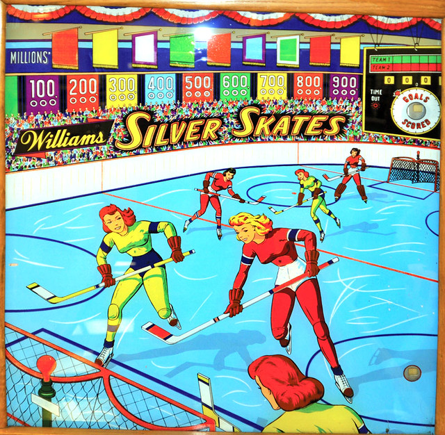
• Speaking of the coin-operated sports gadgets, when’s the last time you saw a women’s hockey pinball game?
• Who’s that on the right? None other than Honus Wagner, taking a rare turn in a basketball uni. Love the sash-like trainer’s insignia, too (full listing).
• What’s better than a pocketknife with baseball imagery? A pocketknife with baseball imagery with its own leather carrying case!
• Great illustrations on this 1956 football card display box.
• There are baseball cards, and then there are baseball-themed cards (full listing).
• I really like this patch design from the 1958 MLB Japanese tour.
• When Bill Veeck introduced the White Sox’s leisure suit uniforms in 1976, he apparently had a jersey made up for himself. Would be stronger with the proper number/NOB font, though.
• Speaking of the White Sox, how about a pair of one of history’s greatest stirrup designs? Possibly the only uniform element ever to feature a sock on a sock!
• Yet another Chisox oddity: a pair of Carlton Fisk pants that were converted into shorts.
• How awesome are these little die-cut baseball figurines? And there’s plenty more where those came from.
• And here’s a great one to go out on: the Big Train in a Navajo-style sweater (full listing).
There’s a new entry on the Permanent Record blog, but it isn’t about report cards. It’s about some stuff that I found in — well, here, see for yourself.
Uni Watch News Ticker: As you probably know, Kobe Bryant suffered a broken nose in the NBA All-Star Game, so he’s now wearing a facemask. ”¦ Here’s the new USA away kit, which debuted yesterday in a friendly match against Italy. … Francisco Cervelli is back to wearing the S100 helmet. ”¦ For the first time since 1948, the NFL will play a game on a Wednesday. ”¦ The St. Cloud Riverbats are now the St. Cloud Rox. ”¦ Here’s a rare treat: footage from the 1999 O’s/Halos TATC game (big thanks to Jack Krabbe). … You probably know that Howard Cosell announced the news John Lennon’s death on Monday Night Football. But did you know that ABC’s crawl misspelled “Beatles”? (Good one from Tom Nawrocki.) … Disturbing to see black Mets logos on the locker stools down in spring training. And yes, that’s not the only disturbing thing in that photo, but one thing at a time. … Apparently they’ve run out of colors for good causes, because the Canucks just gave away pink anti-bullying T-shirts (from Adam Jackson). … Here’s a good question, submitted by Michael Weinstein: When the Knicks used the Yankees-style “NY” logo, why was that legal? Did the Yanks have to give them permission? Or is that logo in the public domain, like the wishbone C? There’s also the question of why the Knicks would wanna use the iconic logo of another New York team, but that’s a separate question. All you legal types, fill us in. … Whoa, what’s going on here? Due to a miscommunication, both teams showed up in their home whites, so the road team had to borrow the home team’s road jerseys (from Chad Fette). … New uniforms for the Kia Tigers. … If you don’t like politics mixed with your sports, skip to the next item. But for everyone else, check this out: The City Council of Kodaira, Japan, where FC Tokyo practices, wore FC Tokyo uniforms at a council meeting as a good luck gesture toward the team (great one from Jeremy Brahm). … Tyler Kepner was in Marlins camp yesterday and says the batting helmets didn’t have the raised/stitched logo appliqués that we saw photos of from the winter meetings. “Just a regular logo decal,” he says. ”¦ Very nice uni match-up last night in Chicago, as the Blackhawks wore white at home and the Leafs wore their heritage thirds, creating a classic Original Six pairing. ”¦ Another interesting tidbit from that Leafs/’Hawks game: “Apparently the trainer pulled a fast one on Michael Frolik,” says Greg Townsend. “He hasn’t had a goal in the past 26 games, so he was given a black helmet for pregame warm-ups while everybody else had white.” ”¦ The Knicks have finally updated their center court logo — no more black, and it’s about fucking time already (screen shot by Ryan Ross). ”¦ My Page 2 colleague Jim Caple has ranked all 30 MLB uniforms. ”¦ This is pretty amazing: A photographer down in Tampa shot all his Yankees Photo Day pics with an iPhone — in a bathroom — and now Getty has picked up the photos (thanks, Kirsten). ”¦ Speaking of Photo Day, this is weird: Remember how the Indians updated their uniforms for 2012? They wore last year’s jerseys for Photo Day (from Michael Strittmatter). ”¦ Georgia Tech baseball has a player named Mitch Earnest, but his NOB is misspelled as “Earnst” (good spot by Douglas King). ”¦ “MLB 12 The Show has a new mode called Diamond Dynasty, where you create your own team and play against other people,” says Caleb Yorks. “What is important is that it seems you can create or re-create any uniform you want. Same goes for logos. Anybody with a PS3 can play this mode and create a 3-D rendering of the uniform. This video shows a little bit of the uni and logo creator.” ”¦ See this Ducks logo tie? Coach Bruce Boudreau was wearing it last night (from Luke Rosnick). ”¦ Someone on the Spurs was wearing a black arm sleeve last night, which created the illusion of a disembodied hand (as spotted by Tim E. O’Brien). ”¦ No photos, but here’s a description of the Cardinals’ World Series ring design (from Michael McLaughlin).
Can take the Vikings off the “move to LA” list.
They got a stadium deal overnight, apparently, and it includes the team signing a 30-year lease.
Will be built on a site just east of the Metrodome.
outdoor?
We wish.
It’ll either be another dome or they’ll go with a retractable roof that they won’t actually open unless it’s sunny & above 70 degrees.
I bet they want a piece of the Big 10 championship pie and potentially another Super Bowl. No chance of either without a roof.
link
didn’t say in that article
however, when i hear the word “stadium,” i don’t think “dome” but rather an open, outdoor structure
we can only hope (and i would think they would, given the [apparent] success of TCF and target) that cold wx football will again be a reality in minnie
Especially since adding a retractable roof for a venue that only gets used 8-10 times a year & costs anywhere from an additional $150 million to $250 million+ just seems like a gigantic waste. Even if it served double as a convention center there’s no point to having the roof open.
Fixed roof, but not a dome.
Fixed roof, but not a dome.
Pyramid?
Click on “full story” for diagram showing the footprint relative to the Metrodome…
link
Just now on the radio, I heard the Chairman of Stadium Commission said Lucas Oil Stadium in Indy is the model, but adapted for multi-use. Gophers and a huge number of small colleges and high schools, for example, still use the Dome for sports such as baseball, football and soccer. Also, many of the state high school football semis and all the finals in all classes are played in the Dome every year. They want to continue as much of that as possible. If it all gets passed the legislative bodies, the city and state will be ponying up over half a billion dollars between them, so I’d say they’re entitled to get some public use out of the place.
Supposedly, depending on construction schedule the Vikings may have to play at TCF Bank for only one season.
Ah, they changed the lead image.
Was a rendering of the inside of the stadium.
Somewhere, Coach Bud Grant sneers at the word “dome” and lowers the thermostat in his house another -10 degrees.
New Stadium
link
49ers, you mean?
That is an old picture of Neyland Stadium, home of the Tennessee Volunteers. I don’t think I completely get the joke here, but I will always recognize that stadium.
Looks like the person who designed that station’s website is a fan of link more than a couple of years…
Update, with specs on the facility:
link
Here’s the deal. Yes, outdoor football would be better, and not just better, but Truly Freakin’ Awesome in Minnesota. And yes, if the Vikings played outdoors, they would undoubtedly win more games, as they would be able to use their familiarity with outdoor winter play to their advantage, as they did under Bud Grant. (The line I heard from several veteran Grant players reminiscing when I was a boy was that Grant would time the length of his practices by how long it took the black guys to turn white in the cold.) But. The NFL has made it quite clear that it will never again schedule the Super Bowl outdoors north of the Texas Panhandle. And a number of other potential stadium uses require climate control.
So the new stadium has a roof, and the Vikings will continue to play football with all the romance and charm of watching TV in your living room. And they’ll fail to win that extra game or two a year that cold-weather conditioning and home-field advantage would otherwise give them, so they won’t be getting to the postseason anytime soon. But they will get to play one Super Bowl in Minneapolis sometime during the life of the stadium, so yay!
On the plus side, the stadium deal apparently has a clause permitting a retractable roof, so long as the public funding is not increased to cover it. Read: If the team feels like paying extra cash for an expensive amenity it never intends to use.
Scott, if I ever have tickets for a December or January outdoor game in Minnesota (unlikely though that is), you’re welcome to use them. I’ve found that sitting in temperatures below 20 is an unpleasant experience, and if I were a Vikings season ticket holder, a roof would be a necessity.
MLB 12 The Show… so close, yet… no. Why can’t they give us the create-a-team without tying it into the stupid card collecting minigame garbage? :( The logo creator itself looks to be really similar to Forza or Backbreaker – meaning that while you *can* recreate just about anything, it’s not exactly an easy task.
UB Bull, Mitchell Watt forgot his jersey for their road game at Akron last night. Had to wear nameless 44 jersey instead of his normal #21. It was also the first time his parents got to see him play during his collegian career.
link
Small coding issue with the Diamond Dynasty ink.
Now fixed.
– Yet another Chisox oddity: a pair of Carlton Fisk pants that were converted into shorts.
Link goes to permanent record
Fixed.
Holy crap that hockey pinball machine is pretty damn cool. Would be a great addition to my hockey room. Too bad it’s 500 bucks.
The Frolik helmet switch is great. Nice lockerroom prank to lighten the mood for a struggling player and team. Always wondered though how the player doesn’t notice when you look at the lockerroom stalls that his helmet is different than everyone else’s. Or even if it’s handed to him at the last second, not notice its black. Love the smirk on Jimmy Haye’s face behind Frolik.
The Hawks usually wear black helmets at home, but with last nights switcheroo, he probably didn’t catch it.
He figured it out about 1 minute into the warmups and he goes over to the bench where they switch it for him. By the time I went to record it on my phone it was over.
I have this game in my basement:
link
Yeah, the artwork is unbelievably corny and totally unrealistic, but it WAS inspired by the Bobby Riggs-Billie Jean King “Battle of the Sexes” match. Although I literally just noticed the the shadows which are supposed to be the ankle bones on each of the competitors look like sideways Nike swooshes.:(
I like the black helmet with the white jerseys. I think one of the minor league teams – Portland Winter Hawks??? – wore it that way.
I never understod why they can’t waer their colored helmets with both uniforms instead of having two sets. Of course, nothing looks worse that white helmets with colored unis.
I mean “wear”. Damn this tiny screen! ;)
“I like the black helmet with the white jerseys. I think one of the minor league teams — Portland Winter Hawks??? — wore it that way.”
Yep. And they link. (It’s a major junior team, actually)
I prefer the dark helmets with the white jerseys, as well. I don’t understand why the only time we see it in the NHL is during the Winter Classic.
And BrianC, you also meant “than” but nobody noticed.
The helmet switch prank you will hear of a couple times a year. This reminded me of when Keith Primeau was with the Red Wings and he played on a line where it was all Russians expect for him. So as a prank the team made up a jersey with ‘Primeaov’ on the back which he ended up wearing for warmups for a game without realizing it.
link
I remember that!
It’s great the Orioles and MLB are putting up a lot of old video highlights to celebrate the 20th anniversary of Camden Yards. They also have footage of every home run launched onto or beyond Eutaw Street.
“…beyond Eutaw Street.”
It would be neat if ‘Utah’ was spelled like this.
Ain’t that how it’s pronounced?
/proud Southerner
turn ahead the clock…the horror…..
RE: Knicks/Yankees logo
link
“There’s an interesting story about that logo. It was designed by the Tiffany company in the 20’s not as a sports logo but as a medal given to the families of police officers killed in the line of duty. The yankees started wearing it as a tribute to those men and then just decided to keep it. So I think anyone can actally use it becuse it’s a new york logo, not a new york yankees logo. I guess the knicks just realized that people would always see it as a yankees logo now, so they ditched it.”
I’m not buying that.
link presented to Officer John McDowell in 1877.
The Yankees took the basic interlocking “NY” design and ran with it, making it uniquely their own.
My thought would be that the Yankees gave permission, or at least didn’t care enough to step in and tell them to stop.
Or an agreement similar to whatever the Packers/Georgia/Grambling have going on with the G.
I’m guessing that had to be it. The Yanks must have been involved somehow, either giving permission at the beginning or asking them to stop using it at the end.
It was always my impression the logo was originally for the NYPD, Hence, anyone can use it if they asked.
If it had been the same logo, then yes.
Although the NYPD could make a trademark claim to restrict commercial use, as they did with their other insignia.
I think the Yankees didn’t bother to enforce the trademark against the Knicks, if a trademark even existed at the time.
At some point, maybe in the 90s, didn’t MLB have all the teams sign over their trademarks to the league in order to set up the revenue sharing system pioneered by NFL Properties? At that point, I suspect the Yankees/MLB informed the Knicks/NBA that they were going to enforce the trademark, and it was time for the Knicks to come up with something new. Which they did, with the Subway Token secondary logo.
“How cool would it be to own this Babe Ruth flip-card movie machine thingie? And look, there’s Bruce Menard placing a bid right now!”
I WISH!
Actually, I’d just love to see the full film clip that’s in it.
“… Here’s the new USA away kit, which debuted yesterday in a friendly match against Italy…”
What a dreadful look. Of course, I would have our lads wear it every game until they lost. Superstition has its uses.
By the way, is there anybody cooler than Clint Dempsey?
I don’t care for it, either. I didn’t like it when a handful of MLB teams started wearing the vests with undershirts, and this has much the same feel. For some reason, Arsenal’s white sleeves don’t bother me as much, but that could be because they also wear white shorts. I also couldn’t make out the sash very easily, kind of like the “silver”-on-white sash they wore in the last World Cup. Why can’t Nike just use a regular sash, like the ’50 WC squad: blue on white?
I may be in the minority but I like the new US away kit. I wish the sash was a little more visible, but I like the idea of keeping a consistent element through different kit cycles. Maybe the sash can become an element that can easily identify the team as the US. International soccer’s biggest teams have iconic looks and the US needs to elevate themselves to that category if not by success right away, at least through their look. Keeping the sash is a good step, next step ditching the dated crest.
Seriously, there’s gotta be enough backlash from the fans to get this thing scrapped.
Clint Dempsey is pretty badass, but unfortunately he’s picked up unscrupulous skills such as flopping while playing in Italy.
The team is also going NNOB and wearing numbers according to their position:
1 = Goalkeeper
2 = Right Back
3 = Left Back
4 = Right Center Back
5 = Left Center Back
6 = Left Holding Midfielder
7 = Right Wing Midfielder
8 = Right Holding Midfielder
9 = Striker
10 = Central Playmaking Midfielder
11 = Left Wing Midfielder
link
Not uni-related, but when did Dempsey play in Italy other than yesterday?
Sorry, I wasn’t thinking there. I should have said England (Fulham).
The team is also going NNOB and wearing numbers according to their position
That’s brilliant.
Very nice uni match-up of Leafs & Hawks at the UC. The way things ought to be.
I’m sure the NFL is thrilled because they got exactly what they wanted: (basically) games & exposure on every single night. Been on every day in my lifetime. Miss the days when my team played most of their games Sunday at Noon. It’s like: yeah I enjoy pizza, but not every single day.
Wasn’t the Detroit old English D used by another local team? Always wondered about the Knicks use of the Yankees NY too. I seem to recall Uni Watch mentioning New York police logo/badges originated or used the interlocking NY first?
Jim Caple… mailing in another one.
No kidding. Right off the bat he misses the mark with the Padres: they should be in BROWN. The rest is filled with too much cutesy pop culture filler rhetoric.
Jim Caple is what he is, and he was trying to appeal to the masses in a fun way. We are not the target audience.
I was just shocked at the order of his teams, in that I think he was actually pretty accurate. I assume he will be put in the ESPN penalty box for not following company protocol by listing the Mets, Yankees, Red Sox and Phillies in some order from 1-4, as those are the only teams they willingly talk about or televise.
I know you’re joking about that last bit. But just for the record, I’ve been writing for ESPN for nearly eight years now and have *never once* been told (or even asked) to write about specific teams.
Did you have words with Caple over his declared love of purple? :-)
Caple has never been my cuppa, but to each his own. However, as a Halos fan, I love that Torii Hunter is often one of his go-to guys for baseball-related items. In that video I noticed Hunter was wearing a very sedate version of the current BP cap (blue, with a red bill, no color panels), which has generally been the Angels M.O. Although I know MLB sells a more colorful version on its site. link
I think Caple was just riled about crappy alt jerseys (esp. the Pads) and stretched it into a column. A little fatuous perhaps, but anyone that takes a good swing at alts is OK by me.
And heck, he referred to Paul as an “expert … who writes a spectacularly comprehensive column”. How can you gripe about that?
Paul- I think you (or one of your fine lieutenants) should publish a more in-depth ranking on UniWatch. I’m not thinking a dissertation on each team’s uniforms but maybe 4-5 sentences on each with the perspective of an expert?
” . . . when’s the last time you saw a women’s hockey pinball game”
When’s the last time you saw women hockey players wearing leotards and bullet bras?
Just to clarify on that Monday Night Football/John Lennon item: It was the local ABC affiliate in Baltimore that misspelled “Beatle,” not the ABC network. Glad you liked the item, though.
Was that a news crawl or closed captioning?
A news crawl. It appeared on the screen a good ten minutes or so before Cosell made his announcement. If you’re interested, I wrote about the subject at greater length here: link
Very cool – thanks!
Re: Indians wearing last year’s unis for photo day.
Although it’s definitely weird, I was glad to read that blurb, because it confirms that I’m not crazy. Last night, Indians IF Jason Donald was being interviewed on the local “Spring Training Daily” program. The shot was from the shoulders up but I could clearly see the blue piping that was allegedly removed for 2012. I couldn’t figure out why he would be wearing that version of the jersey and this morning was actually starting to doubt if I actually saw it. I now have confirmation but it still doesn’t explain why they did it. I have a feeling this is going to annoy me all season when I see Tribe promotional materials that feature those pics.
LSU wore color at home against Tennessee for those interested.
link
….Last night.
Probably a little more significant to see Tennessee in white on the road. I’m guessing they don’t have a BFBS or GFGS uni, and gold vs. orange would have looked confusing.
Is that an odd thing for them to do? Yellow-gold at home in basketball isn’t exactly uncommon… though it’s usually used in place of white rather than against it.
I will say that white vs yellow-gold is definitely a better choice than Tennessee Orange vs yellow-gold.
After a little research, it appears that LSU began wearing the yellow unis for home games at the beginning of February. Before that, they wore white at home. And yes, orange vs. yellow would have been hideous.
The Pirates at number 6 on Jim Caple’s uniform list. Maybe they are doing SOMETHING right by not going back to the pillbox hats and/or the full bumblebee uniforms. I do think the Bucs will get over the hump this year in a weakened NL Central.
As for A.J. Burnett’s injury? He plays for a team that once had a cocaine addict as their mascot. Is anyone REALLY surprised he got beamed in the eye with a baseball once he became a Pirate?
Not all that surprising a pitcher coming over from the American League would have a mishap at the plate. Wasn’t the first, and won’t be the last time this kind of accident occurs.
All the more reason to eliminate the DH.
I wonder if this is a Patrick Duluth sweater/coat?
link
It’s Howard Cosell, not Cossell.
Yes, that’s what I was thinking, oh, the irony of misspelling “Cosell” in a ticker item where you point out they misspelled something, in which case if it was intentional, good job!
Not too crazy about the USMNT new road kits. The white sleeves looked tacky on TV in the Italy match.
I like the shirts in isolation, but the whole uniform looks unbalanced. Too much blue – Arsenal link because they pair them with white shorts. (They look even better link.)
Without any other white on the uniform, the sleeves look out of place.
Ugh.
That should, of course, be white sleeves.
Nobody tell the lads at Ashburton Grove; they’ll take away my season tickets.
The solid white/red/white/red On Arsenal looks great, very balanced.
If the USMT had stuck with simple, they might have been on to something. Once all the little “details” are added things start getting muddy. Striped collar, sublimated sash, stripe on the socks. Too much.
Can’t really agree about the White Sox stirrups being “one of history’s greatest.” When you’re called the White Sox, you could wear red socks and slap images of white socks on them. Or you could, you know, WEAR WHITE SOCKS.
I just like the meta aspect of showing a sock on a sock.
Yo dawg, I heard you like socks… (insert rest of meme here)
IT’S OVER 9000
wait no, that’s not it.
Paul, Paul, Paul.
I know it’s largely purple, but how can you overlook the most amazing item in that MEARS auction – link?
Go ahead, link.
Oh, wow — that is amazing. Mea culpa for missing it.
Holy shit that is cool! I LOVE the Superdome outlining!
LOVE it? *pfft* I WORSHIP that Superdome outlining!
Did a quick search and found a couple of cool Jazz playing at the Superdome pics. At first I thought they were maybe from an NCAA tournament, but they are labeled as Jazz games…
link
link
As a kid, I just thought it was the coolest thing in the world that the Jazz (and Sonics) played in domes. It made them seem like such a big deal.
i saw the dream team play in the georgia dome… twas as awesome as you think it would be!
Wow. That thing is amazing. I’m not surprised that it sold for over $18 grand.
I’d imagine the buyer insists that he’s not rich, too.
the pink t-shirt thing is part of anti-bullying day. there’s an article on yahoo about a people being upset over lady gaga’s music being used in a video to promote the pink shirts, and it also explains the origins.
link
At least they only lost one letter from his name. To lose two would seem like carelessness.
On the Nellie Fox tobacco display, the pouch shows Jim Lemon of the Minnesota Twins (in an “M” cap) and Dick Donovan (in a 50s era “W” cap). They knew which teams the players were on, but not the insignia for each cap. Must have been printed after the end of the 1960 season.
The pink shirt that David Booth of the Canucks was wearing is for anti-bullying day, which is on the last Wednesday of February every year and had been for the past couple of years. The day is known as Pink shirt day and is celebrated nation wide throughout Canada.
Just to add some context to the pink anti-bullying t-shirt discussion….
The reason the pink t-shirt got attached to the anti-bullying cause is because of a couple of students in Cambridge, Nova Scotia, who witnessed a fellow student get bullied for wearing a pink golf shirt on the first day of school. They went out and bought 50 pink shirts and handed them out to friends to wear to show solidarity with their pink-shirt-wearing brethren. Since then, it has become a national awareness day throughout Canada that is celebrated in most schools.
i can’t imagine why anyone would get beat up for wearing a pink golf shirt to school
I think that’s the problem.
Nice DCI (Drum Corps International) logo behind Bruce Boudreau.
St. Cloud “Rox?” Ugh. When will marketing “geniuses” stop naming teams ridiculous things with x’s and singular titles?
They were the Rox 60 years ago.
Maybe even before that.
I saw Lou Brock play for the St. Cloud Rox of the Northern League when he was Cubs’ farmhand. Was called Class “C” ball then.
link
link
One more…
link
I believe Orlando Cepeda and possibly Felipe Alou also played for the Rox (a few years before Brock) when the club was affiliated with the Giants.
Yes the link and all of their link must be stopped.
One month.
I think it’s great that Thing from The Addams Family is now playing ball for the Spurs. It just goes to show that disembodied hands can lead productive lives too.
HA! I made similar joke to a buddy of mine last night:
“Thing from The Addams Family is a rapacious defender.”
Anyone else heard about this Beren Academy Boy’s Basketball situation? Just saw it on the Mothership, and most (if not all) of the players were wearing Yarmulkes (I hope I spelled that right) during the filmed game used for the story. This is an Orthodox Jewish High School in Houston, TX.
link
Who says white boys can’t jump…
bad link, here’s the fix – link
ACTUAL LINK – link
Also, they have a bunch of different yarmulkes link but that one kid seems to be wearing the game-day official yarmulke link (scroll down for the picture. Damn no direct linking…)
bad first link, here’s the fix – link
link
Sorry, f’n internets
i quit.
*touches your shoulder and points to the sky/horizon*
Bad links
Bad links everywhere
ACTUAL LINK – link
SORRY, tim no understand internets. broke link make tim sad. tim cry tears.
Photobucket hates Tim E. That is all.
fuckin kids
“…Yarmulkes (I hope I spelled that right)…”
link.
nice job, jimbo
Hahahahahaha:
link
That is mean, but hilarious.
As a Buccos fan, I can only laugh the pain away
That is not right.
But it’s funny…
Fucking brilliant.
Yeah, that 1960-67 logo was pretty silly-looking…
Seriously, though, it’s interesting that the original patch-inclusive logo featured the patch on the left eye but when they brought back they eye patch, it was moved to the right eye.
Well,it’s interesting to me, anyway.
Obviously, this was supposed to be a reply to Paul’s “Hahahahahaha:” comment.
The Babe looks suprisingly svelte in that cardigan.
*surprisingly*
link
Interesting Iowa State uniform concept as a Jack Trice tribute……
We’ll probably never know what the Yankees thought of the Knicks’ use of the interlocking “NY” logo. Attorney-client privileged information.
The Knicks weren’t the only New York team that appropriated the use of the interlocking “NY” from the Yankees. The football Giants used a rather inconsistent version of this. Here’s a team picture of the 1958 team. While most of the coaches appear to be wearing what appears to be a DIY replica of the Yankees interlocking “NY,”, there are also a couple of examples of the version the baseball Giants wore, i.e., with the “Y” set more as a subscript to the “N.”
link
Oregon State Beavers To Wear Turquoise Nike Uniforms Against Utah tonight link
Knicks center court logo looks good. I think the whole era of adding black to uniforms to attract the young hip hop crowd (a team actually responded to me with those exact words) seems to be coming to an end, thank goodness.
link
Really? Ugh, I don’t care how “‘sociologically’ accurate” or “inclusive” the Spanish-named jerseys are, but can I just say no me gusta?
They probably didn’t want to put a feminine noun on there. It would be La Magia.
That guy ranking the MLB jerseys ranked the A’s at number 20 cause there’s not enough “yellow.” They’re alternate home jersey is “yellow.” A’s are number 1. GO A’S!