Seems like everyone has a different level of tolerance for the pink-uni thing. But whatever your pink threshold may be, I think we can all agree that this is a bit much:
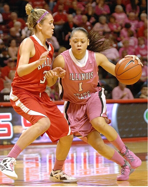
That’s Illinois State vs. Bradley, from this past Sunday. As you can see, the Redbirds became the Pinkbirds for that game, which would have been just garden-variety annoying if not for the fact that Bradley wore their usual road reds, creating one of history’s worst — and, I’m sure, most visually confusing — color-on-color games. You can see more photos from this game here.
This would be bad enough as a one-time fluke. But this wasn’t Sunday’s only pink-vs.-red game in women’s college hoops. Take a gander at the Rutgers/St. John’s match-up:
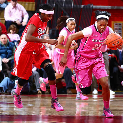
Incredible. Additional photos from that one are available by clicking the “Photos” button on this page.
In both cases, couldn’t the road team have worn their home whites for the occasion? Or black? Or platinum gray? Putting red and pink together on the same court just makes no sense. Hard to fathom how the officials allowed it, too.
Speaking of which, remember that high school team in Nebraska that was recently assessed a technical foul for wearing pink, instead of white, at home? That was a pink-vs.-red game too, although in that case the pink was lighter and the red was darker, so there was a lot more contrast.
The last thing I want is to sound like I don’t care about women’s health issues, especially at a time when certain factions are trying to restrict women’s access to contraceptives (yes, in 2012 — amazing). But come on, pink vs. red? Enough already.
(Special thanks to Gordon Blau and Joel Hackler for bringing the two pink/red games to my attention.)

Collector’s Corner
By Brinke Guthrie
Reader Steve DuHamel sent in bunch of items from the 1970s WFL team the Hawaiians. That got me thinking about the WFL (who can forget the Southern California Sun?), so I started poking around. Lotta great stuff out there, like this crock of coasters!
I also found this 1974 Chicago Fire Media Guide. It immediately occurred to me that I had seen that cover illustration before, and I had: I had drawn my own version of it back in the day, to suit my local team.
As for non-WFL items, here’s this week’s rundown of eBay goodness:
• Great item here, a 1960s SF Giants kitchen apron. “To Hell with Housework, let’s go see the Giants play.” She looks like she means it, too. [This is one of the greatest items ever featured in Collector’s Corner! ”” PL]
• From reader Keith Bangs, check out this set of NHL marbles. [Ditto! ”” PL]
• Ah, Tudor’s 1975 “NFL Power Sweep” game — they had me when I saw the opening shot of the box lid.
• Lotta great NBA logos on on these 1970s bed sheets.
• And to go with your sheets, here’s a nice 1970s NFL team logo towel.
• Vintage jacket. Sears. Patriots. Wear it proudly while you cruise your school playground blacktop on this 1979 Sears bike with an NFL head badge.
• Nice 1970s NY Giants gumball helmet buggy. And note the photo on the card with all the helmet buggies lined up!
• This must be a 1970s NFL Helmet Bank. Says so right there on the side.
Seen something on eBay or Etsy (or anywhere else) that you think would make good Collector’s Corner fodder? Send your submissions here.
What’s the matter with Kansas? Ben Traxel hepped me to a great little story, as follows: A five-year-old girl in Olathe, Kansas, was given a Jayhawk logo by her kindergarten teacher as part of a coloring exercise. But the girl comes from a family that hates KU — they’re big Kansas State fans. So she refused to color the Jawhawk, and her parents ended up printing out a K-State logo for her to color instead.
Thankfully, no teacher ever asked me to color in a Yankees logo when I was a kid, but I wonder how I would’ve responded. I know for sure my father would have supported me if I’d refused to have anything to do with it — we were a National League family all the way.
Meanwhile, speaking of the Jawhawk logo, is there anything that can’t be Jerry Dior-ized? (Thanks to Adam Jackson for sending that one along.)
Shaving technique: As many of you know, I have a rather large pencil sharpener collection. As most of you don’t know — but some of you might logically surmise — I’m also a big fan of the cartoonist David Rees and his awesome comic strip Get Your War On (now sadly discontinued). So I was intrigued when Rees recently began a new project based on a very specific activity: artisanal pencil sharpening.
Rees has authored a new book on this weighty subject, which will be published in April. Last night, in preparation for his upcoming book tour, he did a reading and sharpening demonstration at Pete’s Candy Store, and I don’t mind saying it was quite the edifying experience. By the evening’s end, even I — a relative sharpening savant, by virtue of my large collection — had learned a thing or three (not the least of which was that David Rees is even more entertaining in person than he is on the page or computer screen). I can only hope that your own Monday night was spent even half as well.
Party reminder: Uni Watch gathering this Saturday, 6:30pm, at the Devil’s Den in Philly. See you there.
Also, Phil and I will be attending the USA Curling Nationals just outside of Philly this Friday and Saturday. Tickets are cheap, so come on down and join us.
Uni Watch News Ticker: What’s arguably even worse than red vs. pink? How about white vs. gray (from Archie Troxel). … Middle Tennessee State wore blue at home on Saturday (from Britton Thomas). … “My buddy from grad school came into a class wearing this beauty of a warm-up jacket,” writes Scott Leighty. “He’s a Loyola Chicago grad and says he found the warm-up jacket in a closet. He said that at the time this warm-up was used, they were known as the Runnin’ Ramblers, rather than just the Ramblers, as they are today. He also noted that they changed their logo because, in his words, ‘The hobo running around was deemed politically incorrect.’ As a result, they switched to the wolf-based logo (which recently got an update).” … Yesterday I Ticker-linked to Kansas’s throwback uniforms, which they wore over the weekend. What I didn’t mention — because I didn’t know about until Justin Stuewe told me — was that the Jawhawks’ cheerleaders wore some spectacular throwback outfits of their own. … Another minor league hockey team with an unusual sweater: The Belleville Bulls had raised money for a local hospital by wearing a jersey that featured the team’s logo character wearing a stethoscope and a head mirror, plus medical crosses on the shoulders. I like (from Jonathan Deery). … Check out the Yankees and UConn decals on Tiger’s caddie’s yardage book (good spot by Wade Manley). … Wanna drink a sports drink out of a helmet-shaped bottle? Here you go (from Brice Wallace). … “I am a member for the track team at Central Connecticut State University,” writes Anthony Gonsalves. “Recently I was competing at our NEC Indoor Conference Meet in Landover, Maryland. Before the race I went to check in and was given a race ‘hip’ number (these are the little stickers you put on your uniform that display which lane you are in). The official was giving us the usual instructions when he said something weird: ‘Numbers go on both hips and the upper left. If you don’t want to cover the Nike Logo that is fine — just put it lower (on the uniform).’ The weird thing is that most track uniforms have school name or logo beneath the manufacturer’s logo, so he was basically telling us we could put the sticker over our school name. I’m assuming the official has been asked many times if it was okay to do that. It’s just that I thought it was strange that people would rather cover up the school that they represent instead of a Nike or Adidas logo.” Indeed. … A Toronto newspaper is encouraging readers to submit design ideas for the Maple Leafs’ 2013 Winter Classic uni (from Ewan Williams). … Also from Ewan, a pair of Aussie rules football items: an article about players who wear black shoes and news that NFL-style sticky gloves may be banned. … Reprinted from yesterday’s comments: The Marlins are unretiring No. 5 for Logan Morrison. And the family of the guy for whom the number had previously been retired isn’t happy about it. … “Thumbed through a big football coffee table book called Guts and Glory over the weekend,” says Scott Little. “Lots of great pics in it, including one of a Dallas Cowboys cheerleader dancing around with a Confederate flag.” … Here’s an interview with the head of a company you’ve never heard of, which supplies uniforms for a league you don’t care about Moneyball Sportswear, which outfits the National Basketball League of Canada (from Ben Trattner). … New lacrosse uniforms for BYU (from Dan Graham). … Alan Kreit notes that Henrik Lundqvist has his name and personal logo on his leg pad. … “Sigh, my wife has a douchey cousin who decided to get this tattoo over the weekend,” says Andrew Lehman. “Bet you can’t guess who he works for.” … Guess what Bill Belichick wore at Pebble Beach? If you said, “Duh, a gray sweatshirt,” you’re right! (Thanks, Brinke.) … A Brazilian blog has leaked the new away kits for the Netherlands, Portugal, and France. ” Looks like they’re using a new fabric,” says Christopher Peterson. “You probably remember that FC Barcelona had complained publicly that the new Nike material became much heavier during the game, and even weighed their shirts at halftime. I’m guessing this material performs better.” … Pete McNally has a big-ass Mets jersey collection — including a rare Mercury Mets specimen. … Snow games aren’t just for football. That’s an England/Italy rugby match played in Rome over the weekend. “The TV crews abandoned the high-angle camera early on, since England sort of blended into the snow,” says Caleb Borchers. ”¦ Here’s a mind-fuck: Wayne Gretzky in a Blackhawks uni. That’s from the Great One’s fantasy camp (from Ben Van Mierlo). ”¦ Andrew Levitt got a tour of Camden Yards and took some pics. I was particularly intrigued by this — like, how many players bike to the ballpark? Also, I didn’t realize the Commissioner’s Trophy had an ugly-ass copyright line on the back. Woof! ”¦ If you looked at this old Pirates pennant, you’d probably think it’s for the baseball Pirates. But no — it’s actually for the old Pirates of the NFL, who played from 1933-39 and then changed their name to the Steelers in 1940. How can you tell? Because the same logo on the pennant also appears on the back of these warm-up jackets, which Jeff Flynn, Jr. spotted while watching some old Steelers footage. “It’s the first time I’ve seen a pirate head logo for the original Steelers,” he says. “I’ve seen that pennant a lot over the years and never identified it as an original Steelers item. I just assumed it was a bootleg baseball Pirates pennant.” ”¦ Hmmm, new helmet in the works for Western Michigan? “That was posted to a friend’s Facebook page, and he’s a WMU player,” says Steve G. ”¦ Mike Carp of the Mariners has designed a T-shirt to pay tribute to fallen teammate Greg Halman, who was stabbed to death in his native Holland back in November. For now, the tees have been distributed among the Mariners’ players, but they may be made available for retail sale soon (from John Doodigian).
Northern Kentucky vs. St. Joseph game also had pink jerseys Saturday
Yeah, but that wasn’t pink vs. red — it was pink vs. black:
link
The Great One actually looks pretty good wearing a Hawks’ sweater.
What’s arguably even worse than red vs. pink? How about white vs. gray
Indeed. White vs Gray shouldn’t be seen in any sport. ;)
Except baseball. Then again, there’s generally little doubt as to who’s playing whom in baseball, as it’s 9 against 1-4 on the field of play at any one time (not counting brawls, or coaches standing in foul territory), and the 1-4 are confined to a 360-foot path.
Color on color for last night’s Beanpot final.
link
That’s a nice-looking game.
What did you think of the Eagles’ get-up?
Not wild about that color. Seems to work for them, though.
There were a handful of other pros that played in that fantasy camp too. Would be cool to see pics of them in those unis. Leetch, Joesph, McSorley, Tocchet, Fuhr were all expected to be there.
Red vs. Pink happens all the time in Palermo (well, with some black thrown in there…)
link
link
Yeah, but there’s enough contrast between the lighter pink and the much darker shade of red in that case (particularly with that second photo, when you have a red-black stripe combo) that it’s not as much of an issue. Plus, you’ve got contrasting shorts with those kits.
Having teams in all-pink vs. all-red where the red is particularly bright just isn’t a good sports look at all.
Just noticed that Virginia Tech wore grey throwbacks on 1/25/12 against BYU in basketball. Complete with black numbers and font outlined in orange.
Normally, I would hate this with a passion as VT is neither black nor grey, but since they are throwbacks and say “VPI” on the jerseys, I can excuse it. Before the burnt orange/chicago maroon colors of the present, Virginia tech was grey and black.
So this is excusable…but barely.
link
Click on the BYU game to see photos.
Ehh, not excusable. Tech’s colors quit being black and gray when they quit being Virginia A&M. In fact, the orange and maroon coincided with the switch to VPI. I can’t find any backup, but I want to say that Nike retrofitted some kind of “tribute to the Corp of Cadets” explanation for the gray when these first came out a year or two ago.
Also, the ridiculous cookie-cutter regular template grays against UNC were terrible.
Those aren’t throwbacks. Those are regular uniforms using Syracuse’s HyperElite template from the Nike Team Uniform Builder. This has been happening as of late: people confusing a retro-inspired/mash-up uniform with an actual throwback. The Braves’ new cream alts aren’t throwbacks because they *stupidly* excluded Chief Noc-A-Homa (hope I spelled it right) on the jersey sleeve. The Steelers’ (soon-to-be) discontinued retro alts from 2007-2011 aren’t throwbacks because of the white cleats (should be black). Teams should either get the details right with a throwback (while considering today’s technology), or else they can’t call it a throwback.
The Steelers’ (soon-to-be) discontinued retro alts from 2007-2011 aren’t throwbacks because of the white cleats (should be black).
Give me a break. The white shoes don’t make the uniform not a throwback. By that standard, then the lack of proper sleeves also makes it not a throwback. Which basically means that every throwback uniform of the past 20 years wasn’t really a throwback. That’s just silly.
If anything makes it not a throwback, it’s the black facemask and the “Steelers” on the logo rather than “Steel”.
Let’s just say that the line between “throwback” and “retro” is really, really thin.
I can completely agree with both of those statements. And obviously I don’t know my VT history as well as I thought I did.
That being said, as a good Virginia Tech student, I pay zero attention to our basketball program.
“Wanna drink a sports drink out of a helmet-shaped bottle?”
No. No I don’t.
I HATE COPYRIGHT AND TRADEMARK MARKINGS ON STUFF.
yeah, I know they are “needed”, but they sure f*** up the looks and majesty of stuff.
I don’t know why they wouldn’t just put it on the bottom. At least they tried to put it somewhere out of the way instead of ruining the balance of the trophy from the front.
Former O’s pitcher Jeremy Guthrie was a cyclist, so it’s probably for him. I think a few of the other players used it too because they live so close.
link
Yes, Guthrie was the main catalyst of the “bike to the stadium” initiative among the players, but it did catch on with a number of other guys on the team. They actually built that rack due to high demand; here’s a picture Guthrie tweeted of player bikes in the hallway prior to the installation of a proper rack: link
Wow — as a daily cyclist myself, I really like that!
See…there actually are a few things the team does right!
NESN had a little in-game feature/interview with Guthrie about the bike rack when the Red Sox were in Baltimore last season. Can’t find the video, though.
I’m not a fan of red vs pink, but how is it different from royal blue vs light/powder blue?
It’s different because the pink uniform is a special-occasion design that the team *went out of its way to wear.*
Also, there’s pink and there’s pink. Hot pink, as Rutgers wore, is, aside from being just plain ugly, too saturated. At least the more pastel pink of the Illinois State unis was both easier on the eye and a little easier to see as distinct from the opposing team’s red. That’s the hue of pink that would work for a pro team, if there were any pro teams with the manly confidence to step beyond the run-of-the-mill sports team colors.
They are both terrible. Gold and grey are the only suitable alternatives to white as a home uniform.
As for the Kansas cheerleaders’ throwbacks — yes, they are great from the waist up and about three feet too long. Show some athletic leg for goodness sake’s! :)
Respectfully disagree. Tulane (an apparent favorite among many UW readers for their unique school color combo) could go sky blue at home.
Silver, gray, yellow-gold, metallic-gold, light blue, neon green and creamsicle orange would all be perfectly acceptable as white replacements. Light pink and lavender would also work if they were actually used as team colors anywhere.
Yes, count me as one of the Tulane lovers.
I think most pastels could work as a home color – maybe purple would be an exception to that. But the away team’s contrast should always be taken into account. Sky blue isn’t a good choice if the away team is royal blue, obviously.
There’s usually a bit more contrast between royal blue and powder blue, though one is probably more likely to see a navy vs. powder matchup.
Have the Tarheels ever played the Blue Devils with both teams wearing their respective blues?
No, and I doubt you will see that. I don’t think I’ve ever seen either team wear blue at home, though Duke once wore black at home early in the the year it debuted that uniform.
Buffalo also wore blue at home on Saturday.
I’ve seen a few (ok, 2) WS trophies up close, and neither one had a copywrite on the back
Here are a couple links from Google images that show a side view, and that plaque isn’t on either
link
link
Saw the A’s 4 at Fanfest and don’t recall seeing that on any of them. I think I’d have noticed, but can’t say for sure.
“… A Brazilian blog has leaked the new away kits for the Netherlands, Portugal, and France… ”
Almost right. The blog leaks the new Away kits of Netherlands and Scotland, and the new alternates (“suplentes”) of France and Portugal. The Dutch Aways are all-black and all-awful. The other kits are rather good, I think, with Scotland’s being downright beautiful.
Great site, btw: Todos Sobre Camisetas (Everything About Soccer Jerseys). Love the easy mix of Spanish, Portuguese and English, e.g., “Away Kit de Holanda para la EURO 2012.”
Well, I guess that NBA bedsheet (which appears to be specifically from 1971-72, since it has the ball-crown logo of the Cincinnati Royals alongside the funky script of the Seattle Supersonics) confirms the “14” in the Warriors’ logo from that era. I’ve seen it up on SportsLogos.net and wondered about that…
Definately ’71-72 – it has what was then the Braves’ new logo, plus the final years for the Royals & Hawks logos.
Every image I’ve seen of the Warriors logo from that era has the 14 in the circle. I’m yet to discern why – I’ve always assumed it was for Tom Meschery, the first Warrior to have his number retired.
Being a track and cross country guy, that little bit you mentioned about covering up the school name with your race number is probably one of the most disrespectful things I’ve ever heard. Unless you’re a professional runner, who needs to see your sponsor logo? When I ran in high school, I wore my cross country race numbers under my school name (and it was still visible) and my hip number on my right hip, with my sponsor logo on the left hip of my shorts. Completely idiocy by the part of that race official.
There is no link to click on for the National Basketball League of Canada interview.
No link to the Moneyball Sportswear article.
Thanks — now fixed.
Here’s the proper link:
link
So busy thinking of that clever jab in the text that you forgot the link, eh? ;-)
“… Snow games aren’t just for football. That’s an England/Rome rugby match played in Rome over the weekend. “The TV crews abandoned the high-angle camera early on, since England sort of blended into the snow,” says Caleb Borchers…”
England/Italy, not England/Rome. Part of the Six Nations Cup, in which the UK is disaggregated into England, Wales, and Scotland. Then there’s France, Ireland, and cellar-dweller Italy. The Ireland/France game in Paris was postponed because of snow and ice on the field, a decision that the hearty Gaels found incomprehensible.
Thanks. Will fix.
The French weren’t happy either. But it’s a safety issue.
“The French weren’t happy either.”
~~~
are they ever?
Would you be after refunding the gate for a sold-out Stade de France? Or if you were on the team, getting all stoked to play, only to have the match postponed shortly before kickoff?
i meant that in a more general sense
I am now thoroughly in love with this link pennant. I’d like to send it an old-timey sports-themed Valentine’s card.
My high school used to have a logo VERY similar to the one on that pennant. It’s been over ten years since I’ve been inside the gymnasium, but we had that logo painted on the wall. I wonder if it served as the original inspiration.
Those old pennants were awesome
Especially that Pirate one.
A good mix of Uni Watch and Valentine’s Day:
link
Fabulous!!
Agreed … and approved by The Comics Code Authority! So we know it’s OK!
“Barger died on Dec. 9, 1992, before the Marlins ever played a game. The Marlins retired the number because his favorite player was Joe DiMaggio.”
I hate “symbolic” number retirements, be it for owners, coaches, “the fans”, whatever. If you didn’t wear the number it shouldn’t be retired. Period.
Agreed, it just doesn’t make sense. If the organization wishes to honor management or the fans, there are other alternatives. For example, something done at the home stadium or arena.
Much like my point below. (Later post because it took longer for me to compose…)
I think the Indians’ 455 retired for the fans works, since no player would wear that anyway. It’s an entirely symbolic retirement that doesn’t affect the team on the field.
But there are still other, better ways to commemorate that than pretend-retiring a pretend number. Like designating a Section 455, or naming some stadium amenity 455. Retiring a number is a way to honor a player, just as erecting a gravestone is an appropriate way to honor a dead person. It would be as weird to put a grave marker at home plate to honor a living player as it would be to retire a number to honor a dead non-player or fan accomplishment.
JERSEY GEEKS TO GATHER IN PHILLY:
link
Besides us, he means.
I heard on the radio yesterday that the Bulls are wearing red at home tonight. No word on whether the Kings will break out some “special” unis for the occasion.
I think it’s just the Bulls doing their annual red for Valentine’s Day thing. They’ve been doing it for a few yrs now.
Probably. And the road team has worn white for those games.
I was actually at the game vs. the Bobcats last year and nobody sitting near us could figure out why they were wearing red. It didn’t occur to anyone that it was a V-Day thing because it was Feb. 15th. The reason dawned on me on the way home.
I think we can rule out pink unis for Sacramento, but I suppose purple or black isn’t out of the question.
Teams shouldn’t retire numbers for non-players, period. I think it’s silly that the Pistons have retired number 2 for Chuck Daly (representing the 2 championship teams he coached), that the Angels retired 26 for Gene Autry (the “26th Man”), or that the Wild retired number 1 for the fans (any retirement of an eligible number for “the fans” is patently ridiculous).
You can honor such people in other ways, even hang a banner for them (the Pistons have a GM banner for Jack McCloskey, and Bill Davidson’s signature hanging above the retired players’ numbers as of this season). But taking a number out for someone who never wore that number on the field of play for that team is a bit much.
League-wide retirements are a bit of a different animal. I can somewhat accept them, but it still comes off a bit odd that, say, someone for the Tigers can’t wear 42 (except on the day where everybody confusingly wears 42), or someone on the Canucks can’t wear 99.
Teams shouldn’t retire numbers
Fixed.
Nah, it’s OK to retire numbers. But only rarely, and only for players who pass the test that, if you’re going to have retired numbers, you couldn’t possibly NOT retire their number. For most teams, this should be no more than about three numbers per century of play. If a team wants to honor someone other than a player, retiring a number is never an option. You can name the Barger Home Run Porch or whatever, but it’s absurd to retire a number for a non-player.
Limiting the retired numbers to three per century is difficult to judge without the benefit of a time-travelling De Lorean.
How would one know that Mickey Mantle would have been so good if the Babe, Gehrig, and DiMaggio had already had their numbers retired? Mantle would be SOL if the three-per-century rule was steadfast.
Personally, I think that teams should honour numbers worn by players, but I don’t believe the number should be taken out of circulation. For a team like the Montral Canadiens, there are 17 numbers no longer in circulation as per their team, and the vast majority are the lower numbers that players like to wear.
Retiring numbers makes little sense when you consider that Maurice Richard will always be associated with #9 in Montreal as compared to Joe Drifter who joined the team as a fourth-line free agent.
Not a rule, a guideline. Of course there will be exceptional clusters of talent as with the 20th century Yankees. But almost all teams, including the Yankees and Habs, retire too many numbers. So the question for someone like me who kind of likes the tradition of retiring numbers is whether it’s possible to do it with appropriate moderation, or is the devolution into ridiculous numbers-retirement inherent in the practice? If the latter, then that would negate the case for retiring numbers.
Good question, Scott. Since all of the numbers that have been put into retirement have been, for the most part, within the last 100 years in all sports, maybe the latter is true? After all, Gretzky was great, but he had little to no monetary impact on franchises that came after he retired. You can make the argument for that he did a ton of good for the game, but then why hasn’t his number been retired at other levels of hockey?
(I could go all day on this one. But back to the dynasties…)
When looking at teams such as the Yankees and Canadiens, they pretty much set the benchmark for success in their sports. No one has more championships, and, arguably, no teams have had a more historical collection of superstars that brought home those accolades.
Should some of their players be penalized because they had so many good players that we hold the retirements of numbers for those two teams to a loftier standard than, say, the Nationals or the Blue Jackets? If yes, we’re creating a slippery slope on which we base retiring numbers.
Don’t forget the Seahawks retiring #12, or the Heat retiring #23…I can’t stand either of those.
The Seahawks don’t have a great track record with retired numbers. They “unretired” #80 for Jerry Rice in 2004, after it had been retired for 12 years in honor of Steve Largent, but still had the retired number banner hanging in the stadium that year. So weird.
What’s worse, the Heat retiring #23 or #13? Michael Jordan didn’t play for the Heat, but at least he played basketball. Dan Marino didn’t play basketball, but at least he played for a Miami team.
23, definitely. For one, 13 is actually only honored by the Heat, but still in circulation. The idea’s still lame, though (should the Panthers and Marlins “honor” 13 for Marino as well? I think not!).
The other thing is that it’s one team acting on its own to retire the number of an opponent. It’d be like the Red Sox retiring number 7 for Mickey Mantle!
By the way… the Marlins retiring a number for a team official that died before they ever took the field, only to unretire it for a player two decades later? The Heat retiring a number for a player that never suited up for them, and honoring the number of a player from another sport?
link
*smh*
David Rees is filling a need I didn’t even know I had…
Freddie Solomon passed away, yesterday. Upon hearing the news, the mental image I had was of Freddie wearing black shoes, when everyone else wore white. I searched for a pic of him and he’s wearing white, in all of them. However, I did come across this article that mentions him wearing his “lucky black shoes” against the Dolphins in the Super Bowl.
link
RIP 88
New mizzou uniforms. 4-14-12
link
The Antigua and Barbuda national soccer team is having a “name the team” contest (or, more specifically, a “nickname the team” contest).
You may know that Mexico is “El Tri,” Trinidad & Tobago is the “Soca Warriors,” Jamaica is the “Reggae Boyz,” Costa Rica is the “Ticos,” etc.
Antiguans have the choices of Beach Boys, Benna Boys, Benna Rebels, Black Ants, Iron Bandits, Wadadli Jam Bulls, Party Crashers and Rhythm Warriors.
(“Benna” is apparently a Calypso-like genre of music. “Wadadli” apparently comes from the original Amerindian name for the islands, “Oualadli.”)
link
Party Crashers is good.
I don’t know what “wadadli jam bulls” means, but I like it.
“Jamaica is the “Reggae Boyz,””
~~~
GTFO…really?
Oh, yes.
The national stadium in Kingston is nicknamed “The Office.” Visiting teams frequently comment about a strong…herbal fragrance emanating from the stands.
I smell major fail coming in that Mapleleafs “Design the Winter Classic Jersey” contest. Just freakin’ do a throwback from any Leafs jersey from the 60’s on back and it’ll look fabulous.
-Jet
I’m more concerned about them going the rather bland route that the Rangers and Flyers took with their rather similarly-designed unis with no prior historical value.
That, and going off-white. Baseball teams can get away with cream unis. Hockey teams just look like [insert steady 2-minute stream of vile Angry Video Game Nerd-inspired profanities] when wearing “vintage white” over the white ice. (Teams with “wheat”/”sand”/tan in their actual color schemes are exempt, though it should only be limited trim, not a primary color.)
It’s just a newspaper contest. It’s not binding on the team or anything…
If the Kansas cheerleaders are going to wear time period-specific sized uniforms, so should the players. Also, that Adidas logo pops out way too much for a throwback design.
Not sure if anyone here would have any info, but is there a place online that I could purchase an NBA referee jersey? I’m looking for the same style that is currently being worn but haven’t had any luck.
Thanks in advance!!
The Red vs. Pink game is almost as confusing as the Wisconsin (in red) vs. Illinois (in orange) game back in 2004.
link, eh?
Hey Paul!
Florida’s women’s basketball did a pink game last week (2/5/11) vs Ole Miss. It was Pink vs. dark blue.
Link here: link
“certain factions are trying to restrict women’s access to contraceptives”… who?
Well, it’s the “evil” Catholics who obviously don’t care at all about women’s health. The Catholics don’t really see it that way, but I think that’s what Paul was getting at.
Who said anyone’s evil? And why did you put that word in quotation marks? You’re not quoting anything Paul has written today.
It’s certainly not just Catholics that are behind such efforts. Is Rick Santorum Catholic?
And really, is it Catholics or The Catholic Church? Big difference.
While I agree with your statement, you should know that Rick Santorum is Catholic.
Shit. That’s right. He is. I meant Rick Perry, but he’s no longer relevant, so I went with the other Rick.
“Is Rick Santorum Catholic?”
~~~
does a bear shit in the woods?
A bit judgmental, aren’t we?
Let’s stick to unis here. Or is that request only honored when someone utters a non-liberal comment?
I’m to the left of Castro.
The statement caught my eye… There is a big difference in saying; a) Catholic/other health care initiatives should not be forced by government to provide birth control services and b) trying to limit women’s access to contraceptives.
There’s also a difference in saying, a) McDonalds drive through should not provide shots of Jagermeister and b) alcohol should be banned everywhere.
Somebody seems to be drinking the NY Times editorial page’s Kool-Aid!
check me if i’m wrong, bobby, but i was under the impression that catholic institutions were refusing to PAY FOR certain health coverage (i.e. birth control) for their employees — not being obligated to provide them…
ergo, trying to limit women’s access to contraceptives
the government never was nor is trying to force catholic hospitals to perform abortions or provide birth control, merely to require that they provide for them in the insurance plans for their employees
im sure there are certain organizations (religious or other) who have a moral opposition to say, covering viagra or liposuction or breast implants after cancer surgery…or say, detox or rehab for drug addicts — there is no difference here; moral objections are fine, but if every organization has a moral objection to coverage, NO ONE would have anything covered by insurance
if you don’t want the government meddling in the affairs of private citizens or organizations, you have a fair argument…when those organizations receive government funding, that argument is far more specious
That doesn’t limit access to contraceptives. Phil, if you and I were outside a bar, and I refused to pay for your cover charge, I would not be restricting your ability to enter the bar.
This is a manufactured political issue. I’d much rather the politicos discuss issues of real importance…like the looming possibility of Nike effing up the NFL uni’s like they have 0regon’s uni’s!!!
For the record I think you are good people, and would pick up your cover charge and the first round.
Amen, Bobby. I’ll buy the second round.
all very true bobby, with one caveat — the catholic church, under the guise of a “moral” objection, IS refusing to follow the patient protection and affordable care act
my point, i suppose, isn’t so much that they are denying women access to contraceptives so much as they are forcing them to go outside of coverage other employers are being required to provide…
let’s, for argument sake, say that obamacare requires coverage for lipitor — but for whatever reason, my employer has a so-called “moral” objection to providing that insurance coverage…instead of a $20 co-pay, i have to spend say $300 for that medicine; they’re not denying my purchasing it, but they are limiting my access to it, especially if i can’t afford the $300
now, that being said, there were so many exemptions and exclusions already built into the law (the “cornhusker kickback,” the “louisiana purchase,” the 1,000 or so small-businesses in Rep. Pelosi’s congressional district who are exempted, etc.) that it seems like one more isn’t going to kill the whole deal
the point is that either everyone should be required to follow the law, or no one should…to give exemptions for ANY reason, whether it’s because you were paid off for your vote or you have “moral” objections — that’s just wrong
now, if you want to tell me the government has no business in people’s personal lives to begin with, well, you won’t get much of an argument from me
but as a country built upon laws, either everyone should follow those that are passed (whether or not we agree with them) or we live in a society where certain classes and segments get special privileges
and that shit aint right
I got to cover a pink-on-burgundy game Saturday. It was Fort Scott Community College’s “Pink Zone.” But FSCC’s uniform set was originally to be a home alt. They took them and washed them with pink dye, which came out so light as to not really clash so much with Johnson County’s. I’m not even sure you’ll be able to tell they’re pink in the pic: link
It looks like there’s just a hint of pink to me. It’s very light, very much contrasting well against Johnson County’s dark unis, and not nearly as hard to look at as the examples atop today’s entry.
Finally:
link
I am now officially rejoicing.
“Oh, and another FYI — Lewin grew up a Yankees fan despite spending a large chunk of his childhood living outside Boston.” — Mike Silva, sportsmediawatchdog.com
FIRE JOSH LEWIN ALREADY!
Vintage street hockey Ebay find:
link
Rule Number One:
Make sure you wear BOTH gloves when playing.
link
Love the item about the KU/K-State coloring kerfluffle. Love how the parents handled it even better.
Illinois at Indiana women also went pink vs. white. The referees even had pink whistles. Photo Gallery here, just click on the link on the next page: link
Pink vs. white is definitely more tolerable… except for using orange numbers on pink unis. (Looks like their white unis dyed pink, rather than all-new special unis.)
But Illinois also wore pink against Ohio State… link With white numerals.
*smh*
Penn State makes a commercial based on its uniform
link
Todosobrecamisetas, the blog who revealed the new soccer kits for Netherlands et al, is not brazilian, but Chilean.
Grrrr, how dare women wear pink, especially for a cause
The problem isn’t the pink; it’s that the other team wore red.
I know it wasn’t discussed today. But, I really thought the Florida-Tenn game was kinda eye pleasing. With Florida in Grey w/ orange, and Tenn in solid orange.
link
On TV, the wide shots made the oranges a bit more complementary.
“I know it wasn’t discussed today. But, I really thought the Florida-Tenn game was kinda eye pleasing. With Florida in Grey w/ orange, and Tenn in solid orange.”
(link)
Eh, gray vs orange looks fine… but the gray team should be someone like tOSU. Flor-i-DUH should’ve worn blue.
Every damn team having a gray alternate is just getting really, really, really, really stupid.
“Every damn team having a gray alternate is just getting really, really, really, really
stupidawesome.”(fixed)
Well, whaddaya know? The Bulls decided to wear their home unis after all.
Look at those warm-up pants: link
FNOB:
link
The goalie in the centre of the picture of the Belleville Bulls is the younger brother of Montreal Canadien’s P.K. Subban.
Paul – I am not a fan of the pink uni’s either, but I do thing it is a little bit in bad taste to trash the choice when it is all part of the Play 4 Kay foundation. This is part of the V foundation and remembers Kay Yow, the NC State women’s basketball coach who passed away from breast cancer. While I am not a basketball fan in general, and do not like pink in uniforms, if the teams want to promote this worthy cause, then I can not fault them for wearing pink….even if it does result in pink vs. red matchups.