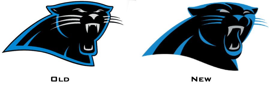
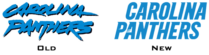
In case you missed it yesterday, Phil reported how Nike had unveiled a new set of NFL gloves for the Pro Bowl on Saturday. What Phil didn’t mention (in part because he wanted to let me address it) was that the Panthers gloves featured an updated team logo. By the end of yesterday, the new logo — along with a new wordmark — had been formally acknowledged on the team’s web site.
So how do the new logo and wordmark differ from the old ones? Here’s let’s take a look (click to enlarge):
.
.
.
My thoughts:
• The single biggest plus about the new logo, at least to my eyes, is the elimination of the black keyline, which makes the whole design feel less cartoon-ish, more fluid.
• Using more blue and less gray also feels like an improvement. Ditto for the extra detailing on the ears.
• That said, a lot of small details on the new design feel wrong. Why is the left eye all squinty? Why does the lower-left fang lack definition? Why do the left whiskers not extend into the cheek? Why does the outline of the lower mouth and lips look like it was lifted from the Rolling Stones logo? All in all, not bad — but not nearly as good as it could have been.
• The new wordmark is an obvious upgrade, but only because the old one was a joke. The new one feels very, very generic.
• Lots of people are already referring to this as “Nike’s first new NFL design,” or words to that effect. But if you go back and look at the announcement on the team’s web site, it says the tweaks were made “by the National Football League’s creative department.” In fact, there’s not a single mention of Nike. All of which supports what I’ve been saying all along, namely that the NFL’s changeover to Nike does not mean that Phil Knight is suddenly calling all the shots for the entire league. In other words: Everyone calm the fuck down already — it’s just a new outfitter, not a whole new era, even if the Swooshkateers would like you to believe otherwise.
(Incidentally, there’s been some chatter that the Falcons gloves show a gold outline on the logo and that the Seahawks gloves show slightly different team colors. But they don’t — it’s just the lighting. Trust me.)
As for the Pro Bowl, I didn’t pay very close attention to it (my friend Carrie was over and we were too busy drinking and yakking to care about the most meaningless NFL game of the year), but I laughed when I turned on NBC just before kickoff and saw Ray Lewis being interviewed while wearing Under Armour gloves. Guess he didn’t get the memo about the new handwear. In fact, I only saw one player wearing the new gloves: Greg Jennings of the Packers (although I suppose there may have been others who I didn’t notice), who was also the only player I saw praying toward Mecca Beaverton (nice of Nike to provide a way for pro players to be penalized for excessive celebration, just like they did for college players). So these gloves seem more like hype-driven merch than game equipment. In other words, who really gives a shit.
A few other notes from the Pro Bowl:
• Nike also introduced a new set of cleats for the game. Several players wore them, although the cumulative effect was no big deal.
• There appeared to be lots of players wearing untucked jerseys, droopy socks, and lots of other things that basically said, “No, we don’t take this game even a little bit seriously.” I’ve decided to honor that sentiment by not bothering to track down photos of the untucked jerseys, droopy socks, etc., because if they don’t care, why should I?
• Of course, the most uni-notable thing about the game was the complete lack of maker’s marks on the jerseys and pants (as I had reported several times over the previous 10 days or so), making this the first NFL game without logo creep in twenty-some years. Glorious.
• You know, all joking aside, I think these Pro Bowl uniforms aren’t bad. I mean, look at that shot of Larry Fitzgerald in the last link — nothing to be embarrassed about there. They should quit while they’re ahead and stick with this design.
Okay, now let the Stupor Bowl hype begin.
More glove stories: We’ve occasionally touched upon the topic of Canadian football players wearing glass cutter’s gloves back in the 1980s. The pseudonymous Hungry Hungry Hipster has come up with some new info on that front:
I stumbled upon a Saskatchewan Roughriders fan site with a discussion thread about the glass cutter glove phenomenon. Lots of great stuff in it, including the following:
1) All of the Saskatchewan wide receivers wore glass cutter gloves in the 1989
Western Final.2) Most of the people in the thread agree that WR Jeff Fairholm was the first player anywhere to wear glass cutter gloves. One guy claims Fairholm wore them at the University of Arizona first and then brought them to the CFL (Some of the thread’s participants disagree, saying James “The Duke” Ellingson or Donald “Narco” Narcisse was first.)
3) This is probably the most important piece of info from the thread:
“[The first player to wear glass cutter gloves was] absolutely
Fairholm. They even did a halftime thing on him once that focused on
the gloves and that he brought them up with him.”4) Another guy posted in the thread: “I remember Fairholm’s (halftime) piece because he [said he] preferred the tackiness of the glass cutter gloves.”
5) Yet another guy claims his brother played for the Rams, had green glass cutter gloves, and only paid $5 for them!
6) Someone named Sanduski (or Sandusky — it’s spelled both ways in the
thread “had a Sandman company that sold [glass cutter gloves].”7) One guy claims Doug Flutie wore gray glass cutter gloves in the NFL.
Good stuff. I continue to be puzzled by the way gloves apparently made their way onto the gridiron without anyone raising a peep as to whether their legality.
Gotta see it to disbelieve it: You probably know that Phil Knight spoke at Joe Paterno’s memorial service last week. What you might not know is what reader Darren Walton posted in Friday’s comments: “As Knight walked to the podium to deliver his emotional eulogy, the image displayed on the large screen [behind him] was just Joe’s feet, showing his black Nikes. Nike has found a way to sponsor funerals.”
Here, see for yourself:
I have nothing to add.
Friendly reminder: I recently created a fun set of T-shirts based on old sportwear clothing tags. You can see them in the Uni Watch shop on Zazzle.
Report card update: New developments over on the Permanent Record Blog.
Uni Watch News Ticker: If anything uni-notable happened in the NHL All-Star Game (which featured the same uniforms from last year), I’m not aware of it. ”¦ Novak Djokovic tore off his shirt after winning the Aussie Open yesterday. ”¦ Total brain cramp on my part for not mentioning Thursday night’s amazing Clippers/Grizzlies throwback game in last Friday’s Ticker. … Check it out — a Keith Hernandez coat rack. … Interesting “MU” cap logo in this 1920 Marquette hockey photo. “I’m curious as to whether that logo was in use for any baseball or other teams at the time,” says Gerry Hintermeister. … Brett Lowman, who runs the excellent Play OK Antiques memorabilia operation, recently got his hands on this magnificent old baseball uniform. “It was owned by a player named Jack Silknitter, who played for both West Chester and the Parkesburg Iron works team in the early 1920s,” he says. … Speaking of Brett, I just bought these three old uniform catalogs from him. Further details once they arrive in the mail. … Some thoughtful writing on the subject of MLS jersey sponsorships (from Sean Tuffy). … Hey, there’s a whole blog devoted to photos of hockey players as kids (from Jay Sullivan). … We’ve already seen the Astros’ 50th-anniversary logo, but here’s how it looks as an embroidered patch. Nice! (Big thanks to Chaz Noerenberg). … Not often that you’ll see a curling sheet and the Super Bowl logo together in the same photo. That shot is from the Super Bowl Village in Indianapolis, where USA Curling has set up a demo sheet to help promote the sport. … Tim E. O’Brien has written an open letter to Indiana football, pleading for better uniforms. … Someone in Brooklyn threw a uniform-themed dance party on Friday night. … Kudos to Sam Lam, who’s custom-painted — and custom-afro’d! — a Coco Crisp bobblehead. … In a related item, the A’s are giving away a Chia Coco Crisp to the first 10,000 fans on June 17 (from Mike Rowinski). … And in still more A’s news, they’ll be wearing Oakland Oaks throwbacks on July 8 (from Peter Thompson). … Tim Duncan’s knee brace has a Punisher skull. “Like the article says, you would never see it during a game because he has a sleeve over it,” says Marcus Ramsey. … Anyone wanna colorize this awesome 1904 Nebraska baseball shot? (From Dan Cichalski.) … Literary note from Gregory Koch, who writes: “Canadian sci-fi author Robert J. Sawyer’s novel Mindscan, written in 2005 and set in 2048, makes a reference to the Blue Jays’ uniforms. The protagonist, Jake Sullivan, collects ‘every permutation of Toronto Blue Jays uniforms, including the lamentable ones from the zeros when they temporarily dropped the “Blue” from the name.'” … “The Seibu Lions are asking kids to design a special uniform for the 100th anniversary of the Seibu Railway,” reports Jeremy Brahm. “The kids can only design the top, not the pants or the cap. And it must use the Lions’ logo, wordmark, or initial.” … Also from Jeremy: New uniforms for FC Tokyo. … The Knoxville Icebears had planned to use pink pucks for a recent cancer-awareness promotion. “But following warm-ups, it was determined that using pink pucks in a game where a team was using pink sweaters, pink sticks, pink socks, pink stick tape, etc. would make it too difficult for the players and goaltenders to see the puck, thus creating more of a hazard than anything else,” says Martk Atnip. “Based on that, pink pucks were used in warm-ups, but not in the actual game.” … Here’s a very cool inforgraphic on NHL All-Star Game MVPs (from Tony Caliguiri). … Syracuse’s mascot has been given more of a “Nike presence,” how wonderful (from Rick DiRubbo). … Bruce Menard spotted some very interesting MLB caps in the recently completed Mears auction, including a very rare late-’40s Cubs design (look how the patch background doesn’t match the blue on the rest of the cap), a Dodgers cap with an unusual version of the “B” logo, and a super-rare blue Pirates cap from 1947. … Nice article on uniform numbers here (thanks, Kek). … Check out this shot of Reds prospect Tucker Barnhart wearing a “Futures” jersey patterned after the Reds’ BP jersey (from Matt Lesser). ”¦ It’s tough to see, but Corey Culton says the dribbling the ball in this photo is none other than Mike Schmidt, circa 1971 or ’72, in a charity basketball game. ”¦ New lacrosse gloves for Alabama (from Jeff Brunelle). ”¦ AFL teams always wore NOBs. So how do you explain this NNOB shot of a Boston Patriots player? Answer: It’s from a preseason game, and teams didn’t add NOBs until the regular season started. ”¦ Latest college hoops team to go gray: Seton Hall (from Griffin Whitmer). ”¦ Yabba-dabba-do, check out the throwbacks worn by Wisconsin-Green Bay on Saturday. Also: Those three photos show the same player — freshman point guard Keifer Sykes — wearing three different uni numbers during the game. Sykes suffered a head gash and ended up having to switch to two different blood jerseys as the game progressed. ”¦ Here’s something you don’t often see: a hockey team with subscript NOBs. “I think it was the Michigan Tech Huskies,” says Nicole Haase, who spotted it while watching a program about Herb Brooks on the Big Ten Network. ”¦ New uniforms for the Yokohama DeNA Bay Stars (Jeremy Brahm again). ”¦ Most of you probably know about the Saints’ short-lived stint wearing black helmets during the 1969 preseason. Here’s the only known surviving helmet from that unusual chapter in uni history (Bruce Menard again). ”¦ Not often that you see an MLB player introduced at a press conference in this uni number. “I mean, Barry Zito had 75 by choice, Albert Belle picked 88 with the Orioles,” says Tyler Kepner. “But 63 is the number Montero was somewhat randomly assigned as a September call-up last year with the Yankees. Is it the number he intends to make his own? Or did the Mariners just base it on what he had with the Yanks?” … Baylor had a neon-out the other day, to “blind the national TV audience with Baylor neon pride,” whatever the fuck that means (from Tyler Mastin). ”¦ Possibly the best advertising slogan in the history of ever can be found in the lower-right corner of this ad (thanks, Kirsten). ”¦ Whoa, check out the socks being worn by Arizona State’s (club) hockey team (big thanks to Kenn Tomasch). ”¦ This is pretty awesome: A bunch of Occupy activists dressed up as the “Tax Dodgers,” complete with high-cuffed uniforms! (Big thanks to Ed Westfield Jr.) ”¦ This is unusual: a curling-style sweater made of corduroy, instead of wool. ”¦ Really nice move by the Padres, who are providing hundreds of Padres replica jerseys, from various eras, to local Little Leagues (from Brady Phelps). ”¦ More chatter about possible new helmets for Illinois (from Eric Lovejoy). ”¦ Joe Loch was shopping at a teen shop with his daughter and saw a T-shirt with a distressed version of the old NFL logo. “Thought it was interesting they would be selling retro NFL logo T-shirts to tweens,” he says. ”¦ Speaking of T-shirts, what the hell is the “National Football Association”? I dunno, but they apparently made this Super Bowl tee, which David Raglin’s wife found at an airport. … A skier at the X Games was disqualified for wearing hair ties on her pant cuffs. “She was apparently the only competitor not wearing a spandex ski suit,” says Tim Lewis. “You’d think they’d overlook a couple of hair ties. It’s kind of impressive she made it to the finals wearing less-aerodynamic snow pants to begin with.” ”¦ A Maple Leafs time capsule, buried by Conn Smythe himself in 1931, has been found. Its contents include a small elephant carved out of ivory, and Jason Bodnar should embrace the story by adopting the elephant as a shoulder patch. Nice idea, except it feels a bit too A’s-ish, no? ”¦ Kudos to Leo Strawn, whose design concepts for the Cleveland Cannons and Charleston Saints (those are American Aussie rules football teams, and no, I didn’t know such a thing existed either) have just been accepted as the teams’ official kits. ”¦ Color-on-color game last night, as Evansville wore orange home against Indiana State. “The last time I remember them in orange was in the 1993-94 season, when they wore their orange sleeved unis at home every game as a tribute to the Hall of Fame Coach Arad MuCutchan,” says Stephen Smith.
Panthers new logo looks like something from the animated Batman series.
Specifically, it looks like the character link:
link
link
link
link
How ’bout we have at least one image of the original, the Wildcat of the Golden Age…
link
Same guy, Ricko – Ted Grant. Still active in the DC Universe, and still in the JSA after all these years…
No mention of New Era’s first foray into the licensing agreement? Hideous sideline hats, but the 39Thirty practice hats and visors were spot on
I showed the sideline headgear in the Ticker last week. And Jesus, it’s only sideline headgear — who cares?
The Pro Bowl sideline hats are very similar to what the Draft Day hats are going to look like. Team name, in block letters, with logo behind the team name.
“National Football Association” gear sounds like something Customs would be seizing if they saw it.
I know the old Panthers word mark screams 90’s, but that new wordmark is terrible.
I second your thoughts about the Panthers new word mark. It is beyond horrible. We could devolve into a whole dissertation on logo design and typography to point out the basic design flaws, but why waste the effort.
At least we learned a new oxymoron today: NFL Creative Team.
sure looks like the Lions font to me.
link
It was dated when it debuted. I’m amazed it lasted so long. The uniforms were fine and it is a shame they’ll probably have something worse in 2012.
I’m all for more blue in the unis, but I think the gray/silver works better than the black.
Logotype looks like all the other “pointy” fonts going these days.
The new version of the Panthers logo is pretty harmless to me… And although the new wordmark is totally uninspired, the old one was so corny that almost anything would be an improvement.
Totally agree Matt! Good riddance to the cock rock band wordmark.
Bears gloves on the Nike page: apparently Nike has enough clout to move Chicago to New York.
I saw that too… whoopsie daisy…
link
According to the Grid Iron Database, the 1970 Boston Patriots had neck and sleeve trim. It’s hard to tell from the B/W photo, but I don’t see that on the player. My guess would be the NNOB is because its a practice jersey.
No, that fire took place at a preseason game. The neck and sleeve trim may have been left off until the regular season, just like the NOBs.
I obviously didn’t read your answer after the link…
Speaking of curling, in case anyone missed it in Saturday’s comments, fun logo design for USA Curling’s 2012 Scotland tour:
link
The new Panther has put on weight and gotten a busted lip. The original panther was a bit amateurish – 2D facial features on a 3D head – but a bit endearing in its amateurishness. It always reminded me of Brak from Space Ghost.
Yeah buddy.
Spaaaaace Ghoooooooossssst.
featuring VO by Ted (hi MARE) Knight, who also VOd “Fantastic Voyage.”
link
link
Well, didn’t see anything in the NHL ASG, but over in the AHL’s ASG skills competition, Hershey had three players selected, Keith Aucoin and Chris Bourque were wearing the current Bears jersey while Boyd Kane wore the skating bear throwback.
the fact that only the “A” in “PANTHERS” and not either of the “A”s in “CAROLINA” has a ‘claw mark’ bothers me with each additional viewing
Yeah, I thought that was odd, too. Although if they added it to each “A,” we’d probably say it looked too forced, like a willful affectation. Bottom line: They should’ve skipped the claw marks altogether.
agreed
Those “scratch” marks look more like “speed” marks to me. Like they were trying to make the words look FAST. I can’t imagine that is really what they were up to, but that’s what my brain sensed first.
The item on panthers.com says it refers to “a panther’s swipe” — i.e., claw marks.
Zees are speed holes. Zey make ze car go fasta.
I agree with Paul, they probably only added the claw marks to the “A” in PANTHERS so it wouldn’t look forced. Repeating a unique/clever element reduces how unique/clever it is. But they still wanted to add a unique/clever element to the wordmark, and since when decorating an endzone most of the time only a team’s nickname is used, AND there’s only one “A” in PANTHERS, the claw marks were just used in the “A” in PANTHERS.
Maybe they plan on using just the “Panthers” part of the wordmark by itself more often than the complete version, which would then make more sense.
I think the concept is that the Panther took one good swipe at the wordmark, and caught the “A” in Panthers.
Not that it batted at it like yarn ball.
honestly, i thought they were whiskers in the A… mirroring the 3 whiskers on the panthers. in hindsight, that’s rather idiotic. glad i could contribute.
I don’t like the claw marks in general, but why not put them in the P so they could use a standalone P as a secondary mark?
jdreyfuss, that would make too much sense!
Actually, it really would make much more sense, because then the claw marks would be appearing on a letter that’s only used once regardless of whether you have “CAROLINA PANTHERS” or just “PANTHERS”.
Those West Chester unis are the greatest … The Crisco ad recommended by Kirsten – “9 out of 10 doctors say: It’s Digestible!” – naturally makes me want to find that one dissenter.
I’ve seen that slogan before – probably mentioned on here before – a great Flickr account “Roadsidepictures” that has all kinds of sharp pics of stuff like that & links to other retro food items & graphics:
link
lol, what a slogan.
I thought the ad was fake, but apparently it’s real, and that was an actual slogan.
How dumb where we back then?!
NPR’s Planet Money podcast discusses the history of Crisco (including that and other dubious health claims) in episode #335, “Who Killed Lard?” Very interesting, including some audio from a restaurant party featuring an all-lard menu.
“Not often that you see an MLB player introduced at a press conference this this uni number.”
too many “this” in this sentence
Thanks. Now fixed.
I don’t mind the new Panther’s logo, but the darkened silver kinda dulls the entire thing. Also, the wordmark is trash, but everyone knows that by now.
Saw about 10 minutes of the ProBowl. Lots of tied-up-in-back jerseys too.
Also, Ben Roethelisberger’s name plate was veeeerrrry small–at least in comparison to how we’re used to seeing it on his Steerlers uni.
1904 Nebraska baseball shot not showing up (at least for me)
Try it now.
There we go! Striped socks and sleeves!
In fact, I only saw one player wearing the new gloves: Greg Jennings of the Packers (although I suppose there may have been others who I didn’t notice), who was also the only player I saw praying toward Mecca Beaverton (nice of Nike to provide a way for pro players to be penalized for excessive celebration, just like they did for college players). So these gloves seem more like hype-driven merch than game equipment. In other words, who really gives a shit.
Here’s another one:
link
Yeah, but that was during the pregame.
True. But even I’m not so cynical to think he would have just put those on to pose for the camera and wear different gloves during the game.
That new Panthers logo looks more like Brak than the old one, so that’s a plus.
That NHL All-Star MVP graphic is nice, though the anal-retentive side of me prefers that it would’ve been done with the actual designs from each year, rather than picking one design for each decade.
Oops, that was supposed to be its own thread… arrgh!
As far as the Brak thing goes… too bad Highway (Interstate) 40 doesn’t pass through Charlotte!
If a player on the Rams did indeed wear green glass cutter gloves, it wouldn’t have looked that odd because, after all, yellow and blue makes green.
Based on that being a Saskatchewan centric forum I’m guessing he is referring to the University of Regina Rams.
LOVE the Grizzlies throwbacks! Why don’t more basketball teams wear shorts that are a different color than the jersey?
Eww, no!
my god…im finding myself more in agreement than disagreement with THE these days
/shoot me now
Well it is 2012, maybe the Mayans were right after all.
Done tastefully (as the Grizzlies did), there’s nothing wrong with contrasting jerseys and shorts. Bring it on.
though the intro was very tacky, Phil Knight’s speech was pretty spot on.
Tacky? That intro was unconscionable.
Tackiness aside, it’s perfectly — PERFECTLY — in keeping with Nike’s basic M.O.: They start with something that’s about somebody else (a team, a league, a deceased person, whatever) and make it about Nike.
It’s what they do.
What has greater tackiness: Phil Knight’s intro or glass cutter gloves?
I’m not surprised at all that this is one of the few outlets that I’ve actually seen criticism of Phil Knight’s performance at the JoePa memorial. Question whether the Chairman of Nike should have been there in the first place? Sure, legit criticism. Question whether one should use the eulogy as a time to make a poltical/social statement or anything else that could be deemed potentially controversial? Sure. I’m not really a fan of using this kind of speech as I feel the time and place is off.
But it’s hard for me to disagree with anything the man said. Most of you all know me as a Pitt guy and I’m a diehard. I hated that man and that program for many, many years. But he’s NOT the villian in this Sandusky thing.
Was a picture of Joe’s Nike shown on the board tacky? Sure. I think people would have known who Knight was anyway. But come on, photos of Joe’s iconic black shoes with his pant legs rolled up and white socks have been around for ages. LONG before Penn State was a “Nike school”.
So I’m not sure how Knight/Nike made this out to be about them. I went back and re-read the transcript of the speech. It’s not as if he was describing the latest in Pro Combat fashion!!!
Oh, come on. So if it had been an open casket, they would have opened the end by his feet, instead of up by his face, because that was the more iconic end of his body? Please.
When the chairman of a corporation comes up to speak at someone’s funeral (or at any other event), and they just happen to flash a photo of that corporation’s product on the screen, then yes, that is PRECISELY making the event about Nike. And it’s disgusting.
As to the content of the speech, I have no dog in that fight. It’s the photo of the shoes that offends me (and, I suspect, many others).
But he’s NOT the villian in this Sandusky thing.
Fully disagree, Kek. He reported one incident to the AD, and then went right on living life to the fullest.
He didn’t take a member of HIS coaching staff aside and ask him any questions (let alone the hard questions), he didn’t follow-up to find out if this allegation was true and how it would affect HIS football program, and JoePa didn’t take an allegation of abuse on a minor on HIS campus to the police.
In other words, outta sight, outta mind for JoePa. Had this been a domestic abuse victim, would he have done the same thing? And think about your answer before saying yes or no – it will say a lot about the man that everyone thinks is such a moral and upstanding human being.
If it’s yes, he condones sexual abuse, but not domestic abuse. If it’s no, he might actually be worse than Sandusky because he contributed to the silence.
Wait… the yes and no don’t really relate properly to the question.
Yes = he condones all forms of abuse and he might actually be worse than Sandusky because he contributed to the silence.
No = he condones sexual abuse, but not domestic abuse.
Sorry!
yeah, and look!
buy the DVD here!
link
Probably should be noted that when Paterno first became associated with the rolled up pants he was wearing Riddells, the coaches model with the rippled sole.
That was before Nike even existed, I think.
Rick are you saying Joe was paid to wear Nikes? The first time I remember seeing a Nike logo on a PSU jersey was 1994–and I recall Joe wearing the swoosh before that.
I can see why uni-watch posters would be cynical about that logo creep–Joe definitely paved the way for the commercialism of big-time college football (the 1986 fiesta bowl was the first with a corporate sponsor).
I just always saw the shoes as something organic, not sponsored.
We’re saying the same thing.
People noted Joe “trademark” pants style on the sidelines long before Nike. It isn’t a “Nike thing.” It was, as you say, organic. Riddell was and is irrelevant per se; only noted it as a detail.
Therefore, there’s no doubt the shot behind Knight suited Nike’s purposes, and they were gladly capitalizing on Joe Pa’s style. And, sadly, sorta makes it look like Nike was implying they had something to do with it.
Which, of course, they did not.
I’m pretty sure Nike pays lots of football coaches, not just Joe. Heck, Bill O’Brien’s new 5 year deal with Penn State includes a $350,000 contract with Nike. And who knew who he was 2 months ago.
Let’s be real, had Knight not been in the building, I’m SURE there would have been plenty of shots in Joe in his trademark Nikes.
And furthermore, sure Ricko, he may have worn another brand of shoe prior to Nike being in existence. Find me a photo…..and I’ll find hundreds of him in Nikes.
see above. :)
“As Knight walked to the podium to deliver his emotional eulogy, the image displayed on the large screen [behind him] was just Joe’s feet, showing his black Nikes. Nike has found a way to sponsor funerals.”
Hmmm… where have I seen this link…
wow! WHAT A CALLBACK!!!!!
Truthfully, the way I took all this around these parts, is that the whole idea of Nike as a going concern was secondary. Knight’s comments were what drew the most attention. The idea of the company Nike and his role as chairman was clearly a footnote (no pun intended).
I’m sorry, but a more valid criticism of this whole event would be Knight’s relaxed attitude towards sweat shops and child labor. (File under “he could have done more”)
How ’bout we just assume something like this (because I’ll guarantee it was thought, if not ever said aloud)…
“Man, did we catch a break. With any other coach we could NEVER get away with a photo of his feet/shoes up behind Phil during his portion of the program. But, because of the trademark old school way Paterno rolled up his pants, everyone will find it charming… or wistful…or sweet. We’ll get a big ‘Awwww, that was Joe, alright.'”
Spot-on? Let’s see…
“If there is a villain in this tragedy, it lies in that investigation and not in Joe Paterno.”
So it was *the investigation* that committed serial child rape and/or didn’t do anything to stop it?
“Joe Paterno left this world with a clear conscience.”
Yeah, he probably did.
Let me first start by saying I am by no means a Nike apologist. I think there marketing using “combat” imagery is appalling BUT I don’t think they are the villains in this scenario.
That image of Paterno and his rolled up pant legs and Nike sneakers was used throughout the memorial and not just prior to the introduction of Knight.
I agree with Paul “As to the content of the speech, I have no dog in that fight. It’s the photo of the shoes that offends me”, but that photo montage offended me long before Knight made his way up to the podium.
The Weyland-Yutani Co. approved.
The (viewer’s) left eye should be a bit narrower on the new Panthers logo. The slightly asymmetrical whiskers are just fine, even putting aside the fact that any “solution” that brought the right whiskers as close to the nose as the left whiskers without breaking the non-intermediated color scheme would look terrible.
But the lip! Ugh. I’m willing to not hold the curvy loopiness of it against anything, even though it clashes stylistically with the angularity of line in the rest of the logo. My problem is that it gets the perspective all wrong. The farther bits of the lip are rendered more strongly than the nearer bits, which is how perspective works when Bizarro Superman is your art teacher. And the farther bit of the lip appears to slightly cover the farther fang, which again breaks the whole things-behind-other-things-don’t-obscure-the-nearer-things rule of normal-universe perspective.
Still convinced Nike wasn’t involved? I see some similarities here.
link
It’s true: Nike invented typography. Or at least that’s what they always claim.
How often was that font used before Nike put it on everything the last few years? It at least looks like they’re influencing decisions.
There’s no question that Nike is hugely influential.
But that’s not the same thing as saying they were involved in producing a given design (like, say, the new Panthers wordmark).
And, as previously noted, in the minds of some they probably had a hand in the development of color photography, too…
link
I thought of the Spartan logotype as well. That pointy/chiseled look is going to be real dated, real soon.
At least with MSU, you know where it came from:
This guy: link
Why the Panthers want it, I don’t know. Maybe subliminally they’re trying to get closer to this:
link
Y’know, I was only in the 3rd grade when they started play, and had just started regularly following the Detroit Tigers and Michigan Wolverines football, but I don’t recall there ever being a whole lot of fuss about the Michigan Panthers locally, even though they won that inaugural USFL title.
Oddball colors, but I do like that helmet.
The worst part about the new Panther head is that it might ruin one of the best “unofficial alternate” designs in the league. This is a window decal design all over the place in Charlotte: link
I’m disappointed they don’t run with the negative space thing.
i think that’s a better logo in general, would love to see it on their alternate unis. i don’t think it would ruin anything. it just changes the eyes a bit and that’s it
I thought the same thing when I saw the logo at first!
The third page down shows what the new version should look like: link
That’s actually a swell looking image.
To be more specific. The window decal image from David A.
I love how Jennings manages to link the glove shout-out.
Why the heck didn’t Conn Smythe think to toss a jersey and pair of socks into that time capsule? Now THAT would have been something…
-Jet
re: the Saints black helmet up for auction. i noticed in the close-up side view, tell-tale evidence of a previous football shaped logo:
link
wonder if it was previously a college helmet with the “100 Years” decal from 1969?
[IMG]http://i5.photobucket.com/albums/y170/hekawi/amanning8x10-om.jpg[/IMG]
meant to use this link for the 100 Years example
link
The color of the fleur-de-lis on the Jerry Shinners helmet up for auction is noticeably different from the color on the helmet shown in in the earlier link. Is one of them faked?
You mean it’s different from link? That’s a reproduction, not authentic.
Also, the white decals on the link have discolored with age, (“vintage white” hadn’t yet caught on in 1969) so I wouldn’t rely too much on that helmet for colors.
why didnt rebook sponsor any colleges? with the nfl contract over, all they really got is the NHL.
so nike keeps all of their college brands and gets the NFL? rip rebook
Adidas and Reebok are the same company. So they also have the NBA and a bunch of college football programs.
Hence why they’re often referred to in comments here as “Reedidas”.
I’m still calling Adibok.
They used to be with Boston College, til Under Armour got on board.
link
To the best of my knowledge, Nike is only taking over the uniform aspects of the league as a whole (i.e. jerseys, pants, practice/sideline gear, coaches gear).
However, I think individual players will still have their own deals for shoes, gloves, etc. Ray Lewis is a UA guy, other guys are Adidas, Reebok or Nike. Hence, Lewis would be wearing Nike gloves just as he wouldn’t be wearing them during the regular season this year despite wearing Reebok branded jerseys and pants.
Only Nike athletes would be wearing these new gloves or cleats for the pro bowl.
On claim number seven, I can almost verify that Flutie wore glass cutter gloves in the NFL. In his first season, the Bills were shown on television often in Boston, due to local interest, and I remember a CBS sideline reporter showing an example of the glove and claiming that the wearing could still lift a dime off of a flat surface.
Re Seton Hall in gray: Gray’s been a major part of the color scheme since they link Don’t know if it was ever official but in this alumn’s eyes they moved from blue/white to blue/white/gray then.
Not quite GFGS or maybe SHU was just ahead of the trend?
Wouldn’t those tags look totally boss on a knit polo shirt, instead of a t-shirt? All those squares and rectangles would translate perfectly as a left-breast logo. (Then again, I guess embroidery would represent a steep production cost.)
The Marquette U interlocked logo is interesting, but… short shorts and really long stockings? What, they couldn’t get breezers?
The lack of boards anywhere near the players suggests a game of shinny here.
There is a company called Cutters that makes football and other sports gloves. They have a web site and their gloves have been sold on Eastbay and other outlets.
There was a receiver in the 1980s and early 1990s named Jim Sandusky who played for the
Edmonton Eskimos and British Columbia Lions. He had his own little cottage industry where he
made his own gloves. He sold his gloves,pretty much out of the trunk of car,to fellow CFL players,
high school and college players in Canada and the US. I believe the gloves were called Sandman.
Last I heard,he is coaching high school football in Washington state.
When I was a senior, pretty much all the receivers on Rice’s team wore Cutter gloves, despite being a Nike school all the way. I think the players forced the school to negotiate a clause letting them buy their own ancillary equipment if they didn’t want to use Nike’s supplied gear.
The gloves were introduced to the team by James Casey, who, with the Texans, doesn’t appear to have any glove consistency and is shown in pictures wearing several designs I’ve never seen elsewhere.
Patrick Peterson and A.J. Green are both wearing the team gloves in that picture. As for untucked jerseys, Ben Roethlisberger looked particularly sloppy, even by his low standards.
5 bucks says the Panthers have new uni’s this fall
How many teams change a logo but don’t change the uni’s? 1986 California Angels but they did change the sleeve patch. I’m sure there’s probably others.
Ravens, possibly? That’s the only one I can think of.
Well, technically, the helmet decal changed?
If we were to use your logic (I’m not shooting it down, but it’s a legitimate question), then the Seattle Mariners qualify as well. They used to have the simple trident-M as their cap logo. For their All-Star Game, they made a ASG logo that was a recolored trident-M in front of a star. That became the M’s new logo, until they switched to simpler white and gray button-downs with the big gold S caps, i.e.: the “rookie Griffey” jerseys.
Halfway there: the Boston Red Sox changed their letterhead logos along with new road uniforms, but the homes were left completely untouched.
All the way there: the LA Dodgers changed their primary logo (and even gave it a soft launch all throughout the 2011 season), but have stated that the jerseys will remain unchanged. Just like the various Yankees’ “NY” logos and the cap and jersey Detroit Tiger D’s, it was decided that the Dodgers jerseys should keep the jersey script, and that no logo tweaking should affect the nearly-perfect uniforms.
The blue lip in the new Panthers logo is as ridiculous as the Jaguars’ teal tongue.
What’s the alternative?
Should it not be there at all?
Should it be in silver? No, that’s the color of the teeth.
It’s a stylized image created in a limited number of colors and, in it’s new look, with a black outline to define it. It’s like bitching about Superman’s hair having bright blue highlights.
If our problem is with the configuration, well, big cats typically don’t roar (or snarl) simply by dropping their jaw straight down. There’s something of a lower-jaw rotation involved, that extends the jaw to one side (posted this yesterday, too)…
link
withOUT a black outline to define it.
Yes, the omission of black outline in the new stylized image creates some challenges with the limited colors at hand. They still could have toned down the fullness of the lips or something, I mean, do cats really even have lips? Bottom line, it looks funny.
I was thinking the same thing about the jaw movement, Ricko. Thanks for the illustration.
The new rendering of the lip is simply too big and not particularly well defined.
It looks goofy.
-Lee
Look at the size of the white area around the MGM Lion’s mouth.
The blue line is an artistic device to suggest movement, a pronounced snarl/roar.
Y’know, Bugs Bunny’s teeth are little big, too. But neither he nor the updated Panther logo is artwork for National Geographic.
Well here’s a quick job on reducing the lip:
link
At least a bit restrained & more consistent.
Much better.
I think you took too much off. It just needs to be thinner under the bottom teeth.
More like this… I also messed with the whiskers a bit
link
Ooh.
From the Padres uni story:
“I will leave it to the Paul over at Uni Watch and Chris over at SportsLogos.net to break down the historical accuracy of each jersey.”
XD
Maybe I’m not happy with the progression of the Padres’ branding, but the team seems pretty sanguine about its history. They’re embracing their multiple identities because each one has importance to a different era of fans; I respect that.
-Walter
Solution for the Pro Bowl?
If you can’t change the nature of the game (which apparently would be difficult), change perception. Alter/lower viewer expectations.
Keep it in Hawaii forever (for the “escapist” element) and change the name to the “NFL All-Pro Aloha Scrimmage”.
And maybe have Marisa Miller go out for a few passes.
I’m only about half kidding (well, totally kidding about Marisa Miller).
(link)
That, too, yes.
I admit to carelessly lambasting Nike yesterday without reading the actual article.
I would like to take a moment to appologize to all parties I have offended.
Particularly the good people at Nike.
So what happened to the doctor that couldn’t digest Crisco?
great SI slide show on both NYGs and NEPs;
link
link
Very nice. Love that square-toed kicking shoe in the first Pats photo!
Are those Steve Maddens? Or Campers?
link. At first I was wondering how a post-merger QB could have 21, then I realized that the numbers were all screwed up… because it’s 16 mirrored!
That’s great. The Patriots had such beautiful uniforms until flying elvis. And the Giants have always looked good (though I never took a shine to the GIANTS helmet logo).
This image is just amazing…
link
…Where is that? What a breathtakingly cool environment.
It’s Franklin Field, University of Pennsylvania in Philadelphia. Home to the Eagles 1958-70.
link
and a bonus:
link
black and yellow Pumas!
Kind of funny that Jennings’ shoes happen to be in the colors of his team’s opponent that day…
Those socks are RIGHTEOUS.
And a half. Get me a pair of those, pronto!
Man, that was a fat stripe.
It looks like they made those pants out of the failed NY Ranger sleeves of the 70’s.
I have Dave Jennings’ autograph.
Jennings was the featured speaker at my youth league’s annual awards dinner one year. Things I remember from that night:
1) He gave a speech in which he encouraged us to use what we had. “In my case,” he said, “I’ve been blessed with perfect physical fitness.” I recall thinking, “PERFECT?!”
2) When they handed out all-star trophies, we all got to go up and shake Jennings’ hand. I remember saying to him, “Go out there and break the record for the longest punt!” He said, “How long is it?” And I said, “98 yards, by Steve O’Neal of the Jets” [a record that still stands today, incidentally]. He looked at me like I was fucking nuts.
3) At one point my father leaned over to another kid’s father and said, “We have a good table — near the bar and near the exit.” I’ve never forgotten that lesson, even though he didn’t say it to me.
Good story
Location, location, location.
My favorite G-man uniform and my favorite Eagles uniform in that SI slide show. link
Bad team/Good uniform.
-Walter
At least the Panthers wordmark doesn’t make me think of Zubaz pants anymore.
haha the old word mark reminds me of the 90s so much
As a rather biased Falcons fan I don’t love or hate the changes Carolina made. It’s a wash for me. The new font sucks but not as bad as the old one and should look better in the endzone than the old outdated one did.
The logo was never great but I don’t feel they did much to improve it either. The old one always looked to me like it was yawning. I know it’s more accurately showing growling but the new one just looks like it’s yawning differently than the old one. But then again as I said I guess I’m a bit biased. I’ll wait to see any kind of uni changes to determine if it’s good or bad overall.
St. Louis Cardinals post the items from their Hall of Fame on line. Lots of uni-centric stuff to see and more!
link
I know I shouldn’t, but I can’t help but love the navy blue Illinois football helmet.
Note on the ASU hockey unis…as a “club” (not varsity) team, they’re not allowed to use the actual new pitchfork that ASU unveiled for all its sports teams last summer. They have “a” pitchfork, which is good enough for government work, as they say. (Oddly enough, Arizona’s team DOES use the school’s official “A” mark.)
But I’ve been told that next season they’re getting outfitted by Nike (don’t know how), the official ASU outfitter, and so will have official-looking marks, as if they were an actual varsity team (which they won’t be, for many reasons).
Did Baylor outfit the Ferrell Center with black lights for that neon shot?
From the Play OK Antiques memorabilia site, this is one sharp dressed team, some are sportin ties with the uniform.
link
I’m being told the Panthers logo is supposed to look like North and South Carolina on the map?
“Look like” or “suggest”?
Cuz I’ve always seen that.
link
The two bear no resemblance almost at all…
You don’t see that? I totally do.
link
Can you do that with a Mercator projection?
Would look considerably different, I think.
And would interesting to see.
Thank you THE, they look NOTHING alike.
Still haven’t seen it on a Mercator (typical road map, with latitudes and longitudes as perpendicular horizontals and verticals).
Don’t know what difference it would make, but would be interesting to compare the two.
Although, as long as TimE has given his ruling (y’know, as opposed “Well, I don’t see it”), I suppose there’s no sense in wasting time with further discussion of abstractions the designer may have incorporated.
It really doesn’t make that much of a difference… you still get a pretty large chunk of the lower jaw jutting off into the ocean and the Georgia border is just totally wrong.
link
The closest “match” is to make it face left, then rotate a bit…
link
I have to agree with TimEO that the shape of the states wasn’t part of the design. It’s just kinda sorta maybe close enough that people went with the idea anyway.
On the right side of the helmet, that is.
I’m a mapgeek, and I have to admit I have a hard time seeing that.
“Very loosely suggests” would probably be the best way to put it.
That’s why I asked, “Looks like” or “suggests?”
There’s a bit of an “F” in the Falcons logo, too.
Isn’t essential to the design, but that’s not saying the designer didn’t use it as a jumping off point.
Much as (I’d always assumed) that the Panther was meant merely to be evocative of the states’ combined shapes. Were it literal (which I think some of you are being), the logo’s style guide would indicate it never be flip-flopped.
Ricko, the “figurative’ shape of the states is nothing like the shape of the panther head. You know what probably dictated the shape? The shape of a panther head.
If you believe this ‘combined carolina’ story, I bet you also believe that the ‘G’ on the Packers helmets stood for ‘greatness’.
It’s a sports design backronym.
“Were it literal (which I think some of you are being), the logo’s style guide would indicate it never be flip-flopped.”
No. Were it literal, it would always have to face LEFT, not right like it does. It’s not even remotely close to the shape of the states unless you flip the logo around and have the head on the left side.
Whatever you say, Tim E, whatever you say.
All I said was it’s possible it was something of a jumping off point for the designer.
Is in intrinsic to the design? I absolutely NEVER said that.
Backronym?
You mean a retcon?
I just feel like backronym is a better known term, even though it’s a term about words.
I also coulda used revisionist history…
I think it’s a happy coincidence that retroactively got pulled into the backstory. I mean, if it were truly intentional from the get-go, don’t you think the “default” panther would “face left” like the current Philly Eagle? Instead of, you know, making everybody whip out Photoshop just to reverse the logo and see the hidden picture?
+10
+20
Living in the Carolinas, this is how the team described the logo at it’s original unveiling. The head of the Panther (take out the neck) is meant to resemble the combined states of North and South carolina. The right facing jaw resembles the coast lines and the left facing jaw and ear vaguely resemble how North Carolina comes to a point on the western side.
So the logo represents the Carolinas, except for the half that doesn’t. Brilliant.
Honestly that sounds to me like something they pulled out of their collective ass to try to appeal to fans and justify being “Carolina” rather than “Charlotte”.
just telling you what they said.
you wanna tell me the tarheels “stripe” suggests the state…
i’ll buy that
(though i’m NOT buying the miama ass stripe is meant to be florida, despite what vilk & marshall say)
YMMV
Vilk does not think the Miami stripe is meant to be Florida. Marshall might, but Vilk thinks it looks like a wishful-thinking-length limp appendage.
Utah State has it, too, and I’m pretty sure they don’t think it’s Florida.
sorry to lump you in with herr marshall there yumpin’ yimmer
i won’t make that mistake again
marshall thinks it looks like a state
vilk thinks it looks like a limp dick
got it
If you look at the Panthers home page they have the new logo and lettering on a black background. In that case I think the lettering looks better but that’s because of all the contrast from a light Carolina blue to black.
link
A “little birdie” has told the Seahawks beat writer for the Seattle Times that the new helmets “will be darker” and “there will be some feather trim”. Also, this won’t be a “massive overhaul” and there won’t be a comeback for the silver.
link
My guess is that “darker” means the helmets will use the Seahawks’ navy blue.
Meh, aren’t there enough navy helmets already?
Of course, “a little birdy” could be a legitimate source or it could be some random nobody on Twitter.
“There will be some feather trim” sounds like absurd disinformation intended to punk the hardcore fanbase. At least it better be.
That is the most interesting use of “punk” and “hardcore” in the same statement.
Some of my buddies (some IU alums and some not) are having a facebook debate on Tim E’s open letter to Indiana Football.
link
Glad I could start a debate, but can I get a little more info on the arguments?
Because it sees to me that a lot of the people linking and commenting on my letter didn’t read it (granted, it is 1500ish words…). Many people are reacting like I want the candy stripes as the normal pants, when I make it clear in the article that I think they’re AT MOST a one game thing and can be easily convinced to never see them on the field – its just a jumping off point about having fun with IUFB uniforms that relies on IU imagery and history rather than another school’s.
I read it.
Yeah, it was a tad wordy and there were some bad links. But other than that, I agree with about 95% of your sentiments.
Fixed those links, thank you.
Isn’t the official color of Indiana Crimson and Cream? Why not ditch the white altogether for cream and stand out from Wisconsin and Nebraska. Certainly would be unique and create and individuality to Indiana in the Big Ten. Spoken as a Wisconsin alumi in full disclosure. Because, we own white in the Big Ten. :)
Indiana is the only school in the B1G to have a red helmet. That’s unique enough to differentiate from the wonder twins, Neb and UW.
That being said, the official school colors are Cream and Crimson BUT that is hyperbole that comes from a school song written well over 100 years after the founding of IU.
Cream and Crimson fit in the song better than Red and White (we, just like Neb, chant “Go Big Red”) which are more accurately our school colors.
As a Sooner alum and fan, I appreciated your mention of the carbon copy uniforms at Indiana. I’ve even found myself fooled a few time thinking I was looking at a Sooners picture, only to realize it’s a Hoosiers game.
I read the letter Tim. I understood that point(striped pants), as you made it very clear. Totally appreciate the passion. Well done and good luck. I’ve been biting my pen (not my tongue) the last few years, with the shit the Vikings trot out in. I want a competitive team like everyone, but losing all the time, and looking terrible to boot, is way wrong. Conceptually, you have blended the past nicely, with the 21st century, on your IU concepts. I need to get you Ziggy Wilf’s address.
Comments all over the board…someone mentioned bringing back black from Randle El years…quickly shot down. Most loved the striped pants, but a cooler head mentioned that they only work as warm-ups in basketball.
Look at this absolutely terrible list of the 15 worst sports uniforms according to Bleacher Report:
link
Well, he is right about the Broncos old horse.
And the Raptors. Maybe absolutely terrible was a little harsh, I’ll just say lame.
Well, in reality, the Blue Jays got rid of those lamentable uniforms after the 2011 season. And the announcement was made in late 2011. Sawyer didn’t know that when he wrote the book. Or did he? In 1999, Sawyer wrote the novel FlashForward (later made into an ABC TV show) which was set in 2011, but everyone simultaneously passes out and “flashforwards” to 2032 and sees themselves then. However, Sawyer envisioned several other events from 2011. He predicted the Pope would be named Benedict XVI. He predicted two of the three Nobel physics laureates. Could he have had a flashforward of his own back in 1999 and seen the Pope, the Nobel winners, and the Blue Jays’ new uniforms all in 2011? Crazy to think….
Note that the logo is different on the Nike gloves than on the separate announcement and graphic that Paul embedded in the article. Most particularly, on the gloves the right-hand whiskers extend to the cheek, whereas on the embedded graphic (as Paul points out) they do not. The treatment on the gloves looks way better. The fangs also seem lighter, appropriately IMO, on the gloves.
Looking at the Astros patch. Did anyone else think of JR Richard?
link
“But following warm-ups, it was determined that using pink pucks in a game where a team was using pink sweaters, pink sticks, pink socks, pink stick tape, etc. would make it too difficult for the players and goaltenders to see the puck, thus creating more of a hazard than anything else,”
It sure is a good thing link uses black jerseys, pants, sticks, socks, gloves, helmets, skates, tape, etc.
Lets just go back to the days when the puck glowed. link
The glow puck ROCKED!
I don’t know why anyone thought Nike was going to just take over the NFL and swooshify every club with new logos, new wordmarks.
The clubs and the NFL own those marks. Not Nike. All Nike can do is come out with new material for jerseys, a new cut, new styling. They couldn’t change a team’s ID if they wanted to. They’re just….wait for it…
A VENDOR.
Another interesting aspect of the team gloves is that they lack the usual “NFL Equipment” branding, likely because Nike was “testing” them during the Pro Bowl where uniform restrictions are obviously more lax.
I must admit: I watched a good chunk of the Pro Bowl yesterday. At some point in the first half, they showed Cam Newton on the sideline, wearing the standard NFC sideline ball cap. Well, standard saved for the fact that he seemed to have removed the brim entirely. I’ve tried GIS for ‘Cam Newton Pro Bowl sideline’ and other similar variations yielding no results. Curious if anyone else noticed this and, since I saw no other player with a similar style, why he did so. Was he forced to wear it rather than simply wearing his skullcap, but doesn’t care for brims?
I saw this as well, and mentioned it last night. However, I wasn’t able to get a screen grab, not did I find any pictures today of it.
Been a long time since I’ve posted here, but with the Panthers thing…. why not…
When I first saw it, my initial reaction was that the logo looked like Eddie Murphy in The Nutty Professor when he’s in the Dodge Viper halfway in the process from his skinny self to his fat self and his lower lip flops out all fat and all…
link
The Panther’s logo is having a strange affect on me, at first, it looks like an improvement, then it looks like a very hurried variation of the “old” logo. Almost like it was one of the designs that inspired the old logo.
It’s messy.
I’m not sure if I like it yet or not either.
But it does fit nicely into the trend of “we want a meaner logo, but don’t change it too much”: link
Here’s the full Logo Slick breakdown of the new Panthers Logo. Shows how it should be applied in various situations, including a slight redesign of the secondary logo (which is the eye-whiskers-nose-teeth logo used on many auto decals in the area)
link
Note to everyone making Panthers gear: Don’t use a blue background, it looks horrible.
Yeah… I can see that being adjusted in the future. It just looks washed out on the blue background.
Also looks like that is how the logo will appear on the jerseys themselves going forward. Have to say, I like the application on white, I really like the application on black.
Also, looks like they’re keeping the silver helmet. Look on the first page in the ‘Keyline Versions’ and you’ll see one outlined in silver, where the caption states “Keyline color must always match predominant background color of garment.” Though, with the application of the logo on it, I really would not mind a black helmet. The logo on black is just sharp.
….or you could look at the insert in the black section….
*sigh* Nobody ever accused me of being overly observant
Not really uni related, but check out this pic. Shows how the dugout roof at Skydome (not calling Rogers Centre) become part of the stadium floor when the stadium isn’t in baseball configuration
link
When the Panthers introduced their original logo back in the day I though it looked awful. I couldn’t believe it, really. I have to say, this new version is a huge improvement. They had nowhere to go but up.
But what (still) is with the neck? It looks like a cape. Why is the wildcat wearing a cape?
That’s because it’s designed to look like the states of North Carolina and South Carolina combined:
link
Just tilted a little bit…
link
no name change for ‘Stros.
That’s good no-news… Jeez, is Houston a city where they threaten you with bad news and then tell you there’s no news on a regular basis? First there was the Rockets threatening to bring back the PJ’s and then this.
I recently heard Detroit will be hosting one of NHL’s “outdoor classic” in the near future. Also it will be played at the Big House vs the Maple Leafs->who will be sporting their Toronto St.Pats uni’s.
Unconfirmed, and, quite frankly, preposterous at this stage of the game for the Leafs to be planning what they will wear. Whoever told you that is feeding you a pile of crap, Rydell.
Btw, I couldn’t get to sleep the other nite so I thought to myself..who needs new uni’s in the NFL?.. Carolina were the first that came to mind. I hope they go traditional yet modern. A team in Carolina needs to emphasize on the carolina blue.
Just a shot in the dark for me.
Confirmed changes:
-Seahawks
-Panthers
Highly possible changes:
-Vikings
-Falcons
-Cardinals
-Bengals
-Patriots
-Broncos (they said that nothing will change next year except that the orange top will become the primary home jersey, but I doubt it)
Small chance but could change:
-Eagles
-Rams
-Titans
-Jaguars?
-Dolphins
-Chargers
Teams with little to no changes:
-Packers
-Bears
-Lions
-Saints
-Buccaneers
-Giants
-Redskins
-Cowboys
-49ers
-Browns
-Ravens
-Steelers
-Colts
-Texans
-Bills
-Jets
-Chiefs
-Raiders