.
As most of you probably know by now, Nike unveiled new basketball uniforms yesterday for Arizona, Baylor (women’s), Connecticut (men’s and women’s), Duke, Florida, Kentucky, North Carolina, and Syracuse, all of which we’ll get to in a sec.
What you might not know is that the presentation of the uniforms was preceded by a multi-media performance thingie that was sort of like Tron meets modern dance meets basketball meets that scene from the The Simpsons where Homer has a bad trip after eating a super-hot chili pepper. Fortunately, I was watching the live webcast (from which I made all the screen shots you see above) instead of attending in person, so nobody heard me hooting and chortling and generally losing my shit. All they needed was some chick in the corner pouring white wine into cheap plastic cups and it would’ve been a perfect parody of a pretentious Chelsea performance art opening. But they didn’t have that, so instead it was just a self-parody of corporate self-importance.
And what was this production in the service of? A series of uniforms that will be worn in nine games — one for each participating school. In other words, after all the hype is over, each team will wear this super-advanced uniform once. Once!! For this they hired a choreographer?
As you probably also know by now, the uniforms are all gray (although Swooshie is saying with a straight face that they’re actually “platinum”) and all have the same features — reflective trim, sweatback sublimations, super-bright footwear, etc. A few thoughts about this:
• As usual, taking a certain group of schools and putting them all in the same design template creates a Team Nike effect. In other words, the schools look like they’re playing for Nike instead of for themselves. Bogus.
• Nike’s press release states that the new design will be worn “for some of oldest and strongest rivalries in college basketball.” Here, take a look at the nine games. Notice anything unusual? Every one of those games features a Nike school against a non-Nike opponent. The real “rivalries” here are Nike vs. Adidas and Under Armour. In other words, the only team Nike is interested in is Team Swoosh.
• As usual, there were the endless claims about lighter fabrics, new engineering, etc. Some of this was interesting — the shorts, for example, have fused hems instead of sewn hems, which means there’s one less seam that could rub against the skin and cause irritation. I like that. But here’s a question I’ve always wondered about when Nike unveils one of these “elite” uniform sets: If this is really the acme, the pinnacle of uniform design, how come only a handful of schools (in this case schools that have won a national championship) are invited to wear it? Unless you’ve won a national championship, you’re not even allowed to wear this latest advance in uniform technology. If Nike is really about making things better for the athlete, as they always claim, why can’t every school wear the Hyper Elite Super Duper Lightweight Razzle Dazzle design? For that matter, why can’t every football team wear Toy Solider Foxhole Flywire, or whatever it’s called this week?
The answer, it seems to me, is that Nike likes to create hierarchies of envy, stratifications of desire — or, more plainly, a caste system. It’s a stacked deck of haves and have-nots: If you’re in the 1%, you qualify for the good stuff; everyone else is treated like they’re in steerage. Screw that — occupy Nike!
• For the life of me, I don’t get the gray thing. This isn’t just Nike, of course — it’s all across college hoops. Is there anyone who likes it? It looks soooo drab. Can someone please explain it to me? New Uni Watch slogan: Pray the gray away!
• Reader Brandi Bennett sees another problem: “I spent seven years behind the scorer’s table at every conceivable level of basketball, from high school to pro. Just looking at these pictures, I can tell it’s going to be impossible to stat a game with these jerseys. How are you supposed to call something when you can’t even see the numbers? These numbers are barely distinguishable from the rest of the jersey. Wait until a tournament when the stat crew is unfamiliar with the players because they haven’t statted a season of home games for every team on the court.”
• Did you notice they managed to sneak a little apostrophe catastrophe into the Syracuse jersey? I guess it’s nice that they bothered to include an apostrophe at all, even if it’s backwards; they didn’t even bother with one for Arizona.
• Naturally, I like the striped socks, although I wish they were higher and weren’t swoosh-emblazoned.
You can see all of the designs here. Really, though, I think you’d be better off finding video of the performance thingie from the beginning of the event — way more entertaining than the uniforms.
Will they get Wilbur Wood to toss out a ceremonial first knuckleball? Remember that weird period in the early ’70s when the White Sox wore a lot of red? I never understood that. Like, if there’s another team out there called the Red Sox, why would any other Sox wear red? As a kid growing up around that time, I found it very confusing.
Anyway, we’ll all get to re-live those days this summer, as the Sox have announced that they’ll be wearing these 1972 throwbacks for Sunday home games (click to enlarge):
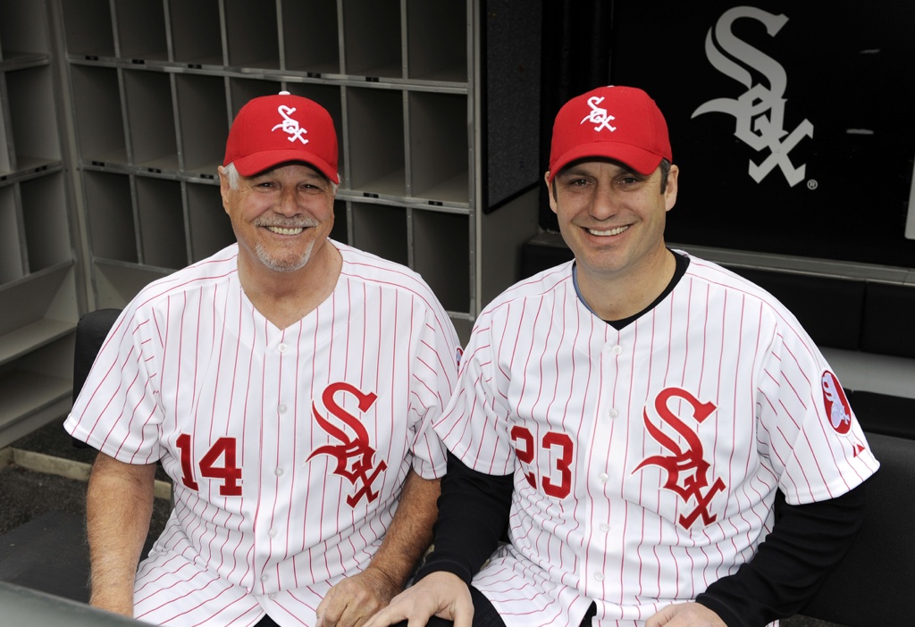
The above-stated chromatic issues notwithstanding, it’s a perfectly nice uniform. A little disappointing to see that they’re going with a button front and raglan sleeves, since the original version had a zipper front and set-in sleeves. The big question, of course, is whether they’ll bring back the sox on the sox
Interestingly, this uniform isn’t shown in the MLB Style Guide, and the Sox didn’t give any advance warning about it, so it caught everyone by surprise. In a world where everyone has already read, responded, and counter-responded to the State of the Union message three hours before it’s even been delivered, I for one love it when something happens spontaneously. Wish more unveilings were handled this way. Good.
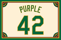
Membership update: As you can see at right, Jeff Adelsberger came up with a creative way to thumb his nose at the Uni Watch Membership Program’s rigid “no purple” policy. Major clevertude points to him.
Jeff’s card is part of a new batch of designs that have just been added to the membership card gallery. The printed/laminated versions of these cards should go out in the mail by Saturday.
If you’ve been meaning to follow through on that New Year’s resolution to finally sign up for a membership card already, you know what to do.
Meanwhile, there’s an exciting new development over at Permanent Record.
Uni Watch News Ticker: Cavs wore their CavFanatic uniform last night. … I’d never be able to tell this by myself, but Joey Potts says Cincy coach Butch Jones is wearing Adidas golf shoes in this photo. “I’ve noticed a few other coaches from Adidas-supplied schools wearing golf shoes too, but this is the first picture I’ve came across,” he says. … Yet another college hoops team to going gray: Purdue (from Jimbo Huening). … Yesterday I linked to the new Pro Bowl visors. Here are the full caps (from Jason Snurr). … Interesting note about Bruins goalie Tim Thomas in this article. Key passage: “Thomas made a pretty symbolic change at the beginning of last season when he drained the black and gold colors from his goaltending pads and goalie mask after a summer of trade rumors. Thomas removed the Bruins logo from his mask and instead replaced it with an image of the lucky coin he wears around his neck. The message was simple: From then on, Thomas was playing for himself first and the team second” (from Jeff Downe). … New lacrosse cleats for Hofstra. … Speaking of lacrosse, Jeff Brunelle says, “The first ever ‘helmet wrap’ (full helmet sticker) for professional box lacrosse was revealed last weekend by the Colorado Mammoth,” plus there are some new gloves for Penn State. … More G.I. Joe nonsense, this time for Milwaukee and Butler. They’ll face off wearing those designs tonight. … Remember that talk about the Rockets possibly bringing back their pinstriped uni as a throwback? Forget it (from Robert Silverman). … Octavio Dotel is about to set the record for the most MLB jerseys worn. … Did it ever occur to you that the Cardinals’ birds on the bat aren’t very proportional? (From Kurt Esposito.) … Love this old 1964 football-themed Pez ad sheet. … Here are the Rugby Six Nations 2012 kits. “For those who don’t know, the teams are, from left, France, Wales, England, Ireland, Italy, and Scotland,” says George Chilvers. … Okay, this is really weird: When the KOVO Volleyball League in South Korea had their All-Star Game recently, the players wore bows when they were introduced and the liberos dressed as comic book superheroes. As for the regular uniforms, they were pretty nice (from Jeremy Brahm). … Also from Jeremy: new away uniforms for the Japanese national soccer teams. From left, that’s futsal, men’s, and women’s. … Here’s a site devoted to soccer infographics, including one that shows 100 different depictions of a soccer ball as found on assorted team and association crests (nice find by Chris Cruz). … The Marlins haven’t been able to pimp out the name of their new stadium, so they’re calling it Marlins Park, at least for now. What a pity. … Penn State hockey has added a Joe Paterno memorial decal. “The same stickers will go on the women’s hockey helmets and the lacrosse helmets,” says equipment manager Dustin Allgeier. … Oh great, now there’s specially designed “performance” footwear for the annual coaches-wearing-sneakers cancer thingie (from Adam Jackson). ”¦ Doug Keklak was watching last night’s Minnesota/MichState game and noticed that the Gophers currently have three rather unusual NOBs. ”¦ The Clippers and Grizzlies will be dressing up as the Stars and Tams tonight. … Matt Hendricks of the Caps suffered an ear laceration in practice over the weekend and had to have his helmet fitted with an external ear guard. “I’ve never seen that before,” says Mike Engle. “Most ear guards are either completely removed (as seen on most NHL player heads), or left intact and installed from the interior (see Crosby and Malkin, or any hockey helmet at retail). Obviously, this was a last-minute modification.” … The Heat made a headband switcheroo at halftime last night, changing from NBA Fit blue to their regular black (from Keenan Bailey).
Matt Hendricks suffered the ear laceration, not Bradley.
Right — thanks. Now fixed.
That was *my* mistake originally. Sorry about that. But can I get boldfaced in the Ticker, as per your typical style?
Oops. Done.
I know that’s mostly cartilage (unless I’m way off-base), but… damn. That’s brutal.
Cartilage has more nerve endings in it than skin. That must have hurt like a motherfucker.
The White Sox also had 3 different “Sox” wordmarks going on at the same time in those 1971-75 unis. The change happened because then-owner Art Allyn sold his controlling stock to his brother John who wanted to revamp & restore the franchise. Why they chose red, it was never explained in the official team encyclopedia. Probably to get away from the royal blue of 1969-70 & nobody else wore red in the A.L. West.
If they ever brought those unis back or updated them, they would almost have to bring the powder blue roads with it to compliment as a secondary color. Would be a unique color scheme.
That is an excellent throwback set, and it’s almost amazing that the Sox managed to have unis that nice, even for a brief interregnum, during a multi-generation streak of remarkably crappy uniforms. What I think it shows is that the basic template can work with any primary color. Black is probably thematically best, despite the unfortunate reminder of the team’s sordid history, but if there weren’t already a Red Sox and also too many damn teams wearing red, the ’72 look would be great. But it would also work just as well with, say, green or purple or any shade of blue or even yellow. (Er, I mean, gold.)
It’s also interesting to see that even in ’72, the Sox were using a basically monochrome color-and-white scheme but slipped in a pale secondary color for accents. So the light blue functioned just as the silver/gray does today.
That light blue is so much nicer than boring old plain gray/silver.
13 Sunday games is a lot to test a uni. Reinsdorf originally said the current unis will stick around at least 25 years; tho that was back in 1991. Who knows, if it’s popular enough maybe they’ll switch. Just so sick of the black & silver. I need some color in my life.
“…Like, if there’s another team out there called the Red Sox, why would any other Sox wear red?…”
My question was Why don’t the White Sox wear white socks?
We all know why.
do we?
Yes we do, Phil.
Death of stirrups.
The red in their uni always baffled me as a kid also… however, that particular set looks just as sweet as I remember it.
-Jet
But they wore pictures of white socks on their red socks, which they wore over white socks. It’s like an infinitely recursive picture!
Loved the White Sox red pinstripes and the powder blue roadies from 1971-75. It was a color-full era as most TV broadcasts were now presented in color. Today, for the most part, the colors are mostly cooler tones. Heck, let’s bring back the Padres’ brown and gold, the Brewers’ blue and gold, the Astros’ orange and blue, etc. full time.
Why doen’t the patch on the 1972-75 White Sox jersey have the silhouette player on it?
You mean why don’t the throwbacks they’re wearing this year have the silhouette on the patch or why didn’t they use that as their sleeve logo link?
Always liked Tim Thomas’ white mask. Now I read that it was motivated by putting himself above his team is upsetting. Thought his non-trip to the White House, while he had the right, came off selfish. Hoped that’d be the last we’d hear of acts like that from him. Guess not. Always had great respect for him seeing how he took his road to the NHL and became a superstar. Plus he grew close to where I’m from was always a bonus. Thought he was one of the exceptions of today’s self motovated sports stars. Don’t get me wrong, still a huge fan of his, but it’s just disapointing to read.
To be fair to Thomas, his white pads and helmet representing a “me-first” mentality is pure speculation/armchair psychology on the part of the writer. And before this whole White House thing I had never heard a whisper that Thomas was not a team-first guy.
John Buccigross, the Sports Center anchor, tweeted a quote which said that within the locker room there was some feeling that Thomas was not a team first guy.
Thomas’s mask. During the playoffs last year they talked about it (and if I remember correctly) and the reason given was the impression Tim got was that RASK was going to be the #1 and he was going to backup (maybe traded) so with a blank mask it would be easy to repaint. And where does it say a Team logo must be on a goalie mask? With that logic I guess Martin Brodeur didn’t care for the devils last year.
Actually, Brodeur’s mask is interesting. The solitary J was designed to split the difference between the New Jersey and the Utica affiliate logos. For a brief moment, the J was replaced by a MB30 logo, but I guess the hockey gods voiced their disapproval.
That MB30 logo was just an ugly mess when placed on Marty’s mask. I’m glad he’s reverted to the “J”.
Sometimes, less really is more.
What’s up with those “NBA Fit Blue” headbands? Josh Smith (Hawks) was wearing one last night with their Navy road unis and it looked like he got dressed in the dark, like he just couldn’t quite match the blues..
You know that old “you learn something every day” adage?
Someone explain this “box lacrosse” sport to me, please.
Indoor lacrosse, played on a hockey-rink sized playing field.
I thought all indoor lax was played on hockey-rink sized surfaces. Oh well.
Per Wikipedia:
“Box lacrosse, also known as indoor lacrosse and sometimes shortened to boxla, LAX or simply box, is an indoor version of lacrosse played mostly in North America.”
Can’t read the Japanese text of the page regarding their new unis, but I suspect that the kit on the left is *futsal* (5-a-side indoor soccer), not futal.
Yup. My bad. Now fixed.
Noticed this the other night and forgot to mention it (partly because of my depression over Purdue’s loss, and my disgust with their gray uniforms). Saw that Tim Hardaway Jr.’s NOB reads: “HARDAWAY, JR.” Can’t find a good shot from that game, but here’s one from another:
link
Not often a comma is used between a surname and “Jr.”
Still doesn’t make much sense to me for him to use it at all at Michigan, since his dad went to UTEP.
Got to agree with the disgust for our Boilers’ grays- I say get rid of ’em and go with gold – an actual school color (what a concept!)
I’m in complete agreement about the gray uni’s and the outcome of that game. But i HATE how our gold uni’s have the school name in white on the front, and the white uni’s have the name in gold. You can barely see it and it kinda looks like shit imo
Uh, those sleeves in the sox throwback picture don’t look like Raglan to me – they look set-in just like the picture with the zip fronts.
I always thought Raglan sleeves had a curved seams and fully separated the jersey front and back at the collar. Is that wrong?
They’re raglan. You can tell by the horizontal pins on the shoulders. Compare that to this shot of the old set-in sleeves:
link
link
On the proportionally correct birds on the bat … I give an A for the thinking, but wouldn’t the bird on the right be even smaller? I mean, the bat is coming at us (closer to us on the left), correct?
I don’t mind the dispproportionate birds, even though I tend to be a visual literalist. But I have long wished that the Cardinals would put gray, female cardinals on their road unis. Would complement the gray unis and blue caps nicely. I mocked it up once:
link
link
Aren’t female cardinals usually more of a buff color?
That’s link.
Of course, some female link are more rare than others.
True. But from afar, in winter light, they’re gray enough. Especially when you see ’em next to their partners.
But if the Cardinals wanted to switch from gray to buff road unis and keep the red male birds on their chest, I’d be happy with that too. Especially if they switch to red caps.
In a similar vein, shouldn’t Donald Duck be much, much bigger than Mickey Mouse?
-Walter
My mind = blown
Well, then they shouldn’t be allowed to speak, either…
This steers us away from more pressing issues, such as, “How can Donald get away with not wearing any pants?”
how do you get away with it?
Veering off with you Jim. Why would Fred Flintstone ask for the large order of ribs at the end of each show, if he know’s his car is going to tip over?
I always thought it was one of those mini bats you can buy at the gift shop.
Yeah, those giant birds have always looked off me. Doesn’t look nearly so bad when the equipment is link.
And then there’s link, with the bat just a bit too big for him. Perfect.
Cardinals are like nine inches long plus the tail. The ones on the uniform are disproportionately big but in those proportions the bat is something like 50 inches long.
The ONLY thing I like on the Nike unis are the championship stars. Really, I like the idea more than I like their execution. Something more subtle would’ve been better. But…Nike doesn’t do subtle.
those aren’t sweatback sublimations in the hyper elite. Those are laser cut patterns.
This changes everything.
Consequences will never be the same.
Paul,
I love reading your overviews/takes when these hyper-advanced technology uniforms are released. I agree with you on all points (The Team Nike point is dead-on accurate). I can actually feel the distain as I read. Your distain for these corporate rags is so thick I have to wipe it off my computer screen once I leave the page. It’s beautiful. It’s such pure distain though, like it ‘aught to be. Pure, natural distain.
Disdain.
Yes. Pure, natural disdain. Like it ought to be.
“Your distain for these corporate rags is so thick I have to wipe it off my computer screen once I leave the page.”
~~~
i hope that is the only stain you have to wipe off your computer when you leave the page
“The answer, it seems to me, is that Nike likes to create hierarchies of envy, stratifications of desire – or, more plainly, a caste system. It’s a stacked deck of haves and have-nots: If you’re in the 1%, you qualify for the good stuff; everyone else is treated like they’re in steerage.”
This has to be the most chilling & disturbing thing I have ever read on this blog. But it’s totally spot-on.
And referencing to yesterday’s comments, I do not pledge allegiance to any particular sporting company; Adidas, Nike or Reebok. I don’t know how one would decide over the other. They all seem pretty obnoxious & invasive to me. I couldn’t imagine wearing something that just had a manufacturing sporting company logo on it – it’s either bare bones plain or team logo for me.
I thought the same thing as I read it.
Me too. Really, really great stuff there Paul.
Thanks, guys. Nike’s creation of a de facto caste system is something that’s been in the back of my mind for a while, but I’d never articulated it — even to myself — until now. Writing it out like that was useful for my own thought process. Glad it hit the mark with you, too.
There’s an interesting perception vs. reality question here though. Or perhaps bullshit versus reality. If Nike’s claims (or the claims of any manufacturer selling supposedly performance-enhancing products) are true, and if they do not make the supposedly performance-enhancing products available to all, then they are creating an unfair competitive environment. And all sports have rules designed to prevent any competitor from gaining an unfair advantage of that sort, so the basic values of sportsmanship should dictate that limited-availability, performance-enhancing equipment be banned. It’s no different than, say, one team having access to graphite-composite baseball bats while everyone else in the league has to use wood. And I don’t mean it’s closely analagous; it is literally an identical situation.
If, that is, Nike’s claims about the performance-enhancing effects of its products are true. My suspicion is that the reason these products are not banned by the NCAA, leagues, or other governing bodies, is that everyone knows – and Nike probably acknowledges privately – that the performance-enhancing claims are bullshit. Nike is claiming to be making available graphite-composite super bats, but in reality all they’re doing is painting regular old ash wood bats gunmetal gray.
So the hierarchy, the caste system being created is an illusion; it’s a caste system of programmed desire in which certain magical incantations satisfy magical-thinking wishes planted by the magician in his audience of suckers. This is Nike convincing the Sneetches today that a star on the belly is superior to no star, and tomorrow that no star is better, and then selling star-painting and star-removal services. It is not Nike actually giving any particular Sneetches, star or no star, a competitive advantage. So while it illustrates much that is wrong with the values of modern consumer culture, and particularly the way we educate our children, it isn’t actually perverting the foundtational values of sportsmanship.
If, on the other hand, Nike’s claims about the performance-enhancing effects of its limited-availability products are true, then the leadership of any conference or league that permits the use of the equipment should be fired and blacklisted from ever again holding a position of responsibility over athletic competition.
A couple of entries down the ticker, I noticed Minnesota was still wearing the System of Dress jerseys, so can I assume since the Gophers have never won anything, they can go suck eggs?
-Walter
I agree that amateur sports have become far over-corporatized. However, I have a nit to pick with the tone of the statement “If you’re in the 1%, you qualify for the good stuff; everyone else is treated like they’re in steerage.”
The one area in which we seem to be totally in favor of a winner-take-all system – giving all the spoils to the 1% – is sports. UConn won last year’s NCAA basketball tournament, although but for an inch here or there it could have been Kentucky, or Butler, or any other number of teams. However, we’re comfortable with recognizing UConn as the undisputed champion, because they earned it under our rules: they get all the championship gear, all the accolades, all the interviews, etc.
I still think Nike’s (Adidas’s, Under Armour’s) marketing practices are pretty douchey. All I’m trying to say is that their recognition of champions with special gear isn’t as elitist, in context, as it might sound in most situations.
Anybody remember George mason basketball? More specifically, that year when they (and LSU as well) made the Final Four? Well, the following year, Nike made a new line for all of its one-time Final Four “finalists.” I THINK it was the Nike Elite line. LSU was outfitted with the new line right away. George Mason, however, was still stuck with the old Nike horns. Complete bullshit. Caste system based on merit, but with selective enforcement as to eliminate “beginner’s luck?” No wonder I have no patience for university basketball outfitting shenanigans. (But I remember a lot, thanks to this site. So please don’t confuse me for a fan. I’m not.)
Let’s all be honest here, that’s part of life. If you win championships and big games, you get nice stuff. Why shouldn’t it be that way? Teams like UK with 7 championships earn it. Now I dont think that they should earn drab, ugly gray uniforms, but there’s nothing wrong imo about them getting more than let’s say a team like Penn State.
It comes down to Scott’s point above. If these really are better unis to play in, they should be available to everybody – Penn State has a hard enough time competing with Kentucky (vice versa in football). If it’s just marketing BS, then it’s OK to “reward” favored schools.
That article about Octavio Dotel poses an interesting question: which player wore the most uniforms while playing for a single team? Tim Salmon is a pretty decent guess, and he’s almost certainly had the most name changes for a single player (modern era at least), but I’m sure there are others that could give him a run for his money.
which player wore the most uniforms while playing for a single team?
Any Met in 1999.
Carlton Fisk wore 4 completely different White Sox uniform sets & 5 different caps.
Harold Baines too.
Yes he did, eventually. Just not consecutively.
Not baseball, but Olaf Kolzig has worn every single iteration of the Washington Capitals uniform, except for the Winter Classic reprises. That means:
Original RWB’s: home and away–2.
The blue and bronze era: home, away, and black alternate–5 so far.
There were two similar yet distinct white jerseys during that time (“Capitals” was removed from the hemline in the later version), so add another one. 6.
And the RBK Edge, home and away. Grand total: 8.
Would you count switching from a link to a link on the black unis as a uni change? Or not, since none of the actual design changed?
I’d have to say “no,” for the same reason that Chipper Jones only has one distinct white uniform. After all, in both of those cases, the respective blank jerseys–and even their hypothetical NNOB counterparts–saw no change.
For the NBA, off the top of my head, Allen Iverson has at least 9 Sixers uniforms. Rookie season’s red and white set, the BFBS era with at least four different uniforms (black, white, blue, blue-without-arm-striping…do you want to count the other tweaks?), the “current” red and whites, and a Syracuse Nationals throwback.
Come to think of it, Anderson Varejao has a pretty high number with the Cavaliers too. He’s worn everything LeBron wore (the standard wine and red, the navy alt, all of the umpteen trillion Cav Fanatic alternates), and every post-LeBron jersey to date as well.
And forget Olie Kolzig, Teemu Selanne has worn nine different Ducks uniforms! Original white and purple, the other parallel set with the vertical shoulder stripes, Wild Wing, the black Anaheim alt, and all three “non-mighty” Ducks jerseys.
Of course, it depends on how you want to count the mix-and-match Pirate uniforms. Willie Stargell wore the vests at Forbes Field, the original pullovers with no belt at Three Rivers, those pullovers with the gold pillbox caps in ’76 (which you may or may not count), and then all the combinations from ’77-’82, including losing the stripes after 1979, and three other combinations with the unstriped whites in September 1980.
Saw a clip of Drew Brees being interviewed at the Pro Bowl this morning. His t-shirt had a big swoosh on the side. Does this probably mean Nike will be making the jerseys, too?
I was specifically told by the NFL that the Pro Bowl uniforms would not have maker’s marks.
Not real impressed with the Mavs Championship rings:
link
Those look like Monopoly game board pieces.
“… Here are the Rugby Six Nations 2012 kits. ‘For those who don’t know, the teams are, from left, France, Wales, England, Ireland, Italy, and Scotland,’ says George Chilvers. … ”
***
Aside from the egregious corporate advertisements, I think they’re pretty good. Wales is the best, I’d say, but only Scotland stinks bad. What do you think, George?
I’d like Italy to win the tourney, but the Irish are a much safer bet.
“… … Here’s a site devoted to soccer infographics, including one that shows 100 different depictions of a soccer ball as found on assorted team and association crests (nice find by Chris Cruz). …”
Wonderful.
considering Oregon won the inaugural NCAA tourney, I’m surprised they don’t have these ungodly Nike outfits.
I think the stipulation is that you had to have won you championship while wearing Nike gear.
Yep. Lots of current Nike schools not included here because they weren’t wearing Nike for their National Championship(s).
For instance, in 2000, link.
I once sent the White Sox a stern letter, in 89, I think, insisting that red should never be used as the primary color for the “White” Sox. That was when they were considering which “Classic” Sox uni to return to after the script “White Sox” period of the late 80’s, in preparation of the new Comiskey.
Twenty years later, and I’m happy to see those babies return as a Sunday alternate. My big question: will the back half of the jersey have the oversized numbers and NNOB, true to the 71-74 design?
And who knows, this may be the inspiration they need to replace the silver on the regular jerseys with red – a UNIQUE color combo in baseball at the moment.
As for powder blue road uni’s – hey, they’re not wearing the red on the road, so forget about it. I’d be happy to settle for the 60’s-70’s influence in piping (black/white/black) or (white/black/white) to replace that bullshit two color elastic underwear look they’ve had on their road sleeves since 91.
One thing they got right- the logo on the cap is missing the flourish on the “S” (actually it’s parallel with the “S”, seems to be part of the “O”) – exactly like the period embroidery. Nice eye.
“And who knows, this may be the inspiration they need to replace the silver on the regular jerseys with red — a UNIQUE color combo in baseball at the moment.”
Eh?
Cincinnati Reds – red with black accents
Houston Astros – black with brick red accents
Arizona D-Backs – black with Sedona red
As much as I like the ’59 Go-Go Sox unis with black & red, I think their time has come & gone. I’d want the Sox to go either straight black & white, or red & powder blue.
Interesting note: when the White Sox were designing their 1991 set, they considered navy blue:
link
Well, it would be unique in the AL (unless the Astros stick with their colors).
Hey, with the Angels, Rangers, and occasionally the Red Sox wearing red jerseys, you can keep the red.
The Angels are particularly egregious. Red numbers on red softball tops.
Never, ever been a fan of the Silver & Black combo for the Sox…..I know that combo sells crazy well, but don’t change your identity for $. (pie in the sky, delusional, I know, I know….)
Naw, I got sick of the black & silver by ’93. Been buying the navy & red retro gear ever since. When you’re a post-1975/pre-September 25 1990 White Sox fan, you have no real ties to the Olde English logo & its variations.
Unfortunately black & silver was a color change everyone was more than willing to make for the White Sox.
On second thought, those powder blue and red road jerseys would outsell the rest of the league jerseys if the Sox wore them on Sunday road games. But alt/throwback road uni’s never happen. So I’ll forget about it. It’s a shame, because M & N finally got those right.
IIRC, it’s your opponent’s responsibility to furnish your visiting uniform in a Turn-Back-The-Clock game.
-Walter
Wow. That Nike presentation was something.
You didn’t happen to get the lighting designer’s name, did you? I have a production of Midsummer coming up in a couple months.
Lot’s of dislike for the platinums here in Tucson. First, the ZONA name, which virtually zero Arizonans use and many feel is an outsider’s name for our state.
Second, more than any other time, this is totally a Team Nike move. Partial use of team colors as an accent. Here is today’s take from the Tucson Newspaper.
link
Initially, I like the grey uniforms worn by teams like The Ohio State when they debuted a few years back. Now, it’s plain ridiculous. The Team Nike point couldn’t be more correct. If any of those were stand-alone uniforms they would be pretty cool, but as a whole, they lack major creativity.
I happen to like the color grey. Perhaps it’s because I recently lost my mother to brain cancer for which the color is grey.
At least with Ohio State, gray is an actual school color.
And they’ve been wearing gray unis link.
Sorry to hear that about your mom, Benjamin.
fyi, that’s a bad link
link?
If not (and you really want to see what I’m referring to) just google image search “Jimmy Jackson Ohio State” and it should be like the third image returned.
Since you asked the question I will answer … I actually like gray uniforms. I don’t consider them drab at all. I guess because I just like the color gray so much …always have.
I agree with some of your Nike points and disagree with others. Very interesting how you pointed out that all the games where they are wearing these are vs. other shoe companies.
One final point … NIKE always throws out there that their uniforms are the most advanced uniform ever … according to whom? You can claim anything you want when there is no one measuring the results.
The swoosh serves as the apostrophe on the zona uniform.
Good thing the White Sox didn’t have red softball 3rd unis in 1972. Otherwise some parent in Boston would have had to explain to their kid why the White Sox are wearing red & the Red Sox are wearing white.
The gray/platinum look is dumb for a number of reasons. 1 and 1A are the Team Nike argument and the obvious issue of gray NOT BEING A SCHOOL COLOR for any of these teams. In fact, is there a school for which gray is an official school color? Outside of Ohio State, I can’t think of any off hand.
I think that there should be an issue with a company providing certain schools with a competitive edge and not allowing others that same edge. Regardless of how big or small that edge may be. They are marketing it as an edge and therefore are knowingly trying to influence competitive balance in college sports. Am I taking that too far? Seems like the NCAA should take a look at this from the standpoint of fair competition. Too Polyana-ish?
Georgetown’s colors are blue & gray.
Rice is blue and gray and a Nike school. I think our only uniforms are blue or white though.
Duh. Forgot about Rice. Also Washington State.
And how could anyone forget link!
U of Memphis
link
if gray is dumb then white is dumb
unless white is a school color
we’ve already gone over the arguments that games can be color-vs-color in hoop and as such, there is about as much reason to have a white uniform as a gray one
Which baseball player actually has worn the most different jerseys if we take that literally to refer to multiple uniforms from the same team as different?
UConn’s newspaper has a section called the InstantDaily, where students can submit random quips about college stuff. Today (link), someone submitted this gem
“Did you see those hideous uniforms? We’ll need to change our fight song to “Connectict UConn Husky / Do it again for the white and gray / So go – go – go / Connecticut Hip Hooray!”
I’m so going to sing it that way on Sunday. Especially since I submitted this.
What is gray but a shade of black?
A few things:
1. It’s funny, was just talking with a co-worker at a coffee break this morning about gray and how I’ve liked what teams have done with this even though it’s screams GFGS. That being said, I HATE these unis. I like what Ohio State has done in the past. I really dig what Penn State has done this year as an alt, but I just don’t like these at all.
2. I don’t mean to pick on reader Brandi Bennett but the “think of the scorer” complaint has been brought up in the comments in the past. I think that saying it’s going to be “impossible to stat a game” is just a bit of hyperbole. I’ve covered high school basketball and sat courtside, in the stands and in press boxes above the general seating area. I’ve seen the gambit of different uni/number styles. Also, I was in a position where I was keeping my own numbers AND working on writing a game story. It can be done. You may have to concentrate a little more, but if you’re keeping book or working the scoreboard, well, that’s kind of your job. Furthermore, I’d like to know what makes these unis potentially so challenging? Heck, when I look at the Duke, Florida, Kentucky, Syracuse, North Carolina and Baylor set, I see a nice block white number popping off the gray background.
At least this is a rational, thought-out, based-on-experience comment, as opposed to the usual “screw the stats people” barbs we get here.
True, it won’t be *impossible* to score the game, but it will be harder, for sure. Unnecessarily so, at that. Stealth/reflective numbers should be saved for the folks who want to buy a specialty jersey.
At least the shoes have school colors. That’s the thing that really stands out in the photos. Imagine that…
screw the stats people
and besides that, if you want to make it easy to score, you and ricko already have made it clear that black numbers on white jerseys and white numbers on black jerseys are the easiest to read
you want every game to be black versus white, be my guest…
Ricko said that black/white matchups give you *maximum* visual separation, but that doesn’t mean we think every game needs to have that much. Instead, I’ve mentioned optimal (as in most *desirable*) visual separation. “Maximum” is not always the most desirable…there’s such a thing as “just right.”
When I do an ADA sign package for a building interior, the letters must have a certain contrast to the background color of the sign so that folks who can’t see so well can see the writing on the sign. The sign company gives you about 50 combinations of colors that have good contrast of letter versus background. I believe it is based on some measurement of level of contrast between colors. White = 1 and Black = 9 (everything else is in between) and ADA signage has to be more than 3 or 4 units difference. You can’t put black letters on a dark blue sign.
Why can’t the NCAA and every other league just institute some similar rule?
Based on the pictures I saw yesterday, the numbers were shiny grey on top of flat grey. I could be wrong, but that’s what my perception was.
The back numbers look white, but the referees/stat men don’t always have the luxury of seeing a perfect view of a player’s back when scoring a game.
@andy I was going off the views on Nikeblog so if they aren’t optimal as far as what they’ll look like under arena lights, I’ll stand corrected
@vilk thanks for that response, I mean I’ve been there! I’ve seen a lot of whack fonts, but never once did I feel I had to struggle. Of course, this is mostly WPIAL basketball, which can be plodding no shot clock hold the ball 45 seconds kind of ball, but there are teams that run and gun. I think football is a much more challenging game to stat, especially when it comes to tackles-assists.
In reference to the Caps player with the ear injury, I can’t remember off the top of my head what year, but Igor Larionov wore a similar protector when he played for the redwings. I am trying to find a picture of it as we speak.
I just got back from France, saw a bit of hockey.
The following link is to a picture of Morzine Penguins during a line change:
link
Why is that guy wearing a backwards F?
And check out this sweater from the Flying Frenchmen:
link
it’s a 7
Worst 7 I ever saw in my life.
Its a french seven. Their handwritten 1’s also have long top tails, so it too looks like a seven. I guess they added the crossbar to the 7 to tell it from the 1’s.
Looks like the practice shirts, and coaches shirts at the Pro-Bowl are swooshed out.
link
link
Just saw Catch of the Day. Swissted = Brilliant.
Credit goes to one of my ESPN editors, Dave Wilson, who tipped me off to that site yesterday.
So much fun to look at.
Great Stuff!!
Fun to look at, but the vast majority just don’t work for me as posters for the particular bands or shows in question. Great art, not great design. (OTOH, the ones that work, really work, and are some of the best show posters I’ve ever seen. Probably sufficient to validate the entire exercise!)
I think the point was to juxtapose bands that play music of a style very un-similar to the theory and philosophy of the Swiss Style. I don’t think any of them are seriously intended to work as posters for the particular bands.
Andy, I’m sure you’re right, and if anything that makes the ones that work really well – one of the Clash posters, a Black Flag concert, to name two from the first half or so of the page – all the more awesome.
Ah yes, that storied, age-old Syracuse-USF rivalry. Wait, what?
I’m still calling it I-95 (or whatever):
link
Scandalous.
Scandalous, but it’s old news. There’s a Lucent Blvd in Southern Colorado and a Qualcomm Way in Southern California.
Government should never sell, buy or commandeer ads. It makes propaganda even more ubiquitous when we need to get rid of it.
These schemes also put the government in direct competition with private advertising businesses, and in so doing drive down prices and profits for one sector of the marketplace versus other sectors. In short, you can be in favor of “limited government” staying out of the free market, or you can be in favor of these naming deals, but you can’t be both.
Or you can be in favor of really limited government and say privatize the roads and if the companies who own them want to sell naming rights, good for them.
I can’t speak for Qualcomm, but at least in Lucent’s case, wasn’t that named Lucent since that road essentially went into their corporate buildings (at least at the time)? You’re referring to down off C470, right?
By the way, big thanks on the mention about Big Papa’s BBQ…wife and I tried it the other day, the ribs made me feel like the Flinstones’ brontosaurus portrayals.
Glad you liked Big Papa’s.
IIRC the Lucent Blvd did start off as an exit off 470 just for their facility, but it seems to have some other stuff now. They could have done like they did a few years earlier in that same area with Titan Road, it had been built for an aerospace contractor but it was named something a little less blatantly commercial.
Could be. One of the last exits on the New York State Thruway before you’re in the Bronx is for “Stew Leonard’s Drive”. But that runs to the factory. And of course, back when my dad and I used to go to Yankee Stadium by car (before the train station was there), the milestone for knowing we were close was going through the Yonkers toll barrier and seeing the Stew Leonard’s Drive exit on the right, along with a giant headquarters.
While making an earlier comment, I think I just figured out the whole gray trend.
What sticks out in this photo?
link
That’s right…the shoes.
Cue Mars Blackmon…
“I think I just figured out the whole gray trend.
What sticks out in this photo?”
~~~
if those uniforms had been white instead of gray, would the shoes have stood out any less?
no?
now, i happen to like white unis, as they belong on the home team, but unless white is a team color, how are the gray unis any different than white ones?
don’t use the “gray isn’t a school color” or “black isn’t a school color” (even though i detest bfbs) unless you’re also willing to concede that white isn’t a school color either
if you accept that, then you should either a) demand color-vs-color games (a good thing) OR stop complaining about not using school colors, because white is no more a school color than gray or black aren’t
White is bright. Black is bold in its darkness. Both command your eye’s attention. Gray, on the other hand, is just…there. So, the first thing I noticed was the colorful shoes.
The reason I like cloudy days when picking the 5&1 is because the weather is less of a factor then. On a sunny day, the white unis get washed out. In a night game, the darkness can swallow up a less-than-brightly-colored uni. When it’s cloudy, on the other hand, the colors really pop. Same concept, and I think that’s what Nike’s thinking, too.
White doesn’t need to be a school color. It’s the longstanding de facto fallback alternate uniform color, because it provides optimal visual separation from 98% of all other colors. White unis have been around so long because they work. You’ve been hanging around The too long.
now, i happen to like white unis, as they belong on the home team
I didn’t think a longtime link fan would say that…
The sad thing about Nike’s Chelsea Art Show / Product Unveiling, ultra-modern Tron 5000 mumbo jumbo, Professional Battle Soldier uniforms, etc., is that as ridiculous and douchey it is… it also works. Nike is massively successful, in large part because of things like this. I would expect that in the future, we’ll be seeing more, not less.
The answer to why Nike doesn’t give the latest and greatest technology to everyone is simple…this is just the introduction of it. Just like when they introduce things in football they give it to high profile teams first. Then the next time a team is up for uniform redesign, whether they’re Duke or Iowa State they’ll be transitioned to the new tech.
That’s actually the 2nd time Purdue has worn the grays (earlier vs. Miami). Players love ’em, of course. They’ve worn those now as many times as their gold alts this season.
Best thing about the White Sox throwbacks on home Sundays? They used to wear the all-black jersey on home Sundays. So we’ll be seeing less of that!
I like the all-black, but only if its used sparingly.
“They used to wear the all-black jersey on home and road Sundays, Mondays, Tuesdays, Wednesdays, Thursdays, Fridays and Saturdays.”
Fixed.
Really, I wouldn’t mind the black alt so much if it was truly an alt and if they had some kind of set schedule as to when it gets worn.
And I’m hoping that Ozzie’s departure means that the “starting pitcher picks the shirt today” rule is gone, too.
Does anyone else feel like the sweatback designs on these gray jerseys is reminiscent of the MLB Turn Back the Clock jerseys? The way that they’re at an angle/diagonal to the jersey, as big as the whole back, etc. When I saw the pictures, I immediately thought of this: link.jpg
Sorry, I meant this: link
anyone notice that the colts had a blue helmet w/ white horseshoe on the podium banner during their press conference to introduce pagano? are they changing their helmets?
I wouldn’t think so. That podium has featured the reverse helmet since Tony Dungy’s days. Just a design quirk, I suppose.
Cool stash of 80s sports posters…
link
Check out Eric Davis with the stirrups under the suit. I could see him strutting across on MLB fields everywhere, putting all sartorial perps behind bars.
James Worthy-L.A. Law… he’s got a hot secretary and his uniform in his briefcase.
For a long, long time I’ve read all UW Nike articles with the thought in mind that Paul loathes the swoosh. I’ve often times found myself at odds with Paul’s take on Nike and have even been irritated. I’ve always just assumed Paul had the “get off my lawn” mentality when it came to modern design, and that’s what really fueled his disdain for Nike.
No longer.
The wall has come down. I’ve had enough.
The very reason I got into the design business 20+ years ago was for the creative itch it scratched. I always suspected others followed the same path. The first ten years or so, I barely kept the lights on, but I continued doing what I loved.
I’ve always had some respect for Nike because, above all, they seemed to push the design boundaries. No more. The cleverness of design has not only taken a backseat to the corporate dollar, it’s been kicked out of the car.
These “new” basketball uniforms are the latest in a long line of “designs” that lack any ounce of imagination. IF Nike were really about selling performance enhancing technology, that’d be a little different. Clearly, that’s not what this is about.
Paul, you laid out an argument that is indisputable today. Nike is in it for Nike, not for the schools or the sport.
Forgive me for ever denying what you’ve known all along.
P.S. Get off my lawn.
Are the new red White Sox unis NNOB with those HUGE numbers like they wore then? Will they have many beltloops like then or tunnels?
I’m guessing not. And pajama pants will mean no little white sock emblem on the stirrups. Triple meh.
New ERA NFL Pro Bowl hats..on sale in the Big Apple:
link
Pro Bowl Gloves & Cleats getting the Nike Treatment link via Darren Rovell’s twitter link
(Sees a swoosh on the horizon)
“The ground shakes, drums… drums in the deep. We cannot get out. A shadow lurks in the dark. We can not get out… they are coming.”
all I know is for a couple of years, I had a contact @ Swoosh who sent me more free stuff than you can possibly imagine. I mean, I had EVERYthing. Tons of Jordans, parkas, shades, watches, real game jerseys, NCAA, staggering.
The Fedex guy grew to hate me in my building, with all the packages marked MEMPHIS on the side. But me a big warehouse there or something.
But man, what a ride, what a ride.
uh that was “Must be a big warehouse there or something.”
Marathas helmet leaked link Actually, prototype of Schutt helmet. Navy blue, orange, cranberry and metallic silver. New logo revealed at EFLI.com.
#EFLI #Marathas helmet features orange cranberry orange stripping! link
link
The symbol crest upper logo image over the custom team word marks are establishing a wonderful brand footprint for the EFLI.
Sorry Platinum Nike but the NJ Nets had an grey alternate jersey, which was really a very popular uni 15 years ago. Again, the originality pouring out of Beaverton is embarrassingly no more than more design knockoffs.
link
On TNT right now the Grizzlies and the Clippers are playing in ABA uniforms. The Grizzlies are wearing Memphis Tams jerseys and the Clippers are wearing the LA Stars in a color on color match up.
Also, those Chicago White Sox uniforms are my favorite White Sox uniforms. I always loved those.
This just became my computer’s desktop background:
link
C’mon NBA! You have two teams playing each other in ABA unis and you can’t break out the red, white and blue ball? Weak ass!
jim vilk approves of this
especially the “tams”
Here’s more pics
Tennessee Arkansas Mississippi —–> Memphis Tams