
Click photos to enlarge
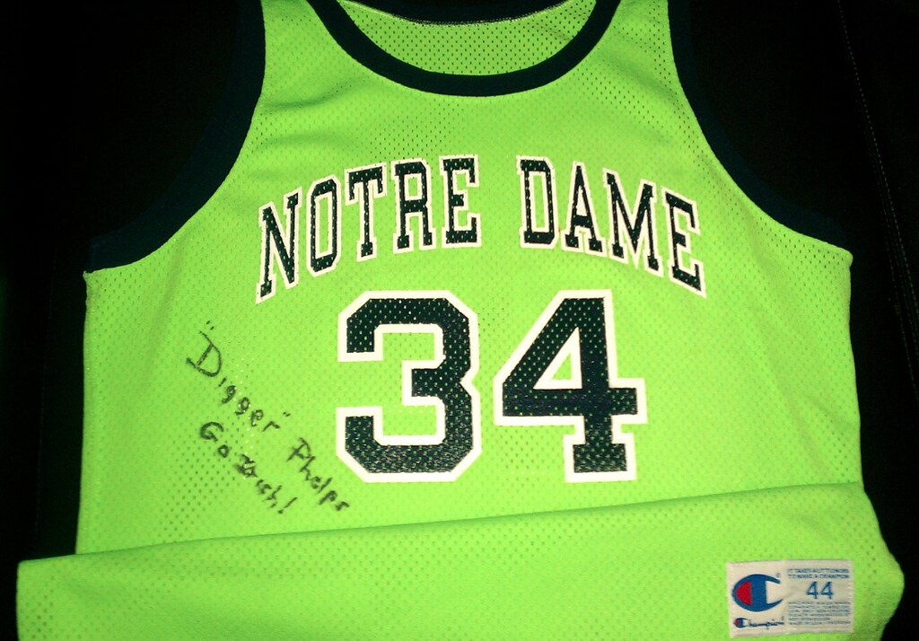
For one game in 1991 — and only one game, thankfully — Notre Dame basketball coach Digger Phelps outfitted his team in lime green uniforms. (There’s an account of the game, but no photos, here.) The jersey you see above, which is owned by Uni Watch reader Jeff Flynn, Jr., may be the only one remaining from that game. I’ll let Jeff explain:
Digger Phelps occasionally designed uniforms for Notre Dame. He designed the famous shamrock jerseys from the UCLA game, where they broke the 88-game winning streak, and he designed these lime green jerseys for an emotional lift during a down season in a nationally televised game against Syracuse. It was just a one-game thing, and it almost worked — Notre Dame lost by just one point.
Evidently the announcers made lots of “Don’t adjust your dial” jokes during the game, and the Notre Dame athletic director was outraged. After the game, he summoned Phelps to his office and explained that Notre Dame’s colors were Madonna Blue and Papal Gold and demanded that the green uniforms be destroyed.
Assistant coach Jeff Nix, who runs a charity called CamoKids, somehow managed to save this jersey. He later gave it to Phelps to remind him of his uniform-designing days, so for a while the jersey was in Phelps’s private collection. But when Nix later later asked Phelps for an autographed item to raise money for CamoKids, Phelps gave him back the green jersey as a joke. The person who obtained it at a CamoKids auction later sold it to me.
The jersey was worn by Oliver Gibson, who played football and basketball for Notre Dame, and who later played for the Steelers. Unfortunately, he didn’t get into the game (benchwarmer, close game). It’s hard to tell in the photos but the trim on the jerseys and around the letters/numerals is navy blue, not black. It looks slightly better in person.
Faaaascinating. Jeff says he hasn’t been able to find any photos from that ND/Syracuse game, and I haven’t turned up any pics either. Did Notre Dame burn all the pictorial documentation along with the uniforms? If anyone can find some visuals, I’d like to see them.
Uni Watch News Ticker: Here’s an absolutely sensational article about the guy who washes and repairs the Giants’, Jets’, and Eagles’ uniforms. Tons of great details. Essential reading. … Funny article about jersey etiquette for Colts fans (from Timothy Lofton). … Earlier this week I had a Ticker item about rugby players playing with their socks bunched down at their ankles. That prompted an informative note from Bruce French: “I do the same thing — not for the look, but for the protection the bunched-up socks provide my ankles. Yes, I could get ankle braces, but those are expensive and I’m already wearing the socks. Most players who wear their socks in this manner do for the same reason.” … Interesting situation for the Nets, who now have four Williamses on the roster! “And two of them have first names that begin with S, so maybe we’ll see some FNOB action,” notes Nathan Gemignani. … TCU quarterback Casey Pachall shaved the school logo into his head the other night. ”¦ Garrett Malcolm got his hands on a 1964 Milwaukee Braves scorecard and scanned the whole thing for our enjoyment. Some really great ads in there. ”¦ Terry Duroncelet was watching the Sam Houston/Montana State football game two weeks ago and noticed some inconsistencies in Sam Houston’s 2s. ”¦ You know uni-watching has gone mainstream when the Wall Street Journal, of all places, runs a boilerplate piece on the best and worst college football uniforms. ”¦ Michael Maggert has an original, pre-lawsuit Jags helmet. “We were living just south of Jacksonville when the city was awarded the franchise, and all sorts of merchandise immediately went on sale,” he says. ”¦ J.J. Watt of the Texans committed some critical penalties in last night’s game against the Colts, but he really should have been flagged for improper helmet decal adherence (screen shot by Nathan Walker). ”¦ Rex Henry spotted this guy on the street in DC. What could that logo be for, I wonder. ”¦ Brandon Roberts sent in some great old college hoops pics, including views of UNC’s numbered socks, Xavier’s horizontal striping, and Coach K from his days playing at Army, wearing No. 12 at home and No. 13 on the road, as some teams did back then.
Holiday schedule: Phil’s taking the weekend off. I’ll be open for business tomorrow, although I can’t guarantee how extensive the content will be. On Sunday, as per longstanding custom, I’ll have the winners of this year’s reader appreciation raffle.
If you’re traveling this weekend, travel safe. If you’re visiting someone else’s home, bring flowers. As for me, I’m having eight friends over for dinner on Sunday. Making a big-ass pork rib roast with a cherry-raisin-walnut stuffing, bacon-wrapped dates, a tarte tatin, and lots of Irish cream (yes, it’s like Culinary Corner’s greatest hits), and my guests are bringing lots of excellent-sounding stuff too. Can’t wait!
i got a lot of problems with you people! and now you’re gonna hear about it!
Ah, yes, my bad — happy Festivus!
To make this uni-related, what color singlets are each of you wearing for the Feats of Strength?
Paul will have the green and gold to match the Uni-Watch colors.
Phil will have colors that match either the Mets or Islanders. Either without black.
I’m going black and red, ala Big Van Vader.
link
In Soviet Russia, bagels boycott you!
“TCU quarterback Casey Pachall shaved the school logo into his head”
Aw, Man…. it was only his hair, not his head. Drat!
I miss that old TCU logo.
They should bring it back.
Madonna Blue and Papal Gold
L O L Yet another fine example of official color names being just flat out silly compared to what the color really is. Madonna Blue? It’s f’king navy. Papal Gold? Yeah, it’s same metallic gold that everyone else uses.
Actually, Notre Dame didn’t come up with those designations for the colors until the late 1990s. If you look at the university’s website today, they just refer to them as “Official Blue” and “Official Gold.”
But it is true that the AD was less than pleased. Someone once showed me the memo he sent out the following Monday morning, reminding all varsity coaches that the school colors were gold and blue, and requiring his permission in advance for any uniform that was not white, gold, or blue.
As a once-upon-a-time Catholic I find the description of Notre Dame’s blue as “Madonna Blue” to be odd. Every representation of the Madonna I ever saw growing up had quite a lightish blue for the veil.
Around here we say “Recovering Catholic,” George.
I was taught by Irish Christian Brothers, Connie. I’m not sure “recovering” is appropriate yet ;)
Notre Dame’s original blue color was, in fact, a light blue shade similar to that worn by Mary in traditional Catholic iconography. The color darkened over time, especially in athletics (the academic garb is royal blue).
The nomenclature, as mentioned above, changed in the last year or two. Maybe someone figured out that dark blue ought not to be described as “Madonna.”
link
“Rex Henry spotted this guy on the street in DC. What could that logo be for, I wonder.”
That logo belongs to the AArow Sign Spinning World Championships. That is the marketing agency that sponsors the championships for all those… um… talented young people you see on street corners spinning signs.
“Rex Henry spotted this guy on the street in DC. What could that logo be for, I wonder.”
That logo belongs to the AArow Sign Spinning World Championships. That is the marketing agency that sponsors the championships for all those… um… talented young people you see on street corners spinning signs.
The National Guy On the Corner Holding an “Open House” This Way Sign League.
Oh those lime jerseys-
Back in the late 80’s/early 90’s, Coca-Cola had a deal with our Big 3 coaches in Indiana to shill for their products. Commercials were produced where Bob Knight would inform us that Coca-Cola Classic was all he drank, Gene Keady preferred Diet Coke, and Digger Phelps was all for “The great lymon taste of Sprite!” John MacLeod continued this crappy tradition after the grave-digger’s son left, but anyway…
I grew up on the west side of Indy by a large Coca-Cola bottling plant, and folks who worked there were pretty loyal to their brands. The day after the game, one of the kids whose dad worked at the plant told us that Notre Dame was going to change their colors to “lymon” because of Sprite. We bought it for a while, but many of us also still believed in Santa Claus.
That was my first time being duped by a “sports insider”. Thanks for bringing the memories back.
Take it that isn’t former England cricket wicket-keeper Bruce French? (Sorry, showing my age and nationality here.)
I vividly remember watching that Notre Dame game on TV and thinking the color was off on my set. I think I mentioned this in a post here once.
Notre Dame had been wearing gold uniforms as an alternate at the time, so I thought it must be the TV, because the uniforms looked like highlighter yellow on TV.
I think the game was in February 1991, just a couple of months after UCLA debuted gold uniforms at home in a nationally televised game against Louisville. I remember those being two notable uni events of that college hoops year.
Does anyone know the game when UCLA wore gold and if so can you find pictures? I think it was in 1990-91. I remember John Wooden, in his gentlemanly way, panning the unis in Sports Illustrated.
I vividly remember watching that Notre Dame game on TV and thinking the color was off on my set. I think I mentioned this in a post here once.
Notre Dame had been wearing gold uniforms as an alternate at the time, so I thought it must be the TV, because the uniforms looked like highlighter yellow on TV.
I think the game was in February 1991, just a couple of months after UCLA debuted gold uniforms at home in a nationally televised game against Louisville. I remember those being two notable uni events of that college hoops year.
I can’t believe the Wall Street Journal listed Maryland as some of the best college football uniforms. I’m a Maryland alum and even I’ll tell you that they sucked. All of them. But maybe I’m just a cranky old man (at 36) who prefers more traditional designs.
It makes sense for the reasons they give. Ugly or not, it was different and made people talk.
Good thing they won that game. Especially since they’ve only won one other game all year.
Look like a fucking clown and win = you’re a winner. Look like a fucking clown and lose = you’re just a clown.
Yes, that’s what you get when you have men’s fashion designers evaluate college football uniforms. Not much better than 17-year-olds doing it. UCLA as one of the worst? Hardly. That panel would probably pan the Chargers’ baby blues too. Not “intimidating” enough.
UCLA is still pretty bad though, but it’s because of how badly Adidas has butchered the shoulder loops. When UCLA no longer wears “UCLA stripes”… well… yeah.
“Look like a fucking clown and win =
you’re a winneryou’re just a clown. Look like a fucking clown and lose = you’re just a clown.”(fixed)
And thanks to Bryan, we all know that clowns suck at football.
The radio talkers here in DC were saying the same thing. If Maryland had lost, then they would have been criticized for focusing too much on their clothes than the game. But fortunately, they won.
Unfortunately for Maryland, that was their only “real” win. I don’t put too much stock into any ACC win anymore, especially a Miami team that had several suspended players.
Edsall had a weekly Twitter tweet of what that week’s uniform combination would be. Obviously, that became criticized as the losses piled up.
Although… upon reading the whole article and the utter garbage they wrote in for the worst section (“Baby blue should not be a primary color in male apparel, ever.”, among other things)
…I think we can safely say that the Wall Street Journal should stick to Wall Street and leave the Uni-Watching to people that have a clue.
Oh good, can we make that a law and force Manchester City to disband?
I don’t think “baby blue” or any color should be banned from men’s sports. I think they can all have their place. Not every team should be some sort of combination of red, white, and blue. That’s boring. There needs to be an orange team, a baby blue team, a green team, a yellow team, and a teal team. Yes, even a purple team. (Go Ravens!) And a gray team. (I think the Ravens should add some gray to their uniforms. I said SOME.)
The issues lie in the shades and the execution. Florida Marlins looked good in teal. Arizona Cardinals look bad in blood clot red.
Men’s fashion has made pink hip. But that might be the one color that we don’t see in sports… except during the breast cancer awareness campaigns.
The only colors I want ditched are those invented southwestern desert-y reds. See Houston Astros, Phoenix Coyotes and Arizona Diamondbacks.
If you watch Italian soccer, you’ll see that there’s even room for pink as a team color. Palermo wear pink and black, and Juventus’s change jerseys this year are pink.
I think it’s funny that it’s the Italian teams. If we’re to stereotype them as being more fashionable than others. And Americans as being too “manly” to wear pink. (There was the hubbub of Iowa’s visiting locker room that is painted pink.)
Perhaps pink is more readily accepted as a sporting color because of its association with the Italian sports daily La Gazzetta dello Sport:
link
Perhaps pink is more readily accepted as a sporting color because of its association with the Italian sports daily La Gazzetta dello Sport
Maybe in Italy…
In North America, if pink is more acceptable, it’s probably due to professional wrestling and Bret “The Hitman” Hart.
“Baby blue should not be a primary color in male apparel, ever.”
Another baseless bullshit rule. What, is he some goth or vampire who can’t wear bright colors or dare be seen out in the sunlight to work on a tan? Basically any shade of blue is considered masculine enough to be a sports color – it’s pink is where the problem is. Pink is a girl color. That’s Colors 101.
Shit-For-Brains panelists.
The baby blue thing is a huge WTF statement from the WSJ. It’s like, have these people ever seen a man wear a suit to a professional job? Light blue is the second most common color of men’s dress shirt, and has been for at least 40 years. But other than, you know, every member of the publication’s intended readership, yeah, men shouldn’t wear light blue.
Maryland as one of the best, and calling Clemson’s helmet “a child’s helmet” told me all that I needed to know about the writers.
WSJ complete dreck. Totally classless (in keeping w Murdoch pedigree) in not citing Paul, either for this site or for his ESPN.
Eh, why should they cite me? It’s not as though every rock critic has to cite Greil Marcus.
Bad analogy. If Marcus (or Christgau or Ellen Willis) had invented a daily (DAILY!) medium for rock criticism zealots, in addition to serving as the sole rock critic on the masthead of one of the most popular publication in the country, and if you were assigned to write an article on rock criticism, yes, you should call and quote him. It’s not as if sports uniform aesthetics constitutes some longstanding field of inquiry, in which you are merely one of many.
Dammit, if you’re not going to brag about yourself and demand your props from the lowing herd of Murdochland, well, I will. As a matter of fact, I’m going to hop on the #1 Train to the WSJ office right now and find somebody short and weak to punch in the nose.
Tying these threads together, there’s a great story about how Willis broke up with Xgau by punching HIM in the nose!
The first thing that crossed my mind is that the reason such a topic was covered in the Wall Street Journal is the fact that it is a Murdoch property. What’s the probability that would have made print if it was still under old ownership?
I’ve generally liked Clemson’s gear. They started introducing too much purple back in the late ’90s-early ’00s, though. I think they got away from that. And it’s possible for them to go overboard with the orange. Again, it’s all about execution.
Maryland and Oregon good? Clemson and the red-and-white teams bad? That reporter’s worse than the 5&1 clown on this site…
That 5&1 clown can still be pretty ridiculous at times though.
Must be all the pressure from his editor that makes him crack every so often.
Good point. That editor’s kind of a jerk sometimes isn’t he?
;)
I move to conduct an investigation to make sure the uniform companies (“Knee-Kay” & “Adi-Das?”) are going above and beyond the unscrupulous methods of the NCAA and Congress to influence the weekend editors and their picks.
Things graphic and fashion designers know about: clothing design.
Things graphic and fashion designers do NOT know about: uniform design.
They’re actually remarkably non-overlapping domains. If I were coming into this discussion knowing nothing about sports, I’m not sure I’d expect how different the attributes of a good uniform are from a good clothing design.
Speaking of home and away basketball numbers as shown in the Coach K photos, my high school also did home and away numbers. (I was class of ’94, so it’s not like it was that long ago. Not sure if they still do it.) Does anyone know why basketball teams did that? I never asked when I was the team’s manager. But I had to learn two sets of numbers, obviously, for when I would fill in the score book and pack the travel bags. It was a little annoying, but of course, you get used to it when you do it all the time.
It’s a way to idiot-proof scorekeeping. If one team is exclusively of odd numbers and the other team is exclusively of even numbers, there is zero chance of recording a foul or points for the other team’s #12.
Ah. That makes sense. But it makes sense for 40 years ago. Not so much anymore. I’ll have to go back to my school and see if they still do it.
Were the home numbers and the away numbers each within a certain range? If that was the case, it may have had something to do with referees calling fouls, I knew a high school basketball referee who explained about uniform numbers only (at least where he was) used any single digits, but on double digits only used numerals up to five, so the highest number allowed was “55” (for instance you could have an “8”, but you couldn’t have a “27” or a “38”) so that refs could signal fouls to the scorers table using two hands. If it was “8” he’d hold two hands together, but for a “42”, he’d hold up four fingers on one hand and two on the other.
So maybe similarly home teams and visiting teams had to each have players within a certain range so that in a given game there was only one #14 and only one #31, etc.
Yes, in my experience (and Coach K holds to this, too), a player wears two consecutive numbers. His home number is 10, his away number is 11. So if you had one guy whose favorite number is 20 and another guy whose favorite number is 21, they’re screwed. Because one of them gets both. A media guide should show both numbers for a player, so then it should read something like “Bob Jones 32/33.”
At the high school and college level, I have only seen digits up to 5. That could be different in leagues and high schools in different parts of the country. My understanding is that it’s so a referee can indicate a number with one hand. So yes, numbering would be 0-5, 10-15… up to 50-55. Obviously, NBA differs (See Dennis Rodman and everyone who wears 6 or 8).
That DC guy with the NBA-like logo on his jacket works for this outfit:
link
To you and me, they’re “those guys who wave giant signs on the streetcorner,” but those who do it professionally call themselves “spinners.”
Sorry, somehow missed Jon’s comment when looking to see if anyone had answered that one yet. If the conversion rate is 1 day = $1 short, then I’m 23 minutes late and 1.6 cents short on this.
What the hell, WSJ?
link (relevant)
I even disagree with their “Red and Whites.” I agree with them that the combination is common and boring. What they don’t recognize is that most schools chose their colors a century ago when things were simpler and teams weren’t zipping around the country as much to play each other. So it’s tradition and the established colors for Wisconsin, Nebraska, Utah, NC State, Indiana, Stanford, etc to wear red and white.
Same thing for all of the blue and white teams.
Seriously, I love the red and white (forget that I went to N.C. State), let alone any combination of a solid color on a clean white.
What about Wyoming or any team with brown and/or yellow (gold).
If you have to criticize a team’s colors, call out the teams that changed their colors in a professional league in say the mid to late 90’s that put a spherical orange ball through a circular piece of metal.
“… Garrett Malcolm got his hands on a 1964 Milwaukee Braves scorecard and scanned the whole thing for our enjoyment. Some really great ads in there. …”
Thank you!
happiness, no more be sad, happiness…i’m glad
That’s the first time, Heckenberger, you’ve stumped me on a song lyric. I mean I hope it’s a lyric. If it’s you, time for a nap.
thank you
Not a Zepp fan then, Conn?
I am humiliated.
Hank Aaron has 342 career home runs? He MIGHT get to 500.
As a certified athletic trainer, I can, in my professional opinion state “lol” at rugby players claiming bunched up socks protect ankles. Good pair of ankle braces are $80. Tube socks are $5 for 3 pr? Well, that’s true, socks are cheaper
RE: Braves scorecard….
There are no fewer than 8 different beers advertised!
They definitely were the MILWAUKEE Braves.
It was weird seeing that old PBR bottle, especially after the conversation I had at the bar last night where my friend thought Pabst had very recently changed their bottle.
We spend a good 10 minutes trying to figure out what changed before giving up.
If you weren’t smokin’ and drinkin’ in ’64, you weren’t livin’. What a smoker’s paradise that was back then. Tho I wonder how anybody slept in those days being so strung out on first & secondhand nicotine.
Damn it, that was supposed to go under umplou’s.
Not to mention all the ads for smokes…..what a different world 1964 was….
Beautiful pictures here that captures skiing from the days yore in the New England region.
link
Merry Christmas to you all, stay safe!
Well the game program is on eBay…
link
…and it says the game was on February 9, 1991. Of course no pictures of that game would be in the program, but this eBay seller also has programs from successive games, and one of those could possibly have pics from that game in it.
and apparently the link has footage of that game, if anyone is close to South Bend.
link
I checked my ’91 ND Yearbook – all basketball pictures are black & white. None appeared to be from the Syracuse game anyway.
FWIW – football did get a couple pages of color pictures.
That’s a great looking Notre Dame uniform.
link
No it’s not, they almost look like Michigan.
Same “Catch of the Day” as yesterday?
No rule as to how often the COTD will be updated. Basically at Paul’s whim. But you can just hover your clicker over the COTD and the lower left part of your screen will tell you its URL. If it is the same as the previous day then you can simply skip it.
Thanks; I didn’t realize I could skip it.
For our host: My wife, a Wisconsin native, received her annual holiday cheese order from link in Tomah yesterday. Included was this link
Perusal of the Humbird online catalog doesn’t show it as available; my wife phoned in the order so it may be a new item. Said mascot has his own line of cheese products available through Humbird link
Ick, who wants to eat Badger Cheese?
I’m sure plenty of Badger fans will enjoy it. It’s cow’s milk cheddar, as I can’t imagine how difficult it must be to milk a badger much less enough badgers to produce any quantity of cheese.
What strikes me is that I don’t see any trademark licensing info on either the block Bucky or the tub of cheese spread. I hope UW-M is getting some cut from this.
Came home the other night after work to this birthday decor the kiddos fixed up….
link
Wow. Give them all a big hug. Awesome.
Awesome kids.
That’s great. Happy birthday, Ben!
Yes…Happy Birthday!
Cool – happy birthday!
Thanks all. Much appreciated. However, birthdays aren’t quite what they used to be. A kid on the boys soccer team asked me if I use “Touch of Gray”. Then he guessed I was 60 years old. Though, I didn’t feel quite as bad when his second guess was 23. I put him on waivers anyway.
That kid sounds like a f***.
Oh, and happy 60th birthday.
He’s not the only one! :) And thanks, 18 years early.
So awesome. Happy Birthday! =D
On the Colts jersey article:
I say unless there’s a huge falling out with a player (and even then it’s up to the individual) I see no reason to constantly update your jersey. That shit is expensive, and it is a time piece & helps weed out the bandwagoners.
For the Colts fan who suggested a two-beer fine to be paid to everyone in the group? “Fuck… you.” A new jersey would actually be cheaper, but that’s irrelevant. My jersey ain’t in realtime. #AiringofGrievances -Happy Festivus!
I dunno, I thought those rules weren’t that bad. If a player’s still active and on another team, he’s become the enemy. Once he’s retired, then he’s cool again. I’ve never bothered buying a jersey with a name other than my own on it, but I can totally understand where they’re coming from. For example, I liked Marcus Allen as a Raider and I’d wear a Allen jersey today, but during his years in KC, my attitude was pretty much “fuck that guy”.
I’d be more annoyed that some jackass would come up with some stupid rule to get free beer out of me like I was some kind of magic beer vendor. I’ll be happy to buy a round of beer, but not when it’s forced on me. My rules on NOBs is I guess own NOB is okay, I have reservations about wearing another man’s name on my back but since you really can’t wear football, basketball or hockey jerseys without numbers, my overall general preference is NNOB, and then his name (tho in very rare exceptions).
As for the “enemy” thing, I’d hold off wearing that kind of jersey until well after he’s retired. I used to have a road CCM red Blackhawks Chelios jersey but rid of it as soon as he ended up on the Red Wings. Tho if I needed another excuse, the C on the shoulder C-tomahawks was wrong & bugged the shit out of me. It did have the flesh outline on the old 1991-99 indianhead which is something I miss & prefer that logo much more to the current wider & more refined version.
“you really can’t wear football, basketball or hockey jerseys without numbers”
you can’t wear a hockey jersey blank?!?! LMAO. geez…
@ Ry Co 40 – Well you CAN, it just looks odd. I just don’t see any NFL or NBA numberless jerseys; NHL I don’t really notice it so much. I saw a blank red Blackhawks jersey at Question Ma’ Authority for $120 fucking bucks – (I think) just regular embroidered indianhead but screen printed shoulder patches?? What the hell??! What total cost-cutting bullshit. I would go on ebay & get real embroidered patches for the little extra dough & put them right over the top of them. #AiringofGrievances -Happy Festivus!
Well, you kinda make more of a point for hating a player if they go to a rival. I still wear my throwback Dawkins jersey (even though he’s on the Denver Tebows) and it’s pretty much a-okay. If he was a Cowboy, I think I would have a problem.
But Bob Sanders being on the Chargers? Not a big deal. A team like the Patriots or any decent AFC South team? Bigger deal.
Fair enough… I have to admit I am fairly indifferent to Charles Woodson in Green Bay or Nnamdi in Philly.
Now there’s a “uniform police” for the NFL fan as well? Screw that. Wear what you want.
And bring on basketball season already.
“bring on bas
ketball season already”(fixed)
See, all this is why never put a name on the back of a jersey. My #24 Nats jersey? Maybe it was because I liked Nick Johnson back in the day. Maybe it commemorates the 1924 World Series win, Washington’s one and only. Maybe it’s alphanumeric code for BD, or for X. Or maybe it’s because I’m a fan of [names of various obscure Senators players who wore #24 whom old guys come up to me at the ballpark asking if that’s who the #24 stands for and how on earth a young pup ever heard about their personal childhood hero]. Maybe I just like the shapes of the digits 2 and 4. It’s ambiguous. (True answer: Most of the above. Except the old-guy thing, but it’s an added bonus to have old guys come up kind of excited to ask you about long-ago players nobody else remembers, and then you get to ask them about the players, and they tell you great stories about baseball back in the back-in-the.)
Some sports don’t look right with only a number, no name, but most NFL jerseys look just fine without the nameplate.
Not proposing a rule! I don’t judge others, except for people who wear #2 Yankees jerseys with the name JETER across the top, because seriously, dude, show some respect. It’s just my personal solution to avoiding the inevitable obsolescence of any named jersey. The one exception is a Motre Bame-era Brewers authentic I got for dirt cheap on ebay that came with NOB, and which I still haven’t gotten around to changing BRATWURST to go with the #1.
See, all this is why never
put a name on the back ofwaste money on a jersey.Fixed.
All of this is why when I ordered my Washington Capitals jersey, I paid a few bucks more to have it customized. I got my number, #13, and put “Capitals” for the name. Now some people won’t accuse me of being a shmuck for having my name on it and I don’t have to worry about a player being traded or getting arrested.
My brother gave me a Ravens Todd Heap jersey after consulting me. (I was going to get a Ravens custom jersey at some point.) But you can’t say ‘no’ to a $30 jersey with tackle-twill. I have no idea what truck the jersey fell off of. And at least Heap was one of the team’s top players for a solid decade. So I’m not embarrassed about having a Ravens Heap jersey.
I assume this only relates to jerseys that are still relevant, and in use? It’s still ok to waste money on old jersys right?
See, all this is why never
put a name on the back ofwaste money on a jersey.Hey, speaking of how Paul never wastes money on jerseys and thus owns none, what ever happened to the “From Paul’s Closet” feature? We got like 7 installments of cool vintagy jerseys – none of which Paul actually owns of course, since that’s a waste of money – and it was a cool little periodic feature, and then nada for many moons. Bring it back!
[Festivus grievance aired.]
im pretty sure paul has never paid 2 hundy for a piece of polyester shit
i don’t think he ever said he owns no vintage sweaters or jerseys
I think these rules are ridiculous. And it has nothing to do with the expense; the rules are ridiculous on principle. You, by wearing the player’s jersey from when he was with your team, are commemmorating that particular period in your team’s history. This is true even if the player is now with another team.
I have a Net jersey with Jason Kidd’s name and number. His time was a great period for the Nets; and he is the second greatest Net after Dr. J. There is no way I am going to be shy about sporting that jersey, even though the ageless Kidd is now playing for another team.
When I was young, I wore my Rick Cerone Yankee jersey even after Cerone left the Yanks (and before his two subsequent returns).
The comment in the article about supporting “the current 53 guys on the active roster” is about as wrong as can be. A fan supports the entire history of the team, which includes every era and every guy who ever played for it.
However, to pull back a bit, I also like the idea of putting one’s own name on a jersey. Really, wearing a jersey is self-expression. You can call it “supporting the team” if you want; but that comes down to a word game: you are expressing yourself by projecting yourself as a “support-the-team” person. The reality is that, by wearing team gear, you are supporting/promoting yourself, identifyng yourself as a fan of that team. Which is totally cool. So, if I were to get any new jerseys made up, then I’d proudly sport the only name that really matters in that situation — my own.
(This is analogous to the understanding that altruism doesn’t exist: people behave charitably so that they can feel good, so that they can perceive themselves as behaving charitably — in other words, for self-centred reasons. Which, again, is totally cool. I certainly give money to homeless people; but when I do that, I am not denying myself, I am indulging myself. It is best to admit this.)
This just proves what I’ve been saying for years: Colts fans are fucking idiots.
In the hypothetical where THE COLTS trade Manning, people would burn the $150+ jerseys of the greatest QB in franchise history (sorry Johnny U., Manning is pretty damn good at throwin the football…). Your team traded him in that hypothetical, if you want to burn something expensive, burn your tickets because that would represent the party at fault and you – for burning anything – have proven you don’t deserve nice things.
I’m sure some poor homeless guy would love to wear an extra layer while sleeping on Meridian. Or maybe some out of work father would love to find it at a salvation army and give it as a gift to his kid around this time of year.
But no. If he plays for another team, under any circumstance and no matter how many Super Bowls he brought to your 1 1/2 horse town (which I’ve been to dozens of times), fuck him and burn his jersey.
Stay classy Indy…
I don’t think jersey burning is exclusive to any city. Just look at St. Louis after the 2nd greatest player they ever had spurned them. Plus not all sports fans are created equally. Some of the ignorance I read from general sports comments just astounds me.
And yeah, people talk about team boycotts, but they never give up their season tickets. Talk is cheap.
I was proud to wear my Bucs #47 John Lynch jersey to the Bucs game against Denver in 2004, his first with the Broncos. In fact there were a lot of Lynch jerseys there, it was for me, and it seemed like it was for most people, honoring the years he spent with the Bucs. I don’t know why that’s different than Marcus Allen going to the Chiefs, or other situations.
Maybe it depends on why a player left a team, if he left for more money, or if he was cut or if he was traded.
I also vividly remember watching that ND-Syracuse game. It was, naturally, (Hi-Liter) color-on-(Hi-Liter)color, with ‘Cuse in their orange roadies. We never thought to adjust our set, but I do also recall the frequent mentions by the play-by-play man.
Here’s something odd. Granted the Bills went from bad to just plain awful this year I just got an email from them for all jerseys marked down to 39.95. I figured oh bc they’re trying to move iventory for the holidays. So when I checked the site out it was for all current players in the new home duds and it had a disclaimer all sales final, etc. The last time they did this it was before they dropped the navy unis for the new look this year. I’m aware Nike is taking over the licensing rights next season so I’m wondering if they’re getting a makeover again, which I’m hoping isn’t the case. Anyone else get an email from their team about blow out prices? I’m just glad my Jim Kelly jersey still fits me.
I thought NFL rules now required 5 years between uniform changes.
Yeah, the NFL enforces its own uni-rules so well. Maybe they’re exempt due to the switch in manufacturer?
Couldn’t it simply be that they want to get rid of the Reebok-branded stuff before the Nike-branded stuff comes in?
No, that’s far too obvious, so it has to be something more sinister.
“the Bills went from bad to just plain aw
fulesome this year”~~~
i find tinsel distracting…
Was watching CNBC this morning and they had a short segment about Nike getting the uni contract from Reebok and what that meant in terms of business and merchandise sales. Apparently sales of jerseys and such are down because fans don’t want to shell out $175 for a Cam Newton jersey if the design is going to be outdated next season. The report also mentioned Nike’s penchant for making frequent uni changes in the college ranks, and that while this wouldn’t happen nearly as often in the NFL and that while there are apparently some radical changes coming to some teams in terms of design and color, teams with ‘classic unis’ like the Packers and Cowboys aren’t going to have anything but minor cosmetic changes, if that.
I’m praying that the Seahawks get an overhaul. I’m so tired of looking at that nasty steely blue monochromatic garbage.
And the Bengals. The Bengals can be done well with their tiger stripes. But not like they have been going the last decade. Bleh.
I’m trying to remember how many designs changed “because” of the last jersey manufacturing shift. That was in about 2001…all the Puma and Nike teams became Reebok (just before “NFL Equipment,”) and then it was exclusively Reebok. (Yeah yeah, Adidas to Reebok shouldn’t really count as a shift, unless you count your right pocket’s “loss of money” to the left pocket as a loss too.) IIRC, no huge changes, and no obvious “meet the new boss” changes either.
In university, Nike is a uniform company, publicity machine, design factory, think tank, and lack-of-think tank, all at once. For the NFL, Nike will likely do as they are told. Now, if you want to wait for the Reebok Cam Newtons to go on epic sale, now that’s a good decision.
The change to Reebok happened after the 2001 season and in the 2002 season there were a number of changes/new unis:
1) The Bills introduced their horrid and now retired set.
2)The Panthers got their Carolina blue jerseys
3) The Browns got their orange jerseys.
4)The jags got their all black alt set
5)The Saints got a throwback set and a gold jersey
6) The Pats got a throwback set
7)The 49ers got a throwback set
8)The Redskins got a 70th anniversary set.
For some reason, I seem to remember seeing the highlights on SportsCenter with ND wearing those neon green jerseys, and always associate them with LaPhonso Ellis.
Still doesn’t help to dig up photos, though…
link
I also remember the game, but the only photo record I’ve ever found was the LeRon Ellis basketball card in the link above. I have longed for a picture like the one in this blog entry. I don’t even like highlighter jerseys. It’s just fun to reminisce.
I had the shorts. Picked them up back in 1993 Pittsfield Champion Outlet back in the day sz 36…
Were amazing shorts…
Ebay’d them in 2003
I have pics somewhere….
Michael, My brother and I have 2 Jacksonville Jaguar mini helmets with the leaping jaguar. I think yours was not the full leaping jaguar, correct?
Ours look like this.
link
What’s funny is the Nets actually have two players with “Sh”… not just “S”.
So FNOB is almost a certainty.
Since they’re playing in the pre-season… anyone that follows the Nets… can we get an update how they’re handling it?
On “jersey rules,” mine are mine, and if you object to my rules, kindly retrace those footsteps you made to get on my lawn, and get back on the sidewalk. (Two beer rule my ass.) But totally agreed that it’s a case-by-case scenario. As a Habs fan, not only do I have and regularly wear a Maxim Lapierre jersey, I bought it off the clearance rack while he was (still is) a Vancouver Canuck. (Really miss him. I don’t think the Habs have been the same team since his trade. And as a true Uni Watcher, I slapped the ASG and the “100 seasons” patches on it to “date” the jersey.) Meanwhile, I’d love to pick up a Benoit Pouliot something or another, for he scored the regulation goal AND the shootout winner in my first in-person regular season Habs game. But I literally CANNOT do that, because Pouliot is a Bruin.
Isles vs. Leafs on TSN. Isles in their thirds. Bah Humbug!
Horribly dressed team, Jim. I concur.
Bring back the Fishermen!
link
rioting over sneakers.
Swell.
Was just gonna post that. Speechless.
Terrible. I just don’t get the whole sneakers thing. Plain & white is my shoe. I guess if you got nothing to do all day but look down at your feet. How many people need to get arrested or die before Nike can be stopped for good?
this isn’t nike’s fault
it’s matt powers’ fault
I’m more of a $45 Vans guy.
Wearing your socks bunched up protects your ankles about as much as washing your car protects from chicken pox. Weak ass excuse for looking like a fricking slob. and The Frank boys look like big messy slobs.