Click photos to enlarge
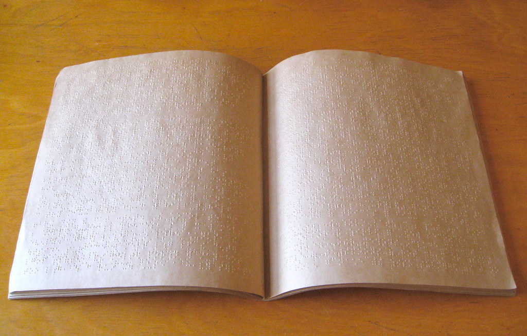
I own lots of objects that have nothing to do with sports but are nonetheless very interesting from a design perspective. I’ve decided to start discussing them here occasionally, beginning with the Braille magazine that you see above. It was given to me several years ago by a friend of a friend after she’d been told that I tended to like “unusual things.”
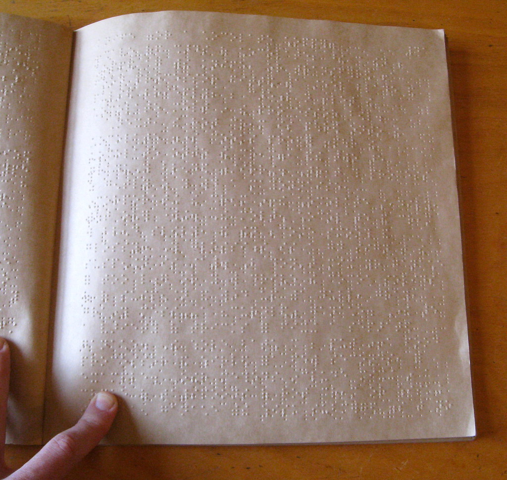
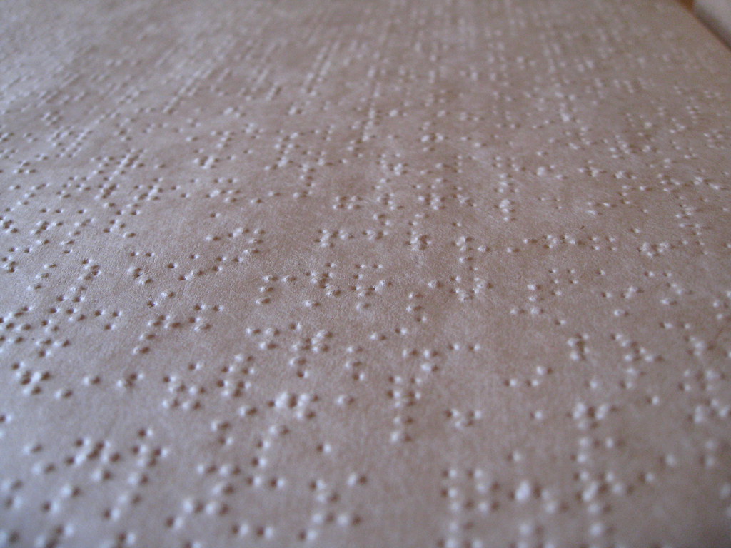
Like most sighted people, I can’t read Braille, so the magazine is just gibberish to me. But it’s a remarkably satisfying object. The paper is thick, like Kraft paper, so it can stand up to the embossing. The pages, as you’d expect, are extremely tactile, very pleasing to the touch. And the embossing patterns — language to a blind person but just abstractions to me — are beautiful:
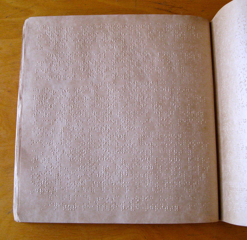
I used to work in book publishing, and we were always concerned about the two sides of a given page aligning, so that the top, bottom, left, and right edges would be in perfect register. But as I looked through the magazine, I quickly realized that the two embossing plates for a given Braille page are purposely misaligned — they have to be, in order to ensure that the same spot on the page doesn’t end up being embossed in both directions. For example, look at this random section of a random page from the magazine:

If the two embossing plates (or stamping dies, or whatever they use) for that page had been perfectly aligned — in other words, if the one punching the impressions from the side we’re looking at onto the other side had been positioned slightly lower and to the left — the areas that I’ve highlighted would end up like this:
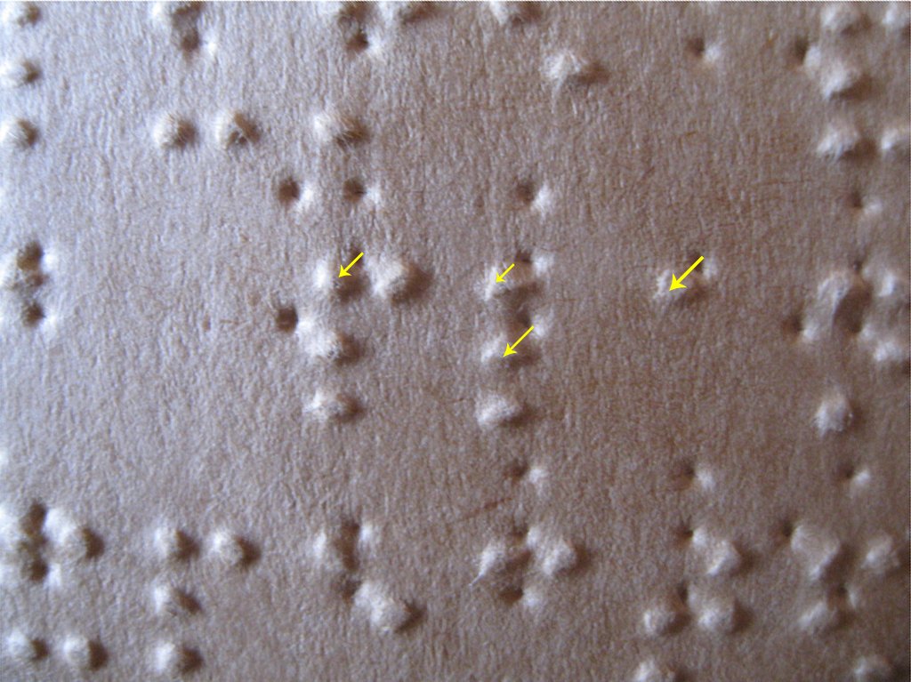
And that wouldn’t work, because the same spot can’t be embossed in both directions.
Braille has been around for nearly 200 years, which I gather is a testament to what a good system it is. Looking at it, though, it’s hard to conceive of it as a mode of communication. I’ve tried closing my eyes, running my fingers along the pages, and imagining that the embossed patterns are letters and words — it’s hard to imagine how it works. Of course, I can stare at any page printed in an unfamiliar alphabet (Chinese, Cyrillic, whatever) and probably get the same effect, but at least I can see those and imagine myself learning them. It’s harder to imagine myself — or anyone — learning Braille. Really makes you appreciate and respect the people who’ve done so.
Meanwhile, are you wondering what publication this is? I’ve deliberately avoided mentioning that until now, because it’s my favorite thing about the magazine. Take a look:
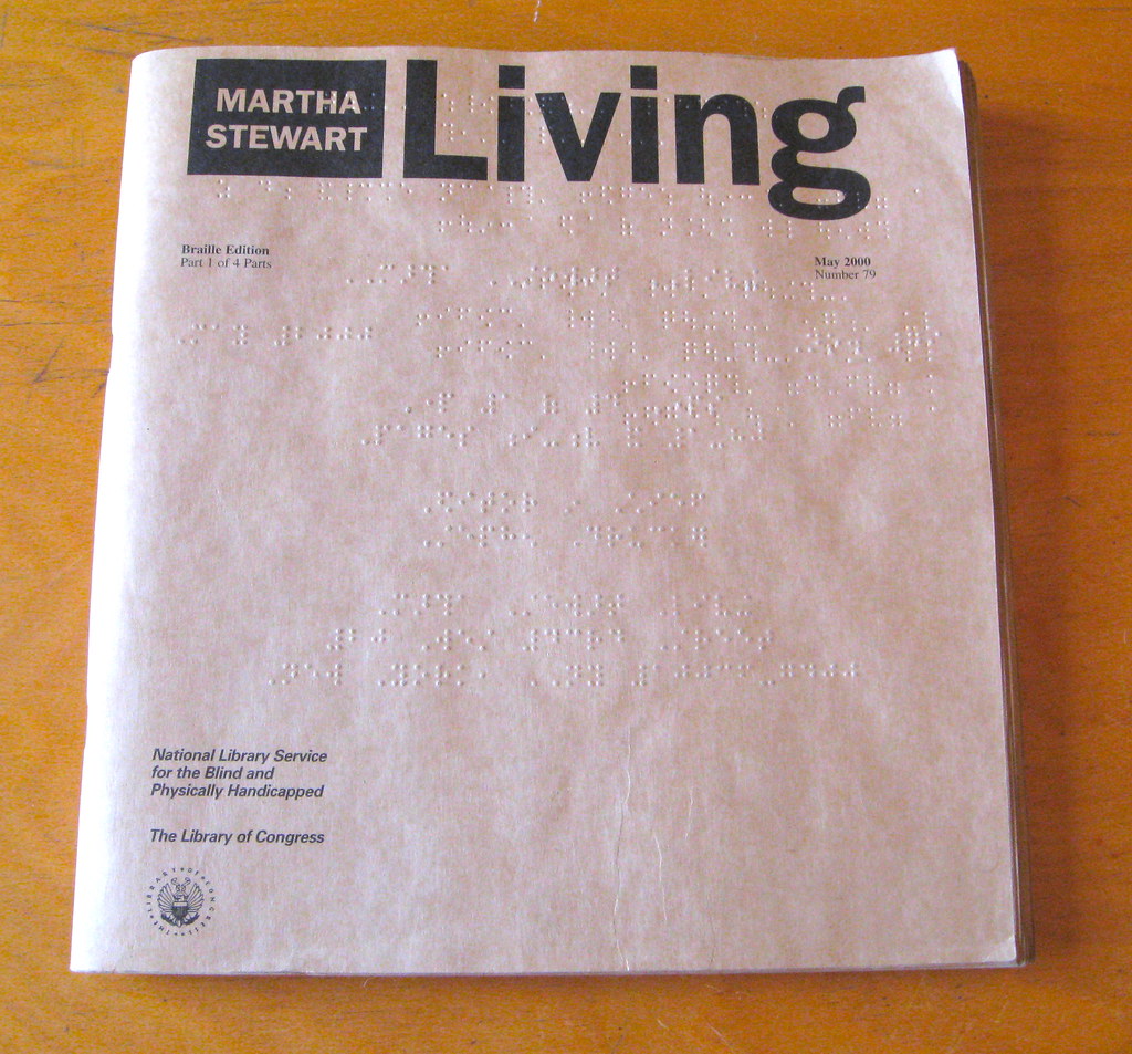
Seems like an improbable choice for a Braille translation, right? Like, is a blind person really gonna do the 17-step recipe? Is a blind person gonna create the fancy table centerpiece, or the floral wreath, or any of the other projects outlined in Martha Stewart Living? The only less suitable candidate for a Braille treatment would seem to be Hustler.
Then again, most sighted people don’t actually do most of the Martha Stewart projects either — they just like looking at them, thinking about them, dreaming about them. In fact, the Hustler comparison is quite apt in a way, because Martha Stewart is in the lifestyle porn biz, and her readers are primarily escapists, fantasists, just like Larry Flynt’s readers. I’m assuming blind people can fantasize as well as the rest of us (maybe better, given their circumstances), so why shouldn’t they get to lose themselves in the alternate reality that Martha constructs?
In case you’re wondering, I haven’t been able to find any references to a Braille version of Hustler (although someone has imagined what it might look like). There are quite a few references, however, to Braille Playboy.
And while we’re at it: Yes, there’s also a Braille version of ESPN the Magazine.
ESPN reminder: In case you missed it yesterday, my latest ESPN column — the annual NBA season preview — is available here.
Last chance: The deadline for entering this year’s Uni Watch Reader Appreciation Raffle is tonight at 7pm. For details, look here. I’ll announce the winners on Christmas Day.
Uni Watch News Ticker: I never thought meat could give me the creeps, but that was before my buddy Shane Arbogast sent me this. … The “modification” to the Wisconsin uniform for the Rose Bowl apparently involves rose petal-patterned numbering (big thanks to John Okray). ”¦ Small item on this page indicates that Michael Cuddyer, now with the Rockies, will wear No. 3 as a tribute to the guy on the MLB logo Harmon Killebrew. … The Capitals all wore No. 22 during warm-ups to commemorate Mike Knuble’s 1000th game (from Jason Mott). … Ethan Allen reports that the LSU hoops coaching staff has worn matching sweater vests for every game this season. … Never seen this version of the Oriole bird before (good find by Gary Streeting). … Marty Hick has a little Xmas mini-tree in his basement, decorated with mini-helmets. “Back in the day I used to adorn it with old-school gumball helmets,” he says. “I even hand-painted all of the white facemasks. I wish I still had those helmets. I’ve since replaced them with some larger, newer versions from some stupid game I can’t even remember the name of (I never played it). I made the tree topper back in 1995 — hence the old NFL logo. Some of the helmets have already changed. When all of these teams undergo these changes, they never think of the little guy and his tree.” Words to live by right there. … NSFW: Here’s one of the odder uses of the NFL’s old white/nighttime football. That eBay seller has several additional shots from the same photo session. ”¦ A new study conducted at Oregon concludes that academic performance at the university has declined as the football team has gotten better. So if the uniforms have contributed to the team’s upswing, as many folks believe, then they’ve also hurt the university’s core mission. ”¦ Ross Forest of TCU had some helmet decal issues last night (screen shot by Frank Mercogliano). ”¦ Very interesting submission from Denis Hurley, who writes: “Adidas is famous for having three stripes on its garments. But in Ireland, another company, O’Neills, also uses three stripes regularly. In the 1980s Adidas took O’Neills to court but the verdict ended up being that O’Neills is allowed to use the three stripes within Ireland only.”
about the night-time football pic… is that Joe Namath posing for that pic?
Dammit, that mini-helmet covered tree reminds me that I still need to add the new Bills helmet to my collection of Riddell Pocket Pros.
Is anyone impressed with how closely mini-helmets resemble traditional globe-shaped Christmas ornaments? Beautiful objects.
If you notice on the Caps sweaters, they all had 22 on the back, but their regular numbers on the sleeves. it took me a moment to figure out what was going on as i sat there watching warm-ups. The sweaters were then silent auctioned off.
The braille lede today was really cool. Made me think of a band back in my hometown of Blythe, CA called I SpeaK in BraiLLe. No one in the band is blind, but just wanted to throw that out there. And the “Braille Edition” of Hustler had me busting out laughing big time. Great read.
I SpeaK in BraiLLe
OK, crack the code for me. What (if anything) is the significance of the upper and lower case letters (or it that something you young youngsters just liek to do)?
It’s a band name, it’s allowed to have seemingly random caps in it. MetallicA, TestAmenT, etc. It makes more sense on the actual band logo than it does in normal text.
The O’Neills/Adidas post is interesting. I have an O’Neills jersey for the Dublin Gaelic Football team and I wondered how they could use a three stripe design that is virtually identical to the one used by Adidas. Now I know!
Same here. I had been actually meaning to do some research into this myself for quite a while but I guess that’s unnecessary now. Cheers Denis Hurley!
I also decided to check to see if indeed the “within Ireland only” aspect is true. New York GAA is outfitted in Azzuri uniforms so no luck there. London however are outfitted by O’Neill’s and they only have two stripes (link)
However, in trying to find a good photo to demonstrate this I came accross a photo which had London playing against Fermanagh from earlier this year. The photo (link) shows the difference between London’s two stripes and Fermanagh’s three. But then it occurred to me that Fermanagh is in Northern Ireland and therefore technically the United Kingdom. I had assumed that “within Ireland only” would have meant the Republic (seeing as it was a Dublin supreme court ruling) but if Fermanagh (and indeed all the Northern Irish teams using O’Neill’s) can get away with it then I guess this isn’t necessarily true.
Still more questions to be answered.
Law in Northern Ireland is a complicated matter, from what has been explained to me, and which court rulings are given precedence between the UK and the ROI.
But, really, law in all of the UK is not always as clear as many Americans think. (And, my friend from England is still having a bit of a hard time dealing with what is federal and what is state in the US – so it goes both ways).
There has been difficulty in the past over constitutional ambiguities (up until 1998 the constitution of the Republic cited Northern Ireland as being within its “national territory”). In some areas there is indeed crossboarder cooperation but in terms of copyright law, I can’t imagine that would happen. I could be wrong though.
What I suspect is that Adidas and O’Neill’s reached a settlement themselves which included the entire island. Either that or nobody cares enough to enforce the law in the North (history has shown us that this happens quite regularly).
Friendly reminder, deaf people do NOT read braille. Crazy how often I get asked that.
Also, braile typo with the 200 years line. Great lede!
You think that meat picture is disturbing? You ain’t seen nothin’ yet!
link
That is without a doubt the most awesome thing I have ever seen…ever.
Bring out the wolves!
that’s not actual meat though…
Maybe it’s a minor league Baltimore Orioles logo? While looking for it, I came across something else of a 1908 Eastern League Orioles team photo with a very early use of uniform numbers; one year later (1907 Reading Red Roses according to the Dressed to Nines site). I thought the number placement was interesting.
link
Those aren’t uni numbers. They’re placed on the photo to help identify the players.
The Oriole bird on the button is from the minor league Orioles, prior to MLB’s St. Louis Browns moving to Baltimore.
As a fan of the Silver Britches, I didn’t really have a dog in the race last night while watching the Culligan Holiday Bowl, but I found myself not being able to turn it off because of how freaking sweet La Tech looked. I’ve never given them much attention, but those are some amazing uniforms.
Agreed — always been a fan of their look.
La Tech has the most underrated look in all of college football.
Easy mistake… It was the Poinsettia Bowl (also in San Diego). The Holiday Bowl used to have much more visible poinsettias – this year they are TM sized obligatory inclusions. Ugh!
I just did an excel spreadsheet mapping the heritage of each bowl (and of course, scoring the level of douchebaggery in the logos/names). I was stunned to find out the Miami Orange Bowl had been torn down for the Marlins.
Susan, I’d love to see that spreadsheet–any way you can share it?
Hey Paul, I come here to read about uni-centric topics, not some crap about braille. If you don’t post something right now about uniforms, you will lose me as a reader forever. I don’t care if this is your site and it has a foundation based on your interests. Nobody puts baby in the corner Paul. I want to read about the stitching used on jerseys in the Pacific Coast League and I want to read it now. I know you’re thinking to yourself, “Go fuck yourself, I don’t care if you never read my stuff again. I even prefer it as a matter of fact.” But believe me Paul, you will regret it. Maybe not today, maybe not next year, but losing me as a reader will slowly eat at you and one day your friends will find you in your apartment (after not seeing you for a month) sitting on the floor rocking back a forth, sucking your thumb and eating cat litter. This post will be your downfall.
One more thing, just kidding (I hope everyone figured that out by now) and Happy Festivus. Thank you for your hard work on this blog throughout the year and the daily enjoyment I get out of it.
Festivus is typically celebrated on the 23rd.
And Christmas is celebrated on the 25th, but people say Merry Christmas all month long, so I feel Festivus deserves the same treatment.
My friends and I have been celebrating Festivus every year since 1999. We have a pole, Seinfeld-themed food, we air grievances, but we have not done the feats of strength in a while because Festivus is usually in a public restaurant. Our group is even featured in the Festivus book that came out not too long ago.
Festivus? I used to like him on Gunsmoke back in the day!
At least he could have provided a jersey with NOBiB (Name on back in braille)
Or would it be a BNOB?
Someone with a Braille jersey could then hang out with the guy who had the Mike Morse Morse Code Name On Back jersey.
A little off-topic: is Festivus accepted as the Winter Holiday of Pastafarians?
I could be wrong but I don’t think it has anything to do with Pastafarians.
I’ve heard it argued that since Christmas is a Christian regifting of existing pagan midwinter celebrations (true!), therefore Pastafarians should also coopt and claim Festivus as their own.
Just take Festivus as it is, and then add in a bit where everyone writes a wish on a strand of spaghetti, then all the noodles are thrown at the Festivus Pole, and those that stick will either be granted or not by FSM in the year to come. Perhaps Pastafarians can rename it the Feast of Strings or something.
Have you ever tried to write on spaghetti?
Jeez, someone is butthurt today. Did you fall off the pedestal that you put yourself onto?
And a merry festivus to you too! (Gotta learn to read, not skim)
Another interesting challenge with Braille is how much more space it takes up. The cover of the Living magazine says it’s part 1 of 4. That’s a lot of paper for one magazine.
My uncle has a Braille bible and it takes up an entire bookshelf. It’s printed in about 40 parts, each the thickness of a phonebook.
Is there a single standard size for Braille text or does it vary a bit between publications?
/serious question
There is no official standard of font size, but most Braille text is based on the Perkins embosser size font. It was the first wide spread embosser and created an early standard that has remained relatively the same. There are some exceptions. Pharmaceutical labels, for example, use a smaller standard embossing.
I can’t read Braille myself, but logically it seems like characters bigger than a fingertip would be more difficult and take longer to read.
another serious question:
Are only letters represented in Braille, or are there words as well. (I’m an idiot who is likening it to sign language). I know I could google it, but an answer here is education to more than just me.
I’m about 99% sure it’s just letters & numbers. I’ve never seen any sort of chart or other imagery to indicate additional symbols to represent words. Essentially it’s just a basic font – A-Z and 0-9, I don’t think it even bothers with punctuation or capitalization.
There are a few levels of Braille. The first level is each letter A-Z and 1-9 has a specific symbol. The second level of Braille combines common combinations like ch, sh, th into one symbol, mixed in with the single letter system. The braille signs I’ve designed in the past 10 years have all used the level 2 “lettering”.
Actually when I did the first sign package, the contractor submitted a sample sign, I checked the spelling of the braille lettering (level 1) and HA! They misspelled a word! When I brought this to their attention, they advised me the spelling was correct using level 2 braille. Woe was me.
I just hope there’s no such thing as Bellotti Braille….
A 40-volume Braille Bible? Yet another wrench thrown into the plot of The Book of Eli.
I’m guessing the conservation of energy between scholastics and high-profile sports is a bargain some schools will gladly take. Oregon has been pretty craven about grabbing for the brass ring, as has Oklahoma State and Maryland.
Paul, you take some pretty sweet photographs. What camera do you use?
Seriously? I always think my photos look crap… In any case, I use a Canon PowerShot SD 850, which is a really basic point/shoot. Not bad for what it is, but definitely not fancy. Then I usually tinker with the images a bit in iPhoto (cropping, brightness, contrast, etc.).
Let’s put it this way: When I’m taking photos for the site, I want them to look good and try my best to achieve that. I don’t always think I succeed, but I’m glad you like what you see!
Absolutely. Those Braille shots today were excellent.
Thanks. But let’s face it, I had good material to work with!
Seinfeld-themed food? What’s that? Cold cereal? Cold cuts? Mangos? Calzones? A big salad? Chips & salsa? (no double dipping!) Sausages? Kenny Rogers Chicken? Mutton? Shrimp? Yoo-hoo? Chinese food? Specialty soup? Fat-free yogurt? Lobster? Muffin tops? Bagels? – or no bagels? No tuna on toast – Chicken salad, on rye, untoasted & a cup of tea. Toxic envelopes? And a black & white cookie and chocolate bobka for dessert.
Damn it, that was supposed to go under Johnny O’s post.
Seinfeld themed food just means that there’s no soup.
Except maybe lobster bisque?
eggwhite omelette, marble rye, yankee bean soup, muffin stumps, pudding skins (ndividually wrapped of course)
Oh Henry bar.
Snickers (with a fork)
Lest we forget Mackinaw peaches…assuming they are in season.
Junior Mints
Snapple
You want disturbing meat? THIS is disturbing meat:
link
As much as we all gripe about advertising around here, I thought this would be a pertinent question: do the magazines show the same “ads” as in the traditional versions, with said ads in Braille? My guess would be yes, but I honestly don’t know. Either way, as Paul said, I do find it amazing that people are able to learn that “language”.
The story about the braille is just another reminder of the strength of the human imagination. The brain is an amazing thing!
Blind readers also use screen readers for reading websites. (The site is read aloud to them.) Each photo on a website has an “alt tag,” which describes the image. A descriptive tag is extremely helpful to a blind reader. For example, the current alt tag for the photo of the braille magazine is “IMG_0421.jpg”, which tells the blind reader nothing. If the alt tag was “Photograph of two pages of the braille edition of Martha Stewart Living”, the reader would know what is really there. Tip of the day for anybody that has a website.
LSU hopps = hoops
Thanks. Now fixed.
LSU hopps make a very bitter IPA. It’s won awards, but it’s very hard to swallow.
TWIXXXXXXXXX!
That was supposed to go under concealed’s post. My bad.
Paul, thanks for the link to District Sports Page today regarding the Mike Knuble 1,000th game tribute.
Braille Playboy on ebay
link
Isn’t that how people go blind…?
No, it’s for after they do.
not that there’s anything wrong with that.
and hairy palms, which would make reading braille quite difficult
By that standard, pretty much all magazines are “lifestyle porn.” Most readers of the New Yorker, for instance, have no intention of ever attending any of that week’s New York events listed at the front of the book, will never read most of the books reviewed, nor see the theater reviewed etc in the back of the book, nor do any of the crazy rich white guy stuff that fills so many of the long-form profiles. Even Make magazine is consumed by people who will mainly not attempt to make the actual stuff in the mag. Even the great magazine writing of, say, Hunter Thompson, Plimpton, and Tom Wolfe have that same air of voyeurism and vicarious living. It’s all the same stuff and nonsense as Martha Stewart Living, when considered that way. Which is to say, I think that’s the wrong way to consider a magazine.
Two notable exceptions in the history of magazine publishing would be Beer Frame and Might.
I’m curious how literal the translation is, either here or with sports magazines. Is it word for word? Are photos described? Or is there more systematic translation going on, sort of like modernizing the language of the Canterbury Tales?
Scott, you’re painting way too narrow a vision of the publishing world. For one thing, you’re restricting yourself strictly to service journalism. But there are a jillion publications in the non-service journalism world that aren’t lifestyle porn, from Newsweek to Scientific American to Elevator World.
More to the point, though, I’d argue that there’s a big difference between, say, the New Yorker, which is selling a certain kind of information (much of it not service-oriented, incidentally), which its readers may or may not put into active practice, and Martha Stewart Living, which is selling a certain escapist fantasy of a life its readers will never live. The New Yorker is mostly about the world outside one’s home; Martha Stewart Living is mostly about one’s home, about one’s self, about projecting one’s personal fantasy of an idealized life(style).
One easy way to spot lifestyle porn is the use of professional models instead of real people in photo shoots. In this respect, the similarities between Martha Stewart Living and Hustler become easier to see.
It’s true that Beer Frame never had models. No budget for it!
What about video games or drugs? They serve as excellent escape routes for many. It’s living in a fantasy for many.
Sure. But that’s not what we were talking about — we were talking about magazines.
Great lede today.
Blindness is a condition which most of us, I’m guessing, know nothing about. Certainly not me. Try moving about your home with your eyes closed, going about your daily routine. Then, LEAVE your home and go about your daily routine, or perform your job…with your eyes closed. I guess I don’t think about it because it’s scary to imagine a world without visuals.
I guess what it comes down to is: People adapt and experience the world, life, differently. Braille is invented.
I’m always impressed with the blind people I see navigating DC’s Metro.
An example of a Braille sked:
link
Wow — TREMENDOUS find!
Heat just unveiled their Floridians throwbacks:
link
Hmmm, that went from NOPE to yup without anyone telling me. Grrrrrr….
8 days of uni-leaks, perhaps?
wow. love em.
For a few years in the early 1990s Action Packed Trading Cards experimented with Braille trading cards. Here’s one example.
link
Great, they had to include the Haywood Jeffires card. What, are they trying to teach blind people how to spell wrong??!!
Paul, LOVE the “Catch of the Day” Christmas catalogs–looking at the ones from the ’60s and ’70s takes me back to the days of hoping and praying for a cool slot car racing set!
Ooooooooo!!! Check out page 58 in the 1975 Sears catalog–it has the NFL mini-helmet/goal post sets–looks like $2.88 for each conference…
Holy crap, I had the Redskins jacket and matching knit cap on pages 50-51 when I was 5 years old.
oh FUCK YEAH –
1969 Sears – Pages 405 & 406: Jarts!!
Oh! That just made my day. Before it was illegal & the popularity of bean bag toss, there were lawn darts.
Man these catalogs take me back. I love how the 1977 JC Penney Page 528 – Coleco Telstar Arcade TV Game console with steering wheel with a gun holster built in to it with a real-looking toy gun to blur the lines of reality! Man what a gun paradise it used to be. Man, so many board games.
I love the Shuffle Bowl game on this page:
link
Not uni-related, but this was one of my favorite pages:
link
I’m curious… with all the linked Braille magazines and the football schedule… they all mention “The Library of Congress”.
Any ideas on the connection there?
These seem to be done FOR public libraries (perhaps, that’s just what I’m seeing) so maybe this is a service provided by the Library of Congress.
“These seem to be done FOR public libraries (perhaps, that’s just what I’m seeing)”
~~~
pun firmly intended?
I wish…
Our tax dollars at work. The LoC helps produce these magazines for the blind. Goddang socialist gummint handout….
I was wondering when this seemingly apolitical topic would turn political. It’s happened, good. haha
I was watching football one Sunday with this blind friend, and I turned on the Vikings game and he was like, “Oh god turn it off, the striping makes no sense and it’s so hideous and busy. Go back to the days where the helmet purple didn’t match the uniform purple.”
We both shook hands and he ended our conversation with, “Gray Facemasks. Fuck THE Jeff.”
Noted lifestyle product purveyor Maker’s Mark just did their (sort of) annual thing of sending a holiday gift to their ambassadors, and this year, it’s a uni for your whisky bottle:
link
I think it’s meant to be some sort of Winter Classic-style throwback.
Also, is Fearless Leader aware of the United Steaks of America project? In case not, I give you:
link
I had the pleasure of visiting the Maker’s Mark distillery and interviewing the CEO a few years ago. He was a hoot. Among other things, he said he can look at any bottle of MM and know which of their line workers dipped it in the red wax, because each worker has her own distinctive flick of the wrist, which creates its own distinctive drip pattern. I got to dip a bottle myself, which was fun (although I sure wouldn’t wanna be doing it all day long for minimum-ish wage)….
Bill Samuels retired this summer; his son Rob Samuels has taken on most of his actual duties. In “retirement,” Bill is focusing on doing more of the promotional, being-an-old-hoot stuff while Rob does the running-the-distillery-operations stuff. (Bill Samuels really is one of the great characters of postwar American business. He also established much of the template for aspirational lifestyle branding.)
I attended a Maker’s ambassador shindig with Frank Howard a few years back where we got to re-dip bottles in navy blue wax. Hondo was Hondo, telling great stories, and I have high hopes of being able to open the red-and-blue dipped bottle he autographed “For the Nats’ Next Pennant” soon. He now works in sales for Jim Beam full time.
U.S. Grant drank Old Crow.
grant pretty much drank anything that wasn’t kerosene
and even that he may have dabbled in
Also from the same artist, the Raw Terror series of cartobutchery:
link
My girlfriend is on the MM Ambassador’s mail list so she got the mini-micro-sweater last week. Odd since she’s a teetotaler so I guess I’ll have to use it on my bottle of Bacardi 151. Then again, Bacardi 151 will keep you warm all by itself!
Absolutely sensational article about the guy who washes and repairs the Giants’, Jets’, and Eagles’ uniforms. Tons of great details. Essential reading:
link
Fascinating!
I agree. That’s an interesting article.
I used to do the uniforms for my high school basketball team. That was simple, though. Just throw them all in the machine and turn it on. Then run them through the dryer the next day, or something. I didn’t have to deal with half the stuff he does.
Since my Dad is blind, and I know a few other blind people, I can tell you that blind people can do just about anything sighted folk can, with the right tools of course. So, yes, they could do the full 17-step recipe. There are some schools set up to help train the blind (especially those who become blind later in life) how to adapt to their new life, use everyday appliances, and to get where they need to go. My dad actually built a table while he was at school. One of the other blind people I know is a lawyer for New York State. It really is amazing how much they are able to do without the sight we all take for granted.
Oh, and as for the Library of Congress:
link
many of them seem to find gainful employment wearing zebra costumes and occasionally, blue shirts
I really like the Wisconsin Rose Bowl pattern. It’s a subtle change in a classic uniform that doesn’t really alter the primary design elements; it’s fun enough that the kids will like it; it’s tastefully done. Good for Wisconsin and Adidas for making something that’s special and different without going the Nike/Under Armour ridiculous route.
Any word if they are doing the red pants again this year? I might’ve missed it in an earlier article and I’m too lazy to go back and look.
No red pants.
Looking at all of the pages of toys from the late 70’s brings back a shit ton of memories.
Getting older is depressing.
“Rejoice, O young man, in thy youth.”
or maybe i should stop talking
No way man!
I wonder if blind people ever get tattoos?
Here’s one for you Paul, should have made it a COTD:
link
really…
boise community college in hat to shoe mono blue…and sparky in black/white/black
what could have been a mothervilker “top 5” has possibly dropped into an early contender for the 1…
ASU’s coaches jacket’s helmet logo doesnt match the real helmet: the logo appears to have the pitchfork vertical, when it really points forward
Boise doesn’t bother me, but ASU pairing white jerseys with maroon numbers and stripes with the black helmets and pants looks dreadful.
you know what woulda looked much better?
sparky in gold/maroon/gold vs. boise in blue/white/orange
instead…
we get this
ugh