I was walking around my neighborhood yesterday when I passed a guy wearing a very nice burgundy cardigan with the Redskins’ script “R” logo on the chest. I’d never seen that product before, so I asked the guy where he got it. “It’s just a plain sweater, and my girlfriend sewed the logo patch onto it,” he said. “I have season tickets, but I won’t give them any more money by buying anything.” I’m not sure why he was in Brooklyn instead of at yesterday’s game in DC, but whatever — viva la DIY!
As for yesterday’s NFL action:
• The Cardinals went full-blood-clot at home in Glendale. Not a good look, but hey, they beat Dallas, so that works for me.
• Very pastel-ish game in Tampa, as the Bucs wore their Creamsicle throwbacks against the Panthers.
• Yesterday marked the first time this season that the Chiefs went white over white (a look they used five times in 2010, plus twice in the 2010 preseason). Note that they went with their white-topped socks, instead of the red-topped socks that are normally worn with the white pants.
• This isn’t really a new observation, but it’s still amazing to see just how inconsistent the Bengals’ nameplates and yokes can be. All those shots are from yesterday’s game against the Steelers.
• The Texans wore navy over navy.
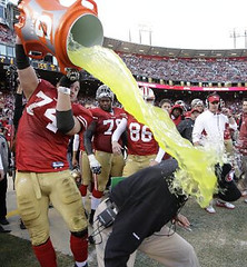
• For the second time in seven days, the Saints wore black over black.
• In that same game, Jonathan Vilma was missing the fleur de lis patch on his left sleeve.
• While watching the Giants/Packers game, I thought Ahmad Bradshaw had a stray piece of tape on his helmet, but now I think it was his mouthguard. Also, note the sleeve on the cup of his chinstrap.
• Turning to Saturday’s college action, several readers suggested that the middle letters of Lamin Barrow’s NOB appeared to be backwards. I think it was just a combination of the camera angle and the way the fabric was puckering, though.
• In yesterday’s Sunday Morning Uni Watch entry (which you can check out here), Terry Duroncelet mentioned that Boise State wore their blue Amateur Pacifist helmets for the game against New Mexico. What he didn’t mention, however, was that Boise moved the helmet numbers from the back to the side. First time they’ve done that. I like it.
• In that same game, New Mexico defensive lineman Reggie Ellis lost his left-side helmet decal.
• Two Texas players wore No. 2 as a tribute to injured teammate Fozzy Whitaker: WR Marquis Goodwin (who normally wears 84) and LB Keenan Robinson (who normally wears 1).
• North Dakota State wore their gold alternate jerseys.
(My thanks to all contributors, including Ernie Ballard, Aaron Bernstein, Tyler Lougee, Matt Mitchell, David Pealing, and David Trett.)

Culinary Corner: I don’t usually repeat recipes from previous Culinary Corner installments. But I make an exception each December for my favorite holiday preparation, homemade Irish cream. In other words, homemade Bailey’s. In other words, melted ice cream that gets you drunk. It’s super-easy to make, it’ll make you the hero of whatever Xmas party you bring it to, and lots of you have told me how much you like it. Here’s how to do it:
Start with some decent Irish whiskey ”” Bushmills, Jameson, Tullamore Dew, something like that (but not super-high-end stuff, because the nuances will be lost in this preparation). Pour a pint of the whiskey into a large-ish container and mix it with a can of sweetened condensed milk; a pint of heavy whipping cream; a tablespoon of chocolate syrup; a teaspoon of vanilla extract; a teaspoon of instant espresso dissolved in two tablespoons of hot water; and a quarter-teaspoon of almond extract.
Mix well (if the container has a tight lid, you can just shake vigorously), refrigerate, serve over ice, and get ready to become the most popular person in the room. No need to thank me afterward, but you’ll want to do so anyway — trust me.
Uni Watch News Ticker: New 35-years-in-Jersey logo for the Nets. … A reader who prefers to remain anonymous was recently at the Rock and Roll Hall of Fame. “They have four Hendrix drawings, circa 1958, of college football teams,” he writes. “Pictures are not allowed, but I took that one on the sly. Also, in the costume area, there’s a Patti Smith mannequin with a vintage Braves cloth jacket.” The Hendrix drawing looks a lot like Ricko’s early drawings, no? … Inaugural uniforms fo the Montreal Impact. … Here’s one for urban decay fans: photos of an abandoned Catskills resort (big thanks to David Heit). … UCLA’s women’s hoops team wore some really nice throwbacks the other day (from Jose Coria). … Have I mentioned the increasing overlap between sports design and superheroes? (From Chris Chaussee.) … Here’s a photo album showing B of A Stadium’s transformation for the ACC championship game. … When the Lightning unveiled their current uniforms last winter, they mentioned that season ticket subscribers could get a jersey with an implanted electronic chip, which would entitle the wearer to discounts on food and merch. Here’s an article on how that promotion has worked out (from Alain Nana-Sinkam). … Drew Brees and his wife recently appeared on Ellen Degeneres’s show and presented her with two pony blankets made from his jerseys and a jacket lined with one of his jerseys. You can watch the video sequence here (from Ewan Williams). … Alphonse DePalma notes that Michigan hoops was wearing striped socks for a recent game against UVA. ”¦ I really liked Miguel Cotto’s striped trunks from Saturday night’s bout against Tony Margarito, but very disappointing to see both men going without socks. … Springfield Central, a high school in Massachusetts, uses the Miami “U” logo turned on its side (screen shot by Ernest Dubeau). ”¦ Speaking of borrowed logos, here’s something I’ve never seen before: a high school basketball team using the NBA logo (from Chris Schoenthal). ”¦ I don’t know if MLB’s winter meetings really need their own logo, but they have one anyway (from Comi Sharif). ”¦ New kit for the New England Revolution. ”¦ The Niners’ receiving corps has been fined for sock and footwear violations (thanks, Brinke). ”¦ Kudos to R. Scott Rogers, who writes: “Finally put my Uni Watch stickers to the use God intended when she invented vinyl: Stuck ’em on the rear window of my car. Is there a danger that another motorist will be so distracted by the awesomeness of the UW logo that he’ll spin out into a fiery crash that leaves scores of cars burning and snarls traffic for hours? Yes, but if even one new person Gets Itâ„¢, it will have been worth it. On a serious note, this is the first time I’ve ever put any sticker of any kind on a car I own. UW is just that important! (For less important stuff, like Obama 2012 or the Star & Stripes, I hew to a strict magnets-only policy.)” As always, you can get stickers based on your membership card here, and you can get a set of three Uni Watch logo stickers by sending a self-addressed stamped envelope to Paul Lukas, 671 DeGraw St., Brooklyn, NY 11217. ”¦ This is pretty cool: The earholes on Jonas Hiller’s new mask are shaped like the Ducks’ logo. ”¦ Here’s a page devoted to Oklahoma State football uniforms (from Charles Spitsnogle). ”¦ Reprinted from yesterday’s comments: Instead of TV numbers, Oklahoma State has a stylized “TV.” Coincidence, or a clever design choice by Nike? ”¦ Kent Hagan notes that Brandon Boykin of UGA has been wearing 2XU tights. “2XU is a running-specific brand that makes very expensive gear,” he says. “I’m surprised some equipment guy didn’t make him tape over the 2XU logo or make him wear Nike tights.” Yeah, or maybe Boykin is a Wire fan. … Matthew Duke was at the Greater New York Dental Meeting last week and spotted a dentist wearing a swoosh-defiled yarmulke. … Here’s a video clip about that new Euro 2012 soccer ball (from Kenny Loo). … Also from Kenny: new 75th-anniversary kit for the Orlando Pirates. … Hmmm, should I go into a cross-branding partnership with these guys? Geoff Poole spotted that in the athletic laundry room at UW-Whitewater. … Tim Moore has launched a new blog that he describes as “my attempt at keeping the baseball card trade from dying a slow, douchey death.” Check it out here. ”¦ There was some kind of weird zebra convention at Saturday night’s Rangers/Lightning game. Anyone know what that was about? (Screen shot by Alan Kreit.) ”¦ The Chicken Sandwich Bowl sponsors aren’t exactly my favorite people to begin with. Here’s the latest update on their attempt to win the Mega-Douchebags of the Year award. ”¦ Very odd to see Tiger Woods wearing white shoes yesterday (as noted by JP Samsel). ”¦ Shaun Tunick notes that the Pac-12 championship logo features an Oregon helmet that doesn’t exist (yet). ”¦ Adios, Jose. Thanks for the memories.
happy b-day vince grzegorek, wherever you are
Jeez, the Nets have a real set of onions wearing a “35 years in NJ” patch. Maybe underneath it they can put “…..and we’re f-ing outta here!!!”
Interesting that you say they have a real set of onions. That little New Jersey dangling from the bottom of that logo reminds me of those scrotums hanging from the trailer hitches of numerous pickem up trucks. It was either that or a dingleberry. Either way, nice way to “honor” New Jersey.
I know I posted about this last night, but methinks that the Panthers link instead of white.
Or at least some, because some players looked like they were wearing white.
You may want to check your monitor settings, because those are clearly white.
It’d be nice if they did use the silver ones though. I’d definitely prefer that over the all-white.
It was only Cam Newton that looked like he was wearing silver, but it just might be the difference in material from jersey to pants. Checked it on my home computer and it looks normal. Fuckin’ school.
How tasty would that game have looked if Carolina had worn their blue jerseys?
Best looking NFL game of the year I would say
…at least uniform wise.
For some reason, Vilma was missing the fleur de lis on both shoulders. I noticed when he was in the game that neither sleeve had it.
Francophobe.
Don’t need it. There’s two on the helmet.
This is not the first time Jonas Hiller had Duck-shaped earholes in his mask. The mask he unveiled for the 09-10 season had them. He also debuted his Team Switzerland mask for the Olympics which featured cross-shaped earholes, which was only the beginning of the cut-out vents of that mask.
Here are the articles for both masks:
Ducks – link
Team Swiss – link
Here’s a better view of the earholes on the Ducks mask
link
The zebra convention are GTHL (Greater Toronto Hockey League) referees: link
was it an organized road trip to Florida? I love that they were wearing the ref unis.
Ironically, the game itself had only three officials, due to linesman Pierre Champoux falling ill.
I too noticed Tiger’s shoes yesterday. Thought they looked like something my Dad would wear just without the Velcro.
link
Hmm, I thought I had read it on here, but maybe it was on a golf website. Tiger has been wearing a prototype golf shoe made by Nike (naturally) based on the Nike Free running shoe. His comments were along the lines of “I do everything else in that shoe (train, run, etc.) why not play golf in them too?” So far, I haven’t heard any rumors that they will be produced, but with a recent win and the Tiger cache, I feel it’s only a matter of time. Who knows, could be really comfortable.
Yeah, I totally missed that T.V.-number-on-the-side-of-Boise State’s-helmet thing because I saw what they were wearing, and just changed the channel afterwards. My bad =P
And about that UCLA throwback game, if you look at link, you can see that three of the four players have the Pac 12 patch on the left side of the chest, but #22 has the NCAA certification patch in place. What’s up with that? But with all of their inconsistent patches, the women’s team should wear those throwbacks full-time. The men’s team needs a throwback uniform too ;)
To continue, how come those are allowed, but Xavier’s Royal-style Preseason uniforms weren’t?
Yeah!
I think Xavier’s weren’t allowed because they had asymmetrical shoulder striping. I remember Memphis was fined for the same thing a few years ago.
The New England Revolution kit, appropriately given better-but-by-no-means-good appraisals over the weekend here, does contain an element that works well, and might be lent to future US national teams. I’m talking about the red-and-white stripes on the shoulders contrasting with the dark blue of the main portion of the jersey. The Revs ruin it, of course, with red inserts and darts and general lack of chromatic discipline…. But. I do like that shoulder element and wonder how it might be exported to the unis of USA teams in different sports.
Shoulder stipes = Adidas
US National Team = Nike
That element will never show up on a US national team shirt as long as Nike is the equipment provider, and I for one am thankful. That detail is gaudy, and for that matter the new Rev’s shirt is gaudy. That franchise has always done a horrible job with their kits and these new shirts are no exception.
The worst problem with the Rev’s kits however is their crest. The bad 90’s graphic flag is the worst logo in the league. New Englands needs a new crest, plain and simple, literally.
Well, you’re obviously a close observer, MG12. And you’re almost certainly right about Nike and stripes. But I cling to the belief that a “gaudy” element like stripes on the shoulder can work if juxtaposed with a larger, sober monochrome. Same as for American Football: I love the contrast between old-fashioned tan pants — no stripes, no logos, no nuthin’ — and deliriously striped stockings.
Agreed. That element CAN be gaudy, but if paired with the appropriate level of minimalism, it’s excellent. Germany’s green change shirt is a good example.
As has been discussed here, a leaked photo indicates that the new US Men’s soccer jersey for 2012-2013 will be red and white hoops.
That and it’s a bit of a ripoff of the Champions League logo:
link
Excellent, thank you for the Bailey irish cream recipe! My fiance is allergic to corn, soy and wheat and we were trying to come up with a way to make a substitute for Bailey’s Irish Cream (has corn in it) and there it is right here! Thank you!
Be careful with the chocolate syrup, which may have corn syrup as an ingredient. If need be, you can omit that step.
Vanilla extract has corn as well, but we make our own by simply throwing in 2 or 3 vanilla beans in potato vodka (750 mL) and leaving it in for a month. And presto, you get vanilla extract. We probably will make our own using cocoa powder, water and sugar.
Use Fox’s U-Bet. It’s kosher for Passover, so it’s made with beet sugar instead of corn syrup.
Fox’s is only Kosher for Passover *during Passover.* They do a special production run made with cane sugar. The rest of the year, it’s made with corn syrup.
I didn’t know that. Thanks for correcting me before something bad happened.
I too use that recipe and I love it… and I generally have no interest in Bailey’s. As an aside, if you don’t feel like buying instant espresso just for this, I used a tablespoon of cold-pressed coffee the last time I made mine. And now I feel like my coffee’s missing a little something this morning!
Unfortunately, that picture of the Niners division champ gear is probably shopped. Packers NFC North Championship gear is up, and the Reebok logo is present at the bottom of the shirt.
link
And sure enough, Niners have it too.
link
Ah, disappointing. I’ll remove that item from the Ticker.
The Chicken Kings’ legal shenanigans reminds me of the lawsuit filed by Ford against Ferrari over the “F150” moniker. Pick-em up truck v. F1 race car would have been very confusing.
Yeah, except Ford vs. Ferrari is a case of picking on someone your own size.
Chicken Sandwich Douchebags vs. some random T-shirt guy is just a case of corporate bullying.
Also, whereas Ford was in the right in its lawsuit, Chik-Fil-A is very clearly in the wrong. If this guy can move the venue from Atlanta to DC or into the Second Circuit, he’ll win without trouble. Even in Atlanta he’ll probably win.
Paul, just wondering where the hate stems from for the chicken sandwich outfit.
I don’t hate them any more than I hate the sponsors of the Processed Snack Food Bowl, the Shipping Company Bowl, or any of the other companies that have turned college football into a wasteland of corporate douchebaggery. (Well, maybe a smidge more, because I’m particularly anti-chain restaurants.) But none of those other companies have picked on a random T-shirt guy lately.
Doesn’t a company have a right to make sure their service marks, trade marks and copyrighted material is used in an appropriate manner.
If you honestly think Corporate Sandwiches Inc. has a good case, I’ll be happy to make a bet with you: If Corporate Sandwiches Inc. wins, I’ll go to one of their “restaurants” and buy you a sandwich; if they lose, you buy a free-range organic chicken, cook it, and use it to make me a sandwich (dark meat only, please).
Deal?
No thanks. I would never collect. But I do feel any corporate entity has a right to make sure that their service marks, and trademarks are not used in a manner which they deem inappropriate. It us up to them if they let it go or decide to take legal action.
So, no one else should be able to say “eat more _____” because Sandwich Inc has those stupid ass cows with the “Eat Mor Chikin” signs? Gimme a break. Parody is supposed to be legal, if a properly spelled slogan even counts as that.
But I do feel any corporate entity has a right to make sure that their service marks, and trademarks are not used in a manner which they deem inappropriate.
This is like saying, “If I feel you are threatening me, I have the right to punch you in the nose.” Which is true, if I’m actually threatening you — but not if you’re just being paranoid, or overly territorial, or an asshole.
Simply asserting that a company is policing its intellectual property appropriately doesn’t make it so.
Also, about this:
No thanks. I would never collect.
Meaning you know you would lose? Or you’re implying that I wouldn’t pay up?
Sandwich Inc. are also Christians from Hell.
This is an overbroad application of “Eat Mor Chikin.” Chik-Fil-A’s trademark is only infringed upon if someone else puts out a product that creates confusion among consumers.
Whether this is an independent action or a parody of the statement, consumers cannot confuse the statement “Eat More Kale” as being made or endorsed by a restaurant that doesn’t sell kale. Trademark protection also only extends to market sectors the holder is likely to enter, and again unless Chik-Fil-A starts selling kale products this lies outside those bounds.
@Paul…No it means, since you live in NY and I live in Texas that it would be hard for us to pay up either way. I would not expect you to come to Desoto and buy me a chicken sandwich and I have vowed never to step foot in New York City. No biggie. We have a difference of opinion.
I have vowed never to step foot in New York City.
Never say never, baby. You know you want to lick a dirty subway pole!
I love the south. I will go north so my so can see his maternal grandmother in Gary, In. I can lick a dirty light rail pole in Downtown Dallas.
Didn’t the article say that he has been making the kale shirts since 2000?
lick a dirty subway pole! >>> eat New York Style Pizza
Total cheap shot by a Chicago Style Deep Dish Pizza fanatic :P
Chick-fil-A, I don’t find any of their food particularly special & being closed on Sunday is annoying. Of course if I ran a restaurant my cause would be Planned Parenthood.
Never say never? You just said it twice.
Hardy har har.
“if I ran a restaurant my cause would be Planned Parenthood.”
~~~
+100!!!
attaboy
So its bad that a company chooses to close on Sunday.
You know, JED, I have to admit that I’m taken aback by “I have vowed never to step foot in New York City” and “I love the south. I will go north so my so can see his maternal grandmother in Gary, In. I can lick a dirty light rail pole in Downtown Dallas.” [That last line is pretty fun, though.]
The only reason I’m taken aback is that I just can’t conceive of any city in the USA that I would “vow never to step a foot in.” I mean, I know of lots of American places where the electorate is stupid, the powerful are odious, and the environment has been screwed over beyond recognition. I’m ready to go visit any of them.
A vow “never to step a foot in” the largest city in your country? Wow.
If you really need more reasons to “strongly dislike” this company….take a look at a few of the articles….
link
link
link
They run a “restaurant”, not a “church”, whatever their beliefs may be, they would be better served to keep them to themselves.
Its too many people for my taste. I have also vowed never to go to LA because I am afraid of earthquakes.
In re: Chik-Fil-A
I hope one of the changes the new Astros’ owner makes is to get rid of the “fowl” poles.
I always thought it was weird that Chik-Fil-A doesn’t object to leaving those up for Sunday games. Isn’t advertising a form of work?
“Here’s one for urban decay fans: photos of an abandoned Catskills resort (big thanks to David Heit)”
Ahhh. Grossingers. The Avis to the the Hertz that was the Concord.
You can see all of those pictures, along with some more (and musical accompaniment) in this “video”: link
Wow. Thank you, Seth.
I have been making Paul’s Irish cream for years, and it is always a mega-crowd-pleaser. Delicious!
Thanks for the recipe, Paul! My book club’s having a pre-trip-to-the-bar potluck on Friday and I’ve been stumped on what to make. This’ll be perfect.
Only a Yankee could find a way to hate Chick-fil-A.
I hate how they close on Sundays. Bunch of Jeebus Freaks.
It would be nice if some semblance of blue laws returned. Do people really need to go to package stores on Sundays? Does Wal-Mart really have to open at 10 p.m. on Thanksgiving?
what’s so special about sundays?
Do people really need to go to package stores on Sundays?
Dude obviously isn’t a Giants fan.
Some states would not let you buy certain products on Sundays. I know in Texas some time ago they had blue laws…You could not buy household products. Right now you can’t buy liquor on Sundays in Texas. You can buy beer and wine after 12 noon on Sundays, but no liquor. I
or, uh, homosexuals: link
“Gay The Pray Away”
Your Pal,
-Walter
My (only) problem with Chick-Fil-A is that their food is simply too BLAND.
I bet that yarmulke is made of ultralight materials that make him run faster and jump higher.
And it wicks sweat from the scalp!
The special fabrics and advanced construction boost shofar performance. It’s part of Nike’s new Pro Combat Worship line, which includes body-hugging burkas, camouflage bhikkhu robes, and black-on-black clerical collars.
No doubt those ideas are already on the drawing board.
The Revs uniform has the flag of New England on the back. Here’s the flag.
link
No American flag in sight.
Slightly better image of the New England flag:
link
And that is an American flag. Just not the American flag. Instantly my favorite example of slapping a flag on a uniform ever.
I love it, too. [My buds and I used the Pine Tree Flag for a mildly pioneering website in 1996 known as the Liberty Tree Alliance] Flown at Bunker/Breeds Hill, widely recognized thanks to Trumbull’s painting “Death of General Warren,” which depicts the last moments of the great-great etc. grandfather of my college girlfriend.
And there’s still more about me!
“He should be quite well protected. If he survived the freezing process, that is.”
link
Those NBA/Marvel caps are spectacularly lazy. OK, so Human Torch works for the Heat, Thor works for the Thunder and Spidey works for the Knicks. But the rest of the choices are somewhat… Lacking. How about using Hornet (a minor Spider-Man character) for the Hornets? Doctor Strange for the Wizards or Magic? Two-Gun Kid for the Mavericks? They might not be as marketable, but they’d make a lot more sense…
Captain America makes sense for the Wizards, since they do play in Washington. I don’t understand the reason why he should be on the Mavericks hat though. There wasn’t a single cowboy super hero available for that?
Gambit should be on the Hornets cap.
Waiting to see who gets paired with Howard the Duck….
Cavaliers. Duh.
Touché.
The Texans looked perfect on Sunday. Saints needed black hats and Arizona needed Red hats.
No, the Texans need to wear their red socks with the blue pants.
Woulda helped.
Just so we’re clear here, you’re good with the Cards & Saints going with the ballet practice look, just not the Texans?
Not exactly. The Texans are just the quickest fix since they already have the red socks.
That would look cool too, even better if they had red hats.
I’d say the Texans monochrome looked like crap, but I’m not going to fret given who they are. Reminded me way too much of the old bad Bills. Don’t really think about the Texans ever.
I LOVE LOVE LOVE the all Deep Steel Blue look! Except, of course, the the dark socks and black leggings.
I disagree. Monochrome makes them look like a college team.
If they’re going to wear the blue pants with a color jersey, I say I prefer this combo:
link
to this one
link
I like that first one Winter. That what teams should do. I have always felt that the britches and hats should be the same color. The second link does not work hoss.
i like it too…
in fact, i made that one …not sure if it was for a concepts article or a color-vs-color bit
just in case you thought they have ever worn that combo — they haven’t — here’s what they wore that day. (from here)
i’d love to see them break that one out though…but i’m guessing they probably never will if they haven’t in all these years
Yeah. Second link was supposed to just be what they wore Sunday.
Creamsicle is to Bucs as brown is to Padres.
Agreed. And it’s always one of the throwbacks I look forward to the most. “Florida Orange”, red & white may not be the most appealing color scheme, but it’s extremely unique & fitting for a team in Florida, and the set looks really good overall, but it wouldn’t look as good at all with orange pants; gotta be white.
Maybe burnt orange & crimson would have worked better, but I’d say the Tennessee Vols have no problem pulling off their lighter shade of orange.
That shot of link is amazing.
Scott Rogers, you heathen swine…
When God gave us vinyl, link.
I don’t have a picture but Vonta Leach had his Raven decal mangled during the game vs Cleveland yesterday.
He must have run into his own teammate. The Browns sure as hell didn’t hit anyone. I was one of the dozens of fans at the game who wasn’t dressed as an empty seat. Brutal game. But the silver lining is me having Ray Rice on my fantasy team. Not sure many fellow Browns fans were appreciating me when I yelled to Rice he better get into the end zone after running for 68 yards in the 3rd qtr. Priorities! (He got tackled at the 5 and Ricky Williams stole my TD..)
Ron Santo finally goes to Cooperstown.
On behalf of Ron Santo I’d like to invite the Hall Of Fame to shove it up their ass.
Seriously. Fuck those miserable SOBs. He was good enough to get in, but not until after he died? What’s that shit about?
I just found out about something fun to do at a hockey game. You may have already heard about it.
With about 1 minute and 3 seconds remaining in a period, shout “How much time is left in the period?!”
The announcer should answer directly. Be sure to thank him.
Betcha dollars to donuts your buddy’s a Michigan fan, or he’s been to Yost Arena before.
I’ve been doing that at Capital games off and on for the last ten years.. What the fan base in DC has taken to doing is when the announcer gives the details of an opposition goal they respond with a “who cares” and when the Caps score their 1st goal some fans shout at the other goalie “it’s all your falut.” then when the caps score more they count up before blaming ~ so if the caps score 5 goals ~~ the chant goes “1,2,3,4,5..It’s all your fault.”
“It’s all your fault” was being shouted at college hockey goalies at least as far back as the early 1980s (and, I’m assuming, well prior to that).
Reminds me of a Soldier Field/Bears game tradition I had no idea about until I actually went to a game:
PA Announcer: There’s a timeout
Entire fucking crowd (except me and my brother, the first time): WHERE?
PA A: …On the field.
EFC: OH!
____
haha, good stuff.
The Soldier Field/Bears “Where?” tradition paired with the singing of “Bear Down Chicago Bears” made it more fun for me to watch a Bear game in 16 degree weather than watching a Cub game in 70 degree weather…
I used to go to games where the announcer would ask, “Are you ready for another EXCITING period of hockey?!?!?” Our response would be, “Not yet. Can you wait 5 minutes?”
LMAO i just heard a kid at a hockey game yell out “hey ref, is this your phone? there is a missed call on it!”
“I can’t skate. I can’t see. I wanna be a referee!”
or “I’m blind; I’m deaf; I wanna be a ref!”
I also sometimes offer my glasses to college basketball refs if I sit close enough.
Good one! There were a few dropped calls in Super Bowls 40 and 43, if I remember correctly.
At the Kohl Center in Madison for Wisconsin Hockey games, when the announcer declares “One minute remaining” the entire crowd (well, the student section at least) shouts “Thank you” in response. Also, after a penalty for either team is over and the PA says, “both teams are at full strength” they respond with “that’s debatable!”
Every place has those wonderful little traditions. It’s what makes going to a local game more fun than watching it on TV.
That’s their normal look on the road when it comes to socks.
Yesterday marked the first time this season that the Chiefs went white over white (a look they used five times in 2010, plus twice in the 2010 preseason). Note that they went with their white-topped socks, instead of the red-topped socks that are normally worn with the white/red pants.
link
Beginning in 2009, during the Pioli/Haley era, the team has alternated between white and red pants for road games during the season.
As far as I can recall, the Chiefs haven’t worn anything but the white-top socks with the all-whites in my years as a STH. Also, the red pants were brought back well before Pioli and Haley showed up. I know that we wore them under Vermeil, and we may have even worn them under Gunther. All I know is that Marty Schottenheimer loved the all-white look, and it’s all we wore on the road for the entire decade of the 90’s.
Looks like they haven’t worn the red socks with the white jerseys link (except for those Texans throwbacks).
Oh, wait. The red socks they wore in 1994 were also for their throwbacks. Duh.
So basically, since they introduced the red pants, they’ve never really worn the white jersey/red sock combo.
I make the recipe with bourbon and call it ‘Beam Cream’.
Seriously?! link You’re the third Canadian team. This is exactly what I was talking about.
The Revs don’t have a flag on their sleeve and their the REVS – they basically have the flag as their logo.
I defy one person to explain – reasonably – why the Canadian flag is needed, good design or appropriate on those unis.
Like I said before, a Canadian team is playing in the MLS, a league that originated in the US. They want to bring their Canadian pride to US soil for their games I suppose. I don’t think it’s a big deal.
I’m sure the Revs would put on a US flag if they were playing in a soccer league that originated in Canada.
Not good enough. Canada represents 16% of the league. The only league with more Norther Exposure, if you will, is the NHL at 23% (team locals, not players – obvi).
NEXT.
Are the Canadian teams without flags/leaves traitors? Are they not patriotic? or are they just not jingoistic idiots?
I think you need to take your Ritalin.
???? So all the Canadian teams have to come together and decide who gets to wear the flag to represent their country? I don’t think the Kramer pin theory applies here. They choose to wear the flag. Cool. They choose not to, fine by me. I can at least understand why they’d put the flag on their uniform. It’s not outrageously random or egregious.
It’s a team from Canada. Playing in an American league. But if you think it’s dumb to put the Canadian flag then leave it at that. Don’t come up with anything more than that, like they’re afraid to put the flag on because they don’t want to be perceived as a traitor or they’re lazy with their designing. Pure speculation and here, speculation comes to die.
it’s a pride thing! why can’t you get that through your head???
serious question: have you been to canada? (not windsor, and not niagara falls)
“have you been to canada? (not windsor, and not niagara falls)”
~~~
because those places aren’t actually located in canada?
If we can just give up places in our country we don’t like, I start with Detroit. That place is a shithole but I guess that’s what you get when you’re due north of Windsor.
And my travels around the globe have no rational bearing on this conversation so – just like on my site – I will ignore this irrelevant question.
…cause they’re chalk full of tourists!
By Ry Co’s logic, if you’ve been to NYC you haven’t been in America since it’s full of tourists.
don’t forget our friend from star wars
so you’re saying if you’ve never been to the U.S. and say… have a bit of a layover in NYC… go over to times square and jerk off for 4 hours… that you HAVE experienced america?
good to know, thanks!
it takes you 4 hours?
I guess it’s safe to say we know what Ry Co did both before and after the Sheep Station gathering.
If you’re willing to leave a NY metro area airport, travel time and distance to get to Times Square and then spend four hours feverishly masturbating, I say not only is that experiencing America, but you should get US citizenship on the spot.
Tim, this is stupid. Every single MLS team displays its national flag on its jersey. Every singe damn one. Thus, any new team from Canada will carry l’Unifolié on its sleeve, and every new team from the U.S. will carry Old Glory on its sleeve. Right or wrong, it’s a league-mandated thing that is enforces consistently across all the teams.
Ok. First semi-legitimate point. From the image of the Rev’s new jerseys (sans-flag) I was not sure if the league mandate was the case.
That being the case, there is no reason to have the US or Canadian flag on any jersey. Still Stoopid, but now I understand that it ‘must be there (so you say).
(Confusing, though, as to why the Revs – a team with an identity based on patriotism – did not have the flags on their uni’s in those images.)
This might make your head explode but the Revs have the flag of New England on the back.
That’s 1000x better than a national flag. They’re the New England Revolution – a New England flag makes perfect sense.
A Canadian flag for the Canadian Canadians would make sense. Not so much for the Montreal impact.
The Revs don’t have a flag on their sleeve and their the REVS — they basically have the flag as their logo.
But they do. All MLS teams have a national flag on their left sleeve.
The reason you didn’t see a flag patch on those new Rev jerseys is because they are replica jerseys. The authentics — the ones that will be worn during games — have the US Flag on the sleeve and the flagt of New England on the back as the team’s collar logo.
All of this has been covered since my first comment.
Uni watch mentioned on the web site Sports Shooter. here is the linK:link
I was half expecting the site to be on hiatus today given the recent news regarding Jose Reyes.
Hey Joe Hilseberg,
link
Who is that memorial for?
I’m not Joe, but that’s the “EBW” memorial for owner Edward Bennett Williams, worn in 1988.
What’s SOTY and did the mustache prevent him from winning or did it vault him to #2?
Just got my new Blue Jays cap. Logo seems to be about 1/4 bigger than the old one (at least the one that’s on the throwback that they been wearing).
Does anyone know the rationale behind the Premier League using the high-visibility snow ball? I’m watching the Liverpool-Fulham match and they’re using, but I don’t think there’s any snow anywhere in England.
I believe the PL has decided to go to the day glo yellow ball from December through February for all matches, not just inclement weather affected matches.
My membership card arrived! Thank you, sir!
Cool shot of new Cardinals helmet from Rawlings for 2013 apparently, per Steve Berthiaume-
link
So Ricko got his idea for kid cards from Jimi Hendrix?
Well, hell, they played a lot of gigs together.
ricko got all of jimi’s sloppy seconds
Charles Spitsnogle, Glad you sent in the Oklahoma State site. I hope anytime there is a uni history site that it is sent in to UniWatch
Cool photo gallery
link
From the Calgary Hitmen’s annual Teddy Bear Toss. Its the same jersey they wear for this event every year, I love the modified Christmas logo and the snow on the numbers.
Darn it.
The very same Wire reference popped in my head as I read about that dude’s shorts. I’m glad that I read on before posting.
Lest we forget Minor Threat.
link
Having been fortunate enough to travel extensively to all 50 states, I enjoyed today’s “Catch of the Day.” I thought the choice for New Jersey was stereotypically symbolic.
The Virginia one is distressingly fitting.
Paul, I hate to be contrarion, but I would swear that the “R’s” in Barrow’s name were backward. My picture I sent you didn’t do it justice, but the angled leg is pointing to the left.
Saw this article from the Pittsburgh Post Gazette about signs painted on buildings in my local paper & thought of Paul.
link
The link that was also referenced in the article looks pretty good too. I wish I had more time to browse that than I have so far.
Detroit wearing Dick Vitale-era throwbacks for their game against St. John’s tonight (on ESPN2), in the dedication game for Dick Vitale Court. Vitale had quite the taste for flashy uniforms, both with the Titans and in his brief run with the Pistons.
Also, today during school, I got out of trouble for looking on Uni Watch during Web Programming by saying the Tampa Bay Bucs had one of the nicest throwbacks in the league. My teacher agreed with me.
Can’t wait to try the homemade Irish Cream! Paul’s never let me down when it comes to matters of the belly.
I’ll consider that recipe my Christmas present Paul…and I didn’t get you anything.
You have plenty of time left, fortunately…
Best part of NHL Realignment? Everyone plays everyone at home. Great for the Original Six, even better for the NHL.
Bring back white at home, and hockey is almost back to its glory days. Lose Reebok’s rounded hems and the numbers on the front of helmets and jerseys, and hockey will be spectacular once again.
Bring on the “conference” playoff series!
R. Scott Rogers, I’m a cop, and if i ever pulled you over and saw that sticker on your rear window, well, that’s a free pass, my friend……..
So if Jimi Hendrix was alive today he may be a UW contributor?
Is there a flickr page or something that has all of the “Colorize this” pics on it?
i don’t know if EVERY one is here, but i think most of them are (if someone already hosts their own photo, i generally don’t rehost it)
enjoy
Yahoo high school football article with a Michigan winged helmet: when bad uniforms happen to good kids:
link
I don’t even know what to think of that uni. Anti-pollution advocate Woodsy Owl mimicking “Bohemian Rhapsody” video?
The Pac-12 Championship uses a helmet that doesnt exist for Oregon because Nike owns the Oregon “O”
I think that is true. For some reason, I recall that UO and Nike co-own the “O” logo and “OREGOn” lettering. (Nike might also own the MATT court logo).
Basically, if Oregon ever decides to terminate its partnership with Nike, the university is going to have to find a new logo. Viewed another way, if Oregon wants to keep its “O” logo, the Ducks will either have to stay with Nike or pay Nike a lot of money for the full rights to the “O.” I would guess that Nike has similar “relationships” with other schools it has helped re-brand.
Whatever the ownership of the “O” is, the reason there is not a real helmet or logo on the Pac-12 gear is most likely because Nike did not win the rights to produce the Pac-12 title game merchandise.
A quick review of UO products on the Oregon online bookstore (uoduckstore.com) suggests that the “O” is almost exclusively found on Nike shirts, hats, etc. Everything else (non-Nike) has more generic/traditional “Ducks” or “Oregon” designs.
I know the official “O” and helmet(s) have been used, in the past, on non-Nike gear for most bowl games. I suspect there must be language allowing the school to use the “O” for postseason events. (Oregon had a similar agreement with Disney for the use of the Duck – before Disney agreed to pretend that Oregon’s Duck is not Donald)
That is a long way of saying that either: the Pac-12 wouldn’t pay Nike a fee for using the “O” on Pac-12 title game shirts and hats; or Nike refused to allow its “O” to be used on non-Nike merchandise.