.
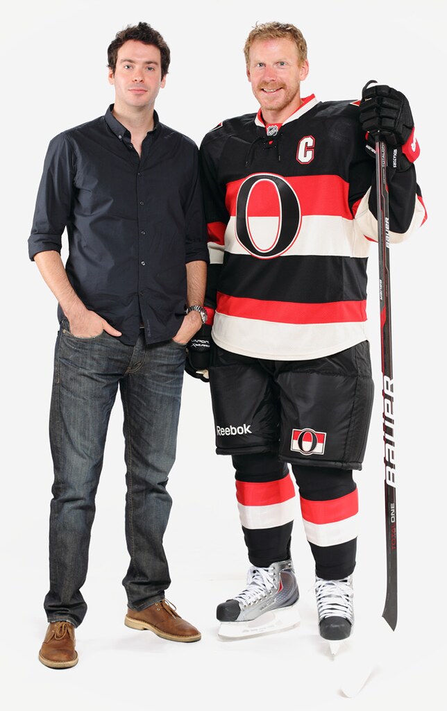
On the right is the Senators’ new heritage uniform, which the team will wear for the first time tonight. On the left is Jacob Barrette, the guy who designed it. Jacob’s unlikely route to becoming an NHL uniform designer is the subject of my latest ESPN column. (My goalie column has been delayed but should end up running next week.) — Paul
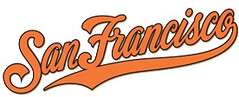
San Francisco feat: A faaaaascinating windfall for a bunch of attorneys story is unfolding in the Bay Area, where the Giants apparently neglected to trademark their “San Francisco” script for, oh, just 18 years or so. Some apparel company apparently noticed, went ahead and trademarked it themselves, began slapping it on assorted merch, and sued the Giants for good measure. You can read the full story here and here.
Permanent Record update: The technical difficulties at Slate seem to be endless (photo link glitches, disappearing blocks of text, etc.), but I’ve now fashioned a work-around. If you want to read the Slate series, or pick up where you left off, or revisit it, look here.
Even if you don’t care about PermaRec, there’s one little section of it that I think will appeal to all Uni Watch readers. I’ve taken that section and given it its own page here.
Party time: The next Uni Watch party will take place in Brooklyn on Saturday, Nov. 12, 2pm, at Sheep Station. See you there, yes? Yes!
Uni Watch News Ticker: Here’s the Brewers’ memorial patch for groundskeeper Gary VandenBerg, who passed away on Monday. And in an unusual twist, the St. Louis grounds crew wore black ribbons last night as a gesture of groundskeeping solidarity. … The Cowboys will be wearing blue this Sunday and throwbacks on Thanksgiving. ”¦ This is pretty cool: a CFL pillowcase! (Nice find by Mike Hersh.) … “I was reading a Bradley University message board thread about the basketball team’s new unis,” says Adam Mettrick. “Someone asked how often the team usually gets new designs and BU’s sports information director, Bobby Parker, chimed in with this response: ‘Usually every other year, or maybe every third year. Has as much to do with Nike marketing efforts as anything.’ I’d never heard anyone from a school straight-up admitting that they just let Nike put them in whatever uniform the company wanted, even though we all know that happens all the time.” … Remember how Eric Bangeman was offering $100 for a new uni design for his rugby league’s referees? Here’s the winning entry, submitted by Mako Mameli. … Mmmm, Parisian butchery market (thanks, Kirsten). … Mmmm, sausage race socks (from Jerry Kulig). … Dan Tearle — co-founder of the great Illustrated NFL site — is one of the featured artists in the new Football Invitational exhibit at the National Art Museum of Sport in Indianapolis. “I’m very proud of him, since his work is alongside other famous artists such as LeRoy Neiman and Bart Forbes,” says Illustrated NFL co-founder Michael Princip. “The exhibit precedes this season’s Super Bowl and Big 10 championship game, both of which are in Indy this time around.” … Soccer note from Chris Chaussee, who writes: “For Tuesday’s match against Ecuador, it appears that Brek Shea of the USA had cut the feet off his team socks and was wearing Nike Elite Basketball socks at the foot level, with the rest of team sock pulled over the top of it [like a leg warmer]. He had also done this in the previous game vs. Honduras, but I didn’t get a screen grab. It’s my understanding (from my wife the soccer player) that soccer players usually wear thinner socks so they can have a better ‘feel’ for the ball. The Nike Elite socks are thicker and have areas that have been built up for extra padding.” … Reprinted from yesterday’s comments: Victor Martinez has had some serious pine tar stainage on his shoulder during the postseason. … I guess squirrel merch was just a matter of time. … I’m kinda in love with this curling sweater, but the bidding has gotten too rich for my blood. … Here’s an odd one: Navy basketball is offering $3 tickets to fans who can show “an article of clothing, game program, or old ticket stub with a professional basketball team logo on it” (from Jason Mott). … A Minnesota designer is creating a logo for each one of the state’s lakes. Further details here (big thanks to Jimmy Lonettii). … Don’t think we’ve ever seen Tom Brady in the Revo before (from Tom Adjemian). … Tons of mid-’60s Packers and Rams goodness in this sensational photo gallery (big thanks to Jeff Ash). … New merit badge designs for the Girl Scouts. And as a bonus, the Girl Scouts don’t discriminate against gay and atheist kids like the Boy Scouts do. … Everyone knows by now that Yanks/Bosox games are ridiculously long. That helps explain why the Yanks and Sox played the most minutes of baseball this past season (from Stefan Spasovski). … Fascinating and addictive: this kerning game (big thanks to Michael Sulivan). … The ESPN web site was using this background wallpaper last night. “It’s advertising Carmelo’s new Jordans,” says Erik Morris. “Doesn’t it look like a straight rip-off of Golden State’s jerseys?” ”¦ Oh, taxi — taxi! Kyle Speicher spotted that in Tampa. ”¦ Interesting note from Eric Vanderburght, who writes: “I recall a 49ers/Jets game at Shea Stadium back in 1980 where Niners QB Steve DeBerg played with a microphone or amplifier under his jersey. He was having problems with laryngitis and they used this to pump up his voice. If I recall correctly he played with a rather large hump on his back just under the numbers.” Anyone know more? ”¦ Oh for shit’s sake, settle the lockout already, if only to put an end to nonsense like this. ”¦ Wondering how the SF Giants get their jerseys to be orange? Look here (from Christian Cisneros). ”¦ Doug Kyed has started a blog about the history of teal in pro uniforms. ”¦ Last Sunday Adrian Peterson was wearing something I hadn’t seen before: pink kinesio tape. “Barf,” says Leo Thornton.
The Girl Scouts are still evil though… getting everyone addicted to those damn cookies and not selling them year-round…
The Boy Scouts also don’t allow girls to be members, do they? How evil of them.
Not only does the Boy Scouts allow youth of any religion (or non-religion) or sexual orientation to participate in the program, they also have a co-ed program for young men and women ages 14-21 (known as Venturing)
The BSA also allows women to serve in positions of authority and leadership. As opposed to the Girl Scouts that do not allow men, of any kind, to serve as contact leaders for the girls.
“…the Boy Scouts allow youth of any religion (or non-religion) or sexual orientation to participate in the program…”
Yeah, um, no they don’t. Maybe in other countries this is true, but the Boy Scouts of America definitely do not welcome gays, atheists and agnostics.
JTH, I’m an Eagle Scout, and now an adult leader/volunteer in the program.
The official policy against homosexuals in the BSA deals with adult leaders and executive professionals only. Policy considers youth, essentially, to have no sexual orientation, as it’s not a part of the program. There’s no place in scouting for youth sexual activity, hetero- or homosexual alike. Thus, the BSA does not “discriminate” against young people who are gay. It’s a non-issue until you reach 18.
Now, as for atheists, yes, that applies to youth. There is no requirement to believe in any particular permutation of God(s) or religious tradition, all that is required is even a modicum of spiritual belief. And even this is really only an issue if someone wants to become an Eagle Scout. The question is asked, and the barest minimum of answers expected.
Listen, I don’t agree with these policies. At all. But I (and many others) have decided to participate in the program anyway because change comes from within, and aside from these issues (which are not nearly as central to the program as is portrayed), the BSA program really does a lot for young people. It greatly impacted my life and the lives of my friends, and I’m glad to facilitate that for young people now that I’m an adult.
OK, yes, maybe I should have been more specific.
I’ve actually been reading up on the BSA quite a bit recently because my son wants to be a Cub Scout and my wife and I have some serious misgivings about their official stances.
Not true, actually. Youth are only expected to live by that part of the Scout Law that reminds them to be ever Reverent. Reverence towards faith and belief in God are two seperate concepts.
That’s not exactly true, either. Doing one’s “duty to God,” from the Scout Oath, is treated with equal weight as “A Scout is Reverent” in the Scout Law.
“…getting everyone addicted to those damn cookies and not selling them year-round…”
My friend got me hooked on the Shout-Outs from this year… I thank her and now wish that February would roll around already. I’ve been wanting to snack on sweet things all Fall. Damn you, Autumn (Fall), with your link that make me crave…
im pretty sure the miama dolphins use aqua, not teal
Indeed. The Dolphins are aqua, the Jags are teal. Aqua is bluish green, teal is greenish blue.
I think the Charlotte Hornets were the first teal team.
It’s true that the Jags officially refer to their color as teal. But I’ve always thought of it as turquoise.
Turquoise can cover quite a few different shades. The actual rocks have a pretty good range of colors: link
You could probably use turquoise to describe both the Jags and Dolphins and not really be wrong.
Quoth Doug Kyed: “So I did a little research (very little)”
Waaaaaay off base on that one! Putting the 90’s Teal twist on a 60’s uni color isn’t cool…
Not sure about teal v. aqua, but link. That’s the road jersey of the former AHL Kentucky Thoroughblades. We loved them, anyway.
That looks very Anaheim Mighty Duckish.
I don’t mind the colors, in fact, I actually tend to like fun and unconventional colors. So many here whine about the overuse of black and dark, sober colors, and while that’s a concern, I can’t see why that same criticism can’t apply to the many standard shades of red and blue we see. Yeah, green needs to be added to the mix. But why not purple? Why not more inventive shades like teal? The sharks have great uniforms using such shades, and seeing those retro purple and yellow kings uniforms on the ice recently was great.
So why not?
All that said, that logo is one of the most horrible things I have ever seen grace the front of a hockey jersey.
I’d be up for more purple, orange, and green in sports (not all three together of course). The teal backlash is because of overexposure in the ’90s and the fact that it’s most often paired with black, which gives darker colors a very muddy appearance.
I completely agree. I loved the Marlins’ original unis. I thought that the use of teal as the primary color was perfect for a team based in South Florida.
I also didn’t have a problem with the Mighty Ducks’ color scheme or their logo. It’s just too bad they couldn’t design a decent jersey to apply them to.
I wish the Miami Heat had the balls to use the Miami Floridians’ colors instead of the “toughened up” version they ended up using.
These are just three examples. I could go on.
Teal/aqua works best for marine-themed teams. Everyone else, not so much.
Check out the link; he looks like he’s wearing baseball pants with cuffs that low.
…and the Argos sure teach their quarterbacks a crazy way to grip the ball up there!!
That’s why they’re 3-11.
Aside from the unorthodox grip, pretty clear that this guy was the model. Remember, rhymes with Heisman:
link
And #23 of the Green Riders couldn’t be anybody but Ron Lancaster.
Correction: the Boy Scouts don’t allow openly gay and atheist kids. [sarcasm]Biiiig difference, dude[/sarcasm].
Paul,
As usual love the column and site. However, I do not know why you swear on it and are making political statements. That is disappointing. Anyway, the teal guy also seems to be obsessed with the Kansas City Chiefs classic alternate logo. Growing up in the Chiefs family as I did then, I do not recall there were terms like alternate logo. Though it did have an outgrowth of the Dallas Texans logo, the inclusion of Nebraska, Iowa, Oklahoma and Arkansas in the design was intentional. True, it made the Chief fit better on the design, but it was meant to show to fans in outlying states that the Chiefs were meant to be their team also. I would have written him on his site, but he as no comments section. And Phil is correct, the Dolphins are a shade of aqua. I love teal, but it seems rare and a fad of the 90s, like the San Jose Sharks and Might Ducks were.
“…I do not know why you swear on it and are making political statements. That is disappointing.”
Not to sound like a 20 year-old asshole (and I’m really not trying to in any way, shape, or form), but it’s not really your place to tell Paul what to write on this site.
I, for one, wouldn’t tell Paul “Hey, if it’s not too much trouble, could you put something that I enjoy as today’s lede, because I’m not a fan of Hockey? Thanks =)” just because I don’t take interest in Hockey. Nor would I get at one of my friends on Facebook for using the word “Gay” to describe something that they don’t like. I don’t approve of it, but I’m not gonna give them crap over it.
I’m not saying that everything that Paul writes is gonna appease everyone (there have been times where Paul discussed Nike-related topics that even I found to be unfair), but that doesn’t mean that I would ask Paul to censor himself.
Just so long as he’s not taking a deliberate stab at “X” topic for its sake with no regard for anyone else’s feelings when “X” topic happens to be a touchy thing to talk about, I think he should be able to write whatever he wants to write about, F-bombs and all.
Paul was right in talking about the “No-Gays-or-Atheists-In-Scouts” rule that the BSA *unfortunately* enforces, because discrimination is wrong in all facets.
I’m gonna go back to sleep, but please take what I just said (well, typed) into consideration.
The hockey wing is waiting for you to cross over to the Dark Side, Moono.
Don’t resist. Resistance is futile.
;o)
He’s not on base with the policies of youth membership in the BSA. He’s not even close
Words like “shit” and “fuck” are perfectly reasonable words if used in moderation.
What is political about today’s post?
No particular reason, I’ll be taking a break from the site for the rest of the day. I see a bunch of green stuff on the other side of the clear parts of my wall. I wonder what that’s all about.
For the record, I have a problem with the swearing too, in that I would like to see more of it.
Oh fuck off Jeff A. Paul will fucking swear when Paul wants to fucking swear and he doesn’t give a shit about what you fucking think. ;)
/was that too much?
And that’s enough of that. Thanks.
For some people, institutionalizing bigotry is a political issue. Sadly, their insistence on it as an issue makes it one for everybody.
I know you know that and are asking for effect, but I thought I would put in in writing anyway.
Not as if you will, but please don’t capitulate to those who actively seek to entirely disengage from public discussions about how we organize our society. Which is, at its core, what politics is about.
Also, as an Eagle Scout, remember that the anti gay and atheist stuff tends to be the national organization. Local troops can be and usually are much more welcoming. The national organization is run by mormons and southern baptists, and is comprised of a bunch of fat old white men. Not a whole lot of people on the local level really care for the national leadership.
Call me crazy, but isn’t UW a place to discuss all things uni-related? I know this is technically your site and I simply don’t have to read if it bothers me. I am a long time reader from back when you were just on Page 2, but I doubt anyone comes on here eager to read your comments on organization x or why you dislike organization y for something totally unrelated to the entire premise of this site.
Why is it so hard to stick to why this site is here and why we all started incessantly following it in the first place?
I doubt anyone comes on here eager to read your comments on organization x or why you dislike organization y for something totally unrelated to the entire premise of this site.
Honestly, what people are “eager to read” isn’t particularly relevant to me. What I’m eager to write, on the other hand, is.
Look: You apparently have this notion of what you want this site to be, and/or not to be. That’s fine — fantasize away! — but you don’t get to decide what this site is, or isn’t. I do. Sometimes your conception of the site and mine will coincide; sometimes not. That’s life.
As always, you don’t have to read what I write, or even care. Either way, I’ll write what makes sense to me.
The whole scouting thing seemed to come out of no where. And where someone stands on that seems to just come out as hotly political. There is plenty of political hot air outside of sports on the web. A sports talk host in Kansas City in the 80s had a saying about sports place in society. He ended every show by saying, “Remember, sports is the toy department of life.” And the appreciation of uniforms and logos is one of the most fun aisles in that department. Just trying to keep it in perspective.
And where someone stands on [kids being discriminated against] seems to just come out as hotly political.
I’d say you have a funny notion of “political.”
I’m just furious over how many Jeffs read this blog.
Jeff A, Jeff P, The Jeff…, someone switch to Geoff or leave the site and never come back.
I think I’ve been around the longest, but I’m not sure. Had a bit of a hiatus though.
Also, us real Jeffs make fun of GeeOffs.
Paul,
One other historical note about the Chiefs. It was Norma Hunt, Lamar Hunt’s wife, who chose the colors of the team red and gold (yellow) when the team originated in Dallas. Oh, and why is the Toronto quarterback on the CFL pillowcase trying to throw the ball end on? LOL.
You ever seen the Argonauts play?
The photo of Tom Brady in a Riddell Revo is very strange but I noticed that Brady wore a Schutt Air XP earlier in the season but recently switched back to his normal Riddell for the last two games (including both the Flying Elvis and the throwback, Pat Patriot versions). Brady has an extremely large head (insert joke here) and has been wearing the Riddell, VSR 4 model (I believe), in an extra large shell size for years with the Pats. The VSR 4 has been discontinued for a few years now but I have been told that the Pats bought out Riddell’s remaining stock in XL so Tom would have this model helmet for years to come. I wonder if all the concussion concern in the NFL has caused him to change his helmet or if it was coming from higher up (the NFL, EQ staff, Gisselle, etc.)?
I’ve never considered myself a Powerade guy, but the more I see the “oh, gee. someone left a bottle (or two) of unopened sportsdrink where the label just happens to be facing the audience on the interview table” situations in the playoffs, the more I think of changing.
So I am not sure if anyone else has noticed, but its been bugging me since the start of the MLB playoffs. It looks like Comerica Park in Detroit has a weird pattern on the grass, particularly on the right field/1st base side where the grass is darker in some areas. Is this too nitpicky even for UW, or does anyone have any idea if there’s a reason for this? Is it just the shadows from the way the lights hit the stadium? (I think every time I’ve noticed it has been during a night game).
I haven’t noticed it, but it’s not unusual for certain patches of sod to have been patched/replaced by this point in the season.
It’s been bugging me, too. Imperfections in baseball or football fields completely warp my brain.
I think (large) sections of sod were probably replaced after a concert there. The stage is typically out in center field.
San Francisco had something similar last season- though I think they just left the damaged areas in place. Looked pretty bad for a while.
To me, it looks like the sod was replaced because the patched sections are a deeper green than the rest of the field.
I have just the opposite reaction: fake turf looks too perfect and unnatural.
You’d really hate the field at Reliant Stadium then. They put it together in 5×5 yard patches and there’s no guarantee that anything other than the patches with markings that have to be in a certain place will be there from game to game. It gives the field a somewhat uneven look.
I know its not natural grass, but I see the same thing with Metlife Stadium (or whatever its called now, the Giants/Jets stadium), particularly in the endzones. Bugs whenever I see it on TV.
Bugs *me* whenever I see it on TV, i mean.
Reliant is natural grass. That made it even more baffling to me.
How do they do patchwork with a FieldTurf field? I would think it would be hell to move the substrate around.
Kid Rock held back-to-back concerts at Comerica Park in mid-August. The replaced patches are from where the stage was as well as high traffic areas where the flooring was above the OF grass.
Replacing turf in August in Michigan is a tough task. It is usually very dry followed by unpredictable weather in September.
Out of curiosity, what are shout outs? I happen to like samoas better.
google is always your friend
link.,cf.osb&biw=1188&bih=531&wrapid=tlif131851566877710&um=1&ie=UTF-8&tbm=isch&source=og&sa=N&tab=wi
Yes… and it also makes you crave.
Got an 84 in my first effort at kerning. Does this mean I can apply for Printers Academy? Home of the Fighting Typesetters.
We need to get Tim E. to mock up a uniform for that team.
logo 1: link
logo 2: link
Road football uni: link
Link 2 is broken-
Logo 2: link
Let me guess, that’s lead gray?
It’s 535353 gray.
were you usung this: link ?
and I might be able to whip something up…
Today’s ESPN column is up:
link
I would’ve liked it a little more if you’d asked about the decision to go with vintage white, particularly since there was none on Jacob’s original concept… but, otherwise, a great article.
Nice Q&A. I’d imagine I’m not the only one on here a little jealous that Barrette’s “living the dream.”
great cheerleader shot in the Packer’s gallery-yellow sweater with a green block “P.”
I dug that too.
I also love seeing blue sky in the background of so many shots!!
3 things today:
– Odd that the Nike/Jordan/Carmelo logo uses the Brooklyn bridge in their blatant rip-off of Golden State’s logo. Especially since Mello’s a Knick and not a (Brooklyn) Net.
– I love the helmeted Dolphin logo as much as the next Uni-Watcher, but that link helmet is super cool.
– The link is brilliant. Mighty ambitious: Should only take a little over 27 years to hit ’em all.
Indeed (re: lakes).
The one for Lac Qui Parle is especially good.
Yes, the Lakes Project is really inspired.
I think Carmelo is from Brooklyn. That was one of the selling points the Nets were trying to use to coerce him to come there I believe.
Also, doesn’t the Brooklyn Bridge connect to Manhattan as well?
Yes, in 1980, Steve DeBerg did wear a microphone with a noticeable bump in his back padding in a game versus the Jets at Shea Stadium. Because of the trouble with his voice, the Niners came up with this setup, don’t know if this was a one timer or not. Despite the baggage, Deberg had a great game, and later, Joe Montana finished up for San Francisco.
DeBerg’s amplifier malfunctioned during the game, leading to more playing time for Montana than originally anticipated. And Joe did well, too, leading the Niners to a win at Shea and a 3-0 start.
IIRC, DeBerg was able to get rid of the amplifier the next week.
Of course, the Niners went on to lose their next 8 in a row, but that’s another story…
I may have a photo of this somewhere, I think.
There’s a picture of it in the book Great Ones by Riffenburgh and Boss.
DeBerg was one of the guttiest quarterbacks of all-time. And he was the master of the play action fake. No one has done it better.
At 2:30 in this clip “1980 San Francisco 49ers”, Deberg demonstrates the voice box prior to the game vs the Jets. link
The new Ottawa uniform beats the Reebok harlequin costumes they wear now. Of course, so would a sharp stick in the eye, but it still works very well. Yet another team picks tradition over “concepts”!
I’m no fan of MLB slapping a trademark on everything in sight, but if the Giants’ oversight means the demise of the San Francisco script, I for one will be saddened. That was a sharp look, especially on warm-up jackets. I have no beef with the “Giants” and “San Francisco” serifed logo. It looks fine on the uniform. It’ll look boring on the jackets if it comes to that.
I seriously doubt it’ll be the end of it. As the article notes, the Giants may not have registered it, but its constant use by the Giants for nearly two decades gives them precedence.
Correct. Registering a trademark/copyright is just a formality. If you can prove its yours first, you get it.
You can’t go out and find works that mistakenly weren’t trademarked officially and quickly call them your own.
Its an interesting story, but its sort of a non-story.
My business, for example, has never officially trademarked anything. Or logo, whatever. Doesn’t mean someone else can just start using it.
You don’t have to register a trademark to own it as long as you can prove that it creates an association with your brand for consumers. Registering just gives you a better argument in court.
An example, albeit one that has more to do with business registration than a trademark: back in 1984, retired NHL defenceman Carl Brewer discovered that the Toronto Maple Leafs, whom he played for, weren’t incorporated under the name Toronto Maple Leaf Hockey Club. They had been, back in 1927, but Conn Smythe restructured his business in 1948 and the corporate name was abandoned. The Leafs continued as a division of Maple Leaf Gardens, Ltd.
So Brewer went out and filed the papers to incorporate a company called Toronto Maple Leaf Hockey Club, Ltd. Owner Harold Ballard took him to court, and won, because he could demonstrate that the team had continued to do business for the previous 35 years or so as the Toronto Maple Leaf Hockey Club.
So, a similar principle was involved: through continuous use, the Leafs demonstrated a claim to the company name. And I’m pretty sure Ballard was quick to send some minion down to the provincial government office to secure it once and for all.
Is it just me or is the move by this Gogo sports company like one of the biggest d-bag moves ever. I mean c’mon. It ranks pretty high up there on the stupidity/slimeball scale as far as I’m concerned.
As A Dolphin fan, I’d be even more disappointed if the team doesn’t go ‘throwback’ @ Dallas in Thanksgiving. This organization needs something pretty this year, geez. It was pretty nice when they did it in ’03 which was the only Dolphin game I saw while deployed. I’ll never forget it and the those B+ Throwbacks. Anything above what they’ve got now.
Not a fan of the navy blue drop shadows, huh? Can’t say I blame you.
Not at all, Rob. Not at all. I can’t say I’m a big fan of tertiary colors. On my Dolphins, I hate it. I’d rather have my abstract Dolphin logo with Sun rays than the cartoon Dolphin with navy blue accents we have now. It’s like the Detroit Lions. THey would looks so much better without the “black”. I hate it that two teams I loathe the most, the Bills and the Jets have better uniforms than us.
Definitely agreed on the Lions and their black. Unfortunately, that’s one aspect of the Millen Era that’s not going away just yet.
(Though he did draft Calvin Johnson… of course, with so many WRs picked, one of them HAD to stick eventually, right? Even a blind squirrel finds a nut, etc. etc.)
I seem to remember the Dolphins did wear the 1972 throwbacks for a Thanksgiving Day game in the 1990s. It was the white road uniform.
I believe they wore that uniform in ’03. In the 1990s, they played the Cowboys twice on Thanksgiving: 1993 and 1999. They wore their Aqua (current–respective) jersey for that time.
So, yeah, after seeing the Cowboys’ website heavily infused with pink from that link today about their unis, I checked out the rest of the NFL teams’ sites, and found that nobody else is using pink like that (a few teams do have pink backgrounds outside of the 1000-pixel wide zone, but aside from the obligatory ribbons on some sites, and a pink “ticker” line on the Dolphins, nobody comes close to the ‘Boys in their usage of pink).
Which led me to this interesting find that had yet to be mentioned in any of this week’s posts (and, to my knowledge, hadn’t shown up in the comments, either):
The Packers website’s home page (www.packers.com) has been configured with Acme Packers graphics this week, as they’ll be wearing their 1929 throwbacks against the Rams. Confirmed on their link page (the bottom bullet of the Highlights section). Note that the rest of the site retains the modern Packers graphics.
I’ve e-mailed this to Paul as well, at least the Packers part of the story (since it’s the most uni-relevant part).
It’s about time the memorial patch became integral to every team’s uniform design, to make it easier for no team employee to go unmourned. Just change out the initials as need be.
Well, the Bears, Browns, and Chiefs already have permanent memorials…
While we’re at it, the Packers have been extremely lax… they should have permanent memorials to Curly Lambeau AND Vince Lombardi on their unis! Put “ELL” or “Curly” on the right sleeve stripes, and “VTL” or “Vince” on the left!
/sarcasm
The Hunt and Halas memorials are justified. The Lerner one is a complete farce.
Sarcasm duly noted, but Lambeau already has a permanent memorial in that the Packers play in a stadium named for him. Lombardi does not deserve one.
Lombardi has one, as well. The winner of the Super Bowl hoists the Lombardi Trophy every year.
I was talking team-specific, and mockingly so…
Besides, Hunt and Halas also have trophies named for them; they’re the ones hoisted in the two games preceding the Super Bowl.
Well, if memorials don’t float your boat, I’ve yet to read in this space that the Toronto Maple Leafs have memorialized Igor Korolev, Alex Karpovtsev or Wade Belak in any way.
Was thinking re: groundskeepers, broadcasters…put a permanent patch on the next uni design. Incorporate it.
Baseball has the edge in morbidity. Football is more about diseases.
Let’s face it, football – specifically, the NFL – is all about boobies.
Minnesota lake project:
Lake Mille Lacs:
link
in case G+ sucks:
link
That’s a picture begging for use on Memebase…
I’m not gonna do it, though.
It does, thus contradicting link.
LMAO! ok, then google is my friend… but his creepy brother sure is pissing me off!
Love the lake logos but it would be better if some of the ones with just a design had a wordmark as well because I have no idea what those logos represent since I’m not a Minnesotan.
Well, the one whith a splash forming a crown is just a crappy trace from a shutterstock image. King Lake maybe?
May we all hope and pray that this man is NEVER EVER responsible for any sports uniforms of any kind. Almost makes the Swoosh look modest…
link
What if the Department of Redundancy Department needs new unis for its softball team?
link
By the way, you guys are getting love from one of my favorite sites:
link
Noticed that AD still has shit on his jersey. And did he go back to a VSR-4?
Yes…and a different facemask as well.
Steve DeBerg is my uncle and you are absolutely correct regarding the amplifier/large hump. It was pretty innovative at the time :)
Helluva QB.
Got pushed to the bench by the arrival of at least three HOF caliber QBs, right?
Montana in SF, Elway in Denver and Steve Young in TB, maybe?
Honestly, don’t remember for sure. Might even have been one more. But it seemed like every time he got a relatively firm hold on a starting spot, it took someone extraordinary to relieve him of it.
Actually, DeBerg was the starter who had to make way for Steve Young and then was the starter AGAIN who had to make way for Vinny Testaverde.
Bucs got him in 1984, he started in ’84 and ’85, they got Steve Young in ’86, who supplanted DeBerg…and then they dealt Young to San Francisco to pave the way for Testaverde. But DeBerg opened the 1987 season as the Bucs’ starter (again) before they finally turned to Testaverde in Game 12 of ’87.
After Steve went off to Kansas City, the Bucs actually got him back in 1992, when he backed up….Testaverde.
Thanks.
As I said, couldn’t remember exactly, just know there are all kinds of quirky things about his career and the other QBs he played with.
Seemed like every time he’d get a toe-hold somewhere he’d get moved back to the bench.
Didn’t he end his career as a backup to Chris Chandler on the 1998 Falcons team that went to the Super Bowl? Also I seem to remember his coached in Arena football for a brief stint.
Does that make Steve DeBerg the Wally Pipp of the NFL?
Certainly maybe the all-time “Second Banana.”
Backed up Ken Stabler in Oakland, too, didn’t he?
No, he never played for Oakland.
But, yes, he did come back from five years away to sign with the Falcons in 1998 at age 44.
DeBerg was pretty tough man. He played a playoff game with a splint surgically inserted in his finger. Chiefs almost got us that day. A couple years later he come to here to Miami and got his chin busted by the Giants, got stitched up and came back out to finish the game. Dude was a badass.
Shouldn’t that Seahawks jersey say “James” and not “LeBron”? This isn’t the XFL.
If anybody deserved the moniker “He Hate Me”…
I have to officiate a FB game the morning of the 12th but fully expect to be involved with the annual UW gathering!
[note to self: move UW gathering up to 11/12 morning]
Appropriate that I saw this yeasterday morning:
link
Yesterday…I apologize or Ms. Phil and hope that is not foreshadowing.
Much along the same lines of the Giants being sued for using the San Francisco logo, some clown person trademarked the phrase “Shop With A Cop” associated with law enforcement taking children Christmas shopping.
There was the threat to law enforcement agencies and organizations that used the “Shop With A Cop” in association with their events of being sued if they did not attach a rambling notification that SWaC was being used by permission from blah, blah, blah….
So, at the Biennial Conference in Long Beach, California in 2009, the National Fraternal Order of Police authorized, and trademarked, “Cops & Kids” to be used instead of “Shop With A Cop”. I know “Shop With A Cop” is still being used in some areas, but most have decided against it.
Similar IP squatting taking place in Britain & the EU over the famous WWII propaganda poster, “Keep Calm and Carry On.” link. Added twist: It turns out that poster, one of the most famous pieces of Allied propaganda, was never actually used in WWII after all.
New rules on football shoes.
link
WHAT????
I thought Nike declared lime/neon green to be a neutral color.
Sounds like the teams have to be uniform among the players on what the shoes look like, something that I’m sure Nike is jumping for joy at.
Habeas Corpus?
TRIVIA QUESTION:
Speaking of backup QBs (DeBerg), how many QBs in the TV era have pretty much been their team’s full-time punt returner?
I can think of only one. But I could be wrong, of course (didn’t look up any stats other than the player I’m thinking of).
Brad Smith?
Didn’t Thiesmann return punts way back at the beginning in the 70s?
There ya go.
1974, after he came down from the CFL.
Returned 14 or 15 punts (I forget exactly) that year.
Smith’s most in a year is like 3 or 4, I think.
Unless this is a different Brad Smith, he didn’t really return punts at all, just kickoffs.
As for the Brek Shea soccer socks issue. As a soccer player I have never understood the fascination with getting thin socks for a better feel. When I still played outdoor I always wore white no show socks under my soccer socks to thicken it up. Now that I play exclusively indoor I just wear regular soccer socks but all the pairs I own have a little extra cushion on the bottom of my feet. The idea that a thinner sock will get you better feel through a leather or synthetic shoe seems stupid if you ask me. The same people that have the thin socks are the same people that complain about getting blisters. After 14 years of competitive soccer I have never had a blister and I chalk that up to thicker socks. Is it me or do all athletes sometimes get non-practical dumb ideas like “I’ll be able to feel the soccer ball better through my shoes if I wear a thinner sock and somehow this will make me have a better touch and be more composed on the ball”? It’s called practice. That’s what makes your touch better, not thin socks. So kudos to Shea for wearing thicker socks. Those shoes he wears are some of the thinnest on the market anyway, and one doesn’t want to be stamped by some soccer thug while wearing those to begin with let alone with thin socks too.
link link
(Islanders 3rd news, for those who are unsure about clicking the links, which are to Sportslogos.net and Icethetics.info, respectively.)
I couldn’t decide between quips so:
1. Well at least we know the Mets’ recently ousted black infusion has found itself a new home.
2. Good to know that bad ’90s designers can still find work.
link does not approve.
it’s a good thing this lockout is going to cancel the season
His last year was with the Falcons (I got SB tix out of it) and he coached the Indiana Firebirds of the AFL for 5 games before being fired. (they went 0-5)
so is this guy nelson cruz any good?
Don’t forget Mr. DeBerg also backed up Dan Marino in Miami. Came in to beat the Cowboys in the snow!!
Yep, he started the Leon Lett game
I’m sitting in the waiting room of a doctor’s office and there’s a girl wearing one of those script “San Francisco” tourist shirts.
No, I’m not taking a picture of her.
“No, I’m not taking a picture of her.”
~~~
then it didn’t happen
COWARD! TAKE THE PICTURE AND REFUSE TO EXPLAIN YOUR ACTIONS!
The Giants logo thing is a joke. Cheap fleece company out of Hayward, which is in the East Bay. I see those knock-off script jackets all the time @ Fisherman’s Wharf, and that’s precisely who buys them- tourists who realize in July that damnitscoldhereandibetterbuyajacket.
don’t know if you looked this far into it, but here are all the legal docs.
I haven’t even been able to wear my new majestic one yet!
link
It’s going to be interesting to see how this plays out. I’d like to think the Giants will win, but my gut tells me the court will say the marks are distinct and neither wins. Have the Giants filed an answer yet?
Never mind. They filed it in LA and demanded a jury trial. Gogo will win.
They filed it in LA and demanded a jury trial
~~~
is that bad?
I promise you that this cheap little two bit operation has no chance and if I was a gambler I’d bet you 50K I’m right.
By the way, is that triangle cut-out of dirt outside the baselines right in front of 1st & 3rd base at Busch stadium new? I’ve never noticed before, but then I haven’t watched a lot of Cardinals baseball this year.