.
Paul here, back from a glorious Midwestern getaway (I’ll have more to say about that tomorrow). Major thanks to Phil and John for holding the fort in my absence.
Now then: The endearingly primitive illustrations showcased in today’s entry were recently sent my way by reader David Cline, who describes them as follows:
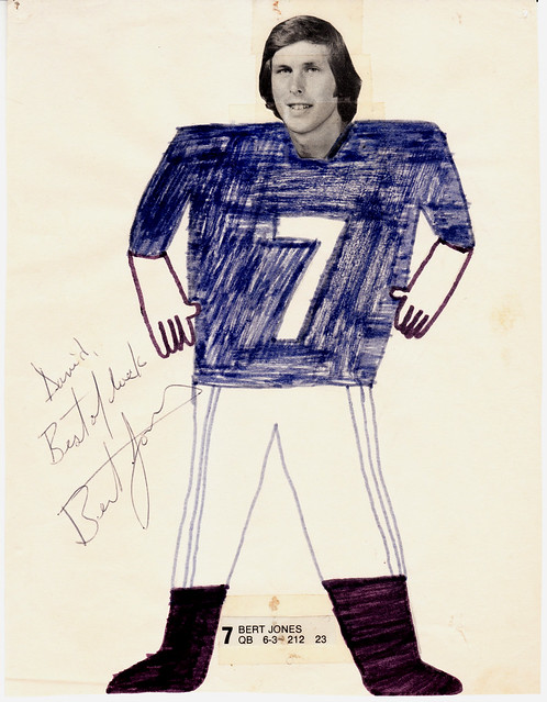
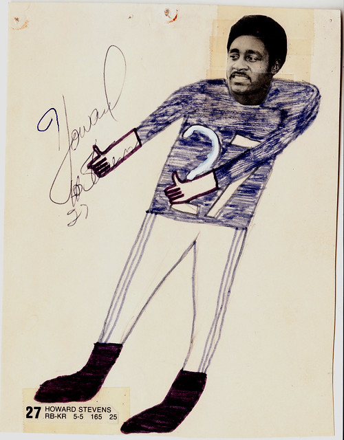
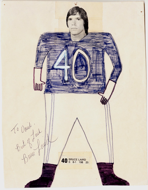
In 1975, when the then-Baltimiore Colts were in the midst of their most successful season in many years, I took the game-day program, cut out the pictures of my three favorite players, drew on uniforms for them, and sent the pictures to the Colts, requesting autographs.
Much to my amazement, all three were signed and returned. Granted, the physique of each player is a bit off (except maybe for Howard Stevens), but the thought was there. And I think I got the pant stripes, too. Not so much the sleeves, though.
A stickler might quibble with the lack of socks, but the whole thing is so charming, we’ll let it slide. I’m not sure which part of this story I like better — that David assembled these little drawings or that the players actually signed them and sent them back. Good on all of them!
David also shared another uni-related story, which goes like so:
During the Colts’ last year in Baltimore (1983), I worked them as a PR intern. … One day I was told to request a game jersey for one of our players to use in a photo shoot with children from a local community center. The equipment staff was leery of that but they finally agreed.
About an hour after the photo session, the jersey was missing. I felt panic coming on, but the equipment manager took it in stride and said, “I have a pretty good idea where it is.” Turns out one of the kids in the photo shoot followed our player inot the locker room and swiped he jersey. The kid was located, the jersey was recovered, and I breathed a huge sigh of relief.
In addition, David was kind enough to loan me a bunch of coffee table-style football books for the Uni Watch library. I hope to share some images from them in the near future.
Membership update: About a dozen new designs have been added to the membership card gallery (including Erik Morris’s Memphis Sounds treatment, shown at right). As always, you can get in on the membership scene by signing up here, and all members can now order stickers based on their card designs. Full sticker details are available here.
Uni Watch News Ticker: I’m still catching up on stuff, so please forgive me if anything in today’s Ticker was already covered earlier this week. … I’m still calling it the Superdome. … Oregon will be wearing a new mascot-driven jersey design for tonight’s game against Cal. … Here’s a look at the Rangers’ Derek Boogaard memorial decal (from Luke Rosnick). … Speaking of the Rangers, their European opponent for one of last week’s preseason games, HC Slovan Bratislava, has a chest crest that’s basically a repurposed Penguins logo (from Patrick Mahoney). … Still more Rangers news: The team is seeking an art director/designer. How cool would it be if a Uni Watch reader landed that job? (Thanks, Kirsten.) … Temple hoops coach Fran Dunphy is honoring a bet with a player by shaving his longtime mustache (from Andrew Hoenig). … Buried at the bottom of this page: Oklahoma coach Bob Stoops was asked if he’d wear a “Beat Texas” cap like Barry Switzer did in ’84. His reponse: “If Nike gives me one, I’ll put it on.” Spoken like a true corporate stooge (from Peter Young). … Chaz Noerenberg spotted something interesting in this photo of the Pats’ locker room. “Those are the ’80s throwback helmets they wore last year (white facemask, blue stripe between the red stripes),” says Chaz. “But the weird thing is that those are the ’60s AFL throwback pants hanging with them — blue-red-blue striping. The correct ’80s pants are red-blue-red, with thicker stripes.” … Here are some shots of the Northwestern marching band’s new uniforms being made (courtesy of NU Athletic Communications). … Coyotes goaltender Jason LaBarbera has a new Pat Tillman-themed mask (from Jim Wilkie). … And as long as we’re talking goalies masks, here are this season’s designs for the U. of Wisconsin netminders (from Stuart Ciske). … Soccer stuff from Nathan Gemignani, who writes: “Here is a long piece on English (mostly) soccer clubs having to wear borrowed jerseys/kits. That’s the first part. The second part lists some players who played for their national teams but whose last names were that of another country — for example Mike England, who played for Wales. The piece on wearing the kit of the opposing club, links to this site, which is a rather unique visual history of Oxford United. They even go so far as to put the kit of an opposing club in one of the season uniform rundowns, because Oxford United had to wear them for one game.” … All Things Considered ran a story yesterday about a new kind of chinstrap. ”¦ The Hungry Hungry Hipster reports that someone on Etsy is making and selling “Beard Beanies” — a knit hat with a knitted fake beard attached. And naturally, one of them is based on Brian Wilson. ”¦ Very cool “How a golf club is made” display case here. ”¦ Latest NHL team to incorporate its logo into its red line design: the Kings (big thanks to David Ludwig). … RIP, Steve. You changed everything.
A stickler might quibble with the lack of socks, but the whole thing is so charming, we’ll let it slide.
Maybe they’re all wearing Johnny U – inspired high-tops?
Every time I see Bert Jones’ picture I am sadly reminded of my friend Butch Duhe who, as a Junior in 1970, was the starting quarterback at LSU. Days before the season opener Butch died suddenly of a previously undetected brain aneurysm, opening the door for Sophomore backup quarterback Bert Jones. And the rest, as they say, is history…
Truly sad. I had a long talk Tuesday with a guy that played baseball with Mike Miley, another LSU QB that died too young. Truly sad ….
Speaking of LSU quarterbacks, I’ve been wondering…Is current LSU QB Jarret Lee any relation to Buddy Lee, who was a QB at LSU around the time of Bert Jones?
Remember Lee and Jones wearing #3 and #7 (of course), respectively.
Ricko,
I do not believe that they are related. I’ve seen about 150 articles about Jarrett Lee, good and bad, and they have never referenced Buddy Lee or any connection to him. I believe Jarrett Lee is from out-of-state (Texas?). Surely, someone else on here is more knowledgable about the LSU roster ….
Yeah, I kinda figured it would have come up with the talking heads by now…but also thought I could have missed it it.
Thanks.
That’s one of the best Oregon jerseys I’ve seen in quite a while.
PS: I’m a Disney guy.
Not a Disney guy, and I love that Oregon jersey. But it’s fatally flawed. If a football team shows up on the field wearing green and yellow, how will anyone recognize Oregon? The Ducks will be like lining up to receive the kickoff, and Cal’s coaches will be holding a powwow with the refs saying, “Where the heck is Oregon?” and demanding that the refs award them a forfeit.
“I love that Oregon jersey. But it’s fatally flawed. If a football team shows up on the field wearing green and yellow, how will anyone recognize Oregon?”
Not to argue w/ Mr. Vilk, but this right here gets my vote for COTD.
I want to like it, but Bellotti Bold absolutely kills it for me.
I agree…I loved the 2009 Cal game real “retros”
link
Agreed. Those are great unis. Sad they can’t stop the nonsense and wear those fulltime.
pflava for Comment Of The Day!
I guess the number in the collar is a reference to how many push ups the mascot did last year. Awesome.
Sorry if the links have been posted already, but here’s the Facebook album (only three pics, though):
(link)
Image URLs:
(link)
(link)
(link)
Regarding the shot of the Patriots’ locker room, don’t you suppose those are just older pants that are being used for practice?
But the helmets interest me. A few weeks ago the NFL Channel was been playing a documentary about Bill Belichick with footage that I think was from the 2009 season when the Pats wore throwbacks. Their white helmets had two red stripes.
But the interesting part was that the helmets were “eggshell white”, like Riddell used to make them back in the day, and not a modern bright white. Can anyone tell what color the helmets in the locker picture are? And, does anyone know of any teams that still wear eggshell white helmets?
White helmets are still slightly more cream colored than white jerseys in all cases, at least to my eyes. Bugs me every time I watch white helmeted teams in HD. I think the ‘pearl metallic white’ is a little bright than the flat white that’s used for throwbacks, but nothing gets quite as white as the fabric.
The Patriots’ 1960 throwbacks that they wore for the AFL 50 celebration had a colonial hat on the side (not Patriot Pat), some uniform numbers and featured two red stripes (no blue stripe).
WTF are you talking about?
The Patriots didn’t wear a 1960 hat logo’d helmet, they wore 1963 uniforms for the AFL games.
link
Three pointed hat:
link
My mistake, The Jeff. No need to be a complete asshole. They still were early sixties helmets before the blue stripe was added.
“… … RIP, Steve. You changed everything…”
Yessir.
And since his shade probably approves of my using one of his products to enjoy the company of a far-flung, idiosyncratic fraternity that couldn’t have existed twenty years ago, I’ll also say that David Cline’s pictures are amazing and wonderful, that Dumb Guy has it right about the Ducks’ uni, and that, thanks to Chaz, I now can distinguish 80s Patriots pants from 60s Patriot pants. I like the 80s better.
In his honor, here’s a look at link. A mind forever voyaging indeed.
Love it.
That is great. I’ve never seen that before!
Speaking of the 1970s Baltimore Colts, every time I see Howard Sevens in a Colt uni I am happy to know he made the playoffs, and yet I cringe.
Howard Stevens was drafted by the Saints and played two years for them. A 5’5″ RB/KR, he played quite a a bit, and played on some horrible Saints teams. He was and still is my all-time favorite Saint. A star with the Saints, some idiot GM traded him to the Colts for a low draft pick.
A lot of that happened immediately prior to moving into the Superdome. Bill Butler, John Didion, Jess Phillips, Wille Hall, Larry Cipa, Jubilee Dunbar, Mike Tillman, Dave Rowe. Some hit it big with new teams, some went from Saints’ starter to getting cut by their new teams before the first preseason game. They were all Saints heroes, and nothing that the Saints ever received in a trade for most ever amounted to anything.
Bert Jones was the No. 2 overall pick in the 1973 draft. He was picked with the Saints’ pick, which was sent to Baltimore for average DE Billy Newsome, who lasted 2-3 years before washing out of the NFL. Typical Saints trade for that era.
Cringe.
Speaking of Howard Stevens, he was a tremendous basketball player – I saw him play a Charity Game once and he was absolutely stunning. Brought the house down. He could have been a Harlem Globetrotter. Crazy ballhandling and fast and jumping ability – Awesome.
He wore number 22 for the Saints, didn’t he?
link
BTW, Nick do you remember when you could buy these Saints game jerseys off the rack at Security Sporting Goods on Carrollton Avenue and have them numbered before you left the store?
WR Kenny Burrough was another Saint who was traded(to Houston), and became a key part of those playoff Oiler teams later on. Have no idea who the Saints received in that deal.
Oilers at different times had Steve Largent and Jimmie Giles, and also parted with each player.
I also recall we used to send our big name players to the Chargers…like Chuck Muncie and Wes Chandler.
Forgot Bobby Douglass played for the Saints, NFL Films did a 60 minute show on a week with the Saints in 1976, and Douglass started games that year. Manning was injured, this was during the Hank Stram era.
Saints had black pants then along with black cages, don’t know if this was Stram’s idea or not.
Do recall a funny story Manning once told about the Saints picking up a kick returner before a game, and the player had a pet parrot he brought to the Superdome prior to the contest. During the game, the new player fumbled, and the bird was found dead in his locker room stall after the game. The kick returner was waived the next day.
Absolutely. I never had the money to get one, but I wish that I did now. When the store was closing, I bought the Saints oil painting of the generic 1967 Running Back that was at the front of the store – it is currently in my office. Apparently, there was more than one – another hung over a bar at Cleveland Ave near South Galvez. That same paintng was used as a template for posters, cards, etc. I see it used here for certain things re; Saints.
I also best remember making my annual trip to buy football cleats in 1976 they had a pair of Johnny Unitas – style Black hightops on the bargain rack. I passed them up for some White Pumas – and have always regretted it since !!!!
Black pants were Hank Stram’s idea for 1976 +. They were 500x better than the recent Black leotards that (I pray) are retired – as they have yet to disgrace our Saints team this year – yet ….
Stoops was trying to appease the fan base while at the same time trying not to excite the Longhorns too much. That said, I really hope Nike gives him that hat.
Boomer!
I took it to mean that he didn’t want to wear the hat but he would if they made him.
In the press conference he said things like the “Beat Texas” hat, which was made famous by Barry Switzer, were good for the RRSO, but that he wasn’t going to go out of his way to fan the flames.
Man. If I was ten years younger and ten years dumber, I’d be all over that Rangers AD job. I wouldn’t get it, but I’d be all over it.
My favourite football colour clash situation is described here link with photo.
Standard Liege normally wear red shirts, but for some reason travelled to Leeds with white shirts – the same as Leeds’. The picture of Billy Bremner (the fiery Scttish captain of Leeds) looking at his opponent is a gem :)
David Cline’s pictures are priceless. I love the yellowed tape on the players’ heads.
Am I crazy (in regards to this specific thought), or do the Baltimore uniforms pictured above look closer to Baltimore Ravens uniforms than the Baltimore Colts? Not a criticism, mind you, as I don’t think I could draw the uniforms as well at 40 as he did at … well, the age he was.
I had the same thought – the juxtaposition of the word “Baltimore” with the dark blue (that could pass for purple) as well as the shape of the number — at first glace at the front page I thought of the Ravens too.
link
My first thought was “What kid would be drawing pictures of Kyle Boller?”
Thanks, Paul, for the feature – I was not expecting that, but I am honored and flattered. And thanks for all the comments, too. I was 12 when I drew those pictures, but as you can see from the wite-out, I did have a few issues.
And yes, Johnny U was a huge influence – love his look in the high tops and crew cut … and his two-bar face mask with no connective vertical bars – really!
Once again, many thanks. It’s fun, educational, rewarding, and inspiring to be a part of the Uni Watch family.
I am all DUCKED-out at school today, and I like the Puddles logo, but not on the jersey.
link
Get your damn feet off the desk!
link
HA! That’s funny right there. I don’t care who you are.
I am who you thought I was!
All kidding aside, The Jeff is right. I shouldn’t have my feet atop the table!
I was actually hoping that the Ducks would come out like this tonight:
link
link
If the ducks wanted to go throwback in their modern set, why not go with this link ?
So much better than weird duck head shoulders.
Oh, god…that tech/shop class room looks exactly like the one I had in middle school.
Interestingly enough, one of our projects was to build a fully functional 8’x4’x4′ hydroponic growing system. They magically disappeared one day after grading.
Never really thought it was weird at the time
@ Tim – I really like your “modern” throwback. The old colors with the current wings/Bellotti Bold – very well done.
Is that a ‘Hook’ poster?
Nope…Goonies
Tim,
That idea is interesting, but like pflava up above in the comments, the tapered Belotti Bold kills it for me.
I don’t have belotti bold hangups, but I understand. I still argue that this – link and this – link are the two best uniforms the Ducks have worn since Nike started wearing the Ducks.
I would love if that second one, with yellow pants, would become their everyday home uni. (like that’ll happen)
You forgot one, Timmo:
link
That was Nikegon at its finest. Then it all went downhill from there.
LOVE them but also LOVE all of the other ideations.
I didn’t however like the diamond plating.
Check these Oregon Kicks out:
link
OK, the Ducks have improved slightly. The diamondplate was the bottom of the barrel. The current wings are actually a nice touch.
This (and its variations)…
link
…was most definitely a guilty pleasure of mine.
Striking, inventive, unique…and still within the Ducks’ color palette.
But, as Vilk noted, the descent into madness followed.
Any chances of getting an updated MLB Playoff Tracker today? I know what it will say, but I desire to see it in a graphic.
I may be the only person who cares about Northwestern’s new Marching band unis…
I’m a bit torn, while the old unis probably needed to be replaced after 15 years of service, and while I like that there’s more purple, I don’t like the less traditional uniform – than this: link (although, my alma mater’s band is in the background wearing their hideous mono reds and white baseball caps. WEAK.)
I’ll have to wait and see how it looks on the field (and see the pants and hats) but the band also changed up their pregame show this year after more than 15 years of the same (basic) pregame. Again, some good, some bad. I guess change has to happen but the NUMB (that’s why it has to be NU not NW!!!) was a huge part of my childhood and still remains as some of my most vivid memories of NU football games (tho, I remember this too, link Best football game I’ve ever seen. Suck it MICHIGAN)
Oh, I care. I think the new uniform is probably a bit modern for my tastes, since I’m a traditionalist at heart. I love O$U and Purdue’s bands uniforms.
I think we can all agree that the Marching Hundred are far and away the worst looking band in the conference.
“I think we can all agree that the Marching Hundred are far and away the worst looking band in the conference.”
Sadface.
My highschool band (which I was in, w00t drumline) was more professional and did more interesting marching than IU has ever done since I was a freshman there in 06. Good thing I gave up band in college. plus, those uniforms don’t look half as bad with white pants.
That’s awesome! I had no idea you were in the marching band in high school! Video? Band picture? Anything? And it’s all about the percussion B)
But I’ve never liked white bibbers. They look better with certain color schemes, but I always thought that they were a recipe for trouble, because if you beef it during a show, at least you won’t mess up a pair of black bibbers as much as white ones (especially if you’re marching on a grass field).
My high school band (which was — and still is — extremely small) have had link since 2005 (I’m the Black guy in the mono-green Drum Major uni). The wrong shade of green always bugged me, as my high school uses Forest Green, but still a nice uniform, overall.
Here is my band my senior year of HS – 2005-06 (so 2005)
link
I’m in the second row above the ‘B’ in Benet. Coolest thing we ever did was play the halftime show of the Outback Bowl in 2003 (my freshman year).
link
I’m a few rows behind the top left star, playing cymbals. Kinda hard to see, haha.
Yeah, I went cymbals, bass, bass section leader, snare co-section leader. I had a lot of fun but – especially cause I went to IU – I’m glad I didn’t do it in college. I do miss playing though, man could I hit the loudest rimshots.
Must’ve been good times…
The above picture that I linked to was our trip to UCLA Band Day on Sat. Oct. 18th, 2008 (my Senior year). The feeling of playing “Sons of Westwood” behind a link was one of the highlights of that year.
I played pretty much everything on the drumline before being named the full-time Tenor player in 11th and 12th Grade. I kinda miss the “Jolly Green Giant” comments from whenever I put on the DM uni…
Another nominee for best game in (I’m still calling it) Dyche Stadium history: ‘Cats 33, No. 7 OSU 27 in OT
link
I was at UM NU. I watched OSU NU on tv in Columbus, OH, isn’t that a mindfuck, haha.
(At the time my sister went to school about 25 miles outside Columbus, Denison University in Granville)
Ummm… excuse me, guys… I can understand how you can dig a college marching band outfit because it’s so “traditional,” or because it’s so out there loopy crazy Americana that it’s fun and should be cherished, but you don’t really LIKE them, do you? It’s like championship rings, right?: amusing in their grotesquery and over-the-top-ness. Right?
I’m a former caBando who has a stolen one of these – link – jackets from his high School.
So, yeah, I actually Like marching band uniforms. To me, they are on the same level as military dress unifroms, they just look kool.
Tim – what’s your take on these?: link
(BTW – my daughter is in there [somewhere] on sousaphone)
my take is that that link doesn’t work
Good to see another Sonics card in the membership gallery. And great to see two Invaders cards! Welcome to the club, RyCo and Terence!
RyCo and TK…AWESOME!!!!!!
link
Trajan sucks:
link
Pointedly Mad ROCKS!
thats all kernsies doing. completely awesome of him, none-the-less!
movi, the invaders are new to the club. me, i’m now a “gets it” 3 times over:
pens WC:
link
classic:
link
:-)
Oh, that’s right. I remember the Pens card now. Didn’t realize you had a classic one, too.
classic is a must! afterall, it IS classic. lol
HC Slovan Bratislava, has a chest crest that’s basically a repurposed Penguins logo
Wonder if there’s some sort of informal partnership. Western PA has the greatest concentration of Slovaks in the US, so I’m sure the Penguins are one of the most popular teams in Slovakia.
Paging Dr. Teebz?
Officially, no. The HC Slovan Bratislava team has been in existance since 1921, but has no official ties to any NHL team. The last tie to a European team that the Penguins had was the Russian Penguins.
How did that happen? After Penguins’ owner Harold Ballard bought a 50% stake in the team, the Russian Penguins became a touring team that played in the IHL during the 1993-94 season. The games played against the IHL teams counted in the standings, and the Penguins would play each team once. The Penguins went 2-9-2, but featured two decent NHL players: Sergei Brylin and Nikolai Khabibulin. Khabby got lit up, however, as he posted a 2-7-2 record with a 4.41 GAA – not far off from what he did with Edmonton last year (ZING!). After two seasons, the sponsors, including Ballard, pulled their sponsorships of the team.
Thanks, buddy! I knew I could count on you.
Harold Ballard = Howard Baldwin
(The idea that Pal Hal owned the Pens startled me)
Crap! You’re right, Mike. I was reading an SI Vault article on old Ballard, and I must have transposed the name.
link I was reading. The Maple Leafs have to have been the most dysfunctional team in the history of sports.
That was a rather amusing mistake…
By the way, not a big fan of Howard Baldwin, but it still galls me that the NHL let Harold Ballard back in after serving jail time for essentially stealing from his own team.
Still, it’s fun to realize that he pushed for John Ziegler over Ed Snider for the position of NHL president, on the assumption that since Ziegler was working for the Red Wings under Bruce Norris, that he’d side with the “old guard”, only for Ziegler to almost immediately open negotiations with the WHA (something Ballard vehemently opposed). Then there was the battle between Ziegler and Ballard over NOBs…
here’s the new Miami Marlins logo on the sides of seating being installed in the new (Corporate name here) Stadium in Miami. So yeah, that’s the new logo, for sure.
link
I’ll wait to see how the colors are used on the uniform before making any judgement.
I don’t mind that logo as placed on the seat AT ALL. I prefer more traditional, old-tymey looking logos, but it’s not bad for a modern look. It wouldn’t even be bad with one or two complimenting colors added, either. I’m NOT a fan of the Marlins gay pride logo as previously leaked. I have no problem with gay pride, but how ridiculous would it be for ANY major sports franchise (or entire league) to add colors to their uniforms for the sake of raising awareness to an issue? They’d be ridiculed by everyone for such an act.
Jim, why do you hate America…you cancer-loving commie? ;>)
Call me crazy, but I still like it. I liked it the first time I saw it.
You’re crazy.
It does look better it all-white though.
Haha, well. It does look good in monochrome. I still think how it is combined with the eventual unis will make a huge difference as to how people feel about it. I think this logo will look great on a jersey if it is used on one side, a la the Yankees. It doesn’t need to be combined with script spelling out “arlins”. Hopefully on the caps it will be a standalone M.
I like it, too.
There’s something about that M that just doesn’t sit right with me. Too big, too clunky, undignified.
However, I’ve come to like the abstract marlin, though. I think that alone would make a great cap logo.
Oh, man, that logo is one of the worst designs ever. It’s like Steinbrenner playing golf with Ted Williams. (Too soon?) I’m still not sure whether that’s meant to be a fish, or if it’s just an M with an apostrophe catastrophe.
On a serious note, I wonder if the monochrome treatment is final, or whether they’ll be adding any accent colors to the seat decos. I also wonder if the bass-relief offers any kind of preview of which portions of the cap logo will have puffy foam under the embroidery and which will be flat.
It’s OK. Ted’s been dead for a while.
Interesting.
A little bit of googling led me into a bunch of pages depicting the row ends at most MLB stadiums:
link
A couple of observations:
– some teams are committed to their logos, by casting them in metal – Nationals, Twins and now Miami
– some teams are less committed to their logos and have gone with stickers or generic logos (Indians, Mets)
– some teams were committed to their logos and probably regret it now (SkyDome)
and some like the White Sox cast all of their previous logos on them, with each row being different.
My favorite remains link, where the Orioles use a complex bit of old-timey lettering, including a B that should be their cap logo. But since the decorations cast in iron on the seats is not part of the team’s brand identity, they can modify their uniforms & logos and never have outdated seats. Seems like the smart way to do it.
Great find, Mike.
Thanks.
I’d have to go with Detroit as my favourite.
link
Not a uni story exactly, but David Cline’s signed Colts pictures bring to mind one of my greatest sports-related possessions. Probably around the same time that David was watching the Colts, I was 40 miles south watching the Redskins. I had a Redskins lunch box (which my Dad later used to store loose hardware and is, I believe, still on his basement workbench) and a Redskins 3-ring binder. At the end of the schooll year, I pulled the cardboard cover out of the binder and sent it to the Redskins to be autographed. It came back with signatures from Billy Kilmer, Jerry Smith, George Allen, Diron Talbert, Chris Hanburger, and several others, including my all-time ultimate sports hero, Sonny Jurgensen. I have it framed in my spare bedroom beside the poster board I had autographed by all of the Muppets…but that’s a different story.
If I weren’t afraid of starting a firestorm, I’d mentioned that MNF’s intro change is now officially long-term.
WARNING: FOX NEWS LINK BELOW –
link
For all those who support Hank Jr. they might want to visit his website and console themselves with some Hank Jr. keepsakes:
link
link
link
Nothing beats a Confederate flag with Hank Jr.’s name on it to show your Rebel Pride.
wrote a friend @ ESPN voting for the retro 1973 MNF opening-
link
he responded maybe they’ll ‘just go with hot chicks.’
Woulda never guessed that.
Sigh.
I’m sure they’ll find another dumbass song, too.
You can be sure they will. Maybe, they should try a hybrid country/rap theme? Lil’ Troy, we have ESPN on the line.
Uhhh….I mean’t ‘Cowboy Troy’: link
The Xtreme Muzik Tour with Big & Rich, Gretchen Wilson, Cowboy Troy, and 2 Foot Fred has begun! Check the schedule and with venues for ticket info!!!!”
The Xtreme Muzik tour? Didn’t they used to be known as the Muzik Mafia? I hope they weren’t the victim of political correctness as well. Some PR guy probably decided that to be associated with the word Mafia is as bad as using the word Hitler in an analogy.
For those unaware, and who give a shit, Cowboy Troy is the dude layin’ down the country rap in the ‘College Gameday Live’ theme song, w/Big & Rich.
link
GRETCHEN CARLSON: “You used the name of one of the most hated people in all of the world (Hitler) to describe, I think, the President.
HANK WILLIAMS JR.: “Well, that is true…that is true. But I’m telling it like it is.”
Analogy…what analogy? Rob, you really should watch the entire six minte clip.
I did watch the whole clip, and while I don’t want to risk angering the Uni Watch community by continuing to discuss politics where it isn’t wanted, I would like to at least respond to that, if I may, since it was directed to me and my previous comment.
Analogy…what analogy? Rob, you really should watch the entire six minte (sic) clip.
He used the analogy: Obama & Boehner playing golf is like Hitler & Netanyahu playing golf …etc etc. The exchange you quoted above was later in the interview…after the analogy. In fact, this part even offends me a little more than the analogy itself which everyone seems to be up in arms about.
It was specifically the analogy that ESPN mentioned as to why they dropped him. This is the exact quote in the ESPN Statement:
In the wake of Williams using an analogy involving Adolf Hitler and President Barack Obama to make a political point on the Fox News Channel, Williams’ “All My Rowdy Friends” will no longer be part of the MNF opening.
In the part you are quoting, he is basically saying that he described Obama as Hitler. If I may, however, I interpret that to mean more that he is saying that, “yes, in the analogy I used, yes, Obama would be Hitler, and Boehner would be Netanyahu.” But that (to me, anyway) doesn’t mean that he is saying that Obama = Hitler. He is saying that in the (perhaps unfortunately phrased) analogy he used, that yes, Obama would be Hitler – in the analogy.
And then him throwing in the “he is the enemy” blah, blah, blah – that’s just partisan politics. If anything I am offended by the network (ESPN) taking action in opposition to this, it shows they are just stooping to the same partisan politics he is using.
And if he had come out and specifically said that Obama is synonymous with Hitler, which most people are interpreting his comments as being, I would be just as offended as everyone thinks they are now, however, still not as offended as I am by how stupid ESPN thinks we are that we would not watch football because the theme song singer offended us, and therefore they felt they had to take action against him. (They even acknowledge in the statement that he was just making a political point.)
By taking action in response to his “political point” ESPN is not “above the fray” – they are simply showing what side they are on.
Had they come out with a statement that we “disagree with the comments he made, however, the freedom to say what you want is part of what makes the United States so great, and we look forward to many many more years of Hank Williams Jr. performing the iconic theme song to our Monday Night Football telecasts.” (at least until we decide to not renew his contract after this season), then I would have respected them much more. As it is, I blame ESPN for being just as political as Hank.
Anyway, (to UW Paul, Phil, etc.) I apologize for keeping the political discussion going, but I felt I had to respond to what was directed at me, and hopefully this type of discussion will continue to die down.
Hank Williams Jr.’s problem (apparently among many) is that he unwisely (and gratuitously) offered the offending remarks during an appearance that was designed, at least in part, to plug Monday Night Football. Brian Kilmeade even introduced him as “the voice of Monday Night Football for over twenty years.” Had Williams made his comments at one of his concerts (which he probably does) or at a Sarah Palin rally then ESPN would not have touched him. But to go on national television, particularly in connection with the NFL and Monday Night Football, and to equate the President of the United States with the worst mass murderer in history made his continuing association with them untenable. I would think it was the NFL that had the greater voice in removing Williams as “the voice of Monday Night Football”.
Personally, I have nothing but contempt for the guy. I think he’s an arrogant, uneducated slug. Visit his website and you can buy Confederate flags adorned with his name…that alone speaks volumes. The guy deserved to get canned and all this parsing of words to argue that somehow he was only making some sort of academic analogy is laughable…it’s bullshit. The guy intended to offend in the worst way…and he did.
On “Man vs Food” last night Adam Richman was wearing a “I’m still calling it Joe Robbie” t-shirt.
Not really uni-related, but definitely Apple/logo-related: A Hong Kong designer named Jonathan Mak made a slight adjustment to the Apple logo, and I for one think it’s link.
I guess in honor of Steve Jobs, Apple’s giving away free iPhones. He’s been gone less than 24 hours and the place is already falling to pieces. link
I heard they were going to do that before Job’s death. The iPhone given out for free is the iPhone 3G, I think, and it was going to be free by the time the 4S comes out.
Yeah: 8GB iPhone 3GS unlocked for free.
Both of your calm, reasonable explanations are killing my joke.
Wait, are you serious? Where can one get it?
Technically its “I’m still calling it The Louisiana Superdome.” The “Superdome” name will remain, thankfully.
Yea…”Yankee Stadium” was already taken. ;>)
link
Next step, the OED.
I guess I should have said, Next stop, link (search the text for “faux”), then the OED.
Since they virtually never get all the details right on a throwback, I might save “fauxback” for unis like the Montreal Expos’ retro-esque pinstripe & script jobs from the early 90s.
“We have a unique, modern design here. Let’s be the Dodgers & Cubs instead”. Fauxback.
But those weren’t intended to be recreations of any past uniform. As a counterexample, I’d offer the link the Nats wore on August 3, 2007.
That uniform featured a jersey script the Grays never used, a jersey number font no team in any league wore prior to 1976, jersey piping with relative widths unlike anything the Grays ever wore, a very yellow tan much deeper than most “cream” jerseys, and so forth. I regard those unis as the single greatest baseball uniform ever worn by any team, ever. All of the changes the Nats (or Nike, who supplied the unis for that game) made were improvements over the design of the historical uniforms they were based on. But in every detail they were not just inaccurate, but wildly inaccurate. Every detail was either wrong, or anachronistic by many decades. (I forget what year the Nats claimed to be throwing back to, I think 1937, but the kicker was that the year was one in which the Grays did not wear that iconic style of radially arced script, but rather wore vertically arched block letters. Doesn’t matter, though, since the pointy script the Nats used was applied to the jersey in a noticeably different configuration than what the Grays ever did with their pointy script.)
That is a fauxback. It’s a retro uniform that isn’t just a little wrong, but that’s a mishmash of inaccuracies that at best suggests a sort of retro feeling, rather than recreating an actual specific past uniform.
Wanna talk fauxbacks? How about the 1994 NFL 75th Anniversary unis? Varying greatly from the simplicity (and higher relative accuracy) of the Lions to the Bills completely missing the mark (essentially the then-current unis with plain collars, and the then-current red helmets with a white standing buffalo?), and everything in between.
I remember when they reviewed the throwbacks on Sportscenter, and Keith Olbermann was tripping balls over the Raiders’ white unis (“I CAN’T SEE THE NUMBERS!”).
Apologies if this is a rerun, but link has sold naming rights for its athletic facilities, and to a shoe company at that. I’d be tempted to change the “ew” to “o” on the sign. Just sayin’
Has anyone ever put together of the football unis for the SWAC, MEAC, SIAC and the CIAA?
I didn’t get a chance to ask this yesterday in regards to Susan’s SWC football column. I noted on the “Family Reunion” prints all the mascots. What is the tie-in for Texas A&M? Looks like an army sergeant perhaps? I was under the assumption that A&M stood for Agriculture and Mechanical.
A&M has a long history as a military school. It’s one of the five or six schools other than the service academies that a student can obtain an active commission from instead of an ROTC commission. Because of this, the Aggie used to be represented as a drill sergeant.
Thanks for the info! Wondering if any high schools in America have JROTC any more…
Ours(North Rockland High School)does and they are an excellent, well-decorated group.
Don’t know if this has been covered or not (especially since I didn’t see one minute of preseason hockey), players now have numbers on the FRONT AND BACK of their helmets. It’s pretty bad looking, but some teams will look worse than others backed on their number style. The Devils will look horrible with those huge helmet numbers.
Also, the Bruins are wearing a Stanley Cup Champion banner patch on their sweaters. Assume it’s a just for tonight thing (raise the banner tonight). Looks pretty good though.
Well, after a period, it’s official. The new numbers on NHL helmets are ugly and pointless. Fortunatly, they just look like a blob from th standard game angle, it’s only close up that the full stupidity becomes evident.
It is, however, nice to have hockey back.
Don’t forget, you hockey fans – free NHL preview this week on DirecTV.
yeah…ok
game 5 (deciding game) of ALCS tonight, and two of them tomorrow, plus the dighting fucks…
trust me, hockey aint happenin
I’ve watched all three hockey games and not a second of baseball.
*Checked out the Oregon unis for a 70 yard run…
I watched the two games that were on Hockey Night In Canada, while listening to the Tigers-Yankees game.
(YANKEES LOSE! THUUUUUUUHHHHHHHHHH YANKEES LOSE!)
Mike- it’s been known, but this is the first time it’s been seen in game action.
It ought to look especially stupid on teams with numbers on the front of their helmets.
WKU and Middle Tennessee State going color on color tonight with the Blue Raiders going BFBS.
Fugly…
That *would* have been a Top 5 lock.
But I figured MTSU would do that. It seems every time they’re on Thursday night they go BFBS.
I’d scream too if I had to wear this:
link
Man, if they went mono blue…or better yet, mono silver, THAT would have been something special.
It would be better if they had black hats!!!!
They just referenced Cal as “…the Stormtroopers in white.” on ESPN.
Has Oregon ever been known as the Fighting Ducks?
not tonight anyway
haha so far you got it right
Duck fighting is risky.
Never know when your quarterback might get involved in it.
There must be a joke in here somewhere about “nasty little peckers,” though.
The mascot had an image representing Chip Kelly on his shoulder.
WHAT.
Worst. Chicago Bears uni. Ever.
link
Lemme fix that link for ya…
(link)
If you wear mono-blue as a Bear, you’re “screwed”.
” a meat-filled piñata shaped like a football player ”
I can appreciate the attempt, but never would I claim that is was shaped like a football player that I’VE ever seen!
We have, however, seen numerous meat-filled football players shaped like piñata.
link
I thought they were link.
From a distance, this oregon cal game looks great.
BUT Cal shouldn’t be stormtroopering and that shoulder duck is dumb, especially with black helmets and pants.
well, that’s a shame
…for fox
Will the rest of the playoff games still be on TV now?
I hope not, it’s hockey and football season.
Did anyone hear the report that the NBA was considering possibly postponing, not cancelling, games and just playing on into July or early August if necessary?
Wouldn’t that be special.
ESPN just showed The Duck, he’s got Chip Kelly’s silhouette on his shoulder instead of his own image
You sure it isn’t Phil Knight?
isn’t it lee corso?
Uncle Phil was probably on the other shoulder ;)
So I guess Oregon opted to salute Mandrake instead of puddles
link
link
Also Maryland is going with these on Saturday in Atlanta, I feared we’d get the yellow get-ups (I’d like to thank the umd captains for sparing the Tech faithful’s eyes), they still haven’t worn the white helmets have they?
link