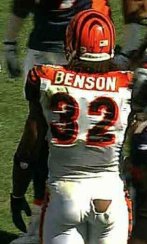
As you can see at right, there was a waxing moon over Denver yesterday, as Cedric Benson of the Bengals suffered a rather unfortunate tear in his pants (here’s a larger version). Also, note that his nameplate was encroaching out of its orange panel.
In other football news from the weekend:
• The Jets wore their Titans throwbacks. I don’t mind that design, but I’m surprised that they’ve stuck with it for so long (they first wore the throwback in 2007). Lots of Jets fans have told me they’re itching to see a Klecko-era throwback, and that does seem like a more logical approach. Maybe next year..?
• Check out LeGarrette Blount’s super-stretchy undershirt.
• I noticed that Niners coach Jim Harbaugh appears to have a little chest-mounted holster for his pen.
• In case you missed it yesterday, reader Terry Duroncelet is now providing weekly college football uni roundups each Sunday. His latest report is here.
• I have a few additional college items, beginning with the Iowa game, where one of the sheriff’s deputies on the sideline had the Iowa logo on his sidearm.
• Ohio, which is normally one of the best-dressed FBS teams, wore a really shitty BFBS outfit.
• No photo, but I’m told that WVU’s Geno Smith lost his nameplate at the end of Saturday’s game.
• Looks like there were some major color inconsistencies in Florida State’s facemasks. The Revolution masks, shown at left and right, were bright red, while the Revo Speed, in the center, was much darker.
• Cancer-awareness season apparently came early to Missouri, because the Tigers were wearing pink accessories.
(My thanks to all contributors, including Johnny Bruno, Timothy Burke, Chris Cocuzza, Tommy Daniel, Trey Jones, and J.D. Nighswonger.)

Rebel flag revisited: When I wrote that piece about the Columbus Yankees wearing a Confederate flag sleeve patch last month, I had only one documented example of an African-American player wearing the flag, and that was Roy White.
Now we have an additional example: Jerry Kenney, who played for Columbus in 1966. Reader Al Bernardo found that photo on Friday. Even after all the discussion we had last month, the sight of a black man wearing that patch still packs a significant punch.
This week should be a doozy, and will be capped off by what promises to be an epic weekend. Here’s the rundown of what’s in store:
• The Permanent Record series will be rolling out all week long on Slate, one article per day. The first one is up today. I’ve put a lot of myself into this one, kids — hope you’ll check it out.
• On Thursday I’ll have an ESPN column that should make some waves. All I can say for now is that I have an exclusive scoop regarding a uniform of serious historical import.
• On Friday, Kirsten Hively’s “Project Neon” exhibit will be opening at the City Reliquary in Brooklyn. There will be dozens of photos, lots of info, and you’ll be able to download the new (and free!) Project Neon iPhone app, which allows users to find cool neon signage all over the city. There’ll be an opening reception at 7pm — NYC-area readers are encouraged to attend. (Unfortunately, this sign will not be on display, but you can’t have everything.)
• On Saturday afternoon I’ll be hosting a small Permanent Record gathering in Brooklyn. Attendees will include some of the students’ families who I’ve interviewed, some of the researchers who’ve assisted me (sorry you can’t join us, Cort), some folks from Slate, and so on. We have room for a few more people, and I think it would be nice to have some readers there, so if you’ve been following the project and would like to attend, get in touch and I’ll fill you in on the details.
• Sunday brings us the latest installment of the Brooklyn Beefsteak at the Bell House. Two seatings — 1-4pm and 5-8pm — both featuring all the usual slop: unlimited meat, unlimited beer, tunes by the mighty Susquehanna Industrial Tool + Die Co., Beefsteak Betty, and some chucklehead in the back selling a certain protein-themed T-shirt (plus this time he may have a new design on hand). Getcher tickets here.
Not a bad week, esp. if you live in NYC. Hope you’ll join in for some of it.
In case you missed it, Phil ran some amazing Seahawks redesign concepts over the weekend, and you’ll eventually get to vote for your favorite. Check them out here and here.
Uni Watch News Ticker: The Maple Leafs have added advertising to their practice jerseys (from Grant Phillips). … Lots of cool archival soccer photos on this site (from Stephen Wong). … Bolton High in Tennessee wears the Kansas State logo, but Kevin Lewter says they have permission to do so. “I was talking with the AD and he said, ‘We contacted KSU to see if that would be OK. They said, “Sure, but we will have to charge you….$1 per year.” It cost us more to write and send them a check than it does to use the logo.'” … The Caps’ will wear last season’s Winter Classic throwback as a third jersey this season. … Fairly detailed analysis of Auburn’s uniforms here (from Spencer Maddox). … Michigan State blogger/historian Eric Greenwald has provided his assessment of the Spartans’ AmPac uniforms. … Nice note from proud papa Tyler Kepner, who writes: “Thanks mainly to Hunter Pence, my nine-year-old son has ditched the low-pants look and now proudly wears the high cuffs with his baseball uniform. But thankfully, not too high -”“ he’s going mid-calf, and even lets me do that blousing-the-pants thing for the perfect style. We can win this war, Paul, one convert at a time!” … The whole state of Nebraska flipped out on Friday, when the Cornhuskers’ equipment staff posted a photo of some new gloves. Check out what was lurking in the background. “They quickly backed off and said it was something they made for fun and not something intended for game use,” says Lincoln Arneal. … New soccer kit for Peru (from Kenny Loo). … “Color-on-color isn’t so unusual in cricket,” says Coachie Ballgames. “But this match-up, between South Africa in green and Pakistan in slightly lighter green, is really confusing. … Can’t decide if your favorite Bear is Ditka or Butkus? This guy has just the jersey for ya (from Chris Chaussee). … Brian Wilson was wearing those Back to the Future sneakers the other day (from Conrad Olenik). ”¦ Here’s the backstory on Tennessee coach Derek Dooley’s orange pants (from Mike McLaughlin). ”¦ Unusual rugby kit worn by the New Zealand Warriors a few nights ago (from Michael Craig). ”¦ Parker Ferguson’s old high school — Corona del Mar High in California — has just adopted a new pitchfork helmet logo. The weird thing is that Ferguson also attended Arizona State, making him a double pitchfork alum. ”¦ More fallout from the Russian hockey plane crash: Pavel Datsyuk of the Red Wings is changing his uni number in the preseason to honor Ruslan Salei (from George Flory). ”¦ Meanwhile, the Preds have added a memorial decal for Wade Belak (from Paul Richard Cook). … Lots of speculation regarding Tim Thomas’s new goalie gear (from John Muir). ”¦ Floyd Mayweather Jr. wore vaguely Bengals-ish gear for Saturday night’s bout against Victor Ortiz. ”¦ Texas Tech will be wearing Wounded Warrior camo jerseys on Nov. 12 (from Adam Loving). ”¦ Kurt Esposito notes that the Phils celebrated their division title with team-branded Champagne. … When Pearl Jam played in Winnipeg recently, they had Jets-themed T-shirts (John Muir again). … Mets announcer Ron Darling on the Braves’ red Sunday jerseys: “It’s good, because it’s different.” Thank goodness we have trained professionals providing trenchant analysis like that. ”¦ On the brighter side, Rays broadcaster wore the team’s varsity-style sweater on the air yesterday (big thanks to Tim Burke). ”¦ The Senators’ third jersey design has leaked, thanks to an “inadvertent” shipment by Reebok (from Mike McAllister). ”¦ “I’ve been working on this solar construction project at American Canyon High School, 40 miles north of San Francisco,” writes Al Cummings. “Turns out there’s a Detroit Lions injury cart in one of the empty classrooms. A teacher said some faculty member bid for it. From the looks of it, it was during the Barry Sanders/Silverdome era. Sadly, they are going to re-wire it and paint with the school colors, which are black and gold.” ”¦ Garish use of flag-based imagery isn’t limited to Maryland. That’s Aussie golfer Kurt Barnes, who won the ANA Open in Japan (from Jeremy Brahm). ”¦ Interesting piece about Kentucky’s basketball uniforms (from Dwayne White). ”¦ The Rays wore their letterman sweaters for last night’s train ride from Boston to New York.
Paul, is there still no word yet about what UA/Maryland will be wearing this weekend against Temple? The suspense is killing me…
That South Africa vs Pakistan clip is from the 1992 Cricket World Cup. Talk about a blast from the past!
All nine teams in that tournament had that blue/green/red/white shoulder stripe on the shirts. Some countries are now selling those shirts as throwbacks, e.g. link
Also if you look for any pictures on those shirts you’ll also see it took place long before any major manufacturers saw what kind of money could be made from the game. No sign of a swoosh or three stripes anywhere. Time machine anti-logo creep!
Here is what all the teams looked like. link
Sure there weren’t any manufacturers logos, but every uniform had this badge – link
I think you will find that ISC is the company that made the shirts for the 1992 Cricket World Cup, they now make Rugby League Jerseys in the NRl in Australia and the European Super League.
Re: Confederate flags. I happened upon this last night. Not sure if it’s ever been covered here. U. Florida apparently wore confederate flags on their helmets in the Gator Bowl in 1962 vs. Penn State. It’s on the Helmet Project.
link
One reader speculates there’s a cotton boll on the flag, but I think it might be the state seal.
link
Here’s the helmet: link
Here’s the link straight to that CSA Florida helmet. Nice find. link
I posted this late last night but I’m reposting this because I think a lot of readers will get a kick out of this. In tweeting a picture of the Rays in their letterman sweaters, Joe Maddon wrote “Our guys just get it!”
link
Wade Belak was not killed in the Russian plane crash. There were two other former Predators and another prospect who never played with the team on that flight.
Duh. Mea culpa. Will fix.
When Pearl Jam played in San Diego in 2009 they had Padres themed t-shirts as well:
link
Pearl Jam does this frequently with tour shirts (designing city specific w/sports teams…the Montreal one is very good)…
Lots of bands have been doing this for years now. It’s really not news anymore…
Yeah but this one is totally awesome!
1. Cedric Benson’s pants: Was he going commando, or was there an identical tear in two different layers of clothing?
2. On the Seahawks redesigns … from what I could make it through in limited time, I was impressed … I don’t suppose there’s any time-effective way to put images up in one quick to flip through flikr account? I wish I could see them all!
3. The Nebraska helmet “leak” … I’m going with 1000% absolutely intentional. No blur. Helmet carrier is flat footed. If you’re just trying to get a picture of the gloves, that’s all that would be there. The image was beautifully framed to display something that allegedly wasn’t supposed to be there.
Re: point number 3 – it *could* still be a prototype helmet – see Marvin Lewis and the custom black w/orange stripes Bengals helmet of a few years ago – link
Maybe, maybe not. With the Bengals helmet, it was obviously not currently in use when it was pictured. I chalk it up to, “hey, we’re not going with that, but I LIKE it! I’m taking it for my office!”. Not to say that the Nebraska isn’t a prototype, but I would imagine it would be uncommon for some kid to being “casually walking” through a locker room in the middle of the season carrying a helmet that has no chance of making it onto the field.
To #1: Only if “jock” counts as commando.
What….no polka-got underpants like in the cartoons???
Seeing the photo of Cedric Benson reminded me of an article I read years ago about how cheap the Bengals’ organization was. It mentioned worn out jockstraps and other equipment that the players complained about and torn uniforms that were constantly being repaired rather than replaced…and in photos you could clearly see repair patches on many of their uniforms. Seeing the photo of Cedric Benson made me wonder if the Bengals will repair his torn pants rather than replace them.
Apparently JimWa, you’ve never played football. EVERY level of football down to the pee-wee leagues wear nothing but a jock strap underneath. I remember a few years back when then-Steelers safety Mike Logan was a guest on the morning show on top 40 station WBZZ (now sports-talk station KDKA-FM), and one of the hosts (Shelley Duffy, who is now with sister station KDKA 1020) actually asked him what they wore underneath their pants. It actually led to an interesting debate.
Oh, and the pants ripping? Not unprecedented.
link
A lot of players are starting to wear compression shorts instead of jocks now. They’re a lot more comfortable and less likely to cause unwanted exposure.
Yup. And many—especially those opting for the biker shorts look—wear tights.
So other than tights or compression shorts, jock only is the common choice.
You got me. Never played an organized down in my life. I had the dexterity for cross country and track. I tried to try out for basketball my freshman year of high school, and broke my finger when a ball was (unexpectedly) thrown my way during pre-tryout warm ups. I figured that was all the sign I needed to stay away from sports where the extent of my thoughts would be more than “faster or slower?” and “left or right?”.
FWIW, I played from when I was nine through HS (80s, early 90s). I always wore underwear, though I realize I may have been in the minority.
The Nebraska helmet — “flat footed”
Exactly, his feet — it’s as if he’s standing there in a “let-me-stand-like-this-so-it-looks-like-I-just-happen-to-be-walking-by” kinda stance. Oops. Did this helmet get in the picture? You guys weren’t supposed to see that. Let’s take another picture with just the gloves. Nah, don’t worry about. No one will notice and if they do, who cares, it’s just a helmet. It’s not like I’m trying to get this “accidentally” leaked out to the interwebs on purpose, so a whole bunch of people will stir up a whole lot of publicity about it.
Regarding those flag pants: Loudmouth (the people who outfit John Daly) also have Norway, USA, and are going to be doing Canada.
(P.S.: I have two of their sports coats. Not flags, however!)
Is it just me, or does that Rays broadcaster look like House Speaker John Boehner?
Todd Kalas? Yeah, a little.
Thanks for the ID. I’ve looked at some other pics, and I’m only seeing the resemblance from certain angles.
“The Maple Leafs have added advertising to their practice jerseys.”
Because, you know, if ever there were an NHL team that needed to tap additional revenue streams in this tough economy, it’s the Toronto Maple Leafs.
Incidentally, Purolator Canada is owned by the post office. Keep those cards and letters (and overnight parcels) coming, Leaf fans, and maybe this’ll be the year your team makes the playoffs!
It’s been a big source of amusement for me that the carrier has retained the name of their former parent company for nearly a quarter of a century since they were divested. You’d think that, for package service to be so far removed from the manufacture and sale of oil filters, they’d have had a separate name for the carrier all along…
As everyone knows, I like the Jets’ navy/gold Titans throwbacks, even though they’re really a hybrid of the 1960 and 1962 uniforms. I also like how the coaching and sideline staff go all-in with the navy blue gear and the vintage “The TITANS of NEW YORK” logo.
Somebody mentioned on another thread that the Jets may be, or may have been, reluctant to use the Klecko-era uniform as a throwback, since it’s really more of a “throw-ahead” compared to the current uniform, which is itself a throwback (or more precisely, a “fauxback,” since the green is darker and the logo is shaped differently) to what they wore prior to 1978.
Regardless, I’d be OK with it because (a.) it’s been long enough since they’ve worn it, longer if you don’t count the Coslet/Kotite black-trimmed version, and (b.) plenty of MLB teams have “thrown back” to uniforms that were more “modern” than what they’re wearing now, regardless of whether their current uni is an actual retro look (the Astros, Padres and Athletics immediately leap to mind).
Then again, the Jets and Giants are the only NFL teams to revert to a classic look after years in a more “modern” design (although I think we can count the Buffalo Bills in this category now as well; I don’t count minor tweaks like the Colts and Browns). Can anyone see the Giants wearing a Lawrence Taylor-era throwback?
Then again, the Jets and Giants are the only NFL teams to revert to a classic look after years in a more “modern” design
______
…and Niners
Right, good catch. Forgot about those.
Well at least the Giants have kept around the script GIANTS logo with the “ny” logo.
Oh, and if you want to go throwback, try the Steelers “Batman” uniforms. Their current uniforms (1968-present) have more in common with the pre-1966 uniforms they now wear as throwbacks than the Batman uniforms.
No photo, but I’m told that WVU’s Geno Smith lost his nameplate at the end of Saturday’s game.
Midway through the 3rd quarter, Geno Smith’s nameplate link. On a play on which he threw an interception, with about three minutes left in the third quarter, a defensive lineman link. Next time they got the ball, he was link.
Titus Young of the Lions and Brandon Flowers of the Chiefs got in a skirmish yesterday, and the result was Flowers’ link.
Could that shredded jersey be a metaphor in the making?
Have been enjoying the P.R. blog but the Slate article is really awesome. Can’t wait for the rest of the series.
Thanks, man — greatly appreciated.
Seconded.
link
Uniform article in todays Tulsa World. Bad part is that in the picture there is a major branding faux pas. Interesting that Jenks was offered a full set from Under Armour for only $100/per uni when they were just getting into the uniform game. Wonder what kind of deal some of the big Nike schools get?
A ton (most? all?) of Bengal nameplates were too big for the orange section of the white jersey yesterday. Here’s hoping Nike fixes it next year. (Hint: Just make the orange part bigger.)
not uniforms but I think the concept behind this stadium is actually pretty cool: link
whatta great website.
can the Niners please get one of those before Candlestick rusts into the water?
Which may be next week.
They’re gonna build that for only $82 million? Jerry Jones should got them to build Cowboys Stadium.
“Albania, Albania,
You border on the Adriatic,
Your land is mainly mountainous,
And your chief export is chrome”
“Color-on-color isn’t so unusual in cricket,”
In one day cricket, it’s pretty much always color-on-color (example: link)
In test or long form cricket it’s always white-on-white – or cream, eggshell, etc (example: link)
You don’t really need any color contrasting in cricket unis because there’s the fielding team and two batsmen… and you can tell who they are because they’re the ones holding bats.
I’m a bit surprised that the Maple Leafs are sitting on the Sabres team store story, as their 1967-70 style jersey which has been purported (but not officially revealed) to be their new third also showed up on the rack at First Niagara: link
Now THIS…
link
…is a promotion.
That is funny.
I think I read, maybe here, that KSU lets schools use their logo for a small fee as long as they do not use KSU colors or U Kansas colors.
It’s a standard policy for pro and college teams to send smaller organizations a C&D letter with a provision to start a royalty relationship, usually for $1 a year. They have to protect their trademarks or they lose them. It’s actually interesting to see a school like KSU that restricts the use of its logo away from KU’s colors.
US Women’s National Soccer team has a game in Portland this week and go figure this happens: link
Shouldn’t ’08 be on 2nd and ’10 be on the plate for the Phils champagne? Don’t know many instances of 1st-home-3rd.
Paul- Great work with the Permanent Record project. I can not wait until tomorrow.
M-N
Thanks, man. ’Preciate it.
Watching Sportscenter on ESPN2, a commercial for Dancing With The Wannabestars, and they’re still calling Metta World Peace by his old name. They’re so 2011.
when he loses, will the judges simply say, “Peace Out”
I think the BIGGER question here … what judge in good conscience would be willing to put an end to World Peace?
Clarence Thomas?
heh
i always figured it would be alito
All I’m gonna say is, I don’t care who wins this season…as long as it isn’t Chaz Bono.
Hope Solo FTW.
The Bills: undefeated in the new threads. Sometimes the answer is so simple.
That was one good-looking game.
I was just thinking the same thing. To paraphrase Billy Crystal’s Fernando: “In order play marvelous, you must look marvelous.”
The surprising part of the Capitals’ third jersey is that it will only be worn on the road, going against the grain of having another moneymaker for the home fans to gobble up.
I know that women’s sports don’t get a lot of attention on here, so I don’t even know if it’s worth my while posting this, but I’ll give it a shot:
The USWNT (US Women’s National Soccer Team) are playing a “celebration series” after their second-place finish in the WWC in July. The first game was in Kansas City on Saturday, against Canada. At some point during the game, Sophie Schmidt, a Canadian player, had the numbers completely fall off her jersey. I was watching a webcast and haven’t been able to find a good image, but here’s a before and after shot (she’s in the red): link
link
Also, Nike’s hi-liter green has spread to the USWNT, apparently because of their SPARQ training: link
And finally, USWNT midfielder Megan Rapinoe recently got a Nike shirt designed after the likeness of her hair, kind of like those baseball facial hair ones:
link
Paul got an article on Gizmodo: link
I think I can safely say that’s about the last place I expected Permanent Record to be discussed…. But I’ll take it!
“The Jets wore their Titans throwbacks. I don’t mind that design, but I’m surprised that they’ve stuck with it for so long (they first wore the throwback in 2007).”
It pisses Peter King off, that’s a good enough reason for me.
Those Ohio hats are awful with the black on black. They should have worn black hats, then it would have been greatness. If the Cornshitters would wear those black hats, maybe I could cheer for them…..Nah Nebraska sucks the big one!!!!!!!!
haha:link
Paul, don’t NFL teams have to keep uniform designs for 5 year? I believe it was mentioned in the articles concerning the Packers new throwbacks.
So, given that the Jets first donned their “TITANS” throwbacks in ’07, this could be the last year in them.
I think that rule only applies to the primary uniform. I could be wrong about that, though; I’m trying to think of teams that have worn different throwbacks within a 5-year span in recent years but I can’t think of any. The AFL-50 unis would likely have been exempted from any such rule, as teams are typically allowed only one throwback or alternate, but the AFL clubs each had home and road variations of the throwbacks. Others, like the Rams and Falcons, only have home-colored versions of their retro duds.
I don’t know if it counts, but the Patriots 2010 throwback was different than the 2009 AFL uniform.
Actually… the proof that it only applies to “regular” uniforms would be the Eagles.
2006 black alt
2007 30’s yellow & blue
2008 black alt
2009 black alt
2010 60’s kelly green
’07 could be a “special”, as it was Eagles 75th Anniversary
Ahh, yes. Good catch; second of the day. I must be getting senile…
Hmm… Not sure I care for the Rams in white-over-white. Why don’t they wear the gold pants anymore?
Yeah I don’t know what the Rams are thinking. The all-white is not a good look for them.
They went whole seasons in that look b/w 64-71 (white at home).
I realize they likely consider it the converse of their mono-navy rather than any sort of nod to tradition, though.
Dark cleats might help balance the color. Or not.
(it wasn’t a good look then either)
Football just didn’t look good prior to your arrival.
And before the royal and white, this was their road uni (Cheddar horns, center stripe on pants Cheddar)…
link
Is any team uglier than the Rams in all-white?
I don’t think they look bad in solid white, but I think they look AWESOME in white-over-gold. Wish they’d wear that at home as well as on the road. One of the best looks in the league.
Agreed. They look better in white-over-gold than blue-over-gold, which is their second-best look.
The Seahawks in all-white?
“Is any team uglier than the Rams in all-
whiteblue?”(fixed)
while i agree the rams look better in white over gold, the white over white is just fine, thank you very much
of course, the best rams look is this
Wrong picture, Phil.
The yellow jersey is good, but this is better: link
no denying the royal over gold is awesome…
but you’d rather see this
“Is any team uglier than the Rams in all-white?”
-The link?
-The link?
-The link?
-The link?
-The link?
I don’t know, I’m just riffing here.
-The Saints?
*facepalm* I forgot about them…
I think he meant to ask whether there was a team that looks worse in all white than the Rams.
“Why would he want to kill her in public?”
“I think she meant he threatened, in public, to kill her.”
;)
let’s eat grandma
Either that wasn’t responding to my Clue quotation or we have our wires crossed on it.
it’s all about the comma…
let’s eat, grandma…has quite a different meaning from let’s eat grandma
/nevermind, that’s an oldie (but not a goodie)
guess my response should have been oh…was that his final word on the matter?
with the comma talk, I had to share this:
link
My eyes! The goggles do nothing!
This whole series only supports my viewfrom over a year ago that the all while look is generally bad.
So… uh… why does Coughlin have a little yellow ribbon on his jacket above the NY? Doesn’t seem to be one on any of the rest of the coaching staff.
5th Year Coach?
Does he have a relative serving overseas in the military? Using a yellow ribbon to signify support for a loved one in the army goes back to the English Civil War.
New Zealand Warriors jersey is based on National Flag of New Zealand, pity Canterbury and Vodafone have to deface it!!!
they have worn it since April of this year, it’s the heritage round shirt… sure the rest of the league does it right and wears retro shirts, the Warriors have their own version
That Ditkus jersey – unless it had a 51 on the front – it could be paying homage to the famous press conference where Da Coach was heckling a heckler and mimicked the Heckler’s calling out of “Ditkus” or “Ditkuth”…..just sayin’.
LOL… cute bum! I would be so embarrASSed if that was me :P
Looking through the ticker, I noticed that one of the DC area football helmets is my alma mater’s: Woodrow Wilson High School in Northwest D.C. Go Tigers! BTW, their baseball hat is a green version of the Senators hat with a white W. Thanks for the memories!!!!