.
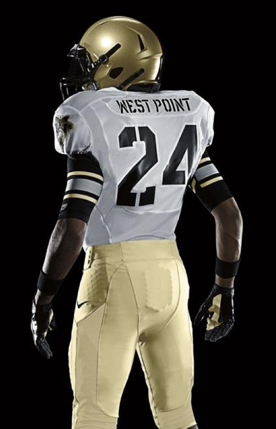
That’s Army’s new Amateur Pacifist uniform. Not bad, right? It’s one of six new AmPac designs that were unveiled yesterday morning — some pretty good, some not so good. I put together a quick ESPN column for the occasion, which was posted yesterday around noon. You can check it out here.
Two follow-ups to that column: (1) The column includes a mild criticism of the black block-shadowing on Navy’s uni numbers, but several readers pointed out that this is a clear visual reference to how Navy ships are numbered. Fair enough. (2) One thing not mentioned in the column is that most of these designs — and most of the other AmPac designs — do not have TV numbers, which is going to make life difficult for broadcasters and spotters. I’ll have more to say about this soon.
That ESPN piece will serve as a stand-in for today’s lede, okay? Okay. ”” Paul

Collector’s Corner
By Brinke Guthrie
I went to Mariemont High School in Cincinnati. Our football team had a pretty basic look back then, just solid navy jerseys and yellow pants, with yellow helmets and a block M. Along those lines, I love this retro Sand-Knit football jersey. Dig those huge numbers and shoulder color trim!
As for this week’s other finds:
• Here’s a nice framed collection of MLB pins.
• The CFL has never graced Collector’s Corner until now. Those bedsheets were submitted by the Hungry Hungry Hipster.
• This is a new one, at least to me: a mid-1970s NHL Action Players sticker book. [Wish we could see some of the interior pages on this one. Anyone know more about this item? ”” PL]
• Look at this great 1956 New York baseball Giants pocket schedule!
• I understand that Paul is, for some reason, a Niners fan. So here’s a vintage Niners bobblehead and a helmet wall plaque. [Those are fine, but they’re nothing compared to these Niners pasties that Ricko posted in yesterday’s comments. ”” PL]
Seen something on eBay that you think would make good Collector’s Corner fodder? Send your submissions here.
Design contest reminder: Today’s the last day to submit your referee’s uniform design for Eric Bangeman’s rugby league. Full details here.
Because man cannot live on uni alone: There’s new material over at Permanent Record and the Butcher’s Case.
Uni Watch News Ticker: The Jets will be dressing as the Titans this Sunday. ”¦ Under Armour is now having its way with the Maryland soccer team (from Stephen Wong). … Rob Ullman was nice enough to send me a copy of his new Old-Timey Hockey Tales comic, and it’s sensational. Highly recommended. … The Penguins have announced their third jersey schedule. … “Pittsburg State, in southeastern Kansas, usually wears the tired Mizzou template,” writes Ryan Atkinson. “On Saturday, they brought back the glorious white-yellow-white stripes to their helmets and brought stripes back to their pants. They also ordered throwback jerseys, but they were in the baggy 1991 style. So they only wore them during warmups before switching to their normal Mizzou-style tops for the game, creating an, uh, interesting combo.” … Hope College will being doing an orange-out for cancer this weekend. “At least they’re keeping their regular school colors and not donning pink or purple,” says Jonathan Cain. ”¦ I think we’ve seen this before, but once more can’t hurt: The Astros’ strength and conditioning coach wears pinstriped uniform shorts (from Andy Woolley). … Oooh, check out this old shot of the Packers’ drum majorette (nice find by John Okray). … England’s rugby team has been scolded over those recent peeling uni numbers (from Eric Bangeman). … Caleb Borchers reports that an All-Blacks player suffered a ripped jersey sleeve during the Rugby World Cup and had to do an on-field jersey switcheroo. … Love these shots of the Pink Panther, Paula Creamer, wearing some serious hoop socks (big thanks to Corey Burnett). … The WinniJets haven’t even played a game yet, but they have their first memorial decal (from John Muir). … Speaking of the Jets, Tim E. O’Brien has this video game report: “The Jets made it into NHL 12, but their jerseys are basically what they showed at the Draft (plus a road version). But where it gets strange is that they also have home and road versions of the old 1980s Jets jerseys. Stranger yet, the Coyotes (formerly the Jets) also have these as a uniform option, which means you can pit two completely different teams against each other in the same uniform. Since the new Jets don’t own the old Jets team history, why not just put in Atlanta’s jerseys?” … New mask for Josh Harding (John Muir again). … I was heading home from my daily bike ride in Prospect Park yesterday evening when Mets radio announcer Howie Rose went off on a mild rant about the Mercury Mets TATC promotion. Then he said, “For those of you who don’t know what I’m talking about, I bet you can find a photo if you Google ‘Mercury Mets.'” Now, I happen to know from past experience that the Google results for that search happen to include this photo of Rose himself. So as soon as I got home, I sent Rose an e-mail with the photo link, telling him to be careful what he wished for. He promptly said on the air, “Wouldn’t you know it, someone has just texted us a photo of yours truly with a Mercury Mets jersey. So be careful when you’re Googling — you may get more than you bargained for.” Later on, I asked Rose if he still has the jersey, and he responded, “Actually, I do. I couldn’t throw out something so hideous. However, the current black alternate jersey would never get through my door.” … Good article about Novak Djokovic’s sponsorship deal (thanks, Brinke). … Went poking around on Etsy last night and found some old-timey sports decals, an old MLB video game, a kids’ baseball book with one of history’s greatest cover illustrations, a pair of saddle shoes with Arkansas Razorbacks logos on the toes, and a bowling shirt that promotes bowling shirts. … The 49ers’ cheerleaders will be wearing throwbacks this Sunday. No idea if this means the players will be doing likewise. … Here’s another set of those weird kidney jerseys. That’s the 1932 Brown University squad (nice one from Bud Brooks). … Think the script on this varsity jacket is big enough? … The Citadel had an absolutely brutal look last weekend. “The jerseys were based on the flag known as Big Red, which I believe was the flag cadets flew during Civil War battles,” says Matt Gladwell. So they’ve taken a flag flown by traitors and used it as the basis for a really ugly uniform. A win-win! … Credit where it’s due: College baseball teams with Nike contracts will no longer be required to use Nike bats. It’s a complicated story — recommended reading (big thanks to Dylan Horowitz). ”¦ Here’s something I’ve never seen before: a 1993 Colorado Rockies corporate opportunities catalog.
Always loved the McDonalds or ketchup/mustard look of Pittsburg State. Bishop McCort High School in Johnstown rocked that look for years before they traded the yellow in for gold. During that period for McCort we did refer to them sometimes as Bishop McDonalds.
Also, how great is the nickname “Gorillas”?!
Keeping with the high school theme, that Citadel scheme reminds me of Cambria Heights High School in Patton. I’ve always wondered who thought it was a good idea to have school colors in red and light blue?! Now The Citadel’s reasoning, just as puzzling!
My alma mater (North Alabama) played Pitt State in the D2 Championship game in, I believe, 1995. I remember loving those Pitt State unis. Unfortunately, UNA currently uses that Missouri template as well. Back in ’95 when the two met, the Lions had a great uni (in Paul’s favorite color) with a jersey that featured link. Too bad UNA (and Coach Terry Bowden, whose Auburn team had similar jerseys) can’t break out the throwbacks, as well. It would be much better than the link.
I agree on liking the Gorillas name. The unique mascots are one of the reasons I love D2.
Go TUNA !
I remember that UNA look, liked it a lot!
Showing my local bias, I’m partially to the Cal U Vulcans out of California, Pennsylvania!
And more PA flavor, IUP (Indiana University of Pennsylvania) lost to UNA in the ’93 D2 title game.
Cal U got new unis this year, eh?
link
Nice. Big improvement over what they’ve had recently.
link
Yeah Vilk, they look much better this year.
…and they’re beating my alma mater (C.W.Post) in that pic! ;-)
@Kek, I was at that UNA/IUP game. It was a great. That UNA “three-peated” as D2 champs, and was simply one of the greatest college teams I’ve ever seen. I think the ’94 version lost by only three to eventual 1-AA champ Youngstown State, AT Youngstown. Only loss in three years. Don’t mean to brag, but I’m still proud of that accomplishment.
I believe Cal U had been pretty good in recent years, as well? I always got a kick out of Cal and Indiana… both in Pennsylvania :)
California…Indiana…there’s an Oklahoma, PA as well, but they don’t have a university in that town.
Yeah, Cal’s been really good lately. They keep getting to the D-2 semis but haven’t made it to the final.
Yes, Chris, I remember watching that game on TV as a few guys I played high school ball with were on IUP’s squad.
Cal U has been one of the better programs in D2 in our area lately. Former Pitt head coach Walt Harris is actually their OC.
There’s a Wyoming, PA, too. Any other state have so many towns named after other states?
Surprised you didn’t mention the closest thing to complete shoulder hoops/UCLA stripes we’ve seen on a high-tech jersey. If only they didn’t also include pit stains on that LSU jersey, it would be near-perfect. OK, that and the purple/alternate gold color scheme…
Same here, those are some nice “un”-truncated should stripes the Bayou Bengals will be wearing. Now I’m pissed since I know full stripes are doable even with today’s jersey cuts.
“Etsy is the world’s handmade marketplace.”~~That’s the headline on Esty’s home page.
Re-selling old baseball stickers doesn’t seem to meet that mantra. (Can you tell I have a vested interest in Etsy doing what they say they do?)
Etsy is still a DIY craft fetishist’s wet dream. But I also like their vintage listings, which are often more interesting (if less comprehensive) than eBay’s.
The football declas in your Etsy link look for all the world like a renumbered Ray Nitschke sacking a recolored Roman Gabriel, but I can’t find a wire photo to confirm.
*decals
Love the Army unis!!
Not a bad batch of uniforms this year.
Stanford should have treated the rest of the black the same as the numbers and added some trim for color separation.
Ohio State ought to use a bit lighter gray.
Army needs a pant stripe and helmet logo. I love the number font and sleeves though.
No complaints at all about Navy.
The Spartans look good if you ignore team colors. It’d look great for a new UFL or AFL “Spartans” but not so much for a team that’s supposed to be green & white.
LSU would be better without the pit stain, but it’s still far better shoulder loop treatment than what a certain other company has been doing lately. I think yellow (aka “athletic gold” – we don’t need to have the argument today) instead of metallic gold might have been a better choice too. It looks out of place on them in much the same way that navy blue looks weird for the Green Bay Packers.
“Army needs a pant stripe and helmet logo”
~~~
no…the helmet is perfect and if you saw what qualifies as “stripes” on the other uniforms (see: stanford and THE osu), do you really think they’d actually make a stripe in the classic sense?
Actually Stanford’s strips look almost traditional. Yeah the color combination makes them a bit hard to see and they start a bit low, but they don’t do the wrap around thing that OSU’s have. I think they could have put a single black stripe or possibly a silver trimmed black stripe (to match the numbers) on Army and made it look good enough. Then you just pull that shoulder logo off and put it on the helmet and replace it with TV numbers and you’re good to go.
Like Paul I wonder why does Nike insist on these goofy pants “stripes”
Ohio State’s in my opinion looks decent. But I would have rather seen a authentic or accurate 1961 era uniform. So what if the home uni was plain.
Stanford is probably the worst looking one.Navy is nice and Army is nice. They can make a basic look and look good.
MSU did wear black and gold long ago. I guess they are calling this color bronze. LSU is just ok too
Just wear throwbacks, not Nike creations. allegedly mixing elements of a past uni and modernizing it.
Replace all of the Stanford black with white and I think that would actually be an awesome uniform. The numbers are a little Anaheim Angels, yeah, but it’s not a totally out-there twitch. I’ll see if I can photoshop it all into white…
Here we go, kind of quick and dirty, but I’d actually kind of like this instead of the full-on BFBS treatment (which makes them look like South Carolina).
link
That is a damn good looking uniform. Can you change the pants to white and make the pants stripes red-black-red instead of white-black-white?
The best part of Army’s unis are the shoes. They are made to look like standard issue boots. Nice touch.
Just an FYI, the MSU “AmPac” unis are described as being bronze, not gold; the whole implication of Spartan warriors clad in bronze armor, etc. etc.
I’m a Michigan guy anyway, so whatever.
link
Regarding the interior pages of the mid-1970s NHL action stickers. They’re not really that great. These were issued in 1974-75 by Loblaws in Canada and by Acme in the States.
Here’s a link to the interior view
link
I personally like the album cover from the States better than the Canadian version.
link
These were also issued for the NFL.
The Nike Ambien Combats makes me hopeful for the NFL takeover.
Re: Hope College jerseys… that has to be the first time I’ve seen the Colorado Avalanche number font on a football jersey.
Way back in the day when I was in high school (okay, six years ago), our team wore said Avs number font on their practice jerseys.
It’s a Russell Athletic template font. My HS alma mater’s current uni set has these numbers.link
I really dig the yokes on the OSU AmPacs.
Too bad they did not put the yoke on the 2009 creation that was supposed to honor the 54 Buckeyes.
In 1961 the yoke on the away jersey looked great.
This guy did a nice job on this but the end of the short sleeves should have been red. Supposed to be 1961 Paul Warfield Ohio State away.
link
paul, your “amateur pacifist” gloss has never sat well with me, primarily because pacifist is not the opposite of combat. i agree that “pro combat” is stupid, but i think it’s lame primarily because of the “pro.”
combat has more than one definition, and the word can be used in situations where death does not come into play. indeed, merriam-webster’s first defintion of the word combat is, “a fight or contest between individuals or groups.” i would certainly describe football (or, indeed, any other sport) as “a contest between individuals.”
all that being said, obviously the swoosh is trying to relate football to war – the use of armoured vehicles and things like that at their presentation ceremonies reflects that. and that is stupid and insensitive considering there are people who engage in far more serious types of combat on a daily basis. but still. it is perfectly justifiable, on a lexical level, to describe football as combat.
just a thought.
Lately I’ve been thinking of changing my term to Amateur Armistice. Makes for a nicer acronym.
“AA” uniforms and college students would definitely go hand-in-hand. Not that I would know from experience, or anything.
“FauxCombat” works just fine IMO.
I call it “Toy Combat.”
Although with Army and Navy, the kids are getting a free education in exchange for being soldiers, so they’re as close to “Pro Combat” as you’re gonna get…
So by that logic a game of checkers would be combat also. It’s brutal out there.
It’s combat of the mind.
If someone is “pro-combat”, then they’re “anti-cooperation”.
My new favorite person in the world: Whoever put this line of legalese on the ESPN Mobile App commercial (with the rancher): “Do not attempt while bathing in horse trough”. Apologies to my wife and kids, though I’m sure they’d understand.
Re: the All-Blacks rugger’s ripped jersey article:
Adidas have sent the damaged hi-tech jersey to the manufacturers’ headquarters in China to find out why it ripped so easily, but it will then be returned to Williams and put up for auction.
To quote Adam Savage, “Well, there’s your problem right there!”
The Rick Rypien memorial sticker on the helmets is more about what the player meant to Winnipeg than what he meant to the franchise.
True North Sports and Entertainment saw him rise through the ranks as a member of the Manitoba Moose before making it with the NHL’s Vancouver Canucks. He was a fan favorite in Winnipeg because of his blue collar work ethic and lunch-pail style of play. When he signed with the Jets, there was much excitement that Rypien would bring all the grit and tenacity he had shown as a member of the Moose. Unfortunately, we never got to find out.
It’s not a rugby league, it’s a rugby union referee society. We could definitely use some more submissions!
Yea I had to throw out two or three designs when I came to that realization. woops
I don’t think you are gonna like this Paul
link
Eh, whatever. The Packers will still look like the Packers, the Jags have already announced that they’ll still look like the Jags, etc.
Just noise.
…yeah, what Paul said.
Nike’s talking about materials and uniform construction. The actual designs ain’t gonna change unless the NFL teams ask for it. We aren’t going to see the Vikings in monochrome black with gold helmets and purple stenciled numbers or anything.
Love the script, too:
“Fast is faster”: Unquestionably true.
“Strong is stronger”: Ditto.
“Explosion is nuclear”: See, you had a nice thing going there and then you ruined it with this lame-ass comic book bullshit. Douchebags.
Well, they couldn’t go with “explosive-ier”, could they? I mean, unless it was Stephen Colbert narrating…
Ehh, it’s all part of the hype machine anyhow.
I believe the proper comparative would be explodier, not explosivier. Please get your made up grammatical terms correct in the future. /snoot
The video says “explosive“, not “explosion” – Paul got it wrong, not me. :P
I was curious on your thoughts too Paul. Agree nobody is changing the vast majority of the NFL looks, but you don’t think there is a chance that some of the less memorably dressed teams use this as an opportunity for attention? I’m thinking Seahawks, Cardinals (5 year window approaching), Texans, Eagles.
I’m sure a few teams — two or three, say — will make big changes, just as the Broncos did in 1997. And really, so what? There are always a few outliers. And there are always a few teams coming back to the traditional fold (Bills, Niners).
Thanks Paul. If Nike brings back the Eagles’ Kelly green they will have made at least one improvement. Though I imagine something closer to Oregon would be the suggestion.
Is there any one contract regarding NFL pads and other under uniform gear? I would think the weight, effectiveness, comfort, and longevity of the football gear you DON’T see would have a SIGNIFICANTLY greater effect on how well the game is played than the uniforms we know and love.
Excellent point. To my knowledge, there’s no single licensee.
Good question Jim, I was lead to believe (maybe I lead myself to believe) that the NFL had an exclusive deal with Riddell for thier helmets. However, I’ve seen several players over the last week in Schutt helmets.
I did notice though, that the neck bumper has an all white textured Schutt logo (that is hard to make out unless it’s a close up of the player), while all the other Riddell helmets either had a team sticker or said Riddell.
Nuclear? Who considers a nuclear explosion to be a good thing? It’s not even a bigger explosion, since it’s still measured in the amount of TNT the explosion is equivalent to. Is “Explosion: More Explosive” too academic for them?
It’s called marketing and if you just took all three adjectives and made them “fast, faster. strong, stronger, explosive, more explosive” it would be kind of bland and nobody would want to buy it. When you throw out there on the third descriptive set of words something like “explosive, nuclear” it garners more attention, which as a corporation marketing product is their primary objective.
I have a marketing degree. Nuclear has a bad connotation in the market. The two words you never use in relation to explosiveness are volatile and nuclear. I can’t think of a better way to say it, but that means they should have used a different metaphor than explosiveness. Perhaps the third one should have been “Quick: Lightning.”
It’s called marketing…
Thanks for clearing that up for me…. Duh, we all KNOW it’s marketing. But some marketing is interesting, clever, tasteful, creative, and some marketing is idiotic. Describing an athlete as “nuclear” falls into the latter category.
As a Michigan State grad, I am not pleased with those uni’s. I understand the bronze and the font reference to Sparty, but that combination, and the vanishing of the white makes them look like Baylor, which is having a hard enough time looking like itself these days.
Go Green. Go White. Not go gold(ish) and black.
As a Baylor fan the school colors are Green and Gold. Black is not a school color. So no thank you on those unis for next year. I wish the Bears would clean up the claw marks on the pants. Good luck to Sparty.
Ref the Army uni: I beleive the new cleat is a mimic of the standard Army desert boot. If this was the intent then well done Nike, although I really liked the ACU inspired helmets of years past. (Army, Navy and AF should be the only colleges that wear camoflague)
Agreed. The only teams that can pull-off the camo-look are our service academies. Everyone else is merely posing.
Only a Yank would call Confederates traitors.
(Disclaimer: I don’t like the Citadel’s uni’s and I only jest about the Civil War loyalties).
Ya know, they were traitors. It’s actually rather definitional.
The Yanks were traitors too, just to a different cause.
Really? yall are gonna call other people traitors after your bitching about athletes supporting our country last weekend? Get off your high horse
Nothing says patriotism like seceding from the Union and forming your own country. And then opening fire on a U.S. installation.
One of Lincoln’s advisors once remarked regarding Confederate troops advancing northward, “We don’t want them on our soil.”
Lincoln, in a bit of a huff, said, “It’s ALL our soil.”
And Jeff P wasn’t looking for a fight. Just stating a fact, that by the book, yes, that would be the definition.
We are all traitors to Great Britain, are we not?
We certainly weren’t British patriots.
And history is, as we all know, most often written by the winners.
I find it rather fascinating having discussions about the Civil War and other examples of traitor/treason/treachery. Definitions themselves are not always clear cut and need to have debate and discussion.
Really poor analogy.
Why did we revolt? Because we were being mistreated by the Brits. We were taxed without representation; other Brits weren’t. We were forced to quarter British troops; other Brits weren’t. We had to deal with the Intolerable Acts; other Brits didn’t.
In short, we were turned into an oppressed class. When an oppressed class revolts, that’s not treason — that’s freedom.
Now, why did the Southern states form the Confederacy? Were they mistreated? Were they subject to different rules or laws than the rest of the country? Were they an oppressed class?
No, no, and no. All that happened was that Lincoln was elected. Now, Lincoln didn’t ban slavery. He didn’t even say that he wanted to ban slavery. He said he wanted future territories and states not to have slavery.
And what would that mean? It would mean that slave states would soon be outnumbered by free states. And that could mean tip the balance of power in Congress.
In short, the Southern states could see which way the political wind was blowing. And it was blowing in a way that threatened their economy — an economy built on the immoral, indefensible practice of treating some of their fellow Americans as property.
So, rather than face that threat — and rather than retooling their economy in a way that didn’t involve crimes against humanity — they lashed out at their own government, and against their own countrymen.
Yes, that is treason. And to use it as the basis of a uniform design is seriously messed up.
“How is it that we hear the loudest yelps for liberty among the drivers of negroes?”
Samuel Johnson (England), 1775
If the American colonists were an oppressed class, what does that make the slaves owned by Geo. Washington, Tom Jefferson et al?
Paul, enough with the “traitor” stuff, please. The War of Northern Aggression has been over a long time.
But yeah, the Citadel and Maryland certainly have some ugly uniforms this year — I gotta agree with you on that!
The War of Northern Aggression has been over a long time.
Then maybe one side should stop using the war’s flags as cultural signifiers, including as the basis for uniform designs. As an American, I find it offensive that an enemy of America — i.e., the Confederacy — is celebrated in this manner.
Sir:
I wish you would re-read your history. The South was not an “enemy” of the United States, it was PART OF said country and wished to break away. The Confederacy was trying to become independent, not overthrow the US government, which is why the conflict is more correctly referred to as, “The War Between the States.” Had the South been allowed to form its own country, many historians believe no hostilities would have taken place.
Let me be VERY CLEAR on two points. All of the above is NOT to say, however, that breaking away was a good idea, or that slavery should not have been abolished.
Regarding uniforms, and mascots, the South is full of teams that have Confederate origins (and I am not talking about the obvious “Rebels”). The North Carolina Tar Heels were so named due to the fact that their troops “stuck to their ranks like they had tar on their heels”. Another example is the LSU Tigers, named after a Louisiana Confederate regiment, NOT the large cat. I could go on, but it is very late.
My point is that there are many examples of Confederate “cultural signifiers” that are interwoven into the fabric of college football. You should not find them offensive. However, I find it offensive when I read on this website that my ancestors were “traitors.”
Hey, in the pantheon of names the CSA so richly earned, “traitors” is about the kindest. ;)
My votes for likelihood of wholesale changes to NFL teams in 2012 (#1 being most likely for all out change):
1. Bengals (please!)
2. Seahawks
3. Falcons
4. Cardinals
5. Vikings
6. Rams
7. 49ers
8. Buccaneers
9. Panthers
10. Broncos
11. Redskins
12. Jaguars
13. Chargers
14. Titans
15. Giants
16. Lions
17. Patriots
18. Dolphins (shocking to look over the years how many tweaks have been made while keeping the same general identity)
19. Texans
20. Eagles
21. Ravens (surprised that such an ugly uniform has remained unchanged for so long)
22. Chiefs
23. Colts (no wholesale changes, but I’d expect tweaks with the shoulder striping)
24. Bills (without the new season’s gear, they’d be up near the top of the list)
25. Jets
26. Saints
27. Steelers
28. Cowboys (will Nike try to standardize the silver, or will JJ demand they stay consistent…ly inconsistent?)
29. Bears
29. Packers
29. Raiders
29. Browns
I don’t know why you have the Jags at No. 12. Their equipment manager has already explicitly stated that they’re sticking with their current look.
Niners can’t change next year (five-year rule).
And so on…. You can speculate all you like, but the vast, vast majority of teams will look the same as they do now.
As a Ravens fan, I would like some tweaks (not a Vikings or Falcons wholesale change however) Change the number font (get rid of the drop shadow go block), Move the B on the hip to the helmet and fix the helmet strips to mimic the pants stripes. Add stripes to the black pants. Move the bird to the hip if you like and keep the State trooper patch on the jersey. Simple, not earth shattering and you create a more classic uni
I agree. The CONCEPT of the jersey isn’t bad at all. Unfortunately, the execution left plenty to be desired. The tweaks you suggest … mostly could have been done with little fanfare over course of the team’s history.
the Bengals HAVE to change their uniforms. talk about an eyesore
The Cowboys had the mismatched colors on their white unis under Russel, Apex, and Nike (as well as before corporate branding had encroached the uniforms), so unless Jerry Jones suddenly dies (I don’t see him selling the team under any circumstances) and his successor decides to finally make them match, I can’t see them making any changes.
That would be Russell with 2 Ls… >_<
I don’t know how you could have the Redskins so high on your list. Snyder has done many bad things to that team but one thing he hasn’t done is fiddled with the uniforms (except for bringing back the gold pants which was an improvement). Everything from the pant stripes to the helmet stripes has remained unchanged for the most part (I say for the most part because the width of the sleeve stripes have changed but that has more to do with the fact that football jerseys don’t really have sleeves anymore).
Very good question … I don’t base it on what the Redskins themselves have done, but actually what other people keep trying to do FOR the Redskins. From what I’ve seen on here, it seems to be one of the largest draws for reimagining of any NFL team. I would think this MAY be one case of the tail trying really, REALLY hard to wag the dog. The question will be how many times the dog has to bite that tail before it stops wagging.
Well the Seahawks are already planning changes for 2012, and the Broncos are already planning on adopting the orange alts as their primary jersey.
The Jags, Niners, Lions, and Bills won’t change, due to the five-year rule.
The Steelers, Browns, Packers, Cowboys, Redskins, Giants, Jets, Raiders, Chiefs, Colts, Eagles, Saints, and Bears are “untouchable”. I’d include New England as well, as I’m sure they would be due for a return to the Pat the Patriot days if it wasn’t for their three Lombardi trophies won in the current unis.
Everyone else is fair game.
I like the Titans uniforms, but clearly I’m in the minority as the Jets blogs are exploding with outrage and hate. Personally, I think the outrage and hate are a little over the top for something as inconsequential (relatively speaking) as one’s favorite team wearing a different uniform for one game. People are talking about selling their tickets, and saying, “How am I supposed to explain to my kid that the Jets are wearing the wrong uniform.” WTF?
I’m trying to figure out if this outrage arises from the fact that the Titans had a different name and different colors than the Jets, that very few people identify with or even remember (they lasted only three years, 50 years ago), or from the subjective opinion that the uniform is just not aesthetically pleasing irrespective of its associations. Or, does the former inform and therefore bias the latter?
I personally think the Titans throwback as the Jets have rendered it (combining the old gold numerals of the original jersey with the shoulder stripes of the later version) is a very good-looking uniform, and I like the nod to history even though I don’t remember it, and even though that history is not entirely memorable or a source of too much pride for anyone. Of course I love the green and white, and of course I love the Jets’ current uniform and hope they never change it (except maybe get rid of the green pants, make the green a shade lighter and make the logo football-shaped instead of oval). But I don’t mind seeing the blue and gold for one game, especially when it looks this good.
All this “we’re not the Titans, we’re the Jets” and “we’re not the blue and gold, we’re the green and white” business reminds me of a conversation I had with my brother when we were kids, the first time the Jets and Giants played each other at Giants Stadium with the Jets as the home team. My brother kept insisting that the Giants should be the home team, because “It’s Giants Stadium.” No amount of explanation of the logistics of a game scheduled by the NFL as Giants at Jets, or any game where both teams play home games in the same facility, could move him off of the insistence that “It’s Giants Stadium.” It’s an arbitrary declaration of an arbitrary feeling about how things are supposed to be, nothing more.
And I don’t think this is the same as the “Ditch the Black” outrage either. The Jets aren’t changing their color scheme and adding an unnecessary extra color that was never part of its scheme historically and that ruins an otherwise perfectly good uniform. They’re wearing a throwback uniform for one game, and in my opinion a very good-looking one at that.
I don’t know; I just wonder why something like this is so hard for people to handle. I don’t get why people don’t like the look in and of itself, without incorporating the whole “wrong colors” thing.
I don’t really care one way or the other, but I am a bit surprised that the Jets haven’t done a Klecko-era throwback yet, instead of trotting out the Titans again.
I can see them doing that, and I’d like to see it. If the Bucs can wear the creamsicle/gay pirate unis once a year, the Jets can wear the Sack Exchange unis once a year. It’s been over 20 years (if you don’t count the Coslet/Kotite black-trimmed variant); that’s long enough. Time to revive it.
“If the Bucs can wear the creamsicle/gay pirate unis once a year…””
~~~
gay pirate? you mean bucco bruce?
I’m being crass, but yes. ;-)
I tend to prefer the Titans throwbacks, because they are so different than what the Jets have worn since. I also kind-of like it when the Jets paint their current logo in the end zone with the Titans colors.
The “white-at-home” debate with the Jets? THEY DO IT NOW ON OCCASION! I’m surprised they didn’t do it this past Sunday night when they played the Cowboys.
And as much as it is nice to see the Steelers in their throwbacks (still no word on when those will be worn this year), probably time to retire those and be like the Yankees and sticking with just the minimum two uniform combinations.
link
The only thing that bothered me about that era uni-wise is that in 1985 they started wearing white at home, and consequently only wore the green jerseys on a handful of occasions over a five-year stretch (i.e., against another white-at-home team like Miami or Cleveland). IIRC, Joe Walton felt the white jerseys made his team “look bigger.” If they bring these back, I hope they wear the green.
I think it’s simply a matter of management considering the Klecko-era uni to be a throwahead compared with the present design.
The whole idea of a permanent throwback uni to be trotted out each year in perpetuity might be what’s getting to Jets fans. In connection with a team’s or league’s anniversary, okay, but forever? That’s just odd.
The Chargers did that for a while, with the AFL-era powder blues, before they redesigned the whole uniform to include a powder-blue variant on the current design. The Buccaneers appear to be doing that now, with the creamsicle/gay pirate ensemble. The Cowboys and Lions wore throwbacks on Thanksgiving every year for a while, as did many of their opponents (Broncos and Patriots leap to mind). The Packers are wearing theirs again this year. The Bills wore their 1966 AFL throwbacks each year for several years. The Rams have worn their 1980s/90s throwbacks for a few years now. One can hope the Falcons will continue to bring out their 1966 throwbacks, which are legions better than their current unis (anyone know if they’re wearing them this year?).
Well I personally think the NY Titans uniforms are ugly as hell, but that’s sorta beside the point.
I can say with certainty that if my Raiders were to break out black & yellow 1961 uniforms, I wouldn’t be very happy about it either. The Bucs have history in orange, the Jets really don’t have history in blue. Three seasons that no one remembers or cares about do not make for a very good dose of nostalgia.
I’m a Jets fan, and the best thing I can say about the Titans merchandise is that my one Jets-as-Titans t-shirt looks good with my Yankees hat. But then again, so would Klecko-era swag. So that isn’t a strong point at all for keeping them around. Kind of nice that they exist, but I won’t miss them when they are retired.
Aesthetics in and of themselves, as Paul constantly reminds us, are a matter of individual subjective taste. To each his own.
Your point about the NY Titans’ brief and rather forgettable history is a valid one, and is directly analogous to the Raiders’ pre-Al Davis years. (I was a Raiders fan from 1983-96, so I feel your pain.) I would like to see those original unis, though, because I think it would look cool. That said, I doubt Al would ever allow it.
Finally a fellow Raider fan…I’ve been fearing for years what will happen when Al goes, what the next ownership group could potentially do to the uniforms. What do you think? I’ve always hoped Al has somekind of back up plan to prevent any changes even though he’s gone.
Assuming that Al doesn’t live to be 150 just to spite everyone, I have to think he’s already hand picked his successor and the Raiders colors won’t be changing any time in the next century.
I wouldn’t mind reverting back to silver numbers on the white jerseys though.
“Assuming that Al doesn’t live to be 150 just to spite everyone”
I have it on good authority that Al Davis has in fact been dead since 1990 and that numerous virgins are sacrificed in a black ceremony conducted at his sarcophagus right before the NFL Draft in order to sustain him throughout the year.
Aside from the Raider logo on the helmet, the Raiders’ uniforms don’t strike me as being that much different than those of Penn State. I’m not really making a value judgment here, but I don’t recall seeing any comments about how boring the Raiders’ uniforms are as we do with Penn State. Could it just be the silver pants that make them more acceptable?
@Skycat:
The Raider uniforms were actually modeled after the Army (USMA) football team at the time, with silver replacing gold due to Al Davis’ color-blindness.
@Skycat: There’s 2 key differences – helmet logo and pant striping. Which are the two things I keep saying that Penn State needs to add.
There’s a line between minimalist and boring. Penn State’s on the wrong side of it.
Yeah silver numbers on the white jerseys would be acceptable. I’ve always like that look…and if living to 150 will spite everyone, then Al will do it.
Is it just me, or does the LSU Nike Pro Combat uniforms unveiled yesterday actually an IMPROVEMENT over their classic unis? I like their classic look, but the Pro Combat appears to have corrected the shoulder striping.
link
LSU’s uni’s look sharp. As an Auburn fan I’m biased to the white helmets…..
I wouldn’t go so far as to say that they’re an improvement over their current unis. The pit stains and the unfinished collar are too much for me to overlook. If you’re going to put purple at the base of the collar…finish the look. I’m also not too fond of the sublimated stripes on the numbers. But I LOVE how they’ve hidden them so well on the white helmet.
Only the helmets. Not a fan of LSU, but seems like the helmets are “off” somehow. The white looks better, but the plain LSU on the helmet just looks off.
Georgia’s uni’s made me want to barf. LSU is keeping it close to tradition which is all I can ask from a SEC school.
I dont have a problem with any of the latest Nike ProCombat Jerseys.
I actually LIKE the Army and Navy unis.
i hope we are not going to lament the passing of tv numbers if it comes to be. and i hope it does sooner then later by the by, been one of my personal ocd pain in the asses since i could walk. well that and pampers crappy tape, but i was 2, what do you want, i wasn’t as sophistimicated. but back to the point, i rarely see a play when i can’t see the big ass numbers on the front or back of a jersey, so those itsy-bitsy ones on the shoulder sleeve are functionally useless to the average viewer, let alone a “professional” spotter who can can look at the numbers that are 7.78 times as big and 67.89% lighter(then 2009 dark ages) on the front or back of the players jersey.
I would lament them. Anything that helps a spotter’s job even a little is a good thing, and anything that hurts a spotter’s job even a litte *coughBellottiBoldcough* *coughstencilfontscough* is a very bad thing.
The whole purpose of numbers is to make it EASY to tell who’s making a play for spotters, announcers, fans and coaches alike. Especially spotters. They don’t have a lot of time to compile a ton of statistics, so they don’t need anything to hinder them.
sorry jim, horse plop. maybe in black and white fuzz era they were necessary for the viewer, but not in hi-def. and i have spotted, so it ain’t rocket science, and i never got a player from a teevee number that i can remember, they are too fargin small to see from a distance. and announcers? they prep for the game, how often does a scrub make a play? i know the player without even looking at a number in a(n ncaa) football game, i can just tell who it is, so i am sure they can too most of the time. or they could look at the big numbers, the ones you can actually see. teevee numbers are the most overrated uniform element since NOB’s. i mean really, how many identifiers do we need? shoot. if i care enough to watch a game in the first place,which ain’t often, i care about the team and know the players, and if i didn’t care enough, why would i care about the players anyway? they might as well be 2 or 78, or 41 and not smith, jones or williams. teevee numbers are the US-magazine of uni elements, useless. spotters, pffffft, i call BS.
and link is from 5 feet away. teevee numbers are useless. or we could go back to link enormous mud.
I can make out 9 different TV numbers on that picture and guess at maybe 2 front jersey numbers.
And I always liked the enormous mud of da OSU. Dinky names and numbers always look wimpy.
You’re right…the numbers now are too small. And not all spotters (or viewers) have big screen HDTVs. Bring back the enormous numbers!
Ben’s got a point there, which brings up another reason to keep the numbers – photographers. Someone assigned to shoot pics of a game may not have the same prep time as an announcer or spotter. That picture you showed…if a photographer or editor gets just that one shot and they’re trying to identify the players, those TV numbers came in real handy there.
Keep them and make them bigger.
Dinky names? Just drop them altogether and make the jersey numbers bigger.
I’m with you rpm! I remember all the fuss about the missing teevee numbers when ASU unveiled their newest unis. I don’t think I’ve ever identified a player from the should numbers.
I would guess about 95% of the viewers know who’s in on a play either from the position they play or the front/back numbers.
i chose that image, as opposed to another because you are still close, as opposed to say a spotter, and you can still barely make out anything. and welcome the the mountain west. seriously ben, you find teevee numbers functional?
like the mud? when i was in school this is how i knew i was a freak…
guy random: “bstreit sucks”
me: “yeah that 4 on his shoulder is huuuuuuuuuuuge
guy random: “we are playing USC”
me: “they should ditch the northwesterns
yeah, with regards to teevee numbers, they have no use for function or design.
keith, i am a bit manic today, so don’t take it personal, but teevee numbers should be at the bottom of any asu problems, at the top should be the gangster disciples and/or black and/or matte helmets and/or what are you going to trot out this week. bottom line, your unis are unfortunate at best, and so was a black out against a black team, that was maybe the biggest fail of all. sheeeet, the only good thing about the whole package is you didn’t have useless teevee numbers.
you know what would look awesome and solve both problems?
put the friggin numbers on the side of the helmets and keep them off the shoulders!
done and done
Wow, for once I can say, “Phil is absolutely right.”
I always preferred TV numbers on the sleeves instead of the shoulders. Since sleeves are going the way of the dodo, then put the numbers back on the helmets.
I think everyone would be surprised how often you use the TV numbers for identification – especially on the shoulders. I’ve actually paid attention to that for a while. Go ahead, try it when watching the next game.
Now, are the attractive? I guess not really. I’d probably use that canvas for more uni design elements but I don’t despise them being there, especially when they are unique like the over sized Thyo State. They have always been more readable on the shoulders than the sleeves though. And when they are small on the sleeves they get all crooked and gnarly – see the Nubbers.
As for the helmets, yes, that is a good spot.
Now this is a properly sized/placed TV number:
link
I am glad Nike kept it pretty tame and traditional with the Navy PC uni. I want to take some time to analyze it some more but my first impression is that I love the white helmet with the anchor. The all Navy uniform with the white belt fits as well. Probably one of, if not the, only schools that it fits.
Hooyah Navy!
It would appear the white belt pays homage to the link dress uniform, not the link
And what Department do the Marines belong to?…
When they’re at the Academy it’s all Navy. Not until they graduate do the decide to go Navy or Marine Corps.
And what Department do the Marines belong to?…
Right, but the “Navy” uniform doesn’t have a white belt. That was all.
That’s true. And by no means was I trying to start any argument with my previous comment, I see now that it may look a little snarky.
What I’m saying is that since it’s the Naval Academy, which contains both future Naval AND Marine Corps officers, it suits the uniform well.
Whatever the reasoning, I like it. Maybe I’ll jump into Photoshop and tinker with one for each Branch now…
Interesting uni story here, and a little bit of eye candy:
link
Couple questions:
1) Olivia Munn is on the LPGA tour?
2) Gaudy pink stripe socks are cool but this isn’t?
3) How can you play golf in heels like that?
4) Geeky, comedian, athlete… is Olivia Munn the perfect women?
5) Isn’t this a tad understated for AU?
Just realized the story’s from last week. Apoligies if it’s already been covered…
If I had to guess, I’d say the outrage is fake. Olivia Munn is there for a reason, and it probably isn’t her golfing skill.
Oh noes! Someone’s drawing attention to our sport! The horror!
I call shenanigans. I require photographic proof that she actually took that outfit out on the course. Cleavage-bearing publicity shots on a putting green in Florida don’t make me believe she wore that on the course in Vancouver.
Good call, fellas:
<a href="link and TV personality Olivia Munn may be hot but she’s no LPGA golfer
oops
link
Losing all over the place today.
pretty sharp looking set for navy. dunno if it has been mentioned, but just as the number font is a reference to navy ships, the ‘NAVY’ script is done in the same font found on naval aircraft.
link
link
There was a bit of a sneak preview of the WinniJets’ uniform last night when their prospects played the Sharks’ prospects. Still just practice jerseys but you can see how they will probably use their logos. No colors unfortunately. Here’s a photo link:
link
“- This is a new one, at least to me: a mid-1970s NHL Action Players sticker book. [Wish we could see some of the interior pages on this one. Anyone know more about this item? – PL]”
I have the book – as mentioned above, the stickers came from Loblaws, a grocery store. Its on my list of “to do” things, to scan and flickr the book.
The book would have been from 1974, because it had the Kansas City Scouts and the Washington Capitals as expansion teams.
I’ll get the scanning done this weekend if you’re interested in seeing the whole thing.
“The book would have been from 1974, because it had the Kansas City Scouts and the Washington Capitals as expansion teams.”
Correct. As if it were yesterday, I recall having a surplus of Pete LaFramboise stamps.
By coincidence, also from 1974 – the CFL bedsheets.
They show the Alouettes helmet from the front so that the logo shows – 1974 was the one year that the Alouettes put their logo on the front, and numbers on the sides.
link
If the shadow in the Navy uniform numbering is a nod ot how the Navy ships are numbered, isn’t the Army stencil number a nod to how the Army numbers (at least some of) their stuff?
Gotta think so, right? Nice touch.
Yea just doing a quick google search looks like that’s what they do for tanks and the like. I’m sure there are other examples.
Rob Ullman’s “Liberez Le Rocket” print (featured in the hockey booklet that Paul praised) is wonderful, and I just sent in an order. Also included in the order was Rob’s fabulously anachronistic print of a cute teenager, lying on the floor, legs elevated in the best pin-up style, chatting on the phone and listening to her phonograph records, all the while wearing a Clash t-shirt… So not-punk it’s punk.
Delighted to see that Rootie Kazootie item, with which my familiarity may explain why I’m happy to see those NY Titans unis rolled out again. Harry Wismer! Lee Grosscup!
I too like those new Army and Navy outfits, and I too like to throw rocks at Confederate nostalgia horseshit.
I don’t know if it was mentioned anywhere else but on Sunday Vernon Davis of the 49ers was wearing a towel that advertised the USO rather than a normal ‘NFL Equipment’ towel.
I wonder if he was saying, “look at me… and support this worthwhile organization”.
“Players using the uniform to make personal statements is prohibited. Unless, of course, we agree with the statement.”
That’s how it should go?
Unfortunately the only practical, applicable policies would be to allow everything, or allow nothing.
Because who exactly would sit in judgement over which players’ personal statements were appropriate and which weren’t?
Last time I looked, this was not the United States of Everyone Who Agrees With Me.
What’s up with the right comp sleeve on the Army photo above? Could they not line up the stripes all the way around the arm?
Good catch. Now that’s bugging the hell out of me.
Also, I’d have liked this better had the comp sleeves been white, like the jersey.
Are the sleeves on the undershirt seamless or do they have the normal seams running up the underside?
This is supposed to be under Traxel’s comment.
Normal seams on the underside, hence the unaligned stripes.
Did you notice how Ohio State’s gloves when combined don’t form the school logo, which is not the case for the other teams? Perhaps you remember the Buckeyes getting flagged twice in last year’s special Nike uniform game against Michigan for doing the glove thing to the crowd. My guess is the university told Nike they better not make that mistake again.
NCAA Nike New Pro Combat? Brand destruction.
That’s actually Ohio State? I thought this was Ohio State.
link
Is that the Stanford Cardinals? Or is this?
link
Michigan State Spartans were a green team? Right?
link
Seriously, let’s face it, Nike must have interest in the Transformers properties since all these new designs look like Bumblebee or Optimus Prime… Suck
Nice ESPN column Paul–thanks for putting all the new combative unis on a scroll.
The Army uni looks great. As for Stanford…I’ll never be a fan of monocromatic looks, except for white jersey/white pants. Red pants/jersey combo looks like pajamas on roids.
And for what it’s worth, our high school football coach was a vet and used ALL the military jargon on us–“It’s a war in those trenches”, “Let’s storm the beach!”, “Let’s go to war, gentlment,” etc. Some might, but I never took the Pro Combat thing that seriously.
And you want fugly? What’s with these Missoni zig-zag gag rags?
Really enjoyed the analysis of the Professional Combatant Bodily Identification Systems. Used to love that kind of thing on this site. Glad ESPN made you do it!
Army vs. Navy is gonna kick ass.
Just got this from a publicist:
“Just wanted to give you an FYI that at 6pm today, Coach Edsall will be announcing what Maryland will be wearing this Saturday when they take on West Virginia.
He will be announcing this on Twitter, Facebook and his website so thought you might be interested in a sneak peek.”
The publicist, incidentally, does not work for Maryland or Under Armour; he works for this PR firm:
link
In other words, someone at Maryland and/or at UA approved a promotional budget that includes hiring an outside firm to tell the media that the football coach will be be making uniform announcements via Twitter.
What is it universities do again..?
can u post wut combo theyll b wear’n plz?
um, maybe not concerning themselves with what their teams are wearing and concentrating on educating. but if you are talking about about athletic departments, maybe they are thinking about how they are going to pay for field hockey or baseball. that would be the simple answer. ooooooooor on the other goose/gander tip, selling new shiny universities(which includes shiny athletic programs that kids want to in some part be a part of) to 17 years old kids and parents. hm, i can think of other shiny charades that these shams of educational institutions care about too. boy howdy if you are in an urbanish setting do they hate bums hanging around their pristine campus and scaring their virgin daughters. they also want to at least pretend that the university actually cares about educating them and not generating revenue, “look at our shiny facilities that your useless kid won’t use”. campus life doesn’t look like anything i recognize back in the day way you stepped over bums to go to a calc class with 1,500 students taught by a vcr tape just to get out of a dorm where 16 people lived in 400 sq ft spaces and ate such dishes as texas straw hat and johnny marzzetti before you drank buckets of beer at mean mister mustards or $.25 draws at the northberg just to forget you were at an AAU school that didn’t give two rats asses about educating, but you made the most of your situation, and didn’t expect a shiny version of the same exact thing . either or take your pick.how bout this, you just cut and paste “no scholar athletes” on every college sports isue and be done with it, and i will try to catch the baby you throw out with the bathwater. /end rant
paul, i agree with what you are saying in general, but i just refuse to believe things have to be so cut and dry on this issue.
Guess that AAU college didn’t give “two rats [sic] asses” about puncutation or capitalization either?
Golly, I can hardly wait…the excitement is killing me. I think I’ve got to pee…
Tell you what, Coach Edsall…why don’t you just concentrtate on beating West Virginia? How about that…?
LET’S GOOOO MOUNTAINEERS!!!
Paul, did you read this at Catalyst’s website?
“We work with leading brands such as SUBWAY® Restaurants, Under Armour, TIMEX, Callaway, NASCAR and vitaminwater to create communications strategies that engage consumers and influence behavior.”
Now I wonder what kind of consumer behavior they are trying to influence by creating drama in announcing Maryland’s weekly wardrobe selection? I guess Catalyst knows what it’s doing…the New York City PR firm was, after all, voted Boutique PR Agency of the Year (2010).
Yep, I guess this is what universities do…
….back to uniform details….
Let’s talk Royals baseball for just a sec. link Not a fan of the powder hats, but if they must stay, how about changing to powder sox too. And they could even go Royal blue sanis with powder stirrups.
Here’s my thankin, the hat is a trim piece. The powder and white are field colors. All the uniform trim is Royal blue. Therefore the hat should be Royal.
Now (in white pants powder shirt situations), if the hat is powder it now blends in as a field color, no longer a trim piece – except for the brim which remains a trim piece. With the added field color on the head, it needs more field on the bottom, therefore the powder sox come into play.
With a royal blue hat the sox need to remain royal. And with powder pants, the sox need to remain royal. But if powder pants ever happen, the powder hat needs to go away for the sake of too much powder.
Okay, you can now get back to the corporate douchebaggery and traitor talk.
As a child of the 70s I will never accept powder blue as a home color. We’ve got white for that.
On the road you can have grey or you can have powder (or sand, gold, etc.). Pick one. But you gotta wear them top and bottom. Do you see grey over white anywhere? That’s your clue. Powder over white should be worn only for your ‘halfway between home and road’ games.
But as for the Royals I don’t think you mentioned powder blue sanis w/ Royal stirrups. Might look good w/ their ‘half & half’ look.
While I agree the Royals should wear royal (I know that’s not why they’re called Royals, but whatever), I *sorta* like the powder blue hats and jerseys. If they replaced the white letters and numbers with royal letters and numbers, I’d *love* them.
The photo you showed is a good example of why I don’t love them now. Bright sunlight washes them out and you can barely see the details. Contrast, baby…contrast.
“On the road you can have grey or you can have powder (or sand, gold, etc.). Pick one. But you gotta wear them top and bottom.”
Hmm. The Royals in mono gold? With royal hats and lettering? I’d like to see a tweak of that.
Just like Paul, I’ve never been a big fan of purple, but I have to say that I like the new boots that some of the lads will be wearing in the upcoming Champions League matches, effen sexy.
link
Joe Maddon says on twitter that they’ll break out the letterman sweaters tonight on the trip from Baltimore to Boston:
link
did he happen to mention the maryland combo for saturday?
Can’t the USMA and the USNA legitimately use the corporate schlock title of Pro Combat? While they are not professional, the combat seems to be in line for the Army and Navy. Amateur Pacifist works for the other lame shitbag schools that allow their Daddy to dress them.
“It was the University of Maryland’s ‘Maryland Pride’ football uniform, the latest in a trend of bold jersey and helmet designs that, depending on one’s tastes, can be described as fashion forward, garish or blindness inducing. Perhaps for that reason, the jersey was not put on sale to the general public. No problem, really, for Maryland intends to use at least four other jerseys this season, all of which will be for sale.”
~~~
That’s from today’s New York Times (PL is also quoted)
anyone know which combo they’ll be wearing saturday?
According to the Washington Post, they’ll be sporting their BFBS look.
link
(Black pants too)
Link no good, sorry.
Retry:
link
Not BFBS by any means. Black is not only an official UofM color, but they’ve been wearing black and gold longer than red (and white?).
Sorry, there’s not a convenient acronym for “gratuitous amounts of black even though it’s definitely not your primary team color.”
GAOBETIDNYPTC? lol
I just came from a neighborhood street fair where there was a firetruck parked with a couple of wide screen TVs attached to its side. I happened to glance over as I was walking by and what did I see? One of the ESPN channels was doing a piece on the uniforms Maryland is planning to wear Saturday. I could hardly contain my excitement…that was the information I needed to make my day complete.
Pro Combatant –> Amateur Pacifist (WRONG!!!)
Pro Combat –> Amateur Pacifism (Correct)
Somebody mentioned the other day that Dolphins Stadium (or Land Shark or Pro Player or Joe Robbie or whatever they call it nowadays) had the white sidelines not filled in because the Marlins are still playing baseball. I’m sure that’s true, but I just noticed they did have the infield dirt filled in with grass Monday night. Surely it takes more effort to put all the grass in than it does to just white in some sidelines?
Northwestern State’s kicker is rockin’ the bicycle shorts…
No mention of the Texas-San Antonio Alternate Unis?
link
Reminiscent of the old Spurs Fiesta Logo.
link
What other teams do those pasties come in?
They would be great for jogging.
And as far as the other night goes… Yes.
link
The final nails are being placed in the coffin of the dreaded buffa-slug that was smeared on my team’s unis for too long.
Slug Appreciation Day (link|BUF|home)
This comes after the scoreboard was de-slugged, along with the rest of the arena.
One more Sabres note:
I forgot that they wore these against the Rangers in NYC a month after 9/11.
(link)
Are they going to do anything to honour the Angry Goat?
As a Navy fan I am mostly pleased with the new uniform. It is definitely better than the shoulderboard one from a couple of years ago.
I do, however, have a couple of issues with it.
I am not a fan of monochrome jersey/pant combinations so I would have liked to see the gold pants remain.
The white helmet with gold stripe/logo violates the hell out of the rule of tincture. I would rather have it as gold helmet with a blue stripe/logo or (as a last resort) a blue helmet with gold stripe/logo.