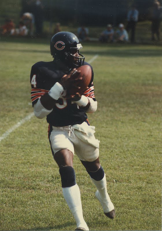
Paul here, doing an utterly inadequate job of filling in for Phil this weekend. Yesterday I Ticker-linked to a shot of a Pitt player wearing cut-off pants with thigh pads. That prompted reader Jamison Nash to send the photo you see above. I don’t know about you, but I’d say two pics of these cut-offs on consecutive days are about as much as I can handle.
Meanwhile, for those of you who get a blood rush from such things, UGA’s Amateur Pacifist uniforms — which they’ll be wearing in some game involving a sandwich, although I still don’t understand what that has to do with football — will be unveiled today. Wheeee!
Wait, isn’t there something else I was supposed to copy and paste in here..? Ah yes — here we go…

Benchies
by Rick Pearson
Always good to be sure you understand the question…(click comic for larger verison)

You can get a glimpse of the new Georgia uniforms here:
link
To quote: “The red and black represents their ruthless style of play, and the silver is a nod to their last national championship season.”
Or…those could just be the colors that comprise their already existing uniform (and a pretty great one at that).
That UGA Nike uniform is an abomination. I hope the Dawgs lose big time so those costumes never see the light of day again. Why would ANYONE want to mess with a classic uni like this one?
link
The silver is NOT a nod to Georgia’s 1980 national championship season. The Dawgs had silver helmets until 1964.
Dawgs wore silver helmets in 1942, our other NC.
Why doesn’t Nike — or Tiki Barber — tell us what the G on the helmets stands for?
“Goobers”
It’s ‘green’ for the green dots on the helmets. Duh.
To quote: “The red and black represents their ruthless style of play.
And I was naïve enough to think that red and black represents the colors of the University…
Red and black represents their ruthless style of education.
Or their ruthless pursuit of quality roadkill.
(Come to think of it, that’s kinda what those unis look like. Roadkill, I mean.)
Here’s some 1979 footage of a South Carolina-Clemson game featuring a USC punter rocking the short football pants…cringe
link
@J.R. Clark: Why would the South Carolina-Clemson game feature the Trojans’ punter?
I get your point, but down here in SEC-land the University of Southern California is only relevant because that’s where Tennessee’s former coach bolted.
In the rest of the real world, South Carolina is only relevant because that’s where Florida’s former coach restarted his college career.
I hate the SEC (you can thank Auburn’s fans for that).
As someone who’s basically forced to root for three SEC schools (LSU, ‘Bama, and Georgia), I must say that the only real evil in that conference resides in the South Carolina Gamepussies, the Florida Gators (I used to have an insulting nickname for them too, but a small change in morals had me scrap the name), and the AUfulBURN Tigers.
While we’re at it, the Georgia NPC uniforms, while not as great as they could’ve been (silver pants and better research on the helmet would’ve improved that uniform TREMENDOUSLY), are not as offensive as I thought they were gonna be. As soon as all of the Pro Combats are revealed, I will be doing a review video on each uniform.
Who cares what the players wear at training camp when it’s hot? I sure be up in arms if that became an on-field uni, but to get pissed about guys trying to keep from getting heat stroke and pulling a Korey Stringer? Get a life…
Holy shit! Korey Stringer would still be alive today if he had only converted his pants into shorts. Who knew life was so easy? I must get one now. Thanks for all of your help.
i better change my handle. how’s it hanging marty?
Well.
Sure is easy to see sometimes who has never had to get through two a days in the heat and humidity of August, ain’t it, moose.
indeed mr. rick. you know rick, i was thinking of taking up some rugby, i played a little back in the day. how long do you think it would take me to get killed? i am guessing one month, maybe less if i don’t quit smoking.
Depends if you survive the pre-practice workout.
Paul, I think you should do a full weekday post on an 80s football practice phenomenon: the shimmel.
As an UGA alum, I am embarrassed.
They are awful…
Doug, as a fellow UGA alum, I am embarrassed too. If the coaches/ADs are going to let 18-22 year olds decide the uniforms, they should go whole hog and let the players decide what the ADs and coaches wear on the sidelines. I would LOVE to see Mark Richt have to wear an Ed Hardy T-shirt and a flat-billed UGA cap with the tags and stickers still attached…
Another Georgia alum wearing what the kids today call the “unamused face.”
This is a program that has been in steady decline since buying its own hype after clobbering an overmatched Hawaii team in the 2008 Sugar Bowl. Coming off its first losing season since the mid-1990s and looking very thin in the backfield and on the o-line coming into this season, maybe the hope is that the fake juice of Pro Combat unis will inspire the team to upset BSU.
I hope this is a one-and-done but seeing as this seems to be what it take to attract recruits anymore I expect there will be more to come.
*what it takes
” If the coaches/ADs are going to let 18-22 year olds decide the uniforms, they should go whole hog and let the players decide what the ADs and coaches wear on the sidelines.”
Hey now, not all college-age football-loving guys are hell-bent on destroying tradition.
I would be ashamed of my team if they wore anything like that. Sadly, I think it inevitable that they will at some point. Can’t even blame Nike, though. If the schools and the teams said no, give us something proper, we wouldn’t get these atrocities.
Who wagged the dog?
The chicken?
Or the egg?
Once again, tradition demands I post this…
link
So tired of current designers’ nose-in-the-air attitude that, by god, THEY know how a football uniform ought to look, that everyone’s had it SO wrong all these decades.
Once upon a time, football uniforms had canvas pants, leather helmets and full length sleeves. Yes, let’s blame Nike and UnderArmor for doing some experimental designs.
Put words in my mouth, why don’t you.
Who said anything about fabric, fit or technological advances? I certainly didn’t. Was talking purely about “fashion”, if you will, the aesthetics of color schemes, trim, decorative elements, etc….not the engineering of the unis.
Many of them look like as if there designed, as I’ve said many times before, by a 7th grade Home Ec glass that had seen, cumulatively, one football game.
Ricko, my point was simply that football uniforms are always changing.
Dark monochrome goes back to the 30’s. Non-block numbers date back quite a ways too. And there’ve been plenty of uniforms with what I’d call experimental designs. Remember the diamond sleeves on the Steelers in the early 60’s? I’m failing to see why the experimental Nike designs are any worse/different.
Because they aren’t doing it very well.
Their focus seems to be that everyone see them as revolutionary, trend-setting visionaries. Never mind if what they do actually is valid.
It isn’t automatically wonderful just because they’re the ones who came up with it.
It’s almost childlike.
“Look what we designed, Mommy, isn’t it really good! Can we put it on the refrigerator?”
““Look what we designed, Mommy, isn’t it really good! Can we put it on the refrigerator?””
Who knew that Stewie Griffin was a link Peter and Lois are clearly traditionalists.
LSU has been wearing purple, cropped football pants during practice.
link
Aren’t those just their game pants, sans pads?
Did anyone else notice the two-toned, red/black, facemask on the Georgia Nike Pro Combat uniform? Dear God, please don’t let that become a new trend…
Look closely and you’ll see the face mask is red in the middle, the same width as the red stripe on the helmet. The rest of the facemask is black.
I’m not sure if I like that or not. My first thought was just “why is the helmet stripe so thick” but now that you’ve pointed out that part… I don’t know. Seems like the type of thing you’d see on a motorcycle helmet.
It does, doesn’t it. I reckon that’s from the school of design that figures if a lamp that looks like a football helmet is nifty, then a football helmet that looks like a lamp would be equally as nifty.
And if there are fins on a rocket ship, I bet they’d look great on a Chrysler, too.
I really don’t think that Georgia’s ProCombat uniforms are that bad. Pretty restrained by Nike’s standards.
Now…from what I am hearing out of East Lansing, the Michigan State ProCombats should be a clusterfuck.
RE: On Georgia — Nice to see that someone doesn’t hate the uniform entirely because they want it to be bad.
RE: On Michigan State — I’ve learned to keep my expectations low on big unveilings like this, but my mind immediately went from “…” to “Aw, shit”.
I’m a lifelong UGA fan and I am absolutely disgusted. What shameful corporate douchebaggery.
So are you more disgusted by this than you were by the black helmet in 2009?
I didn’t like it when Jim Donnan messed with the stripe on the helmets in 1996…didn’t like the black helmets or the black jerseys…I would really, really like to see UGA go back to the modern equivalent of the 1941-1960 uniform. I would really like to see UGA go to the modern equivalent of the 1964-1984 uniform.
I hated the black helmets.
Saying that, I kinda liked the black stripe on the helmet. I also liked the black facemask and black pants we wore in the Outback Bowl one year.
The worst, however, was the red over black we wore in the WLOCP in 1998 maybe. Just garish.
Re: The Georgia uniforms: 1) Were the pants grey/silver in 1980 or am I “mis-remembering?” 2) The Pro Combat uniforms: Eye bleach please.
The silver britches were brought back for “home” games in 1980 (red over silver).
We wore white over red on the road.
We (and “my God! a freshman!”)only wore white over red on the road @ Tennessee in 1980 IIRC. link and company wore silver britches in Jacksonville.
uga plays boise in week one if i am not mistaken. will uga wear that for that game? if so, it is sad, because i would have rooted uga. but if they come out with that crap, how can i? the sec is that and that, and the broncos are not, and then you wear that crap? shouldn’t you play the big bad sec card?! if i was a bronco, and i saw the dawgs as the dawgs, i miiiiight wet myself a little. but if i saw the dawgs as captain marvel, i would say to myself, yeah, we can beat them, who are they? blah-blah, whatever the coaches fed me. i thought you were georgia for corn’s sake, come out and be georgia and squash that boise community college bug, or lose to that toad and sconnie all over your big bad self. but do it as georgia, not as some comic book character that even DC or marvel wouldn’t print…hey, what’s that in the sky?!…it’s georgia man! it’s fucking disgusting, it’s fucking embarrassing, welcome to the clown club. but maybe this is the only way to pop the oregon zit. maybe if enough schools look like freaking abominations, nikegon loses it’s unique and we can get back to simple. we need to make a list of the sell-out schools who wear this crap. it could be a poll/pool college style. like the top 20 schools that would never be such turds, and rank them, then when michigan or alabama wears some crap, they are out of the top 20. bnut let’s make it a top 5(up to a vote of course) holy corn! did you see number 1 geogia go down to boise?! then the new number one is whoever. penn state obviously is number one in this. but how do we treat bama, they did crap out last year by bear bryanting their numbers, that should be enough for a fail. but my school only licked the tip, one might say. um, yeah, that’s enough. oaky, i got it, they go to that embarrassing others receiving votes section. so who is the most tradition laden we would never sell out school? my top 5…
1 penn state
2 texas
3 wisconsin
4 oklahoma
5 georgia southern(we need a little guy)
other receiving votes
alafuckingbama, stanfuckingford(and all the other bfbs schools like tennefuckingsee)
That is the UGA-Boise game uniform.
Boise will wear blue, so it will be color vs color.
well i do like that part. too bad it will be bcc vs cap’n gawga.
Not sure about selling out. But most of those teams have worn throwbacks And good for them that they did.
Even PSU changed its unis this year.
a very small uni tweak does not count for penn state. but you are right, texas added helmet numbers for a throwback, sconnie had a throwback too that i didn’t think of, but it was all off the top of my head so whatever. fact is none of those schools horrified me like ours(?not really sure you went there?) did wearing costumes for their biggest game of the year the last two years. oh, and i am sure about “selling out”, it is the very definition of selling out.
New uniforms for UTEP. Sorry if it has been previously posted.
link
Hadn’t seen those. Thank you!
any word on when the Football Giants will be unveiling their throwbacks for this season??
Not sure that’s happening anymore.
Moose,
Tejas also did pro-c unis either last year or the year before, so drop them to the others receiving votes.
To be fair, the 2009 Pro Combats for Texas looked almost exactly like what Texas normally wears. The main difference was the addition of a helmet number on the side.
(link)
The Bulldogs pro combat helmet has the early to mid 60’s Ohio State look.
The new laughing stock of the SEC; beyond stupid.
This is what happens when you provide the large Crayola set to adolescents. Isn’t Nike based in Oregon? That explains everything.
Georgia’s helmet was an interesting idea that just doesn’t work in reality. The rest of the uniform just looks half baked. That detail at the collar is garbage.
Nike has done MUCH better.
link
Now here’s a perfect football uniform.
Gotta say, and I still need to see it on the field, but I like the big fat center helmet stripe on GA better than ANY tapered stripe like Louisville or Mich State. And the extension onto the facemask has peeked my interest. Not saying I approve yet or not, but it has made me curious. As for the all reds, kinda too much all red for my taste.
I don’t know much about soccer, but I have become a fan this year. On the lines of football practice garb, is the sleeveless soccer shirt commonplace? Not exactly attractive in my book.
link
That’s just training apparel. Not the match kits.
Georgia uniforms in Athens Banner-Herald:
link
I share the sentiments of those above: they are awful.
Astros have LOS above their usual lettering.
I think the Astros have their hearts set on becoming the new Mets: from their gameplay to the way they “honor” people of Latin heritage on their uniforms.
What can I say? I’d wear that.
link
No, it’s not as good as the regular unis, but they’ll still look better than Boise State.
Not saying I’m down with the whole Toy Combat scene, but looking at it strictly from a design perspective.
The jersey itself? Yeah, I’d wear it too. It looks decent. Better than what could have happened.
However, monochrome red pants? I hated that look on the link, and I hate it on the Dawgs. What the hell is up with that helmet stripe? That only looks good on a link, not sports equipment. The black “sleeves” on the end of the jersey warrant–at least–a black undershirt, not red. Also, why no full length socks!?
I’m probably just scratching the surface of the problems of this uniform overall…
Well, there are monochrome Cards and there are link The Dawgs are more like these than the ones you posted.
I’m with you on the socks, but the other things don’t bother me.
Would y’all calm down… They’re not that bad looking. Okay they’re not as traditional as most Uga fans would like but it’s a one time thing. They could have looked much crazier (I.e. Va techs numbers last year) it’s a red uni with black sleeves. Minus the helmet it’s nothing to freak out about. And I think the helmet’s kinda cool… I’m all for traditional looks and love nothing more than a simple classy look of a psu or Alabama but put it in perspective, it’s one game and Georgia is getting exactly what they want from this unveiling: press.
Bingo.
Never aim for “press”.
Somebody’s got it. Right on, Mason.