When the Mets wore their blue Los Mets jerseys a few weeks ago, literally dozens of readers asked me if it might have been a test-drive for a blue alternate jersey next season. I said I had no idea, but I hoped so. Deep down, though, I was pretty sure the answer was yes, because the Mets tend to telegraph their moves pretty obviously. And now that has been confirmed. According to that story, the Mets will wear a blue alternate at least a few times next season and will probably put a blue alternate into the team’s regular jersey rotation in 2013.
I can now contribute an exclusive bit of additional info to the proceedings: According to multiple sources, all of whom I trust, the black drop shadow will not be appearing on the Mets’ home uniforms next season. Halle-freakin’-lujah!
This still leaves a bunch of questions unanswered:
• Will the drop shadow be banished from the road grays? (I think so.)
• Will the black and blue/black caps be scrapped? (Not sure, but my hunch is no.)
• Will the black undersleeves, socks, and belts be scrapped? (Probably depends on what happens to the black-inclusive caps.)
• What about the black jersey? (Not sure.)
• Will the elimination of the black drop-shadow — and any other possible changes I’ve just outlined here — be permanent, or just a one-year thing to mark the team’s 50th-anniversary season? (No idea.)
• Speaking of the anniversary, that ESPN article mentions that next year’s uniform will include “significant elements of the original 1962 uniform.” Does that mean they’re planning to eliminate the uni number from the front of the jersey, since that wasn’t added until 1965? (Hope not.) Maybe they’ll change the orange squatchee back to blue? (That’d be nice.)
I know some of you out there already know the answers to these questions. Surely you’ll want to clue in your old buddy Paul, won’t you?
Meanwhile, the news about the new uniforms is being warmly received in Metsville, especially by Mets Police blogger Shannon Shark, who summarized his feelings with an extremely effective visual aid.

Collector’s Corner
By Brinke Guthrie
Good grief, look at this — a genuine Pittsburgh Pirates World Series trophy for 15K. We are family, indeed.
That’s this week’s featured eBay item here at Collector’s Corner. As for our other finds of the week, let’s take a look:
• Reader Mike Hersh found this great vintage Portland Beavers baseball pennant.
• Hmmm, was “Unconditional Surrender!” a Steelers slogan in the 1970s? It was on this T-shirt.
• Nothing beats 1970s NFL stuff from Sears, like this Falcons helmet plaque.
• I really like this 1970s Nordiques/Stingers program.
• I used to write to pro sports teams and they’d always send back schedules and stickers, like this mid-’60s Astros car window decal.
• Vamos Gigantes with this late-’70s bumper sticker.
Seen something on eBay that you think would make good Collector’s Corner fodder? Send your submissions here.
That other thing I do: New post over on the Permanent Record blog.
Uni Watch News Ticker: Tennessee football is changing its shoes and socks from black to white. “Sadly, the orange in the cleats doesn’t match the jerseys,” says Chris Howell. ”¦ New third jersey for Chelsea (from Nick Orban). ”¦ New hockey jersey for Boston College (from Nate Ewell). ”¦ Ino Patron of the Thunder Bay Border Cats — a team in the Northwoods Collegiate League — wears some mighty nice stirrups (photo by Daren Landers). ”¦ Can’t figure out what to do with that old, unwanted NFL jersey? Someone else has figured out a use for them (“Ticker gold!” says Rob Ullman). ”¦ Last Sunday’s “Ripley’s Believe It or Not” comic was uni-based. “Should’ve been ‘Oregon Ducks used to look good, believe it or not,'” says Jim Vilk. ”¦ New uni number for Ravens WR Lee Evans (from Bryan Starkey). ”¦ JD Denison attended the recent Comic Con in San Diego, where he spotted Dolph Vader. ”¦ Some Marshall players are wearing red-striped helmets. Brice Wallace says it’s for freshmen. ”¦ The Braves still haven’t added that Ernie Johnson Sr. memorial patch. Not sure why. ”¦ New goalie mask for Martin Biron and maybe Ilya Bryzgalov (from John Muir and Matt Pesotski). ”¦ I realize the Packers are pretty much part of the fabric of Green Bay, but it seems a tad inappropriate for the team’s logo to be used on the local police badges, no? (As noted by Joe Kardel.) ”¦ Here’s a video clip on USC football uni history (from Ed O’Farrell). ”¦ Northwestern is asking fans to give their feedback on several potential court designs (from Britton Thomas). ”¦ Two contributions from Terry Duroncelet: Saints burgers and an NFL sideline official in a burgundy polo shirt. That’s new to me. Definitely isn’t an on-field zebra, because those aren’t NFL zebra socks. Anyone know more?
I was a fan of the drop shadow, especially after PL’s interview with the maker, who said he wanted to emphasize the city’s “shadows.” It’s a nice touch — understated, but adding depth. I will be sad to see it go. Also, to me, the no-shadow harkens back to 1996.
Do you know if the “snow whites” will stick around?
Also, I’m a BU fan, and I may be biased, but good lord are those BC jerseys just plain awful! Did anyone else see that there’s virtually a down arrow pointing at the players’ crotch?
NU fan here. I know I’m not the one to say anything about uniforms in Hockey East but I think BC’s new uniform is a subtle change. When I saw the link, I thought to myself, “this is going to be major if they change the wordmark on the front” but it’s remained pretty much the same. I think the stripes got touched up a bit but nothing to force milk out of your nose. It’s still a crappy uniform. BU’s probably got the best one next to UMass Lowell when they have that diagonal Lowell uniform.
I’m actually more shocked that someone could write this sentence with a straight face:
“For a team that plays fast, these new jerseys really emphasize the sleekness of the players.”
Some like to call that the tragedy of modern design education.
Well if you buy the theory that wearing red can make you perform better than anything goes.
I’ll take a crack at it: “Waffletown State’s new benzine-soaked, cancer-causing uniforms emphasize the squad’s commitment to passion, agility and esprit de corps; by using flammability as a weight-saving parameter to turn our players into dynamic vectors. The carcinogenic fabrics create a sense of shared sacrifice and common cause. Go, Screaming Canaries!”
that hurt my brain :(
The benzene also makes the team smell sweet enough to distract their opponents!
Will the BC hockey team be accompanied with calliope music when they take the ice? Or the sound of maggots gagging? One of the worst hockey jerseys I’ve ever seen!
The new Boston College hockey jersey is ugly. The “broken glass” patches break up the stripes and it looks too plain without the BC shoulder logos.
Then again, I am a UNH alum and am kind of happy BC will look like garbage in their new unis. I hope their play matches their new attire.
Go ‘Cats!
I agree, the BC uniforms are terrible. The old uniforms were sharp and did not need to change, but even so they didn’t have to do such a lousy job of it. Ugh. Ugly.
Nah, the old jerseys were lousy too. The striping was okay, but the giant Boston College on the front just never worked for me. Wordmarks are fine and can even be great, but keep visual balance in mind with them too. Keep it to one line. Or put a logo on the front.
I’m happy I went to a school in the ECAC. Unlike many of the Hockey East uniforms, where they’re often garish, awkward, or put you to sleep with the lack of visual interest (looking at you, BU), the ECAC has a lot of classic and interesting uniforms. Maine has the only jerseys in Hockey East that are up to the standard in the ECAC.
That’s not to say there aren’t a few duds in the ECAC. Just a lot less.
They incorporated the Stain Glass look on the sleeves too. There’s got to be a better place for that than just throwin’ it out there!
“Tennessee football is changing its shoes and socks from black to white. “Sadly, the orange in the cleats doesn’t match the jerseys,”
~~~
neither did the black socks & shoes
“neither did the black socks & shoes”
Oh like that matters… I thought it was “cool” to wear equipment that doesn’t match your uniform… or is that only for “retro” NFL uniforms? Black shoes look dumb on Tennessee, but they’re cool on the Buffalo Bills, right?
no…black SOCKS look dumb…they only look good if you’re wearing black pants
but i’d rather they wear solid color shoes (white or black, hell, even orange that matches the jersey) than these stupid designer colorways
Quiet, you.
erm, that was supposed to be a reply to your “fix”
…stupid comment page.
I agree the black socks do not look good. The new shoes look is not that bad but not matching the jerseys makes them noticeable. In a not good way.
Shoes, facemasks and gloves should all be black or grey, or navy blue.
Navy blue? Um, what?
If they were *all* gray or *all* black (or *all* white for that matter), it actually wouldn’t bug me though.
Shoes, facemasks and gloves should all be black or grey, or
navy blue.white.(fixed)
“
Shoes,facemasksand glovesshould all beblack orgrey, or navy blue. white.(fixed)“fixed properly
I think the black socks and shoes look neutral on Tennessee, they don’t add anything, they don’t take away anything, they don’t draw any attention and they’re shoes, a part of the uniform that really doesn’t need to match.
Now the white socks and white and orange shoes looks like complete crap. The black has a classic look to it, and although it is neutral it slightly complements the orange jersey. A total move backwards, to me, shoes are really more equipment and not part of the uniform, and only certain teams like the A’s can successfully pull unique shoes off.
Really I sit there looking at those side by side TN photos, and one says “yes, classic” and the other says hell no.
And what’s wrong with black shoes and white socks for a college football team?
“And what’s wrong with black shoes and white socks for a college football team?”
+1 for Geeman =^)
I think what really catches my eye about the old TN uniforms is the blocks of color. Black on the bottom, white on the legs, orange on the torso, simple and classic.
The half orange shoes are akin to the new football uniforms with the stupid piping and contrasting underarm panels and half stripes on the sleeves, etc, they’re a mess.
…what shade of orange on Tennessee’s uniform DOES match?
It should be noted that this is a move back to white shoes and socks after only wearing the black for one season.
Correction: It is a move back to white socks only. The shoes is a change as they wore black shoes with white socks prior to last season, blacks shoes and black socks last season, and now have moved to white shoes white socks.
Seems strange that they would change to the complete opposite after just changing to black shoes and socks, but it could have something to do with the changing of coaches the past couple of years.
you guys also notice the pant striping orange is a slightly darker shade as well?
The burgundy polo shirt is for the guy in charge of the K balls (for kicking downs). Been around for a few years.
Ah, got it — thank you!
The Mets dropping numbers on the front? Hope so. The “Mets” script just isn’t proportioned right to balance the number, the way scrips like the Dodgers wear do.
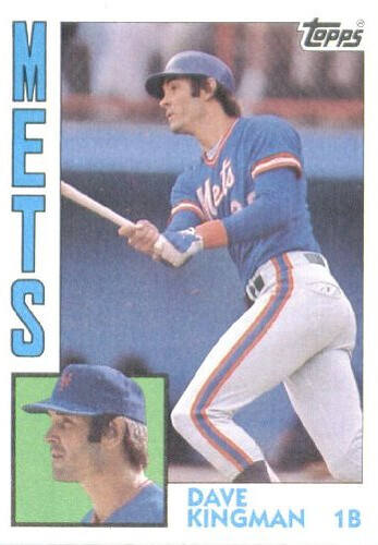
Great image on the lead, though. The Mets definitely got it right in 1962, but they got it even righter with the racing stripes.
“The Mets definitely got it right in 1962,
but they got it even righter with the racing stripes.”~~~
(fixed)
I’m hoping not only will they go N#OF, they are also authentic enough to go NNOB for the *throwbacks*…however, in a convo i just had with paul, he doesn’t think the fans would go for that little bit of authenticity
the racing stripes were the bane of met uniform design … almost worse than the BFBS … and i say *almost* only because the racing stripes were in actual team colors
Halleluja. Hopefully they will do it right and not have that extra white outline around the numbers like they did in 1996 either. I would love it if they went NNOB, but I do like the front #. Something seems to be missing when it isn’t there. Switching the cap button back to blue would be awesome as well. Who made up the word squatchee?!
I was happy with “cap button”.
I like the orange squatchee.
Squatchee should match the bill
Orange bill? I’d wear that.
A hat with more orange would look great with the bluealts. I was there on Los Mets night and man did they look sharp with the snow white pants and blue socks, belt, shoes.
The racing stripes do pretty much say “1986”, so they’re not all bad.
This isn’t borne out in practice, but numbers on the front of the jersey usually say “National League” to me. Right off the bat, I can name a few exceptions: Oakland, Kansas City, San Francisco. My particular stereotype, or does anyone else see this?
Outside of the fact that San Francisco is in the NL, I don’t know if it’s true that it’s a national league thing. I remember from watching a game last night that the Cubs and Astros both have them, but, IIRC, the Braves and Phillies do not. It may simply be a team-by-team decision.
I think Walter’s point was that San Fran was one of the rare exceptions to the “NL teams have front numbers and AL teams don’t” pattern.
The following results were based on observations from Dressed to the Nines and only include teams’ 2011 home and road jerseys, not any alternates or throwbacks:
The NL being the Number-on-front League bias might stem from the larger size of the National League and slight percentage lead it holds over the junior circuit. Only 57% of the American League teams (8 out of 14) have numbers on the front of at least one of their jerseys. Compare that to 69% of National League teams (11 out of 16) and problem solved, right? Maybe.
It also seems to be a script/no script thing. In the AL, we find 91% of script uniforms (10 of 11) sport numbers on the front and in the NL it’s 80% (12 of 15). That means 85% of slanted script uniforms in Major League Baseball (22 of 26) that have numbers on the front.
The only place where the AL seems to have the advantage is home jerseys with slanted scripts. 83% of teams (5 out of 6) that use a slanted script on their home uniforms, including the Twins and Blue Jays, have numbers on front, with Cleveland being the lone hold-out. and 75% of home uni script teams (6 out of 8) with numbers on front.
Actually, the Jays don’t wear numbers on the front of their home jerseys that have the slanted script, but they do wear them with their road unis (which have a vertically-arched “TORONTO” on the front).
Then again, teams can change – the Brewers had numbers on front prior to the 1994 revamp, when they were dropped, but brought the numbers back in 1997 when they tweaked the unis again (while still in the AL).
Baltimore
Chicago
Detroit
Kansas City
Los Angeles
Minnesota
Oakland
7 in the AL, 11 in the NL. I don’t think it is as much as an “NL” thing as you think
You missed Toronto on their road unis, and Detroit’s also a road-only case. The Cubs are a road-only team as well.
Thanks Lee Evans…now I feel pretty stupid with my #83 Dickson jersey I just got
The Pittsburgh Pirates replica trophy: I thought Tiffany makes the trophies, not Balfour.
“Can’t figure out what to do with that old, unwanted NFL jersey? Someone else has figured out a use for them (“Ticker gold!” says Rob Ullman).”
Dude, give a guy some warning! Eeesh!
Things cannot be unseen!
You must be new to the interwebs if you think that was a horrible sight. That was nothing compared to some of the horrors that lurk in the darker corners of cyberspace.
LOL! Don’t I know it.
Perhaps my being a ‘Skins fan increased the horror level in my mind. 8^o
If you’re a skins fan, that image should’ve been right up your alley.
(Entering Emily Litella mode) Oh, wait. That’s different. Never mind. (Exiting Emily Litella mode)
Because it’s a Lavar Arrington jersey?
Well, there’s a use for all of those once-used green Seahawks jerseys…
When did the internet get so dirty?
Saints burgers huh? I much prefer Dolphin burgers!
I prefer Aspergers.
they sell them at local grocerie stores, they’re just burgers that say “saints” on them, they also sell lsu burgers down here ( they both taste terrible)
NFL Jersey Exotic Stripper Wear! I bet the NFL shield is to protect everyone else from the wearer
NHL commissioner Gary Bettman, desperate to get his league any sort of, um, exposure, is probably hatching a marketing proposal as we speak.
2 minutes for hooking!!
Actually, I’m pretty sure the NHL already sells ’em.
Labeled simply as bikinis, of course. They don’t sell the rest of the outfit.
During August camp, Marshall freshmen wear a red stripe to help coaches easily identify a freshman. This practice started last year under then new head coach Doc Holiday.
I thought it was to identify the ugly players.
link
I know it’s off subject but yesterday I posted a comment that I wear an “America” Airlines shirsey and you asked isn’t it Alaska Airlines. You’re right. I must have seen that the guy above me posted America and just typed it in but had a mental brainfart and thought it was Alaska. oh well, my bad.
NU already chose their new court design – link
And the purple will be stained – not painted – onto the court so the wood grain will still show through.
This link was my first choice (of the alternatives given).
Kinda sad when you market based on the conference rather than the team… But I guess when you suck, the conference does have more cachet.
I don’t like that Green Bay Police nonsense, one bit! Does this mean local law enforcement is in the pocket of the Packers? Can you now get legally roughed up for wearing Minnesota or Chicago apparel? It absolutely sends the wrong message.
Agreed. Those look like something you sell to fans as a $5 souvenir for their kids. Actual law enforcement shouldn’t be wearing them. What’s next, a badge with golden arches? A swoosh? Not cool, City of Green Bay, not cool.
Exactly walter, anyone wearing a Green Bay jersey while committing a crime will be given a free pass. Beating up your wife? No problem, just don’t let it happen next time. Stabbed a neighbor over a dispute in your Super Bowl champion sweatpants? C’mon now, put the knife away and drive him to the hospital. Be a good sport.
However anybody wearing the colors of a NFC North team will be shot without warning.
I think it’s a fun idea. They’re proud of their Packers. Honestly, have you ever looked closely at your town’s police badge?
“Honestly, have you ever looked closely at your town’s police badge?”
True story: the Toronto Police emblem features a winged wheel. Also a crown. But no maple leaf. No wonder the Cup drought is entering its 45th year.
Well, look on the bright side. If there’s ever a sexual harassment scandal in the Green Bay PD, Tiki Barber can remind everyone that the “G” stands for “Grab-ass.” If it’s a bribery scandal, the “G” stands for “Graft.”
too bad larry the cable guy is fron nebraska and not wisconsin… the “g” could stand for “git-r-done”
Why not? If you can lose your job in Chicago for link…
For the record, you could legally get roughed-up for wearing Bears or Vikings gear before they introduced those badges. And given how much Packers stuff I saw this past weekend when I ventured north of the Cheddar Curtain (not that it was that much different than before they won the Super Bowl), I think they showed restraint by putting it on the badges rather than going with full-on green and yellow police uniforms complete with Packer construction helmets for hats.
“The Cheddar Curtain”…I’m using that term from now on!
The (inevitable) next step:
[IMG]http://i100.photobucket.com/albums/m27/JimHayden/crownvic-749067a.jpg[/IMG]
im guessing uv’e never been to green bay, doesn’t surprise me one bit.
Some of their fire hydrants and the local McDonalds are also Green and Yellow, errr…Gold.
Not quite to the level of Green Bay, but the Ruston (LA) Police has had the Louisiana Tech University logo on their uniform patches for decades.
Example:
link
Police patches have always been interesting to me, they show a town’s history and usually have some cool backstories.
Might be a fun uniwatch project to find how many sports references there are in police badges/patches.
Is it just me, or does every single NCAA football uniform change absolutely SUCK (Except of course, the Colorado Buffs – who dailed it back a few decades to improve their respective unis – again).
More useless stripes and trim, mre team names and slogans on the legs and ass, more already-tired Nike/UnderArmour templates, more shorter sleeves, more useless half-size wordmarks and team names on the chest, more screwwing up the front numerals be forcing them lower on the chest to make room for the useless chest clutter, more smaller TV numerals to go with the new materials and sleeveless cuts.
I’m sorry, all of it seems to SUCK.
If anyone can point out a uni change that is an improvement, and that does not involve a team moving to an older uni to improve the new one, please let me know. We’re looking for hope over here ….
The Sun Devils? (minus the black alt)
Getting rid of the Black is good, but the “update” sort of sucks, IMHO. ASU had a great, unique look and tradition. They look like a too-well-funded 9 yr old team now …. The Pitchfork helmet was a decent idea, the execution of the idea sucks – too cartoonish and off-center …. almost Nike Rivalry type stuff. I just do not see it as an improvement ….
You’re wrong. The new Buffs uni sucks as well (though I only say that because I went to Colorado State for grad school).
I agree. The new Colorado uniforms look undercooked; get some stripes.
You’re not wrong; the uniforms are mass-produced to make them cheap. Too many logos, to please greedy conferences and apparel companies. Ugly skintight contours, to please pumped linemen. It’s no coincidence the traditional teams are the best-looking.
For the most part, yes. But, there are some schools that are going in the right direction.
Virginia Tech switching from the orange sleeves and angled numbers to the ‘traditional’ throwback unis with UCLA stripes was 100% a change for the better.
NC State going from the Falcons-like sleeve pattern to the traditional red with white block numbers and ‘STATE’ across the front is an improvement.
I would even say Boston College going from their funky thick numbers to the slimmer easier to read ones they just debuted was a change for the positive.
Agreed on VT and NC State, but Boston College still looks like crap.
And NickV is right – on the whole, college football uniform changes are almost universally for the worse. Templates, bumper stickers, pandering to teenagers – these things pretty much guarantee bad.
Not to throw one manufacturer under the bus but it’s all the Under Armour unis that look particularly hideous. With those weird butt stripes and the shoulder panels.
A few years ago Rice changed from link to link. Modern, cluttered jersey to modern, clean jersey. That was also the year they won a bowl game and got ten wins for the first time in fifty years. Coincidence? I think not. That gold piping was nasty.
The Steelers’ “Unconditional Surrender” T…..that’s got to be the quintessential late 70s font. Anyone know the name of it?
Serif Gothic.
Thanks!
The new Boston College hockey jersey is ugly. The “broken glass” patches break up the stripes and it looks too plain without the BC shoulder logos.
Then again, I am a UNH alum and am kind of happy BC will look like garbage in their new unis. I hope their play matches their new attire.
Go ‘Cats!
I missed the possibility of this a couple weeks ago, but it appears sanity has prevailed in Evanston:
link
This was the possibility in question:
link
Here is the winner:
link
Regarding Mets changes: Cream/Pinstripes, Snow White, and road authentic jerseys are all discounted on Mets.com’s shop. The black jerseys aren’t.
Can probably infer that the drop shadow will be eliminated on the three discounted jerseys with the black remaining and unchanged.
The mets were discounting the away greys early in the season at the clubhouse shop. I asked my contact in the industry if they were planning a change. He thought it was merely the Mets having a sale, but they were 50% off. I also wonder if the dump of jerseys at TJ Maxx 6 weeks ago was also part of Majestic thinning the inventory.
Looking back all the signs were there. Everytime a major change (design or manufacturer change) such as this is preceeded by jerseys showing up at a huge discount on sale at the shops, TJ Maxx/Marshalls and on ebay.
Hey, I have a Chicago Bears helmet plaque. It must be from before ’73 since it has the white wishbone C on it.
This might be asking too much, but what’s the possibility of the Mets going back the the 1969/73 era road number font?
link
Be careful…that Mitchell and Ness font is now wrong…their authenticity has gone down the drain. This is the real font, a thicker Wilson Varsity (still worn by the Braves for one)…
link
That M&N has some kind of block with serif font. The Nolan Ryan road is now a joke too.
Watching Sportscenter, and noticed what seems like a HUGE spacing between letters for Alejandro De Aza. Not knowing the White Sox roster, I saw his jersey and thought maybe a letter had been ripped off.
link
Great news on the Metropolitans front. One can only hope the players will embrace the high blue socks as well. I REALLY hope they ditch the black/blue hats.
The Chelsea 3rd kit is gorgeous. They managed to make both the sponsor logo and the maker logo unobtrusive. Well done.
Since when did Tennessee’s jerseys switch to yellow? Thay’re not orange anymore…
Agree. As a big Tennessee fan I can assure you it has been like that for a while. The helmet stripe/logo and pants stripes seem to be the correct shade but the jersey often looks very different from that. It probably has to do with fabric and photography (see article about Michigan’s pants from a little while back). The basketball team doesn’t have this problem and it is less noticeable at night, so it must be a material/lighting/photography issue.
Ed O’Farrell, Thanks for the USC uniform history clip. Only bad thing was too much time wasted in the beginning. They did go over a lot in short time.
Chevron sp ? That is what those are called.
USC is probably my 2nd favorite uniform. The home cardinal and gold. that is.
I forgot to thank RYCO yesterday for him helping Thomas on the sweet Astro’s DIY.
Always nice to see fellow Uniwatchers helping each other.
Plus I enjoyed the work of both.
Redskins OL wearing headbands during walk throughs: link
To me, the 2 biggest questions are:
– Will the road grays also lose the drop-shadow, 2-tone cap and black accessories? [Biggest issue for me as the 1962-73/1995-97 road grey is the BEST Mets uni EVER.]
– Will this be a one-year deal or permanent change?
I can deal with retaining the BFBS as an alternate as long as the home pins and road greys revert to 1995-97.
I like the black drop shadow of the Mets uniform. It does add depth as someone stated before.
But if you are going to go back to ’62 uniforms- do it right. NO ALTERNATES, no black, no number on the front. Get rid of the orange squatchee AND GO BACK TO THE DARKER BLUE CAPS. Then it will be a throwback.
it’s gota be the link. charle was selling the gold here, but for sure the “namath” whites to the kidos.
and is link kc athletic groundskeeper the first pajama panta-loonie?
Damn, RM, I think he may just be! Those almost look like marching band pants.
came across it random, and marching band pants might be accurate, who knows. good call flava daddy.
The Mets hat in this ebay listing has an orange brim.
link
I think the Cooperstown Collection got it wrong.
BTW, if the Mets go with faux flannel for the road uni, I will be first on line at the Clubhouse Shop the day they go on sale.
“if the Mets go with faux flannel for the road uni”
~~~
not if majestic makes em
but you’d be second in line (after me) if mlb dumped shitty majestic and got a real uni manufacturer capable of producing such beauty
If the Mets really do go with the ’62 look, home and road, next year that would vault them from middle of the pack to maybe the very best uni set in MLB. I’m not a Mets fan, but those original road uniforms are the greatest single baseball uni of all time.
Shitty majestic? I have 300 jerseys form different eras and the majestic are the best constucted and stand up better after use and time than Rawlings or Russell. And El-cheapo Russell used less fabric, making the jerseys shorter than Majestic does.
i wasn’t referring to fan jerseys
i really couldn’t give a shit about those
I’m talking about ON FIELD stuff…they can’t make throwbacks properly, can’t replicate any of the older *looks*, screw up simple things like fonts, numbers, striping, piping — all of which could be gleaned from a quick look at okkonen or henderson, or a topps baseball card…they can’t, apparently, make “faux flannel” or anything like that….and they take three months to make a simple (or perhaps not so simple) thing like the dodgers ersatins…while bobcat or AIS seem to be able to pump them out in weeks; same thing for EFF
i really hope nike or UA (can’t believe I’m saying that, but it’s true) wins the next MLB contract
as far as russell or rawlings? don’t care, they won’t be winning any MLB contracts anytime soon
and as far as how well your fan jerseys are made? I’m glad majestic makes a nice product, but i really don’t care what their fashion line is like — i care about how the teams look on the field — and in that regard, majestic SUCKS
I’ve got game worn jerseys by from Russell, Rawlings, Majestic AND minor league AIS and Majestic held up better of the the four. Actually the AIS jerseys I have are in shitty condition and thier quality sucks.
You may not care about the retail jerseys but readers like me who collect not just gameworns but retail jerseys look for quality. Like it or not that “fashion” line helps drive your business. Teams wouldn’t do throwbacks unless they could sell them.
How ’bout a compromise:
-Either Nike, UnderArmour, or Rawlings takes the exclusive primary game uniform contract.
-Either Bobcat Athletic, AIS, or EFF takes the exclusive throwback uniform contract.
-Majestic keeps the retail contract.
~~~~~~~~~~~~~~~~~~~~~~
Sure, the retail jerseys won’t be “true authentics”, but then again, when is a jersey that isn’t off of a slugger’s back a true authentic?
“Like it or not that “fashion” line helps drive your business. Teams wouldn’t do throwbacks unless they could sell them.”
~~~
not my business
and sadly, teams nowadays don’t do ANYTHING unless they can “sell them”
god forbid anything gets done without making a buck in mind
with an attitude like that, you probably have no problem with putting ads on unis too, since clearly teams could make a buck off that too
i realize we crossed the “lets introduce a softball jersey so we can sell it to the public” bridge long ago, but it would be nice if maybe ONE aesthetic decision could be made with an eye towards quality, authenticity, or just plain fun and not the fashion jersey market
4 out of 5 dentists5 out of 6 hoops writers agree – the Golden State Warriors have the best jerseys in the NBA, according to the end of this ESPN roundtable:link
I’d put them in the top 5, along with Utah, Memphis, San Antonio and Chicago. Boston would be 6th.
Well, the sixth guy did say that link were better, so it’s all good.
Naming rights for Mile High Stadium have just been taken over by Sports Authority. So no more Invesco Field. Welcome to link.
So glad I have my “I still call it Mile High” t-shirt from No Mas!!!
Ugh. Why do they have to add the whole @milehigh bullshit? Can’t we just call it Mile High Stadium? Or for a compremise, Mile High Stadium (brought to you by the Sports Authority)?
Big time relieved about StLJeremyMaclin.
Hey all im here again showing off 2 more metal logos!
Arizona diamondbacks: i was force to weld on the hash mark in the “A” because i accidentally ground it off but i think it turned out well:link
Seattle Seahawks: Made this for a fellow shipmate who saw some of my other work. this one was fairly easy due to so much of the logo bieng a shade of blue i decided to etch the colored sections minus the iris and leave the white parts clean. came out great.
link
Next up is the texas longhorns logo, tampa bay bucs flag and sword logo and the seahawks diving osprey logo.
What size are we looking at here? ‘Cause those would make some fine belt buckles. Keep ’em coming!
the seahawks logo is approximatly 6″x3.5″ at the tip of the beak… a little less otherwise…. the Dbacks logo is 6″x5″ and thank you… my LPO is actually the seahawks fan and he welded it to his belt buckle and plans on painting it when he does ill post the picture!