As most of you know, I’m not a video game guy. But many Uni Watch readers are, and several of them were all abuzz over the weekend, because the Teambuilder for NCAA 12 has gone live, which means a lot of new uniforms are now accessible.
We’ve seen some of these new designs before (sometimes in video preview clips, sometimes in official unveilings), but it’s fun to see them all in one place. Reader Douglas King has done a good job compiling all of them — here’s his rundown, including his commentary on each new design:
• Boston College: “It’s hard to see in those screen shots, but the numbers now have the same stained glass design that the basketball team had last year, as does their sleeve (similar to Maryland’s, but without the piping), and their cuffs and collar have been modified. The pants also have skinnier stripes.”
• Colorado: “They’ve made their throwbacks from last year their primaries and added an away version. Pants are only available in gold and black.” (Reader Jeff Alexander points out that you can see the school’s mascot, Chip, wearing the new road jersey in this shot.)
• Hawaii: “Very Tennessee Titans-y. Not bad for a modern uniform, until you get to the pants (why stripes are increasingly being moved to the ass is beyond me).”
• Louisville: “Stripes on the uniform now match those on the helmet. No black option, at least not yet.”
• Maryland: “No black helmet, even after we previously saw screens of them. The Teambuilder site went live several days sooner than had originally been advertised, so it’s possible that it’s still a work in progress and that the black helmets will be added later.”
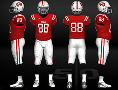
• South Carolina: “They have corresponding garnet and white versions of this design, too.”
• Texas Tech: “I like that they went to a number font that’s consistent with their wordmark. Also, note that although the road version looks a bit gray, it’s actually white (there are quite a few white uniforms that are for some reason darker on the Teambuilder site).”
• UCF: “Their new black jerseys are shown, but their gold jerseys are only available in their old design. Could this mean they’re downplaying the gold? They have dropped the Golden from their name.”
• USF: “Gold gets a little more attention than it has in the past few years, with the inclusion of gold pants and more gold on the green jersey.”
• Washington State: “Remember those dark gray pants they showed off with their new uniforms? Apparently there is a jersey with the same colors (swap the two grays on the gray uniform they showed off, and there you go).”
• Western Kentucky: “UCLA stripes, a silver alternate, and three pairs of pants (same color as the three jerseys).”
One other note: Reader James Comfort notes that the Teambuilder site shows Auburn wearing the design as last year. That runs contrary to what I’ve been told and reported. Hmmmm.

Collector’s Corner
By Brinke Guthrie
This Sunday, the Mets visit the Giants for the ESPN night game. It will be absolute Armageddon in the line to get inside the park, and I’ll be there like three hours before gates open @ 3pm, to get one of these.
So that’s something I’m hoping to avoid having to buy on eBay. But here are some items I (and maybe you) wouldn’t mind snapping up:
• Reader Jon Leib writes: “As an avid license plate collector (and Uni Watch reader), I knew Massachusetts had issued plates to Boston Bruins players in the 1970s. I didn’t realize they’d also issued them to Whalers players back when the team played in Boston, before they moved to Hartford.”
• Always have to showcase anything that’s 1970s NFL IHOP, like this standings board.
• As you might expect, a book called Big Hair and Plastic Grass is about MLB in the 1970s. [But ugh, that apostrophe catastrophe on the cover — grrrrr. ”” PL]
• Look at this! A nine-DVD set of This Week In Pro Football from the ’70s, with Brookshier and Summerall.
• Dig the ’70s logo goodness on this ABA serving tray.
• I actually went to Johnny Bench’s restaurant back in the day.
• One more shot from the ’70s: this great Wheaties New York Rangers poster.
Seen something on eBay that you think would make good Collector’s Corner fodder? Send your submissions here.
Uni Watch News Ticker: As most of you probably know by now, all players selected for the MLB All-Star Game began wearing little gold stars on their jerseys yesterday, and today they’ll start wearing them on their caps as well. ”¦ The West Michigan Whitecaps held Space Alien Night last Friday (with thanks to Tim Miller). ”¦ Did you hear that they held a women’s pro bowling tournament at Cowboys Stadium last week? Further details here. ”¦ Soccer stuff from Kenny Loo: New away and keeper kits for England and a new home shirt for PSG. ”¦ Patrick Mackin reports that the Lake Erie Crushers wore Cleveland Browns-themed jerseys on June 30. ”¦ The member of the Mexican women’s soccer team at top-left in this photo has a different collar style than her teammates do (good spot by Jonathon Binet). ”¦ Here’s an unusual find from Mike Hersh: an experimental U.S. Navy baseball cap. ”¦ Here’s a close look at Under Armour’s HydraStrike Pro FG, which is being worn by the by American team in the Women’s World Cup. Those three colorways are not available at retail. ”¦ The Padres are apparently considering a uniform change. ”¦ According to this page on the Mets’ web site, “Four college football games [were] played at Shea Stadium (two in 1965 and one each in 1974 and 1975). The first college contest paired two of the most traditional teams in college football: Army and Notre Dame.” But Ryan Dowgin has turned up a program cover indicating that a Colgate/Kings Point game was played at Shea a full year before the 1965 Irish/Army game. ”¦ Here’s a really good piece on the science and history of camouflage patterns (thanks, Kirsten). ”¦ The old Ole Miss helmet on the school’s stadium façade has been painted over. “Most Rebel fans I’ve talked to had wanted the helmet removed for a long time because it was so dated,” says Michael Martin. ”¦ Friday’s post about colors prompted a note from our old friend Bob Halfacre: “I can chime in on this one first-hand. The most difficult thing to do in manufacturing uniforms is textile colors. The Brooklyn throwbacks we made [for the Dodgers] should have been a touch darker. Sometimes you just have to go with what’s available out there. It’s especially tricky when you have a uniform that has two or three different fabrics used in it. I know of two cases specifically where a team actually changed their uniforms because the fabric combination couldn’t come together properly. MLB does an amazing job in matching colors from socks to jerseys to caps. Look at old photos, especially royal blue clubs, and see how much better the matching is now.” ”¦ ’Twould appear that the rehabilitation of Michael Vick’s image is now complete. ”¦ The Vancouver Canadians are the short-A affiliate of the Toronto Blue Jays, so it’s not surprising that they wear a Jays sleeve patch. “The strange thing is, the patch is the old-school Blue Jays logo, not their current one,” says Hovan Patey. ”¦ Remember Chase d’Arnaud’s unusual NOB? Some sportswriter in Pittsburgh thinks it’s in bad form. I say fuck that — if his surname starts with a lowercase d, then let his NOB start with a lowercase d (with thanks to Jack Borrebach). ”¦ This is pretty funny: One unexpected ramification of the NBA lockout is that the league has removed all player imagery from its web sites. ”¦ If you can’t stand how kids leave the stickers on their baseball caps, then you’re gonna absolutely love this (big thanks to Brady Phelps). ”¦ New uniforms for the Japanese men’s and women’s gymnastic teams (thanks, Jeremy). ”¦ The Amarillo Sox’s new mascot — the one who basically looked like a giant anthropomorphized boner — has been sent back to the drawing board. ”¦ The L.A. Galaxy have revealed their third kit. “Surprise-surprise, it’s black,” says Adam Yarnevich. ”¦ Rob Hoscheit reports that the new Vanderbilt Medical Center helicopter pilot helmets resemble Vandy football helmets. ”¦ Tommy Gough designed himself a Naming Wrongs-style shirt for Saturday’s Phils/Jays game. “I lost count of the comments after about three innings,” he says. ”¦ Pretty cool-looking Quaker State NASCAR pit crew uniform available here. ”¦ British heavyweight David Haye went FIOB for Saturday’s bout against Vladimir Klitschsko. Not sure what that was about, since it’s not like there were any other Hayes in the ring. If anything, it’s the Klitschsko brothers who should always go FNOB, so we can tell them apart. ”¦ Haye also entered the ring wearing one of those high-tech blanket thingies that look like aluminum foil. ”¦ You know the whole stupid trope with Freedom Fries, Freedom Toast, etc.? Jimbo Huening went to the john at a gas station in Illinois the other day and spotted this. “Sadly,” he says, “I had no quarters.” ”¦ A new election season means the usual boilerplate articles about campaign articles. ”¦ Trenton Thunder players are required to go high-cuffed, but Derek Jeter chose to ignore that rule for his minor league rehab assignment. As you can see, he also brought along his single-flapped Yankees helmet. ”¦ Speaking of the Thunder, they really outdid themselves — and everyone else — in the flag-desecration sweepstakes. On the bright side, it’s probably the first time Jeter’s had anything in common with Abby Hoffman. ”¦ Robert Ruszczyk points out that Jeter also wore his own personally branded T-shirt instead of Trenton’s BP jersey. ”¦ Here’s more info on England’s new blue soccer jersey. Oh, and the keeper kit is an instant laughingstock (with thanks to James Vetter). ”¦ Check out these 1948 Indians aprons (nice find by Larry Bodnovich). ”¦ Ron Roza notes that Rodrigo Lopez’s NOB appears to have been rendered in the wrong font. ”¦ The Halos wore their halos on Sunday night. “I can’t decide if it’s the best or worst cap ever,” says Phil, but you can probably guess which side I’d come down on. Too bad they didn’t add the halos to the batting helmets, since that looked extra-cool back in the day. ”¦ Ervin Santana needs to button up. ”¦ Remember how we were wondering how the Predators’ new “guitar string” number font would look for numerals other than 1? The answer can be found in this photo set, which shows their new practice jerseys (big thanks to Paul Richard Cook). ”¦ “Mitchell & Ness used to sell a 1937 St. Louis Browns jersey with yellow graphics,” says Joe Dotzman. “They sold this style for years. I saw it in the Philadelphia store a year or two ago. Now they’re selling the same jersey, but with orange and brown graphics, which is more in line with Dressed to the Nines. I assume M&N corrected an error in issuing a new version of the jersey. And what about all those folks who bought that completely off base yellow version for years? I guess they’re stuck with an inaccurate jersey.” ”¦ A lot of additional Ticker contributions from yesterday will end up running tomorrow. My apologies for the delay.
This might come off as jingoism, but this confuses me to no end. All of New Era’s on-field caps are made in America. The Hooray for America caps, though, are made in China. Is this just a bad oversight by New Era or an example of the irony in corporate patriotism?
Maybe their American workers find it morally objectionable to produce those “patriotic” pieces of garbage, so they have to go overseas instead.
clearly new era hates america more than they’re letting on
maybe it has something to do with the hats being custom? i’m pretty sure my ryberto’s hats were made in china too
I liked the halo caps. The look was especially cool on TV whenever they had a shot of the pitcher from the centerfield camera – it really looked like they had halos.
The L.A. Galaxy’s new jersey is a dark blue. It even says so in the article. Someone didn’t research it very well when writing the article.
May have been blue, er um punjab, but looked black on screen. What was odd to me about the Galaxy’s third kit is that they unveiled it for the July 4th weekend, but the American flag on the left sleeve isn’t even red, white and blue. It’s a muted old gold to match the uniform. Strange choice for “July 4th kickoff party unveil”.
link
Also, I caught a quick look at Landon Donovan’s captain sleeve, and it looked like it was an American flag made from rhinestones. Was I seeing that correctly? Does anyone have a picture? That is worth a closer look.
A corporation can have identity guidelines that demand you don’t render their logo in any color other than its original colors or all black or gray, but you can do an AMERICAN FLAG in a monochrome gold as if it’s a New York Yankees’ fashion cap? That’s bullshit. Not from an aesthetic standpoint, from a flag standpoint. You can’t do that to the flag.
Also, Landon has been wearing a “bedazzled” captain’s armband for weeks now. I can’t figure it out. It’s certainly unique.
Looks like Landon has been wearing that armband all season long. Here are the best images I can find of it. Does anyone know the story behind this band? It is like no other captain’s armband that I have ever seen and it totally different from what all other MLS teams wear.
link
I’ve seen the flag on camouflage soldier uniforms rendered in greens and tans. Is there a prohibition against depicting it in different colors?
The entire kits were navy and gold – including the sleeve patches!
The navy and gold MLS logo on the right shoulder looked cool.
But the US flag on the left shoulder rendered in nothing but navy and gold was certainly pretty high on the flag desecration scale.
BC now has a 3 stripe pattern on the pants. It used to be 2. like the Skins.
Yesterday the Rochester Red Wings wore the same stars and stripes jerseys as shown for the Trenton Thunder.
I’d guess a lot of minor league teams wore patriotic uniforms on or around independence day. The Connecticut Tigers sported jerseys with stars and stripes going down the shoulder, with the jersey otherwise primarily red, for Sunday’s contest.
Columbus Clippers did the same. I thought maybe Evel Kneivel took up baseball uni design as a hobby.
The Lake Erie Crushers’ jerseys look more like Cleveland Browns’ jerseys than the football team’s do. Damn modern football!
Actual sleeves for the sleeve stripes!!!
That SkyDome shirt is awesome.
I do concur. Nice use of the Jays’ old font.
Thanks! Like it said in the ticker- I can’t tell you how many people approached me or I overheard comment on it. I actually had two Jays/Dome employees come up to me to tell me how much they liked it!
The shirt really was pretty well done. Bravo.
I’d wear that! Great job.
The UnderArmour ass stripes are actually inspired by the old (pre-1950s?) pants that had stripes up the rear. A handful of NFL teams used to wear pants of this style. Tim & Bill’s gridiron uniforms site can illustrate this style for those unfamiliar.
But, as with anything, just because it’s old doesn’t make it good. I’m not the biggest fan of ass stripes.
Are we sure they’re “inspired by” and it’s not just coincidental?
Either way, it’s not a very good look.
“I’m not the biggest fan of ass stripes.”
~~~
who is the biggest fan, if you’re not?
Maybe next year they’ll put the “All-Star” stars on the “Patriotic” caps – creating S&S&S caps!
(^sarcasm^)
Your sarcasm is now New Era’s new marketing ploy. Thanks a lot Jim…
After all the crying that the Giants did I have no problem saying this-
Does the Posey bobblehead have a cast on?
No.
And he’s not holding his ROY trophy or wearing his WS ring either.
I understand you can get a bobble of the Marlins player on eBay, and it’s C h e a p.
Will the Brian Sabean bobble come with a tiny violin player?
nope—his has a WS ring, too, though.
Too bad that ROY trophy didn’t come with a manual on to to properly block the plate. Even the greatest catcher of all time said it was his fault.
I would never wish an injury on anyone one but I feel nothing for this team or this kid after the way they acted.
I love how people miss the point. Posey wasn’t trying to block the plate. As he had been instructed, to avoid injury, he left the runner a lane to make it to the plate without a collision. Did Cousins do anything illegal? No. But he made a choice to try and blow up the catcher who a)didn’t have the ball and b)wasn’t blocking the plate. I think it’s pretty understandable why the Giants would be upset by it.
Bull shit. He had his knee on PLANTED on the line. He F ed up and he had no body else to blame.
Validity to that. I was taught (as were/are all catchers, I hope) to keep the knee low but not planted as you play the throw, then drop it if the runner slides…because you need to be flexed so you can absorb the collision if he tries to drill you up high.
And you can’t block the plate until you have the ball.
Posey is at least a foot in front of home plate (towards the pitchers mound) completely in fair territory. He was not in anyway blocking or attempting to block the plate. Watch the video.
The play by Cousins wasn’t illegal but it was unnessary. If he continues running on the foul side of the third base line (which he is doing until the last four feet) and slides and swipes his hand on the plate there is no way Posey ever puts a tag on him. Cousins gave himself less chance of scoring by what he did.
Jack, were you born with this attitude or did you just come by this recently? the fact is, the Marlins guy deliberately went for Posey. I’d also be willing to bet the next time the two teams play, someone gets hit.
Case closed.
Wrong. His knee is PLANTED ON THE LINE. He may be stretched a foot in front in front but he is blocking the plate with the leg… WITH HIS KNEE down. Go look at the replay yourself.
I attended Jerry Garcia bobblehead night at
Pac Bell,AT&T, that gorgeous stadium by the bay last year.I’ve never seen so many barefoot hippies (or smelled so much ganja) at a ballgame. Dudes were reselling the bobbles for $80… inside the park!
I hope the idiots from the bay do throw at somebody. Be a shame for the Giants to loose the division and miss the playoffs because someone else got hurt or suspended because they retaliated and they could not contribute to the team. Yep… Be a crying shame. But then again that is all the Giants do…cry.
I saw a screenshot of NCAA Football 12 somewhere displaying Auburn in blue pants. It was either on Gamestop of IGN, but they were wearing the blue pants with their white jerseys. Didn’t look too bad? Anyone heard of these Auburn blue pants?
Here’s the link showing Auburn in their blue pants:
link
The pics of Auburn’s blue pants were from an early build of the game; according to EA the university requested that they not be included in the game.
they aren’t in the game, as the school asked them to
be removed
Haven’t found any images but Indians rookie Lonnie Chisenhall played the 1st inning yesterday wearing the home white pants along with the alternate cream jersey. By the time the 2nd inning started he had changed over to cream pants. Tribe announcers were giving him some flack for his gaffe.
Hard to see in this shot, but here it is:
link
It’ll be in tomrorow’s Ticker.
Maybe a silly question, but has there ever been an instance of a player being colour blind and accidently messing up their uni-combos?
I suppose it’s possible, but depending on the for of colorblindness the team would either have to have uniforms in red and green or have two different uniforms with the same color value. The only ones I can think of that might are the Red Sox and the Braves, who have both worn deep red and navy blue uniforms at the same time. I think the red was still enough brighter than the blue to tell them apart (the red for both is no darker than a carnelian, while the blue is almost a flag royal).
So he was wearing the wrong pants when he made the error on the Jeter AB, then the correct pants for eight error-free innings? Hmmm, sounds like uniform-related karma to me.
Any idea why the UA HydraStrike pictures are listed with SMU in the image titles? SMU is definitely still under contract with adidas for the 2011-2012 academic year, but I wonder if a change is in the works?
The SMU part has nothing to do with Southern Methodist, those are being worn by the US Women’s National Team (soccer), and are not available to anyone else (as he said after the link).
The SMU in the image titles stands for Special Make Up.
The screenshots of Auburn in the blue pants (as I mentioned above) are on IGN. It actually doesn’t look that bad…
link
Not sure if this was mentioned – sorry if it was, but it looks as if Ruth Roberts, who penned Meet the Mets, passed away Thursday.
As I said, sorry for the double coverage if it has been covered.
link
Those “Little Gold Stars” on the back of the jersey, not mention the caps, is beyond stupid. Who thinks this stuff up anyway?
It’s got to be about marketing, right? Hey, it’s no stupider than the NFL issuing league-sanctioned captaincy patches.
I don’t want to be held responsible if this becomes an actual thing. But how far away are we from seeing stars on the field at the positions these guys play? i.e. a light colored dirt stenciled star by first base at Great American Ballpark for Joey Votto. Or spray painted darker green star in right field for Jay Bruce…They have to be thinking of everything they can cover right? God forbid we have blank spaces anywhere. More bumper stickers, more patches, more STUFF!!!
I’ll tell ya who, Gary. The guy who thought this would be a great idea is the same guy who thought it would be totally patriotic to have MLB players look like clowns by wearing stars n’ stripes caps over the weekend. It pissed me off more this year than previously, but it’s always pissed me off. It’s got to stop.
I like the white panel caps. They look sharp on their own. I could see a team using that as a primary cap as long as it wasn’t a S&S design.
While I understand the dislike for the flag caps on teams with different color schemes, I don’t understand the unanimous distaste (the Braves for example have looked great the past 2 seasons – the red caps they wore in 2009 were bad though). If they are going to continue doing this they need to stick to last year’s design which featured far less color-clashing (as the bill was the only clashing aspect).
I don’t see a problem with the stars on the All-Star Players. Its like a badge of honor for them (though having them on the cap and the jersey is redundant), they should be smaller though (they shouldn’t be larger than the MLB logo, from an aesthetics point of view).
I do understand the fears behind the stars though. The whole “What are they going to do next”, I doubt we’ll see field changes to represent all-stars, but we could see more modifications to uniforms that are less and less appealing. For example the flag caps started out as a July 4th thing only (am I remembering correct?) and now they are worn 3 different times a year (and at least one team has already worn them for a separate event).
video games? as the lead?! seriously? fucking video games rot my nuts at best. someone needs a vacation/slivoviyz stat. thank the corn mother i’m still loadeed, otherwise i would remember seeing his today.
at the least i should be told to fuck the hell off for that, seriously.
fuck the hell off
/feel better?
I was just getting around to it.
i tried with the Q, but i over compensated clearly. one day of the year i miss the broad shoulders, and make fun of midmeriac pathetic crap. fucking guns? is that the best you have midtown???seriously pathetic, sad, pathetic, verb, words. i thought people loved this country enough to blow shit up.
Shut your pie-hole, moose. The average gamer is in their 30’s now. Just because you don’t play them, it doesn’t mean there’s anything wrong with those who do. Besides, in recent years they have been a good way to see new uniforms before they’re officially unveiled.
/is that good enough?
I really think you can do better.
fucking jeff, yeah raiders are cool by his ocd standard.ha!. go brown, or anyone else mismatched for the win. i’ll i red right 88 …
the average gamer is an average gamer, snore my atari 64.. and while i am at it, how does a raider fan, a fan of the most provincial cap ever get off on railing olde schul? you giant fucking hip-oh-crit. shit motherfucker, root panthers, i would respect you more. i love raiders and hate boring. how that work?
maiden
The Raiders have a helmet logo, a helmet stripe and a matching pants stripe, and they were wearing black & silver before they became trendy colors. They have a simple but consistent uniform. Penn State has no logo and no pants striping. There’s a difference between a simple uniform design and “we got our uniforms directly off the rack from the local sporting goods store”. They look like a low budget high school team. There’s a minimum threshold for boring that I can accept, Penn State is below it. Hell, even the other prominent no-helmet-logo teams (the OSU & da Browns) try to make up for the lack of a logo by using stripes on everything else. Penn State does nothing.
…and there is no Atari 64, ya freak weirdo.
but there is a commodore vanderbilt 64, which is, not coincidentally, what comrade marshall uses to communicate to us on these here interwebs
/intellivision blew atari 1200 away
Ahhhh, okay, I see your point now, the Penn State unis–in their sparseness—are TOO unique.
They need to get in line, at least look a LITTLE like someone else. Stanford in the Elway years, maybe…
link
I liked the edging they just got rid of. Added at least a modicum of visual interest, but was still a nice, clean design.
To me, Penn State’s changes were a lateral move. I liked the contrasting trim on the white jerseys, but not on the blue ones so the positive change cancels out the negative one.
On second thought, they’ll wear the blue jerseys 7 or 8 times this year compared to 5 or 6 for the white. So they did improve their overall look.
GENERAL OBSERVATION…
Uni previews aside, sports video gaming does not…
Make someone an athlete,
Mean they’re good at the particular sport,
Give them any real knowledge of the actual experience of playing the sport.
But it does give them the illusion of all three, so some of those Gamers often begin speaking with authority, as if those illusions were reality.
Usually their pronouncements make those who DO have actual experience playing the real game scowl and say, “Man, are you full of shit.”
But I guess most of them being in their 30’s now makes a difference. Yeah, it does. It makes ‘em look even more ridiculous, like someone making a career out of delivering newspapers and calling himself a “self-employed businessman.”
i am shame.
I’m not sure why this is such a controversial topic. I play sports video games because they’re a fun leisure time activity. I’m not making a life out of them. I’m not proclaiming that I’m an athelete because I can take my pixelized version of Elvis Dumervil and blow up a pixelized version of Tom Brady (although, to be honest, I’m usually afraid to play the Patriots).
I believe that the video game topic made the lead today because people are trying to get hints as to what their favorite college teams will be wearing this fall on the actual field. EA Sports knows before we do. Let’s take a deep breath and calm down.
It becomes controversial when Gamers start buying those illusions and start acting and thinking as if their accomplishments were athletic accomplishments, that was my point.
And we all know some of them do. Plenty of them do.
It comes down to this. If someone would pass up a good touch football game because he’d rather play Madden…he ain’t any kind of athlete, and shouldn’t think or talk as if he is. If the way he plays between his ears gives him more sense of self worth that actually playing…the line we should’t cross is behind him.
“The Halos wore their halos on Sunday night. “I can’t decide if it’s the best or worst cap ever,” says Phil, but you can probably guess which side I’d come down on. Too bad they didn’t add the halos to the batting helmets, since that looked extra-cool back in the day”
Mentioned this over the weekend. The problem with the halo on today’s helmets—with all their dips, rills, vents and gullies–is that the thing would look like a damn tapeworm.
Simple solution… get rid of all of the dips, rills, vents, and gullies.
what’s a “rill”?
I don’t know. I just yanked a part of Ricko’s comment.
Who knew “rill” was a big word.
Guess I’d better never use “tor,” huh.
Hamer?
Love the Blue Jays patch on the Vancouver Canadians sleeves.
Reminds me of the Milwaukee Admirals, who have been wearing the link as their sponsor patch for years now. But that’s in the same city. I know the old Blue Jay logo is popular in Toronto, but is it that much more popular across all of Canada?
The Vancouver Canadians wear the current Blue Jay head on their sleeve on their road uniforms. The front of their schedule has a player in the home jersey with the old Jay, but right underneath him is the new Jays wordmark. There is also a ghostly Robbie Alomar behind the player in a World Series era outfit on the schedule.
I didn’t think to look this year, but they had two separate signs on the outfield fence, an old Jay in left field, and a new Jay in right. They have the old logo in left for sure this year. Even stranger, they had the dueling Jays promotions in the outfield even when the team was an Athletics affiliate.
I’d say that there are as many old logo people as new logo people walking around Vancouver. Seems to me (without knowing any of the numbers) that more people started wearing Jays gear of both old and new designs when the new logo came out. There doesn’t seem to be a clear cut demographic for one logo over the other.
There is supposed to be new everything next year anyways.
How does EA manage to be up to date on 120 college uniforms, each maintained by the individual school, every year but is always a year behind on 32 NFL teams’ uniforms, logos, and field designs that all have to be registered with the league a year in advance?
I guessing the NCAA cooperates while the NFL are dicks about it.
why are the NFL dicks about it? if uni’s are embargoed, then they should stay embargoed
otherwise, we should all get to see them at the same time
Short answer–they don’t. For the most part EA does a pretty good job of getting most schools uni’s correct, but there has *never* been a year when EA’s NCAA game didn’t contain significant uniform errors. Some occur because a school doesn’t notify EA of a uni change early enough for it to be included in the game (i.e. Oregon a couple of years ago when they introduced their current winged shoulder uni’s or Mich St. last season); sometimes the schools do notify them in time, but the actual uni gets tweaked after the fact; and sometimes EA just plain screws up (EA’s inability to get the Iowa Hawkeyes uni correct became something of a running joke for several years running).
Madden has the ability to update uniforms through patches, while NCAA does not (or at least they haven’t been able to since NCAA 08). Like coogrfan said they don’t get all 120 teams right, they tend to get a majority of the teams that reveal their changes to EA in time (sometime in mid-April), but they don’t get all of them right.
I’m confused as to which teams they have wrong (unless you limit the things they are behind on to field logos/stadium decorations), The Jaguars new look was in prior to release, the Seahawks green jerseys were in the game (through a patch released after the game in which they were worn I believe). The only inconsistency I can think of (in the uniform department) is with the Redskins 2002/2003 feaubacks, they had them right in ’10, but in ’11 the gold pants were replaced with the athletic gold pants they started wearing (again) last year (but that may have been at the request of the Redskins).
link
I guess we have a new frontrunner for worst NCAA football uniform.
Overall, yeah they’re pretty weak. I’m a Maryland fan and I actually love four uni sets – or at least emphasizing all four state colors (there’s no BFBS or GoldFGS in Maryland, all four flag colors are equal). But Under Armour’s execution is so poor. The pants striping is busy and non-sensical. The turtle shell prints don’t really work for me, though you can understand the theme (actually think Nike did better with their bold, controversial TCU horn prints).
The white Maryland uni set doesn’t look too bad, mostly because it mutes a lot of the problems on the color sets. Under Armour never seems to understand the importance of clean contrasting. Gold and red do not look nice on black – you need some white to make numerals clear. Plop the rumored helmet on top – link – and this is definitely going to be a crappy uniform. It’s no coincidence that the only nice college football uniforms produced by UA are Auburn’s. Because they are given absolutely no leeway to express themselves.
Who’s listed as #11 on the Maryland football squad? I ask because with that ridonkulous “stripe” under the number the kid is going to look like a walking “smiley” emoticon.
Ha! I guess that would be freshman QB Troy Jones link
Good ol’ Troy “Smiley” Jones, you mean?
That’s perfect.
A combination of two well-travelled B-western sidekicks: Smiley Burnette and Fuzzy Jones.
Smiley Burnette…
link
Fuzzy Jones…
link
I think that Whalers plate was from when they were in Springfield. The plates were still red when they were in Boston.
For some reason the ESPN 2011 NHL Draft page uses the old Buffalo “slug” symbol and Penguins “pigeon” logos. link
Those minor league stars and stripes jerseys looked like a half-assed attempt at remaking the ’94 US soccer jerseys. Yiiiiikes.
btw, I totally effed up some things from Phil’s TdF article on Saturday. 22 teams, obviously, and I think I mixed up Fabian Cancellara with Thor Hushovd (sorry Thor!).
Anybody have any idea how those new Nashville guitar string numbers are manufactured? ( the string component specifically)
Also- the players in those pics still have the old number font on their helmets.
Probably direct-embroidery.
I remember the Angels of old w/ their halo caps. Thought they were the coolest ever. Last night, I was rethinking it. Depending on how pointed the cap was, it looked really dopey or kind of cool.
I was disappointed they didn’t add them to the helmets. They had to repaint them anyway (except the base coaches).
But after seeing them again last night, I understand why they simply put the halo over the A. (And it matched the old scoreboard.)
To me, the navy and red beat the newer emphasis on red, though I understand the marketing reason for red. But go with the kerning of the new unis with the old colors and you have one heck of a uniform.
Many MLB players make appearances in the minors to rehab their games before coming back up… and almost ALL adhere to minor league squads uniform policies… Jeter big-timing the Thunder strikes me as pathetic! I’m not sure why its bothering me as much as it is; maybe its the fact that the rest of the team is out there following a team policy and Jeter puts himself above the team and wears his cuffs ‘his way’… I would expect more out of a ‘captain’ and leader of the organization.
“Just passing through, chumps!”
exactly, pushbutton.
Plus there’s the whole he’s a Yankee, and he’s barely a mid-level SS (especially in fielding) at this point in his career, and he gets that ridiculous contract in the off-season. Then there’s the fact that the Yankees didn’t even bother to force him to test the waters, they tried giving him a lower contract he said, nay and then they gave him a ridiculous contract (they didn’t even bother trying to save money which they could have because he wasn’t going to get a big contract at his age and playing level), he’s rich but taking an appropriate contract to finish his career with the only team he has played for wasn’t good enough.
The only thing I hate more than a Yankee (when it comes to baseball) is a Yankee that feels they are underpaid.
Not defending Jeter, just making a point regarding how some personnel moves work.
First off, if the Yankee policy is that minor leaguers go high cuffed, that’s fine.
But, an MLBer on a “rehab assignment” is not, I believe, technically a minor leaguer. I’m not sure they count against the team’s roster; don’t require anyone to be released or demoted/promoted to another level to open a roster spot.
They are, quite literally, “just passing through”. So I suppose if an MLBer wanted to bring alone his big team trousers because that’s how he’s comfortable playing, that may well be his option. One he’s earned.
That’s exactly what I thought when I saw it in the paper. The worst has to be not wearing the BP jersey to me. You are not above the team, even if you are just rehabbing there. You are not baseball Jesus, you’re one part of 9 men on that field.
… New uniforms for the Japanese men’s and women’s gymnastic teams (thanks, Jeremy). …
And they’re just terrible. What the hell is wrong with a red-and-white design as cool and classy as the national flag. What IS that black etch-‘n’-sketch design, Jeremy?
Even worse is the new blue England footie kit. It would be one thing if England were Iceland, some distant isolated place where you can change colors without screwing up your neighbor’s. But England has four close neighbors, and none of the five can switch without the express permission of the Five Nation Board of Colours. The Board has ruled that any nation may use WHITE and that no nation may use BLACK. RED is the color of St George and England; BLUE is the color of St Andrew and Scotland; GREEN is St Patrick and Ireland; RED w GREEN TRIM is St David and Wales; and BLUE w RED Trim is St Robespierre and France. They cannot vary.
UMD should sue Under Armour for those football uniforms. They are a travesty….
Yeah, but they really make the players’ butts look cute and, near as I can figure, that’s the only real logic behind this whole new “butt stripe” movement. It certainly isn’t because they look streamlined.
I thought that the NCAA had a rule against teams wearing grey/silver, and that’s why linemen’s gloves were grey, so the officials could see holding better. Did that change, or was there no such rule?
No such rule for football as far as uniforms go. The grey glove thing was a rule but it goes away this year.
I agree with the Pittsburgh sportswriter (Dejan Kovacevic). Why should the first initial be given special treatment? All but one of the letters in Chase’s last name are lowercase. So if the Pirates insist on using a lowercase “d”, then the entire name should be “d’Arnaud” and not “d’ARNAUD”. And all the other players should be “Lastname” instead of “LASTNAME”. It seems like the Pirates are using this as an excuse to do something unique.
was excited to see the all star stars on the yankees jerseys and hats but no dice are there other teams that are not following….
Anyone know where I can buy an on field hat with the stars on the back?
I love that Licence Plate collection for sale (since I collect them too)…too bad I don’t got $80 to throw around.
Those Angels halo caps looks like they’re wearing a yarmulke on top of a regular cap.
The halos on the caps look cheesy. They would look better on the batting helmets.
I see link and I want to do link
Lose all the piping, but keep that yellow/gold uni.
Why on earth are the Mets wearing their black tops with script Mets on the road tonight?
They haven’t had the “New York” black jersey in several years now.
Better question: Why on earth are the Mets wearing black tops, period?
Anyone know what the deal is with Justin Verlander’s hat tonight? Looks like it has a couple stars on the back sandwiching the MLB logo and perhaps an All-Star Game logo on the side.
Found a pic. Why is he wearing this tonight? Anyone else wearing one?
link
link
Thanks Paul