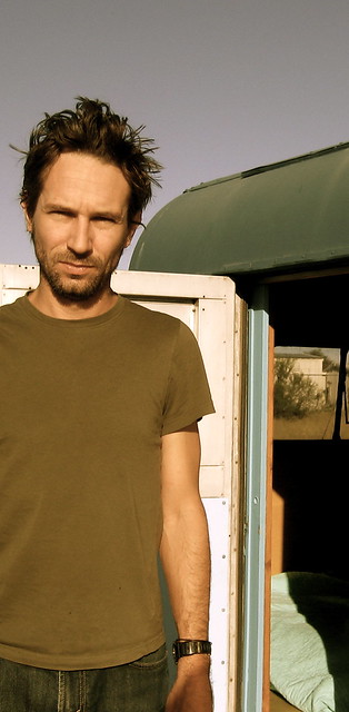
The superb Texas band Centro-matic will be playing this Thursday at the Mercury Lounge in Manhattan. I’ll be there, because I’ve been a fan of the band for about a decade now. But what I didn’t know until very recently — when reader Brad Tucker pointed it out to me — is that Centro-Matic frontman Will Johnson has been producing a series of sensational baseball paintings over the past few years.
I’ve always loved Johnson’s music, and his baseball artwork gave me an excuse to interview him, so I sent him a note. He wrote back right away and, in a nice coincidence, said he was a longtime Uni Watch fan. After we got the mutual-admiration thing out of the way, we settled in for a good discussion. Here’s how it went:
Uni Watch: How old are you, and where do you live?
Will Johnson: I recently turned 40, and I live in Austin, Texas.
UW: Have you always been a baseball fan?
WJ: As far back as I can remember, yes.
UW: Who do you root for?
WJ: The Cardinals. I’m a native Missourian and I’ve maintained my allegiance, even thought I moved to Texas around ’83 or so. Jack Buck was the voice I grew up listening to.
UW: What about other sports?
WJ: I own one share of the Green Bay Packers, so I’m a part owner, technically, and I follow them very closely. And I’m pretty obsessive about soccer. Our band plays in Europe a lot, and it was impossible not to take a curiosity in that sport once we started playing over there. And for hockey, I follow the Red Wings.
UW: Why would a Missouri kid follow the Packers and the Red Wings?
WJ: I know, it doesn’t make any sense. There are stories behind them, but it’s probably too boring to get into here.
UW: When did you get the one Packers share?
WJ: That was a Christmas present from my Mom in 1997.
UW: Did you play sports when you were growing up?
WJ: Yeah, definitely. There wasn’t much else to do in the little farming town I came from.
UW: And were you already becoming to attentive to uniform and logo details in those days?
WJ: Yes. And remember, this was the 1970s, so there were so many crazy, classic uniform designs out there — the Taco Bell Padres, the Fruit Stripe Gum Astros [never heard them described that way! ”” PL]. There was so much eye candy. It was a great time to be paying attention to those details. It was impossible for me not to be drawn to them.
UW: And did you pay close attention to your own uniforms, like in Little League and so on?
WJ: Sure did. My wife and I were talking about this just the other night. We were watching the UT/A&M baseball game, and A&M was going with high cuffs and stirrups, which is not something you see too often anymore. And I leaned over and told her that’s how I liked to wear my socks back from about ’78 to ’82. I had to show some white under those stirrups.
UW: Any other formative uniform-related moments you can recall?
WJ: For basketball, I was just issued, y’know, some shorts and a tank top, so there wasn’t much to worry about there. But I would always go socks-high, sort of the Michael Cooper look. I probably should’ve paid more attention to my game instead of my look.
UW: Nah, I think you had your priorities straight. Now let’s talk about your baseball paintings. When did you start doing them?
WJ: About three years ago. I was living as a bachelor at the time and lacking for stuff to put on the walls, so I thought I’d make some paintings for myself. I also thought it would be a good way to pay respect to certain players, and to learn a little more about their history — not only baseball history but also American history. I try to learn something with each piece.
UW: Were you already an active painter at that time, and did you study art in school and all that?
WJ: No. I wish there was some exotic story, but I actually studied English and played music. Maybe five or six years ago I tried a few small paintings just to take on the road and sell at the merch booth, but I didn’t really dig ’em enough to take ’em out of the house, so I just kinda left them in the closet. Later on, I went to a larger scale, which gave me a little more space for detail, and that’s when they started looking a bit better.
UW: About half of your subjects seem to be baseball characters from the ’70s and ’80s, who I guess were the players you grew up watching, and then the rest are a mix of much older players and Negro League players. How do you decide who to paint?
WJ: A lot of the paintings of ’70s players, those coincided with an art show I had a few months ago up in Denton, Texas, which is where I went to school. For that show, I decided to have a focus on the strangeness and the wonder of ’70s baseball. So that’s where a bunch of those came from. With all the bright uniforms and the questionable facial hair, it gave me a lot to work with.
Soon I’d like to focus on lesser-known, sort of under-the-radar Texas baseball players. But really, there’s no rhyme or reason to it. It’s just a matter of when a certain player will inspire me.
UW: Once you decide to paint a particular player, what’s your working process? Like, do you find a good photo to use as reference, or what?
WJ: I’ll usually look through a bunch of photos to start. If a photo inspires me, I’ll let it guide me — sketch it out on a one-inch-thick board, which takes the paint really well. I may change the uniform scheme a bit as I sketch it, kind of morph it a bit, to make it a little more unique. And then I’m also reading up on the player, learning about him, so I can zero in on what I want to include in the script, be it a story or just a simple quote that I want to include.
UW: You use mostly acrylics on wood or board, right?
WJ: Yes.
UW: How long does it usually take you to do one of these?
WJ: There’s a lot of standing back and letting things dry. I guess maybe two and a half to three days. And that’s not all nose to the grindstone. It includes a lot of taking breaks, playing a little music, and so on.
UW: You tend to include a lot of text, which seems like it would be really painstaking. Do you write it out first on paper and sort of block out how it will fit, or do you just wing it, or what?
WJ: Man, I totally wing it. It is a roll of the dice as to whether it fits or not. And sometimes it doesn’t, and I have to figure out how to round the space out when that happens. Maybe I’ll kinda eyeball it, but really, I’ll just start painting and commit to it. Sometimes I get lucky, and sometimes I don’t, and that can be a really frustrating moment.
That’s the part that takes the most time, getting all the script in there on the painting. That’s a carpal tunnel special — sometimes I have to put the brush down for a bit and then pick it up again later.
UW: Yeah, I was struck by the amount of text in some of your pieces, and it’s all rendered so nicely. Do you have really good handwriting in normal life?
WJ: I have okay handwriting, but painting the letters instead of writing them tends to make me slow down, which makes them look better. Each letter gets a new dip of paint, so it goes on thick, and that helps the letters really pop.
UW: Most of your subjects are players who were really great, or really important, or both. But I was surprised that you included Dave Kingman. He didn’t quite fit the pattern. Why did you choose to include him?
WJ: The story of the rat really piqued my interest. I just couldn’t stay away from it. I slept on it for a few nights and I thought, “Yeah, I’m gonna do a Kingman.” And I hadn’t painted any Mets at that point.
UW [sarcastically]: As a Mets fan, I really appreciate that you chose Dave Kingman to represent us.
WJ: No problem. I’ve got other Mets who I plan to work on, but he was the first. The rat story was just too good.
UW: But the rat incident came later, after he’d left the Mets! But whatever, let’s focus on the positive. You’ve included a few details that we’ve actually discussed at some length at Uni Watch, such as Bill Buckner’s Cubs batting glove, and Hank Aaron’s Adidas-striped cleats. How do you decide which details to include and which ones to take liberties with?
WJ: If it’s a signature-type detail, I include it. Like Buckner’s Cubs glove, I had to include that.
UW: Had you been aware of the column I wrote about that back in 2006?
WJ: No, I’m embarrassed to say I totally missed that.
UW: No no no, it’s so much better that you picked up on that detail without having read about it. When that column ran, so many people were saying, “I’ve watched that play a million times, seen tons of photos of it, but I never noticed the Cubs logo on his glove.” But you noticed it on your own. That’s awesome! [After our interview, I sent Will the link to that 2006 piece, which he said he enjoyed. ”” PL]
WJ: Thanks. That Buckner painting will actually be appearing in that “30 for 30” episode about Buckner [Catching Hell], which should come out this fall. I do try to pay attention to the details, like the 1976 patch on Kingman’s sleeve. That was really important.
UW: Did you have fun getting all the shades of orange just right for J.R. Richard’s Astros uniform?
WJ: Good grief, it took a lot of time to get all of those right. That was a fun one to do.
UW: Do you paint other stuff besides baseball?
WJ: I’m sticking to baseball right now. I’ve had a few requests for basketball players, soccer players, but I’m pretty backed up on baseball commissions right now, so that’s keeping me busy.
UW: I’ve been a Centro-matic fan for years, but I never got any baseball vibe from your music. Have you written some baseball songs and I just haven’t noticed?
WJ: There are probably some metaphors floating around in there. But a straight-up, overt baseball song..? I don’t think I’ve written one of them.
UW: That’s good. I was afraid maybe I just missed the boat on that.
WJ: Four or five years ago I kinda had to put the nix on the sports metaphors. I was abusing them, they were showing up a little too much, so I kinda had to shut that down for a while.
UW: What about the other guys in the band — do they care about this stuff?
WJ: They do, they do. I don’t think any of them is quite at the level I’m at, but they all have their interests. Mark, our guitar player and bass player, is the most knowledgeable Dallas Mavericks and NBA fan I’ve ever met. He keeps me up to date on that, because I don’t really follow the NBA too much. And we all follow college football, but I’m kinda the baseball guy.
UW: Is it hard to keep up with your team when you’re touring?
WJ: Sometimes, yes. But oftentimes I’ll get back to the hotel, or wherever we’re staying, and I’ll find myself checking out MLB.TV and settling in to watch the ballgame, whether it’s on a delay or whatever.
UW: Do you collect anything sports-related?
WJ: I have a small jersey collection — maybe 20 or 25. Mostly baseball and hockey.
UW: Are they things you bought new, or vintage?
WJ: A little bit of both. eBay’s always a fun source.
UW: Do you ever wear them onstage? I think I’ve only ever seen you in a T-shirt.
WJ: I did wear an FC Barcelona shirt onstage one time, around 2006, back when they won the Champions League final. But that might be the only time.
———
Big thanks to Will for sharing his time and insights. Some quick follow-ups:
• If you’re interested in commissioning Will to make a baseball painting for you, you can contact him here.
• If you’re not familiar with Centro-matic, there’s tons of info about them on their web site. If want to check out one of their albums, I strongly recommend Love You Just the Same as an ideal starting point.
• I encourage all New York-area readers to come down to the Merc on Thursday to see Will and the band. Wear a jersey, so we can all find each other. (If you don’t live in New York, other dates on Centro-matic’s current tour are shown here.)
• Finally, you can see Will’s painting technique (although the image he’s working on isn’t baseball-related) showcased in the band’s latest video. Dig:

Collector’s Corner
By Brinke Guthrie
Remember Paul’s ESPN column about the White Sox’s 1981 uni-design contest? Here’s a photo we haven’t seen before, showing all the prototypes!
That’s our major eBay find of this week. Here’s a bunch more:
• I love this totally rad 1960s NFL poster.
• The St. Louis Browns don’t exist anymore, but you can still show your support for them with this great little sticker.
• Can’t say I’ve seen a KC Athletics bobble before. And this 1970s Texas Rangers dude is terrific!
• I absolutely owned this 1970-71 Kentucky Colonels press guide back in the day.
• Here’s a very nice player-worn KC Chiefs sideline jacket.
• Hmmm, what’s with the blank helmet?
• And just for PL: a Mets garden gnome! [No thanks. ”” PL]
Seen something on eBay that you think would make good Collector’s Corner fodder? Send your submissions here.
Uni Watch News Ticker: Big congrats to Kirsten, whose Project Neon venture is featured in this week’s New Yorker. ”¦ Here’s an interesting piece about gloves on the PGA tour. ”¦ Jeff Barak attended the NHL draft and took lots of photos of fans wearing various jerseys. ”¦ Turns out Phil already covered this over the weekend, but in case you missed it there: In yesterday’s Ticker I mentioned Chase d’Arnaud’s unusual NOB, but Larry Miller noticed something I didn’t, namely that the lowercase d looks like it’s probably an upside-down P. Good catch! ”¦ “Interesting situation came up in Saturday’s LA Galaxy/San Jose Earthquakes game,” writes Ethan Allen. “Starting goalkeeper Donovan Ricketts was injured in the first half. His backup, Josh Saunders promptly got red-carded, forcing the Galaxy to use diminutive forward Mike Magee in goal for the last 60 minutes of the game. Magee used Saunders’s goalkeeper jersey and military-themed gloves in the first half, before switching to a pair of Donovan Ricketts’ gloves in the second. But wait, there’s more: As Saunders was getting ejected, I noticed that the Galaxy’s black goalkeeper jerseys have the two stars above the crest (to note the team’s two MLS championships), but they’re done in black, so you can only see them when the light catches them.” ”¦ Jim Walaitis attended Friday’s Cards/Jays game and had a good view of outfielder Matt Holliday. “From the beginning of the game, it was very obvious that he really, really likes his sunflower seeds,” says Jim. “I don’t ever remember seeing a player eat (and eat and eat) on the field in the middle of game action before. All those pictures were taken within a couple innings, though I could have taken many more if I’d wanted. Holliday’s habit was quite the topic of discussion among the fans in the area around me (especially as a possible explanation for his level of fielding skills).” ”¦ Neil Roesler was recently at a convention in Fargo. “One of the speakers was a gentleman who was involved in securing the TCF Bank naming rights for the University of Minnesota football stadium,” he says. “His presentation was all about the logistics of working out these deals, the branding considerations, contract details, etc. Of particular note was when he went through his ‘naming risks’ slides, and there for all to see were the No Mas shirts such as ‘I’m Calling it Shea.’ I couldn’t get my phone out in time to snap a picture, but I’m still happy to report that the revolution is at least leaving its mark.” ”¦ New soccer ball design for La liga, EPL, Serie A (with thanks to Kenny Loo). ”¦ Legendary WASP theme park Manhattan clothier Brooks Brothers is getting into the college apparel biz (with thanks to Matthew Robins). ”¦ Remember the Philadelphia stationery store with the paper sock monekeys in the window? Ben Marciniak spotted a similar display in Boston, only this time with a Bruins theme. ”¦ I’m still calling it Giants Stadium. ”¦ “I’m not sure how clear it is in this photo,” says Chad Dotson, “but Nationals prospect Derek Norris [No. 25] wore a darker uni than his Harrisburg teammates in Monday night’s AA game at Richmond.” ”¦ I just won this absolutely killer Durene jersey. Might end up being a tad small for me, but nobody else bid on it, so at that price it was worth taking a gamble on. ”¦ New away kit for Arsenal. … Condolences to the family of Norma “Duffy” Lyon, an important American artist who worked in a unique medium. R.I.P.
Halliday’s sunflower seed ingestion is matched by the Red Sox first base coach, who eats all the time he is out on the field, and is obese.
I know about his family tragedy, but that’s unrelated.
Related to absolutely nothing today… the Bills new uniforms and the, er, discussions about gray facemaks, white helmets and retro trends… caused me to make these:
link
link
…just to see if there really is a noticeable trend or if it was just in my mind.
/ooohhh colors…
Interesting! I assume the “gray” helmets are actually silver (Raiders, Pats, etc.), yes?
Yes. I didn’t quite go the extra mile on the metallic colors. I used the same shade for the Saints & Niners, the Cowboys are lumped in with the rest of the normal silver teams, etc. I thought it’d look a little too cluttered if I got that specific.
Nice jersey acquisition, Paul. Take it to a tailor and get that seam repaired before you wear it. You don’t want it to open up further on you.
The “wool” cloth looks to be in excellent shape. Virtually no “pilling.” It’s simply amazing how the crossbreeding of two different species of sheep can produce rayon or nylon/durene cotton wool. Who’da thunk it? Ah, aren’t the miracles of modern science great? What HATH God wrought!
fantastic interview & very cool video…
had remembered something about the rat story with kong, but didn’t remember it until today’s refresher course
great stuff & only in my double mind is a very cool tune
Great stuff from a real polymath. Very impressive.
I’m distraught that I won’t be in NYC for the Thursday concert. Would have been good to see you there, Paul. Damn job.
And while I’m here, a whoop for Kirsten Hively and wave goodbye to Duffy Lyon.
Dude is lucky. Musical AND artistic ability? There are some of us that would enjoy having just one of those talents.
Fun interview.
From one small town Missouri boy to another, I just gotta know, what farming town are you from, Will?
And maybe it’s just me, but does there seem to be an inordinate amount of Missourians drawn to this site?
“does there seem to be an inordinate amount of Missourians drawn to this site?”
~~~
it’s just something we have to live with
Can I be an honorary Missourian? Most of my dad’s family is from Dexter.
I. . . I just like to be included.
As long as you don’t bring Phil with you.
Yes. Yes there are (a lot of us).
Will is referring to Kennett, Mo. He is Kennett’s best kept secret.
Cardinals, Packers AND Red Wings? I’m thinking this guy just hates Chicago.
Heh. I was just going to post something along those lines as well.
Cards fan? That makes sense to me.
I guess I can buy the Pack loyalty as well.
The Wings? You lost me there, Will.
There are a number of fans with divided loyalties apart from where they spent their years growing up. That said, it has always felt strange to me when people support their hometown team in one sport, but not the other. Obviously, winning plays a big factor, in these type of decisions.
I can’t speak for anyone else, but in my case, I root for the Rams when they do well, and I still root for the Bears. I root for the Blues as well as the Blackhawks. Those are sports I enjoy watching, but don’t feel a HUGE connection towards my hometown teams (past and present). That said, I root for the Cubs in baseball. That’s it. Besides whoever is playing the Cardinals, anyway.
really bad punctuation there, but you get the idea …
Columbia’s Women’s World Cup team wearing First NOB on jerseys.
And imagine that, they lost…
Is there a link to a whitesox prototype on ebay in collector’s corner? All I get is a link to the old column about them (which I read and is very good). Searched on ebay for a whitesox prototype and came up empty as well. Big fan of collecter’s corner. Also, tough to tell, but it looks like Mike Magee who took over in goal for the Galaxy swithed from red to blue cleats at the half. Never heard of special cleats for goalies. And why is the adidas logo on the back-left leg of his shorts instead of on the front? Is that typical for soccer uniforms?
Shit — bad coding on my part. Now fixed.
Here’s the prototype photo:
link
d’Arnaud: Whether its is a “d” or a “P” it seems slightly smaller than the other letters.
New PSU uniforms, first time I’ve seen them on an actual person………..
link
Yay boring uniform!
Ok, so I get that they’re never going to add a helmet logo because they think the plain white is their thing… fine, whatever. But would it kill them to add a pant stripe to match the helmet? Or maybe even use their lion logo as a patch (think Jets or Steelers)…or even just a PENN STATE wordmark under the collar? Isn’t it bad for the only logos on your uniform to be Nike swooshes?
So, uncomplicated, non-complex design is inherently bad design, right? The fact that Penn State (like, say, Texas and Alabams) stands out in a slag heap of overthought, overwrought hodgepodges is irrelevant?
More and new are always better?
Man, you must think the H&R Block logo is lame (never mind that it’s very likely one of the most effective and memorable recent re-branding designs out there).
C’mon, THE, you know I’m gonna get in your face a little on this, like the professor who asks, “Oh, really? What about…” just to keep you on your toes.
What design? They don’t have a designed uniform, they have team colored sports equipment.
Did you even read the changes I suggested? I’d like them to make their uniform about as complex as the Raiders. Totally modern and radical, right? Seriously, a single pant stripe and a small collar wordmark. Oh, the horror.
Like I said, the only mark on their uniform is a Nike swoosh. How the heck is that a good thing?
“Yay boring uniform!”
~~~
you say that like it’s a bad thing
it’s even better now that they got rid of the stupid contrasting collar
why does everything have to please YOU? there are enough teams that have plenty of bumperstickers and superfluous piping, striping and logos…psu looks great
i will, however, raise an issue with the tv numbers on the “sleeves”…may as well move those to the top of the pads, because if the uni manufacturers are gonna make things sans sleeves, then don’t attempt to put anything there
of course, the whole issue could be solved perfectly if they’d just adopt ricko’s comp sleeve designs
Put the numbers back on the helmets.
I do see a glimmer of a point in The’s thinking, though – that swoosh really stands out without any competing features. *Almost* makes one want to slap a logo on there somewhere.
Almost.
Again, you’ll never get all the players to wear the compression sleeves, and we’d be left with the football equivalent of stirrups v. pajama pants. Half the team has long compression sleeves with stripes and/or numbers on them, and the other half of the team has bare arms.
I kinda have to agree with The Jeff for the pants stripe idea. I know the plain uniform is PSU’s thing, but if you’re going to have a swoosh infection, counteract it with some uni design of your own.
A solid blue pants stripe and numbered helmets would make it look really nice.
That’s what they wore in the late ’60s, whent they wore royal instead of navy.
Not saying that
s a reason not to do it, saying there are images out there to see what it would look like.
Here you go…
link
And the road…
link
That would be essentially what Stanford did for years, but nobody gets in their face…
link
Is that because they have a helmet logo (and before that helmet numbers)? Or because they played on the west coast, which is (although no onees seems to be noticing it quite yet) largely becoming almost as second tier as it was before MLB headed west in ’58.
When networks were cherry picking games to televise, West Coast teams got more attention, it seems. Thesedays, fans watch their favorite team on cable, and they head out to do do something with the rest of the day when the West Coast games begin.
In the 50s and 60s, sometimes the only way to follow the eastern was on the radio…while you did something else out and about. Then, by West Coast start times, you’d settle in to check out UCLA or USC play…and get your shot of football on the “tee-vee”.
So why can’t they do it now?
Overall thumbs-up on Penn State – it’s bold and clean. I like that they avoid (I think) putting an ugly shiny sheen on the uniform – something that hurts the Bills new uniform.
While I wouldn’t want all teams to look as simple as Penn State, I would be OK if the balance would tilt more that way.
Hunh?
I would way see PSU drop the helmet stripe to match the pants as opposed to the other way around.
While you’re at it, drop the sleeve numbers.
Still WAY too much clutter, but heading in the right direction.
As for the Nike logos. Well, you DO have to give the nod that it’s 2011 somewhere along the way!
FIVE, count ’em, five swooshes on that kid. You can’t see the socks (two more?) or shoes (4 more?). There could be up to ten swooshes, with the football making eleven, per player. I like the idea of the generic uniform for Penn St since that is their thing and they rock it quite well, but that uniform is for the University of Nike Swooshes. Nothing on the uniform says otherwise. No PSU, no lion, no nothing. Adidas would have done the same thing. Penn St has to sell out to keep up with the Joneses. This is just a bad system. The NCAA might wanna climb down from it’s perch and maybe take a look at it.
Thanks for having Will… and again for coming on my show. I’ve had both of you as guests, so this was a real treat. Centro is playing Buffalo on July 1. They are my favorite active non-E-Street band. So brilliant, and great guys.
Arsenals new away shirts are blue it seems… nice to seem them paying homage to both Spurs and Chelsea with these, same as what happened with the Liverpool away shirts
They’re pretty specific about the design elements on the new away kit, including the blue(s) usage.
From the Arsenal site:
link
Didn’t the ’03-’04 Invincibles wear a blue away kit?
I’d rather their away kits be blue instead of yellow. I really liked the pinstripes from two years ago…not a fan of the diagonal split.
Why is durene not used for jerseys unless its retro? The material just has an awesome feel and texture. Nice ebay pick up Paul..and the price is right!
Really great interview. Went to their site a few weeks ago and they were offering a free download of 21 songs! So I was able to get a nice primer on Centro-Matic.
A note on the Galaxy/Earthquakes game: I happened to turn it in just before Saunders’s ejection (Lenhart should have been ejected). After subbing in as keeper, Magee spent the rest of the game wearing 12 (jersey)and 18 (shorts) simultaneously.
The “I’m Calling it Shea” shirts also got a mention on Toronto radio last week, during a discussion of the Wilbon/Madoff story.
That Centro-matic video has a real Robert Marshall-esque vibe to it. Can you sing, Robert? If so, you could do a duet.
Anyway, good stuff, Will Johnson. I think the Bake McBride poster is my favorite.
Ugh, whatever happened to soccer balls looking like soccer balls?
link
I play with one of the Adidas “Finale” Champions League balls..probably the closest to the classic design as you can get these days.
link
I like that one…almost as much as the MISL one.
Actually, in the grand scheme of things, the “classic” design we all think of wasn’t used for long. It was only featured in two World Cups.
link
Never knew it was called a Buckminster ball until now.
I really liked the Tango design, too.
link
Oh wow, the old Tangos. I have a beat up Tango Barcelona that I found in the woods when I was like…6. It still holds air fine, but my friends complain about it being too hard (the Finale’s got foam lining or something).
Dunno how old it is, I’d guess it’s a budget version of the Espana in that link you put up. 1982? Older than I am!
Speaking of soccer, looks like Brazil might have a new BFBS shirt for the upcoming Copa America tournement:
link
Not really new and definitely NOT BFBS.
Brasil traditionally wears a blue change strip; I’m pretty certain they debuted a black one within the last year or so. Purists like me went bananas because it just didn’t LOOK like Brasil.
Brazil wears blue and yellow. It’s BFBS. And it’s also a enw shirt – even if only minor changes – so you’re wrong on both accounts.
Thanks for playing, better luck next time.
Tim, change strips are traditionally very different colors than the “normal” colors. Look at the Arsenal change strip in today’s ticker. It’s blue, whereas Arsenal’s normal colors are red and white. According to you then, Arsenal’s change strip is Blue for Blue’s sake.
If Brasil decided to go to a red change strip, would it be Red for Red’s sake? I say no; it’s a CHANGE strip. It’s SUPPOSED to be very different.
I stand by my statement that there is no BFBS when it comes to change strips in futbol.
They’ve unveiled black tops like 3 years in a row now but they’ve never actually worn them for matches
In response to the death of former basketball star Lorenzo Charles, the N.C. State athletic department plans to honor him in a number of ways:
— A commemorative patch for use on the men’s basketball uniforms for the 2011-12 season.
Read more: link
Kentucky to unveil new football unis Thursday. Hadn’t seen it posted.
kentucky has a football program?
I think it moved there from Long Island.
A change strip is often different (think the Portland Timbers red and white strip, symbolizing the City of Roses), but sometimes it maintains some link with the primary kit. Brazil’s traditional change kit is blue and white (with green and yellow, the national colors). They’ve worn it since the 1958 World Cup Final, when host Sweden chose to play in their traditional yellow, forcing Brazil to change. As two-time World Cup-winning manager Mario Zagallo (who played on the 58 team) recalled, the team was upset about not wearing yellow, but took inspiration from their coach telling them they would wear blue, the color of the Virgin Mary.
Brazil has never worn black in soccer competition. Were they to do so, it would be BFBS, as defined by the board. Doug’s statement is simply wrong.
Kentucky has announced they will unveil new football uniforms Thursday.
link
This photo link has been circulating but I’m not completely buying it. For one, every photoshopper on earth uses that template now for Nike uniforms. For another, the alleged mockup looks a whole lot like TCU’s unis from a year or two ago.
Centro-Matic’s song “Only in My Double Mind” is available on the Current Song of the Day podcast today.
2 of my favorite things:
Centro-matic and UniWatch come together.
I have seen Will J. wear a Cardinals cap onstage before.
Worlds collide… my favorite musician being interviewed on one of my favorite blogs. Beautiful. Paul, I agree that Love You Just the Same is a good starting off point for Centro-matic but I think the new album Candidate Waltz is even better place to start. Totally immediately satisfying… even the wife likes it. It’s stellar. I hope they finally get the love they deserve. By the way, I believe the song “monument sails” is about a 2005 or so Packer/Viking game.
For those going to the show in New York (or any other currently listed tour dates), don’t be late. Opening act Sarah Jaffe is not to be missed. Wish I could be there.
Monument Sails- lyrics by Will Johnson. Subject- Packers v. Vikings game in mid- 00’s
it’s a number four gain
on this viking terrain
surprise, a needed relief
for a thirty-year pain
came with all allegiance high
to the monument sails of the southern skies
never to deny the magnitude gained
on the final drive
and if there’s time,
just rearrange everyone for a
change of scenery
add to that moment an electric victory
that you will surely see
this airborne attack on a suspect
DB was planned
a false sense of safety on enemy ground,
a band stand but they have been missing