Several years ago — I’m not sure exactly when, but I think 2003-ish — I had the window seat on an airplane. We were flying over a part of the Midwest that had lots of small towns packed fairly close together, like Ohio or Indiana, and we were at that altitude where you can make out certain landscape details, like farm plots or lakes or big freeway interchanges. I was sort of taking it all in without actually noticing or thinking about any of it, in that daydreamy, free-associative way that people tend to have when looking out an airplane window.
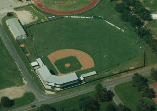
At some point I made out a baseball diamond on the ground below. And then another. And another. It suddenly struck me that there were lots of baseball diamonds down there. Their elemental simplicity and geometric perfection seemed somehow magnified by my high-altitude vantage point. Some of them had the full grass-and-dirt infield:
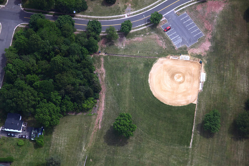
Others had all-dirt infields, with no grass:
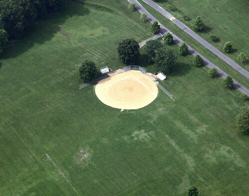
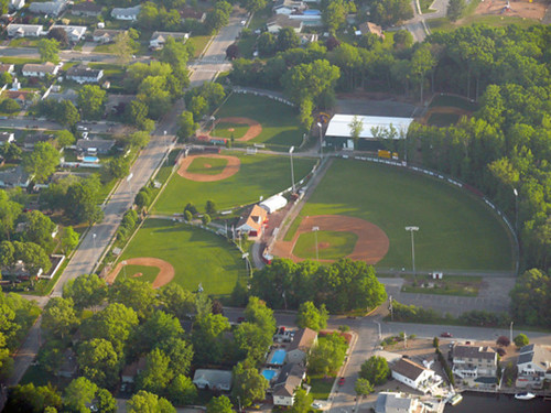
Some, like the two shown above, were single fields, but there were also lots of fields that were grouped together:

Sometimes four or five fields were oriented so that they could also share a common outfield:
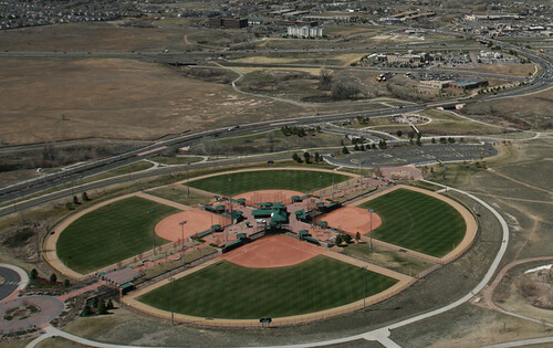
More often, though, the groupings were oriented with the home plates at the center, so that the outfields created a sort of four-leaf clover effect:
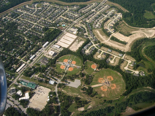
Sometimes there were several cloverleafs clustered together — groupings of groupings:
I decided to play a little game to see if we could go five seconds without my spotting a new ballfield. I looked out the window and silently counted: “One, two, three”¦” There was a new diamond. “One, two”¦” Another one. “One, two”¦” Another. “One”¦” Another.
Over the course of ten minutes or so, I never got to five. It struck me that this endless series of baseball diamonds formed a sort of tattoo on the landscape. And a uniquely American tattoo, at that — what would an Englishman or an Ethiopian, for example, make of this:
To many foreigners, that’s just a bare patch of land. But to an American, its true identity as a baseball diamond is unmistakable.
I remember thinking at the time, “There has to be something I can do with this” — some sort of article or art project — but I never got around to it and then I forgot all about it. I was reminded of it during that Pop-Up Magazine thing I took part in last month, because one of the other participants was an artist named Jenny Odell, who specializes in making collages from Google Earth satellite imagery. Here’s one she displayed at Pop-Up — it supposedly shows every basketball court in Manhattan. Not bad, but I think basketball courts aren’t quite as distinctive-looking as baseball diamonds.
Incidentally, I found many of the photos featured in this entry simply by searching for “baseball aerial” on Flickr — a search that yields nearly 700 results. Some of them are really interesting. One grouping of fields, for example, looks like a star, or maybe a sand dollar (that’s a tough effect to achieve, because you need to have dirt foul lines all the way through the outfields, which is a high-maintenance format); another grouping looks like a dollar sign. Ultimately, though, it’s the simpler sandlot diamonds, with their endearing no-frills-ness, that I find the most appealing.

Collector’s Corner
By Brinke Guthrie
Want to own a patch just like the one the Royals and Cards were wearing last weekend? Here you go. And that’s just the start of a great Collector’s Corner haul this week:
• Here’s a patch celebrating the 1969 Mets, just for Paulie. [As any Mets fan could tell you, they misspelled Tommie Agee’s first name. Common error. ”” PL]
• I like how this 1960 Patriots program refers to the game as a “Professional Football Exhibition.”
• I would almost commit a felony to have this “Kruk & Kuip” Giants bobblehead from 2003 or so. They were sold in a limited quantity, and they go for a ton every time. If you have one and want to give it to me, I’ll take it.
• Staying with bobbles, check this out: a three-foot-tall Cal Ripken Jr. bobble, complete with a maniacal look on his face.
*More O’s: This way for parking at Memorial Stadium.
• Remember the 1960s NFL Punt Pass Kick Library series? Man, I bet I had every title.
• Your 1977 Eagles Action Mate can “Do It Like The Pros,” according to the box.
• Here’s one from Mike Hersh: an early Expos fan’s scrapbook.
Seen something on eBay that you think would make good Collector’s Corner fodder? Send your submissions here.
Cap-ital idea: Someone over on the Chris Creamer board has been working on a graphic showing every MLB cap logo since 1950. It includes alts and BP caps but does not include one-time promotions like throwbacks, TATCs, flag-desecration, etc. He’s been revising it as other Creamer-ites have pointed out errors and omissions, and I imagine there are still a few tweaks that need to be made, but it’s a fun project. For one thing, I never would have guessed that the A’s and Orioles had the most cap styles over the years. Good stuff.
Oh, and in case you’re wondering: When referring to stuff that happens on the Creamer discussion board, the reason I never link directly to the thread is that it’s a registration-required board, so I don’t want to provide a link that, for most of you, won’t be functional. And I always refer to “someone on the Creamer board” because all the participants on that site use pseudonyms. OK? OK.
Membership update: A new batch of cards has been added to the membership design gallery (including Stephen C. Boyd’s very nice Arsenal treatment, shown at right, and several more sign-ups from Purple Amnesty Day). The printed versions of these cards should mail out later this week. I believe we’re now caught up on everyone except for Dan Patterson (just need to fix a glitch in the design — should be done later today or tomorrow) and Nick Werner (your design request is proving to be challenging, but we’ll get to it soon, promise).
As always, you can join in the festivities by signing up here.
Uni Watch News Ticker: Are you ready for URL suffixes like .coke and .nike? They could be coming. Maybe I should set up .uni. ”¦ With the Bills set to unveil their new uniform set this Friday, the team’s web site is running a series of excellent uni-related articles. Here’s one on Bills uni numbers, and this one is about the team’s biggest, smallest, dirtiest, etc. uniforms (big thanks to Tim Tryjankowski and Nick Schiavo, respectively). ”¦ Encouraging news from Joe Kuras, who writes: “Last year the Grafton Lake Sox, a summer league baseball team for 16- to 19-year-olds, experimented with two-in-one faux stirrups. The concept of wearing the pants high to show the socks was a hit with the team, and the majority of players asked to go with real stirrups this year.” Excellent to hear that the youngs are opting for proper hosiery, but they need to learn that stirrups and high-top shoes don’t mix. ”¦ With 80-year-old Jack McKeon taking over as the Marlins’ skipper, many people are pointing out that McKeon is now the second-oldest MLB manager ever, trailing only Connie Mack. But Mack, of course, wore civvies, so McKeon has now set the mark as the game’s oldest uniformed manager. When asked how the game had changed since his previous managerial stint, McKeon said, “Now they make us wear this stupid swoosh-collared undershirts. When did that shit start?” You can make all the jokes you want about the Marlins leading the league in liver spots or whatever, but I think it’s all pretty great. Can’t wait to see if McKeon can actually scamper out and get in an ump’s face after a bad call, but the bigger question now is whether Loria will hire JoePa as the next skipper after McKeon. ”¦ Speaking of baseball lifers, Matt Holliday plans to keep wearing Red Schoendienst’s pants. ”¦ And speaking of Connie Mack, here’s something you might not know (and that I had forgotten about): The 1950 Philly A’s marked Mack’s 50th anniversary as skipper by wearing gold-trimmed uniforms, along with this sleeve patch. ”¦ A very cranky Rob Ullman reports that the Richmond Flying Squirrels “undid a season and a half’s worth of good uni karma — gained from wearing striped stirrups — by sporting these monstrosities for Jimmy Buffett Night on Saturday.” ”¦ Here’s a weird one: What’s up with this white-vs.-white NBA game? Anyone know more? (Good find by Matt Beahan.) ”¦ Doug Smith notes that there was some patch trouble during the USA/Jamaica Gold Cup match. ”¦ New kit for Tottenham (with thanks to Kenny Loo). ”¦ I really like this old AFL-CIO baseball jersey, but unfortunately it’s too small for me. ”¦ And this nice Durene jersey is too big. Grrrrrr. … Tom Adjemian reports that a stationery store in Philly has a window display featuring what appears to be a paper representation of a sock monkey wearing a Phillies uni. ”¦ EyeBlack.com has inked a deal with MLB (with thanks to Matthew Robins). ”¦ Ethan Allen checked in to inform me that the Everett Aqua Sox will be wearing really cool Mariners-inspired throwbacks this Sunday. I like, I like. ”¦ Yeah, whatever. ”¦ Outmania hits New York tonight, as Josh Outman starts against the Mets. Unfortunately, I already have plans for the evening, which may be just as well, since I might end up with a serious case of divided loyalties. ”¦ Kyle Ostendorf sent along a close-up view of that Notre Dame throwback. Man today’s football jerseys just look ridiculous when they’re not stretched around shoulder pads and a torso, no?
Patience, my son: I know I promised that there would be U.S. Open coverage today, but there’s been a slight delay. Tomorrow, I promise.
I’ve played that exact game in the window seat of many a plane. Flying back from overseas, the first sighting of a ball diamond from the air is kind of a big deal for me. Though if you’re flying into Amsterdam Schiphol, you can also usually see a number of Dutch diamonds as you approach.
That MLB cap chart is slightly incomplete: The Nats one should have a second set of curly Ws for their new cap logo, which is subtly but significantly different from the 2005-2010 cap logo. But as uni-infographics go, I love it.
I like that cap chart myself, but the real leader in changes among current teams are the Baltimore Orioles. I’d like to see a separate chart of teams from old cities, such as the Kansas City A’s.
Love the cap chart, but it would be better if it did not have BP cap logos in it.
Exactly, the BP/ spring training cap logos shouldn’t be there. Only stuff that’s worn in real games…
Lovin’ that caps chart
-Jet
Love the window seat story. Love the cap logo poster. Love the old man:
“.. When asked how the game had changed since his previous managerial stint, McKeon said, ‘Now they make us wear this stupid swoosh-collared undershirts. When did that shit start?’…”
Now they make us wear this stupid swoosh-collared undershirts. When did that shit start?
Should be the official motto on the Uni-Watch coat of arms. Or maybe just the short version, “When did that shit start?” I’m terrible at Latin conjugation, but something like, “Merdas Primoris Res Ut?”
Classic! or “WDTST!?” for those times when discretion is necessary
-Jet
*Ahem* It would be , uh, WDTS*S*.
The cap chart is awesome, but of course I got stuck on at least two omissions from the A’s, that I learned about here. There is a grey KC variation missing, and of course the white cap/green logo A’s version worn on the field (not just by coaches) a few times in the late 1960s. On the other hand, they omitted a few phantom logos that pop up on throwback caps but were never worn on the field as far as I know.
I imagine flying over other parts of the world, travelers can play the “football pitch” game. Nice work.
I play that game Matt, not as frequently found on US flights though I must say with sadness. Maybe one day, maybe.
When I was studying abroad, the sight of baseball diamonds in the Netherlands always brought a big smile to my face.
The Cardinals are missing a red hat with a navy STL
The star/sand dollar effect is actually formed from the dirt warning tracks of all the fields, not dirt foul lines. Any how, it is a truly awesome effect!
The local auto glass company must love that parking lot.
Today’s lead entry is a beauty. Kudos, Paul!
Yes, absolutely. Good Lord, baseball diamonds are beautiful.
I concur. The intersection of math and imagination. Dreamy.
totally agree!!!
here is the field i grew up on:
link
Nice! What town/state?
-Jet
thanks. Pennsylvania. It’s in the borough of Swissvale about 2-3 blocks from Pittsburgh city limits (east side).
Now that would be a fun game on the board….post the photo of the diamond you played your little league games on…
Mine would be: link
in Whiteland, Indiana
Mine is here: link
(I tried the HTML code – twice – and it dodn’t work)
I spent many summers in Padres brown shirts and Astros rainbow guts at link in Eden Prairie, Minnesota.
But before that, first of all I was a Met for two summers at link in Wayne, Pennsylvania.
Here’s mine:
(link)
Most of our high school games were, and still are (since 2007) played at Alexander Field (that’s the big park in the link). Good memories…
Of course, you’ll have to zoom in…
I’ve always loved the distinctiveness that ballfields have on the landscape when I’ve flown. Love your presentation of the many configurations–constellations, if you will–of ballparks.
Nice lead entry, but one nit to pick – out here in “fly-over country” an all-dirt infield is the provence of a softball (typically fastpitch) diamond, whereas ther dirt-and-grass combo is a baseball diamond.
Just sayin’
Growing up in Iowa, Pennsylvania, and Minnesota in the 1970s and 1980s, and coaching youth ball in Chicago in the 1990s, that was very much not the case. I don’t think I played on a grass infield until either Babe Ruth league or JV ball in high school. Dirt infields were the norm for civic youth fields, shared by baseball and softball. High schools maintained grass infields, and towns would have maybe one such field for older youth ball or tournament play, but beyond that, everywhere I lived, if you were under 13 years old, you played on dirt.
But in the Northern Virginia suburbs, I do see proportionally more well-maintained grass-infield diamonds now, so perhaps the ubiquity of dirt infields for youth baseball is receding.
Indeed, many of the dirt infield fields that you posted are softball fields. However, I do know that a lot of baseball diamonds I played/umped on were completely skinned as well. Having a grass infield is a high-maintenance endeavor, one which most municipalities and schools in my area do not care to spend the money on. Although the grass infield looks much better, it’s a lot cheaper and easier to have an all dirt infield.
Baseball, softball, whatever. Little Leaguers play baseball on softball fields. Grown-ups play softball on Little League fields. When you’re looking down at it from an airplane, it’s all the same thing.
I’ve always wondered why softball fields don’t have grass infields. Anyone know?
I’ve played softball on both types of fields and prefer the grass infield kind.
However the majority of those pics you have there are of softball fields – you can see the faint pitchers circle in a lot of them. The pics of the complexes with the central nexus building are softball complexes built to house tournaments and multiple leagues – with a central building for concessions, batting cages, rest rooms, etc….
Compare the pics where there are softball and baseball complexes together…
YEP! I live in Denver, and both of my boys play (have played) little league ball. To my knowledge (memory) they have never played on a diamond with a grass infield.
Most municipalities use an all dirt infield (aka “multi use”) fields so that they can “sell” time for baseball, softball, kickball, etc.
Our local fields charge $75 for two hours, or $225 for a day. That’s just for our youth baseball/softball programs. Adult league softball/kickball gets charged $200 a game, or a daily rate of $750.
Sadly, our parks & rec department (much like many in the country) is operating in the red, so the upkeep on the fields has really dropped off.
If I ever win the lottery, I’m planning to build a 4 field park, with each of the fields modeled after big league parks…and only for youth baseball. In the meantime, I will continue to daydream about it.
Keith, Cal Ripken had the same idea. His facility in Aberdeen, MD has a mini Camden Yards, plus fields in the shape of Fenway (with monster), Memorial, and Wrigley. He also has four fields with dirt infields.
In response to Geeman:
Having a daughter who plays fastpitch, I can say with a great degree of certainty that playing on a grass infield radically changes the game. It all but eliminates bunting and/or slap-hitting strategy, which is huge in the younger age brackets. A grass-and-dirt infield would take away some of the “speed” of the game, which truly differntiates it from your average “beer-league” softball. Also, most fastpitch governing bodies require an all-dirt (or “skinned”) infield.
In a slowpitch context, and going back to the beginnings when bats and balls weren’t so lively, grass slowed that game down terribly, too.
Also, quite honestly, there was (and still would be if gras were used) an expense and maintenance factor, too.
We played mostly dirt infields through high school (I’m an ’88 grad). It was an oddity, and quite a treat, to have grass. There are more grass infield in this area of Missouri today but it is still quite common to have dirt.
Yeah, I’d also say my town (in Indiana) was the only little league field with a grass infield in at least the tri-county area. Which, of course, they took out the grass a few years ago. It was a very sad day. It still has grass on Google Earth, though.
My “home field” for a good portion of my mis-spent youth (as well as our Little League “home field”)
Forgot the <a href="link
wonderful lede today
Fun at night, too, when you fly over all the lighted diamonds.
Ditto on a fall Friday, spotting all the high school games.
And, Ricko, don’t forget those wintertime night approaches over Minneapolis that reveal all the baseball diamonds that have been transformed into brightly lit hockey rinks.
Absolutely. Them, too.
Loved the lede today.
Speaking of baseball, North Carolina wore navy blue yesterday, looked good, and won.
link
You’re right, Geeman, that’s a good look.
When I saw your note, I muttered something impolite about UNC — just one of those schools that, for reason or another, I root against — before I went to your link. And then I realized that many, maybe most, of the teams I love to hate have worn and wear some tasty unis in their day. UNC; Princeton; Duke; Ohio State; USC; Virginia; Brigham Young. Hard to find the connective tissue. Maybe pretension? I really hate Princeton.
You are on to something, Connie. I’m a Red Sox fan and have always rooted against the Yankees, but they sure look good. Same goes with Carolina. I’m a Wake Forest guy, but Carolina sure looks good.
Connie, obnoxiousness has got to be the link. Some of your list is self-evidently obnoxious: Duke, USC, Virginia. Ohio State calls itself “The University”, which is a little like Albania calling itself “The Nation” or the Rochester Rhinos insisting on being known as “The Soccer Club”. It’s a little much.
Then there’s BYU. I attended BYU. I met my wife at BYU. My charitable contributions support the university. But, boy, that school is hard to take. Spend a weekend in Provo, you’ll see what I mean. Take a sense of Divine Mission that makes Joan of Arc look like Christopher Hitchens, perkiness that borders on madness, and a strange combination of Canadian-style inferiority complex and Margaret Mead, “Hello, Pygmies!” anthropological fascination with The “Gentile” World, and you’ve got yourself a potent stew. Sweet football uniforms, though.
Completely unrelated to anything posted today, but I thought it was interesting:
In researching pictures from early in D-Wade’s career, I found a few odd pictures.
1: Check the alignment of the 3… link
Looks like they couldn’t decide if they wanted the center or right align it. Compare it to a picture of his gameday jersey: link
Looks to me like they threw something together for one of their rookie photo shoots.
2: During an apparent summer league game, Wade wore #5 link
Interesting because the card that picture is on clearly lists him as #3 in the upper left hand corner
Paul, I do the same thing on flights, but I also look for football fields–specifically practace fields–and when flying west, the circular patches of green in the brown desert of irrigation farms.
Also, here in StL County, there is a baseball field set up for disabled kids to play on. No grass or diry, just thick rubber/foam matting that is a sea-foam green. Seeing from the air really showed the oddness of the color, but you could still tell it was where kids played baseball!
North, South, or West?
West StL County: Chesterfield Valley specifically. I believe Mike Matheny was the one who had the special needs field built.
Ah… the Valley.
The home to every chain store and restaurant in the book.
Well, I didn’t plan it this way. A buddy of mine took this picture at one of those flyover softball/little league fields mentioned above last night. I just can’t escape the humor of my college years I guess.
link
Is that why Stan Musial and Ted Williams never were photographed from the back while sitting together?
Rad.
Also not planned, but I have an Evan Longoria shirt from when he played for the Montgomery Biscuits. He wore #6. I also have a Spurs Tony Parker (#9) shirt. Put them side by side and you have
Longoria Parker
6 9
Too bad Eva and Tony aren’t together anymore…
Make all the “old” jokes we want, but unless Jack McKeon is getting senile (and he certainly doesn’t appear to be) he may know more about baseball than the Marlins players combined.
Actually, considering how they’ve been playing and their reported attitude toward playing the game professionally, that isn’t much of a stretch.
I recall an excellent Babe Ruth coach I worked with, looking out at our team of 13-year-olds rolling their eyes over a drill he wanted them to perform. He stopped mid-sentence, waiting until the silence got their attention. “Okay,” he said, “I know you all think your coaches and I are a bunch of old guys who don’t know everything there is to know about baseball.
“But…” he paused, “…we know more than YOU do.
“So pay attention and learn.”
I love Trader Jack. Before last year, he was the last Reds manager to have them in a pennant race in the very entertaining ’99 season. For that alone I root for the guy everywhere he goes. The fact that he speaks his mind and is a true baseball guy is gravy. Good for him and good for the Marlins.
“Jack McKeon … may know more about baseball than the Marlins players combined.”
hell, THE may know more about baseball than all the marlins combined
So true… I did just watch Major League II a couple hours ago. ;)
Remember when a star player with a ten-cent attitude would get labelled a “head case”? Now it’s like that’s the behavior we almost EXPECT, or maybe it’s the way they think they SHOULD act…
link
As for the ball cap logos … have the Marlins actually worn the M logo? I know its assumed that’s what next year’s logo will approximate, but I don’t recall it being worn on the field.
As for the ballfield where I played growing up:
link
(incidentally, I didn’t make the connection until LAST YEAR about playing at Raven Park, connected to Edgar Allen Poe Elementary School)
They used that M logo on their BP caps for a while.
And in 1995, I lived within walking distance of that park.
Really enjoyed today’s lead, Paul. My dream home is one with a ball diamond behind it, with evergreen trees for a batter’s eye.
I wish I could enjoy the window view from an airplane. I’m always preoccupied with my imminent death.
Paul, you wrote a few months back that the Knicks would be getting new unis next year, likely a throwback-type with the black removed. Newsday’s Knicks beat writer Alan Hahn, who is usually dead on, says it’s not happening. Has something changed?
I only know what I’ve been told. Keep in mind that for many beat writers, something like removing the black trim qualifies as “no uniform change.” Some people don’t consider it a “change” unless you alter the chest logo or something along those lines….
Ah. Do you think there is any chance that the throwback they were wearing last year becomes the full time jersey?
Hahn has been rallying for the Knicks to change the painted area to blue as opposed to the current orange. Gotta love it.
Great stuff as always!
I’d be happy if they permanently removed the triangle from the link. They’ve already done it on the link.
I’m positive I’ve seen one sans triangle with the empire state building & NYC skyline behind the “New York” text too. Infinitely better than the triangle, which just screams early 90s.
‘Course, I’m still waiting for the revival of Father Kinckerbocker dribbling the ball upcourt…
The new logos are out already. Saw on ESPN the other day. Maybe the labor situation forced them to alter their unveiling plans slightly.
“Man today’s football jerseys just look ridiculous
when they’re not stretched around shoulder pads and a torso, no?”~~~~~~~~~~~~~~~~~~~~~
Here’s my “link” (the one at the bottom, set off by itself).
Very nice late 80s Arsenal away choice. Didn’t want to go for this doozy?
link
Scott would probably have a heart attack, but I really hope someone requests that!
As I’ve been saying for ages, the ugliest jerseys make the best membership cards.
You should charge extra for something like that.
This might be a good one as well…
link
Back
link
Their link for next season alludes to that design. Thankfully, it’s only in passing.
Hypothetically, if this were to become a membership card, would the swoosh in the numeral be omitted, or would the membership card reflect total authenticity?
Has to have the branding right? Because that was the uniform policy?
I wonder when the Premier League went to the standard numbering, lettering and letter logos?
link
Oh and the Nike 90s “lightning” look is back with a vengeance
link
link
And speaking of that 92 Arsenal away kit
link
I can’t do it as a United fan. I can’t. Or else I would.
Speaking of aerial views, Portland to Phoenix during the day gives you an extraordinary view of the Grand Canyon. Interestingly, my flight that night from Phoenix to Indianapolis afforded me an alternate view of the Joplin storm. Seeing something like that from such a close, yet safe vantage point really gives one a new respect for the damage nature can do. Surely one of the most unbelievable things I’ve ever seen.
Flying into Phoenix at night has amazing views of lit up ball fields(and shopping centers). Couldn’t believe the number of them I saw.
There really ARE a lot of shopping centers out there
“Life sized Cal Ripken bobblehead”? Who knew Cal Ripken was only three feet tall…
I was listening to a radio show recently and the discussion was gang culture in California and professional sports teams uniforms. The issue was the possible return of the NFL to Los Angeles and the idea that the uniform should be neutral colors, I guess it would be beige and white?
Or… figure out what the most common gang colors are, and wear them equally.
My thanks to everyone for the kind words about today’s entry. Glad you like!
There’s a whole lot to like.
My favorite posts involve the crossroads of sports and everyday American culture. This is one of those.
I’m lovin’ it. I’ve actually been on google and bing looking at my old hometown fields. I wanted to post pics but I’m not sure how to get the map picture to show up properly… Anyone wanna help me out?
This entry reminded me of a Richard Hugo poem about viewing baseball diamonds from an airplane: “From Altitude, the Diamonds”
link
Garrison Keillor voicing that poem was not bad at all.
In the Expos scrapbook listing the third picture has a box showing the National League divisions for 1969. I think it says Dallas would be the team joining the NL West in 1969, not the San Diego Padres. I can also sort of make out in the third paragraph in the middle column the phrase “San Diego et Dallas-Fort Worth”.
Was there any chance that San Diego would not have received a franchise in ’69? I’ve surely never heard of this before.
From what I can read in the Google News Archive, San Diego was always considered a front-runner. Dallas was competing with other cities for the second spot which eventually went to Montreal.
Not sure why Dallas appeared in the western division instead of San Diego but noticed that St. Louis and Chicago were listed in the west, Atlanta and Cincinnati in the east.
Made sense but never happened.
This link is great but I’m really not fond of the logos against pinstripes/soutache being included as though they’re separate cap logos. The stripes are cap design elements, not parts of the logos.
For that matter, if multiple logos are shown, but only the background color is different, then it just be one logo.
I will take the opposite tack: I like as much variety as I can cram in. In fact, I find it frustrating how plain caps have become vis-a-vis design elements. Too many teams slap an insignia on a plain hat. Give me some originality like that Senators’ hat with the vertical red piping, or the bell-fronted Padres’ cap.
Yeah, but the Pirates’ gold P is still just a gold P whether it’s on a plain black cap or on a black pillbox cap with gold soutache. The soutache is not part of the logo.
Richmond might as well have gone all the way and had the players in shorts and sandals.
Did you happen to see anyone actually playing on these fields? It kills me to see all the school-and-small park fields in my city going unused all summer. Kids don’t play ball like they used to.
I don’t think very many kids even play catch on their own anymore. Everything is so organized it’s like it doesn’t occur to them to focus on something until it’s time to focus on it, when it’s one the schedule, when they’re told to.
I used to watch the 12-year-olds, even the best of them (including one who went on to be a heckuva QB for the high school football team), and note that for so many of them handling the glove hadn’t yet become second nature. They looked like athletes, but not ballplayers. That’s when it occurred to me, “They don’t play catch the way we used to.”
Also, I wonder how low the percentage is these days of kids who even know what “500” is.
Shoot, we used to yell “75” to an outfield teammate to one side or the other during a game to let him know he only had a chance to play a batted ball on the first hop. Still do, in fact.
Doesn’t seem to work anywhere but among the older (55+) crowd, though. ;)
Explain the meaning of “75” to me. I know of “half-fields” for pull hitters, but never outs on a hop (outside of vintage 1864 rules).
In “500” you get 100 for a fly ball caught, 75 for first bounce, 50 for second hop, 25 anything else.
First to 500 comes in and becomes the guy hitting balls to the others.
Therefore, if the outfielder next to you is coming in on a fly ball and you can tell there’s no way he’s gonna get to it on the fly, yell “75” from the kids’s game to let him know to play it on the hop and not try something that might let the ball get past him.
Also just to help him judge the ball. Line drives hit right at you can be a bitch sometimes.
Line drives right at me were the primary reason I ended up as a DH.
Can’t tell you how many times my brother, a friend and I would play Pickle in the back yard. And that sentence just looks really bad now.
Anyway. Lots of catch growing up.
Everyone of those fields probably has a use by permit only sign. Insurance kills the pick up game
Yep.
Exactly.
I’m sure there’s something to this, and to Ricko’s thoughts as well, but in my own childhood, late 1970s and 1980s, I and every boy I knew in three states were catch-playing fiends. Yet I can’t recall ever going to a ball field to play catch, or even a pickup game. Diamonds were for league games, or practice. Catch or pickup, that’s what parks and cul-de-sacs were for. Find some grass, or even just flat ground, throw down some bases (Dairy Queen cap-day Twins caps, most often), and there you are. Much more fun.
Living in the Philly suburbs in elementary school, the official start of summer every year was when one of the dads would go out with his cardboard stencils and spraypaint home plate, three bases, and a pitching rubber onto the asphalt of the cul-de-sac.
That’s what I was talking about, that kids don’t seem to do as much of that anymore. Not so much that formal fields sit empty. They pretty much are reserved for games.
I remember playing “500” as well, this was in the era before video games, when kids played ball outside more.
We had another baseball related game called “Double or Nothing”, which happened when we only had several players on each side.
Kids most certainly don’t do as much of link anymore as we all did even 15 or 20 years ago.
Which I kind of don’t understand. I mean, we had TV and video games and computers when I was a kid. Sure, it was link and link, but all summer long, we’d watch reruns on TV, or play Atari, or load up games on the computer, and we’d still manage to play countless games of stickball or freeze tag or rumble or ghost-runner wiffle ball or just bike around every day, too. Are there like fewer hours in a day now or something?
We could walk to and from school in those days, Scott. Between school consolidations, bad neighborhoods, or just being spoiled and lazy, that’s not so much the case now.
I took my boys to link this past weekend, and I can tell you with great joy that not only was every single ballfield crammed with use (kids’ leagues are in season), but there were many young and old playing catch wherever they could find a few clear feet of grass.
It was magnificent.
could also be the parents being scared of letting their children play outside when they can’t watch them(not saying this is a majority, but there are some) think the other thing about video games is that not every kid had the system 10 years ago, maybe one or two in the neighborhood had one, but not everyone
I can vouch for Chance’s observation. New York City playing fields these days are much more widely, much more safely used than anytime after 1970. Baseball, for sure, is on an upswing, though the two fastest-growing uses are soccer and cricket. Parks&Rec-wise, the City is in pretty good shape. On the other hand, public school sports other than basketball are in a shambles. It’s a shame.
The biggest uniform news today or tomorrow would have to be the 1971 throwback uniforms scheduled to be worn by the Bucs and Orioles. Is there any way to get the official word about this event, have the Pirates been uncooperative in releasing information? Will the O’s also be wearing 1971 throwbacks?
If the throwback game is scheduled for tonight, it’s disappointing not to see a paragraph about the event, I recall seeing a few lines about the 1936 Nats-Padres retro game the day that game was going to be played, and those franchises just don’t have the tradition and following of the Pirates and O’s.
For anyone who didn’t follow baseball before 1990, the 1971 Series is one of the most memorable Fall Classics since divisional play began in 1969. There have only been 13 WS contests which have gone the full seven games since then, and this one featured a 3-1 comeback. The star power of this Series was impressive too, with seven(and possibly eight, hall of famers) involved in this Fall Classic, including two of the all-time greats(Clemente and Frank Robinson).
Not trying to be too critical, but what kind of impact on baseball history have the Grafton Lake Sox and that Flying Squirrels team made? Honestly, I’ve never heard of them until today. I’m not suggesting the ’71 throwback game deserves top billing either today or tomorrow, but it seems strange not see see the recognition this event would receive when compared to others.
what kind of impact on baseball history have the Grafton Lake Sox and that Flying Squirrels team made? Honestly, I’ve never heard of them until today.
In other words, you learned something. Horrors.
The ’71 Series was the first one I ever watched. I was seven yrs old. One thing I specifically recall is seeing Jackie Robinson interviewed prior to one of the games. I knew what he was famous for, and I understood that it was important, but I didn’t grasp the full dimensions of it.
I also remember when Willie Stargell came up to bat and they showed his season stats, which included 48 home runs. As a Mets fan, I couldn’t even wrap my head around that number (the Mets’ season high for dingers that year was 14). How was it even possible? I figured it must have been a mistake of some kind.
First Series I remember, too. Willie was/is my all-time favorite. Either that summer or the summer before, I yelled hi to him from the seats and he waved. Later that game he hit a homer and I decided then and there that he was going to be my favorite player. Then they go and win it all…and he turned out to be a class act and a hall-of-famer.
I hope both teams go throwback tonight. Can’t wait to see the photos.
and…horror of horrors…
the mets and a’s are having a redux of their 1973 world series tonight, which also went 7 games…and i think there were a few hall of famers playing for both squads
and nary a word on that either (except for outmania)
not trying to be too critical, but what kind of impact on baseball history have the grafton lake sox and that flying squirrels team made? it seems strange not to see any kind of recognition other than a mention of outman’s hosiery
The ’72 and ’73 Series were the first I ever saw. Still have all the baseball cards from them. Those Oakland A’s uniforms were awesome, and so was seeing the Big Red Machine and the following year, for the Mets, Willie Mays (even though I didn’t know that Willie had passed his prime by then and really should have been wearing a black cap instead of a blue one with “NY” on it).
No doubt, the ’73 Series was a thrilling one, with a bunch of hall of famers, even though Mays was aging in center field, and badly misplayed a couple of fly balls.
But this isn’t the 40th anniversary of that Series, and New York will be hosting the A’s, so I haven’t heard about the Mets doing anything special, since they lost that Fall Classic. I’ve heard absolutely nothing about any 1973 throwbacks being worn for this Mets-A’s series, and if there are, I would be interested in hearing about it.
I guess my point was, since the topic of the 1970-76 Pirate uniforms have been discussed many times on this site, and this is the first time these will be worn since ’76, I was anticipating some inside info, just like the coverage for the 1936 Nats-Padres tilt. If this wasn’t possible for some reason, such as the Pirates being uncooperative, I think everyone would completely understand. If the Pirates are being uncooperative, then they deserve to be criticized. I enjoyed the airplane-baseball fields story today, as I’m sure many others did as well. But if you polled everyone who reads the site, I’m sure the overwhelming number would have appreciated covering a significant MLB throwback event tonight along with the minor league team news.
It was the ’79 series that had the 3-1 comeback. (My brother-in-law still can’t watch the tape of game 7)
Ok, I’ll say it. That Ripken bobblehead scares the hell out of me.
Mr. Marbles?
I am an Englishman and I play Softball so I get the same feeling when I see diamonds up in the air as you guys do. Most people in my country spend summer at the beach and I spend mine at Softball parks so they are not as uncommon as you think
Lived right next tolink in college. We always tried to hit it over the little lake inlet just beyond the outfield fence.
LOVED today’s entry! Fantastic stuff.
This just in (to my head):
Charlie Hough has been signed by the Marlins and may start this weekend.
Benito Santiago gonna catch?
…or as my college buddies and I called him, “Benitoooooooooooooooo Santiagoooooooooooooooooooo”
That never got old.
“Number 0-9 in your program…”
Probably shouldn’t forget, in the outfield, the game’s next great young superstar….Preston Wilson.
link
Tell me again, how is this a bad looking uni for a Miami-based team, a uni that simply cried out for a change to black?
link
(I’m not talking about tight pants with clodhoppers; that’s another issue altogether).
it’s a baseball jersey, it needed to be more intimidating.
See: link
frightening
“Ultimately, though, it’s the simpler sandlot diamonds, with their endearing no-frills-ness, that I find the most appealing.”
No sand (well, not yet…I’m getting a little bit when we get rid of the kids’ sandbox this summer), but here’s an overhead of Wifflevilker Stadium:
link
I drew in the lines with MS Paint, obviously. The only time I do it for real is if we’re having a real game. Unfortunately that doesn’t happen very often these days.
Naming rights are for sale, but I have final say and it will be classy.
We should have a UW tourney here someday. It will have a big time feel, because where I live it’s not uncommon for the Goodyear blimp to fly low above us.
Count me in. I’ll try to see if I can get my knuckleball grip working again.
There’s only one thing better than a submarine pitcher, and that’s a knuckleballer. You’re on my team.
I’m in, as long as I can DH.
I’ll give you ten bucks if you call it Lucas Field.
If Paul gives me eleven, I’ll call it Lukas Field…
The fields of our “yute”???
Playground fields now are the site of retail oulet and, after being parking for a rubber & gasket company, apartment buildings.
The “official” field was Skippy Field, so named for its major contributor, the Skippy Peanut Butter Plant not far away (some nights the smell, which was more like popcorn popping, would waft over the neighborhood; was great).
It was the first Little League Field (uppercase) west of Chicago, btw, and it was all so new and exciting (jeez, I’m old). Wool uniforms that included pants and striped stirrups, chalked baselines, dugouts, on-deck circles, “bullpens” n’everything. Even a PA announcer and advertising signs on the outfield fences. How big league did THAT feel.
Skippy Field is still there, btw. Not sure it still carries the name, though.
“Corporate naming”? Man, were we ahead of the times.
Sheesh. And all these years I thought the Field of Dreams was in a cornfield in Iowa.
My favorite all-time park is the Little League Stadium on Coronado, California, with palm trees overlooking the stadium and a breeze from the San Diego Bay a block away.
Geeman, you live in San Diego? I’ve driven by that park a few times, pretty awesome.
I asked longtime Nets Official Scorer Herb Turetzky (Since 1967)about the White on White Nets/Sixers game in 1980. Here’s his take on it.
“As for the white-on-white game in Philly, you’ve got me. I have no idea what happened there. If I had to guess, Fritz’s bag with the normal road uniforms either got misrouted on the way to Philly or was stolen. Other
than that, I can’t imagine him making a mistake like that. If I had to guess who would know about it, I would get in touch with Harvey Pollak with the 76ers. He’s been there a million years (even longer than me). I bet he would know. At first, I thought you might be referring to the Nets-Sixers game that had to have the last 3 minutes replayed in Philly because Ed Middleton called 3 technicals on Kevin Loughery in a game we lost at the end.
Since the league only allows for 2 technicals (and ejection) our protest was upheld, and the final 3 minutes were replayed the next time we played in Philly. Sort of a doubleheader.The unique thing about that game is that a few players who were traded between the two teams after the protested game and the replayed 3 minutes (Al Skinner, Eric Money come to mind) actually were in the box score on both sides. Never happened before or after. Somehow, I thought that might have been the game you were referring
to, thinking the Nets might have worn their whites for the replayed 3 minutes and the Sixers simply wore their whites since they were home. That game would have happened in the late 1970s or, perhaps, as late as 1980 or 1981, before we moved to the Meadowlands.On second thought, maybe this picture is from that evening. If so, at least I might have a plausible explanation for the white-on-white unis.”
We’ve got gold sanies/navy stirrups on one of the Cal players today.
Make that several players.
“NBA white-on-white” — At first I wondered if the NBA ever had an all-star game that mirrored MLB with teams wearing their own unis. (I see a star as part of a logo on the background wall) But it sure looks as if the good Doctor is driving against the Nets, who would certainly be East teammates in any all-star game. Stumped.
The NBA did do that off and on for ASGs, but it wasn’t until link.
Considering that, they went from link to link crap in back-to-back years, is it any wonder they went with the teams’ own unis in ’97?
Somehow, that third link didn’t end up working right… “crap” was supposed to link to Team Pace Picante Sauce here: link
Yeah, that was my nickname for the ’96 unis in San Antonio: Team Pace Picante Sauce, while the dorky Phoenix unis from ’95 I nicknamed Team Taco Bell.
Ugly… just ugly.
Was this the mascot for that game?
link
I was actually at the San Antonio game. Even with the garish standard of the time, I remember thinking those uni’s were absolutely brutal.
so uh… is that a stoogie mckeon have in his hand…?
Great post today. I’ve always loved seeing diamonds from that view.
Hey, has Cal baseball been doing these great ‘rups all year? Today is the first time I’ve noticed them. Game is streaming online right now.
From aerial views of baseball diamonds to lunar views: link to show scale. From link.
Fabulous.
Perhaps NASA filmed the whole Moon landing thing in the Astrodome?
Speaking of flying over ballparks, does anyone know what you’re going over flying east out of Midway Airport in Chicago? I’m not at all familiar with where it is in the city.
Flew back from Oakland in 08 between the ALCS and the World Series, and we had a layover at Midway before getting into Albany. Leaving Chicago, I noticed a pretty big ballpark all lit up, but totally empty to the left of the plane. My only guess right now would be Wrigley, but why would it have been lit up?
They leave the lights on at the Oakland Coliseum all the time. My guess was always that it makes it easier to see if there’s anyone down there who shouldn’t be.
“My only guess right now would be Wrigley…”
That’s really the only guess you can come up with?
IIRC, in the offseason of 2008, they were upgrading the lighting systems at US Cellular Field so as to accomodate HD broadcasts. Better to do it in October (install, then light the field at night for testing) than in the cold of winter.
What uni will the Winnepeg ______ use at the NHL Draft?
link
The new Hurricanes just used a jersey with the NHL shield.
Flying east out of Midway takes you over US Cellular Field.
Texas A&M and Cal on ESPN right now and both teams are in stirrups. Best looking baseball game ive seen in a long time.
Forgive me if this has already been posted or is in the ticker. If it is, I missed it.
Menino To Niketown: Take Down Controversial T-Shirt Display
link
Medi-Fan-Cultural Note…
Ricky Rubio in town today to announce his signing with the Timberwolves may be the greatest Big Four sports non-event I can remember in this market.
So “ho hum so what” that it’s almost embarassing for the club.
Yeah, the media’s covering it, but you can feel they’re doing it because they think they’re supposed to. They’re there, but it’s like they really don’t know why.
Like they’ve been sent out to record a tree falling in the woods when no one’s there. Or something.
Does anybody else think that partnership between MLB and EyeBlack.com is going to be a baaaad idea.
I hear the Bryce Harper’s of the world rejoicing, but I don’t want players looking like The Ultimate Warrior.
They already look like clowns with the baggy uniforms now. They don’t need the makeup too.
Speaking of that, has anyone else noticed the relative absence of eyeblack nonsense on teams in the NCAA World Series?
Hmmm, I wonder if there could be some kind of correlation between having a coach (and, ultimately, players) who frowns on such silliness and having a successful program…
I don’t mean the absence of eyeblack. I mean the absence of facepainting with it.
You sometimes find baseball diamonds in the most unexpected places, e.g. link
Buccos vs. Orioles 1971 throwback game, not a single period-appropriate stirrup in sight. Sigh…
The Orioles uni is dead wrong too. Looks like they referred to Okkonen again. The stripes were Black White Orange on the sleeve, not Orange White Black. That bugs me to no end… but then again, that’s why we are here.
link
Paul Blair begs to differ:
link
Loved the lede today. I hope to see a sequel of this one day.
No comments about the A’s wearing the gold uniforms on the road against the Mets?
They’ve never done that this year, have they?
holy crap!
just got home and no…im about 99.99999% positive they’ve never worn gold on the road before
also, and thankfully because he wears his rups all wrong, DJ Carrasco is wearing socks tonight
Carrasco was wearing socks on Sunday too. Must have lost his stirrups.
Howie Rose said the A’s looked like someone trying on clothes in a men’s store.
link
i don’t have the time to check, but is this also the first time the a’s have worn the solid green caps with the gold jerseys?
If you mean the first time with these particular cap/jersey designs, then yes. If you mean first time ever, they had gold jerseys with solid green caps for several years in the 60’s, before the yellow-billed cap was introduced in 1970.
yeah…i mean this uni iteration
i know they had ’em in both KC and oakland…a nice look, if very different
but did they ever have green caps with poly pullovers? or had they moved on to the two tone caps by then?
this is NOT the first time the A’s have worn their gold jerseys in the NL new york ball park
they also wore them in game 3 and game 5 of the 73 world series
and of course…over in pitty…
this vs. this
verdict folks?
Man, I wish I was there!
That looks fantastic. Not perfect, mind you, but faaaantastic.
I see they didn’t bother to go with mustard helmets,
link
but there is historical precedent. They wore the black helmets in 1970, even after the move to Three Rivers.
Since this was a celebration of 1971, it’s incorrect, but I’m not complaining much. Great number font, NNOB…these two teams really ought to just stay with this look full-time. Seriously.
1970:
link
And while looking for that, I found this shot of Dock Ellis:
link
Don’t recall seeing that on here before.
Nice touch with the bat boy wearing #71.
link
Or did the Bucs sign Evgeni Malkin to a 10-day contract?
One of these days, I want to sit in those seats above the right-field scoreboard. The only thing you’re missing from there is the view of downtown behind you. I get to see that in my usual seats, right field upper deck.
link
Great seats, and in the shade. Can’t beat ’em.
A beautiful game in a beautiful park. Love those unis. Pittsburgh has always had good looking duds, other than the pillbox of course. And yes, I consider the bumblebees in the good category. I really liked their version of the pins mixed with black or yellow pants or jersey. That’s a bad=good combo fur shur.
Oh, and I haven’t razzed LI Philharmonic for a while so here.
link
I’m with you – take away the pillbox and the bumblebees were awesome. Heck, I even liked the late-90s gray hats with the gray pinstriped unis.
And you should razz Phil more often.
Yeah, I didn’t mind those grays at all neither. One thing that maybe kinda always bothers me though is their big P and smaller IRATES. I seem to want them all to be the same size.
I also don’t mind this wordmark style link And the red vests grew on me very well after the initial shock.
I will make an attempt to get on Phil’s case more often this summer. I promise.
The gold color is revisionist history, they were more yellow than gold
link
it was just how film from back then looked that made it appear so gold.
um…no
i spoke with jerry reuss about this (probably appeared in one of those articles too), and he assured me those colors were mustard
look at the bottom five photos on that page, and the first eleven on the next…and then look at the bumblebee gold (athletic gold/yellow)…
the man is not only into correctness of color (as you may know) but he is also a photographer who takes pride in making sure the colors on his flickr stream are correct
Is that Vegas Mustard or Athletic Mustard?
it’s traxel brown
but those are from 74 not 71 when clemente was still alive, maybe both are correct…?
I do like Dijon.
could they have been lighter?
could they? possibly yes, possibly no, i guess it depends on the photo
they sure as hell weren’t “yellow” tho
It’s fuckin mustard.
Reuss has it right, Phil has it right, StLMarty has it right, and anyone would watched them play or watched that W-S on TV would have it right. It was mustard.
The vagaries and inconsistencies of pre-digital photography and printing bamboozle the hell out of people, apparently.
I could probably find several photos of Dave Cowens or Larry Bird that make it look like the Celtics once wore the same forest green as the Packers. Or that the Tug McGraw era Phillies wore maroon and not burgundy.
But that wouldn’t mean they did.
I love the Pirate and Oriole throwbacks. Especially the old Pirate hats – which I have a couple of somewhere.
ugh
sorry, i love rups probably as much as about 2 people on this board, and everyone not named lukas or marshall…
but this looks fucking ridiculous
and the gray pants & green lid look like shit with the gold jersey
Agreed. Wear some low-cut ‘rups… and white pants… and stuff.
I know I’m late, but you don’t mess with a streak. Looks be damned.
link
Great video of the White Sox late 70’s unis. Notice that Fisk’s NOB isn’t arched like the rest of the team. You can see it around the 1:43 mark of the clip. Man those getups were great.
Bing maps shows a diamond in a peculiar place…
link
Eyeblack.com… Really? What happened to burning a cork on your stove, or a lighter. Pulling some ash out of the fireplace. That’s eye black, not putting a damn sticker on my cheek.