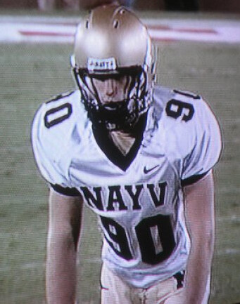
The screen shot at right shows Navy placekicker Matthew Harmon from a 2006 game against Stanford. You’ve probably seen it before — it frequently shows up in listings of uniform typos. I linked to it myself in this ESPN column back in 2007.
But here’s the thing: As the years have gone by, I’ve started to have a funny feeling about that typo. Here’s why:
• The misspelling was so blatant, so egregious — how is it possible that nobody caught it?
• The first mention of the typo that I could find was in this entry’s Ticker back in 2006. As you can see, there was no photo — just a mention from a reader who didn’t give his name. The screen shot didn’t come until several days later (again, it’s in the Ticker). Hmmmmm.
• I’ve never seen any other visual on this typo — just that one screen shot.
• Given that Navy was using simple block lettering on a white background, with no major shadows or folds in the jersey fabric, this typo would be very easy to create via Photoshop.
All these factors have combined to make me a bit skeptical about this typo. Over the past two years or so I’ve stopped referring or linking to it.
As it happens, a list of jersey typos recently appeared on SportsCenter. I didn’t compile the list, although they ran the list by me beforehand. It included Matthew Harmon and his “Nayv” jersey. I considered saying something — there were certainly other typos that could have been swapped in — but ultimately held my tongue. I can’t really explain why, but maybe a little part of me wanted to put that typo out there in wider circulation, just to see if it prompted any response.
As it turns out, that’s exactly what happened, although the response came from a place I never could have anticipated. It came in the form of an e-mail from one Matthew Harmon. Here’s what he wrote to me:
Paul,
My name is Matthew Harmon and I live in Yokosuka, Japan. I graduated from the United States Naval Academy in 2009 and was the starting kicker on the varsity football team. Being on active duty in the Navy and stationed in Japan, I have a hard time keeping up with sports in the States, but my buddies are telling me I was on SportsCenter as one of the top 10 misspelled jerseys.
A little background: We were playing Stanford the year they opened their new stadium, 2006. I was the backup kicker at the time. We played very well and ended up winning the game by a large margin.
At the start of the fourth quarter, I was being heckled by a couple of fans. I didn’t want to acknowledge them, but I decided to turn around to figure out why there were yelling at the backup kicker. The fans told me to look down at my jersey and that’s when I realized that my jersey read NAYV, not NAVY. Once I saw the mistake, we shared a laugh and I didn’t think it was that big of a deal, because I never got in the game anyway. But toward the end of the game, we had a big enough lead that the backup kicker (me) was able to get in the game and make his first collegiate field goal.
So I made that kick and was the picture of the week on collegehumor.com. During a team meeting the following week, Coach Paul Johnson said, “Harmon, that’s the last time I call a timeout to put your ass in the game.”
And there you have it, right from the horse’s mouth. I wrote back to Matthew and asked if he still had this jersey. His response: “I don’t know what happened to it. It probably got stashed away somewhere in a closet. I do know that Nike apologized, though.” Oh really? Did they issue an official statement or something? “I don’t know about that, but I know the A.D. was involved and they apologized. I don’t think anyone expected the picture to be such a big deal.”
Indeed. Interestingly, that screen shot was contributed back in 2006 by reader Andrew Shieh. According to our site-search function, it’s the only time he’s ever contributed to the Ticker, but he sure made it count — that one screen shot has spread all over the web, and even to SportsCenter. Andrew, are you still out there? It’s almost time for your quinquennial contribution!
Uni Watch News Ticker: When the Cards and Royals play an interleague series next week, both teams will wear this patch to help support relief efforts for tornado-flattened Joplin, Missouri. The patch — which probably sets a record for the most logos appearing in one patch design — will also be available for purchase, plus game-used uniforms will be auctioned off, etc. Further details here. ”¦ Here’s a good article on the design of the torch for the London Olympics, plus an accompanying video. ”¦ Way back in the olden days of 2004, Delta Airlines ran a fashion show on the history of flight attendants’ uniforms, and Russell Goutierez was there to take a bunch of photos. ”¦ The Chicago Bandits — a professional fast-pitch softball team — wore All-American Girls Professional Baseball League throwbacks the other day. Lots of photos if you scroll down a bit on this page (with thanks to Kenn Tomasch). ”¦ Speaking of the old AAGPBL, check out this great program (nice find by Jeff Wilk). ”¦ New football uniforms for Northwest Missouri State. ”¦ Here’s one of the better surveys of Canucks jersey history that have popped up in recent weeks (with thanks to Will Leslie). ”¦ While looking for something else, I came across a shot of John Hodgman — the “I’m a PC” guy in the Apple commercials — posing in old-school football gear. ”¦ Here’s a really interesting analysis of an old Willie Mays photo (big thanks to Chris Howell). ”¦ Ray Barrington spotted this old Jets program cover featuring a helmet design that the Jets have never worn. ”¦ The graphics on this old St. Louis Browns schedule are really charming (Jeff Wilk again). ”¦ Here’s a look at historically ugly jerseys in Aussie football (with thanks to Mike Powers). ”¦ Look at all the Nordiques shirts in this photo, plus a Whalers shirt for good measure. “I think that’s pretty neat, considering those teams didn’t even exist by the time those kids were born,” says Jamison Nash. ”¦ Mark Reynolds of the Orioles has started wearing stirrups. He talks about it briefly at the 1:36 mark of this video clip (big thanks to Jack Krabbe). ”¦ Interesting note regarding the Heat/Mavs series from Andrew Rader, who writes: “I believe this is the first time that two opposing teams in any sport’s championship round have had their home venues sponsored by the same company — American Airlines Arena and American Airlines Center.” Can anyone confirm or refute? Are any similar situations even possible? ”¦ The movie The Doors is set in the 1960s (duh). So why does this scene from the movie open with a televised clip of what appears to be Rod Carew from the ’70s? (Good catch by Jim Slade.) ”¦ Can anyone tell Doug Mulliken exactly what Lebron is wearing under his jersey? ”¦ Joe Alvernaz notes that the new USA rugby jerseys owe a substantial stylistic debt to a certain 1970s daredevil. ”¦ I don’t know who this chick is, but someone needs to get me her phone number, stat (carnivorous thanks to Chris Flinn). ”¦ Brad Reissig notes that Big Papi’s helmet logo is riding kinda low. ”¦ The Rays’ latest unusual road trip attire: pajamas. Additional shots here and here (with thanks to Mike Edgerley).
“I believe this is the first time that two opposing teams in any sport’s championship round have had their home venues sponsored by the same company – American Airlines Arena and American Airlines Center.” Can anyone confirm or refute?”
It actually happened back in 2006 during the NBA Finals…when the Miami Heat played the Dallas Mavericks. Sorry to say, but this is the second time this has happened.
Actually, Albany’s been called the Times Union Center (local newspaper) for a few years now.
But everyone still seems to refer to it as “The Pepsi”.
Whoops. That one’s for jtv108’s comment. My bad, Cliffy!
Didn’t know that. These things change names so often, its hard to keep track.
I thought it was the “Knick” from back in the day!
Started off as the Knick, then was the Pepsi Arena, and now it’s the Times Union Center.
TV and online news articles stated that this was the second time this has happened, as Cliffy D points out correctly. The estimated advertising value of each game that AA is getting for free is about $10 millions’ worth per game, $10.5M at Dallas and $10.7M at Miami. (Well, not free. They are paying for the naming rights, but they have to pay it whether the Heat/Mavs make the Finals or not.)
link
link
As for two arena names with the same company. Both are unlikely to have a championship since one of each is currently a minor league arena.
Two Wells Fargos
Wells Fargo Arena – Des Moines
Wells Fargo Center – Philadelphia
Two Pepsi’s
Pepsi Center – Denver
Pepsi Arena – Albany
It could happen in the NHL if the Senators (Scotiabank Place) faced the Flames (Scotiabank Saddledome).
See above comment RE Pepsi Arena/Times Union Center.
I’m looking for an “I’m still calling it the Knickerbocker” T-shirt!
I would be all over one of those! I’m from Massachusetts, but Albany’s closer for me than Springfield. Always have been a River Rats/A-Devils fan over the Falcons.
Or how ’bout an…
“I’m still calling THEM the Knickerbockers”
teeshirt?
If the NHL is ever returned to Quebec, and the expansion/relocated team plays in the Nordiques old home, you’d have Colisee Pepsi.
If that team were to ever play in the Stanley Cup Finals against the Colorado Avalanche, you would have a team relocated from Quebec playing in the Pepsi Center playing against a new Quebec team playing in the Colisee Pepsi. Too many hypotheticals here but as an Avs fan, that would be a dream match up.
Speaking of Nordiques, the kids in that Patrick Kane story have a funky Nordiques logo on their T’s. The proper logo is link.
Considering they look like they were done in marker, possibly by the kids themselves, I’m willing to give them a pass on historical accuracy.
I want a “Je suis toujours l’appeler Le Colisee” shirt.
LOL. Bravo! “A” for effort and “A-plus” for humour.
“Je vais toujours l’appeler Le Colisée”
The other way, it was pretty close to “I am always called Le Colisee”
The first comment in that article about Kane is great.
“He must have been pretty pissed when he got there and realized that they were actual tall boys.”
They look like DIY efforts. And so do the Whaler shirts, when you get a closer look. See picture #1 in this photo gallery on the Chicago Tribune website
link
Re: the Nordiques logo, Chris Creamer’s logo site doesn’t reflect some variations in the way it appeared on team sweaters over the years.
Here’s Rejean Houle’s 1974-75 hockey card. Note that, on the white sweater, the hockey stick part of the logo was also trimmed in blue: link
The ’72-73 road blues featured red stick and puck, not to mention a red that looks more like maroon: link
The ’75-76 O-Pee-Chee cards show that the white stick on the road blues was thicker, and on both home and road crests, the puck was not centred on the stick blade: link
In ’76-77, the stick on the white uni is no longer trimmed in blue, and in terms of thickness it matches its white counterpart on the blue uni (they’ve also gone with blue pants): link
By ’80-81, we’re seeing the thin-handled stick on the white unis, with the puck centred atop the blade. The same crest appears on the blues, but with a white outline that may or may not also be featured on the home uni: link
Starting in 1991-92, the crest seems bigger, and the blue trim around the “igloo” more prominent. See Valeri Kamensky on this page: link
(By the way, Benoit Clairoux, proprietor of the Histoire Nordiques website, is one of the go-to guys when it comes to all things Nords.)
They look like DIY efforts. And so do the Whaler shirts, when you get a closer look. See picture #1 in this photo gallery on the Chicago Tribune website
link
They wouldn’t be playing in the old Colisee unless it was short term. Not being able to replace that thing is why the team left, remember?
Now, the new arena they’re tossing around (not just for NHL purposes, they need a new one anyway) might get Pepsi sponsorship, and then you’d have a somewhat more realistic scenario.
How aboot the ROGERS CENTRE (nee SkyDome) in Taranno (To-ron-to) and the ROGERS ARENA in Vinkoover (Van-coo-ver), eh?
In the event that the Jays or Argos play the Canucks for the Grey World Stanley Series Cup?
Both hosted NBA teams once upon a time – the Grizzlies playing at what was then GM Place, while the Raptors played out of Skydome until the Air Canada Centre was finished.
But thanks to the draft and salary restrictions imposed on them, not to mention the ass-tute management of Isiah Thomas in Toronto, it would’ve been a feat for those teams just to make the playoffs in the same year, let alone meet in a final!
Dont forget the Pirate’s Home, PNC Park and the home of the cross-state Scranton-Wilkes-Barre Yankees, PNC Field.
And off course an even less serious variation, if the NY Giants met the NY Jets at the Super Bowl at Giant Stadium – well you get the drift.
Right about now, I think the Blue Jays could beat the Canucks at hockey. Jose Molina – would play the Tim Thomas role – except the way he’s been catching, too many would go through the 5 hole
wells fargo arena in Tempe, AZ
I don’t think that’s Rod Carew. Isn’t the player in the video clip of the Door’s movie wearing #10?
Yeah, my bad! I was so excited when I first saw this and sent in the link that I didn’t think to check uniform numbers. Some friends and I have been looking through #10s from the ’70s, and Mark McLemore and Lyman Bostock have emerged as possibilities.
When I saw “Brokeback Mountain,” I couldn’t get over football footage used in the scene that takes place at Thanksgiving dinner: an old Grey Cup game from the 1970s between Edmonton Eskimos and Montréal Alouettes. It’s what they could license, I guess. (The film was shot in Alberta, after all.)
A few years ago, there was a Canadian-made movie called “Away from Her.” The cast included Julie Christie and Olympia Dukakis. And Gordon Pinsent, the gifted Canadian actor. The film also featured Ron Hewat, the former Toronto Maple Leafs play-by-play man, who portrayed a sportscaster suffering from Alzheimer. There’s a scene where Hewat is watching a hockey game (Leafs-Flyers, from the 2003 playoffs). Hewat, in his hospital room, starts calling the action.
Thing is, the film is set in southern Ontario, yet the feed he’s watching is from ESPN. Couldn’t have happened, of course, but I guess CBC wouldn’t license its Hockey Night in Canada footage.
But it’s odd for Oliver Stone to let an anachronism like that get through. Maybe they couldn’t find or license period-accurate footage of the Angels?
I remember seeing a trailer for that film and imagining it to be incredibly depressing.
“The Rays’ latest unusual road trip attire: pajamas.”
(fixed)
Touché! The only difference between the airplane attire and that photo is David Price’s nice little booties!
Re: All-American Girls Professional Baseball League throwbacks – Sorry, 180×120 photos of a uniform dont really cut it. What were they taking those photos with? A My First Sony?
Ditto. What team is that?
Did anyone check out the rosters in that 1943 AAGPBL program? Number 6 of the Peoria Red Wings is Annabelle Lee, the Spaceman’s Mother.
Marla Hooch…what a hitter!
link
In regards to the question about the Heat/Mavs both playing in arenas with the same corporate sponsor – it would have been the first time if they had not already met in the Finals in 2006.
I think Lebron is wearing one of those Under Armor Compression shirts. kinda like this one
link
The first thought that crossed my mind was maybe he was mic’d like NFL Films does with football players. Just a guess.
My guess is that its either a Kings Crown pendant embedded into his chest or its a control box installed by Nike.
I think he might be wearing an arc reactor:
link
I second that motion.
It’s a Nike Pro Combat padded tank, most likely. Highly doubtful it’s an Under Armour product.
here’s a link to what Ansy mentioned, however, it looks like LeBron was wearing it backwards.(the back can be seen if you scroll down)
link
I think it might be McDavid HexPad gear – Dwyane Wade wears it, even though he’s sponsored by Nike/Converse.
link
Maybe it’s just a slightly different model than what’s featured on their outdated website? My first thought was Hexpad, since it’s considered the “premiere” basketball padding.
Perhaps LeBron is wearing a heart
locatorprotector.Speaking of typos: “Here’s one of the better surveys of Cancucks</u jersey history that have popped up in recent weeks."
Serves me right pinging you on a typo and not getting my HTML correct…..
Its actually the second time two teams playing in a finals have had the same arena sponsor. The first was in 2006…when these same two teams met.
I thought it might be a Under Armor compression shirt as well but something tells me that Nike would frown upon that. I’m going with the microphone theory.
It’s an energy cell. He’s a robot.
not just any robot, he’s a Cyberman
link
Does his power supply run down after three quarters?
Zing!
i think it looks like a fist. or brass knuckles protruding from an invisible chain. that’s what i’m going for. and the extra weight would explain why he played so poorly.
On the link, a couple of interesting things…
Seems the Atlanta Flames cribbed their base design from the old WHL Canucks, at least for their first season (the Flames changed their stripes in ’73, thickening the gold stripes and adding a thin red border which remained until Calgary’s 1994-95 revamp).
Also, in the pic with the three guys, the dude in the kilt and red helmet is wearing a counterfeit jersey. The “VANCOUVER” font looks off, but the shoulder patch is a dead giveaway, as it’s clearly not an accurate version of the modern stick-in-rink logo (stick is too thin, the shaft looks parallel to the top and bottom, and the corners aren’t rounded enough – it’s not even an accurate reproduction of the 1970-78 version!). It’s especially egregious when it’s right next to a proper version of the logo on the third jersey in the middle!
In the 2006 NBA Finals, the Mavs and the Heat played in American Airlines Center and American Airlines Arena, respectively.
WATCH OUT USA RUGBY!!! the Evel estate might not be happy–especially with the fat guys on the team.
From 2006, via the Smoking Gun:
DOCUMENT: Crime
Evel Knievel Sues Kanye West. Daredevil claims rapper copied him in ‘Touch The Sky’ music video.
DECEMBER 12–Retired daredevil Evel Knievel is suing Kanye West, claiming the rapper ripped off his trademarked look in a recent music video….
The first thing that popped into my head when I saw these was Evel’s daredevil outfit. It couldn’t be just a coincidence, right? I mean someone had to deliberately design this uniform with his uniform in mind.
and Whoever did design them deserves a raise; they are simple, sharp and loads better than some of the other kits you see.
It’s still a bit odd for a union side to use a rugby league-style V though
they probably figured nobody (or at least not enough) people in the usa, or outside of eastern australia and the m62 corridor for that matter, would even know the difference.
personally, i like the shirt. it’s much better than the springbok shirt in my opinion. although if they are going to do a rugby league design, why not steal the sydney roosters’ shirt? even though i’m a rabbitohs fan i really like roosters’ shirt design.
link
Surely no more a coincidence than link.
I kinda like that never-used Jets helmet logo from the 1964 program cover for the Jets first game at Shea. And that color drawing of Shea itself: so spanking new, so perfectly circular, such an up-to-date complement to the World’s Fair next door.
Compared to other World Fairs, the New York 64-65 version was undistinguished architecturally and of little general influence in iconography or culture. Unisphere is OK, but nothing magical, you know? I have been trying (fruitlessly) to gin up enthusiasm and money for the restoration of the one great exception to the rule of 64-65 blandness: the crazy great New York State Pavillion. Moviegoers may recognize it as a setting for Men in Black. Incredibly expensive to restore, alas, but cool even in its current skeletal form. Someone more deft than I might post a link to a photo.
Don’t tell that to Paul… link
No, no, no. I love the Candela structures, and Paul’s work is terrific. I was talking about big, iconic “trademark” structures, but your point is taken.
Interesting as always to see old schedules for graphics, etc. But on the Browns schedule I was also struck by how different the scheduling was as compared to today. Several series started on Sunday and one “series” was a single doubleheader on a Sunday. I assume train travel had a lot to do with it but still seems odd and maybe even a bit quaint.
It’s Nike Pro Combat tank. Can’t find the exact one on Niketown.com.
It’s not Rod Carew in that Doors clip because Carew wore #29 on the Angels. It appears to be Lyman Bostock who only played one season with the Angels, 1978. #10 by the Angels was mostly used by Jay Johnstone, Jeff Torborg, and Tom Eagan from the mid 60’s-mid 70’s. Jerry moses and Tony C. wore #10 during the 1971 season and Adrian Garrett & Mike Easler wore #10 during the 1976 season. Dave Kingman actually wore #10 during the 1977 season.
Bostock only played one year for the Angels in 1978 before he was tragically killed by gunshot. The catcher in the clip was wearing #21. There were only two catchers in the AL who wore #21 during the 1978 season, Buck Martinez of the Brewers and Art Kusnyer of the K.C. Royals.
It appears to be an Angels home game in the clip so Martinez and Bostock only appeared in the same game twice in California during 1978, May 26th and May 27th. There doesn’t appear to be any type of play (Bunt, slap hit to SS-3B) to match the clip in the Martinez games.
Bostock & Kusnyer only appeared in one game together, June 26th in California. In the first inning Bostock reached first base with an infield single so that appears what’s being shown in the clip.
I’m pretty certain that the clip in the film is from the Angels-Royals game from June 26th 1978 which would be an anachronism because the scene is supposed to take place around 1966-1967.
I knew someone here would get to the bottom of this. Amazing!
Re: stadium advertising, in addition to the above-mentioned NHL example (Calgary-Ottawa), it is possible for the International League championship series to be contested entirely at venues named after Coca-Cola – the Buffalo Bison play at Coca-Cola Field and the Lehigh Valley IronPigs play at Coca-Cola Park. Teams in the Carolina League and the Western Hockey League also share common stadium sponsors, but those pairs (Myrtle Beach & Winston-Salem in the CL, Saskatoon & Swift Current and Lethbridge and Red Deer in the WHL) also share divisions and can’t meet for their league championships/
With the WHL, couldn’t they meet if one was hosting the Memorial Cup?
They could, but both arenas wouldn’t be in use as the Memorial Cup is only held in one building.
That brings up an interesting question to this whole thing. No doubt that Coca-Cola (and/or insert your own company name here) sponsors more than two minor league ballparks across the country. So, are there guards in place that prevent there from being Coca-Cola Fields anywhere, or just in the same league/state/region?
Fifth Third Bank seems to be headed in that direction, at least in the Midwest. The Midwest League’s Dayton Dragons play at Fifth Third Field while that same league’s West Michigan Whitecaps play at Fifth Third Ballpark. The Toledo Mudhens of the International League also play in a park named Fifth Third Field. In addition, Fifth Third Bank has the naming rights to the arena on the University of Cincinnati campus. That’s a lot of money for a regional bank to have tied up in naming rights!
Interesting story about Fifth Third Ballpark. When it opened in 1994, it was called Old Kent Park for a local bank. This was a great sponsorship choice because the Whitecaps play in Kent County and it allowed fans to pretend it wasn’t really a sponsorship deal at all. However, when Fifth Third Bank bought out Old Kent Bank in 2001, they changed the name.
Their sponsorship in Dayton predates the buyout, and the park in Toledo opened a year after the Old Kent buyout. This begs the question, why have two ballparks in Ohio sponsored by the same bank with the same name? link link use the same logo. Thankfully link uses a different, yet similar logo.
Hey, everyone … I’m having a little argument with a friend about the teams in the NBA Finals in 2006. Anyone know who the teams were? Anyone at all?
Same two teams as this year, and same American Airlines situation as this year. Could you guys stop posting the correction in the comments?
Matthew Harmon’s jersey was not spelled incorrectly. It was spelled phonetically…NAY-V.
Ha, good one!
I know Paul only does the backs of jerseys for his membership cards, but I think he can make an exception for Matthew Harmon…and Andrew Shieh as well. Honorary memberships for both!
The guy responsible for that misspelling now owns an embroidery company in the Annapolis area.
They do the Natinals stuff.
Funny. I thought the same thing.
Good coverage by Paul, as I’ve always thought this was a photoshop job.
I could be wrong, but when ESPN did their top misspellings last week or two weeks ago, I thought they had video of Harmon kicking with his “NAYV” jersey? A quick search on Google, and I couldn’t find the Top 10 video. Anyone know where that video is, or did someone DVR it?
I saw that too. They definitely had footage of him with the jersey on.
Seeing the Joplin tornado patch brings up a question for me. We know it was widely believed (and subsequently thoroughly debunked) that the MLB logo was based on a picture of Harmon Killebrew. Is there any similar story about the MLBPA logo? I always thought the generic ballplayer looked like Roberto Clemente. Any thoughts?
To follow up on that Doors clip, the Angels only had 5 black/latino players wear #10 from 1961-1986: Dick Simpson 1962, ’64-65, Willie Montenez 1966, Bubba Morton 1966, Mike Easler 1976 and Lyman Bostock 1978. Simpson & Morton were both Right handed batters so that eliminates those two players. Also, Bostock was the only black/latino Angel to wear #10 to play a home game against a catcher wearing #21.
The uniform in the clip looks like a pullover non-button type which the Angels only started using in 1973. So that would eliminate everyone except Easler & Bostock. Easler while on the Angels in 1976 never played against a catcher wearing #21 so it has to be Bostock in the clip.
Again, it appears to be the first inning of the Angels-Royals game of June 26th 1978.
I thought it might have been Mark McLemore, a switch-hitter (who did not wear double earflaps) who wore #10 with the Angels for the 1989 season (right around the time the movie was filmed), but the only AL catcher wearing #21 that year was Ozzie Virgil. In Virgil’s limited action that year I don’t think he faced the Angels.
It couldn’t have been Mclemore in 1989 because the Angels switched back to a Button-up jersey instead of the pull-over type they had been using from 1973-1988. Ozzie Virgil played for the Blue Jays and did wear #21 in 1989 but he only appeared in 9 games and never played against the Angels.
No Angel wore #10 in ’79 or ’80 probably in deference to Bostock. Butch Hobson wore it 1981 and Tim Foli wore #10 from 1982-83. Rob Picciolo wore #10 in 1984 and Ron Romanick wore #10 in 1985-86. Tony Armas wore #10 in 1987.
Chico Walker wore #10 in 1988 and actually played in a game with a catcher wearing #21, Bill Schroeder for Milwaukee. Schroeder left the game in the 8th inning and Walker didn’t enter the game until the 10th.
#21 is an unusual number for a catcher, you just don’t find many catchers that wore the #21. Most players that wear #21 are pitchers or outfielders.
It’s probably very difficult to find clips of Angels baseball games from 1966-67 so the person in charge of finding those types of things probably found some footage from a game in the 70’s. Also, seeing that it’s only on the screen for a second or two, Oliver Stone probably didn’t worry too much about any Anachronism.
Hey, has anyone pointed out yet that the Heat and Mavs met in the finals five years ago?
With all the “Municipal Stadiums” (KC, Cleveland, Philly (before it was called JFK), Baltimore, etc), it may have happened before.
If the Maple Leafs move into the Rogers Center, they might face Vancouver, who play in the Rogers Arena
I was about to ask you if you might have meant “Memorial Stadium” in Baltimore (where I attended many, many games as a kid), but I’m glad I checked first — I didn’t know/recall that the Orioles played several years (1945-49, it appears) in Municipal Stadium until moving to the new Memorial Stadium in 1950. Interesting.
“If the Maple Leafs move into the Rogers Center, they might face Vancouver, who play in the Rogers Arena”
That gets a hearty (even heartsick) LOL from this Torontonian!
The sleeve patch on Evel Knievel’s jumpsuit on that SI cover reminds me he was sponsored by Chuckles candy. I imagine there was a huge bidding war with Slo-Poke.
So today the question is, Will there be MORE signed Terelle Pryor Ohio State jerseys around now that he can sign with impunity…or will their price go up cuz he’s done signing?
The tipping point inches closer.
And the Pirates are 30-30!!!
Yes, the Bucs have been surprisingly good, especially since they have received practically nothing from Pedro Alvarez this season. The Pirates were also 30-30 in 2005, so we don’t know how this will end. That said, Clint Hurdle is doing a fine job, and the club has multiple players worthy of all-star game consideration.
A total ‘fuck you’ to the Mets — link
yeah…that’s been posted before
i’m not sure what the “six” are though…
yanks…check
giants/jets…check
knicks/rangers…check
clearly they haven’t been watching any islander games because the number is more like 5
It must be counting the link, because there’s no way it’s the Islanders.
Was it maybe originally conceived when New York still had an Arena Football team?
Go, Dragons.
Aaron Garcia recently passed the 1,000 TD pass mark, y’know. Well, not with Dragons, of course, but still…
The ad asks “Why leave a city that has six professional sports teams, and the Mets?”
So that rules out the Giants, Jets, Liberty and Red Bulls because they all play in New Jersey and the Isles play in Uniondale.
So it’s…
Yankees
Rangers
Knicks
Brooklyn Cyclones
Staten Island Yankees
Plus the soon-to-be-moving-to-Brooklyn Nets?
I was looking at some player pages at ESPN and came across this Brewers hat:
link
I was hoping some one could tell me more about it. It’s a hat I’m unfamiliar with. Thanks.
I don’t believe it is anything but a dirty ball cap. I live in Wisconsin and have noticed this the entire season. It isn’t a “special edition” or anything like that. I just believe Marcum likes his caps dirty and worn in.
Could it just be a photoshop of an old headshot from when he was with Toronto?
“Here’s a look at historically ugly jerseys in Aussie football”
Hey now, how can link be voted the worst, when it looks so much like link uniform
link
“New football uniforms for Northwest Missouri State.”
from the link:
“The Bearcats struck a new deal with Jock’s Nitch Clothing and Adidas to provide the team with new uniforms.”
Jock’s Nitch? Really?
Jock’s Nitch is a real thing. But I’m mystified why they’d name their company that rather than either Jock’s Niche or Jock Stitch.
“Look at all the Nordiques shirts in this photo, plus a Whalers shirt for good measure.”
Not to restart this discussion, because I’ve heard all the pros and cons of it, but if you eliminated fighting (not checking, mind you, just fighting) AND brought back the Nordiques and Whalers unis, I would become a hardcore NHL fan.
they don’t want you
That’s OK, the NBA would still be better. ;)
I used to have a white Nordiques replica, but instead of putting Michel Goulet’s #16 on the back (he was the only Nordique I ever knew), I put #18 on there instead. Not for Mike Hough, who actually played for Quebec, but for link of the Penguins. Back then I had that much hair, and I thought I looked like him.
I got an email from Chelsea FC’s mailing list announcing its new away kit, and its pretty garish, although Chelsea away kits have been in the past few years. link
I highly doubt that it’s a Nike Pro Combat compression tank that LeBron is wearing. Last I checked, all NBA players had to wear either the Adidas TPU compression tank or the Adidas padded compression tank, even if they are high-profile Nike, Jordan Brand, or UnderArmour athletes.
If I’m wrong, then I guess that we can add that to the list of rules that, regardless of being clearly written in the rulebook, are not upheld.
No picture, but new logo for Monday Night Football.
Is this it?
link
I think it’s link.
Ha!
It’s a much more innovative branding package. They’ll be using link for weeks 1-8, and link for weeks 9-18.
They have lots of classics they can rerun…
link
Or, even better and just as thrilling…
link
At least we’ll still see the Chris Hovan look, maybe…
link
Aw, man … when I’M the only one that can come up with a straight answer, we’re ALL in trouble …
link
– JimWa
“I tell you, it’s a sad day when Sam Malone is the voice of reason.”
–Sam Malone.
Does beg a question, though.
Which are we likley see in actual use first, that new logo or the Bills new unis? Cuz if there are pre-season games to telecast, could be the logo. If NFL doesn’t play til regular season, would be the Bills unis, probably.
I’m curious.
I’ve been off the grid for almost two weeks. Is it official that we won’t be seeing the Bills unis until they’re worn on the field?
If this is old news, well, that’s news to me!
They’re unveiling them in a couple weeks.
yup…june 24
Man how great would it be if those Reynolds stirrups were the classic O’s style i.e. Robert Marshall club.
How great? Pretty fucking great.
Before the newer, stretchy knits, the white stripes on the Orioles’ stirrups were quite narrow…
link
link
btw, Larry Doby never played for the Orioles.
Went to spring training with them, yes. Was in ’58 after a December trade from the White Sox. But he was traded again April 1 to the Indians, where he began.
Was surprised to find a photo of him in that uni.
(Relevant to nothing, but twice in his career Doby was involved in trades where he and Terry Francona’s dad, Tito, exchanged teams. I mention it because apparently either the Red Sox and Yankees is everyone’s home team these days).
I miss trades. They were fun. Not so much for the players, of course, but for the fans.
Young kids don’t know the fun of sitting around dreaming up “great trades” anymore.
I mean, how can you not like a world were the American League batting champion and home run leader switch teams right before Opening Day? Tigers and Indians swapped Harvey Kuenn for Rocky Colavito, even up, April 17, 1960.
“I mean, how can you not like a world were the American League batting champion and home run leader switch teams right before Opening Day? Tigers and Indians swapped Harvey Kuenn for Rocky Colavito, even up, April 17, 1960.”
How can you not like that trade? Ask any Indians fan.
I never said it was a GREAT trade.
Just that it shook things up a tad.
Imagine the Rangers and Jays swapping Hamilton for Bautista right before Opening Day this year.
Wow Ricko, I’ve collected a lot of Oriole pictures in my time but I’ve never seen that Larry Doby shot before!
Some more information on the ND v. Michigan throwback uniforms for this year. Unveiling soon
link
Google’s Les Paul page is beyond awesome. Here’s me paying “One” by Metallica (I’m slow, so cut me some slack)
(link)
You think we’ll see a Uni Watch version of the Google homepage one day?
That’s one of the worst patch designs I’ve ever seen (Re: KC/STL Joplin Patch).
First, there’s the issue with the logo madness on the patch. Add to that the color and oddly aligned font, and it just look way too rushed.
I’m probably wrong here, but does #40 of the Miami Heat, specifically the back view , look like he has a bigger number font, than some of the other Heat players?
Took me a whole quarter to get a closeup, but nah, I don’t think it’s any bigger. Probably just looks that way because he’s the one regular player for them with two wide numbers. Most of their double-digit guys on the floor have a 1.
OK, 4th qtr. is on…see ya.
gotta agree with movi here…haslem’s # just looks a lot bigger because there are two wide ones…but they’re no bigger than anyone else’s nombres
just a optimacal illusion
Oh yeah, Heat are wearing the black unis for the first time in the Finals. Can’t call them BFBS, but I call them meh. Red unis make more sense…after all, you’ve heard of “red hot,” not “black hot.”
First game where the teams are heading for 100+ points. Been appreciating the defense, but this is more my style.
I thought teams were supposed to stick to one type of road/alternates throughout the playoffs, i.e., if they wore red, then they’d have to wear red on every road game, but if they wore black, then they’d have to wear black every time. Was this a rule or more of a suggestion, or did I just remember this wrong and no such rule exists?
BTW I watched a soccer game between Mexico and Cuba, and Mexico wore a black kit instead of their traditional green ones. Talk about BFBS!
One more to go!
possibly the biggest win in cavalier history?
LOL @ “Cavs for Mavs” movement. That’s just sour grapes. That’s like coming up with “Lakers against Fakers” if you hate the Heat but your team (the Lakers) have already been eliminated, or “LA for LBJ” because Lakers got embarrassed by Dallas so they want LeBron to avenge their sweep.
I guess what I’m trying to say is, “Cavs for Mavs” is a clever ploy to get Cavs fans to unite, but the only real way for Cavs fans to come together is a “Cavs for Cavs” campaign, which will only be truly successful if Cleveland wins a championship of their own. Maybe they’d have a chance if they hired Phil Jackson and brought Kobe and Dwight Howard together…. Nah, it’ll never happen!
Wouldn’t it be funny if the Mavs won because they were the only team with an updated [road] jersey that made the playoffs? (I guess I’m not counting Orlando’s black [alternate] jersey nor those with new collars due to the “mission: collar simplification.”)
The new color Mavs Jersey sales will go through the roof, which is why the Mavs must win, especially since the people who liked LeBron have already bought their Miami jersey not long after “The Decision,” said the conspiracy theorist in me :)
Jeff Marquez is pitching for the Yankees in this late-night rain delayed game against the Sox. his #41 on the back in improperly centered. The MLB logo lines up centered to the gap between the numbers, which you can’t do when one of the numerals is a 1. The whole thing is a good inch* too far to the left.
*or, roughly one pinstripe..