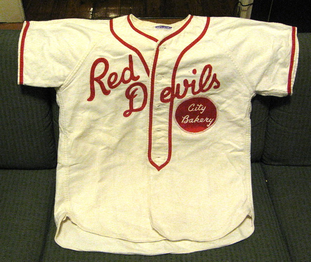
What’s the only thing better than a birthday? An extended birthday. That’s what I got to enjoy yesterday evening as I came home from a few games of bowling and found the jersey you see above waiting for me, courtesy of a certain very thoughtful bench coach. Pretty swell, no? It’s cotton flannel, with a chain-stitched insignia and tackle twill rear numbering. I’m kind of in love with it.
As for the bowling, I was joined by the estimable Bart DeCoursy (proprietor of the excellent DeCoursy’s Sidecar, don’tcha know). I tossed some good games — 160, 205, 185 — but the highlight was picking up a 4-10 split for only the third time in my life. Yee-freakin’-haw!
New ESPN column today: the 13th annual Uni Watch MLB season round-up. Very little in the column that we haven’t already covered here, but it’s nice to have all the info in one place, right? Many of you have told me this is always your favorite column of the year, so enjoy.
Popeye update: In case you read yesterday’s entry in the morning and didn’t return to the site after that, at around 11:45am I added an important update to the Don Zimmer story. To wit: While it’s true that the Mets asked Zim to model the team’s new road uni on Feb. 11, 1962, it turns out he wasn’t the only player in uniform for the photo shoot.
That photo, which was found by reader Dwayne White, ran in the 2/12/62 edition of the St. Petersburg Times. As you can see, pitcher Bob Miller was also in uniform (and, like Zim, also made his home in St. Pete at the time). So Zimmer wasn’t the really the first Met to suit up — he was one of the first.
I’ve asked the Rays PR guy to show the photo to Zim, to see if it jogs his memory about Miller being on hand that day. But as you might expect, all MLB teams are a little berserk this week, so I doubt this is going to be a top priority. Might have to revisit it next month, when things are a bit calmer.
In any case, it’s a great example of how you can think you’ve nailed a story and then it turns out that it’s not the whole story. History, as we’ve learned again and again here at Uni Watch, is a tricky thing.

Collector’s Corner, by Brinke Guthrie
MLB opens up this week, so we’re focusing on baseball this time around. Here we go:
• We’ll start with one for Paul — a complete set of 1966 Mets tumblers.
• Some much better than camouflage: a 1940s Marine Corps baseball jersey!
• Here’s a 1970s Sand-Knit baseball jacket with a tequila sunrise flair.
• All you Seattle readers might be interested in this game-used jersey from the very first Mariners game.
• President Carter signed this 1979 World Series ball.
• Ever seen a Cubs “baseball bendable” before?
• And we wrap up with a 1940s Pepsi vendor’s tray from Shibe Park in Philadelphia.
Seen something on eBay that you think would make good Collector’s Corner fodder? Send your submissions here.

Contest reminder: I’m currently sponsoring a design contest to create a logo for the Baseball Project. Full details here.
Membership reminder: The membership enrollment fee will go up to $20 at the end of this month. If you want to sign up at the $15 price, there’s no time like the present.
Spring cleaning reminder: While poking around in my basement, I found an extra box of T-shirts promoting a certain protein-based foodstuff in the design style of a certain team. Once they’re gone, they’re gone — so if you want in, speak up.
Uni Watch News Ticker: The Connecticut Whale honored Gordie Howe on Saturday night with a banner and by having the players wear New England Whalers warm-up jerseys, plus the Howe family was on hand (with thanks to Chris Hernandez). ”¦ Only in spring training will you see a player and coach wearing the same number (good catch by Frank Mercogliano). ”¦ Ryan Dowgin has built a web site to showcase his Colgate football memorabilia collection. Lots of good stuff here — programs, tickets, etc. Recommended. ”¦ Here’s a great look at how Topps did a really crummy Photoshop rush job just so they could be first with a Jayson Werth card (with thanks to Ted Bloss). ”¦ “I was curious about the baseball uniforms at my alma mater, Drury University,” writes Aaron Duncan. “I was appalled at what I found — they might qualify as one of the worst baseball uniforms of all time. Feeling low and ashamed, I checked to see how the softball uniforms looked. Much better.” ”¦ Here’s our first look at the new Miller Park video board (with thanks to John Okray). ”¦ Here’s something you won’t normally see: Josh Beckett pitching at Fenway with an NOB. Paul Gaiser spotted that in this ad for MLB 2k11. ”¦ When I went out to Ada, Ohio, back in January for the Wilson football factory story, I stopped in Columbus and had dinner with longtime pals and indie-rock legends Ted Hattemer, Jerry Dannemiller (both of the great band Moviola), and Ron House (former frontman of Great Plains and the Thomas Jefferson Slave Apartments). Last week those three guys recorded a Buckeye State anthem for our times: “Fire Tressel, Not Teachers.” ”¦ Bill Hoppe found this old shot of Craig Ramsay wearing a helmet with football-style center striping. ”¦ The Minnesota-Duluth hockey team went with yellow-bleached hair for last weekend’s NCAA East Regional games in Bridgeport, Connecticut. Dane Drutis took that shot, among many others. ”¦ I knew the Mets used to have a mascot character named Lady Met, but I didn’t know there was also something called the Lady Met Club, which was apparently some sort of women’s auxiliary fan club. … Mike Hersh just scored a 1970 football helmet decal catalog on eBay. I was planning to bid on it myself, but he spotted it before I did, so I stepped aside, as long as he promised to scan the entire thing for us to see. I’m happy to report that he has delivered. ”¦ The new Broadway production of How to Succeed in Business Without Really Trying apparently includes a football-themed costuming production number. ”¦ We all know the Marlins are planning to re-brand for next season. Could that include adopting orange as a new team color? Could be, judging by this graphic, which Gregg Clifton spotted on the MLB.com home page. Then again, the Marlins won’t even be using the “F” logo next season, because they’re going to become the Miami Marlins, so it’s hard to know what to make of this. ”¦ New logo for Nebraska-Omaha athletics (with thanks to Chris Bisbee).
As a Marlin fan, my prediction is that orange will be the primary color. The seats in the new stadium are blue, so it probably will be orange and blue with red somehow thrown in. (check out the new stadium logo)
Yeah I saw the new seats being installed in the UFO Stadium of theirs and I thought the same thing, they more than likely will rebrand themselves in the colors and looks of the old Miami Marlins, aka Blue and Orange
I agree, but the Mets are the same colors in the same division, but then again, the Mets primary color is BLACK. I hope they simplify the hat and just go with a cool”M”..We’ll see what our bozo owners do to us!
The Marlins official website is predominantly orange now as well. I’m not a Marlins fan but I’m still hoping for a teal/orange combination that mirrors the Dolphins colors.
link
I’m with you, but teal is out. link. Luria has said that merchandising will help decide the new colors. I’m pretty sure that he also mentioned silver and black, but can’t find a direct quote.
Shame – the Marlins had a great color scheme and uniform, once. Since their first season, they’ve been systematically chipping away from it, downgrading the teal in favor of black, adding unnecessary outlines and in general cluttering up the uniform.
This is only the latest in a long line of poor design choices. Go back to the originals, teal caps and all, put “Miami” on the roads and an “M” on the cap, and you’ve got a winner.
Sorry, that should be orange and black. Luria had mentioned orange and black as the probably new Marlins colors.
Seems a bit odd to eliminate the main color of the animal you’re named after. A bit like the Cardinals eliminating red to go to black, no?
So the Marlins will look like….the Giants? Lame.
Blue and orange, or teal and orange are such obvious choices for Miami. Then again, if “merchandising” is picking the colors, none of that matters. In a nutshell, that’s why most new uniforms suck now.
I agree, but there’s a chance that the Marlins won’t have to look like hand-me-down copycats, whether they go with Giants/Orioles orange and black or Mets orange and blue. That is, if the Fish make orange the primary color, and black/blue the secondary. To make this work, though, they’d have to make their caps solid orange, or orange with a black/blue bill, and even if that would turn out to be the most popular cap in the history of sports merchandising, no amount of market research would ever tell you that in advance. So it almost certainly won’t happen.
Yes to orange hats! I’d buy one of those.
If it comes in adjustable twill, that is.
Hey Paul,
My wife works with a lady that used to be a Lady Met.
Tell us more about it!
Maybe I can get you an interview. I talk to her later.
Sounds a lot like the Rosy Reds. I know one of the things they did was organize group road trips. A lot of times you will see a group of Reds fans at an away game on TV and the announcers will mention that they are part of the Rosy Reds.
Looks like Daniel Radcliffe needs the actor who played Lombardi to show up on the set to show him how to hold a football.
Glad to see my alma mater in Uni Watch. Unfortunately, it’s for bleached yellow hair, but we’ll take our mentions where we can get them. :)
Radcliffe’s character in HOW TO SUCCEED is a nebbish. If he were carrying the ball right it would be wrong. Know what I mean?
Regarding U of M Duluth…that’s the surfer look. As you well know as an alum, Duluth is the surfing capital of the Upper Midwest (TFPIC).
Unfortunately, being the Bulldogs, they’ll likely soon be sued over their nickname by the winner of the apparently inevitable Yale vs. Georgia vs. Fresno State litigation (eyeroll).
—Ricko
Someone mention link
That is pretty awesome right there.
It was Yale vs. UMD in the East regional final, so it was Bulldogs vs. Bulldogs.
I was impressed that UMD uses arched NOB. I was less impressed that Yale has vented armpits on their jerseys.
I had to plea ignorance concerning the term nebbish.
So I googled the term and found a pretty funny Venn Diagram(Graphic organizer) copmaring and contrasting nerds and nebbishes.
link
Good point about the character…I had assumed it was a rugby hold…hadn’t put 2 and 2 together with the character.
Agreed on the surfer capital…Lake Superior gives them that nice ice cube look.
Late to the comments, but…
Fellow UMD alum here, as well. Way back in my college days, my roommate had a photography class, and we went out to Park Point on a frigid day, where my roommate was able to get some spectacular shots of guys in their wetsuits (body)surfing on Lake Superior.
Regarding uniforms, I also love the arched NOB lettering. My white UMD jersey is unlettered; I may have to pick one of the current players and finally get it done. Any recommendations on lettering shops in Duluth, or who actually does the team’s uniforms?
im sure this wasn’t where it happened, but is this how it happened?
did you chop the 4 cross lane or did you use a big left hook and bounce off the 4 into the 10?
the hartford whalers logo’ed #9 banner has been hanging at the XL center (then Hartford Civic) since 81 (I was there when it went up) there is a new First Family of Hockey Banner than went up last week.
XL still has the banners up for Rick Ley (2) and John McKenzie (19), and they’ve also honored Ulf Samuelsson (5), Ron Francis (10), and Kevin Dineen (11). Francis is the only one whose jersey is officially retired by Carolina, although the Hurricanes have never circulated number 9.
I like those old New England Whalers jerseys.
the XL retired #’s are all jacked up McKenzie’s 19 is a hartford logo, he never played as a “Hartford Whaler” in the NHL. Ron/Kevin/Ulf were retired very after the fact by the Wolfpack in an attempt to get people to show up.
link Looks familiar, no?
BYU:
link
A number of the early helmet logos were pretty generic stuff, right out of catalogs.
(See Terry’s and my comments below).
Also why helmet numbers rarely matched the jersey font. There were different suppliers for different elements, and computers weren’t around to easily, and precisely, match things.
—Ricko
I started in the sporting goods business in 1967, right when the Pack was at the peak of their popularity. Every school in the Rochester area that used the “G” logo naturally wanted the Packers’ style. One school, Greece Olympia, had Dark Green and Gold as their colors and wore Packer-style uniforms exactly. I’m sure Angelus Pacific realized that this would be a fad nationwide and altered their “G” to accommodate everyone. Imitation is the sincerest form of flattery.
Imitation is the sincerest form of flattery.
~~~
not to mention theft
The Wisconsin Badgers link in the 1970s and 80s.
I notice that the “oval” helmet decals in the catalog are actually FOOTBALL shaped.
The Drury College men should exchange uniforms with the women. Then everyone would be happy.
Regarding the Angelus Pacific catalog. We used AP for just about all of our football decals. Did anyone notice the Atlanta Falcon, Minnesota Viking, Chicago Bears wishbone “C”, New Orleans fluer-de-lys and Pat Patriot on the pages with no apparent regard for copyright infringement? Where WERE the NFL Gestapo?
Although of those instances when we have to point out things haven’t always been as they are today, huh, Terry.
Which brings me to something I’ve been meaning to ask you.
I could swear that, at the time the Packers added the helmet “G”, I remember thinking it was nothing particularly original, just a letter in a football shape, something that had been around on letter sweaters, etc. for some time (I don’t mean the particular catalog referenced here today; that obviously came later).
That happen to you, too?
—Ricko
ANOTHER of those instances.
Jeez.
It’s early.
I could swear that, at the time the Packers added the helmet “G”, I remember thinking it
was nothing particularly original,stood for “greatness”~~~
(fixed)
Well,only because I was a kid and didn’t know about Gouda yet.
—Ricko
It doesn’t stand for gruyere?
Tiki has discovered it stands for “gullible.”
Don’t forget they basically ripped-off the Detroit Lions logo too.
I have to say, those designs have a lot of retro charm to them. If there’s anything worth using there, it’s probably the S57 logo that I could try to work into a Marlins concept.
Helmets weren’t so intrinsic to NFL marketing back then.
It was more like…
“We should add a lion decal to our helmets, maybe.”
“Well, there’s this one in the catalog.”
“Okay, use that.”
Whearas other teams such as the Rams, Eagles, Redskins and Vikings made a point of doing something original with their headgear graphics.
—Ricko
What caught my eye on the Drury Uniforms was the classy green bleacher seats on the cement blocks that make up Meador Park, the home to Drury Baseball. Great memories from Springfield.
Oops, I meant red seats. Having a color blind moment today.
Looking at that MLB 2k11 screenshot of Beckett, I wonder if they didn’t paste a NOB in for the ad so as not to draw attention to the fact that their graphics people still haven’t fixed the positioning of the jersey numbers in their games. They position it as if there were always a NOB, and when there isn’t one, there’s a giant blank space abothe the number.
It bothers me enough that real jerseys position the number too low; the 2k~ video game series actually manages to look worse. I’m betting that the advertising department gambled that the casual fan doesn’t know what the Red Sox’ uniforms are supposed to look like, so inserting a NOB would be less bad than revealing that 2k still haven’t learned to position numbers correctly.
Even in the seventh generation consoles sports games use sprites made of polygons with the skin stretched over them. I’ll bet since only a handful of teams have uniforms with NNOB and even then not all have all uniforms without it, 2K just has a default number place.
It’s not just a hanful of teams, though; these days games have all kinds of throwback uniforms and historical uniforms too. I have MLB ’09 The Show, and in it, the Cubs had not only the 1940s throwback that they actually wore during the season, but also another 1930s classic. These didn’t have names, but the numbers were still off-balance. If they can get facial expressions and drops of sweat just right, they can get number positioning right too.
It isn’t so much the stripes on Craig Ramsay’s helmet…its the muttonchops on the Leafs’ Norm Ullman and Dave Keon! Also, #2 behind Ramsay is none other than Tim Horton.
Yeah, I saw all that too! Soooo much going on in that photo, where to begin?!
-Jet
Toronto’s V-neck and Horton’s presence places that in the 1972-73 season, as they reverted to the tie-up collar in 73-74. At least, according to the Hockey Uniform Database…
The piping around the Sabres’ shoulder yokes is huge! It looks about as thick as the red stripes going down the sleeves on the 1976-78 Rangers and 1979-90 Jets! Thankfully they link. The Edge versions, though, both the link and link, have piping that’s just too narrow for my taste.
I’m craving a chocolate-filled powdered sugar donut now, for some reason…
Oh wait, that’s Dunkin’…
I want a double chocolate or an old-fashioned plain.
Timbits!
Not home right now, using my phone to reply to Phil’s query: picked it up similar to the way shown in the video, but with a bit more back-door hook to get the ball “behind” the 4.
This is like in Superman, when he gives up his powers and becomes human, only to get a nosebleed!
Powers, that was awesome!
i’m reminded a little bit of Carnac the Magnificent, who would hold the envelope to his forehead…ponder for a moment…then say, “what are four words you’ll never hear uttered on uni watch?”
Phil, I’m thinking of four more words that I can guarantee you’ve heard before!
oooohhhh…the hermaphrodite comeback!
“Phil, go be asexual”…basically
but matt, i thought you spelled it “Your Self” BAAAHAHAHAHA!
Nope…
Christopher: “I’ve got two words for you.”
Adriana : “What?”
Christopher: “Jimmy Choo Shoes!”
Congrats, Paul! Best split I’ve ever picked up is the 6-7-10, so you’ve got me beaten.
If you ever come back to NE Ohio you should go bowling. Akron used to be the home of the PBA, after all.
It seems that Harry Potter has given up Quidditch.
link
And quite possibly zipping up his pants.
I’m still waiting for team names and unis for the National Quidditch League here some weekend.
Or maybe it would be Major League Quittitch.
—Ricko
Quidditch (shoula put my glasses back on, huh)
link
Speaking of Red Devils baseball: link
The name “Red Devils” is near and dear to my heart. As I spent the last two and a half years of my service as a Memebr of the modern Red Devils (’00-’02).
The pic above came from here: link
The jersey looks delicious.
That was going to be my comment, exactly.
It’s the uni equivalent of comfort food…
-Jet
Citizens Bank Park will be debuting their new scoreboard this week also. It’s a bit larger than Miller Park’s.
link
Go Phils!
See, now, this is one of the things I hate.
I had to stop and think for minute which stadium was going by “Citizens Bank Park” thesedays.
I’m afraid we’ll never see the likes of the Polo Grounds or Candlestick Park again, venues named for their purpose or place. Not singling out the Giants, just thinking of two of many great names.
(sigh)
Discounting geography/neighborhood is disappointing. Thank goodness the Orioles had the good sense to include “Camden Yards” in their park’s name.
—Ricko
As far as I’m aware, it’s still Oriole Park at Camden Yard(s), right? Here’s to hoping it’s like that for the rest of my life (or at least the life of the park).
The days of the old civic stadium/arena are unfortunately long dead. The corporate names that have replaced them are bland and characterless, much like many of the new stadiums themselves (especially football stadiums and basketball/hockey arenas). It’s kind of the sports equivalent of every suburban strip mall with Old Navy/Target/BestBuy etc. – they are all the same, and could literally be anywhere.
Yup, it’s still “Oriole Park at Camden Yards.” The “Yards” is plural as in “train yards.” The one thing that Oriole fans like about Peter Angelos is that he won’t sell the stadium name.
I can never remember if it’s plural or not. Hopefully that will set me straight.
I’m not sure he had the right to sell the naming rights, there was some sort of dispute with the MD Stdium Authority about that. Something about equal treatment between the O’s and Ravens.
Hey, wait. Great great birthday present. Amazing design.
PS I presume “bench coach” refers to Phil, not Kirsten.
Hey, wait (bis). Those kegler scores are outtasight. Our leader bowls in the 200s?! I hate him.
Jersey is from Phil, who I can’t thank enough.
I average about 170 (and three beers) on the lanes, but I crack 200 now and again….
The Reds have had a women’s supporters group, the Rosie Reds, for nearly 50 years. Well, it’s not officially labeled a women’s group, but in practice I’m pretty sure it is. They call themselves a “philanthropic and social organization focused around the Cincinnati Reds.”
link
paul’s ESPN Column is now live.
Re: Angels gold halo – I’m a fan of little modifications for specific occasions, but the halo was gold until their early-90s redesign anyway.
Not to mention that for centuries most every time angels have been depicted their halos have been gold, not silver.
Not always, but most times.
—Ricko
A’s yelloow alts=SWEET!
Yes, they should definitely be wearing that instead of the black. But you know what? The black jersey is pretty darn good looking — if your colors are black and gold. But I’m glad the A’s switched. It’s a historical winner, and no other team wears that color in the major (except the Pirates in batting practice).
If link “link” then I’m calling link link.
… because it’s not. The only thing more ludicrous would be calling it “link“.
They’re calling that forest green? link is forest green. link is not. At least come up with an original name for it if you’re not calling it forest green.
If I had to place it, I’d say it’s closest to link.
Love that Wiki site on all the greens… Thanks.
Hard to believe someone in Seattle has never seen a forest, isn’t it.
Or where Ewoks live, for that matter.
—Ricko
I thought the M’s called that “Northwest Green” when they first introduced it. Whatever, it’s teal.
Heh. See my response in the thread just above. (Took way too long in composing it… XD)
That’s “Forest Green” as much as this is link.
That is Dodger blue. It’s a registered trademark, like Carolina blue or the Eagles’ midnight green.
Minnesota-Duluth hockey team hair … not yellow. Athletic Gold.
Fixed
Nah, athletic gold is much brighter. It’s basically the same as the colors link or link. The Minnesota-Duluth players’ hair was more like icterine.
And yes, I am very bored in class today.
link
Oh will y’all stop with the gold/yellow arguments every damn day?
Why not build off the M’s green argument and tell us what shades of green the Jets and Packers wear, and what shade of teal the Eagles wear?
In the generic days, they’d probably all three have been Forest Green. But now they’re a little different because of computer matching for fabric dying, etc.
Think Pack is the more typical Forest Green.
Jets maybe a bit lighter, what might have been called Hunter Green (I think, anyway; perfectly willing to be corrected).
And the Eagles darken it a bit. Don’t they call it “Midnight Green” or something?
—Ricko
Jets have been a darker shade of green since their 90s redesign.
Let’s throw “kelly green” into the mix as well.
Not really. Kelly is the green equivalent of Royal Blue.
—Ricko
The Jets wear hunter green. The Packers wear Kelly green. The Eagles wear a patented shade of cyan called called midnight green.
Wait, no the Packers wear hunter green too. Forest is actually lighter than hunter green.
For the record, the Packers and Jets wear the exact same shade of green.
There’s no reason to argue about the M’s. I think it’s safe to say that we all agree that it’s teal and that whoever decided to call it “forest green” must’ve been really high at the time.
Of course it does add more fuel to my point about official color names not always being a good representation of *actual* color.
The Packers wear forest green (thus why I’ve said they should call themselves forest & cheddar rather than green & gold). The Jets are hunter green. The Eagles are midnight green, though it does have quite a bit more blue in it than most other typical shades of green, so it’s not inconceivable for one to consider it to be a really dark aqua.
Maybe that’s the solution. Let’s just call it “cheddar”.
And we’ll leave “Yellow” for Michigan, Oregon and Tweety Bird (okay, Big Bird if we need a more contemporary reference).
“LSU wore their cheddars.” I can live with that.
Of course, no doubt someone will then argue it’s more like “colby” or “monterrey jack”.
:)
—Ricko
Is it possible we’ve reached peace through cheese?
One can only hope!
We’d also be valuing cheese above gold.
Okay, maybe in Wisconsin.
—Ricko
Monterey Jack is white, being an American name for queso blanco, but I’m sure someone would argue that it’s colby or maybe Edam.
I have no problem with valuing cheese above gold. Cheese is edible and usually quite tasty. Gold is shiny.
The Packers and Jets wear the same green.
“Maybe that’s the solution. Let’s just call it “cheddar”.”
Eh, never eat any white cheddar? The yellow / orangeness in cheeses is Annatto.
**watches the whole Cheddar Peace Treaty go up in flames**
There’s white Zinfandel, too.
Unlike white cheddar, however, it is totally worthless.
Except, of course, for those who think pink wine is pretty damn swanky.
“Do bring me another Crackling Rose? I just LOVE those little clay-like bottles.”
—Ricko
Can I ask again why the Angles went away from the navy and red?
disney…when they moved from “california” to “anaheim” in 1997, and disney bought them, they dropped the red/blue and went to blue
that lasted until the went to basically what they’re wearing now in 2002, except then they had “anaheim” on the roadies…it was a return to the red predominate, but they never returned the blue…a mistake they’ve never corrected
Maybe I should rephrase that. I know the “reasons” why, but where was the whistleblower to point out how bad that idea was?
Probably somebody who thought “there’s too many damn navy & red teams in MLB! And there’s not one red team in the A.L.!”
Not saying what the Angels did or looks right, but it was a different persona & it would sell a whole boatload of gear. Had they kept the navy blue, it probably wouldn’t have generated as much buzz.
The Marlins on the other hand, I hope they go full-forward with red-orange/burnt orange as the primary color.
Hasn’t been a full-on orange team in MLB (without raindow guts, that is) since…
link
—Ricko
Got me. Anything other than a navy hat with a red visor on the Angels still looks odd to me. Just too many years of watching them under the ownership of Gene Autry, I guess.
And despite what anyone says, the various Navy-Red ensembles were plenty different enough from Dodger blue to give the Angels their own identity. To say the contrary is to contend that the Cubs and Braves have looked a lot alike for most of the past 20 years.
—Ricko
I picked the Braves and Cubs because I saw the Braves play at Wrigley a few years ago. Wasn’t hard to tell the teams apart. Frankly, anyone who contends that Navy and Royal are “too much alike” has no credibility in a discussion of uni colors. Might as well say Maroon (Texas A& M) and Scarlet (Nebraska) look alike.
—Ricko
Like saying the link and link look alike?
I noticed some duplicate numbers in Orioles camp as well. They have link in camp as a coach wearing his familiar #9 as well as backup backstop link. Too bad, I couldn’t find a shot of them together.
Well, Coyotes ain’t really Maroon, in the Texas A&M/Mississippi State sense. Not as dark on the “value” scale.
—Ricko
I believe officially, it’s “Sedona red” or something like that… more of a brick red, to be sure, than the old Montreal Maroons.
Of course, that won’t matter much should the bond deal collapse; if it does, and Matty Hulsizer doesn’t break down and just buy the damn team entirely with his own money, then you can kiss the Desert Dogs goodbye.
Speaking of colors, can someone check this?
When the Cavaliers first wore what pretty much has now come to be called “Vegas Gold,” didn’t they label it “Champagne”?
Could swear I saw that in a media guide way back then. Might even have been paired with “Burgundy”.
—Ricko
I think you’ve got your teams mixed up a bit. If Colorwerx is to be believed, they just called it Metallic Gold. Cavalier Wine and Metallic Gold.
The only use of “champagne” as a team color that I can think of is the Michigan Panthers, and I think they were a bit lighter and more silverish than our modern vegas gold.
/and the Cavs are another team who could call their yellow “cheddar” instead of “gold”. Their other color is “wine” after all.
Yes! Thank you. Knew I recalled it from somewhere.
And, yeah, knew it was a precursor of Vegas Gold, but also that it was, in fact, an early label to describe something other than “old gold.”
Panthers’ colors were, like, “champagne & plum” or something. With a little powder blue, of course.
—Ricko
Redskins, too. Burgundy and Cheddar.
Not my favorite combination, nourishment-wise, but you get the gist.
—Ricko
My brother has some old media guides, so I’d have to check with him some time.
On the Cavs web site, they just called it metallic gold (about halfway down this page, when they talk about 1981):
link
Nice to see the team admits the link were bad:
“The Cavaliers (thankfully) modified this look in 1997, sticking with the color scheme, but losing the incongruous torso splash.”
Know what, if the Mariners had any gonads they’d junk the “teal” (or whatever they wanna call it) and trade it for the neon green that’s so become part of the Seattle sports scene.
Maybe not wear jerseys that color, but as an accent/trim color might look pretty good. Bright, too, a shot of which MLB could use.
—Ricko
Agreed. I think neon green looks great as an accent.
If the Ms insist on calling it green, how about “Griffey Green” since link
That might work, but is there a main color they could offset it with that works as well as the Seahawks’ darker blue without just copying the Seahawks?
Seems to me the existing navy would work just fine.
Those are pretty much the sleeve trim colors on the Seahawks, aren’t they, navy and neon?
—Ricko
The darker blue is more drab than what I usually think of when I think of navy blue. I suppose a regular navy blue would work too. Are Messrs. O’Brien or Hecken available to mock something up?
Great ESPN article Paul.
If you make any additions, you can also add that the Reds now use 3 different fonts on 1 uniform. (“Old-Time” font, batting jersey script, typeface REDS inside the wishbone C). Hell, at least the’re as consistent with their approach as the bengals…must be a cincinnati thing.
Dartmouth men’s lacrosse tried out a new, school-specific logo on one side of its helmets this preseason. However, they’ve done away with it now, which is too bad. Photo at link and shot of what inspired it at link
So Nebraska-Omaha first makes the absurd decision to go DI and join the Summit League and drop a successful football program and a wrestling program that had just won its third straight DII national title.
Now they unveil that God-awful logo? Good riddance UNO. DII and the MIAA will not miss you.
About the Mariners jersey in the Collector’s Corner:
First, the syntax can be read as either “Inaugural Game” “Used” or “Inaugural” “Game Used” so there’s no proof it really was from Opening Day.
Second, the player whose jersey it supposedly was, Juan Bernhardt, did not play on Opening Day, so calling it the former is misleading.
Third, the item DESCRIPTION does not mention the date, nor does it mention Opening Day.
Fourth, $2000 seems low for a piece of Mariners history.
Fifth, I have contacted the seller to figure out whether it was worn on Opening Day, and how the seller would know.
It says in the description that it is “inaugural season . . . game used” so it sounds like the seller is selling it as a game used jersey from the inaugural season, not a jersey used in the inaugural game.
You only have so many letters to work with when putting together a title for an eBay auction. I thought it was obvious from the context that the jersey that it’s game used, from the inaugural season.
Hey Paul,
Just finished your ESPN article. I think the next stars&stripes “patriotic” caps should be based on the old Expos hats. I threw this mock-up together at work, just as an idea…
link
Possible hat to wear with that “Red Devils” jersey for, say, softball purposes…
link
San Franciso Demons, XFL
—Ricko
Pickup softball, that is.
I guess that would be “choose up” on the East Coast.
Starting as far back as the 1930s, the Delavan Red Devils were a mainstay of minor league football…
link
link
—Ricko
Wait, as far back as 1919 or so, evidently.
I mention them because, for many years I have wished they’d somehow hung on the way the Packers did.
Wouldn’t you love to see the Green Bay Packers and Delavan Red Devils playing each other a couple times a year in the NFL?
Sorta like I wish the Fort Wayne Pistons had survived. What a great nickname that was.
—Ricko
Gee, sansabelt pants notwithstanding, let’s talk abut all the things that are right about this photo…
link
—Ricko
Just about everything.
Only nitpicks would be the Cards’ pullovers and the astroturf, but I’ll take those any day when they’re accompanied by gorgeous striped stirrups and no trace of black anywhere on the Mets.
And as for the pullovers – I actually like all the striping on those. Always did. Frankly I think it looks better than the current St. Louis uni’s (which, again, have a just-purchased-from-Sports-Authority look to them).
I’ll tell you what’s wrong with it – I don’t care if he did spend most of his career in St. Louis, I always picture Ted Simmons in link, not red.
hell yes.
I like the pullovers and I’m only 26, so I never actually got to see them in play. I just think they’re more appropriate for an athletic endeavor. Why not just put a mock placket on them like Missouri had last year?
Love the black spikes. Always noticed that the waistband on the Cardinals’ pants was skinny – about half the width of everyone elses’. Also, the Pirates and Cardinals wore boatneck-style pullovers that year; the Cards switching to V-necks a season or two later.
So United Airlines is gunna advertise on a wrigley rooftop but their putting their shitty new logo on it, which makes me sad.
link
I sweat to god, if they ever change this:
link
to their new logo, I will be deeply saddened.
(I know this is all corporate sponsorship/logo creep-esque stuff, but at least the current logo corporate sponsorship/logo creep looks good)
Always loved the story about the guy in Milwaukee who was arguing with the city about aircraft noise at his home along the landing path to the airport.
Getting nowhere, he devised a unique way to screw with the airlines. Passively, of course.
Painted “WELCOME TO CLEVELAND” on his roof.
—Ricko
Haha, I bet a few passengers had to be talked off a proverbial (or maybe even literal) edge after seeing that.
“Sir, I swear to god, it’s not Cleveland…”
If only they would change their corporate policies to match Continental’s as well. I know it doesn’t belong on this blog so I won’t write the very long story here, but I’m about to file complaints with the FAA, FTC, and DOT over how United is screwing over its customers in order to put discount websites out of business.
Also, Someone requested these Royals throwbacks a while back but I forgot to post them:
Red and Blue:
Home link
Road link
Purple and Blue:
Home link
Road link
While is doesn’t sound as hostile as some of the other nickname disputes, NC State has contacted tiny Loyola University in New Orleans, LA regarding its use of the “Wolfpack” nickname: link
we covered it yesterday if you want to check the comments. The short version is that this will never get past the motion stage because ‘wolfpack’ is too generic to copyright.
Anyone see the England-Ghana game (on FSC now)? England had a bunch of different guys from their game on Saturday and today’s lineup are all still wearing 1-11, but their name placards are just spare pieces of fabric loosely tacked on top- looks really weird.
Mea culpa. (All of us culpa, I suppose.) Didn’t mention the work of Ryan Dowgin (recommended by Paul in the ticker). Ryan is the recent Colgate grad (and second-string football kicker) who’s posted a great site on the Gridders Once Known As Red Raiders. Many of those old program covers are fabulous. Way to go, Ryan, you disgustingly young man.
Boy, first you “hate” me because I’m a decent bowler, now you call Ryan “disgustingly young.”
OK, OK — I’ll buy you a beer, Mr. Crankypants!
Crankypants are all the rage.
Thanks for the comment, I guess I am still fairly young, though my knees and feet tell me otherwise in the morning.
I have been looking to build a site for my collection for a while and finally got around to it. Used Weebly and it was surprisingly easy to use. Took a few nights of work and that is only because every picture had to be uploaded one at a time (and I had to have them in year order, darn OCD).
Keep it up, Ryan. I really admire the Colgate sports tradition, and you’re providing a fine service. Do you know — or do any UW folk know — of any sites where first-person accounts and reminiscences of old college footballers are archived?
Sorry to hear about the knees. Have you considered serious drinking?
Haha, I’ve thought about it, but I just keep playing (semi-pro now) instead. I figure they’ll fall off and then I’ll know that I need to stop.
I know of a few sites, but they may not be exactly what you are looking for… I talked to this guy for a little via email because he has a Colgate auto I desperately want, but it’s pretty clear that all of the items in his collection are unavailable…
link
link
The auto I want is of Belf West. He owns the Colgate record for longest field goal, 51 yards.
If you want to read about old, old college footballers then I recommend the book Ninety-Nine Iron about the 1899 Sewanee Football team. They went undefeated which included a 5 game in 6 day road trip where they did not give up a point (they played Texas, Texas A&M, Tulane, LSU, and Ole Miss). The book was a little dry in some spots, but overall it was worth the read.
Very happy about the Pirates uniform decisions lately, first the gold ST/BP jerseys, and now the disposal of the black pinstripe sleeveless jersey.
Does the elimination of the black pinstripe sleeveless uniform mean the Bucs will shelve the 1960s standard white uniform for Sunday games as well?
I’m hoping these guys:
link
Do a better job than they did with their “throwbacks” last year:
link
Those aren’t hoops. That’s just a bisected square. Did they miss the part about the stripes going all the way around or something?
Honestly, the people who own the Strikers couldn’t sell Brett Favre a time machine. They are completely clueless.
Thanks to a link in that second article…
link What the crap where they thinkng– oh, wait, it was the late 1970s… they obviously weren’t thinking!
Those are now classics.
A couple minor league baseball uniform notes:
* the Pawtucket Red Sox will wear a memorial patch this season to honor of their late owner, Ben Mondor;
* the Bowie Baysox unveiled a special Friday night home jersey: solid black with a fish patch, representing the Chesapeake Bay, on the shoulder.
nice colgate stuff. oaklanders connect to that little upstate hamilton, ny team. always thought it very cool two great oakland raiders – hubbard and van eeghen – were colgate raiders first.
I emailed this to “submissions” as well.
Further to yesterday’s column on Zimmer, I’m nominating Al LaMacchia as the first guy ever to wear a Jays uniform:
link
link
Two expansion teams down, 12 to go.
Excellent. I’m not a fan of the pullover-style jerseys, but the Blue Jays really should go back to something reminiscent of that look.
“New Jeans For the Jays”? What does that mean?
also, they refer to the road uni as the “travelling version”
That sportswriter didn’t realize that an odd-numbered of teams in both leagues doesn’t work; especially because of the 162-game schedule & only roughly 19 off-days in 6 months.
Wait, if that pic was from 12/08/76 of the road unis, then why did they link with a solid royal “TORONTO” wordmark for the first 2 seasons? What happened to that road script that didn’t really debut until 1989?
Meant to make link the link. There’s a reason why there aren’t many designers who write HTML code.
Well, that’s a new mystery. LaMacchia is holding a road jersey they never wore (pullover with “Toronto” in split lettering). When they changed the road jerseys in 1979 they used the split lettering but changed the word to “Blue Jays”. When they put “Toronto” back on the jersey, it was on the grey 1989 jersey.
For confirmation, DTTN is correct:
1977: link
1979: link
Hopefully someone with access to the Henderson style guide can shed some light on this?
here ya go, Mike
oh, and to actually answer your question: 1977 (as posted); 1978, also “TORONTO” and solid lettering, but with white outlines around the word toronto…rear number were NOT SPLIT (only time in the run of that font when the #s were solid)…1979 went to split lettering on the roadie, but it was “BLUE JAYS” not toronto…and in 1989 they did go to “TORONTO” in split lettering, but it was on the gray uni
so they never wore a blue uni with “TORONTO” in that style
that “mystery” photo is verrrrrrrrrry interesting