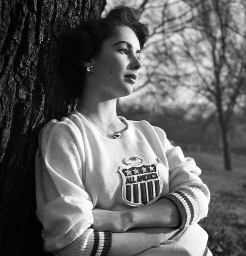
Whatever else you can say about Liz Taylor, she sure knew how to wear an All-American sweater. That shot is from 1948. “The pin she wears belonged to 1946 Heisman Trophy winner Glenn Davis, who she was dating at the time,” says reader Chris Bisbee.
This photo would make for a nice candidate for colorization, no? Go ahead and take a crack at it, and send the finished results to Phil.
New ESPN column today, and I think you’ll really like it — good story, good images.
Dealometry update: As I mentioned yesterday, I’m excited about our new sponsor, Dealometry (if you missed yesterday’s entry, you can check out the full scoop here). But here’s something I didn’t realize yesterday: Although the current Dealometry deal is pitched as “Half off on a pair of Chucks at AmericanAthletics.com,” the discount actually applies to anything on the American Athletics site. In other words, if you buy the deal for $23, you get an American Athletics discount code that’s worth $45, which you can spend any way you like. It’s a good deal!
And like I said yesterday, even if you don’t want this deal, it’s totally worth signing up for the Dealometry email list, so you’ll be apprised of their future deals.
Contest reminder: I’m currently sponsoring a design contest to create a logo for the Baseball Project. Full details here.
Uni Watch News Ticker: As I was posting yesterday’s entry about disaster-relief appeals on uniforms, my pal Rob Walker had a very interesting piece on Slate about the design of disaster-relief campaigns. Rob came up with a really good term to summarize this phenomenon: “the propaganda of concern.” Wish I’d thought of that. Recommended reading. ”¦ Meanwhile, more tsunami gestures, as explained by Sean Clancy: “Supercross and Motocross are unique because nearly all the machines ridden by the racers — Honda, Suzuki, Kawasaki and Yamaha — are made in Japan (the exception is Austrian maker KTM), as are many of the components on the bikes. At last week’s Supercross race in Jacksonville, Fla., many teams and riders sported stickers showing their support for disaster victims in Japan. In addition, Cole Seely wore a Japanese flag on his jersey and riders sponsored by gear-maker Fox sported butt patches in Japanese, which translated to ‘To Live in Hope.'” ”¦ Earlier this week I linked to photos of the L.A. Kings’ St. Paddy’s Day warm-up jerseys. Until now, though, I hadn’t seen how they looked from the front. Also, I hadn’t realized that another team wore green warm-ups that day: the Flames (all this courtesy of Jeffrey Downe). ”¦ I really like the massive block letter on this varsity sweater. ”¦ “The Portland Timbers’ presenting sponsor is Alaska Airlines,” writes Jason Halpin. “As part of their partnership, the airline decided to outfit a plane with a Timbers design and have fans submit designs. Yesterday, the team and the airline announced the winners and runners-up. As you can see in that article, there are two winners, and the eventual plane design will incorporate elements of both. Not sure how they’ll do that.” ”¦ Here’s a good video report on an arena being changed over from basketball configuration to hockey (with thanks to Nick Phillips). ”¦ Yankees announcer Michael Kay lost a bet and had to show up at Madison Square Garden in full New York Rangers gear the other day. “I was at that game and saw him,” says Alan Kreit. “The back of his jersey had ‘KAY 47.'” Matt Harris says the number was “because of the running joke on Kay’s radio show that they’ve been on the air since 1947.” ”¦ Cycling note from Sean Clancy, who writes: “If you win the Italian pro road race Tirenno-Adriatico, or ‘The Race of the Two Seas,’ then you get this kick-ass trident.” Now that’s a trophy! ”¦ “Embarrassing moment for Nike,” says Patrick Fleming. “They made a commercial to commemorate England winning the Grand Slam (winning every one of their games) in the Six Nations rugby tournament. Only problem is that England lost their last game of the tournament to Ireland, thus denying them the title of ‘Grand Slam Champions 2011,’ and now the ad has been leaked.” ”¦ New helmet logo for McNeese State (with thanks to Chris Mycoskie). ”¦ Michael Jordan chastised a UNC player for wearing Kobes instead of Jordans (thanks, Brinke). ”¦ Not uni-related, but there’s a sensational collection of vintage postage meter tapes here. Be sure to click on the photos to see the larger versions, many of which are spectacular (big thanks to Thomas Moore). ”¦ “I play baseball for D3 St. Norbert College,” says Kevin Wilson. “We recently played a game where both teams wore green for St. Patrick’s Day. We also played a game where both teams wore white.” ”¦ Shawn Sweeney works in the Media Relations Dept. at Long Island University, which earned an NCAA tourney bid — the school’s first in years. “I was surprised to learn that the NCAA patches that all the teams wear are adhesives, not sewn on,” he says. “Since we didn’t have a traveling equipment manager, one of the associate athletic directors and I put the patches on all the jerseys. The patch’s primary recommended location is on the left side, but we decided to go on the right (secondary by NCAA standards), since we didn’t want the patch to go above the flag. We used a ruler to line everything up and make sure they were all the same distance from the trim. Also, the patches were kind of a pain to deal with — we almost pulled a few of them apart trying to peel the backing off.” ”¦ Here’s a shocker: Michigan football has been practicing in white pants (as noted by Nate Jamison). ”¦ New info on the Senators’ forthcoming third jersey here (thanks, Phil). ”¦ Really ilke this old shuttlecock display. ”¦ City Paper, the alt-weekly in DC, had a bunch of designers create new logos for the Wizards. “Frankly I think they’re all pretty shite,” says Ben Fortney, “which is a shame since the DC flag has such a strong visual.” ”¦ Fourth graf of this story says Don Zimmer “was the first player to try on a Mets uniform.” Not sure on what basis they’re making that claim, but I’m looking into it (with thanks to Dwayne White). ”¦ The goalie mask company Head Strong Grafx has been running a design contest. Here’s Ben Gorbaty’s entry. “I attend Washington University in St. Louis and our mascot is the Bears so I wanted to come up with a design that reflects the school and the mascot. I have the seal on the chin, a portrait of Washington on one side, and the main building across the top. On the other side, opposite Washington, is the ‘Battlin’ Bear’ logo.”
“I play baseball for D3 St. Norbert College,” says Kevin Wilson. “We recently played a game where both teams wore green for St. Patrick’s Day. We also played a game where both teams wore white.”
Hey, if it’s worth saying two times … go Green Knights!
Actually, everything down to the mention of the Michigan pants is up twice.
Mea culpa. Now fixed, I think.
Heck ya! As a proud Alum I’ll be cheering them on tomorrow night in Minneapolis,D3 Hockey Final 4!
Bring back another National Championship to campus would be nice. It would definitely make up for all the snow that just got unloaded on the campus.
Regarding yesterday’s NY Times front page article on the “newly discovered” Babe Ruth footage. Twenty years ago that exact same footage was found for HBO’s When It Was A Game documentary series. It was used extensively for that show as well as a Babe Ruth documentary later in the decade. There is nothing new, or unusual, about that footage. It was a horrible job of reporting by the Times.
Met Elizabeth Taylor once at a party in Philadelphia. She really did have violet eyes. Unbelievably beautiful. Almost took your breath away.
—Ricko
Elizabeth Taylor would have been 16-years old in 1948. That’s the usual age for high school juniors. How many girls in your junior class were that beautiful? She was simply gorgeous in those days. RIP, Liz.
PURPLE eyes?
Indeed.
link
Could we make a teeny exception to the purple rule for “those beautiful violet eyes that I’ve been in love with since ‘National Velvet’.”?
I’ve always said that I’m fine with purple as it appears in nature.
…and that’s just one of many reasons why that particular photo doesn’t need to be colorized. This is one of those instances where you won’t be able to improve by adding color. It’d just distract from the beauty of the original image.
I agree, do not colorize that picture, just enjoy it.
What was Ricko and Liz Taylor doing at the same party?
link
Just chatting in the buffet line.
—Ricko
escort?
These graphics are really plane (offer it because one involves the Oakland Raiders)…
link
—Ricko
and another the All-Blacks of New Zealand.
I want to follow up on yesterday’s posts on Kansas uniforms. I was off-line for most of yesterday. Two things:
1. The red, white, and blue Nikes that Kansas wore in that 1987 game were not the ones that Powers posted; they were the previous version. They looked like the Nikes that every team wore that year (including Western Carolina), except they were red, white, and blue. If you look for a picture of Barkley from 1987-88, you’ll probably find them.
2. Sorry about my mistake saying that Kansas’ blue and white uniforms had gold trim. The home white uniform, I guess, did not. I just remember the picture of Danny Manning on the cover of SI after Kansas won the national title and the blue uniforms had gold trim. Kansas was a low seed in the tournament that year, so it may not have worn the white uniform at all in the NCAAs, which is when I would have most noticed the uniforms.
Here they are. I may still have a pair in my basement, since I gave them to my younger brother and he stashed his stuff there years ago.
link
Beautiful shoes. One of my all-time favorites, along with the Adidas that Notre Dame wore in the late 1970s with the blue, gold, and green stripes; and the Carolina blue Converse All-Stars.
By blue Converses, I take it you are referring to the white Converses w/ the powder blue inside. Understated look that’s not fully appreciated. Here’s K-State’s Rolando Blackman in the purple version. link
Yes, that was what I meant. Carolina wore them in the 1980s. Jordan was probably wearing them when he hit that shot against Georgetown in ’82.
I’m no shoe fetishist, but I have noticed that
Ashton KutcherKyle Korver wears link that appear to be a modern take on those.Converse was king in the 1980s, with Adidas second, and then Nike started tugging at their tails.
Converse is owned by Nike.
They scored a coup the year that D-Wade, Mike Sweetney, and Kirk Hinrich entered the league.
They all signed with Converse as opposed to the swoosh.
Now my boy elton Brand is with converse as well as the stalwart Udonis Haslem.
Right. But at one point they were No. 1 in the industry and Nike was a toddler.
What do you think of those red, white, and blue shoes that Kansas wore (above)?
I couldn’t open your link, but Danny and the Miracles wore the Nike Air Assault High in the 88 Final against Pearl Jam’s favorite pointguard, Mookie Blaylock.
Danny Manning:
link
Air Assault High:
link
Pearl Jam’s tribute to Mookie Blaylock:
link
GeeMan…I have never liked them…too high and bulky.
However, they were a distant cousin to the 1987 Nike Air Revolution…the first Nike hoops shoe to feature a visable bubble. I remember Chuck Person, the Worm and the Microwave wearing them.
Chuck Person:
link
The Worm:
link
The Microwave: Ive actually only found pics of him wearing the Air Alpha Forces(Barkleys) that i linked to yesterday, but I remember him wearing the revos.
link
Another cool pair of Vinnie Johnson edition Delta Force kicks in Pistons colors and a digital font top mimic the clock:
link
link
I will e-mail to Phil so he can post the pic.
Check out the pic that Phil is sending you. This was a great shoe to play in. I’m with you on those Nikes with the strap and bubble — too bulky, much like the Weapons and the Reeboks with the blow-up button, all from the same general era.
here’s that pic
didn’t realize it belonged in this comment string
Gee…i couldn’t open the link due to my school filter but the URL has AF2 in the title which is these:
link
I fondly remember Stevie Thompson of Cuse wearing them:
Number 32
link
Barkley, circa 1987:
Air Force Two low:
link
Air Alpha Force:
link
Doing what he does second best…in Cons:
link
Those NCAA patches are stupid and driving me up the wall. More and more stickers to litter up the front of a jersey? Some schools have four and I think I remember one with five. Graphicly it looks absolutely horrible. And they serve NO purpose. None. Take them all off. Flag included. Conference patch, gone. Manufacturer, gone. I could handle a one off for a memorial, but unless it is originally designed in the uniform, take off the rediculous stickers!!! This goes double for football too.
Quintessential “one more bumper sticker for perfection”, init.
—Ricko
Absolutely dead-on right.
The worst was the team that had the NCAA square just below the tournament patch. Two patches for the same organization next to each other. When logo creep starts getting redundant, it’s long past time to stop the madness.
Clemson
link
Amen. Get rid of ’em all.
in that goalie mask contest, go vote for that bad ass “Band of Brothers” mask called “Easy Company”
That is some terribleness going on at the City Paper with the Wizards designs. I’m a bit surprised, actually, since I just went though a major design RFP process focusing on the DC market, and there are some really outstanding graphic designers in Washington. Shame the local artsy weekly can’t find (or, apparently, employ) any of them. The lone exception might be link, which has a very strong basic logo concept. Crap typography and an almost incomprehensibly poor choice of red hue, but the basic concept of the two-blue ball-moon with the three DC flag stars is very solid. The red stars probably need to be moved to the other side, though, and the whole thing rotated clockwise.
just a few simple tweaks, and that “Maggie Famiglietti” entry is money! something charming and genuinely throwback about that design…
The worst was that 90s-tastic, superhero font, 3D, dropshadow, nickname-no-one-uses ‘ZARDS one. It’s almost as much of a 90s cliche as that Atlanta Bullshit logo from the Cracked article.
I’ll give the artist this though, at least he got the apostrophe right.
Zachary Vabolis made a decent attempt, but that design might be deemed a bit too similar to link for a team that plays link.
My favorite on the other hand, was Maggie Famiglietti’s, although it just feels more like Philadelphia than Washington for some reason, even with the nod to the DC flag.
Zachary Varbolis’ entry looks more like an airline logo than a sports team. Too corporate and bloodless for my taste.
There’s just no good design for the Wizards. The name is the problem. I know, I know, we already had that discussion, but seriously, the only option is a total redo.
Or…they could move the team to Kansas City. Since MLS’ KC Wizards became Sporting KC, the name is available. Then the Sacramento Kings could move to DC. Can’t move to the home of democracy and still be called the Kings, so they become the Bullets. Washington fans get their old name back, while the franchise that belonged to Abe Pollin still honors his wishes. A total win-win.
Call me crazy, but I kind of like their current logo and wordmark:
link
I’m actually going top leave the denizens of Washington alone since they have a much bigger problem now:
link
Am I the only one who thinks the designers treated the contest like a gag? I don’t think any of these would actually be pitched to a team.
“My inspirations were rage, despair, jewel tones, and patriotism” seems to give it away.
Finally, the Twin Cities is major league…
link
Who needs the Vikings.
—Ricko
“There has been a tremendous sense of excitement in the marketplace since the LFL began discussions about bringing a team to Minneapolis.”
Riiiight.
—Ricko
minnesota purple nurples?
There’ll probably be a sign-up list for phone photos from the quarterback.
—Ricko
twitter feed and crossed fingers, my man ;-) hahaha
Wow, look at the definition in the quads of the defender in the foreground of that photo.
Othet than Kay’s f-ing huge head, he looked like he could have been a hockey player…too bad it wasn’t Kay’s new wife in only a Rangers sweater…
He’s talking about Jodi Applegate…
link
He really outkicked his coverage! Too bad she is stuck on the horrible WPIX 11 news…..
Kay’s head in that helmet really makes him look like the Great Gazoo… but all that gear, and they couldn’t spare a genuine Edge jersey? He gets stuck with a crappy Premier replica?
No, the real outrage is the sweatpants he’s wearing rather than a pair of proper socks.
There’s that too.
really?
But they got the apostrophe right!
Ah, that’s where Tim E missed on Oklahoma City.
Should have gone with ‘Der.
—Ricko
Although “Pist” is pretty good for Detroit, too.
That designer HAS to know that it would immediately become ‘Tards. That is one thing to consider when doing logos or team names….how will your opponents turn it into something negative?
Not to mention, who calls ’em the ‘zards, anyway?
I figured it was an link.
On the other hand, I kind of hope this inspires a movement to nickname the team the Zards. Think of all the great headline alliteration and rhyming it would encourage: Zounds, Zoom, Zombie, Zuck, Hard, Shards, Zip, Disaster, Biz, Hazard, Blizzard, Buzz, Bizarre, Whiz … the old headline writer in me is practically in tears at the beauty of the possibilities.
Plus, there’d be the ever-present temptation to put Zards Tix into a headline, which would be just one of the most glorious messes of letters and syllables ever.
Also, this from the designer:
Clearly they need a name that’s more urban …
Zards is more “urban”? More Urban Outfitters, maybe, but not even in Adams-Morgan is that “more urban.”
“Clearly they need a name that’s more urban …”
No, bad designer, it’s not that clear at all. Why do they need a more urban nickname? And what the hell does that even mean?
He goes on to define “more urban” as:
shorter, percussive and monosyllabic.
Which (A) fails as a definition of “more urban”; and (B) doesn’t describe “Zards.” Shorter, barely; monosyllabic, only technically; but “Zards” is actually less percussive than “Wizards.” Put the Z at the start of the word, and it becomes a long, soft consonant. If we spoke Russian, we’d have the letter Ц, which would let us start words with the percussive, short-Z sound of the letter Z in the middle of words. As in “pizza.” But we don’t speak Russian, and we don’t have that letter, so when Z comes at the start, it’s less percussive. Plus, moving the A to the first syllable deforms the D to be less percussive, too. Turns it from a consonant that rhymes with “nerds” to one that rhymes with “shards.”
Maybe the designer envisions a German-style pronunciation (Z is like your pizza example).
Just saw this discussion was down here, too.
They don’t need a more urban name, they need a new name. I won’t repeat everything I said earlier, but basically, no design is going to help the fact that Wizards isn’t a good name for this franchise.
Right on. It’s just a terrible nickname no matter how you look at it.
How do you get more urban than the wiz?
link
wow calgary, going with a whole different number and nameplate font for the st paddy’s day jerseys! but ask any DIYer here… you went that far on the jersey, would it have been too much to change the black to green on the primary “C” logo?!?!
and the kings… having to move the “A” to the wrong side (unless you play for motown), because of logo creep… threw up in my mouth just a bit
What was with that font on the Flames’ NOBs? It looked like something out of the Flintstones.
yeah… definitely not a fan of that font. but, good hustle, calgary!
Today’s ESPN column is up:
link
In that column, Paul mentions Tom Seaver’s 300th win.
Another player reached a signficant career milestone the same day. Don’t remember such a thing ever happening in MLB other than that one time.
Anyone care to take a stab at the other player and the milestone?
—Ricko
HINT: The players’ teams had very similar color schemes.
—Ricko
I’m probably too slow after reading Paul’s article, but I believe it was Rod Carew’s 3000th hit.
Yup. Was with the Angels, of course.
Big Hurt hit his 500th homer and Craig Biggio got hit 3,000 on the same day in ’07.
I guess I’ve been reading Uni-Watch too long…I feel as if I’ve read/seen almost all that info before in various features/tickers/links over a great deal of time on this site. It felt like a repackaged LP with 3 “bonus tracks”…
Are you kidding me? I never quoted Richard Launius before, nobody has ever shown his original design boards before, the crazy Dayton-to-Dayton connection, etc., etc….
Sometimes the repackaged LP with 3 bonus tracks is totally worth the money.
I love the fact that the UD baseball team wearing the design is a complete coincidence.
And it looks like the Sox link from Richard’s prototype with someone else’s. His featured link. Maybe those are the road socks from design #6.
I think it’s funny his Reds prototype looked exactly like his White Sox prototype. Which seems to owe everything to the Astros.
Yeah, I thought that was funny too. I asked him if he did the Reds redesign on his own initiative, or if the newspaper asked him to do it, and he couldn’t remember! Either way, I think it was more of a lark than anything serious.
Wonder what the MLB…I mean…wonder what MLB would look like if almost every team went the Astros route back then. I’m sure some teams would look good.
Not advocating that every team actually wore them, but I would like to see the concepts.
wonder what MLB would look like if almost every team went the Astros route back then
~~~
this is your vision of
hellheaven, isn’t it?great piece paul!
and yeah…tom terrific got 300 & sir rodney notched 3K on the same day
I was in left field for Tom’s 300th at Yankee. Strike was supposed to take place a few days later but was averted, making it all the more sweet.
Never owned a Sox beach-blanket jersey, but I’d wear one. I did have a batting helmet from that era, though.
As much as I liked that uni, it was the second-best choice. I LOVE that striped-sleeve jersey on the far right of these photos:
link
By the way, what was the significance of the number 39?
Always liked those uniforms.
I must say this man has become an immediate hero to me. Not only did he design one of my all-time favorite uniforms (Guilty pleasure?), but he also designed Arkham Horror, a board game that easily has consumed my life (Try it, if you can. It’s a pretty long endeavor though)
I posted this yesterday, but I didn’t get the type of discussion that I was looking for.
This link shows the Michigan lacrosse team with Maize on Maize jerseys and a winged helmet. I’m a purist, but do people think this is a good look for the football team?
link
Thanks
Minnesota Gophers did it and were roundly criticized hereabouts.
—Ricko
See.
link
I’d criticize the striping on those Gophers unis, not the choice of color.
If Michigan wants to try it, they should do so against Notre Dame. If I recall, they’re playing that game at night this year, which already breaks with one tradition. Might as well add maiz-on-maize unis.
Granted, Michigan’s pure yellow would be considerably brighter.
The highlighter yellow Michigan currently uses is bad enough on just the pants. If they wore matching jerseys they’d look a lot like Oregon. Not good.
It would be worse. The pants have no striping on them. Only a block M on the hip. The jerseys only have block numerals.
Add the fact that Adidas uses a highlighter yellow and they would look like big bags of piss running around…
Actually. Probably pretty fitting.
Depends. Do you like link?
For the record, I don’t believe any WVU fans like that all gold uniform. It’s just terrible.
Chad Reed also wore the Japanese flag on his jersey this past Saturday night in Jacksonville…you can see it in this video link:
link
Also, MotoGP had some tributes to Japan as well…same situation as SX and MX, most of the manufacturers are from Japan with a lot of Japanese ties…only pic I can find is from Dani Pedrosa, but I’m pretty sure all the Repsol Hondas had the flag and an inspirational message on them:
link
Wouldn’t be too surprised to see World Superbike with some tributes this weekend as well.
Also, the Yamaha Factory team had this tribute on their bikes:
link
Can’t remember what the translation is.
If you want to talk about uniform quirkiness look at motorcycle racers. Valentino Rossi is among the most superstitious personas out there, and his leathers and motorcycle match.
Don Zimmer “was the first player to try on a Mets uniform.”
Ah, but which one was it? link, or production version?
Do we even know if the Mets made prototypes?
That’s my favorite part of today’s article – the evolution from design to prototype to on-field model.
I’ve been asking Brewers collectors who were active in the 1970s, see if anybody knows what happened to link.
“Michael Jordan chastised a UNC player for wearing Kobes instead of Jordans”
From the article:
“I don’t care if your feet kill you, you’re gonna wear them Jordans.”
Niiiiice. I know he was joking around with them, but still…that just ain’t right.
Agreed. What a jerk.
Whadda ya expect from a guy with a Hitler ‘stache?
I can’t wait until the day the team-mandated sneakers put all the players in the hospital.
It’s that commitment to athletic performance that has…
oh, wait.
Followup…
link
Any Uni Watchers know who this athlete is?
link
do you know or are you trying to find out?
if you do, hint?
Unfortunately I don’t know. Trying to find out for myself. I guess I don’t even know if it is an athlete, but judging by his apparel and such, it’s a strong guess.
(this is supposed to be here.)
Looks like Walt Hazzard. Probably isn’t, but that’s the first guy I thought of.
–Ricko
And lookee what I found…
link
Rod Carew?
Looks like Walt Hazzard. Probably isn’t, but that’s the first guy I thought of.
—Ricko
Ricko! You da man!
link
That’s the exact picture.
Remember, my trivia contest is coming up in a few weeks. So be sure to check your email for some photos. Consider this a warm up. (actually a friend saw this image and had no clue who this was and wanted to see if I knew. I didn’t, but knew of people who might)
great call, ricko
OK, so I’m way too old to have a lifesize Fathead of “Insert Star Player Name Here” on my wall but now they have these:
link
What do you guys think?
I’d probably prefer one of those framed ones they sell. The borderless bit doesn’t quite do it for me.
That said, I prefer colorful hockey jerseys hanging on the wall even more.
I never thought of the framing issue and yes, I have a framed, game-worn jersey hanging in my office and it looks great!
Our next deal from Dealometry — slated to begin next week, I believe — is a Fathead discount.
Sounds good, because link would look very good on my boys’ bedroom wall.
The Jordan thing doesn’t surprise me. He may be the greatest ever but his ego was always a little out of control like most elite athletes.
Those Wizards logos were pretty bad. The only one worth using was the first one and it still wasn’t great. The rest were retro for retro sake(RFRS? Maybe) or silly. ‘Zards really? Who in their right mind shortens wizards.
“Hey, I got tickets to the ‘Zerds!” (as it would be pronounced).
Yeah, we can hear that catching on, can’t we.
(eyeroll)
—Ricko
The San Francisco Giants have officially unveiled (via Twitter) what their special jerseys will look like when they receive their Worl Series rings:
link
These will be paired with the hat that Paul linked to in the Ticker the other day.
At least you can tell there is gold on that uniform.
wow i so much do not like those. hideous.
they’re not gonna wear them in game play, right?
just the ceremony?
I’m sure they will wear them during the game. I actually don’t think they look bad, but I would prefer they don’t change anything.
Also, please ditch the orange jerseys.
Considering what they could have done, not bad for a one-game special.
Shows a certain amount of restraint, actually, while still being noticably different from the norm.
Not sure the different hat is necessary, though. The special jerseys would have been enough.
But, of course, is easier to sell hats than jerseys (I suppose first I should ask if either IS being offered retail).
—Ricko
The hats are being offered retail, and the jerseys will be soon (per the note in the Ticker recently). Not online, but at the official dugout store at the ballpark.
geeman asked that i post this:
Kansas Nike Barkley
Greetings from O’Hare… Lots of goid stuff today, but from Gate K-4, what matters most are Postal Strips. What a great country.
Top notch ESPN column, Paul! Loved it; blown away by the info! I appreciate it as a Sox fan & this is just stuff you can’t get anywhere else. Just, honest historical spoonful good stuff!
Thanks, man — glad you liked! I’m not a Sox fan, but I had a blast working on that story. And the Dayton coincidence, which didn’t fully click into place in my head until the day before my deadline (at which point I hurriedly phoned the Dayton athletic dept.), was the cherry on top, at least for me. Fun story!