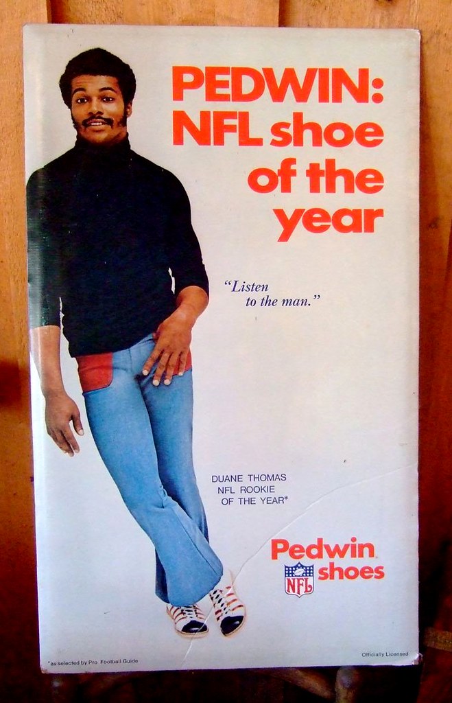
I spent the weekend knocking around upstate with my friends Jon and Karen. We hit a lot of thrift, vintage, and junk outlets, including an old barn where I spotted the poster you see above. Must be from early 1971, since Thomas had been a rookie in 1970. I didn’t buy it, but it was too tasty not to photograph — dig those pants, those shoes, that turtleneck. I especially like the cryptic “Listen to the man” line, which is particularly ironic given that Thomas was about to become infamous for not saying a single word to anyone during the ’71 season. (Also, I’d never heard of Pedwin shoes, although it turns out they did plenty of sports-themed advertising. Anyone know more about this brand?)
Something else I did not buy: this football-shaped 45-rpm record, which I found in an antiques shop in Kingston.
The one thing I did buy: this swell bowling shirt, for a very reasonable $16.
And that’s it for today, because a certain uniform columnist is marking his birthday by taking the day off. Back with a full slate of content tomorrow. — Paul
Happy Birthday!!!
Happy Birthday, Paul!
Have a Happy.
Happy birthday Paul!
Happy birthday!
Happy Birthday, hope you get lucky!
What flavor ice cream, Paul?
As long as you’re here, Phil, I just want to tell you what amazing work you’ve summoned from your growing corps of weekend colorizers. Yesterday’s batch was insane. Really, it’s a wonderful gift to your lazy but avid faithful. You also correctly used “penultimately,” thanksbetothesaintsandholymothermary.
And Happy Birthday to the chief.
What?…you mean “penultimate” doesn’t mean, “really super ultimate”?!?
:D
Happy Birthday Paul and thanks for this wonderful site!
I suspect some type of meat-flavored ice cream.
Bacon Brickle.
Showoff.
Happy birthday, Paul!
Happy birthday Paul! Enjoy the day off!
I sense…a theme here.
Happy Birthday, Paul.
Thanks for creating a site that gives me so much enjoyment every day. For Deep Freeze and the other good times and email exchanges of shared discoveries, too.
—Ricko
Regarding Pedwin…
Didn’t they make bowling shoes in the ’50s and early ’60s? Seem to remember that name spoken often on the local “Bowlerama” TV show.
—Ricko
Or maybe it was that one of the prizes was a Pedwin Shoes Gift Certificate. Just know that Pedwin Shoes and Butwin Jackets got a lot of mention on that show.
—Ricko
A definite link…
The Pedwin shoes in that poster are F-L-Y fly.
Happy birthday, Paul!
An link for Paul’s birthday.
¡Feliz cumpleaños!
Happy birthday, Paul!
Happy Birthday, Paul.
Happy Birthday, Paul!
You share the day with my daughter Grady who turns 9 today.
I want to again thank you for providing us with a forum for our extremely specific interest.
oh, happy birthday to paul and little grady!!!
Happy Birthday, Paul!
Someone go snag that football-shaped record: “Funked on Fight Songs” has piqued my curiosity.
BTW, I just had a chance to read yesterday’s entry by Phil. What a treat!
Great work by both Phil and Jerry Reuss! A great read to remind me of warm days and baseball while a snowstorm rages outside on the first day of Spring!
thanks matt
jerry was great to work with — and “volume II” will be even more awesomer
stay tuned…
link
“LUKAS HAS GONE OFF THE GRID! MELTDOWN!!!”
DIY a bowling shirt?
Sure. Put his baby on the back of a red or black shirt.
link
Presto, psuedo-’50s.
—Ricko
nice find!
Happy Birthday!
You would think they would give Gordie Howe a new pair of shoulder pads.
link
Checkout Rick DiPietro wearing the old school Cooper mask combo against FLA. I heard for his next trick he is going to Plante’s mask.
link
Happy anniversary of your first experience with a female’s genitalia, Paul. May you repeat that experience with a different subject this very day to celebrate the occasion.
Hey Paul,
Happy Birthday!
Can anyone point me to the UniWatch post where a minor league club had a cap with a fighting asparagus logo?
Thanks,
Chris
Don’t remember an asparagus – the Wilmington Blue Rocks have a celery – would that be it? (celery is much better than asparagus anyway…)
Could it be the Scottsdale Community College Fighting Artichokes? They were mentioned in link.
Crap. link.
Duh.
Wrong link, Jimbo.
Thanks guys – This was from last summer.
I think it was a minor league ballclub, I remember there being a link to a New Era cap with the fighting asparagus or artichoke on the front…
Maybe it weas broccoli?
It was a pretty cool ballcap from aminor league team. I had a dreak about it last night and need to buy one pronto!
Thanks for the ongoing help.
Happy birthday, Paul!
Happy Birthday my good man. Enjoy this day off. Do no work. Experience only joy. And if you see another football shaped record, for the love of Pete, man! BUY IT!
That thing was SWEET. Reminded me of those square records you could peel off the back of a cereal box. Good Times.
Craig D
Happy birthday to you,
Happy birthday to you.
Happy birthday to Pau-llll,
Happy birthday to you!
Happy Birhtday! (as a bad uniform man would spell it)
LMAO! “from your friends at majestic”
First of all: Happy Birthday, Paul!
Secondly:
Pros and Cons of the 2011 NCAA B-ball Tourney after the opening two (or three?) rounds…..
PROS: -Having every second of every game televised.
-Seeing a team (VCU) that the committee only viewed worthy of a play-in game make it to the Sweet 16 and have what looks like a nice match-up vs FSU.
CONS: -The locations hosting the opening rounds all had the same court design…….BORING!!!!
-Due to the “First 4” play-in games, the NCAA is now calling Thur/Fri action as the second round and Sat/Sun action as the third round…..THAT JUST AIN’T RIGHT!
VCU did not equal a pro in this part of Indiana.
Good ol’ Vacuum Cleaner U. advances.
Usually they suck.
PROS: we get to see the beautiful uniforms of marquette for at least another game
(glad you mentiond the whole 1st, 2nd, 3rd round thing. honestly couldn’t figure out why every station was “wrong”).
CONS: Having to look at the clown suits 90% of the teams wear now.
Does anybody know why some tourney teams had a US flag patch on their jersey and some did not? There didn’t seem to be any rhyme or reason to who had the flag and who didn’t. Was this an option that some schools could choose, or was it a holdover from regular season uniforms?
I agree about the same ol’ blah looking courts, but it’s all about branding by the NCAA. And, I remember the constant complaints when the tourney would be played on Boise Junior College’s court with the kaliedescope top-of-the-key design. Maybe simple is better?
No, having the diverse and colorful courts was better. They had character. The clash of colors with the two opposing teams and the court was beautiful, and really highlighted the neutral site aspect. The homogenized black/blue NCAA courts look bland and corporate. Now a game in Chicago looks exactly the same as one in Tucson. That’s no fun.
I agree with pflava 100%.
The only positive aspect is this: you don’t see any courts with three different 3-point lines on them. Speaking of which, why can’t the mens and womens lines be the same? This link is just ridiculous. Actually, I’d rather see everyone shoot from the NBA distance, but I can live with 21′ for high school and college.
Anyway, Happy Birthday, Paul!
Also agree 100% with pflava. I normally didn’t have a clue where the games were played. Plus, I know last year they actually shipped a court in to Buffalo for the NCAA to play on. Don’t know if it was like that everywhere, but if so, it would seem like an awful waste of money to ship in a basketball floor to what were mostly NBA arenas.
3-point lines: I say keep it 19’9″ for high school, but the NCAA should move back a few inches to the FIBA distance.
Tournament courts: I don’t have a problem with the template, but why can’t they at least paint the courts in the colors of the host team/conference? E.g., the court in Tampa would be USF’s green and gold, the one in Tucson would be Arizona’s cardinal and navy, Chicago would be painted, um, link…
I could be wrong but I believe the first step towards using the same color scheme on all the courts was the NCAA having host arenas apply a giant blue NCAA decal at center court of the host arena’s floor. The NCAA in their infinite wisdom did not account for the fact that the decal being added on top of the existing floor could become incredibly slippery.
To combat this and keep the brand,they began using the standardized courts and shipping them to the host locations around the country to maintain a uniform playing surface.
Why they can’t use a standard court format with unique colors is beyond me, and why they chose a black/blue combo that makes reading the host cities name nearly impossible is another question.
Yeah, a standard court is safer than putting a sticker over an existing court, but I never had a problem with leaving the court alone and just having the NCAA banner at the scorers table. Worked for years.
They’ve always had problems with NBA teams’ logos on the floor. (A personal favorite was at McNichols Arena, where they left the Nuggets’ skyline logo intact but changed the text to “Denver Mile-Hi”.) It struck me as odd to have them play at TD Garden a year or two ago without giving the kids the chance to play on the parquet.
And as someone who’s not so much of a college basketball fan, I was much less interested in watching the first weekend this year than I was when CBS was switching from game to game.
Ah, McNichols…
Loved watching games from there during the skyline logo era. Can anyone turn their old buzzer into a ringtone for my phone?
link
Wishing you a Happy Birthday and many more.
I feel like I’m late to the party, but have a very happy birthday.
We saved you cake.
God do I miss the moody black athlete(s) of my youth. I can close my eyes and see Alex Johnson sitting by himself at the end of the bench.
Yes.
Happy Birthday, dude! I assume the only reason you did not buy a record with a song by D.J. Funkenstein was that they wanted too much money for it?
Happy Birthday, Paul! Here’s hoping you have just as many on the other side of this day as well! May you live to be 100, and still love the aesthetics of the game!
Great, today is Paul’s Birthday AND my Anniversary. I will never forget it now! I’ve got to tell my wife this amazing news!
PS. Happy Birthday Paul!
Happy Birthday Big guy!
Thanks for all the kind words, folks — much obliged.
And the Mets gave me the best present ever by releasing Ollie Perez this morning!
I imagine that news buoyed even Phil, who went out to his car this a.m. to find a flat tire.
Oh, like Monday’s aren’t annoying enough.
—Ricko
But the play by play guy remains, right?
yes, brinke…wayne hagin still holds gainful employment…dammit
/baby steps
“Best present ever”? Oh, I think the Mets could have given Paul an even better link than Perez.
Speaking of New York’s finest National League baseball team, seen the Mets’ new ads in niche magazines like Harper’s and Wine Spectator? Kind of sad, actually; they’re not even for season tickets, but for Mets mini-plans. Uni-wise, the ads feature Jose Reyes in the ice cream whites with the no-black cap – and a whole lot of dirt on his jersey. I’m a fan of the Mets in royal pinstripes, but the crisp white headspoon with the blue cap is probably their best look. Little to no black anywhere in the ad.
Still, though: Full-page, four-color ads in national magazines. I can’t recall any baseball team doing such a thing before. It’s either innovative or desperate. Or both, perhaps.
Just wanted to give some Birthday wishes to Paul and some of the other 3/21ers (Tim Dalton, Matt Broderick, Shawon Dunston & Al Iafrate)
And many more..
My personal favorite 3/21ers: link and link. Two giants of the blues.
Son House is the man.
Thanks for creating a place that keeps me busy. Happy Birthday UniGod[/Cool Runnings Accent].
A Son House reference on Uniwatch?! Proof positive that Paul has excellent taste. I actually visited House’s grave here in Detroit a few years ago. Happy birthday Paul!
Even though you passed on an awesome die-cut record, I’ll still wish you a happy birthday.
Happy Bday Paulie!
link. (Well, at least the number is right.)
And remember, you don’t need to work out any more. Pushing 50 is all the exercise you need.
Happy Birthday Paul. Hope you’re enjoying your day
Here you go.
For those who advocate a Dodgers gray hat.
For Spring Training or otherwise.
Here’s a look at one…
link
—Ricko
Okay, Eagles fans, find yourself a kelly green bowling shirt…or kelly green jacket…and get to DIYing…
link
—Ricko
Or…
link
I think Phil needs that.
Sew this onto hat, Jimbo…
link
—Ricko
You’re talking to Vilk, right? I think that’s more up his alley than mine.
Your city, though, so I think he meant you.
But you’re right…I’d wear that.
Coulda been either, therein the handiness of the same first name. But, yeah, thought of JTH cuz of the city, then realized applied the USFL wonk, too.
—Ricko
Love the white helmet era?
link
Happy Birthday Paul!
Happy birthday Paul!!!
Happy Birfday Paul!!!!!!
Paul- Cheers on your Birthday!
Save Ferris!
Well, we’re filling the comments with the same thing… but I gotta join in wishing you a happy birthday, Paul. Not only does this blog rock, you’ve formed a real nice community of folks here. Thanks!
Remember Paul, birthday cake is the healthiest thing for you because the more you have the longer you live.
That sounds like Rachael Ray advice.
There’s a certain amount of love around here for this logo…
link
—Ricko
That would be an amazing logo for a San Fransisco 49ers MLS team.
link
I. Like. This.
link
Boffo stuff, Tim.
Unfortunately, there’s another meaning for “gray matter”…
link
—Ricko
Well, crap…
link
Must. Have. Basketball. In. Logo. Can’t… resist.
oh crap, you’re right.
Agreed. I love the half-ball/cityscape logo design. Masterfully done sir.
I like the brainball cloud, but the bison cloud is the better primary logo. The brainball cloud is a good center court logo though. There just aren’t enough straight-on pissed off animal logos out there that convey anger and immediacy as well as the bison cloud without looking cartoony.
Have a happy birthday! May all the purple be hidden from sight on this exalted occasion.
I’ll join the happy birthday chorus, and to keep this uni related, I present a gallery of NCAA hoops cheerleaders via Charles Apple. link
Oh boy. The man in black is back.
link
That means you photoshop people can have a whack at turning this link into a BFBS uni.
“UFL commissioner Michael Huyghue said that bringing in Glanville is part of the league’s strategy to hire coaches who ‘have a winning pedigree and are household names.'”
Well, they got the household name part, at least.
63-73 in the NFL and 9-24 at Portland State doesn’t sound like a winning pedigree to me. It also proves that outfittng your teams in black to look tougher isn’t a guarantee of success. But I’m sure he’ll do it anyway.
Fine, try this photo…
link
I always get him and Johnny Cash mixed up.
—Ricko
Cash is the one whose body is dead but soul is still alive. Glanville is, well you see where I’m going with this.
A household name….in 1993.
I vote for none of the above.
link
Since gamers are the only ones who will be playing NFL football this year, I nominate The Jeff.
I dunno, maybe.
But it’s SO hard to get a good photo down there in Mom’s basement.
Should be Clay Mathews, as long as they photoshop some sleeves onto his jersey.
So I was just thinking about this, if the wizards change to the hypothetical blue/red color scheme rumored last week AND the Kings become the Royals with their old colors (r/b), 6 of 30 nba teams will have red/blue color schemes and 12 NBA teams will have red as one of their two main colors.
That’s 20% and 40% of the league respectively.
Well, other than the NBA, ABA and MLB in the ’70s, pro sports hasn’t had too many periods of widespread originality.
BFBS has proven to be a much safer bet, and requires very little of, whatchacallit…oh, yeah, thinking.
—Ricko
Again I have to ask, does the LA area really need another crappy team? They don’t even appreciate the one they already have. The people of Seattle would probably be glad to take either the Kings or the Clippers off of California’s hands.
they won’t always be crappy, though, will they?
ok, they will
/carry on
Holy crap! It’s even worse with blue. Not including the impending changes, there are 17 teams that feature it prominently.
Hawks
Bobcats
Mavs
Nuggets
Pistons
Warriors
Pacers
Clippers
Grizzlies
T-Wolves
Hornets
Knicks
Thunder
Magic
Sixers
Jazz
Wizards
That’s 57%. That’s insane. Blue and red are banned from new color schemes.
Bobcats need to become the Sonics. Folks in Charlotte seem more interested in college hoops, so move the team to Seattle.
Mavs need to go back to green.
Clippers need to go back to orange.
link
Grizzlies and Hornets need to contract.
Thunder need to use Tim’s gray design.
Jazz need to go with just purple and green (I know it’s Paul’s birthday, but yeah, I said it).
That takes care of seven teams. That should spread the color palette out a little.
the nba needs a good fuschia team
im thinking the heat
Jim: how ’bout this? Grizzlies, Hornets, Bobcats, Kings and Clippers all contract. “New SuperSonics” team in Seattle cherry-picks its roster from those teams’ rosters. That takes care of three current blue teams and one potential future one.
The Mavs could return to green as the primary color, but they’d have to come up with a new secondary color because they’ve always worn blue. In my contraction scenario, we lose an orange team (Charlotte), so how about green and orange for Dallas?
The rest of the lottery teams get the remaining players via dispersal draft.
Phil: link definitely works. That knocks another red team off the list.
‘zactly trogdor…i was going for the floridians throwback with that suggestion…hell, they could even keep the black, since it works pretty well with fuchsia (if only i could spell it)
Wow, you’re taking away two CA teams. Nah, there’s room for the Lakers and the Anaheim Royals.
Would Ricko mind if we included the Timberwolves? Contract them, the Griz, Hornets, Cats and Clips. Add the Sonics and you get 26, just like your scenario. In time, Paris, London, Berlin and Madrid/Barcelona could get them back up to 30.
And count me in as liking that fuchsia Miami uni.
Oh, and as long as it’s just a trim color, the Mavs can keep blue on the green unis.
link
I like the newer green one, too.
link
Fuchsia Heat – link
Is fuchsia hot hotter than red hot?
As far as getting rid of the red and blue I say Grizzlies, Clippers contract. Bobcats move to become the “New SuperSonics”.
The Mavs could return to green as the primary color with blue as the accent.
Miami, red becomes fuchsia.
OKC, blue becomes gray.
TWolves, no more blue back to gray, black and green
Nuggets go to purple and gold link
Royals, purple blue as opposed to red and blue
Red (-3)
Blue (-6)
Happy Birthday Paul.
Just throwing this out there for those who always use this argument against soccer, “They don’t score enough goals. It ends up in a 0-0 tie half the time and is boring.”
First 10 games of the MLS season 27 goals scored. That’s 2.7 goals per game. And no 0-0 ties. Every game had at least one goal and one even had 6.
Speaking of soccer, Man. City is sporting their beautiful white kit with the sash today. Love the look even if there are too many gaudy patches cluttering it up.
link
The only way that shirt would be better is if something that wasn’t Man City wore it.
yeah, the jersey certainly didn’t help them today. They lost 2 nil… (2-0 for non-soccer folks)
Best modern jersey with a sponsor logo ever. They got it right on that one – the team logo is on top and it isn’t dwarfed by the sponsor logo. And it looks great, too.
I really like that they wear Umbro designed kits. Umbro is one of the most classic companies when it comes to soccer, and it’s nice to see the powerhouses haven’t pushed them to the wayside just yet.
Until the MLS has the same amount of scoring as the NHL since the lockout (5.5 – 6 GPG) soccer will still be like watching paint dry.
And I’m a soccer fan.
Despite all evidence to the contrary.
If “the” MLS ever gets 5.5 – 6 goals per game, it won’t be soccer anymore. There’s not an outdoor league in the world that does this.
There are those for whom goals are the only indicator of excitement. And then there are others.
There are also those who recognize that a 0-0 game between arsenal and ManU is a thing of beauty and a 0-0 (I’m saying nil nil as I write this) game between Real Salt Lake and the Houston Dynamos is A) barely soccer and B)boring as sin.
One of the best games I ever saw was a nil-nil World Cup matchup between Sweden and Trinidad&Tobago. T&T goalie Shaka Hislop was on fire.
link
To me that’s like watching a pitcher throw a no-hitter.
Happy Birthday Paul!
Just don’t.
link
link
I know there are some techy people here. The new Firefox 4 is out tomorrow -officially-…….but get it @ that link now, obviously in celebration of PLs BD.
Phil, when I get the iMac or Macbook- coin flip- do I do Safari or do you like Chrome/FF.
as a mac user, FF is unbeatable on any OS.
^whatever tim says^
^That
Now link is how sports teams should unveil their new uniforms/logos.
I wrote about the whole “New Look Coming Soon!” phenomenon for Fortune back in January of 1998.
The story is no longer on the web, but I still have the text file and have uploaded it to Google Docs:
link
What I’m saying is that the Wizards need to start wearing a patch that shows their new red-white-and-blue uniforms somewhere on their current unis. Shorts, jersey, take your pick. Though the potential for merchandising sales of the jersey with the new-jersey patch – that would be the jersey-on-jersey jersey, or JOJJ – makes the jersey make more sense than the shorts. (On that note, Buffalo buffalo buffalo Buffalo buffalo.)
The Wizards could even add the legend, “Coming Soon: New Look, Same Great Basketball.”
Same Great Basketball? The Wizards?
They could put 9-20 as everybody’s uniform number.
/TK joke
dammit kenn
the “sarcasm” tags appear to be broken again
Do I really need to “familiarize myself with the pasta box to come?” If it’s in the pasta aisle, I’ll assume IT’S FRIGGING PASTA. I can actually figure out a long rectangular box that’s in the pasta aisle, in and among other long rectangular boxes in the pasta aisle, even if you change the coloring of the box.
Jesus, some people over-think things.
I think the actual best jersey unveiling I ever saw was many years ago, an IHL team hired celebrity impersonators (Marilyn Monroe look-alike was the one that sticks in my mind) to model the new jerseys.
I dunno. I say it’s a good move.
We usually have Barilla pasta in the house and it comes in a dark blue box. If my wife sent me out to do the shopping and she specifically wrote Barilla Spaghetti Rigati on the list and I didn’t see any dark blue boxes in the aisle, I’d probably just grab a box of Prince or Creamettes or some shit because I damn sure ain’t tracking someone down to ask if they have any Barilla.
I am REALLY late to the party, but Happy Birthday, Paul!
Get a load of this… the Awesomely Bad Baseball Card of the Day
link
Happy birthday Paul!
i’ll join the chorus, happy birthday paul, the world is a better place with you in it.
App State wearing striped stirrups
link
WANT! *o*
Happy Birthday! =D
happy birthday!
I’d be interested to know what you consider “upstate”
Probably what I consider downstate.
Everything north of the Bronx, no?
see the gold?
that’s upstate
Happy Birthday, Paul.
My apologies if this has been posted before:
Tommy Hilfiger redesigns the Cowboys (and others) unis:
link
Sorry to be very late, but happy birthday, and thanks for the daily shot of interestingness
I’m eating cheese popcorn. I had to wash my hands to type this. Happy Birthday, Paul Lukas.
P.S.
Never take shorts cuz Brooklyn’s the borough.
Happy Birthday Paul!
Hope you have had a Grand Birthday, Paul.
Happy Birthday Paul.
It is also my Mothers’s birthday too. :)
link both wore throwbacks tonight?
Speaking of the Knicks, how’s that trade with the Nuggets working out for them?
If they really want to throwback they should use Ace bandages instead of those arm sleeves.
And wear white socks.
Happy Birthday, Paul! It’s my birthday too!
I know gray is a color of Washington State, but it looks like they got a new gray uniform to break out for that big NIT game
Uh Umbro is owned by Nike.
Happy Birthday, Paul!!!