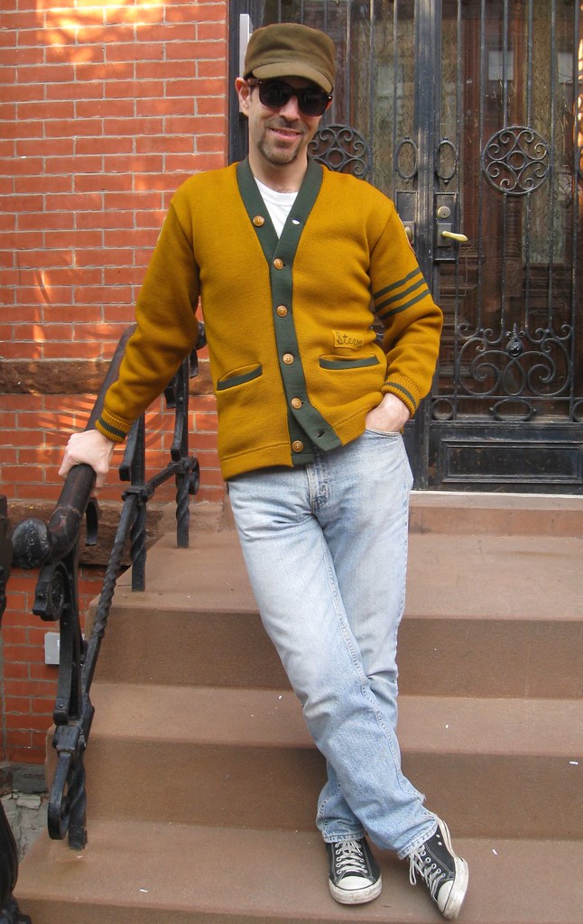
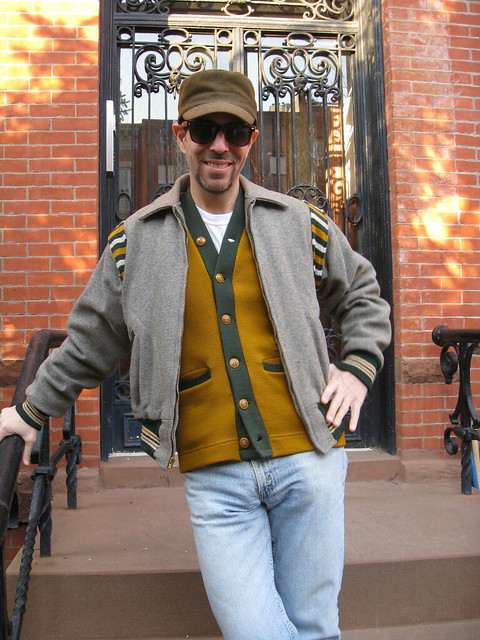
You all know how much I love old baseball cardigans, letterman sweaters, and the like. You also know how much I love green and gold. So you can imagine how much I’m in love with this wonderful 1940s Lane Tech varsity sweater, which I recently scored on eBay. I received it in the mail last weekend, which was perfect timing, because I was slated to have lunch yesterday with former Mitchell & Ness honcho Peter Capolino (a man who knows a thing or two about sweaters), and I figured he’d totally plotz if I showed up wearing this beauty.
Turns out I was right, but we’ll get to that in a minute. First, let’s take a look at how the sweater looks from the back:
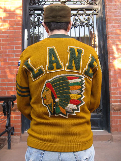
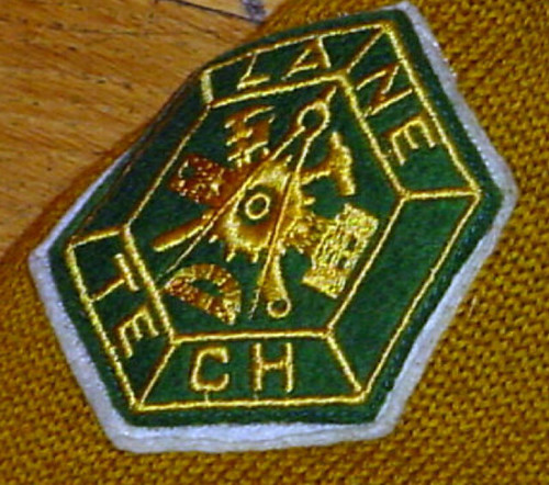
As you can just barely see in that last shot, the left sleeve has a familiar-looking patch, which you can see better here:
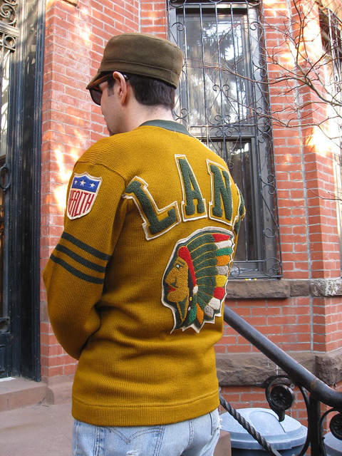
That, of course, is the same patch that baseball teams wore in 1942. As geeked out as Peter C. was about the rest of the sweater — and believe me, he was plenty geeked out — he was particularly excited about the patch. “It’s an original,” he said. “Canvas, with satin thread!” He said he’d never seen this patch appearing on anything other than a baseball jersey (same here). He also said he knew of at least one collector who’d pay upwards of $200 just for the patch (sorry, but it isn’t for sale).
There’s a lot of confusion and misinformation about this patch design, incidentally. Here are a few salient points:
• Although people frequently refer to this as the “Health” patch, its proper name is the Hale America patch. Hale America was a nationwide fitness program instituted after the United States entered World War II, and the “Health” shield was its logo. Yes, it’s odd that the name of the program wasn’t part of the logo, but that’s just the way it was. There’s surprisingly little info about Hale America on the web — no Wikipedia entry, for example — but there’s some background on the program in this article. (As an aside, there was a Hale America Open golf tournament in 1942, the status of which remains somewhat controversial.)
• The Hale America patch was also worn by minor league teams in 1942.
• Many MLB teams continued wearing a shield patch for the duration of WWII, but it was not the Hale America patch. Instead, it was this stars and stripes patch. The Hale America patch was only worn in ’42.
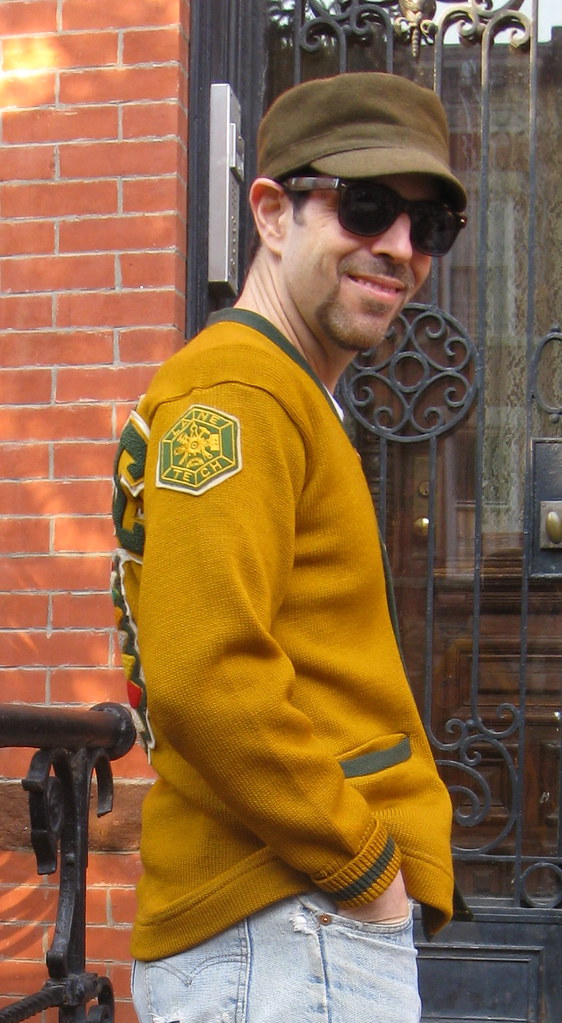
Getting back to the sweater, the other sleeve has a really nice Lane Tech patch:
The sweater is in remarkably good shape — almost like new, in fact. A real prize. But the kicker is that it makes a nice ensemble with my vintage Lane Tech varsity jacket (which has a similar design on the back):
Lane Tech, incidentally, is a high school in Chicago. I’ve never visited the school, but I’m starting to feel like an honorary alum.
March Madness reminder: Our annual NCAA bracket pool is currently open for business. Details here.
Uni Watch News Ticker: Geez, ya think Clemson was wearing enough logos last night? ”¦ Meanwhile, UAB had SNOB. ”¦ Another team with way too many jersey patches: Inter Milan (as noted by Kenny Loo). … St. Paddy’s Day isn’t until tomorrow, but the Bulls couldn’t wait. ”¦ FNOB alert — and vertically arched to boot! That’s Joe Ross of Notre Dame, as spotted in ESPN’s Fab Five special by Chris Flinn. ”¦ Speaking of the Fab Five documentary, it has sparked a bit of a controversy regarding the origin of the baggy shorts trend. ”¦ The President received a Blackhawks jersey and championship ring last Friday, while the First Lady got a Team USA jersey (with thanks to James Huening). ”¦ New Sunday alternate uni for South Carolina baseball (with thanks to Beau Franklin). ”¦ Good Deed Dept.: Mark Penxa, who does the great “Stealing Signs” watercolors, is raising relief funds for Japanese earthquake victims by auctioning off one of his sketchbooks. ”¦ Logo creep is always unnecessary, but sometimes it’s even more unnecessary than usual (with thanks to Michael Dean). ”¦ Eric Bunnell found a bunch of NFL Huddles up in his attic. ”¦ Here’s the entire NCAA bracket broken down by shoe and uni outfitters (with thanks to David Merrill). ”¦ Interesting note in this auction listing for a Joe Montana jersey, as follows: “When Montana was traded from the San Francisco 49ers in 1993, the Chiefs mailed three jerseys to Montana. One was number 3, his number from Notre Dame, another was number 19, which he wore in little league [I assume they mean Pop Warner ”” PL] and also briefly in training camp of the 1979 season with the 49ers, and the third was number 16, which Hall of Fame quarterback Len Dawson offered to let Montana wear since the organization had retired it. Montana declined Dawson’s offer and wore 19 instead as he played for the Chiefs the last two years of his career.” I’d never heard this before. “I wonder what happened to the number 3 and 16 jerseys,” says JD Denison. ”¦ New uni set for the Tucson Padres (with thanks to Alan Borock). ”¦ Here are the sneakers WVU will be wearing for the NCAA tourney. “Could be worse,” says Joshua Exline. ”¦ Here’s a rarity: color footage of the 1941 Orange Bowl (with thanks to Warren Ables).
At least Inter’s surfeit of logos is primarily due to their winning trophies. The tricolour shield is worn by the current Italian champions, the bullseye by the current Coppa Italia winners and the bronzeish shield by the current holders of the World Club Cup.
The Scudetto (Serie A champs) and the Cockade (Coppa Italia champs) are part of the great tradition of Calcio… er.. Italian Soccer. If the UEFA Champions league had a badge they’d wear it too! Forza Inter!!
Not to mention the Champions League patch on the right arm, and the respect patch on the left. Here’s a better picture:
link
And both teams were wearing black armbands for the minute of silence at the beginning of the game for Japan
I don’t think Inter had the black armband (just Bayern did), but they did play a Japanese player (Yuto Nagatomo).
I thought I saw it when they were in the tunnel. Hard to see a black armband on a dark blue and black striped sleeve.
Big thumbs up to Mark Penxa.
+1
Back of the sweater seems pretty racist to me. But, hey, you can wear whatever floats your boat.
Is it okay if we just not go there today? I don’t want to root through the racism in sports debate (again) when I go to read comments again this afternoon. Besides, this is about the least offensive depiction of a native American I’ve ever seen on any sports apparel.
That logo is every bit as racist as the Vikings’ “bearded guy in a horned helmet” logo. It’s a stereotypical representation of a culture. The biggest difference is that there aren’t any Viking reservations.
Every poll and statistic I can find indicates that the vast majority of Native Americans aren’t offended (or at the very least, don’t really care), so just let it go.
The more you go looking for racism, the more you’re going to see it. Even if it isn’t really there.
Well, here’s a odd moment.
The Jeff’s pretty much right on this.
Except he’s forgetting all those raucous, tuna-pea-noodle-casserole-and-Grain Belt-fueled demonstrations protesting the Vikings logo staged by the Sons of Norway back in the early ’60s. Although, “How dare they represent us and our heritage as being brave, strong and formidable” seemed like an awfully weak philosphical position.
TFPIC (Tongue Firmly Planted In Cheek, haven’t used that one in a while).
—Ricko
Ricko, during the one year regime of Les Steckel, those of us in the frozen northern hinterlands of Minnesota did ponder protesting the association with such a pathetic team, but, as good northern Minnesotans of Scandinavian descent, we just became really passive aggressive about it. Some have continued that trend to this day.
“That logo is every bit as racist as the Vikings’ “bearded guy in a horned helmet” logo. It’s a stereotypical representation of a culture. The biggest difference is that there aren’t any Viking reservations.”
I’ve just had a revelation thanks to The Jeff (and one we all should’ve had long ago). Having Indians as a nickname isn’t racist, what we did to the Indians was racist! As a Skins fan, I’ll concede the name was once a racial epithet though I don’t consider it as such in today’s society.
When I see logos/mascots like the Fighting Sioux, Blackhawks, Chief Illiniwek, or Lane Tech, I don’t think of “redskins.” I think of the beauty and majesty those headdresses display. I think of how much preparation went into making them and the power they held. It makes me think how proud those who wore them must have been…and not the “Power of Pride kill Saddam” bumper sticker pride. They’re very impressive, and were I Native American, I think I’d lean towards how it honors the past.
That sweater is totally awesome. The value of the patch alone is impressive, and I really dig their seal/crest. Lane still uses “Indians” as their mascot to this day. Lastly, does anyone think people who were molested by priests will want the Padres to change their name?
I fail to see how. It’s an image of a native, wearing a war bonnet (or headdress) which they were, in fact, known to do. Is the simple image of a race on the back of a sports-related article of clothing, “racist”? I don’t think so. I’m not denying there are sports logos of Native Americans that cross the line, but this one doesn’t.
Seems to be every bit as racist at the Blackhawks jersey, which seems to be one of the top finishers in just about any “best jersey” poll it’s in.
It’s not blatantly racist like Chief Wahoo, or like the term “Redskins.”
But it’s fair to say that appropriating the imagery of a culture you essentially subjected to ethnic cleansing is in somewhat poor taste by definition.
I have mixed feelings about it. Not mixed enough to keep me from wearing the sweater. But it’s perfectly fair to bring it up — it’s a valid issue.
Kudos to you for your response, Paul.
Quick story I’ve told here before: My brother and I were driving across the country years ago and as we entered Arizona started having a debate about Native American symbols in sports. I said it was insensitive and he said otherwise. We stopped at a roadside stand for a snack. This Native American lady working the stand gets up to get us something. She turns around and she’s wearing a Washington Redskins jacket with a giant ‘Skins headress logo on the back.
“Okay, you win,” I told my brother, or something to that effect, and we both laughed and dropped the matter.
“This Native American lady working the stand gets up to get us something. She turns around and she’s wearing a Washington Redskins jacket with a giant ‘Skins headress logo on the back.”
I always wondered what a sports team logo could look like based on my ethnicity(s). It would make one pretty jumbled crest link
But at least one permanent rule would be: no BFBS on any uniform or headgear.
And yeah, I would wear that Lane Tech sweater. It looks cool as hell.
Is it wrong that I laughed a little at Geeman’s story?
Seems to me that the offensiveness of the logo is in direct proportion to its cartoonishness. The photorealistic head in profile of the Redskins’ logo has little to inherently offend, but taken with the nickname, it’s anotehr story. Chief Wahoo goes to the other extreme. The laughing/screaming, Mohawk-wearing Brave used in Milwaukee and Atlanta may be borderline.
I think the technology used to create the logo may have an effect as well. The Lane Tech heads in profile as well as those used by the Braves in Boston may be as realistic as was possible using the sewing equipment of the day. Still no pass for Chief Wahoo under that theory.
Why doesn’t anyone ever bring up Notre Dame in this debate? “Their logo would be deplorable if it were any other race. I’m neither Irish nor offended by it, but if we’re going to say referencing a race or culture for a team name, we need to be fair about it. It seems ridiculous that the Lane Tech logo could be perceived as racist, but you have no problem with the “Fightin’ Irish”.
Being Irish doesn’t have the stigma in the U.S. as Native American mascots do. Personally I’ve never had a problem with native mascots (and it’s more common where I grew up where indian tribes were) & maybe I’m being naive, but didn’t teams & school pick a native mascot out of honor? Why would a school pick a mockery for a mascot? They don’t pick mascots because they hate the sports teams & want them to lose every game, unless they have some kind of sadist compulsion.
“Now all please rise for the Weezie Jefferson High School Marching Band plays the National Anthem.” #tongueincheek
one of the best points i’ve read:
“but didn’t teams & school pick a native mascot out of honor? Why would a school pick a mockery for a mascot?”
I’m Irish, I root for Notre Dame, and I have absolutely LOVED the Fighting Irish mascot for years. Just bought a drinking cup with the blue, gold, and green mascot on it. It used to be on the basketball shorts in the late 1970s. Of course, my immigrant Irish ancestors did not face the same roadblocks in society as Native Americans, African-Americans, or others. Plus, if you make fun of us, we’ll fight you! (Just look at the mascot.)
Cherokee High School, on the reservation in North Carolina, has a Native American mascot and the team’s nickname is the Braves.
The same stigma, no, but being Irish sure didn’t do one any favors for a long time. See: Paddy Wagons.
The Notre Dame comparison is widely cited, but I think falls short. First, while Aaron is correct that the Irish have suffered a fair amount of discrimination in this country’s history, “No Irish Need Apply” vanished completely a long time ago. Nowadays, being Irish is more likely to smooth one’s path through society than anything.
I’d also argue that there’s a difference between ethnic and racial identities.
And finally, Notre Dame uses a leprechaun logo. Not a human mascot.
“Colored Rest Rooms” and “No Coloreds Need Apply” vanished completely a long time ago too.
…except, as The Jeff said, “The more you go looking for racism, the more you’re going to see it. Even if it isn’t really there.”
The spirit behind “NINA” has, I think, by and large disappeared from our society. The spirit behind segregated water fountains lingers.
And again, we’re into the distinction between ethnicity and race. Ethnic nicknames don’t always have the problems that racial ones will.
First thing you need to do is look up who established the University of Notre Dame.
Won’t change anyone’s position on anything else, but does explain why, indeed, Notre Dame “Fighting Irish” truly isn’t one to be included in this discussion.
—Ricko
First thing you need to do is look up who established the University of Notre Dame.
French priests from the Congregation of Holy Cross.
Yeah, my bad.
Shouldn’t have said founded.
Should have said funded.
As I undertstand it, what really gave Notre Dame its toehold was the money Irish Catholic Americans put into the school as they began to make their way in the U.S., particularly in the Midwest.
—Ricko
Really, doesn’t it come down to this…
Most all those nicknames weren’t chosen as a form of derision. Weren’t selected to make any group feel small. Quite the contrary most of the time.
However, how the nickname is represented can be the tipping point. Does it honor characteristics or become a caricature? That may be where the line is.
Now, the fact is that Notre Dame was founded by a group of proud Irish Americans, and the school’s logo/mascot is a beloved creature from Irish folklore. A scrappy leprechaun is not the same category as a cartoon Chief Wahoo. At all.
—Ricko
Question: If the Fightin’ Irish played home games in England, would the name/logo be more offensive?
Also, for what it’s worth, the only time I’ve been on an Indian reservation I saw a disproportionate amount of Native Americans wearing Washington Redskins and Kansas City Chiefs jackets. Didn’t see any other team jackets except those two.
Very true.
Another funny story: In my first week in naval officer training, we were issued uniforms and told by our company commander that during uniform inspection we better not have any “Irish pennants” (loose threads) on our uniforms and to make sure to cut them off. My Irish roommate took mock umbrage and said: “Do you realize she’s calling the Irish bums?”
“Very true” was directed to Ricko’s comments.
re:”Question: If the Fightin’ Irish played home games in England, would the name/logo be more offensive?”
Actually, there is a Rugby team called London Irish link
As I mentioned above, Notre Dame was not founded by Irish-Americans, but by French immigrants. Why would Irishmen name their school L’Universite de Notre Dame du Lac (the University of Our Lady of the Lake)?
link
Moreover, choosing the name “Fighting Irish” was the act of taking a term of derision, accepting it as one’s own, and removing the stigma from it:
link
It’s a common phenomenon — in England, the terms “Whig” and “Tory” started out as slurs and became adopted by their targets. A more modern version of the phenomenon is the adoption of “queer” by certain militant gay groups.
I just think it’s funny when white males of European descent try to tell anyone who ISN’T a white male of European descent that they shouldn’t be offended by stereotypes or legacy nicknames.
The kids of today should defend themselves against the 70’s.
Q: Where do American Indians send their children in the summer?
A: To Camp Goldberg.
Eh! Steve! Nice sweater!
… the acronym “FLOTUS” just doesn’t look right, especially on a jersey.
… I wonder where the Montana Jets jersey from the link is these days… (don’t know if it had an actual NOB, since we only see it from the front.)
If I recall the details correctly, gifts to the president are considered gifts to the United States, and thus government, not personal property, except that when he leaves office, the president may claim any of the gifts provided that he reimburses the government for their value. Typically, an outgoing president loads up on representative knicknacks for display in his presidential library. But if that’s a real championship ring, I’m betting it stays with the National Archives. I can see spending $300 to keep a personalized jersey or two on your way out the door, but $30,000 for a championship ring?
Now, if the Bulls win another championship before the prez leaves office, that ring probably winds up in the Obama Library.
Youre right I remember hearing about that when Bush left.
However, I don’t know the full story on this. Did they give him the ring for real or just for a photo op?
Good question. The coverage I saw on the local SportsCenter-type show indicated that it was a gift, but I can’t find anything to back that up.
The ring wasn’t a gift…he borrowed one for the photos and then gave it back to the player.
All “44” got was the Jersey and the mini Cup.
That holds for foreign gifts. When the forieng minister of some country gives Michelle Obama a necklace, she has to pay for it if she wants to keep it. I’m pretty sure that if it’s a domestic gift, it has to be reported, but it’s theirs free of charge.
You’re right. link is the best one-page summary of the rules I could find. Press accounts suggest that most non-foreign gifts are either destroyed by the Secret Service or donated to charity, since any gifts accepted are taxed as income and also trigger the need for an ethics disclosure. Most of us don’t bother reporting the value of gifts on our tax returns, but that’s kind of something the president can’t get away with letting slide. It’s little remembered, but the articles of impeachment that were about to be voted against Nixon at the time of his resignation in 1974 were mainly not about Watergate; one of the five articles of impeachment dealt directly with illegal acceptance of gifts and improper tax filings.
The “Health” patch is glorious. It’s perhaps the best of the entire 20th Century. Really…..
Big thanks to Paul for that lesson on the history of the Hale America patch. I never knew any of that beyond the year it was worn.
A little added information about Joe Ross’ FNOB – He had his full name on the back of his jersey because his twin brother, Jon Ross, was also on the team. And since only one letter separates “Jon” from “Joe,” Jon Ross also had his full name on the back of his jersey.
Speaking of the Ros brothers and those awful early 90s, Notre Dame teams…
Does anyone have any photos of the horrible neon green-colored uniforms that they wore for a few games in the seasons that the Ross twins played?
It was in 1991.
Try a home game against Syracuse, late February or early March of that year.
I’ve looked high and low for a good image of the neon green uniforms, and I haven’t been all that successful. I did find this basketball card of Syracuse’s LeRon Ellis, and the neon green uniforms are visible behind him: link
The uniforms are obviously not the focus of the card, but at least it’s proof that they existed. I do believe that Notre Dame has footage of the game in their archive, and at one point I found a site that would let you buy a copy of the game. But I didn’t care THAT much.
No wonder that was Digger’s last year as coach.
Only one game. Once was more than enough.
Yes, forever.
Logo creep is always unnecessary???? Excessive logos, that’s what is unnecessary. A Swoosh on the shoes and one on the jersey? Whats wrong with that? They are the manufacturer…are you saying a car company shouldn’t put their logo on a car? Why is there an NBC logo in the corner while I’m watching The Office?
No problem with a company putting a logo somewhere to let it be known its their product but counting up 13 Swooshes on one guy, or Under Armour UAs, or conveniently placed Adidas stripes. Thats what is unnecessary
are you saying a car company shouldn’t put their logo on a car?
It sure would be nice if they didn’t.
Why is there an NBC logo in the corner while I’m watching The Office?
Why, indeed? Just a decade or so ago you only saw those silly on-screen logos no cable channels. I say dump them.
It would be nice but it’s overwhelmingly accepted business practices. On Planet Mark cars may have no logos, but on Earth car companies are businesses that want to make money so they want people to see their name and logo out in public.
That’s why I have no problem looking at a hood seeing a meredes benz logo, and why I have no problem seeing, USC for example, on tv and a Swoosh on the jersey.
On the flip side, I would definitely think it would be overboard to see a Ford, for example, driving around with logos on the hood, all four doors, the trunk, both bumpers, all four rims, all four hub caps, the windows, the sun roof etc. And that’s why its overboard when there’s like 10+ sports company logos all over someone head to toe
>>are you saying a car company shouldn’t put their logo on a car?<< Poor analogy. Addressed in further detail here: link
“On the flip side, I would definitely think it would be overboard to see a Ford, for example, driving around with logos on the hood, all four doors, the trunk, both bumpers, all four rims, all four hub caps, the windows, the sun roof etc.”
The current generation super duty F-series trucks have at least 15 different brand logos on the exterior alone. The standard Ford logos on the hood and trunk, one on each wheel, and badges on either quarter panel; plus “Super-Duty” embossed on each hood vent, each quarter panel, each running board, and on the rear bumper. This doesn’t take into account the five visible logos on the engine and turbos and roughly twelve scattered around the dashboard and interior panels.
How is the NBC logo in the corner of “The Office” more annoying than all the crawls and shit on every live sporting event?
—Ricko
are you saying a car company shouldn’t put their logo on a car?
~~~
you can never read the primer too often
dammit…sick and slow on the draw today
It seems like a major issue with logo creep from reading this would be advertising encroaching on public thing. But, are uniforms ‘public’? We are fans but in the grand scheme of things they aren’t our uniforms as much as we want to be so attached to who we support. Its off on a tangent but the NFL issues currently going on show how really disconnected the fans are.
I get what you guys are saying about the car analogy after reading the link, but I don’t believe it is so cut and dry sports are doing it but other industries aren’t. I’ll use cars one more time. I’m leasing a Nissan and I can go to the garage and tell you who made the brakes just by bending over and looking at the front tires. I can look in the corner of each window getting in the car and see who made the glass for the windows, who made the windshield wipers, etc. It’s there. It just doesnt have millions of people getting up close views of it like college football Saturdays.
It’s a good argument and I’m glad you guys sent me that link, but there are some generalizations I don’t buy. There are plenty of non sports apparel companies that you can look at their product and see exactly who made it. Designers like Ralph Lauren, Tommy Hilfiger, etc. try to findaproduct they make that doesn’t have their logo on it. A lot of clothing will have the names of who made the buttons zippers lining etc on them. The best example would definitely be products with Goretex. Jackets shoes boots anything if it has Goretex I bet that logo is going to be on it somewhere regardless of who made the product.
Couple questions going back to sports logo creeping to wrap it up. I’d love to hear your guys’ opinions… (1) Who is to blame more for the problem? Is it the leagues/teams/schools wanting to make that much more money by allowing the companies to put their logos on uniforms or is it companies wanting to get the most free advertising out of the investment they’ve already made? I always wondered that. Like if the NFL told Nike in the new deal for 2012 there weren’t going to be Swooshes on jerseys I’m sure Nike would still make them just not want to pay as much. (2) What are your thoughts on how uniforms used to be where on the field there weren’t logoed versions but when sold to consumers as ‘replicas,’ ‘authentic replicas’ etc they would have the Swoosh/Reebok/Adidas logo on them?
>are uniforms ‘public’?
To a certain degree, yeah, I’d argue that they are — to the same extent that teams are civic entities.
>>here are plenty of non sports apparel companies that you can look at their product and see exactly who made it. Designers like Ralph Lauren, Tommy Hilfiger, etc. try to findaproduct they make that doesn’t have their logo on it.<< True enough. The problem with proof by example, however, is that it's vulnerable to disproof by counter-example, and I can name waaaaaaay more apparel companies that DON'T put their names or logos on their clothing. Most of what you're wearing at this very moment probably doesn't have a VISIBLE brand identifier on it. A tag on the inside, sure -- but not on the outside where everyone can see it. >>Who is to blame more for the problem? Is it the leagues/teams/schools wanting to make that much more money by allowing the companies to put their logos on uniforms or is it companies wanting to get the most free advertising out of the investment they’ve already made?<< Combination, but mostly the companies. >>What are your thoughts on how uniforms used to be where on the field there weren’t logoed versions but when sold to consumers as ‘replicas,’ ‘authentic replicas’ etc they would have the Swoosh/Reebok/Adidas logo on them?<< Not sure what you mean by how it "used to be" this way -- that's how it still is in the NBA.
are you saying a car company shouldn’t put their logo on a car?
You’ll notice that the more distinctive design cues any model has, the less prominent its manufacturer and model logos will be. The bigger and more numerous the logos, the less confidence the manufacturer has that the car in question is in any way notable or attractive. This is true even within models over time; compare the more prominent “Taurus” logo on 10-year old Tauruses that look like every other sedan on the market at the time with the much less prominent “Taurus” logo on the newly redesigned, much more distinctive Taurus. It’s either one heck of a coincidence that just happens to have been going on for 60-plus years, or companies really do choose between doing good design or relying on proliferating logos to compensate for poor or commoditized design. Assuming it’s the latter, Nike’s 12-gauge approach to logo placement tells us a lot about the company’s faith in the quality of its own design work. Which is to say, it has very little.
The worst is the big,unsightly, and annoying dealership logos put on vehicles.
that’s an easy fix actually. tell them something like “sweet! now take that sticker off while we do the paperwork, and you got yourself a deal!”
worked both times for me…
The first thing I do when I buy a new car is to take off all the stupid license plate frames, and decals the dealers put on the cars advertising themselves
You can have them take their ads off for you. You can also refuse to pay the “advertising fee” and “removal fee” if you choose to do that, too. You have to ask for it, but they have to take that fee out if you do.
I always have any stickers that weren’t on the car when it left the factory removed, but I don’t mind the license plate bracket. I think it’s the fact that I always have the option to remove a plate bracket if I don’t want to advertise where I got my car.
I hate dealer logos. Unless they give me a specific deal on the car, I’m not giving them advertising.
Years ago, I took my car back to the dealer for service, and they returned it to me with a replacement license plate frame attached. The second one lasted about as long on my car as the first – I left it on the counter.
I have a very easy fix.
I was a professional golfer at one time, like Johnny in WI. When I bought a car, I told the GM to dump the dealer logos. He refused and asked why. I told him to call my lawyer to work out the terms on an endorsement deal, as I got paid for every logo I wore into his dealership.
Needless to say, the dealer logos were gone instantly.
Nothing wrong with a shoe brand putting a logo on athletic shoes. That goes back at least all the way to the first All-Stars and Keds.
Jerseys are a problem in and of themselves, but jersey logos aren’t going away. Putting a swoosh on a dog jersey is excessive though, at least where they put it. The dog is not a Nike mascot, so the swoosh shouldn’t be more prominent than the Butler wordmark.
Actually, going back to Paul’s primer on logo design vs logo creep, shoes are a piece of equipment, even if they are mandated to be a certain brand by the school’s contract. Players in that situation still usually have some leeway in terms of specific model or colorway, so there isn’t the kind of rigidity associated with the uniform proper that would proscribe logo creep.
This is a better reason than simple traditional grandfathering for why logos on shoes are acceptable when they aren’t for the rest of the uniform.
That’s actually a really cool sweater. The letters on the back seem a little of but still, really cool.
Have to say, I’m a little disappointed we didn’t get treated to that Green Bay dickie under the sweater…
Ooooh, hadn’t thought of that…. Good call!
I don’t know…the Green Bay dickie underneath a Chicago high school sweater…that might be askin’ fer trouble…
It certainly won’t help you stay employed selling cars.
Love the colors of the jersey! and that footage of the 1941 Orange Bowl is fun and interesting to watch. I’d love to find out what formations they are running.
From the same auction house listing the Joe Montana jersey, these super items also listed; link, link, and link.
Interesting that the two magazine cover illos both show a rip in the jersey shoulder and the pads poking thru. Never seen that before. Must have been a way to signify rough/tough action!
The rip on the ‘American Boy’ cover player’s shoulder, sort of looks like a clover patch as well. The green jersey helps accentuate that a bit.
Just an awesome cover layout.
I have that 1934 Illustrated Football. I have most every year of the magazine from the 1930’s and early 40’s.
They are some of my favorite items to have. Tons of pictures in them
Eric Bunnell:
If you are interested in parting with the Huddle for the 13-Time World Champion Green Bay Packers, please contact me at:
link
Thanks –
Frosty
“the 13-Time World Champion Green Bay Packers”
That was a lot of fun to type, wasn’t it?
FYI…Lane Tech is located a couple of blocks from WGN’s studios, and was the filming location for the football scenes of the Goldie Hawn film “Wildcats”.
It’s also one of the largest and most imposing looking high schools you’ll ever see.
link
Looks like Shawshank.
link
Nice.
Have to say, fantastic looking building. Love the smokestack.
All I know is, when the Lane Tech track team comes to downstate Illinois, they kick our butts every time…
Here’s another view of Lane Tech:
link
Always made me think of Hogwarts, especially the ancient (quiddich) stadium nextdoor.
There is also a large totem pole on the front lawn as well…
link
Awesome! Thanks for posting the pic.
see darren rovell’s tweets last night to reference unc asheville’s uniforms they wore last night by a company called crons
Is the NOB on the Obama jersey italicized???
It’s just the angle it’s being held at. Here’s another look: link
Baggy shorts – I reiterate what I said elsewhere, MJ started it. Not the Fab Five, not the Illini. #23.
Yeah, we discussed this pretty thoroughly in the comments the other day.
Kendall Gill definitely took his cue from Jordan when he went to Lou Henson and requested that the team go with longer shorts.
But Gill and Bardo were referring to A) college basketball and B) a team-wide look. Jordan wore his shorts longer than his teammates at the time.
Also, this link sums it up nicely:
Scoop Jackson penned my favorite:
Sole Provider:
link
Huarache, Maestro 1 and 2, Air Unlimited, Air Force Max B, Air Flight Lite, Air Dynamic Flight…those are the shoes that they all wore and made famous!
Maestro:
link
Maestro 2:
link
Huarache:
link
Air Flight Lite:
link
Air Dynamic Flight:
link
Air Force Max:
link
Ray Jackson Air Unlimited:
link
Air Max2 Uptempo:
link
link
Someone needs to make a timeline showing the evolution of Jordan’s shorts.
… that just seems all kinds of wrong, written like that…
sounds like another infographic!
Here’s Kendall Gill. Latest this would be is Spring of 1990…
link
The shorts are…I don’t know. Long-ish, but it’s hard to say they’re any longer than the norm at that time.
As an aside, how great did “Fighting Illini” look on those uniforms?
link
The Illini’s shorts are maybe slightly longer, but it seems like the trend was already heading in that direction anyway.
Here’s Indiana-Syracuse just 2 years earlier.
link
Great Final Four shot. I’m not seeing any evidence that would change my mind that Jordan is most responsible for the longer shorts trend. The Fab Five just took it further than anyone had up to that point.
The Illini may or may not have had longer shorts than the norm of the time in the late 80’s, but I have yet to see any convincing photographic evidence.
They were longer. I’m not an Illini fan but I watched a lot of their games during the 88-89 season and it was a noticeable difference.
It’s not as though they were wearing anything close to what’s the norm today, but for the late 80s, the shorts were long.
As far as that Final Four shot, what makes the Michigan shorts look approximately the same length is that a lot of players started wearing their shorts lower on their hips. It’s hard to see for sure in an action shot like that, but take a look at the two leftmost players. You can see how far up his leg the one on the far left’s hem is (shorts pulled all the way up?). And look how low the other one’s waistband is. It’s harder to tell with Rumeal Robinson on the far right because his jersey is covering the waistband.
Here’s link. Glen Rice’s shorts look a lot shorter to me than anyone else in the photo.
After watching the nice, nice G-town-MSU Orange Bowl from 1941, I found the Illinois/Syracuse Elite 8 game from 1989. Illinois’ shorts are long, to be true, but Syracuse isn’t exactly wearing nutters. I suspect Gill and Bardo still haven’t gotten over losing the national semifinal that year.
And since I didn’t get to the site this weekend: Great job on those MLS kits Lance! I have a few things I would do differently, but overall a fantastic job. Might just have to try some myself.
Y’know Paul, even if that sweater didn’t have the awesome lettering and patches, it would still be a killer item just for those three stripes that appear on the left sleeve only…
-Jet
Agreed. Just an overall sweet looking sweater in my opinion.
I don’t know about y’all, but the Tucson Padres’ page had a Groupon ad at the top for me for cupcakes using “Sweet Sassy Molassy” as a headline. Somewhere, Chet Harper is smiling.
Also, I have one of those Joe Montana Chiefs #19 jerseys, with 1994 75th anniversary patch AND AFL 25th patch, as both of those events happened in the same season. It WAS a bit much.
But Montana was right to decline wearing #16 (something Jerry Rice should have done) and #3 wasn’t retired, but that was Jan Stenerud’s number, wasn’t it? Good call, Joe.
Yeah I really appreciate that Montana did not wear Len Dawson’s retired jersey. Jerry Rice never should have worn number 80 in Seattle. I believe 19 was also Montana’s high school jersey number, but I may be wrong about that.
#3 was indeed Stenerud’s number, and it should be retired.
That would have been a 35th anniversary patch for the AFL.
link
The 25th was in 1984.
link
That patch has to be a knockoff, because I’m almost certain the real ones used a different facemask.
Although the Chiefs’ history section does show that patch. Not that that means anything…
I have some photos of other teams from that year and they all seem to have this type:
link
The Bills definitely had that type.
And the Chargers and Oilers. Those I’ve seen up close.
Upon further review…
The best photo of the Chiefs I have is inconclusive, but if I were a betting man I’d say it’s the one that I thought was a knockoff.
The Patriots patch just had Pat Patriot on it instead of a helmet, the Raiders had the logo (and they wore theirs on the hip, not the jerseys), but the others had the helmets with the newer facemasks.
I don’t have a scanner, but if anyone has the Prolog magazine reviewing the ’84 season, there are lots of photos in there.
This looks authentic:
link
And here are some of the other patches:
link
You’re right, 35th. It was my understanding there would be no math.
I’ll have to take a look at that jersey when I get home. I have never looked that closely at the patch.
And I’m almost certain I have the 1984 Prolog…I know I have several from the early 1980s.
My Chiefs’ 35th anniversary patch appears legit, anyway:
link
Pretty pathetic when the tiger paw – Clemson’s signature mark – is the smallest logo on the hoops jersey. I can see where the US flag should be bigger, but not the rest. I guess they figured the paw on the shorts made up for it.
Kinda bugs me that the NCAA patch is above the flag patch…
Kinda bugs me that there are two NCAA patches next to each other. Even if you assume everything else is necessary, the tournament patch should be gone or on the back collar or something.
That’s like the million Ford logos on their trucks that Chris and I talked about above. It doesn’t do anything for brand awareness since there’s already a patch there for the same brand. Redundancy breeds contempt.
Does anyone know how Nike chooses which schools will get the Jordan brand? UNC is obvious, but why Georgetown? Why Marquette?
I would guess it has something to do with Dwayne Wade for Marquette, not sure about G-Town.
JTIII has had a connection with JB since his Princeton days.
Marquette was a Converse school while D-Wade wore them and switched just recently.
UNC, Cal, UNC A&T are still JB teams…St. Johns used to be. Sooner or later San Diego State will become one since almost all of their players wear them on-court.
Cincinnati used to be as well, and I assume that had to do with Bob Huggins. I know for certain I’ve seen Huggs in a Jordan Brand WVU warmup, and I’m 85% sure I’ve seen either the football or basketball team in JB warmups, even though Jordan does not outfit either squad. I wonder if WVU might eventually go JB (at least for basketball) because of Huggins.
And I wonder if they’ll change their school colors to black and black because of him, too.
I think you’re on to something with Huggins. Didn’t K-State switch to Jordan while he was there?
Hmmm… not sure about K-State.
Not sure if it really adds anything here, but I know my school (Wabash) has Jordan warm-ups, and they’re D3. Maybe Nike isn’t the one making the decision?
Inter Milan’s jersey patches (two of them anyway) are traditional for winners of certain competitions. The Scudetto, the flag like one is worn by league winners, and the centrally located patch is for the winners of the Fifa Club World Cup. Thus, patch creep was justified
They could have arranged them in a more pleasing fashion.
Paul, your Lane Tech sweater, with both patches, was still being worn during the years I attended the school 1970-74. The school colors were (are) myrtle green and gold. This was a “Letter” sweater. For those so inclined, if one received a Letter from a sport or activity, it would be sewn on the sweater. There was also version in white, same myrtle green trim.
Wait — you’re saying they were still wearing the Hale America (“Health”) patch in the early 1970s??
Yes. It may have been a Letter for health class.
Wait, you can letter in health class?
All those afternoons on the tennis court, chasing the elusive chenille “W”….
Presumably, this means that Lane Tech either had, or had access to, a sizable stock of Hale America patches at least 30 years after the fact. That in and of itself would be a significant find. If Lane had a supply of the patches on hand, then that creates some interesting leads for any collector trying to track down an original.
Great to see some alum respond here.
I see that Fritz Pollard went to Lane Tech, wow!
link
To my knowledge, Lane Tech is one of the holdouts in terms of NOT changing the name of their mascot. Local schools like Marist have gone from Redskins to Red Hawks and Hyde Park has gone from Indians to Thunderbirds. Lane Tech is a polyglot high school that some may say should at least go to a more specific Tainos or Aztecs. And to this day, Lane Tech has such a historical reputation of being a good votech and computer science school that its alums put it on their professional resumes.
Did anyone notice UALR’s jerseys last night? They seemed oversized for most players. I also saw that the letters were not cut out correctly.
link
A visit to Lane Tech should be on your list without a doubt. In addition to being the largest high school in the state of Illinois, as already mentioned, it also has the most amazing collection of WPA murals you’ll ever see. Each mural depicts an individual state’s industry and commerce. The murals are stunning, but if you’re looking for racism, its on display. While each mural shows people toiling away, the only image of an African American is in the mural for Mississippi, in which he is eating a watermelon.
Just saw this on my FB newsfeed from Life Magazine – “Ugliest Baseball Uniforms. Ever.”
link
Clearly, the author has a problem with all the late ’70s and early to mid ’80s baby blues, because they’re all in there.
Pissypants know-nothings like that caption writer are the reason why 95% of teams have scripts like the Dodgers or headspoons like the Tigers (and sorry, I’m not looking for the actual statistics on that. That’s how it seems to me).
I no longer think of those colorful doubleknits as ugly. They look goddamed bold and magnificent compared to the two boring templates of today.
Keith Olbermann tweeted this just now, the Tigers’ memorial patch for Sparky Anderson:
link
Which means Keith is only about a month behind the rest of us.
He’s gaining. ;)
Rad cardigan, Paul! I usually don’t like yellow (see: why I’m not a Columbus Crew fan), but I’d wear that.
You think that sweater’s yellow?
Remind us not to send you to the store to pick up lemons.
—Ricko
The Jeff freaks out in 5…4…3…2…
i don’t even think
THEmr. provo thinks the sweater is yellowWarren Ables, Thank you very much for the Georgetown Mississippi State color film. I just watched it.
Great find.
Indeed.
Was trying to figure out what was on the front of Georgetown’s apparently silver helmets. Thought maybe it was a Hoya! (jk).
So found this…
link
—Ricko
holy crap rick
that would be a great “colorize this!” entry
What struck me was how easily that dark area on the helmet could be modified to become very similar to the Boston Patriots’ original three-corned-hat helmet graphic.
Wouldn’t that have been a look for the ’60 Pats…a hat on the front of the helmet?
—Rickok
Texture!!
Pretty uni-centric post today on pitchersandpoets.com
Mets fans will appreciate this part of it, describing the three Mets hats:
“The colors are equally challenging, urging me to dislike them. They are best served by the first cap, where the two main colors live together. As the black is introduced, and the logo darkens, it goes to hell. The alternate cap feels like staring at a photo negative.”
link
Yo, I’ve always wondered why so many people on this blog are d-bags. Ain’t nobody frontin, biotch.
Seriously, this place needs a warmer vibe to it. There’s always some old fool going off on some young dudes. And a general lack of warmness and community. Other blogs I frequent are much nicer and more pleasant. You can have sophisticated and even heated discussions without resorting to snobbery.
Take it from the Wix, this place could use some harmony. And it starts at the top. I’m looking at you Paul. Naw, that don’t mean singin Kumbaya around no campfire, but it sure do mean not puttin some poor fool on blast.
Peace out, A town.
–Wix
Um. . .okay?
Read the comments on almost any Yahoo news story and you’ll think we’re *all* about the love here. We have our moments, but this is one of the nicer comment threads I’ve read…and one of only two where I regularly comment.
You can’t fool me, Ricko. Nice try.
Nice! I want to see this dude mix it up with Mick and the Benchies.
Stephen A? Stephen A? is that you?
The sweater is really gorgeous, especially from the front… but dude! Those jeans. Eek.
Jeans are jeans, man. I still wear jeans from the decade when the Pirates last had a winning season. As long as the holes & rips don’t get too noticeable, it’s good to go.
that’s cool…bell bottoms never go out of style
“Hey, quit raggin’ on my bells, man! I’m outta here!”
**gets on a bicycle only to have the bells get caught in the chain & falls down** “Oh god damn it!!”
But seriously, it’s pointless to bring fashion trends into blue jeans. Just keep it clean, keep it classic.
I’m a proud Lane Tech alum so forgive my bias when I say that sweater is a beauty! I earned two athletic letters and city championship patches but I’m sad to say I never had the funds to buy a varsity jacket to put them on. I actually saw the auction for that sweater Paul, but lucky you, it’s too small for me. I’m of the newer generation (class of ’99) but that old school stuff sure has great timeless appeal.
For those that don’t know, Lane is a very large school of ~4,000 and has a very rich athletic history. So rich in athletics that Lane wins on average maybe 6 to 10 or so city championships every school year. Several years ago, a record of 13 championships were won in one year.
Along with Fritz Pollard (Class of ’12), Johnny Weissmuller went to Lane Tech.
Anybody actually get confused for a second after clicking on the South Carolina link? I mean nobody for a second wondered if they were Southern Cal, right.
Because one of USC’s (the one who we don’t typically call USC-east) arguments against South Carolina trademarking their ‘SC’ logo was that it would confuse their identity despite them being different colors, different fonts, and different arrangements.
I could care less about the 2 schools, I’m just very anti-copyrighting/trademarking everything. “that’s hot”, “I can’t wait” and other general phrases, along with letters (such as SC) should not be off limits like they are.