Before the Super Bowl completely fades from our collective memory, I want to showcase a pair of DIY projects today — one of them Super Bowl-related, and one of them partially Packers-related.
First up is reader Ben Beattie, who did something special for the big game:
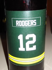
My wonderful girlfriend was nice enough to buy me a home-brew kit for my birthday. I recently used it to brew an ESB (extra-special bitter). As I looked at the calendar, I realized it would be done on Super Bowl Sunday, so I decided it was my duty to be a little creative with the labels.
I had 22 bottles, so I uni-fied them with the starting lineups for each team — Green Bay’s offense vs. Pittsburgh’s defense. I used the sleeve stripes from each team to add a little flair to the labels, modified the Super Bowl logo for the reverse side, and put the helmet logos on the caps. All in all it was a great success, aside from the near cat-fight over which female got the Aaron Rodgers bottle.
Since I came up with this idea during the divisional round of the playoffs, I made proofs of labels for each of the remaining teams at that time. The teams with more traditional sleeve stripes looked a lot better than, say, the Falcons, so from then on I started rooting for teams that would result in decent-looking labels. I lucked out with the Packers and Steelers.
Next up is Brian Pettit, who recently DIY’d himself a few T-shirts, including one that’s particularly appropriate in light of how Sunday’s big game turned out:
I’ve wanted to do make my own T-shirts for a while, and I recently ran across a few tutorials of how to make T-shirt stencils by using freezer paper.
I decided to test out this technique by making a few shirts for my brother. I came up with three designs:
1. Acme Packers. This was the first one I printed, and it didn’t come out as good as it could have. It actually looks better in the photo than in person. I guess I could call it “distressed” and go with that excuse. I still like the overall design I came up with for the logo.
2. Barrel Man. I couldn’t find a T-shirt in Brewers blue, so I went with a charcoal tee instead. Maybe a little odd, but I like the contrast. After doing the main design, I thought it needed a little more, so I added the sleeve stencils. I like it because it doesn’t say, “Brewers” in big letters across the chest and is a little bit more obscure.
3. Mario. This one was a little tougher to print because of the two-color design. I think it looks striking against the black shirt. I like how it came out.
The downside of this technique is that you have to destroy the stencil, but it makes these shirts special and one-of-a-kind.
Great stuff. My thanks for to Ben and Brian for documenting and sharing their projects.
Uni Watch News Ticker: Super Bowl tidbit that I neglected to mention yesterday: Antwaan Randle El was wearing very short socks (as noted by Make Mameli). ”¦ And here’s a surprise: The logos on the end zone pylons were actually patches. At first I thought, “Hmm, that’s new,” but apparently it isn’t. Turns out the pylon logos have taken a variety of forms over the years (big thanks to Ryan Connelly for getting the ball rolling on this one). ”¦ “Here are some photos from my cousin’s outdoor hockey game — Lawrence Tech U out of Detroit against the D3 Michigan State hockey team,” writes Jason Taber. “It was played at Clark Park, right in the heart of an old city neighborhood in Detroit, with a view of the Ambassador Bridge. The Zamboni broke so the teams had to shovel the ice every 10 minutes.” ”¦ Yesterday I mentioned that the Giants are changing the sleeve patch on their road jersey. What I neglected to mention, however — until Frankie Parish reminded me — is that the old patch is migrating to the orange alt jersey. So basically those two jerseys have swapped patches. ”¦ Speaking of MLB sleeve patches, the Tigers are wearing one in spring training to mark their 75th anniversary in Lakeland. ”¦ There are soooo many teams wearing pink for breast cancer awareness now, so I stopped listing them all in the Ticker a long time ago — it gets tedious. But I will never get tired of showing examples of pink ice (with thanks to Brian Schulz). ”¦ New logo for the National Volleyball League (with thanks to Paul Lee). ”¦ Marvel Comics, having already made a joke out of the NHL, is now turning its attention to the NBA (with thanks to Stu Taylor). ”¦ Scroll down on this page to see some uni number news for the Cardinals. ”¦ With all this talk about anti-concussion football helmets and such, the protesters in Egypt have their own ideas about protective headwear (with thanks to Michael Stinton). ”¦ Jeff Katz found a really fun site devoted to Dick Allen. Lots of great old photos and such — recommended. ”¦ Oh. My. God. Jake Doyle sent me that, and holy shit do I want it for my wardrobe, like, yesterday. ”¦ Also from Jake: You know how the Flames use the franchise’s old Atlanta logo for their alternate captain “A” patches? The old “A” also appears on Thrashers goalie OndÅ™ej Pavelec’s mask. ”¦ Jake also sent a photo that I think speaks for itself. That looks like a textbook case of a jersey that looks awful in real life but would look completely awesome on a Uni Watch membership card, incidentally. ”¦ Last one from Jake: Check out the crazy insignia style on this old basketball jersey. ”¦ Guess what’s turned 135 years old yesterday? Right, the hockey puck. The 135th anniversary of Don Rickles first calling someone a hockey puck comes up next week (with thanks to Michael Koch). ”¦ Would you wear Brent Musberger’s signature on the sleeve of your sweater? You would if you’re Brent Musberger (good spot by Ben Teaford, and it’s worth noting that Jon Beckmann submitted almost the exact same screen shot exactly three minutes after Ben did). ”¦ Is Tim Thomas wearing a red Reebok logo? Seems odd, no? (As noted by Casey Grapsas.) ”¦ New secondary logo for the Winnipeg Goldeyes (with thanks to Bradford How). ”¦ New sponsor for FC Barcelona. “I’m not too happy,” says Joe Schmidt. ”¦ Jay Bilas had a few things to say about basketball shorts last night (thanks, Phil). ”¦ Twins President Dave St. Peter was addressing several uni issues on the Twitter last night. Closest thing to news was the revelation that the team has at least been talking about elevating the throwback to primary status. Personally, I’d love to see that, although I’m dubious (with thanks to Kyle Petersen). ”¦ Now there’s one thoroughly awesome college hoops jersey. Mark Prusinski snapped those pics the other day at the Louisville Hall of Fame, which is located in the school’s basketball arena. ”¦ Very sloppy lettering job on Nicolas Batum’s NOB (screen shot by Bob Delano). ”¦ Reds broadcaster and all-around cheery guy Marty Brennaman was the keynote speaker at Marshall University’s preseason baseball banquet the other night and had the following uni-related analysis of a certain National League team: “The Chicago Cubs won’t be a factor because, no matter how much they add to their club, at the end of the day, they’ve got ‘Cubs’ across the front of their jerseys. That’s the reason why they won’t win.” Might’ve been better if he’d said “on” instead of “across,” but whatever — Brennaman managed to overshadow that sage commentary with a quip that would’ve made Marge Schott proud, as you can see in the third graf of this article. How lovely to hear that his address received “rousing ovations” ”¦ Remember that Super Bowl ad where they digitally dressed all sorts of sitcom characters in NFL gear? Here’s a side-by-side comparison of the original and altered versions of those scenes (with thanks to Scott Davis). ”¦ I think we’ve covered this before, but what the hey, once more can’t hurt: Check out these shots of Broadway Joe. Looks like he was wearing a practice jersey — no stripes, NNOB. Those shots are from a Jets/Oilers game in 1969. Video available here (major thanks to Paul Wiederecht). ”¦I’ll be visiting my Mom out on Long Island today, so Phil will be minding the store. See you tomorrow.
Today’s NY Times has an excellent story on how the TB Lightnng designed next season’s new jerseys
They have already changed the center ice logo to the new one. Mid-Season Logo change, ever been done before?
First time I’ve seen that
I live in Tampa and as a native Floridian don’t think about hockey very often. I think the Lightning jerseys look nice but think they could have felt less generic with one simple change. The Photoshopping isn’t wonderful but here’s what they would look like if the generic blue in their uniform were replaced by a more Florida orange.
link
I probably wouldn’t ever go to a game unless someone gave me a free ticket but I’d think about buying one of those.
Sweet! If only a few teams had the nutsacks to dress in something other than blue, black and/or red…
+1 looks like it would be better.
the flyers are the only ones that look good in orange
That new Winnipeg Goldeyes logo is all ‘roided up.
More importantly, it’s yet another example of a cartoon mascot wearing a better cap than the actual team wears.
I didn’t know anyone outside of Winnipeg even knew we existed anymore.
I’m a Goldeyes fan from my days living in the ‘peg. I started with the Thunder Bay Whiskeyjacks when I was living in NW Ontario, then started following the Goldeyes after I moved to Winnipeg and the Whiskeyjacks moved to Schaumberg.
(I used to have a Whiskeyjacks hat around somewhere, that was a great colour scheme and logo)
Regarding Joe Namath in the all-white jersey in the 1969 game against the Oilers, let me offer a few things I recall from those days. I was a Joe Namth fan back then.
During pre-season the Jets often wore plain white jerseys, which I assume were actually practice jerseys or, at least, a light weight summer jersey. When the season started they would wear their traditional white jerseys with green shoulder and sleeve trim.
However, there was once a game in Houston, which I believe was around 1969, that was either a pre-season or early-season game, before which Joe Namath’s jersey was stolen from the Jets’ locker room. Namath had to wear a plain, practice jersey while the rest of the team wore their regular game jerseys. I remember reading about it in the newspaper.
The reason the episode sticks out in my mind was because about a year or two later I saw the pitcher, Vida Blue, who was from a little town in Louisiana not far from Houston Texas,on TV being interviewed while wearing what looked like an authentic Joe Namth game jersey. Keep in mind, this was long before you could walk into any store and purchase NFL jerseys and merchandise. Seeing an actual NFL game jersey was rare. I always wondered if Vida Blue was wearing Joe Namth’s stolen game jersey.
Cool story. I would love to see a photo or screen-shot or something of Vida wearing a Joe Willie gamer. Priceless.
I remember seeing an Atlanta/Baltimore Bullets game on NBA TV. They were showcasing The Pistol v. The Pearl (around 1971). Pearl’s jersey was stolen from the laundromat, when he was washing his own jersey before a game!
Almost positive the first time the Jets broke out those jereseys for a game was when they played the College All Stars the summer following Super Bowl III…
link
—Ricko
Great info, Pierre.
-Jet
Yep, it was the college all-star game. And the Jets wore this type of jersey for a regular season game (with NOB) in Miami in 1970.
Something similar went on with the Redskins in their first game in 1969 against the Saints. I’m not sure of the backstory behind this, but they wore plain white jerseys with what appeared to be screen painted numbers on them. The rest of the season, their whites sported the burgundy and gold stripes that they wore their current stripe pattern, which I believe started in 1979
here’s a color shot of that game
link
here’s a close up of Sam Huff, they actually used a different number font on these jerseys than on their normal ones that season.
link
A side note on the Redskins 1969 uni adventures, it appears that in the pre-season they wore their previous season’s jersey style for at least the whites. I’ve seen pics of their old darks being used in 1969, but not in game action.
link
I do know that the jerseys in the Saints game featured the 50th anniversary of the NFL patch, but I don’t think they wore them in the pre-season.
Video proof here at the 5 minute mark.
link
Marty Brennamen is an ass.
That is all.
+1
+∞
It would be one thing if he’d just say, “They fired my pretentious son, so I hate them and always will.”
But he doesn’t.
Brennaman’s apologized for his comments, said it was a poor choice of words but doesn’t “reflect [his] opinion about gays at all.”
Sorry, forgot the link:
link
Making a mountain out of a molehill. It’s not like Brennaman dictates public policy.
Nice work, Brian. Perfectly understated t-shirts. The perfect amount of “cool.”
Thank you Sir. I always dig those more subdued shirts that isn’t necessarily spelled out for the viewer.
As long as the Twinkies keep their recently tweaked version of the 1987 home script, they can do whatever they want with the underlying uniform. Turn the script blue with a red outline, slap it on the cream pins, and ditch the NOB, and we’d be talking something close to univana.
But the vintage-style Twins script really doesn’t belong anywhere near a professional playing field except as a throwback. It’s easily one of the worst-rendered jersey logos in MLB history. Even in terms of the more naive, “hand-drawn” style of script designs of old, it’s a link. There’s no consistent baseline, letters have badly misaligned vertical angles, connectors are random, and line thicknesses are wildly inconsistent. It even crosses the rubicon awkwardly. Can’t even call it “amateurish,” since any amateur calligrapher would do a better job.
What makes the 1987/2010 script so good is that it preserves the fundamental character of the older script’s forms and style but both corrects the simple technical faults and brings it forward into a distinctive execution that’s at once more modern and more timeless than the slapdash, sub-generic 1961 rush-job. The 1987 original was beginning to look dated by the turn of the century, but the 2010 modification probably bought it another 30-plus years.
link, while still not perfectly aligned, looks much more visually appealing than that hot mess they’re going with.
RS, we’ve had this discussion a million times, and while I still respect your analysis, I still don’t get it.
What you describe as deficiencies, I see as strengths.
That script is beauty to my eyes, for all of its so-called “slapdash” execution.
The ’87-2010 cold is cold and characterless.
Once more, we will agree to disagree. :)
Totally agreed, TC. The Twins throwbacks are absolutely BOSS, and I absolutely love the script. It has, for lack of a better description, a playful looseness to it that is striking and refreshing in a sea of computer generated wordmarks.
I’m disinclined to mess with the ’87 script, it having ushered in their World Series championships– karma, you know.
Both DIY projects looked great, especially those T-shirts…I want to learn more about this freezer paper!
Barrel Man and Mr. Met are two logos that are sadly underused!
Ben and Brian are clearly off their rockers and offer inspiring hope for those of us who seek a better world. Wonderful.
Also liked that Dick Allen site.
yeah, those guys did a GREAT job! now i want to get into this “freezer paper” thing like ASAP!!!
also, aside from the sleeve numbers not being filled in enough, those Lawrence Tech U jerseys are a true thing of beauty!
i played ice outdoors last night in the snow, under the lights. it’s tough on the visor/half shield, and the snow piles up quick slowing the puck down… but damn, i loved every minute of it!!! something i wish everyone could experience at least once…
great post and ticker today!
Playing outdoors is the only way to play. The league I play in does it every Friday night on four outdoor rinks over six hours. Double-headers make it so you don’t sit around and get cold (unless it’s frigid). Yes, you have to dress for it up here, but it rocks.
RyCo, why was it tough on the visor? I assume it was because of fogging, but you need to use an old diving trick: spit on your visor and wipe it around. Works pretty well here (but you may have to apply often depending on fog and temperature). ;o)
Freezer paper stencils can be time consuming but a fun project. Take you time and use quality ink like Speedball. I have some plans to do some more but is sort of a long process when you design the logo also.
I hope others do their own shirts instead of paying so much the crap on the racks.
And yes Connie…I’m a little out there. :)
If working on a light colored shirt, spraypaint works great, also
Hey Brain! :-) I almost had a coronary when I saw the hits my tutorial was getting for the stencils… they are super addictive and so much better than the cookie cutter stuff in the stores. I’m so glad you liked it!
Have fun!
Hettie, CelticMommy
That Reebok logo on Tim Thomas appears red in that screen shot. It’s black.
Would it increase or decrease the violence in Egypt is they had logos on those “helmets”?
That’d depend on the logos used, wouldn’t it?
Soon, all riots will have logo creepage.
Does anyone know the reason that the general public can’t buy authentic, game quality college basketball shorts?
I used to have a pair of Michigan fab five era ones that I bought when I was a kid that were authentic, but the closest thing now are swingman or the like, and they aren’t really all that great.
link
Authentic Shorts and Jerseys Nike Eastbay 1997-2000
I can’t be the only Uni Watcher who cringed at some of the anachronisms in that NFL commercial… Fonzie wearing an Aaron Rodgers jersey? Jerry wearing the 60s Giants logo in the 90s? Norm wearing a modern Pats jersey, when Cheers ended just as the Flying Elvis was being introduced? The Dukes flying the 2003 Falcons logo?
You’re not, I found the Falcons logo particularly galling…
Pretty sure that was the point of the commercial. The Fonz whacking the flat screen to put on Joe Buck and Troy Aikman, Alf in the Panthers shirt, that’s the whole point! If it were one mistake it would be glaring, but since obviously that was what they were going for, it was incredibly well done.
What I found most interesting was how they had to block the martini glasses in the How I Met Your Mother clip. The one in Barney’s hand becomes a Super Bowl cup, while the one on the table is covered by a menu. The beer in Marshall’s hand remains, however. Must be because of the hard alcohol…
I think that was a threshold thing. You’re not allowed to advertise hard liquor before 10, right?
They also chose a scene where Marshall wasn’t wearing a Vikings Jersey, which he has done multiple times in the series.
The biggest takeaway I had–one that was distracting enough to make me lose focus on the rest of the ad–was ALF in the Panthers jersey. Was there something in the series that said it took place in NC? Or was it just some old, royalty-free footage laying around?
Well, ALF like to eat cats, so maybe he gravitated to the Panthers…
Seriously, someone didn’t think the anachronisms were the point of the whole thing? That TV characters go on living in a TV Heaven even after their shows have been cancelled?
That’s a little like being upset by all the historical inaccuracies in BILL & TED’S EXCELLENT ADVENTURE, isn’t it.
—Ricko
ALF was let in LA.
Yes, and I assume we’ve all heard of computer graphics.
They wanted the Panthers represented in the spot, so maybe someone realized ALF’s culinary affection for cats made him a funny natural for a little computerized wardrobe pro-Carolina adjustment.
Y’know, sometimes this stuff is like murder, the most obviously solution is the right one.
They CG’ed the shit out of a mess of old footage to make a fun TV spot.
Everyone clear on that now? It ain’t fraught with all kinds of mystery.
—Ricko
ALF ran from 1986-1990.
Panthers didn’t begin play until 1995.
Can we say “CG”?
—Ricko
When Nike first started releasing their Authentics, only two teams were available: Carolina and Michigan.
I had the Navy Michigan Fab Five era but searched high and low for the maize.
I now have a pretty big collection of Swingman Elites abd S.O.D. and the last version of the Michigan S.O.D. had a tiny M and did not do them justice.
Around the time of their release, 96/97 I believe, Nike ran a few print ads for them. One sticks out in my mind. Rasheed Wallace was wearing the Carolina set with black sneakers…which struck me as very odd.
As for the quality of those shorts, they were beautiful but a little known fact…the first version of the Fab Five maize/blue sans the swoosh…were made by Russell!
That was their freshman year when they wore the Navy shorts with the original Huaraches against Duke in the NCAA Final.
Their sophomore year is when they almost exclusively wore the Maize with the Black barkleys and black socks…still to othis day, one of my favorite uni-looks ever alonf with Rams era E.D. 29!
As for the Wallace ad, I am next to positive that there is a copy of it in Sole Provider…I will search tonight and scan it!
link
Marty Brennaman is the man. One of the most congenial, ebullient, funny, straightforward guys you would ever want to meet.
Unless you’re a fan of a team that fired his son years ago, apparently.
As I recall, Thom left the Cubs to take the Diamondbacks job, because the Cubs wouldn’t commit to him as Harry Caray’s full-time replacement; either that or they wouldn’t accommodate his Fox NFL/MLB work if he was going to replace Harry. It was a long time ago and I could be wrong.
The circumstances probably are more nuanced than I portrayed them, but the guy definitely has some sort of chip on his shoulder when it comes to the Chicago National League Ball Club. He’s allowed to dislike whomever he wants, but personally I feel the disdain he shows Chicago borders on unprofessional and overly personal.
Unless someone asks Brennamen WHAT IN GODS NAME did he mean, everyone can speculate WTF was in his head.
Was he being disparaging to a particular group and life style? There are 12 definitions to the word. Which one was he using?
Nobody in the audience questioned him and nobody in the media other than the Cincinnati Enquirer asked him what he meant. Here is the link- GO READ IT: link
The act of post first- ask questions later is asinine.
For the record I don’t like Brennamen.
Oh, please. If I say, “Softball is for queers” and then follow up by saying, “Oh, I didn’t mean anything disparaging about gays, of course,” that gets me off the hook?
Get real. If I say, “Day,” it doesn’t suddenly become “Night” just because I claim it does.
It was an offensive comment, the end.
I’d say those “rousing ovations” Brenneman got were for his disparaging remarks on the Cubs, Tony LaRussa, etc. Had he gotten one for his vulgar description of Marshall’s president’s regard for its softball program, it’d be disappointing.
The disappointing part is that people didn’t boo or simply walk out after the queer line.
Possibly. Although “queer” is an interesting word in that the advocacy group “Queer Nation” is trying to “take the word back” and remove the offensiveness from it.
That said, Brennaman could have used the phrase “he has a hard-on for softball”, gotten his point across, and offended … just about everyone. He went with “queer” and offended … not everyone, perhaps. Too bad. There’s no real need to be vulgar in public, and it’s more than a bit gutless to resort to a disparaging word against a “minority” because you think you can get away with it.
Oh wait, the all seeing Oracle- Paul Lukas has spoken.
You can be as snide as you want, but I don’t see you refuting my analysis.
The problem with your argument is you call it an offensive comment. He never utters any word that speaks ill of alternative lifestyles or those that live it.
Yet you act as if you know in what context he is using the term. You act as if you know what is in his mind. When did God grace you with such talent?
It also doesn’t change the fact that ONE news organization actually called the guy on the issue.
OK, folks, let’s calm down about Marty’s quip. I know Marty and he’s not a hateful guy, not by a long shot. He likes to joke, and his joking sometimes comes across as offensive to those who don’t know him and/or who aren’t in on it. Trust me on this.
If Ghandi — who I think we can all agree was a swell guy — had said the same thing Brennaman said, it would’ve been just as offensive. The fact that he’s “not a hateful guy” (which may or may not be true) doesn’t change the fact that he said something patently offensive that has no place in public discourse. It’s a comment that feeds a certain kind of fire — a fire we should all be looking to extinguish, not feed.
Definition of QUEER
1 a : worthless, counterfeit
b : questionable, suspicious
2 a : differing in some odd way from what is usual or normal
b (1) : eccentric, unconventional (2) : mildly insane : touched
c : absorbed or interested to an extreme or unreasonable degree : obsessed
d (1) often disparaging : homosexual (2) sometimes offensive : gay 4b
Lighten up people. He used an odd figure of speech. He didn’t intend it to be hateful. I think that’s rather obvious from context alone. If you can’t tell the difference between “queer for X” and “X is for queers”, I don’t know what to tell you.
Dude, you can scrape the bottom of Webster’s barrel as much as you want. We all know what he meant, we all know the position of safe and powerful privilege from which he said it, and no amount of rationalization is gonna change that.
Twisting yourself into knots to justify this is just embarrassing.
If Marty’s such a swell guy, here’s a thought: How about an apology. And not one of those bogus “I’m sorry if anyone was offended” lines (translation: If you were offended, that’s your problem). No, how about a bona fide, “I said something unacceptable, and that was wrong.”
Context is important.
One cannot deny that Brennaman used the term in a disparaging way, to denigrate someone with whom he disagrees. That’s hard to justify.
If he’s such an upstanding guy, then surely he knows he was wrong, that his mouth traveled faster than his brain, and he can publicly acknowledge as much.
I understand what you mean, but all he said was that the Marshall U. president “must be queer for softball” because he seems to favor it over other programs, not that he is “queer” or that softball is “queer” or that softball players are “queer” or that people who like softball are “queer.”
I remember during the 2008 primaries, Bill Maher was talking about himself and other people being “gay for Obama.” He even had Dan Savage, a gay journalist and activist, on that show to talk about it, and Savage did a short video diary that ended with something like, “Yeah, I’m a little gay for Obama too.” I don’t recall any outrage then.
OK, I don’t really like the rhetorical tactic of “nobody was outraged when X said Y, which is just as bad as what Z said that you’re now complaining about,” but I’m only trying to make the point that Marty didn’t call anybody anything. He used the phrase “queer for” to mean “unusually fond of.”
Look, Marty should not have put it that way. And Marty’s my friend, so I’m naturally going to be inclined to defend him. And I completely agree with you that offensive comments have no place in public discourse; I just don’t completely agree that the comment was offensive, and I also think that going out of our way to take offense doesn’t help public discourse any more than the comments themselves.
wanna make it right jay?
if marty’s your friend, have him contact paul or post something here to that effect
if he’s your friend and all
I’m about to head out the door and visit my mom (I’m kinda gay for her), so I don’t have time to list all the logical flaws in the above.
But here are a few thoughts: irony vs. power, non-obvious linkages (Obama = gay?) vs. obvious linkages (softball = queer), positive (“Gay for Obama, hooray!”) vs. negative (“He must be queer for softball, what a jerk!”), etc., etc.
Jokes rooted in prejudice are powerful. That’s often why they’re funny — those words carry a lot of oomph, a lot of power. And that’s why people who already enjoy positions of power and privilege — people like Marty Brennaman — should know better than to use them.
Allright, look, I don’t want to upset or offend anyone. You’re right, Paul, it’s not a great analogy; it’s just the first thing I thought of, i.e., the term “gay for” or “queer for” being used to indicate an unusual level of enthusiasm. That’s all. Not every connotation is the same, I know. Bill Maher or Dan Savage calling himself or others “gay for Obama” would not be the same as Rush Limbaugh or Bill O’Reilly calling people “gay for Obama.”
I only thought the outrage was a little out of proportion to the offense. But it seems you can’t even say that anymore without amplifying the outrage. Nevertheless, I’m sorry that I offended anyone.
Defend your friend. In the age of tweeting and blogging, insinuation and imputation are more and more common place.
Oh, that’s for sure. People project whatever meaning they want onto any word or words they hear. Heck, I remember a local college professor once got himself into a heap of trouble for using the word “link or one of its variants in a speech.
In some cases, the problem is one of framing. As many of our favorite radio and television personalities who desperately want us to believe certain things about certain political actors know, if you frame the discussion a particular way, then it’s easy to impute a particular meaning onto the facts that the facts themselves, viewed objectively absent the framing, simply don’t evince.
Look, I get it; “queer for” = unusually or abnormally fond of, therefore “queer” means unusual or abnormal, and “queer” is sometimes used to mean “same-gender-oriented,” therefore the speaker must think that same-gender orientation is unusual or abnormal and therefore bad, and must be saying that same-gender orientation is unusual or abnormal and therefore bad. I can see where offense would be taken even where none was meant. And every time this happens, we wind up in a Möbius loop of argument over whether what matters most is what was (or could be) taken or what was meant, depending on which side you find yourself advocating.
Paul’s point, which is correct, is that people with power, privilege and influence should be more careful what they say (although I don’t know how much power, privilege and influence is borne by a local radio sportscaster, even one of Marty’s stature, that few people outside Cincinnati are really aware of), and that “jokes rooted in prejudice are powerful.” But what are we arguing over? Is it whether Marty’s statement is actually rooted in prejudice, whether it is reasonable to believe that a person would use the phrase “queer for” in that context were it not rooted in prejudice? Or is it between what was going through his mind when he said it, versus what goes through anyone else’s when they hear it?
The idiom is, of course, a fluid thing. I can find any number of old movies where a character says one of her girlfriends is “queer of Johnny (somebody or the other)”.
Brenneman appears to have employed that severely dated turn of a phrase.
Who knows why. Perhaps he thought he was showing he was ahead of the curve and that the phrase could now be used in such a manner again.
Whatever. The whole thing seems a great reminder of another old saying, a rule: “Engage brain before opening mouth.”
—Ricko
Ricko: “”‘Dated'”” is probably right: Time Magazine, 1959: “Hollywood: Queer for Fear”.
link
Any number of old British movies probably use the word “fag”, and they probably wouldn’t use that phrase today. But OTOH, if you had a gathering of people over age 70 or so in Britain and someone used that word, nobody would automatically start in on the idea that it’s NOTHING BUT a homosexual reference.
The British still employ the words fag or faggot when referring to cigarettes.
Alabama State vs. Mississippi Valley State went link last night. MSVU is in forest green and ASU was in black.
Screencap isn’t the best, but I think you can tell how hard it is to tell them apart.
Are there enough homebrewers ’round these parts to warrant an entire post on sports-related homebrew labels? My gut says yes. I know I myself have made three sports-themed labels (well, two explicitly sports-related; one a little more tangential). Anybody else?
I make link – aged by me, that is, not distilled by me, which would be a federal crime, but it’s the aging that turns spirit into whiskey – yet I’ve never done a sports-themed whiskey label. Which now seems like a huge oversight. I’m thinking that for my next batch I might experiment with barreling unaged tequila, so maybe a luchador-themed label would be required.
Awesome! Do you get used barrels or do you buy new ones and treat them yourself? Or do you use spirals or chips or something? I know people that do all sorts of booze (and I know a professional craft distiller), but I’ve never met anyone who ages their own spirits so I find this fascinating…
I buy link – usually go for the 2 liter size, but you can get ’em anywhere from 1 liter up to a few gallons, and the smaller, the faster they age the spirit. You can get barrels raw, but most come with a decent char already. And you can always add more charring with a flex-neck lighter. Then you just have to source some unaged spirit. There are some decent corn white dogs on the market these days for a bourbon-style whiskey, or you can find single-grain vodkas and make your own mash bill. You start to get noticeable color and taste in six weeks or so, and I’ve had good whiskey at anywhere from 3-13 months, depending on the batch. I’ve only used barrels twice, though I’ve read that you can get good results with re-charring for a third use, and that tequila ages nicely in a barrel that’s previously been used for whiskey.
Nice… There’s a craft distiller here in Chicago (Koval) that makes single-grain white spirits and just recently released a line of whiskeys. I could use their spirits, though at ~$40 per 750mL that could get a little costly. At the same time, I’m really intrigued about the possibility of re-using the barrels to age strong beers… The wheels are spinning!
Though this was my first attempt at making labels, it went smoothly enough that I will likely be doing it again. In your experience, what is the best way to remove the old labels in order to recycle the bottles?
Oxiclean and hot water. Fill all your bottles with hot water and stand them up in a cooler. Then fill the cooler with hot water until you’re about a half inch below the top of the bottles. Now dump a little Oxiclean in each bottle and then dump about a scoop into the cooler itself. Close the cooler and let it sit overnight. Depending on the type of label used, they’ll either be floating on top of the water when you open it up in the morning or they’ll peel off easily. Should you find some nasty glue on the bottles that you just can’t get off, spray some WD40 on a rag and it’ll take the rest of the glue right off (though you obviously want to make sure you clean the bottle well afterward so it doesn’t smell like your garage!).
Great job on the labels, by the way!
Oh, and FYI that method works for most commercial bottles too.
That’s not the first time Brennaman has said something like that about the Cubs. When I first saw the Uni Watch reference, I thought someone had found an old quote. He’s right about Tony LaRussa, too. I never had any dislike for the Cards until LaRussa came around. Other teams aren’t allowed to showboat and admire their HRs against LaRussa. But if Pujols homers, he can stand there, watch it, call a cab, order a pizza, throw his bat to the side, then run the bases, and it’s OK with LaRussa. He’s also a hypocrite on the subject of beanballs, too.
Nice DIYs, guys!
Brian, I love the “Acme Packers” logo. Well done!
Link to the Lightning piece in the NYTimes:
link
Oddly enough, nothing in there from Yzerman saying, “What we really wanted to accomplish was pissing off people who will never, ever buy a ticket to one of our games. So, mission accomplished.”
Paul says “Twisting yourself into knots to justify this is just embarrassing.” What about twisting yourself in knots to be offended by something that really wasn’t that offensive at all.
Queer, to me, means unusual. Something is queer when a university president prefers softball over baseball, considering it’s not that way at most colleges. Had I read that quote, I would never have associated queer with homosexuals in this context. Never.
It’s easy to be offended by just about anything if you try to be. As a Christian, I was offended by Paul’s use of GD in this blog just the other day, but I didn’t get on here and whine about it and ask for an apology, and belive me, using that term is a lot more clear cut offensive to Christians than what Marty said.
Just my thoughts…
Yeah, I just can’t get worked up about the queer reference. And, as a Christian, I can’t be bothered to get worked up about “GD” either. I could understand why it might give somebody pause, but full-on offense? Eh, not really. The whole Arizona shooting/Oregon light show thing a little while back was a whole lot worse than this.
if you didn’t see gay in the comment your stupid. Saying that I can’t get offended by it, it’s not a big deal. But it was clearly a denigration by Marty toward the pres.
Joe, my friend, I can assure you I am not stupid. But thanks for your concern. Adults, at least where I come from, can have a debate without lowering themselves to calling each other stupid.
And also, by typing “your stupid,” you just really, really made yourself look bad.
“Your stupid” means “You own stupid. It’s yours.” Maybe that’s what you meant, but I suspect you meant “you’re stupid,” which means “You are stupid.” Get it?
On second thought, maybe you meant that I own stupid. In that case, nevermind.
oh boo hoo, I forgot an e. I do like your taking ownership of stupid, its fitting Sincc you do seem to have all of it, do people have to borrow some stupid from you since you have it all?
You must’ve been really shocked by “Unusual” Eye for the Straight Guy then, eh?
Honestly, I would love to see the rock that some commenters live under. It must be breathtaking. Probably gets great reception for Redskins games.
Paul, I will fight tooth and nail for that Capreol Millionaires jersey if its available
-Jet
Noticed that Kentucky’s Josh Harrellson’s ncaa/sec patch is flip-flopped from everyone else’s while watching the UK/Florida game Saturday. I couldn’t find a photo from that game showing it, but I was able to find the one below from an earlier game this season.
link
Nice catch!
Some of those Egyptian ersatz helmets were great. I was hoping to see the venerated saucepan helmet make an appearance, but the bread helmet really sealed the deal for me.
Yeah. Move over cheeseheads…we have breadheads now!
For what it’s worth, the bread helmet photo is from the protests in Sanaa, Yemen.
Ah. Good catch. We can pin this on Tiki Barber somehow, can’t we?
Did anyone notice Mike Wallace wearing the proper socks and white cleats :) :) :) :) :) :)
Even though I was rooting for the Packers to win, I’m glad he scored that touchdown.
Ole Miss football players are taught to be very uni-aware. That’s why we usually have three or four appearances every season in the Vilk 5 and 1.
link
Yep.
I don’t root for them, but I sure like to watch them.
Ole Miss c/o ’93 here, and I was so glad Houston Nutt brought back the red/blue thick stripes on the pants. That’s the way it is supposed to be!
Maybe 30 years ago, a woman I worked with (who was white) went absolutely ballistic on another co-worker for being a racist because he said something about “calling a spade a spade.”
No matter how how we tried, the rest of us simply could NOT convince her the reference was to a kind of shovel. Wish we’d had the Internet. Instead we scrambled for some kind of “book reference” to the saying’s origin and meaning.
Why am I remembering that today?
—Ricko
Ricko, when Bobby Knight was still coaching the crowd Northwestern started chanting “Hoosier Daddy” during an Indiana game. And one of the local columnists in the Tribune (NOT Bobby, not any of his players: but some columnist) just went totally gonzo on how racist the NU crowd was. The crowd at a private university, in a dry community.
It tok a day or two (and rumor has it, a few phone calls from NU alums who had control of some advertising budgets); but eventually the columnist figured out that he wasn’t the be-all and end-all authority on racist comments.
Yeah, or like the guy referenced in one of the above comments who got in trouble for using the word “niggardly,” which has no racial connotation at all.
Or Howard Cosell getting flak for calling a black football player a “tough little monkey.” That also had no racial connotation, it was just a common phrase that had become outdated — for example, Ernest Borgnine’s character uses it to refer to Frank Sinatra’s character several times in From Here To Eternity — but Howard still got skewered for it by idiots.
I’m as sensitive to homophobia as anyone, have several gay friends and family, yada yada — but I honestly don’t think Marty meant it as a slur.
If you google the phrase “queer for” this comes up third from the top, from link:
queer for something
Inf. in the mood for something; desiring something. (Old.) I’m queer for a beer right now. She’s queer for him because of his money.
hmmm…good column regarding the excesses of the super bowl and how this might impact the labor agreement
I love that! Great article, and spot-on. It reminds me that I liked the NFL a whole lot better when it was more civic oriented and less corporate (your city had a team, and they played at the municipal stadium). Now, it feels like a giant corporation that has a branch in your town.
And the Super Bowl has been bloated for a long time now, but it’s just about reached the point where it’s insufferable.
re: The Cavaliers.
Tell you what, it’s damn nice to see a team with a shot at a record not go out and screw it up.
—Ricko
And to have the good sense to wear their harkbacks for the occasion, too.
I’d rather they would have set the record in these mishmashes:
link
Then perhaps we’d never see them again.
Now, this link replaces this link as the losingest uniform in Cavs history. Pity – I’d rather something Bill Laimbeer wore be considered the losingest.
There’s still hope. Sure, the streak is in the books and they’re on pace for their worst season ever, but they’re not there just yet.
Before the streak started, their record was a perfectly respectable 8-19. Who’s to say that they won’t win another 8 by the end of the season? So that Laimbeer squad could still end up being the losingest Cavs team ever.
Before the previous streak they were a perfectly playoff-bound 7-9 (playoff bound in the Eastern Conference at least)!
Posted this late last night. Worth posting again.
It’s sort of a measure of how relatively obscure the NFL was a month prior to the GGEP.
Check out how one of the panelist pronounces “Unitas,” too.
link
Hard to imagine such a thing today, huh.
—Ricko
especially juxtiposed against the story Phil linked to above about Super Bowl excesses, and a game watched by 111 milion viewers.
—Ricko
Marvel Comics, having already made a joke out of the NHL, is now turning its attention to the NBA (with thanks to Stu Taylor).
I disagree. Stan Lee did the awful NHL designs…on his own with his crew…which were not Marvel people.
I think Marvel duid a bang-up job on the ESPN comic covers representing NBA teams from the fall. Not all of them were hits, but lots of them were cool homages, were topical and clever. The Marvel artists who did them put those weak NHL mascot things to shame.
Stan Lee is a member of Marvel’s editorial board, but you’re right — Marvel Comics has absolutely nothing to do with the Guardian Project.
That’s more of a title, than an actual position, he’ll occasionally write an intro or a short story, and they will stick “Stan Lee Presents” on comics directly related to his creations, but that’s about all he ever does with marvel.
Marvel is not doing anything in this situation, Stan Lee is acting alone (and doing about as well as you would expect an 87 year old who never evolved past the way comics were made in the 70s).
Stan has his own company, in which he is much more involved, Marvel has nothing to do with it, and since the guardian project is between Stan Lee, the NHL, and Guardian Media Entertainment. Marvel would actually be mentioned, and they would be advertising their partnership with the NHL if they actually were behind the guardian project.
Warrick Dunn runs a charity organization and his a minority owner of the Atlanta Falcons, his involvement with the Falcons organization doesn’t mean that the Falcons are behind his charity organization.
dick allen. ray berry. thanks.
Amazing how the “PC” crowd takes every opportunity to flex its muscles, whether warranted or not. Anyone with a lick of common sense knows that Marty was not making a derogatory statement against gays. Just taking every opportunity, warranted or not to make a crazy allegation and bring attention to something that had absolutely no relevance to gays. Absolutely amazing. You might say, “Well, he could have used a different word.” Well, the people accusing could have used some sense and not blown it into something it was not. No, gotta flex the PC muscles. What a joke. People have no common sense and try to ignite every situation into a power cause. Good grief! Have half a mind, anyway. Put some big boy pants on and don’t be so dang sensitive. I guess I should go off every time someone uses some improper or offensive adjectives on this site. Children might be reading. Heck no, I think people need to get a filter. Obviously, Marty knows about the ongoing situation that exists for Marshall baseball. Travel 50+ miles to play Conference USA home games. This situation has existed for years and has still not been addressed. I know. I was a part of it. Bussing to practices all over the place. It’s no secret that this University president has not been much help in trying to resolve the situation. As unfortunate as it is, Marty was on the mark with his comment about the attitude of the University toward the baseball program. It’s been ugly for a long time.
Poor Marty Brennaman… he’s been victimized by personal computers.
Oh c’mon, James. Put on your link.
They don’t make ’em much bigger.
Once again, that photo of the latest unis at clown prison.
—Ricko
The believe the film’s working title is COOL HAND BOZO.
Not sure, though.
Could be COOL HONKER LUKE.
;)
Cards on the table: I’m not in the least offended by Brenneman’s remarks, and I’d hate to be Paul’s horse today with all those burs under the saddle.
But my rule of thumb, and it has never once led me astray, is that the first side in an argument to accuse the other of being “PC” or “politically correct” is wrong. To invoke the specter of PC is to declare that one is knowingly peddling BS. As a rule for determining the truth value of claims, “The first to invoke PC is wrong” is, in my experience, even more reliable than Godwin’s Law. The guy who first invokes Hitler might actually be right. The guy who first whines about political correctness never is.
Good rule of thumb.
“Jay Bilas had a few things to say about basketball shorts last night”
I liked Bill Raftery’s comment better.
Yeah, they were an inch or two too short then, but that’s about it.
Great DIYs today, gentlemen! Actually, I just bought some freezer paper the other day to use for stenciling, so I appreciate the tutorial you linked to, Brian.
Awesome! There are plenty of tutorials out there but this one was the best I could. Take your time, use good ink, and only use fresh exacto blades. I’m glad others are doing this!
“New sponsor for FC Barcelona. ‘I’m not too happy,’ says Joe Schmidt.”
First sponsor, to be precise. The club paid Unicef to wear their logo. This is the first time someone paid Barcelona to feature a logo. And I’m not too happy about it, either.
As unhappy as everyone is with it, after racking up over $550 million in debt, you can’t be surprised that they’d take that $200 million sponsorship. Even the giants see dollar signs at some point.
You’re right. Not surprised at all. Still not happy about it, though.
Pitchers & Catchers in less than 14 days, and boy does this blog need something else to talk about…
Am I the only one who wonders why Dr. Travis Stork isn’t an OB/GYN?
I mean, his patients could actually tell their kids a stork brought them.
Then again, I always thought Rollie Fingers would be a great name for a proctologist.
(And, yes, we do need Pitchers and Catchers to report. Desperately.)
—Ricko
Ricko I dont know what this say about me, but I know who Dr. Stork is ugh………………….
click on link to him…
link
Was on The Bachelor (I think), now on “The Doctors” syndicated talk show.
—Ricko
What profession should Bill Hands pursue?
Football instead of baseball is a given, but any others?
Sell insurance for All State?
Another dated reference, but aggressive single guy from the 50’s/60’s era.
That reminded me of the guy in my law school football league who wore “Learned Hands” as his NOB. Hehe.
link
“says”
Alright, I know this isn’t a sports uniform, but an Islander Ice Girl, but the headgear left me speechless:
link
I’d say it’s nice of the them to recognize a menorahity but it’d probably piss off somebody somewhere.
—Ricko
But I’d have to fess up to ignorance regarding the nine-candle version.
—Ricko
The middle candle is the helper candle, used for lighting the other eight.
link
(forehead smack)
Duh.
—Ricko
How do you know Spring Training is just around the corner? By having the famous Klemet’s racing sausages load up trucks of equipment to head to Brewer camp in Arizona of course.
link
In terms of Authentic game shorts from my recollection going back 16 years in my Eastbay Catalogs.
Nike Started with
UNC, Michigan, Georgetown (Iverson Era) UNLV (very rare had a pair), Duke home and away, Cal, Cincinnati (Huggins Era) Oklahoma State, Uconn, Kentucky (looked like Umbros) when I get home I have a clip of my brother in a AAU tourney doing a Iverson Like crossover with the Iverson Georgetown Nike Shorts on.
Trying to think of other teams… Yes… Villanova..
I had a ton of these and working camps around the country I’ve come across many a pair…
I’ll dig through the crates later and link to them….
At the 40 second mark of the side by side NFL ad, you can see a bar sign of Super Bowl XLV with the Steelers and Packers helmets and the old style AFC & NFC logos.
we know Paul is no fan of purple, but there was a good reason to wear it today, in honor of Senators coach Luke Richardson’s daughter that committed suicide last year.
link
Packers versus Brewers remains the most one-sided football/baseball mismatch in our land (scroll down)
does link guy have exposed legs?
Caption, quick, somebody!
Me, I’m going nowhere near anything having to do with desire or vulnerability.
“Aw man, why’d you throw my pants up there in the rafters?”
“See way, way up there? If the Jumbtron had been invented yet, that’s where you’d see how stupid you look.”
—Ricko
those are both pretty good.
doing some research, and i found the only link i have ever seen of the 41 pirates stirrups. i have looked multiple tims, but never found one. this is arkie vaughn in the 41 ASG.
and if anybody knows of a better one, please send it my way.
link
that wouldn’t apply to link gem i just found. is that joe klecko?
sibley park link team in minneapolis
rpm, yes that is Joe Klecko.
Ah, yes, the good ol’ days…a youth hockey team sponsored by a tavern.
—Ricko
see…?
link
Looks like it may have been a Minneapolis youth hockey team.
—Ricko
Not far from Pond Hockey, either.
oops, glanced at the “Sibley” in Sibley Park and thought of St. Paul. Was having so much fun thinking about how long Cloggy’s has been around that I wasn’t paying attention, I guess.
—Ricko
my first baseball team was sponsored by a liquor store…eastman party store.
I remember their slogan for the youth market:
“We make getting to second base easier.”
Right?
—Ricko
that might have been it, but we were pretty bad, so maybe they had something aimed at the parents, like…it’s okay that your kid will not whop a mighty blast, go ahead and grab a blatz.
another times have changed…my grandfather would give me the growler to “go up the bar” to get him beer at the same age, which would be 8, and it was a mile away on a busy street. aaah memories.
was the mothervilker the barkeep?
Allegedly…
no, he corrupted me later. when i met mothervilker i was leaving the library on my way to church too.
So this may be old news by now or maybe I am too lazy to cull the press on it, but why did Johnny Damon choose number 22 for his Rays uniform? Also, as an aside, I was in a faculty meeting (I work in a jr. high school) the other day (bored) and we have a poster encouraging kids to read posted in the library- I was thinking they need updating because one of ours is Johnny Damon in a Sox uniform. Also I can’t remember what his Sox number was. Getting older is a drag…
18
Thanks!
I’ll say it again.
If the Broncos are switching to orange full time at home, then they should switch to orange numbers on the road. If they stay blue, then they must change the side panels to orange. Orange must be represented mightily.
The Raiders look better with black numbers on their white jerseys. Too much silver otherwise.
I realize that the Broncos used to have blue numbers back in the day. I didn’t like it then.
they do have orange marty…it’s on that stripe-thing on the helmet
I always thought their current duds would look better with an orange panel running down the sides of the white uniform.
basically…you want something resembling the pro combat mock i did (and ya gotta have the orange trou)
of course…i had to dump the awful swooshie side panels in my mock…
YMMV with rbk’s last stand
If they went with the orange instead of blue for the panels on the aways, they’d still have to have 2 white pants. A problem that is avoidable if the blues become alternates and they wear the mono-chrome look when they go with the alternates (which would only be seen 3 times a season at most: 1 preseason game and 2 regular season games).
Another thing we have to watch out for is if they have blue pants and they pair it with their orange jersey.
That thought makes me shudder.
January was a terribly busy month for me at work and home, so I fell behind on my daily Uni Watch reading. I have taken significant time out of the last four days to catch up and I am finally here! I see this as a real accomplishment although my wife would disagree.
It has been a very enjoyable time getting current. Thank you UW for so much entertainment.
This one is for Paul and his love of cool bowling establishments.
This is at a church in Kansas City. There is also a nice pic gallery on the right. (Below the article picture) Enjoy.
link
I like the new Goldeyes Alternate logo. Zephyr always does a good job with these Secondary Logos.
As an aside, I notice it was contribute to the Ticker by Bradford How. If it was the same guy, I remember when he used to be a VJ on MuchMusic. Never knew he was a UniNut.
I watched a funny episode of All in the Family this evening. Archie was raving about the bowling shirts of the his potential bowling team. They were called the Cannonballers. They had “yellow silky shirts with red piping on the sleeve and collar” (Archie’s words).
Archie Bunker ties in well with Marty Brennaman.
Joe, this pretty much tells me all I need to know about you. I think any further debate with you would be a waste of my time.
joe | February 9, 2011 at 11:30 am |
oh boo hoo, I forgot an e. I do like your taking ownership of stupid, its fitting Sincc you do seem to have all of it, do people have to borrow some stupid from you since you have it all?
Once again, a sports team doesn’t know the difference between “anniversary” and “season”. The 2011 spring training will be the 75th SEASON that the Detroit Tigers spend in Lakeland. It will be the 77th ANNIVERSARY of their first season in Lakeland. The Tigers’ first spring training in Lakeland was 1934. Therefore 2011 is the 77th anniversary, i.e. 77 years have passed since the first year there. However, there were three wartime seasons that the team did not travel to Lakeland, so instead of being the 78th season (1934-2011), it will be the 75th season. It’s not the 75th anniversary. Add another patch to the pro sports Mistaken Patch pile.
Crystal Lake South HS in Illinois has been given 10 years (!) to phase out their gator logo.
Why they are named the gators is a better question, since they’re about a thousand miles from the nearest gator.
Good catch!