[Editor’s Note: Today we have a guest entry from Dan Cichalski, who’s found a huge stash of interesting ephemera. Enjoy — PL]
By Dan Cichalski
While researching a blog post of my own on a former Notre Dame ballplayer and Major Leaguer in the 1930s and ’40s named Billy Sullivan Jr., I came across an outstanding online archive of Sullivan’s personal files found in an estate sale after he passed away in 1994. The collection can be found at Crosley-Field.com, a site not unfamiliar to Uni Watch [among other things, it features an excellent photo gallery of old Reds uniforms — PL], and includes Sullivan’s personal ID cards, Major League contracts, various stationery and correspondence (much of it with Hank Greenberg, one of Sullivan’s former Tigers teammates), and other ephemera, much of which will be of interest to Uni Watch readers.
Before we look at this trove, here’s some quick background on Sullivan: He played 12 seasons with seven teams but surpassed 100 games in a season only twice. In 962 career games, he hit 29 home runs and drove in 388 runners — eight homers and 10 more RBIs than his father had in nearly 200 more games from 1899-1916, mostly with the White Sox. It had been said that if you could combine the father’s fielding prowess with the son’s hitting ability, you’d have had one of the better catchers of the early 20th Century. When Billy Jr. played in the 1940 World Series with the Tigers, he cemented the Sullivans as the first father-son duo to appear in a Fall Classic, following Billy Sr.’s 1906 appearance with the White Sox.
Now then, let’s take a look at some of the more notable items from the archive:
• Here’s a shot of a young Sullivan, shown in his Reds uniform.
• Here are pages 1 and 2 of Sullivan’s Reds contract. More contracts and correspondence from his time with the the Dodgers are on this page. [Note that one letter suggests that Branch Rickey apparently tried to stiff Sullivan to the tune of $2500 in 1943. — PL]
• Don’t see too many players posing with their cars on the field anymore. That’s Sullivan with his Pierce Arrow (one of the top luxury cars of the time) in the Comiskey Park outfield. Based on the scoreboard — with the A’s in town, the Red Sox due in for the weekend, and the other A.L. match-ups lining up that way — that shot was taken in May or June of 1933. I wonder if Sullivan’s Notre Dame ties had anything to do with the car, because in 1928, Buffalo-based Pierce Arrow was bought by Studebaker, which was headquartered in South Bend.
• Some of the strongest material in the collection is the great variety of letterhead designs. Among the highlights: White Sox, 1930; Hank Greenberg’s simple design; The Hotel Auditorium in Cleveland (another letter from Greenberg); Indians, 1940s; Indians, 1949, after winning the Series in ’48; Indians, 1950s; White Sox, 1960s (and the envelope); Browns, late ’30s; New York’s Hotel Commodore, Hotel Roosevelt, and Hotel Piccadilly; the New Moody Hotel and Bath House, Hot Springs, Ark.; the Chase Hotel in St. Louis; the Santa Rita Hotel in Tucson; Southwest Hotels, Inc.; Society Brand Clothes of Chicago (wonderful images in the margins); American League, 1960s; and a very detailed Victorian Baseball Association letter addressed to “Mr. Billy Sullivan, Catcher Chicago White Sox Club, Comiskey Park, Chicago, U.S.A.”
• I also like how this letter from Commissioner Kenesaw Mountain Landis simply says “BASEBALL” at the top and also seems to be in response to Sullivan asking if his wife could stay with him during spring training.
• Sullivan’s collection included a 1961 Fleer card of his father, shown on this page with a couple of his players union cards.
• A neat page of Tigers autographs.
• Sullivan held on to several pocket schedules, including a Browns spring training schedule and roster from 1938; the Tigers’ spring schedule and roster from ’42; the 1948 National Girls Baseball League schedule; and the 1960 White Sox schedule.
• In 1934, Sullivan’s contract was sold to Milwaukee of the American Association. That November, he was assigned to Indianapolis. He kept many of these release or transfer cards, often with the letters from the club, including the release that ended his career (on great Pirates letterhead, no less).
• A birthday card from the Pirates (with the inside).
• An illustration of new Dodgers for 1942, from the Boston Daily Globe. The artist, Gene Mack, was known for his ballpark sketches that appeared in the Sporting News.
• As far as equipment goes, here is a receipt for “baseball shoes” with “spec. eyelets,” one for a catcher’s mitt, and an interesting note from John Hillerich (of Hillerich & Bradsby Co.) about stamping on the knob of players’ bats.
• A drawing, apparently by Sullivan, of “Pinching the rubber ball.”
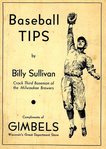
• And, finally, a pamphlet entitled “Baseball Tips” written by Sullivan. It’s a simple text-only handout, with a Gimbels ad on the back cover. All pages appear to be scanned and begin about a third of the way down this page and continue to the end.
Want to see more? If you’d like to do your own browsing, the bulk of the archive begins here.
ESPN reminder: Paul here. In case you missed it yesterday, my annual Super Bowl preview column is up now on ESPN.
And speaking of ESPN: Page 2 has package today on the Puppy Bowl. It includes a piece I’ve written about the kitten halftime show. Enjoy.
Uni Watch News Ticker: Here’s a better look at that new WKU helmet (with thanks to Brian Ditmer). ”¦ Reprinted from yesterday’s comments: Nike has come out with a line of really great MLB T-shirts — except for the completely annoying Nike logo, which ruins the whole thing. ”¦ Umbro has come out with some really nice kits for several Peruvian soccer teams. Look here, here, and here (with thanks to T. Faust). ”¦ Yesterday’s ESPN column included a shot of the end zones from Super Bowl XL. That prompted this note from Rob Weber: “The Seahawks’ end zone for that game didn’t just say ‘Seahawks’ — it included ‘Seattle’ above it. That is not how the Seahawks have ever treated their home end zone, ever (although it is used occasionally in logos). Bottom line, it looked horrible, and was an embarrassment. Any idea why they would have done that? They did it again two years ago with the Cardinals. Why?” Anyone..? ”¦ Here’s an interesting story: The Jamaican track and field uniforms for the 2012 Olympics will be designed by Bob Marley’s daughter (with thanks to Cody Dannen). ”¦ Another Super Bowl, another article about groundskeeper George Toma (with thanks to Rob McDonald). ”¦ I’ve mentioned before that Gilbert Arenas is currently a sneaker free agent, so to speak, so he’s been wearing a different pair of footwear for each game. Now he has a web page that tracks his sneakers on a game-by-game basis (with thanks to Brian Johnson). ”¦ Good piece on Fab Five-era Michigan hoops uniforms here. ”¦ Oh baby, here’s a major find: Check out these awesome matchbooks from Pete Rose’s restaurant. And for ten bucks, I bet he’ll autograph them for you. ”¦ Everyone loves stories about the team seamstress — like, say, the one for the Phoenix Suns (with thanks to Darrell Bragdon). ”¦ Sharp-eyed observation from Drew VanNess, who writes: “During Thursday night’s Portland/Gonzaga game, I noticed that only one player for Portland (Jared Stohl) had a swoosh on his jersey. They’re not wearing the NCAA certification patch, so it makes sense that no one would have this, but I’m not sure why he did. Also, something looked off with his swoosh, like the tip of the tail was missing or peeling up.” ”¦ Here’s another Super Bowl-themed Pepsi display, only this time it’s for an old Super Bowl, not this year’s. Only problem is that they got the Roman numeral wrong — should be XIV, not XIII. “Sad that the Pepsi vendor did all that work only to screw up that one detail,” says John Beare.
New uniforms for Women’s Professional Soccer:
link
Hoop socks!
Great piece on Sullivan. Nice to see his stuff was saved.
Boy, you said it. Dan Cichalski deserves big thanks. And good for Sullivan himself for being so archival-minded. Those letters from owners and GMs are so revealing, about baseball and America both.
The Sullivan family story is easy for me to relate to (though I was a conspicuously untalented ballplayer). Irish Catholic, sports-obsessed, construction industry, blah, blah. My father was Class of 1932 at Notre Dame, where he sat on the bench for Knute Rockne.
But I must say, the most poignant thing in this morning’s trove came from the pen of a Jewish guy…
“I am sure you will understand my failure to answer your thoughtful telegram when I tell you that I am so deliriously in love…”
Way to be, Hank.
My only experience like this was during high school when I did some demolition work. We were asked to gut a house that was damaged by fire. The house belonged to basketball player Kenny Durrett. He was an All-American at La Salle and selected 4th in the 1971 NBA draft by the Cincinnati Royals. I managed to find a letter sent to him by HOFer Bob Cousy who was the coach of the Royals, a large portrait oil painting and some old college game films. Still have it all stashed at my parents house.
this was a fun one, and the reason i love uni watch so much. sure, whatever, today’s players are wearing yada-yada, but the finds we get here from days gone by are priceless to me, and can not only make my day, but sometimes actually lift my spirits. i should buy 4, no paul is a 7’s guy, 7 membership cards on principle.
I sure hope that Eric Bowyer sure has the werewithal to donate a good portion of these items to someplace that can professionally store and archive them like the HOF…
Amazing stuff!
Interesting article on Michigan’s uniforms, but I seem to remember Michael Jordan starting the trend toward the longer shorts. He wore his UNC practice shorts under his game shorts and needed something longer to cover the practice shorts. Michigan took it to the extreme with the baggy shorts, but they are still pretty modest compared to today’s man-dresses, and the uniform design itself is really classy and simple.
Michigan and Ohio State both wore alternates last night. Wasn’t sure who was the home team at first. Either uniform can be worn at home or on the road.
link
Those Ohio State greys are so sweet. They should wear them for evey home game. I agree though, Michigan should have worn blue, but it didn’t look terrible as is. Ohio State is grey and Michigan is maize in my first thought, so it is pretty cool.
The gray uniforms for Ohio State are fine from the front, but they look ridiculous from the back.
and if you skipped the article’s by-line, it would be tough to tell from the photo — there’s enough scarlet in there to let you know it’s being played in cowlumbus, but it’s not like the audience even gives away the location
oh…didn’t notice at first — the ball also gives it away…check out THE “O” on the rock
You mean dateline, I think.
There was a black and white photo in the paper this morning and it looked from that like Ohio State was wearing red and Michigan white, but the dateline on the story next to the photo said Columbus, so probably no one would be fooled.
Michael Jordan started it in the NBA, the link adopted the look in college and Michigan took it a step further.
Uh…
I just went back and re-checked that link I posted and it’s not entirely SFW. The video itself is fine, but some of the ads on that page aren’t.
Here’s a link.
Never understood why Michigan went away from the look that won them a title. Loved the big M and the little ichigan on those jerseys. Then everyone embraced the look of the “all talk but no finish” Fab Five. I rooted for them at the time because I’m not a Duke fan, but in retrospect I’m glad the guys who started the super baggy shorts look came up empty.
Speaking of super baggy, have you seen Jordan’s son lately?
link
Yikes.
Utterly absurd. It boggles the mind how such a look makes its way on to the court, either in style or in function. I’ve said it here before, but while football is going one way — tight, form-fitting uniforms — basketball is going the other. It also makes no sense for basketball players to be all weighed down inside with fabric from head to toe, including on their arms, while football players go sleeveless in freezing temps. Too hot or too cold as the case may be.
what…does he have a pair of carolina, chicago AND wizard shorts under those?
Yes. Plus Bobcats, Loyola Academy and Whitney Young.
And Birmingham Barons pants, of course (home and road).
nice article dan!
Have a vision of some people visiting here today and thinking, “Oh, so THAT’s what a ‘letter’ looks like. Wow, hand written, even.”
–Ricko
funny you said that. sometimes on a loger/pic-heavy post like these, i’ll skim to the ticker with all intentions of coming back throughout the day to enjoy the main post. but i HAD to stop at “A neat page of Tigers autographs” just to see the penmanship of that era!
great post dan, thanks for sharing!
Ricko and others-thanks for the help.
I googled “1973 Dolphins Raiders” and got the Hulu version of the 1973 Raiders highlight film. About 2:30 in, they showed the Dolphins game and it looks like that is where the particular picture was taken. Then, at 4:49 in you can see a pic of the smiley face sticker on Stabler during the Chiefs game.
Of course, I have to add :-)
The Dave Grob uniform collection is great! I’ve been a fan of the Crosley site for a long time. Great site!
The Seahawks’ and Cardinals’ style guides only show their logotypes with the location name locked up. Teams can do what they want at their stadia, but when the NFL is setting up the field, they will always go by the style guide, i.e. only official logos on the field. The ‘Seahawks’ logotype without ‘Seattle’ is not official because it’s not in the style guide. Likewise for the Cardinals.
Actually, now that I think about it, the Seahawks have an official lockup that has the logo locked up above the word ‘Seahawks,’ but that’s as close as it gets.
Andy is correct. IIRC, the new Falcons wordmark follows the same style — with “Atlanta” in small print above “Falcons.”
Yep.
link
Also, IIRC, Jacksonville’s new wordmark.
Yep.
link
When a team like the Seahawks or Cardinals makes the Super Bowl, most people don’t know where they are from or anything about them – so they add the location to the end zone treatment to help the fans.
Ha! I was thinking the same thing.
Well, if one endzone on Sunday says “Green Bay Packers,” we know that means not-the-Steelers.
For the sake of league consistency, do the Rams have an official logo without St Louis included on it? The city was not part of the field art in either of their most recent appearances, but it doesn’t look like they have an official logo without it.
They do, but it’s specified for use on the jersey only.
Where can we see these style guides?
Too bad the Nike shirts didn’t include one for the Padres…the late great Ken Caminiti really popularized the goatee in the late 90s.
Among other things.
I thought that was Greg Vaughn who made the goatee popular – and then forced the Reds to waive their no facial hair policy when he played there?
Those Nike baseball shirts look like the banned Ron Washington shirts.
I was in high school when the Fab Five arrived on the scene. I can remember making my mother drive me from Binghamton to Syracuse to track down a pair of yellow Michigan shorts, and I spent three weeks of my paper route money on the kicks found halfway down this page. Ah the good old days.
link
No mention of the Hardwood Classics? The NBA coverage here is weak.
actually, they were mentioned in wednesday’s ticker, so perhaps you’re just late
Well, it’s far easier to bitch about something than it is to actually bother checking to see if anything was mentioned, isn’t it?
And Mael, did you send anything about the Hardwood Classics to Paul?
Last few photos are from Warriors-Bucks…
link
—Ricko
You are right, my apologies.
Wait, people give a damn about NBA coverage?
Yes sir.
Not in the Bay Area. Do we have a team?
Yep. The Warriors are pretty entertaining, too, playing some old school run & gun. Go see Steph Curry while you have him. Kid can shoot.
From the page of old Reds uniforms…
we recently discussed the archetypal “C” logo of the Chicago Bears/Cincinnati Reds/Cleveland Indians/etc.
Note that this 1966 uni does not have the distinctive “tail” point on the left side of the “C”
link
I never noticed that before…
-Jet
The “tail” went away when the Reds went to the navy-added version of the vests in 1961 (the “oval” C replaced the “wishbone” C). I’ve a seen a few scattered photos that show it still appearing on their hats in ’61, but I’m not sure that survived much past spring training. Everything from ’62 on (through the run of vests, that is) uses the Oval C.
—Ricko
Bye bye Andy. Thanks for a wonderful career and many happy postseason memories. I don’t think anyone will be wearing 46 in pinstripes for a while.
Any chance he gets in the HOF?
Good anti-HOF case made here:
link
Yeah. Andy seems like such a solid guy in so many ways, but character should be irrelevant to elections for this particular institution. And, yes, that would mean that Pete belongs, and ASAP.
“character should be irrelevant to elections for this particular institution”
But until they change the stated criteria, it is.
That’s the true crux of, and deciding factor in, the discussion. Issue shouldn’t be taken with the voters, but in this case rather with the HOF itself.
Feel the same about Bonds, McGwire and Palmeiro, do we?
Just, y’know, asking, because it’s either across the board or not at all.
And fessing up shouldn’t change that.
“Well, you cheated…but as long as you admit it, okay.”
That’s pretty much another version of a Participation Trophy.
—Ricko
c. hustle deserves induction but will never get in…at least until some of the older members die off
as far as i know, he never took performance enhancers and never bet on a game as a player…
he broke baseball’s *only* cardinal rule “no betting on games” and until that changes, he’ll probably never get in (or at least until commish for life selig dies)
~~~
otoh…roid takers cheated (depending on your definition of “cheat”)…and as far as i know, that’s never been a bar to admission
they’ll have to wait … and some sure things just might not make it
bonds will, there’s no question there…just how long will it take
the others? time will tell
Well, you ask some good hard questions, Ricko. Maybe I was too quick and too glib (imagine!).
The distinction I would draw is that Pete’s actions had no consequences on the field, made no impact on the score. [Maybe that’s a disputable premise, and I’m all ears if it’s not true.] The other gentlemen you mention took actions that did indeed affect scores and outcomes, and put their opponents at an unfair, unequal disadvantage.
Or would you say that’s a distinction without a difference?
It will take a fundamental change in the way we see how athletics should be approached for Bonds (and a few others) to get into the HOF. Perhaps if they include a special wing for “significant accomplishments” or something…but as a player, no.
He didn’t just cheat. He conned us. His memorable, historic accomplishment (no matter how great he was before that time) was a fraud. He, McGwire and Sosa led us, at different times, to believe we seeing something extraordinary. And it was all a lie. How exactly do we pat them on the head and forgive them for that? More importantly, why should we? Just because they’re athlete? Or because that’s all baseball has to show for those years?
Fifty years from now, when someone updates and remakes FIELD OF DREAMS, is will be Barry Bonds who appears that night on the diamond in the cornfield (probably played by Will Smith’s grandson).
—Ricko
“character should be irrelevant to elections for this particular institution”
But until they change the stated criteria, it is.
Agreed.
Sincerely,
Ty Cobb
(As for me, personally, I don’t believe character should ever be irrelevant. We’re human beings. Character matters. In everything. If I didn’t think it didn’t, I wouldn’t bother. But we just want people to entertain us.)
For one thing, Cobb was elected when racism wasn’t necessarily frowned upon.
Also, let’s ponder this…
If we suddenly learn that Muhammed Ali always fought with weighted gloves, should our opinion of him remain as high as it is? Or should that change things?
—Ricko
He didn’t just cheat. He conned us.
~~~
so did a lot of guys with plaques
bonds gets in…close on first ballot, definitely by second or third
the others? especially roidger…
maybe not
i don’t agree with what any of them did, and for the most part, these guys were complete d-bags, at least public personna-wise…but for the most part you’re talking about guys who had HOF #s with or w/out the stuff…and to what degree are we going to say “drugs” helped? i don’t think roids help eyesight or hand/eye coordination (without which, you’re probably not going to play the game at all), and what about guys whose careers were saved with techmology (tommy john surgery, for example)…or who played on greenies or even blow?
put an * next to any of their records, sure…but they don’t deserve to be barred admission
I honestly believe a lot of people’s thinking is based on the fact they were still young enough to have some residual stars in their eyes during the steroid era.
And to now reallie it was all (or a huge share of it) bullshit is tough to take.
Wouldn’t it be better to accept there were some truly dishonst phonies (speaking of chemically altered competition) that were part of “your” bsseball era and instead focus on Cal Ripken, who broke what from the time I was a kid was considered the single most untouchable record in MLB?
And his accomplisment was authentic. Bob Costas uses “authentic” as a word that ought be applied. And I think he’s right.
—Ricko
There are those out there (I’ll see if can pull some cites if work slows down) that contend that the drugs do significantly improve hand-eye coordination and greatly sharpen reflexes, which would be a great help at the plate especially.
Wouldn’t it be better to accept there were some truly dishonst phonies (speaking of chemically altered competition) that were part of “your” bsseball era
~~~
my baseball era?
listen, i fucking hate bonds, and nothing would make me feel better than to have him tossed in jail and denied entry to the HOF…
doesn’t obscure the fact that as a player, even before he grew a giant head and teensy testicles…he was a HOFer
he deserves entry
does he “deserve” hank’s record? no fucking way…but you can’t place a morals clause on him (or anyone else)
why should i focus on ripken? he is in and he deserves it…not sure what his admission has to do with bonds or clemens or sosa, palmiero or mcgwire
what about bags? he never failed a roid test, but does that mean he’s above scruitny? i suspected him before i suspected others, but i have no proof — if im a voter, does that give me the right to reject him based on that alone?
im not defending these guys, rick…but i am saying you can’t apply a holier-than-thou attitude towards them either
unless, of course, you’re casting the first stone
How does Ricko know that Ripken didn’t juice? I think there is no way he played in all those consecutive games without using some illegal substances along the way.
I was just suggesting that that baseball generation doesn’t have to, so far anyway, think everything about that time period was phony.
But you make a good point. If there was a “dead ball” era, there certainly could be a “steroid era” and we’ll just assume everything from that generation is tainted.
Because, as you mention, it may well be.
Now, for those who consider it their favorite time in baseball…that’s gotta suck.
—Ricko
A quick search brought up this NY Times article (link) that says that it might not improve hand-eye coordination, but it would greatly increase bat speed. That increase would be seen as improved coordination, as it would give the hitter more time to watch the pitch so as to make a better decision to hit it square. And, given the increased muscle mass, hit it further.
1) Steroid use gives the user the ability to work harder athletically, and recover more quickly, than the user could do otherwise. Hence the term “performance enhancer.”
2) “Character”, whatever that means, is part of the BHOF criteria. Aside from that, no person on baseball’s banned list is eligible for induction. Right now, that list includes Pete Rose for one of baseball’s historical taboos — betting on the game. It’s such a huge taboo that it almost guarantees you will never get into the HOF.
3) Baseball is as much a set of stories as it is a set of stats. How else could you take a card with a table of numbers that would make an actuary comatose, slap a photo on the other side, and make a precious memory? A group of players have “The Dead Ball Era” as part of their stories; another group “The Pitcher’s Dominance of the 60s” as part of theirs; we’re now assessing those who have “The Steroid Era” as part of theirs. We were able to separate the true Hall of Famers from the tainted before; there’s no reason we can’t do it again.
I don’t think Bonds gets in. Besides being a doper, he is a WORLD CLASS JERK. Boorish, arrogant, and a total a-hole. He treated everyone like dirt—sportswriters most of all. They remember.
If Pettitte had spent three years with the Yankees between long stints with the Astros, there’s no chance he’d even be seriously considered a HOF candidate. He’d get maybe 24 percent on the first ballot out of respect/boosterism, and probably hang on the edge of the voting for a long time. But he’s no more a Hall of Fame pitcher than Kevin Brown or Dwight Gooden.
But Pettitte played mostly in pinstripes and only briefly in Houston, so he’ll probably get in on the first or second ballot. He’ll be just about the worst starting pitcher in Cooperstown, but those of us who think Jack Morris belongs in the Hall will have our case permanently vindicated. There is simply no conceivable argument for enshrining Pettitte but not Morris.
Looks like the vendor took my advice and used Mountain Dew Code Red for the red parts of the display.
really…riley?
“Both teams wear yellow pants”
~~~
once again, the only *research* done is to look at a tv screen and to declare it “so” … both teams’ official colors include “gold” not “yellow” … but he knew that, right?
Do we have to keep bringing up this topic?
Both teams wear yellow pants. What shade of yellow? Athletic Gold.
It isn’t that damn complicated. Lemon is a shade of yellow. Athletic Gold is also a shade of yellow. Navy is a shade of blue. Scarlet is a shade of red.
It isn’t wrong to call the Steelers pants “yellow” unless it’s also wrong to call the Yankees hats “blue”.
I hate to agree with both RR and TJ, but if you want to call it gold or cheddar or “greatness” or whatever, it’s still yellow.
If the Texans were playing and he referred to their colors as “red, white and blue” would you take him to task for not referring to them by their *proper* appellations (Battle Red, Liberty White and Deep Steel Blue)?
Exactly.
Technically, a ‘shade’ of a color is a mixture that involves only that color’s pigment and black. A mixture only involving said color and white is called a ‘tint.’ Athletic gold really is a slightly different hue than yellow, meaning that it is actually a different color, because it contains a lot of yellow and a tiny bit of red in terms of pigment.
That is to say, athletic gold is on a different radian of the color wheel. All the shades and tints of yellow lie on the same radian of the color wheel as pure yellow, just closer to or farther from the center.
Who invited the art major to the party?
It. . .it’s a joke, you see? Why is nobody laughing?
True enough, but the only time you ever need to be that specific is if you’re in the industry, or you’re looking at color chips at Home Depot and trying to decide which one to use on your bathroom wall.
There’s a LOT of different hues. Most of them aren’t named with more than a number.
The physical reality behind human color perception and the social constructs behind human understanding of color are well understood – the latter being one of the most interesting fields of linguistics since Berlin & Kay in 1969 – and simply put, The Jeff is right. We see colors as relatively large ranges, and then we name those ranges, and only then do we differentiate among particular hues within those ranges. Interestingly, a number of societies don’t differentiate between what we call red and yellow; both are part of a larger category that’s based on a warm/cool division.
So to the extent that there is a primary color called “yellow,” then in fact gold is a subset of yellow. While it would be wrong to call a pastel hue of yellow “gold” – that would be “lemon” or something – both “lemon” and “gold” are rightly called “yellow.”
For this to be false, it must also be false that both the sky and the union of an American flag are blue. In SAT terms, navy:gold as cerulean:lemon and gold/lemon:yellow as navy/cerulean:blue.
So yeah, they’ll both be wearing yellow pants. They’ll also both be wearing gold pants. They will not be wearing canary or maize or chartreuse pants, though if they were, those would also be yellow.
yeah…no shit scott
im simply pointing out that yellow is (athletic) gold and vice versa (even if “athletic gold” is slightly different)
but my beef is NOT with those who call gold “yellow” (though they are “technically” wrong) but those who insist that yellow is NOT GOLD…
that is not true … and that’s what bugs the shit out of me
it’s not “old gold” but it is “athletic gold”
Phil, I think we agree completely, except maybe for two things: Old gold is too a subset of yellow (though sometimes of brown, depending on the shade); and Riley didn’t actually say what you say bugs the shit out of you. He just called the yellow pants yellow, which they are. I didn’t read him saying anything about them not being gold, which of course they also are.
It’s totally fine to call those pants “yellow,” and it’s totally fine to call that color of yellow “gold,” even though it bears absolutely no relationship whatsoever to the color of the element for which the hue is supposed to be named.
yeah, we do — my *anger* wasn’t directed at you
my point is we had more than one reader flat out DECLARE that yellow is NOT gold
that’s what got to me — riley didn’t say that, nor should i have intimated it
BUT…what did bother me was riley’s glib comment that “both their pants are yellow” (or “they both wear yellow pants” or whatever it was) — because, technically that’s NOT correct — their OFFICIAL colors are, steelers: black, white and gold; packers: green, white and gold
im not 100% positive, but close to it, that there are websites called “the black and gold” and “the green and gold” and both teams are commonly known by those monikers
so when i see someone of riley’s stature calling the pants yellow…it causes him to lump me in that group who can’t possibly fathom “gold” being any color other than what the saints helmets are
ok…done with this
…for now
MEMO
TO: Lyricists, poets and namers of paint colors
There is no such thing as gold Autumn leaves.
Kindly remove any such references from your work…past, present and future.
The Jeff says so.
Thank you for your attention to this matter.
—Ricko
No. He’s not saying it’s wrong to call the color gold. He’s saying it’s *not* wrong to call it yellow.
I’m with James and The.
Besides, poets and lyricists still have poetic license. To the general public the terms are somewhat interchangeable. It’s just the paint namers and other color-related professionals who *need* to be specific.
Uh, as well as the Uni Watchers!
Ricko, aren’t you old enough to realize by now that 20-somethings who sit in front of a computer in their basement all day know all? Sheesh.
Now if only spring would get here so we could enjoy the warm golden rays of the sun.
Golden rays? Clark Kent begs to differ. ;)
link
Nike, no Red Sox/Luis Tiant handlebar t-shirt? I’m saddened.
Second that.
And sorry, Rollie belongs to the A’s, not the bloody Brewers! For that matter, where are the early ’70s A’s? Guess no one stood out in particular, but that was facial hair central …
Or A’s/Eck
el tiante wore a link. a link has enough length that it comes off the face.
I can’t figure out the Cub for the life of me.
There was quite a bit of discussion about it yesterday.
Until someone provides convincing evidence to the contrary, it’s link.
same with jack morris.
I’ll agree … my best guesses were Buckner or Dennis Eckersley … but neither was a standout like the others shown.
Don’t start this shit again. You don’t need Hall of Fame numbers to be a popular player (especially if you’re a Cub in the late 70s/early 80s).
Is the reason for not Nike’s not providing identities have anything to do with not wanting to pay the subjects of the images?
I’m still torked there’s no Mad Hungarian.
I was a bit miffed that no O’s would quailify for their own Swoosh-shirt…
Then I remembered Eddie Murray:
link
These look suspiciously like those awesome fan-made Ron Washington shirts that MLB shut down in October. Here’s a link to what they looked like. link
And here’s what the MLB lawyers did: link
“Everyone loves stories about the team seamstress – like, say, the one for the Phoenix Suns”
…who happens to be someone you just featured recently:
link
My piece on the Puppy Bowl’s kitten halftime show is up:
link
cutest thing ever
Cuuuuuuuute!!! Seriously, we need more cute in this world! Bringing this back to uni-land I personally get bummed out when a cute mascot or logo is replaced with one less cute, examples are removing Goldy Gopher from center court at Williams Arena, and the toothy Florida Gator in use nowadays. Keep the pictures of the kittens coming!!!
The beasty boy that lives at my house:
link
That was SUPER cute! Cuter than the twirling Bucks logo of old.
My wife and I have three kitties, so I think we make the N+1 rule. Does owning two dogs put us in the “crazy” range?
If so, crazy is the way to go.
We are so tuning into this kitten halftime show!
I know this isn’t exactly the kind of thing that you or anyon else wants or needs to hear, but I personally thought your kitten piece SMOKED the puppy piece. Nice job.
My guess is that the rogue swooshed Portland player is either a freshman or needed a replacement jersey, and Nike sent them a non-matching jersey. It’s not uncommon for mid-major players to use the same jersey for multiple years.
yeah…but they weren’t supposed to have swooshies then either (past years)
link. I love the smell of stop-motion in the afternoon!
Off topic, but you know what? I really hate this years and the new “template” for the Super Bowl emblem. Again, they might be lame, but its better than the drab silver b.s. that I’m being forced to accept from now onto forever. My favorite logo? Super Bowl XLIV, the last Super Bowl. It was simple, and creative. This template is taking the uniqueness out off the idea of the Super Bowl, since now it’s just a copy each time.
I get the whole league unity thing, especially for the AFC-NFC logos, but the Super Bowl, make it different every year.
Great look at a full, link, football uniform on auction.
Pretty cool.
Not sure if its an alternative Super Bowl logo, or an example of one of the counterfeits the article is talking about, but the WSJ law blog has a much nicer (in my opinion) Super Bowl logo — with the Cowboys’ star, and the Texas flag, well done
link
Would that have been the logo if the NFL hadn’t instituted the Total Unified Brand logo system? That, or possibly the logo of the first Super Bowl to be played in Glasgow?
That was a concept posted either here or at Chris Creamer’s, can’t remember which. It might have been around the time the whole standardized logo system was announced.
Dodgers are letting fans vote for throwbacks they will wear 6 times this year.
link
OH MAN that is sweet — any of those three would be fanfckntastic
The only downside is that we’ll now see another team wearing a road uni at home.
Hope the 1911’s win, the Brooklyn placket would look nice.
And one thing I’m glad for is if the Dodgers are going to do throwbacks to Brooklyn jerseys, at least they’ll be using one that actually existed, as opposed to throwing a road “Brooklyn” wordmark on a 21st century home white jersey and calling it a “throwback”
I’m sure you all figured out the answer to this already, but I just called the Dodgers and asked whether the throwback based on the satin uni would actually be rendered in satin.
The answer: “All the throwbacks would be produced with modern fabrics.”
So the satin uni would just be a basic powder blue. Maybe just as well, since these throwbacks are going to be worn in day games, which means there’d be no point in wearing the satin uni anyway.
I’m sure that this will NOT be the case, but they could always render the satin uni in that dazzle polyester fabric that NBA teams like the Bulls were using up until this season.
That’s a “modern” fabric, right?
Dumb for the Dodgers to ever wear a road uniform at home. Are there going to be any home turn-back-the-cock options?
Unless they’re playing in Brooklyn, road uniforms make perfect sense.
well, we already have the stirrups for one of them.
Damn do I love those 1931 stirrups, but I just can’t bring myself to buy anything representing the Dodgers.
I’m usually automatically for anything with the number 1911 in the name, but daaaaaamn, those are some sweet options. I think 1931, satins, 1911 for me, in that order.
. . . and they can’t afford anyone to proofread their copy, at least as to what’s on the front of the 40s jersey.
In regards to the satin Brooklyn unis…I just finshed this book link and there was a mention of the satins, which I loved! It states that after Koufax signed with the Dodgers, they donated the satin unis to the Parkviews as a gesture of thanks. The Parkviews were one of Koufax’s sandlot teams in the Coney Island Sports League. Makes me wonder whatever happened to those satins! Also, that Dodgers poll is crap without the 1937 kelly greens.
Agree that any of ’em will be great — but if they had some real cajones they’d have offered link — home or road.
johnny latecomer here. agreed with those 1916s. that needed to be option 4. and the satins need to be satin like the bulls. but, schnikeys, those are some nice options!
I just didn’t a quick scan and didn’t see this posted yet, the Broncos have petitioned the NFL to switch to their orange alternates full time starting in 2012, the navy would then become the alternate.
link
It was first reported in late December — buried in the middle of this column:
link
Man, I’m hungry. I think I need to run over to the Yellow Arches and pick up a burger and some fries.
Can you even get through the athletic gold snow to make it out your front door?
Thank you for posting this article. I also plugged the show on Face book, with mixed results from my friends. All I ask of people, whether they are familiar with homeopathy or not, is to watch the story. link