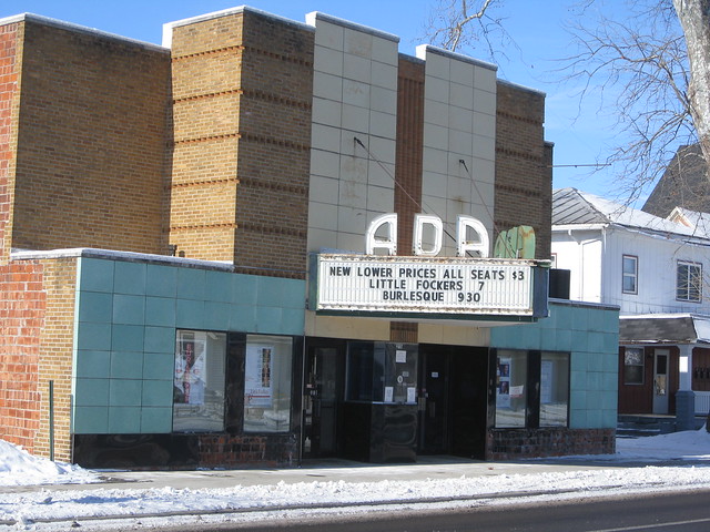
My article + video about the making of the Super Bowl footballs in Ada, Ohio, is up now on ESPN. For today’s blog entry, I wanted to show you a few things that didn’t make it into that ESPN article, including the really charming movie theater in Ada. Here’s how it looks at night (sorry for the shitty image quality — I took that photo through a car windshield).
But you’re more interested in what went on in the football factory, right? Here are some details:
• My article shows a worker cutting panels from a sheet of cowhide with a cookie cutter-like die. But it doesn’t show this photo of all the other cutting dies used at the factory. Each one is for a different kind of football — NCAA, high school, Pop Warner, etc.
• Similarly, my article shows the machine where a worker stamps type into the cut panels. What’s not shown in the article is that the plastic walls around the machine are covered with little stamped leather swatches. I liked that a lot.
• The article shows a worker sewing a football together. But it doesn’t show this view of the old sewing machines, the cool metal tags on the machines, or the spools of thick, waxed thread.
• I bet some of you already knew this, but I didn’t: When the pebbled surface is stamped into Wilson’s NFL football leather, they also stamp little Wilson “W”s into it. This has apparently been going on for about five years. I have several official NFL balls, but I’d never noticed this before.
As for the rest of the scene at the factory, you’ll have to check out the article for that.
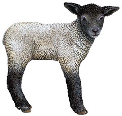
Baa-aaa-aa! Weekend report: I had a great weekend, beginning on Friday night, when I went to a gallery reception for an art show by the great Tony Millionaire. Hadn’t seen Tony in years, and he promptly said hello by trying to autograph my face. Fortunately, I was able to convince him to autograph Danny Hellman’s head instead (more surface area, much better). Lots of additional photos here.
Then on Saturday I went to a lamb butchery class at a Manhattan restaurant called Back Forty. On my way there, I walked down a random East Village block and passed a paint store I’d never noticed before, with what appeared to be a very interesting wall display. So I went inside and discovered that the wall was basically a massive swatch catalogue, all painted by hand — so cool! I took several additional photos, which you can see here.
From there I went around the corner to the butchery class, where Back Forty’s chef, the lovely Shanna Pacifico, taught a dozen of us the particulars of taking apart half a lamb. As you can see, the head and feet had already been removed, and it had also been gutted, so there was nothing gory about the proceedings — just lots of cutting and sawing.
There were some hands-on segments, too. This guy got to remove the leg from the hip socket, and then I got to de-bone it. Shanna later slathered the boneless leg with an herb paste and tied it up into a roast.
The roast was one of several lamb dishes we feasted on, beginning with an amazing lamb tartare. What you see there is raw minced lamb, herbs, and little pieces of salt-brined lemon rind (an amazing ingredient that makes so many things so much better). Shanna added a little bit of mayo as a binder and then used a ring mold to create perfect pucks of lamby goodness, which we then spread on toast. Best thing I’ve eaten so far this year.
That was the appetizer. Then we sat down to dinner, which included lamb pâté with pickled onion and mustard; smoked lamb croquettes (doesn’t look like much, but it was my second-favorite thing after the tartare); chickpeas with braised lamb shank; and assorted cuts of roasted and grilled lamb. Oh, and apple crisp for dessert.
It was all really, really good. If you want to see more photos, I’ve put a few dozen images here.
Sunday got off to a good start when I won this item on eBay. It’s gonna look totally boss in my bathroom.
In the late afternoon I went down to the Bell House, where my longtime friend and softball teammate Phast Phreddie was hosting one of his periodic “Big 10-Inch” parties, so named because the DJs play nothing but old-timey 78-rpm discs. All the cool kids turned out, and it was a grand time.
Afterward, a few of us went out to the Draft Barn, a Hungarian-style beer/schnitzel joint. To our surprise, we were the only customers. I said, “Slow night, eh?” to our waiter, who responded with the Funniest Thing Anyone Has Ever Said in the History of Ever: “Yeah, but it might pick up — the Pro Bowl is on.”
Slow night or not, the chow was superb. We started by sharing some “hunter’s bites” (i.e., little hunks of sausage) and beer croutons (dark rye bread soaked in beer, fried, and tossed in salt), and then I got a sausage sampler. Great stuff, but my favorite thing about this place is that they can’t even spell “vegetarian,” which is an unmistakable sign of a kitchen that has its priorities straight.
Which is lamer: the Pro Bowl or the Pro Bowlers Tour? Discuss. For all my jokes about the Pro Bowl, one legitimate uni-related storyline did emerge from yesterday’s game, as several of the players chose to wear long pants. Naturally, I’m opposed to this, since it de-emphasizes the socks, but it makes a certain kind of evolutionary sense. The refs, who for generations had been the classic exemplars of knickers/hosiery protocol, now wear the long slacks for cold-weather games (and, as we’ve all seen, for plenty of not-so-cold games as well), and of course bringing the pants down toward the ankle also mimics what’s happened in baseball.
The common denominator in all of these examples, methinks, is the low-maintenance aspect of not having to fuss with one’s socks in order to get them (and keep them) just so. Okay, I can kinda see that, but fussing with one’s socks is one of life’s great pleasures, is it not?
In any case, I assume the Pro Bowl pants were just an experiment that won’t have any immediate bearing on team uniforms, but it’s an interesting hint of where the game may be heading. It’s also a noteworthy reminder that for all the chatter about Nike’s imminent takeover of the NFL uni contract, this is still Reebok’s league for now.
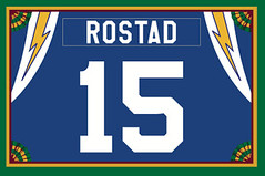
Membership update: A new round of membership kits will mail out this morning, including Lance Rostad’s throwback Chargers treatment, shown at right (he didn’t ask for the lightning bolts, and we don’t usually include sleeve/shoulder treatments, but I guess Scott was feeling inspired when he designed that card). As always, you can see the full gallery of membership cards here. And if you haven’t made good yet on that New Year’s resolution to sign up, you can take care of that here.
Last call for the football: Today’s the last day to enter the raffle for the Super Bowl ball. Details here.
Uni Watch News Ticker: Titans owner Bud Adams still likes to wear an Oilers bolo tie (as noted by Jonathon Binet). ”¦ This is pretty funny: a team-branded hockey glove, sort of, that doubles as a cup-holder. “No Islanders glove, though,” says Brooks Simpson. “You know those fans need a drink.” ”¦ The Angels will be wearing throwbacks for their Friday home games this season, including on Opening Day Night (with thanks to Jessica De Leon). ”¦ New uniforms for the Mizzou marching band (with thanks to Kate Sutter). ”¦ Tris Wykes reports that Cornell goalie Andy Iles has former Cornell star Ken Dryden depicted on his mask. ”¦ Rob Holecko has provided our first look at the Super Bowl field. Interesting to see that both end zone logos are stencil-style. When’s the last time that happened? ”¦ Additional photos of the field and stadium being prepped for the game here (with thanks to Jeff Flynn, Jr.). ”¦ Here’s a good site devoted to Iowa State football jerseys (nice find by Shawn Hairston). ”¦ Here’s an excellent video on how the Blue Jackets’ third jersey was designed. ”¦ Speaking of third jerseys, the Senators will have a new one next season. ”¦ Several small inconsistencies in the NHL skills competition: Zdeno Chara’s captain’s C was slightly off (compare the lower-left corners), and so was Tyler Seguin’s NOB (note the lack of serifs on the I). Meanwhile, Montreal’s P.K. Subban wore Jeff Skinner’s Hurricanes jersey in a bid to attract the hometown fans’ support. Coverage of some additional uni-notable issues can be found over at Icethetics. ”¦ No photo, but Matt Lesser reports that Alabama hoops player Hunter Jeffery was NNOB in Saturday’s game against LSU. ”¦ Speaking of college hoops NOBs, Mike Page notes that Ashton Gibbs of Pitt had his NOB badly off-center on Saturday. ”¦ The Tri-City Americans — that’s a WHL team — wore “Nuclear Night” jerseys on Friday. Further details here (blame Michael McLaughlin). ”¦ Someone has come up with a bunch of NFL-themed soccer jerseys, complete with city-appropriate sponsors (fun find by Rob Leavell). ”¦ Chivas USA has a new shirt sponsor: Corona Extra beer. “I believe this is the first time an American team has worn a shirt sponsorship sold by a beer/liquor company,” says Ric Jensen. “I had thought Major League Soccer banned shirt sponsorships by liquor/beer companies when they introduced the concept years ago. Is that right?” Would any of you soccer-savvy readers care to weigh in on this? ”¦ New super rugby jerseys for New Zealand. “Appallingly ugly,” says Caleb Borchers. “Don’t know if I can watch.” My prediction: He’ll watch. ”¦ New uniforms for the Nippon Ham Fighters. Here’s the back view, the road jersey, the road back, and the BP jersey (all this courtesy of Jeremy Brahm). ”¦ Attention MISL fans: The Missouri Comets wore their long-awaited throwbacks the other night. Sweet (big 1-thanks to Jeff Husted). ”¦ Somebody who didn’t give his name sent shots of this super-cool softball jersey. ”¦ Ball State wore their red road uni at home on Sunday, with Ohio wearing white on the road (as noted by Dylan Buell). ”¦ Gotta love the packaging on this underwear. ”¦ The sponsor of the Chicken Sandwich Bowl is taking some heat for supporting a group that opposes gay marriage. ”¦ Some serious mismatched jerseys on Bob Cousy and Eddie Macauley, plus Cousy’s jersey number doesn’t match the number on his shorts (with thanks to Allison Ambrous). ”¦ The Lakers wore throwbacks yesterday, although Paul Lee noticed a typographic inconsistency. Tons more photos from the game here. ”¦ Matt Mitchell notes that Baylor point guard Odyssey Sims wears multi-colored nail polish. … A Wisconsin company is designing some genuinely hideous bowling shirts (with thanks to Jeff Ash). ”¦ Word has leaked that the Mets will host the 2013 MLB All-Star Game, which has prompted Justin Kerr to envision what the game’s logo will probably look like.
How many times over the past 30 years or more have we all thought, “Now THAT would be great look for football pants”…
link
—Ricko
That’s a great, under-appreciated look. Homies were much more acceptable than the awaysies.
Probably about as often as we thought we’d want to see a giant orange swoosh down the side, but that didn’t stop it from happening.
I’d rather see that than the biker shorts look.
Plus if the pants are going to start getting longer like that (which if the league makes knee pads a requirement, I could see happening), there’s no reason they couldn’t put stripes or a colored section at the bottom to simulate the old high sock look, much like the compression sleeves simulate the old long sleeved jerseys. It doesn’t have to be baseball-like.
“there’s no reason they couldn’t put stripes or a colored section at the bottom to simulate the old high sock look, much like the compression sleeves simulate the old long sleeved jerseys. It doesn’t have to be baseball-like.”
Been thinking the same thing. One can only hope.
But that nonsense yesterday was decidedly “baseball-like”.
I can see the slghtly wide “capri pants” look coming, though. In baseball, if a player needs a knee examined, there’s a clubhouse where he can, if necessary, pull his pants down. For football, pantlegs would need to be wide enough, or stretchy enough, so the pant could still be pushed above the knee for the trainers/doctors to do their work on the sidelines.
Lotta potholes, esthetic and otherwise, in going this direction.
—Ricko
Ankle-long football pants (in Lime/Neon Green no less) were a feature of the California Crusaders in the movie “Any Given Sunday”…
(insert Oliver Stone v. Swoosh joke here)
“…but it’s an interesting hint of wear the game may be heading.”
I’m guessing that wasn’t intentional, but it was amusingly appropriate. :)
Take THAT, China! Who needs overseas outsourcing? Hand-made footballs in a factory in little town Ohio!
Conversely, something inherently wrong with the term “lamb butchery.”
Seriously … lamb … butchery.
So very wrong. lol
Yep. The Ada story is one of your best ever, Paul.
Favorite element: “…(T)he plastic walls around the machine are covered with little stamped leather swatches. I liked that a lot.”
Also outstanding on a very good Monday:
1. The awesome hand-painted swatch collection wall.
2. The Kool-Aid jersey from Anonymous.
3. Lamb butchery. Sorry, Scotty. I see Paul’s hyper-carnivoristic exhibitionism to be part of the essential character of this site. He hawks “Meats” t-shirts, fer krisake. I also understand, and sympathize with, his distinguishing himself from the common run of Brooklyn veggie zealots. Not saying that’s his motive — I assume he begins and ends with the fact he likes to eat flesh — but it certainly constitutes a side benefit. I only regret that the seminar didn’t include decapitation and gutting. I’m planning on raising the little beasties meself.
Yup, kinda like the old saw about…
If you like sausage, never watch how it’s made.
—Ricko
Loved the Ada story. That lil’ factory just screams Midwest! No fancy schmancy suburban complex. Just a cinder block building, shelves from the local Ace Hardware store. Even that clock is no-frills.
Thanks for sharing.
Evidently, MLS won’t allow hard liquor sponsorships but beer is okay.
Because, y’know… um… beer is not as bad as liquor? What a weird rule.
Mind you, they sell beer at the stadiums. And not liquor. The great Money God strikes again.
Hard liquor, tobacco products, and online gambling websites are not permitted by MLS, IIRC.
I guess they would sell Corona at their games then. Has that ever happened? Does Corona even come in kegs? How will they keep up with the lime supply? All these unanswered questions…
Tobacco ads aren’t allowed by U.S. law. That’s why it’s the Sprint Cup and Teams Ferrari and British American have blank spaces in the USGP.
That would be great if Corona were, indeed, beer.
I still don’t think they understand.
I have a crazy idea: why not just ban jersey sponsors alltogether? You don’t have to fuss with sponsor rules, and it saves everyone a lot of time and money. Done. And. Done. Oh, wait… but then the Money God(s) will burn my house down. Nevermind =(
When I first started watching soccer, it bugged me to no end. The (somewhat unfortunate) thing is that, after having watched for several years, a soccer jersey looks weird to me without a sponsor now. The MLS is really trying to mimic Europe in many of their soccer traditions (jersey sponsors, team names, etc.) and it has so far led to quite a bit of success. It’s hard for teams who don’t make the billions that NFL teams do to turn down a lucrative shirt sponsorship, especially when it’s de rigeur for most soccer teams around the world.
$1-2 million in jersey sponsorship is not trivial to an MLS club. Yes, the League has deal with adidas and some other national sponsors that help meet the player payroll, but each club ideally needs to generate enough local dollars through ticket sales and sponsorships to pay the coaching and front office staffs and cover operating expenses. Since no one is paying jack squat for local broadcast rights, jersey sponsors are the best option available right now. (Bad for the uni purists, I know, but claiming one league is a bunch of whores while another isn’t just because of ads on the jersey is more than a little bit disingenuous.)
FWIW, Corona is not the first alcohol product to be on a MLS jersey. 5-6 years ago, there were back of the jersey/below the numbers ads for some league sponsors. I specifically recall ads for Honda, Budweiser, and the US Soccer Foundation.
Those bowling shirts are bad. Like mid-’90s-beginning of computer-graphics-combined-with-rudimentary-sublimation-techniques bad. Truly awful.
I bet Vilk would wear them.
Heck, if I bowled more, I’d wear them.
a) If we have caught even a snippet of video of the PBA in recent years, saying those shirts are hideous is a bit like saying Hawaiian shirts are “a tad gaudy.”
b) They’re produced in ever fashion-forward Wisconsin, which gave us giant cheesewedge hats, for pete’s sake.
c) Yes, Vilk probably would wear one.
(Oh, I’m gonna get it now from the Wisconsin contingent, ain’t I).
—-Ricko
Um, no. For exactly the reason jdreyfuss said.
I have bowled in Hawaiian shirts before, but comparing the two does a disservice to Hawaiian shirts.
The Dude would not abide…
That’s Ohio, not Ohio State…
No reason they couldn’t have gone green on red then. Why wear your home jerseys if your opponents’ away jerseys easily clash? I’m not disagreeing, I’m just asking why they wore white.
I love those soccer/football jerseys! They look great! I am not too fond of the sponsorships but I like how they are all local companies who are known in the particular cities. Now all we need is an Indianapolis Colts soccer jersey with Eli Lilly as the sponsor. The cursive Lilly would look gorgeous!
I also really enjoy the NFL soccer jerseys. Well designed and clever mix of sponsors and suppliers (nike,adidas,puma, etc.) I would love to see a Giants one!
As a growing soccer fan, and someone with the general opinion that soccer jerseys are much better for casual wear, i think that they could actually sell these.
Whomever did those, PLEASE do one for my Saints!
It looked like the artist was generally using the stadium naming rights holder for the jersey sponsor if there was one and using naming rights from other local venues if not. In that case, as unfortunate as it would be, the Browns’ jersey sponsor should be PNC.
The Browns refuse to sell stadium naming rights, but National City (now PNC) does have the primary sponsorship deal that includes all the normal benefits except naming rights. That could never happen though, since the city would probably revolt if the Browns jerseys were sponsored by a Pittsburgh company. Same with if he had used Quicken Loans instead of Progressive.
I wonder what company he would have chosen a few years ago, when all three places were still named after teams or people instead of corporations. Sherwin Williams maybe?
The Ice Palace in Tampa, Florida is sponsored by The St. Petersburg Times newspaper.
Kind of awkward for the Tampa Tribune newspaper to give the venue of the local hockey team when it is the name of your rival newspaper, The St. Pete Times.
The Ice Palace was an excellent name, though tied in with Palace Sports of Detroit, owners of the Pistons and former owners of the Lightning. The venue is now called The St. Petersburg Times Forum, which is confusing since it is located in Tampa, 25 miles northeast of St. Pete.
The Tampa Tribune always refers to the venue as The Forum. Next year there will be a new change in signage for the venue: The St. Petersburg Times, Home of the Detronto Maple Wings!
Yes, those new DUDS are just that, unoriginal and uninspired.
I agree, those soccer/NFL jerseys are awesome. I’d buy that Packers one in a heartbeat!
Those NFL soccer jerseys look great. Job well done. I think they would sell if they actually made them.
That is a brilliant 2013 All Star Game logo. Except it needs some gratuitous black. Otherwise, perfectly sums up all that’s wrong with the Mets, aesthetically.
But whiskey-tango-foxtrot on New York, especially U.S. Treasury Field, getting the All Star Game before Washington? The last New York All Star Game was a couple dozen months ago. The last Washington All Star Game was 42 years ago, and DC’s new ballpark was finished before the Mets’ new digs.
Plus, the way the next few ASGs are lining up, Washington’s next chance is probably 2017, with at least three stadiums newer than Nationals Park likely to get the nod before Washington. That’s just ridiculous.
Mets haven’t had an asg since 1964. Simple as that.
I’m sorry, but link would like to know why New Yorkers are such whiners. And that’s just the transit directions; in a car, it’s a 15 minute drive between the stadiums. And aside from several All-Star Games in New York, including the one less than three years ago, you know what else Mets fans have had? A freakin’ team playing baseball every year. Washington didn’t even have a team from 1972-2004. So, you know, I can’t even hear the violins from here.
I’m totally kidding about all that, of course, but there is one actual problem here: Since the 1980s, MLB has used the threat of relocation to Washington and the promise of an All-Star Game as the primary stick and carrot in extorting new ballparks out of state and municipal authorities. So now that Washington finally has a team, and local authorities built a posh new ballpark, it almost borders on the offensive that DC has been sent to the back of the bus for the All-Star Game. I’ll be just as pissed when Target Field inevitably gets the All-Star Game before Nationals Park (probably either 2014 or 2016, or an AL-makeup date in 2015 if Wrigley gets a special centennial ASG after the Mets), even though I’m a huge Twins fan.
Not to mention that Charlotte should maybe be considered for an MLB ASG.
I mean, if Citi can get one, then apparently having a major league organization as the host is no longer a requirement.
(Now I’m gonna get it from Mets fans, too). ;)
—Ricko
HEY-OH!
(makes sure to remain at least two states away from Ricko)
The way ASG venues get picked in MLB, the NBA and NHL is so political, so money-driven, and seemingly rather esoteric at times, that I’ve given up caring where games are doled out. That shark was pretty much jumped when the NBA went to Vegas.
And more to the point, you just know a DC ASG would have a better logo and BP unis than anything the Mets will put together. So, really, U.S. Treasury Field getting the ASG before Nationals Park is a loss for the uni-watching nation as a whole.
yo scotty…
settle down…before you complain about the mets getting their first ASG in like 50 years, why don’t you complain about the pirates, astros and angels having three since the last one in an NL ny ballpark?
and if you bitch about frequency, RFK had TWO games (1962 & 1969) in a seven year stretch
again, i don’t blame you for being pissed about the nats not getting one…but there’s about 28 other teams (including the yankees, who stole the game in 2008) at whom you shold be pissed…not the mets
Philo, I’m not pissed at the Mets, or Mets fans, or even U.S. Treasury Field, which I expect to be a terrific ASG host, and it’s about darn time the Mets had a home worthy of hosting a premiere event. I’m actually a closet Mets fan; before the Nats came to town, the Mets were my team in the NL East and had been since 1981.
It’s just that MLB has treated the ASG as a reward for public spending on stadiums for so long that I’m a little miffed that the hundreds of millions DC spent on its stadium, which by the way didn’t benefit the team but actually directly benefitted MLB itself, which needed the stadium to be built so that it could sell the Nats franchise at a massive profit, didn’t get DC into line ahead of new stadiums built after Nationals Park. Citi, Target Field, and whatever the new stadium in Miami will be called will almost certainly get the ASG before Nationals Park now.
I predict that the BP unis will blue for the NL, black for the AL. Unless I underestimate the Mets’ commitment to sucking, in which case it will be the reverse.
well…like i said above and below
you want me to join you in a march on the capitol to protest the shabby treatment of the nats i’ll get in line
but please don’t take out your frustrations on the mets — they’ve got more than enough problems, most of their own making, without you assigning the all star snub to them
blame commish for life allan (and talk about forcing an ASG into a stadium — remember the game where it rained inside a domed stadium? and the game ended in a tie? — yeah, i do)…for screwing over franchises and bending over backwards for the ones who get taxpayer funded stadia built
/sorry…i NEVER defend the mets (with good reason) but your (perceived) attack on them just touched a nerve today
Given their penchant for uni-trocities, a D.C. logo for such an event would probably refer to the “Basball All-Star Gam.”
… or would the hitting rehearsal jerseys say “Natinal” and “Amercan”?
sorry scotty ~
here’s one time i’ll let my homerism get in the way — like paul said, the mets haven’t hosted since before i was born — some teams have gotten THREE games since then and many others two
this one’s not about the CITY but the TEAM
granted, and paul can probably tell you more about it than i, after 1964, the mets didn’t exactly lobby to get the game, but when it’s 47 years and counting since you last hosted, it’s more than fair
you wanna argue the injustice of warshington not getting one, i’ll stand right behind ya, but DC getting a game shouldn’t come at the expense of the mets getting one —
even the “old” senators (1969) have hosted since the mets did
~~~
and since the mets last hosted, those teams who’ve hosted multiple times:
indians (2)
pirates (3)
cardinals (2)
reds (2)
tigers (2)
phillies (2)
brewers (2)
giants (2)
astros (3)
angels (3)
royals (1 plus 2012)
braves (2)
padres (2)
mariners (2)
~~~
and that is why the mets should get one as soon as possible
plus the White Sox in 83 and 03
Yorkers Unite! I want the ASG and I liked the logo.
I don’t see how you can count all those teams’ multiple ASGs when the Mets played at Shea all those years. They may as well have had it in a parking garage instead of Shea.
@RS, give it a year or two till Strasburg is back and the seats are full every fifth night. That will generate some more interest on that fine new park.
If you break a car window in the parking garage is that a foul ball or a home run?
I dunno, if you go by size of contract, the Nationals now have maybe the greatest rightfielder in the history of baseball.
That ought to put butts in seats more often.
(Now where is that “facetious” button?)
Don’t get me wrong, I like the guy a lot; the money just keeps getting ridiculouser and ridiculouser.
Evidently MLB is one of those “recession-proof” businesses we hear about.
—Ricko
Is the MLB ASG awarded like the NHL’s? From remarks that Caps’ owner Ted Leonsis has made, teams bid to host a NHL ASG. It’s possible the Lerners haven’t made a pitch because they waiting for development in the areas surrounding Nats Park to mature.
Chivas USA is not the first MLS team to have a beer sponsor, they aren’t even the first LA MLS team to have a beer sponsod. The Galaxy used to have Budweiser as a shirt sponsor.
link
Picture of Cobi Jones jersey on ebay.
Several small inconsistencies in the NHL skills competition: Zdeno Chara’s captain’s C was slightly off (compare the lower-left corners), and so was Tyler Seguin’s NOB (note the lack of serifs on the I). Meanwhile, Montreal’s P.K. Subban wore Jeff Skinner’s Hurricanes jersey in a bid to attract the hometown fans’ support. Coverage of some additional uni-notable issues can be found over at Icethetics. …
It seems that EDGE version 1.0 jerseys were worn by the players in the skills competition.
That temporary seating at the Super Bowl looks scary as hell. Looks like the pictures of the ski jumping setup at Soldier Field.
The only thing that could have made the Pro Bowl worse to look at was if the players had all swapped helmet logos and plastered them all over their own piece like the kids do in the East-West shrine game…..
…..and by the way, what about the two West Virginia players sporting two different lids on the field at the same time during the Senior Bowl on Saturday. ‘Sup w/ that…
anyone got a pic of this? I wasn’t able to watch, but I’d like to see what it looked like…
here’s one of Devine wearing the Toy Combat helmet… (pic #9)
link
I believe this is Chris Nield, also in the Charcoal helmet…
link
That’s all I can find for the moment… No separate helmets I could find, but I’m certainly not saying it didn’t happen.
Coleman,
Don’t have a pic, but the player wearing the “standard” issue WVU helmet was the receiver, Jock Sanders…..it stood out cause he seemed to drop several balls in a row thrown his way and then I noticed him in the huddle a couple of time with Devine. Sorry I don’t have a pic.
Ouch! Helluva way to remember Jock! Sounds about right though.
I guess he was just wearing the standard blue helmet then. Maybe they just let the players pick their helmets if their school had more than one this year?
I thought this year’s Pro Bowl jerseys were pretty good, except for the stars on the side that looked like pornstar tattoos or something. Take those off and it was a clean design with a clear intent behind it that didn’t get lost in a sea of bumper stickers. I even liked the necklace thing they had going, since it wasn’t crowded out by anything else.
Dialing up Uni Watch only to find photographs of a ton of my comics pals is completely freaking me out. Worlds are colliding!
Gotta say, though, if you’re looking for a super-swank art/comics book, you can’t do any better than The Art of Tony Millionaire.
Wooo Ada, Ohio!! My father in law retired from the Wilson football plant. He still has a travel bathroom carrying case that is a Wilson football but with a zipper on top instead of the laces.
Paul you should of went down the road to Lima and got a Kewpee burger when you were there!
I’m sure if he’d had time, he would have did that.
Two stenciled wordmarks, I like that.
A couple of blue collar, working man, lunch pail union teams going at one another.
If the Steelers are the designated home team, then shouldn’t they have used the away end zone design from Heinz Field? We’d still know who was playing, even if it was just hashes at one end of the field.
Sorry, should say designated road team.
packers are home team.
The older he gets, the more Bud Adams looks like Grandpa Munster…
So I’ve watched about 5 minutes of NBA ball since Jordan retired from the game in 1999 … but I noticed something during the 2 minutes I viewed of Lakers/Celtics game yesterday:
Are (at least on the throwbacks) the Lakers numbers the same size on the back as they are on the front of the jerseys? If so, is it the same for the current set? If either is true, is there another team in professional sports that does the same?
The Chargers for one, I think, late in the Hadl era. Front numbers were same size as back. That is to say, HUGE.
link
link
—Ricko
I think that UNC’s basketball jersey’s do that, but I’m not sure. It might just be me but I think they are the same size.
The new Nipon Ham Fighters uniforms…direct rip off of the old Washington Capitals uniforms?
More like the Washington Wizards.
A minor point on the NFL/soccer unis…. It would seem to me that the sponsor for the Falcons should be Home Depot (Arthur Blank’s company)….
I’m gonna miss you Chick Fil A.
EAT MORE CHIKIN.
(but only in a normal heterosexual relationship, not some perverted, sordid “thing” for which you will be, in an eternal sense, smited)
It’s a good thing they don’t make sausage. Imagine the conflicting message their ad slogan would send.
—Ricko
EET MOR SAUSIGE… No Homo.
link
Quote from the article:
“If you’re eating Chick-Fil-A, you’re eating anti-gay,”
Funny, considering that a chicken (usually a Rooster) is sometimes reffered to as a “cock”. So eating a “cock” is the same thing as eating “anti-gay”. Riiiiiiiiight.
I suppose Del Taco will come under fire for selling a fish taco that’s the equivalent of eating “anti-lesbian”.
Not to sound blasphemous, but Bible-thumping Religious Extremists piss me off sometines. This is coming from a nominal Body-of-Christ-Eater.
The author of the story seems to not understand the concept of franchises.
Yes, corporate can lay down a few laws, but usually is not in the habit of dictating what individual franchisees can do with local enterprise.
Boycotting the Pennsylvania location would make more sense, if one would be so inclined to do that.
I think the controversy is overblown.
Before you quote chapter and verse about how franchising works, you might wanna go back and read the first graf of the second page of the story.
I always get scared when politics and chicken are intermingled……..
SI had this photo up in a gallery, I dont think I have seen this facemask on here before?
link
Joe Gilliam (photo #26).
Pretty sure most who visit here never saw him throw a football.
Incredibly quick release, great feet, threw on-the-money lasers.
His story is one the archetype “what a squandered talent” tales.
—Ricko
I’m old enough to have seen him play. What I remember most is that he often didn’t bother to buckle his chinstrap. I was a uni-watcher even back then….
And high white socks (with the Steelers, anyway).
link
A joke at the time…
“Why’d the Steelers try a black quarterback?”
“Cuz they couldn’t find a gold one.”
—Ricko
I saw Jefferson Street Joe Gilliam myself, people forget he beat out Bradshaw for the starting QB job in early 1974. Sadly, Gilliam began using drugs after Bradshaw reclaimed
the starters job, and was out of the NFL after 1975. Too bad, because Bradshaw missed nine games in ’76, and a clean Gilliam could have reignited his career.
I think Gilliam played briefly for the Washington Federals in the USFL before retiring from pro football.
1974…not that long ago, is it? The SI cover Ricko posted reads: Pittsburg’s Black Quarterback. “Black” Quarterback. I am at once grateful that society has made some progress in this regard and look back in wonder that, when I was 14, that mattered.
Gilliam played for a bunch of semi-pro teams after he left the NFL, but couldn’t hold a job with any of them.
He supposedly lost the starting job in Pittsburgh because he insisted on passing even in situations where they should have run. (Most QBs, including the Steelers’, called their own plays in those days.) If he came along now, he’d be great as long as he could stay clean.
Today’s ESPN column + video is up:
link
Terrific report; I hope it gets some play on the Mothership. One thing that struck me was how the ball uses so much metallic gold, whereas the NFL has gone all-in for a unified postseason/Super Bowl identity that’s all about the silver. I was expecting to see the balls adorned with silver, and maybe even the new trophy logo, this year.
They should make those high-grade football wallets for retail. I’d replace my ACM wallet in a second (and that is saying a lot).
They were available at one point (at premium prices, IIRC). I have no idea if they still are.
Awesome column Paul! As always, it’s nice to see the extras here on UW.
Hey, so here’s a random question that may or may not have been raised before here. Why do some teams celebrate the 50th anniversary of their creation, and other celebrate a 50th season. Seeing the Angles celebrating their 50th anniversary this year, wondered cause the Twins also started in 1961 (though due to relocation vs expansion) celebrated their 50th season last year and are doing nothing this year. Not sure the Mets or Expos/Nationals are doing anything for their 50th season which would be this year, if the Senators/Rangers are doing anything for their 50 anniversary (though I understand both TX and Was moved). Who decides these things? Is there a right way or a wrong way? Just random thoughts I had that I thought this crowd might know.
Anniversaries make more sense. You celebrate your 10th wedding anniversary, not the start of your 10th year together; you celebrate your 10th birthday, not the start of your 10th year on the planet.
But seasons let you do it one year sooner. And in the eyes of most marketing departments, sooner = better.
It’s usually a little easier in the winter sports, that wrap around the years, than in baseball where the season’s only within one calendar year, and then you have to make that choice (do we celebrate our 50th season, or 50 years?)
Of course, the NHL and NBA have gone weird in this area – the NBA celebrated its 50th anniversary during the 1996-97 season, acknowledging the start of the BAA (1946-47 season) as the NBA’s beginning, but it was the NBA’s 51st overall season. Similarly, some teams’ anniversaries were pushed back by the NHL lockout (several teams that would’ve celebrated an anniversary during 2004-05 pushed it back to 2005-06), causing some confusion in recent years (Calgary celebrated 30 years north of the border last season, having started in 1980-81, while Buffalo and Vancouver, starting in 1970-71, celebrate their 40th seasons this year; Columbus and Minnesota, both 2000-01 teams, celebrate their 10th seasons this year, while San Jose, started in 1991-92, celebrate their 20th year).
Whew!
On a related note, the Original Six teams thus far have ignored the lockout, and stuck with calendar anniversaries, even though the “100 Seasons/Saisons” patch worn by the Montreal Canadiens in 2008-09 would’ve been technically more accurate during the portion of the 2009-10 season they wore their alternate centennial patch (the ribbon-like 100 with the 1909-2009 dates).
Doing the “–th Season” thing always seems like jumping the gun to me…when you tell someone your age, you say you’re 49, never “I’m in my 50th year”.
The Expos/Nationals only date to the 1969 expansion (with the Padres, Royals and Pilots/Brewers) – I don’t remember if the celebrated either “40th”. (and I feel it’s a bit passe’ to celebrate the birth of some other city’s team who left – do I celebrate the anniversary of my wife’s previous marriage?)
brewers celebrated their 40th last year (1970-2010) but celebrated their 25th (1970-1994). so who knows how they go about it.
The SF Giants used opposite conventions in consecutive years, celebrating their 25th year in San Francisco in 1982 (1958-1982), followed by the franchise centennial in 1983 (1883-1983). I guess it served to avoid both celebrations in the same year.
They did their 50th SF anniversary in 2008, with no 125-year celebration.
Paul,
Thanks for the memory. My grandparents has a ton of those old 78 records. I had almost forgot that until you mentioned it today.
Here is the what the field will look like for Super Bowl 45
link
i miss the old 2-bar helmets they used to put in the endzones. it seems the endzone color was opposite of the helmet color. now that they’ve done away with that & just put the logos, i’d like to see the steelers with black & packers with yellow.
Are the celtics uniform numbers outlined in black? I always thought they were just white on the green jersey. Yesterday, and in the pictures it looks like they are outlined in black.
Some days they are edged in black, some days in white.
Sell sell sell!
No. The new NBA jerseys use a mesh-type material for their numbers that is heat-applied. The cloth used for that material might seem slightly darker than the material the jersey is made of, making it look as if the numbers are trimmed in black. If you look closely at a white NBA jersey, you can often see the white outlines around the numbers.
link
Good image to show no black outline. That said, I kept going back and forth while flipping through the photos … “There’s the outline!” … “maybe not” … “definitely there” … “not a chance” …
From the .com article – link
Old logo alert!
Yeah, that was the first thing I thought of when I saw it. Decided not to mention it in the article, though…
Nice to see the Laker throwbacks, but they got a little lazy.
1) Uniforms are supposed to be late 60s-early 70s, yet they went with the larger font LAKERS on front from the Magic era.
2) Waistband striping on shorts too wide.
3) Smaller, unshadowned NOBs.
And probably a few more things I missed. That said, still solar systems better than the Robin Hood style crap they’ve worn for the last half-dozen years.
@ 1) 60’s & 70’s font LAKERS were more slanted; the lettering on these throwbacks were more like late 80’s through 1998/99, i.e., slightly, if at all, slanted.
@ 2) Yeah, it’s almost disgusting. But after seeing teams (e.g., Lakers and more recently the Spurs) getting rid of waistbands (on the outside), it’s good to see waistbands of any kind make a comeback.
@ 3) I’m not so sure about NOBs being shadowed on the old jerseys: link
I think the jersey numbers were a little further apart on the jerseys worn by Goodrich and Chamberlain as opposed to the one Kobe wore, i.e., the 2 and the 4 should be further apart to be more accurate.
@3, you’re right. What I think I meant was NOB 50 percent larger on 60s-80s Laker jerseys.
A good word for sock-related stuff is “socksmanship.” As in, the long pants promote poor socksmanship.
Word of the month, is what that is. My personal test for word awesomeness is how it compares with “trencherman,” and “socksmanship” is right up there.
Tampa Bay Lightning new jerseys
link
link
Don’t understand why the Lightning removed the lightning bolts from the pants. The new pants look like a knockoff of the old Maple Leafs design.
Except this team has actually won a Stanley Cup in the lifetimes of people under 40. :)
I took a look at the home jerseys. I tried switching over to the road version, but I kept falling asleep.
… wow. Just… wow. Interestingly enough, Chris over at Icethetics loves it on first impression.
Me, I dunno… the new primary comes off as a bit clip-arty. The “Tampa Bay” on the road white seems tacked on, and while I like that the original 1992 lightning bolt is incorporated into the shoulder patch, the font on it, while decently legible, is totally bland. And I’ll miss the lightning bolt stripe.
“SHOW ME YOUR LIGHTNING BOLT!”
A blue jersey with a circular crest, collar laces, and simple hem stripes: The official uniform design of the NHL.
Better than what the Lightning currently wear, but like Rob points out, so, so much room for improvement.
And special RFIC-chip-embedded jerseys for proximity detection of season ticket holders? What could possibly go wrong?
As I consider it more, the primary logo’s growing on me… but the lack of the distinctive lightning bolt on the pants and the removal of the Victory Stripes from the undersleeve gussets – those are part of the team’s historical identity.
Who knows… with this much lead time until next season, maybe one of the reasons they released it early was to get feedback early, and work out any perceived kinks. Certainly, the pants would be the easiest element to change, seeing as how NHL hockey pant designs aren’t exactly the most marketed item…
Rob, those are valid points about the bolt going away and the Victory Stripes. Those ARE parts of the team’s historical identity.
But Bucco Bruce is a part of the Bucs’ historical identity, too. Things evolve over time.
Right now 56% of those responding to a poll on the Trib’s site say they prefer the old ones (I don’t know if that means the ones they’re currently wearing or the “old ones,” but probably the current ones). That’s about to be expected, I guess. Most people are resistant to change when it comes to things in which they’re emotionally invested.
If they’re going to keep the third BOLTS jersey, they should make THAT one black and put the things they pulled out of the main set into that one.
sometimes, less is more
in this case…unfortunately…
less is less
Bad news is they are still retaining the Bolts third jersey.
And I LOVE that. HAH!
Zzzzzzzzzzzzzz, I like traditional , but this looks like vintage 1960’s minor league.
Just to see how it would look, all I did was add simple silver piping in Photoshop, and I think already it’s a minor improvement away from the monotony:
link
As it is now, it looks like something a peewee league in Saskatchewan would have worn in 1978.
I’m sticking up for the Lightning because I applaud their attempt to create a classic look. Not sure I agree that a classic look has to be “earned”. What if they started out with this look? Should start up teams be forced to wear “modern sports design” until they’ve won enough or been around enough to wear a nice clean look?
It’s rare to show this much restraint and go this simple and it is entirely refreshing. Maybe a little too plain, yes, color scheme not the most original, bolts on the pants wouldn’t hurt, but because my eyes bleed whenever I see random piping and arbitrary blotches of color, these will be very pleasing to look at. The problem is the “BOLTS” jersey was horrible to begin with and just does not fit at all into this new look.
I sympathize with those who grew up watching the team in black and blue and see those colors as traditional, but the team tinkered too much with its jerseys and logos over the years to have a truly traditional look. The current-old logo is not bad, so now they should ditch the BOLTS jersey and create a 3rd jersey around the current-old logo and black and blue color scheme. A retro jersey harkening back to the days of 2010! Everyone will be happy.
There is just something right about that Ada factory. I loved the ladies who have worked there for decades. I doubt that any machine could be engineered to make ’em like they do. I also love the guy who turned the footballs inside out. If I had to imagine a guy for the job, he was it.
Did anyone ask Wilson why everything is not prepared ahead of time except for the stamping of the super bowl teams? Seems can have all panels cut, other panels stamped (I seem to remember 2 of 4 panels have writing), and everything prepared for the final whistle, saving themselves some time when time is short. Even if they don’t know the final needed numbers, if made too many can just use for next season’s balls (if there is a season).
I’m willing to guess it’s to keep the consistency of the materials the same – if all pieces are cut at the same time, then the leather should be of a consistent quality. Having pre-cut panels opens the window for inconsistencies to crop up.
Actually, they DID have all the other panels cut and stamped. But they went thru the full process for the benefit of me and my video crew.
Ah. Well, shows you what I know! XD
I wanted to say that Super Bowl IX could’ve had stenciled names in both end zones, but I’m not sure the Vikings were using their stencil wordmark at the time (even though it was that 60s-style Futura Black stencil). I was only in my 2nd year when that game was played…
Don’t recall what the SB9 end zones had, that game was moved late in the process from the unfinished Superdome to ancient Tulane Stadium.
Yes, the Vikings name was stenciled, as you can quickly see at the top of this video:
link
And you can see it a lot better here:
link
Thanks, Jim!
Nike gives Penn State $400,000 to honor Paterno’s 400th
link
How much to go Pro Combat?
There are some things in life money can’t buy. For everything else, there’s the big corporate machine.
Paul, I’m having a uniform emergency, and I need someone to take a look at this and agree with me. Hockey is my favorite sport, and I grew up watching the Tampa Bay Lightning. As you have discussed here on uniwatch (I’m an avid reader), Reebok didn’t necessarily do the best job with their EDGE system of dress, where asthetics are concerned.
Never the less, the Lightning we’re left relatively unschathed, and as such I was a fan of the new logo. Heck, I even bought the electric blue BOLTS third jersey.
But what has been unveiled today is simply a travesty of justice for all of us true Bolts fans. The new owners have eliminated the colors black and silver from our scheme, and then hired a five year old to come up with a new logo. All of which has been unveiled here.
Attached below is the video of the unveiling. It makes me sick to my stomach. I know you hate black for black sake, but in this rare case black is the heart of what our team is. We won a Stanley Cup in black, we wore black since 1991… and now, we look like the Toronto Maple Leafs? Please Paul… do something?
link|TBL|home
Un-ditch the black?
I don’t love ’em, don’t hate ’em. Really dig the shoulder patch, particularly the “hockey club” w/ lightning bolts on either side. But it’d really benefit from a thin black stripe on the top and bottom of the white sleeve and waist stripes.
I guess my problem with this is simply due to a lack of respect of the traditions of the team, which I realize sounds comical coming from a franchise founded in the 90’s. Still, to completely rebrand the team mid season, using a child’s cartoon as the crest, was simply too much for me to not speak out about.
You’re right, I might have enjoyed this a bit more if they had moved the black and silver to accent colors… but to simply copy the Toronto Maple Leaf’s look? Its like trying to put the least amount of effort into rebranding.
Think of it this way: In the NHL Toronto, Buffalo, Rangers and Islanders, Atlanta, Colorado, Columbus, Edmonton, Florida, Nashville, Pittsburgh, St. Louis, Tampa, and Vancouver all have at LEAST 1 uniform that is some shade of blue.
That’s almost half the league!! And the best we could come up with is a Leafs ripoff?!
I mean, am I crazy? Am I really that biased that I can’t see any good in this? I hope someone sees that primary crest as being complete garbage.
That little part of the patch, along with the main bolt, I like…
The Transformers fandom has given us an expression for reactions such as BB23’s: “Ruined FOREVER”. Of course, it’s been taken to such extremes over the 27-year history of (and let’s make this absolutely clear) a toy franchise that the TFWiki’s timeline of the franchise notes (tongue firmly in cheek) that the creation of the universe ruined the franchise forever.
By the way, not trying to make fun of anybody… while I’m not as emotionally invested in the Lightning as others are, though, I’ve always liked their original look, and felt that their Edge jerseys got a little bland with the template shared with Ottawa and Pittsburgh.
As I noted on Icethetics, aside from the blue, the design was probably more influenced by the Red Wings than the Maple Leafs – the single-stripe design has been a staple of the Wings’ red uniform, and was done on the white uni up until the red sleeves came about in 1956. And the red uniform has had the white stripe raised above the hem on occasion.
The laces, though, didn’t come from Detroit. I’ve never seen a picture of Gordie Howe wearing a laced-up Red Wings sweater, ever, and to my knowledge, the only Wings jersey they’ve appeared on was the 2009 Winter Classic jersey.
Well, at no point did I ever say it was ruined “forever”. I still love my team, and love the sport. However, our uniform designed had several small details (noted on Icethetics) that brought us residents and fans some comfort, that have now been deleted from this monstrosity.
Our “champions stripes” under the arms, the Lightning bolt on the pants, etc.
I’m not against changing things up… what I am against is apparent half-assed attempts at “creativity”, which this design completely lacks.
Stevie Y wanted “Red Wings South”. Well, guess this is the price for winning.
Well, like I’ve said, unveiling this early does give the team a chance to receive feedback. So, let the letter and e-mail writing campaigns begin!
i like the blue red wing design personally, i think they look sharp, but i don’t root lightning, and detest black and blue together, so i have nothing vested in the old look. i guess i can understand red ryder 23’s concerns, it might have been a bad uniform, but it was his uniform, and there is something important in that. teebowski? thoughts? is it easter? with regards to this sweater my paints are ready, and the eggs are boiled if you say go on this one.
by the way paul, i don’t know what i liked more, the somewhat random topics in the post or the wilson video. a very fun UW day.
Not Easter, but April’s Fool Day is damned close. ;o)
Seriously, if you want the team to be seen as a legitimate NHL squad, downplay the jersey and play up the team.
However, that being said, you don’t take what made them different and discard it like some spolied food. The Victory Stripes are the Lightning’s brand. The colour scheme was TeeBay.
More thoughts on this on my blog once I get off work in three hours, but I think the Lightning have missed the mark with this redesign.
BTW, adding “Tampa Bay” to the road jerseys means one of two things: (1) you think the fans are retarded, or (2) you aren’t well-known enough to just wear your logo. Maybe it’s both, but you either live by your name or you live by your logo. Not both.
okay big teebowski it’s april 1. i think pineapple is upstairs in a bubble bath, maybe i should burst in and throw a cat on her. will that be acceptable for a april fools joke, or will that just get me keeeled?
‘…hired a five year old to come up with a new logo.’
That’s extremely insulting to the individual(s) who created the artwork. I don’t know what your profession is, but suffice it to say you wouldn’t be pleased if some drama king you’ve never met before rolled up to the internet and started telling people behind your back that you sucked at your job.
There’s a way to critique things in a tactful, classy way. This is not it.
at least you didn’t point out his spelling errors
Yes, I’m well aware I misspelled about three different words in my original post, thank you for pointing that out.
that wasn’t a shot at you BB23 — i’m supporting your position
andy kinda takes it all personal when you critique reedidas and/or designers
last time someone spelled “rediculous” he felt the need to point it out
Ah ok. Sorry about that Phil. Still new to commenting. Been reading uniwatch for quite a while… never bothered to read comments.
Really? So now, when someone does a poor job and fails to live up to the standards of the profession, I’m supposed to coddle them for fear of hurting their feelings?
This “artwork” represents an entire city, a franchise, and a great team of athletes. Its going to be in the public forum for a very long time, and is going to be used to try and make money off of people like me. So excuse me if I’m brutally honest with my OPINION. Or was that too insulting?
It’s certainly a fair point. I’ve looked at various attempts to “modernize” the Winged Wheel in various concepts (and even took a crack at it myself back in the late 90s) and none of them ever looked right. The Pistons’ “New Breed” teal and burgundy rolled out in 1996 was considered a major misstep, which resulted in the return to blue and red in 2001. Even the Tigers’ addition of a tiger coming out of the “D” on the road cap got enough pushback that the logo was relegated to a corporate identity within a few years’ time.
Some teams can make changes successfully… particularly if they haven’t had so much success before the change. Others, when they change for change’s sake right after some of their greatest successes (I’m looking at YOU, Howard Baldwin circa 1992!), well…
Ironically, I never really minded the “robo-penguin”, and I liked the 1992 Penguins jerseys, but they’ve now come to be associated with a specific dark time in the Penguins’ history, so that design era does get a little short shrift among Pens fans.
I didn’t say you had to coddle anyone, but that statement about the five year old isn’t constructive at all. I don’t like it either, but I would never use that language to critique a logo, or anything for that matter. It’s ignorant.
Would you find it appropriate for your boss to tell you that a five year old could do you job better than you during your annual review?
I don’t necessarily take it personal when people critique Reedidas or designers. I simply have the ‘luxury’ of being on the other side of that fence and thus have a good perspective for being the devil’s advocate in such situations, so I weigh in on it a lot. I defend Nike from time to time, and I also deride Reedidas from time to time. Everyone hits and misses.
I just don’t think there’s any reason for people to get puffy chested and attitudy just because there are no consequences on an internet forum. BB23 wouldn’t have unloaded that comment to the designer’s face, so I don’t think it’s appropriate to let it fly in any other circumstance. Likewise, I don’t particularly care for Steven’s comment below, for the same reason.
There’s no such thing as a ‘five minute job’ in design, especially design for an entity with as much marketing and merchandising tie-ins as a pro hockey team, and to give it a ‘five minute job’ of a critique like that is an insult to the effort actually put into the project.
And spelling is an extremely important tool in life.
SME Branding is the firm who did this redesign, it looks like. Personally I don’t care for much of their work, especially in the sports landscape, but they still deserve a respectful and constructive critique.
Who are you to say what I would and would not do? Who are you to say I haven’t been told a five year old could do a better job?
Listen, I have. Without getting too specific, I perform a job that requires me to render a hand salute to people just because they have a different logo on their shoulders, if you catch my drift.
It was my opinion that the logo design looked childish, and did not have a professional or polished feel. It was just a bolt, a circle, and two words. No outlines, no drop fades, nothing. So, again, in my OPINION, it looked like something a juvenile drew in art class. I’m making a comparison, not insulting the man’s personal integrity. On this one job, the logo was of poor quality and design, and according to a large number of people across three different websites, I’m not the only one to share the opinion. At no point did I use profanity or any other pejoratives when describing this logo.
Frankly, this is a blog. A place to freely express yourself and make your voice heard within the bounds of civility. I might be harsh, but I’m honest, and civil. If you wish to waste you life nitpicking at every little remark ever made, I highly suggest you stop trolling the uniwatch comments.
I’m a designer and it looks like a five minute job. Perhaps if the designer(s) concerned with this “Lightning” project had doubled that amount of time, then they would have avoided the obvious pitfall of not making an ice hockey team look like a cross between Shazam and The Flash.
As such the Tampa fans have to endure The Justice League of Florida on ice.
It’s a horrible redesign.
BB23, perhaps you can take some solace (and pride; I know I would) in this…
In the Big Four of sports leagues, lately there have been only four teams that wear one-color-and-white (five if we count the Yankees, I suppose): the Red Wings, Maple Leafs, Colts and Jets.
And none in the NBA, the Celtics having recently departed from strictly kelly & white.
So now we can add, to what may be the most select “color combo” group in professional sports, the Tampa Bay Lightning.
It may take some getting used to, but such an unique design distinction is not all bad.
—Ricko
Excellent point. The games between the Leafs and the Bolts may be a little bland from a uni perspective, but I agree this color restraint should be a source of pride for Bolts fans.
I’m a true Bolts fan. I have a hard time feeling like a travesty has been perpetrated upon me.
Not saying you can’t feel that way – just saying there’s balance in nature, because I reserve “travesty” for things of greater import.
These new uniforms are a vast–a vast–improvement over what they’ve worn, one of the ugliest uniforms and logos in the NHL. The Tampa Bay word mark on the white jersey is a huge mistake, totally unnecessary, but they have boldly reduced and simplified the set (sorry, but dark blue and black don’t work) and it works. To those who may respond emotionally to the change, I hear you, I understand, but I think you’ll come to embrace this new look.
I know you were in Ada to see NFL footballs being made, Paul, but as a CFL fan, I have a question: Did they show you how they apply stripes to a ball? Are they separate pieces of white leather sewn in, or painted on, or…?
Great question.
On most balls, it’s printed onto the leather. But they showed me some balls — I think NCAA or maybe high school — that had separate strips of leather for the white stripes. Those strips had more “tack” (i.e., were stickier), leading to a better grip.
Those are for tack? I always thought it had something to do with seeing the spiral of the ball coming at you.
That would be the GST ball. It has strips of composite leather sen onto the top hemisphere of the ball, much like how a twill number is stitched down to a jersey. Almost all the other balls, though, it’s just paint, or ink, or something applied to the surface of the ball.
Those long pants look AWFUL!
Especially on the lineman, wow.
Yeah, that just doesn’t look right. Much like the Saints’ all-black pants/socks combo, if you’re not looking at them from the front and seeing the thigh pads, they don’t look like football pants at all.
Most of the lineman looked like they should be saying…
“Dang it, Ma, I shurenuf have growed some since ya mail-ordered these here fancy dancin’ tights fer me, ain’t I.”
—Ricko
Those Pro bowl pants suck. Plain and simple. AND I don’t mind long baseball pants.
Those pants yesterday looked like tights.
Those soccer jerseys came out of boards.sportslogos.net (Chris Creamer’s site) in the “When the UK Takes over the NFL” page.
“New uniforms for the Mizzou marching band ”
As long as they leave the Golden Girls alone,
link
’cause you can’t really improve upon those unis.
Now can they get new unis for the football team?
Would you wear those golden unis jimvilk?
You first…
So are the Angels throwbacks going to be authentic poly/pull-overs or button down/coolbase that are NOT authentic throwbacks?
“Attention MISL fans: The Missouri Comets wore their long-awaited throwbacks the other night.”
YES!
Although…since this is the place to nitpick, I’ll go ahead and do so. I only had two problems with this. 1) the jerseys were worn with blue shorts and socks back in the day:
link
and 2) instead of wearing them against the Milwaukee Wave, they should have worn them against the Baltimore Blast, who have been wearing throwbacks all season long:
link
The Comets and Blast were in the league together when they wore those jerseys, while the Wave was in the rival AISA back then. Not complaining, though…I’ll take what I can get.
I have a question for all you UW experts. I was wondering what teams in the major sports have been named after literary works of art, characters and such. I know the Ravens of course being Poe’s Raven, and I thought the Knicks were named after Washington Irving’s Diedrich KnickerBocker, but are there any others?? I apologize if it’s been covered before, I’m unable to find anything on it…
The Chicago Hustle (women’s basketball) were clearly inspired by Hustler magazine, although I’m not sure if that qualifies as literature….
“i only read it for the articles”
“…I know the Ravens of course being Poe’s Raven, and I thought the Knicks were named after Washington Irving’s Diedrich KnickerBocker, but are there any others?…”
***
No. Which is to say, I don’t think so. Unless you count the CFL’s Alouettes, who are named after a bird whose de-feathering is recounted in the famously unending song from Quebec.
The Knicks are indeed derived ultimately from Washington Irving’s fictitious Dietrich Knickerbocker, the “author” of Irving’s tongue-in-check history of New Amsterdam / New York. But by the time the Knicks emerged in the mid-20th Century, the connection was by means of “Father Knickerbocker,” an Uncle Sam-like figure used by political cartoonists.
Thanks for the info! I was really hoping there were more teams with a literary history/tie-in. Apparently so is my professor for my Major American Writers class, so I thought I’d try to get some brownie points with her ;)
Anaheim Ducks started as the Anaheim Mighty Ducks, clearly from Disney’s Mighty Ducks franchise. Not literature or a classic by any means, but the movie was the inspiration for the team name.
I’ll be talking about the Wilson factory story, and also about the Pro Bowl, the Super Bowl, etc., at 6:15pm eastern on this Miami radio station:
link
I’m told that the page will “come to life” around 4:45pm.
Love, love, love the crossover NFL soccer jerseys. I’ve thought to myself over the years what would it look like if you had Football, Basketball, Soccer, Hockey and Baseball teams all from the same city with the same branding. I’ve even gone as far as to create lists of how a 32 team/city league would breakdown and what would be the identity of each city. I’ve only mentally thought of what the crossover unis would look like though. Great to see that I’m not all that weird. I’d give you my list but that would make this post incredibly long. Just envision the Philadelphia Eagles, New York Yankees or ‘Boston’ Patriots with unis in the other 4 sports then they normally play. Pretty cool huh!
Tampa Bay’s new uniforms:
link
Stevie Y. FTW.
Stevie Y. FTL.
Hey All,
Working on a project and I’m looking for that list of which shoe each NBA player wears. Anybody have a link for that? Thanks in advance!
Can’t say I am a fan of the new Lightning jersey set. If you ask me, they completely neutered the franchise to make them look ‘retro’.
Blue, black, and silver looked good together, and they should have kept it, because that was their look, and nobody in the league compared. Now, they look like a mix of the Leafs and Wings for the jersey and The Incredibles and The Flash for the logo. Not good.
A bit rushed, but I think this simple change would’ve satisfied most.
link
Another view of the Tampa Bay Leafs…er…Lightning unis
link
Re: New Uniforms for Mizzou marching band
Two comments to offer:
1) As a former high school and college band member, I give major props to the people who designed this. Rather than using a boring straight M or trying to do something stylized (and stupid), they offset a standard Mizzou M, keeping it traditional while at the same time giving it an odd angular look. Kudos.
2) Since Mizzou is a Nike school, I wonder if Nike will outfit the band in Nike shoes like they did for TCU at the Rose Bowl?
link
Nike put the entire band in their shoes (you can see them on the drumline in that shot) and also gave them caps to wear in the stands.
No marching band should ever have logo creep. Shoes are meant to blend into the uniform. Hell, I remember being told to put white shoe polish on the sole of mine because our director said the dirt showed when we marched!
I’ll go against the grain today in saying I kind of like the Lightning uniforms. One color and white is quite unique, and any time you divorce blue and black you’ve done the right thing. The only two tweaks I’d like to see would be changing the aforementioned pant stripe back to a bolt, and making the shoulder yoke contrasting.
I actually really like the crest, but the rest of the jersey I’m pretty “eh” about.
The biggest problem I have is that they “Ditched the Black” without being BFBS.
I don’t disagree with that. When I think TB Lightning, I think black before I think blue.
Yep… Thats my biggest problem with it as well.
In fact, I think the Lightning went to a more disturbing trend than the Black for Black Sake in the 90’s and 2000’s, and are now just another sheep in the ever growing Blue for Blue Sake in the NHL.
At least now they have a distinct color set. Blue, black, and silver, and they pulled it off well. Next year? Well, lets just say I’m not looking forward to what will appear to be an intra-squad scrimmage when they take on the Maple Leafs, or the blue for red mirror look we will see when they play in Detroit.
As a former season ticket holder and diehard fan, I actually prefer the Bolts wear a blue jersey; I would like to see black and silver kept, if only for accents, and a black alternate jersey.
Black breezers would work, and absolutely the bolts should be on the sides of them; going with only blue and white limits this uniform’s potential.
If the franchise had been founded in the 1940s, it might have worked; the concept may have been noble, yet the execution was poor in my opinion.
Unoriginal and uninspired, I hereby christen these uniforms with the name DETRONTO MAPLE WINGS.
Has anyone noticed the coolest thing about these uniforms?
The season ticket holders get a jersey with a chip in it that gives them discounts in the arena!
That is not a cool thing about the uniforms. That’s a thing (maybe cool, maybe not, depending on your point of view) about the merchandise.
no
that’s actually totally uncool
Very good point. I understand its not on the real uniforms, my bad…
Wilkes Barrie-Scranton Penguins will have a Steelers logo under the ice on Friday
link
Looks like they’re using the red hypocycloid’s points to define the red line… that puts it quite off center, doesn’t it?
I fixed the Cousey pic:
link
My story about the Ada factory is now featured on the ESPN home page, whoop-whoop!
SWEET!
I am going to guess that this story will pass the Bill Buckner Cubs batting glove story, eh?
Good luck on the radio show. I am tuning in from Tampa.
This was a really fun story, and I’m proud of it. But the Buckner story was actually Important — it added something major to the uni-historical record. No contest.
I only watch the Pro Bowl for the commercials.
What kind of sauce is that with the smoked lamb croquets?
It was a yogurt sauce. Frankly, I avoided it. I wanted unfettered communion with the essence of the croquettes.
I like-a-tha sauce.
So much for the whole “nobody watches the Pro Bowl” bit:
link
Just got back from the Official Giants World Series Trophy Tour Presented by Visa©. You stand in line, have a photo taken, then go to their website tonight to get the photo.
Like this set from up in Santa Rosa a few days ago.
link
I was surprised at how small the trophy is. I’d seen the Reds WS trophies years before in their Riverfront offices, but thought it was a bit taller!
PS- they also wanted to let you know Toyota© is the Official Vehicle of the Official Giants World Series Trophy Tour Presented by Visa©.
PS–
Terrific article on the ADA football making. I have a folder with notepad inside, made of pebble grain leather and has the WILSON/NFL logo on it, with my name embossed- looks just like a football, and a friend @ the Bengals game it to me!
PPS-
That, btw, is the FIRST time I have heard PL’s voice. I was STUNNED—because—
THAT is a documentary voice, right there. The pacing, inflection, nuance, everything. As someone who has 24 years in radio producing audio and VO work- I know a voice when I hear one.
We say, “great pipes.”
You’re too kind. Thanks, Brinke.
I’ve been told before that I have a decent voice for radio. I think that’s probably just the nicer way of saying I have a *face* made for radio….
Totally serious. That voice has “National Geographic Presents” all over it.
Those NFL soccer jerseys (with sponsorships) remind me of some the stuff I came up with as a kid.
I saw the NFL Films documentary. I thought you looked good, and you sounded very polished. I even called my parents and told them to watch.
No need to apologize about the night photo of the Ada theater. For a shot through car window using a cell phone camera, it is surprisingly sharp with a nice glow from the lights.
I have been watching DVDs of NFL football games played in the 1970’s recently, and I was taken aback at how great the uniforms looked back then. Today’s football uniforms, are in my opinion, hideous in comparison
Can’t even count the number of times I’ve driven by that theatre. Hardin County love.
Bud was on the old LA Galaxy jerseys for a while. link
I wanted to clarify my question about the Corona shirt sponsorship of Chivas USA…. When I refer to a shirt sponsorship, I am putting it in the spirit of the single large ad you see on the front of the jersey.. for good examples, see the HerbaLife LA Galaxy jerseys or the Xanga Real Salt Lake shirts….The pivotal moment in MLS came about 2006 when the league made a profound shift from allowing small ads for various companies on the periphery of the uniforms (I think they had some soft drink companies, MasterCard, etc) but never did allow them in extra large size on the front of the shirt until then…. To restate, the gist of my question is that Since the 2006 decision to allow large ads on the fronts of the shirts, I think MLS has decided not to accept beer sponsorships….Does that seem right?? As always, I would appreciate any comments….
Thanks!
Ric
I doubt it had anything to do with MLS “not accepting” beermakers as sponsors, and more to do with keeping Budweiser happy as an overall league sponsor. It is worthwhile to note that AnheuserBusch-InBev owns 50% of Modelo, the brewers of Corona.
It may also be that the $500,000 annual minimum (and really more like $1-2 million) that MLS requires of a jersey sponsor may not have appeared worthwhile until now.
Hey PL…
I didn’t get to read your piece until late last night (head story on espn.com, no less), but I just wanted to let you know that the video and artical were both excellent; I hope that more of these are in the works. Keep up the great work!