Peter Nash, who runs the excellent Hauls of Shame investigative site, recently posted an entry written by jersey historian Dave Grob that featured several uni-notable finds — one of which led to a lengthy back-and-forth debate between Nash and myself, with Grob eventually joining the discussion as well. Now that the dust has settled, I’m going to share the whole thing with you.
First, let’s cover the non-controversial parts of the post:
• There’s a major find lurking in this clipping. It’s a little hard to read, so here’s a transcription:
A feature of the 1932 Red Sox uniform, a device that would not be noticed by the average fan unless his attention was called to it, is the demountable numeral which has been developed by [team] President Bob Quinn. The numeral is removable and fastens on the player’s back by means of concealed lacing. Quinn, bothered by frequent complaints that his players did not alays wear the numerals which were assigned to them on the official score card [in 1931], and knowing that the mix-up was often due to failure to make laundry connections in time to equip his men with fresh uniforms with their own numbers on, hit upon the scheme during the recent winter.
Detachable uni numbers! That’s a huge discovery. Naturally, it made me think about the detachable numbers worn in the 1934 All-Star Game (if you’re not familiar with that chapter in Uni Watch history, full details are available here), although it’s not clear if there’s any connection. Also unclear: Did the Sox wear the detachable numbers just for that one season, or for longer? Either way, we definitely need some photos of this phenomenon.
• Auction listings and Dressed to the Nines routinely state that the Braves’ first use of satin uniforms for night games was in 1948. But they actually debuted the satins in 1946, as proven by this newspaper clipping.
Interestingly, when Phil wrote about satin uniforms back in August, he included this line: “The Boston Braves wore their satin uniform in 1948 (according to Okkonen ”” I’m not entirely certain this is correct).” So Phil was ahead of the curve on this one! Why did he have a hunch Okkonen might have been wrong here? His response: “You expect me to remember something I did back in August? ”¦ Seriously, I’m not sure why I did that, but I may have found an auction or something that led me to believe the 1948 year was wrong. I don’t remember exactly, but something must have tipped me off.” Whatever set off Phil’s radar, we now know he was right.
Okay, so those are two great additions to the historical record, both from that one Hauls of Shame post. But when Peter Nash was getting ready to publish this entry (remember, he didn’t write it — Dave Grob did), he was sure that I’d be most excited about another aspect of it. On Dec. 30, he sent me the following note:
Paul,
Dave Grob wrote an article I’m going to publish about a pretty cool discovery he made: Fans purchasing “authentic, on-the-field” jerseys at retail stores of a major league team’s manufacturer, as early as 1919!
Have you ever heard of anything this early in this regard? What’s the earliest you know of?
I told him I wasn’t aware of fans buying authentic jerseys anywhere remotely close to that era. It sounded like an amazing find.
Three days later, on the night Jan. 2, Nash published Grob’s post. As you can see, the headline declared that Red Sox fans “wore authentic, on-the-field gear as early as 1919.” In the text of the entry, Grob laid the groundwork for his discovery:
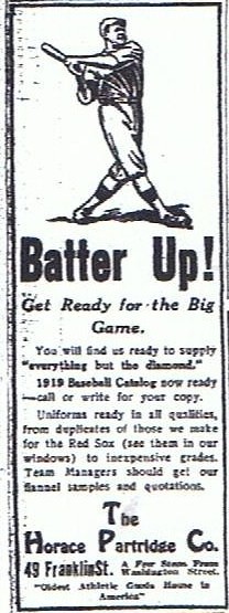
We tend to think of our ability as fans to obtain a high quality jersey of our favorite team as something relatively new. This has been both a blessing for the fan and curse for the collector, since the proliferation of professional quality product gives the collector reason to pause, questioning if what they are buying is really a “gamer.” Well, it seems that all of this just got a little more complicated, since it appears that as early as 1919 you could have waltzed into 49 Franklin Street and purchased a professional quality duplicate of what [uniform manufacturer] Horace Partridge was making for the hometown Red Sox.
That was the drumroll. The cymbal crash was this ad, which Grob discovered in the 4/6/19 edition of the Boston Globe.
As you can see, the key part of the ad reads as follows: “Uniforms ready in all qualities, from duplicates of those we make for the Red Sox (see them in our windows) to inexpensive grades. Team Managers should get our flannel samples and quotations.” To Nash and Grob, this meant Boston fans were buying authentic Red Sox jerseys way back in 1919, just like fans buy team jerseys today.
But I didn’t see it that way. I want to make it clear that I have nothing but respect for Nash and Grob, both of whom are much better investigative researchers than I am, but I felt they were overplaying their hand on this one. As soon as I read the blog post on the morning of Jan. 3, I sent this note to Nash:
Hi, Peter …
Great work!
I’m sorry to say, however, that I’m not interpreting the “retail authentics” aspect in the same way you are. Let me explain.
Old uniform catalogs, which I’m sure you’ve seen many of, routinely offered multiple grades of flannel quality, usually culminating in “professional” or “major league” quality. Any team at any level of play could order these top-quality uniforms if they were willing to pay the premium price for them, and manufacturers like Rawlings or Spalding would make it clear that these uniforms were “the same as Ty Cobb [or whomever] wears.”
I think that’s what’s essentially being stated in the 1919 Horace Partridge ad. They’re not suggesting that anyone off the street can walk in and buy a jersey; rather, they’re making clear that they make the uniforms for the Red Sox and that this exact same quality of uniform is available to any team that chooses to do business with them. It says, “Team managers should get our flannel samples and quotations” — seems pretty clear that they’re selling to teams, not to individuals.
Also, note that there’s no mention of jerseys being sold by themselves — rather, they’re selling full uniforms.
Furthermore, I strongly, strongly believe they would not have sold an individual uniform to a customer — rather, they would have had a minimum order of nine, or a dozen, or whatever. This was standard practice at the time.
Finally, there is simply no way laypeople or civilians would have worn baseball jerseys as casual-wear in 1919. It would not have been considered appropriate in any social setting.
Now, if Joe Shmoe walked in and said, “I really like the Red Sox jerseys, so make me a dozen full uniforms,” I’m sure they would have done it. But I don’t think that was what they were suggesting.
All best,
Paul
That began a lengthy series of correspondence between Nash and myself. Here was his first counter-volley:
While it’s very clear that the business model of these companies was to sell uniforms to teams and team managers, as you correctly state, I think what Dave [Grob] found extraordinary about this ad was this statement: “….from duplicates of those we make for the Red Sox (see them in our window).” I believe he interpreted that as Red Sox uniforms being displayed in the store window.
I believe his thinking was that “duplicate” doesn’t mean that the garment is just the same grade of material (professional-grade), as is alluded to in many company catalogues suiting up teams. It appears to be an actual dupe of the Sox uni for 1919.
We both don’t know for sure (and probably never will) if someone could walk in and buy just one. But I do have photographic proof of Boston’s most famous fan, “Nuf Ced” McGreevy, having single Red Sox duplicate uniforms and dressing up in them. Did McGreevy buy his “single” uniforms at Horace Partridge or Wright & Ditson? Did the ballclubs (which were notoriously cheap) give him the uniforms he wore? It’s all speculation, but all I think Dave was going on was the “duplicate” claim of Partridge.
Of course, to compare the mindset of a 21st-century fan to that of fans from the early 20th is big stretch. Those fans would probably think the concept of wearing just a jersey without pants was pretty bizarre, let alone wearing it to the ballpark. Does that mean they might not hang a Red Sox jersey on a wall? (McGreevy did that at his bar, too.) Obviously what we think of fan gear today is much different.
That being said, McGreevy was way ahead of his time with his fan-innovations (including wearing a full uniform). I’m sure you are familiar with Ronnie Woo-Woo dressed up in his full Cubs uniform at Wrigley. Nuf Ced McGreevy was a century ahead of him. Red Sox mascot Jerry McCarthy also paraded around Fenway in an authentic, custom-made Red Sox uniform. ”¦
Its not surprising that a Boston manufacturer would mention this in an ad, knowing of McGreevy and the Royal Rooters.
I wouldn’t just write off Dave’s finding as being the same old song one would find in any of the uniform and equipment catalogues. Dave was amazed at the fact that you could buy a duplicate of a Red Sox jersey. That is the way he interpreted it. I don’t think Dave has ever seen that offered by any other company (or anything even close to that in catalogues or ads). In fact, one would think the ballclubs would have prohibited the possibility of an amateur or semi-pro team dressing up as the “Red Sox” in the same uniforms.
I guess it all comes down to how you perceive the word “duplicate” in this case.
Either way, a pretty interesting issue to argue. Before you brought this up, I hadn’t even considered McGreevy’s wearing uniforms as some sort of fan innovation.
Regards,
Peter
My turn:
>I think what Dave found extraordinary about
>this ad was this statement: “….from duplicates
>of those we make for the Red Sox (see them in our
>window)” I believe he interpreted that as Red Sox uniforms
>being displayed in the store window.Yes, I’m sure that’s exactly what it meant. Hell, if I made the uniforms for the Red Sox, I’d trumpet that fact by putting them in my window too. It’s a point of prestige, a selling point, etc.
But to whom was the company selling? I don’t think it was to individuals. I think it was to teams. And as we all know, there have always been many minor league, semi-pro, and amateur teams that use the same names as big league clubs. So if I had an amateur team called the Red Sox, I could order a set of “duplicate” Red Sox uniforms for this company.
The fact that one or two nut-case fans (I mean that in the most affectionate way) like McGreevy or McCarthy may have purchased uniforms is not the making of a business model or, to my mind, conclusive proof of anything. It simply means that back then, as now, fanatics were willing to go to extraordinary lengths to show their support for their favorite team. When I was a kid in the 1970s, licensed replica jerseys didn’t yet exist, but that didn’t stop some enterprising souls from procuring Mets uniforms that they’d wear to Shea Stadium. I never knew where they got them; whatever their source, it didn’t change the fact that such items were not available to the public at large.
Steadfastly,
Paul
Nash’s turn:
Our little back and forth here relates to a theory I’ve had for some time regarding how fan gear came about in the first place.
From what I surmise, it was first directed toward kids and I believe the first items offered at the ballparks were caps, maybe early as the ’40’s. Maybe earlier. ”¦ I know for a fact my Uncle wore a Dodgers cap and uniform when he went on Happy Felton’s “Knot-Hole Gang” show in the ’50s.
This photo proves that some kids wore White Sox uniforms (manufactured by the big league outfitter) as early as the 1917 World Series. Same label as the big league uni worn by the Sox.
When did older “nut case fans” like McGreevy and those Mets fans at Shea (in greater numbers) start wearing jerseys to ballparks, etc.? And when did their sales become an actual business? Guess that would be a cool research project to tackle.
I remember that in terms of basketball, when I was a kid (late ’70s, early ’80s), you could walk into Crosby’s and buy an authentic Knicks jersey, just like the ones worn by the players.
Cool Stuff,
Peter
Back to me:
I think the advent of Little League had a major role in this evolution, because it provided children with access to uniforms and caps. They weren’t big league quality, natch, but it gave them a taste of what a uniform was like. Although I never wore my Little League uni to grade school, I knew some kids who did — that’s how proud they were of their uniforms. I think that was a key step in the road toward merchandising.
Meanwhile, I still don’t believe the Bosox outfitter was selling to the public. Feel free to forward my previous e-mails to Dave Grob — I’d be curious to hear what he has to say about this.
— P.
And back to Nash:
Hypothetically, couldn’t youth or club teams, company teams, or school teams (all made up of the general public and everyday Red Sox fans) have purchased these Red Sox uniforms in 1919? Are they not still fans wearing the same gear as their favorite team when they themselves are playing? Could that in some way be considered the origin/ foundation for what has developed in more recent times with licensed gear?
We don’t know absolutely if Red Sox uniforms were sold singularly or how many were sold to the public or to teams, or if there were minimum orders. You say you “don’t think they [sold to the public].” But you don’t know for sure, either.
Perhaps it would have been more accurate in the headline for me to state: “… Red Sox Fans (“Could have” or “May have”) Worn Authentic On-The-Field Gear….”
Both sides here are saying we THINK quite a bit, because we really don’t KNOW for sure.
Either way, I enjoy your input and it’s been fun to argue. After watching the Twilight Zone marathon over the weekend, I feel like we should all just hop in some time machine and settle this back in Boston c. April, 1919.
Best,
Peter
That should probably have been the end of it. But somebody (who looks a lot like me) just couldn’t quite let it go:
>Hypothetically, couldn’t youth or club teams, company teams,
>or school teams (all made up of the general public
>and everyday Red Sox fans) have purchased these Red
>Sox uniforms in 1919?Yes, absolutely. But I think there’s a big difference between saying (a) teams were buying them, and (b) fans were buying them. Teams use uniforms as, you know, uniforms, for use on the field, whereas fans (some of whom have no athletic ability or inclination) use them as civilian apparel. It’s the difference between functional clothing and personal/fashion clothing. And since your piece today was referencing today’s licensed jerseys (which are obviously in the personal/fashion category), the implication of your piece was that fans in 1919 were buying these full uniforms — or were being encouraged to buy them — as fashion apparel. I just don’t see that. ”¦
I’m not trying to be critical or dismissive. On the contrary, I’m just trying to add my analysis to this excellent historical find that you’re presenting.
All best,
Paul
And that’s pretty much where we left it for the next 36 hours or so. Then Dave Grob, who’d been busy with a family issue, weighed in:
Gentlemen,
When I said in my article that it appears to you could have waltzed in and bought a jersey, there is nothing that leads me to believe this was not possible. It appears the product was available and on display to the retail the buyer. The bigger question is: While possible, was it probable? I tend to think that sales of this product would have been extremely rare and here are few reasons why.
A professional grade uniform (jersey, pants, cap, stockings) would have run around $17-$19 if not purchased with a team/volume discount. My guess is the jersey would have accounted for about half of that cost or $8.50 to $9.50. While this does not seem like much, it is 16.5 to 18.5 times the cost of a ticket to a ballgame at the time (50 cents). Compare this to today: Depending on the source, an average ticket to a ballgame is around $30. The fan today can buy an authentic MLB jersey for around $200, or roughly 6.5 times the cost of an average ticket. So with some stubby back of the envelope math/analysis, it would have been three times more expensive for an average fan to have bought one of these in 1919. At this point in time, an average bricklayer, painter, plumber, or stonecutter in a large city was bringing home just over $30 a week, so this would have been [an extremely expensive purchase].
[Also], the convention of the day with respect to culture and dress would have made the purchase of one these jerseys or uniforms an oddity to say the least. This would have been cost-prohibitive for a child and out of the ordinary for a man to wear, except under the most unusual or peculiar conditions. ”¦
So why does the ad read the way it does? ”¦ Did Horace Partridge want to play up the relationship they had with the Red Sox? Of course they did. Did they want fans, players, and team mangers to consider buying their line of baseball-related products? Without a doubt. ”¦ I think the message was “Come see what the Sox use and wear and we hope you buy something.”
Short version: Possible? Yes. Probable? Not likely.Dave
Phew! My interpretation of this is that Grob basically agrees with me. In any event, as Nash pointed out in several of his notes, this all raises interesting questions about the history of uniform merchandising, the evolution of licensed merch, and so on. Good fodder for further research.

January giveaway: I came home from Ohio last night with a nice souvenir tucked away in my luggage: an official Super Bowl XLV football — one of the first to come off the assembly line in the wee hours of Monday morning (that’s Dan Riegle, who runs the Wilson plant that I was visiting). But I already have enough footballs, so I’ve decided to raffle this one off.
I normally have a “One entry per reader” rule for giveaways, but I’m gonna modify that for this prize: If you’re a Packers or Steelers fan (you know who you are — just be honest about it), you can send two entries; everyone else can enter once.
To enter send an e-mail (or two e-mails, if you’re a Pack or Stillers fan) to the giveaway address by 7pm Eastern next Monday, Jan. 31. Include your shipping address in the body of the e-mail. I’ll announce the winner the following day.
Uni Watch News Ticker: Buried within this story is the news, straight from Mike McCarthy, that the Packers will wear green in the Super Bowl. ”¦ Kevin Seraphin of the Wizards had his shorts on backwards last night. … Unveilings, Part 1: The Padres will reveal their new road and camo uniforms today. ”¦ Unveilings, Part 2: The Lightning were planning to unveil next season’s uniforms yesterday but ended up postponing it until later this week. Seems like odd timing, no? Most unveilings take place in the off-season. Anyway, here are some hints regarding what to expect, plus a little birdie tells me, “It’s basically like the Maple Leafs, with white jerseys/blue pants on the road and blue/blue at home.” ”¦ Xavier retired Brian Grant’s number on Saturday and wore Grant-era throwbacks to boot (with thanks to Jason Martynowski). ”¦ LSU wore gold at home, instead of their usual white, on Saturday. “They hadn’t done that in a few years,” says Ethan Allen. ”¦ Check out this old Oklahoma A&M hoops photo. Aside from the one guy in the non-matching jersey, everyone has non-matching uni numbers on their jerseys and shorts (good find by Chris Smith). ”¦ Kansas hoops wore a small black memorial ribbon on Saturday in remembrance of the mother of forward Thomas Robinson, whose mother had passed away the day before. I absolutely do not mean to sound insensitive — losing a parent is a horrible thing — but I think uni memorials for players’ family members are a bit much. ”¦ Wanna see the weirdest baseball hats ever? Check out these beauties from 1875! That same catalog offered these and these (as well as some absolutely killer stockings). All of those images are from the “Equipment” section of this excellent site devoted to 19th-century baseball (great find by Mike Hersh). ”¦ Wisconsin-Green Bay will be wearing mid-’70s throwbacks on Friday night. Here’s the original design they’re based on (with thanks to Andrew Gavin). ”¦ Wanna know what a bunch of designers think of Roger Federer’s personal logo? Look here. ”¦ Kim Clijsters’s fourth-round match at the Aussie Open was delayed when her opponent was flagged for having an oversized logo on her dress (with thanks to Tod Hess). ”¦ The L.A. Kings have been conducting a tattoo contest, and one entrant submitted a sensational Rob Ullman tat design (big thanks to Dave Sikula). ”¦ “Interesting NOB situation going on with the Texas Lady Longhorns basketball team,” writes Bill Kellick. “These photos aren’t the best but you can see that Kristen Nash (#32) has “Kr. Nash” while her sister Kathleen simply has “Nash.” ”¦ Another week, another EPL kit roundup from Michael Orr. ”¦ New soccer kits for Canada. ”¦ Don’t think I’ve ever seen this before: merit decals arranged to form bull horns. That’s Jesse Williams of the Arizona Western College Matadors (with thanks to Matt Lesser). ”¦ Remember Dave Parker’s assorted facemasks from 1978? At least one opposing player — Karl Pagel of the Cubs — had a little fun mimicking Parker’s gear. Just goes to show you really can do anything with duct tape (nice find by Jerry Wolper). ”¦ Remember when Mitch McConnell somehow decided that the best way to hold onto his Senate seat in Kentucky was to remind people that New York is full of pushy Jews? Now another Kentucky institution has connected these same dots. Can’t wait to see how this trope evolves at Churchill Downs this spring.
Since that team is the Matadors, I would think those are bull horns, not devil horns…..
Duh. You’re right. Will fix.
It’s no surprise that the Packers will wear green…the NFC wore white last year…it’s alternates each year doesn’t it?
Who gets to choose their color alternates each year. Pack won three in a row in white, so there was some question . . .
And the team in white usually wins the Super Bowl.
The team in white is 27-17 in Super Bowls with Dallas, Washington, and Pittsburgh each winning once as home team wearing white. It was way closer before white team’s current 6-game winning streak.
26 out of 44 Super Bowl champions have worn white, for a 59.09% clip; that includes the last six champs, nine of the last 12, and 10 out of the last 15.
At least 26, that is… hadn’t factored in if the Redskins wore white for all of their wins…
Yep… make that 27 out of 44, for a 61.36% clip – the one time the ‘Skins were the home team, in Super Bowl XVII, they wore white against the Dolphins.
This does include the Cowboys’ whites, of course – although the only time the Cowboys chose white as the home team was in Super Bowl XXVII, as they were the road team in their other four wins.
The Steelers, for example, chose to wear white in ’06 after winning three playoffs games on the road.
But somehow I never saw the Packers doing the same thing.
Scott, are there stats on that? Obviously the Cowboys and Redskins skew the statistics somewhat, but I don’t recall noticing the trend.
In case anyone cares…
From SB’s I thru XII, the “home” team was required to wear dark jerseys.
Since SB XIII, the “home” team has the choice to wear dark or white jerseys.
For the record…
I want to see the Packers choose white not merely out of superstition but because I’d like to see the Steelers prove they can win a Super Bowl in this century wearing black.
All I know is I’m sure the team in yellow pants is going to win.
It is true that the pack have won 3 games in a row wearing white but have a higher percentage of victory in championship games while wearing the green. Dont believe me, check the records.
Wow those old baseball hats are completely unexpected! Would Jim Vilk wear that? I daresay yes.
The designers who dislike Federer’s logo criticize it without even trying to find out its purpose first? Then they impugn the character of the logo designer? Sheesh.
Completely off topic, but link is a hilarious headline.
“… Wanna see the weirdest baseball hats ever? Check out these beauties from 1875! That same catalog offered these and these (as well as some absolutely killer stockings). All of those images are from the “Equipment” section of this excellent site devoted to 19th-century baseball (great find by Mike Hersh). …”
****
Wow! Terrific stuff from Mike H.
Those are pretty cool.
He found them on Reddit I’m sure ;)
Didn’t know you were a Redditor Paul.
These?
link
No.
These?
link
Yep, I’d wear that.
These?
link
Ooooooooooohhhhhhhh, yeah!
Well there was some people wondering if they would choose to wear white to continue with the “Road” success they’ve had. But we all know the Pack wears green at home! The PACK is back!
The Packers have moved to Dallas?
No, the NFC is the home team for the Super Bowl this year. I believe they just alternate every year. So Green Bay is the “home” team.
Yes, the Packers moved to Dallas. Thanks Coleman for not being a smart ass.
link
/yes, I have too much free time today
Sarcasm is just one of the many services I offer.
I know someone would probably see that and think “WHAAAT?!” so I wanted to post a serious answer. I didn’t know about the NFC/AFC Super Bowl home team switch until recently, so I wanted to let anyone like me know how it really works.
THE – very nice job with that “new” logo!
Question: If the NFL is gonna standardize the Super Bowl logo, then why not just make some use out of the “Heisman Packer Guy” logo?
Just put the state of where the game’s gonna be held behind the player (like in THE’s example) and render it in the usual venue’s team’s colors (Superdome would be Black and Gold, Arrowhead would be Red and Yellow, etc.).
Not the greatest solution in the world, but a lot better than the “JerryWorld Chrome Dong” that Roger NO-GOODell came up with.
link
I’m telling you, link.
Riffing a bit on the ticker Lady Longhorns reference, link appeared in the WaPo this morning. I can sort of accept calling a school’s girls or womens teams the “lady” whatevers in casual conversation. But putting “Lady Mustangs” on the uniform? That really irks me. If the school’s mascot is “Mustangs,” then the only team name that belongs on any athlete’s jersey is “Mustangs.” “Lady” belongs on the jersey if and only if the boys jerseys are also modified, for example as “Gentlemen Mustangs.” Putting a modifying adjective on the uni doesn’t just suggest or imply that the girls are not real, full-fledged Mustangs, it literally says so. It’s like the teams that throw a “Los” on their jerseys for Latino Heritage Night or whatever, only instead of being a lazy pandering, it’s actually kind of evil.
They probably assume that Lady Longhorns sounds better than Heifers.
(or, for your Stallions example, Mares or Fillies)
hard to top this one: at the University of South Carolina, the womens teams are called the “Lady Gamecocks”!
Longhorns are the breed, not the bulls. In fact, longhorns are the only breed in which both cows and bulls have horns.
I can thinks of one exception: Kenyon College. The men’s teams have Lords on their jerseys and the ladies teams have…well, Ladies on them.
Centenary… Men’s teams are the Gentlemen and women’s teams are the Ladies. Louisiana Tech … Men’s teams are Bulldogs and women’s teams are Lady Techsters.
Pius XI High School in Milwaukee uses “Popes” for its boys’ teams, and gives the girls’ team the rather provocative name of “link.”
Sharpsville Area High School has the Blue Devils (boys) and the Blue Darlings (girls.)
I think that’s Oklahoma A&M (now Oklahoma State), not Texas A&M. I recognize Bob Kurland, the first 7’0 player in college basketball. I also recognize Henry Iba, legendary coach of the Aggies. Back in the olden days, most A&M and land grant schools went by “Aggies”
link
Right you are. Will fix.
Yeah, I was going to say the guy in the non-matching top is Hall of Famer Bob Kurland… must have been a freshman photo — he’s awful young and skinny looking in that shot!
Absolutely love the pic of the redsox fans in their fedora’s/bowler hats with the redsox ribbons on them.
link
Never seen this before, do you think fans bought the hat like that or did they just purchase the ribbon to place on top?
Don’t miss that chair in the bottom of the image. Looks like something most of us have in our kitchen.
In 1912, particularly in Boston, there was a big presence for the baseball souvenir business at and around the Ball-Park. The tag line for that season was “Oh, You Red Sox” and was reproduced on ribbons sashes pins etc.(even in song on sheet music) I’ve seen some original examples of the straw hats (exactly like the straw one in that BPL picture) show up in auctions.
It got some more publicity because Isabella Stewart Gardner (of Boston’s Gardner Fine Arts Museum fame)purchases a robbon and was seen wearing it. There were also several versions of Red Sox pennants for sale, too., some attached to thin canes.
When did the individual megaphones begin to disappear?
Considering Ole Miss (who was 0-4 in the SEC going into the game) handed LSU their worst home loss in 15 years (78-51), I doubt if you’ll see the Tigers pull out the yellow, er, I mean gold, unis again any time soon.
Paul,
I’ve got a pic of the Braves in satin for that May 1946 game.
It’s another one of many I’ve been meaning to send you. The hand written caption on the back mentions the game, date and “note satin uniforms”. I’ll send it to you this morning…
~B
can you copy me on that? pleeeeze?
thanks
Will do.
Check your email in a few minutes.
In fact,
I think I sent it to you back in October…but whatever the case, I’ll resend.
It’s been brought to my attention that the last link in the Ticker wasn’t working (at least for some readers). It should be fully functional now.
The Lightning announcement was delayed because of a police shooting in St. Pete yesterday. Short version: Some jackass who is the brother of boxer Jeff Lacy shot at three officers when they came to serve an arrest warrant. Two died, the third is in the hospital. The jackass died during the shootout. Just to be sure, a front-end loader demolished the house he was holed up in.
It was a sad day all around the bay area. It was wise of Yzerman (or whoever) to delay the announcement.
I chewed through your e-mail exchanges and appreciate the insights. For me, simply looking at the ad and reading “duplicates of those we make for the Red Sox” would lead me to believe that these weren’t “authentic, on-the-field” jerseys but just what the ad says – duplicates. The materials and construction may be exactly alike but unless they were made specifically for the Red Sox they weren’t “authentic, on-the-field” jerseys.
Some years ago I had connections within the Seattle Mariners front office. When the team changed its logo and color scheme for 1993 my connection sent me a new 5950 road cap (solid navy; the home caps had the “Northwest Green” bills). I must have been one of the first civilians to have the new M’s lid but there was nothing on it to indicate its source. Since 5950s have long been available to the public, there’s nothing distinguishing it from one anyone could buy at a store. Still I know it came from the M’s equipment room and, although no Seattle player ever wore it on the field, it was made specifically for the M’s and not for public purchase.
Maybe I’m oversimplifying to justify why that M’s cap is special to me. It could’ve easily been diverted to a team store in Seattle, and another lot sent to the Kingdome. Anyway, that’s my story and I’m sticking to it…at least for now.
Paul, sorry to ask in the comments, but about that SB ball raffle, I can never click email links (my computer hates me). Is it the usual one? uniwatchraffle at gmail.com ? This is the most exciting raffle I’ve seen, since I’m a die-hard Green Bay fan, I can’t miss out on the chance!
Yes, that one.
Thanks so much. Sending my allotted 2 emails now!
Would I be able to send in two entries if I’m not a huge Packer fan, but my fiancée is?
problem solving at its best…
\sarcasm
No, you can’t. In fact for trying to cheat like that, you can’t enter at all. You’ll have to tell your fiancee to enter on her own.
If that’s cheating, I’m doing a damn poor job of it. I don’t think “ask permission” was in the handbook.
True enough. I think the handbook says to do it anyway and ask for forgiveness if you happen to get caught.
I don’t really care one way or the other. You’ll be a Packer fan soon enough, whether you want to be or not.
/you won’t win anyway, the winner will be some guy who never posts comments so when Paul announces it we can all collectively say “Who?” and type congratulatory messages while secretly wanting to find him and steal the ball for ourselves. Or something.
You’ll be a Packer fan soon enough, whether you want to be or not.
~~~
i’d say that’s probably true
i bet only the yinzers and other burgh denizens will be rooting for the black and gold
/go GREEN & GOLD!!!
Funny thing, I thought along those same lines. “I’ll never win because I posted about the email address and all, no one would believe it’s not rigged!” Man, I really screwed myself on this one!
Who cares, as long as the Packers get the Lombardi Trophy back where it belongs!
Majestic Athletic has been using their facebook page to present sneak peeks of the MLB 2011 BP jerseys, dugout and gamer(warmup) jackets.
link
Dig that script on the Reds’ BP jerseys:
link
Lose the black side panels and that would be gor-ge-ous.
i know i saw that somewhere else
The fan today can buy an authentic MLB jersey for around $200, or roughly 6.5 times the cost of an average ticket. So with some stubby back of the envelope math/analysis, it would have been three times more expensive for an average fan to have bought one of these in 1919.
That’s an odd way of converting 1919 dollars to current dollars, particularly since it’s easy to find inflation calculators online. According to the one at westegg.com, a $19 jersey purchased in 1919 is the equivalent of a $234 jersey purchased in 2009. Considering an authentic jersey sells for around $200 today, it wasn’t three times more expensive to buy a jersey back then as Dave suggests. To the contrary, it’s surprisingly consistent. The change in ticket-to-jersey ratio (never thought I’d type that phrase) simply reflects a significant spike in the cost of tickets over the years.
+1
Why am I not surprised by this.
… “Kansas hoops wore a small black memorial ribbon on Saturday in remembrance of the mother of forward Thomas Robinson, whose mother had passed away the day before. I absolutely do not mean to sound insensitive – losing a parent is a horrible thing – but I think uni memorials for players’ family members are a bit much”. …
I would argue just the opposite. A memorial patch for a college-age player’s parent for a game sounds entirely appropriate and a solid sign of team support.
Memorial patches for long-gone players, announcers, owners has become passé. They can’t be seen from the stands, etc., etc., etc. Erect a placard on the stadium wall as the Cubs did w/ Harry Caray. blah, blah, blah. But a memorial patch or ribbon among the players and for a short time, that’s worthy of all our support.
Completely agree. And when you consider the circumstances surrounding the death of Ms. Robinson, the patch is all the more appropriate…
link
The poor kid will be handling his mother’s funeral and possibly raising his 9 year old sister. I think it’s quite alright for his teammates to wear a tiny black patch to let him know that they are thinking of him. Jeesh.
Couldn’t agree more. We did the same thing in high school when a teammate’s mom passed – although telling him “Sorry” helps, I think him seeing that visible, public gesture of support on the part of his teammates will do wonders for him.
I don’t have a problem with KU wearing a small ribbon for the players’ mother. I’m pretty sure we’ve seen small memorials like that for a coaches family member before.
Also, the only Super Bowl Green Bay has lost they wore white, just some food for thought.
True enough – 2-0 in the green jerseys, 1-1 in white.
And even though the Packers made a big deal of early white jerseys in 1939 (taking the official posed photos in it, etc.), they still wore their traditional blue in the championship game. Which they won.
I’m sorry, it’s not a 70s throwback if the shorts go below the knees.
it’s not a 70s throwback if the shorts go below the
kneesgroin.(fixed)
True enough. But then again, I think they just simply don’t make basketball shorts in size Stockton anymore…
So how was the bologna? Did you get an Old Milwaukee with a 3 ounce glass for drinking? How about the cream pies?
Bologna sandwich was good. Not life-altering, but solidly good.
I would’ve gotten a beer, but I was on a short sleep and had some driving ahead of me, so I went for soda instead.
The cream pies were impressive-looking, but I’m more of a fruit pie guy, so I got a slice of black raspberry. Same assessment as the sandwich.
In short: Not sure I’d go way out of my way for another visit, but I’d gladly stop in again if I’m passing thru.
Could you describe this special baloney sammich?
Just to set things straight – LSU wears yellow, not gold. Gold is seen on teams like UCLA and Notre Dame.
kek, your thoughts? LMAO
not to pick nits–but “athletic gold” (as opposed to “old gold” or “vegas gold”) is what teams like LSU, the stillers, pack, redskins, etc. wear
we may call it “yellow,” but it’s technically athletic gold
Negative. LSU’s colors are purple and gold. Notre Dame’s colors are blue and gold. You are correct about that part.
In much the same way, Michigan’s colors are maize and blue. Kansas’ colors are crimson and blue. Michigan’s blue is dark, Kansas’ blue is bright, but they are still both blue because the shorthand names for the colors are all subjective, and that’s what they call them.
Notre Dame’s gold is dark and metallic. LSU’s gold is bright and flat. Both are gold.
Negative as in Mael is not correct, Phil is correct.
While it may be correct, it really isn’t “right”.
Referring to both “athletic gold” and “metallic/vegas/old gold” as simply “gold” is confusing as hell if you don’t already know what the team in question looks like.
If that isn’t bad enough, you have teams like Missouri using both colors at the same time.
North Carolina wears blue. So does Navy. Just because they wear different shades of it doesn’t mean they both don’t wear blue.
Yellow is what Oregon wears. Think highlighter. LSU wears gold. And so do Notre Dame and UCLA, though it is now a darker shade (though both have worn various shades over the years).
Ask a 5 year old what color pants the Steelers are wearing. They’ll say yellow.
Athletic gold is a shade of yellow, not the other way around.
So, yeah, it’s technically correct to say that both LSU and Notre Dame wear gold, normal people don’t think that way.
Yellow vs Gold: link
Yeah.
There’s Yellow, Athletic Gold (once called Light Gold or Bright Gold), Vegas Gold (once called Champagne) and Old Gold. There’s also a sort of Mustard color (70’s Pirates hats and Vanderbilt football jerseys in early ’80s).
And—as The Jeff well knows—we aren’t normal people. We talk in equipment catalog colors.
So kids and non-uni geeks can say Iowa football and the Steelers wear yellow pants. But here it’s Athletic Gold. #1 reason? Both teams’ colors are black and gold, so I guess that would be deciding factor in our nomenclature.
If you were coloring a gold nugget in a comic book, it wouldn’t be yellow (and it couldn’t be metallic because of printing limitations), so you’d use something close to Athletic Gold. And don’t make me go look for a frame from “Uncle Scrooge & the Treasure of Incas” to prove something that doesn’t need proving.
The color behind the “S” on Superman’s chest? That there is Yellow.
—Ricko
“Ask a 5-year-old”? Okay, THE, what color pants are the Steelers wearing? Check out your Crayloa box and get back to us.
Look at this: link
What color is that?
Now, put in on a football helmet, and it becomes gold. ATHLETIC GOLD IS A SHADE OF YELLOW – just like navy and columbia are shades of blue. Of course, we typically SAY navy when we’re talking about that color. But for some reason we have to keep using gold because someone didn’t think it was manly enough for an athlete to wear “yellow”.
Sometimes I really hate this place.
The, would you ever really ask a 5-year old to definitively settle an argument with his or her answer? In this case, I would bet that there are a fair amount of 5-year old children who aren’t familiar with ‘gold’ as a color, so yellow would be the default.
Whatever you perceive the color to be doesn’t really even matter. You might see yellow, but if LSU calls it ‘gold’ then it’s gold, because that nomenclature is subjective. No one in their right mind would describe the Lakers’ color as blue, but for a long time, that color was called ‘Forum Blue’ and you can’t really argue it, because that’s the name they gave it. The Lakers, by the way, wear gold as well. ;-)
I’d also like to clarify that I think there should be a standard nomenclature for colors (e.g. any yellow in this range of the PANTONE® book is classified as ‘Athletic Gold’), but there isn’t, so you have to deal with the bullshart.
“Sometimes I really hate this place.”
(Cut to scene of THE scarfing up his crayons and Cheetos and stomping out of room yelling, “Mom, they’re being mean to me!”)
Of course yellow is a shade of gold.
Who would say otherwise.
Trouble is, there are subgroups, shades of gold…so generally we here refer to them by their catalog-type descriptions.
It’s not about what’s right or wrong, it’s about communicating.
Plus, Athletic Gold is odd. It’s perception is altered by the colors near it, especially green and especially over distance. Remember seeing Packers play Viking at the Met back in ’61 and thinking the Packers gear actually looked yellow, a totally different color from the Vikings’ Athletic Gold trim. But…if you set both teams’ gear on a table in front of you, it was the same color. The Athletic Gold was being tinted, visually as the light travelled to the eye, by the forest green that accompanied it.
Not saying that today, with computerized dye-matching, that the Packers’ pants might not be a bit yellower than the Steelers, but back then Athletic Gold was Athletic Gold. It just looked different on different teams.
Also (as a reference point), having seen Michigan play in person a number of times, I can tell you for a fact that around 1980 their pants changed from Athletic Gold to flat out Yellow…because their pants weren’t the same color as the Gophers’ anymore. This IS a difference.
—Ricko
THE, no one is arguing against calling LSU’s pants or the school bus “yellow” — but the shade, in pantone and on this here message board, is referred to as “athletic gold”
i agree with you that it doesn’t make much sense (took me a while to grasp it myself), but that’s what it’s called
if you want to refer to the LSU pants as “yellow,” you’re not incorrect, but someone referring to them as “gold” (or “athletic gold”) isn’t incorrect either
Yellow traffic and emergency lights are referred to as amber in the trades. Notre Dame, whose colors are blue and gold, sells t-shirts on its website that look just like the Oakland A’s jerseys from the 1970s and ’80s. Sorry, THE, but it’s a complicated world out there beyond the computer bubble.
Maybe it’s too late to even jump in, but…
I’m surprised there’s this much debate on this. I don’t even know who I’m taking up for on this, but basically, isn’t “athletic gold” just a more descriptive way of defining the color? To me, the only true colors are the ones on the color wheel (oh geez, my high school art class is actually paying off). If the word “gold” didn’t exist, what might we call the Steelers’ pants? Dark yellow? Who knows. To me, yellow is a base color. I think of it as the color of a lemon, so the Steelers’ pants aren’t yellow. But they are definitely a shade of yellow.
Without the word “crimson”, we’d call it dark red. Without the word “navy”, we’d call it dark blue. I don’t see why athletic gold is in different. Hey, adjectives are fun, that’s why we use them.
Why did/do schools call the color gold instead of yellow? Well yeah, I’m assuming it’s true that they didn’t want the wussy connotation of that word attached to their team. Gold just happened to be the next best descriptor, I guess. Hell, the Packers should have just said “green and Cheddar” way back when. Probably would have been more accurate.
I’m calling it yellow.
I think “Athletic Gold” was coined because jocks are afraid of yellow and its association with cowardice. Ironic, huh? Own up to the fact that you’re wearing yellow and who cares what your opponents think.
Yes, it’s a really complex world out there. So why add to it by being intentionally confusing?
I know what “athletic gold” is. I know what “vegas gold” is. Calling both of them just “gold” is stupid and confusing.
If I tell you that an expansion team’s colors are going to be “gold and blue” you really don’t have any idea what they’re going to look like. If I say “vegas gold and navy” or “yellow and powder blue” you do. If you want to call athletic gold by it’s full name, fine. But don’t call it just “gold”.
“just like navy and columbia are shades of blue”
paul, any chance we can get these shirts made:
“i’m calling it honolulu”
haha
we’re not, THE
lsu is
their colors are purple and gold
this is where the confusion started
the fact of the matter, which i guess you’re still not comprehending, is that “yellow” and “athletic gold” are the same color…of if you are getting it, then direct your anger to LSU for calling it just “gold”
Hey, THE — Walk around a Navy or Marine Corps base sometime and tell a Sailor or Marine that his service color is yellow (and navy blue or scarlet, as the case may be).
Fixed:
link
Lee
Referring to a “yellow” color as “gold” or vice versa is practically older than dirt.
In heraldry, the blazon – the formal description of a coat-of-arms – uses only general color terminology, so that a shield “quarterly Azure and Gules” has blue in the upper left and lower right corners, and red in the upper right and lower left; you could have two shields, one navy blue and scarlet, the other Columbia blue and burgundy, and both’s blazons would read the same. Similarly, any shade of gold or yellow would be described as “Or” (gold).
What’s really funny is that on a blazon, they only use “Argent” (silver) to describe the color white. Any shade of gray, including silver, is called “gris” (Gray).
i know, right?
that shit always cracks me up
another great day, and a link on where i can get equipment for a 19th century baseball league that i would love to start up as a bonus.
i just recently finished a couple bobbles. but the gent who wanted a 70’s gravedigger sent me along link. it’s huuuuuge. pretty cool.
If the Cardinals organization has any self respect at all, they’ll fire the GM. Now.
link
I guess I don’t understand why people scoff at men who wear fashionable, well-fitting clothing in this day and age. There was a time when you had to be dressed like this man to even leave the house. You’d probably prefer he wear a Hanes Beefy-T and some Wranglers?
Although if that’s a black turtleneck underneath the suit, sans tie, he should be fired for that alone.
I agree. I might wonder at the wisdom of wearing a scarf in what I would assume is indoors, but other than that, what’s the issue?
If you work in a white collar office, and the head guy walked around wearing a scarf every day, it would be considered normal?
my creative director way back when wore a scarf, and he was considered colourful.
There’s “fashion” and there’s “style”.
Many times they have nothing to do with one another.
Other times they are totally entwined.
Need to be careful, though, that when you mess up combining the two you don’t get an “affectation.”
I think that photo may be an example of such a mess-up.
Unless that news conference was outdoors and the temp was in the 40’s or below.
—Ricko
Can anyone help me out with the blog that compares new logos to old?
*Mostly corporate logos, and it’s mentioned on here a few times
are you talking about brand new?
Yes! Thanks Phil. That was easier than I thought it’d be!
Great stuff today, Paul!
Assuming all the speculation regarding the new Lightning uniforms is correct (and I’m sure it is), it’s kind of hard to believe that:
a) A team is willingly dumping all black from their look after it’s been there from day one,
b) They are going with a one color scheme, and
c) They finally realized that if your team name is “Lightning” you don’t need to include the actual word on your chest logo.
It might be hard to believe, but consider the GM. He played for 20 years for a team that:
A) Has never worn black.
B) Has gone with a one-color scheme for almost a century.
C) Has never had the team name on the logo.
If anyone was going to go with a scheme that is simple, it would be Yzerman.
Don’t know if this was ever posted, but on Sept. 1, Aaron Rodgers and some of his Packers teammates showed up in linkat the team’s annual preseason luncheon.
The Tucson Padres (AAA) unveiled their logo for their two-year stint in Tucson. link Not a bad start, excited to see the unis. One article stated that last year’s camo jerseys have been sent down for use thoughout this season on military nights in Tucson.
I showed this to a couple of other padres fans last night and read some blogs today. Padres fans are absolutely loving this design. A few are hoping the big league team will go back to this font.
Nice design for Tucson, but I already miss the link.
Thumbs up on the new logo for the Tuscon Padres. Well done. Now we’ll have to see if the uniforms will be any good.
Blah.
Paul, maybe you could just give the raffle ball to this guy:
link
I hate to play devil’s advocate in a situation like this, but that isn’t exactly good for business. Wearing a Packers tie, in Chicago, the day after a tough loss? You’re just asking for attention. It’s not as though the guy fired him on the spot for it, he could have changed ties.
Except he said none of his customers objected. It only bothered the guy’s boss. True, that’s not wise, and I’m not saying the guy is completely in the right, but it seems like such a stupid reason to get fired. Another example of how sports gets taken way too seriously in the world today.
Guess he’s lucky. In Europe, if he wore the wrong futbol tie to work he might have been beaten by an angry mob.
The boss is a dick, plain & simple.
From the article:
______
But, said Roberts, context is everything. “If he’d worn the tie on Saturday I wouldn’t have minded.”
______
If he can wear it before the game, he should be able to wear it after the game.
No, that removes all the context from the statement, which obviously wasn’t the case. It wasn’t just, “Hmm, I think I’ll wear my Packers tie today.”
If the boss says that what you’re wearing is against the rukes or offensive to him or potentially to others, and he asks you to remove the item in question, then you don’t do it, there are consequences. The boss makes the rules and you follow them, or you deal with the consequences.
That doesn’t make the boss any less of a dick.
I wouldn’t want to work in a place where wearing the wrong tie is enough to get fired. Seriously, F that.
I once worked at an agency where a junior guy was almost fired for buying a car at a dealer we didn’t work for. We had 2 car dealer accounts, and this guy tried to get a reasonable deal on a used car from them, but they didn’t have what he wanted and wasn’t willing to give him a better deal on price. He got taken off the account, obviously, but almost got canned, too.
Paul…curious your take on the 1996 Iowa Hawkeyes football team who removed the tiger hawk decals from their helmets for the 1996 Alamo Bowl vs. Texas Tech in honor of a defensive back’s mother being killed in an auto accident on the way to the game. Was that too much and if so, why?
At least that’s connected to the game (i.e., the relative was on the way to the game).
Look, mourn any way you want. But we don’t put the flags at half-mast every time someone’s third cousin dies. Official gestures — and that’s what a memorial on a uniform is — should be reserved for people connected to the team in an official capacity, or at least that’s how it seems to me. If you feel differently, that’s fine.
Rumor has it that Arizona will have new uniforms for their game against UCLA on thursday. Here are some pics
link
That was in the Ticker at least a week ago.
(Incidentally, when I reply to something by saying, “That was already in the Ticker,” my intent is not to say, “Stop wasting our time with this, it’s already been covered,” or anything along those lines. I’m just letting everyone know that I’m on it, it’s already been “logged into the system,” so to speak, etc. )
Great reporting Paul on the Red Sox uniforms. I agree with you on this. It makes me wonder just when you could buy the uniforms. I used to get my caps at Manny’s Baseball Land in Cliffside Park, NJ starting in early 1979. In 1978 I went to a baseball card convention in Northern Virgina and there was a rep from New Era there selling caps. I bought 2.
I don’t recall Manny’s selling uniforms but they may have. I just don’t know. I know they used to advertise in the “Street & Smith’s” yearbooks. I might have one. Not sure. If anybody does a check of the advert might be interesting.
Manny’s had a stand across the street from Yankee Stadium for many years before moving to NJ. I used to get my caps from his daughter Lisa. I think Manny, Lisa or somebody connected to the store would know something about the history of this.
One of the biggest lies we emit is “I don’t mean to _______”–because right after that, the “unintended” attitude is always what comes out. If you don’t mean to sound insensitive, then just don’t say anything. It may be a bit much for you, but man, complaining about a team honoring another’s parent is really cold. Why complain about a nice gesture? I guess no good deeds still go unpunished.
“Losing a parent is a horrible thing.” Ya think?
>One of the biggest lies we emit is “I don’t mean to
> _______”—because right after that, the “unintended”
>attitude is always what comes out.
That is patently ridiculous. There’s nothing wrong with clarifying one’s intent, just as there’s nothing wrong with saying something that different people will interpret in different ways.
You want to debate the merits of the memorial patch, then go ahead and do it without calling me a liar.
Paul’s right. He’s not being a dick in any way, shape, or form. He’s just giving his opinion on a uniform-related subject, which is what this sight is mostly about. I like the memorial, personally, but that’s just my opinion. He doesn’t hate it, he’s just saying that it seems a little much to honor someone who doesn’t really have a direct connection to the team other than being the mother of the player in question.
I’m sure there will be a huge firestorm on this matter in the form of a looooooooonnnnnnnnnnnnngggggggg comment thread, but just know that Paul is not trying to be Jerry Jones (a.k.a. an asshole).
small Horace Partridge ad
link
I agree with THE. Wow that may be a first. I have been bothered for several years by teams and others calling yellow ‘gold’. Any sane person knows that it is actually yellow and that they can call it gold all they want but it is not gold. Gold is 49ers, Saints, Notre Dame, etc. Yellow is Packers, Steelers, LSU, etc. Give five year olds more credit. When I was five I knew the difference between yellow and gold thank you very much. It is stupid to insist that ‘athletic gold’ is even a real color. It’s not. It’s a made up color by someone a long time ago who wanted to make his team seem fancier than they really were and no like lemmings we accept it as such. It was yellow from day one and always will be.
When I was five I knew the difference between yellow and gold thank you very much. It is stupid to insist that ‘athletic gold’ is even a real color. It’s not.
~~~
well, i guess that settles it then
before you go, can you leave your ball?
all that proves to me is that more 5 year olds should read Uni Watch…
i would say too, to share my intellect… but i wouldn’t want to offend a 5 year old now would i?
No, it isn’t. In terms of pigments anad dyes, it’s yellow with a bit of red added, which changes the color.
White with a like amount of red added most definitely wouldn’t still be White, it would be Pink.
Honestly, I think part of the problem is that “Athletic” gold is a bitch to type every time, lol.
“Yellow-gold” would be every bit as accurate, easier to deal with, and everyone would know what we were talking about. Then Oregon could be Yellow. Would end a lot of arguing, too.
—Ricko
Yellow-gold’s fine with me, but as I said in an earlier thread, I think most athletic types don’t like the word yellow ’cause it makes them seem “yeller.” Does anyone even make that connection anymore? Seems like an early-to-mid 20th century connotation to me. Or something you’d hear in an old western movie.
i didn’t see where this convo originated, but…
maybe the difference is that colour isn’t only a 5 crayon box. yellow is not specific to the colour of the steelers or packers pants, even though somebody might think it is. there is yellow- ochre, titanium, chrome, naples, cadmium, etc. just like “gold” teams are more specific too, there is gold-old, pamona, pale, vegas, etc. so if anything, rather then just calling athletic gold yellow, maybe we should just call it gold, they are both just as specific to the actual colour of the pack or stillers. i am not saying we have to call it “athletic gold” all the time, i don’t, and dropping a “yellow” bomb is just fine, but yellow is a colour “genus”, not really a “species”.
Tell that to the Marines (official service colors: scarlet and gold) or the Navy (official service colors: blue and gold). Walk around a base sometime and tell a Marine or Sailor that their colors are red and yellow or blue and yellow and you’ll get an earful in response.
link
link
Been there, done that, sorta. I did ask why the “blue” uniform is black. The answer was something along the lines of “I don’t know, shut up”.
Teams come up with a lot of silly names for the colors they use. That doesn’t change what the colors actually are. The Patriots “nautical blue” and the Rams “millennium blue” are the EXACT SAME COLOR – something we all typically call “navy”.
But we know our dress blues are not navy blue. They used to be, but now they are black. Dress blue is a term, not a color, so your example is poor.
The other point of it all is that color names themselves are subjective. You say, “They can call it gold all they want, but that doesn’t make it gold.”
Actually, it does. If they call it gold, it’s gold, because the term gold is a subjective descriptor. There are many, many different colors that could be described as gold, and ‘dark yellow’ is one of them.
link
If they Lakers still called it ‘Forum blue’ then it would be Forum blue, even though all of us would say, “That’s purple!”
So if I own a team and put them in royal blue jerseys, but I call the color “The Jeff Green”, then it’s green? Give me a break.
Wow, can combine two threads.
Of course color names are subjective. Duh.
But some of those names have become universal.
And there also are names we use for the generic, “catalog” color, so to speak, when we’re talking uniforms.
And there are “affectations”, which aren’t limited to a scarf on a Cardinal exec but also to nifty, precious team names of their very own for one of those generic colors.
rpm’s got it right when he says yellow is a color genus rather than a species. In other words, it’s a primary color, and variations will have their own names…and that’s where we get messed up, with variations treated as if they were the primary, which they flat-out aren’t.
So next time, throw a new red washcloth in with a load of white teeshirts and wash it hot. You’ll still be able to wear the teeshirts because everything that comes out will still be “White”, right?
—Ricko
If you can find examples of that shade of blue bearing the name “green” going back a few hundred years, then go for it.
if i wash something red with something white i will call it ricko red.
jeff does have a point on the navy pats and navy rams, they are both navy, and none of us would call them anything else. the gold thing is a bit different though.
Re: color Names
link
Ricko, I understand that athletic gold isn’t pure yellow, but it is rather close. It’s also quite a bit different from your typical metallic shade. The point is that we really shouldn’t call a Packers helmet and a 49ers helmet both “gold”. For the sake of clarity, we need to be able to say Team X is wearing a gold helmet, and have everyone understand what color that actually is. Referring to athletic gold as “yellow” makes a lot more sense than coming up with another name for the metallic color.
but jeff there is a difference in the “golds” too. i think it is fine to quick hit something yellow or gold, but sometimes we need to be specific, and there is nothing wrong with that too. that is when there is a difference betwixt athletic gold and mustard yellow for instance, when we need clarity, because the stiller don’t really wear 5-crayon yellow.
what the hell, for the yellow debate i quick added a little text to a video that is sort of in “production”, takes about 25 seconds to get rolling… link
That’s why I suggested “yellow-gold” for our purposes here at U-W.
It’s accurately descriptive, communicates faster, and is far less pretentious, or “insider” (or whatever) than Athletic Gold.
I mean, if we lined up Oregon or Michigan’s yellow britches with the Steelers and the Saints pants and asked people to label them using Yellow, Yellow-Gold or (for this sake of this example) Old Gold, I don’t think many people would get them wrong.
“Athletic Gold”—unless something thinks of the Finley A’s, I suppose–doesn’t mean do-do outside U-W Land.
—Ricko
i have no problem with that rick. heck “true yellow” “crayon yellow” whatever. but in reality we are doing the same thing that pat is accusing people of, which is making up a colour. i say use gold or yellow unless clarity is needed, then situationally it is athletic gold, old gold, vegas gold, etc. as far as michigan goes, they have not used “maize” in 80 years, they are “canary yellow” or maybe a “lemon”, that is one bright yeller, it ain’t the shade of the hawkeyes.
As far as an additional name for the metallic, it’s already there. Old Gold has been called Old Gold as long as I’ve paying attention to such things (which is, what, about 55 years now?) Nothing new there.
Not so much when designed as a Team Color, mind you, but as uni color. I think my first reference to it either was the first Notre Dame plastic helmets…an announcer talking about their green jerseys and old gold helmets….or UCLA’s helmets.
“Gold” was saved for reference to teams like Minnesota and Iowa and the Steelers.
Frankly, it was only after color TV became widespread and people with not so much knowledge of team colors (including knothead play-by-play guys) decided to mistakenly say the Packers and Steelers, etc., wore “yellow” that it got confusing.
—Ricko
I guess radio guys, and b&w play-by-play guys, maybe worked a little harder at being descriptive.
And maybe they figured that if a team’s color were black and gold they probably wouldn’t wear yellow pants; that maybe there were, indeed, a shade of gold.
For one thing, because he’s looked up the team colors in order to do his job.
A modern TV guy doesn’t have to bother with such research. “I’ll just look down on the field and use my keen powers of observation to tell everyone about the Bears in their traditional black and orange jerseys.”
—Ricko
George Carlin was a graduate of Archbishop Hayes High School in the Bronx. He was always amused that the “official” colors of Hayes were “Carnelian and Gold.”
“Which always turned out to be just red and yellow…”
What was Paul saying about wasting a whole day? Reminds me of this discussion.
then skip to the next one, that’s what i do when i have no interest in the topic being discussed. maybe the ochocinco or sweater laces won’t be a waste of your time.
The Boston Public Library has some great shots of Michael T. McGreevey in uniform.
From 1909:
link
Love this sweater!
link
Spring Training 1907:
link
Interior of Third Base, Michael T. McGreevey’s saloon:
link
Original Wisconsin/Green Bay Phoenix gamer, inspiration for their current “throwback”:
link
What ball would that be Phil? The Super Bowl game balls with yellow on the Packers and Steelers logos?
pat
see at the top of where you post…it says your name (pat) then the date and time…next to that is “Reply”
it helps us to keep the comments somewhat organized if you hit that button and then add your comment
i gave you a pass in the other thread because we were already 14 deep in the final spot to hit reply
and i guess you didn’t bother to read what anyone wrote about “athletic gold” and “yellow”
while they may not be two “different” colors (i already have said, twice, if not more they’re the same color), just because YOU say there is no such thing as athletic gold doesn’t make it so
but you wanted to take your packers super bowl ball with the green and
yellowathletic gold and go home because you decided that was thatit’s fine to have an OPINION, because that’s what we all do, but it doesn’t mean yours is the only one or it’s correct
“taking your ball and going home” is when you react to a, in your eyes, dirty tackle(rant), then metaphorically take your ball(the conversation), and leave the playground(the boards).
o *rly*
that’s your opinion
/im outta here
In re: the “base ball hats!” ads:
I played vintage base ball for 8 seasons, and saw plenty of the first, brimmed variety being worn by teams from around the country. Always thought it was a bit odd, and now it seems as if they were a bit period inappropriate for an 1860’s squad.
As for my team, we wore hats exactly like the second link, with contrasting orange and black panels. They were made by a company called Cooperstown Caps, which has now, I gather, gone under.
Just read an article on ESPN.com about the money going to conferences from the BCS. Ok so further evidence that the system isn’t fair. The 5 non-aq conferences got a total of $24.7 mil. The six aq conferences got around $145 mil. The non-aq’s would have got even less had TCU not made it into the Rose Bowl. That means that the six aq conferences get about $24 mil a piece, while the little guys share $24 mil 5 ways. Hmm, if that isn’t the biggest scam going then I don’t know what is.
We already knew that it was unequal.
Why do some conferences get AQs and some don’t? Money. Not surprising, then, that the conferences which bring in the money get a larger share of the pool.
i thought the biggest scam was the puppeteers pulling the strings on athletic-gold?
Check out this humorous take on NHL third jerseys:
link
It is a “…a contest to see who [can], in keeping with the NHL’s long standing tradition of allowing teams to abandon color schemes and common sense, come up with the world’s worst possible Detroit Red Wings 3rd Jersey.”
This should be good…
This is going to be awesome. There should be more contests like this.
Speaking of taking your ball and going home, who else saw this article?
link
Not quite as bad as Knight/Oregon (assuming there’s a distinction these days), but it’s not that far off.
i read that earlier, unreal. and way to tie it in.
New HD scoreboard going in at Miller Park:
link
I flat-out love the ribbon and wheat Miller Park logo. That’s the best incarnation so far, although the white space in the middle is puzzling.
I think that the “white space” is completely empty, presumably to be filled out by whatever goes behind the sign–possibly open sky? Anyway, the white looks like the backdrop that you can see on the other side of the sign as well.
Nice hues of blue and gold. : )
Isn’t the white space a giant baseball with stitches?
Seems that this is the first time the Brewers have used hops in the logo as well as the wheat. Quick research on Google, and I can’t find any logo where they used hops before… just the wheat. I love this logo, and love the new scoreboard.
They going with sand in the outfield this year?
Excuse my ignorance, but I never really understood the reason for the laces on the front of the NHL sweaters. Were they a functional part of the sweater back in the past? If so, why do modern teams (like the Lightning) create new jerseys that incorporate these laces if they serve a function that no longer exists (or does it and I’m missing something obvious). As a lifelong hockey fan, I want to become as uni-literate as possible!
Thanks for any info. anyone can give me!
Decoration, maybe?
I have a poster of original six jersey and Toronto, Montreal and Chicago all had laces back in the day. What purpose they served, I have no idea. Teebz might know more
Thanks for the help!
Have those Padres unis been unveiled yet? I haven’t seen or heard anything on the internets about them yet?
Just came across my twitter feed
link
So much for the “But you doesn’t have to call me Johnson” jokes:
link
Does this mean the end for the T.Ocho show?
NOOOOOOOOOOOOOOOOOOOOOOOOOOOOOOOOOOOO!
I didn’t pick up my ball and go home, I just went to work where I’m driving most of the time. Sorry about the while reply thing. I have a fairly valid excuse for that though. My home computer has a filter on it that for some reason won’t let me link to the pics that are posted on uniwatch so I’m almost always posting from my iPhone which has the mobile setup which doesn’t have the direct reply feature. It just has the posts in order of time posted. I always feel bad for cluttering up the board but that’s my excuse. As for the athletic gold vs yellow debate I probably came across a little more agitated than I really was. It’s just been something that’s bothered me for awhile. I’ve honestly never thought of teams with athletic gold as being gold but yellow. I agree that we should be more specific than just saying gold when referencing teams that use athletic gold because when I see or hear gold I almost exclusively think of old gold or Vegas gold.
i hear you pat, that happens to me sometimes. just because i get fired up against an ncaa playoff, does not mean that every time i express an opinion or a bit of sarcasm about some issue that i feel is foolish that my head is spinning like a top, quite the contrary. it’s the medium, and sometimes you get misunderstood, what’chu gon’a do?
About all you can do is check which it is, cuz same thing can happen with other colors.
I mean, UCLA is “blue & gold” but they’re all over the place.
* Football team wears powder blue (well, used to, now closer to Air Force Blue) and Old Gold.
* Basketball team has, since the Wooden era, worn Air Force Blue (which is between royal and powder) and Athletic Gold.
* Baseball team wears Athletic Gold with, depending on which season you’re talking about in the last decade or more, Navy, Powder or Royal. And sometimes they opt for the non-metallic version of Old Gold.
The whole thing wasn’t truly an issue until Oregon and Michigan football actually started wearing what could be called Tweety Bird yellow pants, etc.
Here (again) are swatches Process Yellow, next to the PMS spec for the gold worn by the Packers, Steelers, Chiefs, Chargers, etc. There’s a bit of red added to create the shade (add that much red to white, and we’d call it “pink”, that’s for sure)…
link
Is the color to the right a shade of yellow? Of course it is. But, since the teams call it gold, we probably should assume they didn’t order “Yellow” pants (and call it SOME kind of gold). If they had, they’d look like Oregon or Michigan, who basically wear the Process Yellow.
My point is that we might as well call them what they’ve been called for years. We may think the old Roy Rogers film called THE GAY RANCHERO sounds pretty stupid…but that’s the name of it…and that’s what we gotta call it.
Metallic gold is Old Gold or Vegas Gold.
The other is yellow gold or bright gold or light gold (all of which have been used in catalogs in the past) or the currently common Athletic Gold.
Not so much out in the world, but here—where we note such things—is probably a good idea. If we’re gonna distinquish between the color of Alabama’s jerseys and the 49ers’, there’s nothing wrong with labelling the “golds,” either.
Or, as we probably should, just know that if LSU wears “gold” it’s the same shade they always wear and everyone knows what we mean…and call it “gold” because that’s the school color. If it were a color other than that, THAT would be news.
—Ricko
To defend Okkonen again, his chapter on the Boston Braves reads “In 1946, things were looking up for the Braves… There was even a modified satin version for night games only.” So, while his book does only depict the use of the satin uniform during the 1948 season, it’s clear that he knew the satin jerseys had been worn a couple of seasons earlier.
Please, please tell me these are fakes
link
Athletically speaking, it looks like the Utes colors are Crimson and White (which would be same as Alabama)…
link
The overall school adds black, gold and gray, however…
link
So I guess that makes black okay for football (eyeroll).
—Ricko
for UA, that’s kinda understated — and of course, black seems to be an official UA color, so why does the BFBS alt not surprise me (assuming they’re not fakes, of course)…
did anyone get a vibe, however, that that “U” looks like an oregon “O” with the top lopped off?
Looks like they took half of the Under Armour logo and but it on the helmet. My guess is that it is a fake.
PUT it on the helmet, not but
I dont think the 12 in the Pac 12 logo is exactly right either…cant be right.
Also found this:
link
That wikipedia page shows Utah’s current uniform. Also, I don’t believe the PAC-12 has revealed their new logo yet. Technically, the PAC-12 doesn’t exist yet.
A Michigan high school will be installing smurf turf on their football field this spring. link
Please don’t think badly of all Kentuckians. We have not looked very well in the news lately.
I’m quite fond of Kentucky. And I thought the McConnell ad was as entertaining as it was offensive (life is like that sometimes).
And hey, maybe the Jets graphic was just a typo. But I doubt it…
the really fake (and poorly done) new yawk accent (i think he was going for italian-american, but it was hard to tell) was more offensive than the content, which was pretty bad as well
as far as “jew york jets” — i honestly had to look three times before i spotted that — i kept looking for something wrong with the word “jets”
pretty hard to think that was *just* a typo
When you show a Jewish politician (Schumer) surrounded by animated dollar signs and call him “radical,” the message is pretty clear. And that message is not about Italians (even if they did include a ba-da-bing reference).
what color is john boehner’s skin?
athletic red?
ba dum bum. good one phil, but he might be lotion orange. i don’t care what your politics are, his skin isn’t a right proper shade.
Pete Nash, AKA the Prime Minister Pete Nice, one half of late eighties-early nineties hip hop group 3rd Bass…who woulda thought he’d end up with this as a career?
link
This Lightning fan is ticked they’re going to change uniforms. The ones they have now are hot.
And I hope they keep a third that says “BOLTS” on it simply because I know it irks the hell out of some people here.
I hope they keep a third that says “BOLTS” on it simply because I know it irks the hell out of some people here.
~~~
yes, because that’s always a good reason for a jersey
you have a problem with spite? i like the moxie.
i would argue the paul browns have a great uniform, and i really think that, but clearly everyone does not agree. while my attitude isn’t spite, maybe he didn’t articulate himself, maybe he owns it in a prideful way too beyond wanting to tick off a fetish site.
Re Not liking team memorials for players’ family members – Kiss my goddamn ass. My uncle died the day before my son’s spring season last year, and my uncle had been more of a grandfather to my son than my dad ever was. His whole team wore black armbands for the first game and it meant a lot to my son and me both. Moral of the story — teammates first and outsiders never.
Baseball is such a tough sport to play so you need to be ready to bring your game face on and suit up in the best baseball jerseys. We specialize in providing uniforms for your baseball team, little league or just simply bring out your devotion to this kind of sport. The basic jerseys we offer are made from high quality materials which are actually good for pinch runners who like to slide just to reach the edge of the base. If you like to play it rough then let us provide you with jerseys that can make your team look like they’re playing in a major league.
To those who are meticulous and have preference we are happy to help you personalize your team uniforms. Custom baseball jerseys are perfect to those who just can’t find the right jerseys for their team. You can simply choose from our basic jersey, add your team name, jersey number, other cool designs and you’re all set to play the game of your life.
We offer baseball uniforms for everyone whether you are a baseball player or you are just an avid fan. These uniforms are a way in helping your favorite team play for the win, giving them the confidence and the support they need even if you are just watching from the stands.
Please choose from the featured uniforms below and start creating your team apparel now
link