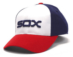
Many of you know that the White Sox sponsored a contest in 1981 to have fans help design and choose the team’s 1982 uniforms. If you’ve been reading Uni Watch for a while, you’ve probably seen these drawings, these prototype jerseys, and this prototype lineup, all of which have appeared here on the site multiple times.
But what I bet you haven’t seen — and what I myself had never seen, or even been aware of, until last week — is this.
Calling it an “album,” as it says there on the front cover, is a bit of a stretch. It’s just a single 8.5-by-22-inch sheet folded in half. You’ve now seen the front cover, and the back cover is just a pair of ads. Ah, but inside — an embarrassment of riches. (You can see closer views of the two interior pages here and here.)
Pretty great, right? And it raises at least as many questions as it answers. Por ejemplo:
• Was the album distributed in the community, or only at the ballpark? I’m assuming the latter, but I’d like to get confirmation on that. (For the record, the Sox played at home during the entire date range listed on the front cover, Aug. 27 through Sept. 6.)
• I assume the album was used in conjunction with fan voting, but there are no voting instrux (or any other text, for that matter). Were fans supposed to circle their favorite and then drop the album in a box? Was there a separate ballot included with the album?
• The uni illustrations in the album are very similar to, but not exactly the same as, the uniforms in the prototype photos. Look at the proto with the striped black sleeves, for example — it’s similar to home design No. 6 in the album, except the colors don’t match up. Similarly, the star on home design No. 4 is a different color than the proto, and the black proto with the white “Sox” bar across the chest is similar to design No. 2 but doesn’t quite match. I suspect this is because last-minute tweaks were made to the protos and/or to the album, but it would be interesting to know the full chronology of each one.
The more I pondered these questions, the more I realized I didn’t actually know that much about the design contest that was the source of all this material. When was it announced? What was the procedure?
So two nights ago I started digging around in some newspaper archives, where I found some interesting material. I haven’t put all of the pieces together yet, but I’ve learned some good stuff, including the following:
• The White Sox’s untucked leisure suit uniforms — the ones replaced by the winner of this contest — had been designed by Bill Veeck’s wife. I hadn’t been aware of that.
• I found one article referring to the leisure suits as “gravedigger uniforms.” Never heard that one before.
• The first reference I can find to the uni design contest is in a UPI story that ran on the wire on Feb. 8, 1981. A subsequent story, also from UPI, ran on April 10.
• The contest winner was 26-year-old designer named Richard Launius. He later became notable as a game designer, which is the field he still works in. He now lives outside of Atlanta, where I tracked him down on the phone yesterday. He said he has a lot of old materials relating to the contest — possibly including his original artwork — so he’s going to put together a little package for me to see. Once I’ve seen what he’s got, we’ll do an in-depth interview so I can present the full story of how the 1982 Sox uniform evolved, from concept to reality.
I am so stoked about all this — it’s gonna be good. Meanwhile, if anyone out there has recollections relating to the album, the contest, etc., you know what to do.
(None of this would have been possible, incidentally, without reader Mark Peterson, who spotted the album on eBay and brought it to my attention. As you can see, I got it for a song. Thanks, Mark!)
Even deeper down the rabbit hole: Yesterday I suggested that maybe the white caps worn by the 1967 A’s had gold brims. I based that bit of speculation on this photo taken back in ’67 by Dave Starbuck, where you can see a hint of gold edging on the brims. But now Dave has posted an additional photo that provides a better view. So the brims were definitely white. But is there still a hint of gold edging? Tough to be sure. Curiouser and curiouser.
Uni Watch News Ticker: Here’s a really nice Bears/Packers historical slideshow. It includes a rare shot of the 2002 Monday-night game when the Bears went solid navy for the first — and only..? — time in their history (with thanks to Nicholas Law). ”¦ Reggie Jackson wore Nos. 9 and 44 for most of his career — except during his rookie year, when he wore 31 (big thanks to Peter Nash). ”¦ Total fucking genius: Pantone swatch cookies! “One of those ideas I’d like to steal and call my own,” admits Kirsten. ”¦ A few days ago I ran this photo of Dolphins-branded socks. But Brady Phelps noticed something I overlooked: “It appears that his shoes are completely covered in athletic tape and then they added an upside-down Champion logo sticker.” Hmmm. Thoughts..? ”¦ Sensational story out of Philly, where the original artwork for the Flyers’ logo has been discovered — highly recommended (big thanks to Scott Marakovits). ”¦ Ho. Lee. Shit. Those are the 1935 Packers, and hot damn do they look good. They even seem to have had a disproportionate number of redheads on the squad, just to make things extra color-coordinated (massive find by the Rev. Nørb). ”¦ New mask design for Kari Lehtonen (with thanks to Marcus Ramsey). ”¦ Bowling Green has rolled out some men’s and women’s hoops throwbacks (with thanks to Tom Konecny). ”¦ Susan Freeman has some old brochures that show all the cartoon mascot “group portraits” for the various conferences — look here, here, and here. ”¦ Attention MISL fans: The Missouri Comets will be wearing throwbacks on Jan. 28 (with thanks to Jeff Husted). ”¦ A DC-area high school basketball team called the Riders — after the Rough Riders, Teddy Roosevelt’s brigade — has been wearing jerseys misspelled as “Ryders” all season long. Even better, when the school complained, the uni supplier (who isn’t named in the story, alas) responded, “That’s the cool way to spell it.” ”¦ An observant Sabres fan who prefers to remain anonymous notes that Marc-Andre Gragnani, just recalled from the minors, was wearing a current sweater but with the slug-era NOB font. ”¦ “I take classes at my local college in Blythe, California, and one of them is at an on-campus gym called the Clancy Osborne Physical Education Center,” writes Terry Duroncelet. “Clancy is best known for being a 49er — here are some SI illos of a 1960 game between the Niners and the Rams that the SI editors sent him.” ”¦ About a year and a half ago I linked to a shot of Rick Upchurch wearing a blank Broncos helmet but didn’t have any explanation for it. That explanation comes in this video clip (excellent find by Tom Nawrocki).
Looking ahead: Tomorrow I’ll be flying to Ohio, where I’ll be shooting a video report about the Super Bowl footballs being made. Won’t be home until Monday night. Not sure yet how this will affect Monday’s and/or Tuesday’s content — I’ll definitely have something, although it might be small, and time constraints will probably force me to be much more selective regarding Ticker material (apologies in advance for any submissions I end up not running). OK? OK — see you next week.
It’s a shame some of those Bears/Packers pictures aren’t larger, or they’d be ripe for colorization. There’s a couple of blue vs blue shots, and the Packers in mono yellow, among other things.
i immediately said to myself, “THE is gonna be all over those color vs. color games” … and yes, some of those old shots would be good for colorization
Sometimes you can resize the pictures some. Just watch when the quality diminishes.
I really, really dig that link. Team name on the front, nice big number on the back, no other adornment. Draws your attention to the stripes. Somebody should make that design a reality.
Agreed, Mark! That one is a beauty and deserves to be made a reality!
-Jet
There’s actually a photo in that same slideshow of a 2006 game where the Bears went solid-navy
It was at the New Year’s Eve game in 2006 against the Packers that was the other Bears solid-navy game. The Bears totally laid down for the Packers and lost handily, but odds are they were probably looking ahead to the playoffs already.
Great ticker today. Pantone cookies, the Flyers logo, Packers team photo and Robert Riger illustrations. Well done.
You are so right, Mike. ChiSox feature is excellent, but the ticker today belongs in the UniWatch HoF. All the ones you mentioned (I’ve already proposed to Melissa, creator of the Pantone cookies) plus the insane mascot group portraits. Even the Bowling Green throwbacks are kind of thrilling.
Right on! Today’s edition is just chock full of eye-popping goodies!!
-Jet
The reason the Champion logo was stenciled on the tape is that the NFL had a deal with the manufacturer that required there be a minumum number of players wearing Champion cleats. Most higher profile players(RBs, QB, WRs. DBs, etc) Wore the brand they preferrred and/or endorsed. That left the linemen to fill the quota of Champion wearers. The big fellas were not all happy with these cleats so the crafty equipment guys created a work around.
In the Upchurch blank helmet video, at the 3:03 mark (as noted by a commenter), you’ll see Haven Moses’ facemask get SHATTERED clean off his helmet. Scary!!
yup — check it out
and is there any question the broncos should be wearing blue lids and orange jerseys?
no, there is not
i’m not usually a fan of a mismatched helmet/jersey/pants combo — but that one works
Make sure that you check out some of the the other videos that user has uploaded. link Pure Gold!
Looking at those 1975 Game of the Week videos is like reuniting with an old friend. man, NFL uniforms sure looked good then.
Have fun in Ada Paul. Make sure to dress warm as its about 15 degrees in northern Ohio.
Bears went navy/navy for the last game of the regular season in 2006, also against the Packers.
Darn it Tim!
Beat me to it. The famed “Rex-Grossman-Looking-Forward-To-New-Year’s-Eve” Game.
It’s all good, Bill. I’ll share the credit with you!
Paul: Need a correction on the ticker item above. There are photos in that slideshow of two games — in 2002 and 2006 — in which the Bears wore all-navy.
Check your coolbrul for 2 questions…
Talk later.
B
Didn’t the Bears go all navy for a Monday Nighter in Miami maybe in 2006?
No but on a Monday night in December 2002 the Dolphins wore mono-aqua against the Bears celebrating the 30th Anniversary of the “Perfect Season.”
That must be the game I was thinking of.
How does wearing a uniform you have never worn before celebrate your past?
Because they said so, that’s why. Plenty of teams seem to think that way. Just look at the Redskins 70th season with the “retro” uniform, or the 1993 Jets sticking the Namath-era logo on their green helmets for a game.
I don’t think the A’s wore the vests in 1972. McLain pitched in Birmingham for eight games in 1972 and they still may have worn vests there. Finley was so cheap he probably had one of his minor league teams wearing old Connie Mack – era uniforms.
Yes, are you sure that pic is from a game in 1972? I thought the A’s had gone to the new double-knit uniforms that year and wore them through their championship years and beyond.
Good catch — you’re right. Like Smed said, must’ve been a minor league shot. I’ll remove it from the text.
Just about everybody’s minor league affiliates wore hand-me-downs from the big clubs in those days. Wasn’t just Finley. Lotta things about which he can be singled out for criticism, but that isn’t one of them.
Wouldn’t be surprised if some of the lower levels still do. MLB teams gross a ton of money, but they aren’t stupid.
—Ricko
Ditto – in the first Minor League game I ever went to waaaayyy back in 1986 the Peninsula White Sox (Hampton, VA CWS A Carolina League) were wearing hand-me-down early 80’d ChiSox unis which was okay, except the most, if not all, of the jersey and pants numbers were mis-matched…
What happened to the ChiSox prototype jerseys that didn’t make the cut?
Three of them ended up in an auction a few years ago. That’s where this photo comes from:
link
It was part of the auction listing.
Man, how cool would it be to own a prototype uniform from your team? I’d love to have the link.
And, of course, if anybody has link, let me know.
The Packers need to do those gold-sleeved green jerseys as throwbacks. Gold numbers, serifed 4s… it would be sweet to see Aaron Rodgers and company rock those bad boys. Especially if they did a color-on-color Thanksgiving Classic against the Lions in their throwbacks… that would be truly epic!
Just noticed a major drawback to that picture… we can’t see the whole of their socks! However, link shows that they appear to have the same green-over-white the present-day Packers use. (Nice Northwestern stripes and gray pants on the Cards, by the way.)
Here’s link of that picture.
You can see the socks in the 1936 photo – solid kelly green. And link.
Solid green, with some players’ whites showing underneath, others not so much… but then again, how is that that much different from today’s NFL?
How is that much different? Back then, they actually wore football pants, not link.
I was just referring to the socks, but yeah… some NFLers today seem to have pants meant for people at least 6 inches shorter than them.
White underneath?
You do realize those are white crew socks over stirrups, right?
And many players would first don a thin white sani as in baseball, then the stirrup, then the crew sock.
So the white between the top of the colored socka and the pants is just the sani showing because the stirrup has slipped down a bit.
—Ricko
just to piggyback on ricko’s comment about the stirrups — if you see what appear to be “white stripes” on otherwise solid colored socks, particularly a single stripe — there’s almost a 100% chance it’s not a stripe but rather white athletic tape used to keep the stirrup in place…this is common in many photos from the 1960’s and back (and probably later than that)
so the “stripes of white” on those packer socks aren’t stripes but tape (just in case anyone did not know that — it used to confuse the hell out of me)
I get it that they’re not stripes, but separate socks. Sorry if I led you to believe otherwise.
The other NFL teams must have felt like they were traveling back in time when they played in Green Bay. Very pastoral…
Interesting that the Cards’ pants are described as “light blue.”
The vast majority of sportswriters and players, we should have learned by now, are notoriously unreliable sources when it comes to uni colors and details.
—Ricko
Nike Pro Combat throwback I made up on the Nike Uniform Builder:
link
And a modern version:
link
Paul, 8:00 tonight on NFL Network, your Top Ten Uniforms show runs again.
Yay! The RSS feed is useful again!
Saw this on BleedCubbieBlue.com (lego Wrigley, building in process photos):
link
I apologize if this has been asked before in the comments, as I don’t read all the comments daily, but has anyone found the white KC or Senators hats? I’m assuming no, so the next question is, how can we demand that New Era make these beauties?
Scroll down a ways…
link
—Ricko
Scroll down far enough and that site shows a gold hat with a kelly visor, saying the A’s wore it for their opener in ’69.
Have no idea. I was in basic training at Ft. Leonard Wood in April of ’69, so I couldn’t exactly follow things real closely.
—Ricko
oops, says they used gold-color BASES.
Have no idea if the hat is real.
—Ricko
They might have for one game — but the other cap merch here is a little suspect: the ’72-’75 (coaches) and ’76 ones show the (much later) “helmet” logo, which I’m nearly positive were never on the caps. Even accounting for all the variations in A’s logos then, they were closer to link and link.
Hmmm – that 1935 Packers team photo link. ;)
The Packers also wore those uniforms link before returning to their traditional blue and gold. Here’s a link of the picture – still a lot of ginger on those benches.
It’s funny that they went from the blue and gold, to green and gold for a couple of years, then back to blue and gold, then green and gold again (with green-over-green, even!), and back to blue and gold, before Vince Lombardi’s classic design took hold. (Also, through that, I found a link back to Paul’s ESPN article about when the Pack nearly went to metallic gold for the 1994 season, but ultimately thought better of it – which is good, because they’d have ended up looking too much like Notre Dame c.1977!)
Ah, link.
Yeah, man.
I remember hearing they may have gone to metallic. I had no idea it was that long ago.1994 wow
Packers…traditional blue & gold… what a strange sounding statement that is…
“Packers…traditional blue & “…. I know what you mean, I had to read that line twice…
I know, I was having a little fun with you fellas.
Hey, it pretty much WAS their traditional blue and gold.
They then once and for all switched to forest and gold permanently, largely with the arrival of Lombardi…and that has now become their traditional look.
That’s about the size of it, init, Chance?
—Ricko
Wasn’t there a year in the ’30s when they wore blue AND green?
1934 I believe it was. As in this period football card:
link
Well, not together. Chance and TimmyB will know better but, yeah, think they had a set of navy jerseys and a set of forest jerseys. Navys had white numbers and striping, I believe, and were wore with white helmets and white pants.
Was there a white set with navy numbers and striping? Think so. I think that all was around ’56 or ’57, maybe? Not too long before Lombardi took over.
—Ricko
Ah, thought you were talking the two sets of dark jerseys era.
—Ricko
That’s screaming out for a throwback version, isn’t it? Even though much of the sleeve action would be lost today.
Honestly, I don’t think you can read to much into an illustrated or otherwise hand-tinted trading card. Definitely not conclusive evidence that they wore blue and green together.
True… but this becomes somewhat of a mystery. There are three Packers in that 1935 card set. All of them are illustrated wearing a jersey pattern that combines blue & green; all of them have a yoke of some kind and all have green & blue striped socks. There are inconsistencies as well, however.
Neither packersuniforms.com nor Timmy B’s historical uni site mention any such uniform. In 1934 the team is supposed to have worn a simple navy jersey over khaki pants… and different sock striping from what we see in the cards. Furthermore the ’34 Packers aren’t supposed to have worn numbers on their front jerseys whereas they do in the cards. I guess the illustrator could have invented this uniform but it seems like a curious artistic choice.
I thought it was you Chance that had those on UW a while back. I used the Marquette vs Wisconsin 1932 picture to show how Marquette used winged helmets in 1932.
Those Milwaukee Journal pictures from the 30’s are awesome.
Here’s the lingering ChiSox uni contest question I have: Which of the six finalists were fan designs and which were done by the professionals?
Second article says that the contest included three of each.
I really miss those Orange Crush unis.
link
—Ricko
Man, I could have sworn that I’d read here (or in one or more of the Page 2 columns) that Bill Veeck’s wife had designed those “gravedigger” unis.
And that “gravedigger” nickname — perhaps whoever reported that had misheard someone referring to the pants as “clamdiggers” and just went with it.
I’m guessing you’re 100% right on that.
“Clamdiggers” used a lot to describe those unis.
—Ricko
Sounds like the response of a Cub fan.
They were designed by Prince Paul and the RZA.
Looking at the lack of diversity on all of those Green Bay Packers team photos made me wonder…
Was there an organized Negro Football League? I mean I know if there was one, it was not at the level of the Negro Baseball Leagues, but is there any pic evidence?
you probably won’t find any people of color on any teams at that time, ricardo — integration actually happened at the outset of the NFL (much like pro baseball in the 1800s) but then jim crow basically worked in the NFL like it had in baseball…
if you’re interested in the history, wiki actually is surprisingly good and should answer your most basic questions
Pantone cookies! you are so right TFG.
Based on a re-view of the 2 pics-those KC A’s cap had gold brims. Must be a baseball card somewhere, somebody’s mom did NOT chuck. . ..
That moron who stated “Ryders” was the cool spelling of Riders, albeit NOT the spelling he was paid to do, reminds me of a printer my HS newspaper employed. My goofy column in which I used a Lewis Carroll Jabberwocky style, often came back with the words changed the ignorant printer felt needed correcting. Bear in mind – not an editor, just a fucking typesetter. It only got worse, too.
Now, “Natinals”, though, really IS the cool way to spell it.
Think that was someone at the suppliers smartass comment on their hitting, maybe? No “O”?
And, as was suggested late last night, could end the entire “Redskins” debate by going with “Redsinks.”
Crossed plungers for a logo. Fat guy with a serious plumber’s crack as a mascot. That wouldn’t offend anyone.
—Ricko
After rockin’ monochrome Navy unis in 2002 & 2006 the Bears decided to never wear them
again. Both games they were worn the Bears were blown out. They were considered a bad luck look.
They were considered a bad
lucklook.~~~
(fixed)
This diehard Bears fan was actually *rooting* for them to be blown out, so I wouldn’t have to see those eyesores again. I wasn’t aware they’d worn them twice.
I truly am “rooting for laundry”.
You weren’t aware or you suppressed the memories?
And I’m right there with you on rooting for embarrassing losses — only times in my life I’ve ever wanted the Bears to lose and both games were against the Pack of all teams.
Reminds me of the seasons I wanted Mizzou basketball to lose every game so Quinn Snyder would go away. I felt rooting against them was best for the program.
Kind of like the Seahawks adding logos to their helmets in 1977 to help boost their fortunes after their first season.
Just so we can put that one to rest:
link
can we please file this under ‘what’s the green dot for’ on the list of things to -never- bring up here?
please?
best part of the flyers logo story was when Ed Snider was quoted as saying he will never change the logo…
I was at the game last night and I can’t tell you how great it is that they returned to orange home unis and ditched the HIDEOUS bfbs junk… although not surprisingly the bfbs jerseys are are still quite popular in the crowd.
Would love to see a super-sized logo at center ice as opposed to the two individual logos. Guess Snider and boys don’t want to sully it by having the red line bisect it?
Green Bay Press-Gazette has dozens of old Packers-Bears photos here. Click through the photos galleries in the carousel. link
Interesting note about the Packers picture; I was looking at the caption to see if I recognized and of the names of the players on the team, and of course I recognized Don Hutson and George Sauer. But then I saw the name “Johnny Blood.” I looked at Wikipedia and found that his real name was John McNally, but he is listed in the caption by his nickname, Johnny Blood.
Cool stuff.
Sorry, that should say “…any of the names…”
Many early pro players played under fake names.
For some, was an attempt to preserve their standing as amateur athletes.
For others was because football for money was seen as a seedy, tarnished version of the “pure” college game.
Johnny Blood was a native of St. Paul, so his story pops up around here from time to time.
—Ricko
football for money was seen as a seedy, tarnished version of the “pure” college game
~~~
just like today
I think according to legend, Johnny McNally and a friend/teammate thought it would be keen (20’s slang) to use code names. They happened upon a movie poster for “Blood and Sand”, which I think starred Rudolph Valentino. McNally said to his cohort, “I’ll be ‘Blood’ and you can be ‘Sand’.”
And of course, for McNally, it stuck.
I wonder, did he ever get his name legally changed??
Blood, BTW, is a charter member (1963) of the Pro Football Hall of Fame.
“football for money was seen as a seedy, tarnished version of the “pure” college game”
~~~
just like today
—
Except that the “seedy and tarnished” version today occurs within the college ranks…
… link
Wow. Was this not the Uniwatch week of the year? I love mysteries. Starting with the Cooperalls, then the A’s, and now the Sox. But then to throw in Bethany Heck! And some DIYs to top it off…Paul, you deserve a break on Monday. But you also just raised the bar.
On the A’s topic, I went back and checked all the 1968 Topps cards. Because they moved to Oakland they were all either shown hatless or airbrushed. Several were brushed green which makes sense because all the bills were green (though why were they so opposed to showing KC hats anyway) but a bunch were airbrushed with black. The earliest BFBS I’ve ever seen.
link
link
link
All look like shots from spring training of ’67, which they probably were. Topps didn’t wait to shoot the ’68 card photos until 1968.
Had they been shots from about the midway point of the ’67 season on, the hats would have had a white “A” and could have been left untouched despite the move to Oakland.
As it was, though, the “KC”s in those photos had to go.
I think we’re going to find those all-white hats weren’t worn by players for more than a handful of games…which means it’s highly unlikely they made it onto any baseball cards.
—Ricko
This leads into some that I have wondered about for – well – decades. Did Topps go on a bit of a photographical hiatus in 1968???
Reason I ask is because normally in the pre-1973 days, Topps would feature in the late numbered series pics on the cards that were taken in that very season; either spring training or early season. But this was not the case with the late series (6th & 7th) in the 1968 card set. So NO A’s players in Oakland attire.
Likewise in the 1969 set for the first 5 series or so, there were numerous older shots that were taken from 1967 or earlier, including some that were taken at the Polo Grounds! But by the time the 6th and 7th series cards rolled out, there were cards of the 4 expansion teams (Expos, Padres, Pilots and Royals) IN UNIFORM from the spring training camps.
So it makes me wonder, did Topps have no photographers under contract in 1968, or was there a strike of some sort??
And just for kicks, another item from those 1968 and 1969 sets…The Astros were NOT listed by nickname like all the other clubs. In fact, until the ’69 late series, all remnants of the star H cap logo was airbrushed off.
Unsolved mysteries indeed…
Thanks for the kind words, Ben — much appreciated.
i agree trax, this was a helluva week. see, snow can be a good thing when it makes it hard for your favourite blogger to do anything outside(i am guessing).
Oops….Uni (space) Watch. Sorry.
Now expecting big things from Lil Phil this weekend.
phil walks 57 miles in 16 feet of snow uphill to and from work to his log cabin where he eats bear grease bread-cake cooked on a wood stove fired by moose dung as he flogs his back with a jersey o’ nine stripes and writes his UNI manifesto. he doesn’t have time to meet your great expectations my good sir, good day.
Plus, he writes the first draft of his copy on a shovel with a piece of charcoal.
All very Lincolnesque.
And it that’s not bad enough, the guy has a job in government.
—Ricko
i heard that about the shovel from a drifter at a diner near the rail station, but i thought it was just philothian myth. the drifter also told me that he once held the manifesto, and his hand burst into flame. but he had just got a mani-pedi, so i couldn’t tell if he was full of it or not.
yeah, well, he has a new 27.5″ iMac.
And I don’t.
Yet.
Is link said shovel?
Hey Paul,
I put that latest pic of the 1967 A’s in Photoshop and played around with it. Every variation I made indicates that those brims are yellow/gold (in that specific pic at least).
~B
You mean just the edging on the brim, not the full brim, right?
I thought that, in the staight-on shot, they looked gold.
At first.
In the new shot, the same gold edge rises from the players hair above their ears. And there’s just not enough gold showing the top of the visors.
Nobody was farting around with ribbon-edged hats and visors in 1963, not even on fishing hats at Woolworths. So that’s a serious reach.
Think it’s a photo/camera anomaly and that the hats were white.
—Ricko
I agree with Ricko’s assessment, that it’s most likely an artifact of the photography of the era causing that slight golden appearance.
You know you’re a uni geek when: When you ponder what you’d do if you had the ability to travel back in time, you’d take a digital camera with you to snap pics of past sports teams.
“You mean just the edging on the brim, not the full brim, right?”
It’s probably going to be impossible to definitively say if it’s the full brim or not (from that pic)…but it seems like the full brim is yellow/gold. The gold color above the players ears could be sweat stains. However, Ricko could be right…just an anomaly.
Great work, Paul! I love the research projects, even though I’m sure they’re way more time-consuming. I can’t wait for the report on the Wilson Super Bowl football factory.
I had to post, because I gotta say this:
It looks like someone forgot to tell Kari Lehtonen that Tombstone is in Arizona, not Texas. I know it’s a Western movie and all, but come on now!
He’s a knucklehead, his last mask was Chuck Norris, and when he first got here last year it was Clint Eastwood. At this point I wouldn’t be surprised to see Jeff Bridges as Rooster Cogburn on his next mask.
Ricko,
I own one that I bought from Mickeys Place. You have asked me about it in the past.
What in the hell:
link
Though, considering their record this year, that’s a pretty accurate mascot.
Wow. That was worth a pretty good laugh.
I’d personally go with link to describe the Pistons’ play this year, but I think he’s already signed a deal with the Cavaliers. (Sorry, Cleveland.)
yyyyyyyes! UW bringing good karma today with the 1975 bronco-chief game of the week. my link came in the mail, and it actually fits. was not a big bronco fan(see drive and fumble), but it is actually my size, and a blank diy canvas for a powder puff jersey, or it could be fun in KC to have this beaaaaaauty turned into a haven moses. i always liked haven because he resisted the white face mask, and opted for link, because as i am sure i don’t have to tell anyone white stinks to play with because it is so distracting. curious that he was wearing white in 75, but wore grey after. i wonder if after getting his face smashed in this game if he didn’t wonder if the colours added to the plastic didn’t make them weaker, or if he just found the colour distracting. either way, a good day. now if the stirrups could just arrive so that i can wear the grün und gelb stripes for the game sunday instead of my packers socks, i will call it a great day.
Yeah, white facemasks are just so distracting. That’s why so many teams still use them. If only the Bills had used gray, they’d be 4 time champions.
why are you trying to start up with me jeff? i didn’t say anything about getting rid of white facemasks. i also never said anything about how it prevented teams from winning. all i said is white facemasks are distracting, because they are, and haven moses must have felt the same way, big freaking deal.
perhaps THE meant they are distracting to him, watching on his couch, not to the actual players
because we all know, it’s not about player comfort, tis for the guy watching at home
i think you left out a “not” betwixt are and distracting. but how many teams still have white facemasks? two? more have gotten rid of them then kept them, and i bet there is a reason more then “classic”. reggie rucker was another player that did the same thing with the browns by not wearing the white as i recall. i can remember a few players that would scrape the paint of their facmasks back then. of course facemasks were different back in the day, they were much further way from your face and fat, while todays are much closer to the face and much much thinner, so maybe they do not get in the way as much. i can really only speak to playing with facemasks in the 70’s and 80’s, which is why a brought up haven moses in the first place, i was talking about the past. i for sure was not calling for white facemsks to go away, and i wasn’t calling for all grey in today’s game. but jeff automatically assumes i am a traditionalist in everything because i am unbending on the playoff issue so he projected, whatever.
There’s plenty of college teams that still use white too. Even the teams that have used white and then changed to something else did it for much longer than a single season. Denver and Cleveland both did it for over 20 years, so I find it hard to believe that distraction had anything to do with the change.
I guess I should be less sarcastic sometimes. I read your post and my thought was “if white is so much more distracting, then why do teams still wear it?” – and that turned into what I posted.
Plenty of college teams?
Hey, don’t forget about the link and the link
Oh, and the link, of course.
alfred jenkins of the falcons was another non-white bar skill player on a white bar team. and not exactly a skill player, but the kicker, what’s his name, mark moseley, at least with the browns, same way. i think one of the pruitts might not have changed right away either. whatever, it was fairly common, i am sure we could think of more skill players that didn’t wear white, or colour at some point. james lofton maybe? whatever, i don’t want this to get into my head too much. but again, i am not saying grey is the way, or white should be abolished, or even that it is universally distracting to everyone even though i found it distracting and hard to see a dark ball when the lights glared of the white cage. like i said, surely technology has come a long way in bringing the masks closer to the face, and making the bars thinner, because less and less people over time did that,but i can’t believe it doesn’t still make a difference. i think it is also funny that moses tried white in 75(and maybe before?), then wore grey the rest of his career. none the less, i was only talking about the past and why i personally wouldn’t mind turning a stupid ebay jersey for a team i don’t care about into into a haven moses, and why i thought haven moses was cool when i was 7, and that was it.
that and no Scott Norwood, you mean.
Love those old nylon Sears blank NFL jerseys! My holy grail is a red Falcons version that actually fits. The Orange Crush one is pretty damn sweet, though.
what is your size? send me an email, you have my addy. i look all the time, i will let you know if i find a falcon. this was the first “48” i have seen, and it fits, iiiiit fiii-iiiiits(oprah voice). like i said, i am no bronco fan, but after 5 years of searching, i was not passing my size up. i would love to find a browns, but would want just about any one i see in my size.
Will do…
An expert chef accepts steak orders not according to a rare/well-done scale, but Pantone color values. I take my ribeye as Pantone 1685.
Pantone doneness scale = brilliant.
But dude, 1685 is, like, brown:
link
what’s your point?
So blue = link?
Interesting that the White Sox held this uniform contest in the immediate aftermath of the 1981 baseball strike which lasted from June 12 to August 10th. With pending labor strife in the NBA and NFL, maybe history will repeat itself.
That’s an excellent point that I hadn’t even thought about. When I interview the designer guy, I’ll be sure to ask him to what extent, if any, the contest was affected by the strike.
1941 Packers vs Bears Championship Game. what’s fun watching this were the referees. 2 arms up signaling ‘touchdown’ in our modern time actually means the play is down/finished. and waving the flag rather than tossing it like today.
link
That was fun to watch.
Thanks for posting it.
—Ricko
1941 was the first year game officials in the NFL wore striped jerseys.
Prior to this, the refs wore those white flatback caps (or whatever they’re called) with a full-sleeve white dress shirt with black bow tie and white pants.
Actually caps on the officials were optional until sometime in the late 1940’s.
That. Was. Awesome.
And surprisingly, only the first minute or so was completely disorienting. After that, I had no problem differentiating the two teams despite the fact that they were both wearing dark blue jerseys.
agreed as to the complete awesomeness of it…
one (not so small) complaint
i realize with teh interwebs, one has to protect ones proprietary interests — but that goddam watermark almost ruined … ALMOST … the film
they could have kept that on for 30 seconds or even a minute, but the whole 6 minutes? i actually have a bit of a headache from that being on there
and like spanks, i had no trouble discerning either team, even at the start — the gold domes and pants vs the blue lids and white pants made telling the two teams apart pretty easy…now granted, i wasn’t watching that on a 13″ B&W with rabbit ears, but on a 27″ screen (at about 13″ of actual viewing), but still — really wasn’t that hard to tell the teams apart — now if there were any “snow” (anyone who ever used a tv with an antenna and a manual tuner knows of what i speak)…it may have been difficult
“now granted, i wasn’t watching that on a 13″ B&W with rabbit ears”
What do you suppose the Neilsen ratings for that game were?
And yeah, that watermark was pretty brutal.
Great catch by Greg Wyshynski over on Puck Daddy.
Rob Niedermayer of the Buffalo Sabres has been playing the last three games with his name misspelled. link.
That was in the Ticker two days ago (and two days before Puck Daddy covered it).
They did link to you, but my schedule honestly doesn’t allow for me to be here everyday.
And I suffer for it. ;o)
Damn my memory, but I could swear I had one of those pamphlets when the Sox were having that uniform contest. I DO remember the Sun-Times having a couple page spread that showed all of the uniforms. I’m thinking that either the Sun-Times or the Tribune might have had that pamphlet in a Sunday paper. I know if they did have that pamphlet in a Sunday paper today, it would have the paper’s logo plastered all over it, however, I don’t know if they did that much years ago. I don’t think there’s a logo on the one Paul’s posted – so I’m at a loss.
I didn’t contribute much to this convo, but I do know for a fact the unis were in the paper at least once, so maybe that will help a bit, for what it’s worth.
As an aside, I have that green KC cap! I went to Kauffman Stadium this past summer and couldn’t wait to get to the shop to get the white cap with the green KC, but they didn’t have my size….in fact, they didn’t have many of the white caps – apparently, they’re quite popular.
They have a great museum in KC at the park. I wonder if Paul (or other eager readers)could get in touch with one of the curators…..I’ll bet one of their contacts/contributors would be able to help with the cap mystery.
My 2 cents.
I remember a Sports Illustrated story on the uniforms in summer of 1981 or so.
Wow! I had no idea that my White Sox ebay find would turn up as the feature. You’re welcome, Paul & thanks!
Honestly finding that auction was a total fluke. I was actually looking randomly to update with some better Sox pics & graphics in my archives when I happened to stumble into that uni contest brochure. Glad to see it wasn’t a rehash of previous examples.
great job mark!
Thanks, Phil!
Well I finally downloaded GIMP and went through Phil’s tutoril(quite helful). Just a dirty and quick run at it….
link
The “album” shows only one stripe down the pants but the picture has a more traditional look.
not bad ben!
just go a little lighter on the saturation (i know, it’s tough to want to do, especially at first), but keep at it…if you saved it (as layers — meaning, you haven’t yet saved and exited and therefore compressed them into jpg form), you might want to go back and lighten them slightly — but great first job
I meant to say “helpful” above, not “helful”. Freudian slip I guess.
It’s a shame you can’t save it without compressing. Too late now. I’ll probably do one guy at a time on that picture to see my progression.
Every one of those unis looks like something Korea would wear in the WBC.
—Ricko
Pond Hockey’s back – and this time it ain’t raining!
link
I understand this year they have a witch, a well digger and a brass monkey on site.
Just, y’know, to check.
—Ricko
Somewhere in Vancouver, a stitcher just got an emergency phone call
link
Story on Johnny Sample. Like the Jets’ kelly green from the ’60s. The sleeve loops looked a lot better back then, too.
Link: link
So am I correct in assuming that Richard Launius is the one who designed the ChiSox batterman logo? It sort of reminds me of a TATC version of Jerry Dior’s MLB logo. I’m anxious for the interview!
No. The batterman logo debuted in 1976. In fact, one of the stipulations of the 1981 contest was that the logo could not be changed. New uniform, same logo.
Duh award goes to me! I should have noticed that on Creamer’s site. Any idea who actually designed batterman?
A couple of things —
American Needle’s Cooperstown Collection includes an Oakland A’s cap with a yellow crown and green bill, button and “A”, which it says was worn in 1969. It may be that they’re just making a cap version of the 1969 batting helmet.
Inside Sports magazine did a whole write-up of the White Sox design contest, which included a bunch of rejected entries, one of which was a caveman getup that said “White Sox”. I saved the magazine, and may still have it. If I do, I’ll scan the article.
Inside Sports also ran an article where they asked famous designers to create new looks for MLB clubs. They dressed the clubs’ announcers in the designs. I remember Phil Rizzuto in a half-white, half-navy get up with a huge “N” on the left breast, and a huge “Y” on the right. And Jack Buck looked very unhappy in what looked like maroon pajamas with a cardinal appliqued to the chest. I’ll look for that one, too.
Well, I did an online search for those designer uniforms. They were featured in the October 5, 2007 edition of Uniwatchblog.com.
That’s what I get for trying to out-uniwatch the Uniwatch people…
Hazy memorys are strange. I know I remember (it hit me just now), back at the time of the White Sox contest – 1981-2, seeing a rendering of one submission that was a player who’s uniform was all white socks. The design was like a quilt of a bunch of white socks stitched together. My fuzzy mind says there were several designs on this page. I also definitely remember these link drawings, probably in the same article. Now I had a subscription to SI and TSN back then and also bought a bunch of Baseball Digests. My guess it was in one of those. I know it existed. TSN doesn’t seem to have an on-line archive set up just yet but I checked SI and BD but came up empty. Has anything like that been posted here at UW yet?
Does anybody know where I can get a Montreal Canadiens hockey jersey WITHOUT the annoying reebok logo creep? I found one, but it has the shoestring on the chest. All the normal looking jerseys have the big reebok logo on the back. Any suggestions?