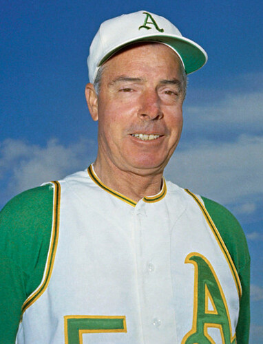
We all know the A’s coaches and managers wore white caps in the Charlie Finley era. It comes up all the time, and it even figured prominently in a piece I wrote about six weeks ago. But the A’s players never wore white caps during Finley’s green-and-gold reign. Whether in Kansas City or in Oakland, players during the Finley era always wore green caps.
That shot is from a 1967 A’s/Tigers game in Kansas City. The two A’s in the photo are pitcher Blue Moon Odom and first baseman Ray Webster. And as you can see, they’re both white-hatted.
A few moments after that photo was taken, a brawl broke out. All the A’s personnel in that shot are clearly wearing white caps. Some of them are coaches (No. 5, near the center of the photo, is manager Alvin Dark, trying to break up the imminent fisticuffs between Ossie Chavarria and, of course, Denny McLain), but most of them are players. Amazing.
I showed the photos to my usual suspects in situations like these — Hall of Fame curator Tom Shieber and uniform designer Todd Radom — both of whom were as surprised as I was by the discovery of the white caps.
One possible explanation that comes to mind: 1967 was the year that Finley first had the A’s wear white shoes, which in turn touched off the White War between the A’s and the Senators. I’ve never heard about the A’s wearing white caps as part of that episode, but maybe they were experimenting with all sorts of things back then — certainly wouldn’t be surprising. The surprising part is that it had never been documented until now.
And the guy who documented it, by the way, is reader Paul Wiederecht, who found those two photos — and several others from the same brawl — in this auction lot. Major props to him for uncovering this new chapter in baseball uni history.
And while we’re at it, Paul W. found one other A’s oddity: a shot of Dick Williams and two other A’s wearing black shoes! Looks like it’s from 1971. The other two guys are presumably players, not coaches, because they’re not wearing white caps. Then again, the whole protocol of which A’s wore which color caps is no longer as clear as it once was, right?
ESPN reminder: In case you missed it yesterday, my latest ESPN column is available here.
Uni Watch News Ticker: Many, many readers responded to yesterday’s splash photo by submitting additional pics of high school football teams that wear MLB logos on their helmets. The most intriguing examples, provided by Eric Guthier, are Nelsonville York High School in Ohio, which uses the Yankees’ interlocking NY, and the Tuscaloosa County Wildcats in Alabama, who wear the Twins’ TC. ”¦ North Korea is about to host its first golf tournament — check out the logo (with thanks to Chris Bisbee). ”¦ Oh wow, check out this completely awesome tag design. It’s from this sweater (have I mentioned lately how good Mike Hersh is at finding great stuff?). ”¦ Schools with new black hoops uniforms: Appalachian State, Davidson, and Furman (as noted by Chris Marsicano). ”¦ New mask design for Marty Turco. “He wears it when the Blackhawks wear their alternate jerseys,” says Eric Lovejoy. ”¦ When the Rams fired equipment manager Todd Hewitt last week, no explanation was given and no additional info was available. But now it turns out that there was a major personality conflict between Hewitt and coach Steve Spagnuolo, as outlined in this superb article. Recommended reading (with thanks to Gary Streeting). ”¦ Midway through this page, it’s mentioned that Dan Reeves had the Broncos wear white at home for several 1983 games specifically as a nod to his days with the Cowboys (with thanks to Justin Brownlee). ”¦ Check this out: scans of an entire 1928 Minnesota football program (with thanks to Eric Baukol). ”¦ “I was bored,” says Alan Chewning. “So I decided to use Google Maps to see if any MLB teams were playing a game when Google’s satellites snapped the overhead picture. Results: Only the Nationals were playing a game at the time of the photo. The Dodgers and the Mariners were set up for banquets. The Diamondbacks had a concert stage set up in centerfield, and the Rangers’ field had snow on it. The Phillies were in the midst of batting practice, and a Brewers game has just ended.” ”¦ The women’s hockey team at St. Norbert College wears a uniform designed by one of the players (with thanks to Jeff Ash). ”¦ Just what the world needs: a red football field (with thanks to Terry O’Donohue. ”¦ Larry Bodnovich has found yet another school that wore the winged football helmet before Princeton did: Marquette in 1932. As an aside, what is the ref holding in the blow-up image? ”¦ Rich Rod donated his Michigan gear to the Salvation Army, which is going to sell it off tomorrow (with thanks to Rob Siergiej). ”¦ Here’s a video clip showing that the 1993 WVU football squad wore a “WV” logo on one sleeve and a huge Big East patch on the other. “Man, would I like for them to go back to that look,” says Jason Bernard. ”¦ Yesterday I mentioned that UNC had tweaked its center-court design. Today I have a photo of it. ”¦ Colgate goaltender Alex Evin, who’s of Russian descent, wears the hammer and sickle on his backplate. Call out the National Guard, the commies are in our midst! (As noted by Tris Wykes.) ”¦ Latest hoops team to get the sweatback treatment: Arizona (with thanks to Josh Miller). ”¦ Buster Olney’s Insider blog yesterday quoted Kevin Jarvis, a former teammate of Trevor Hoffman’s, thusly: “During the Instructional League, it was strict Cincinnati organizational policy to show at least three inches of red ‘old school’ stirrups below the pant line. As much as Trevor was a throwback player, he was even more of a headstrong rebel when he sensed that someone was on an unfounded power trip. In this case, it was then-director of player development Jim Bowden. There were many days when the camp was entertained by Trevor and Jim going nose-to-nose over the length of his stirrups.” ”¦ Oooh, this is good: Jets/Pats footage from 1966. Check out the striped goalposts!
I believe that’s a horn, which was used in those days to signal penalties before somebody invented penalty flags.
Oh, and that game is at Camp Randall Stadium.
The girl from St. Norbert College did a good job on her jersey. Pretty cool she got to design the team’s gear for their 1st season. Well done!
Seconded, and this is a perfect example of why schools are wrong to use ripoff logos. Not because it’s stealing, and a crime, though it is, but because it wastes a chance to let the students develop their talents. Which is, you know, the whole point of a school. From a pedagogical perspective, a ripoff athletic logo is a sin against the students.
To be fair, the template is a pretty blatant rip-off of Dallas’s current look.
They probably went with that template as a cost-saving measure. The article said something about her original design that she’s she’s hoping will be used as a third jersey in the future.
I am not sure why Appalachian State having new black unis is put alongside Davidson and Furman having them. Black is one of the colors of App’s scheme. Not so for the other two.
Red and black are Davidson’s school colors. They have worn black and red road uniforms forever.
Furman’s colors are purple and white.
I didn’t say these uniforms were BFBS — I said they were teams with “new black uniforms,” which is what they are.
I got that, but dkb did not.
re. Google Maps.
Most unlikely place to find an American Football game? How about the Olympic Stadium in Berlin?
link
Kudos to Alan Chewning. I work in the geography/GIS field and have never even thought to do that, and I use Google maps practically every day. I have checked out a few college stadiums in the past (my favorite teams), but not much else. Hey, looks like I might have something to do this weekend after all!
Ditto
That Google technology is getting a little too good, huh?
link
The Nats game looks like it’s just gotten underway, since the field is empty, the Nats are just running out from the dugout, and people are still streaming in from the Metro station to the gates and crowding the concourses. Well, “crowding.” Google recently updated a bunch of DC-area satellite images, including my neighborhood in suburban Virginia, and judging by where my car is parked and the fact that the top was down at the time, the photos appear to be from mid to late August. If the downtown update is from the same day, then it’s probably August 15, when the Nats played a day game against Arizona.
Sometimes when you scroll down Google Maps, it will have a date stamp of the day the pic was taken. When I pic for my home was update last year, when I looked for the date, it had been taken on my birthday…..
Apropos of yesterday, Nationals Park includes a series of dates in Washington and team history that are link. Notably absent are either 1905 or 1969, the two dates the Nats have used as “Est.” years.
Google hasn’t updated Minneapolis for while: Target Field is STILL just a parking lot, not even under construction!
Is it interesting to compare Google Maps and MSN’s Bing Maps -for example, in the Bronx, Google has the old YS totally down, while Bing still shows the old place standing..BUT… a game going on at the new YS!
And btw, Bing hasnt updated Minneapolis either….
It indicates quite clearly in the Kevin Jarvis comment about Trevor Hoffman how entitled athletes feel. And how little they grasp. A team official enforcing management policy is not on an “unfounded power trip.” He might’ve been a nit picker, but Bowden was just doing his job. Morons.
Those white A’s hats had a nasty shape to them. Charlie O. must’ve got a deal from a local KC wholesaler. Uggh.
You call it entitlement, I call it asking why and not liking “because we said so” as an answer.
The team provides the uniform, if they want 3 inches of stirrup showing, then tailor the damn thing so that it leaves 3 inches of stirrup showing. You give a guy a pair of pants that goes down to his ankles and then bitch about it when he wears them that way?
You’d see a lot more stirrups in the majors if they weren’t forced in the minors.
You’d see a lot more stirrups in the majors if they weren’t forced in the minors.
~~~
sadly, that’s probably true
but they should be forced in the majors too…seriously, you’re being paid untold millions to be playing a game you love for 3 hours a day…wear the goddam uniform properly — the other 21 hours you can look, feel and dress any way you please
i really don’t think that’s too much to ask
i do not think it is true about the minors. the same number of people would wear them, which is very few. if some teams didn’t make people wear them, i would imagine 1/2 the players wouldn’t even know what they are.
if i was jim bowden i would have taken one of trevor hoffman’s dirty socks and shoved it down his punk-ass throat while i said “you tell me when i hit three inches trev so we can both be sure what 3 inches is tomorrow.” some people ask why, and some people get the stanky sock down the troat roofus-goofus because of it. it isn’t an arbitrary power trip, it is a corn damn team rule, and you are part of the team, it is that simple. i am sure trev, who names their kid that anyway, had plenty of ways to personally express himself. some people ask why, what a load of crap, i take it you were never part of a team that wasn’t pixelated.
i take it you were never part of a team that wasn’t pixelated.
~~~
pretty sure that’s going at the bottom of tomorrow’s page
Actually, I did play little league ball, and we had visible stirrups – because that’s the way the pants fit. No one needed to make any arbitrary rules about it, it’s just what the uniform was.
You want players to show visible stirrups, you give them a damn uniform that does that. It’s not a complicated idea. You give players a bunch of long, baggy, past the ankle pants and then whine about them not showing enough stirrup, it’s your own corndamn fault.
you’re being paid untold millions to be playing a game you love for 3 hours a day…wear the goddam uniform properly
All that anyone needs to say, or be told, on the subject. If individual expression is that important to you, then go take up tennis or male modeling or something. You want to play a team sport? Then wear the dang uniform.
when trevor came up, he was not given the pants that today’s players are issued, he was given pants with elastic in the legs, you know that and i know that. besides, since when do you just pull them down and show the elastic? he just didn’t want to blouse the things like every one of his teammates. and no, it isn’t arbitrary, it is a team rule because the reds want the reds to alway look like reds, it isn’t up to him to disagree with what a red is. there are plenty of ways to express yourself, but the reds had uber specific guidelines for their hose, follow them or cram it with walnuts. and don’t give me old school/ tradition is stupid BS, it is plain and simple a team code for dress.
link / Red field… already been done!
Wow, Steve Spagnuolo really is a Grade-A asshole.
Yeah, that Todd Hewitt sure got a raw deal. Damn…
-Jet
Anybody else hope the #StLRams never win another game with Steve Spagnuolo coaching?
Yep.
Maybe Hewitt can get his job back when the Rams return to LA for the 2015 season.
“He criticized the way Hewitt distributed socks.”
I am having a hard time even imaginging this…
“WHAT THE HELL ARE YOU DOING!!! FOLD THE SOCKS 3 TIMES NOT 2 RAAAAAAAAAAAAAAAARRRRGH!!!111!”
I hope they win every game. Do you really think that Spagnolo is the only asshole in the NFL?
If I was an equipment manager, I would try to blend in with the background as much as possible. I don’t think this guy did that. It’s possible that all of his years with the team may have led to some sense of entitlement.
Doesn’t Eastern Washington have a red field? I’m pretty sure, I saw pics of it in a weekend UniWatch update, related to how ugly the red uniforms were agains the red field.
Then again, I’ve slept since then, so who knows… :)
You are correct. link.
I like the field, and the unis, but just not together.
This Bud Tucker column from May 24, 1967 indicates the KC Athletics may have been wearing the white caps on other occasions that season:
link
I never like to nit-pick, but knowing some SNCfolks, it should be pointed out that they are “St. Norbert College” and not “St. Norbert’s College”
Now fixed.
In that A’s-Tigers pictures, some of the Tigers have TV numbers on their sleeves, such as Denny McLain at the top of the picture and someone on the lefthand side whose number starts with 2. But other Tigers – specifically number 24 and 21 – clearly don’t have numbers on their sleeves.
Did the Tigers just have TV numbers on the right sleeve that year? FWIW, the Detroit uniforms for 1967 in the Dressed to the Nines database don’t show any TV numbers at all.
Some thoughts…
It’s come up here (and I noticed it recently while watching footage from the Cardinals-Tigers World Series)that all the Tigers DID have sleeve TV numbers on the road unis, but not on the same sleeve. Some were on the right, others on left.
Doesn’t appear to be a system to it, so we surmised that perhaps Detroit’s replacement set (teams rarely go through a season with one set of unis) had the numbers placed on the opposite sleeve (whether by design or accident, we know not)…and the two sets simply got co-mingled (also very common).
Another thing I noticed, and I’ve looked pretty closely at those newly unearthed photos today…
There doesn’t appear to be any white on the A’s stirrups, just two athletic gold stripes. If so, that would be yet another variation on the sock striping with the A’s kelly/gold vested unis. The fourth, I believe.
Two thick two-color stripes
Two narrow two-color stripes (worn most often)
Three narrow two-color stripes
…and now two narrow one-color stripes.
One thing that DOES appear to still hold true, though, is that the players never wore the white hat with the kelly visor (although that version didn’t come along for manager/coaches until the double knits of ’72, if I recall correctly).
Judging by the ballpark, the shot of Dick Williams probably was taken in spring training. The A’s commonly wore black shoes in spring training. Likely a maintenance issue (keeping them clean), plus players who had not yet been with the big club likely didn’t have white spikes…so it kept everyone looking alike.
—Ricko
Also…when the A’s first introduced the white Riddell cleats in 1967 they also had a kelly green set of Riddells regarding which Charlie Finley something the effect of them being “for muddy days.”
They did wear them a few times, I believe (actually wore them quite often for BP and infield). I have several b&w photos from pre-game situations, where they do look noticeably lighter than typical black shoes.
I think within a couple years they just went with basic black as the alternate, though.
—Ricko
More great sleuthing all around, and those brawl pics are mighty cool too.
-Jet
In the one pic (KC A’s-Tigers) the Tiger is 2nd baseman Dick McAuliffe, who was a notorious hot head in the day. No surprise it ended in a brawl.
That is an awesome find, Paul W!!
Yet the Reds wore white caps from 1957-1966 and hardly a word is said. Interesting…
Also, not sure it’s showing up in the pic, the Athletics broke out yellow batting helmets in 1967 and – I believe – used them thru 1971 (71’s hard lid had a green visor).
Reggie Jackson wore such a helmet at the 1971 All-Star Game, where he blasted a home run onto the right-field roof at Tiger Stadium.
Still one of my favorite uni sets.
Mine too — like link, on the road I believe.
Steve’s link has some *very* nice A’s shots, including white caps.
In your “White War” entry, the quoted material from the Minot article says the A’s players wore “off-white” caps in response to the Senators instigation. Hmm… Good stuff.
As an alum of St. Norbert College, I can verify it is “St. Norbert College”, and not “St. Norbert’s College”.
Greta article. I like the simplicity Julia used for their new uniforms, however, she did not design the word mark or logos. Those were introduced a few years ago when SNC did a logo/word mark overhaul.
link
I was able to find the online SNC Identity Guide online for people who enjoy that stuff. I would like to also point out that the logo/word mark change came in the Fall of 2007, so again, I am pretty sure that Julia didn’t design or help design them. Not that her uniforms aren’t done very well… because they are.
link
Here is an interesting story how St. Norbert adopted the nickname “Green Knights”.
The change in nicknames for St. Norbert athletic teams came about gradually, mainly though the influence of the Rev. Louis A.V. De Cleene, O.Praem., a classmate of President Eisenhower at the Military Academy in West Point.
Father De Cleene enjoyed recollecting his days at West Point, where the football team was known as the “Black Knights.” He was able to persuade people at St. Norbert to adopt the Green Knight nickname for the school teams, which had been known as the Green Juggernaut, the Green and Gold Wave, the Green Wave and the Goldmen.
UWers should appreciate this from the sNc site: “Black should not be used as either a substitute or background color. The rare exception for use of black may be in embroidery, where black must be used for technical reasons.” Pity Furman’s using BFBS.
Like UNC-CH’s court design though its leaves out the OBX.
And today is the first time anyone’s ever referred to it as St. Norbert’s, right?
Why does that matter?
Not sure that it matters whether it’s the first time or not…I figure Paul would want it to be correct, don’t you?
Again, as an alum of SNC, we had to correct people all the time. It isn’t a big deal, it is just a common mistake. We are a small, Division III private college in De Pere, WI, and aside from our very good hockey program, no one really knows too much about St. Norbert. Well, maybe people also know that the Packers stay there during training camp. Four of the greatest years of my life.
Just to be clear, my post was in line with Michael’s not asking why does it matter how we refer to SNC. As another small, private, D3 alum, I know we can tend to get defensive about our schools.
Settle down, fellers.
I was just saying “I’m sure that shit happens all the time and it’s probably really annoying” considering that Johnny’s post was not the first one correcting Paul’s ticker entry.
I dunno how many times I’ve had to tell people that there is no “University of Indiana.”
That doesn’t really change anything. The only part that “seconded” the earlier post was for Johnny to mention he was an alum of the school. Didn’t really scream excessive, you know?
What the hell are you talking about? “That doesn’t really change anything” about what?
And where did I say anything about the second post being excessive?
There’s a college named after Hagrid’s baby dragon?
Cool.
—Ricko
That video of the WVU football game reminde me of the great award decals they used in the 80’s – early 90’s. It was a rifle and I always thought they were pretty cool looking. Found an okay pic on this website, second row down, middle pic…
link
I remember JT Thomas (94-95) arranging the rifles on his helmet to spell J T in the middle. Can’t find a pic anywhere, though.
Actually, in the first row, in pic #6 you can see the rifles
In the 2nd row, WV has award decals that are not rifles. I think they are stars? Used in 1985-1986.
The rifles were used as early as 1981.
I had a hard time finding pic of the rifles…also one of my favorite award decals.
Looking at the Gopher lineup in the ’28 program, I saw not only the immortal Bronko Nagurski at fullback, but #29 F. Hovde at “quarter”, who went on to become president of Purdue. Fascinating stuff!
And people familiar with Purdue will also note the administration building is Hovde Hall.
Eleven (I believe it is) teams’ “Pitchers and Catchers Report” a month from yesterday. Pretty much all the rest a month from today.
Always a cheering thought, init.
—Ricko
I’m eight days out from the first of two fantasy drafts, so it might as well be spring already!
Oregon, please go away. Now.
link
Video games often should try to emulate reality.
There is something seriously haywire when we opt for it to be the other way around, though.
—Rickco
Agreed. Oregon, you’ve jumped the shark. Just. Stop. Now.
Now if you wanted to go with a green court, or a carbon court, or something like that, have at it. At least that wouldn’t be so visually disorienting.
After reading that Todd Hewitt article, I kinda hope the Rams lose all their games next year, too.
Ditto.
-Jet
How long have you guys known Todd Hewitt? Is he as great of guy as you think he is?
Inconsistencies with the West Va sleeve patches. At the 0:14 mark #78 doesn’t appear to have a patch. It could be because he doesn’t seem to have much of a sleeve.
Buried in the article about the Texas high school’s red football field was a link to the new football program at Texas-San Antonio a) using the Alamodome for its home games and b) coloring its turf link. Ow! My
spiiiiineeyes!saw that yesterday…
you do realize the “orange” turf pic is just a photoshop (and not a particularly good one at that)…the field may (or may not) end up being orange…but that’s just a “what if”
Re: red football fields.
O NOES!!!!!!!!!!!!!!!!!!!!!!!!!!!!!!!!!!!!!!!!!!!!!!!!!!!!!!!!!!!!!!!!!!! The sky is falling!!!!!!!!!!!!!!!!! The sky is falling!!!!!!!!!!!!!!!!!!!!!!!!!!!!!
Give me a fucking break Lucas.
Explain why you have absolutely no problems with teams colring the fuck out of the end zones but get hysterical and start blubbering like some crybaby when a team unveils a red football field.
And spare us all the whole cranky old man, “it destroys tradition arguement,” cause that doesn’t work.
And how is the red field any different from when a field is covered by snow and thus is white or when it gets oversoaked with rain and turns into a muddy brown field?
Endzones cover a total of 20 yards of the 120 on a football field, and when colored actually serve to bookend and provide a border (read that as: “it looks good”).
Snow is natural. Rain and mud happen all the time. Most people are used to occasionally seeing fields of white or brown when they look out a window. So, when snow or mud covers a playing surface, it doesn’t look ridiculously out of place.
Bright-red artificial turf is *not* something people are used to seeing. It does not have a sensible appeal to *most* people. Most people would rather look at green, white, brown, yellow, tan… hell, maybe even blue… “grass”/ground than they would red, orange, black, or purple.
i think you misspelled the man’s name dirtbag.
tradition? why has it anything to do with tradition? isn’t it because it is a retina burning eyesore? the universal new idea=good does not work anymore then tradition=good. you actually like a red field? you can actually sit there with a straight face, and say, yes, this field is good? were you dropped on your head as a baby?
Does it have lines every 5 yards and a bunch of numbers to label those lines? Then it’s good. Who really gives a corn what color it is? Red isn’t any worse than that horrible sorta greenish color that 70’s astroturf had. Fake is fake.
you are just contrary and ironic to be contrary and ironic jeff. i don’t believe you believe anything you write. you think you stick it to “tradition”, but you do it in such a universal way that nothing you say sticks. 70’s astroturf sucked, old was not good, and it was even worse to play on what amounted to concrete. but that is beside the point, you could watch a red field for 3 hours without getting a headache? really?
Who said Astroturf was a good idea?
I dunno, put’em on TV, I’ll find out. I have no problem with a red field in concept. Or blue. Or yellow. Or any other color. I’d prefer grass, but once you start using the fake stuff, why not use different colors.
because it looks like crap jeff, because. it. looks. like. crap. i understand the angle you are coming from, if it is fake, own the fake, why hide it. in many ways i can agree with this argument, ask my blue tinsel christmas tree. fine, maybe a black field could work, it is a neutral enough colour. but a bright red field with bright red players is going to be an eyesore even more then boise community college. now i am not getting all big conference hating the little conference here, but it is unpossible for me to watch a bcc homegame, it gives me a headache, and the red is a thousand times worse.
Well then it sucks to be you, chimp. You’re getting so hilariously angry over something so inconsequential that it’s worrying me a little.
i’m not angry boomer, i just speak with a strong voice. that being said, jeff does bring out the worst in me.
Where did Paul say anything about tradition?
The brighter the background color the more it comes forward in what we’re looking at. Hence, its function AS a background is compromised, making it more difficult to separate it from the objects moving in front of it (or, in this case ON it).
And, while green naturally is the color of grass, it also is a color that stays nicely where it should as a background color.
Some colors (and this is fact, not opinion) are inherently brighter and more arresting/jarring to the human eye. That’s why we notice them. Imagine, for example, a bright yellow football field on a brilliant sunny afternoon. Three hours of watching that, trying to follow the action, either in person or on TV, could become downright exhausting.
Seriously, did NO ONE pay attention in 8th grade science?
—Ricko
Generational thing. For most of the folks in here, eighth grade science wouldn’t have covered that kind of topic. Just condom technique and “say no to drugs”.
And how is the red field any different from when a field is covered by snow and thus is white or when it gets oversoaked with rain and turns into a muddy brown field?
On the same score, how is a surgeon giving you anaesthetic and cutting your chest open with a scalpel in an operating room any different from when a mugger punches you in the head and then stabs you in the chest? They’re just the same, right? Or maybe there’s actually a difference between similar outcomes – a knife in the chest, a different color of playing surface – being intentional and accidental.
The thing is, everyone is accustomed to green playing surfaces, because the natural state of a football field is to be composed of grass. Grass is green. When you vary the color of the playing surface from green, you inevitably make it just a little bit harder for everyone involved to watch the game. I mean, a publisher could also publish his next book using 72-point all-caps type with tan ink on brown pages. He could, but he’d be stupid to do so, because doing so would make it harder for readers to read the book, and that’s kind of the point. So also with football fields: the point isn’t for the field to look pretty, the point is to play a football game on it. If the field is green, nobody involved will ever notice the field as a field. If the field is any color other than green, everyone involved will constantly notice the field as a field. So arbitrarily varying the color of the field is an obviously bad idea in general terms.
And it’s an even worse idea when we consider the specific colors generally involved in non-green field surfaces. First, green offers reasonably high contrast with the football, with players’ exposed flesh, and with most team uniforms. Red and orange fields offer much less contrast with both the ball and the players’ exposed flesh, and the rules of football rely on officials being able clearly to see the ball and the players, particularly their usually exposed arms. Add on the fact that most non-green fields are colored to closely match the home team’s uniform color scheme, and what we have is not a playing field but a deliberate scheme to camouflage the home team’s players. In what world is it a good idea to make it harder for fans and officials to see one of the two teams? Have fans of the all-red fields been saying to themselves for years, “Gosh, wouldn’t it be great if football were harder to watch? Like, maybe if one of the teams were sort of invisible?” The team-color field is exactly as good an idea as would be televising the game using only high-altitude blimp cameras instead of cameras inside the stadium. It may be kind of a cool effect, but it makes the game harder to watch. Which, for a spectator sport, is objectively and necessarily a bad idea.
In the long run, I actually think that green can probably be improved on as a field color choice, and we’re probably headed in that direction. I have no problem with thoughtful innovation of that sort. My problem is with thoughtless innovation that puts flashy form ahead of the first principles of function. The recent eruption of red and orange fields are all about style at the expense of substance.
For all the camouflage/hard to watch arguments, Boise State’s fans seem to love their blue field.
Sure they do. Because it’s their gimmick, not because it’s a great background for watching a game.
I find watching games from Boise tiring. Especially night games when the artifical light blasts SO much light on the playing surface that the damn thing practically vibrates, visually speaking.
And when the Broncos come out in matching royal and similar color value orange, it’s really tough. Bowling Green (in mono white) and Idaho (in black over gold) in last year’s extrordinary bowl game were far easier to watch against that surface.
—Ricko
Before the nitpickers get after me, that was in reference to 2009’s Humanitarian Bowl in Boise, not last year’s.
Y’know, it being 2011 now n’ all.
—Ricko
For all the camouflage/hard to watch arguments, Boise State’s fans seem to love their blue field.
~~~
do they? do they really? i think they like the success of their team who just happen to be playing on a blue field (and blue is, while annoying, not even in the same ballpark [or stadium, if you prefer] as a RED field)
just because you can do something, doesn’t mean you should
if you want an example of this, look at synthetic tennis court surfaces — over the years, they’ve been painted everything from green and blue to red and black, and by far and away, the consensus is the blue or green are the most aesthetically pleasing, and provide the most contrast
i’ve watched at least one match on a red (and not nearly so red as that wyoming field) surface, and saw highlights of one played on a black court … absolutely unwatchable
i also saw highlights of the games played on the red turf and they, too, were unwatchable…i really don’t care “how much the fans” like it…
i don’t even like watching the french open that much, even in hi-def, because it’s played on red clay — now, i’ve PLAYED on red clay for all of my life, and it’s not a problem seeing the ball…but put that on TV and it sucks
the same can be said for the blue turf — the players and fans may find it fine, but try watching it on the screen…it’s just visually unappealing
Phil, so you have done a survey of everyone who has ever or currentlt attneds Boise State about the color of the football field?
Sure you have.
Seeing as the field has been that way for over a decade, it’s safe to say that the people at Boise State LOVE it and would revolt and burn down the stadium if it was chanmged back to green.
As for the moron claiming that a red field would make it impossible to see the players as the field would swallow up orange and red flesh. Remind me again precisely how many football players have red and orange colored flesh, oh yeah, NONE of them.
Sure, let’s just deny the science of it, what the hell.
See, there’s this thing called the color spectrum.
It’s about light and how it changes as it moved along that spectrum.
Some color combinations, then, are panchomatic.
Others are monochromatic, and…
Oh, fuck it, never mind. Have it your way, the earth’s flat.
—Ricko
“Seeing as the field has been that way for over a decade, it’s safe to say that the people at Boise State LOVE it and would revolt and burn down the stadium if it was chanmged back to green.”
You got that right, Sir Flapjack. Because that’s exactly the response any reasonable person would expect from those smurf turf-lovin’ Boise State fans.
it’s safe to say that the people at Boise State LOVE it and would revolt and burn down the stadium if it was chanmged back to green
~~~
mrs. butterworth knows this because he’s done a survey of everyone who has ever or currentlt attneds Boise State
The only thing that bugs me about different colored fields is when the home team wears monochromes in the same color. That includes green teams that wear mono on grass or regular turf.
When Boise wore orange monos at home, it was cool.
Maybe they could use a different colored ball on those fields? After all, that’s an old-school idea from the first night games.
link
Mr. Pancake,
Your falling sky is much worse.
OH….NOOOOOOOOOOO……………………….! LUKAS GAVE AN OPINION!………………………. NOOOOOOOOOOOOOOOO!
How/Why Muskegon Lumberjacks USHL Hockey players pick their numbers.
link
Couldn’t be more impressed with the Bulwark. Seeing the slight updates each time take it from something that frankly was a little strange looking not too long ago to what is now easily the most attractive piece of football headwear in the world today. Excellent, excellent work, Michael.
Interesting that the ESPN.com story of the Ravens-Steelers rivalry includes a graphic using the old AFC logo:
link
The new logo would look better, and make the scales more realistic. Plus, it would be correct, which is always a good thing.
I saw that graphic late last night. The illustrator, Kurt Snibbe, is one of my favorite pals at ESPN, so I immediately e-mailed him to tell him. He felt really bad about it, plus he said the stars were such a pain in the ass to render — he would’ve preferred doing the new logo. But it was too late. The story was up and running, and changing an illo entails a lot more work than changing a typo.
The funny thing is, if you do a google image search on “afc logo” (which I bet is what Kurt did), you mostly get the old logo:
link
But if you search on “new afc logo,” that’s better:
link
But of course that assumes you know there’s a new logo to search for in the first place.
Anyway: I didn’t have the heart to call it out in the Ticker. But I knew you folks would notice….
I saw that yesterday and I was was more disappointed that he accurately depicted the Ravens in their black pants/socks combo. A little artistic license there would have been a good thing.
I spent most of my childhood watching the Kansas City A’s play at the old Municipal Stadium, before they moved to Oakland. I can postively affirm that in at least part of 1967 the players wore white caps. I have a series of snapshots of A’s players that I took in 1967 during the annual “Picture Day” and they are all wearing the white caps. I am vice-president of the Kansas City Baseball Historical Society and I will post some of those pix on the website for all to view. I just came across the website and really enjoy it. Hope to hear from KC A’s fans.
howdie david. welcome to the site. many a’s fans here. you’ll feel right at home. looking at page 18 1968 a’s yearbook. pic of blue moon in the topic of the day, white kc hat. page 20 tony pierce. on one of the last pages of the ybook, a pic of fathers and sons, possibly the same day as picture day you attended, with, players and their white hats. someone commented on the yellow batting helmets. many pics of players in ybook with the yellow helmets. i’ll be darned. had never noticed white player hats before…
yes, welcome david!
please check your e-mail, if you happen to be reading this
hey everybody. saw this on yahoo a few minutes ago, its a picture of a memo sent out to players in the nfl about new fine regulations for the playoffs. note at the bottom of the memo, there is a list of the only acceptable brand logos to be seen on the field….
link
I know sometimes dining/eating is a topic for discussion here. Given that- I present this heart attack waiting to happen. I may have to go to this place just to see it- it’s not too far.
link
Not real-life uniform related, but check out Rashard Mendenhall’s TV numbers in this Madden simulation screenshot.
link
Hey, what happened to the RSS feed? The whole article used to be in the feed, and now it’s just a tiny excerpt with a link to “read more”. What gives?
/grumpy
Anybody else seeing a red and blue buffalo on Cookie Gilchrist’s helmet on Item #4 of the Bills home page?
link
If so, I’ve never seen that before.
i think that’s just a shadow
No way. That’s the ultra-rare “██████-█████” logo that was only worn for the game against the ██████ as well as the ████████ game back in 19██ before they were forced to change to the more familiar all-red standing buffalo because of ███████ concerns.
So you claim.