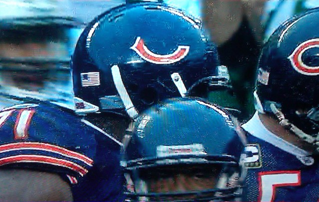
People, I’m going to be frank: I spent all of yesterday cooking, eating, drinking, and shoveling (which is supposed to be my landlord’s job, but he was snowed in across town at his own place). I watched exactly zero football, and I was so stuffed and tired after my Boxing Day party guests left that I promptly fell asleep. So today’s MMUW is extremely abbreviated, consisting of the standard bit of decal-porn you see above. That’s Chicago defensive end Israel Idonije, who apparently drew the short straw in yesterday’s “It’s a December game, so at least one Bears player has to have a broken helmet logo” sweepstakes. (Screen shot courtesy of Mike Mattison.)

Thanks for your kind indulgence. I’ll have a full-length entry tomorrow. — Paul
Collector’s Corner, by Brinke Guthrie
As we wrap up 2010, Collector’s Corner would like to thank all the readers who submitted suggestions this year. Keep them coming in 2011.
Now then:
• Here’s a truly outstanding Patriots 1970s sideline jacket from a Canadian maker I’m not familiar with.
• White Sox fans will go for this 1959 A.L. Champions keychain.
• This Bengals sweater is tagged “Casuals by Cliff Engle,” the sweater brand from the ’70s. Had to have been sold at Sears.
• Bet these were at Sears, too: a 1960s Rawlings Vikings helmet/pads/jersey set. [This must actually be from the early ’70s, not the ’60s, because the packaging includes the logos of the former AFL teams. — PL]
• Very interesting construction on this 1920s Spalding football helmet.
• As long as we’re talking Spalding, check out their 1937 college football guide.
• And we ring out the year with a lot of eight 1970s NFL cloth patches and a lot of six 1970s NFL stickers.
Seen something on eBay that you think would make good Collector’s Corner fodder? Send your submissions here.
Uni Watch News Ticker: The collapse of the Metrodome roof has inspired the ever-creative St. Paul Saints to come up with a Metrodome whoopee cushion promotion (thanks, Ricko). ”¦ Gerry Dincher notes that DeSean Jackson has the Nats’ curly W logo tattooed onto his arm. Jackson grew up and went to college in California, not Washington, so there must be some kind of story behind this. Anyone..? ”¦ Oooh, here’s something I bet most of you have never seen before: Bobby Orr in a Czech jersey! Amazing ribbing on the collar and placket, too. Full details here (nice find by Mike Hersh). ”¦ The Jones brothers, Darius and Roddy, play for Air Force and Georgia Tech, respectively. Those two teams will be facing off today in the Independence Bowl, so the Jones parents are wearing split jerseys (with thanks to Tris Wykes).
Thanks for a great year, and good health in the next.
Doesn’t seem to be a whole lot of information on Shain of Canada, but I recall they were the Canadian alternative to Starter jackets. Shain used to be located at 461 King Street W. in Toronto. They made jackets for NHL, CFL and MLB teams as well.
I used to have a Montreal Canadiens’ jacket made by Shain. The colors, striping and lettering were almost exactly like this Patriots’ jacket. But the French spelling of “Canadiens” on the back would always compel folks to ask why it was spelled wrong. I bought it new in the late 80’s/early 90’s. It was a great jacket to wear to the rink.
D-Jax tattoo represent The Westside…. link
Well that makes a lot of sense.
I guess if I ever need tattoos to tell people where I’m from, I can use Oregon’s O to represent Ohio, and a Cubs’ C for Columbus. Brilliant!
Does this answer explain most/all of the wearing of Nats caps by various non-Washingtonian hip hop artists? And is the frequent adoption of Cincy caps by non-Ohioan rappers a reference to “central” or something?
Cincy caps are worn by gang members affiliated with the Bloods. Dodger / Royal caps by the Crips, Pirate caps by the Latin Kings etc…
After anti-gang task farces began cracking down on gang members wearing bandanas as their colors….the gangs began using specific team caps as their new insignia….
Their is even a mexican gang in the south that wears cleveland browns hats and jerseys.
Let’s not underestimate the importance of “blood” red. Jay Rock, a rapper from Watts, CA (notice the W), frequently wears the W cap and claims to be a Blood (gang member). I don’t know about Cincy, but it’s probably the same deal. If I were a blood from Compton, I’d rock that Cincy cap all day.
Something haywire about clinging to your high school or neighborhood frames of reference.
I used to tell kids I coached that one of the great days in life is the day after you finish high school, because on no other day can you so totally reinvent/redefine yourself.
“For rest of your life,” I used to tell them, “no one will ever ask, or care, if you sat with the cool crowd in the lunch room.”
—Ricko
Maybe DeSean Jackson just really likes Walgreens.
This Bengals sweater is tagged “Casuals by Cliff Engle,” the sweater brand from the ’70s.
More like the 80s, IIRC. Think of the sweaters Mike Ditka wore on the sidelines for the 1985 Bears.
How about this one from the 80s ‘Nati?
link
I love the Air Force/Georgia Tech Frankenjerseys.
I’d imagine that they get the link seal of approval.
~~~~~~~~~~~~~~~~~~~~~~~~~~~~~~~
I can’t decide if the Bears’ cold-weather decal breakage is a semi-charming quirk or just totally bush league.
I’m sure there’s a simple solution — just fill in the center of the C with navy blue. But would that just look like crap compared to the “hollow” C decals?
A blue middle would probably look fine from a distance, but crappy up close.
Couldn’t they just use a clear coating on top of the whole helmet after it’s had the decal added?
Pretty good IQ genes in that family if one kid’s at Ga. Tech and the other at USAF Academy! And they can play ball.
That’s interesting. Student athletes.
What a concept. Has the NCAA ever considered adopting that as a philsophy, do we know?
—Ricko
Yes, but except for a limited amount of schools (the academies, Ga. Tech, Wake Forest, Notre Dame, etc.) it’s usually optional.
I’m wondering the same thing. There’s really no excuse to have broken helmet decals on a professional football team. I’m thinking the Bears need to switch to a solid oval decal to improve stability. That would certainly help the problem.
I dunno. Chin straps break sometimes (or used to), too.
Helmets pop off at contact.
Players throw a shoe once in a while in the middle of a run.
Doesn’t mean the shoes, helmets or chin straps are substandard.
Shit happens. Moreso when things get cold, it seems.
—Ricko
I wonder if it has to do with the C being entirely cut out. If the crown of the opposing helmet hits inside the C, it could basically scrape a portion of the decal until it ripped/broke off. If they were to leave the middle of the C sticker filled, it would be more of an oval and not be susceptible to this ala the jets logo.
That’s where the semi-charming aspect comes in. Sometimes it’s nice to see that not everything is perfect in this day and age of big-business sports.
Kinda like the Soldier Field turf. It’s fun to see big chunks of grass come up during a game, but man, sometimes it just looks downright awful and unkempt.
I suspect that the Bears actually kind of enjoy the fact that the decals break in cold weather. It ties in well with the whole “Bear Weather” myth that they like to perpetuate.
Oops. I meant to reply to Ricko.
But as for your observation, that’s exactly why it happens, as I alluded to above with the filling in of the center of the letters with navy blue rather than using the “hollow Cs” being a possible solution.
Why would you fill in the center with navy blue when its base is translucent? Opening up a big can of worms if you’re trying to color match it & it’ll come off in different colors in different light angles.
If you left the center portion uncolored, it won’t precisely match the helmet shell’s appearance, either. And if the decal doesn’t get applied perfectly, any trapped air bubbles would be fairly noticeable — moreso than air bubbles trapped under the blue.
I dunno. Maybe clear would work. Are there any college teams that do something similar? I can’t think of any NFL teams that have large expanses of their decals that are either transparent or the same color as their helmets.
Well, there is one other option: paint the logo on. Tho that could lead to smears & chips. I guess simply replacing the broken decal is much easier than any time consuming painting or cleaning.
Glad I’m not the only one here who doesn’t mind when things break/go wrong/don’t make sense. I liked your point about the misguided importance of having to apply Vikings logos to Ford Field for that makeshift ‘home game’. Seems like the world has forgotten how to be charmed.
I noticed the half-decal yesterday while watching the game (via webstream) I mentioned to the Bears fan in the room, “You’d think a professional team would have better decals.”
I don’t recall seeing an Jets with decal problems..
Dustin Keller’s decal was half-gone on the right side. If anybody has a screen grab of the play where he hurdles the Bear defender, you can see it pretty clearly.
According to Woody Paige, Broncos will return to orange as their primary color in 2012. So one more year of the blue then orange is back!
Do not want.
I enjoy the Bronco’s dark blue jerseys, as long as they wear white pants. The orange, in my opinion, looks good as a alt.
One of the never-to-be-linked copyright trolls (Denver Post – specifically Woody Paige) has reported that the Broncos are returning to orange jerseys for 2012, it being too late to change for a hypothetical 2011 season. If the source isn’t one of Paige’s pink elephants, it’s good news.
Okay, it was the blue horsey what told Woody about the jersey switch.
Had to have been, since was no brown horsey.
:)
—Ricko
If only you could prove that. :P
That logo looked dead anyway, whatever color it may have been.
Brown would have been an illogical abberation.
If someone’s going to claim an illogical abberation, best offer some proof.
Otherwise, common sense (and ample evidence of a substantial “Wew colors: orange and blue” marketing campaign) should prevail.
—Ricko
As a counterpoint, we currently have the Pittsburgh Penguins wearing a powder blue alternate with a black & yellow logo on it. Or, to be more era appropriate, the Buffalo Bills using a solid red logo while wearing blue jerseys.
I’m not saying you’re wrong, because I don’t know. But, just because it doesn’t make any sense to use a brown logo doesn’t mean that it didn’t possibly happen. All we know for certain is that they used a dark logo for a few games before switching it to white. Blue makes sense, and brown was part of the team’s previous color scheme. Until we see a color picture, we really don’t know, regardless of what the logical choice would have been.
/and I was mostly just messing with you
Have to keep things in a 1962 context, though.
Because that’s all that’s relevant.
(And I know you were messing with me. ;) I just think some supposed “uni/helmet scholar” out there made an erroneous–and stupid—assessment 40 years after the fact, and has been working really hard to cover his ass ever since).
—Ricko
Will say one more time…
My former partner, who was sports editor at the Denver Post in 1962, told me in 1971 that, “They looked like big ink blots.”
Brown not all that likely to suggest ink blots.
Certainly not compared to the degree Blue would.
—Ricko
Whatever rule the league has that prevents them from making the switch next year needs to be eliminated. I mean, come on, both jerseys already exist. It isn’t like they’re doing anything new.
That there is a valid point.
I understand that lead time in necessary for all manner of retail applications, but in this instance it’s seems like a real “Yeah, what the hell, go ahead.”
—Ricko
I don’t think the NFL would do much if they just decided to wear orange a few more times next year and blue a few less. And I like the orange, but you know people will be clamoring for a return to navy blue in a few years.
I don’t think the NFL could really stop them if they did. What’s the worst they can do? A few fines? I’m sure the team could afford it.
…and of course some people would want a return to navy… Denver did win 2 Superbowls in navy while losing 4 in orange. Denver has been wearing blue for quite a while now, there’s probably a good number of fans who do prefer it.
As a Raiders fan I really don’t care what color they wear, I can despise them in orange just as much as in navy. :)
Maybe they are looking at a complete redesign, not just using their alts or maybe they want to give Nike time to make a neon orange one. I still think they should be allowed to change it for next season. I wouldn’t buy a team’s jersey now if I knew they were changing it the following year.
If I had to guess, I imagine this rule is in place for the video game franchise. Making Madden (and other big, yearly release franchises) is a year-round thing. Once 2011 hit shelves, work on 2012 began.
This rule is probably in place to prevent what happened when the Sabres changed back to blue and gold from black, silver, and red. The change was made late, so the Sabres were black, silver, and red on the video games, and blue and gold in real life.
Pretty sure it’s about merchandise, not video games. Selling as many of the old jerseys as possible before unveiling the new ones. It makes sense if a team is going to come out with a new uniform – but this is just swapping the primary and alternate jerseys, nothing actually new.
The video game thing may be part of it, but considering how many stupid errors Madden’s uniforms have every year, I doubt it’s a priority. Basically they just have to swap “uniform 1” with “uniform 3” and they’re good, plus the game allows mixing-n-matching now anyway, so the fans can do it themselves if they want (and freaks like me can play color vs color).
Also about the ratio produced, I imagine. I’m sure they have a pretty good idea of how many regular jerseys to get to market compared to alts, based on projected sales and sales history.
And they’re probably working close to year out.
Might be tough on license holders to flip-flop that ratio on what is, in their world, a short time timetable. Plus, I’m sure they want to know the jerseys have as long a shelf life as possible.
Don’t want to instantly turn navy Broncos into white elephants…so to speak.
—Ricko
This is welcome news. I’m also hoping that they’ll permanently retire the navy jerseys and go with Orange Crush-era throwbacks unis as their alts.
Winter Classic weather forecast not looking good:
link
There they go, trying to copy last year’s UW Deep Freeze Pond Hockey experience.
Supposed to be COLD and rainy, though.
Jeez, get it right, for pete’s sake.
—Ricko
If they can find a tall man with stirrups and a smoker with some delicious meat inside, I’m suing for copyright infringement. ;o)
The rain last year wasn’t great, Rick, but it sure made it unique for me. As a prairie boy, it’s the first time I’ve seen rain in the middle of January in my life! Such good times with everyone too!
This will also put a damper on my polar bear jump.
Cheery Boxing Day to you and yours I’m going shopping today to get a jump on next year for my Boxing Day presents I hope there will be a big sale at the Hanes outlet store for my boxers
Hey Paul, is this what it looks like out your window?
link
Nope. This:
link
Ah, the joy of on-street parking.
Seems like a regular day on the Canadian prairies to me. LOL
Be safe and take care, Paul!
Wow, that’s what my dead-end street in Akron looked like the last two winters while the snowplows ignored us and I had to shovel the street. Looks as if you’re sidewalks are clear, though.
Amazing, but a day or two late! Here in North Carolina it started snowing about 10 a.m. Christmas Day and didn’t stop until the next morning. A beautiful white Christmas, almost like a fairy tale.
Paul, nice job on that sidewalk. Clearest part of the pic.
If one must switch jobs with the landlord, is there a more fitting day than Boxing Day?
Big Ten new logo controversy:
link
When they expand to 16 teams that logo will be perfect.
Wondered when someone would notice that cryptic element of it.
The designer, and the conference, know something they aren’t telling us yet?
—Ricko
interesting article. being an sec alum, i’ve never considered the impact of changing the name on the alums of the big ten. it probably really is a case where the meaning and weight of the name itself is greater than the simple question of “how many teams are actually in the conference.” “ten” in this case is more than a number.
My initial reaction to the logo was the same as everybody else’s.
Part of that, I think, is the previous logo was so cool. But it doesn’t make sense with the expansion.
The more I look at the new logo, the more I like it. There are subtle mind tricks that say “Big Ten” with the simple B1G.
Truth is, the logo is more sophisticated than I first thought. Give it time.
Great job, Mike Hersh. Juicy submission.
Yesterday during the Ravens game LeRon McClain’s helmet decal chipped off towards the beak part of their logo. No screen grab of it though!
No problem, Paul. After the holidays, I lack the energy to read anything much longer than today’s post. Thanks for all your great work all year long!
Watching the weather channel now, and the weather in NY and CT looks ridiculous. the NYC subway is closed? 80mph winds in Stamford, CT? epic FAIL.
Wait wait wait.
How are 80mph winds an “epic FAIL”?
I don’t mean to pick on Brinke here (indeed, I’m grateful to him for providing a Collector’s Corner today and thereby helping to flesh out my pitifully short entry), but I am *so* tired of people trotting out the term “FAIL” as this giant rubber stamp of blowhard invective. It stopped meaning anything a long time ago, and it’s definitely gotten way out of hand if people are now using it to complain about the wind.
Sorry, just something that’s been bugging me.
So, would that be a “Comment Fail”?
the use of the term “epic” in itself is a bit overdone as well, but combine the two and it’s total overkill.
link fits the mood of the overuse of the term nicely
There’s always an adjective-of-the-moment denoting the quality of most-est. It evolves over time. For example, just as the 1990s were melting into the 2000s, “extreme” became “ultimate.” If the whole “fail” thing had come along in 1995, it would have been “Extreme fail.” “Epic” is just the current version of “extreme” or “ultimate,” and it’s well on the way out.
Bitching about the overuse of “epic fail” = epic fail.
Kidding — I’ve actually been waiting for this one.
I’ll now call everyone’s attention to the panel in link.
dude…
too small to read =
epic failwhatever
Row 1:
actually
amazing
and here’s the kicker
awesome
bff
breaking news
Row 2:
caribou barbie
closure
czars
death panels
dithering
drill baby drill
Row 3:
drink the kool-aid
dude
empowerment
enabler
epic fail
facetime
Row 4:
fashionista
anything-gasm
ginormous
giving comfort to the enemy
grilled to perfection
hissy fit
Row 5:
iconic
I’m not feeling it
intense
it is what it is
kicked to the curb
LOL
Row 6:
loser
low-hanging fruit
man up
next generation
no problem
not so much
Row 7:
now more than ever
obamanomics
octomom
pwned
reality check
recent studies have shown
Row 8:
ridiculous
rocking it
senior moment
seriously
sexiest man of the year
sexting
Row 9:
some people say that…
sooner rather than later
staycation
stormwatch
that said…
that’s what she said
Row 10:
transparency
thrown under the bus
whatever
whatevs
[word] is the new [word]
ya think?
seriously
some people say that it is what it is
I’m not feeling it
man up loser
lol, it is what it is…has bugged me for some time now. glad to see it’s being called out.
another one that i’m sick of is someone referring to “throwing someone under the bus.” totally overused…totally, lol.
Snowed-in LI Phil,
Lake Superior State University has published since 1976 an annual list of words that should be banished from the English language.
link
I can’t get my mind around this.
Is there any wiggle room?
THIS JUST IN…
The term “Cowboy up” as been changed to mean…
“Act like you’ve never scored a touchdown before, even when losing the game.”
—Ricko
And “Favrenwaggin'” means…
oh, never mind.
this guy
in the national . . . football . . . league
he’s havin’ fun out there
it’s a double-reverse! [when said of a reverse]
it’s a reverse! [when said of an end-around]
There should be 64. Then we could have a Forbidden Words bracket.
If I could get rid of just one from each row:
1. amazing (I mean, “aMAYzing”)
2. czars
3. empowerment (JUST beat out “epic fail”)
4. ginormous
5. LOL
6. Don’t have a problem with any of those, so I’d vote for “kicked to the curb” from the previous row.
7. ocotmom
8. rocking it
9. stormwatch
10. whatevs
Epic fail on the epic FAIL right there.
(Does two epic fails cancel out, or make the situation worse?)
Speaking of franken-jerseys, was there any mention of the jersey that the Babineaux brothers’ mom wore to the Falcons vs. Seahawks game last weekend? the back was a Falcons jersey with #95 on it (Jonathan Babineaux) and the front was a Seahawks jersey with #27 on it (Jordan Babineaux).
link
Sorry in advance if this was in fact mentioned last week, I don’t remember seeing it but I may have just overlooked it.
Is it too nitpicky of me to point out that the Seahawk half of that jersey doesn’t have the navy outline around the numbers that it should?
Meh, it’s probably there, hidden under the rhinestones.
(Good lord, I despise rhinestones on jerseys. They might be acceptable on certain shirts worn by certain Y chromosome-lacking people, but not on jerseys.)
SI.com writer Zach Lowe certainly putting on a Uni Watch hat to some degree…
link
I obsessed over the Sears Christmas catalogue’s NFL merchandise in the ’70’s and was always bothered by a couple of inaccuracies in the replica helmets. The Eagles wings were way off and the Vikings (featured in Collector’s Corner today) failed to separate the horn from the yellow half-ring.
link
I realize they probably had to stick with one-piece/two-color only decals for manufacturing purposes, but still…..
I’ve always wondered: just what IS that yellow half-ring thing?
I don’t have any pics but when the Seahawks played the Falcons this year the Babineaux brothers were on opposing teams and their mom wore a split jersey but it was front and back not halfway across the front.
Yeah, I remember hearing about that somewhere…
Sorry didn’t read all the posts. I wasn’t trying to be redundant.
Apparently DeSean Jackson’s W tattoo is for “Westside.” He also has “South” and “Central” tattoos. I don’t really get it. Here’s the posts he made about it, though:
link
link
link
It was explained here:
link
Re: the ’70s Patriots jacket, I can’t tell you much about the manufacturer, but I do recall that tag from my high school jacket.
They seemed to specialize in that type of jacket — metal snaps, nylon shell, quilted lining. The striped elasticized cuffs. And those big block letters sewn on the back. Change the blue to black and “Patriots” to “Raiders,” and you’ve got the Aquinas high school jacket. They must’ve only had the one template!
(Speaking of Raiders, I do recall that before I attended the school, they ripped off the Oakland helmet logo. A friend of mine was pretty handy with pen and ink and drafted an original design, which they used until a few years after I left. “Raiders” must’ve been too aggressive for a Catholic school — they changed it to Cardinals. And, you guessed it, ripped off the old St. Louis/Phoenix Cardinals helmet logo.)
link
Good article on NBA courts
Independance Bowl Breakdown
Mascot Edge: If a Yellow Jacket could ever catch a Falcon to sting it I’d be impressed. Advantage Falcons.
Uni Edge: Not a huge fan of the Air Force adding red to their color scheme but their unis are still way nicer than Georgia Tech’s.
Air Force upgraded nicely, except for one thing. Why do so many of the jerseys bunch up at the numbers?
link
Are they wearing those stretchy jerseys?
Not the same as the NFL, ’cause the AF wears Nike:
link
I think it’s just the flak jackets or whatever they’re wearing under the jerseys that’s causing them to bunch up.
didnt read all the comments but the two links for 1970s nfl cloth patches and stickers….note the different colors of the eagles helmets…which means the cloth patches are from 1970-1973 further narrowing them down the rams wore white and blue from 1964-1972
Thank God the Eagles didn’t keep the white helmet…
Haven’t got a screenshot yet, but it looked like the Raiders’ jerseys featured two different materials last night. Sort of a mesh-type around the torso and then something a little less see-through for the shoulders, and possibly down the sides (looked like that for Jason Campbell, but I didn’t notice it so much on anyone else). I’ve not noticed it before, but then we don’t get a lot of Oakland football shown in England. Has this been brought up before? Is there a reason for it?
That’s just normal jersey construction. You’ll see that on almost every player & team if you look for it.
Can anyone explain why the Falcons’ cheerleaders are wearing camouflage tank tops?
Obviously, if you saw them, it’s not working.
If they were working, it would be the one time you could say, “Tank tops? What tank tops?” on this site and get away with it…
Just so you know, the Winter Classic this Saturday is sponsored by Bridgestone.
I was looking thru the NHL website and got clobbered by about 7 million sponsor mentions.
Blue Jackets finally win a game in their third jerseys tonight.
So… I thought they weren’t going to wear them again, like, ever. Oh yeah, just not against the Wings!
Bobby Orr wearing the Czechoslovakia jersey is from the 1976 Canada Cup. At the end of the tournament, which saw Canada play the Czechs in the best of three final, most of the members of both teams exchanged jerseys as a good will gesture.
At least Idonije got the large end of the wishbone!
Line of the day!