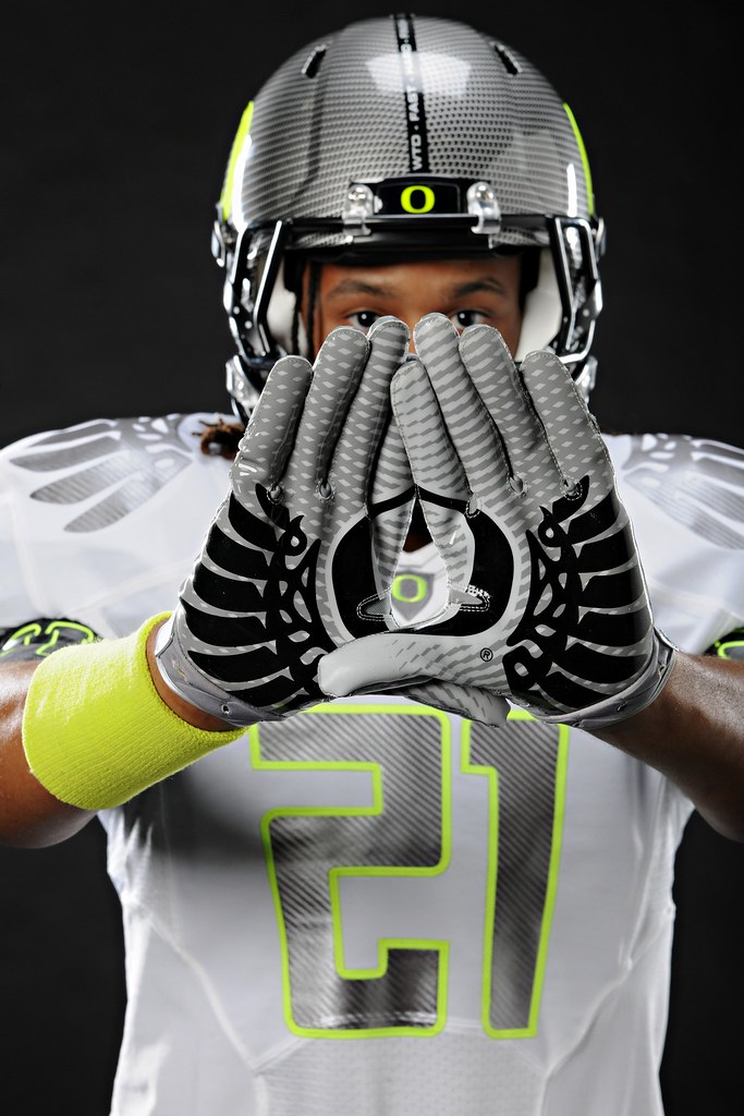
You know, I’d be fine with the new Nikegon design if they’d gone with a true yellow instead of the highlighter tone, which definitely ups the day-glo factor a few notches. My full take will be up on ESPN later today — link coming soon. is up now on ESPN.
Meanwhile, we have a lot of other business to attend to here on the site, so without further ado”¦
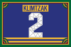
ITEM! Big membership news: A new batch of membership cards has been added to the design gallery (including Eric Klimtzak’s Sabres third jersey treatment, shown at right). The printed and laminated versions of those cards should mail out by the end of this week.
Meanwhile, we’re approaching a milestone: We are now very close — very close — to our 1000th member. I won’t say what our current count is, but let’s just say it could happen any moment now.
Scott and I have been discussing how to mark this momentous event. Should the 1000th enrollee get a gold watch? A singing telegram? A lap dance?
No, no, and no. But the 1000th member will get some special perks, including the following:
• A refund of his or her membership fee.
• A special design for the front of his or her membership card. Scott and I are still working on this, but here are some of the preliminary ideas we’ve been toying with. Still a work in progress, but I promise the final result will be special.
• A one-time resurrection of the old charter member T-shirt design, originally available as a sign-up premium and retired in 2008. The 1000th member will receive his or her preferred version of the shirt free of charge.
There may be other benefits as well. But first we have to get up to 1000. You can help us get there by signing up here.
12:44pm Update! Two new developments: First, we have our 1000th member. I’ll announce his name tomorrow. And second, several people are now reporting that they’re having trouble with my Amazon Payments account. I’ve contacted Amazon via e-mail and asked them what’s what. But the Amazon trouble clearly started after we had already hit the 1000-member mark, so it didn’t affect anyone’s chances on that.
I’ll update the Amazon situation as soon as I learn more. In the meantime, you can still sign up by sending me a check. Really sorry about the hassle. (And no, I can’t take PayPal, which is a long, extremely frustrating story.)
3:45pm Update! The Amazon problem may have been solved — or maybe not. Some people are getting their payments through, but others are not. Keep trying, keep letting me know if you get an error message, and I’ll keep updating things as I learn more.

Collector’s Corner, by Brinke Guthrie
Santa won’t be able to bring these items from the North Pole, so you’ll have to check eBay. Lotta stuff this week from the ’60s. Happy bidding!
• Have you ever seen this type of Baltimore Orioles bobble? [Wow, that’s a beauty. — PL]
• I like this art deco-y Cubs program from 1965.
• Great Buffalo Bills helmet bank from the ’60s.
• Never seen Coca-Cola NHL bottle caps before.
• Here’s a great Eagles program from ’61.
• 1960s Mets items, just for Paul: a Mr. Met print, a green pennant, and a thermal cup.
• For you Bosox fans, how about a vinyl lunchbox?
• This is great: a set of a dozen NFL mini-helmet buggies from the ’70s.
• The great Curt Gowdy provides NFL memories on this mid-’70s seven-inch record.
• And here’s one from Paul: a Pirates World Series press pass.
Seen something on eBay that you think would make good Collector’s Corner fodder? Send your submissions here.

Pool reminder: Phil and reader Tod Hess have put together a college football bowl pool. If you’re interested in joining, you can register here. Our Group ID# is 6828 and the Password is bfbs (all lowercase). If you want a review of the bowls and teams playing, go here and here.
Show-and-tell reminder: Remember, I’ll be hosting Open Mic Show-and-Tell at the City Reliquary tomorrow evening. Bring an item to talk about for three minutes, or just be part of the audience. Doors at 7pm, showing/telling commences at 8pm. $5 suggested donation, plenty of beer on hand, best fried chicken in the city available next door at the Commodore. See you there.
Uni Watch News Ticker: Most likely nobody would want to wear this, but I love the logo on this 1930s wrestling singlet. ”¦ Very unusual chest insignia on this old baseball jersey. ”¦ Did LSU wear purple helmets in the 1968 Sugar Bowl? That would certainly be news, but Klaus Gebhard makes the case for it here. ”¦ Also from Klaus: Some extraordinary 1940 BYU photos, plus dynamite color shots from UNC, NC State (look at that ref’s jersey!), and Wisconsin. ”¦ The Nats are trying to get their curly W logo added to the DC transit system (with thanks to Alex Ozenberger). ”¦ New cycling kit for HTC. “And here’s HTC’s Matt Brammeier in his HTC/Irish National Road Champion’s kit,” adds Sean Clancy. “Nice and understated. Love the shamrocks, but white bibs should nearly always be avoided.” ”¦ Sad story out of Indianapolis, where an old Negro Leagues ballpark is now a Cash for Clunkers graveyard. ”¦ The Blue Jackets are already easing their new mascot out to pasture, plus they’ve gotten superstitious about their third jersey (with thanks to Ben Gorbaty). ”¦ Bowen Hobbs thinks the Winston-Salem Dash’s logo looks like a certain erectile organ, and it’s easy to see why. ”¦ Good article about Dan Ellis’s goalie masks (with thanks to Wayne Koehler).
Have you ever seen this type of Baltimore Orioles bobble? [Wow, that’s a beauty. — PL]
Of course I have! I have a few of those actually….back in the day they were always made with the bird instead of players.
I think my brother has that one. I’ll have to ask him about it.
Here’s one for the St. Louis Cardinals:
link
That Cards one looks nice. The head of the Orioles one, though… that’s potential nightmare fuel right there.
That time period also saw some link bobble heads made from the link mascots.
As to the Oriole one…depends on the angle, I guess.
link
This Flicker set includes a cowboy hat-wearing Houston Colts bobblehead.
I like the neon yellow. I’d rather see green instead of silver/steel/carbon/whatever they call it, and I don’t like the all-white aspect… but I like the yellow.
…and those poor poor stickers on the Bills helmet bank. It’s amazing how badly browned those things have become. If I was a Bills fan and wanted that, I think I’d end up scraping them off and making new ones.
The O in the gloves also looks like, er, genitalia. The other kind.
Heyoh!
Big mistake.
Bush Stadium was also the long-time home of the Indianapolis Indians minor league baseball team, and served as the stadiums in Eight Men Out. It’s been an auto graveyard for several months now. Too bad it can’t be restored in the way Rickwood Field has been.
Also the venue for baseball at the 1987 Pan-American Games.
Eight Men Out is my favorite baseball movie of all time. Good info.
I might be wrong on this but that field could be the place of Hank Aarons first professional baseball game. He was a member of the Indianapolis Clowns of the Negro League in 1952. What a shame!
I saw an Indians game at Bush Stadium one time, when I was 10 years old, when it was in its final season. I even had a “Final Season” t-shirt they were giving away at the game… I need to go see if I can find that thing in a box somewhere. In any case, it was a very cool stadium, and although the new Victory Field is far grander, its a shame Bush Stadium has been relegated to such a state.
Where did Oregon find those puke yellow/green adorned uniforms? In the UFL reject bin? Totally hideous.
Dude, don’t call it puke yellow. I mean, come on. It’s just yellow. So they’re the one team willing to use a real yellow instead of the darker “athletic gold” color, that doesn’t make it an abomination.
If you want to complain about the uniform, you’ve got plenty of other things to focus on. The lack of school colors, the number font, the lack of stripes, the weird textured pattern on the helmet, the words in the helmet stripe… there’s plenty of things to not like. Leave yellow alone!
Agreed. Have we confirmed the actual color of this? Is it regular yellow that was made to look more ‘neon’ with the lighting, or is it actually neon yellow? The wristband looks to be a little less ‘neon.’
I have not been able to confirm whether the yellow trim on the helmet and the uni numbers is different from the usual yellow trim, but there’s no question that it LOOKS more fluorescent in the photos we’ve seen so far. I double-checked with several Ducks fans (including our own Duck tracker, Michael Princip), just to make sure it wasn’t my imagination, and they all agreed that the new yellow has a higher day-glo factor.
Just the lighting? Maybe. But I doubt it.
Good bet it all matches the shoes and socks.
Pretty sure Nike’s a shoe manufacturer.
So when we ask the touchstone of this particular title game ensemble…
It’s the shoes.
—Ricko
welcome back, Ricko!!!
-Jet
I’m with The Jeff – it’s OK for brighter shades of colors to exist. I’m not sure why so many of my fellow White American dudes have such a hard time with bright colors. I wear these shoes to play tennis — link — and the old timers I’m on the court with freak out. It’s just the color orange, not a big deal. Even a dull Swiss guy wears them.
Also, there’s a big difference between using bold accent tones and bright primary colors. The Orlando Thunder (link) and Seattle Sounders (link) were/are awash in DayGlo colors – and it looks bad. Number outlining and socks, not so bad. Another good example is the Seattle Seahawks. Neon green as a subtle accent on the uniform – taken from the eye of the hawk – looks great in my opinion. Then they went and overdid it (link). It’s not the color’s fault, it’s the fault of the people using the color.
As a whole, I like what Nike does with Oregon. We need iconoclasts to give perspective on the notion of tradition. Oregon bends the idea of ‘school colors’ one week, then jumps back into primary green and yellow the next week. There’s enough room for Oregon’s wackiness and Penn State’s orthodoxy.
Fluorescent American dudes are just better I guess.
I agree. I think the subtle use of the (neon) yellow looks great. The Ducks are a college team and should be able to experiment with their jerseys. It would be different if it was, say Wisconsin or Alabama or a pro team like the Bears, but this is what the Ducks do, and in my opinion it’s one of the team’s best looks all year. I especially like the playful yellow shoe/sock combo to give the impression of duck feet. For a team called something as unaggressive as a DUCK I think the jerseys look pretty badass and I’m sure the players wearing them would agree.
Ultimately, this was just a stunt to boost jersey sales. Within an hour of the announcement, all of the sites selling Oregon BCS gear – including the University of Oregon Bookstore – had the ‘new’ jersey up and for sale.
you think?
Did LSU wear purple helmets in the 1968 Sugar Bowl?
LSU did not wear purple helmets in the 1968 Sugar Bowl…I was there.
Just look at the alleged LSU uniforms in the pics with the dark helmets…it doesn’t even look like the same team. Someone just mixed up the pictures.
I agree, the shoulder stripes do not match up. If you look at mmbolding’s site you can see photos of the game and all of the uniforms look the same.
And the author of the blog claims that some of the pictures with the dark helmets come from the LSU 1968 yearbook. I’m looking at scans of the yearbook pages and the pics he claims are in that book are nowhere to be found.
I think that the dark helmet pictures are all from Wyoming against another opponent.
No, all of those photos except for the actual photo of the yellow/gold LSU helmets (the very first pic in the blog) are from this site and the 1968 LSU Gumbo yeabook:
link
You can view the yearbooks after you cough up $30
You can find pics of yellow/gold helmets on pages 192, 200-205
Then, on pages 206-207, their is the Sugar Bowl pics, IN THE 1968 GUMBO YEAROOK.
Also, on page 28 is a pic of the “dark helmets”. I just put this photo on the blog if you want to check it out.
To cross reference, the Wyoming 1968 yearbook Sugar Bowl pics are on pages 283-285 of the 1968 Wyoming yearbook.
But, if one post says he was at the game and another post on the actual IH blog says he has the game on VHS, then I am not crazy after all. Just trying to get some confirmation to make sure I wasn’t seeing things! Thanks for replying!
Those are vidcaps, not photos. Good bet from a b&w print made from a original color film negative.
Can’t begin to explain the technological quirk of it (filter used to shoot original film?), but the Athletic Gold goes dark. The 1960 NFL Title Game Highlight Film (the first shot in color, I believe) does the same thing. There are some b&w prints I’ve seen where, judging by how it looks as you watch the film, you’d think the Eagles were playing a team wearing red helmets and pants, or something. Just doesn’t look like the Packers (in b&w) at all.
Some the early 60’s Fleer football cards had the same problem when color negatives used for b&w reproduction. Long time ago, I posted a bunch of samples here at UW.
—Ricko
Thanks. Great info! I just report what I see. I don’t know the technical aspect of it. Obviously! Just wanted to make sure I wasn’t loco.
I was actually doing research for BYU when I first came across the photos in the Wyoming yearbook. I just now noticed that the dark colored helmet photos were shot by a Bill Kuntzman (wow, what a name) and that the 1 photo that actually looks like LSU was shot by a Willis Wood.
Their are no photo credits in the LSU yearbook.
Could this definitely be a reason as to why this made me exclaim “WTF?”
This is why I presented this to UniWatch so I could let the experts explain it.
Actually it appears some Tigers wore purple helmets and some yellow
Here are 4 pics with captions that have some purple and some yellow. All in b&w though
link
link
link
link
Sure would be great to see a color picture of the purple helmets
Some Klaus used but they do say LSU Wyoming Sugar Bowl.
I know the Washington Huskies had some players with purple and some with gold helmets in the early 1960’s
I just read more of the comments from Klaus site and here. So could it really have been the lighting that made yellow look dark?
Just read all of Rickos too. Anyhow very strange mystery or maybe not a mystery
No one’s noticed that Wyoming’s pants and numbers, which also were Athletic Gold, look far, far darker than in a normal b&w white photo, too? Virtually the same color value as LSU’s, in fact.
Plus, they still all look like vidcaps, not b&w stills. Just aren’t sharp enough to be stills. Have the telltale video softness.
And we know helmets were almost always a shade darker than the matching pants or jerseys, even with Athletic Gold.
There were no purple helmets, guys. Almost certain that that was one of the games I watched that year (because I watched pretty much everything), and I’m kinda sure I’d have noticed something as unusual as purple helmets on LSU.
—Ricko
Yes before I saw your post I was looking at Wyomings numbers and stripes and they do see darker.
Did you notice the “W” on the socks of the vintage Wisconsin photo? They’re not fully visible, but the top of the letter is poking out above the player’s shoe.
Best part of the uniform.
Would love to see them make a comeback. If, of course, college players ever wore socks.
2 phallic references in one ticker. Is this a record, or a marketing ploy to increase membership?
1. Phallic reference #3…Oregon basketball shorts when scrunched up…help me out Phil
2. Unimpressed by the Oregon uniform. I love their innovation, for the sake of evolving, but I must admit that the 90’s throwbacks that they used for Cal ’09 have been my favorites in a while mainly because they were an old style but in updated material and fit:
link
A mind in the gutter is worse than cluttered.
I. Love. It.
I bet I could be member #1,000, if I could ever decide on my card design. I keep flip-flopping between an old Bruins sweater and Manchester United circa the ’99 Champions League final.
Sign up twice and do both!
Would that be repent for buying Mexico’s BFBS away shirt earlier today?
I’m in the same boat. I just haven’t found anything unique enough that fits my fancy.
THE Jeff said:
Terry Proctor said:
hey…it could have been worse…
or
better…
depending on your perspective
Now, see, link would look like a blur on the field.
not “a blur” scotty…just “blur”
Wow, I hadn’t noticed the full depth of corporatespeak from yesterday’s headline. Like the Kevin Costner movie, my brain just adds the article in when linguistic douchebaggery has left it out. And strictly speaking, nothing about the new Nikegon uni will look like a Damon Albarn project. Or will it? On second thought, I could almost see textured gray tones with random neon accents being the kind of thing Blur would have done, so maybe the Nike rep is on to something after all. I mean, the band that would make link video could totally have made those Ducks unis, I guess. Or is that more of a Gorillaz thing?
And just raising the question is giving me newfound respect for the Nikegon uni. Damn you, Nike corporate hack! It’s like you’re swoosh-colonizing my brain!
Human tennis balls.
Me and The Vilk are probably the only people on here who’d call the all yellow version “better” – but in any case it’d be far more appropriate for the team than the carbon & white is.
Count me in…
The all-yellow would be better had the ducks worn the mallard green helmets. Phil whipped up that picture last night after I said I’d rather see the ’02 unis.
link
How about this idea. Oregon wears the all day-glow yellow uniforms, Auburn wears a set of day-glow orange duds and they play the game in a dark stadium. Think of all the energy that could be saved!
Sweet…. you’d the white paint on the field to glow too… but otherwise… yeah. I could go for that.
I’d be perfectly happy with it just being a regular yellow vs blue game… but, glowing yellow vs glowing orange would be cool too. ^_^
Unfortunately, there wouldn’t be enough contrast, or I’d say sure.
Actually, I like the new versus classic matchup. At least Oregon’s in white, so there will be no teletubbie sweatbox problems. That leaves just one little thing wrong with this matchup…
“That leaves just one little thing wrong with this matchup…”
________________________________
It should be TCU instead of Auburn?
/mostly kidding, mostly
OK, two things…
Didn’t want to beat a dead horse about the other thing.
Speaking of the Frogs, why wear black when their web site is asking fans to “purple out” for the Rose Bowl?
link
While I generally like Nike’s Pro Combat alternates, TCU wearing them in their biggest game in 75 years is a shame. Even the purple jersey pro combats (like 2010 Fiesta) would be more appropriate. This is the Rose Bowl, even Oregon goes with a more traditional look!
I liked the purple Toy Combat unis, too. And I know it’s heresy to say so on this site, but their normal purple helmet is sublime.
I really wanted to see them wear this:
link
I could even live with the black trim if they lost the little “TCU” on the butt.
hey mothermaacobowlvilker!!!!
i found a toy costume (no, i didn’t make this one) that even you wouldn’t wear
Reminds me of my old Simms two-tones.
Hmmm…
At least it’s not tie dye.
I’m thinking w/ that second highlighter uniform they could turn off half of the stadium light banks. Maybe that’s Oregon’s way to go green!
Re UW membership #1000, or M1K as the new B1G conference would say it, a certain organization that I’m a member of sets aside big-number memberships like #75,000 or #90,000 and auctions them to raise money for charitable projects. Usually people with lower but uneven numbers bid on the lots-o-zeroes numbers. Whether for charity or just to support UW and have access to the basket of special swag that comes with it, I’d recommend a similar approach for UW’s #1,000 card.
[Opens wallet] Hey, how come there’s no membership # on my UW card? The other membership card in my wallet has my number right there on the front, #73,828. Where’s my UW number at? Though I suppose this means that I can tell anyone who asks that the big “24” on the back is my membership number …
And of the two front-of-card designs, definitely the gold. Much better contrast with the text. Would probably look just fine with the normal UW card-edge colors, too.
I’d be more impressed with the Nats curly-W-on-Metro-signs thing if they’d get around to making a Virginia license plate with a big ol’ curly W on it.
Not surprised that the Jackets didn’t consider the reactions of people over the age of 8 to Boomer. As for their thirds, I hope they do get retired. “Old-looking for old-looking’s sake” just doesn’t work. Especially with an Atari 2600 number font that makes Bellotti Bold look almost classy by comparison.
If they want to try again to incorporate the cannon into a new design, fine, but there should be heavy emphasis on “New” here. “Old” certainly hasn’t worked.
I’m not much of an NHL follower, and I confess to knowing next to nothing about the Jackets’ 3rd jersey. But my curiosity was piqued by you saying “old-looking for old-looking’s sake”. It brings up a question, actually… how many “newer” franchises out there (and depending on the sport, the mileage of the word newer might vary) have done throwback/alternates/whatever that emphasized an “old” look? Or, more specifically to what I’m thinking, are there any teams that have designed a jersey that was their take on what a uniform for that team might have looked like in a different era?
I’m not sure this idea has been tapped by any of the major sports franchises actually, but I could especially see a minor league team doing something similar. Maybe it’s crazy, but I think it could inspire some interesting designs.
I’m sure there are others, but the Minnesota Wild have a 3rd jersey that looks like what you’re talking about.
link
Very nice, I would totally wear that jersey. And with the cursive script, I would say it fits what I am thinking.
The difference between the Wild and other teams that are wearing what’s officially called “vintage white” is that Minnesota’s “wheat” color has always been part of their color scheme. While I’d like to see some white trim on that, I don’t mind it as-is because it fits with the team’s established visual identity.
The Chicago Blackhawks’ third also gets a pass from me, since the sweater being emulated was actually tan back in the mid-30s, and it’s not a case of fake discoloration.
It’s a beauty – the only thing I DON’T like about it is that the script is on a green “plate” rather than individually stitched directly to the jersey. The plate doesn’t exactly match the jersey color/fabric (at least in the angle of the pic). Or at the very least, minimize the green background plate so it just becomes an unobtrusive outline around the white script…
-Jet
I don’t mind traditional design elements, to be sure – the Nashville Predators third is a positive example IMO (although it adds a unique element with its checkered stripe pattern), and I like it better than their regular jerseys. But the biggest part of “old-looking for old-looking’s sake” for me is summed up in two words: “vintage white”. Just because actual wool sweaters from the 1930s have discolored over time doesn’t mean a brand new jersey made with 21st century technology should be deliberately discolored. Unfortunately, that’s what’s happened with the Blue Jackets, the Rangers, and the Sabres with their thirds, and the Penguins with their 2011 Winter Classic jerseys.
There are other issues with the Jackets’ design – that it is visually similar to the Florida Panthers’ third, which itself comes off as a variation of the Penguins’ third, and that they traded red for a lighter shade of blue just as the Panthers did. (The Pens’ third is, at least, a re-creation of their 1968-72 design, while the Panthers and Jackets have no such prior design history.)
I will say the Rangers’ thirds may be growing on me, considering that the “vintage white” is fairly minimalized by the larger red stripes and the red numbers. The Sabres’ thirds also mitigate this a bit as the “vintage white” seems to work a little better alongside athletic gold (yellow), although the yellow “felt” nameplate comes off as a bit too much (especially since they’re using the font from the Buffaslug jerseys on the nameplate!). The Pens’ WC jersey, though, just does not look right at all, and most Pens fans I know would’ve preferred to see the classic gold-sleeved black jersey (specifically the 1988-92 version).
Which brings us back to Columbus. They stated that they wanted a more “traditional” design when they revealed their third, but they really overthought the process. It doesn’t help that Roger Edwards (in association with Reebok) has been selling anachronistic faux-wool sweaters that also use “vintage white” in the last couple of years – seeing as how they only wore CCM 6100 Ultrafil jerseys in that design, a discolored “wool” 1990-96 Winnipeg Jets sweater is a straight-up Jersey Foul. So, the extensive use of “vintage white”, the lack of a primary team color, the unoriginality of the design, and the inexplicable number font (again, I compare it to Atari 2600 graphics) make for a look that, for me, is all-around unappealing. I much prefer the Jackets’ regular uniforms, and even their original look (complete with nearly Oregon-like fluorescent yellow-green in the logo) is superior, simply because of its uniqueness.
Okay, I think I’ve just exceeded my rant allotment for today.
Even though the recent rash of “old for olds sake” (OFOS) jerseys are similar-looking (Paul posted a link to another site that shows them all on one page), I STILL would rather have OFOS than the current horror shows displayed by some teams the past few years, i.e. Washington, Atlanta, Buffalo, Colorado, ad infinitum…
-Jet
Yes, the Edge unis have made a mess of things. Thankfully, a number of teams were able to make the Edge cut work with their classic designs, I think that has helped contribute to the “traditional” design aspect of OFOS. Which isn’t a bad thing in and of itself, if it’s done well.
Those seams arcing all over on the new uniforms lead to question after question.
1. If we need that many seams, why can we seam in a full UCLA strip?
2. Added thread and overlap at that many seams have to cancel out much of the lightness factor of the jersey making players more superfast.
3. On the jersey of the Oregon player at the top of the post, couldn’t they have positioned the backwards 5 so that a seam wouldn’t run through the bottom of it?
4. It looks like different material in different areas of the jersey. What makes you need special belly material different from side panel material?
On #4, different materials in different areas probably has to do with different sweat control needs and wear patterns in different areas. I’m sure someone smarter than I am can give a better and more accurate accounting.
My thought on the UCLA stripe thing: if numbers can cross seams like 21’s jersey up top, I don’t see a reason stripes can’t. Don’t even need to have them be their own pannel.
Now, granted it’s been a long time since I played any youth football, but those don’t look like seams to me. They look like hand-holds. As in, “Hey, look, if I grab hold right here, this sucker is never getting loose of me.” Your normal football jersey has maybe four really good grabbing-spots where the seam helps you get a handful and hold on. This thing has dozens. And sure, it’s tighter, but the fabric is also stretchier, so I’d wager that if you can get your fingers to the seams, it’s noticeably easier to grab hold than an older, looser four-panel jersey.
Then again, overly aggressive defense was the only thing I was ever good at in any sport, so maybe I’m not looking at this from a properly sporting perspective.
Added thread and overlap at that many seams have to cancel out much of the lightness factor of the jersey making players more superfast.
Those seams might not be fastened together with thread. IIRC, they are using some sort of heat-sealing process.
NO, there’s thread. Look at the hi-res Pro Combat images from the unveilings. Regular old seams, and tons of them. And to RS’s point, this is what the adidas TechFit jersey is trying to combat. The body of the jersey has zero seams. The only seams are the ones running along the soulders
From the pictures in this article, the seams look to be sewn.
Most of the details sound like marketing gimmicks – especially the retractable cleats.
link
Yeah, maybe it is…perhaps regular stitching is used to make it tear-resistant.
What the hell would be the point of retractable cleats? I’m sure the players want that… the cleats retract… get stuck (due to mud or a few of those rubber pellets under field turf, mechanical failure, whatever), and then the player slips and blows out a knee. Yeah, that’s a brilliant idea.
The likelihood of blowing out a knee actually increases with the amount of traction provided by the surface and the cleat. The more traction between the cleat and the surface, the more pressure it puts on your joints.
I really like this….
link
…Where or what is Inland?
Could refer to this:
link
The seller is based in Ohio and the uniform was manufactured in Dayton, so this could have been company team uniform for the Inland Container Corp., which has a plant in Middletown, Ohio.
A container company! That makes it even more spectacular (if, in fact, that is its provenance).
Thanks to Klaus for linking the 1940 BYU unis pic – IIRC I mentioned them in a comment to the 1960s USU @ BYU pic. Still would like to see those in color.
Someone please correct me if I’m wrong, but isn’t Duke the opponent in the NC State photo?
Yes, that is definitely Duke.
It would be nice if that BYU uni shows up in the the new South Park musical.
I think Nike should deck out Oregon and Auburn entirely in florescent colors, and play the game under black lights. Make it a true spectacle.
I would like to think if Walt was still alive, he would have revoked the use of Donald Duck just because of those uniforms.
Isn’t it a bit odd/sad that the “R” for registered trademark is on the left hand palm of the glove for the Oregon pic above? Especially since the logo is only made when putting the gloves together?
I hadn’t noticed the circle-R symbol on the palm — good catch.
Typical douchebaggery, natch…
Could this be a necessary evil though? How many times do we see logo rip offs from high schools and other colleges? And there’s always the problem of jersey fakes.
Not exactly taking a side, just kind of playing devils advocate.
Bigger problem is probably the idea that these schools are becoming less about the institution and more about their marketability as a product. The circle -R is less about protecting an identity and more about protecting dollars from going into another persons pocket
No, the Blue Jacket can’t mothball those 3rd jerseys I was counting on those wins when they play the Red Wings
Yeah, they were scheduled to wear them against the Wings on 1/14 and 3/17. Ah, well. I’m sure the Wings will find ways to get those wins anyhow.
“After the play, unsportsmanlike conduct, Number 21, Offense. Penalty will be enforced on the insuing kickoff”
Good point. If only OSU gets flagged for that, that’s not quite fair.
The gloves are my least favorite thing about the whole Toy Combat line. How long before certain NFL players start coming out with similar gloves?
The phrase “Toy Combat” has put the G.I. Joe theme song in my head.
It’s also resulted in me constructing this phrase:
“The Nike G.I. Joe Toy Combat line by Hasbro!”
Knowing is half the battle.
Life isn’t fair.
Or on the try, thus placing the ball on the 18 and not the 3.
If they are kicking, it would then become a 35 yard extra point try.
The offended team has the option to carry over to the kickoff.
A brand-new uniform was worn for the first time in the NBA and it doesn’t even get a mention here. The Magic wore their black jerseys.
This is disapointing. I know the interest here is more old shit with stripes, Oregon and 1950’s jackets, but I figured it would at least get a mention as it is “news”.
link
It is possible that he didn’t know. A lot of the content here is typically user submitted, and the NBA doesn’t really seem to make a big deal out of the 3rd jerseys as much as the other major sports. Plus, the Magic have a lot of history wearing black – someone who doesn’t watch the NBA very often could easily not realize that it was a new uniform.
/or, like when the Arizona Cardinals wore black, Paul just didn’t care… whichever.
In fact, I did not know. Will mention it tomorrow.
That looks pretty good. Wouldn’t call it a BFBS since they used to wear something similar. That picture brought back memories of my Scott Skiles trading card.
Thanks for sharing, Rob.
pretty much every team has a *new* uni this year with the new material causing changes, although some are more full scale makeovers than changes
yes, the magic have 3 new unis this year…
and yes, Paul covered it in his NBA preview
so, the first wearing of a jersey that is essentially a throwback isn’t really that big a deal
did you submit the mention to paul yesterday? perhaps he was busy and didn’t get back until late and didn’t have time to cull the wire for every possible fucking NBA game
relax…if he didn’t put in the ticker, it’s not because he’s snubbing the nba, there is usually a reason
I wouldn’t say it’s “essentially” a throwback. It is black, does say “Orlando” and does have pinstripes…that being said, there are blue side panels, a newer logo than the old jerseys, no stars on the shorts, curved pinstripes, newer typeface for “Orlando”, etc.
When it was released (which also didn’t get a mention here because “it has floated around the internet for a few months”), it was said that they would be worn for the first time on 12/14.
I am simply stating my opinion that I expected to see a mention of it and that it is disapointing to me that I did not. I understand that I can chose to read the blog or not but I can leave my opinion in the comments…even if you don’t agree with it.
Did you submit it to Paul for the ticker or not? If not, stop bitching. He’s not omniscient.
If so…
Stop bitching and just re-read what Phil wrote.
Phil’s response did seem rather harsh to me. As Paul stated, he simply forgot that the Magic were breaking those jerseys out. Rob called attention to the oversight in the comments, Paul will correct it tomorrow. Why all the venom?
The Magic just look right in black.
I have no idea whether that venom remark was directed at me, Phil, Rob, none of the above or all of the above, but I see nothing resembling venom in this thread.
Phil’s response was harsh? Maybe borderline harshness… maybe. But Rob’s comment was clearly a dig at Paul. “…I know the interest here is more old shit with stripes, Oregon and 1950′s jackets…”
The Orlando Magic wearing their alternate uniforms is hardly a “stop the presses” moment.
And it sure sounds to me like Rob didn’t even bother to send Paul a heads-up so I really don’t understand why he’s so disappointed.
sorry…i just got a bit upset at the implication that paul somehow either deliberately missed or didn’t care about the magic’s black jersey
if you didn’t notice the ticker was small today…that usually means paul didn’t get to the items until late or early this morning — i know when i’ve done the weekdays, the ticker is a HUGE pain in the ass — sometimes taking upwards of three hours
we’re lucky he provides one every day … if he misses an item or two, it should be pointed out, yes, but to take the tone that “the interest here is more old shit with stripes, Oregon and 1950′s jackets” and paul left out this item on purpose just really rubbed me the wrong way
i didn’t start the snarkiness…but you’re right, i shouldn’t have continued it
If anything, Phil’s response was way more restrained than what I was hoping for.
The venom comment was supposed to cut both ways. I probably should’ve made that more clear. The dig at the stripes and Oregon uniforms was uncalled for, I do think Phil’s response was harsh. So, my bad on that. I was trying to call attention to all parties, but I see where that wasn’t exactly clear.
also, if you notice the timestamps (another reason i hate this new comment format)…i made my comment long before paul said he forgot…
so i wasn’t piling on…i was defending paul in absentia
had he replied to the original snarky comment, i wouldn’t have said “boo”
“Phil’s response did seem rather harsh to me.”
Probably because the NBA reminds him of this:
link
;)
Yeah, this new comment format isn’t my favorite, either.
I guess the “old shit with stripes…” comment was out of the way. Sorry.
“The Magic wore their black jerseys.”
Looks like they also wore black shorts.
Sort of news I guess– That being said, I like the look… was a Magic/Shaq fan a while back and I just picture them as black primary uni, blue alternate
BTW…my halloween costume last year was a foreshadowing of next year’s Oregon unis:
link
And the highlighter colorway isn’t a NEW thing from Nike:
link
Appropriate photo for today:
link
Mine was a foreshadowing of Brett Michael’s heart surgey.
Those old UNC uniforms
link
remind me of the old Global moving trucks.
link
I remember they used to be a big sponsor of one of the network game shows in the 70s.
And those jersey numbers are awfully small, eh?
Nah. Tarheels just had some HUGE players back then, that’s all.
Brobdingnavian, to be sure.
(for those who don’t get it, check Jack Black’s latest film)
—Ricko
Oooo, I HATE when I misspell “Brobdingnagian”.
“Brobdingnavian”
Big freakin’ bird?
Also known as the MegaBudgie.
Don’t know if this has been mentioned yet but just read this:
link
Please someone tell me this is not true… the logo, the name… please no
I’d almost be willing to be actual money that this is a wildcat effort to either win protection for unlicensed merchandise art or to establish a squatter’s claim on a portion of the IP portfolio the renamed Nets would want. Either way, it looks rackety to me, and has none of the characteristics one would expect to see in even a preliminary legitimate filing.
hmmm…. *think to himself: time to trademark the name “New York Hammer & Sickles”*
I think they should bring back
“Brooklyn Bushwicks”.
And I have to explain why that’s REALLY appropriate for today’s NBA players, then you don’t know who Eva Longoria and Tony Parker are.
—Ricko
haha, i actually kinda like it, even if all I can think about is Bushwick Bill
Or the Bushwick Bills.
Like the writer of that article says, there’s really no good reason for the team to change the “Nets” identity. They were the New York Nets before, they could be the New York Nets again.
What do basketball fans in the NYC area think about this potential name change? Would they rather see “Nets” retained?
Im from Jersey so I’m obviously upset about the move in the first place… A couple of friends in Brooklyn like the idea but were turned off by the whole bushwick thing being that its only one neighborhood in brooklyn
The biggest complaint was the cheesy logo…
Oregon’s New Collar : Win The Day
link
What The Duck?
Overall, the whole Oregon this is fun.
The shitty part is that teams like Minnesota (ugly freakin’ white helmets for no reason) go directly to archtype “monkey see, monkey do”.
It isn’t that Oregon should stop.
It’s that other teams shouldn’t start (TOSU Pro Combats for one).
—Ricko
thank you — i know you haven’t been reading all the time, but that’s what i (and others) have been saying for a while — it’s cool, and fun and unique (in a completely non-traditional way) to do what oregon has been doing
everyone else is just ruining it, for them and for the ducks
Perfect, though blatantly sexist, analogy….
Best-looking waitress at your favorite bar shows up to work on Halloween dressed as Wonder Woman, and she looks fanTAStic.
Fat girl at the end of the bar watches everyone’s reaction and says, “That’s it, I’m gettin’ me a Wonder Woman costume.”
Wrong.
Wrong wrong wrong wrong wrong wrong wrong wrong wrong wrong wrong wrong wrong wrong wrong wrong wrong wrong…
—Ricko
If it wasn’t practically ingrained in human nature to imitate or copycat, then I’d agree. But they had to know other teams would follow when they started this.
Think you had a few too many wrongs there, Ricko.
link
Understand the point about Oregon being the first team to roll out wild alternate uniforms, but that’s only because of the Nike presence. If Nike was located North Carolina, we’d be talking about the Tar Heels wild uniforms right now. The attention and buzz surrounding these uniforms hasn’t even come close to the on field performance of the Ducks. Oregon is unique in being the only program where most people think uniforms, first, and that’s not exactly ideal. The national title game versus Auburn is only the second BCS game since 2002 for this program. In total, Boise State has a more impressive football tradition than Oregon.
These crazy uniforms provide plenty of discussion fodder, but at the end of the day, they’re just like junk food. Tasty, but not nutritious. It’s inevitable that other programs will now experiment. I can understand Oregon fans feeling conflicted, but for the rest of us, so what? Let’s bring on those other concepts and designs.
I stared at that monogram for hours and couldn’t figure it out. Anyone else not see WTD immediately. I thought it might be a U and an O separated by some sort of ‘thing.’
Paul, that Inland baseball uni on Ebay also comes with some nice looking stirrups
-Jet
Funny that you should have the mention of the Winston Salem Dash logo looking phallic because right above that link you had the one about the Blue Jackets “jinxed” third jersey and in that article they also show the Jacket’s “cannon” mascot, who will soon be retired because people are saying he also looks phallic!!
-Jet
Today’s ESPN column is up:
link
Please don’t take this as griping or whining or anything, but I do have a question regarding Member #1000.
Why do they get something special as opposed to the first 999 members who voluntarily signed up with little to no incentive other than “membership”? I’m not trying to be difficult, but it seems the first 999 members deserve something as well if #1000 gets something cool. Without them, #1000 wouldn’t exist. Can the card simply exist with a small logo or insignia (a stirrup on a border, for example) with the number “1000” on it rather than making it significantly different from the first 999 members.
It’s just a thought, and I’m open to vicious responses on this (because they’ll probably come), but I think keeping things mostly uniform on membership cards for a site obsessed with uniformity is elementary. Thoughts?
yeah
quitcher bitchin’ & whinin ;)
Well said, sir. LOL
Why does the 1,000th Customer at The Yarn Barn get three free reindeer sweater patterns and the Collector’s Edition “Sound of Music” dvd?
Marketing. ;)
—Ricko
Marketing is one thing, but the membership program is growing with little to no marketing as it is since we’re now approaching 1000 members.
The Yarn Barn also gives that stuff away as encouragement to shop there since you’re becoming a member there. Membership to UW is awesome except that it’s just a status symbol. Membership gets me no discounts or additional stuff except knowing that I’m a member.
Again, I’m not against Paul raising money for the site, but should #1000 be different than the rest of us simply because he/she is #1000?
You don’t think that the feeling of smug superiority over non-members like me is a benefit?
paul — can you just make teebz a special gold card so he’ll be happy?
No, The Jeff. If I want to feel smug superiority, I’d refer to you as “Jeff”. ;o)
I don’t want a gold card, Phil! I lik being part of the UW membership team with my standard, regular card!
gotcha
you just don’t want someone else to have it
I think what I’m saying is that before, when there were different levels of membership one could buy into, there was value in having different designs for the cards. You could instantly see why Person A had a different card than Person B if you knew how to read the cards.
But now the cards don’t even get members those “three free entries” into contests and raffles. Essentially, they are a card with an emotional and personal attachment to this site through the design chosen for the back of this card.
Membership is great. I love this community, and I really like the dialogues that go on in here for the most part. But being a member gets me no more benefits than someone like The Jeff who is an admitted non-member.
Therefore, why is #1000 more special than me who is card-carrying member #128 (that’s a randomly-chosen number, btw)?
i say we get THE jeff the 1,000th gold card
Make sure the back of the uniform is a white Cleveland Browns uniform too. The Jeff loves him some white uniforms. ;o)
Back of the card*
Sonuva… I’m laughing, and the people around me at work are like “how is that funny”.
Amateurs.
You’re a funny guy Teebz.
Ironically enough, I think I’d probably use the silver numbered white Raiders throwback. I’d rather see them in silver jerseys obviously… but in card format that would just look like a baseball gray uniform, and I can’t have that.
Take a step back, Teebz, and rethink what I might have been saying. lol
—Ricko
Teebz, Phil and Ricko in the same dialogue!
Talk about traditions!
you get a nod and a wink
-Jet
We’ve always put a special “seal” on the 100-multiple cards (the 300th member, the 400th member, etc.), and nobody seemed to mind. This time we wanted to do something extra-special.
Stores and restaurants sometimes make a fuss about their millionth customer. Is that wrong? If so, then OK, we’re wrong too.
You say, “it seems the first 999 members deserve something as well if #1000 gets something cool.” The other 999 members (including you, Teebz) already have something cool: a custom-designed membership card. But #1000 gets something EXTRA-cool. If that bothers anyone, I’m sorry.
We’ll call it a moot point then!
I wasn’t aware that this numbering system happened, Paul, so I apologize if this has ruffled any feathers. Consider your explanation accepted completely by me!
Good luck to those of you who are vying for #1000!
We’ve always put a special “seal” on the 100-multiple cards (the 300th member, the 400th member, etc.), and nobody seemed to mind.
No one seemed to mind? I think that’s because no one seemed to know. The whole point of the doomsday machine is lost if you keep it a secret! Now I’m completely offended that I missed having a special 200th member seal by 16 measly people! Or, alternately, absolutely steamed that I was 84 people too early for the 300th members seal!
Well, not really, but you know. I still say you could raise some serious dough – literally ones, possibly even tens, of dollars – by auctioning off the rights to the 1000 card. I’d totally bid.
I mentioned the 100-multiple cards several times over the years. Maybe not *every* time…. And the point of the little seal we used for those cards was never to publicize or market anything; the point was to give a little extra something to someone because we thought it was fun. There doesn’t always have to be an ulterior motive, you know.
As for the 1000th member, we already hit that mark today. But hey, there’s always 2000…
funny? funny how?
The logo on that San Francisco Olympic Club Wrestling singlet reminds me of this: link
link
Looks more like the Buffaslug than the Bills logo
Speaking of the Buffaslug, I don’t ever remember hearing about this link
I remember that floating around when the Bills made the switch to their current mess of a uniform. I always thought it was just another fan concept, because there were quite a few of those at the time too. Silver helmets… white helmets… a swoosh-less buffalo… all sorts of stuff.
Looks more like the Buffaslug than the Bills logo
It’s the traditional Standing Buffalo — it would seem the decal’s adhesive has discolored with age, taking on a nasty yellowish color, and turning the decal into a blob of yecch.
“Membership to UW is awesome except that it’s just a status symbol.”
(puzzled look).
Why is that puzzling? I love my card, and I carry it in my wallet with me where ever I go.
But I can’t get a discount on items or collect air travel points with it. ;o)
Y’know?
“Sign said you got to have a membership card to get inside. UNNH!”
I tried to flash mine @ the VIP area in the TAO nightclub in Vegas. I didn’t get in.
Well, yeah, I guess.
It has proven to be quite the chick magnet.
(Phil has a Grumpy’s tale of such a thing, I think)
i always looked at membership as my one time pbs pledge fee. i read every day, i have a place to rant, and i enjoy the hell out uw even when i get frustrated with people. it’s my sports page, my only source for sports info, okay 95% of my sports info. why would i not become an “official” member? in my horchata, anybody who is a active participant here should be a member. and yes, i think there is some pride in having my card in my wallet next to my cook county hospital card too. maybe if i get caught inbetwixt another drive by, and don’t get as lucky, the officer who looks into my untimely may look at my wallet, see i am a uw’er, and avenge my death because he too hates BFBS. i’m just saying’.
as for the 1,000 celebration, i see teebz point, but come on kid, it’s all in fun. besides, membership does have it’s perks at some “restaurants”. i wouldn’t say i did things because of membership, but the revolution for sure has done some favours for uw regulars. i never ask to see the card so to speak, but i will look up the membership sometimes when someone has a crazy request, and i have for sure done things not in my best interest to help uw’ers out on the revolutionary front. and bobbles still get discounted for members. so no, there isn’t really a frequent flyer mileage, or anything, but all of us here, and that goes for the people we like, and those we may not, are all still of the same uw family, and i personally take pride in that by carrying the card.
I agree, Comrade, but all I was saying is that there seems to be a large penalty for being #999. LOL
However, Paul’s explanation above cleared that up as I was not aware there were designations for the other X00 members.
All is good. My world is bright and sunny. I was just asking for an explanation/clarification. :o)
that wasn’t just pointed at you my canadian comrade. well it sort of was, but not in a mean spirited way, you know my heart pity-paters for ya. besides there was stuff in there not great teebowski centric.
haven’t sen your name around these parts for a while until recently, where have you been hiding?
Between my previous employer proving that internet censorship is best for employee morale and my search for a new employer who has far more lenient approaches towards Nazi-ism and far superior employee morale outlooks, I am happy to say that I am returning to normal UW practices.
…and the birds sang out, and the angels danced in golden robes, as the crowd roared in ecstasy…hazzah! hazzah! big teebowski!!! hazzah!
“all I was saying is that there seems to be a large penalty for being #999.”
I believe there was a parable that dealt with this…
I don’t see any penalty here. The standard agreement is, pay the membership fee, receive a cool card which you helped design, be the conversation starter at countless social gatherings, etc. Done deal. Now, if Paul decides to be a little more generous with a selected member, does that negate your previous deal? Nope. You’re still in elite company, and should go about the rest of your day with a smile.
Hence my “however” below that, MotherVilker. ;o)
Yes you did. Can’t even blame the new comment format for glossing over that…
Let’s just say I was agreeing with your summary. Yeah, that’s it!
Anyway, glad to have you back on a regular basis.
Firstly, the whole Nike new uni unveiling was a bit anti climatic as Nike seemed to have only tweaked the Combat unis previously worn.
I agree the neon yellow is not needed nor does it match anything in Oregons school colors. (At least the last time Oregon wore the Carbon/grey/white unis they had mallard green trim on the numbers and I believe the O on the helmet was green too.)
I couldn’t tell if the new Boise blue jersey had the horse head on the sleeves like their grey one did but to me the solid blue looks only slightly better than their regular crappy blues. I do like the one sided decal treatment on the helmet.
I actually like the Florida uni with the traditional striping on the jersey and pants. Also, they added striping to the Combat helmet, which supposedly has a gator print which I still have not seen any proof of.
Finally, I like the TCU black jersey with the grey, frog skin pants. Anything is better than the crappy looking purple jerseys, Combat issue or regular, that they normally wear. BTW, I don’t hate all things purple. In fact, I like the purple socks with the white, purple and red cleats. I even don’t mind the red wristbands that bring out the red on the helmet and cleats.
this might be the best look at the TCU uniform so far
looks like the numbers have lizard skin patterns too
whoops…here’s an even better shot…definitely has horny toad skin and lookie…there’s some purple armpits
Will they be driving the HornedFrogMmobile, or will they leave it in the HornedFrogCave?
—Ricko
Ah so TCU does have a speck of purple on those.
Re: TCU – I’ll say it – I LOVE the TCU combat/warrior/$ grab unis!!!!! Maybe the only school who’s “alt unis” from Nike are an improvement, and they red trim and froggy pattern are bad-arse IMHO. Thanks, I feel better
The biggest problem with TCU’s uniforms is the fact that the school colors are purple & white. Ignore that, and the lizard skin is freakin awesome for a team called the Horned Frogs. It’s like the Bengals tiger stripes taken to the next level, while still being subtle enough that people watching on crappy little non-HD screens just see it as gray.
my crappy 9″ non-hd screen still sees the frog skin. i don’t love or hate the frog skin, i’m just saying i can see it. i can’t decide if it is clever or stupid.
as a *costume* the lizard/frog/alligator/whatever skin is basically genius
as a uniform…a traditional uniform which they’ve now spit upon? incredibly disingenuous
for what is arguably their biggest game since the dutch meyer/abe martin era, you’d think the’d come out in something, i donno…resembling their normal unis
problem is…they have such shitty unis to begin with (other than the all white — that’s nice)…the toy combat lizard king unis aren’t as big of a slap in the face as say…OSU coming out in say … this
both are wrong, but one is even more wrong than the other
but jeff makes a good point here, it isn’t that much different then the bengals in principle. so my comment was directed at that…it’s kind’a nappy, but i can’t decide if i like it or hate it, so if they wore it all the time, who knows, i might eventually get into the i don’t mind it camp, and off the fence. that was more what i was trying to get across. that being said, for their game against sconnie, i absolutely hate it, too big of a game for a costume, i completely agree with you there.
and no, it isn’t as much of a slap in the face because THE has worn the same thing more or less for 40+ years. but it is the same slap in the face in that tcu is playing a big game like the THE-scUM game is a big game, even bigger, and those are not the place for costume unis. iowa does it right, they always trot their honouring the past unis against the northern iowa’s of the world, and it makes it so i look at that game, we will be watching the rose no matter what, no need for BS.
I love the frog skin and the blood stripes, but I definitely preferred them with last year’s purple jersey.
link
I think the blood stripes should be permanently adopted, oh, yesterday.
The Jeff’s point about the Bengals is also the reason I thought that jaguar-patterned helmet from this weekend’s tweaks could totally work. I would love to see a mockup of the Jaguars with an old school, conventionally striped and numbered teal jersey, white pants, and all-over jaguar-spotted helmet (a la the Bengals). That would certainly reintroduce the gold color that Paul (rightfully) misses in their current set.
i loved those awful nike submissions too, but even with a little more traditional uni, that helmet as it was would be a bit much. but hey, to each his own.
The helmet as it was, a bit much. The helmet with a black facemask… oh yeah.
Don’t forget, MLB Network airs the 1960 World Series Game 7 Pirates-Yankees telecast tonight at 8 PM EST!
I believe a special airs at 7:30 on the story behind the discovery of the kinescopes in Bing Crosby’s wine cellar.
It will be great to hear two legends call the game. Bob Prince worked the first 4 1/2 innings and Mel Allen called the play by play the rest of the way.
Note the beautiful outfield backdrop of Schenley Park in the background, too. And those nice Bucco white vest jerseys.
If they show any of the Gillette ads between innings that would be icing on the cake.
Agreed, it would be nice to see those old commercials again, but it will still be a great broadcast. Few people have seen extended highlights of this game, most are left with the ten second Maz homer, and that’s it.
ESPN Films(which is currently working on a Vince Lombardi movie), should consider a production based on this game. It would have to include a summary of the previous six games, three close wins for the Pirates, and the three easy Yankee wins. If ESPN can’t afford to do it, someone should step up.
okay….then he tears a groin instead.
I was wondering about what it retracts into. Has to have space for those cletes to go. And then he’s running with a big fat heavy sole when he doesn’t need it? How about changing shoes on the sidelines?
Arrrrgggghhh! That was meant to be a reply to something way the hell up the charts above! This new reply/comment thing still has me befuggled.
“Retractable cleats”?
Isn’t that a little like coming up with a revolutionary new microwave oven that cooks slow?
—Ricko
Interseting how ONLY Oregon gets the cool undersleeve TV numbers…. perhaps promised that they would get them first?
To repeat what I said yesterday, Nike Pro Combat is only to rebrand a team as Nike by taking away their school colors and making the uni more about Nike than the school! Douchebaggery! Some schools have balls to say NO, Auburn, Texas, and even Alabama (the pants mod was disturbing, but minor). It is one thing to throw in a different helmet or jersey that is reminiscent of a throwback look, but another to change the look of the school’s uni so it is not recognizable.
shockingly, since auburn is underarmour, they wouldn’t let nike dress them funny
I know…. duh. But if you read the article you would see how UA continually tries to get them to rty something new! And they say, “no thank you, we have tradition”! Go get a cup of coffee, Phil…
oh, terribly sorry, just when i read “Nike Pro Combat is only to rebrand a team as Nike by taking away their school colors and making the uni more about Nike than the school! Douchebaggery! Some schools have balls to say NO, Auburn…”
i somehow got the impression you were talking about…oh, i donno…nike?
look, if you’ve read anything i’ve ever written, you know i despise the entire pro combat thing, so i’m not pro nike — however, oregon is different — some may like that, others may hate it — but they’ve made a name for themselves by getting into bed with nike; which shouldn’t come as a shock considering uncle phil is an alum
you wanna make cracks about every other school they’re trying to ruin — i’m with you 100%; the whole pro combat toy costume thing is ALL ABOUT $$$ and brand recognition…im shocked they couldn’t twist joepa’s arm … i guess they’re just waiting till 2065 when he finally retires for that
but i just love how people are shocked…SHOCKED…to see a new uniform for oregon and getting upset about it
hello? they invented the damn concept
everyone else needs to just. stop. now.
I think the Dash logo actually looks more like a rocket. The bigger D forms fins of a rocket. No reasoning for a rocket, but it is speeding off.
That’s not totally off base, but look at the details. The tip of a rocket is not generally larger than the fuselage. Plus, isn’t the red streak (looks like a vein to me) conveniently placed. Also, the smoke cloud at the bottom of the baseball definitely reads as foreskin. If it weren’t for the details, it would just be another Columbus Blue Jackets mascot.
So glad I missed the red streak vein…. As for a rocket’s shape, link!
That’s a really phallic rocket! I think the italicizing adds to the phallic nature of the Dash logo.
Just making a point Phil…. just making a point that some teams can say no, whoever dresses them! My complaint with the Oregon BCS BS game uni is the lack of recognizable school colors. I will separate my comments next time ans type more carefully… ;) Don’t get mad, just messing with ya!
Watched the Nats presser to “introduce” Jayson Werth. (Is it a “news” conference if you made the announcement two weeks ago?) Anyway, two things struck me. First, the Nats have not even begun to replace their old curly W logo with the new, slightly tweaked but noticeably upgraded, curly W logo. Even the cap Werth wore had the old curly W. It’s gonna take the Nats years to figure this out and establish consistent usage of their new logo. I wonder if New Era is ever going to bother updating to the new logo.
Second, the new home jersey isn’t red-dominant enough to go with the all-red home cap. The new red/blue placket piping is beautiful, and a huge upgrade over what they used to wear, but it makes the blue almost coequal with the red in terms of overall visual impact on the jersey. The all-red cap is now unbalanced. Makes me think the Nats need either to make the curly W on their caps blue instead of white, or make the brim blue. (Or go with an all-blue cap with a red logo.) Something to throw a little more blue up there to balance better with the jersey.
This may or may not have been known and discussed already but regardless….
Yesterday at the launch for the new Oregon, Boise State, Florida and TCU jerseys, Nike also showed off their new unis for two DFW high school teams playing the state championship this weekend.
Link to the forum on-5Atexasfootball.com link
Link to the photo itself- link
The thing about all the fuss over Oregon and new bowl game uniforms is this. They have so many combos how can anybody else know when something is new or not? And the 4 teams TCU, Boise State, Florida and Oregon have worn enough unis this year to make it hard for me to tell what is new or not.
TCU not wearing purple is stupid too.
here’s how you tell if what oregon is wearing is new
if they’re wearing it, it’s new
Crack-up.
Wow, quite an active board today! In my scanning I see some bitterness, some snarkiness, some observyness, no Elliot Ness……yet.
I was wondering if we could get a membership card tweek done. I suppose I could just make a new one myself but it wouldn’t have master Paul’s autograph. The new ones being done these days are dang sharp and now I think I want to see my NOB in a few other styles now that the creative juices are flowing….not that my original 1976 Cardinals isn’t still classic!
– member since Dec. 2008
tweak away…but you gotta get a new one
i have two…
standard UW model and the seasick fisherman…
thinking aboot getting a third
go for it benjamin
This just in, newsflash. Florida has decided to wear these throwback helmet vs PSU like they did in the 1962 bowl game.
link
Oh, good. (If you aren’t putting on us on) The Stars n’Bars should go over real well these days.
Wonder how the African American players’ll feel about it.
That’s assuming college players today even now where that flag comes from, of course.
—Ricko
Of course I am teasing. Just remembered how the Gators wore those for the PSU bowl game vs the Yankees.
Somebody’s a little early on their April Fools’ pranks?
and to think, way back when—–let’s see, aug 79. I wrote Nike to ask where they sell those white tennis socks with the ‘Nike and swoosh’ on the sides..Vitas G wore ’em in the USO. They wrote me back to say ‘they had no plans to get into the clothing business, and those were promo only for Vitas.’
link
But they sent me a couple pair of plain crew socks, one all white, one with two small powder blue stripes, and one with 2 green stripes, in a Nike package.
No plans to get into the clothing biz.
True story.
10 or 15 years ago, someone asked Phil Knight who Nike’s competition would be in 20 years.
“Disney,” he answered.
(You could look it up)
—Ricko
So who else is watching Game 7 of the 1960 World Series on the MLB Network?
GodDAMN those Yankees flannels look thick and textured!
Buccos in the old-style vests (much more narrowly cut than today’s vests) look great too.
HELLS YES…
“batting fifth for the pittsburgh pirates…roberto clemente”
*wipes tear from eye*
Now sounds like a good time to complain about my TV options here in BFE.
Ben, you don’t get MLB Network? Dang, I thought pretty much every cable system carried it.
flock all 3 of you, and your cable making me jealous. that game would be much better bobble painting background noise then this god awful movie on 50-3, i think it is called troy?
ben,
i think there’s curling highlights from the olympics on your cable channel now
Stoopid city owned cable company. Didn’t I say I was switching to a dish? Oh yeah, during that “Lockup” marathon during the Olympics. I really need to get on that switch.
It should be available on DVD.
burgh~
that would require me to go out and buy it, and put it in the vcr, not just flip on the boob-tube.
the DVD goes in the VCR?
so that’s what i’ve been doing wrong all these years
How’d you like Rocky Nelson’s batting stance?
and of course…there’s probably no better time than now to re-visit this beautiful shot of roy face
flock me? no…flock you
Face saved three of the four wins by the Pirates in this Series, but did not pitch well in game 7. He’s best known as helping to pioneer the role of relief pitching in baseball, as a great closer. In 1959, Face had an unbelievable season, going 18-1.
speak of the devil
MAN…i’d love to see a replay of that berra shot
anything traveling that far oughta have a stewardess on it
Interesting that Mickey Vernon was the Pirates first base coach, he concluded his playing career in 1960 in Pittsburgh in a pinch hitting role. Vernon was a tremendous fielding first baseman, but the gold glove award did not exist until 1957. He also won two batting titles, and finished with 2500 hits. Unfortunately, he missed two full seasons because of World War 2, so that may have cost him a shot at Cooperstown.
Just came across twitter that Bob “Rapid Robert” Feller had died.
RIP, Bob. I actually batted against Feller in 1986, and he could still throw fast, striking me out on three pitches.
It was pointed out on MLB Network that one writer had called Feller, “The Ace of the Greatest Generation.”
Some title.
And almost certainly accurate.
—Ricko
Except for the fact that there is no such thing as the “greatest” generation.
um, they saved the world from fascism ya big dork.
Who is the other team in that NC State coin flip shot? Duke?