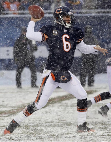
Oh man, is there anything better than a snow game? The shoveled yard lines, the slipping and sliding, the obligatory video clip of the Snow Plow Game. Yesterday’s Bears/Pats game had all that and more (lots of photos here), including Brian Urlacher’s broken helmet decal and the odd sight of CBS’s first down line appearing over the players instead of under them. Maybe the snow messed up the graphics somehow..?
In other NFL observations from yesterday:
• When’s the last time you saw a team-branded elbow pad? Looks like it might be a cover-up patch, which makes me wonder if it’s obscuring a maker’s mark from a non-licensed manufacturer.
• A couple of Lions fans made a bit of a statement at Ford Field.
• In case you were wondering, Troy Polamalu still has that little red cross above his nameplate. (For the uninitiated, he’s been wearing the cross for several years, but it rarely shows because of his hair. The league’s position is that it’s kosher because it’s almost never visible.)
• What do you get when the Chargers and Chiefs play each other? A battle of the uni-numbered chinstraps.
• The Rams have such a low profile now, I’d almost forgotten how much I like this look. One of the classiest, most underrated combos in the league.
• In the unlikely event that you haven’t seen it yet, here’s the amazing video clip of the Metrodome roof collapsing.
• Turning to Saturday’s college action, the Midshipmen broke out their “dress” uniforms for the Army/Navy game.
• Latest school to go BFBS: Texas Southern, in the SWAC (D-1AA) conference championship game
(My thanks to all contributors, including Matt Shepardson, Jeff La Haie, Austin Prather, Prentice James, and Scott Peterson.)
And so it has come to this: As most of you have probably heard by now, Nike will be unveiling special bowl game uniforms costumes tomorrow for Oregon, TCU, Boise State, and Florida. I’ll be covering this with two pieces over on ESPN — a quick Page 2 Blog item very soon after the unveiling on Tuesday, and then a column-length assessment on Wednesday.
While the whole notion of special bowl uniforms is obviously ridiculous, I’m holding out hope that they’ll come up with something nice for Oregon. I’ve always liked the current winged-shoulder set, and Oregon’s design trend these days seems to be more toward “good” than “stupid” (yes, I include the new basketball floor design in that assessment). Am I just being naive? We’ll find out soon.
Show-and-tell reminder: Remember, I’ll be hosting Open Mic Show-and-Tell at the City Reliquary this Thursday. Bring an item to talk about for three minutes, or just be part of the audience. Doors at 7pm, showing/telling commences at 8pm. $5 suggested donation, plenty of beer on hand, best fried chicken in the city available next door at the Commodore. See you there.
Uni Watch News Ticker: Here’s a big photo gallery from the Big Chill at the Big House. Damn, that looks like it was fun. ”¦ We all know that Oregon helmets have that raised rubberized “O” on the nose bumpers. Interestingly, you can see the Riddell logo peeking through on this one (good spot by Dan Herr). ”¦ Here’s a head-scratcher: Why would anyone make (and why would MLB license) a Mets Mr. Potato Head with a Yankees chest logo? Christian Eidt‘s son spotted the glitch right away when he received the toy as a birthday gift. ”¦ Did you know the Winter Meetings had their own logo? I didn’t, until Benn Wineka sent me that link. ”¦ David Arnott was looking through some old Sporting News clips and spotted a 1986 photo of a college hoops player with ANOB — that’s abbreviated name on back. ”¦ Latest camo-based design: a helmet for the Army lacrosse team (with thanks to Connor Wilson). ”¦ Really interesting interview with the Fleer photographer who shot the Billy Ripken “Fuck Face” card (big thanks to Dan Cichalski). ”¦ Eric Davis reports that a Japanese company is taking broken bats from Japanese baseball games and turning them into chopsticks. ”¦ Here’s a nice little item about how various Penguins players chose their uniform numbers (with thanks to Dane Drutis). ”¦ After years of holding out without a jersey sponsor, Barcelona has finally sold out like everyone else. ”¦ The Florida Everblades — that’s a minor league hockey team in the ECHL — are making a serious “worst uni ever” bid with their holiday-themed jerseys (blame Rob Silcox). ”¦ New lacrosse gloves for Duke (with thanks to John Koziol). ”¦ Dig the sensational old Utah State helmet on the right side of this photo. According to the Helmet Project, it was used from 1964-67 (nice find by Jeff Flynn, Jr.). ”¦ Also from Jeff: We all know the Pirates wore pillbox caps back in the late ’70s. But I didn’t know they also used pillbox-ish visors as promotional giveaways. ”¦ I generally have very little patience for the whole black/badass thing, but I have to admit that this black Raiders helmet looks pretty cool. ”¦ Here’s a look at those Oregon basketball throwbacks from Friday night (with thanks to Jeremy Brahm). ”¦ What’s black and white and red all over? That’s Eastern Washington’s red field (with thanks to Samm McAlear). ”¦ You know how the Cowboys put that Dymo label at the base of the white stripe on their helmet? North Dakota State uses that same area to print out the team name. Never seen that before until Evan Stewart pointed it out to me. ”¦ Mike Hersh has written a nice piece about old sports poster catalogs. ”¦ The Palmyra High School in New Jersey is one of the smallest schools in the state, so the football team only has about 30 players on the roster. Yet they still have nine mix-and-match uni combos (with thanks to assistant coach John J. Boris, Sr., who says he’s looking to add white and black helmets to the mix if he can find a sponsor). ”¦ A reader who prefers to remain anonymous has pointed out that the molded ridge on the Riddell Revolution Speed helmet has led to a variety of taping and decaling techniques for teams with helmet stripes, as equipment staffs try to get the stripes to go over the ridge without bubbling or loosening. Some teams simply break the stripe into separate pieces and leave the ridge blank. Others stick with one continuous stripe, but it often doesn’t adhere properly at the ridge. I’m told that LSU deals with this by cutting the stripe into two separate sections and aligning them right at the ridge, creating this illusion of a continuous stripe that stays put. And Virginia Tech has chosen to deal with the problem by truncating their stripes. … What do you use for hockey if you don’t have access to real ice? Synthetic ice.

Everybody in the pool: In case you missed it over the weekend, Phil and reader Tod Hess have put together a college football bowl pool. If you’re interested in joining, you can resgister here. Our Group ID# is 6828 and the Password is bfbs (all lowercase). If you want a review of the bowls and teams playing, go here and here.
“The Palmyra High School in New Jersey is one of the smallest schools if the state, so the football team only has about 30 players on the roster. Yet they still have nine mix-and-match uni combos”
The real problem with that team is that their 3 jerseys are each a different style.
“The Palmyra High School in New Jersey is one of the smallest schools …” – maybe John Deere could sponsor them so they could get that grass cut!!! Seems like they need lawn care more than alt helmets.
No mention of the old school coats that players had on the sidelines in Chicago and Buffalo?
Haven’t seen a good photo. You..?
How old school are we talking? I saw pictures of players in coats that are actually team colors and not that silly gray camo/tiedie patter in the game photos on both the bears and bills websites
“We all know the Pirates wore pillbox caps back in the late ’70s. But I didn’t know they also used pillbox-ish visors as promotional giveaways.”
I had one of those! Ah, memories of Murphy’s Mart, who sponsored that giveaway. I didn’t keep it for very long, but I did wear that.
I’ll confirm it tonight, but my recollection is that they were given away at a rained out game against the Braves on May 3, 1979. I wandered past the Steeler office on the way and found out that Greg Hawthorne was their first draft pick that day.
I think I actually got mine at a Murphy’s Mart. They must have had extras.
Really liked those Navy uniforms Saturday. Since the red is for the Marines, making it technically not RFRS, I say make these your full-time unis.
As long as they can widen that stripe on the pants to match the one on the shoulders (or vice versa), I say yes.
Agreed.
except that it was done purposely…the blood stripe is meant to emulate the marine officer dress uniform
so in this case, it should NOT be widened to match the shoulderboards
I retract my “agreed.” See Phil? I can be flexible.
And that’s why I said ‘or vice versa.’ In this case, the shoulder stripe should be modified to match the pant stripe, then. Read between the lines, Phil.
i really don’t want to get into it today, andy…but if you knew about the marine officer dress pants, you wouldn’t have said ‘As long as they can widen that stripe on the pants’ and then added the ‘vice versa’ as if it were purely a nike design element and not intentional
not in a good mood today, sorry
I knew the stripes were related to the dress uniform, but I didn’t have the moment to look up whether the shoulder loops or the pant stripes were the correct pattern, so I tossed in vice versa to reiterate, no matter which way is ‘correct’ that the uniform would look better if the pant stripe and shoulder loop were the same stripe.
They reminded me of CFL unis for some reason (Montreal, maybe?).
That said, they also reminded me of awesome.
Breaking out a new uni for a bowl seems like a great idea to me. When your school is known for the ridiculous number of uniform combos, play it up. However, I have multiple concerns.
– The number of teams involved is unruly; if only Oregon got to do it, I would be 100% behind the move.
– Why unveil it ahead of time? Let the players trot it out for the first time on gameday – THAT will get some electricity going. Just look at the Notre Dame v. USC game from 1977. No one knew about the green jerseys until gametime.
If you unveil it on gameday, and they lose, you sell a lot less of them. By unveiling it tomorrow, you get a month of sales, then if they lose, oh well, you’ve already sold them, and if they win, everyone is going to need to have ‘the National Championship jersey!’
Gotta sell the replica togs. There’ll still be a week and a half till Christmas.
Why stop a new uniform every game? How about a new one every half, quarter, and then every down? (ugh, I just threw up a little bit in my mouth by thinking like a Nike employee).
oxymoron of the day
With you there.
Enough with the football “costumes” already.
This ain’t Vegas.
Or “Glee.”
—Ricko
Ricko!!!!!!!!!!!!
Stay back – it could be an impostor.
Okay, “Ricko”, if that is who you are: what years did the Broncos wear a brown horse logo on their orange helmets?
I like surprise uniform unveilings, but that wouldn’t work in a bigger bowl. Media day features the players wearing their game jerseys, and you would either have to pack and wear the wrong jersey or give away the game early.
It is unfortunate for Oregon’s purposes, though–the “What will they be wearing?” factor compels me to tune into an Oregon game just to see what they have on. It’s a fun part of the football weekend. Even last year’s Rose Bowl combination was a (pleasant) surprise.
My guess is that the uniform will involve a yellow helmet or pants, since neither of those elements have occurred this year.
I think as regular visitors to this site and Uni enthusiasts in general we kinda lose a little bit of the standard fan mentality towards unis…. I kno alot of readers don’t completely dig the idea of new unis for the bowl games but I think 3 out of 4 normal people (read: non uni-watchers) I talked to about the game have said “…and I cant wait to see what Oregon’s gonna wear”
The winter meetings have had a logo for several years. Many of them have been done by link, which you can see there on his website. They’re specific to the city in which they’re held, and more in line with the ‘fun’ minor league styling.
Barcelona has worn unicef on it’s tops since 2006 or 2007, I believe.
Yeah, but they paid Unicef to do that, not the other way around. This is the first time someone paid Barcelona for its shirt space.
I could have just read the article instead of looking at the picture. :-)
Winter Meeting logos were last reported on Uni Watch on December 10, 2009. But it’s so stupid of a thing it isn’t worth remembering IMO.
The chopsticks are priced at 1,575 or 1,890 yen, which with today’s exchange rate is $18.75 or $22.50. Not too expensive for a cool looking pair of chopsticks.
Palmyra High School didn’t show a Black jersey/Red pants combo. What’s up with that?
or a white top / red pants combo
It’s not the uniforms on the field in that old Utah State @ BYU photo that got my attention but the uniformity of the spectators in the stands. That guy in the argyle sweater at upper right sticks out like a sore thumb.
Yeah, looks like a modern “white out,” but those were just regular dress shirts, I believe.
I think it’s called LDS System of Dress (no offense intended).
Not only did I love the Utah State helmets but the numbers on the back of the BYU helmets.
For many more classic BYU helmet photos, go here:
link
I don’t have Utah State yet but some time next year, for sure…
Thanks for sharing. I’d love to see those link in color.
Not the ones shown but a long time ago I did this BYU 1937 colorization
link
Yesterday during the Broncos’ debacle, I turned to NFL RedZone and caught some of the Bears’ debacle. The announcers mentioned the etiology of the Bears’ name and colors, but said that Geo Halas’ alma mater’s colors are BLACK and orange.
On the Bears’ uniform history section of their website, they mention wearing black and orange at times during the olden days, but I don’t know if that’s just a misconception of the blue being so dark that it was interprested and/or reported to be black, or if it actually was black.
Does anyone know if the Bears ever wore black or if it was always a dark blue?
I’m pretty sure it was always a dark blue. Jerseys from the time don’t pop up often, but when they do they’re always midnight navy.
And why would Halas abandon his alma mater’s colors?
I’m with Chance on this one.
Cost is usually the first one…or maybe the jerseys faded to navy blue and looked better.
How does Army get away w/ having each player sport their unit patches on their sleeves? It’s not allowed per the NCAA rulebook. Do they get away w/ it just because they are Army and no one is going to tell them no?
Would you tell the Army no on that one?
Sure. “Following the rules” is actually kind of a big deal in the military.
On the other hand, if I were the NCAA, I’d also make a rule that says that any armed forces veteran could display a unit or service award patch on his or her athletic uniform no matter what school he plays for. And I’d draw a firm line against anyone wearing such a patch who is not a veteran of service with the unit or a recipient of the service award, including cadets or midshipmen. If a cadet or midshipman previously enlisted and served with a unit and then won appointment to the academy, then he can wear the patch. If not, and it’s just the patch of the unit he plans to serve with after graduation, then tough.
Sure, following the rules is a big deal in the military, but it’s customary (and deservedly so) for them to get special consideration out of the military.
I want to see all those patches on the military uniforms, and I wouldn’t mind seeing that particular aspect getting more attention.
FYI, for Saturday’s game, Army players with a family member serving in the military wore the unit patch of their family member.
(No word in the game notes about anyone with multiple family members serving the military.)
I know the site has mentioned it before but I always get a kick out of the navy unit with the “seahawks” patch:
link
Also, was looking for someone with an Army 2nd infantry patch. My brother in law is currently serving with the 2nd infantry in Korea…. Probably best known because of whoever this guy is:
link
You’re right about that Rams uni, Paul. Classy.
Does anyone know where Canadians and Americans can buy those “Kattobashi” chopsticks?
Do a quick google search. I did and found a few places that would sell them for about 16 dollars. Too bad you need to know your Japanese baseball to buy a set in the color you want.
Akron won the NCAA soccer championship yesterday- they’re also the only adidas team I can think of whose shirts don’t have the 3 stripes anywhere (except the logo on the chest). I wonder if we’ll see any MLS teams without the sleeve stripes in 2011.
link
That’s a uni that could use the three stripes…
A lot better than the football uniforms, but uninspiring.
Still trying to wrap my head around the phrase “National Champion Akron Zips.”
In my opinion, odd schools achieving wild success in lower-level college sports is a feature, not a bug. Johns Hopkins in Lacrosse, North Dakota in hockey, Akron in soccer–these are schools that can appreciate the success, and players that can benefit from it. Several of Akron’s players are from Jamaica (because when you live in sunny Jamaica, logically you dream of moving to a cold industrial town in Northern Ohio), and while they may or may not achieve some professional success in soccer, how many Jamaicans can legitimately aspire to receiving a full education from an American University? That’s pretty cool.
But it does take a couple of moments to comprehend. Akron?
The new Big Ten (12) logo and division names will be announced at noon EST today. According to the tweets in my twitter feed.
Any word on what they’re calling the Big 12 next year? I’m assuming the Big Ten won’t change their name. Maybe the Midwest Ten?
Southwest Conference, Jr.
I think the Ten is still the Ten and the Twelve is still the Twelve. Numbers mean almost nothing for NCAA conferences. How long has it been since the Atlantic 10 had ten teams? It’s almost as bad as the old NFL geography. Atlanta and Carolina in the NFC West? Sure, whatever you say.
Dallas is still in the NFC East and TCU is joining the Big East. I know the first thing I think of when I think of the East is Texas
Normally I’d agree that the numbers mean nothing, but since the Big 12 will have 10 teams and the Big Ten will have 12 teams…that’s just a little ridiculous to keep both names as is.
Go back to the Big 8, then?
The Pacific-10 includes two schools from a state that isn’t on the Pacific coast. When it becomes the Pacific-12, it will include another two such schools/states.
Does TCU belong in the Big East? It’s really no worse than them being in the Mountain West, is it?
They are also unveiling new trophies as well. Press conference on now.
18 new trophies
link
New logo
link
Not a huge fan. Where’s the subliminal “12?”
are you shitting me?
Would I shit you?
That’s a rather lame logo. It just looks big and clunky. And, yeah, where the hell is the subliminal 12? The I is a 1 (which is kinda stupid, really) but there’s nothing even resembling a 2, or an XII, if we wanted to be roman. Definitely not an improvement.
…and does that divisional split mean no more annual OSU/MICH game?
1) According to Delany they were told to get away from the number thing by numerous agencies they consulted.
2) Michigan/OSU will still play. Each school will have a team in the other division that they will play every year. Penn State will play Nebraska.
Well let me officially say that I’m not a fan of those marketing agencies.
Granted, I’m not really sure how to put a 12 into those letters, but it was the only cool thing about the previous logo.
Couldn’t someone put a “2” into the “G”?
Granted, I’m not really sure how to put a 12 into those letters, but it was the only cool thing about the previous logo.
No, there was another cool thing about it — IIRC, it was designed by a then-student at Iowa.
As for the new one…meh. It’s not terrible, it’s not great. I suspect the shade of blue was chosen to match with the NCAA’s logo.
The award names are ridiculous, clearly chosen by committee and quota. Let’s see…gotta have every school represented, including our old colleague, the University of Chicago…
the I is a 1 obviously but espn.com said the G is supposed to be a 0 (zero) to keep the big ten in their roots. If you have to explain it, it shouldn’t be there.
The Division are
Legends
Iowa
Michigan
Michigan State
Minnesota
Nebraska
Northwestern
Leaders
Ohio State
Wisconsin
Indiana
Illinois
Purdue
Penn State
LAME!
Epic. Fail.
I think that is the understatement of the century right there.
Legends and Leaders? AYFKM? I realize they could not do a geographic naming, but hell, I think a Black division and a Blue division would be better than this!
Worst. Unveil. Ever. Very, very disappointing.
The whole thing smacks of arrogance – the B1G instead of BIG, “Legends” and “Leaders,” the insistence on keeping the name when the Big 8 (Big 12) and Pac 8 (Pac 10 and Pac 12) both adjusted to changing times…I’m all for tradition, but I’m not for all traditions. I agree: lame, fail, disappointing.
And yes, Robert, if the Big 12 doesn’t change its name I will consider that arrogance as well, and no, Robert, today’s actions will not affect any future Top 5 opportunities for Big Ten teams.
I guess it could have been worse. They could have sold the naming rights for the Divisions.
New Trophies
Stagg-Paterno Trophy Championship Trophy (winner of Big 10 Championship
Grange-Griffin Championship MVP Trophy (MVP of the Championship game)
Ford-Kinnick Leadership Award (Big Ten Player displaying leadership)
Dungy-Thompson Humanitarian Award
Graham-George Offensive Player of the Year
Nagurski-Woodson Defensive Player of the Year
Hayes-Schmebechler Coach of the Year
Thompson-Randel El Freshman of the Year
I am really hoping that the Graham-George offensive award is named for this guy:
link
and not this guy:
link
It is named after Eddie George.
Here is the link to the trophy names.
link
Barnett-Zook “Everbody Gets a Trophy” Award
The new logo is alright, and should look nice in TV applications, but please tell me those division names are a joke.
Wish I could, but to paraphrase Seinfeld “They are real and they are horrible.”
I think the correct answer is “They’re real, and yes, they’re a joke.”
Our local paper has named the divisions “Bo” and “Woody.”
I have a couple of helmet questions for those who are in the know.
1) link
Why does it appear that Greg Jennings’ head sits so far forward in his helmet? I think that Santonio Holmes looks the same way. Is it a specific model of helmet that produces this appearance? How common is this?
2)As a Packer fan, I’m used to seeing some semblance of a neck bumper on all helmets. Be it actual or only representational, like the decals shown in this picture:
link
The Lions, however, do not use the decal in the models of helmets that feature no visable neck bumper, seen here:
link
This appears to be each team handling the same helmet different ways. This was the first I noticed the no decal system. Is one system more common, and which helmet(s) is it that produces this quandry?
Forget Jennings, check out Chris Johnson and lendale White:
link
link
With Johnson and White, I’m pretty sure it is that they use a low-profile facemask that sets the cage back further than the traditional mask. Just from seeing him every week, I’m sure that Jennings doesn’t wear that. What I’m looking at is most visible at the nose bumper. Most times that piece has some depth inside the helmet. Jennings appears to have less distance there than most others. Compare to the Lion in the picture:
link
Any thoughts?
As far as that picture is concerned, there is a huge difference with the internal padding.
Jennings is wearing a traditional Riddell VSR-4.
The Lion, rookie defensive back Amari Spievey, is wearing the Scutt Air XP which has a much more sunstantial interior pad which would make the helmet sit further away from his face.
The only problem is that both Johnson and White wear similar Schutts!
powers-
i think the difference between spievey and johnson or white would be the traditional vs. low-profile facemask.
oh, and thanks for trying to help me get a handle on the various helmet models. I’m late to that party and trying to catch up.
As far as the Packers and neck bumper stickers go, Riddell VSR-4 helmets have the bumper where you can place the stickers:
link
link
Schutt Air Advantage helmets did not, thus they were placed on the exterior of the helmet above the exposed internal padding:
link
The newer Schutt models, like the Air XP, and Ion all have bumpers where stickers can be placed:
I love the North Dakota State helmets.
Also, not a big deal but in the bowl pool entry, my first name has only on d in it.
check it now
Thank you. It is the cross I bear in life. It took the doctor who delivered me 16 years to get it right.
I didn’t see this mentioned in the post but during the Patriots-Bears game, the grounds crew painted the field lines red to make them more visible in the snow. The announcing crew were surprised by this and I can’t recall ever seeing that before.
Here’s a pic from ESPN: link
BENGAL AND BYU FANS…
The QB is Virgil Carter, isn’t it?
link
From when the Cougars wore Air Force blue….prior to the royal jerseys with white helmets worn by McMahon, Wilson, Nielsen, Scheide, Young, the Detmers and all those other great BYU QBs (wasn’t listing them in order, btw).
—Ricko
Hey, only Ty went to Provo. Koy played his home games in Boulder.
My bad.
Lotta shit in these memory banks.
Sometimes it gets a little scrambled.
Okay, so change “the Detmer” to “Detmer, Bosco and…”
—Ricko
Robbie Bosco was an unholy terror.
Not to mention being named after a long-forgotten competitor to Nestle’s Quik…
(Everybody, sing…)
“I love Bosco,
it’s the drink for me…”
—Rickok
That’s not the code for your ATM card, is it, Ricko? ;)
Not sure.
Let me see what’s written on the back of hand.
—Ricko
Yeah that’s Virg.
You gotta love that at least half of the spectators in the photo are wearing their White shirt/Dark yie missionary combo while watching the game. Pretty cool ….
Almost every male spectator in the stands are wearing their White shirt/Dark tie ensemble. Ya gotta love it!
Those Texas Southern BFBS unis are probably the best BFBS unis in the history of football.
Now if TSU would have had black hats to go with those tops. Those were great unis.
Almost as nice as the East Dillon Lions:
link
Are NFL quarterbacks required to put on a baseball cap when they remove their helmet on the sideline? My Dad asked this question as we watched the concussed Aaron Rodgers don the cap for no apparent reason (domed stadium) yesterday. I told him I didn’t know, but I knew where to ask the question…:)
There is a very good reason to put on a baseball cap even in a domed stadium, the fear of being on TV with hat[helmet]head.
not blaming you because just about fully half (if not more) of the announcers use it, but does it bother anyone else when you hear announcers turn “a concussion” into “was (or got) concussed”?
not quite as nails-on-a-chalkboard as al michaels saying “he fair caught the ball” but annoying nonetheless
None of which is as annoying as, “He drugged him out of bounds.” It’s “dragged.”
The size of some of those linesmen, “drugged” might actually be the correct verb.
Mine is…
“If he would have went…”
Hear that FAR more often than we should.
Always reminds me of than great country song from FERNWOOD TONIGHT (intro’d by the guy went on to play Ernest; y’know, “Hey, Vern!”)…
“If I’da Knowed Ya Wanted ta Went with Me,
I’d See’d That Ya Got ta Git ta Go.”
—Ricko
Don’t forget Al Michaels pronouncing “New Orleans” as “New OR-Lee-uns.” I have several friends from N.O., and absolutely NO ONE down there pronounces it that way. When in doubt, do as the natives do, Al.
In Al’s defense, local pronunciations can be weird sometimes. Once upon a time, I lived near a “Nevada” street, only everyone pronounced it with a long A – neh-VAY-duh.
The only thing worse than pronouncing a place’s name in a way completely foreign to anyone who’s ever lived there is pronouncing it with a feigned familiarity. You’re much more likely to sound like a tool with the latter than the former. If you haven’t lived in New Orleans for at least five years, your attempt to pronounce “Nawlins” will sound as ridiculous as the BBC anchor I heard reporting on the 2004 Red Sox who pronounced Nomar Garciaparra’s last name with a perfect – and perfectly, absurdly wrong – Castilian accent. “gar-THEE-ah-PARLRLR-ah”
And not all locals pronounce any place name the same way; I have heard native-born Oregonians pronounce it with a “gone” and with a “gun”; the same for native Badgers and “Wis-” and “Wes-consin”. Heck, I call it “Missour-ah,” because when I was a boy in Iowa, that’s how people from my part of Iowa and the closest parts of Missouri pronounced it. Recently, nobody I’ve encountered in that part of the country pronounces it that way. Same out here in DC, where a lot of old-timers call it “War-shington,” but very few people under about 65 do so. To the older ear, the flat-voweled “Wah-shington” sounds like some out-of-town poseur, whereas to anyone younger than John McCain (who grew up in DC and pronounces it with the extra “r”) “War-shington” sounds like an affectation.
I must comment on that one, as I am a lifetime New Orleanian and there are at least SEVEN different ways that New Orleans natives say it – depends on neighborhood, geography, schooling and family.
Not uncommon for next door neighbors to differ on how they say New Orleans – even if both are lifers ….
Situation. It’s a “punting situation” or a “third down situation” or a “field goal situation”. No, it’s not. It’s fourth down or it’s third down or they’re going to attempt a field goal.
If there is a rule, then there must be a link link link.
Good question? I’ve noticed this two… mostly during Jets games because my sister gets very aggravated about the backup qbs wearing red hats instead of green… but ive noticed the red caps elsewhere
Paul? Anyone? whats with the red caps?
I believe it’s because the backup QB is often used to signal in plays, and the red cap makes it easier to him from the field.
Figured the typo hounds would like this.
link
In the early 70’s, the Buffalo Sabres PR department issued an April Fool’s Day press release, announcing that the Sabres were replacing the ice in Memorial Auditorium with something called Sliderex, a synthetic material. One of the local TV stations reported it as fact, which caused them a lot of embarrassment.
Synthetic ice? Impossible! It’s clearly a joke!
It’s amazing how much things have changed.
Also, take a look at the crowd in that BYU-USU shot. The photo wouldl have been taken between 1966 and 1968, based on the BYU helmets. Nearly every guy in the stands is dressed in a shirt and tie. Was that still common in the late Sixties, or is it further proof that Provo is perpetually 8 to 10 years behind the trends?
“Was that still common in the late Sixties,”
Yes.
This has to be a UW record for the most mentions of my alma matter (at least in the comments section).
I’m not sure what you mean by Provo being “perpetually 8 to 10 years behind the trends” (what/whose trends?), but the dress is probably related to the generally conservative culture of Provo and BYU’s dress code, which became increasingly conservative in the 1960s.
That photo, BTW, would have been during the earliest years of Cougar Stadium (now LaVell Edwards Stadium), which was built in 1964.
BYU Utah State color picture from 1964
link
link
I have a friend who’s son plays junior hockey and what I’m guessing is a pretty high level. He is friends with Anthony Broduer (Martin’s son)… I’ve been told the basement of his West Orange, NJ home has synthetic ice where his kids play/ practice.
Baseball makeover on Brand New today…
link
Nothing sadder than seeing a franchise color identity crisis trickle down.
Honestly, I don’t see what the big deal is about the Rangers’ colors. They’re red, white, and blue. I prefer their home whites with the blue caps but I don’t think there’s anything wrong with the red alts.
It’d be different if they wore one primary color at home & the other at the road. There’s the chance of wearing 3 different jerseys on a given day – all completely different in color. The Rangers just suffer from an identity crisis. Are they going to be a red 1990s era team? Are they going to be the traditional blue team? Who the hell knows. Personally I prefer them in blue.
It’s a mix-and-match ensemble just like their new parent club’s unis. I think I’m okay with the two colored tops, but four hats?
And they seem to have two completely different identities for home and road. They only wear the “E” at home, and only the “RR” on the road. Would have been cooler to just use one logo, because both of those logos are completely incongruous.
Oh man, is there anything better than a snow game?
A game in the mud, perhaps?
link
Mud AND snow.
Yeah… :-)
link…
and link
So, yeah, it’s pretty weird that link would happen. The pinstripes are different for each – the interrupted stripe for the Yankees logo, and the missing center stripe for the Mets logo, plus the Mets stripes are a lighter shade.
“the Mets stripes are a lighter shade.”
Shouldn’t they be?
Of course it should, but if quality control can fail enough to stick a Yankees logo on a Mets toy, who knows what else they could’ve pulled!
OK, this is ridiculous. We have synthetic grass (Fieldturf), synthetic dirt (Polytrack), and now we have synthetic ice. That means we can play a baseball game without anything natural and, when the Winter Classic comes to town, we can just lay down some fake ice.
How about some robots to play the game? Sheesh.
link
I watched that video numerous times yesterday, but this morning I looked at the field not the roof. In the first video clip, Seconds :01-:06 It looks like a deer is running across the far sideline. New WR?
I totally missed that until I read this. Great catch! And how did a deer end up in the Metrodome?
Exactly!
Exactly what I was thinking.
Also looks like it could be stadium crew whizzing by on a golf cart? Wasn’t the footage sped up a bit as well?
great spot — very tough to tell, but to me it actually looked like two horses with riders
someone get fox on the line
To me, it looks like a golf cart thingy. It might have been some crew guys, and they notice the roof coming in, and they go “OH SHIT” and jet out of there.
True, but all the reports said no one was in the stadium when the roof collapsed. Hmmm
So where will the Vikes’ Sunday game be? The Gopher stadium is probably out for logistical reasons. There are domes in Fargo and Cedar Falls IA, but they’re too small for a normal NFL game (and may even be too small for a Jacksonvillage Jackwagons’ home audience). Would Wilf try to audition San Antonio?
They could do Ford Field again, since it’s already a Monday night game. I think Indy and the Superdome also offered their services for this week’s game; they could also be open to do it next week if Detroit doesn’t want to do it again.
I’ll be extremely surprised if the game is not played in the Metrodome. They’ll be working around the clock this week to get that roof fixed so they don’t suffer the embarrassment of moving another home game.
But with that said, it would be awesome if they played at U of Minnesota’s outdoor stadium.
It would be, and I believe that was their preference, but it’s been shut down for the winter and would take too much to open it back up again.
Plus, beyond the stadium itself (plumbing, concessions, heating and food storage systems) you can well imagine that big-time natural grass fields (Target Field, TCF Bank Stadium) in Minnesota are prepped and bedded down for the Winter very specifically and meticulously.
Not sure the UofM wants the shit torn out of its surface, and then have to do the Winter thing all over again.
Some serious coinage to be spent there.
—Ricko
For entirely different reasons, the Fargodome would be awesome. But neither is likely.
I thought TCF Bank Stadium has Field Turf.
It is. Must be my day to mess up.
I just know I can understand “Shut down for the season.” Some people apparently think getting a facility ready for a game on short notice is as simple as unlocking the doors, and I was reacting to that simplistic thinking.
Almost up there with, “Well, if poor people would just get jobs and get rich, that would solve their problems.”
Not saying next week’s Bears game might not be at TCF, just that thinking the Giants game could have been played there this week was…ridiculous.
Of course the NFL/Vikings would ASK, but they probably already knew the answer.
I like Chuck Foreman’s idea. The 50 Greatest Vikings coming back for that one, so play the damn thing outdoors (if TCF can be made to work by next week)…and wear the throwback unis. That was his suggestion. Good one.
—Ricko
Both of those “domes”, Fargo and UNI hold less than 20,000. I live in ND and I think the FagroDome holds 18K for football. The UNIDome is around 16K.
I’m more frightened of what Nike has come up with for TCU than anything Oregon will be wearing. The Frogs had IMO the worst of the Pro Combat uniforms last season and I won’t be surprised if they are once again the lab rats for some new insane video game design.
And the idea of new uniforms for bowls is just mind-bogglingly stupid.
I’m scared to death. I liked the lizard uniforms they wore in the Fiesta Bowl last year but don’t do that to the Rose Bowl. Just wear purple and white, your traditional colors.
Anybody know if TCU is the designated the road team? If they are, that might minimize the damage.
New Comedy Central logo – Fail
link
As if anyone cares what the network logo is. There’s only 3 reasons to watch that channel anyway: South Park, The Daily Show & The Colbert Report… all of which are easily watchable online.
I haven’t really cared that much about that network since they got rid of Mystery Science Theater 3000 anyway.
My absolute favorite…the best ever The Puma Man!
That is one extremely half-assed logo. F-.
Ok this was THE worst look of the day in the NFL:
link
God. If only the Cardinals didn’t have a blind 9 year old designing their jerseys. I also hate the red socks with the red pants, but it doesn’t look as bad in monochrome, but when you go with what the vikings had: the purple pants and the purple sox, i hate that soo much.
I’d agree. I’d even go as far to say that black on white was far, far better. For a team called the freaking Cardinals.
I wonder how long the “Cradinals” in the caption will last.
No big surprise. Ever notice how the Bidwells have dressed over the years, most of them, anyway?
Clueless.
—Ricko
You’d wonder if they ever tried to integrate a bow tie into a football uniform.
Ahhh, how appropriate that it’s a team from the NFC Worst.
I love it. I wish more teams would wear color on color in the NFL. I’m looking at the Ravens/Texans game right now and Houston is looking awesome. They should have worn blue socks.
link I stumbled across on an Iowa Hawkeyes message board that I was reading for God only knows what reason.
It’s not fantastic, but it’s a hell of a lot better than that link the Big Ten trotted out today.
and it looks like the ripped off brand new in the process
think it will get a “fail” over there?
They made the IG look like a 10 to honor the original member schools.
I guess the TEN wasn’t enough.
Maybe in a few years they can add one more team, then we can get it written as B1G T3N.
There is already a facebook page against the logo.
link
By the way Pentagram designed the logo.
Not worth protesting the particular design of the logo as long as the name of the conference continues to be “Big Ten” and it has any number of member schools that does not equal 10. As long as the message being communicated is in and of itself wrong, then the aesthetics of the thing are moot. It’s one of those deals where there’s no right way to do it.
I was just posting that there was one. I am more disgusted with the division names they chose.
My dad always used to say that the 1962 Mets had lefty Bob R. Miller and righty Bob L. Miller, and because it was the Mets, it made perfect sense. Finally, my generation gets a similar screwball. The Big Ten has (12), and the Big XII has (10). RIGHT.
Couldn’t have said it better, Scott.
Bullshit. Whether the name is apt or not is the irrelevant issue. You can design a good logo for a bad name.
Does 20th Century Fox have a crappy logo simply because it’s now the 21st century?
The old Big Ten logo with the negative-space 11 was cool.
In the sense that a lot of Soviet propaganda art was actually quite well designed, sure. But ultimately, it’s kind of like judging the font and color choice on the packaging of a Happy Meal whose prize is a 9mm handgun. At some point, if the product is bad enough, there really is no right way to market it. And a 12-team “Big Ten” is one of those things. It’s one thing if the expanded size of the conference is an ad hoc affair or not necessarily seen as permanent, as was the case when Pen State made it the Big1T1en. But a rebranding tied to the expansion to twelve schools must either involve abandoning the word “Ten” or the rebranding is a failure no matter how good or bad the artwork is.
Though judged on its own terms, I will say that the new logo is very good. For 1973. If it’s not 1973 out there, then the new logo would be every bit as bad as a collegiate conference that can’t do arithmetic beyond the fingers on two hands deserves. So actually, I think protesting against this logo is misguided on the merits. This is exactly the right logo for the Big Ten.
“But ultimately, it’s kind of like judging the font and color choice on the packaging of a Happy Meal whose prize is a 9mm handgun. At some point, if the product is bad enough, there really is no right way to market it.”
Yes. This is a spot-on comparison because the two things are so completely similar. The Big Ten’s wanton and reckless disregard for the safety of children is unconscionable.
What?
Despite how bad this logo is, I’m beginning to fear that this is going to be some sort of movement with every major logo change. People are going to think they can reverse all of them because they were able to do so with Gap, so even the good rebrands suffer because of this.
The Comedy Central rebrand is pretty cool in my opinion. A lot more sophisticated, not as 90s-tastic.
here’s a better comparison of the brand new big ten
Apologies, but I missed link totally when it was announced.
I still maintain (in looking at the Pats @ Bears photos) that the Patriots socks (three plain stripes) are a holdover from when Adidas branded their unis.
Nah. They were inspired by the 1960 Oakland Raiders’ road socks. Or the mid-60’s Vikings white socks.
Cuz near as I can recall three equal stripes as a design element were around before adidas.
;)
—Ricko
Sometimes three stripes are just three stripes.
Do you think Nike will try to change those socks, as well as the 49ers sleeve stripes???
no
but i checked to see who had those two clothing contracts before rbk, and new england was starter and new era…while, and i didn’t remember this…san fran was adidas…
that being said, the 49ers have had that look for so long there is no way nike would try to change it — unless of course they make jerseys with no sleeves, then they’d have an excuse
as far as changing the pats socks? nah…like paul says
sometimes 3 stripes are just 3 stripes
Thank you ESPN, for wasting halftime on Brett Favre instead of showing us anything that happened during Sunday’s games. You’d think he just died, from the way they’re acting.
so it’s a coincidence that they had Adidas in their lineage. And New Era hasn’t ever had the uni deal. Since logos started showing on unis- in no special order;
adidas
nike
reebok
logo athletic
puma
champion
starter
russell
apex
sorry brink
so…this is apex then?
this is definitely starter
then adidas
and of course, by 2002, they were all rbk
i’d say your 3 stripes conspiracy theory has some merit, except for the fact that the boston patriots were born wearing three stripes
kinda hard to say adidas had anything to do with those, eh brinke?
We’re talking about the perfectly symmetrical three stripes design. I’d love for PL to place a call to the Pats PR to see if those were adidas socks and they just hung around. Notice these are perfectly aligned, same thickness, etc. These are Adidas socks, and look just like the Pats.
link
btw phil those first 4 links don’t display in FF.
so browse in chrome or ie then
im not saying that what the pats are wearing today aren’t repurposed adidas socks, but what i am saying is the pats have been wearing three like colored stripes on their socks, on and off, for 50 years
and those early ones were for damn sure not adidas
It appears they got some purple paint at Ford Field after all
link
Pretty sure mixing red and blue would get them there.
In a pinch.
And with a really big bucket.
—Ricko
My twitter feed is full of all kinds of stuff today
AHL All-Star jerseys unveiled
link
Damn, that is really nice. Especially for an ASG. Won’t buy one (minor league apparel should have minor league pricing, or else I’ll just buy more Habs stuff), but I’d certainly wear that!
better than their original proposal
That is comedy gold Phil, I tell you comedy GOLD!
So… milk chocolate vs. white chocolate?
Yet another hockey coach saying his team needs to pull its socks up. I covered the minors for 8 years and don’t ever recall hearing that phrase, so I think it’s come about relatively recently. link
It’s not the most elegant thing in the world, but I think the concept would have worked, and I don’t think it would have detracted from the logo. That was the Big Ten’s ‘thing,’ as cheesy as it may have become.
link
Agreed.
Not uni related, but certainly aesthetics related: did anyone who was watching Seattle-SF yesterday notice FOX playing cinematic music between almost every play? And at every touchdown? Totally bizarre and distracting.
Just found out it was a FOX experiment. Horrid.
link
What the hell is with the musical decisions being made at Fox lately? This is right up there with their decision to abandon all their unique theme songs and use the NFL theme on all sports programming instead, including NFL Baseball on Fox and NFL NASCAR on Fox.
Might as well continue the trend…
RBC Center re-did the ice today in preparation for next month’s NHL All-Star Game… Not much of a change, but its something…
link
So where’s the “before” shot?
Uh, the “before” shot of the RBC Center was what I meant.
The consecutive game streak of Lou Gehrig (who wore #4, btw) ended in Detroit.
And now the word is that Farve is inactive for tonight.
In Detroit.
Go figure.
—Ricko
guess he didn’t want to end his career on an interception
How many all-time great baseball players made an out in their last at-bat, I wonder.
—Ricko
both cal ripken and lou gehrig made outs in their last ever at bats
but neither struck out
neither of which is as bad as throwing an interception
Interesting discussion, we know Ted Williams homered in his last at bat. In football, Joe Montana’s last pass was intercepted in a playoff loss at Miami, and Terry Bradshaw’s last pass was a TD versus the Jets.
Yup, Vikings’ playoff loss in New Orleans was all Favre’s fault.
How could he have let those fumbles happen and send that 12th man onto the field?
What an overrated hack, right?
i don’t know how in the hell this conversation went from a statement, to a semi-sarcastic remark…to a question which i answered
to all of a sudden my calling favre an overrated hack
i was simply stating that if favre’s career is over, at least it didn’t end on an interception…nothing more nothing less
christ, it’s not like he was fran tarkenton
Sorry, not really aimed at you, Phil.
Just that a lot of Favre-haters drag that out.
Hell, I liked the guy when he was Green Bay.
Has his faults, yes, but he loved the game and showed up for work. I’m not real sure we can say that about that many NFL players these days.
Or in other sports, for that matter.
Hey, I live in a city that got to watch guys like Kent Hrbek and Kirby Puckett play and have so much fun doing it, and hear Bob Allison say, despite his bad break in life, that he had nothing complain about, that he’d “been paid a lot of money to play a kids’ game.”
Hard not to appreciate guys who think, and act, like that.
—Ricko
Didn’t Favre’s last pass (the one that got him injured last week) result in an interception? So Favre’s last game with the Packers, Jets (illegal forward pass), and Vikings didn’t end very well.
To which I will, again, say, “So what.”
And his first completion was to himself.
But in between the first and last…
there was a pretty good career.
Re: Utah St helmet logo — They used the same logo on the back of their basketball warmup jackets, as seen here:
link
paul’s teaser is up…
All hints point to the Ducks going all out Tron with their new threads and gear. Neon green & yellow poppin’ off neutral white, gray, and black.
jeebus…
could fox play up this game anymore?
they have the whole NFL crew and they were “proud to announce our first monday night football game ever”
joe and troy are doing the game
and it didn’t take but 17 seconds to invoke the “farve’s streak ends in the same city as lou gehrig’s”
Not sure if this has been covered lately, but Nike is unveiling some new cleats tomorrow, too.
link
If the Texans are going red jerseys and pants, the least the could do for the viewing public is wear navy socks and the Ravens don’t get me started. Wish I could get the Vikings/Giants game.
Wish the Texans would have used the blue jerseys with the red pants tonight.
(fixed)
“Wish the Texans would have used the blue pants with the red jerseys tonight.”
(fixed better than Phil)
yeah…you would like that one
sorry, i don’t mind sometimes seeing crazy shit, but solid primary colors (and im excluding “yellow” from that triumverate) don’t look good together on one uni, any more than two solid (non yellow) primary colors would look good against each other
If it’s any consolation I’d let the Ravens stay in white.
…and the blue-red-blue is a classic look: link
This Texans ensemble..
link
…is mindful of the WFL Florida Blazers.
They wore royal instead of navy, though.
—Ricko
The Texans did the right thing. They just needed navy socks to help the hats. I love it when the Ravens wear the black on black.
I’d like the Ravens to consider a purple helmet someday, and that would mesh well with the sharp purple jersey/black pants combo we saw vs. the Steelers. Wish the Ravens had gone with a purple helmet from the beginning.
Yeesh. It looks like a “game of shame” even Vilk would condemn.
This?
link
Or this?
link
Actually…
It = as seen on TV, not Phil Hecken’s Photoshop madness.
I’ve seen worse. Kinda like the Texans in that look, but I had to laugh when a friend of mine said, “The Texans should know a ketchup bottle has a white lid.”
i cannot tell a lie
THE jeff did that mock
/gives me a idear, tho…
Here’s a clip explaining how the yellow (and blue and red) lines are digitally projected on the field.
link
Essentially, they have a way of tracking where the cameras are and where they are pointed in a 3-dimensional space. With that info, they can paint a line on any yard line and it will be straight across the field. However, it doesn’t just draw the line over everything, they tell the system to draw the line OVER some colors, the colors of the ground, but to draw UNDER some colors, those being the colors of the players, the ball, and anything else. So like wearing a blue shirt in front of a blue screen, covering the players in snow or mud is trouble for the computer.
Love the Texans red paint in the endzones to go along with the red unis
Ah, I thought you meant the whole end zone,
link
not just the outline. Good catch.
mothersunbowlker…
you either gotta get espn or use adthe
well…too late…the schaub, after a tremendous comeback…just threw it all away
Auburn unveiled their super-special 2010 National Championship Game uniforms in 1966.
…but they will also reportedly wear link and link too.
Links aren’t working, for me anyway
Pack link in your conspiracy bong:
Hey
Adi,
Let’s
Add
Stripes.
What’s that Papa Bear is holding? Plays he’s diagrammed? Nah — oversized checks drawn from the bank account of a certain Herr Dassler.
Just saw the end of the Texans game. What a way to tie it, gotta have a a 2-pointer.
And oops, what a way to toss a duck out there in the flat to lose it.
From the front page of ESPN.com – “Matt SCHAB led Houston on drives of 99 and 95 yards to tie the Ravens”
Couldn’t get a screenshot because my laptop sucks