We all love jersey typos. But you don’t often see typos on retail replicas, in part because any store manager who spotted a misspelled jersey would most likely just send it back.
But what if he didn’t send it back? What if he saw it as an opportunity?
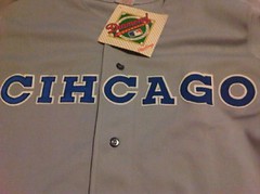
That’s the question raised by a jersey that’s currently up for bids on eBay. The guy selling it originally ordered it from Rawlings back in 1990, when he was running his own sports memorabilia shop. He ended up with a box full of misspelled jerseys and decided to have some fun with them instead of returning them. He sold most of them at the time and is now selling one of the two that he kept for himself.
And how do we know this story is true? Because his eBay listing includes old newspaper clippings from the media coverage he received back in 1990.
I was intrigued enough by this story to contact the seller, whose name is Charles Blatt. Very nice guy. Here’s a transcript of our chat:
Uni Watch: So you had a retail store back in 1990.
Charles Blatt: Yes. The Cubs had a new road jersey that year.
UW: The whole concept of selling licensed jerseys was still pretty new at that point, wasn’t it?
CB: Yes. Things were much different then. You’d get these replica jerseys without the numbers. You had to find a place that did tackle twill letters and numbers and have them do that for you. It was nothing like it is today.
UW: So the Cubs had this new road jersey and you wanted some for your shop.
CB: Yeah, but they were back-ordered for months. I had people coming in who wanted them, and I would take down their names and numbers on a list, but Rawlings was very far behind on filling their orders. I didn’t get my shipment until the end of June, and there were only 14 jerseys in the box.
UW: How many had you ordered?
CB: Probably about six dozen. Something like that. And only 14 came in.
UW: So that was the first thing you noticed — that they shorted you. And then”¦
CB: And then I see that they’re misspelled.
UW: All of them? Like, all 14?
CB: Yes.
UW: So did you immediately call Rawlings?
CB: Yes. And they said, “Oh, we’re so sorry, please send those back.”
UW: And I’m sure your initial thought was that you didn’t want to keep them.
CB: Right. But then I thought, well, first of all I’m a White Sox fan. And I thought, gee, the Cubs can’t do anything right. They can’t win a World Series, and they can’t even get their jerseys spelled right. It was the Cubs in a nutshell. I started thinking about that as a little marketing ploy, so then I made a few calls.
UW: Who did you call?
CB: Our store was on the same block as the local CBS and NBC TV stations. A lot of those people used to come in, so I knew them. I called them, and I also called some newspapers, and everyone liked the story. So first there was a picture in the paper there in Chicago, and then the picture got picked up by the AP and it went out over the wire. And because of that, I started getting calls from radio stations all over the Midwest. Everyone wanted me to talk to them about this. It took off much more than I expected.
UW: Nowadays we’d say it “went viral.”
CB: Yes, definitely. Even years later, people would come by the store and see the one misspelled jersey that we had gotten framed and put on the wall, and they’d point to it and say, “Oh right, I remember that story.” It was a good conversation piece. I still have that one – it’s matted now, not framed — and I have this one additional one, which is the one I’m now selling.
UW: And you sold the other 12 in your shop.
CB: Right.
UW: Did any of those end up going to the people on your waiting list? You know, the people who’d wanted to buy a normal jersey?
CB: I don’t remember. What I do recall is that each time we sold another one, it seemed like the demand kept growing, and we kept raising the price.
UW: What did you sell them for at the beginning? Did you discount them at first, because they were, you know, defective?
CB: No, because I could’ve gotten a full refund from Rawlings if I’d wanted, so there was no need to discount them. But once I realized Rawlings was upset that I was keeping them, because they didn’t want people to know they’d made a mistake, that’s when I knew I was on to something.
UW: Were they, like, calling you and insisting that you return them?
CB: Exactly. And I was saying, “No, I think I’m gonna keep these.” And they were saying, “No no no, you have to return them.” And I was like, “No I don’t.”
UW: Did that affect your relationship with them?
CB: No, I think they got over it. It was fine.
UW: So did you initially price them at the regular retail price?
CB: Maybe a little bit higher. They usually sold for about $85, and I think I started them at $100. I think I sold the last one for $1400.
UW: How long did it take to sell through the 12 of them?
CB: A couple of weeks. Once the story got out there, people were calling and it kind of snowballed.
UW: And now, 20 years later, you’ve decided to sell the last one — aside from the one that’s matted — for $800.
CB: Yeah. I was in Vegas recently and I thought about bringing it to that place from Pawn Stars on the History Channel. I thought it was the kind of unique thing that could actually make it onto the show. But I didn’t get around to it. So I figured I’d try it on eBay.
UW: Have you ever seen anyone wearing one of the misspelled jerseys that you sold them?
CB: No. I have no idea where those jerseys are, or if they’ve been resold or anything like that.
UW: You know, 14 isn’t exactly a round number. Do you think there were some other misspelled jerseys that Rawlings shipped to other stores?
CB: Rawlings always denied that. They said, “Nope, those are the only 14 where we made a mistake.”
UW: That seems unlikely. I mean, even if there were only 14 misspelled jerseys, what are the odds of all 14 of them all going in the same box to the same account?
CB: Right. I always wondered about that.
UW: And did you ever get the properly spelled jerseys?
CB: Yes, eventually.
(Special thanks to reader Mark Prusinski, who first spotted Charles’s eBay listing and submitted it to Brinke, who in turn forwarded it to me.)
The official concussion of the NFL: Fascinating development in the concussion wars, as doctors are apparently not too keen on the NFL having one official helmet brand (i.e., Riddell) when other brands are every bit as good — or as bad — at preventing concussions. According to that article, which I strongly recommend reading, Roger Goodell is sending signals that all helmet brand logos will be welcome on the field after Riddell’s exclusive contract expires in 2013.
Of course, given that today’s NFL helmets are more often used as weapons than as protection, the best summary of this story is probably the one Gerard Cosloy provided in this headline.
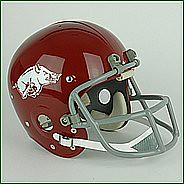
Giveaway results: Santa will be paying an early visit to Allen Pointer, who’s the winner of the Gridiron Memories helmet giveaway. He’s chosen the 1966-67 Arkansas design, shown at right, as his prize. Congrats to him, and special thanks to Gridiron Memories honcho Curtis Worrell for his generosity.

Our next giveaway will be the annual reader-appreciation raffle, in which I unload all the free crap I never wanted in the first place assorted goodies and swag that’s in need of a good home. Further details on that next week.
Culinary Corner: I don’t usually repeat recipes from previous Culinary Corner installments, but I’m going to make an exception for my favorite holiday preparation, homemade Irish cream. In other words, homemade Bailey’s. In other words, melted ice cream that gets you drunk. It’s super-easy to make, and it’ll make you the hero of whatever Xmas party you bring it to. Here’s how to do it:
Start with some decent Irish whiskey ”” Bushmills, Jameson, Tullamore Dew, something like that (but not super-high-end stuff, because the nuances will be lost in this preparation). Pour a pint of the whiskey into a large-ish container and mix it with a can of sweetened condensed milk; a pint of heavy whipping cream; a tablespoon of chocolate syrup; a teaspoon of vanilla extract; a teaspoon of instant espresso dissolved in two tablespoons of hot water; and a quarter-teaspoon of almond extract.
Mix well (if the container has a tight lid, you can just shake vigorously), refrigerate, serve over ice, and get ready to become the most popular person in the room.
Uni Watch News Ticker: Very sad news on the comics front, as “Brenda Starr” — often a very savvy, clever strip, believe it or not — is being discontinued. ”¦ Dig the sensational Minnesota centennial patch on this 1958 Gophers jersey. ”¦ Heartwarming holiday story out of Florida, where the Panthers managed to fuck up their team-branded yarmulke promotion (with thanks to John Koziol). ”¦ Small item buried deep within this article indicates that Bucks forward Carlos Delfino “will play with protective headgear” when he eventually returns from his concussion (with thanks to Nicholas Honeck). ”¦ Someone has whipped up a bowl schedule with vintage helmet designs (with thanks to Travis Gound). ”¦ Yesterday I posted this photo of a possible Boston College jersey for next year. But John Holschuh from Under Armour tells me, “That jersey is from our Fall 2011 team football catalog. It has nothing to do with BC’s uniform for Fall ’11.” ”¦ Hmmm, is it just a coincidence that the player on the cover of this 1927 Canadian football program appears to be wearing hockey pants? (Fascinating find by Matt Schudel.) ”¦ I think by now most NBA fans — or at least most uni-watchers — know that Rajon Rondo stopped wearing his headband this season because the league would no longer let him wear it upside-down. But here it is, straight from the horse’s mouth (with thanks to Ben Marciniak). ”¦ Larry Bodnovich has made a bunch of color screen grabs from old Army/Navy games. ”¦ No photo, but John Muir reports the following regarding last night’s Isles/Bruins game: “During the first period, Islanders defenseman Radek Martinek was injured by a shot to the left hand. When he took his glove off for the trainer to inspect the injury, Martinek’s wedding ring was in plain sight. First time I’ve heard of a hockey player wearing a wedding band during a game.” ”¦ When rules changes forced Otto Graham to give up uni No. 60 and adopt a more QB-appropriate number, the Browns just ripped the numerals off his old jersey and applied new ones. But according to this page, his old number could have been grandfathered in: “[T]here was a clause in the rule book at the time that stated ‘All nationally known players who have been in the National Football League and or the A.A. Conference for a period of three years may use their old numbers”¦.’ The humble Graham waived that out and adhered to the new numbering policy.” Interesting (big thanks to Kevin Whisman). ”¦ Sam Lam‘s company Xmas party was at AT&T Park, where he shot a little video in the visitors’ clubhouse. ”¦ Here’s the full line of lacrosse gloves for the 2011 NLL season (with thanks to Jeff Brunelle). … The Portland Timbers unveiled their kits yesterday. Further details on the jersey designs here. ”¦ Latest sports-related trend on the intellectual property front: athletes trademarking personal catch-phrases. ”¦ Awesome find by Alex Higley, who came across a great shot of Rudy Tomjanovich’s NickNOB. … Here’s how Arizona’s jerseys will look with the Alamo Bowl patch (with thanks to Kyle Mackie). … RIP, Moody — there you go, there you go, there you go. You’ll be missed.
Ha! I sent the “Cihcago” ebay link to Brinke a few days ago. I saw it when I was looking up how much an old Cubs jersey I was about to put on ebay would be going for.
Mark, in case you didn’t see it, I credited you and Brinke at the end of the lead item. Thanks for getting the ball rolling!
Paul, I was so excited I didnt even get that far!!! Thanks!
Re: raffles
I don’t usually enter them, because most of the time, I don’t really want the item(s) in question. If it’s not my team and something I would actually wear or display, I don’t want to waste your time when someone who actually wants it can have it.
Agreed. Just because it’s free doesn’t mean I want it taking up space in my house.
ditto
I share apk3000’s sentiments with regard to the raffles.
A long time ago I impulsively called up a radio station to answer a trivia question, I got the question right, but once I realized what the prize was, (an Eagles album or something like that), I refused to give my name. I felt bad that I would try to take something that someone would want more than I would.
This has been a very interesting stream regarding raffles.
Or is it a thread?
Paul, regarding the Otto Graham jersey, it looks like there could have been a nine or eight as the second digit at one time. If you look inside the triangular counter of the four, you can see a horizontal stroke. Wonder if it belonged to another player first.
I either read or saw on a Browns DVD how they changed from the old numbers to the new NFL rules numbers. When guys like Marion Motley was #76 and most other guys they usually kept the last 2nd digit the same. For Otto Graham they obviously did not.
Pirated NY Islanders “fisherman” logo and a prep hoopster who designed her own Nike shoes: link
Eastbay used to offer that option in their catalog. I remember you could put a name and number on sneakers, although I recall it being more of a team thing where a team could choose it colors and then order the shoes in bulk.
Don’t know if they still offer it.
Eastbay did offer that service for awhile.
However, it is a function of NikeID(Individual Design).
You can either use their online feature at nikeid.com or make an appointment at your local Niketown retail store and meet with a design representative.
Here in NY, there once was a separate studio but is now housed on the fifth floor of the flagship store next to Tiffany;s.
Not only do they have kicks, but bagsm, watches, and clothing to “monogram” as well.
Pretty cool, except for the additional expense, which is considerable.
I just told a colleague about this homemade Irish cream recipe last night. I’ve been making it for parties, tailgates, etc. since Paul first shared the recipe on here. He’s right – people FLIP over it. At the tailgate party for the Backyard Brawl this year, I had a guy say this:
“I thought I was having a great day. And now I drink this, and it takes it to a whole other level.”
Highly recommend!
Agreed!! I made this last year, from Paul’s recipe, for one party I went to, and a couple weeks later word got out for another party I was going to, that I HAVE TO bring the “Bathtub Bailey’s”! I still have the extracts and coffee, just need to condensed milk, U-Bet and whiskey hope I don’t get Punk in Drublic!!
Terence M.K.
I remember seeing those misspelled Cubs jerseys in multiple stores when they first came out because I was looking to buy the new road jersey when they were released that year. Not sure how many were actually produced but it was more than just the 14 Charles received. I also saw the same misspelling when they changed the font on road jersey the next year.
I agree with the above on the raffle issue. I do enter some (including the latest one-very cool!) but many are things I have no interest in, from a team I dislike, or won’t fit (I won’t say I’m big, but when I go to the beach, they keep trying to drag me back into the water.)
ba-dum-bum
RE. the Panthers Hanukkah giveaway: ironically the NY Times profiled Michael Yormark & his twin brother a couple of days ago – link
I usually count as two unique visitors per day: one from home and one from the office. Sometimes I forget to enter raffles too, as with this one.
I’m sure The Jeff will be happy with Portland Timbers new kits- no white home or change. I think Portland’s the first MLS team to have their primary change kit not in team colors. Very common in Europe. If Portland ever has a friendly match at Hollnad’s NEC Nijmegen they may need a 3rd shirt though… link
If only I actually cared about soccer…
So… yeah, I’m happy with their choice, but the odds of me watching them play are lower than the odds for the Detroit Lions winning the Superbowl.
I think that both kits look pretty nice. Even though they’ll only really need to wear the red when they play away to Seattle. Almost everyone else is mostly white, red, or yellow at home.
Which is kind of a neat idea – always wearing the first short until they play at their rivals, where they’ll be in Portland red.
Overall I like both shirts, but once again adidas intrudes on their own nice design by mucking up the sleeves with the three stripes. One of the nice things about white sleeved shirts is how crisp and neat they are. But not with big patches of red/green/corporate branding interfering with the sleeve contrast.
Now THIS is a green shirt with white sleeves… link
“always wearing the first shIrt”
If they tried to always go with best contrast against the other teams home shirt- their away shirt schedule could be:
red-NE, Philly, DC, Columbus, LA, Seattle, KC, Vancouver, Seattle
green- NYRB, Toronto, Chicago, Houston, Chivas, Dallas, Colorado, RSL
They’ll need the change shorts when playing against white teams, though.
I also suspect that they’ll wear the “Rose City Red” against certain opponents at home, as they did in the USL.
Indeed. The Timbers wore black at home (and away) for exhibition games and US Open Cup matches. Presumably they’ll wear the red for such occasions in MLS. With white shorts and socks, green shorts and socks and the white shorts with red trim there are plenty of options for color contrasting.
Radek Martinek is not the first NHLer with a wedding ring in action. Petr Sykora as well. We showed that in this Uni Watch
link
but the picture suffers from link rot. Google “petr sykora wedding ring” and it’s the first image result.
Here we go:
link
re: Otto Graham.. its obviously a renumbered jersey, but it doesn’t look like the ‘4’ was put over a ‘0’.. it has a middle to it and looks more like a ‘9’..
Re: raffles. I used to enter them, but with the odds of winning being so slim, I eventually tired of wasting the time sending an e-mail.
good, that means i am one step closer to winning the misl earrings, or wnba brannock device. while sure the football helmet would have been great, who didn’t want to win that, i think the holiday raffle is my favourite
That picture of Rudy T also features Alex English of the Bucks in a startling, short-lived scripted home jersey.
I remember when the Cubs gave up their solid blue ’80s road jerseys for dull gray in 1990. The word “CHICAGO” was a bit too small (they embiggened it the next year and then went to the script Cuba-style “Cubs” in, I think, ’94), and the numbers on the back were ordinary blue with white borders. If the player’s number was 4, 7, 44, or 47 (the two digits that are still blocky in the Cubs’ font), there was no way of telling from behind that he wasn’t a Dodger or a Ranger.
So happy that that era of dull grayness for almost every team is over now.
There’s nothing dull about gray or white. Just saying it doesn’t make it so.
There’s nothing inherently dull about a “gray jersey.
But when it’s rendered in link, it tends to fit that description.
GAH!
…nothing inherently dull about a link…
You’re right, there’s nothing “inherently dull” about a white or gray jersey. The dullness comes from EVERY DAMN TEAM wearing one.
Gotta side with The on this one. Yes, it worked when there were only eight teams in each league, but all gray and all white for 30 teams? Nah, some of the newer franchises can and should shake things up. The older teams can stick to gray and white to remind us of how things were. There’s room for all kinds of looks in the majors.
OK, I’ll concede that the heathered gray of a flannel jersey can look pretty good, but polyester is just plain dull. I don’t think it’s a coincidence that color uniforms exploded in popularity just a few years after polyester became the standard.
Which means that the 1992-93, when just about every team had gone back to gray, was actually the dullest era ever, since they didn’t have the character that was in the flannel last time all the jerseys were gray.
I suspect people noticed this, because color jerseys started trickling back in almost immediately. The Cubs brought out a blue alternate in ’94 and then started wearing blue a lot more starting in ’97. Same with Oakland and their dark green alternates.
I say wear white at home and color on the road. No gray, and no colored alts at home. Isn’t that a good compromise?
(OK; the Yankees can keep their gray. Maybe the Dodgers and Tigers too.)
The problem isn’t white & gray, the problem is the limited use of the palette, the lack of contrasting crown panels & piping on caps, unregulated pants length, the lack of almost any stirrups, boring solid socks (couldn’t they manufacture a decent stirrup-in-sock design with some microfabric?) no sansabelts or extra thick collar or sleeve stripes. There is absolutely no reason why there shouldn’t be a primary orange team, or kelly green, aqua, burgundy, brown, royal & Athletic Gold, or any other unique color combo.
Yes there’s too many teams (and I’d contract or demote about 6 of them) but going crazy with color alternate tops when almost everybody wears black, navy, royal or red or even worse with dark color pants is not the solution. Sometimes I wonder if everybody was high in the 1970s. They sure looked happy.
“since they didn’t have the character that was in the flannel last time all the jerseys were gray. I suspect people noticed this, because color jerseys started trickling back in almost immediately.”
Technically dark color tops have always been around since 1971 by at least one team. The 1991 White Sox Sunday ‘Good Guys Wear Black’ was the fashionable trend at the time & basically jumped started the merchandise craze. At least that’s what I think.
There’s no doubt in my mind that the Sox are to blame for the alternate jersey explosion.
Prior to the introduction of their black jerseys, pretty much nobody was wearing alts. Baltimore had orange ones, but I can hardly recall ever seeing them being worn. The Cubs had the blue road jerseys until 1989, but they weren’t alts. The Reds might have had a red alt that they broke out once in a blue moon in the late 80s as well.
A couple years later, the O’s switched from orange to the much more fashionable black and then the Rockies & Marlins came into the league with dark alts and then it seemed like the majority of teams rolled out dark alternate jerseys.
concealed78 | December 10, 2010 at 12:56 pm |
“The problem isn’t white & gray, the problem is the limited use of the palette, the lack of contrasting crown panels & piping on caps, unregulated pants length, the lack of almost any stirrups, boring solid socks (couldn’t they manufacture a decent stirrup-in-sock design with some microfabric?) no sansabelts or extra thick collar or sleeve stripes. There is absolutely no reason why there shouldn’t be a primary orange team, or kelly green, aqua, burgundy, brown, royal & Athletic Gold, or any other unique color combo.”
I’ll give you that. If MLB would spring for the box of 64 crayons instead of the 8 box, I could live with white at home, gray on the road.
JTH said:
“There’s no doubt in my mind that the Sox are to blame for the alternate jersey explosion.
“Prior to the introduction of their black jerseys, pretty much nobody was wearing alts. Baltimore had orange ones, but I can hardly recall ever seeing them being worn. The Cubs had the blue road jerseys until 1989, but they weren’t alts. The Reds might have had a red alt that they broke out once in a blue moon in the late 80s as well.
“A couple years later, the O’s switched from orange to the much more fashionable black and then the Rockies & Marlins came into the league with dark alts and then it seemed like the majority of teams rolled out dark alternate jerseys.”
***
Not sure the White Sox are responsible for alternate jerseys. The A’s had three jerseys in the 1970s and into the 1980s (white, green, and gold). So did the Giants in the late 1970s and early 1980s. The O’s wore their orange alternates often enough that I bought one as a kid (and check out the 1979 World Series when they wore them at least as much as the whites). And are you forgetting the Pirates and Indians, who also had alternate uniforms in the 1970s? Also, the Mets had alternate blue jerseys in the early and mid-1980s.
Of course, given that today’s NFL helmets are more often used as weapons than as protection, the best summary of this story is probably the one Gerard Cosloy provided in this headline.
I had no idea that the same dude who gets a shout-out at the end of the Jon Spencer Blues Explosion song “Flavor” is now blogging about sports.
Gerard’s always been a huge sports guy. His blog, Can’t Stop the Bleeding, has been running for years.
Something Cosloy and I have in common, we both subbed as bassist for the Dustdevils when Mark was out. Broke his arm snowboarding during my stint.
Thanks for getting my clubhouse video up. Very unique to see the jerseys and names of players past and present on there.
$800 bucks for the misspelled Cubs jersey???!!! The jersey isn’t the mistake, the mistake is someone paying that much. It isn’t even game used…
Well, nobody’s paid anything for it yet.
When I was a kid, my father told a joke that went like this:
A guy is walking down the street and passes a fellow who has a mutt on a leash and is holding a sign that says “Dog for Sale: $1000.” He says the to guy, “A thousand bucks? For that dog? Good luck with that!”
A few days later, the first guy is walking down the same street and passes the same guy who was selling the dog. “Hey,” he says, “what happened to the $1000 dog?”
“Oh,” he says, “I traded him for two $500 cats.”
That little story taught me a lot about how value is a very flexible concept.
I only enter the raffles for stuff I actually want. I sure as hell sent in an e-mail for this one.
Maybe some people are a little leery about sending personal information (name + shipping address) via e-mail to a complete stranger.
~~~~~~~~~~~~~~~~~~~~~~~~~~~~~~~~~~~~~~
Not nearly as exciting, but I have a Cubs home jersey from 1990.
I remember being really happy that they reinstated the button-fronts and that they went back to gray on the road, but being really disappointed with the execution.
That wordmark is brutal and the primary logo on the sleeve didn’t help matters any. The Dodgersesque red number on the front was another bad move.
Dang. I forgot to include link.
re: Raffles, I don’t much care about football, so I generally don’t enter raffles involving football stuff. Or basketball stuff. My feeling is that if I won, I’d (A) feel like a jerk for winning a prize I didn’t really want, when I know others here would flip with joy to win this particular prize; and (B) regret winning the instant the next raffle comes up and it’s something I’d desperately like to win but not be eligible on account of just having won.
And while I could see entering a raffle whose prize I don’t personally value with the idea of giving the prize as a gift if I won, the truth is most of my friends and family members aren’t sports fans at all. So if I’m not all excited about the giveaway, I don’t enter.
I’ve got to say, I like that Arkansas helmet. That is a classic look. The white razorback on that great red. More is less. Good choice Allen.
How ’bout a spandex Hogs jersey to go with your helmet? link
That Minnesota Gophers baseball jersey on ebay – racing stripes in 1958?!?!? Wow!
-Jet
Not so unusual:
link
I hang my head in shame…
-Jet
Hey Seattle area Uni Watchers:
Head to Georgetown tonight to see RebelMart–aka Scott M.X. Turner, Uni Watch designer extraordinaire. Rock, punk, funk, folk one-man guitar attack. 9pm, The Mix.
The first thing I thought when I saw those Cubs jerseys was, “Some poor woman in an Asian sweatshop, bone-tired and obscenely underpaid, sewed those things. She’s probably illiterate in her native tongue, let alone English, and she has no idea what ‘CHICAGO’ or ‘CIHCAGO’ even means.” The misspelling represents a whole lot of exhaustion, and exploitation, and conspicuous American consumption.
And that’s today’s Debbie Downer moment. This is the reason why no one invites me to their Christmas parties…
Rawlings made the jersey the USA (as demonstrated on the shirt tail label).
It is just another example of poor US workmanship.
In the words of WC Fields, there goes another perfectly good story, ruined by an eyewitness.
On the other hand, do we really know these were made in the States?
My brother lives in Seoul, South Korea. About ten years ago, he sent me a photo he’s taken of a little old lady in his apartment building, sitting in her two room home sweatshop, sewing “Made in the USA” labels onto a big stack of neckties.
I’ve added Conspiracy Theory to my repertoire…
Offer the alcoholic cream and maybe you will!
BTW, Jameson is my safe word…all of my friends as well as the barkeep at my favorite place, unfortunately not the one that Ricko frequents, knows that when that name is muttered, it’s time to be on my way!
It would take a lot more than that. I don’t even want me at my own parties.
Injured? I thought Chara killed Martinek with that shot, the way he went down. Ouch.
The Penguins discuss their first training camp numbers and their new numbers.
Pretty cool.
link
Paul – for those of us that do enter the raffles every time – just wanted to say thanks for even offering these up – not something you have to do – and it usually is fun knowing someone is truly appreciative of the item!
Now.. speaking of that… if Joe Skiba is listening – I already have my raffle email saved for any leftover game used footballs you might have down the road ;) ;)
re: Islanders / Bruins game –
it’s amazing, when i saw the injured Islanders dude’s ring i thought they exact same thing!
UniWatch rules!
Vintage Stanford helmet design on the bowl schedule should have a much smaller s.
And that Oregon helmet isn’t very vintage, is it?
Larry B, great colorizations! One of the first games I remember watching was Army/Navy, so those brought back memories.
The first game that I remember watching was the Pete Giftopoluous, Vinny in Camo Penn State/Miami Fiesta Bowl.
Dang, you got a late start, huh?
Nope, I was 9 mothersunbowlvilker.
go easy on mothersunbowlker, i really got into it with him last night/this morning over the only topic that gets my blood boiling sports wise. i can’t even say the word it makes me so mad.
Fantastic shot!
Thanks I enjoyed some of the color shots of Army and Navy. I actually liked the gold navy pants and jerseys they wore around 63
Strange thing about Navy, there was a year in the 90s, when they switched to a solid blue helmet with “Navy” in script. I recall a Navy kicker missing a game winning FG against Army with that helmet style, but I forget what the rest of those Navy uniforms looked like.
Damn, when I saw that Arkansas helmet for the giveaway winner I thought it was me for a split second, until I found the name of the winner. If it can’t be me I’m glad it’s a fellow Razorback fan.
It looks like Bethel College in Minnesota has patches or printing celebrating football titles on its practice jerseys. At least the shot appears to be from practice. Never seen that before. link
Wait, why are we so sure that’s from practice?
I think the game jerseys for Bethel have larger numbers. It is unusual to have conference title patches on a practice jersey, don’t know if that school has ever won a national title. They have a major test tomorrow against Mount Union.
Why do about 50% of all Toronto St Pats jerseys have the backwards ‘N’ in “Toronto”?
After I saw the UofA jerseys last night on the AZ Wildcat Equipment blog I shot an email off to Paul before even finishing the article. COntinued through it and there were photos from a press conference with AZ’s blue helmet, so I commented on the story asking if they’d be wearing blue helmets for the game or what, and got the response that they’re gonna be wearing white-blue-white in the game.
link
dammit, the link posted above was something else I was looking at sorry. It is kind of funny if you care to watch actually, but here’e the equipment blog link.
link
Moody will definitely be missed. His wife was my real estate agent, got a chance to hear him playing one day while signing documents at their home. That was a good day.
Latest edition of Puck Daddy’s Jersey Fouls: link
Does Eddie Olczyk not use his “happy human(s)” catchprhase on the Vs/NBC broadcasts?
Is it a foul to get a Chicago grandmother a #16 “Old Chick” jersey? (Ducking for cover)
I am actually getting season tickets this year for the Timbers. Those unis are pretty awesome. Also they’re not the first MLS team with a non-white change kit. Not sure about historically, but recently you have Seattle, Chivas, Colorado, Dallas, Columbus, Philadelphia, Toronto(light gray so pretty much white but not technically) and Salt Lake with a 3rd kit. Also this year Sporting Kansas City(Wizards) have no white kit. As far as most of teams having white, red or yellow at home
here is a breakdown:
White(3): Vancouver, LA, New York
Neon Green(1): Seattle
Black(2): San Jose, DC
Red(5): Chivas, Dallas, Chicago, Toronto, Salt Lake
Burgundy(1): Colorado
Orange(1): Houston
Sky Blue(1): Kansas City
Navy(2): Philly, New England
Green(1): Portland
Yellow(1): Columbus
As you can see only 1 team has yellow as their primary kit’s color. As for the Rose City Red jerseys, we may have to wear them at the two navy teams because there won’t be enough contrast. Other than that we won’t need to wear them, just a want to. By the way I’m a huge fan of the site! Speaking of which I really don’t care for the term kit when referring to a uni as my original sports loves were basketball and football. However, I came to soccer later in my life and it became my true love so I’ve been stuck with weird “English” terms ever since. I was a ‘kit’ in elementary school because my high school mascot was the Beavers and a baby beaver is a kit. On another note, we briefly used the Oregon State Beavers helmet logo when I was in school. Sorry for the long post.
I know only my beloved Crew wear yellow. More of pointing out that most teams have bright colored homes that the green wouldn’t clash with.
No problem with the long post; your enthusiasm serves you well.
As for the use of the work “kit” for soccer uniforms… I guess it’s a verbal tic. Kind of like how you use the word “organization” in hockey (complete with Canadian pronounciation) or “ensuing” in football. It’s a word you use in that particular sport, and nowhere else.
Sorry, that thread’s getting too long & unwieldy.
From Geeman:
I’m not saying the Sox were the first to do it or anything like that. I’m just saying that in 1991, the dark alt jersey trend had pretty much fizzled out and, much as it pains me to do so, I was agreeing with concealed78 that they were the ones responsible for reviving the trend when they started wearing the black jerseys.
Major League Baseball has had third jerseys dating back to at least the beginnings of the 1900s. What’s difficult to know, is whether these multiple jerseys were truly alternate, or if one style was phased out during the season in favor of another. So much time has passed, we’ll probably never know the true answer of the first club with alternate jerseys.
Fair enough. You are right that teams seemed to go to straight white and grey for a few years there until color splashed back on to the scene around the strike year of 1994. The Okkonen book vividly shows this.
i love that otto jersey almost as much as i love otto for wearing 60. as an option QB in michigan i wore 54 because i much preferred hitting people from my defensive position as a WIL. it also made me look slower so i could woooooop, get one over on the DE. well, there was that end from novi that hit me so hard that i shit blood for a week, but i prefer to think of my 2, that’s right 2 career passing touties(i don’t think i ever threw more then 3 passes in a game). i think i just had an link there, sorry. and yes it was within the rules, i just had to check in with the official. link with link numbers rock, i think it link personally. er, i might hate horchata.
it also made the move to centre a whole lot easier numerically when i went from 6’2″ 170 to 6’5″ 215. to quote coach blackwell, “let’s face it crazylegs, you were always kind of a horse-shit quaterback anyway, we only won 3 games last year.” feel the love.
I had not seen that card in color of Tom Matte. Sweet. And it is vs Duke in 1959 as Duke had the padded helmets. The next year 1960 is the 1st year Ohio State wore padded helmets. I wonder how much Woody Hayes talked to the Duke staff about theirs.
You may have been a horse-shit quarterback, Robert, but you’re right – QBs with oddball numbers rock.
link
link
link
link
Graham shoulda proudly worn the #60
the double deuce, or .22 is my favourite gunslinger number, i don’t know why people don’t use that more,k it isn’t that clunky. 44 and 45 are a bit more clunky, but great qb numbers, i might hate horchata.
Don’t forget 38. It’s pretty link.
george rogers was the .38 special, that number is retired.
Uniwatch mentioned in Buffalo News article…
link
From the Dan Patrick Show, Aaron Rodgers commenting on the throwback uniforms.
“They looked better on the field than they did hanging in my locker. With a different shoe color, it would have been a little bit better. … I like the pants. The pants were the most comfortable pants I’ve ever had on.”
What? He’s never worn Zubaz?
Congrats to Allen for winning the helmet. Makes me wonder if there will ever be a trend away from the metallic finish back the just old regular glossy helmets. I like many of the current metallic helmets like Oklahoma or Arkansas and so on. But wonder if they will ever trend back to the old looks.
Actually, I was talking to the Auburn equipment manager the other day and he told me that they switched from metallic to flat helmet paint this year, but nobody noticed. He was sort of pleased that he’d snuck in a change under everyone’s nose.
Interesting. And I know I did not notice the change in Auburn. But maybe because it was white. White is a bit harder to tell in my eyes
I really wish Ohio State would go back to a flat or tighter metallic flake, these two were superb.
link
link
Their current lid, as well as, the Patriots silver metallic, just have a little too much reflective flake in there.
This one, oh la la awesome!
link
THE’s silver is fine, it’s the garnet that needs fixin’
The Raiders need to go to a darker silver. The one they’ve used since, uh, before the Plunkett super bowls just seems to bland. A bitty bit darker would be better.
nobody cares what you think
and if the silver were any darker, it’d be gray
oh phil, must you roofus my goofus on this all the time? i think we have established that i am prone to mistakes. ol sc does not wear garnet, it’s carinal, my champ-chimp bad. will evey redish team be called garnet now? sun bowl!
by the way, why is cardinal a darker shade then cardinals wear? and by cardinals i mean the really mean bids.
by the way, does it matter what silver/gray we use on the helmet? don’t we just cover it with white stickers anyway? make the stickers clear for corn’s sake.
that’s a great point larry, i bet he was link by those. and i am sure hayes respected murray.
The original Revo Speed helmet.
mothersunbowlvilker
nothing agin the jim, but it feels good to say that doesn’t it? sheet, i dropped my toothbrush in the toilet. mothervilker! why. won’t. this. car. in. front. of. me. make. the. turn? he. has 6. miles. clearance. gaaaaaaaar, mothersunbowlker!
Son of a Sunbowlker!!!!!
stub yer toe?
The inimitable has happened….
link