As many of you know, all 30 MLB teams will have new BP jerseys next season. This is sort of like hearing that there’s gonna be another Rocky movie — vaguely interesting, but honestly, who gives a shit?
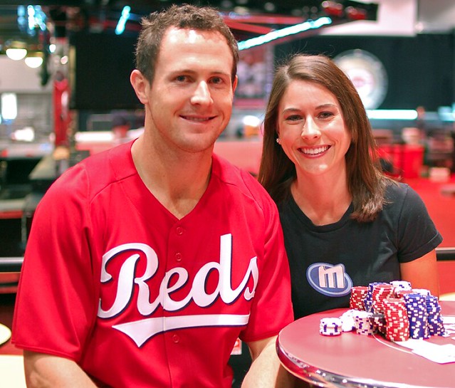
As it turns out, though, the first of the new BP jerseys to be publicly released is also by far the most interesting one of the batch, so it’s worth talking about. It’s the new Cincy design, which you can see pictured above. That photo began circulating yesterday afternoon, in advance of the Reds’ FanFest event this weekend.
Pretty weird that they went with a script, right? Even weirder, it’s apparently based on a much smaller script that was used for two utterly forgettable seasons a million years ago, back when Marge Schott was still a little girl trying to tune in Nazi rallies on the short-wave. I’m all for a team honoring its visual history, but what an obscure chapter to resurrect.
I’ve seen all the other new BP designs, and while I’m not at liberty to show them to you, I can tell you this: Not a single one of them feels retro-ish, and all of them are very much in keeping with their teams’ respective identity system. Only the Reds have used the new BP garb as a canvas for something new (even if it’s based on something old). I kinda like it, at least the part you can see there in the photo.
A few other things:
• The Reds’ BP jersey — like almost all the 2011 BP designs — has some ugly side panels (that’s the part I don’t like).
• As you can see in that last link, the drop shadow and all the other trim is supposed to be black. But the drop shadow in the photo looks a bit blue, no? Probably just a trick of the light.
• As you’ve probably noticed by now, this jersey has a full-length button placket, instead of the two-button front of recent years. That holds for all of the new BP jerseys.
And in case you’re wondering, the retro script isn’t slated to appear anywhere else in the Reds’ 2011 graphics program — there’s no script alternate jersey or anything like that. I suppose there could be a one-off throwback (or not, I have no idea), but definitely nothing more significant than that.
Late-breaking update: Here’s a photo where you can see the black side panel.
ESPN reminder: In case you missed it yesterday, my annual Uni Watch Holiday Gift Guide column is up and running on ESPN.com.

Holiday giveaway: The great people at Gridiron Memories, who turn out the best, most authentic helmet reproductions on the market, are offering a free college helmet to a lucky Uni Watch reader. The winner will get his or her choice of any non-autographed helmet from this page. Pretty sweet, right?
To enter, send an e-mail with your name, shipping address, and preferred helmet to the giveaway address by next Thursday, Dec. 9, at 7pm Eastern. One entry per person. I’ll announce the winner next Friday.
Stirrups Club reminder: A new batch of stirrups is available from Robert Marshall. Full details here.
Uni Watch News Ticker: Rough time for LeBron James last night. First the Cavs tried to confuse him by wearing red at home, and then TNT had him taking his talents to Oregon. TNT apparently used last year’s jersey template, too, because the NBA logo is on the wrong side (screen shot courtesy of Mike Hasselbeck). ”¦ Lots of counterfeit jerseys showing up in Ottawa (with thanks to Dane Drutis). ”¦ This is just too good: South Carolina has a guy named Heinz who wears, of course, 57. And yes, he’s really on the roster (with thanks to Ronnie Poore). ”¦ Two great color-on-color video clips for your consideration: Auburn/UGA in 1969 and Auburn/Tennessee from 1970 (great finds by Patrick Campbell). ”¦ Don’t blink or you’ll miss it: If you go to this video clip, you’ll briefly see the rare sight of the Bruins pairing their white sweaters with their gold socks. “They did it on a few occasions in the early 1970s,” says Brian Codagnone. ”¦ We’ve all seen high school teams ripping off college and pro logos, but come on. That’s George Washington High in San Francisco. Lame (with thanks to Christian Cisneros). ”¦ Hey, speaking of which, Tris Wykes is doing a story for his local paper about high schools that are taking some logo liberties. If you know of any schools that fit this description give Tris a shout. ”¦ Why did the Chiefs suddenly break out the red pants on the road last weekend? Apparently for good luck (with thanks to Chris Heintzelman). ”¦ Leondrus E. Thornton sent along a good video of the Arizona football field being painted. ”¦ Latest college hoops team to go BFBS: UNLV (with thanks to Randon Alford). ”¦ Indiana State is using DC Comics-style artwork for its program covers this season (with thanks to John Pollock). ”¦ The triple-A Round Rock Express have changed affiliations, going from the Astros to the Rangers Texases, which of course means a new look. Further info here (with thanks to James McClure). ”¦ I believe the Bucs will be wearing their creamsicles this weekend. ”¦ Watched The Ice Storm on IFC last night (first time I’d seen it since catching it in the theater when it first came out in the late ’90s — still brutally, devastatingly good). It includes a brief scene of kids playing flag football. It had been ages since I’d seen that, and I’d kinda forgotten how weird it looks for the kids to have those flags hanging off of them. … Good work by Joe Lombardo, who writes: “At the end of the first half of the Eagles/Texans game, Matt Schaub got injured and Dan Orlovsky had to come in to play the last down. He couldn’t find his helmet, so No. 88 Garrett Graham and No. 12 Jacoby Jones each offered him their own. He wore Graham’s helmet for the last down of the half.” Thurman Thomas could not be reached for comment. ”¦ Two Washington Caps notes from John Muir: “Goalie Michael Neuvirth is awaiting a shipment of new stickers, so he played against Dallas while using Semeyon Varlamov’s stick. And new defenseman Scott Hannan’s gloves are extra colorful, because they’re his old Colorado gloves that were spray-painted.” . ”¦ Scott Fendley noticed two early-’70s Astros cards with non-matching NOB fonts. The one on the bottom is wrong — must’ve been a spring training rush job or something like that. ”¦ Jason Varitek is apparently set to re-sign with the Red Sox, which means MLB’s only captaincy designation will be back for another year. ”¦ I don’t know for sure who the Buffalo Bisons were affiliated with in 1985, but I think it’s a pretty safe bet that it was the White Sox. Didn’t know that design had been used in the minors. ”¦ What is this? It’s a comparison of the Bosox cap logo and two different Brooklyn Dodgers throwback cap logos. It’s all part of an admirably obsessive investigation by Dan Cichalski — full details on his blog. ”¦ UNC basketball blogger Benn Wineka has written a piece about the team’s 2010 sneakers.
Speaking of Holiday Gift Guides…and updates on the Portland Beavers striped undershirt?
ed
Good question. Bob Halfacre hasn’t exactly put that one on the front burner. Let me bug him again.
Paul, it’s Dan Orlovsky not ‘Orlovsly’. link
Thanks. Now fixed.
Also, once when Brian Cushing made a tackle, the orange amplifier for his headset was dangling out of his helmet by an electric cord. Looked as if he just stuck it back up in there after the play…maybe it’s velcroed or double-sided taped.
I’m all for a team honoring its visual history, but what an obscure chapter to resurrect.
I know it was a link, but given UniWatch’s recent delve this very chapter in Reds visual history, I was a bit surprised to read such an apparently dismissive assessment. Besides, the Reds have been so consistent for so long with their basic identity elements – no matter how many tweaks you make to the drop shadowing, it’s all just variations on block-REDS-inside-wishbone-C – that the team doesn’t actually have all that many other options to reach for. If the design brief was, “We want a retro BP jersey, so pull something different from our archives,” the 1936-37 script is the obvious first (and very nearly only) choice.
Not a lot of evidence to go on, but on the Reds jersey, the side panels appear to be a definite improvement on recent BP designs. Much less prominent. Combined with the full-button placket, and it’s looking like the rehearsal smocks are going to be an upgrade.
Yeah, but Phil mentioned that design in the context of writing about satin uniforms. It’s not like the Reds are rendering this BP jersey in satin.
Again, I’m not knocking it — I’m just surprised.
Granted, but if you’re the Reds, and you want to feature a retro design of some sort, what are your options? There’s the 1936-37 script, and then what? The notched C from 1906-1907? I honestly can’t find a viable “plan C” for a Reds retro look that isn’t just a variation on the wishbone C or a block “Cincinnati”. If there’s a surprise here, then, it’s not the choice of this particular “obscure” script, it’s the decision to go retro. Because once the Reds make that choice, using the script in question is pretty much inevitable.
And I’d submit that the whole BP-uniform phenomenon is the modern equivalent of the satin jersey as an exercise in pure, though differently textured, gimmickry. ;-)
I’ll bet it’s just an attempted “faux-back”, designed with indifference to the team’s actual historical designs.
Here’s a peeve of mine: why do all scripts have to be HUGE now? I know ‘Reds’ is a small word, but look at the Orioles current script vs. the 60s/70s/80s. Stevie Wonder can read it.
perhaps they should have gone with plan b
This just in: Ron Santo has died.
I know he had his critics, and probably rightfully so, but as a lifelong Cubs fan, I absolutely loved Ronnie, and my summers will be infinitely less fun without him bemoaning the Cubbies’ follies.
RIP.
Saw this in an article from the Sun Times:
–in 1966, he set a then franchise record by hitting in 28 consecutive games. The streak was threatened at 26 when Santo was hit in the face with a pitch from New York Mets righthander Jack Fisher. He suffered a broken cheekbone and missed almost two weeks. When he returned, he added two more games to the streak and a new piece of equipment to baseball’s arsenal–a helmet ear flap that became standard ever since.
link
This is terrible news…say what you want, but he made the games come alive on the radio right down to how playersw looked in their uniforms.
I think you’re confusing Santo with Pat Hughes.
When the Cubs still held old-timer games Santo would appear in his Cubs double-knits but wearing a pair of red spikes he had saved from his year with the White Sox.
My god did he live and die with the Cubs. He was intense. Hated the Mets with a passion. ‘Competitor’ isn’t a strong enough word.
That Indiana State program is most certainly in a DC style, however it features one of the players as Daredevil, a Marvel character.
Ruh-roh, George. Here come the lawyers.
Not just any lawyers, either. The DISNEY lawyers (cue dramatic music).
I really like the attempt, however. Much better than the run-of-the-mill lame program covers you see in most college arenas these days.
Oh, for sure. I think the cover’s great. I was just pointing it out. Esp. as a comic book fan, it was weird to see DD drawn in more of the DC style.
The Daredevil drawing reminds me of one that Joe Quesada did in the Daredevil “Marvel Knights” days or one of Greg Land’s:
link
The Aquaman is definitely a riff on the poster by Alex Ross.
Crap, the link wasn’t quite right:
link
Sorry, friends.
For the HTML-challenged, link is your friend.
here…lemme help ya with that
Interesting bit of history that it’s not intentionally homaging:
both companies are known for their rather impressive April Fool’s Day pranks. One year, they both went in together and announced that they were going to “swap” characters. Marvel would get the Flash, and DC would get Daredevil.
Fanboys were beyond furious. It was absolutely hilarious.
Still not as good as when Marvel “discovered their long-lost WWII hero” The Sentinel.
To be honest, IN St. did an homage to both DC Comics and Marvel Comics of the 1970’s.
See here, link, here link, here link, and here link It’s almost like they’re trying to do a DC vs. Marvel thing with their program cover… Wait a minute, I forgot that’s been done. link
The cover design does look like a hybrid of 80s DC and Marvel cover styles (with the DC-style “bullet” logo in the top left corner, and the Marvel-style infobox – usually on the left – in the top right corner).
Shouldn’t have been the Indiana State Football team the last few season that used the comic book theme? I mean the had the longest losing streak in the nation.
So non-uni related, but when a minor league team switches affiliations, how does that work with the rosters? Does the entire roster from the old triple-a team just move over?
The major league team will stock the affiliate. A few year’s ago, the O’s moved their Triple-A affiliate from Ottawa to Norfolk, so all of the players moved from one team to the other. The existing Norfolk players (from the Mets, I believe) in turn, moved to the Mets new Triple-A affiliate.
Which was New Orleans and is now Buffalo.
The Minor League affiliate has no input on the players that they end up with. The affiliate is contractually obligated to provide a facility (playing field, lockers, etc) up to a certain standard. In exchange, the Major league club provides players and coaches.
The players stay with (and are under contract to) the MLB organization … obviously, people will move up and down, but most of the Texases’ AAA players will move over from Oklahoma City to Round Rock, while the Astros do it in reverse.
Yup, this is correct. I never actually knew this until a few years ago when our New Orleans minor league team switched from the Mets to (I think) Marlins.
When it happened, I thought to myself… I’ve been a baseball fan since 1981 and never once considered what happens when a minor league team switches affiliates.
MAYBE IF RBK DIDN’T MAKE SHIT PEOPLE WOULD BY THE LICENSED JERSEYS INSTEAD OF THE CHINA KNOCKOFFS
Fully numbered authentic on-ice jerseys, identical to those NHL players wear, sell for about $360.
NOT REALLY, ONLY THE EDGE 1.0 is AVAILABLE AT RETAIL. THE PLAYERS WEAR EDGE 2.0 ON THE ICE . . .the stretchy “Edge” material on the version 1.0 is replaced with oldschool airknit material on the shoulders and front panel on the gamers.
Read more: link
There are a ton of Penguins counterfeits on the streets of Pittsburgh, and most of them are terrible. UniWatchers could spot the fakes from a mile away. Font is wrong, color is off, RBK logo in the wrong lac.e. You get what you pay for
Speaking of Heinz(e) 57:
link
link
link
I tried to trick a guy on my softball team named Hines into picking a 57 jersey last year by putting it on top of the pile. He’s not a big sports fan, so I figured he’d just take the top jersey. Alas, he chose a different number. I never asked him if he did it on purpose.
Do MLB teams have a Home and Away version of the Batting Practice uniform? Or do they use the same BP set for both?
Thanks in advance for the responses!
-TC
Most (all?) teams only have one.
ed
A few teams have had separate home and road BP designs. For the new sets that will be used in 2011, the teams with two BP jerseys will be the Yankees, Orioles, Red Sox, Tigers, and Blue Jays. All American League teams, oddly.
Last year the Orioles wore the Orange BP jersey with NOB for a few Tuesday home games. It looked terrible and cheap. Any word on if they plan to continue that?
And mostly AL East. That feels like more than coincidence to me, but you would know much better than I.
especially odd for the red sox, blue jays and o’s since they don’t have any alternate jerseys
Not sure about the new iteration, but the Phillies went with a red BP jersey at home and a blue one on the road this past season.
Best part of that Bruins video: 1:53 – watching the linesman jump up the boards top avoid the play. Rarely see that nowadays.
I’m not so sure we should call UNLV’s new hoops jersey a BFBS. I mean their colors are Red and Black.
The BFBS thing is starting to be overused on UW imho.
-Paul
UNLV official school colors:
Scarlet
PMS-485
Gray
PMS-423
I’ll give you that, it even mentions it here;
link
But my argument is more, they’ve been wearing that color for YEARS. It’s not necessarily BFBS when there options for an alternate jersey are gray or nothing.
I’m just saying not everything is “oh lets get a black jersey because it looks cool”. Maybe a give them the benefit of the doubt on this one.
-Paul
Benefit of the doubt?
If they have a viable option (gray) and choose black anyway, how can you not say it’s BFBS?
And they’ve been wearing the color for years? Sure, as a trim color, like Ohio State football.
Oh, and of course, they had black unis in the late 90s — well after it became a fashion statement.
They have two viable options, Black and Gray. They chose one. Even if their official PMS colors don’t include black, it has been a major element in their jerseys and logos for as long as I can remember. Ohio State has a small bit of black trim in their jerseys, much less significant than the usage of black by UNLV has been. Compare it to someone like Washington, who otherwise has no black in their set whatsoever but brought out black jerseys. That is BFBS. Stanford’s black jerseys are BFBS, since (other than the trim they used on the football jerseys for a couple years) their usual set has no black.
I’m against BFBS, but for teams who use black as a major element in all their uniforms, I don’t mind.
The test should be, if you put the black jersey next to the rest of the team’s jerseys, does it seem mismatched or out of place? For UNLV, since their other jerseys utilize black significantly, the answer is no.
In the Bruins video the one clip shows the Bruins wearing black at home as you can see the spoked B in the center circle.
Good article w/ good questions regarding tOSU Buckeyes getting flagged for unsportsmanlike conduct against Michigan for flashing Nike gloves. link
New logo & color scheme for Washington Mystics- normally not of any interest, but it could signal future color scheme for Wizards. Looks a lot like the Nets to me.
link
Maybe the guy/lady who designed the logo should have had a WNBA ball handy during the process.
If the Wizards re-adopt the Bullets moniker, which I know they won’t actually, thank you very much Mister Arenas, but bear with me here, will the Mystics become the Bullettes?
You should be ashamed of yourself for that one.
Yes, but on a serious note, if the Wizards did become the Bullets, what would the WNBA affiliate be called? There’s such a strong pattern of the women’s team adopting a similar name to the men’s team, but this is a case where I can’t think of a good alternative. Blades? Powder? Shells? Cannonballs? Barrels? Shot? (Which is both an alternative to a bullet as a form of ammunition and a plural that doesn’t end in “S,” so it’s right up the WNBA alley.)
My nominee: Washington Grapeshot.
Anyway, the WNBA team name is why the Wizards will stay the Wizards. You could ditch Arenas and make the Bullets name not remind everyone of that time your star turned your locker room into the OK Corral, but there’s no way to make the women’s team fit the new identity.
I don’t see why they can’t keep the Mystics name if the Wizards revert to the Bullets.
The WNBA team riffing on the NBA team’s nickname is more the exception than the rule as the league is currently set up.
Atlanta Dream/Hawks
Chicago Sky/Bulls
Connecticut Sun/…Boston Celtics? (Orlando Miracle/Magic)
Indiana Fever/Pacers
New York Liberty/Knicks
Washington Mystics/Wizards
Los Angeles Sparks/Lakers
Minnesota Lynx/Timberwolves
Phoenix Mercury/Suns
Tulsa Shock/…Oklahoma City Thunder? (Detroit Pistons)
Seattle Storm/departed SuperSonics
San Antonio Silver Stars/Spurs (Utah Starzz/Jazz)
Washington Pellets
If you’re going for gender role equivalents, how about:
Washington Gaping Wounds?
I like the Reds’ BP jersey. (I like the term rehearsal smock even better.) IMO Cincinnati’s look is underrated. I’d prefer teams reserve use of their softball tops to those activities before the game.
In honor of Mr. Santo. I’d like to declare this No. 10 NNOB Day. Send an invitation to Cooperstown.
Wait are you talking about all sports? Because if you are just talking about baseball, then there would be no point in that because it is the offseason.
Paul,
Thanks for the clarification. I appreciate it. It bugged me to no end – 35 years after the cards were printed!!
Now if I learn to operate my scanner, I’ll be in great shape.
closer look at the varsity jacket LeBron was wearing last night link
Bucs will indeed be wearing orange this Sunday. They’ve started doing this once a year, when they induct someone into the ring of honor. This year’s inductee is their first head coach, John McKay.
Two notes: 1) They also decorate the field and stadium in 70’s gear. The end zones and midfield logo get the orange treatment, and it’s a neat look. The problem is that most of the country won’t see it because FOX is putting Indy/Dallas (which naturally means Buck/Aikman) in 80% of American homes at 4:15. That’s a shame, but I encourage field art fanatics to catch at least a bit of the Bucs game. The cheerleaders even wear 70’s outfits, with the giant over-sized pompoms (no innuendo intended).
2) I think that instead of a “Ring of Honor”, something befitting the Buccaneers personality better would be flags of each retired jersey flying from the masts on the pirate ship behind the north end zone. Just my two cents.
since they are playing the Falcons, wouldn’t it be great to see color vs color with Atlanta in their gorgeous throwbacks?!?!?
that would be sweet…of course that would be another one of those games where the throwbacks would have been from different eras, but it would look awesome
i didn’t use this mockup for last weekend’s CVC pt. deux, but it shows the creamsickle would work against dark colors
Falcons have already worn the throwbacks twice this season, so that can’t happen.
Excellent idea, Kyle.
Though I wouldn’t mind seeing the next Buc to run afoul of the law hoisted up on the mast as well. Then again, there may not be enough room up there the way the team is going.
Going with the whole 70s thing (like they did last year against the Packers) is what makes the whole retro bit work in Tampa Bay better than many other places. The cheerleaders, the field markings, all of it. Good stuff. I don’t know if they played the old “Hey, Hey, Tampa Bay” song, but that would cap things off.
Pretty amazing that MLB and the Reds, a team whose manager was banned for life for gambling, would publish a photo of its new BP jersey on someone sitting at a table with a pile of poker chips. Does MLB oppose mixing gambling with baseball or not?
Good point. The RedsFest event includes a “celebrity poker” component, which is why they were posing at a poker table. Pete Rose will presumably be selling autographs at a table across the street….
RedsFest, what fun. They called me once like the NIGHT BEFORE and said, ‘we need a PA announcer!!!’ So I sat behind a curtain all day and made PA announcements. I don’t even think I got paid.
Forget the Reds jersey and the poker chips; who’s the girl?
Her name is Jennifer.
Will proudly be displaying my #10 Cubs Jersey themed Uniwatch card today.
This just came across my twitter feed
link
I know you can’t revile too much, but are the Royals using the full Royals script or the KC on the new BP’s?
Interesting Freudian slip there….
That’s what I get when typing on my phone. Any hints?
Sorry, I can’t give any specific team info.
Yes, it’s creamsicles for the Bucs Sunday, because they’re inducting John McKay into the Ring of Honor. His son, Rich, now with the Falcons, will be there for the ceremony.
And I will be wearing my #12 Doug Williams throwback.
And I will be watching that episode of What’s Happening.
I don’t know if Auburn made it a habit of wearing color against big rivals back in the 60s/70s, but I do know that Bama and Tennessee usually wore crimson/orange during their annual game during those years. I’m someone that actually prefers Bama’s whites over our crimson jerseys, but in looking at old pictures, the crimson and orange really pop. Interestingly, there were rumors in 2009 that Lane Kiffin would pull out the orange jerseys in Tuscaloosa, but it didn’t happen.
A quick Google search yielded link. I’m pretty sure that’s Kenny Stabler wearing number 12 for the Tide.
I’m not sure when that tradition started or ended, but I know they haven’t done it anytime in the last 30 years. I would love to see the two schools resurrect that look for the game, though.
Hate to reply to my own post, but I didn’t even realize that the pic I linked was originally FROM UniWatch. I guess this has been discussed before. Shame on me for not remembering or checking the archives!
Wouldn’t Stabler have carried the ball in his left hand?
Probably so. Not sure why I was thinking it was Stabler. Must have been Namath.
RIP Ron Santo. About a year ago there was a great documentary on Santo that ran on MLB network. It followed him through a season with the Cubs. Maybe they will bring it back as a way to memorialize his passing.
Speaking of high school/NFL ripoffs, here’s the link from Sunbury, Ohio.
I think that game could be a “ripoff-vs-ripoff” looks like the tackler is wearing a Michigan helment.
But does Michigan own the rights to that helmet since both Princeton and Delaware also use it?
No, but Michigan’s wing design is slightly different from all the other schools that use it.
Fritz Crisler brought the Winged helmets from Princeton to Michigan, so Princeton actually had them first. They look better on Michigan, though.
Winged helmets are reasonably common in high school, a lot of teams use them.
Thanks for the info, I am not a college sports fan, I didnt realize the design originated at Princeton. Should have guessed an Ivy guy created such a great design.
It’s a leather helmet replica.
michigan STATE was the first team to use the link, i’m just sayin. actually what i’m sayin’ is nertz to fritz.
Far right, 1937 road uni is a good look. They shoulda went with that one for the BP jersey …
link
Shame on me for even wondering this so soon, but …
When the Cubs have a ceremony to celebrate Ron Santo’s life, will Ryne Sandberg be in attendance?
If they can schedule it. Ryno will be busy next summer.
in re: new full-button down bp jerseys…
im wondering if this won’t encourage teams to consider wearing them in actual game play…i seem to recall the orioles, nats, and i think, the rays, have all broken out the BP jerseys for real game play in recent years
seems to me giving them an full button jersey instead of a pullover is just asking for teams to wear these *things* in actual game play
Agreed. That may even be why they changed the button format.
This is sort of like hearing that there’s gonna be another Rocky movie – vaguely interesting, but honestly, who gives a shit?
Paul, did you see Rocky Balboa? It was a pretty damn good movie.
[cough] Rocky V [cough]
I’m surprised that they let the Heinz player wear #57 as a punter. Obviously, college football and high school football normally have a much more lenient jersey numbering scheme, but the 50-79 range still falls under “ineligible receiver” rules, and usually college punters wear numbers in the 30’s, 40’s, and 90’s. He must play as a lineman as well.
According to his bio he is a walk-on so I doubt he will see the field.
The only other case similar to this is when former New York Giants linebacker Brad Van Pelt wore number 10 despite just entering the league when the rigid numbering rule went into effect and wasn’t grandfathered. He was the backup kicker so he got away with number 10.
Blair Walsh, Georgia’s current kicker, link He sees the field regularly.
The Reds BP kit bugs me because it has three distinctly different lettering styles that don’t play well together. The ornate NOB and number from the gamers should not have been put on the same jersey with the script. A simpler block style for NOB and number would be a major improvement.
I really like those red pants from the ’36 Reds team, but I don’t know why.
The black side panels completely ruin what would be a rather attractive worthless batting practice jersey. One simple move blows up the whole thing.
Agreed.
So I guess a move to Chicago would be bearable for you now, eh, Paul?RIP, Ronny.
see, i move and look what happens. as much as i complained about the cat when i was a chicagoan, when that news came over the squawk-box, i almost teared up.
The Peoria Suns also wore the 1980s Sox look:
1983: link
Mind you, they were an Angels affiliate at the time. Buffalo Bison White Sox-AAA ’85-’86
What the hell… never seen a pillbox version of this before. Looks old, too.
link
In regards to the new Reds BP jerseys, I don’t mind them. I could certainly do without the side panels, but I like to overall look – if you’re going to give me a solid-colored top, anyway. Interestingly enough, I’ve never been a big fan of the big C, little REDS, or, for that matter, big C, little UBS.
If the Reds are going to go with an alternate look during meaningful games, I’d rather they do it with the jersey pictured than with their “standard” alternate.
BTW, I don’t mind tomatoes or other fruit, but please no rocks. I have kids to feed.
Because of the freaking site it’s on, I would tend to discount this, but supposedly it’s the Houston Dynamo’s shirt for next year:
link
What happened to Amigo Energy? Also, when your name doesn’t evoke any strong imagery, it’s a bad idea to put any pattern on the jerseys, especially one that’s that busy.
I kind of like that pattern. I don’t think it’d show from a distance, and makes it unique when viewed close up.
That said, the pattern could fade with a couple washings and become less bold. All you need is a little blue jug of … oh, what’s that stuff called again?
It’s refreshing to see a player realize when the football/war metaphor gets taken too far and apologizing for it. Antrel Rolle needs to have a talk with Kellen Winslow II and the execs at Nike regarding moderation.
link
Thanks for posting that Bobby Orr clip. I do remember seeing a few games/pics as a kid where Boston wore the yellow socks with their white unis, and obsessing over it, naturally ;)
-Jet
…oh yeah, and it was also sweet seeing some of the Original Six Expansion unis on that Orr clip!
-Jet
Re: the Ottawa Citizen counterfeiting article
I do not support counterfeiting in any way, but really NHL and jersey manufacturers, do you expect a lot of people out there to pay over $300.00 for a “real authentic” jersey for a player that could be gone next year? Jersey counterfeiting, and counterfeiting out of China in general is a huge problem right now, but I don’t have a ton of sympathy for victims of this crime when their intent is to squeeze every last dollar out of customers.
Seeing as today’s lead is baseball…
Gee, I hope this link works.
36 pages of fun and nostalgia from a different media era (and, y’know, since the Giants just won it again)…
link
—Ricko
damn
i was hoping that would have been benchies
Great stuff. On a similar note, here’s a set of link. Brilliant stuff!
Gorgeous Ebay Listing:
link
Was really worried when I saw this headline on CNN.com:
‘Star Spangled Banner’ sells for $500K
I had this horrible picture of people coming out of the right field corner with red and white striped shirts and suspenders clapping their hands as they sing, “Great, Great Flag! It’s a really Great Flag ….”
Luckily, the headline didn’t quite give and accurate idea of what had taken place.
link
Classy Marge Nazi comment Paul. Come on man. RIP Mr. Santo.
Lighten up. It was funny.
First time “classy” and Marge Schott have been mentioned in the same sentence.
link…
i’d love to know what else you came up with in that google search
wow, you almost nary hear tale of a marge schott apologist. does he not know what the marger was about maybe? at least aesthetically, she was a snazzy dresser, i’ll give her that.
The funny thing is that he inadvertently referred to her as “Marge Nazi.” I know that’s not what he meant, but sometimes things just have a way of working out…
I’ll never understand why more teams don’t design their BP jerseys like the Reds- with a completely different design/logo/whatever. That’s the jersey they should be “going nuts” with. I rarely see people buying/wearing BP jerseys… but if teams came up with a completely outside-the-lines look to them, I bet they’d sell more.
Never thought of this, but you are VERY much correct. This could be the start of a beautiful/scary/interesting/confusing/fabulous/insane trend!
I don’t know. I’ve been thinking about this all day, and I’ve concluded that the new Reds BP jersey is extremely generic, like something you’d pull off the rack at K-Mart or Sears.
Ever since the batting jersey & cap craze began in 1999, there really hasn’t anything remarkable worth buying, unless your team doesn’t have an alternate jersey or only has one cap.
After all this progress on fabric materials, design and focus groups, why can’t they invent or use a cap thread that won’t stain with sweat? That’s always my biggest concern with a cap.
The only batting practice cap that I remember seeing somewhat frequently back in the day was the one used by Arizona in which the snake is biting a baseball. It was a unique cap very much distinct from the regular caps the team wore.
Was it this version?
link
It’s certainly more interesting than any “A” or “D” cap they’ve had. Tho its problematic shape runs into the same territory the old Dallas Star ‘Taurus’ 3rds had:
link
I actually own a (now out of date, damn it) blue Phillies batting practice jersey – just because it was cheaper than an authentic with a name on the back, plus it’s actually noticeably cooler to wear when it’s very hot out.
This really should have been posted yesterday….
I live in the far southwest corner of Houston. Our aging little subdivision, Huntington Village, straddles the Fort Band County line: half the neighborhood has a Houston ZIP code; half has a Sugar Land ZIP. The old Imperial Sugar plant, where Skeeter Field is to be built, is about three miles away. I drive past the red brick Imperial Sugar tower almost every day. Our church is just down the street.
Part of the redevelopment plan for the site includes dismantling most of the production buildings, but refitting the main tower for condos and upscale shops. Nothing should make me happier than to have an iconic building saved, and a cool-looking minor league stadium built right next door to it, all within a short bike ride from my home.
I’m depressed.
Long before Sugar Land became the home to millionaire athletes and white flighting, Harley riding, goatee wearing, Jimmy Buffet listening middle aged accountants, it was a company town. The sugar plant dominated the community. To this day, in the area immediately around the plant site, there is a charming (that is not a term used to describe many neighborhoods in metro Houston, believe me) collection of Craftsman-style cottages, the former homes of Imperial Sugar employees. There’s also an old schoolhouse, done in a vaguely Spanish style, which is representative of much of the public architecture associated with old Sugar Land. it features a crown motif. That crown, the logo of Imperial Sugar, used to be everywhere in this part of town. It still is, to a certain extent: freeway overpasses in Sugar Land are decorated with a Texas Lone Star, featuring an Imperial Sugar crown at their center.
Houston is less a city than an aggressive rash: where ever the developers’ bulldozers scratch, a new collection of houses and strip malls and gas stations erupts. It’s a city that takes almost perverse pleasure in destroying the old and interesting to build more of the new and banal (loneliest people in the world: Democrats in Utah. Second loneliest: historic preservationists in Houston). So you have these people who are doing a good thing — saving an historic building — and they spoil it with an uninspired stadium design and a ridiculous team identity.
There is some justification for “Skeeters”: the stadium site is a stone’s throw from Oyster Creek, notorious in the old days for flooding. Much of the land in that part of town is fairly swampy. So there would be mosquitoes.
But there are mosquitoes EVERYWHERE. How many cities have an old sugar plant? How many cities are NAMED after that sugar plant? It would be like a team from Niagara Falls calling themselves “The Ants” instead of the Rapids or the Cataracts or the Daredevils. Stupid.
The only names that makes sense, the only names that fit, pay homage to the city’s history. The Sugar Land Imperials. The Sugar Land Sugar Kings.
It could have been so cool.
It sucks.
You know, I grew up in the Houston area and had no idea about the origins of Sugar Land. Thanks for the background. And yes, that makes the “Skeeters” identity even dumber than I thought it was yesterday.
The bisions were affiliated with the Chicago Whitesoxs for 2 years from 85-86. I still miss when they were affiliated with the Indians they had great jerseys. Though the mets are my favorite MLB team they ruined the great uniforms the bisions had. The Color Commentator for the Bisions Duke McGuire was the disciplinary guy at my high school.
Jeter is captain of the Hated Ones since 2003, still a part of MLB last time I checked. I’d love to be wrong about this.
does he wear a C? that might be what he was talking about, i forget how he worded it and am too lazy or drunk to scroll to the top of the page.
im neither drunk
nor lazyso i’ll do it for ya…here’s what our fearless leader wrote (minus the linkie):taken strictly on verbiage, i suppose one could take that to mean tek is the “only” team captain, but we all know he was referring to the captaincy PATCH tek insisted up having stitched on there
Being both lazy AND drunk at this particular moment, I certainly do appreciate that help, Skipper.
i’m not really drunk…yet…i need to get the pineapple from the airport, but i am lazy. truth be told i was more referring to the fact that i don’t know if tek, as you call him, is the only official captain or the only one that actually wears the c, but i have a sneaking suspicion that fearless meant the later.
Of course I meant the latter. I specifically referred to DESIGNATION — i.e., the letter on his jersey. The number of captains in the sport isn’t of any concern to Uni Watch; the number of “C” designations, however, is.
Yeah, well, I may be drunk, but I’d be remiss in my duties as a link if I didn’t point this out.
It’s certainly possible to be designated a captain but not have any visual representation on the uni.
For example, Paul Konerko was designated as the captain of the Whitesoxs (sic) last year (or at least one of the team’s captains), yet he wore nothing on his uniform to indicate this.
That being said, I knew exactly what you meant by “captaincy designation” as it relates to one Mr. Varitek.
P.S. How sad is it that I’m a Cubs fan and I have no idea who the team captain(s) was/were for them last year?
*phew*
(fixed)
You missed the question mark, Skippy.
Has any team ever had script NOBs?
I’m running on the door, so no time to do proper photo searching, but the Memphis Sounds come to mind:
link
link
It seems like there would be a legibility issue with a script.
Possibly – but since NOB isn’t a uniform requirement (in some sports), what difference does that make?
If the Yankees can continue to not have a NOB, why can’t the Mets or other script-jersey’d team use a matching, though hard-to-read, script for their NOB?
The Flint (MI) School district is selling old Flint Central High School stuff including uniforms. Central closed last year.
link
Columbus lost again tonight in their 3rd jerseys making them 0-3 in them.
love the Reds new BP jersey. it’s unapologetically big & bold, yet clean and simple. definite nod to a forgotten era when baseball wasn’t so afraid of simplicity mixed with a little bit of ‘fun’.