On Saturday and Monday I linked to some images suggesting that the manager and coaches on the 1973 Indians wore piping on their caps. But either of those shots could have been taken during spring training, and I remained unconvinced that the Tribe’s brain trust actually went with piping-clad headwear for the ’73 season. We’d never talked about it here on the site (at least not that I could recall), and it seemed like the kind of thing that would have surfaced in our discussions by now, no?
But now reader Mike Hersh has come up with two wire photos that conclusively prove that the Indians’ coaching staff — or at least skipper Ken Aspromonte — was piping-capped for 1973 games (note the cool ump caps, too).
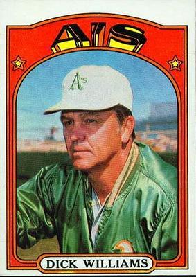
Personally, I find this pretty stunning. We all know that the A’s coaches were wearing white caps around this same time — it’s a famous quirk, even reprised nowadays for Oakland’s throwback games — so how has the Cleveland piping managed to fly under the Uni Watch radar for so long? It’s a potent reminder that there’s a lot of relatively recent history out there that hasn’t been documented. Even those of us who think we know this stuff pretty well often don’t know squat.
This also got me thinking about coaches wearing specialized headwear. A few examples came to mind:
• The most obvious case, as noted above, would be the Oakland A’s, whose managers and coaches wore white caps during the late 1960s and early ’70s (although I’m unsure of the exact years — anyone..?). It was one of Charlie Finley’s many innovations.
• In 2004 and 2005, Texas Rangers skipper Buck Showalter and his coaches wore red caps — while the rest of the team wore blue — in spring training. I assume this was so the coaches could easily be picked out from the mass of humanity that forms during spring training workouts. It’ll be interesting to see if Showalter dusts off this idea next February when he convenes his first spring training camp with the Orioles.
• In football, offensive and defensive coordinators (or whoever’s sending in signals from the sideline) sometimes wear boldly colored caps, so the players on the field can quickly spot them. I can’t find a good photo of this, although I know they’re out there.
• Although this isn’t quite the same thing, the referee on a football officiating crew wears a white cap, while the other zebras wear black caps.
I’m sure there are other examples I’m overlooking. If you know of any, let’s hear ’em.
Gift membership reminder: Remember, if you want to get someone a Uni Watch membership card as a stocking stuffer but don’t know which design motif to use, you can just pay for the lucky giftee’s membership up front and I’ll send you larger versions of these voucher designs, which the recipient can then redeem for the membership card of his or her choice. Full details on that are here. And if you already know what design you want for your giftee’s card (or if you want to sign up yourself), the full scoop on that is here.
Uni Watch News Ticker: Yesterday I mentioned that Virginia Tech was wearing a little ACC Coastal Division championship decal. Clark Ruhland has now provided a much better view of the decal design. ”¦ While looking for something else in Bill Henderson’s guide, I spotted this Jim Perry jersey with no space between the first initial and the surname. ”¦ Hmmm, we’ve come a long way from gumball NFL helmets to gumball NFL shot glasses. “I saw them in a local KMart at the vending machine cluster as you exit the store,” says Randy Williams. “I didn’t have 50 cents to get one, but they were plastic and fairly small. Probably a half shot’s worth. They were right next to the kiddie plastic bling jewelry.” ”¦ I love — love — this old VFW baseball uniform and would totally buy it myself except that it’s too big for me. Although the measurements aren’t listed on the auction page, the seller tells me the jersey measures 23 inches from pit to pit and 32 inches from top to bottom. If that fits you, snap this one up — it’s a bargain! ”¦ Flip Flop Fly Ball’s latest chart: a look at how MLB jersey insignias cross the Rubicon. Only problem is that he doesn’t account for doubled-up letters that give us things like “Philllies” and “Raays” (with thanks to Eric Davis). ”¦ U.S. women’s soccer star Abby Wambach normally wears No. 20, but she was wearing No. 17 for the recent playoff game against Italy. “Only thing I can think is that FIFA mandated 1 through 18 for the numbers,” says Ethan Allen. “That may be the case, because Italy had 1 through 18 as well.” ”¦ Guess which NFL game I won’t be attending this Sunday (blame Jack Krabbe). ”¦ I neglected to mention yesterday that Kansas wore white helmets on Saturday (but fortunately Luis Aranda reminded me). ”¦ New cycling jersey for the Garmin-Cervelo team (with thanks to Sean Clancy). ”¦ Sports Business Journal just ran a photo that included a small glimpse at one of next year’s BP jerseys. Just one problem: That is not what the Braves’ BP jersey will look like. It is, however, very similar to what some other teams will be wearing. ”¦ Evander Kane and Matt Hunwick got in a fight during Sunday’s Thrashers/Bruins game, and Kane ended up ripping Hunwick’s nameplate right off his jersey (great screen shots by Taylor Hasty). ”¦ Reprinted from yesterday’s comments: James Farrior’s helmet will presumably be undergoing some cosmetic repairs this week. ”¦ Very interesting logo for next year’s Preakness. ”¦ Oooh, check this out, kids: three dozen MLB uniform tags! … Jeremy Brahm reports that Trentino Betclic, an Italian volleyball team that won the 2009 FIVB World Club Championship, is wearing cycling-style rainbow trim on their collar and sleeve cuffs. ”¦ I’m way late in reporting that Dan Sexton of the Ducks has been wearing a full cage for Anaheim’s last several games. “He broke his nose last month, had it fixed surgically, then broke it again last week,” explains Casey Casper. ”¦ See all that debris near the center of the photo? That’s paint coming off of Nick Moody’s helmet. Short video clip here (with thanks to Robert Daniel Lim).
The Arizona Cards wore ugly black yesterday and no mention?
Okay, here: The Arizona Cards wore ugly black yesterday. But you apparently knew that already.
My God, you are such a prick.
Ooooo, such nice language. Impressive.
I’m just amazed that I’ve apparently become so infamous that he needed to specify that he wasn’t me.
It does seem that way some days doesn’t it?
Maybe he was saying it more along the lines of: You should include even the obvious stuff in the ticker because it serves as a record of it. So in a few years, it’ll be easy to find documentation of what game they did that in.
And boy, were they u-g-l-y.
And they got pounded by the Niners so here’s to hoping they get pounded every time they wear them and ultimately decide that they are bad luck and stop wearing them.
BFBS never really bothered me, but there was something jarring about seeing the Cardinals in black last night.
It’s really not that bad of a uniform until you remember it’s the Cardinals wearing it. Then it’s just kinda… “wait, what? why?”
Just one tiny little change: link and it’s better.
(yeah, I posted that when they first unveiled it too)
I think if you added more red to the black alternate, it would look better as a uniform alltogether. But, it’s the Cardinals. They’re red. Not Black.
PS: Nice edit.
That VFW “baseball” uniform was probably for softball. I wish they had shown the bottom of the pants. If they have a snap adjustment at the ankle that would confirm it as a softball uni.
Very off topic – What’s the website (previously an advertiser on this site) where they would make the back of a uniform in a frame?
link
And then the Bruins traded Hunwick. Must have been easier with the name already off of the jersey!
So is that VFW baseball jersey black-for-black’s sake?!?!?!
;)
-Jet
Since it’s green, I’d say no.
Nice find with the coaches’ piped caps on the Indians.
After looking at the pics of the Indians, A’s and Rangers coaches/managers wearing different caps from the ballplayers, man, I’d like to see EVERY team doing this!!!
-Jet
Maybe the Tigers could bring the orange brim back for their staff?
Notre Dame has backup QBs wear red hats to allow the QB to easily see who is sending in the plays. link
Only thing I can think is that FIFA mandated 1 through 18 for the numbers,”
That is exactly the case.
Piping on caps is verrrry cool. Too bad the Nats didn’t dust off that look with their makeovers. link
I can’t believe with the mania for retro designs starting in the late 80s that no one has even tried piping on caps. Using it on coaches caps would be a nice toe in the water for what could be a popular design.
I always liked this Sunday 2001 cap, even more so with the two-tone piping that lets the logo stand out:
link
That’s a nice cap I had no memory of.
Baseball is really in a rut. If teams feel like ‘pushing the envelope’ they’ll make the brim a different color from the cap. I give props to the pinwheel Expos, the pinstripe Reds, and the piping-hot ’63 Senators and ’57 Cubs. Also mad love to any team that took the field in a white or a gray cap. And the tealriffic ’93 Marlins.
Couldn’t stand the pillbox look, but I love hats with piping. I agree, some teams need to go with that.
Even minor league teams, which seem to experiment with just about every part of the baseball uniform, have by and large stuck with traditional templates for their caps.
Shame about the Flip Flop Fly Ballin’ omission – those doubled-up letters are the kind of thing which would make the chart.
If you notice on FlipFlopFlyBall, mid-letter splits are noted. Take a look at the RA-AYS for example, and some other teams whose split happens in the ascenders of some of the lettering in their scripts.
It shows the letter being split, but it doesn’t show that the real jersey actually has TWO overlapping iterations of the letter, which is how we end up with things like this:
link
That’s such a fine example of why pullovers are better.
I really don’t know why everyone hates them so much.
I’m not a HUGE fan of the pullovers, but I think that teams could wear them for Sundays.
Pullovers have a place in today’s game, as do button-downs. My “rule”: if the word(s) split logically, go with a button-down. If there’s one word in script or two uneven words, consider pullovers, zippers or going with a logo instead.
Examples:
Red Sox and Yankees are fine as is. Padres would pullover or go with logo at home and button down on the road. PITTS BURGH is perfect, PIR ATES…meh.
Also the road Orioles split is from 2009. They fixed the split T link.
I noticed this earlier, but there’s no email on the site to inform the artist. I don’t tweet, so maybe someone can let him know.
craig AT flipflopflyin DOT com
Or you could comment on the post. He’s usually really proactive in replying.
The horse element of the Preakness logo is fantastic.
I’m neutral on the font. It’s just kind of there. Doesn’t add or detract for me.
What makes the Preakness logo link outstanding is the possibilities that exist for the University of Maryland that it ignores. Really, is this the best it can do? link
I just sent this to Paul for a ticker item- Maryland’s soccer team uses the state flag design on it’s uniforms –
link
Nice! Maryland, by far, has the best looking state flag. Love it on those Terps unis, and the Ravens alt shield logo.
Best by far? Hmmmm…
It’s a great flag, but I’m a big fan of the link, link and link flags (to name a few) also.
always loved new mexico & alaska…and what’s the dealio with hawai’i? the union jack? hello…
All good choices. You gotta love the Oregon “heads or tails” motif as well.
Or not.
I’m kind of a fan of this one link myself.
/what?
Why the British Union Flag on the state flag of Hawai’i:
link
oh, i get why the union jack is on the flag…i just don’t *get* why it’s on there
sure, it has an interesting history, and the stars & stripes was only flown for a brief 2 month period before reverting back to its basic current form, which the people adopted following british withdrawal and again after statehood
just weird to see the jack in the upper left quadrant…looks like an ensign from the royal navy
Cool flags mentioned by JTH and Phil, but I’m with Princip on this one: Maryland’s is the best, by far.
On a side note, how about all the crest-on-a-blue-field states? Wackness.
The NHL was in charge of state flag designs and mandated use of the “forumula”
New Mexico is aces.
Does Oregon’s flag have a carbon or BFBS alternate?
Alaska, New Mexico, Maryland, Colorado, Arizona…if I was a flagpole, I’d wear those.
And although I’m not a big fan of abstract-ish art, I love that Preakness logo.
Have to stick up for the State of Texas here.
link
Simple. Bold. And I could draw it in pre-k.
With most governments running huge deficits – I’m surprise that no country, state or province has come up with the idea to create additional revenue streams, of having the equivalent of the 3rd jersey for national, state or provinvial flags. i.e. the Canadian Govt could introduce an alternative flag that gets flown for certain days just to mix things up – and off course sell additional Canadian paraphenalia Unfortunately, or maybe fortunately , I don’t think the Govt quite own the rights on the Red Maple Leafs – the same way that the Toronto Maple Leafs own the rights for Blue Maple Leafs – therefore I guess there is no money to be made.
Yes I’m being a bit silly.
Amazing horse/rider logo indeed – though I strongly dislike the use of two similar but different fonts.
Yeah, the choice of either fonts is unfortunate. Combining them is a downer.
Not sure I can give exact years for the manager/coach Athletics white caps, but this is approximate:
1966-1970: Solid white caps.
1971-1975: White caps with green button and bill.
The white caps were dropped anywhere from 1976 thru 1979 or so.
At least 1980 as that was probably when this 1981 card pic was taken….
link
Maybe it’s something they kept doing during spring training but not during the regular season.
That has never made sense to me. Why change something between spring training and the season? Unless they are saving something for a big surprise, I see no reason. Cardinals do it with the road red hats, Red Wings change the NOB arch. Why? Really, why?
To give this blog more content?
stillers add front helmet numbers for the reg’lar season…
maybe it’s a rite of passage? you’re not really a stiller until you get your front numbers? you’re not really a red wing till you get your arched NOB?
the cardinals, OTOH, should really wear the red caps with both home & away
Nicky Moody’s helmet is evidence that he, like many players of his generation, is tackling too often with his head down. Yes, it’s a concussion risk. But it’s also a good way to break your neck.
James Farrior, take note.
Uni-wise, TCU’s move to the Big East is a slight downgrade for the conference. On the one hand, the addition of purple is a plus. But on the other, purple is another dark color in a conference loaded with dark colors. The BFBS doesn’t help either. The conference needs some light shades.
Big East football teams by color combination:
3 red/black
2 blue/gold
1 blue/white
1 blue/orange
1 green/gold
1 purple/black/gray/white
The only two things wrong with TCU are the tramp stamp and the BFBS unis. The rest of them are aces (someone used that word earlier in the ticker and it’s stuck in my head now). Yeah, even the lizard-skin ones with the red on the helmet. They’ll look better than Cincinnati and UConn for sure.
Never Tuck in Your Jersey/Sweater
That’s a link, not just type.
Let’s try that again:
link
Who hasn’t wanted to slap Ron Jeremy with a fish?
not. going. there.
… yeah. You definitely don’t tuck in a hockey sweater. (Paying attention, Reebok?)
Or any sweater, for that matter.
Of course, my favorite Bruins Hockey Rules video is still their response to that idiot who kicked in the pillar in the women’s room. At least she fessed up and agreed to reparations…
Hey Paul, with the Cards going BFBS last night, isn’t that against NFL rules on third jerseys? Arizona already wore them against the Bucs and the Redskins–the latter being in the preseason, which DOES count towards the twice-a-year MAX third jersey rule. Did Arizona get special permission from the league or something?
I think the rule is once in pre-season, twice during the regular season, and whatever they want during the playoffs.
Anyone got the official wording?
That is correct — once in preseason, twice in reg. season.
Sweet! The Cardinals don’t have to wear those messes again this season!
Of course, Connie Mack comes to mind when thinking of specialized caps for coaches.
link
But I came across this more novel look for Mack:
link
You have to go back some time to find Connie Mack in a standard uniform and cap:
link
Going back to a June UniWatch…Hinchliffe Stadium is being profiled on an episode of The City Concealed (WNET-NY). Once again, UniWatch is ahead of the MSM. :)
Haven’t seen it yet, it’s currently uploading on my iTunes. It’s not shown on their website yet, but I would assume that it can be viewed here: link
Finding it strangely unsettling that a Minnesoooootan is commenting on a NY Metro phenomenon. :-) (Although, with my luck, I’m commenting on something brought up that I happened to miss somewhere in an earlier blog)
Hey, maybe this is old hat (sorry), but I’ve never seen the top of an old Philadelphia Athletics cap until now:
link
Were all those old-time hats so detailed up there?
Well I remember last year when the Bills and Titans/”Oilers” were in the Hall of Fame game, their AFL Legacy uniforms counted towards the four total that each former AFL team was allowed. I know that the NFL does prohibit third jerseys in the Super Bowl, which is a shame because at the time I was pulling for Carolina to wear their highly-underrated blue jerseys and the Patriots to wear their equally-underrated silver jerseys in Super Bowl XXXVIII. (And of course, Janet Jackson didn’t wear anything except a shield on her right breast, but that’s another story.) Personally, I think whoever inevitably replaces John Fox in Carolina should make their blue jerseys their standard colored jersey and ditch the black jersey. Pittsburgh, Oakland, and New Orleans should be the only teams allowed to have a black jersey.
The AFL Legacy program was an exception. Teams were allowed to go beyond the usual alt-jersey limits. But that was a one-time thing for that program.
“Pittsburgh, Oakland, and New Orleans should be the only teams allowed to have a black jersey.”
You forgot about the Bengals and Ravens. I’d put the Bengals in orange for their primary look, but you have to let them keep a black alternate. They have been wearing black for their entire existence. And the Ravens… well, they’re the Ravens, why shouldn’t they wear black?
…and if for some reason we don’t want to have 3 of the league’s 5 black jersey teams in one division, just do another re-alignment, moving Miami to the South, Indianapolis to the North and Baltimore to the East, like it should have been in the first place.
dallas should be moved out of the east if you’re going to do that, but people like their rivalries, ya know…
Yeah, on the NFC side I’d swap Dallas & Carolina.
I think the rivalry thing is overrated. I doubt that 49ers fans have had any problem with “strongly disliking” the Cardinals & Seahawks instead of the Saints & Falcons. Of course, my team is hated by everyone when they aren’t sucking, so my perspective might be a bit off.
Since I am a Giants fan living near Charlotte, I would love to have the Panthers in our division. That way I could go to at least one Giants game every year. ( The irony is that since I have moved down here, they have played each other 4 straight years, but always in Jersey ).
But most definitely NOT at the expense of losing the Cowboys!!!!!!! Those are the 2 games we get up for the most, no matter the records…… We’ll take the Panthers…..and give you……
If you’re going with the logic of “the animal is this color, therefore the jersey should be” then the Panthers are “allowed” to wear black.
And I’m gonna throw link in there.
Yeah, Panthers are black, so they could be allowed to wear the black jerseys, but they should put it as an alternate.
Well, while we’re on the topic of teams matching the real animal… I guess I should photoshop an on-field shot to go with this: link
EW! Yeah no lets just stay with the blue. Bleh I’m going to have nightmares now!
*insert stereotypical evil laughter here*
link
Enjoy your nightmares, chris. ^_^
If they insist on keeping the black trim, that looks good.
If they get rid of the trim, though, back to blue and silver.
Kinda looks like the 49ers with the pants and the jersey. BLEH. Just the thought of it makes me want to hurl.
The Lions shouldn’t have black in there anyway. At least they dumped their BFBS jersey when they did their redesign.
That look is kinda 49ers-ish, actually. Aside from the helmet, anyway.
You know what, from the helmet diagram you showed me The Jeff and the on field one, I thought it could look worse, but it’s not that bad. Maybe if they go with red helmets instead of silver it would look better.
“I’d put the Bengals in orange for their primary look, but you have to let them keep a black alternate.”
First let’s just go
Sorry I forgot to end it.
Anyway, first lets just go back to the old unis and then we can think about the orange.
“You forgot about the Bengals and Ravens.”
Well, what about the Falcons, too? And the Jaguars maybe, but only if they go back to their old unis from before.
“And the Jaguars maybe, but only if they go back to their old unis from before.”
They showed a clip of David Garrard wearing the old Jaguars jersey on Sunday and my immediate first thought was, wow, those jerseys were and are SO much better than the ones they wear now.
And my old man, who never really notices or cares about stuff like that, couldn’t help but mention the same thing.
The old jerseys plus the new pants (the ones with the Jaguar head logo at the hips; no stripes) would be a perfect look.
I’d be okay with that, because they would get rid of their hideous new jerseys. And as long as those are gone, I think everybody is happy. But I did like the old pants as well.
Oh and change the helmet to the old one also. No black that in the sunlight looks like teal.
The Magic unvieled their new 3rd jersey on Friday.
Loads of media outlets (including me) showed that jersey way back in September.
The last year the A’s manager and coaches wore the white hat …
link
1980
I’m pretty sure the first year was 1966 …
link
Re: Nick Moody’s helmet: I haven’t seen paint flaking off like that since my sister’s 1992 Sundance!
Well, the thing is, black is like white in that it’s a relatively neutral color. I’m not expecting the Steelers or Raiders to wear gold or silver alts, respectively. (The Saints, like the Cowboys, could probably get away with white for an entire season.) Although I don’t care for the Bungals orange jerseys, I do agree that black should be kept as an alt–the original 1968-1980 design with “BENGALS” on the helmet. Carolina & Atlanta look better with blue & red, respectively. I was actually happy that the Falcons switched back to red as their colored jersey. I liked their red jerseys from the 1970’s & 80’s anyways.
Philly, Jacksonville, & even Arizona don’t look bad wearing black alts (though the former two are now retired), though black isn’t a team color. And don’t get me started about Detroit.
I always liked the black alt’s for Philly, but the kelly greens are nice too. Jacksonville looks okay black, but Arizona, the only reason I’m against is that it’s the goddamn Cardinals. They’re RED. Also, the jersey design is just plain ugly.
The Eagles can get away with their black alts because it doesn’t look as bad as most black alts do.
Since we’re talking about black jerseys… the Jets could use one with the old script JETS logo. They’re not a traditionally black team, but it would break up the blue/green monotony of the AFC East for sure.
erg… No.
I think the idea at hand is trying to get rid of some of the black, not adding more.
HELL NO! No black jerseys unless the team originally has black in their unis! We don’t need another team to fall into the black hole!
No…blue/green monotony? Everyone is a different color…and the Jets are one of the most traditional uni’s in the NFL.
I would like an 80’s futuristic Jets throwback with the black facemask…but that’s as far as black goes…
Don’t touch the Jets uni!
agreed — blue/green monotony? the only two teams that are even remotely close in color are the pats & bills and even then, the helmets are completely different
if the jets need to do anything, it’s to ditch the hunter and go go back to a more kelly green
I just had a vision of an NFL where every game features one team in white and the other in black. I wonder how many teams could look worse than the Cardinals do in their black alts.
That would be the football equivalent to baseball’s home whites and road grays. I could see a lot of people out there (not most of us), who wouldn’t mind that.
ESPN, a company with an NFL contract STILL has not updated their AFC & NFC logos.
link
link
Paul, I know they pay the bills, but can’t you get them to acknowledge this change since we are now 3/4 of the way through the season?
perhaps they’ve acknowledged that the new logos suck
Maybe it’s one of those things where, if you ignore the problem long enough, it will go away?
Just saw the upcoming cover SI cover w/ Drew Brees. Anyone else find it funny that he’s wearing one of those cold weather cape things w/ his home jersey, considering he’s the qb for a dome team and all?
link
Yep – and the jacket appears brown as oppose to black – probably a lighting thing.
Back to the subject of contrasting coaches’ attire, my favorite example is Jim Tressel. When the Buckeyes wear red jerseys, Coach Tressel wears a gray sweater-vest. White jerseys yield the red sweater-vest.
link
link
And of course, the New York Football Giants are 3-0 in Super Bowls when Bill Belichick wears red, to contrast with his team’s blue. Twice as a defensive coordinator, and once as the head coach of the 18-1 Patriots.
I think it’s strange that the Colts have not updated the AFC logo in their end zone at Lucas Oil Stadium. You’d think the NFL would have contacted them about that already. Since they have the logo in a blue end zone surrounded by a white circle, it should be a very easy change. Just paint over the logo with white (within the circle) and repaint the new logo. Frankly, I don’t like the new logos at all. As a marketing guy I realize the importance of branding and the sense of representing four divisions in each conference…but aesthetically they don’t look as good as the old logos. Particularly the AFC.
Also, I think there was a lot of misinformation in someone’s post above, most of which has been corrected. Yes, NFL teams can wear alternates in one preseason game and two regular season games. Now here’s the gray area. Can a home team wear an alternate for all playoff games, including the Super Bowl?
Question 2: Did Connie Mack EVER wear a baseball uniform while managing a game?
Dave Mac: I’m pretty sure in the NFL you can’t wear any alternate/throwback/whatever in the playoffs at all.
Most of the time these are separate, colored pieces of turf, so you’d have to replace the entire white circle housing the old logo with a new one housing the new logo. Not that it would be a big deal, but normally the artificial turf is not painted.
Christopher, I thought that alternates were not allowed in the playoffs either, but turned out to be wrong. The San Diego Chargers wore their alternate powder blues in a wild card playoff game against the Colts during the 2008 season. I thought I remember hearing they could wear them again if they hosted another playoff game that season, but I’m fuzzy on that.
Also, the 49ers wore throwback uniforms during the Super Bowl 29 (the 1994 season.) However, this was during the NFL’s 75th season celebration and the Niners got special permission from the league to do so for most of the season, including the big game. So that’s a special case from quite a long time ago. I’m wondering what the current policy would be on that.
Whoops. and of course I didn’t respond to the actual thread, haha. But that’s what was intended.
The replies seem strange today, no biggie. Thanks- though I’m surprised the No Fun League allows this, considering their strict rule for the regular season.
Considering these strict rules, I wonder if there’s an actual rule on how many playoff games you can do that?
I think they should allow teams to wear alts in the Playoffs and Super Bowl IF their alternates are better than their normal unis.
For example:
The Bills should wear their throwbacks if they ever make it to the playoffs anytime soon.
The Panthers should wear their Panther blues.
The Bengals should just go back to their throwbacks all together.
The Pats with their throwbacks.
The Redskins should wear their yellows as a normal, not an alt.
The Steelers should be able to have a choice with their home unis.
The Jags absolutely need their old unis back.
And the Chargers should also be able to have a choice with their home unis with the powder blue or the navy blue.
Oh and for the Redskins, I meant the pants.
Well, I got some clarification. Teams are allowed to wear their third jerseys once in the playoffs.
link
And, as I mentioned before, third jerseys are not allowed in the Super Bowl.
“Also, the 49ers wore throwback uniforms during the Super Bowl 29 (the 1994 season.)”
The 49ers wore that as their original jersey that year because of Seifert. He acknowledged the NFL about it, and that is why they wore it for most of the season, so technically, there normal jerseys were the alternate.
So, looking at the Jag’s and Chargers away, can we end the same color socks as the pants idea. It’s bugging me. I think the Chargers should have dark blue pants with powder blue socks (or vice versa), and have teal pants with black socks for the Jags.
How about the Saint’s ninja gear; why not gold socks?
how about just ditch the blue pants altogether?
works for white jerseys and blue jerseys
and would probably work great with the powder too…
Exactly! The Chargers need to drop the navy pants asap. I love the gold, even though that look would work best with a blue helmet, a la Fouts.
Love that. Would also like to see them go all-white.
I guess…I was never a big fan of the yellow pants.
I’m okay with same color sox as pants as long as they are both white and the sox have stripes. But that’s the only time it works. Chiefs and Jets sport that look nicely. Just like baseball sox need stripes, football desparately needs them too.
I must be the only person around here who is fine with the Chargers pants and was never a fan of the yellow pants they wore for so much of their history.
Thats what I’m talking about. When you get when the Vikings wore purple pants with the white jersey, they wore purple socks. It’s annoying. I like contrasting socks. Personally, the Chargers navy pants with powder blue socks would look nice, and the Saints would really stick out with gold socks instead of black for the ninjaSaints.
For the Seahawks, neon green socks. Any takers?
Seahawks neon green socks?
link
Sorry, I had to.
That isn’t even the normal neons. But it’s okay because I don’t want to see the normal neon greens
Yeah, like when the Jets go all white, why not go with the green socks instead of the white ones. Don’t get me wrong, I love those socks, and they should only be worn when they wear the green pants on the road. for the neon green socks, yeah not so much, but it would be better than all navy. The Saints could go with gold socks with their “ninja” unis.
“Ninja” unis. Haha I’ve never heard that one before.
i’ll mock up the hawks with neon socks…you won’t like it
as far as black socks with black pants (*note to self: dance leggings, not leotards)…i actually don’t mind them IF they DON’T wear the white ankle socks…and even worse is when they wear the white socks and white shoes…just…no
absolute BEST ninja costume, bar none…
the ducks
You know what, those Oregon helmets don’t get as much reflection as normal helmets do. I think it would look kinda sharp on any team that doesn’t have gold or silver helmets.
I meant those type of helmets, not the Ducks helmet.
i see THE jeff has already done up a snot sock mock
but here’s another look
definitely NOT a good look
that seahawk uni is a mess anyways, but adding more neon to it isn’t the answer
they could improve it simply by going back to silver lids and pants
I was mostly being a smartass with my mockup anyway.
Honestly, I’m sure why the Seahawks socks need changed. They *are* a different color than the pants. They aren’t doing the dance tights or whatever like the Saints.
Sure, if you don’t like the monochrome then you don’t like the monochrome, but the socks aren’t really part of that problem.
Yeah the Seahawks do need some work on those unis. They should change their neon green to a darker green, like a kelly green, and keep with the ONE SHADE of navy and go back to the silver.
The Indians coaching staff went piped in ’74 as well. Scroll to the pic on the right-hand side:
link
How ’bout them Izlanders eh Liphil…
link
should be “inlanders”
Kansas City is in Missouri. That looks like Kansas.
KC Napoleans would be a better name.
Kansas City is also in Kansas.
link
Yeah, but not like that.
East St. Louis is in Illinois.
Ok, I have been on the road a bunch today. Did I miss something?
Down on the farm, the minor league Lakeland Flying Tigers coaches wear special caps with palm-tree-themed “scrambled eggs” on their brims in imitation of a military officer’s cap. The regular cap link, and the coaches have link.
Spotted on eBay: Johnnie LeMaster’s 1984 SF Giants jersey. The E is superscripted!
link
boo
Nice find! But LeMaster’s best NOB is still this one:
link
Jim’s top to in his 5 & 1 this coming weekend…
1. USC/UCLA
2. OU/Nebraska
Am I wrong?!
Top “two”…oops.
i think the civil war will be up there
Unless OSU goes BFBS
nah, man…
the beav’s are gonna be sporting their forest-destroying superhero costumes this weekend
And that is better how?
aren’t there only like 5 games this weekend?
that oughta put them in contention for the 5 & 1
(yes, i know there’s more than five games, but not the usual full slate)
Shepherd at Mercyhurst, baby.
Georgia Southern at William & Mary…gotta have a team with numbered helmets, right, The Jeff? ;)
Grand Valley won’t be there since the evil empire of Western Michigan lost last week.
Didn’t the BoSox coaches wear different caps in the mid to late 70’s? I’m thinking they were inverse of the regular players…off to consult Okkonen’s book.
all I know is, Rudolph the Red Nosed Reindeer is on once again. I don’t think I’ve ever missed it.
Great elf unis.
It brings less tears than Nester the Long Eared Donkey.
olaf is a douche
When did the NFL officials switch from the ref wearing the black hat and the crew wearing white to the other way around?
Sometime in the 80s?
Storepic.com is one of the most popular photo storage and sharing sites around, and there’s a good reason for that. It’s free and easy to use, and it features various methods for sorting, categorizing and tagging images.
The interface is attractive, and it’s fun to browse. People can comment and rate pictures, and you can make all or just some photos private or only viewable by friends and family. Storepic.com is easily one of the best photo storage and sharing sites available. If nothing else, Storepic.com is useful as a private gallery to backup images off-site from your hard drive.
Whether you’re looking for a free way to cut down on bandwidth costs or need an easy-to-use and powerful image hosting service to manage your pictures on (myspace, ebay, etc) than hurry over to the coolest free image host on the web : Storepic.com
I still dont understand why anyone would go anywhere else for image hosting other then link – FREE IMAGE HOSTING