
Another week, another batch of old wire photos. This set was submitted by Mike Hersh, Bruce Menard, Paul Wiederecht, Jake Doyle, Jeff Wilk, BSmile, and Brady Phelps.
Here we go:
• Man, Joe McCarthy sure liked his long sleeves.
• There’s something really disturbing about seeing circus elephants in baseball gear.
• Love this panoramic of the 1918 Cubs. Those stripes on the stockings were red, white, and blue to show support for America’s effort in the Great War.
• Who’s that in the stirrups and wings? None other than Billy Martin, showing that he’s “really an angel” underneath the scrappy bluster. The caption describes this as “a pregame stunt” from 1953.
• Here’s yet another uniform once worn by Babe Ruth. Totally digging that bulging “Universal,” even though it does the Babe’s midsection no favors.
• And yet another Babe uni. Seriously, I’m starting to think this could be a great project: Compile all the Babe’s uniforms!
• Show ’em how to bunt, Casey! That’s Stengel and his Boston Braves, 1940. Here’s how those multi-striped socks looked in color.
• What’s going on here? That’s the 1937 All-Star Game, and the players are scrambling to catch the first pitch, which was tossed out by FDR. If you look carefully just left of dead-center, in the background you can see a player wearing the Reds’ 1937 alternate jersey — the one with the script. Never seen a photo of that before.
• Did these Yankees coaches just shoot down a Red Sox fighter pilot? Nope — that’s an early pitching machine, and that photo is part of a big batch of pitching machine photos. Take a few minutes to click through the whole lot — priceless stuff, and highly recommended.
• Who’s this? It’s actually Red Grange, in a rare baseball shot.
• The six-day race referred to in the caption of this photo was a cycling race. The guy getting bandaged up, Joe Kopsky, had been an Olympic cyclist in the 1912 games. I especially love the guy on the right, who looks like a classic street-corner weasel/hustler/etc.
• We all know that a few MLB teams experimented with satin uniforms for night games back in the day. But until now, I didn’t know that the satins had also been worn in the minors. That’s Robbie, natch.
• I think we may have seen this photo before, but with Sparky Anderson’s recent passing, it’s worth checking out this shot of him wearing the 1976 National League all-star BP cap.
• Not a uni shot per se, but I love this photo of Double X outside his steakhouse. Reserve me a table, Jimmie!
• Here’s a weird one: The five shots shown below supposedly show “1978 players donning baggy flannel knickers.” I’m pretty sure the blonde infielder is Buddy Bell, but I can’t identify the other players. More to the point, I have no idea why they would have been wearing old woolen flannels. Anyone know more? (Update: Early comments indicate that the infielder alongside Buddy Bell is Duane Kuiper, the guy in the Reds jersey is Fritz Peterson, and the guy in the last photo is Rick Manning. Still doesn’t explain what they were up to in the old flannels, though.)

Collector’s Corner, by Brinke Guthrie
The holiday shopping season is approaching (plus my birthday next Tuesday). Since virtually 100% of what I like comes from eBay, we start shopping early around here to allow for the mail, slow shippers, etc. I know for a fact Santa already has me down for half a dozen SF Giants bobbles — heck, I picked ’em out (with the approval of our Chief Financial Officer, aka Mrs. Brinke).
And what might you be asking Santa for? Maybe something listed here:
• You cannot tell me this bobble looks like the Say Hey Kid. You just can’t.
• Sticking with the Giants, here’s an old pennant from their New York days.
• It’s not every day you can find an ABA program whose cover looks like it was drawn by a sixth-grader.
• Here’s an absolutely fantastic set of 1970s Mini-Baseball kits.
• Remember the Giants’ Spider Lockhart memorial patch from Super Bowl XXI? Now you can have one of your very own. Definitely one of more detailed memorial patches you’re like to see.
• Sammy Sabre? Never heard of that mascot before. [Me neither. — PL]
• This ad for official NFL blazers looks like they used nothing but TV news anchors for models.
• And here’s one from Paul: a set of ball-shaped name patches.
Seen something on eBay that you think would make good Collector’s Corner fodder? Send your submissions here.
Sweater Update: Yesterday I asked if anyone knew where to find knitting patterns for those old-style dugout cardigans. Uni Watch arts + crafts editor Amy Fritch poked around a bit and found this downloadable pattern — not bad. “I guess you’d have to alter it by putting a button up further on the collar,” says Amy.
Then there’s this collection of patterns. Click on the thumbnails fourth down on the left and second down on the right — there’s some potential there, no? Of couse, I’m gaga over the one at top-left. (And as some of you may already be thinking, most of these would function well as curling sweaters too.)
Finally, while dugout sweater reproductions aren’t available from Mitchell & Ness or Ebbets Field Flannels, there is a company out there offering them: J. Peterman. Who’da thunk?
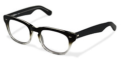
Unsolicited Endorsement: I just got myself a new pair of glasses from a mail-order operation called Classic Specs, and the experience absolutely could not have been nicer. Their frames are super-inexpensive, their service is extraordinary (free shipping, 30-day return policy with free return shipping), and my frames showed up with a free tote bag to boot. Plus the guys who run the company are super-duper nice — seriously, you don’t often find this combination of value, professionalism, and graciousness.
They don’t have a huge selection of designs, but hey, you only need to like one of them. If you like anything you see on the Classic Specs site, I strongly, strongly recommend them.
ESPN reminder: In case you missed it yesterday, my annual college hoops season-preview column is available for your enjoyment.
Uni Watch News Ticker: Yesterday I linked to this photo of Hank Greenberg in a Yankees uniform. Now Gordie Fall has provided some background context: “As the story goes in Detroit, Greenberg and the Tigers were in a salary dispute when that picture was shown to Tigers management. Owner Walter Briggs was so incensed, he sold Greenberg to Pittsburgh partially due to his disloyalty to the Tigers. As it turns out, the picture was from a wartime benefit game several years earlier [as discussed on this page — PL]. And speaking of Greenberg and the war: In honor of his wartime service, his statue at Comerica Park features the shield sleeve patch that the Tigers wore during WWII.” ”¦ A Mississippi high school placekicker has been booted from his team for wearing pink cleats — in a practice (thanks, Brinke). ”¦ Clinton Portis raised a stir the other day by wearing a Phillies cap (with thanks to Justin Kerr). ”¦ Someone out there apparently thinks that the Asheville Tourists’ new moon/sparerib logo is a Will Farrell reference (with thanks to Dave Levy). ”¦ Yankee Stadium is ready for its gridiron close-up. ”¦ So is Wrigley. ”¦ Marty Hick‘s wife, Holly, just turned 34, which gave Marty the chance to make what he calls “the cake of my dreams.” That’s Holly’s dad — Marty’s father-in-law — in the photo at right. “He’s a native Chicagoan and loves old-school uniforms,” says Marty. “He’s only 58, while my dad is 77, but I guess dads dress alike, no matter their age.” ”¦ You know what really bugs Joshua Briscoe? That the on-field graphics on the NFL Network sometimes use small caps and at other times are upper/lower, that’s what. ”¦ What’s this? It’s some sort of experimental radio/speaker setup in Joe Willie’s helmet, but even the the folks at Helmet Hut haven’t been able to figure out the full story behind it. Complete details here (big thanks to Bill Kellick). … Fascinating article about retired football numbers at Michigan (big thanks to Russell Yurk).
Teevee news: About half a year ago I was interviewed for an NFL Films segment on the “10 Greatest Uniforms Ever,” or something like that (I honestly don’t recall all the details). I’ve just been told that the segment is about to start airing on the NFL Network, as follows (all times eastern): tonight at 8pm and 1am, tomorrow at 12:30pm, and Tuesday at 1pm.
Eric Young Jr. of the Rockies is trying to bring back the Purple tops.
link
I hope his endeavor fails.
Last photo in that set is Rick Manning. Pretty sure that’s old Cleveland Municipal Stadium in the background.
Definitely the Mistake by the lake in the background.
and yes, Manning wore his hair in this prince valiant style in the late 70s.
Yup… definitely Municipal Stadium… can’t miss that tire tread on the fascia at the top. I wonder why Kuiper’s in a New York jersey, Peterson’s in Reds’ gear and is that a Braves uni Manning’s wearing? Bell’s got what looks to be the Tribe’s 1948 uni. Maybe prior to an old-timer’s night?
The gloves are “vintage” as well as the uni’s sop it wasn’t any sort of throwback situation. Maybe they were extras in “The Natural”? :P
I was wondering if any baseball movie was filmed in Cleveland in the mid 1970s. The Natural was filmed in the ’80s in Buffalo. There was also a TV movie with Gary Coleman filmed in Detroit.
A friend of mine answered the link that I sent with this…
It had to be the 1975 Indians. That was the only time all of those guys were on the same roster. I further believe that it most likely occurred on August 9, 1975, a Saturday game vs. the KC Royals. Prior to that game the Indians had the Old Timers game which featured the 1948 World Champion Indians vs. All Stars. How would I know this? I actually went to the game with my Dad. It was also the first time I got to see Hall Of Famers Harmon Killebrew & George Brett play.
It had to be the 1975 Indians. That was the only time all of those guys were on the same roster. I further believe that it most likely occurred on August 9, 1975, a Saturday game vs. the KC Royals. Prior to that game the Indians had the Old Timers game which featured the 1948 World Champion Indians vs. the AL All Stars. How would I know this? I actually went to the game with my Dad. It was also the first time I got to see Hall Of Famers Harmon Killebrew & George Brett play.
Elephants in baseball gear disturbing? Nonsense. That photo gave me a good laugh.
What surprised me was that the elephants were wearing what appeared to be Pirates or Phillies caps – not A’s caps. Did Connie Mack trade them?
Man, talk about logo creep. How about that Spalding patch on the Universal jerseys?
I may be wrong but:
That’s Duane Kuiper with Buddy
Fritz Peterson with the Reds jersey
Rick Manning, last photo.
Love those link. Sort of like an early example of the classic Blue Jays lettering treatment of letters with “inlines” instead of outlines.
There is no way that link.
So the question is, were they blue red/white/red stripes or red with blue/white/blue?
They look gray to me.
i’ll bet they were blue, with red-white-red stripes
look at the color of the brim — if that is blue, it looks to be the same strength/shading as the solid portion of the sock
don’t think they were gray
‘don’t think they were gray’
It was a joke.
the interwebs is serious business
If the Okonen image is correct about the colors of the jersey lettering, then it looks to me like red socks with blue/white/blue stripes. Looks like the red tones are showing up pretty light, and the blue tones pretty dark, in the photo. Not the other way around.
But my knowledge of color-to-monochrome is mostly based on old newspaper hot-wax layout training, where white=white and anything else=black.
Apologies for my ignorance in advance, but in the 1937 All Star Game photo, why are both teams wearing home uniforms?
I don’t think they are. All of the NL unis link. The ones I can see are Giants, Pirates, Phillies, Cardinals and Reds.
You mean there were no solid color softball style jerseys? No BFBS? wow, what an age to live in…
:roll eyes:
With Namath’s facemask, could it be a shield to prevent the defense from seeing him move his lips at the line of scrimmage?
I assumed that was the mic, covered in impact padding.
Judging from the Fresh faced Joe and the double bar facemask that he wore during his first years in NYC- this picture could be 65 0r 66, no?
BTW: kudos to Marty on the sweet, ‘Sweetness’ cake. RIP, Walter, you were a one of a kind!
in the Pitt-UConn games yesterday, I noticed multiple players on Pitt’s defense were wearing the NFL pink wristbands. Unfortunately I didn’t snap a pic but I may check it out again on ESPN360 and take a snapshot.
Matt Hasselbeck is wearing the new Riddell Speed helmet. He was out this past Sunday due to a concussion he suffered the week before. Now he’s cleared, and wearing a new lid.
link
Does it bother anyone else when announcers call him ‘Matt Hasselback?’
It’s better than Hassel-hoff!
No more than when they mention the Jacksonville Jag-wires.
Let’s just say that a certain segment of NFL fans in North Florida (or, Baja Georgia) call them the Jag-Wires.
Do you remember John Facenda saying Fran TarkINGton?
Namath’s helmet has a microphone on the facemask and speakers on the side of the helmet. It’s obviously to amplify his calls at the line.
The J. Peterman link reminded me of the clothing line designed by Andre 3000 (of all people.)
His line was inpired by the look of 1930’s football uniforms. Check it …
link
The Walter Briggs / Hank Greenberg story was recounted in the fabulous documentary “The Hank Greenberg Story”.
Walter Briggs was one serious dummy.
That is one *awesome* movie. Highly, highly recommended.
Thanks for the link to Classic Specs, Paul. They look as cool, but a little less expensive than say, Warby Parker.
Warby Parker is an excellent place as well. Very pleasant experience when I ordered a pair through them.
link
I’ve heard a lot of good things about WP and their customer service. It’s just cool having a second option now.
Can anyone explain why the neutral site Wrigley game between Northwestern and Illinois is an all Northwestern decorated field? Are they planning on rotating the field design every year?
It is a Northwestern home game.
Those Boston Braves caps don’t seem to match the 1940 illustration in Dressed to the Nines. They’re closer to what’s shown for 1941.
Sorry to be anal about this, Daren L, but the Boston Braves were known as the Boston Bees in 1940 and 1941.
1936-1940 to be exact. They reverted back to the ‘Braves’ in 1941. Now that’s anal!
Daren L,
I stand corrected. See post on down below. Full details…
Here is a great picture of the New England Patriots throwbacks on Zoltan Mesko. Plus how about the stiff leg.
link
Mesko should be wearing the neck roll like the Steve Grogan, who used to wear that throwback #14
I understand why many kickers/punters wear soccer shoes on their kicking feet, but I don’t understand why they wear a football cleat on their other foot. Why not just wear both soccer cleats?
It could be because of the multiple playing fields made of FieldTurf (Including NE’s Gillette Stadium), so kickers will probably want to wear a more field-appropriate shoe on their plant foot. Also see:
Garrett Hartley
link
Son of a… sorry. You’ll have to redirect, but the image is there
I think they’re required to conform to the uniform except as required by specialized equipment. The soccer shoe is specialized equipment required on the kicking foot, but not the plant foot.
Well, technically, you could wear any shoe you want out there, as long as it’s 50% black (or white), correct? I thought about the plant foot thing, but you have to plant your foot to kick a soccer ball as well.
HIKEEBA!
Dare I say it…Don’t mess with the Zoltan!
Wait…wasn’t Zoltan the leader of the bubble wrap people in Dude Where’s my Car or was that the name of the genie in Big?
Wait…Dave Matthews played the villain in Zohan…and I’m going to see him at MSG tonight…I;m confused.
I can’t believe that it took until 1:16 pm to get there. Bravo.
In both the Wrigley Field Pic, and the Yankees Stadium pic, it appears as if both team would be using the same sideline. They used to do that at county stadium when the packers played there. Why?
I seem to remember a few other parks doing this in the “multi-use” days of yore too. Just speculation, but maybe to give better visibility to those poor shlubs who are *quite* a ways from the field — or down so low the sideline players would block (or both)? These *are* baseball fields first, after all …
One sideline might be close to the stands on either first or third base, where the players standing on the sidelines would block the spectators’ view from the first few rows. Contrast to the fans sitting in left or right field, where the first row is at least eight feet high. Accordingly, you just place both teams benches on the same side as the outfield wall.
It looks like there is no place to put the field where it would not cut into the end zone so that is why the field is laid out that way. There is a bowl game where they both share they same sideline but I can’t remember it off the top of my head.
I forget the name of the game, but it might be the one played at AT&T Park in San Francisco.
Emerald Bowl?
There is. I don’t know the name of the bowl game (Emerald Bowl, maybe??), but it’s played at AT&T Park in San Francisco.
link
In Milwaukee, I’m almost positive it was done so that the fans in the seats along the first base line would have a better view of the game.
This same reason, plus the fact that there’s not much room along the first base line is probably why they’re doing it at Wrigley, but what gives you the impression that they’re sharing a sideline at Yankee Stadium?
No, you can see in the Yankee Stadium picture that the dotted retainer line goes all the way around the field, and you can see the other bench area on the left field sideline. Looks like the teams will be on the same side at Wrigley, though.
In yesterday’s uniwatch, Kevin Grimstad told us about the 1964 Detroit Lions highlights film found on Hulu and the what appeared to be the Lions wearing black and silver due to the poor lighting in the LA Coliseum for a night game against the Rams.
Kevin, for whatever reason, the Lions in fact really WERE wearing a darker blue jersey with near steel gray numerals for that night game in LA. If you check the film closely, you’ll see that the Lions socks were STILL the honolulu blue shade. I know I had to play around with the film to be sure, but yes, the jersey is a near navy shade, but the socks are honolulu.
I read this comment too… I admit to spending 5 hrs. on Hulu last night, in bed, on the laptop ’til 2 am watching the games of the week and annual team highlights…
My wife HATES me today!
IS there anything better than late 60s early 70s NFL films music???? Sam SPence was ‘touched by God’. :)
Sing her a chorus or two of “Love Power”.
(For those of you wondering, it’s a reference to his handle.)
Are you sure that it’s not just another case of different materials showing differently on film?
I already love Asheville, but if it’s true that their Moon-eating-a-rib alternate is indeed a reference to Ferrell’s Harry Carry skit, then that settles… I love that place even more. If you are going to do alternate logos (and this could even apply to uniforms), you might as well make them fun. Great work.
Hey, hey Colin! If you were a hot dog, wouldja eat yerself?
The uni cake is good but Holly’s t-shirt is far better — The Smiths, Queen is Dead!
Is it me or does Holly’s dad look like Archie Manning?
Going to the CAL/OREGON Game this weekend and was wondering if anyone knew what uniform or even colors the ducks would be sporting tomorrow?
Thanks guys!
I’m sure it’s something hideous..
sorry I just can’t help it. Their uniforms repulse me so much they ruin College Football saturdays!
How did Billy Martin not get beat up after wearing something like that?
Great question!
My first thought was that he was being punished for the “Copa” incident.
Definately Kuip in the photo. Interesting.
In the Harry Carey sketch, Ferrell asks the Dr if the moon were made of ribs, would he eat it? Its kind of a stretch to connect that to a moon eating ribs. If the cartoon was someone eating a rib based moon, then it makes sense.
BTW I would totally eat the moon if it were made of ribs.
-CraigD
I just figured Asheville was famous for its barbecue, though it is a strange coincidence that the character is a moon, if that’s the case.
Those are really close quarters at Wrigley Field endzone wise, especially at the far end where it appears as if the end zone lines up shear against the outfield wall.
Honestly, I don’t know why there is a such a huge deal being made about football games being played at Wrigley Field and Yankee Stadium. It’s certainly not like this is the first time it’s ever happened. Well, for the “New” Yankee Stadium perhaps, but certainly not Wrigley, as Sayers infamous six touchdown game took place there.
Not a big deal?
I’ve been trying to score reasonable tickets to the ND/Army game for almost months now.
The cheapest seats are in the 175 range…with obstructed views.
Apparently, a heck of a lot of people think it;s a big deal…
Still not as monumental as this though:
link
I still don’t get it.
Fritz Peterson was out of the league by 1978. I think that’s Jim Norris in the Reds jersey. Manning, Kuiper and Bell are spot on.
Daren L and I had a very mild debate on when the Boston Braves were the Boston Bees and when they changed back to the Braves nickname.
After a little digging thru The Sporting News archives, I came across this morsel from the May 8, 1941 issue of TSN, written by Boston correspondent Jack Malaney:
“…That meeting brought out that the new directors, like (Bob) Quinn himself, did not care at all about the nickname “Bees” which had been foisted on the team after the old Braves had been wrecked financially and to the point of bankruptcy. When Quinn first took over the Braves, he found such a deplorable condition that he wanted to be rid of everything that savored of the former regime. That was why the name Braves was discarded.
“They are the Braves once again, however. The bad odors are all gone. Quinn has the club firmly established again. His team has not been clicking as yet this campaign, but the material is there and it may get going soon as it did last season. When they do start to click, they will do so as Braves.”
I learned something today!!
You know “Bees” wouldn’t be a bad mascot name. It would lead to an awesome sock pattern (like on the ’38 club) & Athletic Gold could be paired with pretty much anything (there’s a defunct grocery chain named Cee Bee’s whose colors were brown, orange and yellow).
link
link.
Michigan is playing Michigan State in what will surely be the most attended hockey game ever on December 11 at Michigan Stadium. “The Big Chill at the Big House”. Anyway, Michigan’s jerseys are gonna look like this…pretty cool throwback…
link
the jerseys is based off of the 1948 national champions
link
That’s sharp. Though I’d like it more without the white stripes on the yoke.
was going to post this myself.
I like the look a lot; gotta love the yoke stripes.
Hey, look, a dead horse! I think I’ll go kick it to make sure …
Anyway, on the Nats, I just noticed something I didn’t see mentioned here on Weds or Thurs: They link the rendering of the link.
Compared to the link of the logo, it’s a subtle but significant improvement. The lines now create continuous curves where the loops overlap, whereas the old logo was strangely pinched there. Also, the shoulder on the left of the logo now comes to a single point instead of having a little square notch. More uniform line thickness, too, though there’s still a little bit of variation across the stroke.
So I’m not the only one who noticed… I thought about pointing out the differences Yesterday, but couldn’t find the time to do so.
There’s still a flat spot on the left; that curve that forms the ball terminal. Sigh…
Here’s an link between the old logo (light blue) and the new logo (light red).
ATTENTION MOTHERVILKER…
I may be wrong on this, but I seem to recall you not liking Nike’s SoD because of all the empty space? Well… I just got a new laptop yesterday, and just found the snipping tool/screengrab feature on it, so I whipped something up on the Nike Uniform Builder just now:
link
link
Would you wear this Laker-inspired alt?
link
Love the colors…
The tiled striping is a winner, although it starts where the pants should be ending (Notice, Phil, I didn’t say the pants should end where the swoosh is). Hike those shorts and the tiles up, make the lettering bigger to fill up some more space and you’ve got something.
I’d make the numbers bigger, too, at least on the yellow alt.
Or do they let you play with sizing on that feature?
Actually, I just tried that out myself. Couldn’t mess with sizing, though. Too bad, ’cause my Mothervilker Universtiy unis looked pretty good, despite the limitations. Don’t know how to screengrab, so I’ll have to make them again sometime.
For those who care: Months ago I was interviewed for an NFL Films segment on the “10 Greatest Uniforms of All Time,” or something like that. I’ve just been told that the segment will air on the NFL Network several times over the next few days, beginning tonight (although I won’t see it, because I don’t get the NFL Net).
Dates and times (all eastern):
Top 10 Uniforms, NFLNET Nov 12 8:00 PM
Top 10 Uniforms, NFLNET Nov 13 1:00 AM
Top 10 Uniforms, NFLNET Nov 13 12:30 PM
Top 10 Uniforms, NFLNET Nov 16 1:00 PM
Awesome. The DVR has been set.
Same here.
What is this DVR of which you speak? And what is this NFL Network?
At least I know what youtube is. Think someone will put it on there?
yeah…mothervilker, you’re not alone in not getting the not for long network
damn my cable company to hell…but i digress
was also hoping one of the good UWers who understands this modernological techmology could maybe dvr the show and then youtube it for the rest of us
I care
Paul,
Absolutely looking forward to it!! Thanks for the heads up!
NFL Films’ take on Alltime greatest uniforms should be most ‘innaresting’, however, i’m not getting my hopes up too high.
Especially if they emphasize the last 15 years like has been done with the Top 100 player’s list.
History started in 1985 after all…….
That All-Star photo of Sparky Anderson was taken in 1976. According to all of the news reports at his passing, Sparky was born in 1934, which would have made him 42 when the photo was taken. Doesn’t he look a whole lot older than 42 in that photo? It’s not just white hair: the guy is wizened. He looks like he’s at least 60. So what is it? Lied about his age? Worked in a coal mine? Exposed to toxic waste or nuclear radiation?
Yeah, I’ve always been puzzled by Anderson’s visage. Shit, I’m 46 — four years younger than he was in that all-star photo. I’d like to think I don’t look that old.
Some people age gracefully, some don’t. Look at Prince:
link
He’s 52, yet he doesn’t look a day over 24 (to me, at least).
There’s also surgery, as well as digital touch-up, that make a big difference between then and now. Just saying.
would that be four years older?
and no…you don’t look 46 either
that was clearly a case of wishful thinking! :) Sparky looks nearly 70 in this 1976 ASG picture. I’m 44 and there’s days that I FEEL like Sparky looks– having a 2 yr. old ‘party girl’ will do that to one.
BTW: how was the Sheep Station to-do????
Read the Michigan article from Russell Yurk and I love these coaches:
Hockey
With two national championships and more than a quarter of a century on the job, Michigan hockey coach Gordon “Red” Berenson could have retired a half-dozen jerseys by now. But he hasn’t, and he won’t, because he’s too much a believer in tradition.
Ice hockey coach Red Berenson says no hockey player’s number has ever been retired, and as long as he’s coach, none will. (Photo: U-M Photo Services.)
Berenson said that when he was growing up, it was unusual to see hockey players wear numbers higher than 20. Berenson isn’t that much of a traditionalist. As Henry Ford might say, Michigan hockey players are allowed to wear any number, as long as it’s between 1 and 39.
“All of the men who’ve played for Michigan hockey have worn the same set of numbers,” he explains. “If we had guys wearing 77 and 99, then they’re getting away from what’s been done before, maybe calling for more spotlight than they can handle.”
As Berenson explained it to Michigan Today, the size of college hockey teams and the scarcity of jersey numbers make retiring jerseys a tough proposition. It would require compromises Berenson doesn’t want.
“If we start taking even more numbers out of circulation, we’d probably have to open up higher jersey numbers. And I don’t want to do that.”
The softball coach has just about the same philosophy — and she makes her players write essays about previous players who’ve worn their numbers! Love it!
Speaking of players benches locations in pro football, turn to page 12 of this week’s (11/15/10) edition of Sports Illustrated.
You’ll find a great panoramic shot from Neil Leifer of a 1963 Packers-Bears game at the Friendly Confines. The pic is taken from the left field bleachers.
You can clearly see the Packers bench on the left of the photo, in fromt of the temporary bleachers placed in right field. But scanning to the right, you can only see a couple of Bears players. Judging from the that, apparently the Bears bench was way down where the brick wall facing the deep third base stands where the wall elevates as the seats turn inward.
So the visitors bench was between the 30’s while the Bears bench was from – what – the goal line to the 20 on the other side of thefield???
Gosh!
Love that photo. It’s also in the book “The Best of Leifer.”
Wonder why they laid out the field at Wrigley to go down the 1st base line as opposed to how it used to be when the Bears played there, down the 3rd base line…
I’m guessing so that the corner of the endzone didn’t come as perilously close to the dugout steps as it did back then
The corner of the endzone didn’t just come perilously close to the dugout steps. Part of the endzone was actually link.
Plus, they actually added more seats just past the dugout and built the brick wall out farther, so there’s link.
gettin’ a lot of mileage out of that pic…
i’d assume, since there’s actually lights on wrigley now, that they could remove the portable one(s) from the endzone (how great a pic is that, btw)
looked like a color on color game too
Any chance I get to post that pic, link.
And I don’t think that’s portable lighting in the endzone. I think it’s a photographer’s flash.
Looking at those SOD unis/uni’s/unies/undies …
Will there ever come a time that a new generation looks at images of NBA World Champion Michael Jordan and makes fun of his “short shorts”?
Only if they start wearing full-length trousers.
A chance to design a uniform!
link
The Cycling BC Team is looking to vamp up their Jerseys for next season and is looking for help from aspiring designers. A design contest will be held from November 1st – December 1st to search for a new look for the team. The winner will receive $500 and a full set of the 2011 Team kit of their design, and a year’s membership with Cycling BC. This design will be worn by the 100+ Cycling BC Team athletes through the 2011 season and will be displayed to a great extent within Canada and around the world.
We are looking for a cohesive design that transfers across all Cycling BC disciplines, Mountain Bike, Road, Track Cycling, and BMX. Your design should be eye-catching, powerful and representative of BC. We are interested in seeing designs that are different from the team clothing of years past. Here are some examples of team clothing from the previous year: Road Jersey and Shorts, Mountain Bike
Design Guidelines:
1. There are 6 articles of clothing that need to have one cohesive design: Long sleeve and short Sleeve Road Jersey, Long Sleeve Mountain Bike/BMX Jersey, Bike Shorts, Skin Suit and Vest.
2. Colors: The design must include Red, White, Blue and/or Gold
3. Sponsor Logos: There must be space for sponsor logos
Deadline and Submission:
1. The final design submission must be submitted in one PDF file, along with a separate vector file for each article of clothing.
2. All designers must submit their design by December 1st to Lisa Tam at link. The winner will be announced on December 10th.
As usual, the wire photos are the highlight of another Uni week!!!
Did anyone notice one of the pics in the set of old pitching machine pics? A coach had pointed the machine skyward like a rocket launcher and a catcher was practicing throwing off his mask and going after a foul ball!! WOW!!
-Jet
Football officials in black pants look awful. Hate watching something that doesn’t look good in the NFL work its way down to the high school level.
These shots just posted on facebook from the NHL of the Rangers jersey
link
link
link
link
link
link
sweet — hey tod, check your email
Just watching the North Carolina-Lipscomb basketball game, and there’s one little thing Paul didn’t notice about Lipsombs new jerseys…Subscript Name on Backs! I’ll try to find pics after the game.
I just saw Paul on the NFL Network on the show Top 10 Uniforms!
Paul, how do you feel about the show’s top 10 list?
Because Peter King likes the powder blues, I guess the NFL Network likes the powder blues. :)
Sure wish the NFL Network would return to showing classic games, they try to be the CNN of the NFL, too much repetive news programs.
The Top Ten show as ok, they threw in pee wee football uniforms and cheerleaders for the comedy effect.
OK, I have been trying to find out about the Orange Sticker on the Idaho and Boise State helmet. Boise’s head coach also had it on the bill of his cap. This is from the Idaho game notes.
In addition, helmet stickers to honor the 116th Armor Cavalry
Brigade, which is based in Idaho and is being deployed to the Middle East, will be worn by the players.
The game is also the Famous Idaho Potatoes Governor’s Cup. That might explain the Idaho Potato ads on the field.
Couldn’t find a shot of the sticker, but I love this photo – looks as if they’re playing in a warehouse.
link
Not a big dome fan, but I make an exception for the Kibbie Dome.
link.
Why exactly are their “heritage” jerseys navy and cream, anyway? (NTTAWWT)
Next up: link and link.
Diplomatic answer: To try to achieve a wool feel, because apparently, navy and cream are “more like it” than royal and white.
Cynical answer: To make something different enough that one could rationalize buying the new jersey.
They have wore darker in the past
link
link
Sorry if this has come up before, couldn’t find anything.
So the White Sox are apparently changing sleeve patches on the road uniforms? Can anybody confirm this is actually happening?
link