Before there were dugout jackets, there were dugout cardigans. As many of you know, I love these old sweaters and wish they’d make a comeback (or at least get a Mitchell & Ness treatment). With an autumn nip now in the air, this seems like a good time to spend a day looking at some particularly interesting examples of these old sweaters, along with a few other kinds of baseball outerwear.
Except as noted, all of these are from a huge batch of material recently sent way by Mike Hersh. Here we go:
• I ask you, how great would it be if the Yankees walked out onto the field every Opening Day like this?
• Similarly, how about if the Bosox took the field attired like so?
• A while back I ran a wire photo of Jim Thorpe wearing a uniform from a New York Giants world tour. But as you can see, there was someone standing next to him who was cropped out of the photo. Here’s the full shot — tasty!
• If you look again at that last shot, you’ll see that the sweater’s collar has a throat tab. That detail is uncommon but not unheard of.
• The buggy is nice, but what I really like here is the Georgia Peach’s sweater.
• Baseball sweater manufacturers advertised their product, just like today’s outfitters. Ditto for baseball jacket brands. Here’s one more.
• Very unusual to see a sleeve logo positioned at elbow-level.
• If you take today’s Cardinals cap logo and deconstruct it down to a stick figure, you end up with something like this. That Cards team portrait is from 1911.
• Here’s a more handsome St. Louis logo treatment. But that isn’t a Cardinals player — it’s Doc Crandall of the St. Louis Terriers, an old Federal League team.
• If you look again at that last photo from the bottom up, you’ll see that the buttons come up the center of the placket and then veer off to the side. That button format shows up in several other sweater photos (look here, here, here, here, and here). Once you become aware of it, the button pattern really jumps off the screen, no? I’m sure there’s a name for this kind of button format, but I don’t know what it is. Anyone..?
• I love the dark trim on these collars. That’s the 1910 Cleveland Naps.
• Most Philadelphia A’s sweaters were adorned with one white elephant. But in 1913 they doubled their pleasure.
• Check out the evolution of St. Louis Browns outerwear, from 1888 to 1909 and 1910 (dig that fleur de lis!).
• Who’s this fella? It’s none other than Paul McBrayer, better known as the U. of Kentucky basketball arena’s namesake, back in his Kentucky baseball days. Love the sleeve number and the K on the pocket. (Big thanks to Brandon Roberts for this one.)
• And here’s an amazing detail to go out on: the Philadelphia A’s wearing fur-trimmed coats! Incredible. (Update: There’s now some dispute in the comments as to whether this is fur or a plaid-ish pattern. Now that I look at it again, I suppose the pattern is more likely. But it’s still a unique coat design.)
Uni Watch News Ticker: Here’s a breakdown of sneakers being used in the NBA. ”¦ Disturbing article about varisty jackets falling out of favor with the youth (with thanks to David Petroff). ”¦ What do you get when combine Nike nonsense with BFBS? A high school forfeiture. Now if we could just get the same rule implemented in the NCAA and the NFL (thanks, Brinke). ”¦ I love the striped belt on this old shot of former Kentucky hoops star Leroy “Cowboy” Edwards so much that I didn’t notice the mismatched uni numbers on the jersey and shorts until Brandon Roberts pointed it out to me. ”¦ Also from Brandon: some sweet vertically striped socks. That’s the Whiting Ciesar All American Players from the old NBL. ”¦ Nivea for Men is now sponsoring the Nets’ locker room. ”¦ Bruce Menard just sent a big haul of old sports-themed ads. “It’s a wide mix of ads for tobacco, gum, beer, razors, cereal, even TV/radio tubes,” he says. “Can’t help but laugh when I see how they got to endorse tobacco. Baseball players I get, but Olympic athletes?! Don Draper would be proud.” ”¦ The Blackhawks will wear camouflage warm-up jerseys tonight, and the Isles will do likewise on Nov. 20 (with thanks to William Schultz). ”¦ Here’s a video about Jimmy Howard’s mask design (with thanks to George Flory). ”¦ Michigan WR Roy Roundtree wants to wear the No. 1 jersey (with thanks to Chris Flinn). ”¦ Yesterday I asked if anyone knew why some of the Chiefs appeared to be wearing black armbands. Now Michael Patton informs me that the “armband” is actually the strap from a shoulder stabilizer, designed to prevent dislocated shoulders. ”¦ New logos and uniforms for the Asheville Tourists. “Being a native of Asheville a and fan of the Tourists my entire life, I am embarrassed by these changes,” says Dan Crawford. ”¦ Here’s a good historical slideshow of English rugby shirts (with thanks to Coachie Ballgames). ”¦ Browns with Orange Numbers Dept.: “I downloaded this photo from eBay a year or two ago,” says Jeff Moulden. “I was going to buy it, but it got pretty pricey. This is authentic, as the tagging is the same as many of my other game-worn Browns jerseys.” ”¦ Larrdy Bodnovich found a bunch of great old Rhode Island football shots. Of particular note: this sensational “RI” insignia and the surprising revelation that the team was wearing white shoes back in the 1930s. Really interesting how they stacked the insignia and the uni numbers in that last shot, too. ”¦ Two college hoops items reprinted from last night’s comments: Preseason color-on-color game last night in Kansas, and new uniforms for Oakland (which I really like, esp. since they kept the subscript NOBs). ”¦ Several tremendous cycling posters here (thanks, Kirsten).
That’s Chief Bender with Jim Thorpe
Actually, I think it’s John ‘Chief’ Meyers…Bender played for the Athletics.
Great image. Great, great feature, Paul. I’ll pay a million dollars to each of our resident colorizers if they would get to work on these babies.
PS Those posters via Kirsten are pretty strong, too.
Can we get that in a contract?
In the mail.
No mention/opinions at all of the leaked nats hat from yesterday?
link
They’ll unveil the full set this evening. You can wait that long to hear what I think.
Did you get invited to the Nats unveiling?
it’s a cap
it’s one of several they’ll wear
it’s similar to the braves
/full unveil later today & im sure paul will have his review tomorrow when you see what they’re pairing the cap with
Some of the jerseys are trickling in, via the MLB online shop. Some of these might disappear from their site..
Road – only a tiny tweak to the sleeve stripes
link
Alternate – adds blue to the piping and note the new patch (Replaces beveled “DC” with a curly W)
link
Old circle DC logo patch – link
Looks like all gold beveling will be gone – “DC” interlocking could go too, which is a shame (though I won’t miss any of the gold). Would be nice if they develop a new look for the DC cause it’s popular with locals.
Would like to see the interlocking DC replace the Curly W on the blue road hat. The new alternate looks nice with the piping change.
Teamo: I’ve heard rumors that the blue road cap might be going away – with the red home hat used more (just rumors though).
At least one alternate will come into play – link That might be used with the red jersey, which would make for a pretty nice look.
the interlocking “DC” logo is also all over Nats Park, including in the ironwork and on the paver stones in the ground outside the gates. I would think they wouldn’t get rid of it completely, maybe replace the gold with whatever color (red/white/blue) is not used for the letters or the trim?
“Now if we could just get the same rule implemented in the NCAA and the NFL”
While I generally agree that the randomly worn BFBS jerseys are annoying… all that rule would do is cause the teams to officially declare black as a team color. It wouldn’t stop anyone from wearing them.
I’d rather have a rule that forces the firing of the athletic director or coach involved than the forfeiture of the game. You sign a six-figure contract with a multinational corporation and you don’t bother to make sure that it comports with the rules under which your teams compete? How does the person who does that keep his job?
The incident also contradicts recent defenses of the competence and good faith of big-brand designers. Familiarizing oneself with the rules governing uniform use is inarguably a mandatory prerequisite to working on any project involving the design of a uniform. A designer who does not do so, and thereby creates a design that contravenes the rules the client must obey, is simply and inarguably a bad designer. Maybe a great visual artist, but a bad designer.
The designer was almost certainly working from a brief that was written by someone else, who wrote the brief based on what the officials at the school said they wanted, then the design had to have been approved by people in positions above the designer, e.g., a project manager, creative director, etc.
I’d say the person least at fault in this case is the designer. The person who wrote the brief and the person who fed the information to the person who wrote the brief, along with the PM or CD are much more at fault. When you’re working for a company as large as Nike, the designer’s job is to design. The managers are supposed to cut through all the red tape.
No, the designers are the ones who push the envelope. Designers solve problems, not create them. These clowns were decorators.
Doesn’t change the fact that it’s not the designer’s responsibility to know the California High School Athletics Association uniform guidelines. The person writing the brief needs to spell out the limitations before the project starts.
Apparently, even the referees didn’t know of this rule, or the game shouldn’t have been played until Roosevelt changed back into their normal uniforms (since they took the field with illegal equipment).
So if an architect submits blueprints for a building that violate local fire or earthquake safety laws, he’s doing good architecture as long as the building looks good? The rules-violating black uni is precisely comparable; another analogy would be designing a football jersey that does not allow room for mandatory shoulder pads, or submitting to an NFL team a design featuring separate home and away helmets.
The uniform rules of the league in question are a core part of the function that any uniform design must serve. This, like so many recent Nike (and to a lesser extent, Reebok) uniform fiascos demonstrates an active contempt for the functional foundation of all design. This is what makes it bad design – indeed, arguably not even design at all. If form is divorced from considerations of function, then we’re dealing with pure aesthetics – that is, art, not design.
A. This isn’t a safety law. It would be more akin to an architect creating a building with a red façade only to find out after obtaining the permit that a little-known ordinance exists that bans red buildings.
B. You proved my point exactly. Yes, the designer is supposed to bend the rules and push the boundaries, but the person (or people) he or she reports to are responsible for reeling it in based on the predetermined boundaries, which are the responsibility of the person who wrote the brief in the first place. An architect has to be licensed and certified, like a lawyer. There’s really no creative director-type to whom an architect reports, so it’s really not that comparable a situation. You’re comparing shirts and skyscrapers, which is a little more exaggerated than comparing apples and oranges, at least to me.
I’m not trying to defend the product that came out of this design process, because it’s pretty obvious that it wasn’t a good idea. The idea? Yeah, that came from the designer. The fact that it actually got produced and now may cost this high school a bunch of forfeits? Definitely not the fault of the designer.
I’m sure a lot of black uniforms get thrown into every design review at Nike, because their M.O. is to break the mold. If the project manager or the creative director chooses that black uniform as ‘the one,’ that’s not the designer’s fault. He’s probably more worried about keeping his job than sticking to his sartorial guns.
Nope. Designer vs. decorator analogy holds. Designer solves a problem aesthetically; a decorator just moves the furniture around and tries a new color.
So if an architect submits blueprints for a building that violate local fire or earthquake safety laws, he’s doing good architecture as long as the building looks good?
Isn’t this more like an architect designing a 50-story building, only to find out later that it violates the zoning code? It’s the school’s responsibility to know the local rules and make sure they’re followed, the same way a property owner needs to know what he’s commissioning and getting back from an architect.
Nobody’s disagreeing with your viewpoint, Flip. It just doesn’t have much to do with this particular conversation. In my opinion, all uniform designers, good or bad, are more ‘decorators’ more than ‘designers’ (by your definition), because there really is no problem to solve any more. The ‘problem’ of the football uniform was solved long ago, by placing numbers on the front and back and throwing a splash of team colored stripes on some team-colored jerseys and socks. From that point on, it’s really just been a fill in the blank, follow the formula sort of thing (until recently, of course, when sportswear companies decided that the classic solution wasn’t popular enough with the younger demographic).
Much of the fault (not all, because Nike certainly is partially responsible) lies with the coach/athletic director/whoever okayed these uniforms for the school. The school colors don’t include black, so why on earth would you wear a predominately-black uniform? If your colors were red, blue and yellow and they handed you green and brown, would you wear them then? Or would you give them back and tell them to do it right?
The problem today is that coaches and athletic directors are throwing out tradition and school pride for “fierceness” and “intimidation.” I graduated from high school just a few years ago (class of 2008), and my high school’s colors were royal blue, red and white. We had link blue uniforms at home, with the road being a white version. (Our helmet was a blue version of SMU’s helmet)
Fast forward to this year. My sister began attending that school. What do I find when I look at her pictures of the football games? link
I ran into the track and field coach (who I believe is also an assistant coach for the football team) a few weeks after the start of the season and asked him about the uniforms. He said that the new football coach/AD bought them all personally. I asked why they were black, even though that’s not a school color, and his answer shocked me. “He had the school change our colors to black and royal blue.”
Then just a couple weeks ago, my sister came home and informed me that the school colors have been changed back to royal blue, red and white. I’m anxious to see whether these uniforms will be used next year (I can’t imagine the coach would waste his money like that).
“requires that all schools wear uniforms that incorporate only that school’s official colors. For Roosevelt, that’s cardinal, blue and gold.”
OK, so according to the letter of the rule.. they arent allowed to wear WHITE JEREYS. White is not their color!
Stupid rule. Incredibly stupid.
“Check out the evolution of St. Louis Browns outerwear, from 1988 to 1909 and 1910 (dig that fleur de lis!).”
Is the 1988 supposed to be 1888?
Yes, thanks. Now fixed.
Just as an aside, those are two separate clubs – the 1888 Browns became the Cardinals sometime around the turn of the 20th Century, and when the American League Milwaukee Brewers moved to Missouri in 1902 they adopted the Senior Circuit club’s cast-off name.
Wow. There are a whole bunch of recycled names…
St. Louis Brown Stockings (NA 1875, NL 1876-77)
St. Louis Brown Stockings/Browns (AA 1882-91, NL 1892-98) -> St. Louis Perfectas (NL 1899) -> St. Louis Cardinals (NL 1900-present)
Milwaukee Brewers (AA 1891)
Milwaukee Brewers (AL 1901) -> St. Louis Browns (AL 1902-1953) -> Baltimore Orioles (AL 1954-present)
St. Louis Pilots (AL 1969) -> Milwaukee Brewers (AL 1970-97; NL 1998-present)
Baltimore Orioles (AA 1882-91; NL 1892-99)
Baltimore Orioles (AL 1901-02) -> New York Highlanders (AL 1903-12) -> New York Yankees (AL 1913-present)
Interesting to note that in the cases where teams started out as the Browns, Brewers, and Orioles, the first incarnation of those all folded, and the second incarnation changed their names (the Cardinals are the only ones who didn’t relocate in the process).
It’s enough to make your head explode!
@ Rob S – that would be the Seattle Pilots that became the Milwaukee Brewers.
*facepalm* Sure enough. And I initially typed “Islanders” before correcting it to “Highlanders”!
WELL, MY HEAD A SPLODE
“And here’s an amazing detail to go out on: the Philadelphia A’s wearing fur-trimmed coats! Incredible.”
That appears to be a patterned strip around the coat and sleeves, not fur.
Hmmmm, now that I look at it again, you’re probably right. I’ll update the text. Still, a unique design!
The arena is named after Paul McBrayer at Eastern Kentucky University, not at UK. But he did play and coach at UK.
That is correct. I probably confused Paul in my e-mail. Eastern Kentucky’s arena is named after McBrayer. McBrayer played at UK and later coached under Adolph Rupp at UK before taking over at EKU. At EKU he became a legend in his own right. Still, the point is that McBrayer had a kick-ass sweater.
Paul, will you and Phil be offering thoughts/etc. tonight re:the Nats new duds, or tomorrow’s post?
I’ll have something to say tomorrow.
I feel like a kid a Christmas. Have always hated that damn gold trim and the funky block lettering.
The funky lettering that they keep forgetting an “O” on?
Is that link really fur-trimmed? Looks more like a mackinaw with a wool blanket insert. Note the quilted diamond shape. That was a not-uncommon way to decorate a parka back in the day. I saw a similarly constructed coat at an HBC store in Montreal some years back that I kick myself every time I think of it for not buying.
Speaking of parkas, those Patrick-Duluth mackinaws are the bee’s knees. Beautiful jackets, and is there a better name for a winter coat manufacturer?
Re: Asheville Tourists
I was thinking on their new logos overnight. The mismatch of the moon and the name bugged me. So much is right about the package (colors, the craftsy font for Asheville), but it feels like a forced arrangement.
So here’s my crazy theory:
Plan B and the management wanted to go to the Moonshiners name but the new owners are hestitant to throw out the Tourists name with its long, established history fearing a backlash. The new owners being a political family, they decided to float the Moonshiners name in the press release and use the Moonshiners logo package. If the “Mr. Moon” stuff sells they can phase out the bear mascot and if there’s buzz around the Moonshiner name, they can make the switch. No buzz, no switch, but they’re still making money off hot selling merchandise. Basically they’re minimizing their risk while exploring what they really want.
Again, just sleep deprived speculation there. No facts.
They better not drop the Tourists nickname. It’s been around for decades and is thoroughly ingrained in the baseball history of Asheville. And Dan Crawford is right: the logo overhaul and new uniforms are an embarrassment.
Oh, I love the Tourists name. It is right for the town the way the Steelers, Brewers and Pistons names are right. Tourism has been a principal industry of WNC for a long time.
Trouble is, I imagine the Plan B guys fell in love with the Moonshiner concept and couldn’t let it go, and management didn’t push them because of a combo of 1) deference to Plan B’s track record, 2) the desire to open up the merchandise revenue stream, and 3) indifference to the nearly century old Tourists name.
Granted, I may be overcritical because the new owners are literally living out my fantasy of owning the Tourists and in this case aren’t doing what I would do.
I’m fairly surprised with the new Tourists backlash. A total overhaul is tough to pull off since it’s so jarring at first…but I think they did well for the most part. I felt they were due for something fresh since it had been a while. I’m curious as to why people feel the new stuff is such an embarrassment (specific examples?)
The Mr. Moon thing IS a little hokey, but so is minor league baseball. It caters to the young kids who make up such a large part of the crowd and I’m cool with that. It’s not the primary mark from what I’ve gathered.
I love all the subtle nods to the Asheville area as well as a nod to the history of the old Moonshiners name.
Good:
– a unique and original lettering system was created based on the local craftsman style
– the “A” hat is pretty simple and has character
– it’s not a trendy and overdone “mean and scary” logo (the swinging moon kinda reminds me of the old swinging Oriole logo)
– it totally gives me the feel of a summer night sitting in McCormick Field surrounded by the trees and mountains…a feeling that I think is hard to capture in a logo
Not so good:
– there are SO many variations (sunglasses on, sunglasses off, swinging full-body moon, just a moon, a moon eating ribs?!? (are you serious!?)
– if there was any team that could go full-on classic and retro it would have been the Tourists because of their continuous professional history in Asheville since 1910
better looks at the logos here:
link
I’m a little surprised, as well. I love the new set. Very cool, very minor league baseball.
I especially love how the Mr. Moon home cap logo is wearing a road cap.
Right, I think a classic, old-school look is more appropriate for Asheville’s baseball team. Leave the seriously cartoonish stuff to other teams that don’t have the legacy of professional baseball that Asheville does.
You hit the +/- of the new set dead on I think. And the result is an upgrade over the vanilla stuff they had.
For me it’s a case of perfect being the enemy of good. I don’t hate it, I just want to love it and don’t.
The script is a little too something (swirly? puffy? can’t put my finger on it) and I got this moon character when I’ve been pining for an update of the old Tourist bear logo that I think was one of the great MiLB logos.
Dislikes aside, I definitely plan on wearing new Tourists gear. One of those “A” hats is on the Christmas list.
New logos aside…I certainly wouldn’t have guessed there was a little Asheville clan round here. I like the passionate comments and opinions about the “little team”. I married an Asheville girl, have been to a handful of games at McCormick and love the dee-lish beer in town. Too bad we live in Baltimore…but it sure does make visiting the in-laws a little nicer.
Wasn’t Crash Davis an Asheville Tourist for a short while?
He was, another reason they ought to keep the name/mark. Durham does well to embrace the Bulls logo and basic pattern from the movie, no reason Asheville shouldn’t.
Just my very outsider opinion.
Crash: I quit. I hit my dinger and I hung them up.
Annie: I’m quittin’ too. I mean boys, not baseball.
Crash: You know there might be an opening for a manager in Visalia next spring. You think I could make it to the Show as a manager?
*That* dinger was for Asheville.
A terrific color scheme, if nothing else. Similar to what I wished the Rays had gone to a couple years back.
On the one hand, the moon-man mascot doesn’t really make any sense to me with the Tourists name. On the other hand, there’s basically no mascot that would make any sense with this name, so you’ve either gotta go with an all-typeset identity or you’ve gotta embrace a non sequitur mascot. All things considered, I think the Tourists made the right call here. And while the identity does have too many different marks and elements, they’re all quite good. Every uniform element wins I’d Wear That marks from me.
I hope you don’t mind if I throw in my own. They weren’t limited to the big leagues – the 1909 American Association Brewers wore link.
link
best story ever
BFBS must die!
I’m kind of surprised at this reaction. I understand that we all hate BFBS, but is it really enough to cause a team to forfeit a game because of it? I would be so upset if I paid to go to a game, endured the emotional highs and lows, and then found out the game didn’t really count because a team wore an improper uniform. Isn’t that way over the line, even for people as obsessed as we are?
Something something the end justifies the means something something…
You’re right, it’s a completely unnecessary rule. As long as the teams have enough contrast between them, it really shouldn’t matter what they wear. If they want to look silly wearing black when it’s not a team color, that should be their choice.
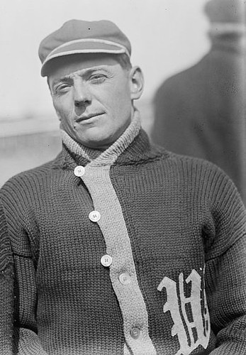
Speaking of the Nats, is that not Clyde Milan in your lead photo? A sweater he wore later in his career link earlier this year. The auction sweater doesn’t have the same button pattern you highlight, which I think must have allowed the wearer to leave it open shawl-collar style.
As awful as their history was, and however you feel about their color scheme, in hindsight the baseball Browns had a unique and not unattractive style. They also seemed to embrace their “St. Louisness” moreso than the Cardinals, given their more frequent use of the city name on their road jerseys and the working in of St. Louis IX of France into their logo.
That’s a sharp sweater. Very collegiate.
I love the Browns’ old color scheme. Sad that baseball lost that club, if only because they’d be more or less forced to keep the colors in the face of an increasing shift to black and navy as the sport’s dominant color (as Cleveland is in the NFL).
The Islanders link is not working.
Now fixed.
Not only are the Rhode Island uniforms great, but so are the Providence with the stripped arms in photo number 10.
I also like the Rhode Island ones where they have the interlocking RI with the uniform number above it. Very unique.
Interesting to note that URI’s colors are light blue and white.
The Asheville logo update might not make too much sense, but a glow in the dark Mr. Moon with sunglasses on (home cap), is pretty unique and very cool.
It’s not unique: the Casper Ghosts already have a glow-in-the-dark cap that was unveiled for the 2007 season.
Ok, so 2 hats glow in the dark. I think this logo is even more unique…Mr Moon eating Ribs. link
new Asheville Tourists uniforms:
anybody know what company redesigned these?
Plan B, per link
Disturbing article about varisty jackets falling out of favor with the youth
Shame. Those of us who loved sports but weren’t necessarily the best at it used to claw and scratch to play just enough to get a letter, so we could finally wear one of those jackets.
I remember how proud I was when I finally got the link (from the article – same school, year is a little off).
My jacket still hangs in the front hall closet after nearly a dozen moves, though I haven’t actually put it on in twenty years.
It is a shame they are going out of style. I still see a lot here in my hometown. I still have both my High School and College varsity jackets in the closet.
Good for you.
I really wanted one from college, but that was where the limits of my claw-and-scratch technique were revealed, as I was competing for a spot against people with actual athletic talent. ;)
I got mine in college for being the manager for the football team but it still has a letter.
If I’d only thought of that….
I didn’t even know I was getting one in college until the head football coach came back to the equipment room and told me to go get fitted for a varsity jacket. I was very shocked.
A few reasons why I never had a Letterman jacket (this being the mid-1990s):
– Grew like a weed (and at one point – 14″ in 3 years) so basically anything I wore would shortly be outgrown
– School colors were derived specifically from the Green Bay Packers (blasphemy in a Chicago suburb & on the heels of an extremely popular fired head coach)
– Jacket itself was very expensive ($120 at least back then)
– Was never on any school sports but moot because I had zero school spirit & wouldn’t have worn one anyway
– Letterman jackets can come off as retroesque, anti-trendy, “Hang-out-with-Potsie-at-the-soda-shop dorky”
And finally, “why would I wear a high school jacket in College or post-College? It looks like I’m living in the past & haven’t grown up”.
But would I wear a Letterman-style jacket of one of my Pro teams? You bet. Absolutely.
My school was worse. Packer colors, plus the nickname was Vikings.
and you had to walk uphill both ways, in the snow…for five miles
Only when I ran out of gas on the way there (something that happened more times than I’d like to admit).
No but I once killed a bear with my loose leaf binder.
My school was worse. Packer colors, plus the nickname was Vikings.
Not a Woodbridge alum, are you? Gives me mental whiplash every time I see a Woodbridge bumper sticker, which is pretty much every time I go outside: The Vikings name and viking-head logo, in Packers colors, with a Wisconsin motion W initial.
Woodbridge? link.
Packers, Vikings AND the Motion W? *shudders*
Back in my day (late 70s-early 80s), many people at my high school got the varsity jacket as a show of school spirit, regardless of whether they were on an athletic team. You were more likely to wear it as a senior if you actually earned a letter (as freshmen, you earned your class number, which was sewn diagonally under the front pocket). And if you won the shield that went with a conference championship, your mom had to definitely take it to the tailor to attach, because it was sewn on the leather sleeve.
Check out the great shirt on sale at the Dave Matthews band website commemorating their concert at not-Shea:
link
I’m not sure if that’s really cool or kinda stupid. I’ve had to travel a bit for a few concerts I’ve been to over the years… no way in hell would I want a shirt for a band that I like that also features a sports team I don’t.
Another Asheville native and resident here not thrilled with the Tourists’ changes.
From a distance, those Oakland elephants
link
look like crabs.
Actually, I thought of hand prints first.
and yet, you’d wear it
…unlike those pillbox hats.
I have to say, the more I see these new Jazz unis, the more I absolutely love them.
link
Indeed.
Me too, although the green section of the ball still blends into the blue jersey.
I’d agree. Still, Utah ought to do a specialty jersey night, rebranding itself as the Utah Ironics.
Absolutely. That’s quietly one of the best uniform upgrades we’ve seen around here in years, in any sport.
agreed. saw all the stuff posted here pre-season and didn’t really think about it one way or t’other. then i saw it in a photo yesterday and thought it looked great.
Interesting piece about Jimmy Howard’s mask. I haven’t seen him wear it yet; he was still wearing the Doc Octopus mask the other night.
He said he needs to break in the foam. The last I heard he was going to try and wear it Monday. I didn’t get to watch much of the game Monday so I don’t know if he did or didn’t. But from what I heard it takes a while to break in the foam.
After seeing those Oakland basketball photos,
link
All I could think of was, how can you screw up a uni with tiled striping? The System of Dress can.
Saw a photo gallery of them last night, and in some shots you can’t even see the stripes. There’s just SO much white space on those unis.
Yes, I complain about excessive decoration on a uniform, but this is the other extreme. Small wording and numbers, just a hint of striping…whatever happened to designing something that’s just right? Minimalism is just as bad as the “one more bumpersticker” syndrome.
The most interesting bit of information in the BFBS article is that California has a rule in place that uniforms can only use official team colors. Since black was not an official color, it could not be used. This is the best way to eliminate BFBS in my opinion.
Since being a Uni Watcher is all about obsessive details, I shall obsess over a detail on the new Kansas uniforms. The piping on the jerseys is significantly thicker than the piping on the shorts. Why on earth would they do that? The design itself is reasonably inoffensive, but it’s not as if it’s particularly difficult to be consistent. If the structure of the shorts prevents thicker accent piping, make it thinner on the jersey.
SOX’S/a>? At least the apostrophe is properly oriented. Heh.
Great-looking coats. It’s hard to tell, but I’m guessing those are American flags on the sleeve patches, like they had link.
Crap.
*grumble, grumble* … no preview anymore…
Let’s try that again.
link? Heh.
Great-looking coats. It’s hard to tell, but I’m guessing those are American flags on the sleeve patches, like they had link.
“cycotte?”
Excepting the “Sox’s,” it’s funny how the sentence is worded “The White Sox’s taken in their Patrick-Duluth Mackinaws at Chicago, April 1917.” Where were they taken? Were they in Chicago or at Chicago? And why “and GENUINE MACKINAWS” at the end? It doesn’t make sense. Ah, early 20th century copywriters… you never cease to make me chuckle.
It’s a two-page spread along with the Cubs’ picture. Makes a whole lot more sense if you view them that way.
Great documentary on ESPN last night “Best There Never Was”, the story of Marcus Dupree. Anyone who saw Dupree at Oklahoma in 1983, thought this player was destined for NFL stardom. It’s a moving story with a bunch of new information, which changed my perception of Dupree. A few uniform notes from that show.
* Kansas State had a sharp, unique look with a light shade of purple.
* Arizona State’s uniform used to have a Houston Oiler pattern of striping.
* Those New Orleans Breakers uniforms were gorgeous.
didn’t watch last night, but found this clip of Dupree- when Colorado had the UCLA look going. link
I thought he was destined for USFL stardom…
They gonna put that one on ABC someday? I’d love to see it.
I was at K-State during that era. The “lighter purple” was, in fact, gray. And an unusual shade of gray at that.
Here’s Helmet Hut’s take on it: link
Jim Dickey was the head coach and for one home game, had the team change from its purple jerseys after warmups into gray jerseys. The effect was gray w/purple numbers and white trim over white pants w/ purple/gray/purple stripe.
It wasn’t a bad look, but it wasn’t purple.
K-State uses gray and/or silver as a complementary color even though the only official color is purple.
Personally, I like purple and white. After all, the school fight song goes:
Fight, you K-State Wildcats
For Alma Mater fight-fight-fight!
Glory in the combat
For the purple and the white.
Faithful to our colors
We will ever be,
Fighting ever fighting for a
Wildcat victory!
Go State!
And that 30 for 30 program: Kudos to ESPN. The “Best There Never Was” was a tragic story. I saw Dupree in that game against State. He was a beast. I never knew the back story to his disappearance. Excellent show.
And I agree about those Breakers uniforms. Among my favorite..
Better gray helmet link: link
Dunno if it’s been posted, but the Kinston Indians have updated their logos and uniforms. Seems they’ve gotten rid of the cartoon indian:
link
I’m curious as to whether the inconsistent direction of the bat between the wordmark and the jerseys is intentional – it is distracting. That said it’s an improvement over any use of a cartoon Indian.
And a very good guide for how Cleveland could make their identity more Indian-y even without Chief Wahoo. The feather is such a strong bit if iconography; I kind of don’t understand why any team in this day and age would use any Indian-head image, with all the baggage and backlash that comes with it, instead of the much stronger but more abstract feathered-headdress thing. I’m looking at you, Redskins.
Logo isn’t the skins problem.
Anyone know where to find the SF Giants/Grateful Dead logo T-shirt they had this summer? The stupid dugout store doesn’t have any except for Womens M, and only one seller on eBay. And he has lousy feedback.
I’m just a big nats fan and I’m constantly looking forward to your opinions. Also getting ancy about the New set and you said a few days ago that you’ve already seem them. I’m scared they might be ugly.
if this prototype is any indication, you shouldn’t worry.
link
If I’m not mistaken hasn’t Paul already posted that that prototype is not accurate?
Oh man, just a fantastic football uniform. Thanks Larry B.
link
Modern interpretation: link
From Rock Island, Ill., High School. Great school nickname: The Rocks.
Bad link, you’ll need to redirect. There are some uglies there, but if you scroll down you’ll see a football uniform with interlocking RI on the shoulders. A nice look.
Hey, thanks Flip. I agree, a nice look.
you are welcome Mike
my parents got a lot more mileage out of my varsity jacket than i ever did. not only did they get it a bit big for me, but it was also southern california where i wear an actual jacket maybe 3 times a year. after i graduated they wore it to my sister’s sporting events.
Do the caps worn by the fleur-de-lis Browns have two-tone bills? Something’s going on there.
Um, speaking of NBA unifoms…
I was at the Bulls/Nuggets game the other night and while the Bulls certainly look better since the ditching of the super-shiny dazzle fabric, I think the Nuggets might have actually looked better with the satiny effect.
link vs. link — I’m not sure how obvious it is in the photos, but in person, that powder blue and gold looks really lifeless on the dull fabric.
Gotta disagree there. The old ones would look better on the cheerleaders.
Of course, they both pale in comparison to these:
link
and these:
link
As I said, I’m not sure how well the photos convey it, so next time the Nuggets are in town, go check them out. The powder blue and gold is just not a good color combination on the matte finish.
That last Rhode Island photo, the white shoes shot, would be an eye popping project for the colorizers. I’m guessing that RI was dressed in a an-all powder blue uni set, like a cheesy tuxedo. Add the white shoes and white belts, and you’ve got Prom Night, Rust Belt USA, circa 1977.
Re: the Yankees sweater picture – I was about to claim the notation of the 1923 Yankees opener was wrong. I figured there was no way that was Yankee Stadium (opened in 1923) with a berm in the background. But before I wrote something I figured I better check so i don’t look like an ass. A quick Google search later showed I was wrong. There was a berm beyond the warning track.
link
I thought exactly the same thing when I saw that pic…had no idea that was there…
Not sure if people will be very interested in this, but last weekend was the link link in Chicago. Three days, twelve teams from across the country, twelve games.
I thought people might be interested in seeing some of the uniforms worn by the top roller derby teams. Derby grew out of a DIY ehtic, and many teams still reflect that in what they wear on the track; some are definitely more uniform than others.
I’ve been thinking of combing through photos to find examples of each team, but if you’d like to see some, your best bet is probably this tag on flickr:
link
There are also a couple of very high-quality videos which are definitely worth a watch:
link
link
I should say that “[m]odern flat track roller derby grew out of a DIY ethic” up there. It definitely owes its roots to the banked track “game” of the past, but has now evolved into its own legitimate competition (and subculture).
Listening to Colin Cowherd and Denzel Washington bond over my lunchbreak, they mentioned a guy by the name of Bernard King (supposedly one of the best NBA players no one has ever heard of) and I decided to look him up on google, and came across this image:
link
A whole lot going on with that jersey, but I sure like it.
maybe no one under the age of 30…but he was one of the best, both with the nets AND the knicks in the late 70’s early 80’s…maybe not a first ballot (do they even have that?) HOFer but if he hadn’t destroyed his knee he might have been up there with bird & magic…
i remember his christmas day game (was either 83 or 84) when he went for like 65 points or something…
amazing player…anyone in their 40s and up will know exactly who he was
40s and up? I don’t think you need to be that old. He was still a pretty damned good player when he was with the Bullets in the late 80s/early 90s.
I’m not quite 40 and I certainly remember him even though I didn’t really start paying much attention to the NBA until I was like 17 or so.
Count me as one of the younger generation (not quite 30) who remembers Bernard, especially him lighting it up for the Bullets. Even made the all-star team in ’91.
Phil – it was Christmas ’84, against the Nets. The whole game’s on Youtube, it’s worth watching (again).
Any basketball fan in the SEC who is old enough to remember him or appreciates history can tell you about the “Ernie and Bernie Show,” named for the Tennessee basketball teams featuring King and Ernie Grunfeld.
King was a three time SEC Player of the Year averaging 25+ ppg for his career. King lost his first game against Kentucky in Lexington as the Vols were showered with oranges, coins, and other items from the crowd. Getting hit with a lit cigarette sent him over the top. He swore that he would never lose to Kentucky again, and he didn’t.
In 2007, King became the first Vol cager to have his number retired.
Knew Bernard well. Think I saw one of those 50-point games on TV. And I loved the uniform in that picture.
In addition to his scoring prowess, Bernard King overcame some addiction problems early in his NBA career so we need to credit him for that.
I remember that radical Knicks uniform as well, the 1977 Marquette Warriors had a similar concept(jersey only), can’t think of anyone else. In a general sense, it’s like putting uniform numbers on the side of football helmets, like Alabama, or old school Penn State and Chargers.
Would this concept work with any other NBA or college team, even as an alternate? The logo/city initials would have to be strong on the shorts. The Spurs come to mind in the pros, and Butler in college.
From the “Preaching to the Choir” Department:
link
Random question for the Uni Watch faithful.
I’m looking to find what font Providence College athletics uses for its word mark and uniforms. Any ideas on how I would go about finding it, or a close replica?
This page has an example of the font.
link
Any help is greatly appreciated!
As with most professionally designed/illustrated logos, the word mark Providence College uses was probably either hand-lettered or tweaked to create an original mark unique to the College.
That being said, it looks like it was based on Saracen by typographers Hoefler & Frere-Jones:
link
In that slideshow of England jersey you linked to in the ticker shows the jersey they’ll be wearing on Saturday. In the caption for it it says “According to Nike, the new strip will provide England’s players with a ‘battle-ready uniform of steel’” Anybody else thinks that sounds downright rediculous?
only if you hadn’t heard of “pro combat” nc2a unis…
Could this be a foreshadowing of a move towards “pro combat” for rugby and possibly even other European sports? If so then god help us all.
Is it me or does it seem rather peculiar that the Rhode Island photos of the Brown, Northeastern, and Providence games all feature the same opponent. I have a feeling that the three pictures are all of Brown since all three pics seem to be taken in Brown Stadium (link)
Also, I found this picture (link) which is supposed to be of the Brown football team in action. I do not know what year, but I’m conviced that their playing Columbia at Baker field in Manhatten. link
Just hoping someone could clear up the confusion.
I meant to note that. I think the captions for games were for other teams while the pictures had it seem like different teams all played the same uniform teams
Good eye
Meaning the captions did not reflect the pictures shown
Per those shawl-collar baseball sweaters: the buttons that “veer” off don’t button through holes; rather, they button through loops. This helps to keep the collar tight and warm. You find something similar on contremporary shawl-collar sweaters.
As much as I like baseball & hockey sweaters- They were very much a function of the time and technology. Gone forever like leather helments…
But on field outwear really does need to be improved. Personally I think it would be a coup if Majastic/MLB would make wool or leather & wool varsity style jackets the norm. Get rid of those EMS/Lands End mordern style jackets. (And get rid of that damn pull-over Tito wears…)
ANY improvement would be welcome.
Didn’t read the section on Varsity jackets being on the decline until after I posted. Oh well. I guess crappy pull-overs and ski-type shell jackets are here to stay.
Maybe the NFL can bring back the old style parkas?
Andy said:
“I’m sure a lot of black uniforms get thrown into every design review at Nike, because their M.O. is to break the mold.”
Black IS the mold. Break the mold by sticking with school colors.
Never seen link before:
The Nationals Park Team Store will be the only place to purchase new Nationals jerseys until Nov. 17. Fans will also receive 15 percent off the price of a new Nationals jersey when they trade in any MLB jersey at the Team Store through Dec. 1.
Didn’t the Islanders offer a free T-shirt or a discount when fans brought in those awful Gordon Fisherman jerseys?
i think it was free season tickets
Assuming the link works, I (being 19) still believe in Letterman’s Jackets…
link
Great sweater pics today. I wonder if the colors reflect the team colors pretty much
Picture from the Nats unveiling!!
Curly W’s everywere…including a star-spangled W on the blue alt, and on the home whites
link
So they’re the Washington Walgreens now? Bah. I guess the S&S insanity lives on again.
Uggghh…. They failed to address any of the problems. With the curly W the sharp-edged numbers make absolutely no sense from a design perspective. While not my preferred look, those at least make sense with the old interlocked DC logo. They should have used numbers with a rounded or soft edge.
Also, maybe just a slight overuse of the W on the chest a little bit?
Will say the new primary mark is an improvement.
Just saw the Nats new jerseys and can sum them up in one word: fugly.
The Nats jerseys are underwhelming, for sure.
But on the surface they seem like incremental improvements over the last set.
Home: They got rid of the “Nationals” that looked like it was designed in Microsoft Word. And they ‘may’ have gotten rid of the beveled numbers.
The alts look like weak BP jerseys, but once again if they ditched the beveled numbers and names, it’s an improvement.
Road: minor tweaks to a jersey that was improved last season. The worst part of this in 2010 was the lousy numbers and letters, hopefully these are fixed.
Snooze. The Nationals had a good home jersey. The script was unique and interesting. I had no problem with the beveling. The new uniforms are just so boring.
Holy crap did they drop the ball. Sure they cut down on the odds of misspelling, but…. Curly W’s on EVERY jersey but one? What a letdown….especially in light of the ‘leaked’ jersey from the other day. That one was sweet.
-CraigD
Actually, since the wordmark on the road jersey starts with W, doesn’t that mean every jersey now has the “curly W” on it?
Or is there an alt that I missed?
The Nationals definitely missed a golden opportunity. Scrap any alternates (red one with the W is fine if it’s a must), and then go with the road from last year and the prototype from a few days ago. No gold bevel on the numbers. Also, keep only the red hat with the W. Those would have been beautiful.
I do not see the fascination with the stars & stripes alt, looked better with the interlocking DC logo if that is possible.
I think the Curly W on the home jersey serves 2 purposes: 1) They don’t have to spend money to update the scoreboard (bet we will still see the Nationals in Fuddrucker font up there) and 2) it relates to peoples fondness for the Senators. There are still those that would like the Nats to get the rights back to use the Senators name. Doesn’t make it right, just a theory.
Plus, they wore the Red Curly W Alts a lot a home this year. Kinda thought that might be a option for the home whites.
Nats homes are a bit disappointing only in that the full name “Nationals” is gone from across the chest. Still a great improvement, reminiscent of the Tigers’ classic homes.
There is a lot to like about the new Nats uni set. Best feature: The consistent two-band piping on all but the road uni. Major upgrade on an important detail, and one that prevents the new Nats home from being a complete Cincy retread.
On that score, the biggest negative for me is that the road uni’s piping is untouched. Instead of the bold two-color piping and the placket pattern, it retains the ugly narrow three-stripe piping that’s effectively purple, and it keeps it around the neck instead of down the placket. Give the road gray the same piping as the home white and the Nats would be a top-ten uni team to me.
A close second on the disappointment meter is the treatment of the front numbers on the home and alts. There are two acceptable solutions to the problem of numbering the front of a left-chest-logo jersey: No number at all, like the Tigers or Yankees, or a number at the same height as and in a typestyle with a similar weight to the logo, like the racing-stripe-era Expos. Nats fail on both accounts.
I’m not loving the new Braves cap, but it does fit with what the team seems to be trying to do with emphasizing a more coequal red/blue balance, so meh.
Back on the plus side, this new aesthetic gives the team much-needed definition and uniformity, and it places the Nats squarely in line with a nearly century-old Washington baseball tradition of wearing a W on the side. That the W in question is from the expansion Nats, so it’s a double historo-aesthetic entendre, sweetens the deal for me, even though I basically despise everything that Bud Selig meant to say when he imposed his curly-W fetish on us. Also, the new sleeve patch is strongly reminiscent of the old Expos circle logo, which is a nice touch.
Heck, even the dreadful blue stars-and-stripes alt is an improvement over the previous iteration.
All in all, I wouldn’t grade this new uni set much higher than a B-minus. But that’s a huge step forward for the Nats, and makes this possibly baseball’s biggest overall uni upgrade since possibly the late 1980s in my book. The Nats have gone from a contender, with the Jays, for Ugliest Team in Baseball to slightly above average.
Ah, and another big positive: The Nats have fixed the road script, so the jersey breaks between the S and the H, rather than in the middle of the H stroke. Should be the end of the “WASIHINGTON” jersey script. (Is this phenomenon a “scripto” – like a typo, but with script?)
nice write up scott…
it’s like deja vu all over again ;)
Overall, the nats jerseys are an improvement.
BUT…
1) I really wish they had put something other than a Curly W on one of the alternate jerseys.
2) Those numbers on the front of the home and alternates just look awkward down there. Either move them up so that they are right across from the W or take them off.
3) The change that they made to the numbers was that they JUST took away the gold beveling. They are the same exact numbers as before, otherwise, and they just look bulky.
I’ll wait for Paul’s write-up to elaborate, but basically, I’d wear all those Nats jerseys. Wish the gray one had just the curly W as well.
the blue jersey needs to burn in hell for all eternity…it is probably … nay…definitely…
THE WORST JERSEY IN BASEBALL…
worse even than the blue jays black and the mets black
and that’s pretty f*ckin’ bad
Easy, big fella…
Blue Jays’ are worse.
Worst jersey in baseball – you working on another poll idea?
Sweaters and baseball…two of my favorite things! I’d love to have a vintage Tigers sweater, although M&N would doubtlessly charge about $1,200 for one.