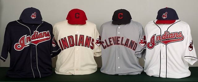
The 2011 MLB season unofficially began yesterday, as the Indians unveiled a new uniform set and promptly announced plans to trade it for prospects on July 31 (here’s a larger view and some additional info). Let’s see, one at a time:
• The new road uni: The Indians are claiming that the design of the road grays “harkens back to the one worn by the team in 1901,” although that seems like a bit of a reach, since the ’01 design didn’t have a cap logo or red outlining on the letters. But whatever — I never liked the “Cleveland” road script (too busy, too big a word for that script style), so block lettering is fine by me. Good or stupid? Good.
• The new home alternate: They’ve kept the block-lettered, cream-colored alt from the past two seasons but have swapped out the navy cap (which is now the primary road cap) and replaced it with a red cap. Not so sure I’m in love with that move. For starters, the cap logo needs some white outlining or something like that — the “C” is getting swallowed by the background color. Also, the Tribe is just as the Rangers when it comes to settling on a primary team color. C’mon, guys, are you a blue team with red trim or the other way around? If you insist on working both sides of the street, couldn’t you at least stick to one dominant color at home and another on the road, like the Cardinals do? And one more thing: When you look at the alt and road jerseys side by side, the difference in lettering size is pretty striking. Obviously, one word has fewer letters than the other (and two of those letters are I), but still, shouldn’t these look a little more like brothers, instead of distant cousins? Not a disaster, but mildly stupid.
• The new alternate road cap designation: This cap, which had previously been paired with the navy jersey, has been mothballed, and not a moment too soon. Never liked it. The navy jersey will now be paired with the solid navy Chief Wahoo cap. Good.
• The new home uniform: Actually, they didn’t change anything to the home set. But as several folks have pointed out to me today, it would’ve been soooooo much better if they’d gone back to this version of the script, without the extra outlining. As missed opportunities go, chalk this one up as seriously stupid.
In short: Could be worse, at least when you look at each design individually. Put them all together, though, and this is starting to look like a team with a bit of an identity crisis, and not just in terms of choosing its main color.
Next up: the Nats, who’ll be unveiling tomorrow.
Uni Watch News Ticker: Mako Mameli noticed something we all missed from Sunday: Several Chiefs players appeared to be wearing black armbands on their right arms. Anyone know what that might have been about? ”¦ Here’s a look at South Carolina’s baseball championship ring design. “The interlocking ‘SC’ that South Carolina and USC have fought legal battles over is the centerpiece,” notes Beau Franklin. “The Gamecocks can’t trademark it, but it’s safe to say they’re not parting with the logo anytime soon.” ”¦ New soccer kits for Malaysia (with thanks to Jeremy Richardson). ”¦ Tom Brady is now in the Under Armour camp. ”¦ Ya say you don’t have any problems with corporate sponsorships of this and that? Then you won’t mind that Texas is now selling ads on license plates (depressing news from Paul Kennedy). ”¦ New hoops uniforms for Wisconsin and Michigan. ”¦ In yesterday’s Ticker I mentioned that the Ball State women’s hoops team has “an inspirational message on the back of their sneakers.” Now Kyle Clifford has checked in with more info on that: “That is LeBron’s go-to phrase, ‘Witness.’ The player in the picture is wearing the Lebron Soldier IV, a popular team-edition shoe for many college hoops teams this season. I’m a student manager for the University of Illinois squad, and several of our players have those shoes as well.” ”¦ The problem with having a team called Wakefield Track & Field is that your team initials can be misinterpreted (with thanks to Matt Friedrichs). ”¦ Another school with an asymmetrical helmet design: Eastern Technical High School in Essex, Maryland (with thanks to Joseph Young). ”¦ Bryan Stevens notes that New Mexico apparently didn’t get the memo about “Think Pink” Month being over. ”¦ Here’s a shot of the Browns’ orange-numbered 1984 jerseys from that one preseason game when they were worn (with thanks to Johnny Woods). ”¦ Interesting find by Jim Vilk, who’s found what appears to be a fairly early example of an NBA throwback. That’s Darryl Dawkins on the right, wearing what looks like a Sixers (or Warriors..?) throwback. Anyone know more? ”¦ You can see a nifty trick play in this video clip, but what makes it uni-notable is that the defensive team is wearing mismatched socks (big thanks to C. Trent Rosencrans). ”¦ Our “White at Home in the NFL” page has now been updated to reflect the first half of the 2010 season. ”¦ I just won this cool varsity skating jacket. Not sure which I like better — the Ohio-shaped patch or the name of the shop on the back. More photos when I receive the jacket in the mail (and given the shipping charges, I damn well better receive it fast). ”¦ This photo of a supposed Redskins cheerleader typo began making the rounds yesterday, but it isn’t a typo — it’s more like “Philllies” or “Raays.” In other words, the doubled up on the vertical stroke of the K, just to be safe, not realizing it’d look like an extra letter. ”¦ The good news is that they finally fired Joe Morgan. The bad news is that they’re letting Jon Miller go too. Meanwhile, I’m hoping maybe Wayne Hagin gets caught up in the Charliegate betting scandal, but the Wayner seems too whitebread to be a gambler. Couldn’t we just dress him up as K-Rod’s father-in-law and see if Frankie punches his lights out? ”¦ Speaking of which, by far the best single piece of Charliegate coverage is this NJ.com article, which recounts all sorts of interesting details — many of them uni-related, a few not — regarding Samuels’s tenure with the Mets. ”¦ Peyton Hillis has a facemask that looks like a serious underbite (as noted by Scott Cummings). ”¦ It’s not often you can see the Red Wings’ 60th-anniversary patch and a serious football facemask on a hockey helmet in the same photo. That’s Gerard Gallant, circa 1985 (great find by Bill Hoppe). … Shoe shenanigans last night for Chad Bengal, plus he was wearing a black chinstrap (screen shots courtesy of Tim Burke). … James McClure recently spent some time on the battleship USS Texas, which has a display devoted to the ship’s assorted athletic teams over the years. The photos included some very interesting uniforms, from baseball and football (the team with the stripes is from the USS New York) to basketball and crew (how great is that “TX” logo with the oar?!). I’ve said it before and I’ll keep saying it: Throwbacks based on these and other military team designs would be a much, much better way to show support for the military than wearing camo.
In my world, the middle 2 Indians jerseys wouldn’t need to exist.
In mine – ONLY the middle 2 would exist.
As long as they got rid of the red cap, those middle two would be a pretty sharp standard set.
No doubt. Use the Navy cap with both of the middle uniforms, and add the blue piping that’s on the raod to the home, and you’ve got a winner. Maybe look at flipping the fill and outline color on the lettering of one jersey to match the other, but that’s not essential, just a what if.
I really like the new Indians roads – retrorific. As for the motives, it completely reeks of desperate merchandise revenue generating & it looks like their trying to usher into a new era while still dragging their feet in the previous one.
I bet the only reason why there’s no outline on the navy alt cap is because it would look too much like the 1978-85 cap. I’d keep the block jerseys and ditch the script jerseys. Maybe the red cap would work if the “C” was white with a navy outline, tho it’d still look too much like the Reds.
The Indians are three minor tweaks away from uni greatness:
1. Give that cream home uni the same piping treatment as the road, but in red.
2. Give both block-C caps cream outlines.
3. Ditch the script “Indians” jerseys and the Chief Wahoo caps.
Paul’s complaint about picking a color is misplaced in this instance – the Indians have long treated red and blue as essentially coequal colors, and these fauxbacks continue that. (Though this tradition would be better served if the home and road caps were switched.) But it does appear that the letters on the road jersey could be a bit taller and still fit within the same horizontal space, and thus more closely resemble the home block lettering.
As a set, these are C-minus uniforms in my book. At best. Failure to choose between two clashing shades of navy make it hard for me to give any passing grade at all. But taking just the script-Indians unis or just the fauxbacks would significantly raise the grade. Script unis: B-minus. Fauxbacks: B-plus, with high upside if appropriately tweaked for better stylistic consistency. I really like how the block fauxbacks create thematic continuity with the Browns for a kind of distinctive civic aesthetic.
Check out the very different placements of the letter “I” on the home jersey and the blue alt. Yikes. Also, I agree with Paul that the earlier version of the Indians script without the extra outlining is preferable to the current iteration.
Unless my eyes deceive me, it seems like they’re reverting to a darker shade of navy blue for the caps, which would be a welcome development in my book. It seems like the blue of the Indians’ caps in recent years has been similar to the Brewers’–a kind of in-between blue, not royal but not quite navy either. The red cap is a disaster. And I agree about Chief Wahoo–they either need to go all-in (return him to full size on the main cap) or retire him altogether (perhaps preferable at this point–he’s actually red for goodness sakes).
I gotta agree with The Jeff. I grew up with the Indians wearing that script and seeing it everywhere. It might be hard to read but all you have to see is the I on the end and you know what it says.
To me the two in the middle are just plain boring.
What ‘I’ on the end? I see Jndians, a running joke for most baseball fans I chat with.
Match the creme home with the red-billed yahoo hat, add the red piping and match the gray road with the all blue yahoo hat and that’s the winner!
South Carolina’s rings are for baseball, not basketball – I’m sure you know that.
Yes. Brain cramp. Now fixed.
Even having read the Special Trademark Trial’s ruling, I’m still confused as to how the respective versions may be considered confusing. Southern Cal’s is a link whereas South Carolina’s is a link derived from the link from the turn-of-the-last-century state dispensary.
The guy who made the ruling is probably confused by these too.
link
I’ve got one of those “Vault” books on the history of South Carolina football and there’s several old photos from the early 1900’s of Gamecock football players wearing sweaters/jerseys that sport the same interlocking “SC” that the South Carolina baseball team uses today. It’s a moot point though because Southern Cal owns the trademark and the case is pretty much closed. The Gamecocks can’t seek a trademark for their version but they have no plans of giving it up. It’s baffling for everyone in our state though because it seems natural that our sports teams are going to use some variation on an interlocking “SC”.
Trademark issues or not, its not a bad looking “Cock Ring”.
I have always thought that personalized plates was a pretty cool way for individual states to raise funds. Teams, Colleges, Charities on plates is a nice way to show your allegiance. In particular if you are from on part of the country and living in another.
I could not fathom WTF someone would put a corporate logo on his/her license plate……. I wonder if any banks will get in on the fun. I might just have to “key” any Bank of America logo plated car!!!
What’s next logos and bumper stickers on coffins. Nike swooshes on prison uniforms…….
I’m sure there’s a ton of idjits who’d love to slap a corporate logo on their license plate. The same people also buy and stick giant MUSTANG decals in the back window of their car of the same name. …and then there’s the legion of NASCAR fans.
I’ve been living in Mooresville North Carolina which is known as RACE CITY USA. For whatever the reason, this little town is home to a lot of the big Nascar racing teams. One of the town’s biggest attractions are “Racing Garage Tours” which for the life I will never understand. Folks spend their vacations here for that crap.
So The Jeff, I completely understand the Nascar crowd angle on this. I also find it annoying that someone would pay to put up a big Ford or Mustand logo on their car!!
Now I might get a Corona or Jose Cuervo logo on my plate….but that would just probably get me pulled over!!
Now I might get a Corona or Jose Cuervo logo on my plate…but that would just probably get me pulled over!!
On that note, and since South Carolina’s on topic today, if I moved there I’d seriously consider link
I have this plate on my truck
link
If they offered Whataburger plates I’d get those.
They call that facemask style a bulldog, for obvious reasons. I thought only Schutt made them and never with the nasal bar, but I guess in the NFL you can get facemasks custom made.
Peyton Hillis is wearing a Riddell VSR-4 helmet with a Schutt moto-cross styled facemask. He has only recently started wearing this.
link
This type of facemask was originally worn by Levar Arrington on a Schutt DNA helmet, when he was with the Giants:
link
Around the same time, Lorenzo Neal of the Chargers began wearing it as well on a Riddell VSR-4 similar to that of Hillis.
link
I guess the tailback behind him liked it, so he started wearing a modified version of it as well, however on a Schutt Air XP helmet. This was referred to as the Vader mask and might have been the coolest thing that I have ever seen:
link
He even had multiple versions of it made, this one without the under-bite extension.
link
Tomlinson’s mask was almost as scary as that of Rickey Jackson, when he played with the Saints:
link
Recently, Chris Canty of the Giants has begun wearing this modified mask on a DNA helmet;
link
In the past, he wore a similar mask due to an eye injury sustained while in college:
link
Keith Bullock, now with the Giants, must like Canty’s because he too is now wearing the full mask, instead of the traditional “triple-full bull-ring” that he wore while at Syracuse and Tennessee:
link
link
Peyton Hillis is wearing a Riddell VSR-4 helmet with a Schutt moto-cross styled facemask. He has only recently started wearing this.
link
This type of facemask was originally worn by Levar Arrington on a Schutt DNA helmet, when he was with the Giants:
link
Around the same time, Lorenzo Neal of the Chargers began wearing it as well on a Riddell VSR-4 similar to that of Hillis.
link
I guess the tailback behind him liked it, so he started wearing a modified version of it as well, however on a Schutt Air XP helmet. This was referred to as the Vader mask and might have been the coolest thing that I have ever seen:
link
He even had multiple versions of it made, this one without the under-bite extension.
link
Tomlinson’s mask was almost as scary as that of Rickey Jackson, when he played with the Saints:
link
Recently, Chris Canty of the Giants has begun wearing this modified mask;
link
In the past, he wore a similar mask due to an eye injury sustained while in college:
link
Keith Bullock, now with the Giants, must like Canty’s because he too is now wearing the full mask, instead of the traditional “triple-full bull-ring” that he wore while at Syracuse and Tennessee:
link
link
Our “What at Home in the NFL” page has now been updated to reflect the first half of the 2010 season.
Should this be White at Home?
Yup. Now fixed. Thanks.
Sorry, the Redskins cheerleaders’ typo looks, to me anyway, as just that–a typo. And an incredible one at that.
I’d tend to agree. The RAAYS thing usually only happens on a baggy jersey with a noticeable gap due to player movement. Those jackets are buttoned all the way up and they aren’t form fitting enough for the cheerleaders’ umm.. upper bodies to cause that much of a distortion.
So you think four separate jackets just happened to end up with the same typo?
Obviously, the extra “I,” if that’s what you think it is, was an intentional part of the pattern — that’s how it ended up being added to the jackets again and again and again. And why was it there? OK, maaaayyyybe someone set up an erroneous lettering template, and maaayyyybe nobody sewing the letters noticed.
But I think a much more likely scenario is that they were worried about the K crossing the rubicon, so they doubled up on the vertical stroke. But they outsmarted themselves.
Paul–That the same typo appears on all four jackets, in my mind, *supports* my argument that it’s a typo, pure and simple. Same manu., same order, etc. I hear you about desiring to cross the rubicon, but I remain unpersuaded.
I’d be willing to go with it being a bad production run.
They’re buttoned all the way up and there’s still a space between that extra line and the K. That’s either the worst intentional extra stroke I’ve ever seen, or a legitimate mistake.
Those jackets are probably produced in a country where english isn’t the first language. It’s not that impossible for an extra letter to go un-noticed for a short run, is it?
It’s rather horrible, whatever it is.
I don’t think its a typo. It really does seem to be intentional, but just a really bad job…I agree that it’s probably “the worst intentional extra stroke I’ve ever seen”…
I think its even possible that this lettering set up was used for a differently cut jacket. When laid out for this one there was too much space between the “k” and the button….
Or who knows maybe those jackets were meant for males….with of course…..different upper body structures…
In any case, they would probably look better if they took off the jackets!!!
This actually looks like a case of being a woman’s jacket (right over left buttoning) vs. a man’s jacket (left over right buttoning).
Let’s hope those red Indians caps have a short life. The navy caps should always be worn with the creams, in my opinion.
I’m with you on that. I’d wear it, but I don’t want the team to wear it. The red ‘C’ shows up much better on the navy hat than vice versa, and it looks much better with both uniforms.
My hunch is they will. Those navy caps are pretty sharp.
Some old-school Red Wings! Nice. And interesting to note that before the Edge era, the Wings’ previous use of the captain’s C on the right shoulder lasted as late as 85-86. (That’s Danny Gare with the C, by the way.)
Of course, it was also the worst season for the Wings under Mike Ilitch’s ownership. Needless to say, they got better…
Fair dos’ to Ilitch and all, RS…. but that 84-85 season was just like all the other preceding seasons since 1955. Right?
Sure, they struggled in the first three years (82-85), but they totally bottomed out in 85-86; 40 points, a mid-season coaching change… and it wasn’t really until the expansion era that the “Dead Things” era began.
It may have been mentioned, and I don’t know if anyone cares, but it appears Josh Cribbs has been wearing a Xenith helmet (like the one Dallas Clark has been wearing for at least a year) since he was knocked out of the Pittsburgh game last month.
did the indians really need to plaster wahoo on every jersey?
im not necessarily in love witht he plain block font (but i do love the home cream, always have)…the script wordmark sucks, especially when shown side by side with the block lettering
and do they really need four caps?
Agreed re: the home cream jersey. Love the red text w/ navy outline. It doesn’t work, however, with the navy and red outline on the grey.
The navy “C” on the red cap doesn’t work either, IMHO. Andy’s idea about using the navy cap with both block lettered jerseys is a winner. Either that or make the “C” cream-colored on the red cap. I think that’d be pretty sharp.
Man, how slick would those two middle jerseys (especially the cream) look with an updated version of link rather than Wahoo?
Those middle two unis remind me of the annual civil rights baseball game. link
Isn’t the wordmark on the navy alternate actually the old 1994-01 home wordmark, or I do remember somebody here showing the slight difference on a letter or two?
I’ve never cared for that ridiculous Wahoo caricature.
Paul – people usually only say it on anniversaries or special occasions, but I want to praise you and your uni-brood yet again for the great work, and giving us uni-nerds a place to go everyday. Thank you.
It seems that they did in fact do a very slight tweak to the script “Indians.” The outer trim around the letters (white on the blue jersey, blue on the white) seems a bit larger.
Also, reading the ESPN article indicates that although Jon Miller’s contract has expired, he may still return to his roles on “Sunday Night Baseball” and ESPN Radio’s postseason coverage.
What is that about Texas? (after the Brady to UA part). Link missing? Or am I missing something?
It’s doubtful the uniform Darryl Dawkins is wearing is a Warriors throwback because the Warriors colors were Royal Blue, Athletic Gold, White and a little bit of Red as a trim color. This uniform has too much Red and I don’t see any Gold. Doesn’t really look like a Sixers uniform either.
It’s a 76ers uniform they wore from 1966-70 (per NBA’s uniform history page). Also link
I just looked at the Sixers uniform page at NBA.com and I saw a Royal uniform with Red numbers outlined in White. The DD pic has solid White numbers. ’67 is when Phila won the title and that’s when they wore the Red over White numbers. Also the description given on the NBA page says the uniforms were Red with Blue lettering and White trim. They’ve got it reversed.
Glad I don’t have to listen to Joe Morgan on the Yankee-Red Sox Sunday night games any longer. When I could I would hit the SAP button and listen in Spanish during ESPN games, but it didn’t always work. The only thing Morgan knew how to do was compare each and every play ( or player ) to the big red machine…… good riddance…
Jon Miller wasn’t much better, but he was play by play and by definition much less annoying…. listening to them ALMOST made me appreciate Michael Kay…
fixed.
wait…that’s just wishful thinking
LOL Phil! But you know the Sunday games of Yankee-Red Sox, Yankees-Mets, Mets-Phillies will usually all be on Sunday night!!
Smirk if you want, but ESPN’s only real bias is a favor towards the green.
If those games didn’t get good ratings, they wouldn’t be the featured matchups.
I don’t think WTF was any “misunderstanding” … yeah, it was 20 years ago, but I NEVER heard Track and Field initialized. We weren’t BGTF, our rivals weren’t WTF or HTF.
Those shirts were made because they could.
Nothing we haven’t really seen before, but there are a few new shots of WVU’s Pro Combat helmet in this message board thread:
link
Hot Damn! That’s pretty friggin’ cool.
One thing I’ve noticed about that Riddell Speed helmet, not sure if anyone has mentioned this around here, yet aside from the borrowed motorcycle helmet design elements(makes since since Riddell has merged with Bell helmets), they have taken a pretty big design cue with that rear air vent cutout from a link.
“Throwbacks based on these and other military team designs would be a much, much better way to show support for the military than wearing camo.”
That would be the shit. We had a speaker who served in the Vietnam War come to my high school one year. He had more pictures of playing football for his company than anything else. Just pick companys and units and honor them for their service to our country.
Couldn’t agree more.
Since we’re talking basically about one-offs, as a work around for the inevitable “but you’d only be honoring a small group of troops” point, you could allow a little bit of a hodge podge uniforms for a team. Sure it would collectively look a mess (like the ASG) but individually you’d see even more designs. Possibly.
Don’t even have to limit to throwbacks- I’m sure there are teams active on bases worldwide right now.
Yeah, me three. Those teams from the USS Texas — especially “CRACK DINGHY CREW” — are top of the line.
Makes you wonder how far those lads got rowing a cracked dingy, uh?
How many changes can a team go through on uniforms? I have to believe the Indians are at the top list when it come to changes to their uniforms year in and year out (aside from patch additions/subtractions).
I also wonder how much price point plays into the decision to keep the triple twill “Indians” script vs. going back to the double twill script.
They could be, although they’d have some stiff competition from the Padres in their early years, where they’d have a somewhat significant change almost every year for about 10-12 years. And in terms of all-time changes, they’d have some stiff competition from the White Sox, who finally settled on a basic framework in late 1990, and have kept it since.
Would like to see the Indians bring back the monochrome red from the Frank Robinson era for one of those throwback games.
The Padres may well have the highest percentage of uniform changes of any team in MLB, considering San Diego entered the league in the late 60s.
ummm… you sure about that? link
Yes, he’s sure. It looks fine. Distinctive, yes, but fine.
Sorry… my point was the badness of the modern interpretation of that look. I LOVED the mid 70s unis, but the throwbacks just aren’t the same. The bagginess and pajama pants ruin it, IMHO.
The pajama pants ruin any look, so why not go with it anyway?
With today’s merchandising, we’re lucky we aren’t seeing all of the teams with subtle changes each year to try to get people to buy a new jersey every season.
First we’ll start with plain blue lettering…next year we’ll add red trim… then the next we’ll add white around that… then we’ll flip those… then remove one…
Look at the Indians’ current home jersey. How many times did they tweak that? So I get what you are saying.
The market size teams are in plays a big part in it too. Bigger market teams seem less inclined to change than smaller markets. The Mets went virtually nine seasons without an overhaul of a jersey (not counting the subtraction of the black “New York” away) so it can’t necessarliy be all about winning.
you say that like it’s a good thing
Which sounds like it is a good thing? The Mets loosing? The Mets not changing uniforms? I liked all five jerseys they rolled out for eight some-odd years. Not a fan of the creamsicles. So I can say for me that was a good thing.
But my point was are things that bad merchandise wise in Cleveland to motivate the Indians to keep things fresh? Do they not sell enough jerseys? Or is it purely for style and artistic value? What is the bump in jersey sales when they make a change.
Aside from the aesthetics, I’m curious about the motivation and justification.
Jeff, try being a soccer fan. I think Man United have had 5 different home shirts in the past 4 years (if you’re counting the 1958 throwback they wore for one game).
I’m a soccer fan with an ’03 Celtic jersey. Two sponsors have come along since then, but I’m not buying another jersey. The design is basically the same, so why would I? In fact, if I could get the sponsor logo removed somehow I would.
well…. i can tell you first hand that a sponsor change doesn’t change anything. My fellow Blackburn Rovers’ MB denizens all rush off and buy the newest kit (home and change!) when they make their first appearance at the club shop. Essentially: you’re not worth a crap unless you have the newest version of the club shirt–besides, you’re doing your bit to support the club via shirt sales.
Used to be that the Umbros of the world staggered the new shirts’ appearance every two years, but nowadays these ‘kits’ are introduced EACH year. To the tune of 50-60 quid/shirt, no less!!
If I were a Blackburn fan I’d just tell my fellow supporters, “It’s a throwback.”
Isn’t buying tickets enough of a show of support? Or watching the games to boost the ratings? Yeah, I believe in supporting the club, but there’s a limit to that.
Preaching to the choir, I know, but when you come across another Rover, pass it on.
With that many cap options, you just know the official designations aren’t going to matter and a mix and match will take over at some point unless the equipment manager has lock-tight control over the hat pairings.
As for the Cleveland roads- it looks like ’42-’43, ’50 might be more direct reference points than 1901.
To me, the Redskins error looks like it is because it’s a woman’s jacket. If the wording had been put on a men’s jacket, the extra “I” would be part of the “K” because of how the sides overlap each other.
very disappointed in the michigan jersey changes. I’m biased as a michigan fan, but I thought their old jerseys were pretty nicely maintained, clean, and a (mostly) classic look.
Re: recent Michigan basketball uniforms
Is there some sort of rule limiting the size of their M on the shorts? The M of the 90s almost seemed too big, but the recent designs have that small M being swallowed by the billowing shorts.
Also seems like Indiana’s monogram has been shrinking in proportion to the shorts as well.
How many different blues is Cleveland going to use? The caps don’t even match the jerseys.
That’s a common problem with link that wear navy. The wool-like poly caps don’t hold dye or reflect light the same as the jerseys (or link), so under some conditions they will always appear to be slightly link.
It ain’t just link.
True enough.
the peyton hillis facemask is the same as one of the ones ladanian tomlinson wore in san diego last season, but lt paired it with a visor
I thought Tomlinson wore a bulldog mask, but the only pictures I could find were standard RONJO masks.
Michigan hoops uniforms are a serious downgrade; at least Wisconsin got rid of those silly shoulder banners. (Glad the Badgers kept that number font. It’s terrific.)
That Dawkins uniform is a mystery to me. I don’t recall any throwback games in the ’70’s.
But what a great picture (and the uniforms rock):
link
How cool do they look? And the Big E’s life guard Bullets uniform needs to make a comeback, IMO.
Those socks need to make a comeback too!
Colorado fired Dan Hawkins today, and what do the players have to say?
A Colorado player said Monday evening there was dissension within the team.
“As a team and as far as players go, we felt we’ve been kind of not heard and not listened to,” he said, on condition of anonymity. The player cited the decision by coaches to not have names on the backs of the jerseys.
“We didn’t vote on that. They chose to do that on their own. It’s stuff they thought would help and it really didn’t. It didn’t help in the end and we didn’t like it. It happened now, but I really think these (coaches) didn’t listen to the players. They didn’t hear what we wanted. They didn’t try to feel for us.”
It always comes back to laundry…
Dan Hawkins was a successful coach at other schools before Colorado, so his failure was a surprise. It’s always difficult to take one players opinion as fact about the mood in the locker room, losing does breed discontentment.
Coaches have a long history of removing the names from the back of jerseys to promote team unity at the college level, the players don’t have a vote on that.
Isn’t the players getting to vote on things relatively new? It wasn’t that long ago where the school and coaches had the only say on things like that. Sorry but if your biggest problem was the coach taking your name off the jersey I just have one thing to say: BOOHOO.
Besides, its not completely the coaches fault that the players don’t perform well on game day.
you’re not suggesting it’s the kids’ fault?
heaven forbid
Must be my old age of 23 has made me grumpy :)
The biggest problem I have with the uniforms is not the recent changes, but when they made Wahoo smaller on the caps a few years ago. It is just too small. If they don’t want to use the big proment Chief then add the wishbone C with the small Wahoo.
The ’54 caps would be perfect.
Agreed. I have one of those via Brooklyn Flannel (?) & I absolutely cherish it — would love to see it make a re-appearance.
I’m a Chiefs’ season ticket holder, and I can tell you that I’m fairly certain that those are just shoulder braces. We have had a real epidemic with that as of late, and I know for a fact that that’s what Jamaal Charles’ and Tamba Hali’s black straps are for. I had no idea Brian Waters had a shoulder injury, but I’m pretty sure that’s all that is going on.
“crossing the rubicon”
Is that an actual term used in the fashion/tailoring (or whatever) biz or is that a Uni Watch term?
isn’t that similar to “the bismark”?
It’s a reference to Julius Caesar. Once you bring an army across the Rubicon River, you were officially revolting against Rome. Basically, “once you cross the line, you can’t go back”.
Uh, yeah, no shit. I’ve just never seen it used in this context so that’s why I was wondering if it’s a common industry term.
Usually, it’s used to describe an action where, once made, there can be no going back without serious repercussions.
Sewn-on letters can generally be removed and reapplied fairly easily.
Oh. I thought it had something to do with cheerleader cleavage or something…
Not a tailoring term, not an industry term. Just a term I occasionally use when describing lettering that goes across the placket.
Also, we have a school in Iowa called Wartburg College. My sister was kicking around the idea of running track and cross country in college, and outside of her high school coach being from there, I’m fairly certain that the WTF shirt was one of the biggest reasons she was contemplating it. She still wears it all the time, despite deciding on just going to UNI. I never really saw anything wrong with her wearing it, and found it to be uniquely humorous for a small university.
A few years ago, the Rice women’s track and field team wore and sold shirts that said “Rice WTF.” They got it through because the coach had no idea what it meant and most of the staffers in the athletic department were recent Rice grads and thought it was funny.
The Chiefs arm bands are shoulder braces. I play football in college and I have to wear one due to many shoulder dislocations.
I don’t think they are, because there’s a lot of different styles. Some of them look like sweatbands, some of them are elastic bands that would be stabilizers, and I don’t know if Paul is counting them, but some of the linemen are only wearing elbow scuff pads on their right arms.
Jamaal Charles(25) and Tamba Hali(91) are both definitely wearing shoulder braces. They’ve both been battling that issue for years. As for Richardson(67) and Waters(54), I can only assume that those are as well, even though I have no real recollection of shoulder problems for either of them.
link
link
In case MLB.com realizes the error.
And can I say that while this cap disappoints me in so many ways, the worst is the red button on top. The Nats are a matching button team, not a contrasting button team. If the Nats need to go with a contrasting bill, fine, whatever. (Shoulda been red with blue bill.) But the button should match the crown to fit with the team’s existing cap aesthetic.
Does any team have a contrasting bill without a contrasting button? Seems like it would look unbalanced.
Didn’t the Pirates used to have a gold bill, red button combo? But it would be no more unbalanced than any of the teams that have a monochrome cap with a contrasting button. There are other elements of the cap that could provide balance, if balance is needed, including the logo, the logo outline, or even soutache piping. In the case of the Nats, the logo outline is sufficiently weighty, relative to the thickness of the logo body, to provide whatever balance the cap button does not.
The underbrims on the gold-bill Pirates caps were red, but I don’t recall the squatchees being red as well.
Yes, soutache piping would work. And I’d love to see that.
But in the absence of such piping, I think a button matching the crown but not the bill would look silly. Maybe I’m alone in that, but baseball has developed a distinct aesthetic, and what you’re suggesting would run counter to that.
I guess that hat did have a link.
[B]aseball has developed a distinct aesthetic, and what you’re suggesting would run counter to that.
True. The thing is, I don’t regard “because we’re used to it” as a particularly compelling basis for making any aesthetic decision. And when faced with the choice between making a specific design element serve the identity of a particular team, or obey with the unspoken habits of the sport as a whole, I would hope that any designer or design-commissioning marketing exec would choose the team’s needs every time.
Fair enough, but I don’t agree with your characterization of the Nats’ identity.
You say that the Nats are a “matching button team”. I agree, but where you mean that the button always matches the crown, I mean that the button always matches the brim. As we saw with their link.
So under my definition of “making a specific design element serve the identity of a particular team”, this new alternate cap does that.
So… the Washington Braves? I mean, it’s not bad, but it’s also not that different. It’s just another example of how too many MLB teams use some combination of red and blue as their color scheme. And I’m a Braves fan.
I hope the jerseys stand out from the crowd a lot more than this cap.
You know, I originally thought a blue cap with a red bill would look good for the Nats but, it just doesn’t work. I like the solid red home and the blue road. And if this is the Alt 2 cap, what, pray tell, is Alt 1? Would love to see a team go back to the K.I.S.S. approach.
Would love to see the Nats bring back this left arm patch.
link
Just pops for some reason.
Nats alt cap, no sign of jerseys yet
Just tweeted by the New York Islanders:
Nov. 20th, the #Isles will wear digital camo jerseys during warm ups to honor our military and then auction them for ICF. link
Digital camo?
Yes, digital camo…
…That’s almost the slang term for them. My brother was in the military and they actually refer to them as ‘digi’s’ sometimes because they look pixelated like they were from an 8-bit video game.
-unless you were saying “digital camo?” in the sense of “wtf, why are they wearing camo when they’re the islanders” then disregard my previous statement
No, it was definitely a case of being unfamiliar with the term. Thanks for the explanation.
Red Cleveland hat sucks. Love the Pro Keds Chocolate Thunder is wearing in the throwback photo.
Aww, I loved Michigan’s hoops uniforms. The striping was classic and perfect. This is a solid down grade, especially coupled with the addition of the adidas logo.
Interesting. If that blue PHILA uni was indeed a throwback for the Sixers, they wore it link.
Looks like Darryl got whole hog into the ‘retro feeling’ by going w/ the Pro-Keds’ for the Bullets game, but switched over to the adidas (superstars???) for the game against the Celts. I guess the retro thing losses it’s appeal after some time?
I’ve lost all credibility. I think I need some lunch. I mistook this second Sixer’s throwback vs. the Celt for another picture of Dawkins…
ah, uh, that’s a 33 NOT a 53!!!! ok, i’m done now… got to go self-flagulate.
I made an error last night that needs to be corrected.
The Blue Jackets will unveil their new alternate jersey on Wednesday, November 24, not the 23rd as I mistakenly wrote.
Following that, the Blue Jackets will take the ice wearing the new alternates two days later on Friday, November 26 as they host the Detroit Red Wings at Nationwide Arena. They will wear the jerseys fourteen more times after the 26th:
– Sunday, Nov. 28 at Detroit.
– Friday, Dec. 3 at Buffalo.
– Saturday, Dec. 4 vs. Pittsburgh.
– Saturday, Dec. 11 vs. NY Rangers.
– Saturday, Dec. 18 vs. Dallas.
– Monday, Dec. 27 vs. Minnesota.
– Friday, Dec. 31 vs. Ottawa.
– Friday, Jan. 14 vs. Detroit.
– Saturday, Feb. 5 vs. Edmonton.
– Friday, Feb. 18 at Chicago.
– Thursday, Mar. 17 vs. Detroit.
– Sunday, Mar. 20 vs. New Jersey.
– Friday, Apr. 1 vs. Chicago.
– Saturday, Apr. 9 vs. Buffalo.
Of the 16 games the Jackets have in December, six will see them wearing their alternate jerseys. In fact, they will only wear their normal blue home jerseys a total of four times in ten home games.
The three road games are one-and-done roadtrips for the Jackets, so fans in Detroit, Buffalo, and Chicago will get to see their home teams wear white in those games.
If you’re a Detroit fan watching your team on TV, you’ll get to see the Jackets’ alternate jerseys four times – once at home and three times in Columbus.
And if you’re a Buffalo Sabres fan, you’ll only get to see CBJ’s alternate this season as they will wear them against the Sabres in both meetings.
Nothing like having an alternate jersey crammed down your throats for the holiday season and beyond!
…the way God intended it.
Wait. There isn’t any chance they’re pulling a Dallas/Toronto move and going with a white alt, is there?
If they do, a lot of teams won’t be happy bringing their dark jerseys with them on roadtrips. ;o)
I’m 99.9% certain it will be a dark alternate based upon the schedule that the Jackets have and the roadtrips for the visiting teams. Otherwise, they could wear them on the road whenever they like.
I’m sure you’re right. The Hawks are wearing their alts in Columbus on Feb. 1, so apparently the two teams worked out some kind of arrangement.
The guy who makes those decisions works in downtown NYC, Phil. Just pay him a visit, and let him know that you’re not happy with the state of the game’s colours. ;o)
Actually the office is in Midtown off of 6th Ave near Rockefeller Center…
they wore dark at home longer than than wore white at home in the NHL. Get some history under your belt. Until 1970 they wore DARK home unis.
Where is your god now?
Chad Ocho-Jackass also had a gold mouth guard in last night. Sorry no pictures.
Paul, I was going to send you that Darryl Dawkins picture. It’s from the 1975-76 season, but that’s all I have so far. The uniform itself dates from c.1970-71.
It was also worn in at least one other game – check out this pic of World B. Free from the same site:
link
I’m utterly stumped by this.
What stumps me even more is, the then Lloyd Free wore #21.
Could be someone else, but that sure looks like the Prince of Mid-Air to me.
I don’t think he wore 21 until later on his Sixers tenure (and Cavs of course). Will check that.
Nope, never wore #33. Wore #21 for the entirety of his Sixers career (both stints). That makes me think this was a preseason game before the ’75-76 season (Dawkins’ and Free’s first). Free’s number might not have been assigned yet, and I don’t think Dawkins played the Bullets on the road that season (he only played 33 games that year).
I’ve seen some pretty screwy stuff from preseason games of that era – a Nets game where half the players were NNOB, a Knicks game where some players had different shorts (“NY in apple” logo versus no logo). The Sixers wearing 5-year-old unis wouldn’t surprise me.
Preseason sounds right. In this photo, you can see that isn’t Boston Garden:
link
Don’t think it was the Hartford Civic Center, either.
I emailed the photographer to see if he could tell us something. While I’m waiting for his response I’m thinking the 33 could also be a blood jersey, or Free might have ripped his 21 jersey.
Okay, this confuses things further:
link
#52 for Boston in that photo is Norm Cook, who wasn’t drafted until 1976 (and played 25 games for the Celtics that year). So these photos must be from the 1976-77 season. I’m still leaning towards them being preseason games though.
link is what the Sixers wore in the 1976-77 regular season and playoffs.
Is there a new rule this year in college basketball that every team has to have that shitty neck template thing? What a shame Michigan did that.
I’ll be talking about that very issue in my college hoops column on ESPN later this week.
Great pics from the Battleship Texas. Old military and amateur team pictures really appeal to me.
I can’t believe that I’ve lived literally ten minutes from the Texas for almost 30 years and never gone aboard.
I vote for block letters in Cleveland. The script isn’t horrible, but I like the block letterd unis. I also liked the shoulder stripes/piping from the late 80s “Major League” unis. IMHO, Wahoo can take a hike.
I agree.
That red hat is missing something…
I know…a blue bill and a blue button. Yeah, that’s it.
no
that’s not it
With blue soutaches. Oh yeah…
I do think the blue and red hats each need white outlines for the “C”. Other than that, good to go.
Make it a cream outline, and I’d think about wearing one. One of the red ones, that is.
This will never happen, but I’d like to see a return to the Indians’ uniforms of 1948.
The cap of 1954 should satisfy those who think Chief Wahoo is necessary.
Can anyone confirm is Wisconsin has a state license plate with the old school Brewers ball in glove logo? I thought I saw one the other day while driving in Little Rock.
Yes – the Brewers plates come in both link and link flavors.
Can a person order one for the front of his car and one for the rear?
the rear … of his car, right?
Just read the comment from the Indians –
“The traditional home white uniform with the blue Chief Wahoo cap and red bill remains untouched since 2002.”
This is not entirely true. The Tribe had a silver twill fabric in the crest originally with blue-white-blue pipping on the sleeve (looked like two seperate blue lines). On the cap cheif Wahoo was outlined in silver as well.
Must be a typo. 2002 was when they made the first major change to the Wahoo cap, changing the outline to silver. It was changed back to the classic white in 2008.
link
That was no typo. They made a statement that it was the same since 2002.
What I mean is they are wrong, it wasn’t about typing 2002 but meant to type 2008.
More corporate logo creep.
My middle school kids brought home their report cards a couple of weeks ago. It was a single piece of paper with a huge watermark behind their grades. The watermark was the name and corporate logo of a local bank.
I know schools everywhere need money, but this just seems wrong.
That is seriously fucked up. Call the school board and register your outrage.
Let me just say that I enjoy this site immensley and have so for four years or so. However, the communistic dogma that Paul spews is getting out of hand. “young fans,corporate douchbaggery, logo-creep, etc.” ibid. The simple fact is that Paul is old and like most self-important, baby boomer begat of the World War II insipid generation, he wants things to stay his way and damn the progression. This just in, Paul. Most old school uniforms are terrible! Nike makes cool looking uniforms that kids want to wear. They are proud that their school uniforms are designed by them. Yes, if your jersey doesnt bear a recognized logo, then your school is deficient in the most important area: appearence. Recruits will continue to use this factor is the school decission process and they are right to do so. It will be great when the WWII crumudgeons and their ill born children are gone!
Judging by the spelling, grammatical, and rhetorical deficiencies of your post, your handle must be short for “Mental Midget.” Do read more, post less, and try to learn something from wiser folk.
Nice post. Couldn’t agree more. Although, “It will be great when the WWII crumudgeons and their ill born children are gone!” seems a bit rough.
NEVER attack someone personally, you may gain some support, but you will turn people off. Let the Mike Fran-say-so’s of the world go off. Just make your point.
Otherwise I agree…
Seriously dude, if the site (and Paul’s opinions) get you that worked up… just leave. He doesn’t write just to please “m squared”. Nor does he write to please me. Nor does he write to please anybody else that posts here, really. IT’S HIS BLOG. I disagree with some things, but most of his opinions I support. I’m 27… does that make me over the hill, as Paul seems to be to you (and just for the record, I’ve never thought of Paul as being an “old guy”, though I don’t really know his age nor see why it’s important)?
Go start your own blog. I’m sure it’ll please your tens and tens of fans.
Paul’s playground, he gets to make the rules. And his rules pretty much means he gets to spout his opinions (most of which I agree with). Not sure how his opinions and terms are “communistic dogma,” but it does seem rare that most anybody knows what Communism/Socialism actually is these days.
Also, you are entitled to your opinions just as much as Paul is. Though Paul is a decent writer, something that greatly enhances this blog and is many times overlooked, I think.
If you don’t like a lot of the old jerseys and want to argue in favor of expanded makers’ marks, that’s good. But try to make your points coherent. Cogency makes any argument stronger.
“most old school uniforms are terrible”.
Well, I guess that settles it.
Sheesh, I’ll never understand why people get worked up about anything like this. Just skip the stuff you don’t like.
I could care less about cycling uniforms. So I just don’t follow those links.
If I disagree with someone, I either comment nicely- to engage in a good discussion- or I ignore it and move on.
Settle down, dude.
Wait, Paul is a Baby Boomer? That would mean he’s born between 1946 and 1964. Dude isn’t that old, is he? Besides, a lot of people born after 1960 aren’t really Baby Boomers, having missed pretty much the entire black-and-white-TV and Vietnam eras. (See Obama, Barack, for an example of a technical Boomer who’s culturally more of a Gen X’er.)
I thought Gen X started in 1960 anyway?
Been out all day, so I missed this wonderful comment thread….
I was born in 1964, which means I snuck in at the very tail end of the Baby Boom. By coincidence, my oldest brother was born in 1948, shortly after the *beginning* of the boom. So we Lukases (or Lukae, as we like to say) had the boom nicely bookended.
Laughable use of “communistic” notwithstanding, it’s fascinating to see how some folks go totally batshit when someone (or at least this here someone) criticizes Nike, Reebok, and the rest of the uniform industrial complex. Seriously, is your faith in corporate supremacy really so threatened by my distaste for logo creep?
Stick with the blue pill if you want, buddy — it’s safer that way, I know. But some of us took the red pill a long time ago, and there’s no going back.
New logo and hats for the Asheville Tourists:
Article: link
Gallery: link
What a major downgrade for the Tourists. While I wasn’t a big fan of Ted. E. Tourist, the scripted “A” with a ball crossing it in front of the Blue Ridge Mountains was a nice logo, especially for the cap:
link
Let me try that again: a major downgrade for the Tourists.
On the other side of the coin, the Kinston Indians made just the right kind of changes to their logos and uniforms.
It’s an upgrade over the generic logos they’ve been using, but it is not anywhere near as good as the old Hawaiian shirt wearing, camera toting bear.
The colors are great and perfect for the region. But that moon guy- he seems forced and a bit like an excuse to have the glow in the dark hat.
And the glow in the hat has already been done by the Casper Ghosts, so it’s not like Asheville is doing anything unique in the minors.
Not sure if this has been posted. UTEP to wear Texas Western
throwback uniforms on opening night.
link
It looks like BFBS has bitten nike where the sun dont shine
link
I like where the Garfield coach says none of his players wanted to go mono-blue and they were relieved to have the more traditional look. Who says all of us young punks only want ‘cool, modern uniforms’ that look dumb?
A little color-on-color exhibition basketball in Lawrence, KS tonight, with Kansas in red against Emporia St. in black.
Kansas has to wear red twice each season to satisfy adidas. Bill Self, no fan of the red uniforms, always burns off one of the required appearances in an exhibition game.
i’ve always hated the Indians uniform, with that stupid script plastered on the front of their jerseys. like they were designed by children, lol.
i do like their alternates, though. at least they’re respectable.
i wish they’d go back to the ones they wore back in the 80’s, with the stripes running along the sides.
Paul, new NCAA unis for Oakland University. Still the Nike System of Dress tight tops, but the shorts have much more pronounced stripes along the side. Almost looked Marquettesh in action.
link
And still with the subscript NOBs!
As an alum, I’d like to hope and pretend that they never lose the subscript NOB.
Texas isn’t the first to offer logo plates.
link. link.
In my opinion, it’s long past the time for Chief Wahoo to go. He’s racist and offensive and as much as I’m a fan, I won’t buy any of their gear until Chief Wahoo goes!