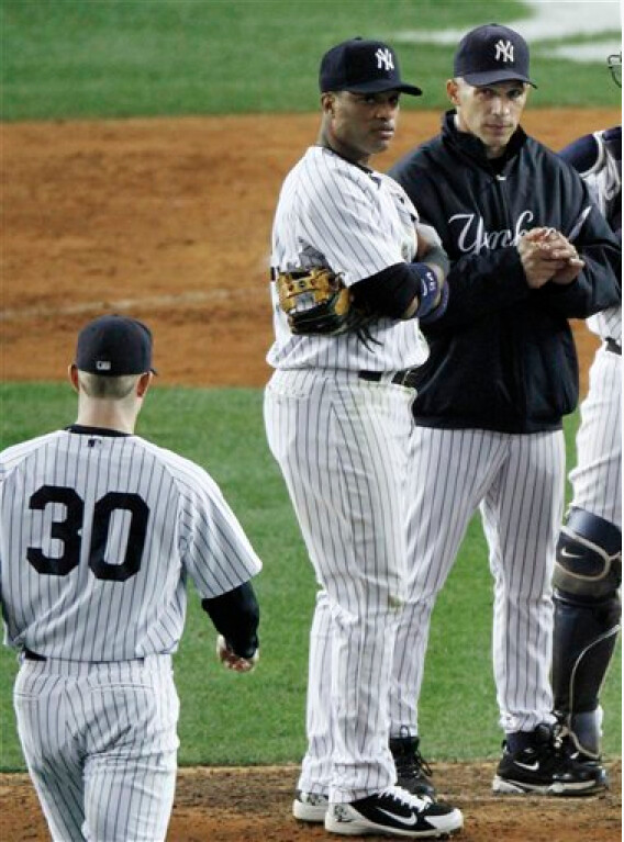
When Dave Robertson entered last night’s Rangers/Yanks game during the top of the 9th, the score was 2-0 and the Bronx Bombers still had visions of a comeback in their final at-bat. When Robertson departed the game six batters later, the score was 7-0 and the game was out of reach.
What went wrong? The answer was right there in front of 50,000 people as Robertson walked to the mound, although I doubt any of them noticed. The source of Robertson’s troubles was obvious as the number on his back: It was the wrong font.
Take another look at the photo above — notice anything amiss in Robertson’s uni number? The problem becomes more evident in this post-meltdown shot of Robertson alongside third base coach Rob Thomson, and it’s even more stark if we compare Robertson’s jersey to Nick Swisher’s.
Imagine that: The vaunted New York Yankees sending one of their pitchers to the mound in an aberrant uniform. No wonder Robertson couldn’t get anyone out. It’s like sending Superman into battle without telling him his belt buckle is made of kryptonite.
Robertson’s previous appearance at Yankee Stadium was during Game 3 of the Yanks/Twins series, and he had the wrong font for that game too (but got away with it, since the Twins were already in the tank by that point). But he had the proper font for his final two home appearances of the regular season. So he’s apparently wearing a new jersey for the playoffs.
So who’s responsible for this snafu — the Yanks or Majestic? I know a bunch of you Majestic folks are reading this. If any of you would like to weigh in (anonymously, of course), I’m all ears.
(Special thanks to readers Peter Fahey and Steve Dodell for helping to spot and document Robertson’s font snafu.)
Uni Watch News Ticker: If you want to see Bobby Orr looking 12 kinds of lame-o, scroll down toward the bottom of this page (disturbing find by Mike Hersh). ”¦ A photo of a white Kansas helmet is rapidly making the rounds. No idea whether it’s destined for on-field use. ”¦ Peter Nash is continuing his vendetta against Barry Halper’s memorabilia haul. ”¦ My Wisconsin photographer friends/heroes included me in their Real Postcard Photography Survey Project. They took a shot of Robert Marshall, too — looking forward to seeing that one. ”¦ Unusual nameplate for the Colony High School in Texas. It’s funny, I received that photo from Marc Douglas about less than 24 hours after listening to the latest weekly edition of Harry Shearer’s radio program, Le Show, during which he opined, “Please, if you don’t have a flag and a U.N. delegate, stop calling yourself a nation.” Agreed. ”¦ You know, October used to be my favorite month, but not anymore. Here’s another view (submitted by Brooks Simpson). ”¦ According to the last two entries in this Q&A session, the Philadelphia Union of MLS could be adding a shirt sponsor next season and are hinting at a third kit for 2011 (as noted by Michael Orr, who also submitted his latest round of EPL uni feedback). ”¦ Looks like the Rangers were in such a rush to capitalize on Derek Stepan’s hot start that they threw together some poorly lettered jerseys and put them up for sale. Alex Melendez spotted the improper arching right away. ”¦ New hoops uniforms for UCLA. Pretty much the same as last year except that they’ve dropped the waistband striping. And yes, there are those new logos on the chest, like most other teams are wearing this year — more on that soon, promise. ”¦ A Michigan undergrad who claims to be one of the school’s equipment managers (I haven’t yet been able to confirm that), says the Wolverines specifically opted not to wear the Adidas super-stretchies last Saturday against Iowa. “Most of the big guys were complaining about how they did not fit well at all,” he says. “The smaller guys were okay with them, but no one was in favor. I even tried one on after the fitting — I wear a small replica jersey, and an XL super-stretchy was snug on me, so I’m not surprised that the team did not wear them.” ”¦ Peter Harzewski notes that the Sabres are still using Slug-emblazoned pucks. ”¦ Shane Martin sent along a late-breaking tidbit from Game 1 of the NLCS: “After the Giants batted in the top of the 9th, they showed Brian Wilson in the dugout wearing Andres Torres’s batting helmet.” … Alex Higley was watching the Broncos’ 1969 highlight reel and spotted a player with mismatched helmet and jersey numbers. ”¦ Phil attended last night’s New York gubernatorial candidates’ debate and was quoted by the Daily News afterward.
Looking at the Kansas helmet and things such as Minnesota’s white helmet, does anybody else think the new trend is white for white’s sake?
It is starting to look that way. It’s all George Lucas’s fault. All the kids who grew up watching Star Wars and thinking that the Stormtroopers looked cool are finally old enough to be in positions where they have the authority to implement these things.
I know! pretty soon, we’ll have teams going mono-white
link
And they’ll organize “White-Out” games
link
*shudders*
first of all, that’s not a bad thing and second of all…
wait, what?
This: link
=
This: link
=
George Lucas’s fault.
/mostly joking… mostly
_________________________
A team that normally wears a colored helmet wearing a white one is every bit as stupid as BFBS.
/serious
I will say this: if there’s any team out there that can pull off the Storm Trooper look, it’s the Texas Longhorns (refer to above photo).
Yes! And not to mention all the schools going to white shoes & socks as well.
The worst example is the ‘Cuse. They used to have the old college look (white socks and black shoes),
link
but then they switched to double-white =(
link
Oh well. At least the rest of the uniform still looks good.
So nobody here knows that white-over-white has been part of the game since the advent of mandatory white jerseys? For about as long as the universal use of facemasks and lowcut cleats? Longer than TV numbers? And FAR longer than instant replay?
Seriously, it’s like looking at MLB and saying, “What’s with the all the teams in pinstripes? Stupid. Makes them look like old-time milkmen.”
The following teams have worn, at one time in the TV era, white-over-white for at least a decade, in some cases for decades upon decades, and some still wear it. I’m sure I’ll miss some (asterisk indicates with a white helmet for at least a time), but here goes…
Oklahoma*
Alabama*
Mississippi State*
Texas*
Texas A&M*
Baylor
Houston
TCU*
Arkansas
Tulane*
Memphis
Tennessee*
Auburn*
Florida*
North Carolina
North Carolina State*
Kentucky*
Marshall*
Duke*
Penn
Penn State*
Temple
Rutgers
Princeton
Yale*
Colgate
Cornell
Dartmouth*
Ohio*
Louisville*
Miami (Ohio)*
Dayton
Bowling Green
Cincinnati
Michigan State
Indiana*
Northwestern*
Wisconsin*
Illinois
Nebraska*
Wyoming*
Utah State*
Arizona*
Nevada
New Mexico State
Oregon State
Stanford*
Patriots*
Bills*
Jets*
Dolphins*
Oilers*
Giants
Eagles*
Falcons
Colts*
Bengals
Browns
Vikings
Bears
Panthers
Cardinals*
Rams
Chiefs
Broncos
Alouettes*
Ottawa Rough Riders
BC Lions
Argonauts
As I said, I’m sure I missed some, but the point is that white-over-white is not weird or “off” or uncommon. It simply is often created by the change to a team’s home uniform owing the rules of the game.
Now, WFWS is just stupid. Almost as stupid as BFBS. But, if white IS one of the team’s colors, or if they’ve chosen to add it to the homes because they’re going to wear a jersey of that color about half the time anyway…then it just plain isn’t odd. So if it assaults someone’s senses, then I guess we can assume that they haven’t bothered to study the history and images of a game they supposedly love, because in the TV era it’s almost as commonplace as cleated shoes.
—Ricko
Just because it’s common doesn’t mean it looks good. I’m perfectly capable of knowing the uniform history, thinking that certain things look bad, and still liking the sport – especially when my favorite team is one that has never worn white over white with their current color scheme.
White over white with a white helmet is perfectly fine. I AM NOT COMPLAINING ABOUT THAT AT ALL. (Blue over blue with a blue helmet is also fine.)
White over white with a colored helmet usually looks like crap. There are a few exceptions of course, but in my eyes not many. The Cleveland Browns, for example, looked far better during the years they used orange pants. They were ugly in 1965 and they’re ugly now. Tradition doesn’t make it look any better.
Wasn’t aimed at you specifically, The Jeff, not at all. Just tired of hearing that white jerseys and white pants look bad. Maybe it does to some, but it’s pretty much part of the game, and complaining about it is a lot like bitching about all the gray road unis in baseball.
As to a dark helmet with white jersey and pants, that’s a result of the mandatory white jersey. If a team doesn’t share your esthetic sense and opt to wear dark pants on the road, that’s perfectly fine. There’s no rule, no right or wrong, just a difference of opinion. And, based on the long list of empirical instances I supplied, most people in football evidently don’t share your particular point of view.
A lot of it, I have mentioned before, goes to the day when white pants were something of a symbol of a successful program. You could afford the expense (and man hours) involved in keeping them clean. Dark pants, back then, sort of said you were operating on a tight budget, because they were most often seen on high school and small college teams. Things have changed, of course, but that doesn’t mean it’s wrong to still like the look of white pants, especially for teams that have worn them for decades.
—Ricko
What’s the complaint here? perhaps I misread it but I thought the issue was teams deciding, willy-nilly, to go head-to-toe white when they normally wear colorful helmets.
No?
it’s like telephone…the argument was against (or in recognition of) the sudden proclivity to don white lids…
where the wfws UNIFORMS comes in got lost in translation
at least i think so…i better check my numbers
anyway…seems all of a sudden people are against white helmets or something…which morphed into an opposition (by some) to all white outfits (where the stormtroopers comes in)
and oregon in white/white/white/white looks fuckin great
A quick comment: on Sunday the Seahawks wore white pants with the white jersey, IMO looked miles better than with navy pants. It made the whole look a lot more tolerable.
Rick
I think the issue here is teams that normally wear colored helmets and/or pants are more often busting out white lids and/or white pants, often together and often coupled with their white jerseys on the road. It’s creating a trend in the ‘Storm Trooper’ look on the field. If that’s your traditional look (Texas) then fine, but Oregon, Ohio State, Florida, Oklahoma, Cincinnati, South Florida, Virginia Tech, Minnesota, now Kansas (among others, I’m sure)? All these teams have uncharacteristically worn white helmets recently. Teams wear white on white on the road. It’s common and has been for years, but white helmets for a team who normally doesn’t wear them has not been ‘part of the game since the advent of mandatory white jerseys.’ They don’t always wear their white helmets with white pants an a white jersey, but it happens often enough for the ‘Storm Trooper’ look to be considered a sort of trend.
We discussed this last week regarding Penn State’s milk-bottle look. With all do respect to Nittany Lions, Jets, Colts, Longhorns, etc., I simply don’t like head-to-toe white on a football uni.
But more importantly, I don’t like head-to-toe any color on a team. Full-on monochrome in football is just as pad as pajama pants in baseball…
“bad” not “pad”
REposting to fix link:
We discussed this last week re: Penn State’s milk-bottle look. With all do respect to them, the Jets, Colts, Longhorns, etc., I simply don’t like head-to-toe white on a Nittany Lionsuni. But more importantly, I don’t like head-to-toe link on a team. Full-on monochrome in football is just as bad as pajama pants in baseball…
Resposting again to fix typo (my bad)
… I simply don’t like head-to-toe white on a any uni. But more importantly, I don’t like head-to-toe link on a team…
Unless I’m mistaken, this “Storm Trooper” look entails no striping on the helmet.
Until it’s done to excess, I don’t find it an offensive look. The BFBS is.
That said, Minnesota’s white helmets DID look out of place. They could have benefited from a maroon-gold-maroon stripe.
The KU helmet looks OK, but it’s a look pretty unfamiliar at Lawrence. Nolan Cromwell was running the wishbone the last time it was used. (And then only for a season or two.)
MFMS = Monochrome For Monochrome’s Sake… You hear it here first…
White at home/road bores me to tears. I wish there are more color on color matchups. Growing up with white being the non-color for every team has made it feel like any white jersey is just the dull version of the teams primary jersey.
As players become ever faster it becomes more and more important that players can tell without thinking who is a teammate and who isn’t. I wouldn’t look for that critical issue to be set aside because fans/viewers are getting bored with white jerseys.
Now, high contrast games wouldn’t post that problem. But don’t expect much red against blue other than on rare occasions. Especially in the NFL, where the game is almost unbelievably fast.
—Ricko
I’m not sure if I buy that argument. The mandatory white rule came into effect because of TV, specifically black & white TV. Players may be faster now, but I seriously doubt there’s any real issue for them being able to tell red from blue on the field. Heck, I’d think matchups like Chicago at Houston or Oakland at Carolina would be harder to tell apart for the players than a red/blue game. Think about it – wearing white against a team whose uniform is rather similar to your own home uniform? I’d love to see stats on whether or not those types of games have more interceptions thrown in them.
We’ve seen multiple color vs color games in the last decade. If it was truly a critical issue, they’d have stopped doing it after the first one.
Said this before. TV led football to something (white jerseys) that they discovered really helped in the actual playing of the game.
Those who don’t understand how critical recognition is apparently never played the game, even at high school level. Playing teaches you things that non-players never understand.
For one thing, that the issue isn’t intereceptions, but rather, “Who’s that in the corner of my eye coming at me at high velocity? Is he gonna drill me, or is he one of my blockers?” In that instance the eye distinguishes light from dark far, far faster that it recognizes the difference between, say, red and blue. When colors are in motion they tend to blend to together. The contrast of light and dark doesn’t.
Someone flips on the light in a dark room, we notice that the lights went on a whole helluva quicker than we notice any colors involved.
—Ricko
there are times that the colored team has so much white on it’s jersey that it can be hard to distinguish the difference. Many games it is Color/White tops vs white/white pants.
That’s KU’s surrender helmet.
MIZZOU-RAH!
Don’t you mean MIZZOU-RAKIM?
You still got my vote, Eric B.
don’t sweat the technique
I was going to say the same thing, only about Paul’s NHL columns.
It’s a bit ridiculous. Goalies pretty much have the most creative ability in sports, and so many of them are sporting a blank canvas. Tim Thomas switching from a black painted mask to a white mask with black + white designs is especially asinine. In non-HD it just looks like a solid white mask.
How I long for the return of the solid white mask…
link
“Please, if you don’t have a flag and a U.N. delegate, stop calling yourself a nation.”
Unless, perhaps, if you are a member of an American or Canadian Indian tribe (in Canada, they are known as “First Nations”). Fans of sports teams, definitely. Get the hell over yourselves.
I love Shearer, but he’s simply wrong in every possible way about the “nation” thing. Nations don’t have flags and UN delegates. States do. “Countries,” in the vernacular. Because most of the world’s current countries and states are organized by/for particular nations – thus the term “nation-state,” which has been all the vogue since the peace of Westphalia in 1648 – we now use the words “nation,” “country,” and “state” interchangeably. But at its root, a nation is a different concept. A nation is a people, a unit of common culture, language, or affinity, and most of the world’s nations do not, in fact, have an independent state. Within the context of geographically dispersed, intensely loyal fans of a particular team, “nation” is exactly the right word.
I say this with some regret, as the whole “Red Sox Nation” thing bugs the heck out of me.
Even under the Poli Sci idea of a nation, it still implies that a nation is a political entity. God help us on the day that a fanbase for a specifc team gets its own lobby.
Not necessarily. It relates to a group of people with some identity in common. There are certainly nations with a political culture in common- the people of the United States can be considered a nation due to a shared political culture and identity. But the shared identity can just as easily be based off religion, ethnic groups, even yes, sports fandom.
Nation in regards to the larger community of fans of your team is correct usage. Something like Yankees Universe isn’t, but the community could still be regarded as a nation.
What about the Yankee “Universe”?
Paul, that should be “The Colony High School” as the name of the town is “The Colony”.
link
Is that The Jeff’s hometown?
My understanding is that The Jeff is from The Cleveland.
The Colony should play The Woodlands for definite article supremacy in Texas.
A game that huge needs to be played at The Stadium in The Bronx
No, I’m actually from Toledo originally… though I now live in the city that’s home to The Ohio State University.
Yeah, I grew up incredibly close to Lake Erie… that’s probably why I’m so messed up now.
…with the MVP of the game getting a scholarship to THE Ohio State University, or perhaps The U.
(I have a bad feeling that I should let this be The End of this joke…)
Wow–nothing about Cliff Lee’s missing button? I was certain that would be the lead story this morning.
If you mean his cap button, he’s been missing it for a while now. Nothing new there.
If you’re referring to a jersey button, then I didn’t see that.
Cap button–guess I missed the prior discussion.
I would guess that numerals are ordered and applied by the equipment manager, but I don’t know. No idea how a wrong one (or two) would have gotten there, on the Yankees or on the Steelers (Ben’s 7) this past Sunday.
No photos or mention about Robinson Cano wearing a PINK MLB logo on the back of his jersey in game three last night? I thought that would be the second story after Cliff Lee’s missing button too… must not be watching in HD if you didnt see that, but you saw the font…
That’s been going on for months.
I don’t know if anyone else has noticed this, but Cliff Lee is also wearing a doubleknit jersey. The Rangers became a COOLBASE-only team in 2009 when they got the new uni set. And it isn’t a reissued old jersey, because the trim was different on the old set versus the new set. I haven’t seen another example of 1 player on one of the 15 or so COOLBASE-only teams wearing a doubleknit jersey.
Now THAT’S a good catch!
I haven’t seen him pitch in the home white jersey or either alternate. I wonder if he has a doubleknit version of any of them. I’ll go look at the pictures from August and September and report back later.
Hey, Paul – I may be the only one in the world who thinks Robertson is wearing the CORRECT font and everyone else is wearing the wrong one. And has been for 38 years. Although slightly wider, it is almost identical to the classic un-serifed Yankee uniform numbers from 1951-1972 (although the early 60s road unis had wide serifed numbers for a couple of seasons). If you can pull up a Mel Stottlemyre photo, c. 1965-1970 you’ll see what I mean.
The Yankees made two bad changes when they switched to double knits in 1973. They had the pinstripes run across the shoulders and they changed the number fonts. For his courage in the face of all odd, David Robertson is now my second favorite non-Red Sox player, behind the Nats Drew Storen.
Looked like Lee was wearing a black undershirt (with front and center swoosh, of course).
Are players allowed to wear black? I thought they had to be the team color (except for the Mets).
Other players on Texas had blue underneath.
OK … I’m a Cub fan and usually don’t have much reason to watch a lot of late-season baseball the last couple years, but in flipping through the baseball playoffs, I’m noticing more umpires wearing sport coats than I’m accustomed to seeing since they went to the polo shirts. Anyone else feel the same way?
Of course, when I go to ESPN to get images from last night’s game, I see 300+ images … of the Yankees in grey, the Texases in red, and Nolan Ryan throwing out the first pitch. No wonder the Yankees lost – they treated it like an away game!!!
link
OK … at least I have proof of such in the NLCS …
link
(fixed)
All I can tell you is this: If – in 2012 – something happens to push the playoffs back, and there’s any shot of the Cubs playing in the final game of the year on or around December 21st, just hold on to your seat … it could be a bumpy ride.
“I’m a Cub fan and usually don’t have much reason to watch a lot of late-season baseball the last couple 101 years
(fixed)”
That just made my morning!!
Check your math, Mr. Hecken.
hey…i may not be good with numbers, but a least i know my own age
I do believe more MLB umps are RETURNING to the ‘plate coat’ when they work the plate in cooler weather. For a while there, almost all of them were wearing the windbreaker type jacket they wear out on the bases.
Those coats are not cheap, as they have to be custom made with strengthened pockets so they can put balls in them, plus they are a little larger to accommodate the inner chest protector.
I like it – gives them a TOUCH more class…
And if you are bored check to see if the plate ump is using an indicator, and if so, what kind – plastic or metal….
Robby Cano had the Pink MLB logo again last night. Also the beady eyed goat, I mean Pettitte, switched under shirts in between the 2nd and 3rd.
“although I doubt any of them noticed”
Hey! I was there AND noticed!!
/superexcitedtohaveajburnettgoingwithseasonontheline
Uh huh, yep, that Yankees colapse in the 9th was do to a Uni Snafu…
Anybody want to buy a bridge?
Like the old saying why do the Yankees win? Because they have Mickey Mantle. -No because the other team can’t stop looking at those damn pinstripes. — Hate to say it, but I had to study the pictures twice before I saw it and it was because of the pinstripes that I didn’t notice it.
No, the number font snafu didn’t cause the Yankees to lose. It caused them to lose by 8 instead of by 2. The number font isn’t a big enough snafu to change the outcome of the game, just to determine the margin.
The outcome was determined by the Rangers wearing their standard road grays, in which they’re undefeated this postseason, rather than an alt uniform. The Rangers lose when they wear an alt, and win when they wear a standard white/gray uni. Obviously it’s all about the unis; it’s just a matter of sorting the casual uni factors from the causal ones.
Soooo. . .you went to a blog dedicated to nitpicking jerseys to complain about the blog nitpicking jerseys?
I didn’t see it right away either until the Swisher side-by-side, but really? I think maybe you need to go to the store and buy a sense of humor. I hear they’re on sale this month.
Newsday columnist Ken Davidoff linked here this morning, so we may have some new readers who aren’t accustomed to Uni Watch’s usual m.o. And as is always the case when people encounter Uni Watch for the first time, some of them Won’t Get Itâ„¢. And that’s fine.
What, you get that frim Seinfeld? If that is the case why don’t you go loose a contest.
Sense of Humor? Those crappy things always fall apart at the worst times, and they’re overpriced on sale. Bah Humbug!
I know I’m months late to this particular party, because I never watch the Yankees, but they clearly lost because the Steinbrenner patch is so monstrously bush league.
The Steinbrenner patch AND the Sheppard patch, WITH a black armband.
I always thought the Yankees were classy with the armband. But they can be just a cheesey as the Mets.
Is Nike making the team logos smaller because they can’t make the swoosh bigger?
Re: Postcard project
“He is writer from Brookyln.”
He is good writer. He is wearing hat.
When I saw that, I could not help but to read it, aloud, in my bad fake eastern European accent.
Uniform. I has it. But I also like savings the tradition.
It, he gets.
I KNEW Bobby Orr was a Jedi. (bottom row, 2d from right)
Yesterday some of you wanted to know which of the current MLB and NFL uniforms I like.
Here goes:
MLB
St. Louis Cardinals-Classic design with great sock striping (You all remember sock striping)
Minnesota Twins- Cream throwbacks and the current roads.
Los Angeles Dodgers- Another classic. Guys, lose the sleeve “LA” logo, you don’t need it.
Boston Red Sox- Bring back the classic socks.
Philadelphia Phillies- Cream alternates are their best.
NFL
Cleveland Browns-All White with the striped socks. Just as old PB designed it. Perfect! No colored pants! Ever!
Indy Colts-Fix the UCLA insert and go back to the MacGregor-style numbers with extra serifs and you’ve got it.
New York Giants-As much as I hate the team their current uniform is classic.
NHL-The Original Six are the only ones that still look like real hockey teams.
NBA-Ditto for the 17-time World Champion Boston Celtics.
I have been finding a lot of folks that hate the New York Giants…. it’s very surprising. The G-Men are not a very “in your face” type of team. With very few exceptions, not too many outstanding or remarkable personalities.
I would understand hatred of the Jets, they can be annoying.
There are other teams that have been MUCH MORE SUCCESSFUL and would be more deserving of ire. Though I am a Giants fan, I actually find the Giants to be a very “boring” team!! Not really worthy of hate….even by teams in our own division. There is a lot more hatred between Redskins – Cowboys – Eagles.
I of course understand hatred of the Cowboys, Pats, Bears, Packers, Ravens, Colts, Raiders, Steelers, Eagles etc.!!!!
Yes G-Men are bring when you compare them to those I havent won anything loudmouths that squat at ” Im Calling it GIANTS Stadium”. Let them stay boring all the way to the playoffs!
I don’t hate the team, but I do have a rather strong dislike for their uniforms, specifically the road version. The red numbers suck.
Giants unis are an accurate throwback (all things considered) to their late ’50s, early ’60s unis. So long as that’s the keystone of their current uni design there’s no reason to change the colors…because it wouldn’t be true to the theme.
If they opt for a new design, sure. The new look would be its own entity.
—Ricko
I have to disagree, I really like the white jersey with red numerals/accents on the road, but the home blue jersey seems to be missing something, maybe it becasue the blue jersey doesnt match the blue of the helmet.
From the ’20s through the ’40s, the Giants used two jerseys: the blue one, and the red one that was briefly revived as a third jersey in the mid-’00s.
When the NFL put in the white-jersey rule in the early ’50s, the Giants flipped the red-with-white-numbers to white-with-red-numbers.
They went to blue numbers in the ’60s, so that would be historically accurate also. (The less said about the blue pants of the late ’70s, the better)
Have to disagree with the assertion the Original Six are the only ones which look like real hockey teams. The NHL had quality uniforms long before the Original Six came to be, the league and pro hockey did not begin in 1942. The Expansion Six also brought good uniforms in 1967, and newer clubs like the San Jose Sharks also look like real hockey teams.
Hey Phil,
Just wondering…… did you attend last night’s debate in your unofficial capacity as Carl Paladino’s Numero Uno speechwriter???
say what now?
if anything, i’m supporting the madame or the rent is 2 damn high candidates…or maybe the libertarian
interesting that the Titans wore their navy pants last night against the jags. They look alright but I LOVE the light blue pants, looks very nice with the navy socks and probably my favorite road unis along with green bay.
Totally agree. The Light Blue pants look better with the White jersey., and match the Light Blue shoulder yoke/striping. It is probably the ONLY truly good look since the adoption of the current Titans uni. Maybe a Light Blue jersey/White pants combo would be OK too.
All of the combinations using the Navy jersey or Navy pants range from medicre to hideous.
“So who’s responsible for this snafu – the Yanks or Majestic?”
Does Majestic provide lettering/numbering services? I was under the assumption that it was all done locally by each team.
In general, Majestic provides the first batch of lettered/numbered jerseys at the beginning of the year and then the teams letter and number blank jerseys after that. But you never know if the Yanks requested a special jersey for Robertson for some reason, or if it’s a leftover jersey from last year, etc. Impossible for us to know, and probably not that easy for the Yanks or Majestic to know either, frankly.
Those numbers definitely look like Stahls regular Varsity Block font. That the Yanks or their letterer would use a stock font when Stahl does make replicas of the Yanks’ regular font is amazing. Inquiring minds want to know…
Go to link and look at #22-the New York Yankees style.
Could someone the wrong New York template have been used? So that was really a navy blue Mets #30 on his back last night?
JTH might be on to something; that *is* the font used on the Mets’ old Giants-style cream throwback uniforms:
link
And if anyone from Majestic is reading this: there’s something you need to fix. Rawlings and Russell got it right, and you should too: my biggest pet peeve in sports jerseys today is the low positioning of numbers on the backs of jerseys. The top of the number should be four inches from the collar, but these days you see a link. This looks link on any player shorter than about 6’2″, and comically bad on the small guys. (Robertson in the photo, for the record, looks fine. Get the font straight, and the Yankees look perfect.)
Actually, if you are talking about tradition, that’s the way the Yankees’ font should look. They probably had that particular numerical font at least 25 years before switching in 1973.
That’s the one thing tradition-wise, the Mets always had over the Yanks. The Mets have had the same home uniform number font since their inception. They’ve had the same road uni number font since, I think 1978. Paul could verify that probably.
Swapping a block font for Varsity sounds like the work of Mitchell and Ness. See any recent 1965 Twins Killebrew for a precedent.
It’s got a silver Jerry Dior logo, so I guess that at least rules out the possibility of it being a leftover from last year.
DAMMIT. Obviously, this should have been a reply to Paul’s last comment.
This Brett Favre Taiwanese animation video has some interestign uni-notables. Packers throwback long sleeve jersey with 49ers pants and socks. Jets throwback long sleeve jersey with plain green pants and red socks. link!
A good article in the Indy Star about potential re-development of old Bush Stadium (former home of the Indianapolis Indians and Indianapolis Clowns).
link
link.
The real reason he’s unfit to be mayor: he and one of his teammates are wearing black shorts but #13 is wearing green.
Did ESPN ask Jack Del Rio to use timeouts for network breaks? Interesting article.
link
Now being denied:
link
Robertson’s number font looked like the one the Yankees used in the 60s.
The Anaheim Ducks third jersey, due to hit the ice Nov. 26.
link
Do they make them in men’s styles as well?
Seriously, that is just butt-ugly
So it’s basically the old one, except uglier and with a proper crest instead of the lame-ass wordmark. What a waste. I would not wear that (sorry, Vilk).
I wouldn’t wear that either…
I used to think that anything with a proper logo would look better than what they have now.
I was wrong. Ugly, ugly, ugly. And I like the vertical striping on the side panels of the flames jerseys. And I like the swooshy bit at the bottom of the regular Anaheim set.
Of course, the ducks having ugly thirds is a bit of a tradition…
I’ve seen some concepts from contributors to this board that would put that piece of junk to shame. That D logo is awful, by the way. Nothing can salvage this mess. start over.
I mean…a duck! The possibilities……(not to be confused with Oregon’s, er, interpretations).
In reply to:
JTH | October 19, 2010 at 11:59 am |
Could someone the wrong New York template have been used? So that was really a navy blue Mets #30 on his back last night?
********************************************************
“Navy blue Mets #30”?? C’mon!
Royal blue, not navy.
No orange outline (or black drop-shadow, thank God)
link
Did Yoda ghost-write the first comment? ;-)
Uh… does link to you?
Total speculation here, but I could see a Majestic mix-up (pun intended) where some guy at the factory calls out “I need a ’30’ in Navy Blue for the Yankees. New guy goes to the templates, sees “New York”, and makes a 30 as he thinks he’s been instructed. Close enough that 99.99% of the population would never notice.
Luckily, the other .01% comes here.
I meant that the Mets color was royal blue.
Should have said “Dodger blue” to avoid any confusion :-)
Yeah, the Mets don’t wear Dodger blue, but whatever.
What I was saying was that maybe the wrong template was used — the METS template — to cut numbers out of navy blue tackle twill for Robertson’s jersey.
I’m curious about the Dartmouth photo removal from yesterday. I thought it was an interesting example in the PFPS problem infecting this month.
My guess is the school said he had no fair-use exception, since he technically wasn’t using it for review, parody, or journalistic purposes.
the state of journalism is in the terlet
Then I guess it’s a good thing the State of Journalism has no representation in Congress…
And as long as we don’t call it the “Nation of Journalism”, we should be fine.
Wouldn’t that be: “Journalism Nation”?
About all the pink accessories in October: It’s OK to knock it because it’s no longer about charity and has become the epitome of the opposite. The pink should be about the breast cancer, not the athletes showing off. It’s sad that a thing designed to help a good cause has been reduced to a fashion trend for one month.
I agree. The whole thing has become a farce now. I will be glad when Novemeber hits and the pink goes away.
And all the political ads go away, too. October used to be tied with November for my favorite month, but not any more.
Since I’m late to the discussion, I’m not going back to the white on white posts but commenting here. I don’t have a problem with all-white unis (especially Texas and Penn State), but there are occasions where I’d rather not see it (such as bright sunny days or when the opponent has white helmets and pants). By itself, it’s a good look, but it’s not always the best look for the occasion. That’s why I’m glad there are teams like Nebraska.
link
Has anyone else wondered why Dexter McCluster has been permitted to wear #22 as a wide receiver?
link
I understand about Devin Hester wearing #23 since he was originally a DB/KR/PR, as was then converted to WR after his rookie season, but McCluster has been a wide receiver his entire rookie campaign and has worn #22 each game. What NFL loophole did the team use to get him his double-deuce?
I think he might listed at RB. That would make him eligible to be #22.
if you check the roster, he has been a WR since the preseason.
McCluster had a number of carries from the TB position in preseason. Not used there yet because of T. Jones and J. Charles, but is one were to get injured he’d probably start getting touches from TB.
This is not the first time a Yankees pitcher had the wrong number font. In 1995, the road jersey of rookie Mariano Rivera had a “4” in his number 42 without serifs. It looked even worse than Robertson’s jersey. Unfortunately, I don’t have any pictures and am going from only memory.
Ogden, did you watch the 10th inning of Ken Burns’ baseball series? That’s where I caught that!
Paul, I’ve heard rumblings about Notre Dame wearing their “new” jersey but green against Navy this weekend. Have you heard anything?
Hadn’t heard that, but I’m probably just out of the loop.
I hope they do. When they play Navy it looks too much like an intrasquad game.
I too am a little late to the white and white discussion. Many here know my feelings about Penn State and especially the road whites.
I think it would be better if teams wore their colors on away jerseys instead of white. For Ohio State, wear scarlet jerseys at home and gray away. Ya maybe some colors would not work as well on the road but it would be nice an different than it has been for a long time.
I have one Ohio State jersey that is gray with red numbers. Kind of dark gray but I think a sharp looking jersey.
Michigan could wear Maize on the road? Anybody else ok with that?
And I am surprised there are not many color on color games.
Maize on the road? Oh yeah!
And for the supposed Kansas white helmet. Not so nice looking in my opinion.
I guess the white Jayhawk helmet would look better with a stripe.
Just like said above about the Gopher white helmet. Add a stripe and the helmet looks better.
I have said several times I like Air Force’s helmet much better when it had the middle stripes. Not so much now with any.
Although some may say it has no place here, I think it’s worth noting that apparently Kevin Harvick will be driving a black #29 Budweiser car next season in the Sprint Cup series. Remember, this is the car that used to be the #3 driven by the late Dale Earnhardt before his death, it was renumbered #29 and repainted white after his death
link
Here is the scheme for next year…
link
My guess is that even though it is a different number and a different sponsor, hardcore Earnhardt fans will throw a fit that the car is once again black with red-trimmed white numbers.
My biggest problem with it is that it seems to me to be the first NASCAR occurrence of BFBS
Why is Adidas screwing around with UCLA’s uniforms??? Arrghhh.
*sigh*
because they can
Even minor tinkering should be forbotten with that classic. I wish more teams had that look. The striping is great.
In the spirit of yesterday’s gone but not forgotten “Nothing Says Breast Cancer Awareness Like Focusing Directly on Your Crotch”, consider the lovely Tampa Bay Bucs Cheerleaders, who featured little pink tops with skulls and crossbows, and skulls and crossbow belt buckles. A mixed message, perhaps?
link
If the Giants and Yankees end up in the World Series, the games in San Francisco will feature NNOB vs. NNOB.
So here’s a question: When was the last all-NNOB World Series game?
Well, right up until the mid 90s the Cubs … oh … never mind …
1965 Dodgers/Twins?
link
I’d venture a guess and say 1965, Twins vs. Dodgers.
That’s a link.
link
Best $12 I’ve ever spent.
Are those something sold by Marshall? Or throwback Bears socks? Details, please.
They are officially licensed “Vintage Collection” Reebok Throwback sox. The tag refers to them as Fanwear Game Sock.
Where do you get them?
a Local sporting good store. I’m sending an email with more photos
I’d also like to know where to pick up a pair of those! They definitely look like Bears throwback socks.
So Phil, what stirrups did you wear to the debate?
debate was on a monday
we don’t wear rups on monday
/course, there’s no maple syrup on the table
Let me get this straight…all the goofy new performance-enhancing unis, the “lighter, dryer, faster” fabrics and such are OK, but make a performance-enhancing shoe and it’s forbidden?
link
Methinks it’s more likely pressure from the bigger shoe companies, since they didn’t come out with it themselves.
At least the NBA has standard-issue unis from one supplier, so I guess there’s no hypocrisy here. But I don’t see why the stuff going on with the new football unis is allowed to happen. If you’re going to come out with a new line of apparel, either make it available for everyone or no one.
so…jim
based strictly on their looks (forget the 3 bills for the pair)…
you must be in one mothervilker of a quandry…
would you wear them because of the electric snot color
or
not wear them because they’re black
what would you do…what would you do?
I’m calling it lime green. And I’d wear those.
Strictly on looks is right. Never spent more than 70 bucks for a pair of shoes, so that’s way outta my league.
Maybe it’s because the lighter/faster/drier fabrics don’t actually have any scientific backing?
shhhh
don’t let facts get in the way of a good salespitch
You can somewhat see it in today’s headline photo, but it looks like Robbie Cano has a logo made out of his initials on his cleats.
I emailed a closeup picture from my tv.
The Collingwood Magpies, Premiers of the AFL (Australian Football League), announced changes to their 2011 guernsey. In addition to adding a new sponsor, Australian Insurer CGU to their away uni, they are adding an AFL Premiers Logo, which is the regular AFL logo with a gold, instead of red, background. This is the first time my Australian fiancee is aware of this logo being used.
link
Robertson still wearing the incorrect font.
it’s gotta be the uni
does Molina often change gear mid-game like that?
I was a little afraid that when Jimmy McMillian’s name was first mentioned that he was the McMillian who was part of Columbia’s great basketball teams of the late 60s and the played for the Lakers and Knicks. Thankfully not.
link
bottom of this page (3rd bullet from the bottom): more pink going on in high school football. A game this weekend in Orange County, CA
According to Mariners’ beat reporter Ryan Divish, the mariners will be wearing their teal throwbacks next year for friday home games.
link
Did anyone notice that Joe Girardi switched warmup jackets around the 7th inning of game five? He had the older model Majestic jacket on with the proper-sized Yankee patch on the left sleeve…then suddenly, it was gone, replaced by the newer version with the quarter-sized logo. I bet the MLB Fashion Police put in a call and made him switch to the model they’re selling for Christmas 2010.