Pretty small turnout for last Saturday’s Uni Watch party (that’s what happens when you schedule something for what turns out to be a gorgeous October afternoon). But if we were short on quantity, we were long on quality. Here’s a rundown of the attendees:
• It was so great to see Scott M.X. Turner back in Brooklyn, even if only temporarily. That logo on his jacket is for his band, RebelMart. He had the jacket custom-made for himself (that’s the kind of thing you can do when you work for Ebbets Field Flannels), with spectacular results — look at the texture on that chain-stitching!
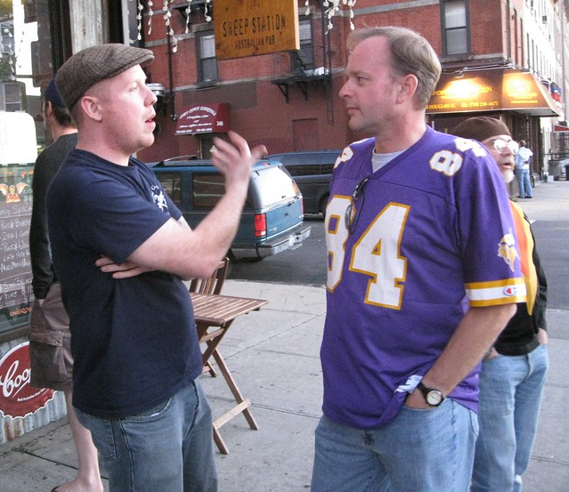
• Phil decided to fuck with me by wearing the accursed color of death. Don’t tell anyone I said this, but I thought the jersey actually coordinated really well with his PÄ…czki Day stirrups.
• I really, really enjoyed meeting Walter Helfer, who told me he’s been a Uni Watch reader for about seven years but had never sent an e-mail, posted a comment, or attended an event until this party. It was certainly worth the wait for me, because he brought a ton of great stuff for show-and-tell. That Padres cap he was wearing was purchased way back in 1978 — check out the old New Era logo! And speaking of caps, Walter also brought a bunch of USFL caps (interesting to see that the team names were sewn onto little vertical nameplates). Plus he has a button-maker and showed off a nice selection of his homemade designs (note the Yanks and Habs buttons next to each other — genius). He even had a great T-shirt under his Canucks jersey. I have a feeling we’re going to be hearing a lot more from Walter in the near future.
• Back in the spring, I mentioned that an old NHL scrapbook was being auctioned on eBay. Jake Doyle won that auction (you can take a guided tour of the scrapbook here), and he came all the way from Boston for Saturday’s party. A really great guy who I throughly enjoyed meeting. Although he didn’t wear a jersey, he had a great tattoo of the 1889 bare-knuckle championship bout between John Sullivan and Jake Kilrain (“They didn’t actually have mustaches for that fight, but I took a bit of ahhhtistic license there,” Jake explained to me). Jake brought a few friends with him, one of whom had an even better tattoo.
• Here we have Pete(r) Bonavita and Ella Moran. Ella explained to me that she was wearing that Coney Island shirt because she has a thing for octopi. This led to a lengthy discussion about what a uniform for a team called the Octopi might look like (I suggested that the team’s dark alternate jersey color could be called “ink”). As for Pete’s Belfast Giants sweater, it’s from a UK hockey league. I especially liked the spokescharacter’s knobby elbows. The little tuft of elbow skin on his left arm looks a little like the little tied-off nub at the end of a natural-casing wiener.
• This is Morgan Doninger. He told me he got a Neil Broten jersey because he always said he’d buy a jersey for whoever scored the Devils’ first Cup-winning goal.
• Many Jets fans I know hate the team’s Titans throwbacks, but not Jay Braiman. His sartorial style raises the question of whether it’s ever acceptable to wear a jersey tucked in. They’re designed to be tucked, of course — that’s how the players wear them. But fans almost never do. Discuss.
• No jersey for Marc Rivlin. His arm was in a sling because he’d recently had labrum surgery, just like the pros. Here’s hoping you get your fastball back soon, Marc.
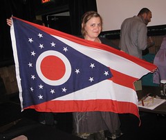
Cool people with cool stuff: The City Reliquary’s Collectors’ Night, which took place on Monday evening, was a big success. That’s my friend Liz Clayton holding the Ohio State flag, which she used to help showcase her collection of Ohio Turnpike memorabilia (additional crummy photos here and here, but none of those images even hint at how great her collection is).
Other collections on display included stringed instruments (as you can see at right, the girl who collected them also had assorted instruments depicted on her dress); books with one-word titles; ashtrays; giant pencils (unfortunately I didn’t include anything for scale, but believe me when I say those pencils were huge); lobster-themed stuff (the collector gal wore lobster-trimmed shorts and served lobster-shaped cookies [I know, eww, but they tasted fine]); volvelles (those are Kirsten’s, natch); neckties (that’s less than half of what the guy had on display); shopping bags (ditto); assorted metal thingies; mousetraps; postcards of European hotels; dipsticks; and dust from art museums (my favorite conceptual collection of the night).
As for me, I played show-and-tell with my small collection of 1950s tap knobs (yes, that’s a piece of a bowling lane that they’re perched on), a framed assortment of clothing tags (as you may recall, I wrote about these a few months back), and, of course, my collection of recipe booklets with the word “Meat” in the title, all of which garnered nice feedback. My thanks to all who turned out.

Can we postpone the lockout to 2012?: As you’ve probably heard by now, Nike will take over the NFL’s uni contract after the end of next season. For those who’d like to beat the rush and start slitting your wrists now, this story has an ominous quote from a Swooshkateer exec: “We plan on changing the NFL jersey dramatically just like we’ve done with the college programs, using new thinking and the greatest technology available.” It’s unclear whether those changes will involve fabrication/tailoring or graphics — I’m guessing some of both.
But that doesn’t necessarily have to be a bad thing. I certainly won’t be shedding any tears for Reebok, which has overseen a fairly wretched period in NFL uni design. I don’t know how much input they had into the current designs being worn by the Cardinals, Vikings, Jaguars, or Falcons, but I doubt they were just passive bystanders in the design process. Think of it this way: How many NFL teams have improved their look on Reebok’s watch? (And here’s a sobering thought: The Bengals have actually gotten worse.)
It’s also worth remembering that Nike had an NFL contract as recently as a decade ago (although it was only for selected teams, not the entire league) and most of their teams looked just fine. For those teams, Nike was just a vendor supplying a product according to long-established specs. Yes, Nike also ruined the Broncos, but that’s only because the Broncos allowed it. NFL teams aren’t like college programs that will take their marching orders from Nike just to impress recruits. They’re mega-corporations that, for the most part, look at the long haul, the big picture, not short-term trends or flavors of the month. Case in point: Not a single NFL team revised its home or road uniforms this season.
Still, some teams are more willing to tinker than others, and Nike will no doubt encourage them to do so. But the NFL’s longstanding rules regarding alternate uniforms (only one alt or throwback design per season, only two alt-clad games per season, only one new alt design every five years, etc.) are, well, not very Nike-friendly. Is the NFL planning to revise those rules when the Nike contract kicks in? I’ve made some inquiries on that but haven’t gotten a response yet. Frankly, I’ll be surprised if I get one.
Do I trust Nike? Not even a little bit. But the responsibility for safeguarding a team’s aesthetic dignity ultimately lies with the team itself. Think of Nike as a virus looking for weak organisms to infect and inhabit. Strong teams will resist the virus; weak ones will succomb. Too bad there’s no vaccine.
(Special thanks to Phil for the swooshified NFL logo.)
Uni Watch News Ticker: More throwbacks in the AHL, this time being worn by the Lake Erie Monsters and the Syracuse Crunch. The Monsters were dressed as the Cleveland Barons — the original minor league franchise, not the NHL version (with thanks to Patrick Mackin. ”¦ Looks like the Blackshear (Georgia) Tigers were taking their cues from Marquette back in the late 1970s (with thanks to Joshua Robertson). ”¦ Tons of great old neon signs in this slideshow. I’m particularly fond of slide Nos. 1 and 19 (big thanks to Andy Moeschberger). ”¦ Someone on eBay is selling a ton of old MLB media guides. Some of the cover designs are priceless (big thanks to Jim Wilk). ”¦ Michael Rich notes that the Giants and Braves both used a different uni combo for each game of their playoff series. Game by game, beginning with the Braves: road grays, navy alts, red alts, home whites. Giants: home whites, orange alts, road grays with two-tone cap, road grays with primary cap. ”¦ A Day Too Late Dept.: The Rays are now selling BRaysers. ”¦ At state fairs in the Midwest, they have cows sculpted out of butter. But at the Texas State Fairs, the butter sculptures depict football players (with thanks to Sean Patton). ”¦ More on the Gap’s abortive new logo here (with thanks to Tom Mulgrew). ”¦ “When I visited my mom in Iowa last month, she gave me a set of 30 postcards featuring the 1979 Minnesota Twins she’d found at a thrift store in Cedar Rapids,” writes R. Scott Rogers. “Some interesting photos, and quite a relic of the era.” ”¦ Adidas is having trouble supplying two Raptors with sneakers (thanks, Brinke). ”¦ If you wear a size Medium, you could do a lot worse than to get yourself one of these T-shirts. I just got one, and it’s a really nice product — good fabric, heavy-duty stitching, and the price is right. ”¦ Whoa, look at the socks that were worn back in the day by USFL zerbras (great find by Chris Markham). ”¦ What have we here? That’s Elmer Lach of the 1947-48 Canadiens with the faceguard that the NHL wouldn’t allow him to wear (with thanks to Casey B). ”¦ Check out the padding on the fingers of Carlos Pena’s batting gloves. Is that a new thing or had I just never noticed it before? … Nick Hanson notes that Brian Wilson has his uni number written on the side of his cleats. ”¦ Here’s another view of Mr. Pink Sox. … We’ve talked about putting stripes on football undershirts. What about putting them on exposed shoulder pads? Those images are from a video game called Backbreaker. “All the players wear this really weird uniform set that looks like some sort of stiff, armor-like jersey worn over shoulder pads, are exposed and have stripes on them,” explains Jimmy Neilly. Sounds ridiculous — until you see something like this. ”¦ The Toledo Walleye have a unique red line design. Here’s a closer look. Further details in Teebz‘s blog. ”¦ Latest school to succumb to BFBS: Memphis. ”¦ Jonathan Cain notes that the lettering on the Bulls’ chest insignia appears to have been tweaked. It’s not as vertically extended as it used to be. This is one of many issues I’ll be asking about when I make my annual preseason visit to the NBA offices next week.
Ready for my close-up: I’ll be spending part of today in Manhattan. First stop: a visit to the dentist. Then, assuming my mouth isn’t shot full of novocaine, I’ll be sitting down for an interview with the folks from NFL Films, who are shooting a segment about the disturbing trend of exposed torso flesh (man, is the uniform beat glamourous or what?). Play nice while I’m out, yes? Yes.
The new Bulls script looks good on the uniform. I didn’t even realize it was actually smaller; I thought it was just a heavier font. Either way, it makes the wordmark appear more substantial, making a very plain jersey more interesting without cluttering it up.
I agree. Speaking to Paul’s observation, I don’t think the letters are any shorter, but the space between them has increased a bit, which makes them look a little more squat. They are also a little bit thicker, especially in the outline.
The photo also gives you a good look at the Wizards’ new v-neck collars.
The new spacing is nice- but it looks like the B and the S don’t dip at their outside points as much as they used to.
It looks more like the arching of the bottom of the letter matches the arching at the top.
Ah, yes. I think you’ve got that right.
The Lake Erie Monsters just slapped an old Barons crest onto a jersey in their current colors. The Barons colors were actually Royal Blue & White. I give the Monsters a D- for their “throwbacks.” Syracuse wore the uniform of the first Calder Cup championship team in league history, the 1936-37 Syracuse Stars. The Crunch nailed it. Grade A. I would have given them An A+ but for the dreaded league-mandated sponsor logo and mismatched pants.
The best combo of the weekend was Springfield and Providence who accurately reprised the Indians and Reds, respectively.
My Rochester Americans wore their 1956-57 “flag” jerseys against Hershey who wore their 1932-33 style. The Amerks are supposed to wear their early-1960s throwback this Friday night.
Note to Burgh Fan-I explained the history of the Rochester and rejuvenated Pittsburgh franchises in Monday’s comments section. I didn’t actually see your question until yesterday.
I’ll look now. Thanks, Terry.
And thank you for confirming that what I read somewhere about the franchise moving was wrong.
Jonathan Cain notes that the lettering on the Bulls’ chest insignia appears to have been tweaked. It’s not as vertically extended as it used to be.
The more visible tweak is that the diamond pattern on the shorts (that has the Bulls logo inside) seems to be rather smaller than before.
I’d like to see the NFL stick to its current rules regarding the use of alt uniforms. The league seems to understand the importance of branding, something that is lost when teams are constantly changing their appearance and tinkering with their uniforms.
I’m not sure if I agree. I think the NFL is established enough at this point that the teams can wear a few different uniforms and it isn’t really going to matter, especially if the main color scheme doesn’t change.
The Titans & Texans both currently have the possibility of wearing 8 different uniform combinations in one season, even with the alternate rules, and I don’t think either one of them are in any danger of losing their identity. I’m not saying every team should do that, but I just don’t think it actually makes a difference if they do.
Titans and Texans? Who are they again?
New York and Dallas, obviously.
/grrr
If you’re going to mention Backbreaker, you should at least also point out the awesome logo editor.
link
link
link
Maybe this has been answered, but was there ever another MLB playoff series (other than Rays/Rangers) where one team’s uni set didn’t have a city name and the opposing team’s didn’t have a team name?
Yankees versus Phillies in the 2009 World Series: Nothing but “NY” and “New York” for the Bombers, nothing but “Phillies” for the Fightins.
Almost what you’re asking, but more noteworthy, IMO:
World Series 2008. Phillies vs. Rays. The uniforms ALWAYS said, “Phillies” and “Rays.” And if the Phillies’ creams would have made an appearance, it would have been “new for 2008 jersey” vs. “new for 2008 jersey.”
Same with Phillies/Brewers NLDS in 2008. Either “Phillies” or “Brewers”.
Touche. I guess I didn’t think of the Yankees because it’s not spelled out like it is on the Rangers unis.
Also 2006 World Series: Tigers wore “D” at home, “Detroit” on the road, and the Redbirds wore “Cardinals” home and away.
The ALCS that year featured Tigers versus Yankees, so a whole series with no team names.
Actually the Tigers played the Yankees in the ALDS and they played the A’s in the ALCS which I believe also had A’s on their homes and Oakland on their aways.
link.
But I guess if having an abbreviated nickname on the jersey fits into this discussion, then the 2005 ALCS was Chicago vs. LA/Anaheim, so it was Sox/Angels for the games played in Chicago and Chicago/Angels for the Anaheim games.
2008 ALDS, for that matter. White Sox wore their alts for game 1, so it was Sox/Rays for three of the games, Chicago/Rays for the other one.
What the hell were we talking about again?
if you think the Nike deal is bad, you should see what a clothing company has done in the southern hemisphere. a clothing company called “Canterbury Clothing Company” (or CCC for short) had such a dominating template that every team that wears their gear LOOKS EXACTLY THE SAME, including a very annoying neck design that throws the shirts off balance. Just imagine the Colts having to throw away the heritage of their shirt design that hasn’t been touched in over 50 years converted to the same looking shirt as the Ravens just a colour difference cause the shirt makers say so?
it is so bad that they are known as Communist Clothing Company
THANK YOU. My beloved Leinster Lions threw away one of the nicest kits in rugby, and now look like idiots. It infuriates me to no end. Hopefully the Irish team’s deal with Puma will show them that there’s a (slightly) better way.
Where did Walter get that t-shirt?
The reason why I ask is because I grew up about three miles from that hamburger stand (Skip’s in Merrimac, MA) and the burgers, fries and shakes are excellent. The restaurant is still there (my parents went about a month ago) and according to them, the food is still terrific. We used to go there a few times every summer as a special treat.
Very surprising to see something so specific of my youth (non sports related, of course) on UniWatch.
You mentioning the list of teams that had horrible uni changes under Reebok reminded me of something. I was reading TMQ (Easterbrook) on ESPN the other day and saw this quote:
“Atlanta, by contrast, is on a 7-1 run with the sole defeat in overtime. Why are the Falcons below the radar? It might be that they do nothing distinctive; it might be their children’s-pajamas-style uniforms.”
Also, don’t know if you are already aware of this, but if not, I’m sure you’d find it interesting. The German word for butcher shop is Metzgerei. (pronounced METS-GRR-EYE)
btw…jay not only wore his jersey tucked, he also had ONOB…just sayin
I know that’s an issue for some people, but it’s never bothered me. Always thought it makes more sense to wear your own name than someone else’s. Hell, that’s how we do our membership cards, right?
Then again, I don’t wear current-era jerseys, so what do I know…
Off to Manhattan now,
Paul
My rules of thumb regarding NOB for fan gear are:
1. Don’t judge; my rules are for me and me alone. You do what you want and that’s cool with me. Unless you’re wearing a Yankees jersey with “JETER” spelled across the back. That’s just wrong.
2. Blank jerseys are always fine. At least for baseball and hockey. Football, not so much. But a blank jersey sends the unmistakable message that you get it, you understand that you’re not actually on the team, you’re not pretending to be someone you’re not, you’re just showing your support or maybe you just like the way the jersey looks, and that’s cool.
3. NNOB is the next-best choice. Most of my jerseys have a number, either random on account of thrifstore origins, or a number of significance to me (#24 on Nats jerseys, ’cause it’s my favorite number and ’cause of the 1924 World Series). Any NOB would detract from that for me, so I mainly go number-only NNOB.
4. If my jersey must have NOB, it will be own name or some other phrase or saying. Mostly, I avoid this, but better for a fan jersey to have the fan’s name than to walk around playing dress-up as some other guy he’s not. However self-consciously tool-like I feel wearing ONOB, I feel more self-consciously tool-like wearing some other dude’s NOB. The jersey belongs to the fan. The number belongs to the team. But a guy’s name belongs to him. I don’t understand how others can walk around with some other guy’s name on their back and not feel like a complete poseur; that’s how player NOB jerseys make me feel. But I know I’m in the minority on this; see Rules 1 and 5.
5. Again, most importantly, whatever rules one has for jersey etiquette, they apply only to oneself. Whatever others want to do, that’s cool for them.
As to tuck, it depends on body type and confidence. If you’re slim enough that a tucked jersey looks like a shirt, not a belly tent, and you can go tucked confidently enough that you don’t think about the fact that you’re tucked and everyone else isn’t, in that case tucking is preferred for football and baseball. Never for hockey, and if you can’t meet those two criteria, then you shouldn’t be Friar Tuck in any sport. Let that hem hang, compadre.
Seeing as how some football jerseys are so long they’d look like dresses untucked, I don’t have a problem with tucking them in. Fortunately, I only had one that long, and I gave it to my brother.
Given a choice, I’d want a NNOB jersey. Sometimes it feels weird with someone else’s name (not a huge Lofa Tatupu fan, but I have his green Seahawks jersey ’cause I like the jersey. I’d actually consider putting my name on there), but when it comes to my Willie Stargell jersey, I proudly wear the name of my all-time favorite player.
Just my opinion, never tuck a Jersey ( any sport ) unless you are actually playing on a field ( or court ).
As far as names…. Depends on the sport. As far as football, I usually get them with no names. The only exception is 2007. During the season I cursed Eli Manning and swore we would never win a SuperBowl as long as he was QB…I ate my words and bought a Manning jersey.
Baseball, I am a Yankee fan. So no names on back..ever. I get annoyed when I see someone wearing a Ruth, Gehrig, or Mantle ( 3,4,7 ) and they have names…. Only exception is those cheap navy t-shirts ( and now also pink ) that you get from those street vendors near the stadium. Those always have a name, and they have become sort of iconic for Yankee fans.
Basketball, never ever a name!
Back in the college days, I wore jerseys pretty frequently. I’m not sure when, but at some point it became a little odd to wear a shirt with another man’s name on it. Especially if that man is younger than me. I do have a few old school jerseys that I will wear, but nothing current. For game gear, I only wear polos now.
Baseball I always get blank. Football, I go with Jim Brown. Retired number and unmistakable team connection square it for me. Basketball, well I sold my Cavs authentic for $5. I’m sure you can guess why. ;)
Here’s what scares me: Reebok paid $250 million over 10 years ($25 million per year) for their deal, which included hats, fan gear, everything. Nike is going to pay about $35 million per year for their deal, which only includes sideline product (on-field apparel, uniforms and locker-room t-shirts). Assuming there’s not going to be some huge, unexplainable spike in NFL merchandise sales, they’re going to have to make a lot more money than Reebok currently does to turn a profit, and they’re only going to have the rights to a portion of what Reebok currently has. I’m very curious to see what kinds of stunts they pull (higher price points, new alternates?) to make up the monetary difference.
all good points, but wouldn’t a LOT of that be just plain due to inflation?
im sure most contracts signed 10 years ago are laughably low today, in comparison…if we account for a rise in the CPI and things i other things i don’t understand, $350m/per doesn’t seem that outrageous
and what…you think nike can’t wait to get its hands on atlanta, arizona, buffalo, minnesota, denver and a few others and actually make them better? because they can’t make look them any worse
those are all new cash cows for fans who have to have the *newest* authentics
Nike may also believe it has greater distribution channels worldwide and will sell more units. Also that the credibility of being the NFL supplier will spill over and increase sales of all its other products.
It isn’t likely the building block of their projected ROI is increasing the retail cost of an NFL jersey by twenty bucks.
If they thought that small, they wouldn’t be where they are.
—Ricko
There’s also an interesting play in this regard: Does it make sense for Nike to operate the NFL contract at a break-even or even at a small loss if it means adidas and Under Armour don’t get that business and don’t get the added exposure and prestige that comes with calling themselves ‘the official outfitter of the NFL’? Is that alone worth it, or do they need to turn a profit from the NFL contract to justify it as a good investment?
Money was clearly the biggest factor in adidas not winning the bid (they know how much money the NFL generates for them, so I could see that as feasible. There are many interesting dynamics at play here.
I’m really worried about what Belichick is going to wear.
It just won’t be the same.
I’m sure he can chop up a Nike hoodie just as easily as a Reebok one. I doubt the power of the swoosh would stop him. This is the same coach who refuses to let EA use his likeness in Madden, and if anyone is as evil as Nike, it’s EA.
so bill’s not *in the game*?
Nope. In this year’s version, they used the name of one of the programmers. In previous years it was just NE Coach or some variation thereof.
That is because Belicheck isn’t part of the coaches’ union, so EA doesn’t have the rights to use his name or likeness.
Yeah it was the same situation with Bill Parcells when he was the Cowboys head coach. Because he wasn’t a member of the coaches’ union, EA could not use his likeness either. They just used “Dallas Coach” for the Cowboys head coach.
You should see the sprite they use for Belichick in the game. I think they modeled it after Emperor Palpatine.
“When I visited my mom in Iowa last month, she gave me a set of 30 postcards featuring the 1979 Minnesota Twins she’d found at a thrift store in Cedar Rapids,” writes R. Scott Rogers. “Some interesting photos, and quite a relic of the era.”
The BOMBO RIVERA ERA!
Viva, Bombo!!!
Well. there was Willie Norwood, too. though. My buddies and I used to call him “Clang” because we figured that’s the sound a batted ball made if ever it actually came into contact with his glove.
Some of those cards show the red cleats they wore at home ’78.
—Ricko
I understand that an early episode of A Prairie Home Companion in 1978 featured “link,” with lyrics by Garrison Keillor. I can’t find any online recordings of the song, though. Anyone?
As miserable and disappointing as the Twins playoff failures have been in the last decade, lest we forget how truly awful the Bombo era Twins were. That includes the uniforms. That hat? Eww.
Garrison’s not “singing,” is he?
Phil in the purple Randy Maws jersey AND the Pacqxpzkwspi rups. He’s just beggin’ to get fired from his weekend gig. Dig those sanis!
Chicks dig pits?
link
Evidently some people think so.
On the subject of tucking in jerseys, I always tuck in football jerseys. I am a bit squishy around the middle and having an untucked jersey (or any shirt for that matter) just does not look good on me.
My first hockey jersey (Leonardo Reapers) is in the mail and should arrive soon. I do not yet know how I will wear it. If I can tuck it in and make look good I probably will. If not, I will keep it untucked like the players do and deal with the unflattering nature.
I do not wear baseball or basketball jerseys since I do not follow either sport so I have no opinion on those.
I don’t tuck any jersey, I have football, baseball and hockey uniforms in my closet.
Agreed. I have an entire closet with football, baseball, and hockey jerseys. The only time I tuck is when I coach baseball and have baseball pants on.
Those tap knobs had to have been the best looking collection of the night. Beautiful.
Is it just me or does anyone else see Nike as a good thing for the NFL. Besides their kooky pro combat stuff, I feel Nike does a vastly better job outfitting college teams than Adidas. I feel the Nike jerseys are tailored better, maintain tradition styles better and most of their jerseys have a matte look to them which I much prefer over the shiny Adidas look.
Compare Nike Michigan
link
To Adidas Michigan
link
adidas uniforms aren’t shiny. Nike uniforms are no longer tailored like that. And, if LSU’s shoulder ‘shoulder loops’ are any indication, there’s no evidence that Nike maintains traditional styles any better than any other manufacturer.
ooook Andy, most adidas uniforms still use “dazzle” mesh, which is shiny. Also compare Wisconsin to Texas, which use the same stripe and number pattern on the sleeves. Which one looks better? It ain’t Wisky.
Wisconsin:
link
Texas:
link
I cannot wait to see the Nike Football League. Finally Reedidas can be put out to pasture. They have already destroyed the NBAs unis. Stick to soccer and other sports that noone cares about.
lets pray they change the Vikings, Bengals, Cards, Falcons, Jags, Seahawks, (in that order). Hopefully we will never see the horrible idea of “super stretchy” jerseys. way to go Reedidas.
What’s wrong with the Seahawks?
I think the league has enough silver & blue teams right now without Seattle reverting back 15 years.
‘Tis true, ’tis true.
Seahawks get way too much grief. There’s always something to be said for having an instantly recognizable look. They tried something different and, while many lament the result, they have stuck with it. At this point, I imagine most of the loathing comes from outside the market.
And I still say the green jerseys are fine….for one game a year, probably in November or early December, hopefully to brighten up a gloomy Seattle Sunday. Besides, while the rest of us may not understand it, that color is becoming associated with the area’s teams.
—Ricko
Could not agree more with this sentiment. Silver and blue teams are a dime a dozen. The Seahawks? Now that’s distinctive.
The only thing wrong with the Seahawks is that depressing shade of blue. They should either go navy and light blue or navy and neon green. I’d rather see charcoal or carbon than that shade of blue.
Unlike Mr. Vilk, I love that shade of blue since it’s so unique. So many other teams are either Navy or Royal.
If they took those colors and made a less cluttered jersey it would still look ten times better. The neon really doesn’t look too bad, but they need some white in there to balance the palette.
how about the seahawks pick one shade of blue and stick with it. who are you, the cowboys? you are a professional football team for crying out loud. they look like amateurs out there with two different blues. They fall into the same category as the Bills.
i agree there are a ton of Silver/Blue teams. But not too many Silver/Blue/Lime Green teams out there. what a terrific accent color. Use it more (as an accent, not a main dish.) ditch those green tops for good. they look like something a 5 yr old would wear.
THE jeff said:
your honor, exhibit a
Well, on the color value scale, that’s about where Tennessee Orange is, maybe a bit darker.
So the problem must the color itself, then. We all do know it isn’t the truly neon green that showed up briefly on the U of Hawaii basketball team a few years back, or some Nike shoes thesedays. It’s just a bright (non Day/Glo) lime green, same color that’s been on their sleeve ends since they went to current unis.
And again (and I absolutely love Seattle, btw) on a slug-colored November or December Sunday, that jersey is a lot of fun.
—Ricko
You can’t argue on this one Phil, I even have Ricko agreeing with me.
no…the problem is NOT the color
i actually have no problem with it…the problem is the rest of the clusterfuck uniform that goes with it…
* helmet matches NOTHING except for the pants piping
* epaulettes (on all their jerseys) IMHO look incredibly stupid
* too dark pants with mono socks for that extra special leotard look
* neon kicks…too much neon there…
change it up to look like this and i have no problem with the color at all
What’s wrong with the Seahawks? Two shades of blue, neon green, and white all in the palette, but they always go monochrome. No excuse. This is football, let’s see some contrast please. No leotards.
Leave the epaulettes alone, purple boy. They’re one of the reasons I love that jersey so much. Without them, that is a little too much neon green.
Never said the uniform as a whole couldn’t be tweaked, but the jersey is fine. Mighty fine.
I agree with the the green not working, but their current colors are nice. I would love a throwback in there for a couple games instead of the green. I agree with Engle that they use the monochrome too much. I would like to see the two tone sets they have rarely used. I’m geeking that we have this many comments about the Seahawks.
I have to say, the notion of a Pro Combat style Seahawks alt. gets me really geeked.
I don’t mind the Seahawks doing the green jersey experiment, however I have to agree with Phil that they failed in their endeavour. Let the professional designers over at Nike have a shot at a Pro Combat stylized alt.(one time) uniform, would love to see the result.
I’ve noticed that the new NBA jersey material has some benefits. Namely the jerseys do not blouse as much over the waistband. This makes any stripes on the waistbands more visible. The beneficiaries are teams like the Bulls and Cavs who have detail in that area.
link
link
I think this could be good, since waist striping is an age-old basketball trait and a welcome change from all the side piping we see today.
Paul said “Check out the padding on the fingers of Carlos Pena’s batting gloves. Is that a new thing or had I just never noticed it before? ”
I think Pena has had two seasons ended by broken fingers/hands. Those things look like cricket gloves.
link
RE: Pena’s batting gloves: I remember when I was kid seeing these Mizuno batting gloves that had padding on the fingers…
link
Apparently they still make them today…
link
Had several pair of Techfires. Loved them. Had some red white and blue ones when my little league team was fashioned like the Cubs, even had some bright neon green ones like Rickey Henderson. They made me feel like hot shi*, since I was used to the plain old Franklins until that point. Man I wish I had my techfires still… just for nostalgia’s sake.
Not sure if anyone caught the ESPN 30 for 30 Once Brothers last night. It was about how the tight friendship between Vlade Divac and Drazen Petrovic fell apart because of the breakup of the former Yugoslavia and the ensuing wars and ethnic cleansing.
It was probably one of the best 90 minutes of television I have ever witnessed ( right next to the one wear Luis Tiant goes back to Cuba ).
The scene where Vladi goes back to Croatia for the first time and passerby recognizes him, spits and curses at the camera was absolutely amazing.
I grew up a Nets fan, so always saw the fued from Drazen’s side.
In any case, to bring it back to the uni-verse, during one scene, team USA ( it was actually the Dream Team for the Barcelona games ) is shown getting off a bus, and Magic and company are wearing an absolutely atrocious outfit. I can not find any images of it, but it looks like some sort of joggin suit that almost seemed tie-dyed red, white and blue. I really dont remember then ever wearing something that tacky! Anyone know what I’m refering to?
You mean this one?
link
I think that was the standard issue for all US athletes at the Barcelona Olympics.
No Jeff it wasnt that outfit ( although I always thought that one was bad ). I guess maybe then it wasn’t footage from the actual olympics but from some kind of practice or exhibition in Europe. Next time the show is on I will try to get a screen grab…
Walter Helfer, would you be my new friend?
link
If you ever want to get rid of one of those hats, you let me know, OK?
I used to have a Michigan Panthers cap in that style many years ago. A friend of my dad offered me $100 for it but I turned him down cold. A few years after that, the hat went MIA when a friends girlfriend went home with it one morning. I miss that hat.
This set of uniwatcher wrists seem to be fine. Nike’s first run at NFL jerseys is a favorite of many NFL jersey wearers/collectors.
Denver would be one of the more controversial changes that happened during Nike’s run, but it’s not like the Denver redesign is a failure. It spawned countless programs (preps) to change their look to the Denver template. Traditionalists might not like the look, but it went over big with the younger set.
Didn’t Nike bring us the font that the Steelers use now? I think it looks good.
Giants, Dallas, Oakland, Green Bay, all traditional teams, all looked great during their Nike run.
Is there any opinion about this lame duck 2011 season coming up? Is reebok/adidas just going to go through the motions or try to go out with a bang?
Regarding the Steelers font, I don’t believe Nike was involved with that. In 1997, the Steelers changed from block numbers to curved ones, to finally match the numbers on the front and back of their helmets. It was always a little strange to see the inconsistency, which was more pronounced with the curved numbers on the front of the helmet. The Giants are the only other team with numerals on the front of their helmet, but I’m not sure New York has done this continuously since the 1960s.
I remembered seeing this link to this interview with Tom Donahoe here in March:
link
where he said that Nike had proposed a radical redesign for the Steelers unis that Dan Rooney rejected after seeing some of their concepts. I also remember hearing here that Dan Rooney only allowed Nike to change the number font and add the team logo to the jersey.
Nike did, in fact, develop (well, adapt) those numbers.
Well, they ‘brought us’ the current Steelers numerals in the sense that, they took the numbers that they’d been wearing on their helmets for years and put them on their jerseys. I don’t mind them as much as some people do, but italics aren’t really my thing.
Oh please bring back the block numbers. I never even noticed that the helmet and jersey numbers didn’t match, but I hate the way those numbers look on the uni.
The Ohio State flag is a burgee, and is the only non-rectangular American state flag.
The obligatory cartoon logo is bad enough, but The Walleye and not the Walleyes? Singular names are annoying when it’s a singular word (Avalanche, Fire, Wild, etc.) but why Walleye? That would be like the Boston Bruin or the New England Patriot.
It’s Toledo, they don’t know any better.
The previous team was the Storm.
much like deer, walleye is actually an acceptable plural form of walleye (singular). So Toledo Walleyes would be no more correct than the Toledo Deers
Say it with a French Canadian accent. It feels better that way.
In regards to the black Memphis jerseys, the university officially added black as a school color a few years back. Since then, there has been a pretty good debate for the Tigers to stick to their original colors of blue and gray, but the administration has not budged.
That’s a shame.
Black with Blue rarely looks good.
Black with Yellow – yes.
Black with Red – yes.
Black with Orange – yes.
Black with Green – meh, better than blue.
Black with Purple – worse than green, better than blue.
If black is worn as a field color, it needs to NOT be on both shirt and pants. Unless you are the ’79 Pirates or the like.
I usually agree about black & blue, yet Inter Milan’s shirt is a classic. link
Yes, I’m hoping the Pirates bring back the black pants with double yellow striping to wear with the black alternate jersey. Speaking of the Pirates, the MLB Network will be airing the 1960 World Series Game 7 special on December 15th, time has not been revealed yet. This will be segments of that classic game interspersed with interviews by Bob Costas with players from that game.
You forgot about silver, gold, aqua, brown & pink. How well does black work with those? Huh?
Black with Silver – yes.
Black with gold – yes.
Black with aqua – not for me.
Black with brown – Hmmm. Need to see an example.
Black with pink – Yes. I like Elvis.
black with pink – Phttp://www.smh.com.au/ffximage/2009/01/12/mark_bresciano_wideweb__470x348,0.jpg
let’s try that again
link
Those are some goofy looking soccer dudes, but I like it. A lot. I’d let Jimvilk wear it fur sure.
Where’s the chocolate brown and black example?
Meh. It’d look better as hot pink instead of bubblegum.
Are you kidding me? Fugly
link
Really wish I came to the party, went to my house in Vermont and my car got stolen! Not in Brooklyn in West Dover, Vermont. Lets get another one soon got some great items for everyone to see.
I’m sorry, but I have to do this once and get it out of my system:
The Broncos, Cardinals, Falcons, and Vikings look fine.
(The Bengals and Jags, however, do look like crap.)
Nope.
Broncos Cardinals, Vikings, and Jags look like crap.
Falcons and Bengals (with a little cleanup and consistancy) look fine.
yeah, um…no
broncos, bills, falcons, bengals, jags, vikings, cardinals, seahawks, titans…and probably a few others when they wear leotards…
need new unis
I’d say the Broncos get a pass, not only because they were the first to do it, but because it’s better executed than the others. The giant color patches on the side, for lack of a better term, actually match the pant patches. It’s a solid match, unlike the Falcons, Bengals, and Vikes.
I doubt we’ll be seeing radical changes for too many teams. Maybe a few, but almost certainly no league-wide revolution or anything (except for maybe the material or cut of the jerseys). And I doubt we’ll be seeing any sort of Pro Combat-esque, one-off alternate program. It’s already been attempted and shot down by the NFL.
To add to that, it would make sense that any team with uniforms that were developed during the Reebok tenure would be the first to receive proposals from Nike (Jaguars, Vikings, Falcons, Cardinals…) and I would hope they don’t try to strong-arm teams into developing something new by telling them that their traditional design won’t work with the new cut. I could see it happening, but it’s not right. There’s always a way to make it work. Always.
Leotards are a cleanup item. Yes they are bad but simply a quick fix and unrelated to the concept.
Broncos template, no matter how “revolutionary” (barf), is not good. Thick wide side panels quickly and unharmoniously narrowing and spiking into the neck from the armpit on the front and rounding off and not spiking on the back, BAAAAAAD design from designers of clothes, graphics, buildings, uniforms, and any other career you can think of. F-. Even Phil occasionally guesses right. The Broncos need new unis.
Oh, right. I forgot about the Bills; they’re just a train wreck.
But I still don’t believe that the only “bumper stickers” allowed on football jerseys are lots and lots of sleeve stripes.
I would hope that the Bills, Cardinals, Falcons, Jaguars and Vikings would be the first teams Nike proposed for a redesign, because Reebok absolutely destroyed them. TMQ’s “Children’s pajamas” quote was right on for the Falcons, and it applies to all the others as well. In the cases of the Bills, Cardinals, Falcons and Vikings, each one has a great uniform sitting in the proverbial closet – we call them “throwbacks”, but I’d rather refer to them as “great, timeless uniforms”. I know Nike wouldn’t reinstate any of those full time, but I’d hope they used them as a template for a new design. Of course, that won’t happen.
As for the Broncos, I don’t understand why they get a pass for being the first with the nu-school/horn design. Yes, they inspired countless college and high school imitators, but that’s precisely why they are now basically a parody of themselves. When I see Denver, I see a dated uniform that screams 90’s in a similar way that the old Diamondbacks did (only without the loud colors).
Seems many (but certainly not all) of the uni designers out there over past 15 years or so need to reminded of something:
Sometimes the proper and necessary esponse to “Wouldn’t it be neat if…”
is, “Umm, no.”
—Ricko
Hey – looks like Peter Bonavita was the mystery “Macon Whoopee” jersey owner from the 2009 party…
link
ed
link
I didn’t realize I was a mystery.
It was a mystery for a little bit…
link
ed
Has video of the White Sox in shorts ever surfaced before?
link!
Yes, but it’s more awesomer every time.
One thing I will say about the days of Nike and the NFL, their logo lends itself better for use on the uniform. In my opinion, when I see it in the photos, it could as well be a fold in the uniform or a stain from a yard marking as easily as it could be a maker’s mark. With Reebok, that’s not so much the case.
link
Well, at least they have that going for them.
And that’s nice.
I was pleased to see that the tie guy had one of those piano key ties from the 80’s in his collection.
I also liked the book stands for the meat books. Those are styrofoam meat trays, right?
Produce trays, actually. In my supermarket, they use green for the produce dept. and red for the meat dept. So, strictly speaking, I should have bugged the meat manager for some trays instead of the produce manager. But green is my favorite color, so that’s what I went with.
When I asked the produce guy for some trays, he sort of flinched for a second, then shrugged, walked to the back, and re-emerged a minute later with eight trays — shrinkwrapped. Cuz, you know, that’s what he does with any product. There was something sort of touching about that.
I asked how much they’d cost and he said, “No charge.” Nice fella.
Awwww.
Blackshear? Someone else has heard of Blackshear?
Speaking of stealing college designs, it looks like Taylor County was impressed with Tulane’s socks of the same era. I wish I could find a color photo.
link
Those of us who grew up in Savannah and the Coastal Empire know Blackshear very well.
Along with Nahunta, Darien, Ludowici, and numerous other small GA towns.
So, I meant to ask this yesterday, but didn’t.
Have I missed anything interesting? I got really, really busy with school/work and haven’t been doing much of anything on the Internet as of late.
yes.
Oh come on man.
If so, what?
stuff
lots and lots of stuff
Once again the “whininess” about Nike has returned. For those of us who actually like wearing our favorite teams apparel this is fantastic. The Reebok and Puma contracts with the NFL have been atrocious.
UA, New Era, and Nike will only be good for fans. If someone’s jersey gets an extra piping on it or the Jags become BFBS (which they should by the way) So be it.
well, see, mikey…that’s the difference
you care who manufactures your team’s uniform because you want to wear it
i care who manufactures my team’s uniform because i care how THEY look wearing it
Don’t care who makes it. Only care what it looks like.
Sounds like a contest as to what company’s unis look better, say 45% of reeboks are acceptble vs. 62% of Nikes (example numbers)? Either company I would guess would be low from most of us here. If we go by the 90=A 80=B standy of measuring they are all in danger of having to repeat 1st grade.
“Puma” was a “supplier” in name only. All they did was cut off the Logo Athletic logo..which had replaced someone else. You can see it in clear closeup shots.
used to be Nike…Adidas..Reebok..Starter..Wilson..Champion..Apex.
then LA took over for someone, then Puma, etc.
I don’t care who actually made them, but if Nike can even come close to replicating the look of link, I’ll be happy to see them take over.
Whininess? In the balance it sounds like people prefer Nike over the others. Even if it’s considered the least of several evils, it’s still the least evil. Most of the comments seem to be in the vein of “their designs are set up to better accommodate traditional designs,” not “woe are us, they’ll only make things worse.”
I know the public will love the UA, Nike, New Era, apparel. I know my heart nearly stopped when I heard the news. With my New Era collecting pushing 300 right now. I could use a few more. What I really meant is some of the authors get their hosiery in a bunch over Nike. For every bad design they come up with….they come up with 50 amazing ones. Times change….live and accept.
Nice job withlink Walter, and those super clean link are friggin’ sick.
I agree with both of your assessments.
accept for the “friggin”.
Here is something I came across and right away I thought of posting it here.
1959 Mickey Mantle Baseball Board Game
link
Pena wore them this year because his finger was broken by a Sabathia fastball late last year. IIRC he actually got credit for a HBP this year when the giant padding was hit again.
I’m actually excited about Nike getting the NFL. ANYTHING is better than seeing those Reebok logos all over the place.
It’s the logos you have a problem with? That’s probably their best feature.
Let’s just say PL already has his knives sharpened for the September 2012 NFL Uni-preview.
And I still don’t know why the NFL hasn’t OK’d home and away helmets. I mean, there’s ALTs for eveything else.
Hello, additional revenue stream.
there a big market for helmets, brinke?
Beat me to it, Phil. ;)
Gumball… yes.
greg or bryant?
They’re going to ‘drastically change the NFL jerseys like in the NCAA game?’
I mean, they added some alternates that are different; but I know Ohio State’s jerseys look the same as they did 20 and 40 years ago for the most part.
I don’t expect a big change. Nike is talking fit and fabric not actual design. UniWatch fails to point out that this is up to the teams, not to nike.