In a move that I didn’t see coming, Adidas announced yesterday that seven of the company’s football schools are being outfitted with fancy-shmancy new jerseys. You know the drill: lighter, drier, tighter, more breathable, fewer seams, blah-blah-blah. I was gonna just put a quip in the Ticker and leave it at that.
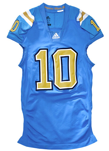
But then I looked at this photo (make sure to maximize the image in your browser to get the full effect). My first thought was that it’s kinda sad when UCLA can’t even wear legitimate UCLA stripes. My second thought was that the stripes look a lot like the truncated stripes the Colts have been wearing lately. And then I noticed the paper towel-esque pattern on the jersey fabric, which is exactly what the newfangled Reebok NFL jerseys look like (I’ve seen them up close at the Giants’ training facility).
Reebok, of course, is owned by Adidas. So that’s what we’re seeing here: the college version of the super-stretchy jerseys that have been worn for the past year or so by the Giants, Colts, Jags, and Packers. Fortunately, none of the other six schools have shoulder stripes, but the press release mentions that the jerseys will have “an ultra lightweight name and numbering system,” which means we’ll no doubt see the same Sears-level NOBs and warped/twisted numerals we’ve seen in the NFL.
I can accept — even applaud — that football uni technology is advancing. But the form is no longer following function. We have square design pegs that don’t fit into round tailoring holes. If modern performance fabrics and tailoring templates no longer support the old design concepts, it’s time to come up with new designs. And that would be fine if I had any faith in the design teams Adidas, Nike, and the other outfitters — which, of course, I don’t.
Meanwhile, how come only seven Adidas schools get to wear this stuff? The press release says the new jersey design “will make old jerseys obsolete” — so Adidas is sticking its other schools with obsolete jerseys? The press release also quotes an Adidas exec saying, “College football is more competitive than ever before and teams need every advantage they can get on the field” — yeah, unless you weren’t considered important enough to be part of this promotion, right?
ITEM! US Presswire update: By now I hope most of you have explored our historical NFL images from US Presswire. We hope to have a new feature to offer you when the two League Championship Series begin later this week: For each series, we’ll have a page of dynamic US Presswire content, meaning that you’ll be able to see photos from the games as they’re uploaded to the internet by the Presswire photographers (usually about 15 minutes after they’re taken). Uni Watch is the only site that will be offering this content. Further details later this week.
Uni Watch News Ticker: Big news in the NFL, as Nike is reportedly close to nailing down the league’s next uniform contract. On the plus side, this should be the end of the super-stretchies; on the down side, it may also provide a new avenue for the Pro Combat program. At the very least, though, Reebok will no longer be in the odd position of manufacturing the Broncos’ pants, which have those giant swooshes down the sides. … Under Armour has unveiled the camo-trimmed Wounded Warrior Project designs that will be worn next month by Maryland, Texas Tech, and Utah. Here are the accompanying cleats. Further details here. ”¦ The Providence Bruins and Springfield Falcons marked the AHL’s 75th anniversary by wearing groovy throwbacks the other night (with thanks to James McNamara). ”¦ Hmmm, amphetamine sponsorship or just an interesting team name? Those are the Greenville Greenies, a minor league team that played in the Coastal Plain League from 1937-41 and 1946-49 (with thanks to Gerry Dincher). ”¦ Yet another new mask for Rick DiPietro (with thanks to John Muir). ”¦ Check out this shot of Ty Cobb with a safety pin in his collar (great find by Austin Gillis). ”¦ New hoops uniforms for Kansas. More here (with thanks to Chris Stoppel). ”¦ For reasons that aren’t entirely clear to me, ESPN showed Dan Marino wearing No. 7 last night (screen shot by Greg Girard). ”¦ Remember last week when I mentioned that the Gap had a new logo? Well forget it (with thanks to Josh Exline). ”¦ “I’ve enjoyed reading about gumball football helmets and used to collect them myself,” writes Matt Stern. “When I was digging around in the garage, I found this one I made back in the late 1970s. I went to Reseda (California) High School. I probably sacrificed a Rams helmet to make this one. I’m surprised that it held up so well.” ”¦ Stephen King points out that last Saturday wasn’t the first time Minnesota had worn white helmets. Further info here. ”¦ Coming to a mall near you: kiosks where you can custom-design your own Nike T-shirt (with thanks to Josh Exline).
Coming tomorrow: Full coverage of Saturday’s Uni Watch party and last night’s collectors’ event.
Dan Marino looks a lot like Chad Henne. I base this on the helmet worn by the player in the photo. I don’t think Marino wore that style of facemask and it looks like one of the newer helmets. Shame on ESPN.
You’re right–that is Henne. I’m not all that surprised that ESPN would screw it up. They’ve been terrible for years (Berman, the Favre sycophants, the terrible shows, etc.). Unfortunately, they’re still the best way to watch sports today.
Speaking of ESPN photo mishaps the other day when George Blanda passed away ESPN was showing a clip of Jim Plunkett playing with the Raiders in the SB against the Eagles circa 1980 and crediting it to Blanda. Granted Plunkett wore #16 as did Blanda and even though Blanda played forever can’t someone at ESPN figure out Blanda had retired prior to 1975 !!!!
ESPN has been a caricature of itself for years. Not even worth tuning into.
Yup, without a doubt, that is Henne.
Please don’t get me started on ESPN/ABC. I will go on a rant about them sending Matt Millen to do Michigan games.
Not just the helmet – the NFL Equipment shield on the collar, the 8-star NFL logo on the football… yep, They Just Didn’t Care.
Matt Millen should not even be allowed within 100 miles of Michigan for fucking up the Lions the way he did!
“Dolphins uniform, prime number, no Super Bowl rings… Close enough!”
ESPN’s Graphic Department: AAAAAAAAAGing since at least 2007.
Well… at least if the whole team is wearing them it won’t look quite as stupid as when it’s only a few random players doing it while the rest of the team is still normal-ish.
Somebody better let Under Armour know that TEXAS TECH IS NOT IN THE ACC. WOW that uniform looks weird, and not because it has camo on it, but because it dons an ACC PATCH. WTF???
Neither is Utah.
Was the intention for all three schools to wear the same exact uniforms? Seems like they made a bunch of Maryland jerseys, changed the name on the front and just forgot to take off the ACC patches. Great attention to detail by UA.
If you compare the pictures of the Texas Tech jersey to the Maryland jersey it’s pretty clear they just photoshopped TTU’s team name and tag onto the Maryland jersey. That’s pretty weak.
Wow, so Utah is in the ACC too! Must’ve missed some more conference re-alignment news (sarcasm).
Seriously, the ACC patch proves that Under Armour put a minimum of effort into these unis, it fits Maryland and TT’s color scheme, stretches Utah’s a bit but it’s another step toward college FB looking like one inter-squad game…
At some point this whole “better, faster, more wicking!!!” thing will reach the tipping point, right? I, too, am a fan of progress, and you’ll find that most of my posts here are pretty receptive of newfangled jerseys, but there’s a point where you’re destroying uniforms for the sake of some likely incremental jersey difference. I can’t imagine there’s much wrong with the jerseys that most teams are wearing, “wicking”-wise.
I would think the tipping point would only be reached when large numbers of players start objecting that the new uniforms are too tight for their liking and/or they start percieving themselves as looking bad in the uniforms.
At that point, new uniform structures (for lack of a better description) with those features will probably start getting spiked for whatever is the next from the R&D people.
Isn’t it funny that football players want the uniforms tighter and baseball and basketball players want them looser?
The tipping point isn’t when the players start objecting. It’s when the consumers start objecting–with their dollars. Jersey and licensed apparel is a HUGE business, and as long as people are buying, these companies are going to keep competing for the most advanced, new-fangled stuff. Don’t get me wrong–I love moisture-wicking clothing and have quite a bit of it, but I scoff at being .08% faster and drier.
But, um, yeah… I keep buying it.
Which probably won’t happen anytime soon, since I’m pretty sure that the “authentics” aren’t anything close to what’s being used on the field. Those are too stretchy and form fitting for that, I’m sure the authentics they’re selling are still the traditional cut.
so…
“If modern performance fabrics and tailoring templates no longer support the old design concepts, it’s time to come up with new designs.”
…if nike wins the NFL contract, is this what we have to look forward to (new designs)? or, because it appears nike can actually make decent repros of shoulder loops and half-decent sleeve stripes, and they don’t use that ultra-crappy new material the giants, pack, jags & colts wear…
might we actually expect an improvement in the unis next year?
or are they just going to strike anyway and the whole thing is just a moot point?
Moot point.
So sick of the “performance fabrics.” Whatever happened to everyone getting the same uniform, then you go out and play and the best team wins? It’s starting to get like golf and auto racing – the talk is almost as much about the equipment as the participants.
I’m not entirely Amish when it comes to technology, but in sports there seems to be two steps back for every step forward. Better, more protective helmets? Great, I can use them as a weapon now. Jerseys that I can’t grab onto? Guess instead of bothering with proper tackling I’ll have to launch myself at the ball carrier. Not to mention the new cuts look like crap.
plus…they’re f*ckin’ soldiers now
This is the kind of crap we have in the NHL with the Edge uniforms. Some teams managed to keep their iconic looks, more or less, while others made themselves look totally clownish. Even as teams move back toward traditional designs, it’s still a pain to try to work around the Edge templates. Oh, and they can straighten out the waist hemline any time now, thank you very much!
As far as the NFL unis… yeah, I pretty much gave up on this generation of uniform when the 49ers’ sleeve stripes were devoured by the armholes. They’re not even sleeves anymore, they’re just shoulder-pad covers! That’s about the only think keeping these jerseys from being tank tops!
As asinine as the Pro Combat name is, as childish as the college designs tend to be, and as potentially offensive as the presentation may be, the pad and uniform system actually does what they say it will, not just a bunch of buzz words.
The way the pads are constructed and integrated into the girdle, pants, and compression garments makes it more likely that pros will wear all their pads, since they’re much less restrictive on movement and more comfortable than hard shell pad inserts. When the pros wear all their pads, it’s a lot more likely that the effect will trickle down to the lower levels as well and everyone will be less likely to get injured.
As for the designs, the Pro Combat is much more flexible than Reebok/Adidas’ super stretchy thing. The one-off college style designs would have to go through the league and the teams before they would see the field; Nike doesn’t have the power to dictate to the NFL the way it does to the colleges it supplies. Those designs aren’t a requirement of the Pro Combat design the way the weirdness is required by the super stretchies, so teams that want to stay traditional would be able to.
Also, the Pro Combat design seems to have migrated sleeve designs onto the undershirts instead of the armholes, which I believe was the solution we all thought would work best. It would also prevent us from having to see linemen’s armpits.
I threw link out there as one possible solution for shoulder loops. Shoulder loops don’t look good on Nike jerseys, either, so something must be figured out.
Looks passable. But it will never fly because the brain-farts that pass for designers at nike, reebok, adidas, etc. didn’t think of it “in-house.” Besides, you forgot to include piping every which where.
It looks ok, but you truncate one stripe, which doesn’t really look like what happened with UCLA stripes on older, looser jerseys.
A better move would be to taper the stripes toward one another in combination with what UCLA actually did this season (until these abominations)- just extend the stripes to armpit level.
That UCLA jersey would look fantastic on a lithe young suntanned cheerleader prancing around the sidelines, like any of these.
link
But on football players, it just ruins one of the great jerseys of the game.
what’s with the dude in the man u shirt?
I did not even notice him in the picture. ;)
Back to the new jerseys: Eventually, players will not wear jerseys. The “jerseys” will be painted on, thus ensuring that they’ll be harder to tackle, lighter, faster, etc., and their sweat will dry with the air.
I swear I’m writing a letter to the president of Adidas and Reebok. I swear I’m going to do it.
This trend is an absolute travesty, and to see it passed down to the college game is all I can take.
There is absolutely no reason that the cuts of these ‘techmo’ jerseys can’t accommodate their current styles (or, better yet, historical styles, where the stripes go ALL THE WAY AROUND).
If they can weave in funky, textured thread patterns, they sure as hell can switch thread colors, or dye accordingly.
They’re just too LAZY to care. Hey, adidas designer reading this blog … you’re a HACK.
That’s a big assumption you’re making. There’s a lot of factors that go into product design, or graphic design, uniform design (any design at such a large scale for that matter). Trying to satisfy all those involved is a really, really difficult job. Rarely is a poor design the result of laziness or lack of skill. It’s simply a product of having to please too many people in one go.
Are you kidding? You’re going to pull the “too many cooks in the kitchen” or “design by committee” excuses on adidas’ behalf here?!
More like, it’s complete laziness from the top down.
Obviously, no one in the organization cares about upholding the traditions of uniform design. Because if they did, someone… anyone… would make it a point to convey that the new designs are ridiculous, not to mention unprofessional craftsmanship.
From the plant manager at the manufacturing facility to the project manager at adidas to the design team at adidas to the account manager/vp at adidas to the president of the division on up the ladder. Any of these can continue to convey the “can’t do” mentality… so, who’s stepping forth internally to put their foot down and say these designs are unprofessional craftsmanship?
It’s obvious no one cares enough to raise the point, otherwise adidas wouldn’t be foisting this garbage on the collegiate ranks.
That’s simply not true. An uneducated opinion, no matter how passionate, isn’t necessarily valid. I would invite you to actually try to gain some accurate insight on how the process works before you rip the people (adidas, Nike, Under Armour, doesn’t matter) who are doing the work, because you clearly have little idea. It’s easy to have an opinion; it’s hard to do the job effectively and it’s even harder to understand how the job is done if you’ve never done it.
Andy, you don’t even know me. I’ve been involved in enough “design by committee” projects to understand the situation.
As professionals, particularly those with moderate-and-above experience, it is our responsibility to stand up for our passionate beliefs. Equally important regarding the corporate perspective, it is our responsibility to demonstrate leadership and professionalism.
adidas (and Reebok,among others) are clearly missing the mark, because the uniforms they’re designing are flat-out poor craftsmanship. In fact, their design workmanship with the Colts/UCLA stripes is EMBARRASSING it’s so poor.
Now, whether the low level designer is pointing this out, or the mid-level account manager, or the plant manager (who’s probably saying “we can’t sew the stripes, because the cut infringes…”), or whomever, it’s obviously not happening. There is a clear organizational disconnect. And it’s only getting worse.
They’ll spend thousands of manhours on wicking designs, technology discussions, promotions, and so forth. But apparently it’s not important enough — i.e., nobody cares enough — to sew full stripes around the shoulders, or to change thread colors, whatever, to accommodate full stripes.
That’s embarrassing. Hence, the reason I will write to the president.
Tell me, Andy, where am I mistaken in my very brief blog comment board description of the process — and who, ultimately, holds responsibility for overall workmanship?
Let’s leave it at this: If I was on the design team at adidas that just introduced that UCLA uniform, I would be embarrassed by the craftsmanship. I’d also have a productive discussion with my boss to try to remedy the problem.
That’s exactly it. Saving full stripes, ect is simply not important to the manufacturers. Or to most teams. Or to most of the players. It’s simply not a concern. Players and teams want the best available to play in, and companies want the advertising. The traditional bits of design get sacrificed to those ends. Why should they go out of their way and possibly compromise those other ends just so a guy can have stripe in his armpit?
As far as the Henne/Marino picture, I would venture to say they may have been comparing Henne to other quarterbacks whose names popped up in the graphic under Henne’s photo.
I certainly hope so… interesting how things taken out of context can look really heinous
BUT
if someone in that position (setting up TV graphics at ESPN) doesn’t know who Dan Marino is, they need to be replaced IMMEDIATELY
ESPN was comparing Favre’s milestones to those of other QB greats. I’m not knocking Henne, but you’re going to have to trust me–they were talking about Marino.
I gave up on football jerseys long ago. Who needs ’em?
This is where it’s at!: link
Nike and Adidas should turn their focus on teaching athletes how to not sweat, and then they won’t have to invent new uniform material. Maybe then we’ll see the return of proper sleeve stripes.
I’m probably gonna get cussed out for this, but I love Nike (most of the time). There, I said it. You all know my dirty little secret now (except for the secret to immortality I have in my… uh… nevermind). That being said, I love UCLA, so here’s what I think of Adidas…
link
Islanders, being the Mickey Mouse organization that they are, spell goalie “golie”. What a joke they are. Classy move yesterday, Wisniewski.
After all these years of telling the Islanders and their fans to suck it…
link
Well, them Isles’ *did* manage to spell the word correctly once…albeit out of SIX opportunities: the correct “goalie” spelling appears under the main image, with the curious nickname referencing “DP’s new mask” [news to me].
On a side note, it’s interesting to see in the webpage’s sidebar that their hopefully-more-legitimate star-to-be John Tavares has a personalized logo-type brand à la Roger Federer, Tiger Woods…and one Sidney Crosby (“SC87”): “J.T91”. But me wonders: why no period after the “T”, for consistency’s sake?
-JohnJ.
on the GAP logo article…
link
this headline has a big error IMHO
The logo they are reverting to isn’t ORIGINAL… is it? it’s PREVIOUS. I’m guessing when the GAP started in SF in the 60s their logo didn’t look like the one they are reverting to. SLOPPY!
The state of journalism is in the terlet
True. Here’s the original GAP logo on the original store:
link
tommy d said:
sweet
Stifle yourself, Edith!
Oooooh, Archie…
I’m so excited to be in this career track right now. You all have no idea.
i know, right kenny?
that made me feel all warm and snuggly just reading it
So warm. So snuggly. So awful.
It’s just so terrifying. But hey, I’m doing what I can to make myself as marketable as possible. And if that doesn’t work out, I have a sweet pair of green-and-yellow stirrups.
Everyone stop complaining about how things are these days. It’s never been better.
When I first looked at the headline this morning, I thought it said “Guess What the Celts and UCLA Now Have in Common.” I’ve now seen that it says “Colts,” not “Celts.” (Obviously did a quick read without enough coffee in me.) Then I looked at the UCLA jersey and thought, wow, it does look like a basketball jersey.
The real shame of the UCLA situation is that they had their stripes looking pretty good this year. They were about the best looking shoulder stripes possible on modern jersey cuts.
The Under Armour Uniforms have the accruate conference logos on the on their facebook photo album so they did not mess up as everyone is saying. link
Paul,
i don’t think that’s ty cobb…i say it’s eminem in old garb.
You might be onto something there. Black & white photos can make it difficult to tell Detroit hate mongers apart.
Re; Cobb Safety Pin, does anyone know if this was a common practice at the time? In most pictures from the era, mnost ballplayers played with the collar flipped up in the same fashion as the Cobb pic. I always wondered how they were able to keep those wool flannel collars flipped up like that.
link
are the div II schools ever getting this treatment?
More than likely not but if this keeps evolving football players will be wearing tank tops.
Probably the same reason only 10 Nike schools get to go ‘Pro Combat.’ I don’t know what that reason is, but I bet part of it is that some schools just didn’t want to, and others weren’t asked to participate because the exposure/cost ratio wasn’t favorable.
Also, I haven’t done the research, but I feel like Nike outfits many more schools than adidas does. I’d bet adidas outfitting 7 schools means that they are outfitting a greater percentage of their schools than Nike is, outfitting 10 in the Pro Combat gear. I could very well be wrong, and I don’t know what the significance of that is, either, but it’s something to chew on, I guess.
you’re correct that nike outfits more college teams than does adidas, but it will be interesting to see how that changes since it appears nike will now have the pros to
ruinoutfitmany of us pontificated on this back when nike intro’ed the pro combat: if the unis are so damn good, good enough to turn the average college football into a pro warrior, shouldn’t they be wearing these full time? perhaps adidas is just full of shit and the jerseys aren’t any better, dryer or faster than their previous models, just that they’re constructed slightly differently?
we’re not being victimised by their marketing department are we?
I thought the same thing. Nike hit the college ranks pretty hard when they got shut out of the NFL a decade ago. I wonder if they’ll shift some of that focus into the NFL and maybe we’ll see adidas’ college business grow in much the same fashion.
As far as the materials go, there is a ton of science behind the engineering of such things, so the statistics on weight and a material’s ability to pull moisture from the skin are valid, but it’s not something that a fan sees as valuable, because it’s not realistically tangible, in a sense. As a fan, you’re inherently skeptical, and even as a player, how do you know whether it was your gear or your own physical ability that allowed you to make that split-second play?
If you’ve ever handled an authentic jersey, be it football, basketball, baseball, they are HEAVY. The materials are thick and hard-wearing, the seams are double- and triple-stitched, and the lettering/numerals are the same way now that the athletic realm has pretty much abandoned screen printing for such applications. That’s when they’re dry. It gets worse when the apparel is soaked through with sweat or rain. I can see how taking any weight at all out of them is advantageous, but it’s very difficult to quantify it with anything but those tiny, seemingly insignificant measurements.
Even the heaviest authentic jersey only weighs about four pounds and even the lightest materials aren’t going to take more than a pound off of that. The advantage of the Pro Combat uniforms is in the pads, which tend to weigh a lot more than the actual jersey. Does the Pro Combat system include shoulder pads or just the girdle, leg, and jacket pads?
Nebraska has been wearing a variation of these all season. Wisconsin tested them last year and is also wearing a variation, I believe the same one as Nebraska. So no advantage there.
All of their schools that have full-apparel deals were included in this, either before the season or now.
You sure about that? IU’s entire athletic department is link and I’ve seen nothing to indicate that they’re wearing these “techfit” jerseys.
It’s pretty clear from the pic that I linked above that Ben Chappell wasn’t wearing one of them this past weekend and link appears to be the same type of jersey.
The jerseys that Indiana is wearing are the same variation that Nebraska and Wisconsin are wearing. Similar material, but they maintain a slightly different cut. It was the schools’ preference. Their material has a more mesh-type look, but is still the newer material.
Kansas has a full deal with adidas and opted out of these new uniforms, at least for this year. They are wearing the new, NBA-style, basketball jerseys.
I’m lovin’ those AHL throwbacks. Now if only teams would make TRUE throwbacks by making them out of dureen or wool instead of polyester!
-Jet
Well, if they were wool, they’d have a genuine excuse to be “vintage white”.
I swear, “vintage white” is to hockey what acid washed is to jeans. It looks doubly ridiculous when it’s on an Edge uniform!
The white helmets look a bit out of place, but all-in-all a great look.
Last night a friend of mine posted this on her Facebook page:
“the NFL needs to take away the Hot Pink accessories from the players…..it’s really not their color at all!!!”
But then one of her friends responded:
“I’m sorry, but I have to disagree. I love it!!! I think that its so cute on them and its so thoughtful!”
Was the NFL going for cute when they thought of this?
Well of course they were. How else are they going to target the teenage girl market?
I would say yes, that’s probably one of the reactions they’d have anticipated.
Among many.
—Ricko
I’m in a law school football league and my team wears hot pink jerseys to look as ridiculous as possible. I’m actually really happy about them selling the pink athletic tape. I stocked up on it.
Daniel Kaplan is “tweeting” apparel updates from NFL owners meetings if anybody cares.
Nike = On field jerseys, sideline gear & fan apparel
New Era = Sideline hats & fan hats
G3 = “lifestyle apparel”
VF = t-shirts & fleece
Outerstuff = youth
47 = Fan headwear
Under Armor = Combine
link
Good news on the hat situation. New Era is definitely among the least-bad of all the major equipment manufacturers these days.
Which says more about how bad the other big houses are than about how good New Era is. But all in all, I see much less disrespect for team identity and branding standards from New Era than just about any other big manufacturer.
Really?
Really really?
Have you seen the shit they pop out for MLB? “Oh, I’m sorry, I had no idea those were gang colors. Wait, most of those people buying LA kings hats with the script logo AREN’T hockey fans?”
New Era ranks right up there with the worst. Best of the major ones is probably VF (who owns Majestic, among other brands)- yeah, they can’t get a proper cut for a vest right to save their lives, but if that’s the biggest complaint you can find against them, then they can’t be too bad.
Twins 47 though- thank god they’re getting involved with the NFL. Reebok doesn’t know what a fitted hat is, much less a simple cotton one (something New Era can’t seem to grasp either). Everything is strech, mesh and flames.
I was thinking of New Era’s treatment of on-field caps, not the “fashion” crap that every manufacturer makes. Almost alone among major suppliers these days, New Era seems willing to say to teams, “So that’s what your uniform needs to like like, eh? OK, we can do that,” as opposed to, “You can take your decades of established visual identity and shove it up your arse, we’re gonna make your uniforms fit our new template so you look just like all the other teams in your league.”
And please… go back to the gray under bill.
link
Am I the only one to notice that the huge thigh pads on those new adidas uniforms give the impression of three stripes? Ugh.
New Era fan caps, that’s an improvement.
This whole UCLA high tech jersey situation is more evidence of the unfortunate truth about the state of football jerseys. Namely, they aren’t jerseys, or shirts really, anymore at all. What we have now is a skin tight shell that holds pads (basically a colored outer covering). There’s no real estate at all for any “design”, especially when you consider that football jerseys historically have had little room for that, what with the giant numbers on the front and back (the individual design elements used to come in the form of sleeve stripes). At this point, you can pretty much slap a number on one of these shells and that’s about it, because honestly the swoopy piping/side panel mess isn’t the answer.
Makes them a lot like the “jerseys” in the Lingerie Football League.
link
Couldn’t find a great shot, but here is an example of cross-branding. The picture is of NSU (Northeastern State in Oklahoma) wearing Adidas jersies and Nike pants. A big no-no in D1, but acceptable (albeit rare) in D2.
link
Wow, will the designated Aggie actually have “12th man” on the sleeve?? Can’t wait to get that Cowboys New Era fitted!
Sidenote: hey Paul, my college (FCS Prairie View) wears purple AND BFBS…which is worse??
“…points out that last Saturday wasn’t the first time Minnesota had worn white helmets.”
No kidding.
Wore that uni in first football game nationally televised in color.
1962 Rose Bowl vs. UCLA.
(Color on color, too)…
link
—Ricko
Was Carl Eller on that ’62 Gopher squad? I believe Minnesota wore white helmets on the ’67? Big Ten winning team.
Looks like Mark Mangino or Mike Leach will be among the possible coaches for Minnesota next season. The Tim Brewster era is drawing to a close.
Pretty sure by ’67 they’d gone to the gold helmets; might even have been the first year of them (could have been ’66).
Not sure of the years Bobby Bell and Eller played (without looking it up), but Eller was a sophomore when Bell was a senior (#78 and #76, that I remember well). Both wore only the white helmets while Gophers.
Bell came out and played touch football with my Sunday Morning Bunch one time while he was at Minnesota. Nothing like this face coming at you ninety billion miles an hour on a kickoff return. Every instinct was to stop, hand him the ball and say, “Here ya go. Bobby, whatever you want.”
link
Those aren’t striped stirrups, btw. It’s two pair of the white sweat socks with a single maroon stripe that the Gophers wore back then. I had maybe a half dozen pair of them, but they’re long gone, of course. Wool. made by Wigwam.
—Ricko
Says link:
“We plan on changing the NFL jersey dramatically.”
How about you do this? Don’t go with the Any Given Sunday/CFL in America type of dramatic change. Do what you want with fabrics and warrior whatchimacalits and climate cool this and all that. I don’t care about that.
But could you please get rid of all the extraneous crap that hangs on the fronts and backs of NFL jerseys?
To wit:
1 – Wordmarks. Stupid. Wordmarks are stupid. You’re wearing a jersey, it should be obvious whose jersey it is if you’ve done it right.
2 – Logos on the back above the nameplate. Stupid and unnecessary. You’ve solved a problem that didn’t exist.
3 – The shield on the yoke. I know it’s been around since like ’94, does it have to be that freaking big?
Last night Favre had the stupid C with stars, the Vikings wordmark, the Vikings’ 50th patch and (I presume) the Viking head on the back above his name. That’s too much crap on a jersey.
Simplify the look and you can do whatever you want with fabrics and stuff like that. But there’s too much stuff hanging on jerseys and then trim and stuff like that.
“Last night Favre had the stupid C with stars, the Vikings wordmark, the Vikings’ 50th patch and (I presume) the Viking head on the back above his name. That’s too much crap on a jersey.”
Starting to look like Nicaraguan Generals, aren’t they.
Or European hockey players, I guess.
—Ricko
I really don’t see a problem with wordmarks. If nothing else they serve a purpose off-the-field for the fans, or at least gift-buying mothers & girlfriends of fans. Without a wordmark, is a non-fan going to know the difference between a 49ers white jersey and a Giants white jersey?
I’ll agree with the other stuff being kinda unnecessary clutter though.
1 – Why do we care about non-fans? There’s a great line in the Rozelle biography (I believe it was) from one NFL owner lamenting that they always seem to want to go after the people who are least interested.
2 – I can see trying to CREATE more fans. But, really, a wordmark is going to do that?
3 – We didn’t have wordmarks for the first 80 or so years of the league. I’m thinking mothers and girlfriends found a way to buy jerseys prior to about 2000.
4 – I’d rather have Nike make the Giants’ white jersey and the 49ers’ white jersey unique enough that you don’t need a wordmark to tell them apart. Really, you’re going to spend $300M and you can’t figure that out?
Think about it. Plain and simple, end of story, what the wordmarks are about is retail.
They keep someone from peddling, say, a white jersey with red NW stripes and numbers as a “NY Giants jersey”, etc. The Giants’ royal jersey would be even easier to replicate.
Any other “benefits” are incidental.
—Ricko
But, Kenn, mothers and girlfriends couldn’t buy jerseys until the late ’80s. Before then, they would have had to buy stuff like the Sears collection, which did tend to have Team Name on Front.
There’s nothing wring with the wordmarks. I had a Jim Brown Browns jersey from before 2006 and people kept asking why I was wearing my old high school jersey. That’s a jersey that hasn’t changed significantly in 65 years and people didn’t recognize it without the wordmark.
The helmet kind of gives it away, unless they’re just wearing the jersey and then who cares?
You are correct , Sir!
CNBC interview with NIKE Brand Pres: link
“We plan on changing the NFL jersey dramatically just like we’ve done with the college programs, using new thinking and the greatest technology available. The NFL program hasn’t had the same type of advancement in recent years. I personally would love to see a kevlar jersey on a quarterback with customizable ninja star pockets by 2013.”
Will that quarterback parachute into the stadium in a keyhole drop, or arrive in the armored van with the rest of the SWAT team?
—Ricko
Oh, wait, my bad. I thought we were talking about a video game.
Isn’t that what the NFL has become, Ricko?
I say all these hotshot stormtroopers should check out their local miltiary recruiting office, because we need their skilz.
Check this out.
Rare photo of Fred Biletnikoff with a cage facemask. He was pretty much exclusively a single bar, then two-bar, guy.
Judging from the bandage on his nose, I’d say there’s probably a reason for the change in facemasks…
link
—Ricko
Apparently Cincinnati will be wearing their compression fit Adidas uniforms this Friday at Louisville, while UofL will not.
link
well … there goes the vegas line
Each jersey will come with a personalized trainer to help paint, or put, the jersey on.
By the way, compression really is overblown. If you’ve ever run in a tight-fitting compression shirt in the winter, you’re gasping for breath much more so than if you are wearing a losse-fitting shirt.
Thank you for pointing that out. Way overrated.
Aren’t worth a damn in summer, either, and their supposed “wicking”.
A cutoff 100% cotton tee makes a far better undershirt.
The issue isn’t drawing away perspiration to keep cool. Air movement (or fabric movement that creates air movement) is what keeps most of us cool. Different on a bicycle where you’re creating your own wind chill factor, of course.
But playing five or six softball games in one day in 90-degree heat wearing a tight-fighting shirt is absolutely stupid. I don’t care WHAT the fabric is.
—Ricko
Yeah, funny, but my high-tech shirt is just as soaked after a 5-mile run in the summer as my cotton t-shirt, though the cotton is a little heavier and takes longer to dry out (but is more comfy on the skin).
Give me a cotton, one-size too large t-shirt when I’m running. Keeps me cooler than anything else.
I haven’t worn a moisture-wicking shirt in a while, so have they improved the texture? The ones I’ve felt all snagged on my fingers. Not my nails, just my fingers.
Depends on what you buy. I have one that I absolutely love made by a brand targeted for rock climbers (PrAna). Wonderful. It lets air through and wicks away sweat, which means I’m cooler and drier. And I’ve had no issue with snagging. Oh, and I wore it literally every day for 2 weeks straight canoing. The thing is proven.
But it’s not a have “they” improved… issue. There’s lots and lots of different stuff on the market. It’s not one unified category. Run to your local REI (or equivalent) and find one with a texture you like if you’re interested in trying one out again. Hell, kohls. There’s always a pretty wide selection of generously cut wicking polos intended for golfers.
Thanks, Jeff!
Nike Brand President Charlie Denson: “We plan on changing the NFL jersey dramatically just like we’ve done with the college programs, using new thinking and the greatest technology available. The NFL program hasn’t had the same type of
advancement in recent years.”
link
crap.
“The NFL program hasn’t had the same type of advancement in recent years.”
Oh, the poor NFL, not to have been bathed in the white light of Nike’s all-knowing all-seeing seers lo these years. And where would WE be but not for them telling us what we should like…and, pray, how has the the NLF managed to become such a success WITHOUT them?
One can only imagine the majestic, magical, all-conquering future as Roger Goodell plays Frodo to Phil Knight’s Gandolph.
(I ain’t sayin’ Nike isn’t good, just that they could use a dose of getting over themselves).
—Ricko
Agreed. I don’t really see how the 50-panel Pro Combat jersey design is any better than the 3-panel Reebok jersey design. The material differences are probably negligible (they may even come from the same supplier, who knows?) and neither of them do a good job of accommodating existing designs. They’ve got 18 months to reinvent the wheel, again, and I, for one, am curious to see what they do.
Minnesota white helmet color pics vs Iowa
link
link
First shot is Roger Hagberg, who went on to play for the Oakland Raiders.
As a sidelight, the fellow shown in the foreground of the second shot (Coach Murray Warmath being carried off the field) is John Croft, a near-legendary longtime sports photographer for the Minneapolis Star & Tribune.
Another sidelight on that Iowa-Minnesota game.
Back then there was the NCAA Game of the Week on national TV on a Saturday. One game. Sometimes two.
That was it. No local networks. No regional games.
You wanted to see a college football game, you bought a ticket.
That game, though, had some much interest (teams were ranked #1 and #2 nationally), that the local CBS affiliate (I believe it was) got to together with the local public television station and a station in Iowa City. I assume the two private stations came up with the money and, to make this story short, the game aired live in the Twin Cities and Iowa City (and perhaps other around the two states) on a special network. Here in the Twin Cities it was on the public television channel.
I remember well watching it. And as if all that weren’t unique enough…no commericals. Couldn’t be. Was on public television.
—Ricko
I had no idea about that Iowa and Minnesota areas televising that game. Pretty interesting Ricko.
I do remember when only 1 and maybe 2 games a week were on TV though. And there was some kind of rule that teams could not be on TV more than a couple times a year or 2 year period. I forget the details.
Yeah, I seem to recall they had to go the NCAA for special dispensation to telecast that game in the manner they did. Given the atttiudes of the day it likely helped that there’d be no unseemingly commericals (or no revenute to argue over, either). The purity of the amateurs and all, y’know.
—Ricko
unseemly.
(I’m tired)
That UCLA jersey looks ridiculous. How much better or faster do these things make the players today? They will be wearing tank tops pretty soon. And again why are basketball uniforms going to the other extreme?
Did a quick scan of the comments and did not see this. If it was posted earlier, I apologize.
Michigan coaches to wear pink shirts and accented caps on Saturday.
link
link
Sony is holding a press conference for a new HDTV with Google TV and they used what looks to be a rather unique if not just old NFL logo.
The Marino pic was actually Chad Henne, I don’t know how they manage to do it but they will from time to time choose the wrong photo for certain situations, in this case they grabbed a Dolphins QB picture w/o verifying it was the right Dolphin’s Photo. They showed a picture of Marcus Vick instead of Tyrod Taylor once, and flashed Josh Nesbitt’s (GT QB, and black)photo when referring to Scott Blair (GT, PK, and white) during the 2008 Chic-fil-a Bowl.
There’s no excuse for it but this is the same company that talks about Favre throughout the off-season and is the top Favre rumor reporting channel, that then complains about Favre’s indecision. Or discuss how they are sick of hearing about it, when they are the ones stirring the pot.
Rick DiPietro doesn’t need a new paint job, he needs a mask about 5x bigger so something has a chance of stopping a shot. Retire already!
I’m surprised no one’s said anything about UA’s “support the troops” thing that actually guarantees money to charity.
“The custom game day jerseys will be auctioned off on each of the Universities’ websites the following Monday of each game with a 100% of the proceeds going to Wounded Warrior Project.”
Someone tell Nike that if you’re going to do an overblown gesture, then you do it by making it a tribute rather than comparing the players to soldiers, and you actually guarantee some money going to charity. I’m surprised and impressed that it’s Under Armour that figured out how to do something genuine and relatively low key.
How many people that comment here are designers? If you are ao sure that you know how a football jersey should be designed then try working for one of the top companies and do it yourself. I think that unless you truly understand materials and or design than you should be a little more selective of your words. Moving away from traditional designs and materials is inevitable and it is a progression that will happen in all spots. Take some time and actually look into the seamless uniform systems that Reebok developed and you will see a uniform that makes athletes better at what they do. Nike has done some good things for college ball and they have also done some pretty radically stupid stuff, I hope that they bring some good designs to the NFL. I think what a lot of people don’t understand is that a football uniform is not always in the hands of the designers, a schools AD or equipment manager will have a lot to do with how a uniform comes out.
I’m aware that I could be wrong about this and I’m sorry if I’m falsely accusing you of sockpuppetry, but say something if you’re gonna change your screen name. No one was saying anything hurtful to Andy or attacking the argument to the point where it became necessary to sockpuppet. IT was a simple disagreement.
That said, you’re right that none of those designs would have gone through without the schools’ support. However, it’s also likely that the power relationship was somewhat skewed in Nike’s favor in the more outlandish designs. Whether it’s a simple incentive program or true strong arm tactics, the company will not have that kind of power over the NFL or any teams. The Pro Combat uniform is constructed to much better accommodate older style design elements than the Adidas/Reebok super stretchies, as evidenced by Ohio State, Oklahoma, and Texas. The only design changes will be the ones the teams want.
>>Take some time and actually look into the seamless uniform systems that Reebok developed and you will see a uniform that makes athletes better at what they do.<< Interesting if proven; irrelevant when asserted. If you have hard data on how the seamless jerseys "make athletes better at what they do," I'm all ears. As for the "If you're not a designer, shut up" bit, that's a straw man argument. I may not be an architect, but I know a shitty building when I see one. You may not be a writer, but I bet you wouldn't hesitate to say I'd written something sub-standard if that's what you thought. I'm on record as having no problem with advances in uniform technology per se -- progress marches on and all that. But that doesn't mean the new technology is always deployed judiciously, or that it sometimes isn't just a marketing scam, or that it doesn't sometimes look like total fucking shit. By the way: Are YOU a designer? Just wonderin'.
“I may not be an architect, but I know a shitty building when I see one.”
You don’t have to be an architect to be a critic.
link
“Give me a cotton, one-size too large t-shirt when I’m running. Keeps me cooler than anything else.”
Don’t forget the band-aids.
… Hmmm, amphetamine sponsorship or just an interesting team name?
Ellis, D. did say that most of the league was popping.
Speed kills, Del.
Both starting pitchers tonight are missing squatchees
These new jersey technologies are being made using what is called “seamless knitting”. Traditional jerseys are made from circular knit mesh, then cut and sewn into panels and sewn into a garment. The seamless knitting technology allows you to combine different knit constructions while adding shape to a seamless tube of fabric. As seen in the UCLA photo, they have use what is called “body mapping” to add compression and support in certain areas while increasing moisture management (wicking) and breathability in others. Additionally, you can see that the only seam on the jersey is where the yolk (shoulders) attaches to the main body. This technology is most popular in technical workout clothing (compression, running shirts, tights, sports bras, etc.) While this may be completely boring to many of you, I thought some might be interested in the textile side of this issue. I do think it would be possible to incorporate these technologies into football jerseys while remaining true to the jersey’s original look and heritage. My two cents.
We have been cleaning the basement and I found this in my dad’s hat collections
link
Pillbox and foam? That’s two strikes.
Now that Dolphins hat in the background…I used to like that style.
He had at least 10 boxes of hats. Yes, the Dolphins hat was an ADJ. I just thought it was an interesting Angels hat. When I get sometime, I will post more photos of sports hat he has.
I had a Pirates pillbox that was foam circa 1980. I loved it anyway.
That Dolphins hat is a Super Bowl hat.
Did anyone else notice that aside from UCLA, all the new adidas jerseys are for teams with little to no extra color/decoration? None of the teams, so far as I could tell, have side panels. Might this be a limitation of the cut of the jersey, or is this simply a case of the teams being chosen not having such adornment? I’m guessing it’s the latter, but if it is a jersey constraint, we could be headed away from the panels every which way craze of the last few years.
Just noticed Carlos Pena’s batting gloves. Every segment of every finger has its own pad:
link
Never seen that before, but maybe I just never noticed. Anyone know if that’s a new thing?
They look like football linemen’s gloves, though I’m unaware of Easton making football gloves at all.
Manufacturers often use the playoffs to intro things such as cleats and batting gloves that won’t be available retail until the following spring. Well, at least they used to do that. Can’t say for sure about these days.
—Ricko
you mean like when rbk introed the nba jerseys they’re wearing now at the ASG?
not saying you’re wrong, but im not necessarily buying it…has pena been HBP recently? and didn’t one of the other glove manufacturers produce a similar product this spring? i seem to recall paul writing about it
A quick check of Easton’s website shows no batting gloves with block padding, nor any gloves that are solid white.
Home teams in dark jerseys went 0-6 in the divisional round.
I think the Rays went with the dark jerseys since they had rallied to win two games in Texas. This loss by the Rays could turn out to be as devastating to that franchise as the 1994 strike was to the defunct Montreal Expos.
Regarding the Rangers, has Texas ever worn a light blue throwback uniform from the Buddy Bell era?
Nope.
“the defunct Montreal Expos”
the franchise isn’t defunct…so im not so sure that term is correct; the departed expos, perhaps…to me, defunct implies the entire franchise is no longer, and that’s not the case
I kind of realized that after the fact, just like using the word “defunct”.
I was mildly surprised (and relieved) that the Rays didn’t wear the plaid-billed caps tonight.
im wondering how many chileans will be having sex with a miner tomorrow
BOO! Get off the stage!
Wait a minute…..
link