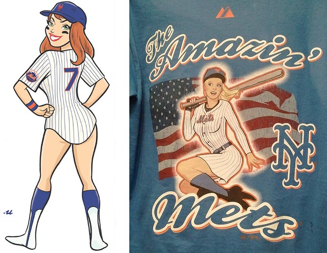
On the left: the awesome Mets pin-up illo that Rob Ullman made for me in 2008. On the right: the significantly less awesome Mets pin-up T-shirt that reader Terence Kearns recently spotted in a shop. Is there anyone out there who doesn’t think the latter is little more than a pale, wan imitation of the former? Okay, anyone besides Fred and Jeff Wilpon, and maybe Wayne Hagin?
Rob’s superior artistry notwithstanding, the T-shirt is a remarkably shoddy piece of work. The bat is too long and/or not balanced properly on her shoulder, she’s wearing a fingerless batting glove, the sleeves are painted onto her forearms, the chest insignia is too small, she’s got one blue sock and one black sock (or maybe one low boot and one high boot — tough to be sure), the team script in the foreground is all wrong, and sure, let’s slap an American flag in the background, just for the hell of it. Oh, and make the flag “distressed,” cuz the kids love that look these days. Well done!
New ESPN column today — a look at all of this year’s NHL goalie gear. Link coming soon. postponed until tomorrow. (Meanwhile, in case you missed it the other day, here’s my column on all the NHL uni changes, plus I also had a short ESPN piece about Joe Skiba’s repair job on Ahmad Bradshaw’s pants.)

Collector’s Corner, by Brinke Guthrie
My PC is acting rather erratic, but I managed to dash off this edition of CC before sending it off to the shop.
• We begin with this outstanding NFL poster from the 1970s.
• Also from the ’70s: this nice collection of NFL media guides.
• Here’s a great batch of NFL stickers from a former Eagles employee.
• From the gone-but-not-forgotten dept., a Minnesota Fighting Saints bumper sticker!
• I do seem to recall seeing NFL stuff in my Mom’s Avon catalogs.
• Cobra shoes? I don’t remember that brand at all.
• Back in the day, it was totally cool to have an STP sticker on your school binder. [True enough. — PL]
Seen something on eBay that you think would make good Collector’s Corner fodder? Send your submissions here.
Party reminder: Uni Watch gathering this Saturday, Oct. 9, 3pm, at Sheep Station in Brooklyn. I threw out my back a few days ago lifting a huge box of Meats tees (not joking — just goes to show that the apparel biz is murder), so it’s possible that I’ll be spending the whole party sitting down. Feel free to bring me all sorts of prescription painkillers, which I’m sure will mix nicely with an oatmeal stout.
Collector-geek reminder: Assuming the Uni Watch party doesn’t leave me in a painkiller-induced stupor, I’ll be among the many collectors showcasing their obsessively curated accumulations of miscellany on Monday evening at Collectors’ Night, sponsored by the City Reliquary. I plan to have three or four separate collections on display, including at least one that I’ve never mentioned before on the site. Kirsten will have her volvelle collection, my friend David Brown will have his collection of books with one-word titles, and dozens of other folks will have things that will make you think, “Huh, it never occurred to me that you could collect that.”
Remember, anyone can accumulate a bunch of stuff — that’s just hoarding. The mark of a collector is the show-and-tell aspect, the urge to display and share. So come on down and let us share with you.
Uni Watch News Ticker: The Braves have a set protocol for the banners at Turner Field. Division championships get a yellow banner with blue numbers; league championships get a yellow banner with red numbers; and the one World Series flag is red with blue numbers. So how is the team marking its first-ever wild card berth? With a white banner. Interesting that they already had it manufactured and ready to go, even though the team’s postseason spot wasn’t secured until the final day of the season (with thanks to Jonathon Binet). ”¦ Back in July, the New York Times published a piece about a woman who’d received courtship letters from George Steinbrenner back in the 1940s. She wanted to publish them in a book, but the Steinbrenner family declined to give their permission for that, so now she’s selling them on eBay instead. ”¦ Big surprise: Mark Cuban wants to whore out NBA uniforms for advertising. ”¦ Speaking of ad-whoring, the Blackhawks are putting an ad patch for a shitty pizza chain on their practice jerseys. ”¦ New hoops uniforms for NC State. ”¦ New court design for the Jazz. ”¦ Horizon Air has several new NCAA-themed liveries, including Montana, Montana State, and Idaho — the latter of which is apparently being whipped up because the Idaho A.D. refused to board a Boise State-themed plane (with thanks to Aaron Klett). ”¦ John Koziol notes that Benjarvus Green-Ellis — who has one of the all-time great names, no? — is wearing Nike Air Hurache TDs. “Although they’re made for both lacrosse and football, I’d previously only seen these on the lacrosse field,” he says. ”¦ Buried on this page are Kris Letang’s thoughts on how hockey could be improved: “I would like a uniform that would be all one piece, with the pads inside, and you could zip it up and it would [cling] to you” (with thanks to Doug Kalemba). ”¦ Al Stone heard some Ravens news on the radio yesterday: “Someone had asked why the Ravens were not clad in pink Sunday up in Pittsburgh (aside from the coaching staff wearing pink ribbons and the players having pink ribbon helmet decals). The reason given was that The NFL only supplied so many pink accessories, and so rather than have only certain players wearing the gear over a series of games, the Ravens chose to all wear pink for just one game in October, as it’s more consistent with the concept of a team. That game will be this Sunday’s home game against Denver.” ”¦ Hey, who’s that? It’s Laura Forde — my good friend and cat-sitter — posing with none other than Marvelous Marvin Hagler back in 1981. “I was 12 years old and ate 14 ears of corn that day (competition with my father),” says Laura. “Marvin was a great guy!” ”¦ Washington DC’s Dept. of Transportation is known as DDOT, usually pronounced as “dee-dot.” So check out their logo. I like it (big thanks to Blair Thompson). ”¦ Dan Plaster tipped me off to a Western Hockey League player named Wes Vannieuwenhuizen. For now that’s the best image we have of his 16-letter NOB. ”¦ We’ve had black-outs, red-outs, white-outs, and now Joe Maddon wants a plaid-out. ”¦ You’ve probably heard that the original designer of the Nike swoosh was paid, like, a nickel and a bucket of spit or something like that. But it turns out she was later given 500 shares of Nike stock that are currently worth slightly more than a nickel, or at least that’s Phil Knight’s story (with thanks to Chris Flinn). ”¦ New basketball uniforms for George Mason (as reported by Taylor Gaddy). ”¦ Whoa, check out this crazy old Wilson football jersey! I’d totally bid on that if it fit me (great find by Scott Cummings). ”¦ We finally have our first clear view of the how the Sharks’ anniversary patch will look in situ. Also: The combination of the front uni number and the European series patch makes for a very crowded jersey, especially for the captain and alternates. ”¦ Interesting article about the Cricket Hall of Fame, which for some reason is in Connecticut. ”¦ The pink thing is really getting out of hand. ”¦ Reprinted from Monday’s comments: The Packers have added tiny NOBs to their helmets. ”¦ Sensational bowling dress available here (big thanks to Robin Edgerton). ”¦ The Supreme Court has let stand a decision that affects logos for USC and South Carolina. ”¦ Absolutely spectacular football-themed cowichan sweater here (be sure to scroll down to see the rear view). ”¦ Sammy Barbour reports that Michigan hockey has added stripes to its pants. ”¦ Millwall, an English soccer team, wore a 125th-anniversary shirt this weekend. “It has the last name of every player to appear for the team in its 125-year history,” explains Jeremy Richardson. ”¦ Yesterday marked the 70th anniversary of the first use of a plastic football helmet. “The Eastman Chemical Division of Kodak developed Tenite — a hard plastic that derived from wood pulp — in the 1930s,” says Doug Brei. “It was used to make screwdriver handles, buttons, desk accessories and fountain pens. Although it’s no longer the plastic used in football helmets, Tenite is still used today in golf clubs, guitars, toothbrushes, purses, phones, and tool handles.” ”¦ What’s with those snaps on Vince Wilfork’s uniform? Were they connecting his jersey to his pants or what? (Good spot by LeRoy DePas.) ”¦ Small addendum to my NHL season-preview column: According to a note on this page, the Stars are “going back to green on the helmet sticker this year once the regular season starts” (with thanks to Dan Mugg). ”¦ Interesting article about the on deck circle. ”¦ “What the heck is this on this Kentucky Wildcat?” asks Robert Marshall. Good question. Anyone..? ”¦ If you’re going to have a hockey-themed wedding, you might as well include a fight as part of the proceedings (with thanks to Alan Kreit). ”¦ New championship-anniversary patch for the Bulls. Here’s how it looks on the jersey. ”¦ Lakers and T-Wolves both wore their home uniforms for Monday night’s exhibition game in London. ”¦ Here’s our first on-court look at the new Cavs uniforms. ”¦ Wouldn’t it be wicked cool if you could whip up some digital code that automatically removed corporate logos from video footage? Someone has created a project to do precisely that (giant gold star to Ryan Summers). ”¦ With the NHL season about to start, I’m not the only one who’s written about all the new sweaters.
Speaking of ad-whoring, the Blackhawks are putting an ad patch for a shitty pizza chain on their practice jerseys.
Putting aside the justifiable disdain for advertising on jerseys, The sponsor is not a “shitty pizza chain.” Their pizza isn’t half bad, and they serve more than just pizza.
The pizza might not be shitty. I don’t know. I’ve never had it. The chain, however? That’s shitty.
gotta agree here, the ad on the jersey is bad, the pizza is awesome Chicago pizza. Now I might need to get one on the way home.
Yeah, I was gonna say! They make an awesome Chicago Style Stuffed Deep Dish pizza that’s one of my favorites. The thin crust ain’t bad either. I would rank the quality better than average and it tends to be more expensive versus other chains.
Yum:
link
I knew this was going to be the first comment thread!
Giordano’s was my second favorite “chain” pizza when I lived in Chicago. Lou Malnati’s is an obvious #1.
Of course I’m sure no one wants to start the NY vs. Chicago pizza debate here… but I’ll just say: there are a million places in the country worse than Giordano’s.
It’s pretty amazing that the best Chicago style pizza is in St. Louis. Black Thorn.
I’m surprised that Mark Cuban would support the jersey ads. He’s always struck me as a fun-first owner, not a business-first guy.
wait, what?
I mean relative to to other owners. I know every owner’s first order of business is to make money. I meant that Cuban in particular seems to give the fun factor of owning a team a lot more weight than other sports owners who are more obviously money driven, like Donald Sterling or the Bidwills.
I fear teams looking too “Euro” if ads are permitted on the unis (see WNBA). Is nothing sacred any longer?
agree that the ad whore on the blackhawks practice jersey is shitty but dont take it out on the pizza!! best stuffed pizza i think… plus they got other good stuff..
Girodano’s is actually a top 5 Chicago pizza joint. Not shitty at all. I also could care less that they have a patch now on the Blackhawks jerseys. I’m a season ticket holder and would rather see that oval on the right side of the chest, if I ever actually watched a practice, then the vector box of Reebok on the left.
Who cares about practice jerseys? Does anyone watch practice? As someone once said, “we’re talking `bout practice.”
It’s only one step away from Nascar-esque game-day jerseys.
Only a matter of time.
The NFL just called.
There’s a few that have ads on the practice jerseys.
Giordano’s shitty?? That’s blasphemy!!!!!!
link
pretty simple, just get plaid tarps to cover the 20,000 empty seats
All they need to do is contact the Jaguars’ tarp maker. Pretty sure it would be a simple process.
I doubt they’d make tarps small enough to use in St. Pete.
I really don’t understand the need for a season-long patch for a championship anniversary.
The Bulls won 3 in a row, do they do another patch next season for the 20th anniversary of championship #2?
As long as Paxon is running things, this is the kind of crap we’ll see.
Yeah, I had to back and re-read that item as well. An anniversary patch for a championship? A 20th anniversary at that?! That’s just WEAK.
New basketball uniforms for George Mason (as reported by Taylor Gaddy).
Anyone else notice that the court they’re shooting on is the is the Wizards court? It has the Wiz logo and even says Verizon Center, but they’re definitely at the GMU arena, the Patriot Center, in Fairfax. Do the Wiz train out there in the preseason or something? And if so, why do they need their own court from the Verizon Center?
The Wizards had their trainning camp at GMU’s Patriot Center and brought their court so that there was 1 and 1/2 courts set up in the arena.
Also, the new Patriot uniforms were already posted on Uni Watch last week… not sure why they are posted again.
Thx.
“Remember, anyone can accumulate a bunch of stuff – that’s just hoarding.”
Let me know when Horders Night comes around. My wife says I qualify much better in that catagory.
The Philadelphia Flyers have dropped a black jersey and gone back to their early-’70s orange.
“We don’t know how we did this to ourselves, but somehow, our black jerseys, which started as our third jerseys, became our regular uniform,” said Peter Lukko, the Flyers’ president. “But we’re a very traditional team. We said: ‘What are we doing? That’s not who we are.’ So we went back to our original look, back to our roots.”
fight back against BFBS, one franchise/school at a time!!!
If only that was true. Too bad they only saw green in the orange.
If it’s wrong to do bad things for good reasons, then how can it be wrong to do something that’s exclusively good for a bad reason? The AFL throwbacks were only intended to sell extra jerseys, but they still looked good.
The logo blocking technology is nothing new. Remember back in 2001 when FOX started broadcasting NASCAR races? They had the technology where they blurred out the logos on cars whose sponsors didn’t buy advertising with FOX? There was massive public outcry and it was eliminated before the first race.
Video censorship is nothing new, obviously…. but isn’t it usually done manually?
Massive public outcry? Or massive NASCAR outcry on behalf of its sponsors?
Actually, that is not the case. FOX did not blur out logos on the actual cars themselves. What FOX did was not live video, or even real video. For the race introduction when they presented the starting lineup, they showed 3D models of each car, row by row, but the only the sponsor logos on the cars were ones who had paid to advertise on FOX.
I don’t remember which companies were shown and which weren’t, but for example, if Budweiser had paid for ad time on FOX, their logos were shown during the starting lineups on Dale Earnhardt, Jr.’s car, but Rusty Wallace’s Miller Lite car and Sterling Marlin’s Coors Light car were plain blue and plain silver, respectively.
NFL players discuss why they chose their uniform number in videos on this Reebok Web site:
link
“John Koziol notes that Benjarvus Green-Ellis – who has one of the all-time great names, no? – is wearing Nike Air Huarache TDs. ‘Although they’re made for both lacrosse and football, I’d previously only seen these on the lacrosse field,’ he says.”
Lots of NFL players have worn these before, including Larry Fitzgerald (back in 2008) below:
link
I want to be his agent when Boston area law firms come to him for endorsements.
Ole Miss releases potential mascot designs: link
Just totally ridiculous designs. The bear looks the best, I guess, but it still doesn’t make any sense when taken in context. As a Bama fan, I’m embarrassed for Ole Miss, its alums, and the fans.
The most obvious thing to do, if Admiral Ackbar can’t be used (pity, really), is to just make the new mascot a Colonial soldier instead of anything Civil War related. At least they were referred to as “rebels”, and would even fit with the school’s color scheme. Yeah, Mississippi wasn’t around as a state in the 1780s, but hey… a landshark doesn’t make any sense, either.
Landshark doesn’t make sense to most true, however if you download the PDF there is reasoning behind each short listed mascot. Landshark selected for the “fins up” motto established by a former Ole Miss player. If they go with the Hotty Toddy, then I will be embarrased for Ole Miss fans, alum etc. Not quite as bad as Oregon’s Duck Vader, however close.
I agree, the Bear is the best of the three.
Horse from Ren and Stimpy said it best.
“No sir, I don’t like ’em.”
WTF is that Hotty Toddy? Reminds me of this creepy-ass thing
link
last year’s halloween costume?
I have two of those Avon cologne decanters, Cleveland Browns version. Not sure if my dad ever used it…it’s, how shall i say…strong.
Turns out Corey Pavin knew the USA’s rain suits would leak. According to this article Sun Mountain had 20 meetings with Corey and his wife (who designed the American’s gear with an unlimited budget). Sun Mountain explained to Mr. and Mrs. Pavin that if they wanted to embroider names and stripes on the rain gear, they would have to poke many tiny holes in the fabric to get that accomplished, and thus would hinder the “rainproofing”.
In the end… let’s leave designing the golf clothing to the professionals, and not the captain’s wife.
link
But, I’m sure Sun Mountain could have done what every other company who makes waterproof garments does and used taped seams. To me, an unlimited budget means ‘do what you need to do to make this work,’ and I think they could have done at least something to make it work.
Nobody’s wearing #84 for the Vikings.
As of this moment, anyway.
—Ricko
Ricko is clearly dreaming of a harvest moon(ing).
And, of course, the time-honored tradition of Packer fans mooning (REALLY mooning, as opposed to pantomime) the visiting team as they walk to their bus after games at Lambeau.
Joe Buck apparently wasn’t aware of that.
But any player who’d ever been on a visiting team in Green Bay was.
I remember Jerry Rice criticizing Moss. So I checked. Rice had never played at Lambeau. Guess you have to have been there.
—Ricko
Are you sure about that?
Maybe the Packer fans mooning “tradition” hadn’t started then… or maybe it only applies to division rivals like the Bears & Vikings… but pro-football-reference shows the Niners playing at Green Bay multiple times over Rice’s career.
Yeah, it might be a traditon reserved for the likes of the Vikings and the Bears, but I do know for sure that at the time the Vikings were on the receiving “end” when they played in Green Bay. That’s the reason Moss did it. A number of former Viking plays were quick to point out the fans’ practice in the media following Moss’ pantomime, too.
Thinking back on it, it may be that when I checked Rice hadn’t played there for a number of seasons prior to the Moss “moon.”
Of course, Rice was so damn focused he may not have even noticed as he walked to the bus.
—Ricko
…now if the Viking would just go back to same uniforms as when Moss left.
clearly, russ feingold is banking on that
of course, the NFL isn’t too happy with his use of unauthorized images
NFL is only happy when their cash registers ring.
Nice to see some USFL footage getting airtime.
Those new NC State basketball uniforms look like hell. The shorts look like your sister’s phys. ed. class culottes and the shirts look like they slapped some letters and numbers onto someone’s underwear. Another “revolutionary” design from Nike. Way to go Swooshies, you outdid yourself with these.
Actually, theyre adidas uniforms. Adidas stuff is so much worse than nike.
I see North Carolina State is going to be draped in large white blankets at home this year. Lovely.
Maybe it’s my antiquated browser here at work but yesterday and today the images at the top of the post block the first part of the entry.
Same thing here.
Been that way since I downloaded Internet Explorer 9 over the weekend.
You’re not supposed to use Internet Explorer for actual browsing. Internet Explorer is only meant to be run one time, to download Firefox or Chrome… or any other browser, really.
I’m an admitted computertard, so I didn’t know that.
But haven’t had any issues until now.
—Ricko
Well, there you go. Opened UW in Safari and it looks just fine.
—Ricko
me too
Should be fixed now, even for IE.
No worries, Paul, at least one person says the problem is not on your side at all:
Ikwamura | October 6, 2010 at 1:26 am | Reply
I’m sorry that your computer is so screwed that you can’t see all the text.
Learn how to adjust your settings.
Love that NFL poster from Brinke’s section. Anybody else notice that the Saints player was using the never-approved black helmet?
I did. Very cool!
About the Braves banners: I don’t think that’s what they’re going to use. During the Bobby Cox pregame ceremony on Saturday they had pennants for every year he managed, with the years he won something mimicking the banners in the outfield. The years they didn’t win anything were marked by white banners. Pretty much the white ones were place holders. I’m sure that made no sense what so ever, so here’s a picture to try and explain.
link
As you can see there, the white banners are just in place of years where nothing was won, and since that ceremony was held on Saturday, the Braves had not clinched anything yet. Also, the pennants in the outfield don’t have a Braves logo on them, like the one the team is holding in the picture. If we do commemorate winning the wild card, my guess is that it’ll be a blue banner, but it wouldn’t surprise me to see them not do anything at all since it’s just the wild card. After all, who do we think we are, the Mets? (sorry, I couldn’t resist)
even if the banner used to celebrate the wild card wasn’t one of the ones used to celebrate bobby cox, it wouldn’t have taken too long to get it made. it’s probably just vinyl lettering applied on a substrate cut in that shape. i work in r&d for a company that makes vinyl film for decals and other applications. i could probably whip up one of those things in a half hour in the lab.
This just on the news…
“Donald Trump says he is seriously considered a run for the White House in 2012” after faring well in some recent poll.
Wonder how many former USFL owners will endorse him.
—Ricko
this just in
the poll was a random sampling of trump casino slot machine winners
Be fair, Ricko. I’m sure they’ll each be willing to donate a dollar to the campaign.
Combined, maybe.
It looks like that pic was taken a long time ago. Perhaps he was moonlighting as a link in a galaxy far, far away. . . .
Being from Kentucky, probably was “Blue Leader.”
“…almost there…”
I have to chime in on the Giordano’s defense. What is it about them that you find shitty, Paul?
It’s not my favorite place around, but they make a quality pie. PLUS, they have locations in Florida, so I know that I can get a decent pizza when I’m down there.
I didn’t say it was shitty pizza; I said it was a shitty chain, and I stand by that, because pizza chains are shitty by definition. The whole notion that a Chicago pizza operation has outlets in Florida is ridiculous. Let the Florida people have their own pizza.
Welcome to America, jackass
Indeed.
A recipe is a recipe, and shipping is fast enough that quality ingredients can be acquired and used anywhere in the country. Why should someone need to be in Chicago to have a good Chicago-style pizza? Not all restaurant chains use mass produced, low quality frozen garbage.
“Welcome to America, jackass”
-Arsenio Hall
I just can’t get by that definition. Since IL-based Portillo’s has restaurants in California, so they’re a shitty chain too? No deal. Best Italian Beefs. Chicagoans immigrate to southern locations and open local themed eateries. Nothing ridiculous about it at all.
Actually, one emigrates “to” somewhere, and immigrates “from” somewhere else…
Let the Chicago tourists (me) have a decent pizza.
You’re painting with a broad brush. Pizza chains are not inherently shitty if the product is good.
Pizzeria Uno (or whatever it’s called now)? That’s a shitty pizza chain. I’m not talking about the original location (or Pizzeria Due, for that matter).
From my time spent in Florida I know for a fact there are several delis in and around Boca Raton that fly water in daily from New York city to make their bagels, Danish and such.
They do a land office business, too.
Think about it. To keep a water supply clean for that many people requires a helluva system. I have read numerous times that the tap water in New York is, in fact, among the purest in the world.
—Ricko
As an old Chicagoan who has eaten all sorts of pizza, chain and unchained, I would agree with your rule that pizza chains are shitty by definition. There are usually locations in the chain that just make the pizza bad. The only exceptions to the rule – where I have never been less than 100% satisfied with the pizza at chain locations – are Lou Malnati’s and Giordano’s.
I live in New York City, where the whole idea of chain pizza is anathema (yes, we have some chain pies, but I can’t imagine what kind of moron would order from Papa Douchebag’s when he can order from his local Gino’s or Sal’s or whatever joint is on the corner).
Chain food is a plague on the landscape. There are a few exceptions — in most parts of the country, there’s no place to order sliders, so White Castle serves a purpose. And for reasons I’ll never understand, most diners don’t have a waffle iron (or serve raisin toast, or have a crazy system of nomenclature for their hash browns…), so Waffle House serves a purpose.
But most other food chains are shit. Food is supposed to be organic (I don’t mean organically grown — I mean a creative expression of people and cultures), not institutional. There’s a big difference between a recipe and a formula. There’s a big difference between a restaurant and a business plan. There’s a big difference between eating and consuming. Fuck chain food.
I am not a fan of chain restaurants, let alone chain pizza. Just because there’s a business plan on how to make exact replica’s of pie’s (pizza), doesn’t mean it has the love. There are several mom & pop’s where I live (Poughkeepsie-Newburgh area) and I will go to certain ones based on who makes the food on that day…I enjoy visiting the various places and where I don’t the same shit-eating grin server greeting me with some corporate playbook greeting at all times…
It’s nice to know that many (indie) food places, especially pizza places, survive on hard work and quality food, vs. cookie cutter ketchup flavor cardboard.
(I fear the day I leave NY/NJ, I won’t get anymore great food…there’s something in the water and that is fact!)
Take it from a New Yorker now living in the South….chain pizza IS SHITTY, particularly when you grew up eating the real thing from the corner pizzeria….
There are a couple of guys down here that have started Brooklyn Pizza or Real New York Pizza or something like that…which isnt as bad as the chains..
I totally understand what Paul means about menus being organic and not part of a business plan. I now live in the land of Applebee’s, TGIF, Olive Garden and Chili’s…..
There are a few local “organic” BBQ spots that are pretty good…. but how I long for the days of the food trucks in Red Hook, little Chinese places with no sings on Allen street, red checkered board table cloth Italian family spots on Arthur Avenue….and ANYTHING ON BROADWAY NORTH OR COLUMBUS CIRCLE!!!!!
Not the mention the Cuban spots in Jersey, Colombian in Queens, Greek in Astoria etc….
So yeah when it comes to food Chain = Shit….
I’m not sure we’re comparing apples to apples here.
There’s a world of difference between Applebees, TGI Friday’s, Chili’s, etc. and Giordano’s.
Just because it has multiple locations does not automatically put it in the same category with Domino’s, Pizza Hut and Little Caesar’s.
And this:
Could be the most parochial statement I’ve read on here in a long time.
Shoot. This should be here.
From my time spent in Florida I know for a fact there are several delis in and around Boca Raton that fly water in daily from New York city to make their bagels, Danish and such.
They do a land office business, too.
Think about it. To keep a water supply clean for that many people requires a helluva system. I have read numerous times that the tap water in New York is, in fact, among the purest in the world.
–Ricko
Paul, I get your point. And living in New Orleans, we probably agree on these things for the same reasons- we both have access to great, creative, local places.
I hate almost all chains as well. However, I can tell you the Giordano’s makes good pizza. My opinion, but they do. No, its not as good as the best stuff I’ve had from local joints. But it is good.
Now, to the point of them expanding to Florida. I have no idea on the quality of the non-Chicagoland places… but I’d kill to have anything close to Chicago-style pizza down here in New Orleans.
Only a few weeks ago I FINALLY found a place that serves true Chicago Italian Beef. Yum.
I’m in New York and I actually like Domino’s thin crust with onions and mushrooms. But I don’t refer to it as a pizza… It’s simply ‘Domino’s.’
i like chain food…fuckin shoot me
Bang.
Save a bullet for me, then.
While I love a good diner, y’all realize that stuff isn’t hand crafted at home – they probably get the ingredients at a warehouse club or restaurant supply chain. Plus, as Carl Sagan once said, “If you wish to make an apple pie from scratch, you must first invent the universe.”
There are good and bad chains, as there are good and bad local restaurants. I patronize both.
Now I’m in the mood for some Taco Bell.
Food is a necessary burden to me. I simply don’t care. My cooking skills end at pouring milk on cereal. Just couldn’t resist putting Phil out of his misery.
As long as it’s Count Chocula (mankind’s greatest invention), that’s fine.
Calvin’s (of Calvin and Hobbes) favorite, Frosted Sugar Bombs. With spooned in sugar until the milk has a thick pasty consistancy. I wish that existed.
Sorry. CHOCOLATE Frosted Sugar Bombs.
That’s better…
Not sure how “chain” it is. I think its family owned with multiple locations, not exactly dominoes, or pizza slut, or papa outhouses
Ah hell, why not just re-ignite the debate as to which is better: NY-style “pie” or Chicago-style deep-dish?
As a native Lawn Guylander transplanted out here to the Chicago ‘burbs, I long for a NY-style slice. For the most part, pizza joints in Chicagoland – “chain” or not – don’t serve by the slice, it’s a whole pizza or nothing. Having said that, Malnati’s or Giordano’s or Rosati’s deep-dish is awesome, and it’s not even a fair comparison to say that these family-run companies should be lumped in with the Pizza Hut/Domino’s/Papa John’s (or God forbid, Godfather’s pizza – which has an outpost in Times Square, IIRC). Variations on a theme, and I agree with the wise man who once said that the pizza we love the msot is the pizza we first had in our youth. Just sayin’
Which superpower would you rather have: flight or invisibility.
This is really a stupid debate. Both have their place.
New York pizza is meant to be eaten on the go. Chicago pizza is a sit-down meal with friends and family.
And do you live anywhere link?
Re the Braves (banners, the “one WS flag” etc: what about the 57 and 58 Milw Braves (WS and NL Champ)? What about the 48 Braves (NL Champ)? What about the “miracle” Braves (1914 WS)? Shame on the current Braves for neglecting their team history, even as they embrace many of the players who made those earlier franchise highlights possible.
The Braves have an extensive exhibit on all their history in a museum inside Turner Field. I’m not sure it’s necessary for them to be flying those banners inside the park, especially since those championships were not won in Atlanta. At least the Braves haven’t stolen championships and league titles won by another franchise, as the Nationals have done in Washington.
The Atlanta Braves have a museum at Turner Field where I believe they do honor the achievements of the Boston/Milwaukee Braves. Unfortunately, what happened in Boston and Milwaukee doesn’t have anything to do with the City of Atlanta. It’s just the way it is. Prior to the Braves moving from Milwaukee in 1966, very few people in Atlanta cared at all about the Braves, since they didn’t witness the history. The Atlanta Braves have their own heritage and accomplishments in Atlanta, and that’s the way it should be. The current Braves have won one world title, maybe they’ll win another this year.
Since Hank Aaron played nearly a decade with Atlanta, they should embrace the Hammer. But Warren Spahn doesn’t have anything to do with Atlanta, that’s why you’s have a tough time finding a Spahn throwback jersey in that city.
Same exact situation with the San Francisco Giants. The exploits of the New York Giants are a separate issue, but that team should celebrate Willie Mays, since he spent most of his career in San Fran. Maybe this will be the year the San Francisco Giants break through and win their first word title.
Tell Dodger fans that they can’t have Jackie Robinson or Brooklyn Dodger history.
If you did, there would be a riot in here.
and on “dee-dot” – the period next to the lowercase “d” is an unfixed pothole.
I GET A GIANT GOLD STAR!
Seeing NC States new uniforms takes me back to (I want to say 1990?) when they busted out the unitard. I remember them making a big deal about it at the time and how it would revolutionize basketball uniforms. It turned out to be a wrestling singlet with numbers on it, and the experiment was short lived because the players started to wear their previous years shorts OVER the uniform so it wouldn’t appear that they were trying to smuggle plums onto the court. Funny though, because the uniform combination (tight jersey, compression shorts, game shorts on top of compression shorts) is exactly what Nike’s System of Dress (SOD) is. Maybe they were visionaries? Maybe they were true trendsetters embarking on uniform limits no one quite understood yet? Either way, the world just wasn’t ready to see grown men in singlets showing off their junk.
link
Interesting Mets uniform info
Hmmm, 52 blue-capped home games — getting there.
wonder where they got that idea?
speaking of which…anyone who participated in the 2010 uni tracking should probably think about sending in your season tallys…i’ll get em posted as time permits
LI Phil – I kiss the ring of UniWatch about three times a week and have admitted the inspiration/ripoffs. I’ve also been inspired/ripped off the black uniform hate.
One of my readers takes the trouble to make the grid – what am I gonna do, not post it? (He also tracks the attendance)
Let us focus on what’s important. We’re brothers in the war against black. I’m only trying to spread the word!
(My ‘you own this Mets jersey’ series is derivative of what straightcashhomey does, but it’s fun to post oddball Mets jerseys
It’s look like the most successful uni, which was worn in a minimum of 10% of games, was the fauxback. Makes you think.
With all due respect to you uni-trackers out there, I don’t put much stock in which designs were more “successful” on the field — seems pretty random. But it’s interesting to see how often the various combinations were worn.
agreed
but when the mets are more successful wearing blue…
there is likely NO cause and effect (just like if your 20 game winner likes alts…does the team win because you’re wearing alts? no, it’s probably because you’ve got a stud on the bump)
nevertheless…when you win MORE and you look better doing it
why not wear the blue caps/accoutrements more often?
we all know the answer
I agree. I track them for curiosity. The Seahawks have a good record in their blue unitard, but that’s because they have a great home field advantage. I find it’s interesting that they are 0-3 while wearing pink and 0-1 while wearing slime green. Do the clothes make the man?
The sublime green jerseys were set up for failure. They picked a game where two major stars were injured on either side of the ball, then the unis were scrapped because they were “bad luck.” Rubbish.
Jim, you’re right. Picking that color for a jersey was setting it up for a failure. They are not the Orlando Thunder. Nice accent color, not main color. Love the ‘Hawks though.
mickel…
i think jim means the jersey was set up for failure because they wore it in a game they were more than likely going to lose, due to their best (relatively speaking) players being out…they would have lost wearing silver pants and royal blue tops that day
NOT…
that the particular color was a failure (even though, to anyone who has a pair of eyes or taste, it was)
I’m sure this is a joke, but imagine if it wasn’t? The question is interesting with the 5:00 start time, though link
Slowly….ever so slowly… the NHL shows little signs of returning to uniform sanity…but it’s like turning around a north-facing battleship so that it’s heading south – it just doesn’t turn on a dime.
Islanders returning to original bright blue… Sabres dipping their toe in the water and having a fauxback in original bright blue, plus dropping the slug…Leafs adding the stripes back on their jerseys and socks (uh, DUH!!)…Flames, Kings, Caps and Canucks throwing back to previous, more colorful designs… gee, color – what a concept!
-Jet
Two steps forward, link?
Well, those are practice jerseys so they’re not even on my radar
-Jet
Wait a minute. What’s that about the link?
Did I miss something? Did they go stripe-free when they first went to the Edge jerseys or something? I don’t recall that.
My error. I meant to imply that there is now some measure of continuity with the jerseys and socks…
-Jet
No On deck circles at Fenway Park. Fungo circles, yes, on deck, no.
Even worse. Douchbaggery on the ondeck circles at AT&T Park and Shitty Field.
Explanation by Ronny Cedeno re: his jersey from the last game.
He simply grabbed the wrong jersey, using the one from a July 10 game in Milwaukee
link
Where does that story say that he grabbed the wrong jersey by mistake?
It simply states that he wore the Spanish-language jersey, which we already knew. But it says nothing about whether he did so accidentally or intentionally.
I’ll give him the benefit of (implied?) doubt, but, the real question is how did a uniform that was nearly 3 months old end up in his locker? And on the road, no less!
That’s exactly why I don’t think it was an accident.
Brady wore Under Armour Monday night? Interesting…
link
When Rice was considering its new equipment contract a few years ago, they actually consulted the players and the football team overwhelmingly voted for Nike, due to superior construction and lighter weight of the cleats and gloves.
Apparently UA, as good as they are at making performance double knits, sucks at putting shoes and gloves together properly.
Am I the only one who thinks the new Sabres home/road uni’s are still kind of crappy?
link
Don’t get me wrong, they’re a TREMENDOUS upgrade over the slug, and the crossed swords over the buffalo is one of my all time favorite logos. Still, we are left with navy instead of royal, superfluous silver, that annoying piping and the pointless little front numbers. I applaud them for taking a huge step in the right direction, but they should have had the balls to go all the way
link
Not alone.
You said it, succinctly, pflava…”they should have had the balls to go all the way.”
We could say that about many team’s attempts at re-creating great looks from the past.
Did anyone else see the backwards sleeve patch on Dolphins center Joe Berger (#67) on Monday? I saw it, but I don’t have a screen shot. Little help?
Can somebody riddle me this?
Why, if the last two days of comments were closed on the site, would somebody go back to a 3rd day just to post something?
I don’t get that.
I was looking for something over the weekend and found a bunch of posts from yesterday on Sunday’s comment section.
Can somebody please explain?
Oh, btw, I am not criticizing the way Paul runs the site.I think that he and the rest of the crew does a great job.
If a post is open for comments — whether it’s today’s entry or from four days ago — then it’s open for comments. Let’s move on. Thanks.
“Why, if the last two days of comments were closed on the site, would somebody go back to a 3rd day just to post something?”
because they can?
Now THAT is douchbaggery to me.
Just my opinion.
Just adding to what everyone else has said about the Braves banner, in 2005 they had the division banner already made link when they clinched, and it was the one that ended up hanging in left field. They may use white for 2010, but that one they showed wont be it, its not even facing the right direction!
When does the goalie gear P2 article go live?
Oh, joy.
The MLB playoffs begin on an Autumn afternoon in that big ol’ airplane hangar of a ball park.
Don’t worry, I said the same sort of thing about the Metrodome. Although, for all its shortcomings the Dome was still better than the Trop, a miserable place to watch a ballgame, on TV or in person. At least the Metrodome worked for football. That bowl game in the Trop was just…yuck.
—Ricko
Agreed, the Trop is sterile environment for baseball, I’ve been there numerous times. There’s something wrong with having a baseball games indoors all the time. Even the old cookie cutter stadiums were better than the Trop, which was once called the Suncoast Dome.
And if they don’t get that new ballpark in Tampa/St. Pete…
Charlotte, hello!
There’s an MLB-caliber ballpark in Charlotte?
With luxury boxes n’ all?
Or there’s one about to be built?
Thesedays, teams just don’t have that “or we’ll move” threat quite so much. Other than LA with regard to football (and both it’s football stadia are a stretch) there just aren’t a ton of NFL- or MLB-ready stadia sitting around vacant out there.
I know when the Twins were rumbling about moving a few years back, the general media reaction hereabouts was, “Oh, yeah, Carl, where you gonna go?” Hence, the contraction discussions; it was the only arrow ol’ Carl had in his quiver.
—Ricko
If they move the Rays to Charlotte, they can play at the Charlotte Knights Stadium. It was built to be upgradeable if Charlotte ever got an MLB team. It is across the state line in South Carolina, but gets a decent crowd for minor league baseball. It can be used for a few years until a stadium can be built downtown. I have been there a couple of times, and it isnt exactly state of the art, but still better than the trop!
link
link
Good luck trying to get out of that 30-year iron clad lease the Rays have. All potential MLB markets are tapped out, so there’s no place for the Rays to go, and it’s extremely difficult to get taxpayer-funded stadiums built now.
I agree, some of the other hopeful cities don’t have MLB or NFL caliber stadiums waiting, but teams can play at other sites before such stadiums are built. This happened with the Tennessee Titans, the Oilers played at the Liberty Bowl until their stadium was built.
The Rays are definitely a serious threat to move within the next several years if not sooner. Horrible stadium, attendance, and ownership has publicly said they will bail out on the stadium lease if a new facility isn’t built. Nothing concrete is happening there, and with payroll getting cut next season, this is likely the last chance Tampa Bay will have at a world title.
The pols in FLA might just tell Rays ownership to f off. With our economy and unemployment numbers it’s getting harder to justify to taxpayers multi-$$$ stadiums, needed or not.
Oh, lord, I didn’t mean to say the Rays wouldn’t, or couldn’t, move. Just that it isn’t like used to be. There aren’t exactly tons of “candidate markets” out there.
Communities no longer are about to pony up the money to build a ballpark and HOPE to attract a team. Not when the going rate is around $400 million.
For the Rays to move, they’d need some kind of plan in place regarding just exactly who’d pay the, what, $200 million or so it might take to upgrade Charlotte Knights Stadium. Likely it would require public money, which means it would need approval of some body of politicians somewhere, and likely a tax increase in the bargain.
I’d hate to be the Rays, announce the move and then have local officials not come through on their promises. That means the club probably would want it approved before the fact. That’d be a difficult task, to be sure, given the typical elected official’s devotion to ass-covering.
—Ricko
Nothing to do with anything, other than it’s the kind of arcane thing we notice here…
With the exception of Patriot 50th Anniversary throwbacks, the current Viking are the first NFL team Randy Moss has played for that wears black cleats.
Marshall wore black cleats when he was there, of course.
And, for at least one game, he shorted some serious stripage on his socks (team didn’t wear them, but you know those showoff wideouts)….
link
—Ricko
More Moss stripes…
link
Today’s ESPN column postponed until tomorrow. Blame Randy Moss.
He’s used to such things by now, I’m sure. :)
One more thing: Did anyone else notice the Ducks green jerseys this year have yellow numbers, while last year’s model had silver numbers?
This year:
link
Last year:
link
Covered in my college football column last month:
link
I love this quote from today’s post:
“the T-shirt is a remarkably shoddy piece of work. The bat is too long and/or not balanced properly on her shoulder, she’s wearing a fingerless batting glove, the sleeves are painted onto her forearms, the chest insignia is too small…”
This is probably the only sports/male centric site on the interwebs where commentary on a woman’s chest would focus on the insignia being improperly sized, and not on any other aspect. And it made my day.
Along those lines, there’s always the chance that the insignia isn’t too small. Everything’s relative of course. ;)
Right. She could be 12 feet tall.
But, oooo, that’d be some big bat then, huh.
—Ricko
I think you will like this. Its not uni-focussed, but relates to heraldry and coats of arms.
The new governor general of canada has a new coat of arms with a series of 1s and 0s. It has lead to folks trying to decypher the code.
link
Apparently, one can also apply to have their own coat of arms created. The possibilities are endless.
Canadian Heraldic Authority link
In what must have taken at least 15 seconds of my day, I was able to figure out that the numbers at the bottom are quite palindromic. Makes me think they aren’t as random as the makers suggest!
(New discovery of my day: SWEET!!!! Google Chrome comes with built in spell check!!!)
Not sure if this was ever discussed or mentioned here. But I ran across this SI article while searching for something else. I found this story interesting from the uni-centric angle. Can’t find any pics, but I would love to see one of the team covering the CAT logos with peace symbols!
“Not surprisingly, Sweet’s baseball budget was almost nonexistent. He doubled as the team bus driver and had no assistants, other than the players’ parents. One reporter described the Ironmen’s uniforms as “World War II rejects,” and the school provided no headwear. A player’s father who worked at Caterpillar scored some free hats, so the team took the field wearing green CAT DIESEL POWER caps. When Illinois baseball officials outlawed Macon’s Caterpillar hats, claiming they amounted to an endorsement, the players covered up the logos with peace signs.”
Anyone familiar with this story? Pics?
link
About the Braves white banner for 2010:
The Braves held a pre-game ceremony to honor Bobby Cox prior to Saturday’s game. During the ceremony, Braves front office employees ringed the field just beyond the infield dirt holding banners for each of Bobby’s managerial seasons, even the ones in Toronto. The banners representing the years the Braves went to the playoffs were the same design as the ones hung in the stadium. The non-playoff years were white with the year in the lower left corner like the one being held by the players during their celebration. As far as what the actual 2010 banner will look like…it’ll depend on how far they advance in the playoofs.
I wonder if these will ever see their way to the field for Washington?
link
Come on Paul. Some more NBA attention!
Yeah!
Here’s some:
Look, Ma! No more shiny Bulls unis:
link
Don’t think I’d seen a side view of the Clippers’ unis until now. Yikes.
link
Paul, are you going to put an M in front of EAT on this shirt?
link
I remember the unshiny Bulls uni being mentioned already.
I don’t mind the Clippers’ side think. Maybe it’s supposed to look like a sail?
More likely the designer would say, “‘Clippers’ has something to do with sailing? No kidding.”
—Ricko
By the way, when I graded Middle Tennessee State’s unis as an A+, that was before they pulled this:
link
The Blue Raiders did the blackout thing last night against Troy. Bleah.
Amen.
Very high school.
—Ricko
“This just on the news…
“Donald Trump says he is seriously considered a run for the White House in 2012″ after faring well in some recent poll.
Wonder how many former USFL owners will endorse him.
–Ricko”
This USFL fan won’t endorse him.
Which reminds me – the latest on the attempt to bring back the league? 12 teams in 2012:
link
The Generals by a landslide.
Is that site a goof?
Vikings play in New England in late game Halloween afternoon.
Spooky.
—Ricko
Michael Myers will be the “Mike” back.
Word to your mother.
Oopsies.
Watched the whole game here- that might just be the best command i have -ever- seen a P have. Every single pitch seemed to go where he wanted it to. And two no hitters for him in one year?? Cool new majestic parkas, too- if they fit, I’m getting one. GO GIANTS
(posted from wife’s laptop!)
Those blue and yellow Cobra sneakers are rad. I would have worn them back in the day. However, my parents would have never bought them for me in all their thriftiness. I wore Traxx. The four-striped Adidas.
The only Cobras I had were my K Mart grips (fake Oakleys) on my makeshift BMX bike.
know what’s funny?
ben wore hick’s
Ben wore Kangaroos.
They cost more than Traxx.
man…being a twins fan and having to play the yanks in the post season must suck even worse than being a pirates fan…
maybe moss and favre can beat new york while the twins are on the golf course
Good feelings.
Won’t you stay with me…
just a little longer
No, Twins fans could enjoy baseball after May.
Amen.
Actually the reason Atlanta had the white banner already made was because it was used from the Bobby Cox celebration. They had every year he coached and with his division championships colored in and the years of no playoffs were white. So the wild card color could be a different color. Obviously if they win the Series it’s a totally different story
The entire city of Philadelphia turns link in October. Yes, they do that for the ENTIRE MONTH!
Her socks are blue/black halves with blue on the outside and black on the inside. You can see a little bit of the black half of the left sock.