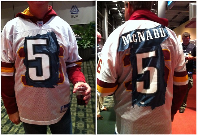
Reader Andy Gladstone is an Eagles usher, and yesterday he spotted the gent pictured above, who apparently felt moved to create something special for Donovan McNabb’s return to Philly. “I was working, so I didn’t have time to chat with the, uh, ‘artist’ other than to ask permission to take the pics,” says Andy.
In other football news from this past weekend:
• Ahmad Bradshaw tore his pants during last night’s Giants/Bears game and apparently got some on-the-spot sideline repairs. I’ve seen lots of improvised darning and mending over the years, but never anything like that — sensational. I e-mailed Joe Skiba to ask for the full story and he shot back a quick note at 1am simply saying, “I repaired the pants.” I’ll try to get more details from him today. Update: Skeebs now tells me, “The tear happened right before the half. Then I used a hole puncher and string to sew it up.” (Big thanks to Tim Burke for that screen shot.)
• Reader Kevin DeBolt documented our first torn Bears helmet decal of the season. So much for the theory that this only happen in cold weather.
• Rare sight yesterday in Buffalo, as Ladainian Tomlinson played without a visor shield. As you can also see, the Bills wore their throwbacks in that game. The Jets, meanwhile, have now worn white over white for all four of their games.
• The Redskins wore their white pants for the first time this season. Nothing wrong with that look, but it can’t compete with the gold pants.
• The Falcons wore their awesome throwbacks. That’s one of my very favorite looks in the league right now.
• The Panthers wore their blue alts. No matter what this team wears, it always looks like a USFL-ish mess to me. Wish they’d do a complete overhaul.
• I loved Air Force’s Thunderbirds uni set. Lots of photos here and here.
• Reader Jimmy Dembski noticed that Wisconsin safety Jay Valai has much smaller TV numbers than those of his teammates.
• Pitt State wore camouflage jerseys.
• Oh, and apparently the NFL was trying to tell us something yesterday, but it was way too subtle for me to figure out:
Big thanks to Phil for compiling most of those pics.
Meanwhile, over on the ice: The NHL regular season begins this Thursday, and I’ll have full coverage with two ESPN columns: my annual team-by-team breakdown of uni changes, which is up now, and a detailed look at the latest crop of goalie masks and pads, which will run on Wednesday.
Giveaway reminder: Today’s the last day for the Maple Leaf Productions artwork giveaway. Full details here.
Party reminder: Uni Watch gathering next Saturday, Oct. 9, 3pm, at Sheep Station in Brooklyn. You’ll be there, right? Right.
Uni Watch News Ticker: Weird scene in yesterday’s Pirates/Marlins game, as Bucs shortstop Ronny Cedeno wore a Spanish heritage jersey for the first few innings. It had a hologram sticker on the back uni number — did he get it from a vendor or something? For that matter, does anyone know why he wore it in the first place. In any case, he later switched to the standard “Pittsburgh” model (last two screen shots courtesy of Doug Keklak). ”¦ The Steelers will be wearing their throwbacks on Oct. 17 against the Browns and Nov. 14 against the Pats. ”¦ Reprinted from Friday’s comments: Here’s a great little piece about the first hockey helmet. ”¦ New uniforms for the Portland police department (with thanks to Phil Amaya). ”¦ Hey, why have a nice public space when you can just slap an ad on it? ”¦ I wouldn’t normally get too worked up over an Aussie rules football uniform, but wow, that is one ugly guernsey (with thanks to Chris Klein). ”¦ New basketball uniforms for Tennessee and Maryland. ”¦ Back when NFL jerseys had sleeves, teams could wear black armbands. Scott Mason figured out that the Bears wore those in 1964 for Willie Galimore and John Farrington, who were killed in an automobile accident. ”¦ The Springbok logo is moving to the sleeve of the South African rugby kit. The is the latest twist to a long saga, as Caleb Borchers explains in this analysis. ”¦ The latest entry in Hall of Fame curator Tom Shieber‘s blog has several good bits, including a rare shot of Honus Wagner wearing his cap backwards 100 years ago — an unheard of maneuver for that era. ”¦ Anthony Zogas spotted this guy in a bar. ” I don’t know if it’s DIY or mass-produced, but it has the official Super Bowl logos for each of the Steelers’ championships.” ”¦ Very interesting font for the Argentine volleyball team. Note the trident-shaped Y on No. 12’s NOB. ”¦ The Caps unveiled their Winter Classic uni on Saturday. It’s hard to see in the photos, but the jersey logo is actually one giant patch, not individually applied letters — tremendously lame-o. I’m not in love with the red helmets either (the originals were white). Good move putting the Winter Classic patch on the shoulder, though — would’ve been way too cluttered if they’d put it on the chest. ”¦ Vince Serritella attended that Caps unveiling and reports that they had little displays about each of the Original Six teams. He took photos, which you can see by downloading this zip file. ”¦ Tris Wykes notes that Penn is wearing two memorial decals. “The 40 is for former teammate Owen Thomas, who killed himself earlier this year,” says Tris. “The ‘Lake’ is for former coach and booster Dan ‘Lake’ Staffier.” ”¦ Here’s Michael Orr‘s latest round of EPL kit assessments. ”¦ Was Byron Scott wearing a swastika on his necktie the other day? Not intentionally, I’m sure, but it kinda looks that way (as noted by Hugh McBride). ”¦ New court design for Central Michigan (with thanks to Jason Bowman). ”¦ Major snafu in an AHL preseason game last night, as Charles Pannunzio explains: “Hershey and Bridgeport both came out wearing white sweaters, the Bears with chocolate-colored sleeves and the Sound Tigers with blue sleeves. Numbers only on back, no names. To start the second, Bridgeport was wearing its blue practice sweaters, which had no names or numbers. After the game, I joked with one of the arena camera guys that it’s a good thing the game was not on the radio because it would be hard to call with numbers only on the Bridgeport guys’ helmets. He responded that their monitors on the cameras are only black and white, so they were totally lost.” ”¦ Yet another black eye for the Baseball Hall of Fame: Last week one of their Joe Jackson gloves was exposed as a fake, and now the same thing has happened with a Joe Jackson jersey. ”¦ Love how the 1932 Morrilton High School football team in Arkansas incorporated an “M” into its jersey. Even better: Nemo Vista’s teams were known as the Zebras and had uniforms to match (both photos courtesy of Jim Bowles).
Even better than a Meats T-shirt: I’m not sure if this is the most perfect photo ever, but it’s certainly the most perfect caption. (Thanks for making my day, Kirsten.)
Housekeeping: Uni Watch will be closed tomorrow while I deal with a family matter. I will, however, announce the winner of the Maple Leaf Productions artwork giveaway. Aside from that, I’ll see you back here on Wednesday.
The Jets, meanwhile, have now worn white over white for all five of their games.
It’s only Week 4.
Right. Now fixed.
The Springbok logo is moving to the sleeve of the South African rugby kit. The is the latest twist to a long saga, as Caleb Borchers explains in this analysis
The article points out that the reason the Springbok is moving to the sleeve is because the Rugby World Cup patch has to be on the front of the jersey during that tournament. It says that for all other matches, the Springbok will return to the front of the jersey.
It might be useful to compare this to how Australia treats the Wallably/Southern Cross logo on their World Cup jerseys (they will use the national coat of arms on the front).
The Caps unveiled their Winter Classic uni on Saturday. It’s hard to see in the photos, but the jersey logo is actually one giant patch, not individually applied letters – tremendously lame-o. I’m not in love with the red helmets either
That might be for visibility purposes in the event conditions are snowy. IIRC, the Red Wings wore red helmets with their white uniforms at the Winter Classic.
DJ makes a good point, plus the Caps love to “rock the red” about everything now. Seeing a red helmet is a lot easier than seeing a white one from the top of a football stadium.
It’ll be interesting to see the backlash to the patch instead of individually sewn letters. Hopefully, Caps fans can pressure Reebok/Ted Leonsis into fixing these sweaters.
I’ll be sporting the legi white sweater, albeit the 1994 version, at the game. But it makes me crazy that with all the money and effort they put into it, they will go with the cheesy patch
You are link.
As much as I love white jerseys in hockey, I hate the white helmets. I wish all teams would match helmet color to pants color when wearing white jerseys.
Unusual choice of the red breezers as I don’t recall them being worn with the original jerseys (link). They had blue with white jerseys and white breezers with red jerseys for the inaugural season but switced to blue with both half-way through because prespiration would discolor the white.
The Caps wore the red pants at home with the white jerseys during part of their inaugural season. Scroll down to the pictures of Mike Marson and Bill Clement on this website; link
I heard the reason they ditched the white pants was that they were all marked up from the black pucks and the black tape on the players’ sticks. (Aside from the fact that they looked pretty gay.) But wouldn’t that apply to white jerseys and socks?
Where the hell do you get a “USFL-ish mess” for the Panthers uniforms? I suppose the tapered stripes could resemble something from the Arena league or the XFL… but not the USFL. Panthers helmet aside, the USFL uniforms were all fairly traditional. The Wranglers did have the flaming pant stripes, but even that was a couple years after the Bengals tiger stripes had shown up, so nothing revolutionary there either.
Sheesh.
I sort of like the Panthers uniforms. They’ve become a modern classic of sorts, unlike their fellow expansion team in Jacksonville, which has made a mess of their uniforms.
Jacksonville’s still in the league?
Oh, yeah, they did beat the Colts yesterday. Other than that, their primary contribution to NFL consciousness is pretty much limited to Maurice Jones-Drew’s popularity in fantasy leagues, isn’t it.
—Ricko
Well, they’re probably the future team for San Diego after the Chargers return home to LA, so they’ve got that going for them . . .
Modern classic? Eh… League didn’t need another blue & silver team with black accents. If they rehaul, they could do a retro-esque Eastern Illinois University version:
link
While EIU’s current logo is basically a ripoff of Carolina’s. Or not. Either way, both teams have generic logos.
Somewhere buried in my parents’ house is a gray sweater with that EIU logo on it.
As for the Carolina Panthers, when they came into the league, they were the link.
I like their blue over silver look. I wish they’d go to that full-time.
You mean silver & black team with blue accents. Remember, it was 1995, they didn’t have a blue jersey yet, and the Lions hadn’t added black yet.
I think they’d have probably been better off without the silver, actually.
I absolutely detest Carolina’s uniforms. The logo looks like it came from a He-Man cartoon, the tapered stripes are awful, and the silver/black/Panther Blue (give me a break) color scheme is so quintessentially 90s it’s painful.
I think the Panther’s home black uniform with the silver pants would be one of the best looks in the league IF they would get rid of the truncated stripes on the helmet and pants. I’ve never liked these and have yet to figure out the meaning. Also, Air Force looked awesome. I’m a Charger fan so I love lightning bolts, but that look was way better than current uniforms. If that switch was made permanent they would have one of the best uni’s in College FB.
Air Force, of course, has lightning bolt helmets before the Chargers (as did the Winnipeg Blue Bombers), but the point is well taken.
Namely that, as alts go, AF was one of the better concepts.
—Ricko
That being said, I’d say “No” to wearing them full time. Red is most definitely not an Air Force color. That branch of the service is based almost entirely on blue.
Hence the song lyric…
“They took the blue from the skies,
and a pretty girl’s eyes,
with a touch of Old Glory, too,
and gave it to the men
who proudly wear
the U.S. Air Force blue.”
—Ricko
I concur that the primary color should be blue. After all, Maj. Nelson’s uniform WAS blue.
“I think the Panther’s home black uniform with the silver pants would be one of the best looks in the league IF they would get rid of the truncated stripes on the helmet and pants.”
indeed. that was one of the tweaks ricko & i played around with (one of the more simple ones too) last year
works with the blue jersey and the all white as well
Living in NC I also remember the original prototypes for the Panther’s uniforms. Talk about a USFL’is mess.
At first I really didn’t understand what the Panthers were trying to do it with their uni design… Since moving to NC a few years….I still don’t!
They wanted to look different.
At the time, the only teams that didn’t have standard straight stripes were the Chargers with their lightning bolts, and the Bengals with the tiger stripes. No one had a tapered stripe of any kind.
…and probably something about claws
I think the Panthers problem was maybe the choice of that particular shade of blue……
I’m shocked only the sticker is off of Jay Cutler’s helmet after the beating that he took last night!
Any chance Cutler slept standing up last night? Y’know, figuring he’d spent enough time on his back yesterday?
—Ricko
Maybe he slept propped up, locked in a broom closet?
The Steelers jersey with the 6 Super Bowl logos is mass-produced, not DIY. I saw it in a couple of stores last year.
link
I saw no fewer than 4 people wearing those at the Bears/Steelers game I went to last year.
Also, when I was at Disney World last December, I think half the state of Pennsylvania was there. I saw a few of those jerseys plus tons of Flyers, Phillies, Eagles and “regular” Steelers garb (sadly, no Steagles).
The Aussie Rules jersey is the Fremantle Football club jersey which is a call back to the original Fremantle jersey (that they use for the heritage round each year, which is usually white with the lines red). They used to have an anchor on the chest as they used to be called the ‘Dockers’ (big ship yards in Fremantle, Western Australia) but had to stop because it infringed with Dockers pants, because y’know how people get Aussie Rules football teams and pants mixed up.
I think they’re going towards their goal of being predominantly purple and white as they have a ‘Purple Haze’ promotion for home games. Plus changing kit suppliers with ISC taking over from Reebok might’ve had something to do with it.
I mentioned the gurnseys in question late Friday/early Saturday AM with the following (sans link):
“Today’s Aussie Rules new 2011 jumper brought to you in Paul’s favourite color (note the Aussie spelling) by the Freemantle Dockers.”
“Reader Jimmy Dembski noticed that Wisconsin safety Jay Valai has much smaller TV numbers than those of his teammates.”
I’m sure there’s an NFL rule about it, but does the NCAA require all players to wear TV numbers if it’s part of the standard uniform. A lot of teams don’t have them at all.
They don’t have a problem with multiple players wearing the same number (as long as they’re not on the field at the same time) and also allow players to change numbers during the game (Michigan vs BGSU one of the #2s that caused the penalty switched).
Anyone who doesn’t think “fashion fad” often trumps common sense need only look at the Falcons yesterday. How can anyone associated with the team honestly think their regular uniforms are better looking than their throwbacks.
link
Seriously, you have to be totally caught up in “trendy-cool-hip-follow-the-crowd” to prefer the regular set.
—Ricko
Seeing them play the 49ers is just further proof that sometimes the classic look is indeed better. How much better do the Niners look with their classic jerseys?
Or you could just be living in the past. :P
I think the modern logo is better, and, probably thanks to my first football watching being in the 80’s, I do kinda prefer the Falcons in red rather than black. So… while the throwback is better overall… the current isn’t that bad either.
…and the Niners are a big step backward, and the cut off sleeve stripes look stupid as hell on jerseys with sleeves. There was absolutely nothing wrong with their previous uniform.
New and More aren’t always better.
Aren’t always bad, either.
Current Falcons jerseys (not the color, mind you, but the design and the way the colors are combined) have a bit of the look of the Palace Guards for the Queen of Hearts.
Which if fine. For live theater.
Lest you think I hate everything new…
It’s good to see the Rams’ fortunes looking up once in a while because, with either white pants or gold, that’s a classy uni set. One of the first to “go modern” after the Broncos, they did a nice job of it. Most teams wearing navy and old gold opt for gold helmets. Rams don’t. Nicely unique that way.
—Ricko
Now if the Rams only played outdoors at home.
Those unis would look so good in sunlight instead of that “viewing through a layer of bleu cheese” sensation we get when watching them play at home now (Metrodome was the same way early-on).
—Ricko
Ricko — About the dome games. I CANNOT STAND watching baseball or football games in a dome, nor even games on turf. Any game with at the Giants’ stadium looks horrible on TV, just horrible. Loved watching Alabama and Florida bang it up on grass the other night.
The Rams’ gold numbers look ridiculous with the white pants.
Same for the Eagles, the Kelly Green was fabulous in week 1.
and do we dare mention a disaster like Oregon?
Sadly it appears “fashion” has usurped tradition in every respect uni-wise
There’s nothing inherently great about tradition. Some traditions are good, some not so good. In the case of sports uniforms, they’ve always been in a state of constant change. Teams like the Yankees are the exception, not the norm. You mention the Eagles and the kelly green… let us not forget their original colors were blue & yellow.
Staying in the NFL, despite all of the changes, nearly every team is still easily identifiable to someone from 1970 (minus the expansions of course). The Chargers still have lightning bolts, the Eagles still have wings.
Change *is* tradition. Uniform research would be incredibly boring if it wasn’t.
Doesn’t common sense and good taste need to rear its head once in a while??
Exhibit A
link
to
link
What’s your point?
So the spectrum of teams by uniform looks something like this:
Yankees——-Everyone Else——-Oregon
On one side, the team that never changes, on the other…
Everyone else falls somewhere in between.
That’s kind of what I said. Although things like Nike’s apparent obsession to, whenever left to their own devices, eliminate straight-line striping is a far more radical departure that anything I remember. As such, it’s difficult not to ponder and discuss whether WE are changing in what we like, or whether Nike and others are TELLING us what we should like.
For example, how can anyone look at the ridiculously truncated jerseys some of the Colts are wearing and say, “Oh, yeah, those stripes are just like what Johnny Unitas wore”? Any real designer who would contend that is either blind or a liar.
As to the Eagles powder blue and gold, that was pre-TV. And I still say that the CVE (Common Visual Experience) I talk about is a valid concept. In one day, more people now see the Eagles play than saw them play entire seasons in powder and gold. Sure, people KNEW what color they wore, but it all was filtered through the black and white still photo lens or the radio.
Pre-TV uni references are valid but, comparatively speaking, they absolutely were not a national mutual viewing experience.
What I’m saying, I guess, is that real uni-watching didn’t get started until TV came long, and maybe not truly until color TV. Without TV, it was virtually impossible, and that makes those pre-TV unis almost cave paintings by comparison…seen, and appreciated, by very few.
Know what I mean?
—Ricko
Nothing great about tradition? See us in 20 years, my friend. Or sign up for a hitch in the service, where we value tradition like few others left in this country.
No Geeman, there’s nothing great about tradition. There’s also nothing bad about tradition. Tradition simply is.
There’s a ton of examples in our history of “traditions” which are no longer practiced for various reasons. Some traditions are good, some aren’t.
They do look good. Similiar to when UGa. wore black jerseys a couple of years ago, only with silver pants.
A red jersey with a black helmet, in that old Falcons design, would look good too.
The current Falcons uniforms are not horrible (unless they break out the dog-fighting all-black outfits), but the old ones are clearly better.
If Atlanta switched to these throwbacks full time, they’d have to get serious consideration as the league’s best looking team. The Falcons’ current uniform isn’t the worst in the league – I’d say they are second worst, with the Bills holding the top (bottom?) spot. And yes, I think that means they look worse than the Bengals. So the difference between the regular uni and the throwback is just jarring. One is solid, clean, striking and dignified, while the other contains all the overdesigned elements of bullshit you find in the arena league.
How anyone can possibly prefer the drunken Falcon/swooshy, swoopy mess they now have is beyond me.
” The Redskins wore their white pants for the first time this season. Nothing wrong with that look, but it can’t compete with the gold pants. ”
Other than the fact they’ve been wearing them (granted, the white pants not all that often) for more than 30 seasons, and it’s the “dark jersey” version of the unis of their most recent Super Bowl teams.
The old pants ARE fun to see, though, as are the striped socks…but neither are designed to be worn with the current jersey, so they’re still a bit of a gimmick, if you know what I mean.
—Ricko
Very disappointed to see the “return” of the white pants. The return to gold pants, I suppose, must just be for home games. I had hoped they’d go with the gold pants any time they wore their dark jersey. As for the “most recent Super Bowl teams,” yes, but that was now almost 20 years ago. Their record in the current set since 1992 is downright abysmal. I say bring back the gold pants permanently (but maybe not the “new” striped socks. The plain burgundy socks with the gold pants would be a better look.) Either way, Redskins in white pants gets a great big “meh.”
I kind of like the gold Skins pants, but I prefer the white to be honest. In my lifetime (just a hair under 28), I’ve been used to the white, so that’s it for me. I think the gold pants could be nice, and MUCH better with a matte finish, not the shiny material. i think the shiny yellow gold under the drab maroon just looks off. These are not mid-90’s basketball warmup pants.
New uniforms for link (with thanks to Phil Amaya).
First off, I know it’s not a sport, but I love when the Ticker mentions developments in police, military, etc. uniforms, since trends in unis anywhere tend to have ripple effects in other uni fields. (The very first baseball unis, for example, which are really the first place where the idea of a sports uniform appear in American culture, were often explicitly modeled after fire brigade uniforms.)
Anyway, I’ve always thought that a two-tone uni, such as the light blue shirt over dark blue pants the Portland police now wear, or the tan shirt over brown pants many county and state police forces wear around the country, looks more like a police officer. A monochrome uni, such as the unis Portland may switch to, to me looks more like a military or paramilitary uniform. For example, even when a police force wears light-over-dark uniforms for regular duty, its SWAT team will usually wear a monochrome uni. I much prefer the less-militarized look of the two-tone cop uni.
I certainly can understand their reasoning for the change, but it strikes me as just another example of the encroachment of Generica.
“the encroachment of Generica”
I think that was painted by Picasso.
Ah, “The Encroachment of Generica.”
Is that a five-yard penalty? link
I remember when NYPD used to wear light blue shirts over navy pants. The mayor and police commissioner were quoted as saying that they looked like postal workers or securiy guards.
link
When they switched to navy monochrome, I think they even used the term “more military like”…or some phrase like that.
link
It was also the end of light blue when they decided to ditch the light blue police vehicle color. They said leaving the cars factory white would save a whole bunch of $$.
The all-navy look seems popular with big-city fuzz. Of the 30 largest cities in the U.S., 22 municipal police departments employ some variation of a solid navy blue patrol uniform, with Portland being the latest, Los Angeles being the link, and Chicago the link…
Huh, the police thought they looked too much like security guards? Does the NYPD understand its mission as something other than safeguarding the security of New York? And given that I see way more rent-a-cops in solid unis than two-tone these days, is the NYPD planning to switch back?
I mean, if you’re in trouble and you need help, you can be pretty sure that whether the first guy you see in a two-tone uniform is a cop, a postal carrier, or a private security guard, he’s going to do his level best to help you, or find someone who can. The same cannot be said of the first guy you see wearing a matching navy top and slacks, since the majority of men’s suits are dark navy!
But to get back on topic, it’s interesting that Portland’s reasoning seems entirely dictated by manufacturer issues and supposedly superior fabric performance. (Since so many departments wear light blue tops, why doesn’t the manufacturer simply offer his shirts in light blue as well as navy? Presumably the same reason Majestic couldn’t be bothered to make its new baseball jerseys available in, you know, gray.) So the classic looks-like-a-cop uniform that has defined “peace officer” in the public conscience for a century is being killed off by the non-sports equivalent of Reebok or Nike templating.
Philly is light blue over navy in the policewear.
Having grown up in Jersey….this uniform will always be the embodiment of AUTHORITY:
link
I must take exception to the phrase “USFL-ish mess” as an oxymoron. The USFL had excellent uniforms across the board; not one “mess” among them. The only one I didn’t like was the 1984 Oklahoma Outlaws’ black-over-black, but that’s because of the monochrome look, not because it was a “mess.”
Take any USFL uniform and hold it up next to, e.g., the Titans’, the Broncos’, the Cardinals’, the Falcons’, the Bengals’, the Bills’, the Vikings’, or the Jaguars’. I don’t think you can reasonably call any USFL set a “mess,” let alone compared to those.
No, in retrospect, the USFL had some pretty decent unis. Outside of the Orlando Thunder, that is.
I think he might want to re-phrase it as UFL-ish mess, or Arena-ish mess.
Thunder was WLAF.
And there was nothing wrong with the Thunder, either.
I agree – “USFL” and “mess” are contradictory terms. I wasn’t a fan of the Gunslingers’ logo, and yeah, there were way too many red teams, but other than that, I found nothing wrong with these wonderful unis:
link
And thanks to a purported Aprils Fools Day joke in 2009, the Seahawks werwe to wear them on a certain blog kept by some guy named Paul Lukas…
Hoping for green-over-white next Monday night. The Joe Walton era was pretty drab, wearing white in almost every game. Still holding out hope that the green pants have been retired for good.
My best guess for Cedeño wearing the Piratas jersey is that yesterday was the anniversary of Roberto Clemente’s last MLB game (Oct. 3, 1972). Any better theories out there?
Got his 3,000th hit that day. 3,000, right on the nose.
Hard not to get a sense of destiny, or something, about that.
Imagine such a great ballplayer frozen forever at 2,999.
—Ricko
VIVA Clemente! A great ballplayer, an even greater man! There is not a player in any league today who would risk his contract, let alone his life for people in a country that wasn’t his own. Number 21 should be retired by all of MLB. His sucess opened the door for Latins in baseball, in much the same way Robinson did for African Americans.
Ill get off my soap box now :)
Amen.
RIP, Roberto!
In regards to the Cedeno jersey, that hologram sticker on his number is part of the MLB Authentication Program (link). An MLB representative will place these tamper-proof stickers on the item to ensure their authenticity.
Each item has a unique code that you can enter into the database and will tell you what game the item was used and who it was worn or used by. The information is very specific – I have a cracked bat that tells which at bat it was used in during the game and what the result was.
The one-off jerseys, such as throwbacks usually get marked, so I’m guessing somebody marked it but the jersey was put back into the bag and it was placed in his locker by mistake.
I am pretty sure I saw a similar hologram on the number of one of the Washington National pitchers this weekend at Shea. (Sorry, no pics; trying to remove images of this season from my memory.) I didn’t think much of it until I saw Brandon’s comment. I could see putting a hologram on a special bat, cap, or uniform that may be sold as game-used (for charity, I would hope), but I don’t think there was anything special about the Nats pitcher that would warrant the involvement of MLB authentication.
Kevin Burkhardt had an (in-game) interview with an MLB authenticator during a recent Mets telecast. The guy indicated that they stick holograms on balls and such that are used in significant plays (eg: unassisted triple plays, last plays of no hitters). I can see them marking the ball when a player gets his first hit but I cannot imagine what might have been special about the Nats pitcher.
The NOB and number font on the Argentine volleyball team is the same one used in the Spiderman movies of Tobey Maguire. Just thought it looked familiar.
I’m sorry for this, but it’s a pet peeve of mine. It’s link, not Spiderman.
Good catch on the link, though.
I don’t mind the pink as long as it’s relegated to the accessories incidental to the uniform. Gloves, towels, sweatbands, even the shoes are somewhat incidental to the uniform, because they can be modified according to personal preference or endorsement contracts. Putting pink on the uniforms however, is unacceptable. What reason is there for the captaincy patches to be pink?
So that that jersey may be auctioned off at a premium for Breast Cancer Day, I suppose.
(eyeroll)
There’s no reason for any of it.
How many billions of dollars does the NFL pull in every year? If they want to donate for cancer research… great. Do it. That doesn’t mean you need to put out a bunch of stupid pink crap to tell everyone you’re doing it. Seriously, I wonder how much money is completely wasted on the production of all this pink garbage when it could have just been directly donated instead.
Of course, I don’t see why breast cancer is any more important than any other type of cancer, but whatever.
Sometimes you gotta show off how concerned you are. And, yeah, it rings more than a little hollow.
One of the great revalations about such things for me came when I was in college, doing a community theater production of WEST SIDE STORY in 1967. There was a black guy in the cast and when he and his wife showed up at a cast party, to everyone’s surprise she was white.
I remember the Director (who’d been my high school dramatic arts teacher) turned to me and said out of the corner of his mouth, “Lotta disappointed people; they were looking forward to meeting another person they could be liberal with.”
So, yeah, sometimes it’s about loving the opportunity to wear something on your sleeve. Or in this case, your feet. Or your chin strap. Or…
—Ricko
I was wondering what happens to that mountain of gear after it’s used for one day.
If they auctioned it off afterwards and donated the proceeds, that would have a huge multiplier effect, IMHO.
Ah, to answer my own post, apparently that’s exactly what happens:
link
But isn’t it to raise awareness for the cause. For people who may not realize that breast cancer is a big deal, or for kids who don’t know what cancer is at all? They’ll say, ‘Hey, what’s all the pink stuff for?’ and someone will explain it to them. Producing all the extra gear keeps the people that design and produce them busy and employed, as well.
And you can buy the link as well.
That Steelers jersey is a mass-produced Asian knock-off.
A little bit like most Nikes then, huh?
—Ricko
“I loved Air Force’s Thunderbirds uni set.”
So did I. Those helmets were awesome.
link
Today’s ESPN column — the NHL season preview — is up:
link
Y’know, the Isles have actually been doing the 4 stripes on the Y thing for link.
Not on the ice. Check last season’s game photos and see for yourself.
It’s not easy to find ones that clearly show the crest, but the four stripes are visible in link.
Oops. I meant to link to thelink
Yeah, but that was the throwback jersey, which didn’t have the four stripes on the shoulder to begin with. They’ve now scrapped the shoulder stripes from ALL their jerseys and added the fourth “Y” stripe to ALL their jerseys.
Maybe I should’ve made that clearer in the column….
The Sabres have stars on the center red line now. The only possible reason I can think of is they host the World Junior Championships in December.
The new road jerseys are a visual train wreck but, yeah, the slug is gone.
Bad move on the Oilers’ part. The bookends look better when the letters go downward and look even worse when you put your location in between the upward bookends. It looks even more like an AHL logo now.
I missed this, but it was sent to me – Packers have new numbers on the back of helmets:
packersuniforms.blogspot.com/2010/10/if-found-please-return-to.html
“Mike Opat, who chairs the County Board, said the 2,800-square-foot sign will “cheapen” the public art and spirit of Target Plaza.”
How did he keep a straight face when he said that. There’s a point in there somewhere, but you can’t seriously complain that a new ad on Target Center which is visible from Target Field cheapens Target Plaza (unless maybe you work for Target).
Exactly! I’m not endorsing the gigantic ad, but the irony/gall of the Twins to complain about an ad ruining the integrity of “target” plaza…Especially when we all know if the Twins owned that building it would be littered with ads!
Getting back to the St. Louis Rams, they do have some inconsistent striping on their three pants. Gold should have blue stripes, similar to the width of the gold stripes on the blue pants. I would abolish the white pants entirely.
In a perfect world, the Rams would revert back to yellow, I don’t understand the switch to gold. It’s always been my understanding blue and yellow have been the original Rams colors, dating back to the 1940s.
tis true the rams have been royal and athletic gold, but there were several times the rams wore white pants with gold and a long stretch of years where they were just blue and white
so those white pants are just fine, thank you
Yes, those 1960s Rams uniforms were sweet. It’s a little surprising they haven’t been used as a throwback yet, I recall the ’94 Rams had the yellow jersey with white pants.
I believe the Rams scrapped the white pants in 1973, when they brought back yellow, and changed the helmet, too. LA brought in John Hadl from the Chargers, and he had a great year. I think the Rams stunned Dallas in the season opener that year, but the Cowboys ended LA’s season in the playoffs.
Have posted this several times., but worth posting again.
Theere was stretch there when the Rams wore white pants with blue jerseys, too. Was right after the league mandate for a white jersey for all teams…
link
First appearance of gold pants in team history was ’72 or so, along with the intro of the ramhorn sleeve jerseys.
–Ricko
I dig the current Rams’ uni, but I wouldn’t mind seeing the Ramhorn (I’m sorry, Ram-Horn) sleeves – if the jerseys had sleeves!
Don’t mind the gold, as the bright yellow reminds me of Vince Ferragamo and Warren Beatty.
Not with those gold #’s.
The rams original colors were actually red and black, but they switched to blue and gold soon thereafter.
The Rams’ original colors were blue and white, going back at least to 1940, according to Creamer. It doesn’t say what their colors were from 1936-1939 though.
Rams started in the NFL in red & black.
Went to a rather dark blue and gold in 1938.
Then went to a slightly lighter blue in 1939.
Went to a yellow/gold with the blue in 1941 and stayed that way thru 1963.
In 1964, dropped the yellow and went just plain blue/white thru 1972.
In 1973, brought back the yellow/gold and kept that thru 1999.
In 2000, dropped the yellow/gold, brought in vegas gold and darked the blue a bit and have worn these colors ever since.
After more e-mailing with Joe Skiba, I’ve whipped up a short piece about Ahmad Bradshaw’s pants:
link
Repairing pants with a hole punch and string?
Brilliant!
I’m watching the Carolina Hurricanes vs. SKA streaming on NHL.com. It is really tough to read the dark red uniform numbers on the backs of the dark blue SKA jerseys.
But it’s good to see Evgeni Nabokov again.
Re Ronny Cedeno’s Piratas jersey. Odd that it was a road jersey with the team name, though if he did it to honor Clemente as suggested, kudos to him.
As for putting the button up jersey over his head … is that a common thing? I tend to, you know, button up my button up shirts, and, with my pullover shirts, I tend to pull them over my head. Am I strange?
I’m sure its common if you’re in a hurry…
Someone hands you a jersey that’s already buttoned up and says “put this on NOW” it’s easier to just pull it on than to unbutton and re-button. Who knows if that’s what actually happened or not though.
…and you’re posting comments on Uni Watch, of course you’re strange.
I’d at least open the top button to get my head through though. He looks like he’s having some trouble there.
A series of photos from my trip this weekend to historic Franklin Field on the UPenn campus. The Quakers beat visiting Dartmouth in OT. I love the feel from the surrounding statues, engravings, etc. link
Great shots. Thanks for sharing.
Ahh, the Palestra. In my less lucid moments, I often wish Ohio State would return to link to play hoops, but then I realize that would never happen. (IMG 2368)
How many fender-benders has the Helmet Cart had? (IMG_2366)
Now that’s how a referee should look! (IMG_2452)
Nice stuff! My father attended Penn, so it’s nice to those campus shots.
I am really hoping to get a chance to see a game at the Palestra this year. I love Villanova basketball, and I like LaSalle, too, but seeing any Big Five school play there would be a treat. Just wish they threw the streamers on the court after the first basket, but they stopped that after things got out of hand.
Watched a Flyers game the other night (home game) and noted that for the long TV shots, an automobile sponsor is now projected onto the glass behind the nets a la the green screens behind home plate. It is not visible on shots from ice level or from the corners. I noticed this last season on a game from the Garden that was on VS and thought VS were the ones behind it. I find it kind of distracting. Wondering if this becoming the norm on all NHL telecasts both local and national?
We talked about that douchebaggery a few months ago, and it’s sad that CSN Philadelphia (where local sports and infomercials come first) is now getting in on that.
Great NHL column on ESPN.com I actually really like the Sabres contrasting color nameplate and number stiches. I think thy are small and subtle difference that give the sweaters real uniqueness while enhancing the look. It is hard to stand out with 30 some odd teams all virtually having the same style of NOB font and number style, so this is a refreshing difference. The Red Wings have vertically arched lettering which is lauded, and now the Flyers and Sabres have contrasting color nameplates. They are easy to read and add a splash of color. Nothing bad with Yellow and Royal Blue!
The Ravens wore white over white for the first time in the Harbough era (i think). They also had link accessories, except for link on the coaches.
link
Actually they had link on the helmets. Like the article says they plan on wearing the accessories this Sunday.
Just saw on ESPN a little while ago that Southern Cal won the trademark battle over South Carolina on the SC baseball hats a while back. I know we talked about it before, and it all seemed a little silly to me, but I’m assuming the courts have their reasons.
Even if one party has prior claim to a trademark, if both are established and one is more publicly recognized, then it has priority, no matter which one came first.
OK (obviously I have a lot of time on my hands today), lemme see if I can get the other 7.
Houston
New Orleans
Philadelphia
Columbus
Seattle
Washington
El Paso
Is link in the top 30?
In fact, among all the police departments that have jurisdiction in Houston, only the Metro Police wear solid navy.
HPD wears powder over navy:
link
The Constables wear navy over khaki:
link
Metros wear solid navy:
link
Harris County Sheriffs wear navy over khaki:
link
The Rangers are generally plainclothes or wear navy polos over khaki.
I know constable can be a general term for a peace-keeping officer and the positions varies from place to place….but when I hear the word “constable”…this always comes to mind:\
link
In Houston, it’s basically another sheriff’s department, except it’s administered by the city, since Houston covers parts of five or so counties. The Constable is elected and then the deputies are hired. The purpose they serve in Houston is mostly as government process servers though. They serve official writs and government subpoenas and occasionally help evict people. I guess it frees up HPD to do the more important work.
And I’ve never met one named Bobby.
I’m not in law enforcement, but one time our department had to dress in black to achieve our objective, and we succeeded. Sometimes in life, it’s good not to be seen.
Tampa PD wears solid navy.
Hillsborough County S.0. wears white over green.
Note to NFL teams: If you’re going to wear throwbacks, don’t do it in October. The pink kinda takes away from the throwback-ish appeal.
Excellent point!
I was going to post the same thing! Really ruined the look for Buffalo and Atlanta yesterday.
But now everyone is a lot more aware of this breast cancer thing so it’s all worth it.
Ok, someone over at the GUU just posted this, and I have been waiting to find a great pic. of this absolute link. Someone said it’s like a modern day take on a link. I’m thinking more like a modern day grill off a Mac truck. The Giants are all over the place with their helmets, love it.
That’s it, I’m done. I’m sick of explaining Keith Bulluck’s and Chris Canty’s facemask predilections.
Sorry I missed your write-up(s)on this mask(s). Probably due to the direct correlation between the amount of content on this site and that most people don’t give a shit about face masks. ;o) Not your fault, or mine, just a fact.
It’s not that. It’s just that someone asks about it every day.
If you’re sick of people asking about it everyday, quit reading the comments everyday. Or you could become more patient. You were one step away from calling someone an EABOD.
I have to believe that in the case of Ronny Cedeno, he should be looking at a fine from the league for wearing a uniform not conforming with an approved league model.
If you remember when the Red Sox made their first World Series run, umpires went into the dugout to make sure Francotta was wearing a full baseball uniform, fining him if they felt he was wearing something otherwise. Officials have cracked down on players who have placed individual markings on their uniforms, such as hats, that independent of what the team has approved, or even cracking down on players with hats and batting helmets where the the logo was obstructed.
In addition, every league has approved wardrobes, incl. what can be worn together. In the MLB, undershirt colors must be consistent on the field, even alternate jersey tops must be worn with the same style of pants. One-off items may be worn up to three times in a given year (but their usage must be signed off) otherwise they need to go through the three-year approval process.
Francotta?
Terry Francona has his own brand of cheese.
Oh crimony, it’s the last game of the season and it’s the Pirates — nobody’s gonna bother to fine him.
Also: Umpires didn’t check up on Francona in the dugout. MLB exec Bob Watson did.
2 employees at a sports talk station in Dallas (KTCK) had a bet. Loser had to wear this to work for a month:
link
It could have been much worse…
link
while searching for something else, i came across this training camp photo of the giants with their stupid timex patch
that’s a really weird cage the guy is wearing, anyone know more?
jdreyfuss is gonna have a fit now. Nice timing Phil. ;o)
NERDRAGE :P
Oh, I know a little somethin’ ’bout some NERDRAGE.
Is it just me or did those pink towels make it seem like flag football was being played yesterday?
link
Not sure if they still do this, but I came across this shot of the Texas A&M University sporting some nice hosiery.
This photo is circa 2007 so things might be different now, I’m not too sure.
link
Mildly surprised (and extremely relieved) to see the Pats haven’t changed their facemasks from red to pink for tonight’s game.
Don’t give them any ideas.
When a standard part of the uniform is changed, they’ll officially have pinked the uni.
They pinked the captaincy patches. Do those count?
I would say no because that’s not standardized across the league, in that not every team wears them. If the did change the facemasks or have them change trim colors to pink, that’d be pinking the uni.
This is pinking the uni: link
I hear ya LI PHIL, I’m cool with a pink helmet decal, pink wristbands, pink NFL ribbons painted on the field but, what I saw over the weekend was totally OVERDONE IMO. (pink chinstraps? shoes? shoelaces? gloves? my goodness, it almost was a distraction trying to watch the games)
Really liked the NHL preview on espn. Some noted improvements made this year (just common sense moves, really). A long way to go to regain respectability, but there’s promise.
id actually be aight with the pink if it was just for one weekend
i assume (and you know what happens when one does that) this is a monthlong pink-a-thon?
anyone know the protocol for the dolfish’s uni proclivities? do they wear aqua in night games (or games started at 4:00 and later?) or have they pretty much settled into a dark at home routine these days
It’s supposed to be all month long. I’ve heard the announcers say that in every game I’ve watched this weekend.
oh good
what month is throat cancer awareness? colon cancer awareness? testicular cancer awareness? pancreatic cancer awareness? prostate cancer awareness? brain cancer awareness? lung cancer awareness?
can we fill each month with a cause?
you see, i have no problem with a day or even a weekend to raise awareness for ta-ta cancer, but when it’s made into an all-encompassing obsession, and at the expense of every other cancer, i do have a problem with it…
what about say, autism awareness? will teams wear those jigsaw puzzle things on their helmets?
how about aids awareness? haven’t heard much about that recently…i guess the scientists have cured it, right?
no?
enough with the pink
I threw a comment about “pink noise” yesterday, but it’s still worth mentioning that “male cancers” – ones the boys are more likely to get – a waaaay more funded than “female (re: breast) cancers”.
SB
not sure what you’re saying…are you saying that breast cancer is not funded as much as the “boys” cancers?
seems to me breast cancer is still #1…by a large margin
and that’s just federal funding…i believe breast cancer funding outstrips all others by quite a large margin when you factor in the private foundations
don’t get me wrong, i’m NOT saying breast cancer research, funding and awareness isn’t worthy or warranted…but it does seem, and i believe the numbers back me up, that it is by far and away the most highly financed…possibly to the detriment of the other cancers
i realize pancreatic cancer isn’t as common, but it is FAR MORE DEADLY than breast cancer…i don’t see any big outpouring of support for research or funding for that one tho
I would have said “the pink looks like shit” and it does, but I couldn’t pull it off without sounding like a dick. But any promotion of any specific cause looks like leery special interest group lobbying, the very thing that shouldn’t influence politicians or corporations & businesses. But special interest groups only care about one thing, and that’s promoting their cause, and they will do it / guilt it anyway possible to squeeze a penny out of people.
damn, mark…you said that a LOT better than i did
“can we fill each month with a cause?”
Phil, after just a random calendar search just to find out Federal holidays, not only is each month somebody’s cause, but each DAY, week and month has multiple causes. Didn’t know my bday was National Pretzel Day – nor did I give a shit.
This, is just plain ridiculous:
link
Hey you farted? There’s probably a day for that, too. Any old lunatic will think of an idea and make it a holiday.
Is it me or is the Dolphins drop shadow noticably less drop shadowy than in recent years????
You may be on to something, the Dolphins haven’t been on national TV as often as they were during the Dan Marino era.
Speaking of TV football coverage, we don’t need songs constantly during the telecast. And ABC, please put Hank Williams, Jr. on waivers, and restore the classic MNF theme. Also, please don’t speed up the MNF theme as the announcers pitch to breaks, it sounds horrible.
I want to say they made that change in 2006, but I’m definitely not 100% sure on that. I know it’s not new to this season.
Still better than SNF desecrating “I Hate Myself for Loving You.”
what was that skit they did, i think it was a rave on drunk white people…where they only know like three words of a song…cutting crew comes to mind
Wikipedia has the answer: “For 2008 the navy blue drop shadow on the uniform numbers were thinned in order to make them easier to read.”
Special 125 anny kit for Milwall FC:
link
SB
I am still lobbying for “Day Day”. A day in which we just celebrate a regular day. A day with no holidays, no interests, nothing remembered, etc.
The official mascot of Day Day:
link
That reminds me of something.
Would you send your child to link?
I sure as hell wouldn’t. They may be fantastic for all I know but that creepy logo is enough to send me in the other direction.
yeah…it’s the logo…ok
Good lord, they even made the post game press conference backdrop pink. Seriously? To what end?
“Thank you fans” painted in foul territory of New Shea Stadium. Caught it on the highlight reel.
Question about the Dolphins helmets in tonight’s game vs the Patriots: Chad Henne was clearly wearing a helmet with some iridescent sparkle in it (similar to the metallic Patriots helmets). I know that didn’t use to be part of the Dolphins scheme: the NFL shop still sells an “authentic” helmet that is solid semi-gloss white. Did I miss a uniform change?