Time for another blast from the football past, courtesy of photo archivist extraordinaire Robert Harvell. Dig:
• Why would you have your uni number on your helmet twice?
• We’ve all seen pics of Hank Stram wearing a blazer with a Chiefs patch. Until now, though, I’d never seen a player wearing one.
• And speaking of team blazers, it’s a little hard to see, but that’s a Steelers crest (“P S”).
• Interesting to see the Packers’ old primary color (navy) and their new one (green) together in the same shot.
• Philly fans, this one’s for you.
• Here’s a rare find: Bears and Rams letterhead.
• I don’t much care about the CFL, but I’ll always make room for this uni.
• Here’s a puzzler: The 1939 World’s Fair was in NYC, so why would the trylon and perisphere be shown on a Bears jacket?
• Proof that Y.A. Tittle once had hair. He’s the “I.”
• Yikes — fix that facemask.
• Always amusing to see athletes doing the isometric thing in those harnesses.
• Love the “M” logo socks.
• Wichita State briefly wore this really odd uniform — ram’s horn jerseys with tribal-stripe pants.
• Smokin’ in the boys locker room. Additional examples here and here.
• We’ve all seen Dymo labels on players’ helmets, but how about on the coach’s sunglasses?
• I’m not sure what to make of this one. The defensive player’s socks and uni numbers are pure Broncos, but what’s with the pants stripe?
• Oh baby, check out this awesome promo shot of Mercury Morris earning his nickname!
• Interesting jaw pads on Don Maynard’s helmet. “That helmet recently sold at auction for $6500,” says Robert.
• I’d completely forgotten — if I ever knew — that Billy White Shoes Johnson wore glasses for part of his career. Here are some additional shots of him wearing specs.
The worst-kept secret in the uniform world: As various NBA-related photos have trickled out over the past few months (from the rookie photo shoots, leaked photos, etc.), many fans have noticed some changes in the jersey fabrics, especially on the uni numbers. This is a league-wide change, and I’ve known about it for the past year or so. But I haven’t been allowed to talk about it until today, when the NBA will finally present all the details at a media event at the NBA Store in Manhattan (which I believe is being live-streamed on NBA.com at 11am eastern). I’ll be attending the shindig and will have several installments of ESPN coverage: a Page 2 blog entry this morning at 10am, another P2 blog item later this afternoon, and a column tomorrow.
Today’s unveiling is actually the NBA’s second media event for the new fabrics. The first one, which I also attended, was held two months ago (mainly so magazines with long lead times, like Slam, could be up to speed on things) and was very hush-hush. Anyway, Josh Smith of the Hawks was on hand to discuss the new fabrics, and I got to interview him after all the boring corporate people made their boring corporate speeches. As he and I talked about various uni-related issues, he told me something pretty funny, which I can finally share with you now:
Josh Smith: Mike Bibby, he needs a new pair of socks every game. Even for every practice.
Uni Watch: Because he can feel the springiness in a new pair of socks..?
JS: Naw, he’s like a semi-germophobe. Semi [chuckles] — I’m gonna say “semi,” cuz it’s not all the way, know what I’m sayin’? But he has, uh”¦
UW: Issues?
JS [laughing hard now]: Exactly. He has some issues. He has to have, like, new everything. Everything has to be, like, up to date.
Smith, incidentally, struck me as fairly thoughtful, serious guy. Count me as a fan.
Giveaway reminder: I’m currently giving away a free print from Sports Propaganda. Details here.
Recommended Reading: Webmaster John Ekdahl has recently been putting together a site for another client. It’s about the visual presentation of politics (“Sort of Uni Watch for politics,” says John) and it’s called Polioptics, which is a pretty ingenious term. It’s an interesting site — definitely worth checking out.
Uni Watch News Ticker: Yesterday’s entry about Rick Friedel’s experience as an Orioles batboy prompted Patrick Haugh to send in this photo of himself as a Chisox batboy-for-a-day in 1985. ”¦ Good article about the brisk turnover of EPL kits (with thanks to Joseph Lichterman). ”¦ The Milwaukee Wave — that’s an MISL team — will not have a standard home jersey this season. Instead, they’ll wear different jerseys tied to local charities for each game (with thanks to Matt Krantz). ”¦ What’s the best thing about Oktoberfest? Super-textured uniforms, natch (big thanks to Charlie Shields). ”¦ Who says Habs and Leafs fans can’t get along? (Gorgeous old ad found by Bruce Menard.) … Very interesting article about how much it costs to outfit the Indiana football team (with thanks to Stephen DaFoe). ”¦ Walt Keys has created a series of retro-themed Ohio State posters — one for each game on this year’s OSU schedule. He’s also selling hand-screened versions of them on Etsy. “Only the Miami print is available for now, but I’m planning on printing more as the games approach, and i will make them available the week leading up to the match-ups,” he says. ”¦ Exhausted after a workout? Good news! You can now spend hundreds of dollars on specially designed recovery gear (thanks, Ek). ”¦ New hoops uni for Maryland? Maybe (with thanks to Ned Belliveau). ”¦ On Friday the Angels will unveil their 50th-anniversary logo, which will be worn as a patch next season. I’ve seen it, and it’s pretty nice. In addition, they’ll display their 2011 uniforms, which are pretty much the same as this year’s except for (1) the anniversary patch and (2) the halo on the “A” on the caps and jerseys will be changing from silver to gold. Details here. ”¦ Reprinted from yesterday’s comments: Great analysis of the Cardinals’ uni numbers. ”¦ Lovie Smith has been wearing this groovy throwback shirt for his post-game press conferences. Plus he’s been spotted in this T-shirt, this throwback polo, and so on. Lovie loves the throwbacks! (All this courtesy of Ben Isaacs.) … The Broncos will memorialize Kenny McKinley with white helmet decals with a navy “11.” ”¦ What’s worse than a wedgie? A wedgie on the gridiron (blame Jeremy Henderson). ”¦ Nice throwback thirds for the Rochester Amerks. ”¦ Had the rare occasion to get dressed up last night. The folks flanking me in that shot are Baroness Karen McBurnie and Juke Joint Jon Hammer, co-editors of the fine new publication Grade “A” Fancy, whose launch party at the Rum House was the occasion of last night’s merriment. As I was getting ready to leave, who should I bump into but Uni Watch editor emeritus Miles Seligman, who nurtured Uni Watch to viability way back in its formative Village Voice days. Hadn’t seen him in years. Man, sometimes I really, really love New York.
I’m not sure what to make of this one. The defensive player’s socks and uni numbers are pure Broncos, but what’s with the pants stripe?
—
That’s easy, he’s a Dolphin, not a Bronco. Both teams had similar sock striping for a while, and the lighting just happens to make the aqua look more bluish in that shot.
Yup.
You can see the aqua face mask.
At first, I was wondering why a Bronco was wearing Browns’ pants.
I think that’s a Dolphins player – probably A.J. Duhe – obscured by Vince Ferragamo and a Rams lineman. The Dolphins would wear similarly striped socks, and had orange stripes around aqua on their pants. Also, Doug France is pictured; he was still with the Rams in 1980, when they hosted Miami, but was no longer playing when they hosted Denver in 1982, according to pro-football-reference.com.
Is the Angels’ gold halo going to be a one-year thing just to mark the 50th anniversary, or will the silver halo be gone permanently?
Good question. Not sure.
I hope it is a permanent switch to the gold. The silver halo makes absolutely no sense, so that would fix one of the two big problems with their unis/logo currently. Second, is the red logo on a red hat… That’s just silly!
I hope it’s Athletic Gold and not Metallic Gold or Vegas Gold, tho I’d guess it’s Metallic Gold. Yeah the Angels have a red logo on a red cap (not unprecedented – the blue MB-Glove logo on a royal Brewers cap), but the A’s & Braves already have a white A logo, and worse Oakland has a yellow A logo too. The Angels I guess are unique in a poorly contrasted cap.
Or, the Angels could…I don’t know…go with a navy hat with a red brim, button, and logo? Worked for Nolan Ryan, worked for Rod Carew, why not now?
–Not Ricko
What Mike said.
Indeed.
(I still have trouble thinking of the Angels as one of the “red” teams…know what I mean?)
—Ricko
“Or, the Angels could…I don’t know…go with a navy hat with a red brim, button, and logo? Worked for Nolan Ryan, worked for Rod Carew, why not now?”
True, but they never won a World Series wearing those caps and, in fact, had a couple of disastrous postseasons in them (’79, ’86). But so long as the Angels don’t go back to the Disneyfied uniforms, I don’t think anyone would complain (speaking of which, will the Angels during their anniversary year break out some of the past uniforms in turn back the clock games?)
Totally agree with Ricko. Red is probably the last color I would think of to associate with Angels. I think blue is much more appropriate — perhaps a combination of light blue with dark blue and a gold/silver trim.
Agreed.
The link says that the hat will also have a 50th anniversary patch. Isn’t that overkill? There’s already going to be one on the jersey. I really don’t like the trend towards a more liberal use of hat patches. They should be reserved for the World Series.
Love that Mercury Morris photo.
Love that 7-Up ad with one kid in a Maple Leafs sweater and one kid in a Habs sweater.
Love the cigarette smoking SF lineman.
Love the once-haired YA and the other Tigers. [School?]
Love the 1945 Bears and Rams letterheads, not to mention quaint diction of contents.
Love the name Grade “A” Fancy and the dress/hat combo of the co-founder.
Excellent edition, Paul. How often do you sport the vest?
>Excellent edition, Paul. How often do you sport the vest?
I really like lapeled vests and have several of them, but I don’t have occasion to wear them very often. I bought that one, which is suede, way back around 1992.
Back when I was a cubicle stiff, I worked in an office that had a “no jeans” policy. But I love jeans and was determined to wear them, so I got in the habit of dressing very nicely above the waist and also wore very good shoes, which allowed me to get away with the jeans. I still have a closet full of ties, vests, French cuff shirts, etc., but I’ve been a work-at-home freelancer for 15 years now, so it’s rare that I have the need or inclination to get dressed up. It’s a fun thing to do once in a while, though.
I actually like wearing suits, but I seldom had the occasion to do so.
So… my friends and I now don suits and go bowling for each others’ birthday.
The Y.A.Tittle shot is from LSU.
I wonder (and I don’t know the answer) is the pants pattern Tribal or is it supposed to be something “electric,” seeing as Wichita State is the “Shockers” (yes, I know that’s a reference to corn)…but seems to me the baseball team has used lightning in its logo…or something like that.
link
—Ricko
to WHEAT, not corn!!!
Man, I need coffee.
—Ricko
Shockers are not about corn. A Shocker is a wheatshocker, and the WSU mascot is a pugnacious little bundle of wheat. Kansas doesn’t grow that much corn, actually, at least not compared to Iowa and other relatively moist places. Tomorrow morning I am traveling to Salina, Kansas, 90 minutes north of Wichita. So there.
Sorry, Ricko, I should have re-loaded before sending!
Yeah, had major “duh” on that one.
Wheatshocking.
Cornshucking.
And they aren’t the Shuckers.
Like I said, I need coffee.
—Ricko
Come to think of it, we might also ask ourselves, What do Ram-horn images on the jerseys have to do with Wichita, wheat shocks or wheat shocking?
—Ricko
Salina? That’s my moms hometown, and spent a couple of summers out there as a kid. Be sure to stop by the Cozy Inn for the best little burgers in the world!
Dude! The Cozy Inn deserves National Monument Status. I’m off to the Prairie Festival at the Land Institute (you heard of Wes Jackson?), where I serve on the Board of Directors in the role of New York Guy Interested in the Development of Perennial Grain Plants.
My guess is the design on the pants is supposed to be something “electric” even tho the name refers to a shock of wheat. As for the jerseys.. maybe the ram horn is seen as the the tie around the shock of wheat. Or maybe it doesnt mean anything and the coach was either a fan of the Rams, or he just didnt know any better…
I’m just curious what year those tribal/electric striped pants were worn. Were they influenced by the Bengals tiger stripes, or the other way around… or neither? Other than the Chargers lightning bolts, there weren’t exactly very many teams using non-traditional pant striping prior to the 90’s.
Ricko- Those Wichita State unis were made by SandKnit. The pant striping was one of a series of tribal stripes that Sand offered in the wacky ’70s for football, basketball and baseball/softball uniforms. In those days before sublimation was perfected all of those striping patterns were screen-printed onto the garments. If I remember correctly the pattern that WSU used was called “Navajo” or something like that. There was also a zig-zag tribal pattern that Marquette used on their hoop unis during the Al McGuire “new unis every month” period. We dealers could never get a break in those days. No sooner had you sold a team one “wild” atyle here would come SandKnit with something even more far out. It was crazy.
Oh, man, Terry, thanks. I’d forgotten all about that short-lived “Native American Pattern” period.
Now if we can figure out why ram horned jerseys for Wichita State.
—Ricko
Walt Keys, I salute you. Those OSU posters are GORGEOUS.
Couldn’t agree more.
If you ever feel like diversifying, I’d love one of those link with the link.
PHILADELPHIA FLYERS: whites at home
The Flyers wore the new road whites at home for the pre-season opener last night. Essentially the Winter Classic jersey worn on New Years Day without the WC patch.
THANKS FOR POINTING THAT OUT, CAPTAIN OBVIOUS!
That was in the works even before with Winter Classic.
The guy in the CFL uniform is Angelo Mosca who later became a pro wrestler under the name
“King Kong”. The uniform that he is wearing is a
1970 or 1971 Hamilton Tiger Cats version.
I remember King Kong. Didn’t he live in Mississauga? Whenever you saw that great uniform you knew you were watching the “Tabbies.”
I recently picked up a Ti-Cats #68 jersey with Mosca NOB. Yet another one of my amazing thrift store finds, along with my two Hanshin Tigers neckties. I really should take photos and send to Paul so he can share with the group.
You ever find a Bernie Ruoff or Paul Osbaldiston jersey at that store, you let me know, eh? I’d love one of those.
Those link are pretty interesting — Japanese jersey makers have been doing it this way for a long time, even for amateur teams. Instead of a two-layer number, you’ll have a single layer, with the border part being formed by embroidery rather than a second layer.
What’s a little weird about this NBA (Magic?) jersey is that the outermost layer seems to be glued on without any thread to sew it to the jersey fabric. It’s the middle layer that’s made of embroidery rather than the outermost one. How does that work?
I was wondering the same thing. Maybe the numbers hadn’t actually been permanently affixed to the jersey when that pic was taken.
Heat-sealed numbers.
Reminds me of the MLB batting practice jerseys that are made of such a lightweight material that sewn-on numbers won’t work; they have to be heat-sealed.
Is that the new Magic alt jersey confirmed?
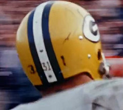
“Why would you have your uni number on your helmet twice?”
Isnt that what Alabama does?
My guess on that Double-Numbered Packer (Jim Taylor) is that it’s preseason or early season. The purpose of helmet numbers such as those (as opposed to ‘Bama-style side numbers) was to help players ID their helmets. That looks like the “the style we did them last year, and the style we’re going to to them this year” put together. Possibly the centerstripe just hadn’t been repainted yet (or maybe Taylor, like Dave Butz, didn’t want his helmet repainted).
Teams weren’t always so fussy about things. I say, yet again, things haven’t always been as they are now.
—Ricko
Shoulda given him credit, yes, was a pretty funny observation.
Just put my comment here cuz was relevant to today’s lead photo.
–Ricko
Ricko, stubbed your toe on a pretty good joke.
Always kinda figured Maynard wore those things partially (largely?) to steady the helmet because he didn’t wear a chin strap.
link
—Ricko
Or was his college job delivering flowers?
link
—Ricko
Will someone, I don’t care if they’re Buffaloes (West Texas, Colorado) or Devils (Duke, Arizona State), PLEASE do a horned helmet like this again?! So completely underutilized at the college/professional level.
I’d second that notion, er, motion. I’m looking at you Duke.
Thumbs up to the Milwaukee Wave. That story deserves to be featured.
Way to go, Lovie. Old school!
Our friend Craig Robinson at flipflopflyball.com has a birthday and a new chart. Unfortunately, I passed that marker some time ago. link
FYI, of course, Wichita State is the Wheatshockers, but Kansas does produce a fair amount of corn. No. 8, in fact.
Those Ohio State posters are gorgeous.
i hope jamie moyer makes it back next season…
link No, I won’t inflict “link” on you… unless you link! ;-)
You forgot the good version:
link
link! I liked when coaches and staff would link, or at the very least, link… It would be great if today’s coaches would show some style (link), but as we can see, they’re working double duty as link showing off the officially licensed link link…
KC Chiefs required players to wear team sport coats back in the day. A interview with Len Dawson before the Chiefs Monday Night game last week he was talking about them when he was touring the new Chiefs Hall of Honor at Arrowhead stadium. Attached is the team historian giving a tour and you can see 2 of those coats.
link
Arrowhead, what a great design. It’s like Dodger Stadium, even tho it’s old by today’s standards (aren’t we all), it never seems to show its age.
Plus it’s so frickin’ loud. Niners there this Sunday. Give us a break, eh?
They just threw $200+ million at Arrowhead, redoing just about everything you don’t see on TV. So now it’s still got that great (and loud) bowl, but with all the amenities of a modern stadium – huge concourses, amazing variety of concessions, plenty of restrooms, hall of fame, huge team shop. Best of both worlds.
It’s good to hear the crowd again, that roar has been missing the last few years.
Ahhhh. Arrowhead. I’d rather sit on the 673 row in 10 degree weather wind howling watching the Chiefs lose by 30 than sit in the Jones Dome on the 15th row watching the Rams win. Nothing against the Rams, it’s just a damn library in that place. Quiet, no emotion vs. one of the best places in the country.
i was ready to chuckle upon opening the gridiron wedgie pic…until i saw it was a beloved auburn tiger who was victimised. nearly an atomic…
Looks like the Sox went to the mall and bought Patrick his batboy jersey at Merle Harmon’s Fan Fair.
Was thinking Little League uni at first, but the pants looked semi-authentic.
Heck, little league jerseys in ’85 wished they looked that authentic.
I’m fairly certain that was a Fan Fair jersey, since I had one exactly like it – even had a heat-transferred “BAINES 3” on the back. Dang number stuck to every chair I sat on.
Those Merle Harmon jerseys are exactly what we wore in Little League in the late 70s/early 80s. One year I was on the Padres (we didn’t get to keep the jerseys).
Year after that, I was on the generic powder blue “Palatine National Bank” team (again, the jerseys weren’t keepers).
I didn’t play the following year but the year after that, I was in a different league and my team was the Tigers — we wore “Fan Fair” road jerseys (arched, block DETROIT) that we got to keep. Of course, that’s where the MLB similarities ended, as the pants were white and we wore replica home caps.
The shirt was not nearly as premium as Merle Harmon, where I picked up a Yellow Pirates jersey a year earlier.
Still better than the powder blue “Cypress” little league jerseys that we paired with jeans in tee-ball.
Is Mercury wearing the stripe portion of his socks sewn into his pants in link?
I thought that was a more modern way to keep those stripes up where they belonged.
Most likely held up with a band of white training tape around the top of the stirrup sock, which isn’t noticeable because..
A) the pants are long enough to cover it.
B) the pants are white, too.
—Ricko
Yeah, but if you look at his right leg it seems like you can see leg hair / leg between the top of the crew sock and the bottom of the stripes.
That just the third (lowest) white stripe stretched really tight over a well-muscled calf, and slightly shaded because of it.
—Ricko
Can we just go ahead and declare shenanigans on Adidas (Reebok included), Nike, Under Armour, and Majestic. Primarily for their fascination with making things X% lighter and drying X times as fast. Is there a significant advantage in having mesh numbers as opposed to tackle-twill? Unlike the switchover from flannels to doubleknits, will this even be noticed? Thankfully, baseball has more or less escaped this ridiculous trend, granted there are exceptions, e.g. the plain armpit panels of the Cool Base pinstriped jerseys and the hideous dugout apparel. Above all, it’s time to give them what for.
If it means the Bulls are ditching that link then I’m all for it.
I don’t want to have to wear sunglasses to a game played indoors.
I think the NY Giants and the Bears played a game at the Polo Grounds in October of 1939 to close out the World’s Fair for that season. The WF ran from April to October in 1939. It was the first season for Sid Luckman who was a Brooklyn native and Columbia grad.
My initial report on today’s NBA event is up:
link
I’ll have a much more detailed assessment of the new uniforms tomorrow.
Well, that’s 90 minutes and two subway fares I’ll never get back.
MWAH HA HA HA HA great opener.
How can adidas call their jerseys a “revolution” when Nike has had System of Dress for 4 years? What a joke!
White Sox and A’s both wearing black jerseys this afternoon. Looks terrible with basically the only difference being the Sox in gray pants and the A’s in white pants. I thought there had to be contrasting jersey colors by both teams with the home team getting preference meaning the Sox should have worn gray today?
They’re both dressed appropriately considering that the Sox’ postseason hopes officially died last night. So MLB gave them special dispensation.
We’ll blame it on Selig. The similarity of both teams looks like bush league baseball, NOT MLB.
it could be worse
Phil, I hope in the name of all things good that Interim Commissioner of Major League Baseball for Life This Bud’s Not For You Selig declares that “home teams must wear white” starting with the 2011 season. This BFBS shenanagans, blarney, mullarkey and bullshit has now officially boned the fish (it’s passe to say “jump the shark” anymore).
Chub Feeney as National League president declared home teams must wear white, so I say let’s get back to tradition.
Just in case you wanted to look:
link
Sir Charles said it best:
link
Frank Caliendo as Sir Charles said it better:
“T-R-B-L Terrible!”
Re: the Cardinals uni number breakdown. The White Sox (the team currently building on their exciting eight game losing streak) have a #1 (Juan Pierre) and #99 ($$$), for the full range of the numerical spread. They also have a coach wearing #98.
And they sell steamed Cuban sandwich’s at the ballpark, if you’re looking for something positive to say about the team.
Cute painting in that “Habs vs. Leafs” ad… but did anyone notice the kid in the Canadiens sweater is wearing Leafs socks?
link
-Jet
maybe he lost a bet
Due date was 10/23…but it looks like my daughter will be here a month early. Off to the hospital. So do I bring her home in a Yankees, Giants or Rutgers blanket and booties!!!!!!!
Congrats!
I don’t care if she comes home in a Packers hat, Red Wings blanket, Cardinals booties and Purdue jammies as long as she comes home healthy.
She, of course, will spend the rest of her life not being ready on time…so enjoy it.
“A baby is God’s opinion that the world should go on.”
—Karl Sandburg
New U.S. Ryder Cup gear is really classy.
Very Ralph Lauren/old school.
link
Although that Saturday ensemble probably has Our Founder grinding his teeth.
—Ricko
yeah…he probably won’t watch now
yes, classy. I like it. Not trying to drape the flag all over them.
Preseason hockey:
link
Jake Dowell of the Blackhawks got in a fight and had his head pop through the middle of the back of his jersey.
That’s funny! Now gotta find more pics for tomorrow’s ticker.
Paul, you mention attending the same NBA function that SLAM attended. Years ago it was SLAM’s Lang Whitaker who turned me onto UniWatch, in the days before you started the blog. He lives on the West Side, and is someone you need to know.
looks like patrick is ready to give carlton fisk a piece of his mind.
“next time f@!#$ing hustle”
– Jamie Blythe
(yes, THE Jamie Blythe)
bonus points to the white sox for the team-issue digital watch, which looks like it’s strapped tight enough to slow circulation to the left hand.
– John “Temp” Templeton Keller
Sorry Paul, but “dressed up” doesn’t include jeans in the definition. Doesn’t mean you didn’t look good, just that you weren’t dressed up.
Much like you might argue that a baseball player isn’t in uniform without stirrups, I’d say a man isn’t dressed up without a pair of slacks.
dude, don’t talk smack about the CFL, way better game than the NFL and fully 99.9% less prima donnas