Back in early July, I ran a Ticker item about the top-selling WNBA jerseys and then sarcastically added, “Yeah, except that the top ‘top-selling’ WNBA jersey only moved about 17 units.” A lot of readers took me to task for taking a cheap shot, for being sexist, and for generally not taking the WNBA seriously.
Now, honestly, I don’t take the WNBA any less (or more) seriously than I take, say, the D-League or arena football, and I’m fairly certain nobody would care if I poked fun at them. Still, I got the message you people were sending that day, so today we are going to take the WNBA seriously. Very seriously, in fact.
First, a quick refresher course: The WNBA is the league that has embraced soccer-style jersey sponsorships, so there are teams out there wearing the logos of Farmers Insurance, LifeLock, Bing, and Foxwoods Casino, instead of their team names or cities.
But apparently that isn’t enough sponsorship action for the WNBA. With this season’s championship round now being played by the Atlanta Dream and the Seattle Storm Bing, a new bumper sticker has appeared on the players’ abdomens. Here, take a look:
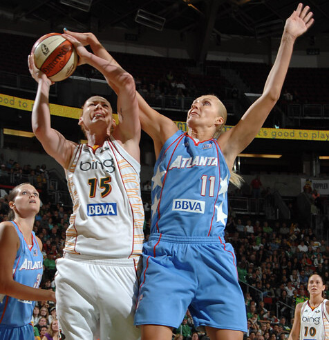
See that “BBVA” patch? Looks real classy, right? Here’s the story behind it (buried at the bottom of this article):
Both teams wore a new sponsorship logo below their numbers on the front of their jerseys. The WNBA sold the marquee space for the WNBA Finals to BBVA, the second-largest bank in Spain. BBVA sponsors La Liga soccer in its native country and coincidentally, [Atlanta Dream player Sancho] Lyttle will play for the Spanish national team in the world championships later this month.
So let’s review: Other leagues put a commemorative patch on their jerseys for their championship finals, but the WNBA sells an ad. The ad is for a foreign bank. And the league’s Seattle team now has two corporate names on its jersey, neither of which has anything to do with the team’s name.
To be fair, I don’t think the WNBA is doing any of this out of greed. I think they’re doing it because they need extra $$$ to stay financially viable, just like minor league hockey teams that wear jersey ads.
But in the grand scheme of sports, minor league hockey usually isn’t treated like a heavyweight property, y’know? Seems to me you can’t have it both ways: If the WNBA wants to be taken seriously, maybe they should stop selling prime uni real estate during their championship finals; if they’re not worth taking seriously, well, uh, yeah.
Just sayin’.
(Big thanks to Jeremy Brahm for bringing this one to my attention.)
Are there any changes I didn’t miss?: I really thought I was on top of the FBS scene this year, but it seems like nearly every day brings another round of changes I missed. Here’s the latest batch:
• Remember those new Arkansas pants with the school name on the back of the thigh? They wore something completely different last weekend.
• Washington State is yet another team that’s changed from black shoes to white.
• Amidst all the fuss over Georgia Tech’s two white jersey designs, we haven’t mentioned that the Yellow Jackets also have new pants this season.
• Houston has a new nose bumper design.
• LSU has added a 150th-anniversary patch. “They didn’t wear the patch for their first game against North Carolina because they were wearing the Chick Fil A kickoff game patch instead, but they added it for the Vandy game,” says Ernie Ballard. “I believe this logo will also be painted on the field, but LSU hasn’t had a home game yet, so no pics of that.”
• And here’s a 9/11 thingie we all missed: Tennessee had a stars/stripes “T” logo decal on the back of their helmet stripe. Of course, putting a stars/stripes decal about an inch and a half from your American flag decal doesn’t really make much sense, but neither did most of the other 9/11 thingies.
My thanks to Drew Johnson, Jim Bowles, Braden Russell Wolf, Carter Templeton, and Aaron Newman for bringing me up to speed on these.

A giveaway? Sure why not!: Last winter a guy named Don Steinberg came up with a completely ingenious blog concept called the America Bowl, in which he compared the 44 Super Bowls to the 44 U.S. presidents. I even wrote a little squib about it for ESPN.
Now the blog is slated to come out as a book, which will be published later this fall. Steinberg has generously offered to give away two copies of the book to Uni Watch readers, plus the two winners will also get one of these cool Red Sox-ish T-shirts that Steinberg designed (“I got bored and made them,” he says). Cool, right?
To enter, send an e-mail with your shipping address and T-shirt size to the giveaway address by 10pm eastern this Thursday, September 16th. One entry per person. I’ll announce the winners on Friday.
Uni Watch News Ticker: Reprinted from yesterday’s comments: Non-FBS school Northern Iowa — which goes by UNI, by the way — has new uniforms. ”¦ Giants pitcher Jonathan Sanchez apparently scratched out the Padres logo on the mound the other day (with thanks to Eric Hawkins). ”¦ Soccer player Julien Escude’s surname is pronounced “ess-cue-dee” — or SQD. Which is what he’s now wearing as his NOB (big thanks to Jeremy Richardson). ”¦ Some people in Cleveland are trying to give unwanted LeBron jerseys to homeless people. ”¦ The Browns have launched a really nice interactive team history page (thanks, Vince). ”¦ Seth Birnbaum notes that several Seahawks appeared to have some sort of little patch just above their nameplates. But only a few players had it, not everyone. Anyone know more? ”¦ Leafs goalie prospect Jussi Rynnas has reportedly put an illo of his agent on his mask. No photo yet (with thanks to John Muir). ”¦ New logo for Super Rugby. “I love the way the negative space is a rugby ball and the use of lettering (and double use of the R) that gives a symmetrical feel,” says Caleb Borchers. ”¦ Genius catch by Ryan Kuehn, who noticed that the Packers are now wearing the old “Heisman over Wisconsin” logo on their visor tabs. ”¦ Why did the Pats wear white at home on Sunday? For the usual reason (with thanks to Matt Friedrichs). ”¦ Reprinted from yesterday’s comments: New hoops uniforms for Vanderbilt. ”¦ Cool day-after coverage of the Redskins’ gold pants here. ”¦ Reprinted from yesterday’s comments: At one point the Bears apparently contemplated changing their helmet color to orange, so that QB Bobby Douglass could better spot his receivers. For details, go here and search on “orange.” ”¦ Kind of amazing that the stitching on a baseball looks so iconic that it can be evoked in completely different contexts (great find by my Scotland travel buddy, Amy Fritch). ”¦ New 75th-anniversary logo for the AHL, plus at least one team will mark the league’s birthday by wearing super-cool throwbacks (big thanks to Andy Rawlings). ”¦ Michael Orr has assessed the latest round of EPL kits. ”¦ Here’s a really good look at the “Sully” memorial patch that the Brewers wore in 1986 for equipment manager Bob Sullivan. The thing is, as Scott Fendley points out, “That shot was taken in Spring Training 1987, so the Brewers were re-using uniforms from the previous season.” ”¦ Very cool video showing the Meadowlands field being changed over from Giants mode to Jets mode (with thanks to Bernie Langer). ”¦ Dig the completely awesome sweaters being worn by Conn Smythe and Frank Selke in this old Maple Leafs team portrait (tremendous find by Terry Proctor). ”¦ If you work for Hanna-Barbera, it figures that your company bowling team would have really cool bowling shirts (good to have Lance Smith combing through the Life archives again). ”¦ The link between football and advanced brain damage continues to grow. ”¦ Steve Strohl notes that some Northwestern players were wearing last year’s number font on Saturday. Compare the two players wearing No. 13 — Siemian is wearing the right font, Bryant has the wrong one. ”¦Not sure I’ve ever seen a soccer player wearing a Rip Hamilton-style mask (with thanks to Tris Wykes). ”¦ The Jets’ “Hey, it’s our stadium too!” patch looked fine. ”¦ Here’s something weird: During the Hank Williams intro to last night’s Chiefs/Chargers game, every shot of the Chiefs showed them wearing last season’s Dallas Texans throwbacks. See for yourself in this clip (alertly provided by Sean Patton). ”¦ And here’s something you don’t see very often: five offensive linemen all with uni numbers in the 60s (as spotted by Mario Fontana). ”¦ Ben Traxel tailgated at the Kansas State game last weekend and took lots of good photos. ”¦ Happy birthday to my old college pal and daily Uni Watch reader Jeff Katz. See you at the Slipped Disc reunion, buddy!

Because there’s (slightly) more to life than making fun of Wayne Hagin: As you may recall, I’ve been working on a book about a bunch of old report cards (and some of you have even been helping with the research — thank you!). For those who are interested, there’s a nice article about that project in today’s New York Times. And if you can’t access the NYT version because it’s behind a registration wall or whatever, try this.
The new logo patch wasn’t the WNBA selling the ad space; the NBA did it. Check out the NBA’s new agreement with BBVA in this article…
link
The NBA that pays all the WNBA’s bills and is probably just trying to get some money back out of that sinkhole?
I should add, I can’t get to the article at work and can’t read it, but it seems like it’s still the same idea. Bet you won’t see that patch on the Lakers this year.
you won’t see it on the lakers in the regular season, but you’ll see it plenty during the exhibition game in Spain
EPL player Julien Escude’s surname is pronounced “ess-cue-dee” – or SQD. Which is what he’s now wearing as his NOB (big thanks to Jeremy Richardson).
Escude plays for Sevilla in Spain’s La Liga, not the EPL.
Is it just me, or is the wearing of white at home due to heat becoming much more prominent in the past few years?
…and this is all I have to say about the WNBA:
link
1. it’s not just you
2. it’s lame
3. AHM is still a douchebag
I think it’s because the guys wearing white jerseys keeep winning superbowls!
Little trivia…
In 1964, when the NFL allowed White At Home after a mandated dark at home policy since 1957, no less than half the league (14 teams) went white at home. They were the Colts, Browns, Cowboys, Rams, Vikings (forced to switch to purple for one game from the second quarter on), Cardinals and Redskins went to white at home. The Steelers even broke out white for an early game hosting the Rams. The one who stayed dark at home were the Bears, Lions, Packers, Giants, Eagles, Steelers (for the other 6 games) and 49ers.
One other quirk here was that a game scheduled to be played in St. Louis (Colts-Cardinals) was relocated to Baltimore because the baseball Cardinals were in the World Series. The Colts then wore their blues at “home”.
the colts played in baltimore? the cards played in st. looie?
wha?
Always amazing info timmyB
Don’t you defeat the purpose of wearing white jerseys at home for heat reasons when you were dark pants?
You would think so. Why in the world are the Pats so resistent to wearing Silver pants with the White jerseys? It would be at minimun as good a look as with Blue pants, to my mind, it would be MUCH BETTER!
Man, I wish they would switch to silver pants. They look so shitty on the road.
-No silver (except on the collar)
-A pant stripe that tries to match up with the jersey’s
side panels
-Side panels
-Socks with Adidas stripes that go with nothing else on
the uni
Wear the silver pants at all times, and get a solid-topped sock (navy). Losing the side panels would be even more dreamy.
This Kansas State logo, from Traxel’s KSU gallery, has a total Dr. Seuss vibe:
link
Can anyone shed any light on that?
That was the first one on the banner, and it says Kansas State College. Leads me to think it was the oldest one of the bunch. I thought the same thing about Dr. Seuss. Either pilfered or a behind the scenes design by the cat in the hat himself.
Or…he could have had a hand in it. Seuss’s real name was Ted Geisel and, as I recall, he had quite a career as a graphic artist (including doing WWII propaganda work, I believe) before making it big with the Cat in the Hat et al. The name was changed from KSC to KSU in 1959, so that would fit the time frame.
Just discovered that there is a K-State English professor who has written a book about (ta-da!) Dr. Seuss. I’ve just emailed him to see if he knows of a connection between Dr. Seuss and this K-State image…
I was wondering, too, if the Chiefs were going to go to Texans helmets after the MNF opening credits.
Did KC have only one appearance on MNF last year, with that appearance being in Texans gear?
If so, that would have made life very easy for some guy who didn’t want to go through licensing paperwork to get footage elsewhere.
Monday Night Football is coproduced by the NFL. They have access to any film the NFL owns, so they don’t have to worry about licensing.
OTOH, Minor League Hockey doesn’t have playoff games on ABC and ESPN. The WNBA is sort of halfway between big time and small time.
The NBA is testing the reaction to this kind of ad in the W. It’s a harbinger of what NBA unis will feature in the very near future.
Agreed. I thought when the Rockets and Raptors put their numbers higher than their team logos in the mid-1990s that you’d start seeing ads in the center of the jerseys like in Europe.
Duke switched to the wider helmet stripe November 14, 2009 against Georgia Tech.
Ooof. I’m all over the place on these changes. OK, will fix (after double-checking to make sure).
I’m really diggin’ these wider helmet stripes.
At the end of the Rutgers-FIU game last Saturday night. I noticed that a New Jersey State Trooper escorted Schiano to midfield to shake hands with the FIU coach, who was accompanied by what looked like a Miami-Dade cop.
Now in every college game their is a police escort of the coach. I never realized that the police apparently travels with the team.
I am not sure if this is common practice or common knowledge. I just had not noticed until now….and the only reason I noticed now is because I unfortunately and VERY FAMILIAR with the uniforms of the NEW JERSEY STATE POLICE TROOPERS!!!!!!
It’s just a show at taxpayer expense.
Gregg Easterbrook has been all over this for a while at TMQ on espn.com.
As the previous poster stated, it is just taxpayer dollars being used to inflate the coaches’ egos.
Does every school do this? I have always seen the cop and I just had never noticed that they traveled with the team…
I seem to remember hearing that the State Troopers that work and travel with the University of Alabama football team is off duty. I cant remember if they are paid by the university but apparently they do not get paid by the state for doing so.
ok i was wrong. the universities pay the state for troopers to work the game. im not sure how to post a link but here is something from ’08 saying just that.
MONTGOMERY, Ala. (AP) – Eight public and two private
universities in Alabama have paid the state Department of Public
Safety more than $38,000 for state troopers who protect their
football coaches.
A department spokeswoman, Martha Earnhardt, said the troopers
are used only during football season.
The 10 schools whose coaches receive trooper protection are
Alabama A&M University, Alabama State University, Auburn
University, Jacksonville State University, Samford University, Troy
University, Tuskegee University, University of Alabama, University
of North Alabama and the University of West Alabama.
Some schools supplement security for coaches with campus police
officers.
Earnhardt said she did not know what each school paid for the
trooper service.
But she said the schools reimburse the department for expenses
such as out-of-state travel, meals and lodging.
Rutgers coach Greg Schiano is the highest paid employee of the state iof New Jersey.
That’s not at all uncommon for a state’s bigshot football or basketball coach to be the highest paid state employee. There was a big stink a year or two ago about Jim Calhoun being the highest paid employee in Connecticut while the recession raged on, and I’m fairly certain that Indiana’s basketball coach is the highest paid state employee here.
I think some NFL QB’s get similar escorts at bars. I’m almost positive that they do in PA.
Wow- another great Packers catch. Well done, Ryan!
Figures. I couldn’t watch the game, so all the good uni notes come out of it.
“Dig the completely awesome sweaters being worn by Conn Smythe and Frank Selke in this old Maple Leafs team portrait (tremendous find by Terry Proctor)”
Love the flags for the eight teams including the Montreal Maroons and NY Americans in that picture.
Ditto.
Anyone else notice that Bob Gracie (bottom row, on our far right) is the only one with sleeve stripes on his jersey? Anyone know anything about that?
Skott, those “stripes” around Gracie’s arms are more than likely his elbow pads. I’ve seen many, many photos of hockey players wearing the elbow pads on the outside of the sleeve. Good catch!
Make that “old time” hockey players (including Eddie Shore), yah hoser!
piss on eddie shore!
So your conclusion on the WNBA is that they can’t be taken seriously if they have ads on their jerseys, yet earlier in the article you mention “soccer-style jersey sponsorships.” Those clubs are taken VERY seriously. Real Madrid hasn’t lost any clout by putting “Bwin” on their kit. The Seattle Storm wouldn’t gain any fans by taking “Bing” off theirs. Sorry, but I’m not buying the jersey sponsors=no respectability formula.
I think the difference is that here in the US, we nearly worship the uni…and for most us that do not really follow European or South American soccer, its nearly sacriledge to “stain” a uni with an ad….so if you want to be taken seriously by the american market, you really cant have the sponsor name more prominent than the team or city name…
just my opinion…
Completely wrong. When sponsors started showing up on soccer jerseys, the reaction was just as angry as it would be if the NFL or NBA did it. They did it anyway.
I would venture a guess to say that it’s because it’s been normalized in Europe to see advertising on team uniforms. Whereas in the US, it has, for the most part, been about the team name. Granted there are exceptions, e.g. the Packers, but it is, in general rare.
Even in the Packers case…most fans don’t really see that as an “ad”…but you are right. We are just not used to see that.
To me putting an ad across the front of a Yankee jersey would be like putting classifieds in the Bible!!
Whenever I think “Bing,” I think Crosby.
That and the “telenovela” commercials … “Ooh! Bing! Bing! Ay, Bing, otra vez!”
Speaking of telenovelas….although I am a native Spanish speaker…I always watch a few minutes with the mute on. Horrible script..but always great to look at!!!
“I think the difference is that here in the US, we nearly worship the uni…and for most us that do not really follow European or South American soccer, its nearly sacriledge to “stain” a uni with an ad….so if you want to be taken seriously by the american market, you really cant have the sponsor name more prominent than the team or city name…
just my opinion…”
Right on.
I love soccer, but wish their kits were free of advertising. But the same arguments raised here against uniform advertising were pretty much answered and defeated 30 years ago in soccer. But I don’t think the jersey sponsors are even a small reason why the WNBA isn’t more popular. Is there even one fan that the WNBA lost when they added sponsors? OK, I’m sure there’s one, but my point stands. Unfortunately, I think one day we’ll look back nostalgically at the Nike swoosh and adidas stripes fondly, as emblems of a more innocent time, before we paid $100 to buy an authentic NBA jersey emblazoned with a corporate ad. I don’t think there’s an exceptional American tendency to resist uniform advertising — if anything, reading this blog makes clear that resistance is breaking down over time. I hope I’m wrong though.
Congratulations on the NYT write up, Paul!
The Seattle women’s pro basketball team is really good. The ascension in the quality of play in women’s basketball since, say the ’70’s, is astonishing. I don’t really follow it closely, though.
BING doesn’t help. It really doesn’t help.
Others can see beyond that, I suppose. (sigh)
Seattle already has “Bing”…now they just need the Samsung Bada smartphone sponsor…
Nice!
Here it is:
link
Hey Paul,
Any word on when the NBA/Adidas will announce the change in jersey material for this season?
Expect some sort of announcement later this month.
It makes no sense for the Packers to use that old logo… take a good look. There are 2 dots on the state map. One for Green Bay, one for Milwaukee. The logo dates back to pre-1994 when the Packers played half of their home games at Milwaukee Country Stadium.
Well, kinda.
There are still two groups of season tickets – one predominantly for fans from Milwaukee, a remnant from the County Stadium days.
And there’s always the chance that the Packers have adjusted the logo to remove the second dot. Sure can’t make it out from the photos.
Lol, gotta love that oxymoron.
Womens sports.
Makes me laugh every time.
Thanks for the inclusion of the Bobby Douglass mention and the potential orange Bears helmets. He was my childhood hero. I’m sure Bobby’s receivers ix-nayed the idea as they sought to avoid concussions from his cannon of an arm that was always set to “11,” no matter the distance.
Stealing Signs 2 (Hockey) are on sale…
link
Nitpick: Julien Escudé, being a Frenchman, would pronounce SQD more like ess-coo-deh.
re: So let’s review: Other leagues put a commemorative patch on their jerseys for their championship finals, but the WNBA sells an ad.
In the words of Lee Corso– not so fast my friend. The WNBA does have Finals patches on their jerseys.
The Seattle Storm patch is located on the back of the jersey. link
The Atlanta Dream is right there in plain view on the front of the jersey. link
Eric Staal in NYC today on a media tour, with 2011 NHL All Star game patch on his jersey.
link
I’m still getting used to seeing the C on him. Patch looks fine on the jersey though, could use black outlining on the letters to make the boundary more distinct though (and to match the Hurricanes jersey lettering, for that matter)
“Backwards” logos on football helmets:
Okay, this has kind of been driving me nuts for a long time…It first started off with the Baltimore Ravens. I noticed that seems their primary helmet logo can only go ‘one direction’ without the “B” being backwards, they actually flip the B in the Ravens head to go backwards, as shown on Derrick Mason’s helmet:
Ravens
I don’t know why it’s been making me so angry, but I feel as if it shows some sort of poor planning or something I don’t know. Another team that upsets me is the Atlanta Falcons. Some may think there is no problem with them but their whole idea of the Falcon logo forming an “F” is completly negated on the left side of the helmet as shown here:
Falcons
Now I know that the rest of the teams could be argued as being reversed because it’s the opposite side of the helmet but their logos aren’t ‘affected’ by the switch. Can anyone else think of times where team logo’s or the intent of the logo have been altered due to the inversion on the opposite side of the helmet? I didn’t even dive into college, but the Ravens are what really set me off haha!
thanks in advance!
Texans
If anything, from day one, the Falcons left side portrait was as equally important as the right side that forms the “F”.
Observe from 1966, the Falcs first season of existance:
link
Agreed. I’ve been a uni-obsessed Falcons fan from day one. Until recently, the fact that the Falcon logo resembled a “F” was never discussed. Sometimes the logo faced one way (on shirts, caps, etc.) but just as often it faced the other way.
Probably had something to do with why they lose so much. I have I mentioned that the current Falcon unis suck?
Bravo to Sanchez for rubbing the logo off the back of the mound!
Whoops! Sorry about that!
“Backwards” logos on football helmets:
Okay, this has kind of been driving me nuts for a long time…It first started off with the Baltimore Ravens. I noticed that seems their primary helmet logo can only go ‘one direction’ without the “B” being backwards, they actually flip the B in the Ravens head to go backwards, as shown on Derrick Mason’s helmet:
link
I don’t know why it’s been making me so angry, but I feel as if it shows some sort of poor planning or something I don’t know. Another team that upsets me is the Atlanta Falcons. Some may think there is no problem with them but their whole idea of the Falcon logo forming an “F” is completly negated on the left side of the helmet as shown here:
link
Now I know that the rest of the teams could be argued as being reversed because it’s the opposite side of the helmet but their logos aren’t ‘affected’ by the switch. Can anyone else think of times where team logo’s or the intent of the logo have been altered due to the inversion on the opposite side of the helmet? I didn’t even dive into college, but the Ravens are what really set me off haha!
thanks in advance!
Ravens simply should have stayed with this:
link
The logo they have now is very sloppy and haphazard, so I agree with you there. They were being sued and they had to think of something quick to replace that awesome shield, and they failed. It’s like Batman meets the Crows from Dumbo, and quick we’re being sued.
The old Raven logo always reminded me of this timeless classic link
In Japan’s X-League the Fujitsu Frontiers look like this from the left side of the helmet.
link
Backward logo on the right side.
link
Let alone on the sleeves.
link
Is that really an “F”.
I don’t see it.
Oopsie?
I’m going to go nuts:
atlanta falcons…
link
I guess the Kansas City Chiefs as well!
link
but they don’t look as bad as the Ravens.
My anti-virus is bugging out because of the pickzone site
I just should have stuck to espn.com…
Ravens:
link
Sorry, it’s inbetween classes, kind of rushed!
Texans
Cardinals
Redskins
Jags
Broncos
Lions
Panthers
Seahawks
Patriots
Bills
just re-read what you were asking – so i will revise my previous list(s):
Texans – note the tilt and colors of the logo are reversed
I tried to be not confusing but I was more looking for the logo actually being altered as opposed to just rotated for the sake of being on the opposite side of the helmet.
I tried to make it clear with this statement:
“Now I know that the rest of the teams could be argued as being reversed because it’s the opposite side of the helmet but their logos aren’t ‘affected’ by the switch.”
But I get what you mean, it’s just hard to word, but the texans would be a great example, the Bills not so much as they just basically went into photoshop and clicked rotate image. Does that clear it up?
Still loving those yellow Redskin pants. The socks were beautiful. Arguably the best home jersey in the NFL. Only the Packers and Bears are in the same league!
I love the new Redskins pants too but am troubled that the jersey, pants and socks have three different stripe patterns.
They need to get rid of the jersey stripes altogether.
Not o mention the helmet, which has a fourth different pattern.
I would put the Giants home blue jersey and Cowboys home white up there too…
Yes Andy. I forgot the helmet does have a fourth different pattern.
“If the WNBA wants to be taken seriously, maybe they should stop selling prime uni real estate during their championship finals.”
If they don’t sell prime uni real estate (and, really? the players’ abdomens are “prime uni real estate?”) during their championship finals, there might not be any more championship finals.
Also, misogyny is fun.
1. Yes, the front of the jersey is prime real estate. You can’t get much more “prime” without selling space on the front of caps and the side of helmets.
2. Paul already acknowledged that this is likely motivated by the league’s rather precarious financial situation.
3. Where exactly do you see misogyny here?
Sure looks like prime real estate to me — any front-view photo of a player will showcase the ad. The Seattle Times article that I quoted referred to it as the “marquee space.” If you think the ad is no big deal, that’s fine, but c’mon — it IS prime real estate on that uniform.
I think the silliness of accusing this entry of being misogynistic speaks for itself.
If they don’t sell prime uni real estate (and, really? the players’ abdomens are “prime uni real estate?”) during their championship finals, there might not be any more championship finals.
and that’s a problem because…?
Speaking of misogyny, check out this article (link) I stumbled on today. I think it was written by a woman, but it’s so unbelievably condescending I can’t be sure. In fact, I’m not completely sure it’s not a joke.
A couple gems:
“Watch out, it’s football season! It’s time for the guys to get rowdy, drink, and have fun hollering at the game! For you, however, it’s just another day. You’re either cooking, cleaning, or elsewhere trying to avoid the commotion. You usually don’t understand all of this rowdy behavior, even though it’s very simple.”
“It’s absolutely imperative for you to have the right mindset before even thinking about anything football related. This is grossly underestimated, and it is why women cannot learn the game, or refuse to learn it. The goal of anything learned mentally is to put yourself in a calm, relaxed state of mind. This starts on Saturday night. Try to get a healthy eight hours of sleep. If your husband watches Saturday, then prepare on Friday. The next morning, make sure to eat a good breakfast. If you do not eat breakfast normally, at least eat a snack or something that you would normally pick up. Again: Football is a three-hour game, and at all points in the game you find critical aspects that you could easily miss if you’re not alert.”
Try sending that to a female football fan friend and see how long it takes for her to call you an asshole…
What is everyone talking about with a new Packers helmet? I didn’t see it, and don’t know what’s being referred to.
it’s not the helmets, it’s the visor tabs
Oh ok. Yeah they sell shirts and various other memorabilia featuring that design in Wisconsin. I guess I’m still a bit surprised it was used on the visor, though.
Pretty sure that’s the first time the logo has ever been used on the uniform.
I like it – all that “throwback” merchandise is now current.
Found it! I thought I saw Matt Hasselbeck wearing 2 green radio stickers in the 1st half of the Seahawks game. The top one was gone after half time. My eyes didn’t let me down link
Great find Mickel! Love the graphics and update at the Seahawks uniform history site.
Thanks Mike. When do we get to see a ‘Hawks Bulwark helmet?
Down the road apiece, I’m planning on doing a few renders of helmets whose decals cross over the seams, even on the link. So, I plan on doing a Hawks version then. Thanks.
When are you going to add some pictures of the Seahawks from that first year (1976?) when there was no logo on the helmet?
LOL your killing me. You bring up a good point though. I will add a section debunking the ‘no logo” myth. Thanks for the suggestion.
There are some 1976 scrimmage pics of them not wearing the logo. Might be a good idea to show those, since that’s the only time they’ve ever done that. I have a few pics, from that scrimmage, if you need them?
I thought they wore them in a game? I have seen pictures.
Just like I “KNOW” the Browns wore that CB logo in a game. Be danged if I can find a pic somewhere, though…
Maybe he had stereo for the first half?
“Very cool video showing the Meadowlands field being changed over from Giants mode to Jets mode”
I’m assuming it’s cool, since it wasn’t available when I clicked on it.
Still don’t see why they can’t have GIANTS in one end zone and JETS in the other and just keep it that way. This isn’t Giants Stadium anymore, it’s Meadowlands Stadium. If you’re sharing the place, share the graphics on the field. Saves money and turnaround time.
apparently they do things a little differently in flyover country ;)
I could not watch it with the sound on…but, is there actually only 1 store, and they switch out the team merchandise after every game?
For security reasons, stadium merch is generally packed up and removed from the stores when the stadium isn’t in use. Reliant Stadium has a gigantic storage locker with the ready merchandise from that season, unsold merchandise from previous seasons, and merch from the various other events held there under the grandstand. It’s much easier to break into the grandstand of a stadium than to get into its guts, so they store stuff they would expect to be stolen if someone did break in in the more secure part.
I forgot my point. :P
Because they pack and move everything every game anyway, it’s no more trouble to switch out the teams’ stuff than normal. If there’s a permanent store, it’s likely split or there are two.
Maybe the Staples Center could leave the Lakers and Clippers insignia on the court all the time as well.
Phil, could your weekend uni-tweaks include courts and fields? ‘Cause I may to draw up Dane’s idea.
“Still don’t see why they can’t have GIANTS in one end zone and JETS in the other and just keep it that way. This isn’t Giants Stadium anymore, it’s Meadowlands Stadium. If you’re sharing the place, share the graphics on the field. Saves money and turnaround time.”
I’m baffled by this comment. The Jets organization and fans complained for years that they had to play in a place called Giants Stadium with red and blue seats. In fact, it wasn’t until the last 10 or so years that they covered up the walls with green and white Jets graphics. It used to be link during games.
The entire point of the new stadium (and part of the expense) was that it could morph between three different color themes with relative ease (Giants, Jets, neutral). It only seemed hectic and rushed this time because they only had 24 hours to prepare in an effort to let both teams “share” the opening of the stadium as best they could.
The Jets never would have gone for playing in a stadium with Giants colors or logos after having to endure decades of feeling like an away team at home, and I doubt the Giants would be okay with playing on half a Jets field.
There really isn’t that much to change from one theme to another anyway. Switch out the merchandise in the store, change the wall covering, switch out the endzones and change the flags outside. Everything else is basically push-button lights.
It’s a cake walk compared to what virtually every arena is forced to do between hockey and basketball games.
I think it probably is pretty easy…the only thing I was surprised was that they would have to switch all the merchandise in the store. I guess it’s also not hard to do, but for some reason I just figured they would just have 2 separate locations.
“(and part of the expense)”
That was my whole point. Why waste so much money just so you (the teams and the ticket holders) can have the illusion that you have your own stadium? You don’t. You’re sharing a stadium, but at least if you share the graphics, neither team has to feel like the away team. In fact, it would have an almost Super-Bowl-like feel to it every week.
Then the fans wonder why they have to shell out so much for parking and personal seat licenses and such. Instead of demanding that every little detail be personalized, why not learn to celebrate the fact that you cooperated on building a brand new stadium?
Just how much do you think it costs to change the endzones 16 times a year?
I guess I should answer your question more directly.
Q. Why waste so much money just so you can have the illusion that you have your own stadium?
A. It’s what the client(s) wanted and New Jersey didn’t want to lose two professional football franchises.
jim, baby…
this is new york
they could have probably each gotten their own stadium, but really, for 8 games each (plus 2 preseason) a year, when they could get sixteen plus however many preseason…
the could also spend twice as much money on one building
do you think they care about how much money they’ll save on not having to change 30 turf buckets and string up a couple of banners?
there was either going to basically be a new stadium that was J-E-T-S jets jets jets ONLY for half the games…and BIG BLUE ONLY for half the games…and neutral colors for any other events held there…or each team would have had to spend for it’s own
they weren’t going to “share” anything
nor should they
Not just the end zones – I was talking about the expenses you mentioned, like the separate lighting systems and all that.
If it’s not that much of a difference, fine and dandy. I’m just wondering how much of the $1.6 billion was really necessary, and what could have been cut. At least it was privately funded.
Now when the Jets and Giants play each other, they really should have each end zone displayed. Again, it would give it a bowl-like feel to it.
As you both said, it’s what the clients wanted (again, just glad it wasn’t taxpayer funded), and this is New York. I concede.
you’re just mad cuz the stillers have to share with pitt
Actually, it’s New Jersey…
I’m not getting this “Super Bowl type feel” argument.
So, because the Giants are playing the Falcons and one endzone says “JETS”… it feels like the Super Bowl? I don’t think so.
Secondly, when they play each other whoever is the listed home team should get all the graphics and colors. It’s their fans that bought season tickets to the game and it’s one of their 8 home games a year. Let it be a home game.
The new Cowboys stadium ended up costing somewhere around $1.2 Billion (or $1.2 Billion per team). The new Meadowlands was around $1.6 Billion (or $800 Million per team). That’s why they did it this way.
Au contraire, Phil…I’d love to see Pitt and the Stillers graphics on the field at the same time, the way the Saints and Tulane did in the 80s. I used to have drawings of such a concept when I was a kid. Instead of sending in a Meadowlands tweak, I’ll have to re-create my Pittsburgh one.
It’s hard to take on two Uni Watchers at once…
John, I could take it the other direction and say, when the Falcons are in town, put a Falcons end zone in there. KC and NO used to do that at their old stadiums, so every week had a bowl-game feel to it.
Of course, I’d also be happy with slashed lines or diamond patterned end zones, but that’s me. Again, I concede to both of you. The kids are clamoring for me, so I’m outta here.
I’m lost. I can’t comprehend why any team would want to put their opponent’s colors and logos on their own turf during their own home game.
Look at an old NFL Films from the Chiefs at Municipal Stadium. They did it every week. The Saints did it for a while at Tulane Stadium as well.
Well, the end zones seemed to both say Chiefs, but both teams’ helmets were painted at midfield:
link
On this Saints video, you can see the Rams logo at the 40-yard line:
link
Sorry, that first link was supposed to take you to the 1 min. 5 sec. point of the video.
A better look here, at the 3 min. 50 sec. mark of this Chiefs video:
link
At 1:35 of this video, you’ll see the Sir Saint logo at midfield…wearing a Santa hat. At 2:10 you’ll see the Saints end zone, and at 2:20 and 2:50, you’ll see the end zone painted for the Bears. For a regular season game at Tulane Stadium.
That WAS going to be my last post, but duh, I forgot the 2nd link:
link
Springfield Falcons will wear gorgeous Springfield Indians sweaters a couple of times this year (I could have sworn this was covered in August on Paul’s vacation)
link
I don’t like it…the crest is way off center…
“If the WNBA wants to be taken seriously, maybe they should stop selling prime uni real estate during their championship finals”
Why does selling prime uni real estate necessarily make a league one that can’t be taken seriously? In every other country in the world selling uni real estate is the de facto standard. It’s no different than NASCAR which is a serious sport – right? It’s just not what we are used to in the USA. Now I’m not saying that the WNBA should elevated to the same level of importance as other leagues. But I also don’t think that selling ads on jerseys is an automatic reason to demote a league.
comparing the WNBA to NASCAR…case closed.
My issue with the WNBA doesn’t have anything to do with ads on jerseys, rather it’s the poor quality of competition. I will be playing in the NBA before you ever see a female player at that level. The comparison to arena football, d-league, etc. is invalid, because the lower levels still send players to the highest level of competition. Some people make ill-informed comments about D3 football, yet it was Mount Union, and not USC, who had a starting wide receiver in the super bowl last season.
no more Mount Union references please- Paul has requested we not mention the “Purple Raiders” on this site :)
Gusto,
The better comparison is to lower weight division boxing. Manny Pacquiao is great, but even a bad heavyweight would kill him. That doesn’t mean he’s not a real fighter, or an undeserving champ.
Kevin,
Never suggested women basketball players aren’t real players or don’t earn their accomplishments. Using your boxing analogy, the WNBA is like toddlers playing basketball compared to even minor league pro basketball. And even the minor leagues occasionally send talent to the major leagues, regardless of the sport.
Gusto,
Toddlers? No. These are professional athletes. They would destroy anyone who didn’t have significant talent an training. We saw this last year when the Sky, a bad WNBA team, played a rec-league level team (the E-league All Stars) in a preseason game. The women won 102-55 and it wasn’t as close as the score sounds.
Wow! the Sky beat rec-league players! That’s impressive!
Hey wnba…I hear those special olympians are getting chatty
A. NASCAR is not a sport.
B. WNBA needs to be in smaller markets.
Paul, thanks for that VERY serious look at the bing® WNBA-BBVA. But next time you make the feminists mad, don’t make US suffer too! What did we ever do to them?!
Self-promotion alert: The NYT article is now being featured on the NYT’s home page! Very cool
Congrats Paul!
BTW, Videoeta.com put up a fun little movie helmet quiz yesterday:
link
Sorry…go to videoeta.com and scroll down to the news section. It is the first item.
ah matt…
we missed ya and your html skills!
I’ve missed your fine-tuned sarcasm as well, Phil!
Martin Demechelis from Bayern Munich (I think it was Demechelis, anyway. Maybe Tymochuk?) rocked the mask last year. As did…someone on Portsmouth. I remember watching a game with my friends and we ended up dubbing him Soccer Zorro because he had a black mask.
Frig, I can’t remember his name though.
It was Demichelis at Bayern – and they nicknamed him “The Phantom Of The Defense”.
Would you guys ever consider doing a feature or addressing how decals are affixed to helmets — I’m always in awe of how perfectly the Vikings horns come together at the back of the helmet.
Vince thanks for the Cleveland Browns historical site. I just opened it and went to 1946. Saw the Miami Seahawks ticket. My dad told us he was at that game. He was a huge Steeler fan but loved sports.
Five more team pages have been added to our US Presswire photo archive section. See the listing in the right sidebar to access the individual team pages.
Paul:
Lots of Dallas pics in the Rams section.
prolly because dallas owns the rams
I think the biggest difference between WNBA (or potentially any other “major” American pro league) and La Liga or the English Premier League is that those clubs use jersey advertising in the same way the large leagues here use television commercials. The WNBA is trying to have it both ways and have in game ads and commercials.
Rockmnation has a preview photo of Missouri’s new home jersey
Rockmnation.com
Ok so this is out of left field but….
Does anything think the Rams will be able to get an open-air stadium in St. Louis?
I don’t know, have you tried asking anything?
Just kidding, it would be nice, but since I am not from St. Louis, I have no idea.
Lol. Just caught that. :) Does “anyone” think…
The Penguins will be wearing a patch for their first season in the Consol Energy Center.
link
PTI just covered the Eagles throwbacks and the ‘Skins gold pants. They were complimentary to the Eagles throwbacks, but not so kind to the ‘Skins pants. Wilbon did say that he thought all teams should wear throwbacks since they are always better than current unis.
i guess wilbon didn’t see the denver throwbacks
wait…
By the way, lose the sponsor logo and those Atlanta WNBA unis are cool. I’d let my daughter wear that.
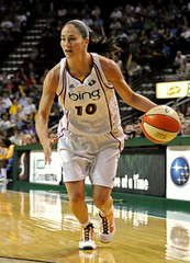
As for the Bing Seattle Storm, I don’t like the…what is that on the sides, anyway? I don’t like the pseudo-Payton/Kemp Sonics-era colors and I don’t like the number font. Is the woman on the right wearing #70?
link
Or #10?
dude…”the woman on the right” is sue bird…she might be one of three WNBAers i’ve even heard of…but i’d know her by sight
good point about her number, but why is that important? she’s playing for the bing vvba’s…is a number that big a deal?
Can’t say that I’ve heard of her.
Did a quick search, and apparently she wants to be Rob Ullman-ized:
link
As much as we talk about them it’s too bad Georgia Tech’s unis don’t look better. This 2010 version DOES look better than the last two years. The tiny shoulder stripes look nice. As much as I hate pants without stripes, the stripeless home pants look better than last year’s wide stripes. And the road stripes are ok…looks like Russell went with an adidas look.
It’s hard to see the 20-year National Championship sticker on the back of the helmet. It was placed right where the lower chin strap buckles. That’s a true GT uniform for you!
Re WNBA selling uniform space.
This a quality basketball series featuring two top quality teams from a world class competition. What they wear and who’s name is on it really is not important. It is interesting is how different leagues use their uniforms and evolve them. Uniforms are not a basis on which to judge how seriously a sport should be taken.
If the Heat playing in white/black reversibles they would be taken seriously due to their talent as a team.
Lets keep things in perspective and not degrade elite athletes based on decisions made by leagues and owners.
One key difference… in other sports that currently have ads on the uniforms – european soccer, nascar (if it counts as a sport) etc – they were taken seriously BEFORE the ads showed up. The WNBA has not achieved that. I’m not saying that they aren’t skilled athletes , but the fact is the general public really doesn’t care about them. Adding sponsors may not hurt an established league with a huge following, but they aren’t going to help the perception of a smaller league either.
Another key difference is the reality that the WNBA has neither elite athletes or world class competition. NCAA champion Duke would absolutely destroy the WNBA all star team.
>What they wear and who’s name is on it really is
>not important.
Um, on this web site it’s really important.
Re: the K-State banner that looked Seussian: I received a response from the prof at KSU who specializes in Seuss and he said:
“To the best of my knowledge, this does not look like the work of Dr. Seuss. Many reasons. The first one is that it lacks Seuss’s energetic line — simply not his style of artwork. It’s possible that the artist behind this image was inspired by Seuss, I suppose. But the artistic style lacks any distinctive Seussian features.”
“But the artistic style lacks any distinctive Seussian features”
except looking just like a typical Dr. Seuss character! I know, I know. Fakes look real to the untrained eye.